Embed Size (px)
DESCRIPTION
Seniro Portfolio as of 5-9
Citation preview

MELISSA HARTLEY / VISUAL DESIGN PORTFOLIO
<<
<<
<<
<<
<<
LEFT/RIGHT


>>
003/004
>>
>>
MELISSA HARTLEY / VISUAL DESIGN PORTFOLIOBOOK / LEFT / RIGHT
>>
>>

01/BI-LATERAL 003/004
<<
<<
<<
<<
<<
MELISSA HARTLEY / VISUAL DESIGN PORTFOLIO
LEFT/RIGHT

COLOPHON /
INSTITUTION / Academy of Art University, School of Graphic DesignMELISSA YUKIKO HARTLEY / Graphic DesignerPHONE / 408.761.8432EMAIL / [email protected] / Mary ScottBINDERY / Blurb.comPHOTOGRAPHY / Melissa HartleyTITLE OF BOOK / Left / RightCOVER STOCK / TEXT STOCK / Luster FinishFONTS / Adobe Garamond, BlenderSOFTWARE / Adobe Creative SuiteCOPYRIGHT@2011 MELISSA HARTLEY
All rights reserved. No parts of this book may be used without the written consent of the author by any and all means.
>>
003/004
>>
>>
MELISSA HARTLEY / VISUAL DESIGN PORTFOLIOBOOK / LEFT / RIGHT
>>
>>

01/BI-LATERAL 003/004
<<
<<
<<
<<
<<
OBJECTIVE /
The brain is divided into the two hemisphere’s, the left and right. Each hemisphere has an outer layer of grey matter called the Cerebral Cortex that is supported by an inner layer of white matter. The Corpus Callosum is what links the two hemisphere’s together by a very large bundle of nerve fibers, and also by other smaller commissures, including the anterior commussure, posterior commussiure and hippocampal com-missure. This bundle of networks transfer information between the two hemisphere’s to coordinate localized functions. The construction of all these cells and nerve’s are assymetrically distributed between the two hemispheres. While some of these districu-tion and construction differences are consistent from one person to another, many observable differences vary from individual to individual, thus being a designer that is more dominant in one area over another.
Being a visual designer is taking your own natural abilities, experiences, preferences, likes and dislikes and applying them appropriately to communicate the objective at hand. The one thing that remains consistent from designer to designer is the objective, but how we solve that is completely respondent to how we are wired.
Information is in everything, surrounding us on a micro level all the way to a macro level. You can approach a problem from the end to the begining or vice versa. It is being a visual designer that makes all of this information exciting and keeps me com-ing back for more. Taking a objective and looking at it from all directions is fascinat-ing and always proves to teach something new about not only yourself but the world around you.
LEFT/RIGHT

TABLE OF CONTENTS /
015/ WHITE AND GREY DO MATTER
015/ A STRATEGIC MEANS OF POWER
027/ DON’T TREAD ON ME
036/ THE TIME FOR HIGH AND LOW
043/ A RUSSIAN STATE OF MIND
051/ BOMBS BRING NEW BEGINNINGS
059/ A SEA OF OPPORTUNITY
067/ THE BEGINNING OF THE END
079/ FIGHTING FOR PROFIT
>>
003/004
>>
>>
MELISSA HARTLEY / VISUAL DESIGN PORTFOLIOBOOK / LEFT / RIGHT
>>
>>

01/BI-LATERAL 003/004
<<
<<
<<
<<
<<

01
OBJECTIVE /
Develop a conference based around the idea of Experimental Typography.
PROCESS /
Brain function lateralization is evident in the phenomena of right- or left-handed-ness and of right or left ear preference, but a person’s preferred hand is not a clear indication of the location of brain function. Although 95% of right-handed people have left-hemisphere dominance for language, only 18.8% of left-handed people have right-hemisphere dominance for language function.
How the mind works has always been fascinating to me over the years, and my curi-osity grew even bigger when I became a graphic designer. The entire process of designing from start to finish is always an interesting path to travel down and where you start to where you may finish can be two completely different worlds. I wanted to design two books in one that would depict how a graphic designer who may be more influenced by the left side of the brain verses a graphic designer who is influ-enced by the right side of the brain given the same problem would solve that prob-lem. The juxtapose positioning of using the same rules but applying them in two different ways allowed me strengthened my typographic, composition skills to the test. I learned that however you are influenced in designing what designers all have in common is to solve the problem at hand and create a visually dynamic solution that not only intrigues but communicates.
WHITE AND GREY DO MATTER.
PROJECT / type conference
INSTRUCTOR / ariel grey
CLASS / typography 4
APPLICATIONS / book
TYPEFACE / vitesse, blender
PAPER / epson heavy weight matte
PRINTER / epson 2400
BINDERY / california office
>>
003/004
>>
>>
MELISSA HARTLEY / VISUAL DESIGN PORTFOLIOBOOK / LEFT / RIGHT
>>
>>

01/BI-LATERAL 003/004
<<
<<
<<
<<
<<

>>
003/004
>>
>>
MELISSA HARTLEY / VISUAL DESIGN PORTFOLIOBOOK / LEFT / RIGHT
>>
>>

01/BI-LATERAL 003/004
<<
<<
<<
<<
<<
>>
003/004
>>
>>
MELISSA HARTLEY / VISUAL DESIGN PORTFOLIOBOOK / LEFT / RIGHT
>>
>>

01/BI-LATERAL 003/004
<<
<<
<<
<<
<<

>>
003/004
>>
>>
MELISSA HARTLEY / VISUAL DESIGN PORTFOLIOBOOK / LEFT / RIGHT
>>
>>

01/BI-LATERAL 003/004
<<
<<
<<
<<
<<

>>
003/004
>>
>>
MELISSA HARTLEY / VISUAL DESIGN PORTFOLIOBOOK / LEFT / RIGHT
>>
>>

01/BI-LATERAL 003/004
<<
<<
<<
<<
<<

>>
003/004
>>
>>
MELISSA HARTLEY / VISUAL DESIGN PORTFOLIOBOOK / LEFT / RIGHT
>>
>>

01/BI-LATERAL 003/004
<<
<<
<<
<<
<<

FINDING THE JET STREAM.
02
OBJECTIVE /
Create a promotional booklet for a paper company using one of their paper line selections to promote the quality of the product.
PROCESS /
With Oil resources dwindling right before our eyes, alternative sources of gathering energy are at the forefront of everyone’s minds. A viable source of energy that is proving to be reliable and just as plentiful is wind energy. Wind energy, believe it or not, has been used by many for various day- to-day purposes. Wind energy can be trapped by the use of windmills, and can be used for the manufacture of electricity, with the help of wind turbines. Wind power is the most efficient among the renew-able energy resources as well as being the cleanest.
With growing concerns over global warming, fossil fuels dwindling before our very eyes, a lot of attention has been put onto alternative energy resources and how we can live our same lives in a cleaner and healthier way that will lessen our carbon footprint on the world. I have always been curious as to how we would continue as a human race without a dependence on oil. While we have made enormous steps to reducing our dependence on oil we still have a long way to go and one of those ways that is paving the way is wind energy. Through the design of this booklet, I learned how to incorporate the newly found information and apply that in a way that would be strong typographically, compositionally, and visually portray what alternative energy sources can do for not only us but also those who come after us.
>>
003/004
>>
>>
MELISSA HARTLEY / VISUAL DESIGN PORTFOLIOBOOK / LEFT / RIGHT
>>
>>
PROJECT / paper promotion
INSTRUCTOR / ariel grey
CLASS / typography 3
APPLICATIONS / book
TYPEFACE / blender, adobe garamond, orator
PAPER / epson heavy weight matte
PRINTER / epson 2400
BINDERY / california office

01/BI-LATERAL 003/004
<<
<<
<<
<<
<<

>>
003/004
>>
>>
MELISSA HARTLEY / VISUAL DESIGN PORTFOLIOBOOK / LEFT / RIGHT
>>
>>

01/BI-LATERAL 003/004
<<
<<
<<
<<
<<

>>
003/004
>>
>>
MELISSA HARTLEY / VISUAL DESIGN PORTFOLIOBOOK / LEFT / RIGHT
>>
>>

01/BI-LATERAL 003/004
<<
<<
<<
<<
<<

>>
003/004
>>
>>
MELISSA HARTLEY / VISUAL DESIGN PORTFOLIOBOOK / LEFT / RIGHT
>>
>>

_›› A
_››B
_››C
_››D
01/BI-LATERAL 003/004
<<
<<
<<
<<
<<

>>
003/004
>>
>>
MELISSA HARTLEY / VISUAL DESIGN PORTFOLIOBOOK / LEFT / RIGHT
>>
>>

01/BI-LATERAL 003/004
<<
<<
<<
<<
<<

>>
003/004
>>
>>
MELISSA HARTLEY / VISUAL DESIGN PORTFOLIOBOOK / LEFT / RIGHT
>>
>>

01/BI-LATERAL 003/004
<<
<<
<<
<<
<<

>>
003/004
>>
>>
MELISSA HARTLEY / VISUAL DESIGN PORTFOLIOBOOK / LEFT / RIGHT
>>
>>

01/BI-LATERAL 003/004
<<
<<
<<
<<
<<

A SECRET MEETING .
03
OBJECTIVE /
Design a book using info graphics to explain a topic prevalent to the world we live in today and its growing impact on who we are.
PROCESS /
Halliburton has become the object of several controversies involving the 2003 Iraq War and the company’s ties to former U.S. Vice President Dick Cheney. Cheney retired from the company during the 2000 U.S. presidential election campaign with a severance package worth $36 million. As of 2004, he had received $398,548 in deferred compensation from Halliburton while Vice President. Cheney was chair-man and CEO of Halliburton Company from 1995 to 2000 and has received stock options from Halliburton. In the run-up to the Iraq war, Halliburton was awarded a $7 billion contract for which ‘unusually’ only Halliburton was allowed to bid.
War is what this world revolves around. Values, morals, and passions can easily pose for conflict between not only people but also entire nations, but when we create war for profit ruining the beauty of the world, taking innocent lives and creating a world in conflict something has got to change. The Iraq War raised quite a few questions in our morals as a nation and at the forefront of that are the corporations that are involved in keeping us in war and profiting from that war. My goal for this project was to create dynamic information graphics that would tell the story of corporation corruption. Through bold colors, design and composition I wanted to tell a story visually that would teach the viewer about what it means to profit from war.
>>
003/004
>>
>>
MELISSA HARTLEY / VISUAL DESIGN PORTFOLIOBOOK / LEFT / RIGHT
>>
>>
PROJECT / information graphic
INSTRUCTOR / bob slote
CLASS / information design
APPLICATIONS / book
TYPEFACE / avenir
PAPER / epson heavy weight matte
PRINTER / epson 2400
BINDERY / self

01/BI-LATERAL 003/004
<<
<<
<<
<<
<<

>>
003/004
>>
>>
MELISSA HARTLEY / VISUAL DESIGN PORTFOLIOBOOK / LEFT / RIGHT
>>
>>

01/BI-LATERAL 003/004
<<
<<
<<
<<
<<

>>
003/004
>>
>>
MELISSA HARTLEY / VISUAL DESIGN PORTFOLIOBOOK / LEFT / RIGHT
>>
>>

01/BI-LATERAL 003/004
<<
<<
<<
<<
<<

>>
003/004
>>
>>
MELISSA HARTLEY / VISUAL DESIGN PORTFOLIOBOOK / LEFT / RIGHT
>>
>>

The Washington Post reported in 2000 “The Pentagon chose [KBR] to carry out the study and subsequently selected the company to implement its own plan.”
01/BI-LATERAL 003/004
<<
<<
<<
<<
<<

>>
003/004
>>
>>
MELISSA HARTLEY / VISUAL DESIGN PORTFOLIOBOOK / LEFT / RIGHT
>>
>>

01/BI-LATERAL 003/004
<<
<<
<<
<<
<<

>>
003/004
>>
>>
MELISSA HARTLEY / VISUAL DESIGN PORTFOLIOBOOK / LEFT / RIGHT
>>
>>

01/BI-LATERAL 003/004
<<
<<
<<
<<
<<

RUSSIANS DO IT BETTER.
04
OBJECTIVE /
Redesign an identity system for a brand in today’s marketplace and build a standards manual guidebook and several promotional pieces.
PROCESS /
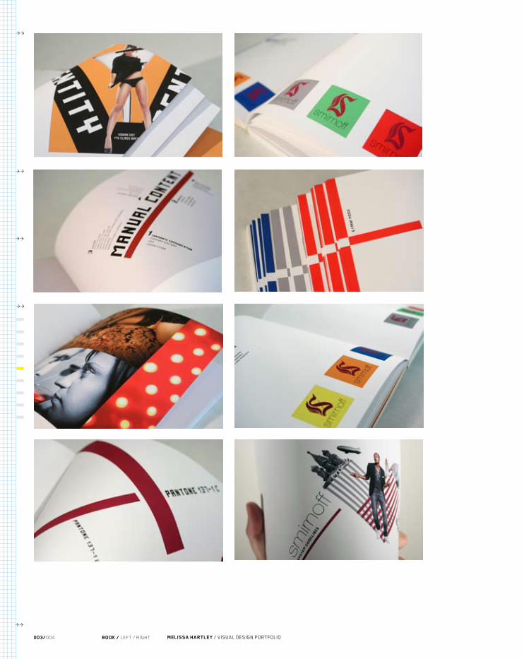
Smirnoff is a brand of vodka now owned and produced by the British company Diageo. The Smirnoff brand began with a vodka distillery founded in Moscow by Pyotr Arsenievich Smirnov (1831–1898), the son of illiterate Russian peasants. It is now distributed in 130 countries. Smirnoff products include vodka, flavored vodka, and malt beverages. In March 2006, Diageo North America claimed that Smirnoff vodka was the best-selling distilled spirit brand in the world.
I have always had a fond admiration for the design produced in the Bauhaus, Russian Constructivist movements so being able to fully envelop myself in this movement for design inspiration was gratifying. Beyond learning about the process of distilling the vodka to the founder who came up as a peasant farmer all the way to the man behind a global brand. My curiosity for the subject and the brand not only allowed me to sharpen my typographic skills, but it also taught me to speculate and visualize abstract and complex subject matter into effective graphic design.
>>
003/004
>>
>>
MELISSA HARTLEY / VISUAL DESIGN PORTFOLIOBOOK / LEFT / RIGHT
>>
>>
PROJECT / identity system
INSTRUCTOR / todd hedgpeth
CLASS / identity 2
APPLICATIONS / book, promotional items
TYPEFACE / future millenium, helvetica neue
PAPER / epson heavy weight matte
PRINTER / epson 2400
BINDERY / california office

01/BI-LATERAL 003/004
<<
<<
<<
<<
<<

>>
003/004
>>
>>
MELISSA HARTLEY / VISUAL DESIGN PORTFOLIOBOOK / LEFT / RIGHT
>>
>>

smirnoff
01/BI-LATERAL 003/004
<<
<<
<<
<<
<<

>>
003/004
>>
>>
MELISSA HARTLEY / VISUAL DESIGN PORTFOLIOBOOK / LEFT / RIGHT
>>
>>

1 860
smirnoff
GRAPHIC STANDARDS MANUAL
01/BI-LATERAL 003/004
<<
<<
<<
<<
<<

VODKA GOTITS CLASS BACK
identit
y
identit
y
>>
003/004
>>
>>
MELISSA HARTLEY / VISUAL DESIGN PORTFOLIOBOOK / LEFT / RIGHT
>>
>>

01/BI-LATERAL 003/004
<<
<<
<<
<<
<<
>>
003/004
>>
>>
MELISSA HARTLEY / VISUAL DESIGN PORTFOLIOBOOK / LEFT / RIGHT
>>
>>

01/BI-LATERAL 003/004
<<
<<
<<
<<
<<

>>
003/004
>>
>>
MELISSA HARTLEY / VISUAL DESIGN PORTFOLIOBOOK / LEFT / RIGHT
>>
>>

01/BI-LATERAL 003/004
<<
<<
<<
<<
<<

>>
003/004
>>
>>
MELISSA HARTLEY / VISUAL DESIGN PORTFOLIOBOOK / LEFT / RIGHT
>>
>>

01/BI-LATERAL 003/004
<<
<<
<<
<<
<<

>>
003/004
>>
>>
MELISSA HARTLEY / VISUAL DESIGN PORTFOLIOBOOK / LEFT / RIGHT
>>
>>

01/BI-LATERAL 003/004
<<
<<
<<
<<
<<

>>
003/004
>>
>>
MELISSA HARTLEY / VISUAL DESIGN PORTFOLIOBOOK / LEFT / RIGHT
>>
>>

01/BI-LATERAL 003/004
<<
<<
<<
<<
<<
05
OBJECTIVE /
Redesign an identity system for a destination anywhere in the world and build a standards manual guidebook and several promotional items.
PROCESS /
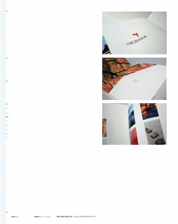
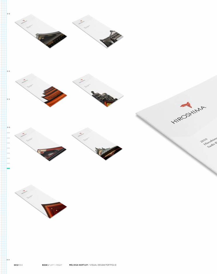
Hiroshima is the capital of Hiroshima Prefecture, and the largest city in the Chūgoku region of western Honshu, the largest island of Japan. It became best known as the first city in history to be destroyed by a nuclear weapon when the United States Army Air Forces (USAAF) dropped an atomic bomb on it at 8:15 A.M. on August 6, 1945, near the end of World War II.
An event that changed the lives for many around the world, and still has an impact on the world today was one that is close to my heart. A world affected by a single event and sent a nation in a tailspin. The importance of recreating a feeling of anx-iousness, hope and progress is something that I really wanted to portray through typography, pictures, and the use and importance of white space. A place with such a horrific history has actually turned its image upside down and has become one of the major economical hubs in Japan and deserves to be represented by a strong, dig-nified identity system that not only promotes peace but also encompasses it.
RESURRECTION OF BEAUTY.
>>
003/004
>>
>>
MELISSA HARTLEY / VISUAL DESIGN PORTFOLIOBOOK / LEFT / RIGHT
>>
>>
PROJECT / identity system
INSTRUCTOR / jane brown
CLASS / identity 3
APPLICATIONS / book, promotional pieces
TYPEFACE / adobe garamond
PAPER / epson heavy weight matte
PRINTER / epson 2400
BINDERY / california office

01/BI-LATERAL 003/004
<<
<<
<<
<<
<<

>>
003/004
>>
>>
MELISSA HARTLEY / VISUAL DESIGN PORTFOLIOBOOK / LEFT / RIGHT
>>
>>

HIROSHIMA
01/BI-LATERAL 003/004
<<
<<
<<
<<
<<
>>
003/004
>>
>>
MELISSA HARTLEY / VISUAL DESIGN PORTFOLIOBOOK / LEFT / RIGHT
>>
>>

01/BI-LATERAL 003/004
<<
<<
<<
<<
<<

>>
003/004
>>
>>
MELISSA HARTLEY / VISUAL DESIGN PORTFOLIOBOOK / LEFT / RIGHT
>>
>>

01/BI-LATERAL 003/004
<<
<<
<<
<<
<<

>>
003/004
>>
>>
MELISSA HARTLEY / VISUAL DESIGN PORTFOLIOBOOK / LEFT / RIGHT
>>
>>

01/BI-LATERAL 003/004
<<
<<
<<
<<
<<

>>
003/004
>>
>>
MELISSA HARTLEY / VISUAL DESIGN PORTFOLIOBOOK / LEFT / RIGHT
>>
>>

01/BI-LATERAL 003/004
<<
<<
<<
<<
<<

MY HIROSHIMA | HIROSHIMA DIRECTORY | CRUISE PASSENGERS | TRAVEL AGENTS | MEETING PLANNERS
HIROSHIMA
>>
003/004
>>
>>
MELISSA HARTLEY / VISUAL DESIGN PORTFOLIOBOOK / LEFT / RIGHT
>>
>>

MY HIROSHIMA | HIROSHIMA DIRECTORY | CRUISE PASSENGERS | TRAVEL AGENTS | MEETING PLANNERS
HIROSHIMA
01/BI-LATERAL 003/004
<<
<<
<<
<<
<<
>>
003/004
>>
>>
MELISSA HARTLEY / VISUAL DESIGN PORTFOLIOBOOK / LEFT / RIGHT
>>
>>

01/BI-LATERAL 003/004
<<
<<
<<
<<
<<

06
OBJECTIVE /
Redesign an identity system for a clothing line and build a standards manual guide-book and several promotional items.
PROCESS /
John Smith started Ocean Pacific in the 1960s as a surfboard brand. Smith designed the original trademark and label for his surfboards, which he sold out of his shop North County Ding Repair. Later, Fred Ryan purchased North County Ding Repair from John Smith along with the Ocean Pacific surfboard label. The Ocean Pacific label was later sold to Don Hansen of Hansen Surf Shop. In 1972, Jim Jenks of San Diego wanted to create clothing that met the demands of surfers in and out of the surf. Jenks’ idea for clothing under the Ocean Pacific label quickly became popular with the surf culture with its instantly recognizable ‘OP’ logo.
As an avid surfer and a person who loves what the surf culture is about, I thought it was fitting to be able to revamp the identity system of one of the first surf brands that evoked an entire culture based around surfing. I wanted to take that culture and turn it into a compositionally sound portrayal of the surf culture that has influenced so many. My goal was to advertise and promote Ocean Pacific as one of the most influ-ential and leading surf companies in the world. Identity design requires all the assets available to the designer, such as printing, packaging, and product design. All of these come together to establish an interactive system that communicates the phi-losophy of the company.
A CULTURE CREATED BY WATER.
>>
003/004
>>
>>
MELISSA HARTLEY / VISUAL DESIGN PORTFOLIOBOOK / LEFT / RIGHT
>>
>>
PROJECT / identity system
INSTRUCTOR / hunter wimmer
CLASS / identity 1
APPLICATIONS / book
TYPEFACE / century gothic
PAPER / epson heavy weight matte
PRINTER / epson 2400
BINDERY / california office

01/BI-LATERAL 003/004
<<
<<
<<
<<
<<

>>
003/004
>>
>>
MELISSA HARTLEY / VISUAL DESIGN PORTFOLIOBOOK / LEFT / RIGHT
>>
>>

01/BI-LATERAL 003/004
<<
<<
<<
<<
<<

>>
003/004
>>
>>
MELISSA HARTLEY / VISUAL DESIGN PORTFOLIOBOOK / LEFT / RIGHT
>>
>>

o c e a n p a c i f i c
01/BI-LATERAL 003/004
<<
<<
<<
<<
<<

>>
003/004
>>
>>
MELISSA HARTLEY / VISUAL DESIGN PORTFOLIOBOOK / LEFT / RIGHT
>>
>>

01/BI-LATERAL 003/004
<<
<<
<<
<<
<<

>>
003/004
>>
>>
MELISSA HARTLEY / VISUAL DESIGN PORTFOLIOBOOK / LEFT / RIGHT
>>
>>

01/BI-LATERAL 003/004
<<
<<
<<
<<
<<

>>
003/004
>>
>>
MELISSA HARTLEY / VISUAL DESIGN PORTFOLIOBOOK / LEFT / RIGHT
>>
>>

01/BI-LATERAL 003/004
<<
<<
<<
<<
<<

07
OBJECTIVE /
Redesign an identity system for a destination in the United States and build a stan-dards manual guidebook and several promotional items.
PROCESS /
Ellis Island was the gateway for millions of immigrants to the United States as the site of the nation’s busiest immigrant inspection station from 1892 to 1954. The island was greatly expanded with landfill between 1892 and 1934. Before that, the much smaller original island was the site of Fort Gibson and later a naval magazine. It became part of the Statue of Liberty National Monument in 1965, and since 1990, hosts a museum of immigration run by the National Park Service. A 1998 United States Supreme Court decision found most of the island to be part of New Jersey.
Creating a strong identity for a place that has changed the lives of thousands needed to be approached from the angle of acknowledgement and gratitude. Learning about the history of the many who walked off that boat with nothing to start fresh in a new world is one of the most admirable events to pay tribute to. Therefore the identity system for Ellis Island needed to pay homage, while at the same time evoking a pas-sion of change and hope. The identity needed to bring about a whirl of powerful emotions because that is what makes this tourist attraction so popular and impor-tant in realizing where it all started and where we all come from. The identity needed to be strong but not over powering, emotional but not weak and timid, and lastly needed to be influential but not ignorant. Through this project I learned to develop
THE BEGINING OF A NEW START.
>>
003/004
>>
>>
MELISSA HARTLEY / VISUAL DESIGN PORTFOLIOBOOK / LEFT / RIGHT
>>
>>
PROJECT / identity system
INSTRUCTOR / hunter wimmer
CLASS / identity 1
APPLICATIONS / book
TYPEFACE / adobe garamond
PAPER / epson heavy weight matte
PRINTER / epson 2400
BINDERY / california office

01/BI-LATERAL 003/004
<<
<<
<<
<<
<<

>>
003/004
>>
>>
MELISSA HARTLEY / VISUAL DESIGN PORTFOLIOBOOK / LEFT / RIGHT
>>
>>

01/BI-LATERAL 003/004
<<
<<
<<
<<
<<

>>
003/004
>>
>>
MELISSA HARTLEY / VISUAL DESIGN PORTFOLIOBOOK / LEFT / RIGHT
>>
>>

01/BI-LATERAL 003/004
<<
<<
<<
<<
<<

>>
003/004
>>
>>
MELISSA HARTLEY / VISUAL DESIGN PORTFOLIOBOOK / LEFT / RIGHT
>>
>>

01/BI-LATERAL 003/004
<<
<<
<<
<<
<<

>>
003/004
>>
>>
MELISSA HARTLEY / VISUAL DESIGN PORTFOLIOBOOK / LEFT / RIGHT
>>
>>

01/BI-LATERAL 003/004
<<
<<
<<
<<
<<

>>
003/004
>>
>>
MELISSA HARTLEY / VISUAL DESIGN PORTFOLIOBOOK / LEFT / RIGHT
>>
>>

E L L I S I S L A N D
01/BI-LATERAL 003/004
<<
<<
<<
<<
<<

>>
003/004
>>
>>
MELISSA HARTLEY / VISUAL DESIGN PORTFOLIOBOOK / LEFT / RIGHT
>>
>>

01/BI-LATERAL 003/004
<<
<<
<<
<<
<<

08
OBJECTIVE /
Design a promotional piece about a public service issue.
PROCESS /
The Federal Reserve System is the central banking system of the United States. It was created in 1913 with the enactment of the Federal Reserve Act, largely in response to a series of financial panics, particularly a severe panic in 1907. Over time, the roles and responsibilities of the Federal Reserve System have expanded and its structure has evolved.
A secret meeting, a gathering of some of the most powerful and influential men of the time all with the hopes of successfully creating a system that would allow for the rich to stay rich and the poor to stay poor. A system that was also created illegally under the wrong intentions and still exists almost 100 years later is not only interest-ing to have learned the process of its creation but how it continues to affect our daily lives. This project is meant to stand as an installation with the measurements of 10 feet by 13 feet. Ron Paul, a Texas senator, is avidly trying to take down the Federal Reserve for the preservation of our country, by making it transparent. Being trans-parent means that there is no where to hide and by allowing the Federal Reserve to be transparent they will not have room to corrupt this country that was founded on freedom and prosperity to all. With a strong understanding and incorporation of typography, I wanted to expose all those people and events that have brought us to where we are today in the eyes of the Federal Reserve.
A LEGAL CORRUPT SYSTEM.
>>
003/004
>>
>>
MELISSA HARTLEY / VISUAL DESIGN PORTFOLIOBOOK / LEFT / RIGHT
>>
>>
PROJECT / public service promotion
INSTRUCTOR / roland young
CLASS / print 2
APPLICATIONS / installation
TYPEFACE / avenir
PAPER / epson laser transparency paper
PRINTER / epson 2400
BUILDER / tap plastics

01/BI-LATERAL 003/004
<<
<<
<<
<<
<<

>>
003/004
>>
>>
MELISSA HARTLEY / VISUAL DESIGN PORTFOLIOBOOK / LEFT / RIGHT
>>
>>

01/BI-LATERAL 003/004
<<
<<
<<
<<
<<

>>
003/004
>>
>>
MELISSA HARTLEY / VISUAL DESIGN PORTFOLIOBOOK / LEFT / RIGHT
>>
>>

01/BI-LATERAL 003/004
<<
<<
<<
<<
<<

>>
003/004
>>
>>
MELISSA HARTLEY / VISUAL DESIGN PORTFOLIOBOOK / LEFT / RIGHT
>>
>>

01/BI-LATERAL 003/004
<<
<<
<<
<<
<<

09
OBJECTIVE /
Design a visual and powerful identity system that reflects and communicates the spirit of the companies, groups and individuals.
PROCESS /
Companies need an identity, and the logo is the obvious vehicle to give the brand a voice. In today’s marketplace, corporations have logos just because other corpora-tions have them and most logos do not give the brand a voice leading to mistaken identity of a corporation. Designers have to make sure that they bring that voice to the corporation and make the audience believe in the company just as much as the company believes in themselves.
GIVING A BRAND A VOICE.
>>
003/004
>>
>>
MELISSA HARTLEY / VISUAL DESIGN PORTFOLIOBOOK / LEFT / RIGHT
>>
>>

01/BI-LATERAL 003/004
<<
<<
<<
<<
<<

o c e a n p a c i f i c
>>
003/004
>>
>>
MELISSA HARTLEY / VISUAL DESIGN PORTFOLIOBOOK / LEFT / RIGHT
>>
>>

o c e a n p a c i f i c
01/BI-LATERAL 003/004
<<
<<
<<
<<
<<

E L L I S I S L A N D
>>
003/004
>>
>>
MELISSA HARTLEY / VISUAL DESIGN PORTFOLIOBOOK / LEFT / RIGHT
>>
>>

E L L I S I S L A N D
01/BI-LATERAL 003/004
<<
<<
<<
<<
<<

smirnoff>>
003/004
>>
>>
MELISSA HARTLEY / VISUAL DESIGN PORTFOLIOBOOK / LEFT / RIGHT
>>
>>

smirnoff
01/BI-LATERAL 003/004
<<
<<
<<
<<
<<

HIROSHIMA>>
003/004
>>
>>
MELISSA HARTLEY / VISUAL DESIGN PORTFOLIOBOOK / LEFT / RIGHT
>>
>>

HIROSHIMA
01/BI-LATERAL 003/004
<<
<<
<<
<<
<<

A SHOUT OUT /
ACKNOWLEDGEMENTS
MY SUPPORT TEAM /
A huge thank you to all of my teachers, friends, and family that helped to me to achieve this accomplishment. Whether it was pushing me to out perform myself, listening to me rant and rave, giving me a shoulder to cry or inspiring me with your outlooks, I truly appreciate you all for who you are. I could not have done this without your sup-port and inspiring words.
Mary Scott, Roland Young, Todd Hedgepeth, Jeremy Stout, Ariel Grey, Sharron Gallant, Michael Gallant, Mike Hartley, Diana Johnson, Taylor Sanchez, and all my peers that braved these classes before me.
>>
003/004
>>
>>
MELISSA HARTLEY / VISUAL DESIGN PORTFOLIOBOOK / LEFT / RIGHT
>>
>>

01/BI-LATERAL 003/004
<<
<<
<<
<<
<<

>>
003/004
>>
>>
MELISSA HARTLEY / VISUAL DESIGN PORTFOLIOBOOK / LEFT / RIGHT
>>
>>

01/BI-LATERAL 003/004
<<
<<
<<
<<
<<