Embed Size (px)
Citation preview

Section 2.4Section 2.4
Representing DataRepresenting Data

ObjectivesObjectives
Create graphs to reveal patterns in data.Create graphs to reveal patterns in data. Interpret graphs.Interpret graphs.

GraphsGraphs
When data is analyzed, When data is analyzed, scientists are often scientists are often looking for patterns.looking for patterns.
Displaying data in a Displaying data in a TABLE (or chart) may TABLE (or chart) may or may not reveal a or may not reveal a pattern.pattern.
Creating a GRAPH, Creating a GRAPH, however, helps to reveal however, helps to reveal patterns that may exist.patterns that may exist.
Population of Region
0
10
20
30
40
50
60
70
80
90
100
By
Tho
usan
d's
EastWestNorth
East 20.4 27.4 90 20.4
West 30.6 38.6 34.6 31.6
North 45.9 46.9 45 43.9
1st Qtr 2nd Qtr 3rd Qtr 4th Qtr

GraphsGraphs
AA graph graph is a visual is a visual display of data.display of data.
There are different types There are different types of graphs.of graphs. A A circle graph or pie circle graph or pie
chart chart is useful to is useful to show parts of a show parts of a whole.whole.
PercentComposition of
NaHCO3
1.200% H 27.37% Na
14.30% C57.14% O

GraphsGraphs
A A bar graphbar graph is used to is used to show how a quantity show how a quantity varies across categories. varies across categories. The quantity being The quantity being measured (dependent measured (dependent variable) appears on the variable) appears on the y-axis and the y-axis and the categories (independent categories (independent variable) appears on the variable) appears on the x-axis.x-axis.
0102030405060708090
Billions of Dollars
1st Qtr 2nd Qtr 3rd Qtr 4th Qtr
Shareholder Dividends

GraphsGraphs A A line graph line graph represents represents
the points of the points of intersection of data for 2 intersection of data for 2 variables. The variables. The independent variable is independent variable is plotted on the x-axis plotted on the x-axis and the dependent and the dependent variable is on the y-axisvariable is on the y-axis. .
Line graphs are used to Line graphs are used to the exclusion of all the exclusion of all others in chemistry.others in chemistry.

Line GraphsLine Graphs
Because data points Because data points can be very scattered, can be very scattered, a line connecting all of a line connecting all of them cannot be drawn. them cannot be drawn. A line must be drawn A line must be drawn so that the same so that the same number of points fall number of points fall above & below the above & below the line. This is called a line. This is called a BEST-FIT line. BEST-FIT line.

Creating a Line GraphCreating a Line Graph
1.1. Two (straight) axes are drawn on graph Two (straight) axes are drawn on graph paper and labeled. paper and labeled.
The x-axis represents the variable that is The x-axis represents the variable that is manipulated (changed) while the y-axis manipulated (changed) while the y-axis represents the variable that responds to the represents the variable that responds to the changes in the manipulated variable.changes in the manipulated variable.
Each label Each label mustmust include the include the name of the variablename of the variable AND AND the unitthe unit attached to that variable. attached to that variable.

Creating a Line GraphCreating a Line Graph2.2. A scale for each axis must be selected and assigned.A scale for each axis must be selected and assigned.
Determine the Determine the highest & lowest valueshighest & lowest values of the data. of the data. Subtract the values to find the range of the data. (NOTE: Subtract the values to find the range of the data. (NOTE: If you want the axis to start at 0, you must use 0 as the If you want the axis to start at 0, you must use 0 as the lowest value!) lowest value!)
Count the number of boxes along the axis.Count the number of boxes along the axis. Divide the range value by the number of boxes Divide the range value by the number of boxes to find to find
the value that will be represented by each box.the value that will be represented by each box. Assign the determined scale to the axis, labeling clearly Assign the determined scale to the axis, labeling clearly
with the appropriate values. It may not be necessary to with the appropriate values. It may not be necessary to label every box but label enough boxes so that the scale label every box but label enough boxes so that the scale is evident.is evident.
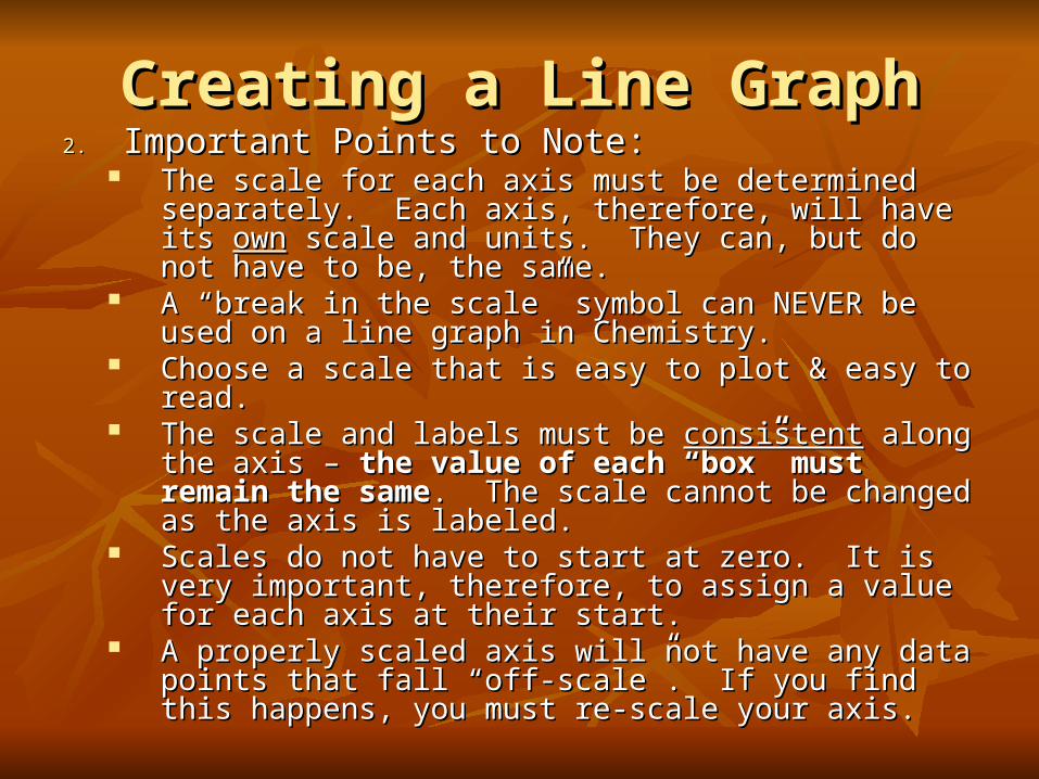
Creating a Line GraphCreating a Line Graph2.2. Important Points to Note:Important Points to Note:
The scale for each axis must be determined separately. The scale for each axis must be determined separately. Each axis, therefore, will have its Each axis, therefore, will have its ownown scale and units. scale and units. They can, but do not have to be, the same.They can, but do not have to be, the same.
A “break in the scale” symbol can NEVER be used on a A “break in the scale” symbol can NEVER be used on a line graph in Chemistry.line graph in Chemistry.
Choose a scale that is easy to plot & easy to read.Choose a scale that is easy to plot & easy to read. The scale and labels must be The scale and labels must be consistentconsistent along the axis – along the axis –
the value of each “box” must remain the samethe value of each “box” must remain the same. The . The scale cannot be changed as the axis is labeled.scale cannot be changed as the axis is labeled.
Scales do not have to start at zero. It is very important, Scales do not have to start at zero. It is very important, therefore, to assign a value for each axis at their start.therefore, to assign a value for each axis at their start.
A properly scaled axis will not have any data points that A properly scaled axis will not have any data points that fall “off-scale”. If you find this happens, you must re-fall “off-scale”. If you find this happens, you must re-scale your axis.scale your axis.

Creating a Line GraphCreating a Line Graph3.3. Data points are Data points are
plotted on the graph.plotted on the graph. The values of the The values of the
independent & independent & dependent variables dependent variables form ordered pairs form ordered pairs (x,y).(x,y).
The ordered pairs The ordered pairs can be plotted on the can be plotted on the graph from their graph from their corresponding x-axis corresponding x-axis or y-axis.or y-axis.
Dep
ende
nt V
aria
ble
Independent variable
Y-axis
X-axis
(x, y)
x
y

Creating a Line GraphCreating a Line Graph
4.4. A “best-fit” line is drawn.A “best-fit” line is drawn. A straight “best-fit” line is almost always drawn. A straight “best-fit” line is almost always drawn. Sometimes a “best-fit” curve is needed. Sometimes a “best-fit” curve is needed.
Instructions must be read carefully to determine Instructions must be read carefully to determine which to draw.which to draw.
“Dot-to-dot” lines are NEVER drawn. Remember, the data points do Remember, the data points do notnot need to be need to be onon
the line or curve drawn. In fact, sometimes the line or curve drawn. In fact, sometimes nonenone of the data points will actually be on the of the data points will actually be on the line/curve drawn.line/curve drawn.
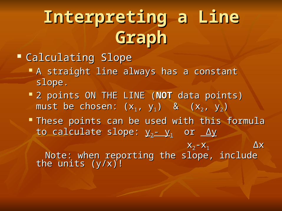
Interpreting a Line GraphInterpreting a Line Graph
Calculating SlopeCalculating Slope A straight line always has a constant slope.A straight line always has a constant slope. 2 points ON THE LINE (2 points ON THE LINE (NOTNOT data points) must data points) must
be chosen: (xbe chosen: (x11, y, y11) & (x) & (x22, y, y22)) These points can be used with this formula to These points can be used with this formula to
calculate slope: calculate slope: yy22- y- y11 or or ΔΔyy
xx22-x-x11 ΔΔxx Note: when reporting the slope, include the units Note: when reporting the slope, include the units
(y/x)!(y/x)!

Interpreting a Line GraphInterpreting a Line Graph What does the slope tell you?What does the slope tell you?
If a slope can be determined (that is, the line is If a slope can be determined (that is, the line is straight), there is a straight), there is a linearlinear relationship between the relationship between the variables.variables.
If the line slopes upward, the slope is positive. This If the line slopes upward, the slope is positive. This means the dependent (y) variable increases as the means the dependent (y) variable increases as the independent (x) variable increases. This represents a independent (x) variable increases. This represents a DIRECT relationship.DIRECT relationship.
If the line slopes downward, the slope is negative. This If the line slopes downward, the slope is negative. This means the dependent (y) variable decreases as the means the dependent (y) variable decreases as the independent (x) variable increases. This represents an independent (x) variable increases. This represents an INVERSE relationship.INVERSE relationship.

Interpreting a Line GraphInterpreting a Line Graph If a slope cannot be If a slope cannot be
determined (that is, the determined (that is, the “line” is curved), there is “line” is curved), there is a a nonlinearnonlinear relationship relationship between the variables.between the variables.
As can be seen in this As can be seen in this graph, as the independent graph, as the independent variable (x) increases, the variable (x) increases, the dependent variable (y) dependent variable (y) decreases. This curve, decreases. This curve, therefore, shows an therefore, shows an inverse relationship.inverse relationship.

Interpreting a Line GraphInterpreting a Line Graph ExtrapolationExtrapolation
When a “best-fit” line is When a “best-fit” line is drawn, the points on the line drawn, the points on the line are considered continuous are considered continuous data points. That means you data points. That means you can read data from any place can read data from any place along the line.along the line.
If the line that was drawn is If the line that was drawn is extended extended beyondbeyond the plotted the plotted points, it has been points, it has been extrapolated.extrapolated.
Estimate values for the Estimate values for the variables can be read from an variables can be read from an extrapolated line.extrapolated line.
Temperature vs. Elevation
43.544
44.545
45.546
46.547
47.5
0 2 4 6
Elevation (m)
Tem
pera
ture
(de
gree
s C
)

Practice ProblemsPractice Problems
Plot the data in each table. Explain whether the Plot the data in each table. Explain whether the graphs represent direct or inverse relationships.graphs represent direct or inverse relationships.
Table 1 Table 2Table 1 Table 2
Effect of Pressure on Gas Effect of Pressure on GasEffect of Pressure on Gas Effect of Pressure on Gas
PressurePressure
(mm Hg)(mm Hg)
VolumeVolume
(mL)(mL)
30403040 5.05.0
15201520 10.010.0
10131013 15.015.0
760760 20.020.0
PressurePressure
(mm Hg)(mm Hg)
TemperatureTemperature
(K)(K)
30403040 10921092
15201520 546546
10131013 410410
760760 273273