Embed Size (px)
Citation preview

Scientific Figure Design
v2.0
Simon Andrews, Anne Segonds-Pichon, Boo Virk
[email protected]@babraham.ac.uk
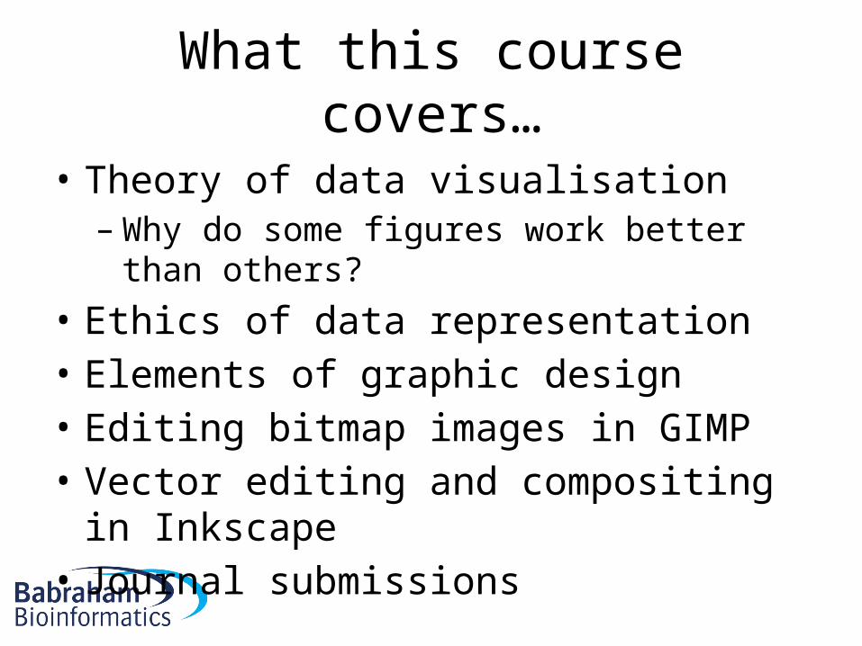
What this course covers…
• Theory of data visualisation– Why do some figures work better than others?
• Ethics of data representation• Elements of graphic design• Editing bitmap images in GIMP• Vector editing and compositing in Inkscape• Journal submissions
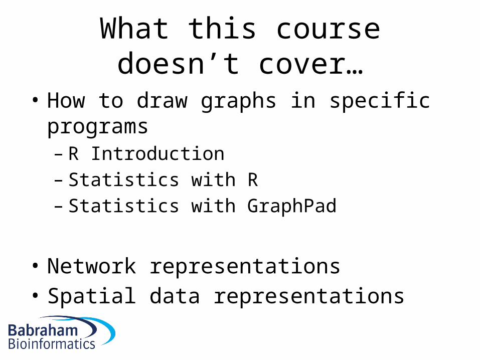
What this course doesn’t cover…
• How to draw graphs in specific programs– R Introduction– Statistics with R– Statistics with GraphPad
• Network representations• Spatial data representations

Timetable
• Morning– Introduction– Data Visualisation
Theory
• Coffee– Data Representation
Practical– Ethics talk
• Afternoon– Design theory talk– Ethics practical– GIMP Tutorial– GIMP Practical
• Coffee– Inkscape Tutorial– Inkscape Practical– Final practical
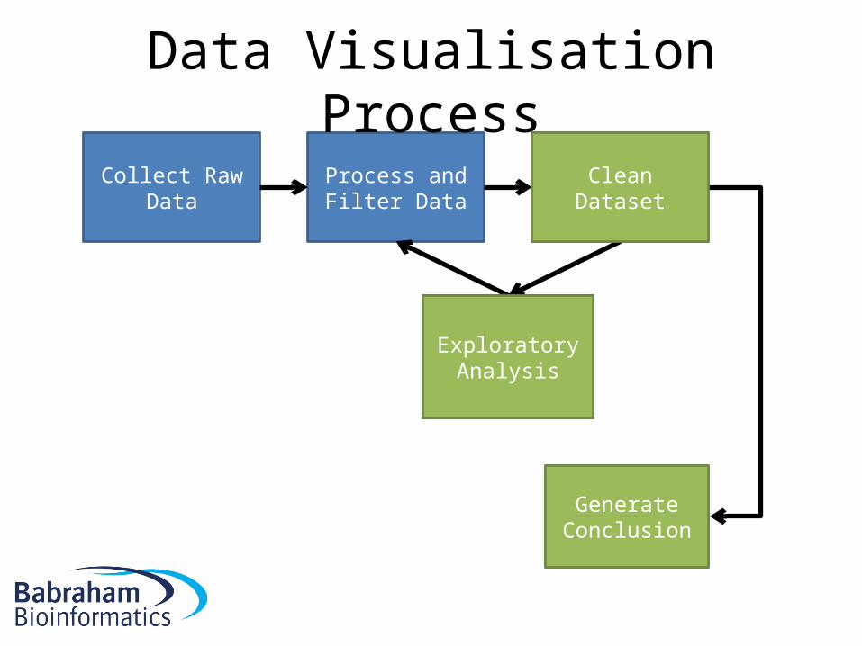
Collect Raw Data Process and Filter Data Clean Dataset
Exploratory Analysis
Generate Conclusion
Data Visualisation Process
Clean Dataset
Exploratory Analysis
Generate Conclusion
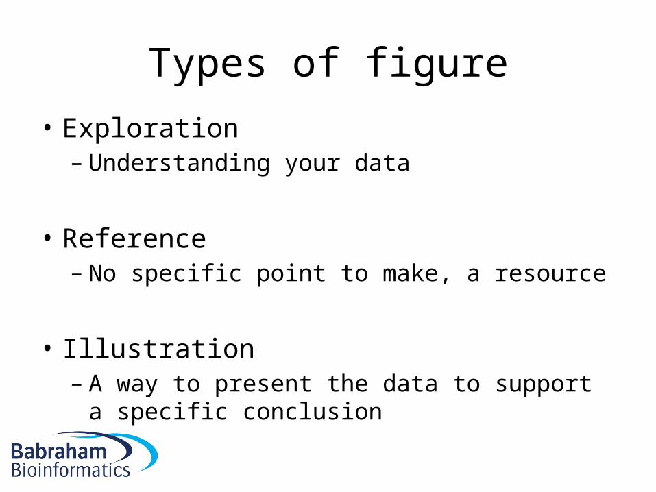
Types of figure
• Exploration– Understanding your data
• Reference– No specific point to make, a resource
• Illustration– A way to present the data to support a specific
conclusion
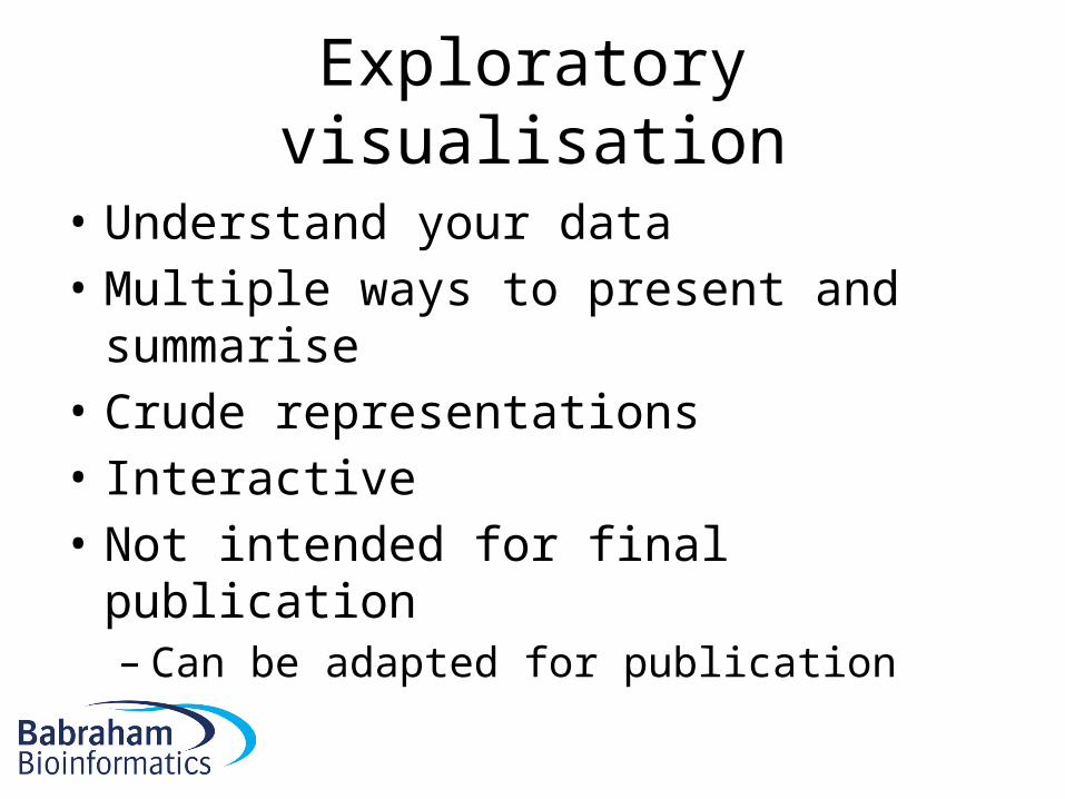
Exploratory visualisation
• Understand your data• Multiple ways to present and summarise• Crude representations• Interactive• Not intended for final publication– Can be adapted for publication

Control Treatment 1 Treatment 2 Treatment 30
20
40
60
80
100
120
140
Val
ue
Control Treatment 1 Treatment 2 Treatment 30
20
40
60
80
100
120
140
Val
ue
Histogram of log2(full.counts[[x]])
log2(full.counts[[x]])
Frequency
0 5 10 15
01500
Histogram of log2(full.counts[[x]])
log2(full.counts[[x]])
Frequency
0 5 10 15 20
01500
Histogram of log2(full.counts[[x]])
log2(full.counts[[x]])
Frequency
0 5 10 15
01500
Histogram of log2(full.counts[[x]])
log2(full.counts[[x]])
Frequency
0 5 10 15
01500
Histogram of log2(full.counts[[x]])
log2(full.counts[[x]])
Frequency
0 5 10 15 20
01500
Histogram of log2(full.counts[[x]])
log2(full.counts[[x]])
Frequency
0 5 10 15 20
01500
Histogram of log2(full.counts[[x]])
log2(full.counts[[x]])
Frequency
0 5 10 15
01500
Histogram of log2(full.counts[[x]])
log2(full.counts[[x]])
Frequency
0 5 10 15
01500
Histogram of log2(full.counts[[x]])
log2(full.counts[[x]])
Frequency
0 5 10 15 20
01500
Histogram of log2(full.counts[[x]])
log2(full.counts[[x]])
Frequency
0 5 10 15 20
01500
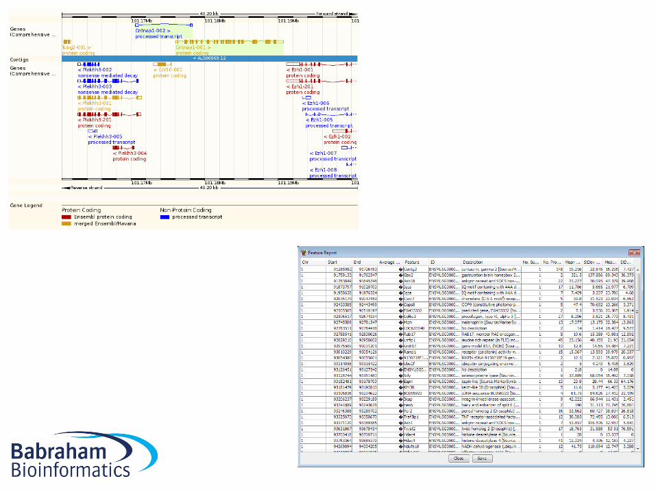
Reference visualisation
• Using your data as a resource• Allows users to look up data of interest• Tabular / Configurable• Interactive
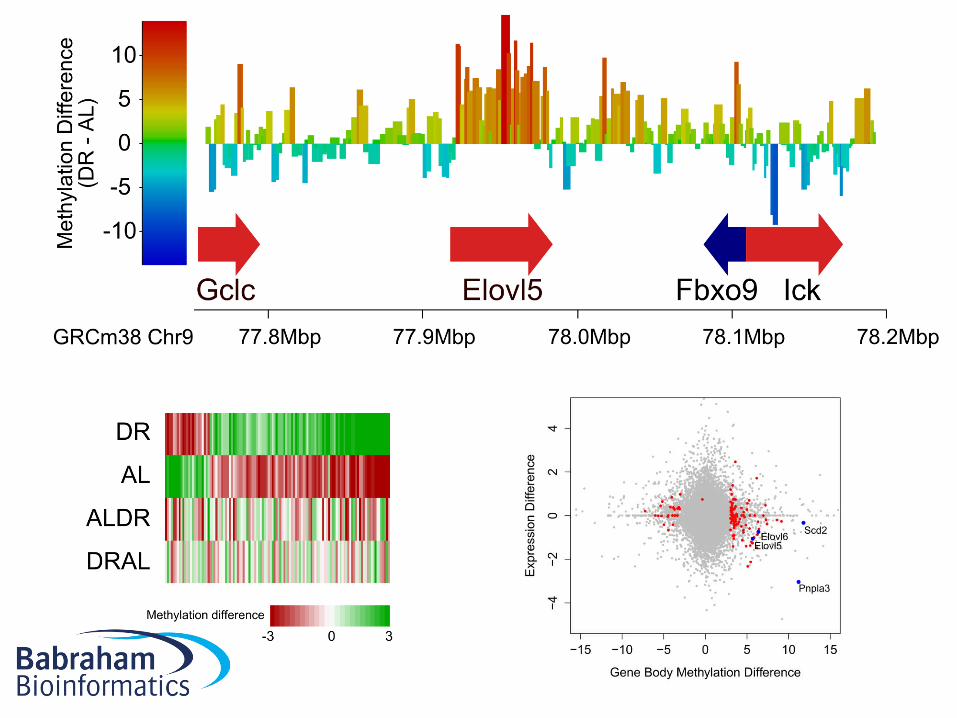
Illustrative visualisation
• Intended to convey a specific point• Carefully chosen subset of data• Optimised presentation• Good design
• Used for figures in papers
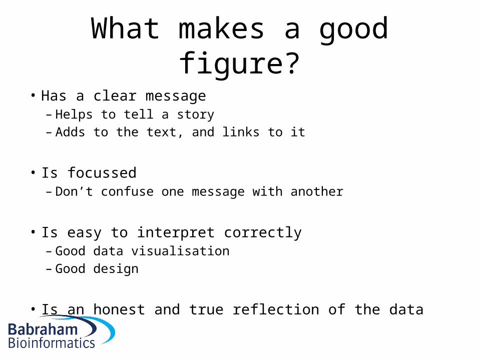
What makes a good figure?
• Has a clear message– Helps to tell a story– Adds to the text, and links to it
• Is focussed– Don’t confuse one message with another
• Is easy to interpret correctly– Good data visualisation– Good design
• Is an honest and true reflection of the data