Embed Size (px)
DESCRIPTION
tutorial for developing samsung gear ui design for tizen os
Citation preview

[Samsung Gear 2] UI Design Guideline
1
Samsung Gear Application UI Design Guideline
Samsung Electronics
[Samsung Gear 2] UI Design Guideline
2
Table of Contents
1. DESIGN PRINCIPLES 4
1.1. INFORMATION AT A GLANCE 4
1.2. INTERACTION FOR GEAR 4
1.3. PERSONALIZED & CONTEXTUAL 4
1.4. BETTER TOGETHER 4
2. UI OVERVIEW 6
2.1. HOME 6
2.2. NOTIFICATIONS 7
2.3. COMMON APP UI 7
2.4. GEAR MANAGER 8
3. BASIC INTERACTIONS 9
3.1. NAVIGATION 9
3.2. TWO FINGERS DOUBLE TAP 10
3.3. TWO FINGERS LONG PRESS 10
3.4. NOTIFICATIONS 10
3.6. TEXT INPUT 12
3.7. ACCESSIBILITY 12
4. VISUAL STYLES 14
4.1. DEVICES AND DISPLAYS 14
4.2. BACKGROUND ON THE HOME SCREEN 14
4.3. ICONS 14
4.4. COLORS 15
4.5. TYPOGRAPHY 16
5. ASSETS GUIDELINES 19
5.1. HEADER 19
[Samsung Gear 2] UI Design Guideline
3
5.2. ACTION BAR (A HEADER WITH A BUTTON) 19
5.3. BADGE 20
5.4. CARD VIEW 20
5.5. LIST 21
5.6. HIDDEN BUTTON ON THE LIST 22
5.7. SWIPE VIEW (VIEWPAGER) 24
5.8. GRID VIEW 24
5.9. BUTTONS 24
5.10. SLIDER 26
5.11. DATE AND TIME SELECTION 26
5.12. PROGRESS AND PROCESS 27
5.13. POP-UP 27
5.14. SCROLL BAR & PAGE INDICATOR 30
5.15. FAST SCROLL (INDEX SCROLL) 31

[Samsung Gear 2] UI Design Guideline
4
1. Design Principles
1.1. Information at a Glance
Gear provides bite-sized information that can be understood at a glance in situations where a user is in motion or unable to use their phone.
Only core information and tasks will be accessible due to the small screen to reduce user input to a minimum.
Gear functions as a preview of a mobile phone because of its excellent accessibility. Due to the size of the device though, its features are currently limited.
1.2. Interaction for Gear A user can control Gear by gesture or voice as well as touch.
Interactions on small screen should be natural and simple. Minimize touch interaction requiring user’s concentration.
1.3. Personalized & Contextual
A user should be able to change the settings of Gear.
Depending on the situation, information can be customized. (Based on location, time, schedule, interest, etc.)
Users should be able to express themselves when using Gear more than with a mobile phone. Gear can have customized clock faces and home screens.
Gear can be regarded as a fashion item.
1.4. Better together
Gear is a companion device to a mobile phone and expands user experience.
[Samsung Gear 2] UI Design Guideline
5
Phone and Gear can be connected seamlessly, enabling the user to switch between devices with ease.
Gear’s user experience will be based on the Samsung mobile UX, and should be familiar and intuitive to the user.
[Samsung Gear 2] UI Design Guideline
6
2. UI Overview
As a companion device to your Galaxy devices, the Gear expands and enriches your mobile experience.
Gear’s UI is based on the mobile device UI, yet optimized to fit onto the small screen of a wrist-type device.
Before you get started, please take a moment to familiarize yourself with the fundamental aspects of the Gear user interface:
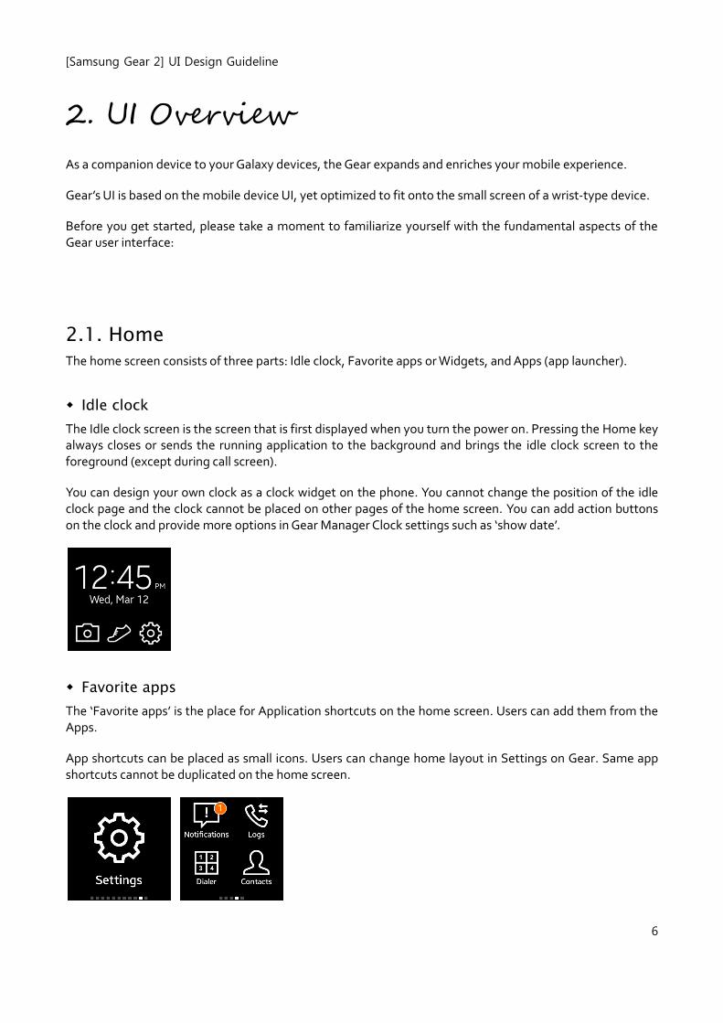
2.1. Home
The home screen consists of three parts: Idle clock, Favorite apps or Widgets, and Apps (app launcher).
Idle clock
The Idle clock screen is the screen that is first displayed when you turn the power on. Pressing the Home key always closes or sends the running application to the background and brings the idle clock screen to the foreground (except during call screen).
You can design your own clock as a clock widget on the phone. You cannot change the position of the idle clock page and the clock cannot be placed on other pages of the home screen. You can add action buttons on the clock and provide more options in Gear Manager Clock settings such as ‘show date’.
Favorite apps
The ‘Favorite apps’ is the place for Application shortcuts on the home screen. Users can add them from the Apps.
App shortcuts can be placed as small icons. Users can change home layout in Settings on Gear. Same app shortcuts cannot be duplicated on the home screen.
[Samsung Gear 2] UI Design Guideline
7
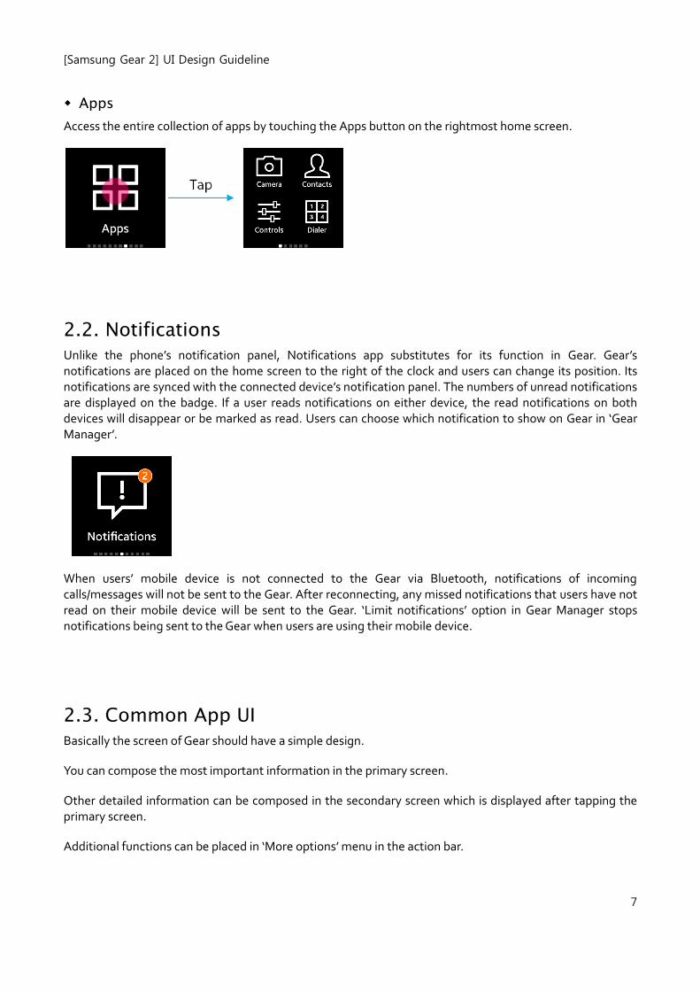
Apps
Access the entire collection of apps by touching the Apps button on the rightmost home screen.
2.2. Notifications Unlike the phone’s notification panel, Notifications app substitutes for its function in Gear. Gear’s notifications are placed on the home screen to the right of the clock and users can change its position. Its notifications are synced with the connected device’s notification panel. The numbers of unread notifications are displayed on the badge. If a user reads notifications on either device, the read notifications on both devices will disappear or be marked as read. Users can choose which notification to show on Gear in ‘Gear Manager’.
When users’ mobile device is not connected to the Gear via Bluetooth, notifications of incoming calls/messages will not be sent to the Gear. After reconnecting, any missed notifications that users have not read on their mobile device will be sent to the Gear. ‘Limit notifications’ option in Gear Manager stops notifications being sent to the Gear when users are using their mobile device.
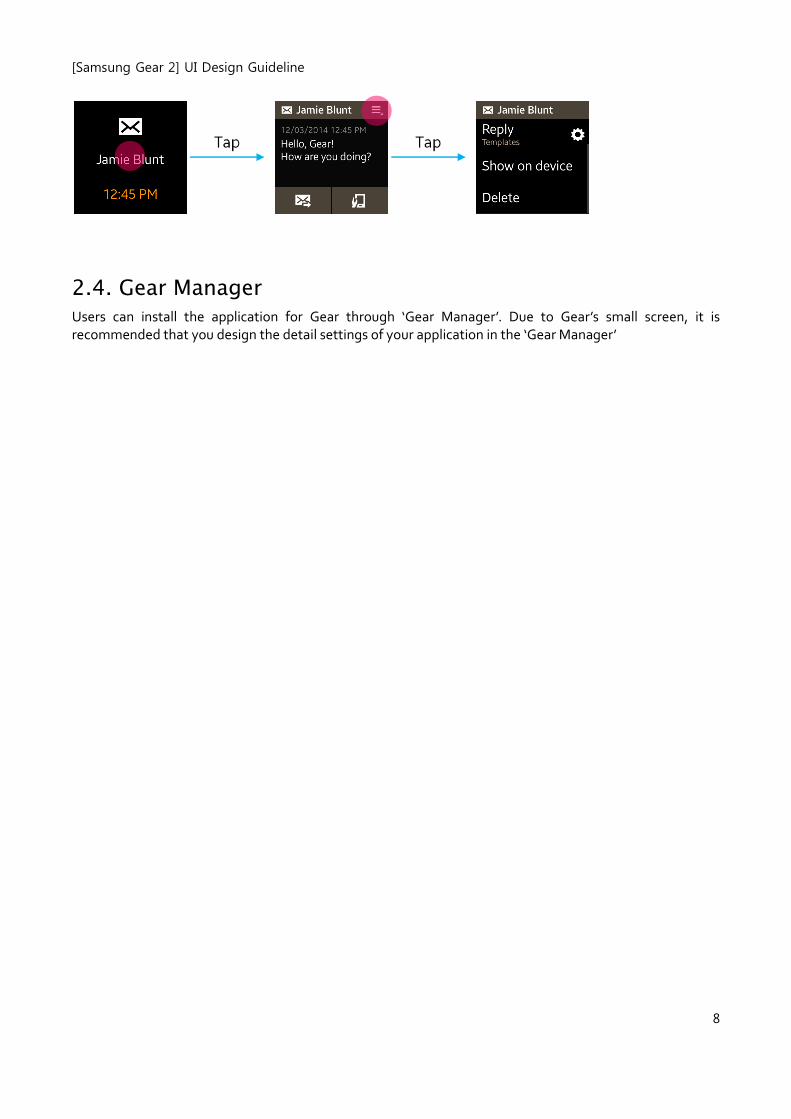
2.3. Common App UI
Basically the screen of Gear should have a simple design.
You can compose the most important information in the primary screen.
Other detailed information can be composed in the secondary screen which is displayed after tapping the primary screen.
Additional functions can be placed in ‘More options’ menu in the action bar.
[Samsung Gear 2] UI Design Guideline
8
2.4. Gear Manager
Users can install the application for Gear through ‘Gear Manager’. Due to Gear’s small screen, it is recommended that you design the detail settings of your application in the ‘Gear Manager’
[Samsung Gear 2] UI Design Guideline
9
3. Basic Interactions
The Gear UI features a number of basic user interactions that you may wish to incorporate into your application design:
3.1. Navigation
Navigation in Gear follows the principle that a device's screen must move and change according to changes in the application depth. The navigation design must be consistent so that the user can clearly understand which depth and screen of the application they are currently using.
Since navigation is the single biggest factor affecting an application's overall usability, we encourage you to consider navigation related issues as early as possible in your application development process.
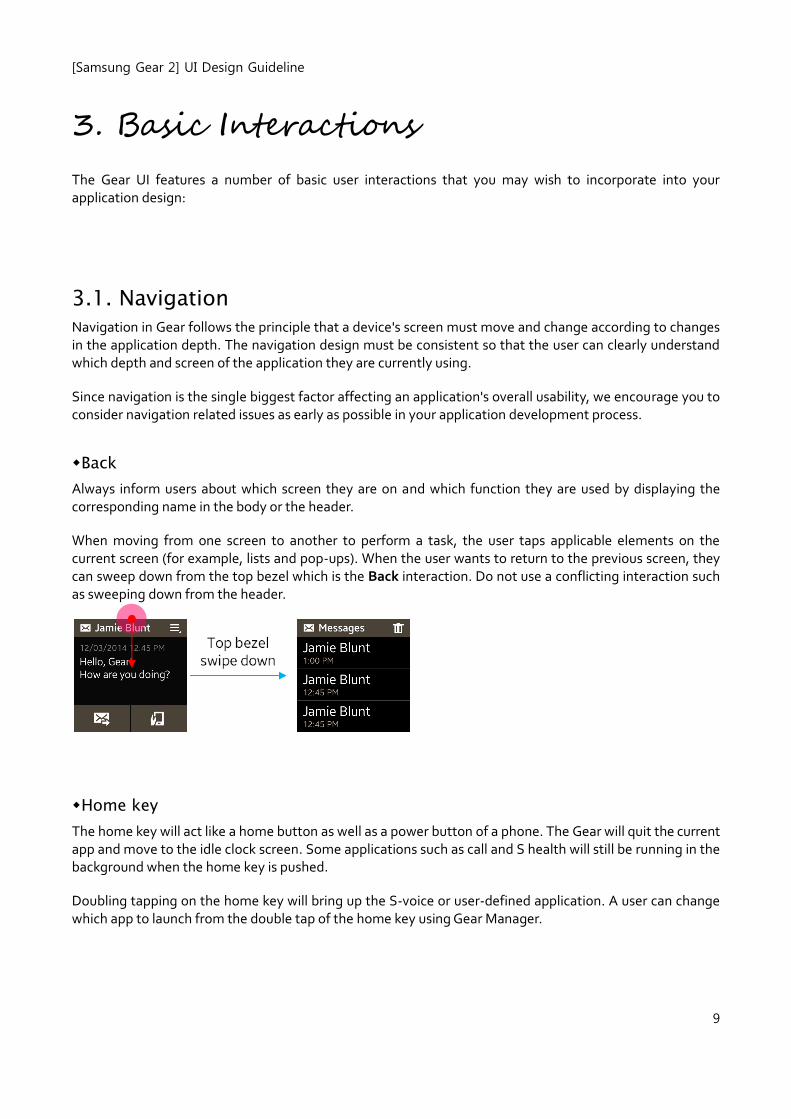
Back
Always inform users about which screen they are on and which function they are used by displaying the corresponding name in the body or the header.
When moving from one screen to another to perform a task, the user taps applicable elements on the current screen (for example, lists and pop-ups). When the user wants to return to the previous screen, they can sweep down from the top bezel which is the Back interaction. Do not use a conflicting interaction such as sweeping down from the header.
Home key
The home key will act like a home button as well as a power button of a phone. The Gear will quit the current app and move to the idle clock screen. Some applications such as call and S health will still be running in the background when the home key is pushed.
Doubling tapping on the home key will bring up the S-voice or user-defined application. A user can change which app to launch from the double tap of the home key using Gear Manager.
[Samsung Gear 2] UI Design Guideline
10
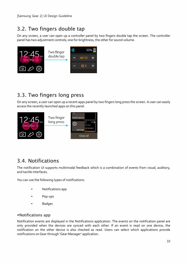
3.2. Two fingers double tap
On any screen, a user can open up a controller panel by two fingers double tap the screen. The controller panel has two adjustment controls; one for brightness, the other for sound volume.
3.3. Two fingers long press
On any screen, a user can open up a recent apps panel by two fingers long press the screen. A user can easily access the recently launched apps on this panel.
3.4. Notifications The notification UI supports multimodal feedback which is a combination of events from visual, auditory, and tactile interfaces.
You can use the following types of notifications:
• Notifications app
• Pop-ups
• Badges
Notifications app
Notification events are displayed in the Notifications application. The events on the notification panel are only provided when the devices are synced with each other. If an event is read on one device, the notification on the other device is also checked as read. Users can select which applications provide notifications on Gear through ‘Gear Manager’ application.
[Samsung Gear 2] UI Design Guideline
11
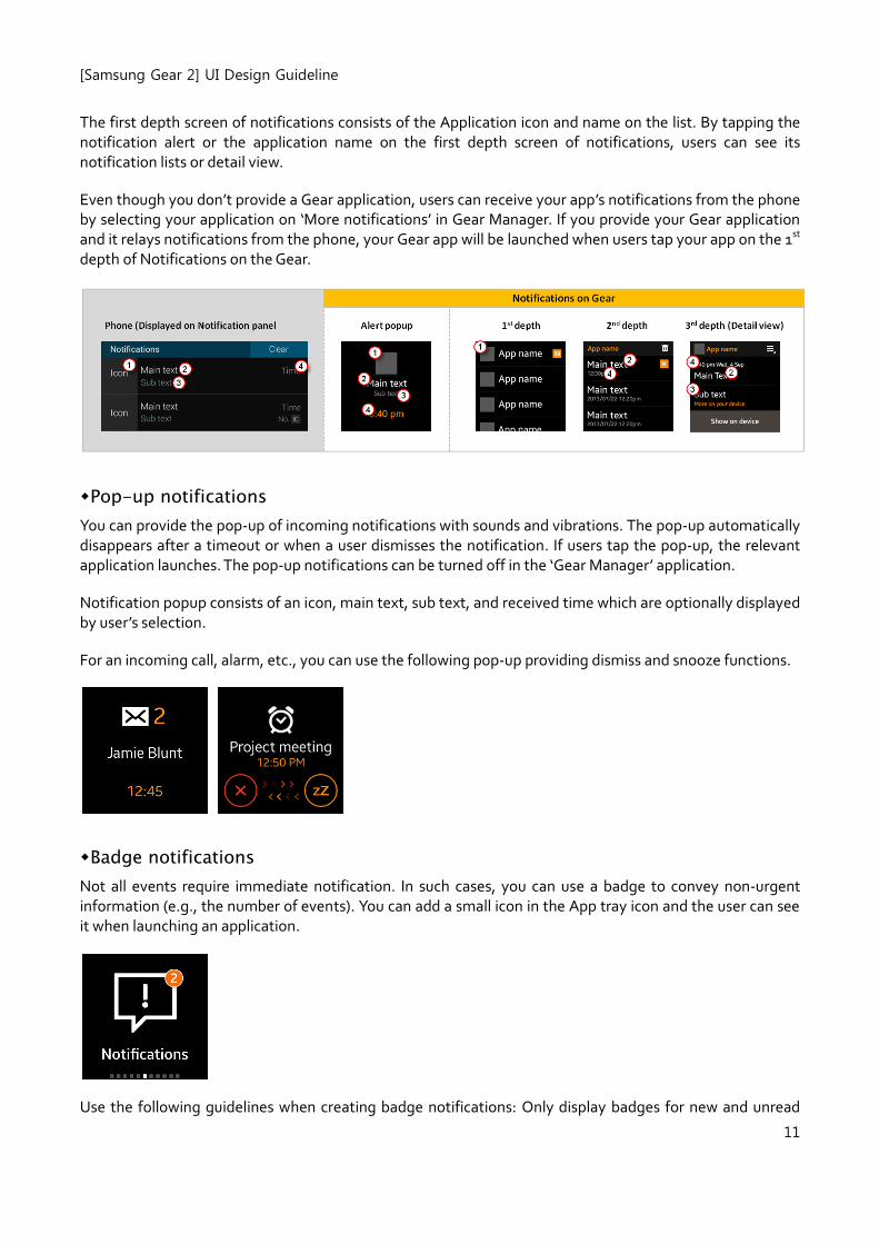
The first depth screen of notifications consists of the Application icon and name on the list. By tapping the notification alert or the application name on the first depth screen of notifications, users can see its notification lists or detail view.
Even though you don’t provide a Gear application, users can receive your app’s notifications from the phone by selecting your application on ‘More notifications’ in Gear Manager. If you provide your Gear application and it relays notifications from the phone, your Gear app will be launched when users tap your app on the 1st depth of Notifications on the Gear.
Pop-up notifications
You can provide the pop-up of incoming notifications with sounds and vibrations. The pop-up automatically disappears after a timeout or when a user dismisses the notification. If users tap the pop-up, the relevant application launches. The pop-up notifications can be turned off in the ‘Gear Manager’ application.
Notification popup consists of an icon, main text, sub text, and received time which are optionally displayed by user’s selection.
For an incoming call, alarm, etc., you can use the following pop-up providing dismiss and snooze functions.
Badge notifications
Not all events require immediate notification. In such cases, you can use a badge to convey non-urgent information (e.g., the number of events). You can add a small icon in the App tray icon and the user can see it when launching an application.
Use the following guidelines when creating badge notifications: Only display badges for new and unread
[Samsung Gear 2] UI Design Guideline
12
items.
Display badges as a number with the figure on the badge icon indicating the number of new and unread items.
If there is more than one new or unread item, the number that displays in the badge must decrease as the user views or reads each item. The text informing the user of the new item should also disappear.
Place badge icons at the top right corner of each app icon.
3.6. Text input
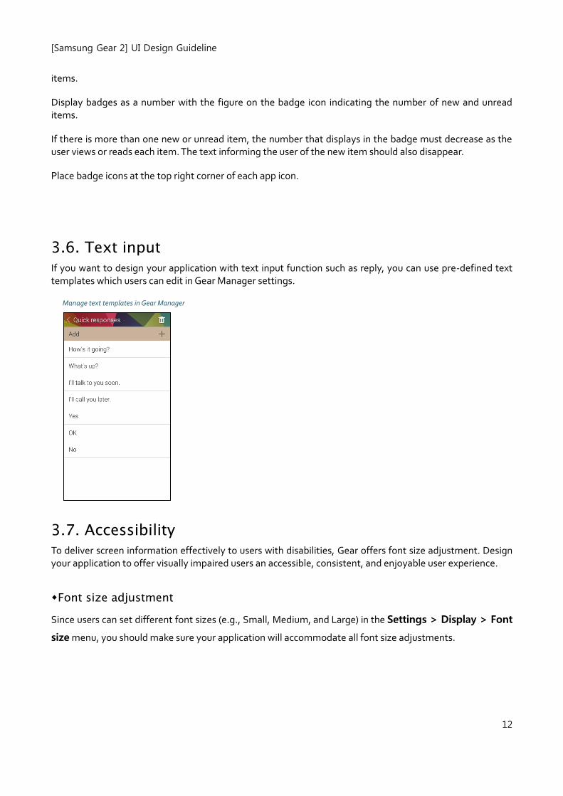
If you want to design your application with text input function such as reply, you can use pre-defined text templates which users can edit in Gear Manager settings.
Manage text templates in Gear Manager
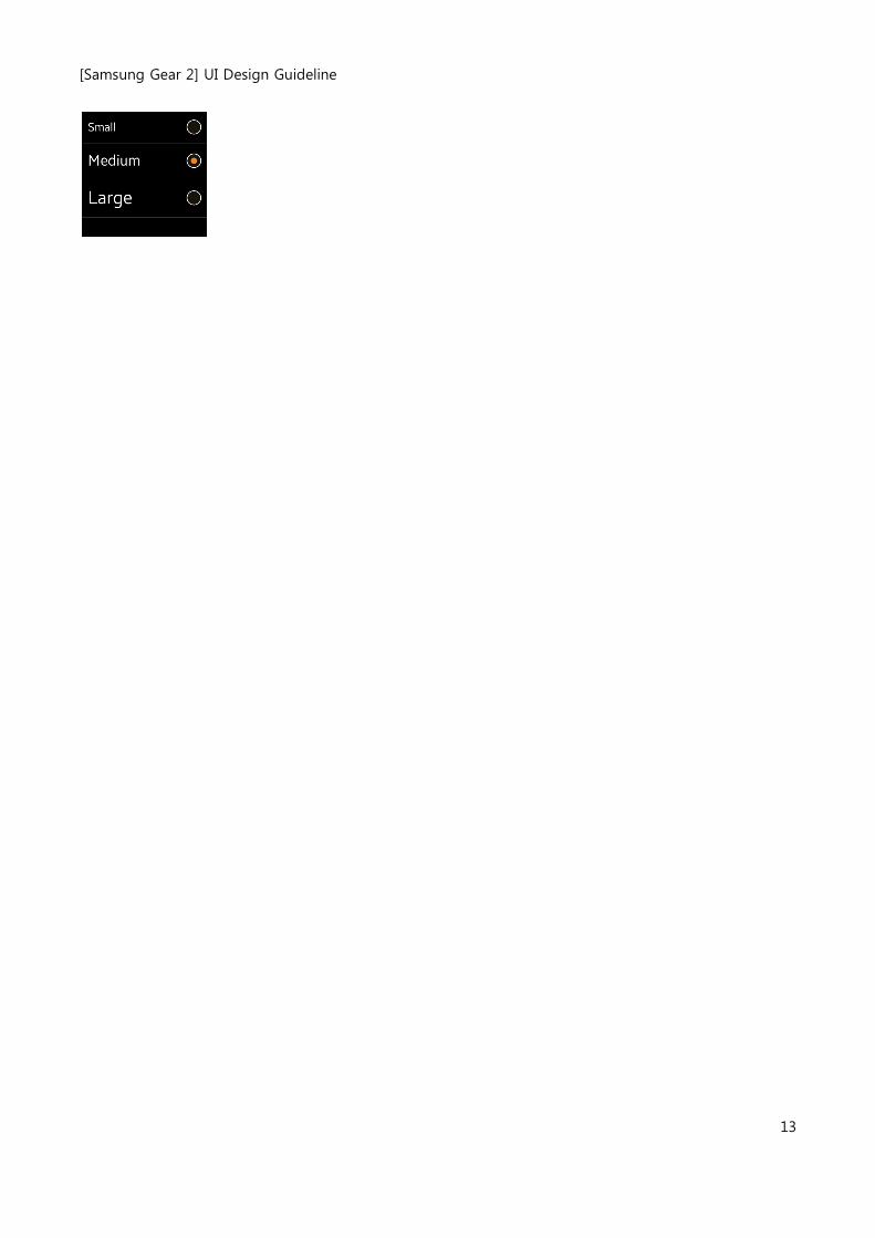
3.7. Accessibility To deliver screen information effectively to users with disabilities, Gear offers font size adjustment. Design your application to offer visually impaired users an accessible, consistent, and enjoyable user experience.
Font size adjustment
Since users can set different font sizes (e.g., Small, Medium, and Large) in the Settings > Display > Font
size menu, you should make sure your application will accommodate all font size adjustments.
[Samsung Gear 2] UI Design Guideline
13
[Samsung Gear 2] UI Design Guideline
14
4. Visual Styles
4.1. Devices and Displays Gear 2’s display is same as Gear 1’s.
• 1.63 inch (41.4mm), 320x320px, Super AMOLED
Single physical button is provided and it is placed on the front.
4.2. Background on the home screen
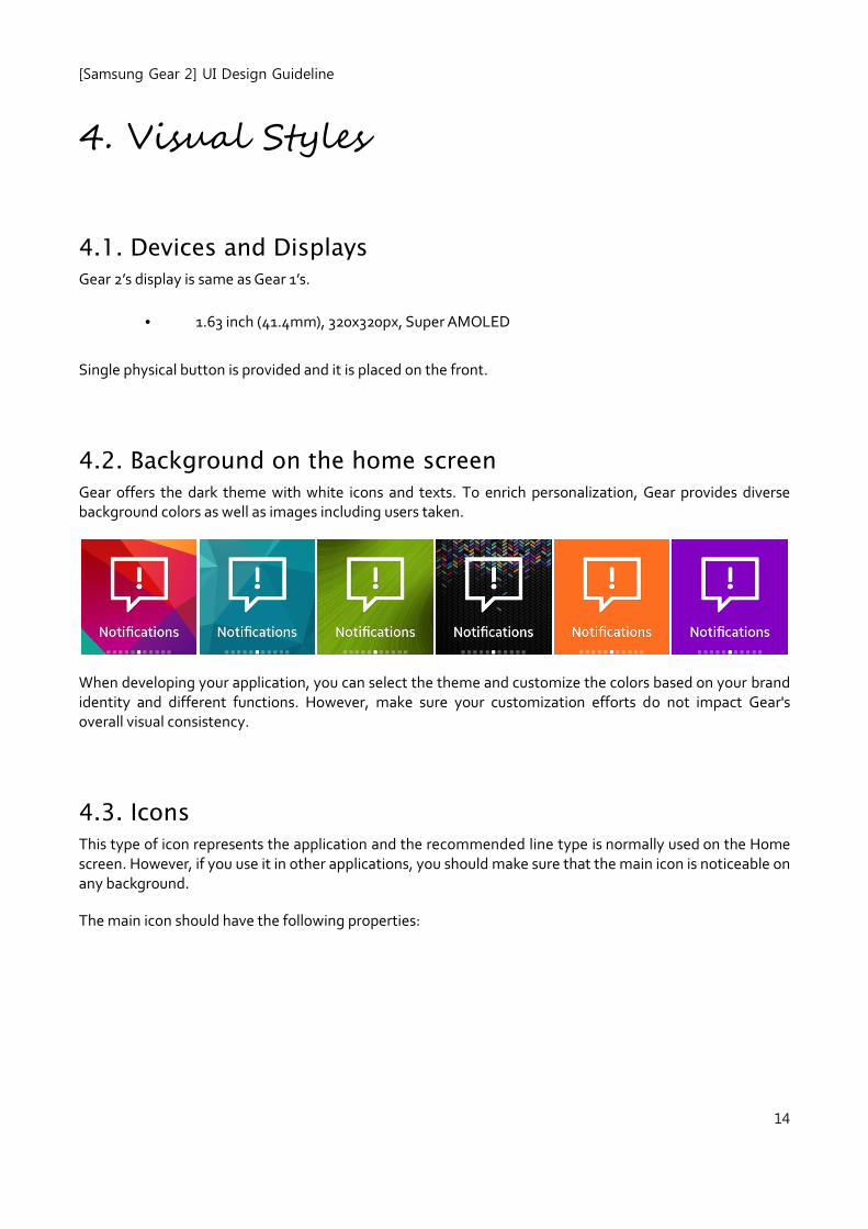
Gear offers the dark theme with white icons and texts. To enrich personalization, Gear provides diverse background colors as well as images including users taken.
When developing your application, you can select the theme and customize the colors based on your brand identity and different functions. However, make sure your customization efforts do not impact Gear's overall visual consistency.
4.3. Icons
This type of icon represents the application and the recommended line type is normally used on the Home screen. However, if you use it in other applications, you should make sure that the main icon is noticeable on any background.
The main icon should have the following properties:
[Samsung Gear 2] UI Design Guideline
15
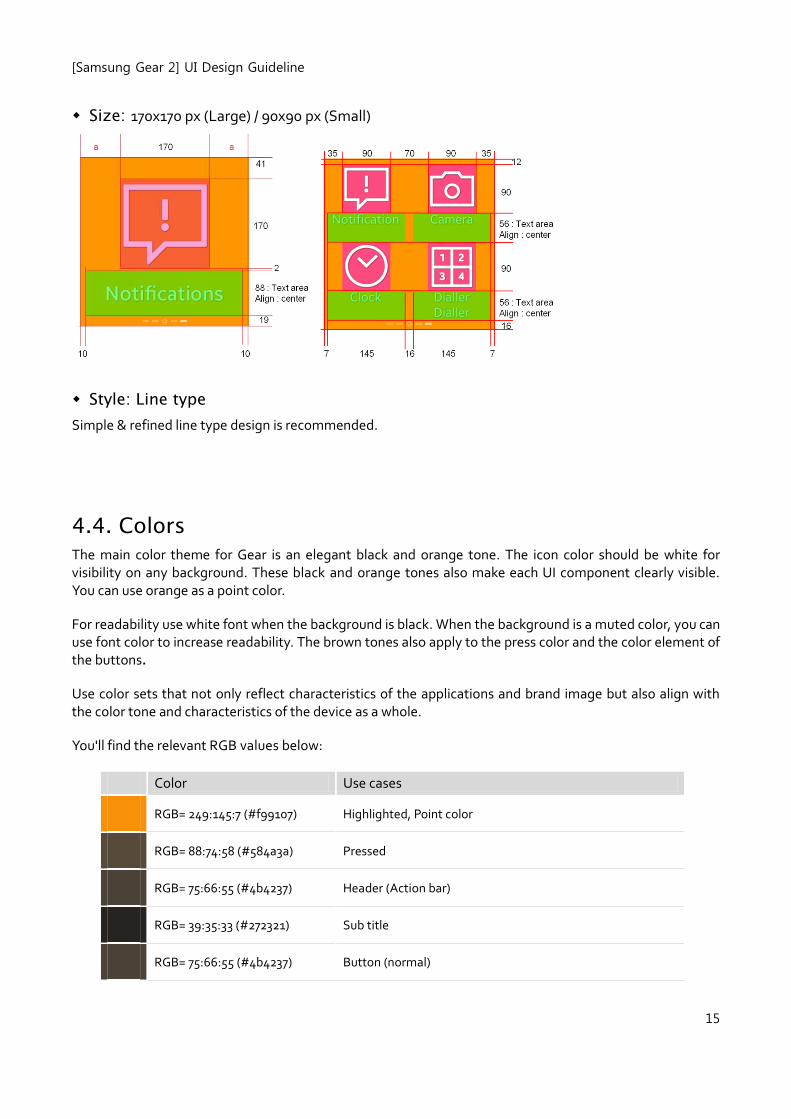
Size: 170x170 px (Large) / 90x90 px (Small)
Style: Line type
Simple & refined line type design is recommended.
4.4. Colors
The main color theme for Gear is an elegant black and orange tone. The icon color should be white for visibility on any background. These black and orange tones also make each UI component clearly visible. You can use orange as a point color.
For readability use white font when the background is black. When the background is a muted color, you can use font color to increase readability. The brown tones also apply to the press color and the color element of the buttons.
Use color sets that not only reflect characteristics of the applications and brand image but also align with the color tone and characteristics of the device as a whole.
You'll find the relevant RGB values below:
Color Use cases
RGB= 249:145:7 (#f99107) Highlighted, Point color
RGB= 88:74:58 (#584a3a) Pressed
RGB= 75:66:55 (#4b4237) Header (Action bar)
RGB= 39:35:33 (#272321) Sub title
RGB= 75:66:55 (#4b4237) Button (normal)
[Samsung Gear 2] UI Design Guideline
16
RGB= 99:93:89 (#635d59) Button (press)
You can use your own brand identity color on the icon.
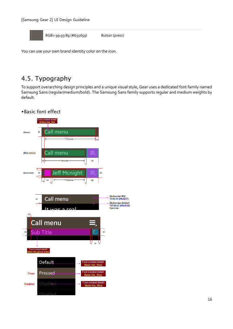
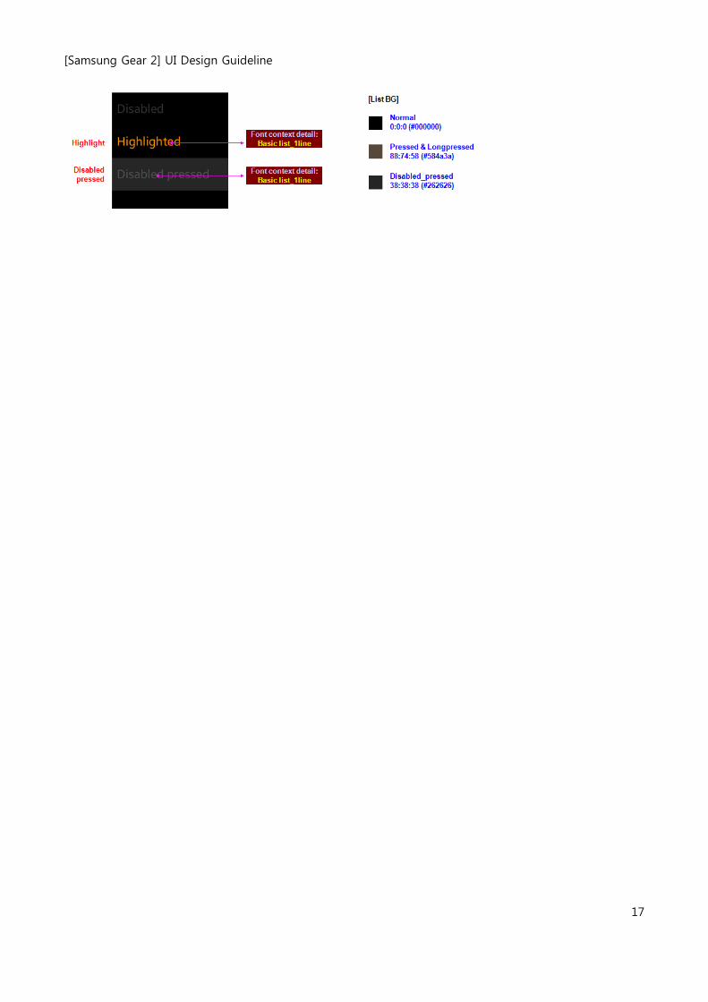
4.5. Typography To support overarching design principles and a unique visual style, Gear uses a dedicated font family named Samsung Sans (regular/medium/bold). The Samsung Sans family supports regular and medium weights by default.
Basic font effect
[Samsung Gear 2] UI Design Guideline
17
[Samsung Gear 2] UI Design Guideline
18
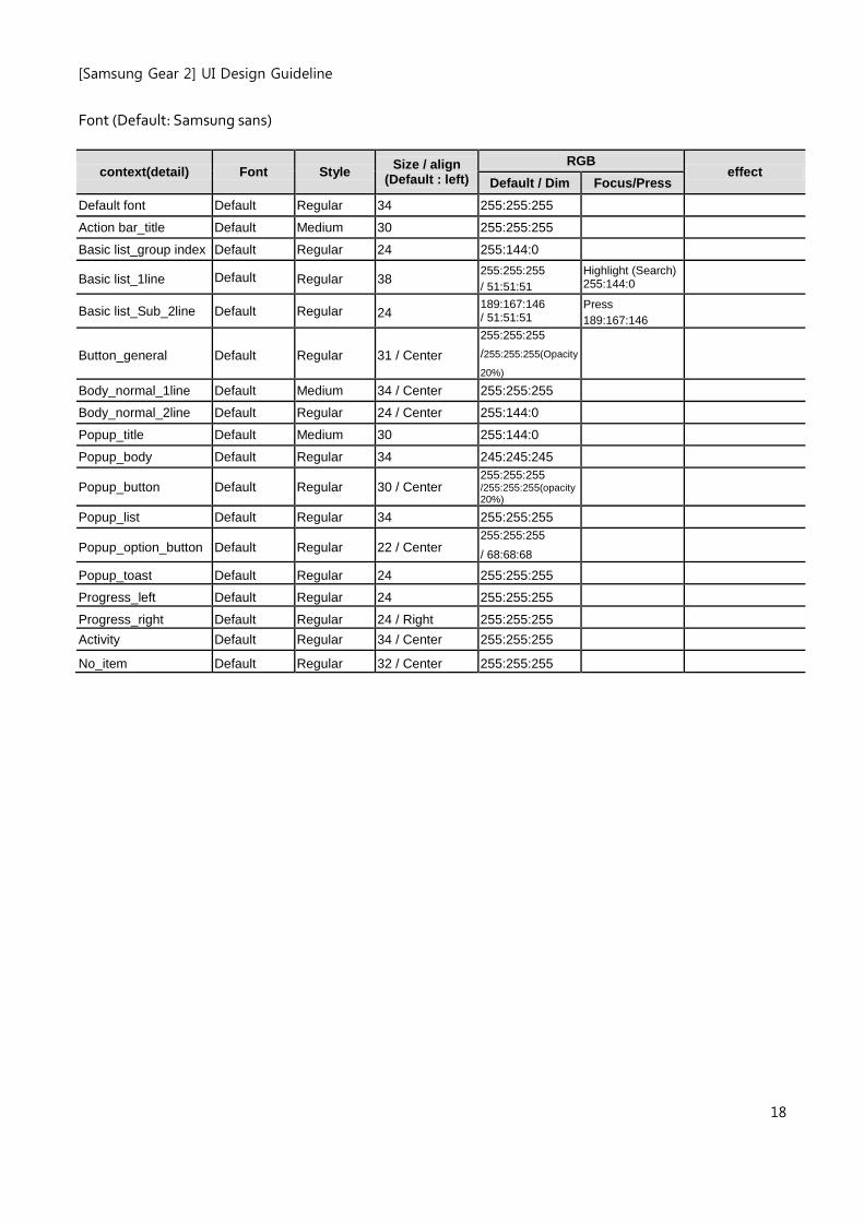
Font (Default: Samsung sans)
context(detail) Font Style Size / align
(Default : left)
RGB effect
Default / Dim Focus/Press
Default font Default Regular 34 255:255:255
Action bar_title Default Medium 30 255:255:255
Basic list_group index Default Regular 24 255:144:0
Basic list_1line Default Regular 38 255:255:255 / 51:51:51
Highlight (Search) 255:144:0
Basic list_Sub_2line Default Regular 24 189:167:146 / 51:51:51
Press 189:167:146
Button_general Default Regular 31 / Center 255:255:255 /255:255:255(Opacity
20%)
Body_normal_1line Default Medium 34 / Center 255:255:255
Body_normal_2line Default Regular 24 / Center 255:144:0
Popup_title Default Medium 30 255:144:0
Popup_body Default Regular 34 245:245:245
Popup_button Default Regular 30 / Center 255:255:255 /255:255:255(opacity 20%)
Popup_list Default Regular 34 255:255:255
Popup_option_button Default Regular 22 / Center 255:255:255 / 68:68:68
Popup_toast Default Regular 24 255:255:255
Progress_left Default Regular 24 255:255:255
Progress_right Default Regular 24 / Right 255:255:255
Activity Default Regular 34 / Center 255:255:255
No_item Default Regular 32 / Center 255:255:255
[Samsung Gear 2] UI Design Guideline
19
5. Assets Guidelines
The following UI components are the basic screen elements of your application:
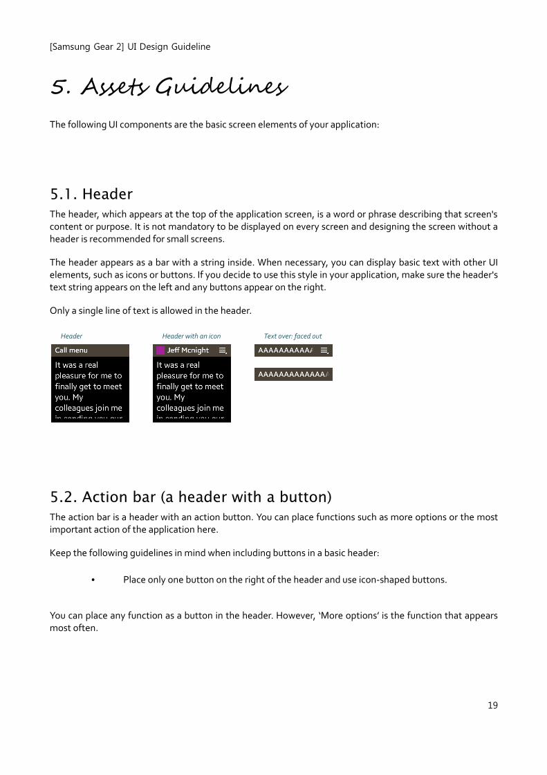
5.1. Header
The header, which appears at the top of the application screen, is a word or phrase describing that screen's content or purpose. It is not mandatory to be displayed on every screen and designing the screen without a header is recommended for small screens.
The header appears as a bar with a string inside. When necessary, you can display basic text with other UI elements, such as icons or buttons. If you decide to use this style in your application, make sure the header's text string appears on the left and any buttons appear on the right.
Only a single line of text is allowed in the header.
Header Header with an icon Text over: faced out
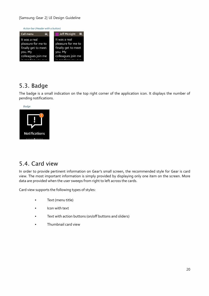
5.2. Action bar (a header with a button)
The action bar is a header with an action button. You can place functions such as more options or the most important action of the application here.
Keep the following guidelines in mind when including buttons in a basic header:
• Place only one button on the right of the header and use icon-shaped buttons.
You can place any function as a button in the header. However, ‘More options’ is the function that appears most often.
[Samsung Gear 2] UI Design Guideline
20
Action bar (Header with a button)
5.3. Badge
The badge is a small indication on the top right corner of the application icon. It displays the number of pending notifications.
Badge
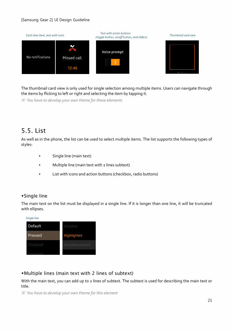
5.4. Card view
In order to provide pertinent information on Gear’s small screen, the recommended style for Gear is card view. The most important information is simply provided by displaying only one item on the screen. More data are provided when the user sweeps from right to left across the cards.
Card view supports the following types of styles:
• Text (menu title)
• Icon with text
• Text with action buttons (on/off buttons and sliders)
• Thumbnail card view
[Samsung Gear 2] UI Design Guideline
21
Card view (text, text with icon) Text with action buttons
(toggle button, on/off button, and sliders) Thumbnail card view
The thumbnail card view is only used for single selection among multiple items. Users can navigate through the items by flicking to left or right and selecting the item by tapping it.
※ You have to develop your own theme for these elements
5.5. List
As well as in the phone, the list can be used to select multiple items. The list supports the following types of styles:
• Single line (main text)
• Multiple line (main text with 2 lines subtext)
• List with icons and action buttons (checkbox, radio buttons)
Single line
The main text on the list must be displayed in a single line. If it is longer than one line, it will be truncated with ellipses.
Single line
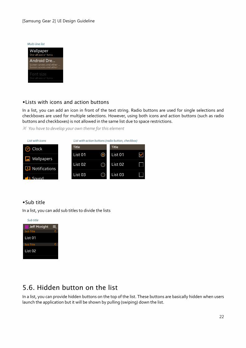
Multiple lines (main text with 2 lines of subtext)
With the main text, you can add up to 2 lines of subtext. The subtext is used for describing the main text or title.
※ You have to develop your own theme for this element
[Samsung Gear 2] UI Design Guideline
22
Multi-line list
Lists with icons and action buttons
In a list, you can add an icon in front of the text string. Radio buttons are used for single selections and checkboxes are used for multiple selections. However, using both icons and action buttons (such as radio buttons and checkboxes) is not allowed in the same list due to space restrictions.
※ You have to develop your own theme for this element
List with icons List with action buttons (radio button, checkbox)
Sub title
In a list, you can add sub titles to divide the lists
Sub title
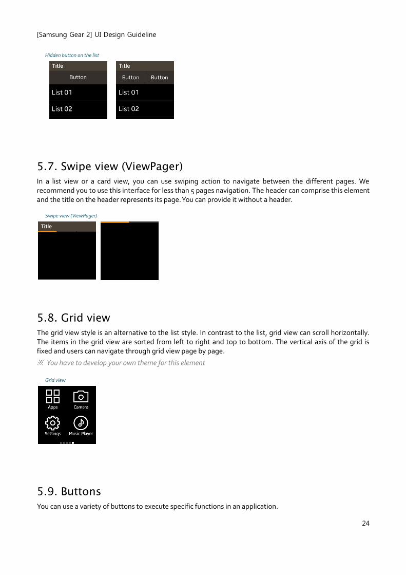
5.6. Hidden button on the list
In a list, you can provide hidden buttons on the top of the list. These buttons are basically hidden when users launch the application but it will be shown by pulling (swiping) down the list.
[Samsung Gear 2] UI Design Guideline
23
[Samsung Gear 2] UI Design Guideline
24
Hidden button on the list
5.7. Swipe view (ViewPager)
In a list view or a card view, you can use swiping action to navigate between the different pages. We recommend you to use this interface for less than 5 pages navigation. The header can comprise this element and the title on the header represents its page. You can provide it without a header.
Swipe view (ViewPager)
5.8. Grid view The grid view style is an alternative to the list style. In contrast to the list, grid view can scroll horizontally. The items in the grid view are sorted from left to right and top to bottom. The vertical axis of the grid is fixed and users can navigate through grid view page by page.
※ You have to develop your own theme for this element
Grid view
5.9. Buttons
You can use a variety of buttons to execute specific functions in an application.
[Samsung Gear 2] UI Design Guideline
25
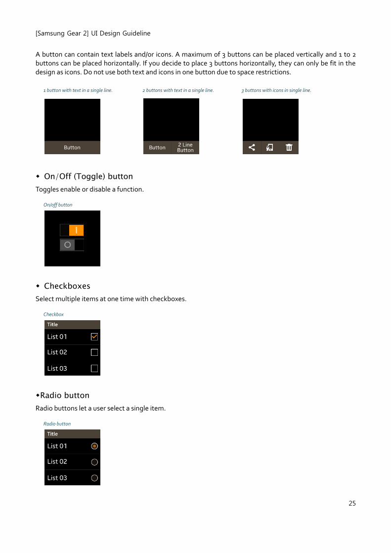
A button can contain text labels and/or icons. A maximum of 3 buttons can be placed vertically and 1 to 2 buttons can be placed horizontally. If you decide to place 3 buttons horizontally, they can only be fit in the design as icons. Do not use both text and icons in one button due to space restrictions.
1 button with text in a single line. 2 buttons with text in a single line. 3 buttons with icons in single line.
On/Off (Toggle) button
Toggles enable or disable a function.
On/off button
Checkboxes
Select multiple items at one time with checkboxes.
Checkbox
Radio button
Radio buttons let a user select a single item.
Radio button
[Samsung Gear 2] UI Design Guideline
26
5.10. Slider
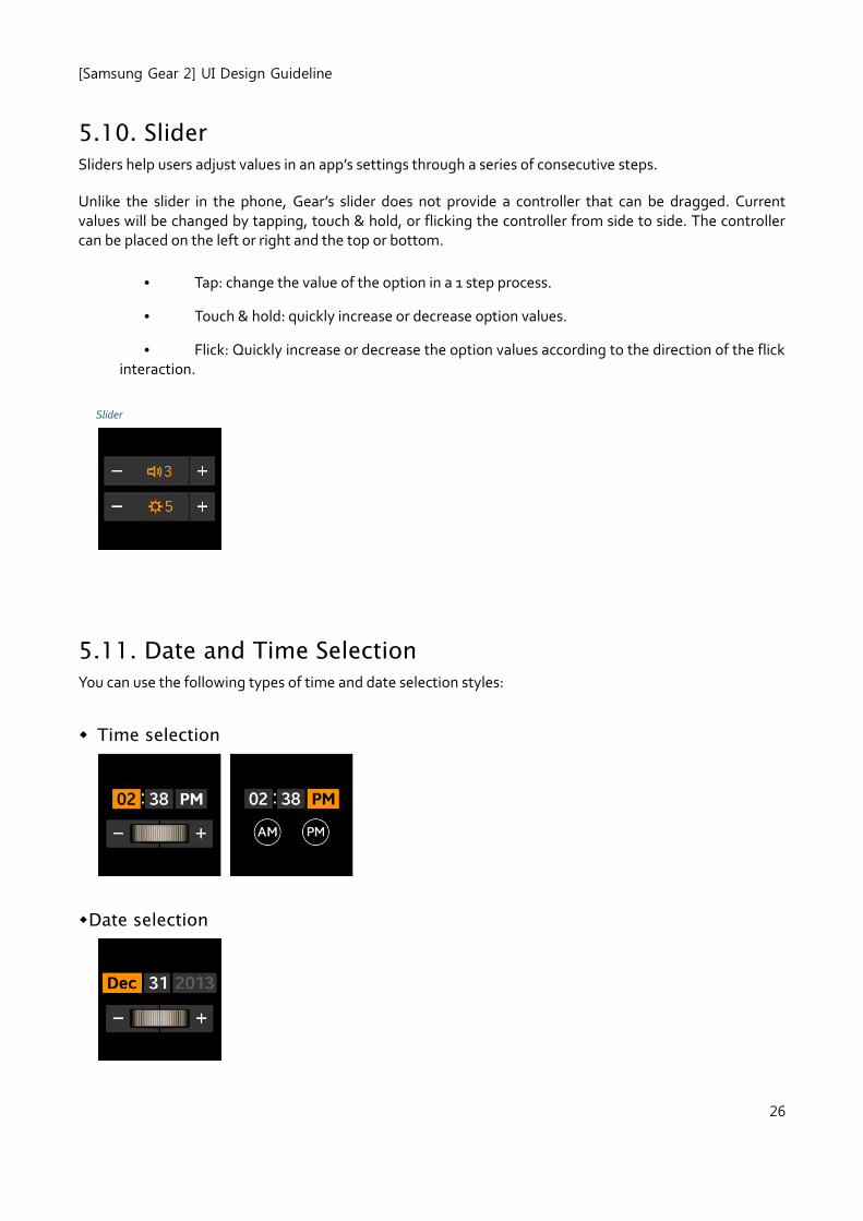
Sliders help users adjust values in an app’s settings through a series of consecutive steps.
Unlike the slider in the phone, Gear’s slider does not provide a controller that can be dragged. Current values will be changed by tapping, touch & hold, or flicking the controller from side to side. The controller can be placed on the left or right and the top or bottom.
• Tap: change the value of the option in a 1 step process.
• Touch & hold: quickly increase or decrease option values.
• Flick: Quickly increase or decrease the option values according to the direction of the flick interaction.
Slider
5.11. Date and Time Selection
You can use the following types of time and date selection styles:
Time selection
Date selection
[Samsung Gear 2] UI Design Guideline
27
5.12. Progress and Process
Progress means that the duration or volume of the entire task can be predicted. Process means that the duration or volume of the task cannot be predicted, so you can only notify users that the task is being processed.
If a specific task is running continually over a certain period of time, you must offer users a visual cue about its progress or process.
You should fill the progress bar from left to right as the task is being completed. If you want to make your application's progress as transparent as possible, you can provide detailed values such as the entire volume of items processing or time to completion of the task.
Progress and process are commonly presented in pop-ups can also provide the cancel button to stop an ongoing action.
5.13. Pop-up
Pop-up is one of useful ways to convey information to user. Unlike the pop-ups of phone, pop-ups on Gear need to be full-screen size to utilize the every bit of its small display space. Therefore it is important to differentiate the pop-ups from other screens by following guidelines. Pop-ups usually have three parts; title, content, and action buttons. If the message body is long, scrolling up or down is possible except in a grid pop-up.
You can use the following types of pop-ups:
• Information
• Confirmation
• Alerts
• Progress
• Processes
• Toasts
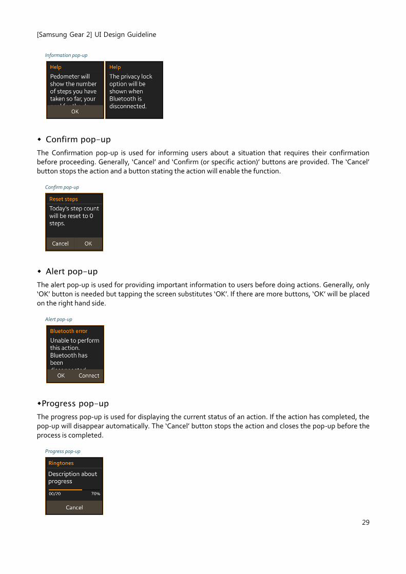
Information pop-ups
The information pop-up is used for providing additional information about a process or function. Selecting the ‘OK’ button in the pop-up, or tapping the screen, or sweeping down from the top bezel (performing the
[Samsung Gear 2] UI Design Guideline
28
back interaction) closes the pop-up.
[Samsung Gear 2] UI Design Guideline
29
Information pop-up
Confirm pop-up
The Confirmation pop-up is used for informing users about a situation that requires their confirmation before proceeding. Generally, ‘Cancel’ and ‘Confirm (or specific action)’ buttons are provided. The ‘Cancel’ button stops the action and a button stating the action will enable the function.
Confirm pop-up
Alert pop-up
The alert pop-up is used for providing important information to users before doing actions. Generally, only ‘OK’ button is needed but tapping the screen substitutes ‘OK’. If there are more buttons, ‘OK’ will be placed on the right hand side.
Alert pop-up
Progress pop-up
The progress pop-up is used for displaying the current status of an action. If the action has completed, the pop-up will disappear automatically. The ‘Cancel’ button stops the action and closes the pop-up before the process is completed.
Progress pop-up
[Samsung Gear 2] UI Design Guideline
30
Process pop-up
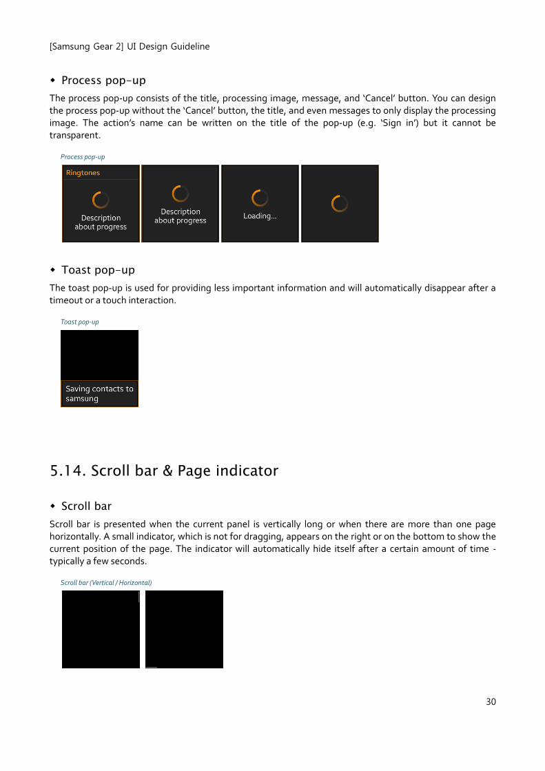
The process pop-up consists of the title, processing image, message, and ‘Cancel’ button. You can design the process pop-up without the ‘Cancel’ button, the title, and even messages to only display the processing image. The action’s name can be written on the title of the pop-up (e.g. ‘Sign in’) but it cannot be transparent.
Process pop-up
Toast pop-up
The toast pop-up is used for providing less important information and will automatically disappear after a timeout or a touch interaction.
Toast pop-up
5.14. Scroll bar & Page indicator
Scroll bar
Scroll bar is presented when the current panel is vertically long or when there are more than one page horizontally. A small indicator, which is not for dragging, appears on the right or on the bottom to show the current position of the page. The indicator will automatically hide itself after a certain amount of time - typically a few seconds.
Scroll bar (Vertical / Horizontal)
[Samsung Gear 2] UI Design Guideline
31
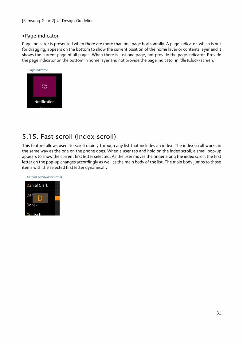
Page indicator
Page Indicator is presented when there are more than one page horizontally. A page indicator, which is not for dragging, appears on the bottom to show the current position of the home layer or contents layer and it shows the current page of all pages. When there is just one page, not provide the page indicator. Provide the page indicator on the bottom in home layer and not provide the page indicator in Idle (Clock) screen.
Page indicator
5.15. Fast scroll (Index scroll)
This feature allows users to scroll rapidly through any list that includes an index. The index scroll works in the same way as the one on the phone does. When a user tap and hold on the index scroll, a small pop-up appears to show the current first letter selected. As the user moves the finger along the index scroll, the first letter on the pop-up changes accordingly as well as the main body of the list. The main body jumps to those items with the selected first letter dynamically.
Fast list scroll (Index scroll)