Embed Size (px)
Citation preview
Romantic Rendering:
Romanticism in Visual Stylization
And Story Conception in 3D Animation
A Thesis
Submitted to the Faculty
of
Drexel University
by
Simon Mason Littlejohn
In partial fulfillment of the requirements for the degree
of
Master of Science in Digital Media
April 10, 2012
© Copyright 2012 Simon M. Littlejohn. All Rights Reserved
i
DEDICATIONS
This thesis is dedicated to my mother and father, Kim and John. Without their
endless support, constant encouragement, and infinite patience this thesis would
not have been possible. Their wisdom and guidance is a gift I will never take for
granted.
ii
ACKNOWLEDGEMENTS
I would like thank my committee members, for providing insight and
guidance during the creation of my thesis. Thank you to Christopher Redmann for
helping me with shader writing, and for honing the direction this thesis took. Thank
you to Dr. Charles Morscheck for the countless hours it must have taken to help edit
and refine both this paper, and my thesis as a whole. Thank you to Nick
Jushchyshyn for joining my committee without hesitation, and for helping
strengthen my animation at short notice.
I would also like to thank my friends and fellow graduate students Dan
Bodenstein, Greg Ruane, Nate Shaw, and Bob Piscopo. Their frequent critiques and
positive input have made this thesis stronger. I would like to also thank those who
have graduated before me, including Evan Boucher, Nick Avallone, David Lally, and
Tom Bergamini. The learning environment they facilitated has been an inspiration,
and their experience and insight have bettered my academic experience.
Lastly, I would like to thank my advisor Dave Mauriello, whose support went
above and beyond his calling. His deep understanding of the field has proven
invaluable to this thesis, and his professionalism has helped me both academically
and personally. I am truly grateful to have had him as an advisor, and an instructor
as well. I owe him for a vast majority of what I know about CG today.
iii
TABLE OF CONTENTS
LIST OF FIGURES ................................................................................................................................... iv
DEFINITION OF TERMS .................................................................................................................... viii
ABSTRACT ................................................................................................................................................. x
1. INTRODUCTION & OVERVIEW ..................................................................................................... 1
2. RELEVANT RESEARCH .................................................................................................................... 6
3. PROCEDURE ...................................................................................................................................... 41
3.1 LAYERED TEXTURES ............................................................................................................. 41
3.2 ZBRUSH ....................................................................................................................................... 47
3.3 CAMERA PROJECTION ........................................................................................................... 55
3.4 MULTIPLE ARRAYS OF TEXTURES ................................................................................... 61
3.5 EDGE BLURRING ...................................................................................................................... 63
3.6 FROM MAYA TO HOUDINI.................................................................................................... 73
3.7 THE SHADER ............................................................................................................................. 76
3.8 TRADITIONAL RENDERING ................................................................................................ 78
4. LIMITATIONS AND POTENTIAL EXPANSION ...................................................................... 82
4.1 THE SHADER ............................................................................................................................. 82
4.2 HOUDINI VOP SOP ................................................................................................................... 85
4.3 MATTE PAINTING ................................................................................................................... 87
4.4 MISCELLANEOUS ..................................................................................................................... 88
5. CONCLUSION .................................................................................................................................... 90
LIST OF REFERENCES ........................................................................................................................ 92
APPENDIX ............................................................................................................................................... 94
iv
LIST OF FIGURES
Fig 1: Caspar David Friedrich Ruins of Eldena, 1824-2 ............................................................ 2
Fig 2: Rembrandt’s St. Peter in Prison, 1631 ............................................................................... 8
Fig 3: Tintorreto’s Pieta, 1559. ....................................................................................................... 10
Fig 4: Raphael’s School of Athens, 1510-11.. .............................................................................. 11
Fig 5: William Turner’s Slave Ship, 1840. .................................................................................. 12
Fig 6: William Turner’s Shipwreck of the Minotaur, 1810 .................................................... 13
Fig 7-8: Goya’s Saturn Devouring His Son, 1819-1823, The Colossus, 1808-1812....... 14
Fig 9: Peter Paul Ruben’s Saturn Devouring His Children, 1636-1638 ............................ 15
Fig 10-11: John Martin’s The Great Day of His Wrath, 1853, and The Destruction of
Sodom and Gomorrah, 1852. ............................................................................................................ 17
Fig 12: A still from Pixar’s Partly Cloudy, showing the mix of photo/non-
photorealism ......................................................................................................................................... 18
Fig 13-14: Henry Fuseli’s Lady Macbeth Seizing the Daggers, 1812, and The Three
Witches, 1783. ....................................................................................................................................... 19
Fig 15-16: Caspar David Friedrich’s Wanderer Above the Sea of Fog, 1818, and The
Sea of Ice, 1823-24. .............................................................................................................................. 20
Fig 17-18: Examples of cell shading in real time rendering as demonstrated by The
Legend of Zelda: Wind Waker (Gamecube), and Jet Grind Radio (Xbox)……………….... 21
Fig 19-20: Diego Velasquez’s Infanta Margareta, 1655, and Bronzio’s Eleanor of
Toledo, 1540-1541. ............................................................................................................................. 23
v
Fig 21: Francisco Goya’s Yard with Lunatics, 1793-94. ......................................................... 24
Fig 22: Johannes Vermeer’s Painter with Model, 1673. ......................................................... 25
Fig 23: Palma Vecchio’s Adam and Eve, 1512 ........................................................................... 26
Fig 24: Delacroix’s La Mort de Sardanapale, 1827 .................................................................. 27
Fig 25: Peter Paul Ruben’s The Virgin and Child Enthroned with Saints, 1628. .......... 28
Fig 26: Hans Holbein’s The Ambassadors, 1533 ...................................................................... 29
Fig 27: Hans Gude’s Fra Hardanger, 1847 ................................................................................. 30
Fig 28: Rembrandt’s Night Watch, 1642 ..................................................................................... 31
Fig 29-30: Titian’s Venus of Urbino, 1538, and Velasquez’s Venus at her Mirror, 1649-
51. .............................................................................................................................................................. 32
Fig 31: Francisco Goya’s El Tres de Mayo, 1814. ...................................................................... 33
Fig 32: Emanuel de Witte’s Interior of a Protestant Gothic Church, 1669. ..................... 34
Fig 33: Eugene Delacroix’s La Liberte Guidant le people, 1830 .......................................... 34
Fig 34: David Fincher’s Se7en, 1995 ............................................................................................. 36
Fig 35: AMC’s The Walking Dead, 2010-Current. Protagonist Rick aiming at zombies
..................................................................................................................................................................... 37
Fig 36-37: Alfred Hitchcock’s Vertigo, 1958, and Psycho, 1960. ....................................... 38
Fig 38: Gore Verbinski’s Rango, 2011. A Romantic landscape that is a character in
and of itself ............................................................................................................................................. 39
Fig 39-40: Gore Verbinski’s Rango, 2011. The main character Rango riding chicken
back, and a shootout in town. ......................................................................................................... 40
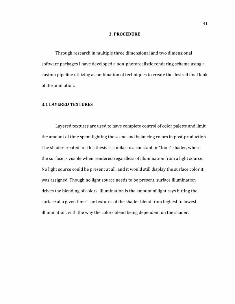
Fig 41: Different blending methods in the same shader. ...................................................... 42
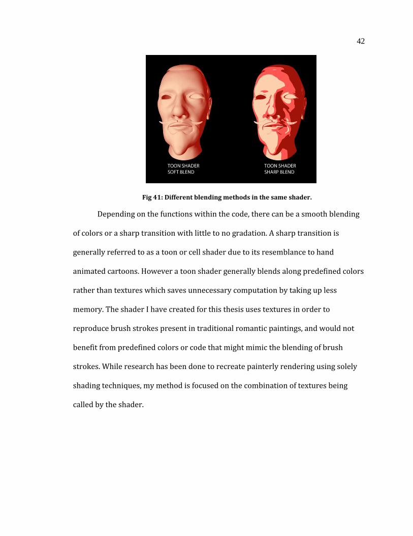
Fig 42: Blending textures and displacement. ........................................................................... 43

vi
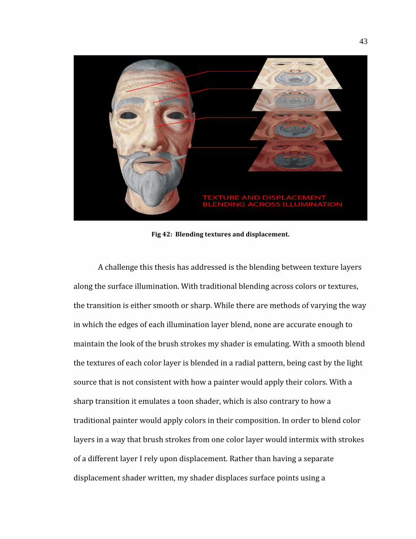
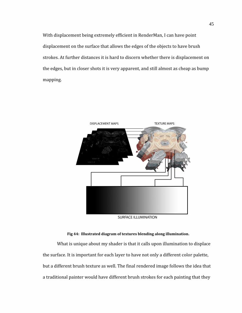
Fig 43: A diagram explaining how the REYES algorithm displaces geometry. ........... 44
Fig 44: Illustrated diagram of textures blending along illumination.............................. 45
Fig 45: Monet’s Haystack study at different times of day and year. ................................ 46
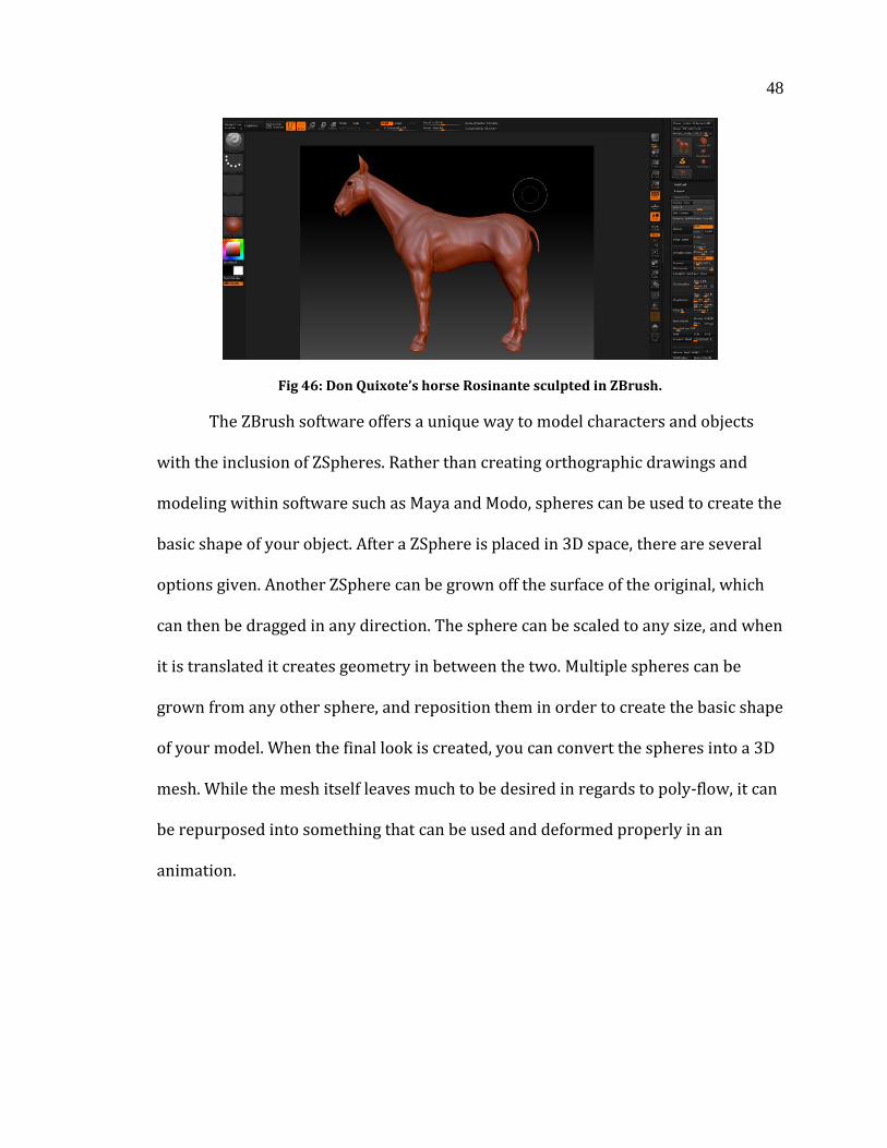
Fig 46: Don Quixote’s horse Rosinante sculpted in ZBrush. ............................................... 48
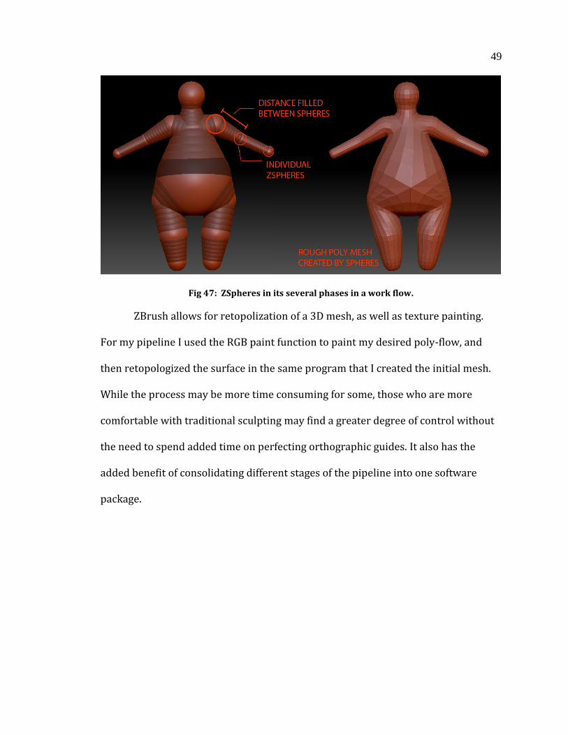
Fig 47: ZSpheres in its several phases in a work flow. ......................................................... 49
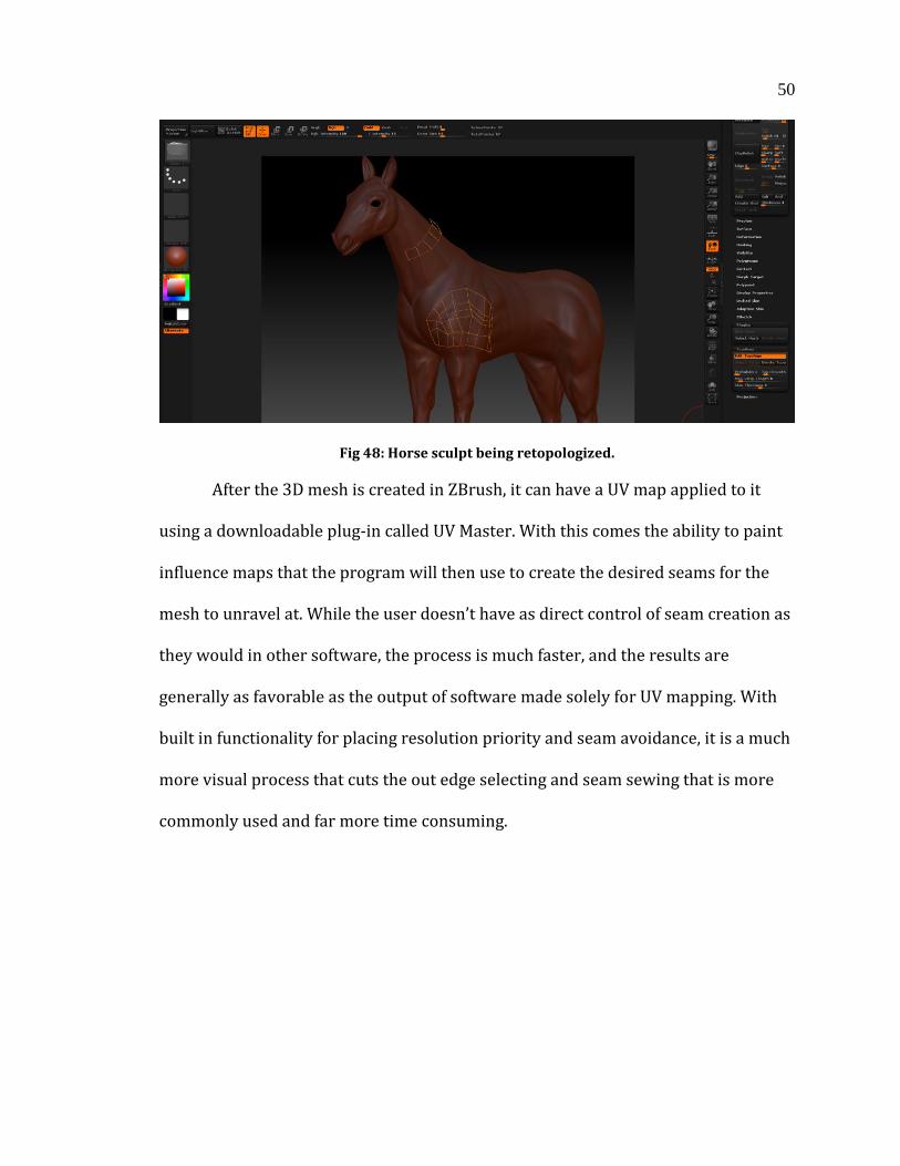
Fig 48: Horse Sculpt being Retopologized. ................................................................................ 50
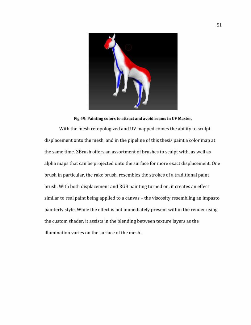
Fig 49: Painting colors to attract and avoid seams in UV Master. ..................................... 51
Fig 50: The rake brush, which simulates brush strokes and adds displacement
simultaneously. ..................................................................................................................................... 52
Fig 51: An example of normal projection and what the ground plane looks like with
a higher camera angle. ....................................................................................................................... 57
Fig 52: Setting up camera projection by layering UV space in Houdini. ....................... 58
Fig 53: An example of the Nuke camera projection workflow. .......................................... 60
Fig 54: Textures blending between small and large depending on camera distance.
..................................................................................................................................................................... 62
Fig 55: A painting by William Turner as an example of strokes blending together. 64
Fig 56: A shot of the windmill giant with edge blur being applied. ................................. 65
Fig 57: The difference between applied and disabled VOP SOP. ....................................... 66
Fig 58: The first half of the VOP SOP showing cross and dot product. ........................... 67
Fig 59: The second half of the VOP SOP with the addition of AA Noise and
displacement. ........................................................................................................................................ 68
Fig 60: Added displacement to the VOP SOP............................................................................ 70
Fig 61: Difference between subdivisions using VOP SOP. .................................................. 71
vii
Fig 62: Differences between edge blur settings. ..................................................................... 72
Fig 63: A character network with individual geometry extracted from the OBJ
sequence. ................................................................................................................................................. 76
Fig 64: Realistic Render, bottom image with vignette and color comping. ................... 80
viii
DEFINITION OF TERMS
Antiquity – Subject matter that dealt with the cultural history of Greece and Rome.
Impasto – A technique used in painting where an artist uses thick applications of
paint, building it until it takes on a tactile texture. This brings a three dimension
element to an otherwise two dimensional medium.
Salon – A highly regarded bi-annual French art exhibition that exemplified artists
work from the Academie des Beaux-Arts in Paris France, which began in 1748.
Painterly – As it pertains to digital media, it is a style of pixel representation that
mimics stroke, line, color, and depiction of light found in traditional painting.
Non-Photorealistic Rendering – A technique used in 3D digital rendering, where
computer generated images are made to resemble other mediums such as oil and
watercolor painting, lithography, etching, etc.
Idealistic Representation – Presenting subject matter in a pristine and perfect state,
without naturally inherent flaws that are generally regarded as unsightly or less
attractive.
Age of Enlightenment – A Western movement that proliferated across Western
Europe in the late Eighteenth century. Its central themes involved rational thinking,
and the questioning of established customs and morals, and seeking knowledge to
improve humankind.
Romanticism – A movement that began in the mid Eighteenth century that
encompassed art, literature, and music defined in part by the rejection of rationality
ix
and the glorification of emotion. The movement’s effects are still present in
literature and film to this day.
Remediation – Refashioning previously defined media such as painting,
photography, and film, and incorporating it into present day media and mediums.
Matte Painting – A painting of an environment, or specific parts of the composition
or set to give the illusion of a complete environment.
Projection – The technique of projecting a two dimensional image onto three-
dimensional geometry.
Compositing – Taking separate elements of 3D rendering, and combining them to
create one unified composition. An example would be rendering a character, and
incorporating a the background environment in a separate pass.
Chiaroscuro – The use of highly contrasting lights and darks in a composition for
multiple purposes, such as depth, atmosphere, the illusion of solidity, etc.
Neoclassical – An artistic style that draws upon Greek and Roman art that focuses on
idealization and perfection.
Rendering - 1: The conversion of a high-level object based description into a
graphical image for display.
2: To portray or depict, as in painting, music, or acting.
x
ABSTRACT
Romanticism in Visual Stylization And Story Conception in 3D Animation
Simon Mason Littlejohn
Romanticism emerged in the mid-18th century as a way to transport the
audience to a setting that couldn’t be experienced in normal life. Its themes dealt
with epic depictions of nature, and emphasized emotion over reason. While there
was no one specific artistic style, the movement began to distance itself from
idealistic representation and antiquity, and moved toward more Baroque
sensibilities that emphasized form and color. The study of Romanticism and how its
effects can be applied in storytelling and visualization present both opportunity and
challenge. Translating the look, feel, and overarching effects of Romanticism into a
digital time based narrative poses unique and challenging possibilities in
storytelling and artistic direction as it pertains to 3D animation, and can aid in the
creative process and visualization.

1
1. INTRODUCTION & OVERVIEW
The Romanticism movement began as a reaction against social and political
norms, brought on in part by the Age of Enlightenment and the Industrial
Revolution [8]. The subject matter and themes transported the audience to an
exciting and often fantastical setting. It was meant to give an escapist experience
never achievable in normal life, with stories of terrible tragedy and terrific acts of
courage depicted in literature and art. The Neoclassical movement emerging at the
same time focused on antiquity, and rendered subjects in an idealized state [1].
Romanticism broadened the horizon of what could be told through art and
literature, and emphasized imagination and emotion over reason. While there is a
wide range of artistic styles during the movement, my thesis is informed by several
prolific painters of the era, William Turner, Francisco Goya and Caspar David
Friedrich. For the purpose of this thesis their artistic style and subject matter best
represent the sensibilities of the movement.
Through the study of the artistic style and effects of the Romantic Movement
I have created a 3D animation using non photo-realistic rendering to capture the
painterly look of artists of the movement. Each aspect of the animation has been
informed by the movement, with a visual style that can be considered a revival of
Baroque qualities, and subject matter often seen in the movement such as
heightened drama, vicarious experiences of powerful emotions, and heightened
naturalism. This will serve several purposes, with the first being to draw influence
2
from the Romantic Movement. The impetus of the movement was to transport the
viewer to another world they could not normally experience [1]. There is value to be
found in the stories and themes from the movement, and they can be applied to the
creative process we go through in this current day. One such theme to explore is
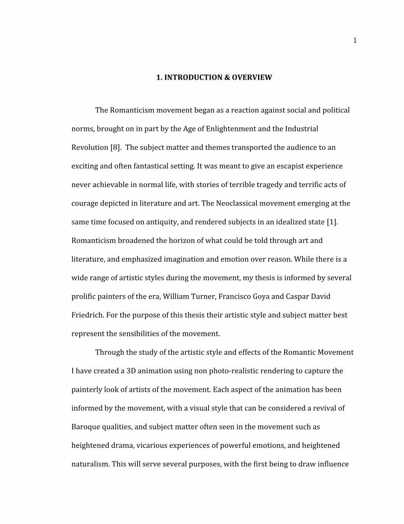
nature in an untamed state, which plays as much a role as the human elements of
the story.
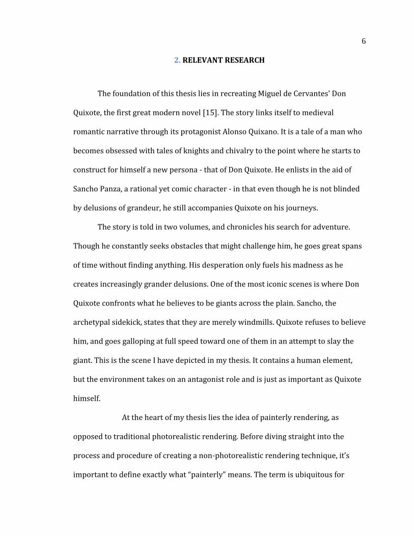
Fig 1: Caspar David Friedrich Ruins of Eldena, 1824-25 – Considered a “Landscape Tragedy”,
Friedrich depicts nature in an untamed state.
The second purpose of exploring the Romantic Movement is as a reaction to
the current trend toward photo-realism. With animation and film pressing the
envelope with what is possible in the accurate representation of life, it is important
to explore new ways of visualization. Baroque painters of the seventeenth century
achieved realistic rendering in different ways than those of the Renaissance
movement. Their paintings, while highly structured, took on a less structured look
and feel to the viewer. I am exploring unique non photo-realistic ways to render
animations as a logical progression, removing the highly structured and calculated
3
nature of 3D animation. As with Baroque painting, the final animation is highly
calculated and structured in its work-flow, but appears to the viewer as an
impressionistic, romantic work of art. Photo-realism still has its place, and will
continue to be improved upon, but it has a narrow purpose - to mimic reality.
Through color, line, stroke, and the use of light, non photo-realism can evoke
emotion and thought in different and more expressive ways than exact
representation of life. Where Romantic rendering draws upon Baroque style, we
may call it Baroque realism. Baroque realism employs various effects such as
painterliness, recessiveness, open form, unity, unclearness, and other techniques
that manipulate light and form to direct the viewer’s gaze and evoke emotion [16].
The third purpose of exploring the themes and styles of the Romantic
Movement is to document the process of refashioning the effects and styles as a
proof of concept that can later be expanded upon. By using every aspect of
Romanticism to create a 3D animation I have strengthened and unified the
composition and helped focus the creative process. I have explored unique ways to
render 3D images to match the painterly styles of Turner, Goya and Caspar David
Friedrich, with the goal of expanding on visualization techniques that differ from
photo-realism. With my thesis I have created an archetype of how current day
digital technology can be employed to enhance visual styles and themes found in
Romantic era painting, and applied them to 3D animation and rendering; with the
intent of preserving the painterly styles of the artists and providing a foundation for
future experimentation.

4
The story I have chosen to animate is an excerpt from Miguel de Cerventes’
Don Quixote. While the story itself, published in 1605, was not written during the
Romantic Period, it is well aligned with its themes, and lends itself to the
incorporation of non-photo realistic rendering. Its sweeping vistas and comically
heroic protagonist will allow for epic depictions of nature, as well as provide a
simultaneously comic and tragic human element. Considered to be the first modern
novel, Don Quixote is a tale of a delusional old man obsessed with fantastical
recounting of chivalry and adventure [15]. Determined to live his life like the
characters he read about, he goes on quests that, while they are epic in his mind, are
delusions of grandeur in reality. Don Quixote is the personification of Romanticism,
looking to transport himself into a world unlike his own to the point where it drives
him insane. The story itself is Romantic, transporting the viewer to a unique world
as seen through the eyes of the protagonist.
To illustrate the contrast between reality and Quixote's perceived reality, I
have used NPR to display a Romanticized version of reality to depict what he sees.
Reality according to his rational companion Sancho has been represented in a
different way. Whereas the delusional reality uses painterly rendering techniques
with vivid saturated colors, the true reality will be desaturated and stark in
comparison. Sancho’s reality is more in line with effects and subject matter present
in Naturalism, with crisp linear edges, and a clear composition with all aspects
holding equal importance and clarity, and simple subject matter depicting everyday
life. This is juxtaposed with the painterly, recessive composition with unclear form
and an attempt at unity of subject and background.
5
Due to the nature of the medium, I have explored solutions to the challenges
presented by 3D environments and time based media. The overarching production
of my project is a painterly non photo-realistic rendering scheme, with strong use of
matte painting and projection to create epic sweeping depictions of nature, using
raw vibrant colors, and a character based narrative that focuses on predominant
Romantic themes such as emotion over reason. I have created a current
representation of Romantic style and sensibilities, while drawing from aspects of
the Baroque movement such as painterliness and open forms. With the many
branches of non-photorealistic rendering a digital artist can take, my path is along
the Romantic Era, but my techniques can be repurposed to fit a broad spectrum of
styles and eras and it is my hope that my knowledge gained while creating this
thesis can be expanded and built upon. With continued development, the medium of
computer graphic animation can surpass the emotional impact and connection
between audience and painting, present in a static two dimensional medium.
6
2. RELEVANT RESEARCH
The foundation of this thesis lies in recreating Miguel de Cervantes’ Don
Quixote, the first great modern novel [15]. The story links itself to medieval
romantic narrative through its protagonist Alonso Quixano. It is a tale of a man who
becomes obsessed with tales of knights and chivalry to the point where he starts to
construct for himself a new persona - that of Don Quixote. He enlists in the aid of
Sancho Panza, a rational yet comic character - in that even though he is not blinded
by delusions of grandeur, he still accompanies Quixote on his journeys.
The story is told in two volumes, and chronicles his search for adventure.
Though he constantly seeks obstacles that might challenge him, he goes great spans
of time without finding anything. His desperation only fuels his madness as he
creates increasingly grander delusions. One of the most iconic scenes is where Don
Quixote confronts what he believes to be giants across the plain. Sancho, the
archetypal sidekick, states that they are merely windmills. Quixote refuses to believe
him, and goes galloping at full speed toward one of them in an attempt to slay the
giant. This is the scene I have depicted in my thesis. It contains a human element,
but the environment takes on an antagonist role and is just as important as Quixote
himself.
At the heart of my thesis lies the idea of painterly rendering, as
opposed to traditional photorealistic rendering. Before diving straight into the
process and procedure of creating a non-photorealistic rendering technique, it’s
important to define exactly what “painterly” means. The term is ubiquitous for
7
describing something that looks like it was painted, but there are many different
types of ways to apply paint, and being painterly is not limited to technique alone.
The style in which a painting is created can also have painterly aspects. Linear
technique sees in lines, painterly in patches of light, dark and color. Linear figures
are defined by their outlines, and cannot be detached from the form they enclose
[16]. The sense and beauty of the linear object is created using the outline, with
interior forms having outline as well. Seeing in masses removes attention from the
outline, but rather gives the impression of the object in patches - with the patches
conveying visual information in lights and darks, or hues and values of color [16].
Linear drawing also conforms to the use of light and shadow to represent
three-dimensionality, but serves as an exact guide to separate luminosity. Line
separates surfaces and applies a perfectly defined contour. A painterly approach
depreciates the barriers between lights and darks, where in some places edges of
color and shape guide the viewer, and breaks down in others leaving the entire
composition to explain itself. It requires the sum of its parts to depict the image,
where certain areas may break down and other areas build up the presence of the
imagery.
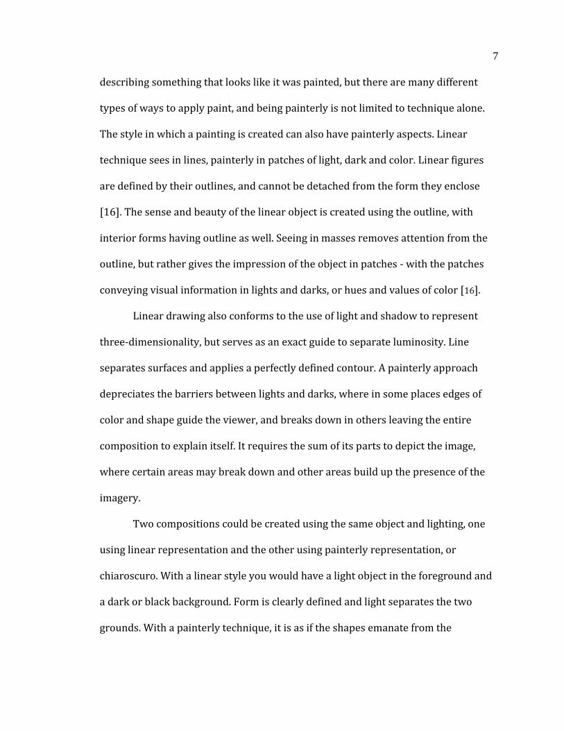
Two compositions could be created using the same object and lighting, one
using linear representation and the other using painterly representation, or
chiaroscuro. With a linear style you would have a light object in the foreground and
a dark or black background. Form is clearly defined and light separates the two
grounds. With a painterly technique, it is as if the shapes emanate from the
8
darkness, and are connected. The only thing that separates the two is the light,
which draws the viewer’s eye to the intended form [16].
Fig 2: Rembrandt’s St. Peter in Prison, 1631. A painterly rendering.
Linear drawing acts more like two senses rather than one. It clearly uses
sight to define the composition, but the outline of objects acts like a metaphorical
guide for the eye to follow like a hand. The hand feels the contours of the object and
forms the shape within the mind’s eye of the viewer, allowing connections to be
made within the shapes to create a whole image. Painterly form gets rid of the guide
rails of contour line, and requires the viewer to take in the image as a whole in order
to connect shape and color to object. There is a devolution of detail, as if it were just
a momentary issue of distance or focus. Glints of shape and color are used to
represent what a linear style would depict absolutely [16].
9
Another thing my thesis has tried to achieve, and has done so with little
difficulty due to the medium, is to create an open form composition. While art in the
Classical period strove to create and confine the subject matter and imagery into the
confines of the rectangular box in which it was painted, I have made an animation
that suggests that what the viewer sees is a part of much more, and that displayed
objects are one part of a whole. This is achieved through framing, and tectonics of
the planes of the image, but also because my animation is not a static image. Rather,
it is a series of moving images that solidifies the notion that there is more to the
composition than what is being presented at one moment in time. While classical
paintings focused on maintaining multiplicity within horizontal and vertical lines,
Baroque paintings and their romantic derivatives focused on obscuring the defined
verticals and horizontals, and introduced diagonal tectonics of a composition to
recede the action into the distance, helping to both obscure the rectangularity of the
medium and strengthen the transportation of the viewer into the artist’s world [16].
Classic art isn’t necessarily confined only to the rectangular space of the
medium, but composition space is clearly defined. Classic artists created a
microcosm which was complete and well-designed within its frame. As art
approached the Baroque movement it moved away from the confines of a carefully
crafted composition in which each element is a distinct part of the whole, and
avoided symmetry. According to Heinrich Wolfflin in his book “Principles of Art
History”, classical painting could be referred to as “Clear”, where the theme and
composition is easily discerned. For the specific styles that I have chosen to achieve
and describe in my thesis, the style could be considered “Unclear”. Edges do not
10
appear with uniform distinction as they would in an ideal lighting situation, and
while the image is carefully constructed by the artist, it is made to appear with a
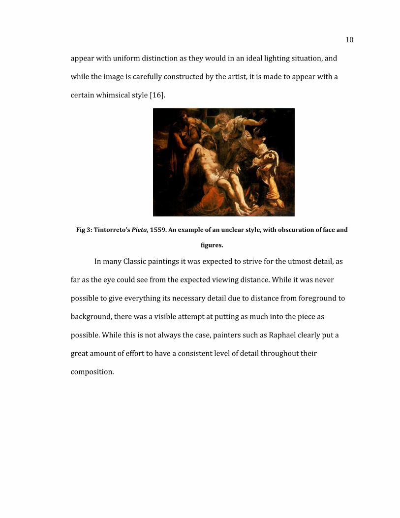
certain whimsical style [16].
Fig 3: Tintorreto’s Pieta, 1559. An example of an unclear style, with obscuration of face and
figures.
In many Classic paintings it was expected to strive for the utmost detail, as
far as the eye could see from the expected viewing distance. While it was never
possible to give everything its necessary detail due to distance from foreground to
background, there was a visible attempt at putting as much into the piece as
possible. While this is not always the case, painters such as Raphael clearly put a
great amount of effort to have a consistent level of detail throughout their
composition.
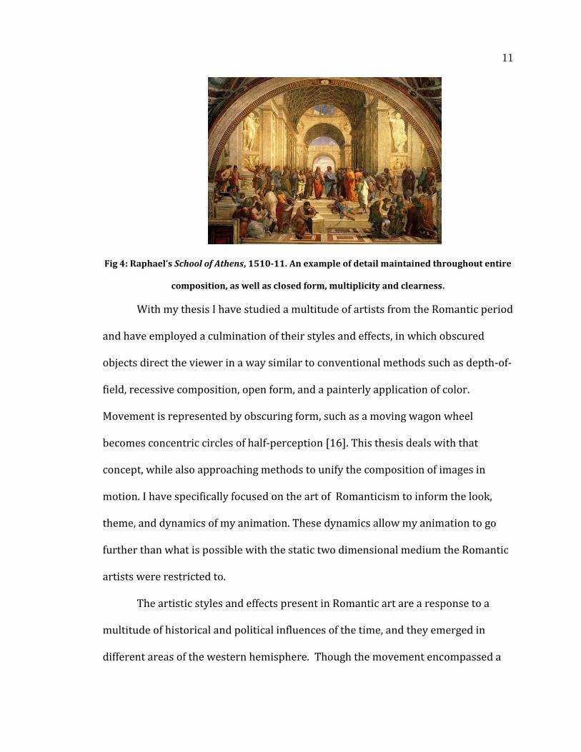
11
Fig 4: Raphael’s School of Athens, 1510-11. An example of detail maintained throughout entire
composition, as well as closed form, multiplicity and clearness.
With my thesis I have studied a multitude of artists from the Romantic period
and have employed a culmination of their styles and effects, in which obscured
objects direct the viewer in a way similar to conventional methods such as depth-of-
field, recessive composition, open form, and a painterly application of color.
Movement is represented by obscuring form, such as a moving wagon wheel
becomes concentric circles of half-perception [16]. This thesis deals with that
concept, while also approaching methods to unify the composition of images in
motion. I have specifically focused on the art of Romanticism to inform the look,
theme, and dynamics of my animation. These dynamics allow my animation to go
further than what is possible with the static two dimensional medium the Romantic
artists were restricted to.
The artistic styles and effects present in Romantic art are a response to a
multitude of historical and political influences of the time, and they emerged in
different areas of the western hemisphere. Though the movement encompassed a
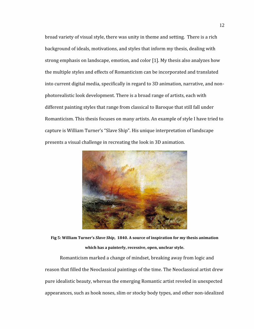
12
broad variety of visual style, there was unity in theme and setting. There is a rich
background of ideals, motivations, and styles that inform my thesis, dealing with
strong emphasis on landscape, emotion, and color [1]. My thesis also analyzes how
the multiple styles and effects of Romanticism can be incorporated and translated
into current digital media, specifically in regard to 3D animation, narrative, and non-
photorealistic look development. There is a broad range of artists, each with
different painting styles that range from classical to Baroque that still fall under
Romanticism. This thesis focuses on many artists. An example of style I have tried to
capture is William Turner’s “Slave Ship”. His unique interpretation of landscape
presents a visual challenge in recreating the look in 3D animation.
Fig 5: William Turner’s Slave Ship, 1840. A source of inspiration for my thesis animation
which has a painterly, recessive, open, unclear style.
Romanticism marked a change of mindset, breaking away from logic and
reason that filled the Neoclassical paintings of the time. The Neoclassical artist drew
pure idealistic beauty, whereas the emerging Romantic artist reveled in unexpected
appearances, such as hook noses, slim or stocky body types, and other non-idealized
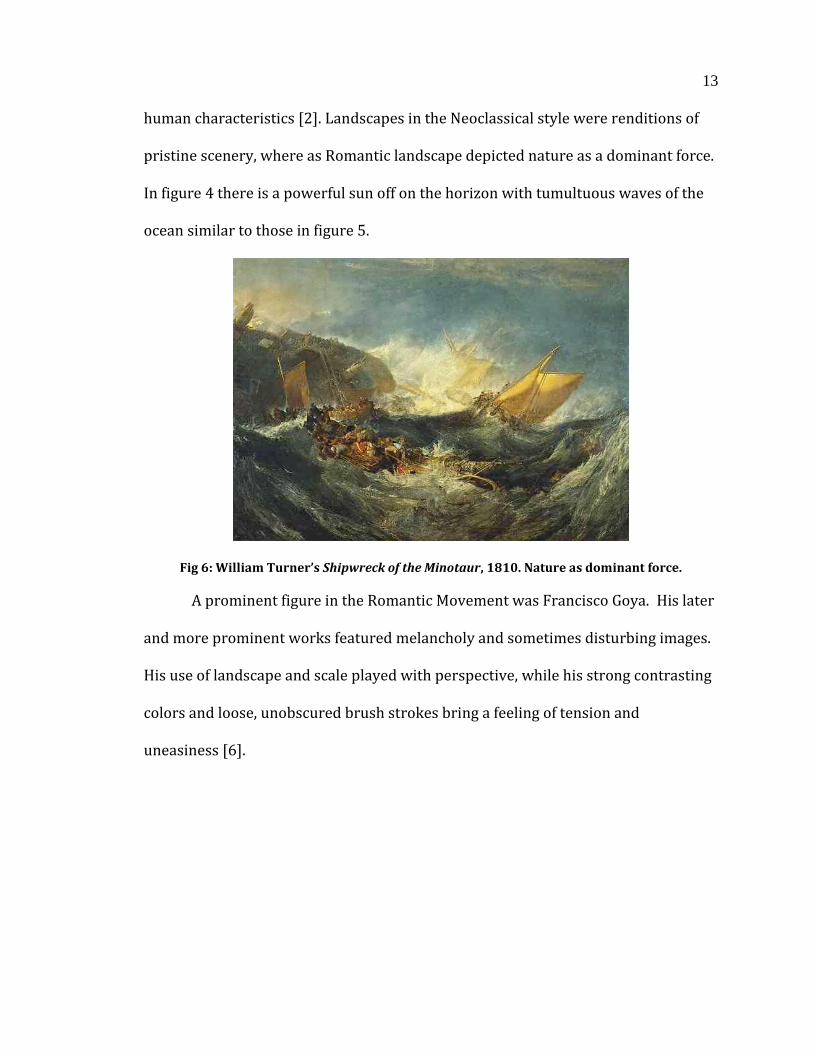
13
human characteristics [2]. Landscapes in the Neoclassical style were renditions of
pristine scenery, where as Romantic landscape depicted nature as a dominant force.
In figure 4 there is a powerful sun off on the horizon with tumultuous waves of the
ocean similar to those in figure 5.
Fig 6: William Turner’s Shipwreck of the Minotaur, 1810. Nature as dominant force.
A prominent figure in the Romantic Movement was Francisco Goya. His later
and more prominent works featured melancholy and sometimes disturbing images.
His use of landscape and scale played with perspective, while his strong contrasting
colors and loose, unobscured brush strokes bring a feeling of tension and
uneasiness [6].

14
Fig 7-8: Goya’s Saturn Devouring His Son, 1819-1823, The Colossus, 1808-1812.
Specific paintings of interest in translating two-dimensional aesthetic to time
based narrative of Goya are The Colossus and Saturn Devouring His Son. In Colossus, a
giant is roaming the countryside in an aggressive posture. It’s unclear where he is
standing in relation to the foreground, or whether he is standing at all [6]. In the
foreground are fleeing peasants, which are completely dwarfed by the enveloping
landscape and lumbering Colossus. All three aspects of the composition are
important, and are unified by the loose application of paint and lack of refined detail
on the human element [6]. The painting bears similarities with my thesis in that it
takes place in a Spanish field, with a larger than life giant roaming the landscape. I
have drawn inspiration from the painting in my animation of the windmill giant.
While I have not intentionally obscured the position of the windmill, I have created a
giant hulking figure as a force of nature to be reckoned with. However, Goya’s
painting it is much darker in both theme and color palette.
15
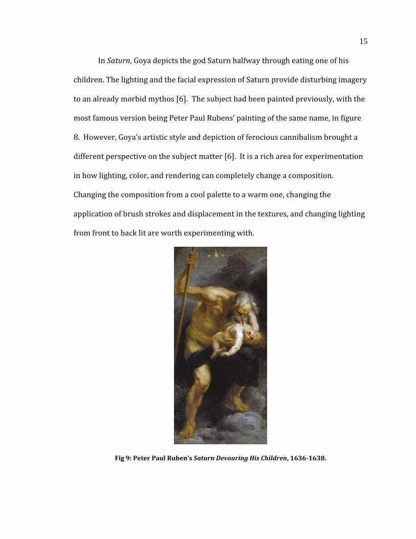
In Saturn, Goya depicts the god Saturn halfway through eating one of his
children. The lighting and the facial expression of Saturn provide disturbing imagery
to an already morbid mythos [6]. The subject had been painted previously, with the
most famous version being Peter Paul Rubens’ painting of the same name, in figure
8. However, Goya’s artistic style and depiction of ferocious cannibalism brought a
different perspective on the subject matter [6]. It is a rich area for experimentation
in how lighting, color, and rendering can completely change a composition.
Changing the composition from a cool palette to a warm one, changing the
application of brush strokes and displacement in the textures, and changing lighting
from front to back lit are worth experimenting with.
Fig 9: Peter Paul Ruben’s Saturn Devouring His Children, 1636-1638.
16
In his later career, Goya suffered from several near-death illnesses. These
close bouts with death left him almost entirely deaf in his 60’s, with failing eyesight
and deteriorating health. His increasing paranoia that he might relapse, as well as
his frustration with losing his senses, inspired him to create what have been named
his “Black Paintings” [6]. With strong contrasts between light and dark, he used a
chiaroscuro technique in a majority of his final paintings. One of the paintings within
that set is Saturn (Fig6). Its disturbing imagery is very unsettling, and would most
likely occupy the horror genre if in motion, with the dark color palette, spindly
figure, and harsh contrast building tension and uneasiness. While my thesis does not
delve into such a morose color palette or extreme lighting, it is certainly worth
exploration within the pipeline I have created.
A theme present in Goya’s, as well as other predominant Romantic artists’
work, is nature as a focus equal to that of the human element [1]. Landscape
painting had been a well-established art, but Romantic painters used landscape to
depict the raw and untamed power of nature [8]. Often violent storms were
depicted or whirling blizzards. Animation of these elemental forces could excel the
effects possible in static 2D images, and surpass Romanticism in the emotional
impact through motion. The grandiose sweeping environment often dwarfed the
human presence. In my thesis, I have applied this common theme to 3D animation.
Coupled with a non-photorealistic rendering style that matches the painterly stroke
and color of Romantic artists, I have constructed a landscape in my development of
narrative that both dwarfs Don Quixote, and initiated effects seen in Romantic
paintings.
17
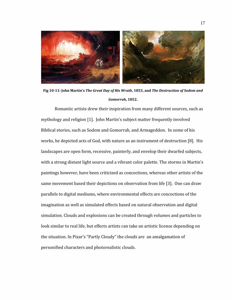
Fig 10-11: John Martin’s The Great Day of His Wrath, 1853, and The Destruction of Sodom and
Gomorrah, 1852.
Romantic artists drew their inspiration from many different sources, such as
mythology and religion [1]. John Martin’s subject matter frequently involved
Biblical stories, such as Sodom and Gomorrah, and Armageddon. In some of his
works, he depicted acts of God, with nature as an instrument of destruction [8]. His
landscapes are open form, recessive, painterly, and envelop their dwarfed subjects,
with a strong distant light source and a vibrant color palette. The storms in Martin’s
paintings however, have been criticized as concoctions, whereas other artists of the
same movement based their depictions on observation from life [3]. One can draw
parallels to digital mediums, where environmental effects are concoctions of the
imagination as well as simulated effects based on natural observation and digital
simulation. Clouds and explosions can be created through volumes and particles to
look similar to real life, but effects artists can take an artistic license depending on
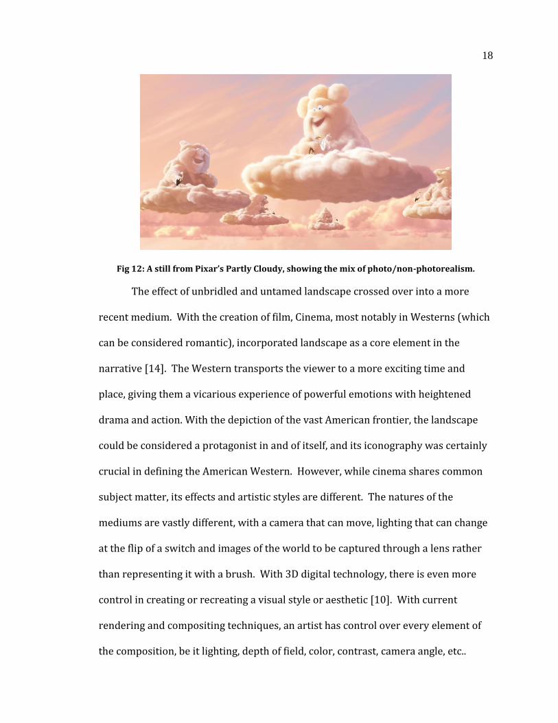
the situation. In Pixar’s “Partly Cloudy” the clouds are an amalgamation of
personified characters and photorealistic clouds.
18
Fig 12: A still from Pixar’s Partly Cloudy, showing the mix of photo/non-photorealism.
The effect of unbridled and untamed landscape crossed over into a more
recent medium. With the creation of film, Cinema, most notably in Westerns (which
can be considered romantic), incorporated landscape as a core element in the
narrative [14]. The Western transports the viewer to a more exciting time and
place, giving them a vicarious experience of powerful emotions with heightened
drama and action. With the depiction of the vast American frontier, the landscape
could be considered a protagonist in and of itself, and its iconography was certainly
crucial in defining the American Western. However, while cinema shares common
subject matter, its effects and artistic styles are different. The natures of the
mediums are vastly different, with a camera that can move, lighting that can change
at the flip of a switch and images of the world to be captured through a lens rather
than representing it with a brush. With 3D digital technology, there is even more
control in creating or recreating a visual style or aesthetic [10]. With current
rendering and compositing techniques, an artist has control over every element of
the composition, be it lighting, depth of field, color, contrast, camera angle, etc..
19
Through this control, an artist can create Romantic art in a time based medium that
could be more emotionally powerful than Romanticism itself. Through the research
done during the creation of my thesis I have found a way to incorporate Romantic
effects to benefit in the final painterly rendering of my animation. The environment
is recessive and open form, there is unclearness in stroke, and I have touched upon
painterly aspects found in Romanticism such as blurred edges and surfaces.
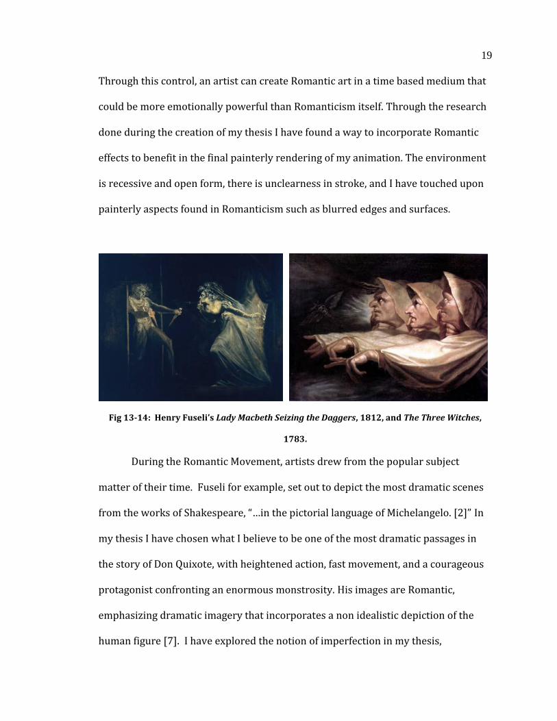
Fig 13-14: Henry Fuseli’s Lady Macbeth Seizing the Daggers, 1812, and The Three Witches,
1783.
During the Romantic Movement, artists drew from the popular subject
matter of their time. Fuseli for example, set out to depict the most dramatic scenes
from the works of Shakespeare, “…in the pictorial language of Michelangelo. [2]” In
my thesis I have chosen what I believe to be one of the most dramatic passages in
the story of Don Quixote, with heightened action, fast movement, and a courageous
protagonist confronting an enormous monstrosity. His images are Romantic,
emphasizing dramatic imagery that incorporates a non idealistic depiction of the
human figure [7]. I have explored the notion of imperfection in my thesis,
20
specifically in the shading and compositing process. To achieve a painterly effect, I
have intentionally omitted fine detail in lieu of vibrant colors and stroke - in the
form of digital representation of a brush rather than tactile paint. Instead of focusing
on line, I am more concerned with silhouette and figure, and how foreground
interacts with background in a series of moving images rather than a still painting.
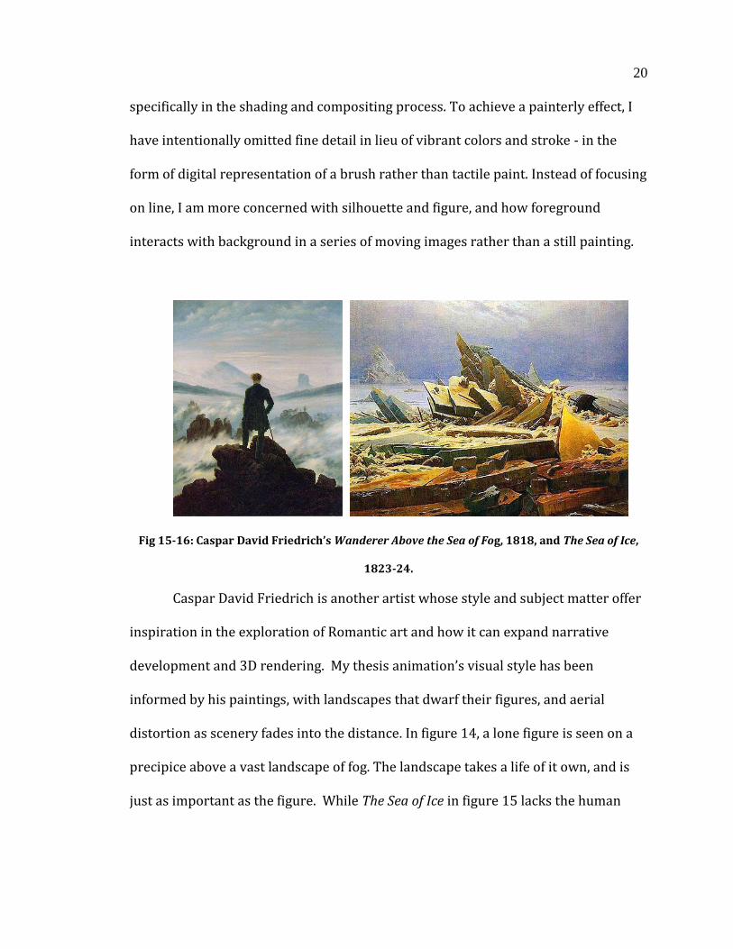
Fig 15-16: Caspar David Friedrich’s Wanderer Above the Sea of Fog, 1818, and The Sea of Ice,
1823-24.
Caspar David Friedrich is another artist whose style and subject matter offer
inspiration in the exploration of Romantic art and how it can expand narrative
development and 3D rendering. My thesis animation’s visual style has been
informed by his paintings, with landscapes that dwarf their figures, and aerial
distortion as scenery fades into the distance. In figure 14, a lone figure is seen on a
precipice above a vast landscape of fog. The landscape takes a life of it own, and is
just as important as the figure. While The Sea of Ice in figure 15 lacks the human
21
element, it does incorporate a hint of melancholy, as a shipwreck is depicted but
obscured by the ice, giving the feeling of desolation.
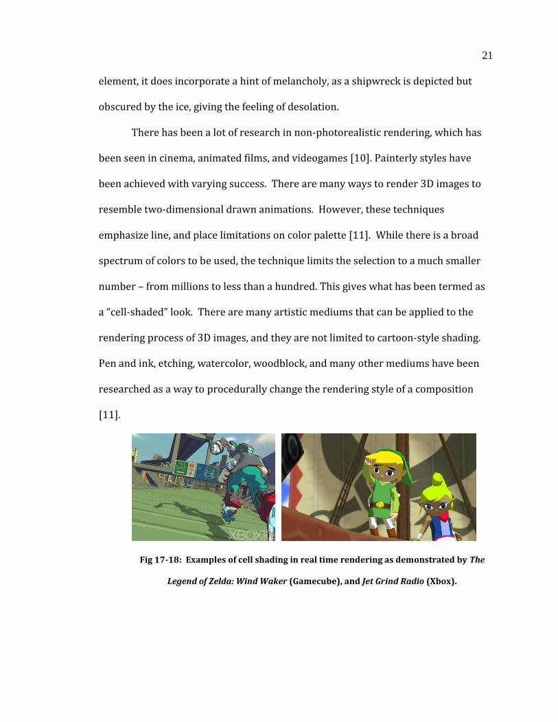
There has been a lot of research in non-photorealistic rendering, which has
been seen in cinema, animated films, and videogames [10]. Painterly styles have
been achieved with varying success. There are many ways to render 3D images to
resemble two-dimensional drawn animations. However, these techniques
emphasize line, and place limitations on color palette [11]. While there is a broad
spectrum of colors to be used, the technique limits the selection to a much smaller
number – from millions to less than a hundred. This gives what has been termed as
a “cell-shaded” look. There are many artistic mediums that can be applied to the
rendering process of 3D images, and they are not limited to cartoon-style shading.
Pen and ink, etching, watercolor, woodblock, and many other mediums have been
researched as a way to procedurally change the rendering style of a composition
[11].
Fig 17-18: Examples of cell shading in real time rendering as demonstrated by The
Legend of Zelda: Wind Waker (Gamecube), and Jet Grind Radio (Xbox).
22
Though there has been a lot of research in the field of non-photorealistic
rendering, the question of "Why?" needs to be asked upon. While the answer
"because we can", or "why not" may be sufficient for some, it is important to look
further and find a more exact answer [10]. In a digital age the limitations of what
can be visualized on a 2D plane are the amount of pixels and the software available.
On the software end, technology is constantly advancing in lighting, fluid, particle,
and cloth simulation, and various aspects of animation and modeling. While we have
come far in the past several decades, aspects of CG that were once only accessible to
professionals will be within reach of enthusiasts and students alike. As technology
advances, the amount of pixels placed within a defined space is increasing [12].
Certain displays, such as the new Retina-Display on the iPhone 4 have shrunk pixel
size to a point that the human eye can no longer detect any higher resolution after a
certain distance [12].
Traditional mediums will always have their place. Each new medium is built
on the shoulders of the previous, but does not replace the old. It incorporates
aspects of other mediums, while creating something entirely unique [5]. With 3D
software maturing as the technology advances, it is becoming easier to incorporate
styles, as well as create entirely new styles of composition [5]. In my thesis I have
effectively incorporated the style and effects of Romanticism. I have built upon the
painterly effects of the movement, as well as the themes present within the artwork,
as they are both interrelated and equally important.
Through my research of Romantic art and its principles, I have studied the
fundamental stylistic patterns of Baroque painting, which are typically present in
23
Romanticism; and how its styles contrast with Classic painting. I have attempted to
apply these effects to my thesis animation in an effort to recreate Romantic painting
in motion, and potentially surpass its emotional impact.
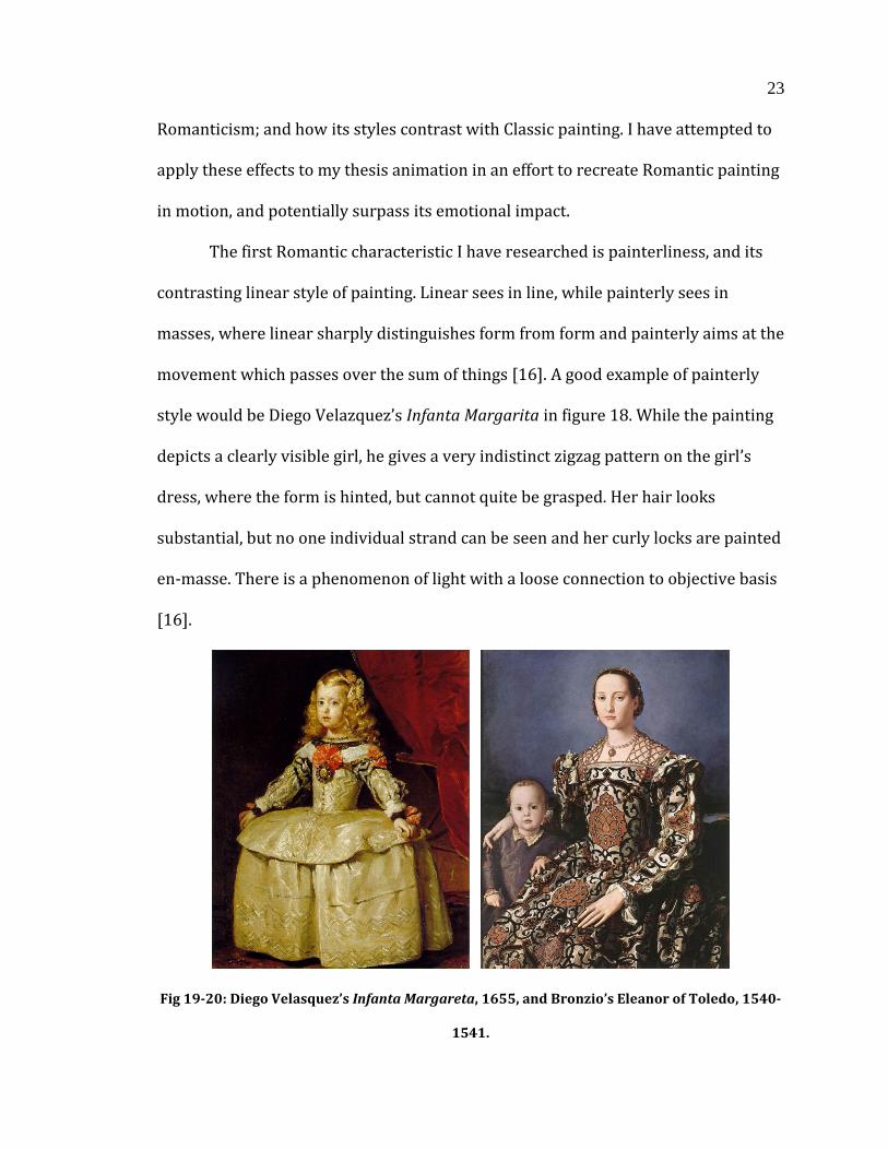
The first Romantic characteristic I have researched is painterliness, and its
contrasting linear style of painting. Linear sees in line, while painterly sees in
masses, where linear sharply distinguishes form from form and painterly aims at the
movement which passes over the sum of things [16]. A good example of painterly
style would be Diego Velazquez’s Infanta Margarita in figure 18. While the painting
depicts a clearly visible girl, he gives a very indistinct zigzag pattern on the girl’s
dress, where the form is hinted, but cannot quite be grasped. Her hair looks
substantial, but no one individual strand can be seen and her curly locks are painted
en-masse. There is a phenomenon of light with a loose connection to objective basis
[16].
Fig 19-20: Diego Velasquez’s Infanta Margareta, 1655, and Bronzio’s Eleanor of Toledo, 1540-
1541.

24
In contrast with this painterly style is Bronzio’s Eleanor of Toledo, which
depicts a woman in a dress, with ornamental patterns intended to be seen for
themselves. It is not just an impression of a whole, but holds it’s own at close range,
with every aspect maintaining a crisp line to encapsulate the form. The color is used
to describe, whereas the painterly coloring of Velazsquez acquires a life detached
from the object, with shining locks and vivid pinkish red hues that describe but also
express.
Franciso Goya’s Yard with Lunatics in figure 20 is an example of painterly
style, with blurred edges and surfaces, and figures that disappear into shadow. His
use of an extreme top light source gives the surface an eerie setting, with people in
the background cast in shadow, giving the scene a sinister feeling. Faces of the
characters are sneering or cowering, but features are represented with minimal
detail.
Fig 21: Francisco Goya’s Yard with Lunatics, 1793-94.
25
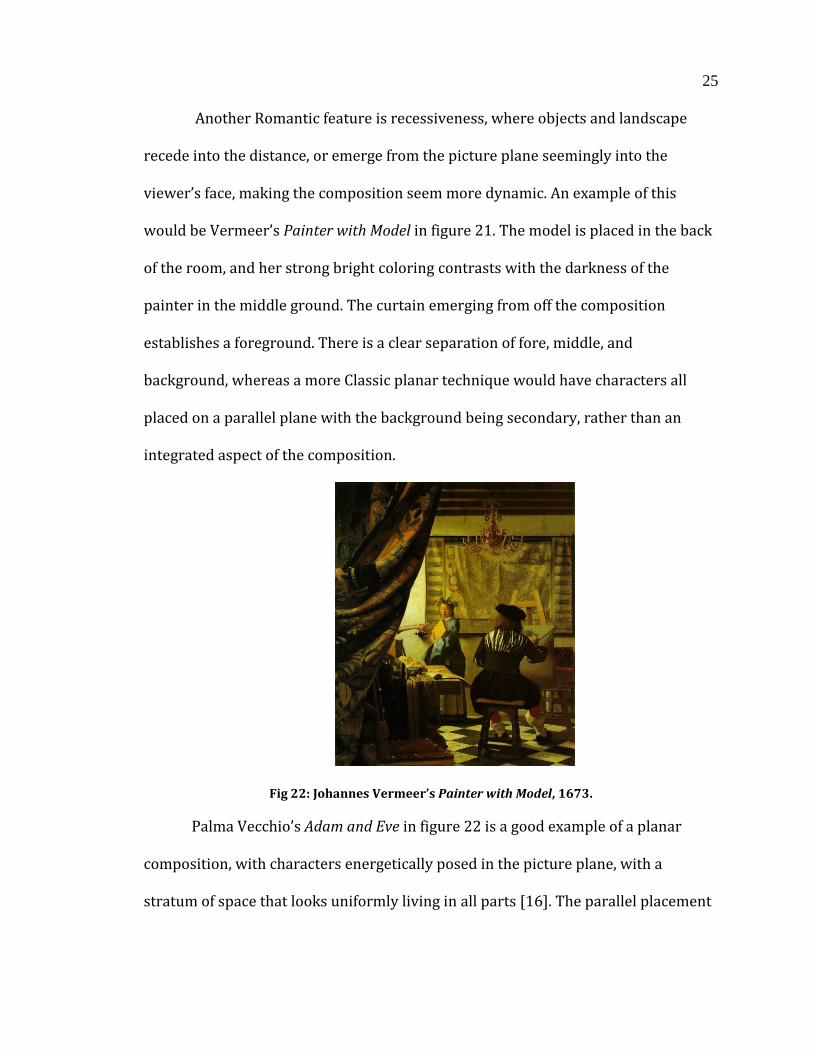
Another Romantic feature is recessiveness, where objects and landscape
recede into the distance, or emerge from the picture plane seemingly into the
viewer’s face, making the composition seem more dynamic. An example of this
would be Vermeer’s Painter with Model in figure 21. The model is placed in the back
of the room, and her strong bright coloring contrasts with the darkness of the
painter in the middle ground. The curtain emerging from off the composition
establishes a foreground. There is a clear separation of fore, middle, and
background, whereas a more Classic planar technique would have characters all
placed on a parallel plane with the background being secondary, rather than an
integrated aspect of the composition.
Fig 22: Johannes Vermeer’s Painter with Model, 1673.
Palma Vecchio’s Adam and Eve in figure 22 is a good example of a planar
composition, with characters energetically posed in the picture plane, with a
stratum of space that looks uniformly living in all parts [16]. The parallel placement
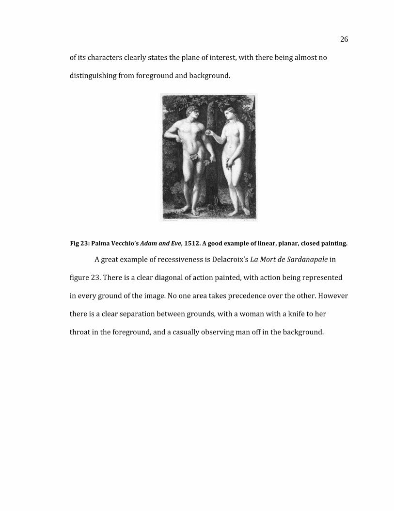
26
of its characters clearly states the plane of interest, with there being almost no
distinguishing from foreground and background.
Fig 23: Palma Vecchio’s Adam and Eve, 1512. A good example of linear, planar, closed painting.
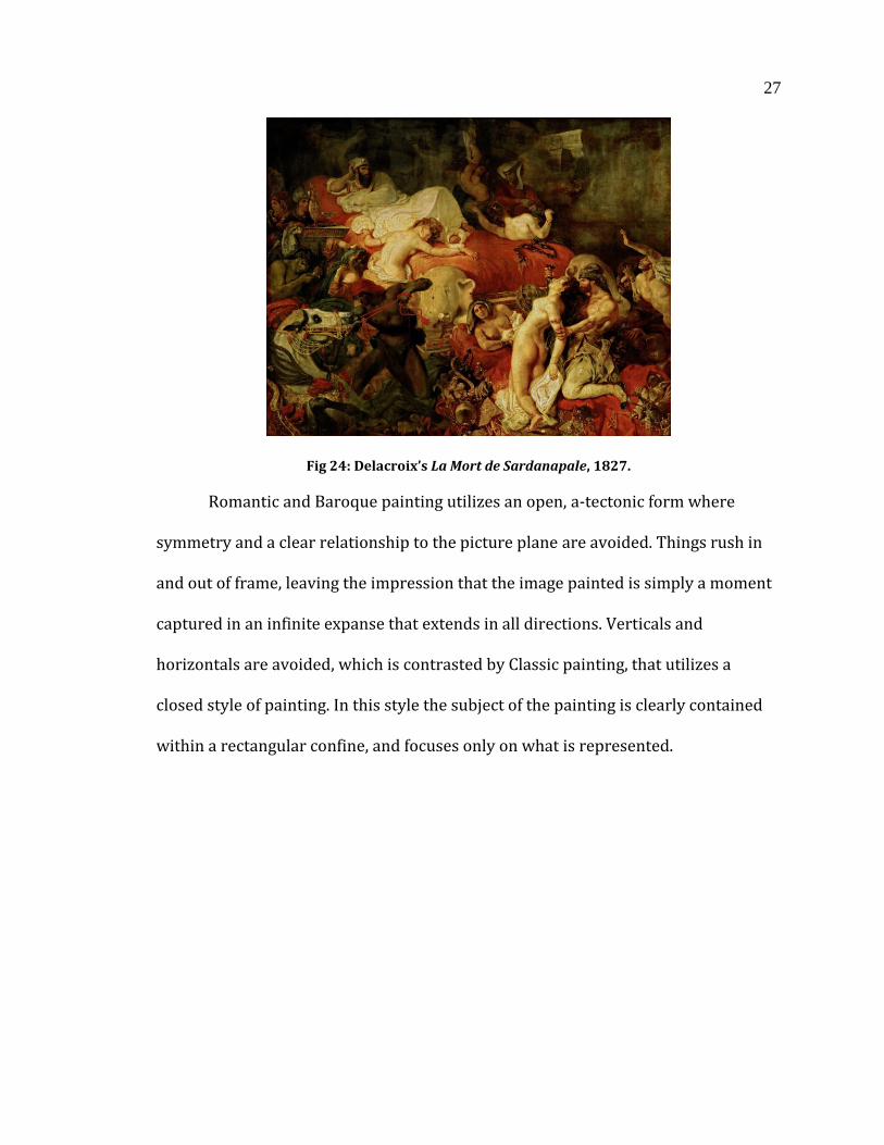
A great example of recessiveness is Delacroix’s La Mort de Sardanapale in
figure 23. There is a clear diagonal of action painted, with action being represented
in every ground of the image. No one area takes precedence over the other. However
there is a clear separation between grounds, with a woman with a knife to her
throat in the foreground, and a casually observing man off in the background.
27
Fig 24: Delacroix’s La Mort de Sardanapale, 1827.
Romantic and Baroque painting utilizes an open, a-tectonic form where
symmetry and a clear relationship to the picture plane are avoided. Things rush in
and out of frame, leaving the impression that the image painted is simply a moment
captured in an infinite expanse that extends in all directions. Verticals and
horizontals are avoided, which is contrasted by Classic painting, that utilizes a
closed style of painting. In this style the subject of the painting is clearly contained
within a rectangular confine, and focuses only on what is represented.
28
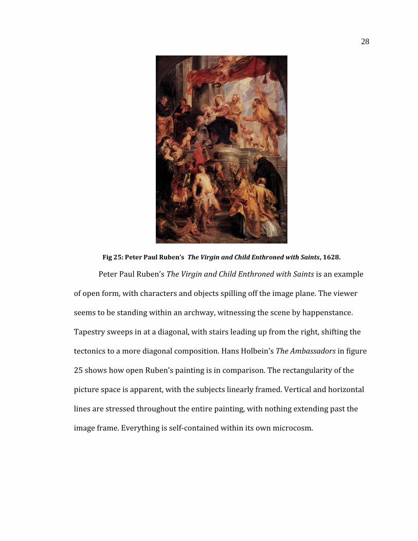
Fig 25: Peter Paul Ruben’s The Virgin and Child Enthroned with Saints, 1628.
Peter Paul Ruben’s The Virgin and Child Enthroned with Saints is an example
of open form, with characters and objects spilling off the image plane. The viewer
seems to be standing within an archway, witnessing the scene by happenstance.
Tapestry sweeps in at a diagonal, with stairs leading up from the right, shifting the
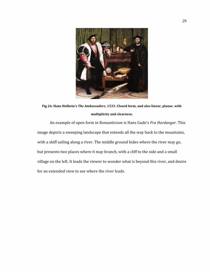
tectonics to a more diagonal composition. Hans Holbein’s The Ambassadors in figure
25 shows how open Ruben’s painting is in comparison. The rectangularity of the
picture space is apparent, with the subjects linearly framed. Vertical and horizontal
lines are stressed throughout the entire painting, with nothing extending past the
image frame. Everything is self-contained within its own microcosm.
29
Fig 26: Hans Holbein’s The Ambassadors, 1533. Closed form, and also linear, planar, with
multiplicity and clearness.
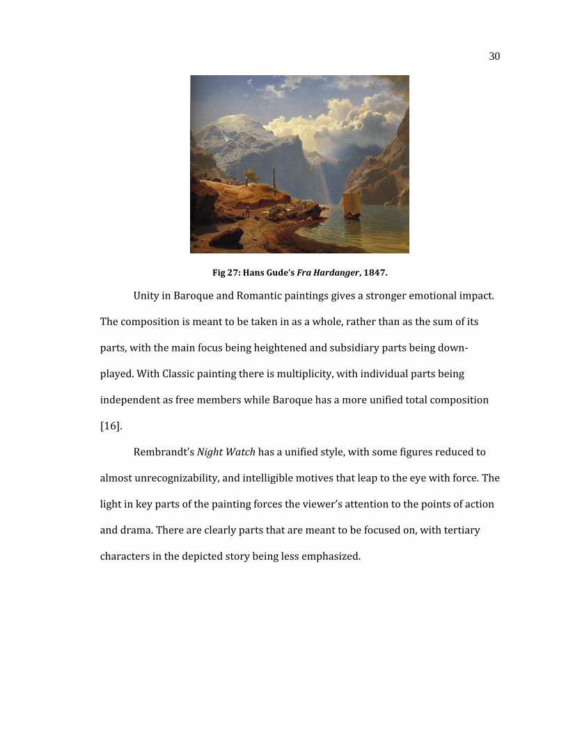
An example of open form in Romanticism is Hans Gude’s Fra Hardanger. This
image depicts a sweeping landscape that extends all the way back to the mountains,
with a skiff sailing along a river. The middle ground hides where the river may go,
but presents two places where it may branch, with a cliff to the side and a small
village on the left. It leads the viewer to wonder what is beyond this river, and desire
for an extended view to see where the river leads.
30
Fig 27: Hans Gude’s Fra Hardanger, 1847.
Unity in Baroque and Romantic paintings gives a stronger emotional impact.
The composition is meant to be taken in as a whole, rather than as the sum of its
parts, with the main focus being heightened and subsidiary parts being down-
played. With Classic painting there is multiplicity, with individual parts being
independent as free members while Baroque has a more unified total composition
[16].
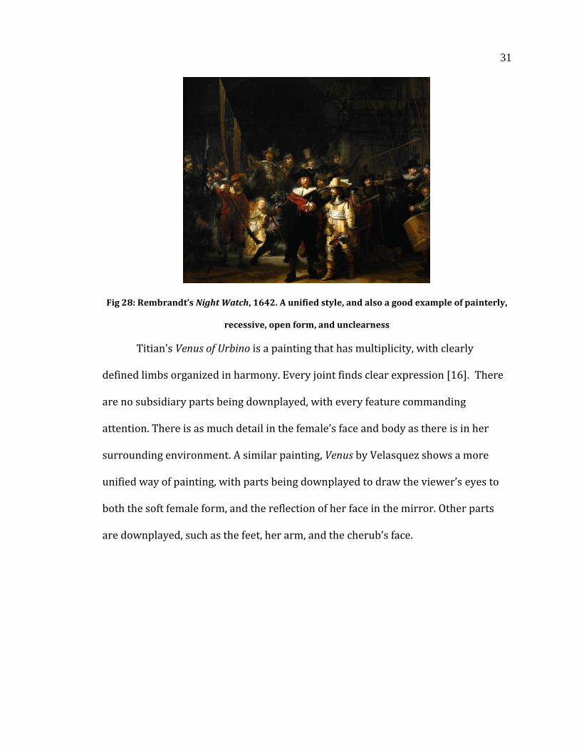
Rembrandt’s Night Watch has a unified style, with some figures reduced to
almost unrecognizability, and intelligible motives that leap to the eye with force. The
light in key parts of the painting forces the viewer’s attention to the points of action
and drama. There are clearly parts that are meant to be focused on, with tertiary
characters in the depicted story being less emphasized.
31
Fig 28: Rembrandt’s Night Watch, 1642. A unified style, and also a good example of painterly,
recessive, open form, and unclearness
Titian’s Venus of Urbino is a painting that has multiplicity, with clearly
defined limbs organized in harmony. Every joint finds clear expression [16]. There
are no subsidiary parts being downplayed, with every feature commanding
attention. There is as much detail in the female’s face and body as there is in her
surrounding environment. A similar painting, Venus by Velasquez shows a more
unified way of painting, with parts being downplayed to draw the viewer’s eyes to
both the soft female form, and the reflection of her face in the mirror. Other parts
are downplayed, such as the feet, her arm, and the cherub’s face.
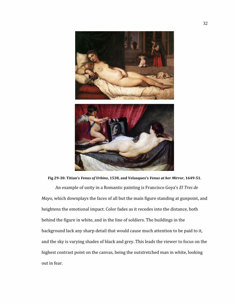
32
Fig 29-30: Titian’s Venus of Urbino, 1538, and Velasquez’s Venus at her Mirror, 1649-51.
An example of unity in a Romantic painting is Francisco Goya’s El Tres de
Mayo, which downplays the faces of all but the main figure standing at gunpoint, and
heightens the emotional impact. Color fades as it recedes into the distance, both
behind the figure in white, and in the line of soldiers. The buildings in the
background lack any sharp detail that would cause much attention to be paid to it,
and the sky is varying shades of black and grey. This leads the viewer to focus on the
highest contrast point on the canvas, being the outstretched man in white, looking
out in fear.
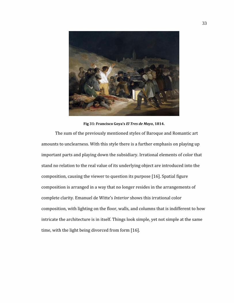
33
Fig 31: Francisco Goya’s El Tres de Mayo, 1814.
The sum of the previously mentioned styles of Baroque and Romantic art
amounts to unclearness. With this style there is a further emphasis on playing up
important parts and playing down the subsidiary. Irrational elements of color that
stand no relation to the real value of its underlying object are introduced into the
composition, causing the viewer to question its purpose [16]. Spatial figure
composition is arranged in a way that no longer resides in the arrangements of
complete clarity. Emanuel de Witte’s Interior shows this irrational color
composition, with lighting on the floor, walls, and columns that is indifferent to how
intricate the architecture is in itself. Things look simple, yet not simple at the same
time, with the light being divorced from form [16].
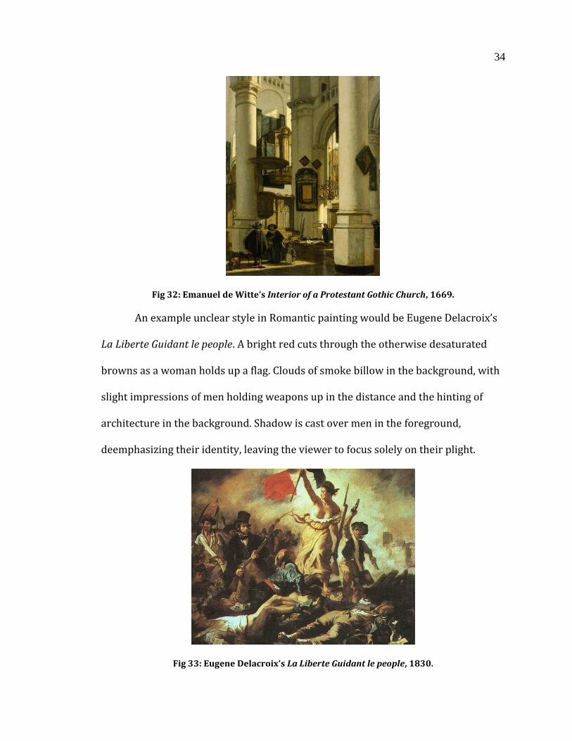
34
Fig 32: Emanuel de Witte’s Interior of a Protestant Gothic Church, 1669.
An example unclear style in Romantic painting would be Eugene Delacroix’s
La Liberte Guidant le people. A bright red cuts through the otherwise desaturated
browns as a woman holds up a flag. Clouds of smoke billow in the background, with
slight impressions of men holding weapons up in the distance and the hinting of
architecture in the background. Shadow is cast over men in the foreground,
deemphasizing their identity, leaving the viewer to focus solely on their plight.
Fig 33: Eugene Delacroix’s La Liberte Guidant le people, 1830.

35
The Baroque and Romantic features I have described, painterliness,
recessiveness, open form, unity, and unclearness, all use various effects to evoke the
intended emotions within the viewer. These feelings include being transported to a
more exciting time or place and having a vicarious experience. Mediums outside of
painting, such as photography, film, and animation have used these effects to
varying degrees. Movies such as James Cameron’s Avatar share common themes,
such as wild untamed nature, and a setting that transports the viewer to a novel and
exciting place. Avatar is not a Romantic painting, but its subject matter and visual
style could be considered Romantic. Due to the nature of the film it does not employ
Romantic effects in the same way I have in my thesis, but there is a lot that can be
learned from other mediums and how Romantic effects can strengthen its emotional
impact.
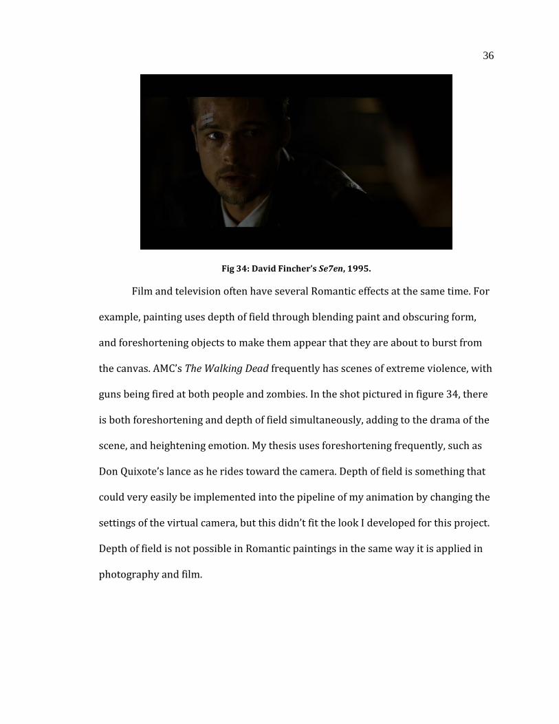
Though film captures images from life, and does not use paint, it can still
have painterly effects. It can create painterly effects by making edges of objects
disappear into shadow and creating aerial perspective. Lighting is an important
aspect, and depends on the theme and style of the movie. An example of how
lighting could be considered painterly would be in David Fincher’s Se7en. In the shot
seen in figure 33, Brad Pitt’s jacket has a small amount of rim lighting, but otherwise
disappears into shadow, merging both fore and background. Due to the fact that it is
time-based media, not every shot can have this look, but it doesn’t have to. My thesis
has explored different ways of lighting a scene, which could create a stronger
contrast that obscures edges of its objects. It would potentially require a change of
color palette, but would not be difficult to implement.
36
Fig 34: David Fincher’s Se7en, 1995.
Film and television often have several Romantic effects at the same time. For
example, painting uses depth of field through blending paint and obscuring form,
and foreshortening objects to make them appear that they are about to burst from
the canvas. AMC’s The Walking Dead frequently has scenes of extreme violence, with
guns being fired at both people and zombies. In the shot pictured in figure 34, there
is both foreshortening and depth of field simultaneously, adding to the drama of the
scene, and heightening emotion. My thesis uses foreshortening frequently, such as
Don Quixote’s lance as he rides toward the camera. Depth of field is something that
could very easily be implemented into the pipeline of my animation by changing the
settings of the virtual camera, but this didn’t fit the look I developed for this project.
Depth of field is not possible in Romantic paintings in the same way it is applied in
photography and film.
37
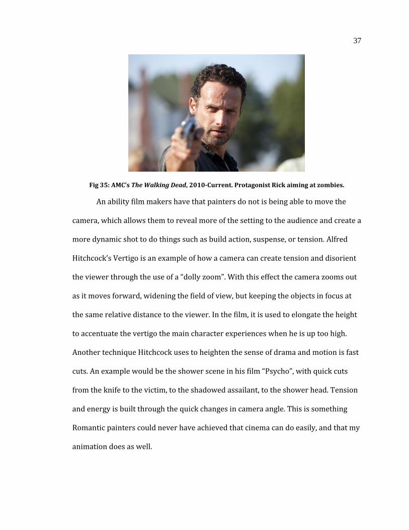
Fig 35: AMC’s The Walking Dead, 2010-Current. Protagonist Rick aiming at zombies.
An ability film makers have that painters do not is being able to move the
camera, which allows them to reveal more of the setting to the audience and create a
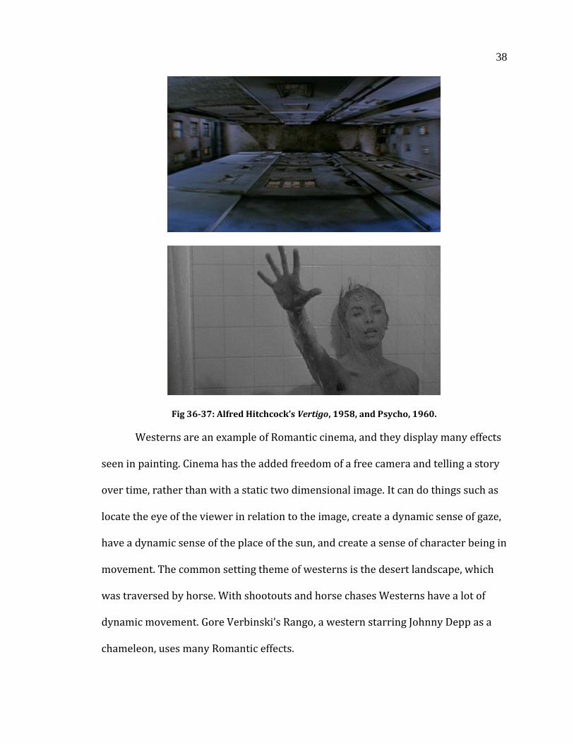
more dynamic shot to do things such as build action, suspense, or tension. Alfred
Hitchcock’s Vertigo is an example of how a camera can create tension and disorient
the viewer through the use of a “dolly zoom”. With this effect the camera zooms out
as it moves forward, widening the field of view, but keeping the objects in focus at
the same relative distance to the viewer. In the film, it is used to elongate the height
to accentuate the vertigo the main character experiences when he is up too high.
Another technique Hitchcock uses to heighten the sense of drama and motion is fast
cuts. An example would be the shower scene in his film “Psycho”, with quick cuts
from the knife to the victim, to the shadowed assailant, to the shower head. Tension
and energy is built through the quick changes in camera angle. This is something
Romantic painters could never have achieved that cinema can do easily, and that my
animation does as well.
38
Fig 36-37: Alfred Hitchcock’s Vertigo, 1958, and Psycho, 1960.
Westerns are an example of Romantic cinema, and they display many effects
seen in painting. Cinema has the added freedom of a free camera and telling a story
over time, rather than with a static two dimensional image. It can do things such as
locate the eye of the viewer in relation to the image, create a dynamic sense of gaze,
have a dynamic sense of the place of the sun, and create a sense of character being in
movement. The common setting theme of westerns is the desert landscape, which
was traversed by horse. With shootouts and horse chases Westerns have a lot of
dynamic movement. Gore Verbinski’s Rango, a western starring Johnny Depp as a
chameleon, uses many Romantic effects.
39
Fig 38: Gore Verbinski’s Rango, 2011. A Romantic landscape that is a character in and of itself.
During the third act of the film characters have a shootout, with the camera
shifting, directing the sense of gaze of each character as they assess the situation
and attempt to draw. While the film is photorealistic, its effects and scenery are
Romantic. The desert is open and exposed, with characters constantly aware of the
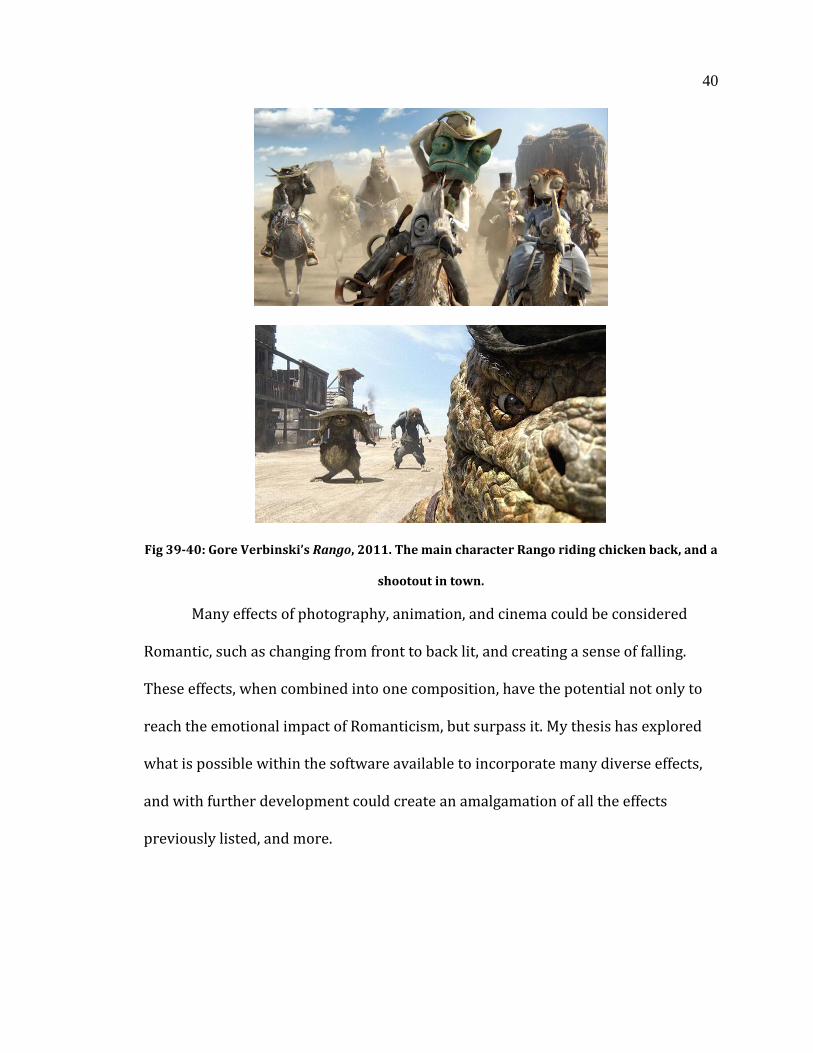
position of the sun and the heat it radiates. In the second act there is a great sense of
movement as characters ride chicken-back through a valley, dodging bat-riders
throwing dynamite. The camera shakes as it follows along, mimicking how a camera
would move in real life, but also giving the scene a visceral feeling and a sense of
suspense, and excitement. I do the same with my thesis, having the camera follow
along with Don Quixote as he gallops toward the windmill giant on the Spanish
hillside. This puts the viewers into the action, so that they feel like they are riding
with him, rather than just observing him.
40
Fig 39-40: Gore Verbinski’s Rango, 2011. The main character Rango riding chicken back, and a
shootout in town.
Many effects of photography, animation, and cinema could be considered
Romantic, such as changing from front to back lit, and creating a sense of falling.
These effects, when combined into one composition, have the potential not only to
reach the emotional impact of Romanticism, but surpass it. My thesis has explored
what is possible within the software available to incorporate many diverse effects,
and with further development could create an amalgamation of all the effects
previously listed, and more.
41
3. PROCEDURE
Through research in multiple three dimensional and two dimensional
software packages I have developed a non-photorealistic rendering scheme using a
custom pipeline utilizing a combination of techniques to create the desired final look
of the animation.
3.1 LAYERED TEXTURES
Layered textures are used to have complete control of color palette and limit
the amount of time spent lighting the scene and balancing colors in post-production.
The shader created for this thesis is similar to a constant or “toon” shader, where
the surface is visible when rendered regardless of illumination from a light source.
No light source could be present at all, and it would still display the surface color it
was assigned. Though no light source needs to be present, surface illumination
drives the blending of colors. Illumination is the amount of light rays hitting the
surface at a given time. The textures of the shader blend from highest to lowest
illumination, with the way the colors blend being dependent on the shader.
42
Fig 41: Different blending methods in the same shader.
Depending on the functions within the code, there can be a smooth blending
of colors or a sharp transition with little to no gradation. A sharp transition is
generally referred to as a toon or cell shader due to its resemblance to hand
animated cartoons. However a toon shader generally blends along predefined colors
rather than textures which saves unnecessary computation by taking up less
memory. The shader I have created for this thesis uses textures in order to
reproduce brush strokes present in traditional romantic paintings, and would not
benefit from predefined colors or code that might mimic the blending of brush
strokes. While research has been done to recreate painterly rendering using solely
shading techniques, my method is focused on the combination of textures being
called by the shader.
43
Fig 42: Blending textures and displacement.
A challenge this thesis has addressed is the blending between texture layers
along the surface illumination. With traditional blending across colors or textures,
the transition is either smooth or sharp. While there are methods of varying the way
in which the edges of each illumination layer blend, none are accurate enough to
maintain the look of the brush strokes my shader is emulating. With a smooth blend
the textures of each color layer is blended in a radial pattern, being cast by the light
source that is not consistent with how a painter would apply their colors. With a
sharp transition it emulates a toon shader, which is also contrary to how a
traditional painter would apply colors in their composition. In order to blend color
layers in a way that brush strokes from one color layer would intermix with strokes
of a different layer I rely upon displacement. Rather than having a separate
displacement shader written, my shader displaces surface points using a
44
displacement map stored in the alpha channel. This consolidates code within the
shader and makes it easier to keep track of textures and functions.
Fig 43: A diagram explaining how the REYES algorithm displaces geometry.
The shader I have written is in RenderMan Shading Language (RSL), which
renders using Pixar’s RenderMan rendering engine. A very strong point of the
render engine is that it renders displacement extremely fast and with very little cost.
Using their proprietary REYES algorithm, geometry is diced into small sections and
analyzed to see what will and will not be seen by the camera. Whatever is unseen is
completely disregarded. Things that are half seen and half unseen are diced into
smaller sections and re-evaluated. Because of the efficiency in which RenderMan
renders displacement, render time differences between displacement mapping and
bump mapping is negligible.
While bump mapping is cheaper and has slightly faster render time, it only
creates the illusion of surface displacement by changing the way light reacts to the
surface. Once the viewing angle approaches being parallel with the surface the effect
breaks down, and it becomes apparent that the surface is unchanged. Any part of the
surface that is supposed to have displaced brush strokes, but its normals are facing
perpendicular to the camera will not have displacement, and be perfectly smooth.
45
With displacement being extremely efficient in RenderMan, I can have point
displacement on the surface that allows the edges of the objects to have brush
strokes. At further distances it is hard to discern whether there is displacement on
the edges, but in closer shots it is very apparent, and still almost as cheap as bump
mapping.
Fig 44: Illustrated diagram of textures blending along illumination.
What is unique about my shader is that it calls upon illumination to displace
the surface. It is important for each layer to have not only a different color palette,
but a different brush texture as well. The final rendered image follows the idea that
a traditional painter would have different brush strokes for each painting that they
46
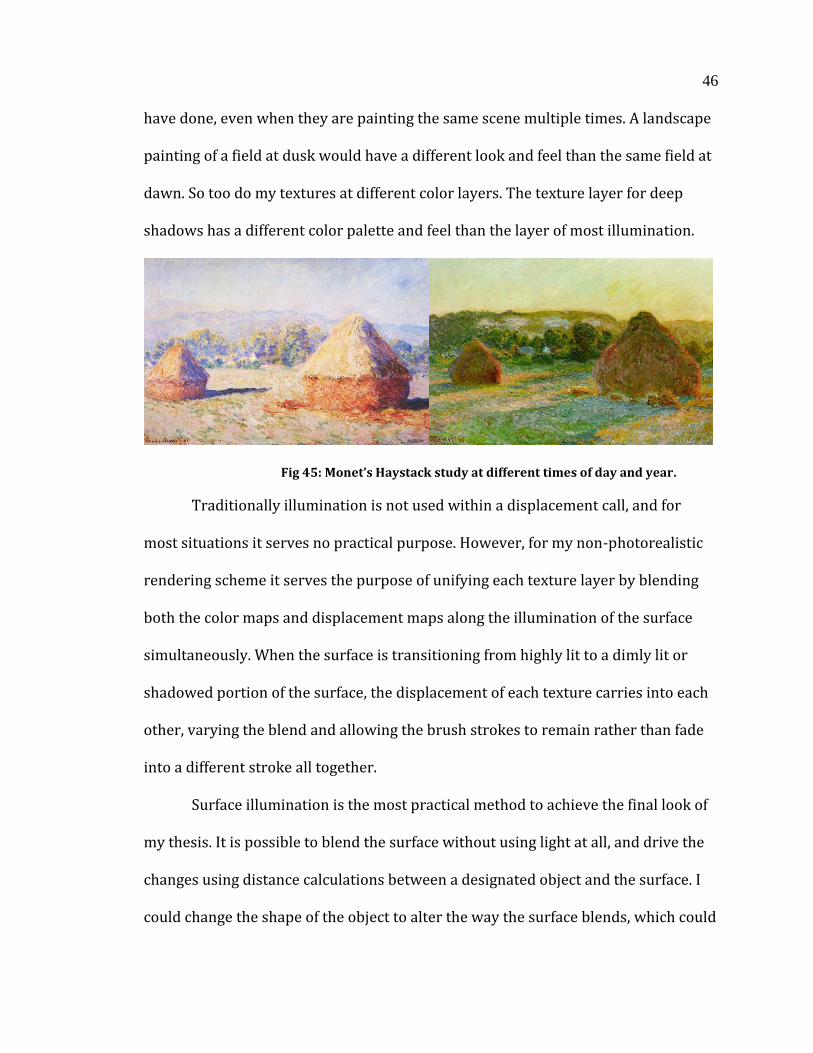
have done, even when they are painting the same scene multiple times. A landscape
painting of a field at dusk would have a different look and feel than the same field at
dawn. So too do my textures at different color layers. The texture layer for deep
shadows has a different color palette and feel than the layer of most illumination.
Fig 45: Monet’s Haystack study at different times of day and year.
Traditionally illumination is not used within a displacement call, and for
most situations it serves no practical purpose. However, for my non-photorealistic
rendering scheme it serves the purpose of unifying each texture layer by blending
both the color maps and displacement maps along the illumination of the surface
simultaneously. When the surface is transitioning from highly lit to a dimly lit or
shadowed portion of the surface, the displacement of each texture carries into each
other, varying the blend and allowing the brush strokes to remain rather than fade
into a different stroke all together.
Surface illumination is the most practical method to achieve the final look of
my thesis. It is possible to blend the surface without using light at all, and drive the
changes using distance calculations between a designated object and the surface. I
could change the shape of the object to alter the way the surface blends, which could
47
potentially yield some interesting results. However, its functionality would basically
equal that of a light, and take added effort to set up in a scene. It would also lack the
ability to cast shadows as it is not emitting rays, which is essential to the look of my
animation.
Another challenge my thesis has addressed is the issue of keeping the color
map of the surface consistent with the displacement map. The painterly look relies
on textures that resemble traditional brush strokes, but in order for them to blend
across multiple layers convincingly they strokes must also each have their own
displacement value. To go into a color map and individually generate a displacement
map would be far too time consuming, and would be difficult to yield the desired
results. With the use of Pixologic’s ZBrush software, I have found a way to generate
a color and displacement map at the same time, with very minimal editing required
after the initial map is created.
3.2 ZBRUSH
ZBrush is a pseudo-three dimensional sculpting program that has
functionality past its originally intended purpose. Within the program you can
sculpt, texture, pose, project, retopologize, UV, and more - with the added ability to
communicate in parallel with other software packages in the situation where
ZBrush is not the superior choice in your pipeline. For this thesis I have used it for a
majority of my pipeline, with hard surface modeling, projection painting, edge
effects and rigging being the only exception.
48
Fig 46: Don Quixote’s horse Rosinante sculpted in ZBrush.
The ZBrush software offers a unique way to model characters and objects
with the inclusion of ZSpheres. Rather than creating orthographic drawings and
modeling within software such as Maya and Modo, spheres can be used to create the
basic shape of your object. After a ZSphere is placed in 3D space, there are several
options given. Another ZSphere can be grown off the surface of the original, which
can then be dragged in any direction. The sphere can be scaled to any size, and when
it is translated it creates geometry in between the two. Multiple spheres can be
grown from any other sphere, and reposition them in order to create the basic shape
of your model. When the final look is created, you can convert the spheres into a 3D
mesh. While the mesh itself leaves much to be desired in regards to poly-flow, it can
be repurposed into something that can be used and deformed properly in an
animation.
49
Fig 47: ZSpheres in its several phases in a work flow.
ZBrush allows for retopolization of a 3D mesh, as well as texture painting.
For my pipeline I used the RGB paint function to paint my desired poly-flow, and
then retopologized the surface in the same program that I created the initial mesh.
While the process may be more time consuming for some, those who are more
comfortable with traditional sculpting may find a greater degree of control without
the need to spend added time on perfecting orthographic guides. It also has the
added benefit of consolidating different stages of the pipeline into one software
package.
50
Fig 48: Horse sculpt being retopologized.
After the 3D mesh is created in ZBrush, it can have a UV map applied to it
using a downloadable plug-in called UV Master. With this comes the ability to paint
influence maps that the program will then use to create the desired seams for the
mesh to unravel at. While the user doesn’t have as direct control of seam creation as
they would in other software, the process is much faster, and the results are
generally as favorable as the output of software made solely for UV mapping. With
built in functionality for placing resolution priority and seam avoidance, it is a much
more visual process that cuts the out edge selecting and seam sewing that is more
commonly used and far more time consuming.
51
Fig 49: Painting colors to attract and avoid seams in UV Master.
With the mesh retopologized and UV mapped comes the ability to sculpt
displacement onto the mesh, and in the pipeline of this thesis paint a color map at
the same time. ZBrush offers an assortment of brushes to sculpt with, as well as
alpha maps that can be projected onto the surface for more exact displacement. One
brush in particular, the rake brush, resembles the strokes of a traditional paint
brush. With both displacement and RGB painting turned on, it creates an effect
similar to real paint being applied to a canvas – the viscosity resembling an impasto
painterly style. While the effect is not immediately present within the render using
the custom shader, it assists in the blending between texture layers as the
illumination varies on the surface of the mesh.

52
Fig 50: The rake brush, which simulates brush strokes and adds displacement
simultaneously.
While the rake brush is close to the look of a real-life brush, it has its
limitations. In order to add to the detail of the brush strokes I used another
downloadable plug-in called ZApp-link. With this add-on ZBrush exports images
from the view-port to an illustration program of your choosing. For the pipeline in
my thesis I chose to use Adobe Photoshop, which has a large assortment of
customizable brushes. These brushes are capable of emulating the bristle thickness,
pressure, and color blending of traditional brushes. Corel Painter is another
illustration program that has far more brush options and customization than
Photoshop. It also has an array of paint mediums that it emulates, such as acrylic, oil,
watercolor, air brush, and various iterations of each. However, due to my lack of
familiarity with the program I chose Photoshop, which has given me desirable
results.
Once the images are imported into Photoshop, paint strokes can be applied
onto the images which will then be exported back into ZBrush and projected onto
53
the surface. Due to the nature of projection, it is important to have multiple viewing
angles painted to eliminate texture warping and to apply detail in spots that other
views may not have been able to see. For the purpose of my thesis, I chose to have a
front, back, left, right, and top angle to make sure every possible view was painted,
but fewer can be done depending how a shot is framed. The combination of brush
strokes painted in Photoshop on top of the paint strokes and displacement in
ZBrush lead to a convincing painterly effect.
In order to get a desired blend of textures and displacement along the surface
illumination, it is important to have multiple textures to blend. For my thesis I chose
to have four different color levels - high, mid, low, and lowest. High textures appear
on the surface with the highest amount of illumination, and lowest appears when
there is very low to no illumination at all. It is possible to have fewer textures to
blend, but from my experience three textures is too few, and does not blend
convincingly along the surface in regard to the light source. Greater than four seems
to be redundant, with some levels of light never being seen, leaving the texture
unused.
After the array of color and displacement maps are finalized in ZBrush, the
object is exported as a Maya ASCII file (.ma). The newly created .ma file includes the
geometry of the object, as well as a TIFF file for the color and displacement map. For
this thesis I would open the two TIFF files in Photoshop to do various manipulations
of color balance and contrast levels, and then consolidate the displacement map into
the alpha channel of the color map. In order for custom RSL shaders to read in the
texture files, the TIFF file must be converted to RenderMan’s custom TEX file type
54
using RenderMan Studio’s txmake function. This file type is optimized for fast
texture lookups, is memory efficient, and therefore is the only file type that will be
recognized by RenderMan.
Having a highest and lowest color palette defined is extremely important in
maintaining a painterly look to the animation. With traditional scene lighting the
color palette is dependent on things such as surface color, color of light being cast,
shadows being cast, and color bleeding/global illumination. An object has a
predefined color within its texture, but that color can change depending on the light
source. If the scene is at dawn for example, there might be an orange light cast,
mixing with the surface color of the object. In the absence of light, shadows would
be cast, which adds shades of black to the color palette. If global illumination is
applied, then bounce light from other objects in the scene also add to the color of the
scene. When you consider adding other bounce and rim light, the color palette
becomes very difficult to control. Using my custom shader I have complete control
over the palette of my scene, and do not have to worry about shadow color adding
blacks and greys to the scene. Only the colors that I want to be present in my
predefined palette will appear, similar to that of a traditional painting.
55
3.3 CAMERA PROJECTION
My thesis has explored methods to improve the painterly look of the
environment as well as the characters, as they are both equally important for the
composition. Initially I had tried to apply the same shader to the environment as I
had the characters, and painted color and displacement onto the environment.
However, in order to maintain the resolution of the paint strokes the texture file had
to be an extremely large resolution. The texture image size reached 6k causing
render times to suffer, and having multiple textures complete with displacement
was wasteful. Since the environment is stationary the only time the light varies is
with shadows and would only require two textures to layer. Even at 6k resolution,
the texture still looked blurry and lost much of the detail that had been painted in
ZBrush. Also, when viewed at an angle, the strokes of the brush would lose their
shape, and distort in a way that wouldn’t be found in a physical painting. When parts
of the environment would be observed in the distance, it would appear to have
much smaller brush strokes than the foreground which also broke the illusion of a
painting. While an artist has an array of brushes of varying sizes, there is a limit to
the size of a stroke a painter can paint. With one giant painted texture for the
environment, brush strokes would be distorted to something far smaller and
detailed than a real painting could achieve.
My thesis deals with this solution by using camera projection. The camera for
the scene is pre-defined and an image from that shot is rendered and exported to an
illustration program. For this thesis I used both Photoshop and Corel Painter to
56
produce the painterly style I desired, drawing inspiration from Romantic era
painters such as Caspar David Friedrich, Francisco Goya, and William Turner. After
the painting is complete, the image is then projected onto the textureless geometry
in the scene. Similar to how a camera projects a film onto a wall, the environment
geometry takes on the surface color of the image being projected onto it. However,
an issue arises with projection in that the camera, while capable of moving, has a
limited range before the effect breaks down. If the camera moves at too sharp an
angle, the viewer will see where the projection begins to stretch, and might be able
to see the opposite side where no projection is hitting at all. With there being
multiple shots with a moving camera in my animation, I have found a solution to
combat the problem.
In Side Effect’s Houdini there is a method of layering projections by assigning
different projections to separate UV space. Using this method I can project another
image on top of the geometry to blend with the bottom projection. The combination
of the two assures that even if the camera moves in a way that reveals self-occluded
geometry, another projection will be cast to keep the painting continuous. For
example, one shot has a moving camera that rises up to the point that the viewer can
see the image stretch along the entire geometry plane.
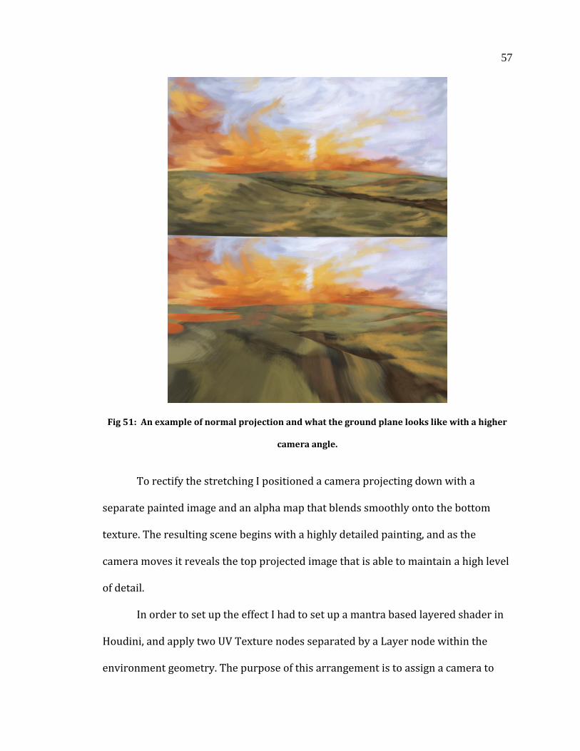
57
Fig 51: An example of normal projection and what the ground plane looks like with a higher
camera angle.
To rectify the stretching I positioned a camera projecting down with a
separate painted image and an alpha map that blends smoothly onto the bottom
texture. The resulting scene begins with a highly detailed painting, and as the
camera moves it reveals the top projected image that is able to maintain a high level
of detail.
In order to set up the effect I had to set up a mantra based layered shader in
Houdini, and apply two UV Texture nodes separated by a Layer node within the
environment geometry. The purpose of this arrangement is to assign a camera to
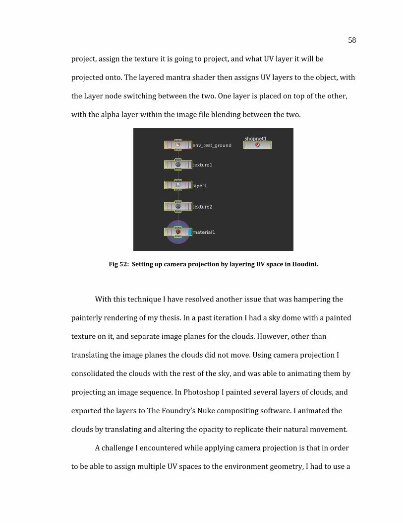
58
project, assign the texture it is going to project, and what UV layer it will be
projected onto. The layered mantra shader then assigns UV layers to the object, with
the Layer node switching between the two. One layer is placed on top of the other,
with the alpha layer within the image file blending between the two.
Fig 52: Setting up camera projection by layering UV space in Houdini.
With this technique I have resolved another issue that was hampering the
painterly rendering of my thesis. In a past iteration I had a sky dome with a painted
texture on it, and separate image planes for the clouds. However, other than
translating the image planes the clouds did not move. Using camera projection I
consolidated the clouds with the rest of the sky, and was able to animating them by
projecting an image sequence. In Photoshop I painted several layers of clouds, and
exported the layers to The Foundry’s Nuke compositing software. I animated the
clouds by translating and altering the opacity to replicate their natural movement.
A challenge I encountered while applying camera projection is that in order
to be able to assign multiple UV spaces to the environment geometry, I had to use a
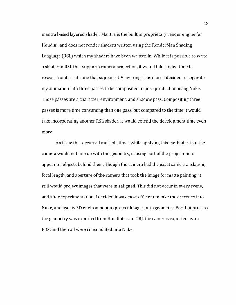
59
mantra based layered shader. Mantra is the built in proprietary render engine for
Houdini, and does not render shaders written using the RenderMan Shading
Language (RSL) which my shaders have been written in. While it is possible to write
a shader in RSL that supports camera projection, it would take added time to
research and create one that supports UV layering. Therefore I decided to separate
my animation into three passes to be composited in post-production using Nuke.
Those passes are a character, environment, and shadow pass. Compositing three
passes is more time consuming than one pass, but compared to the time it would
take incorporating another RSL shader, it would extend the development time even
more.
An issue that occurred multiple times while applying this method is that the
camera would not line up with the geometry, causing part of the projection to
appear on objects behind them. Though the camera had the exact same translation,
focal length, and aperture of the camera that took the image for matte painting, it
still would project images that were misaligned. This did not occur in every scene,
and after experimentation, I decided it was most efficient to take those scenes into
Nuke, and use its 3D environment to project images onto geometry. For that process
the geometry was exported from Houdini as an OBJ, the cameras exported as an
FBX, and then all were consolidated into Nuke.
60
Fig 53: An example of the Nuke camera projection workflow.
There are various methods that can be used to project images in Nuke, and
for my thesis I found it most convenient to use the UVproject, as opposed to
Project3D. The difference is that with UVproject, if the geometry is translated the
camera translates with it, to maintain the image position on the exact spot it was
intended to be. With Project3D, the projection image is stationary, regardless of
whether the geometry moves or not. It is also possible to merge projected images
using the MergeMat node. After the environment was rendered out of Nuke, a
character and shadow pass was then comped together in a separate Nuke script.
With this method the misaligned image projection was rectified.

61
3.4 MULTIPLE ARRAYS OF TEXTURES
This thesis has addressed an issue that could have potentially required an
extra layer of compositing, and further strengthens the painterly look I have
developed. A problem had arisen with maintaining the look at greater viewing
distances from the camera and characters in the scene. When the camera was up
close, the viewer could see a level of detail with a certain size of brush strokes of the
characters. However, when the camera moved further away, that same level of detail
was maintained on the character. The problem with this is subtle but profound. If it
were indeed a painting, and not a 3D render, the artist is only capable of reaching a
certain level of detail. In my animation, brush strokes would maintain their size
regardless of the distance from the camera, reaching a size that wouldn’t be capable
in the physical world.
As the shader initially worked, illumination along the surface of the object
would call on an array of four textures that contained a color and displacement map
in one TEX file. Several lights would be set up in the scene to represent the main
light source and a bounce light from the ground plane, and this would determine the
way textures were blended on the surface. A majority of the shots held up, as the
camera was close enough to the characters that they held believable brush stroke
sizes in the textures. However, in the shots that were far away it broke down. In
order to rectify this, I added another array of four textures to be blended for a total
of eight textures.
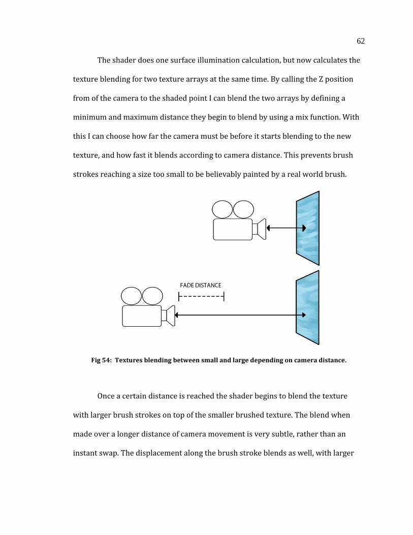
62
The shader does one surface illumination calculation, but now calculates the
texture blending for two texture arrays at the same time. By calling the Z position
from of the camera to the shaded point I can blend the two arrays by defining a
minimum and maximum distance they begin to blend by using a mix function. With
this I can choose how far the camera must be before it starts blending to the new
texture, and how fast it blends according to camera distance. This prevents brush
strokes reaching a size too small to be believably painted by a real world brush.
Fig 54: Textures blending between small and large depending on camera distance.
Once a certain distance is reached the shader begins to blend the texture
with larger brush strokes on top of the smaller brushed texture. The blend when
made over a longer distance of camera movement is very subtle, rather than an
instant swap. The displacement along the brush stroke blends as well, with larger
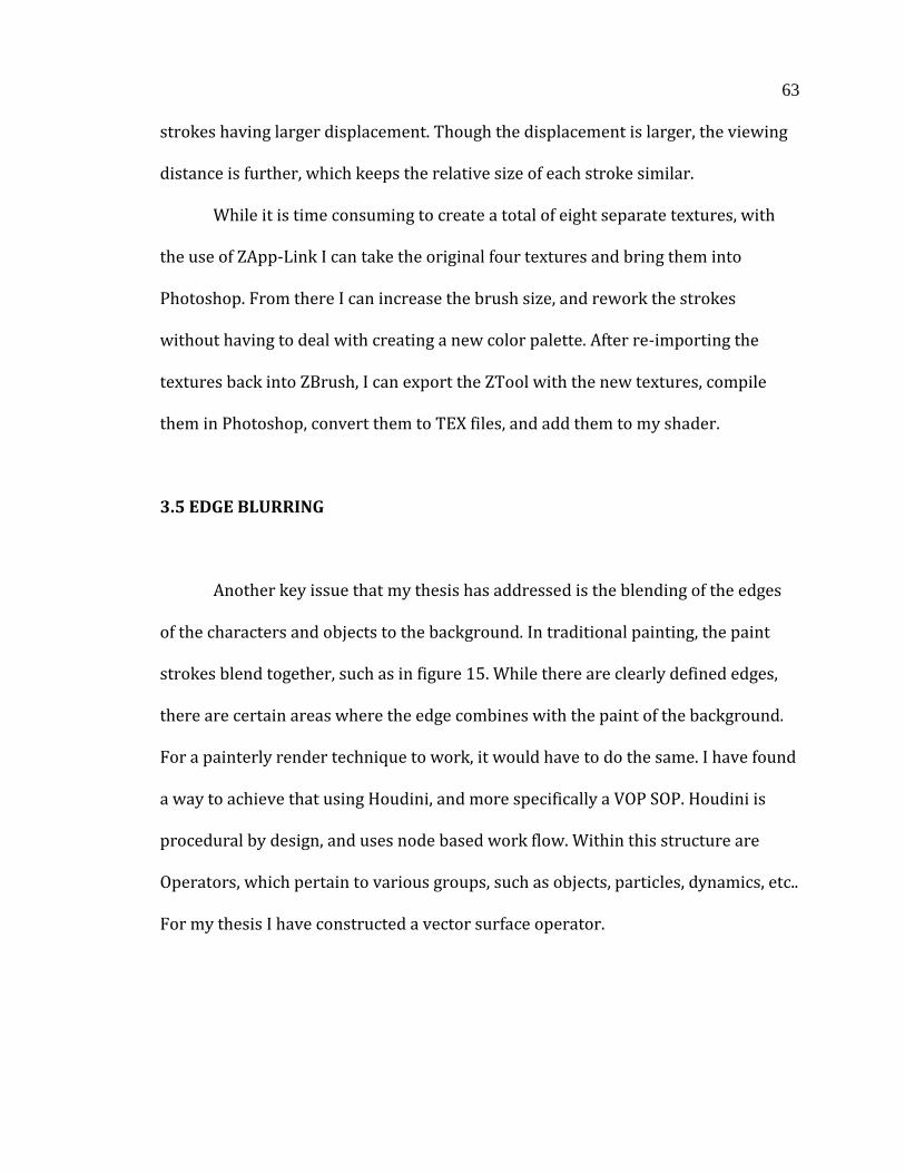
63
strokes having larger displacement. Though the displacement is larger, the viewing
distance is further, which keeps the relative size of each stroke similar.
While it is time consuming to create a total of eight separate textures, with
the use of ZApp-Link I can take the original four textures and bring them into
Photoshop. From there I can increase the brush size, and rework the strokes
without having to deal with creating a new color palette. After re-importing the
textures back into ZBrush, I can export the ZTool with the new textures, compile
them in Photoshop, convert them to TEX files, and add them to my shader.
3.5 EDGE BLURRING
Another key issue that my thesis has addressed is the blending of the edges
of the characters and objects to the background. In traditional painting, the paint
strokes blend together, such as in figure 15. While there are clearly defined edges,
there are certain areas where the edge combines with the paint of the background.
For a painterly render technique to work, it would have to do the same. I have found
a way to achieve that using Houdini, and more specifically a VOP SOP. Houdini is
procedural by design, and uses node based work flow. Within this structure are
Operators, which pertain to various groups, such as objects, particles, dynamics, etc..
For my thesis I have constructed a vector surface operator.
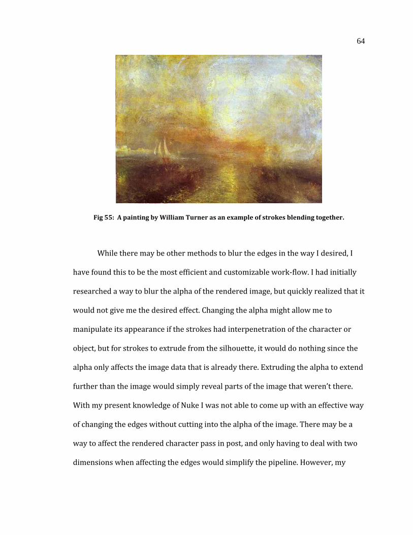
64
Fig 55: A painting by William Turner as an example of strokes blending together.
While there may be other methods to blur the edges in the way I desired, I
have found this to be the most efficient and customizable work-flow. I had initially
researched a way to blur the alpha of the rendered image, but quickly realized that it
would not give me the desired effect. Changing the alpha might allow me to
manipulate its appearance if the strokes had interpenetration of the character or
object, but for strokes to extrude from the silhouette, it would do nothing since the
alpha only affects the image data that is already there. Extruding the alpha to extend
further than the image would simply reveal parts of the image that weren’t there.
With my present knowledge of Nuke I was not able to come up with an effective way
of changing the edges without cutting into the alpha of the image. There may be a
way to affect the rendered character pass in post, and only having to deal with two
dimensions when affecting the edges would simplify the pipeline. However, my
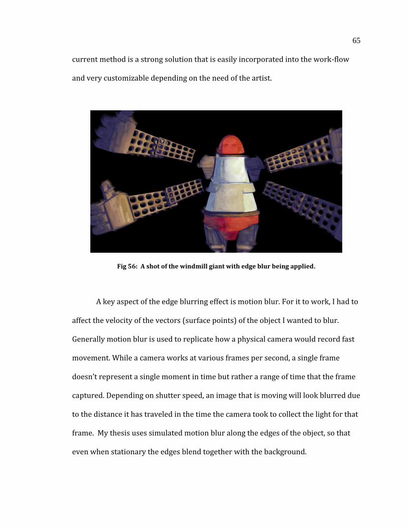
65
current method is a strong solution that is easily incorporated into the work-flow
and very customizable depending on the need of the artist.
Fig 56: A shot of the windmill giant with edge blur being applied.
A key aspect of the edge blurring effect is motion blur. For it to work, I had to
affect the velocity of the vectors (surface points) of the object I wanted to blur.
Generally motion blur is used to replicate how a physical camera would record fast
movement. While a camera works at various frames per second, a single frame
doesn’t represent a single moment in time but rather a range of time that the frame
captured. Depending on shutter speed, an image that is moving will look blurred due
to the distance it has traveled in the time the camera took to collect the light for that
frame. My thesis uses simulated motion blur along the edges of the object, so that
even when stationary the edges blend together with the background.
66
Fig 57: The difference between applied and disabled VOP SOP.
The first thing that needs to be done to establish the effect is to find the
facing ratio of the surface to the camera. This assures that the edges of the object
will be affected, as the surface normal will be perpendicular to the camera. It is still
possible to affect parts of the geometry even if they are not on the edge, but the
effect can be minimized per geometry, and per point if necessary. An example of this
would be a character’s nose, with the character facing toward the camera. The edges
of the nose would have a facing ratio that is close to perpendicular to the camera,
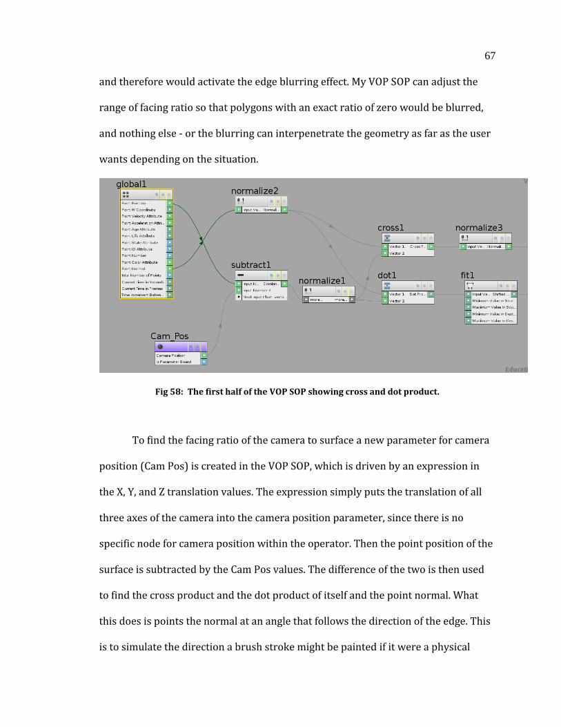
67
and therefore would activate the edge blurring effect. My VOP SOP can adjust the
range of facing ratio so that polygons with an exact ratio of zero would be blurred,
and nothing else - or the blurring can interpenetrate the geometry as far as the user
wants depending on the situation.
Fig 58: The first half of the VOP SOP showing cross and dot product.
To find the facing ratio of the camera to surface a new parameter for camera
position (Cam Pos) is created in the VOP SOP, which is driven by an expression in
the X, Y, and Z translation values. The expression simply puts the translation of all
three axes of the camera into the camera position parameter, since there is no
specific node for camera position within the operator. Then the point position of the
surface is subtracted by the Cam Pos values. The difference of the two is then used
to find the cross product and the dot product of itself and the point normal. What
this does is points the normal at an angle that follows the direction of the edge. This
is to simulate the direction a brush stroke might be painted if it were a physical
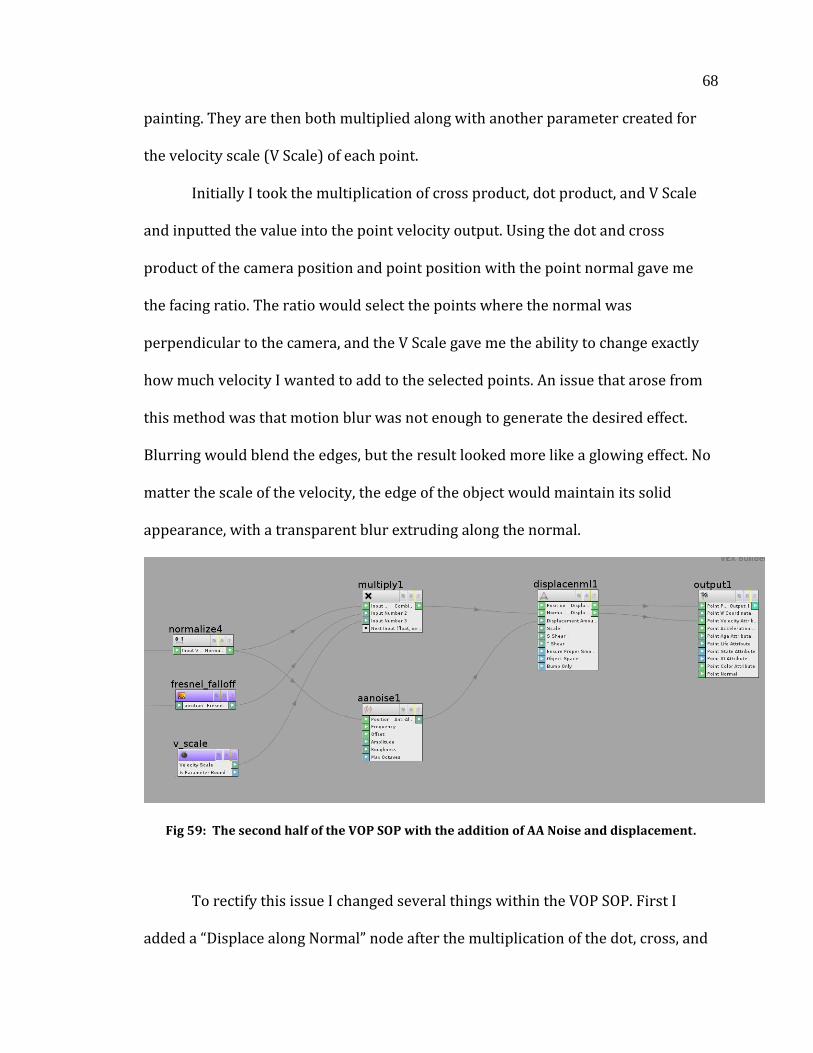
68
painting. They are then both multiplied along with another parameter created for
the velocity scale (V Scale) of each point.
Initially I took the multiplication of cross product, dot product, and V Scale
and inputted the value into the point velocity output. Using the dot and cross
product of the camera position and point position with the point normal gave me
the facing ratio. The ratio would select the points where the normal was
perpendicular to the camera, and the V Scale gave me the ability to change exactly
how much velocity I wanted to add to the selected points. An issue that arose from
this method was that motion blur was not enough to generate the desired effect.
Blurring would blend the edges, but the result looked more like a glowing effect. No
matter the scale of the velocity, the edge of the object would maintain its solid
appearance, with a transparent blur extruding along the normal.
Fig 59: The second half of the VOP SOP with the addition of AA Noise and displacement.
To rectify this issue I changed several things within the VOP SOP. First I
added a “Displace along Normal” node after the multiplication of the dot, cross, and
69
V Scale values. Placing the multiplication value into the Normal Vector gives a
Displacement Position output that is fed into the point position. What this achieves
is displacement in the same manner point velocity is applied. The surface displaces
along the normals of the surface that perpendicular to the camera.
The second change was to create an Anti-Aliased Noise node. By taking the
cross-product of the point normal and point position, feeding it into the position
input, and outputting the noise into the displacement amount, the displacement
normal output can be fed into the point velocity output. What this does is adds
variation to the velocity blur in conjunction with the displacement along the edge. It
is also capable of applying 3D offset to the normal, assuring that it is always being
displaced and blurred either perpendicularly or away from the camera, which
would cause geometry clipping and interpenetration. Changing the 3D frequency
within the Anti-Aliased Noise Node also fine tunes how much variation occurs in the
velocity blur.
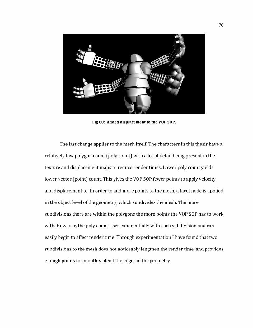
70
Fig 60: Added displacement to the VOP SOP.
The last change applies to the mesh itself. The characters in this thesis have a
relatively low polygon count (poly count) with a lot of detail being present in the
texture and displacement maps to reduce render times. Lower poly count yields
lower vector (point) count. This gives the VOP SOP fewer points to apply velocity
and displacement to. In order to add more points to the mesh, a facet node is applied
in the object level of the geometry, which subdivides the mesh. The more
subdivisions there are within the polygons the more points the VOP SOP has to work
with. However, the poly count rises exponentially with each subdivision and can
easily begin to affect render time. Through experimentation I have found that two
subdivisions to the mesh does not noticeably lengthen the render time, and provides
enough points to smoothly blend the edges of the geometry.
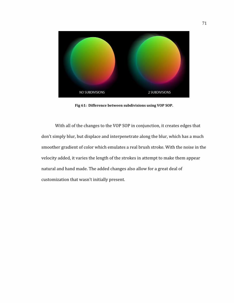
71
Fig 61: Difference between subdivisions using VOP SOP.
With all of the changes to the VOP SOP in conjunction, it creates edges that
don’t simply blur, but displace and interpenetrate along the blur, which has a much
smoother gradient of color which emulates a real brush stroke. With the noise in the
velocity added, it varies the length of the strokes in attempt to make them appear
natural and hand made. The added changes also allow for a great deal of
customization that wasn’t initially present.
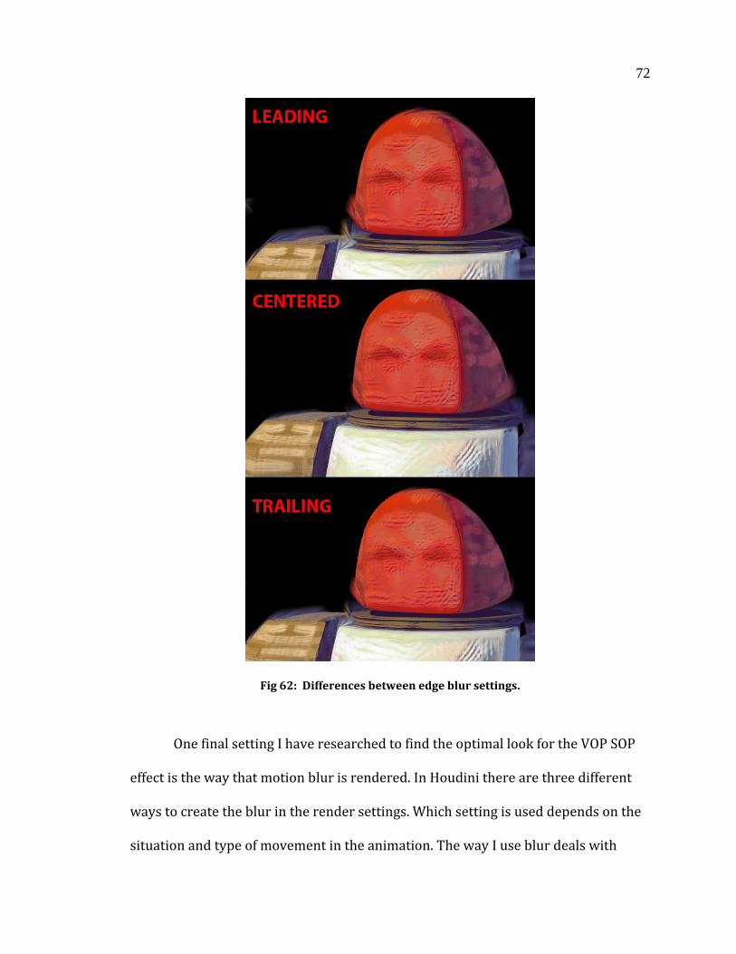
72
Fig 62: Differences between edge blur settings.
One final setting I have researched to find the optimal look for the VOP SOP
effect is the way that motion blur is rendered. In Houdini there are three different
ways to create the blur in the render settings. Which setting is used depends on the
situation and type of movement in the animation. The way I use blur deals with
73
adding artificial velocity to specific vertices without regard to actual character
movement, it doesn’t matter which way I choose to have the blur applied. However,
blur from center seems to make the most sense, as the emulated strokes would
generally be emanating from the character, rather than in front or behind it. The
results seem to be a bit too subdued however, which calls for the edge velocity value
to be increased.
3.6 FROM MAYA TO HOUDINI
Due to additional functionality Maya could not provide, I have included
Houdini into my pipeline. Houdini has a vast suite of procedural abilities and
customization thanks to its node based work flow that allows me to work on a per-
vertex basis on the character model as well as environmental geometry. Therefore I
chose a workflow that incorporates both software packages into my pipeline. Using
ZBrush I created a large portion of the character models, exported them into Maya
for fine-tuning, and reimported them into ZBrush for texturing. After exporting the
final Maya ASCII file containing the mesh, I worked in Maya rigging the characters. I
chose to animate my scenes in Maya as well, due to its strong suite of animation
tools.
While developing the pipeline a major setback occurred. In past experience,
characters with rigs and animation were exported into Houdini using the FBX file
type which contains a much larger amount of meta-data. This allows for cross-
platform development, and was how I intended to import my animated scenes.
74
However, due to unknown complications the animation imported with extreme
irregularities such as random joint translation and rotation, and was essentially
unusable. With too many potential culprits for the botched FBX exporting, I found a
different method of exporting animation from Maya, rather than spending extra
time on fixing the current.
Using a python script, the animated geometry can be exported into an OBJ
sequence. The geometry is highlighted, the script is run, the frame range and output
directory is specified, and an OBJ is created for each frame of the selected animation.
An OBJ file is a geometry definition file that only contains 3D data of the object, such
as vertex and face number and position. Due to the simplicity of the file, it is read by
a majority of 3D software including Houdini.
While scenes are generally animated with one specific object with a
deformable or translatable mesh, my animation has a separate object per frame,
with no rigging, deformation, or constraints. Therefore there is nothing to export
incorrectly from Maya that would cause errors in Houdini. However there are
several drawbacks to this method. While having little to no impact on the file size of
the Houdini .hipc file (the default file type of Houdini scenes), OBJ sequences take up
a large amount of space on the disc. A four to five second clip can take up to 200
megs, as it has to save out an individual mesh per frame. While that is not an
unreasonable file size per sequence, they begin to add up over time. Another issue is
that scrubbing through the time-line in Houdini takes significantly longer, due to the
separate geometry having to be read in for each frame. This is mostly a minor
annoyance, as the animation at this stage should be finalized. However, if there are
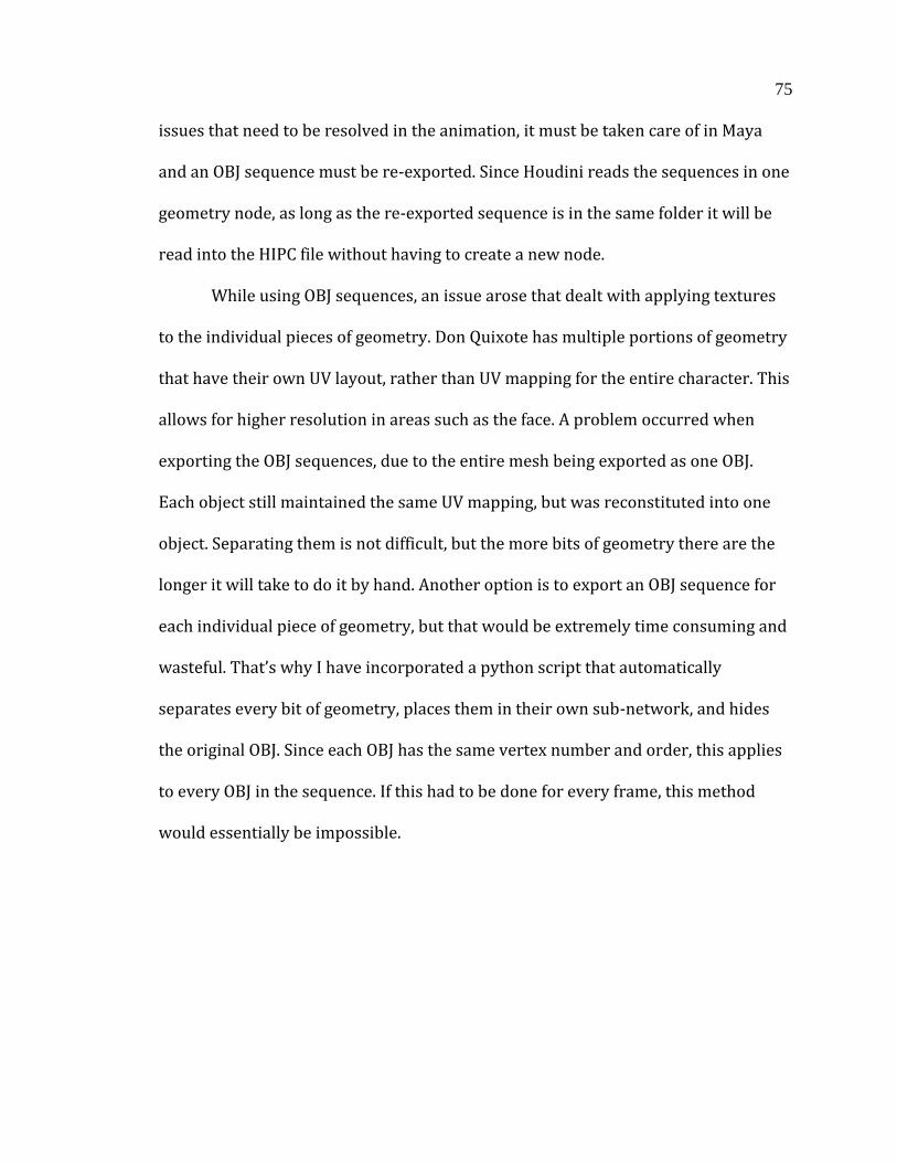
75
issues that need to be resolved in the animation, it must be taken care of in Maya
and an OBJ sequence must be re-exported. Since Houdini reads the sequences in one
geometry node, as long as the re-exported sequence is in the same folder it will be
read into the HIPC file without having to create a new node.
While using OBJ sequences, an issue arose that dealt with applying textures
to the individual pieces of geometry. Don Quixote has multiple portions of geometry
that have their own UV layout, rather than UV mapping for the entire character. This
allows for higher resolution in areas such as the face. A problem occurred when
exporting the OBJ sequences, due to the entire mesh being exported as one OBJ.
Each object still maintained the same UV mapping, but was reconstituted into one
object. Separating them is not difficult, but the more bits of geometry there are the
longer it will take to do it by hand. Another option is to export an OBJ sequence for
each individual piece of geometry, but that would be extremely time consuming and
wasteful. That’s why I have incorporated a python script that automatically
separates every bit of geometry, places them in their own sub-network, and hides
the original OBJ. Since each OBJ has the same vertex number and order, this applies
to every OBJ in the sequence. If this had to be done for every frame, this method
would essentially be impossible.
76
Fig 63: A character network with individual geometry extracted from the OBJ sequence.
After every bit of geometry is separated from the OBJ and placed into its own
sub-network, their materials can be applied. Rather than having to apply the VOP
SOP to the individual geometry, it can be placed within the original OBJ network
before the separation python script is applied. While the geometry in the network is
hidden, the vector surface attributes are applied to the sub-network. This becomes
extremely useful when the VOP SOP needs to be altered, as it cuts the need to edit
each individual object after each change.
3.7 THE SHADER
The shader I have created and altered throughout the development of my
thesis functions as both a surface and displacement shader by using several
methods within the code, which allows multiple arguments to be present in one
77
shader. For example I can affect the output point of P (surface point) and N (surface
normal), surface opacity (Oi), and surface color (Ci) all within the same shader,
rather than calling external shaders.
First the shader needs to define the range of illumination from highest to
lowest, so that rather than adjusting the lights within the scene, I can keep
everything contained within the shader. This also sets the range in which the
textures blend across the surface. The surface diffuse color is found and
transformed to HSV color space, and the Value channel is taken to find surface
illumination. The illumination range is found by taking the illumination level and
defining its lowest and highest point of acceptable brightness.
After the illumination is set the displacement must be read in from the alpha
channel of the array of textures. Displacement maps could be a separate array that
could be read in, but would take a lot of time to load the large amount of files and
would be inefficient. With this shader having two arrays of four images, to double
that to sixteen texture maps (eight color, eight displacement) would be
unmanageable. By extracting the alpha from the arrays, the images are consolidated
and the work flow is streamlined. Once the alphas are extracted, they are blended
along a linear spline along the illumination. This creates the displacement
illumination (dispIllum) and large displacement illumination (dispIllumL). These
two displacements are blended according to the texture that’s being called from the
camera distance, and is placed along another spline. The surface point is multiplied
by that value, and then multiplied by the displacement amount.
78
The same method of extracting the alpha channel from the array of image
files is used to retrieve the color map by using the color channel. This gives image
illumination (imgIllum) and large image illumination (imgIllumL), which must be
blended. The blend is created using the smoothstep function. Within the function is
the near value, far value, and the Z channel of the camera (P[2]). Once the blend is
defined, the final color is created by mixing the imgIllum and imgIllumL according to
the blend. Since the surface opacity is not affected at all in the shader, Oi equals Os.
The final opacity is multiplied by the mix of the blended image arrays to equal the
final surface color (Ci).
The shader is not over-complicated as it relies on texture files rather than
procedural functions. There is very little manipulation of the shader space, with the
only time it is altered being to change the direction the texture file is read in so that
it lines up with the UV mapping of the geometry. With the combination of
displacement and color mapping to emulate brush strokes, the shader creates a
unique rendering technique. To see the specific code of the shader, refer to the
appendix.
3.8 TRADITIONAL RENDERING
There is a dichotomy between what Don Quixote sees, and what Sancho sees.
Sancho sees the world through the eyes of a sane, mostly rational human being
whereas Quixote sees the eyes of a delirious malnourished old man with delusions
of grandeur. Therefore I have two rendering schemes throughout the animation.
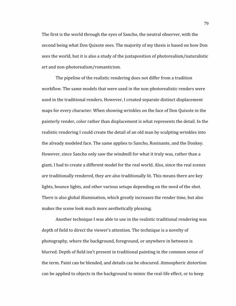
79
The first is the world through the eyes of Sancho, the neutral observer, with the
second being what Don Quixote sees. The majority of my thesis is based on how Don
sees the world, but it is also a study of the juxtaposition of photorealism/naturalistic
art and non-photorealism/romanticism.
The pipeline of the realistic rendering does not differ from a tradition
workflow. The same models that were used in the non-photorealistic renders were
used in the traditional renders. However, I created separate distinct displacement
maps for every character. When showing wrinkles on the face of Don Quixote in the
painterly render, color rather than displacement is what represents the detail. In the
realistic rendering I could create the detail of an old man by sculpting wrinkles into
the already modeled face. The same applies to Sancho, Rosinante, and the Donkey.
However, since Sancho only saw the windmill for what it truly was, rather than a
giant, I had to create a different model for the real world. Also, since the real scenes
are traditionally rendered, they are also traditionally lit. This means there are key
lights, bounce lights, and other various setups depending on the need of the shot.
There is also global illumination, which greatly increases the render time, but also
makes the scene look much more aesthetically pleasing.
Another technique I was able to use in the realistic traditional rendering was
depth of field to direct the viewer’s attention. The technique is a novelty of
photography, where the background, foreground, or anywhere in between is
blurred. Depth of field isn’t present in traditional painting in the common sense of
the term. Paint can be blended, and details can be obscured. Atmospheric distortion
can be applied to objects in the background to mimic the real-life effect, or to keep
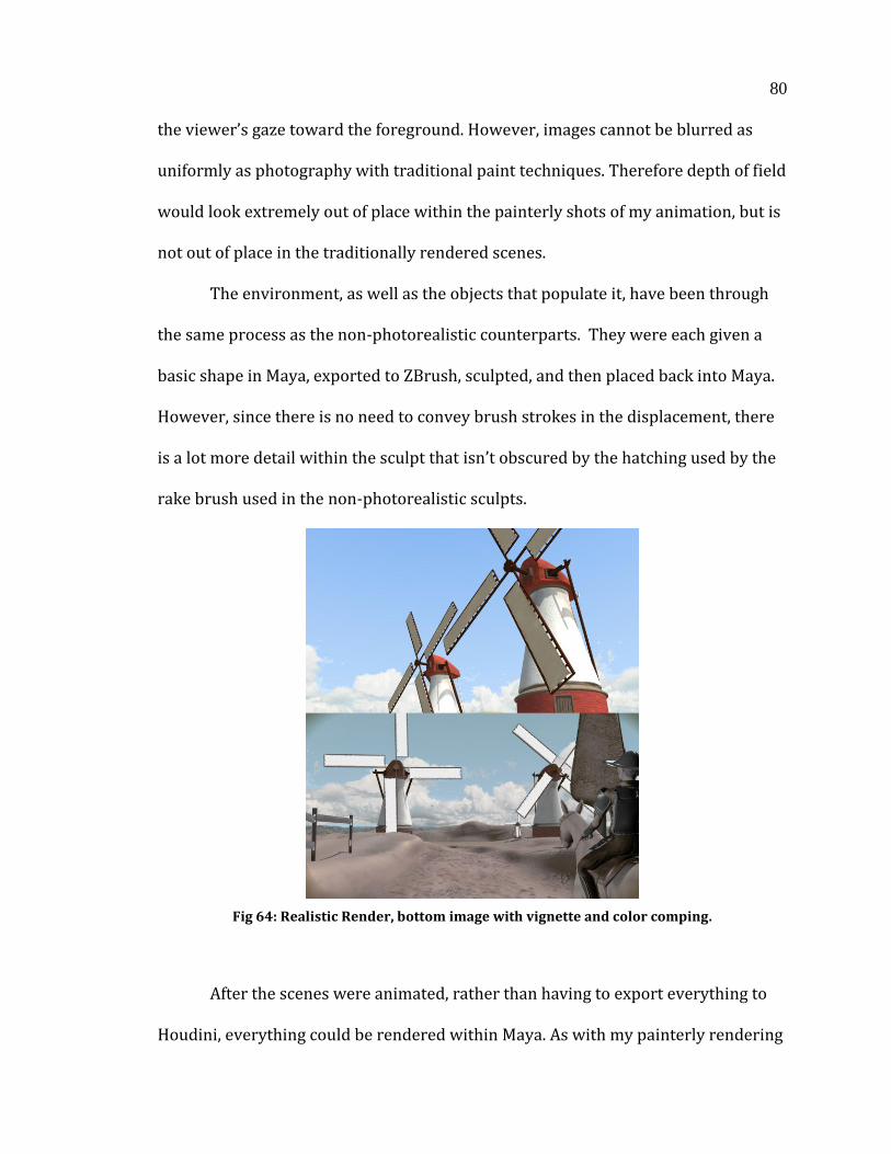
80
the viewer’s gaze toward the foreground. However, images cannot be blurred as
uniformly as photography with traditional paint techniques. Therefore depth of field
would look extremely out of place within the painterly shots of my animation, but is
not out of place in the traditionally rendered scenes.
The environment, as well as the objects that populate it, have been through
the same process as the non-photorealistic counterparts. They were each given a
basic shape in Maya, exported to ZBrush, sculpted, and then placed back into Maya.
However, since there is no need to convey brush strokes in the displacement, there
is a lot more detail within the sculpt that isn’t obscured by the hatching used by the
rake brush used in the non-photorealistic sculpts.
Fig 64: Realistic Render, bottom image with vignette and color comping.
After the scenes were animated, rather than having to export everything to
Houdini, everything could be rendered within Maya. As with my painterly rendering
81
scheme, RenderMan is the renderer used due to its handling of displacement maps.
To help create the sparse Spanish landscape used in contrast to the lush vivid
landscape in Don Quixote’s mind, I rendered separate character and environment
passes so that I could matte paint details that might add to the feeling of desolation.
82
4. LIMITATIONS AND POTENTIAL EXPANSION
Throughout the development of my pipeline, I have come across various
limitations that affect the look of the non-photorealistic rendering scheme. Though
my animation employs the use of shader writing, Houdini VOP SOPS, and projection
matte painting, there are ways to improve each step that are beyond the scale of this
thesis. There are also other potential avenues to take outside the three main aspects
I have focused on.
4.1 THE SHADER
In order for the shader to be effective, it relies on multiple layers of texture
maps and displacement maps. A limitation I have come across is that it is very time-
consuming to create the amount of texture maps for the look to hold up. The current
method uses two arrays of four textures, for a total of eight per character. However,
for it to look even more convincing, it would most likely benefit from another array
of four textures for extreme distances. While each layer has a decreased level of
detail, meaning much less time spent illustrating, it is still another part of the
process that would take a considerable amount of time. Due to my thesis consisting
of five characters, each with their own array of textures, it was out of the scope of
what I alone am capable of doing within the time constraints of this project. With a
larger team of people, it would not be difficult to get up to even four arrays that can
be placed on a ramp driven by camera distance.
83
Another potential solution to the obscuring of detail to maintain the painterly
look would deal with the code of the Shader itself, rather than relying on texture and
displacement maps. There may be a way to obscure and blend the pixels of a single
texture map as the camera moves further from the object. However, it is beyond my
current skill set, and would take a great deal of research to get the effect to hold up.
Other limitations within the code of the shader deal with reflections, and potentially
refractions. Certain objects such as Don Quixote’s helmet and armor are metallic and
therefore reflective. In order to have reflections within my animation, I would have
to make very significant edits to not only the shader, but the pipeline in general.
Reflections would have to be written into the shader, which alone would not be too
difficult. However, different surfaces reflect light differently, and would potentially
require multiple custom shaders that have different types of reflection. Specular
highlights would change depending on what type of metal an object consists of, and
might require anisotropic shading on some materials, or Blinn shading on others.
For each separate object that requires a different shader, they would need a new
array of textures.
Currently characters and objects have UV’s in large groups to limit the
amount of textures required. For example, the horse UV’s consists of the horse body,
tail, saddle, and harness. Don Quixote is similarly grouped, and to change the
reflectivity and basic shading of the surface of his armor would require splitting up
the UV’s. This seemingly small step would require vast edits to a large amount of
already animated scenes, and would be impractical to change at this point in time.
Reflections may also break the painterly look, depending on the visual style of the
84
image being reflected. The reflection must look like it is a painted reflection, rather
than the exact mirror image of the object’s surroundings. More work might be
required within the code to obscure the reflected image, could still potentially hold
up without any extra edits to the code.
To further improve the painterly style that I have created within this thesis,
adding an atmospheric perspective to the scenes would help realize the look. What
this means is that in an open landscape the air or “atmosphere” within the area has a
small but tangible density. The further back an object is in a painting the more
air/particulates are in between it and the viewer. Due to the nature of the air, things
off in the distance tend to take on an increasingly lighter, bluish hue as they recede.
This look can be achieved in my painterly rendering scheme, but only to an extent.
Certain measures can be taken within the matte painting of the scenes, but would be
hard to maintain while in motion. Something could be done within the shader, and
would not be too difficult. It would consist of multiplying a light blue color along a
ramp linked to camera distance, similar to how textures currently blend. However,
that only solves the issue for the characters in the scene.
The environment only consists of proxy geometry that receives the matte
paintings projected onto it. Objects in the distance could be painted with more
atmospheric perspective in mind, and when used in conjunction with the edited
shader would most likely add to the painterly look. However, when in motion
objects could potentially recede further into the distance, and require further
distortion that would not be possible with a static projection. There are various
ways to achieve the look in motion, but each would be time consuming. One way
85
would be to animate the matte painting with multiple layers that would blend as the
camera moves. While this would be effective, it would take considerable time in
post-production painting the extra layers, and getting the blend timing right.
Another way to apply atmospheric distortion would involve writing out a zdepth
pass. That pass would then be used in post to apply a light blue haze with increasing
intensity as objects recede into the distance. This could potentially look artificial,
and work against the painterly look I am trying to achieve for this thesis, and would
take extra time rendering out the pass and incorporating it into the pipeline.
4.2 HOUDINI VOP SOP
The current VOP SOP is used to obscure the outer edges of the object to blend
with the background layer. This is an attempt to simulate the look seen in paintings
where paint strokes from the top layer blend with what’s beneath it. This thesis
achieves that, but only to a certain extent. While it has come a long way in look
development, it is very difficult to control, and depending on the object, breaks
down when there are too many areas facing away from the camera in succession. An
example would be the blades of the windmill giant, where I was forced to apply a
VOP SOP with different parameters in order to get the blurring under control.
Another issue is that the effect is only meant for the edges of the object, but
with the VOP SOP in its current iteration, any face that is perpendicular to the
camera is blurred. Therefore if there is any interpenetration of the character’s body
within the shot, e.g. Don Quixote’s arm being held out in front of his body in relation
to the camera, it will have edge blurring even though it doesn’t rest on the silhouette
86
of the character. To rectify this would require editing the node network of the VOP
SOP to look for geometry proximity, and remove the effect if there are any vertices
behind the vertex that are perpendicular to the camera. That way only the silhouette
would be blurred. At this current time I am unaware how to make that addition to
the network, and more research would be required to make it function as described.
Controlling exactly where on the edge of the silhouette the effect is applied is
currently difficult to control, and certain spots receive more blur than others for no
apparent reason. This can be dealt with within the parameters, but getting bur in
exact spots is difficult to achieve. The original version of the VOP SOP, while
needlessly complex, allowed for selecting specific vertices to apply the effect, and
might merit further exploration, at least at a shot-per-shot basis.
The painterly look of my thesis relies on the interaction of foreground
characters and objects with the background. The VOP SOP extends their edges so
that they overlap with strokes in the background. However, there is no
interpenetration of the background into the foreground that might occur in
traditional painting. I am currently unaware of how to achieve that effect, but
believe it would require post production work in software such as Nuke. All that
would be required is to obscure the alpha of the object or character so that it
resembles brush interpenetration. However, to achieve that procedurally, and to get
the exact look of the strokes while in motion is outside the scope of this thesis.
One final issue within the VOP SOP is that the effect could benefit to
exaggerate blurring in certain areas, but not others. Due to the use of displacement
as well as vector velocity, if the parameters of the VOP SOP are increased, objects
87
can get very distorted. While the look is ideal when further away, the characters can
look off putting when up close. Greater control over where the displacement is
applied would be ideal.
4.3 MATTE PAINTING
There are several limitations that I have run into when applying matte
paintings to geometry for the painterly rendering scheme. While I have found
solutions to maintaining the look, even while in motion, there are various shots that
could be improved with added layering. It would take extended planning, and many
additional paintings per scene, but would add detail and enhanced brush strokes in
areas of interest that the camera might capture as it moves. Currently there are only
two layers of matte paintings at any time, but to improve the look the scene would
benefit from up to four projections depending on how the camera moves. This
would also prevent any images from having flattened brush strokes in relation to
the camera. An example of this would be a texture of the ground being projected
from an above angle, with the camera moving perpendicular to the ground plane.
Brush strokes appear slightly distorted due to the perspective the viewer is seeing
them.
Due to the ground not having the same shader as the characters and objects
in the scene, it receives very crisp shadows that don’t entirely adhere to the
painterly style I have developed. There are ways to blur and obscure it, but it lies on
the ground in a way that doesn’t seem consistent with a painted shadow. To this
there may be a solution within the shadow pass. It would require an intricate
88
displacement map with faux-brush strokes to be created for the ground plane that
would break the outline of the shadow. This would make the shadow look less flat,
and less sharp in contrast to the flowing strokes of the matte painting beneath it.
Another solution would be to have another rendered environment pass with the
same matte painting in a cooler color palette, with the shadow pass being used as a
mask revealing the layer beneath it. The combination of those two methods may
yield desirable results. In its current state, the shadow pass is not simply placed on
top of the geometry, but rather edited so that the color is not pure black by using a
grade node in nuke and replacing the black point with a different color. A
completely black shadow would throw off the carefully selected color palette.
Having a second matte painting specifically for the shadow pass would strengthen
the unity between shadows and well lit areas, but doubling the amount of matte
paintings would be another time consuming process.
4.4 MISCELLANEOUS
There are a plethora of other methods one could employ to further the
development of a painterly style for use in CG that aren’t used in this pipeline.
Through the use of added channels within the image file of the render, one could
experiment with adding a brush stroke channel along the x, y, and z axes. This
channel could be used in post-production in a way that might circumvent the use of
a VOP SOP in Houdini, and potentially reduce render times. Reducing the problem
down to two dimensions rather than three would make things less complicated,
consolidate the work flow to two software packages, and has potential to look as
89
good as or better than the current method. How one would incorporate this brush
stroke channel into the pipeline is beyond my current capability, but is worth future
exploration.
There may also be other methods within post production that would help in
the painterly look, specifically with unifying the foreground and background and
employing techniques seen in painting such as obscuring detail in all but the central
focus. While film uses depth of field to direct the viewer’s attention, painting must
rely on the use of light and detail to define the focal point. Different methods of
blending render layers might garner more painterly results.
90
5. CONCLUSION
Through the culmination of research in multiple aspects of production, I have
created a unique painterly rendering style. While the pipeline is complex, there can
be variations depending on the need or preference of the artist. For example,
modeling and animation can be done entirely in Houdini, consolidating workflow
into one software package rather than three. However, other software in this
pipeline have aided in speeding up the workflow in exchange for time spent porting
assets into Houdini. For my personal work style, I have found that sculpting
characters and organic objects is far faster and more precise using ZBrush, and
animation tools in Maya are more robust and easy to understand. For this thesis
learning modeling and animation in other software packages would have taken
unnecessary amounts of time, but could benefit the pipeline in the future.
In the development of my thesis I have created a composition that
incorporates painting and literature from the Romantic art movement. The pipeline
I have developed can be used for a multitude of styles, and is not limited to one
specific movement or era of painting. While the workflow is time consuming, it is
not overtly complex, and can be truncated when necessary depending on visual
style. The render times are very low, with edge blurring being the one factor that
may increase them. Blending across four separate textures with displacement in
RenderMan is surprisingly fast, and other complex lighting schemes aren’t
necessary, which further speeds up rendering. The pipeline replicates multiple
91
effects of Romantic era painting, and is capable of resembling other painting
movements such as Baroque, Classical, and Naturalism.
There are various limitations to the project that could not be resolved within
the given amount of time. However, with further development this pipeline could
incorporate even more Romantic effects to enhance the emotional impact of the
visual style. This thesis has allowed me to become extremely familiar with a wide
assortment of software packages, such as Houdini, Nuke, ZBrush, Maya, and
rendering in both RenderMan and Mantra. I hope to continue to use this pipeline to
enhance its ability to evoke emotion in the viewer, and to simplify it so that it may
one day be a viable option for others who are interested in non-photorealistic
rendering.
92
LIST OF REFERENCES
[1] L. Rosenthal, Romanticism. New York: Parkstone Press Intl., pgs. 1-2; 37-38.
2008.
[2] K. Clark, The Romantic Rebellion. New York: Harper & Row, pgs. 61; 81-82. 1979.
[3] I. Berlin, The Roots of Romanticism. Princeton, NJ: Princeton Uni. Press, pp. 49.
1999.
[4] H. Honour, Romanticism. New York: Harper & Row, pp. 21. 1979.
[5] J. D. Bolter and R. Grusin, Remediation. Cambrige, MA: MIT Press, pp. 137. 2000.
[6] F. Licht, Goya. New York: Abbeville Press, pp. 204; 220; 242. 2001.
[7] F. Lentzch, Fuseli. Zurich, Switzerland: Scheideeger & Spiess, pgs. 33-36. 2005.
[8] H. W. Janson and A F. Janson, History of Art, 6th ed. New York: Harry N. Abrams
Inc., pgs. 690-691. 2001
[9] W. Doyle, French Revolution: A Very Short Introduction. Oxford Oxforrd: Univ.
Pres, pgs. 19-21. 2001
[10] S. Greenburg, “Why Non-Photorealistic Rendering?”, Computer Graph, pgs. 56-
57. February, 1999.
[11] D. Goldstein, “Intentional Non-Photorealistic Rendering,” Computer Graph, pgs.
62-63. February, 1999.
[12] P. Plait, (2010, June 10). Resolving the iPhone resolution [Online]. Available:
http://blogs.discovermagazine.com/badastronomy/2010/06/10/resolving-the-iphone-resolution/
[13] J. Willats and F. Durand, “Defining Pictorial Style: Lessons From Linguistics and
Computer Graphics.” Axiomathes, vol. 15. pgs. 319-351. 2005.
93
[14] J.L. Rieupeyrout, “The Western: A Historical Genre,” The Quarterly, vol. 7, no. 2,
pgs. 116-128. 1952.
[15] C. Bandera, Humble Story of Don Quixote : Reflections on the Birth of the Modern
Novel. Washington, DC: CUA Press, pgs. 3; 7-8. 2006.
[16] H. Wolfflin, Principles of Art History. New York: Dover Publications, Inc., pgs. 18-
19; 45-47; 73-77; 124-127; 140-142; 155-159; 168-169; 196-198; 213. 1932.
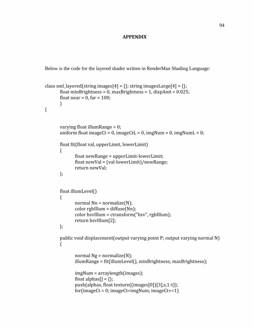
94
APPENDIX
Below is the code for the layered shader written in RenderMan Shading Language:
class sml_layered(string images[4] = {}; string imagesLarge[4] = {}; float minBrightness = 0, maxBrightness = 1, dispAmt = 0.025; float near = 0, far = 100; ) { varying float illumRange = 0; uniform float imageCt = 0, imageCtL = 0, imgNum = 0, imgNumL = 0; float fit(float val, upperLimit, lowerLimit) { float newRange = upperLimit-lowerLimit; float newVal = (val-lowerLimit)/newRange; return newVal; }; float illumLevel() { normal Nn = normalize(N); color rgbIllum = diffuse(Nn); color hsvIllum = ctransform("hsv", rgbIllum); return hsvIllum[2]; }; public void displacement(output varying point P; output varying normal N) { normal Ng = normalize(N); illumRange = fit(illumLevel(), minBrightness, maxBrightness); imgNum = arraylength(images); float alphas[] = {}; push(alphas, float texture((images[0])[3],s,1-t)); for(imageCt = 0; imageCt<imgNum; imageCt+=1)
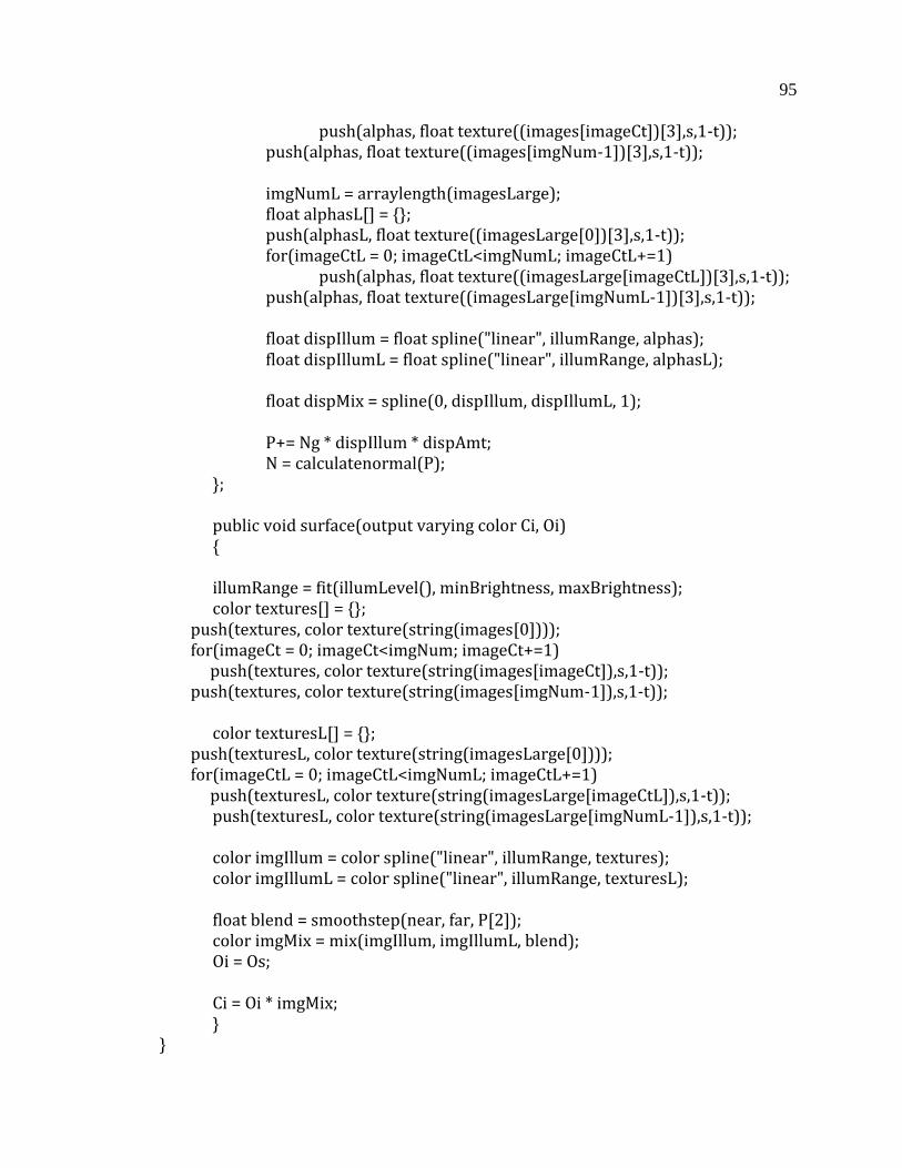
95
push(alphas, float texture((images[imageCt])[3],s,1-t)); push(alphas, float texture((images[imgNum-1])[3],s,1-t)); imgNumL = arraylength(imagesLarge); float alphasL[] = {}; push(alphasL, float texture((imagesLarge[0])[3],s,1-t)); for(imageCtL = 0; imageCtL<imgNumL; imageCtL+=1) push(alphas, float texture((imagesLarge[imageCtL])[3],s,1-t)); push(alphas, float texture((imagesLarge[imgNumL-1])[3],s,1-t)); float dispIllum = float spline("linear", illumRange, alphas); float dispIllumL = float spline("linear", illumRange, alphasL); float dispMix = spline(0, dispIllum, dispIllumL, 1); P+= Ng * dispIllum * dispAmt; N = calculatenormal(P); }; public void surface(output varying color Ci, Oi) { illumRange = fit(illumLevel(), minBrightness, maxBrightness); color textures[] = {}; push(textures, color texture(string(images[0]))); for(imageCt = 0; imageCt<imgNum; imageCt+=1) push(textures, color texture(string(images[imageCt]),s,1-t)); push(textures, color texture(string(images[imgNum-1]),s,1-t)); color texturesL[] = {}; push(texturesL, color texture(string(imagesLarge[0]))); for(imageCtL = 0; imageCtL<imgNumL; imageCtL+=1) push(texturesL, color texture(string(imagesLarge[imageCtL]),s,1-t)); push(texturesL, color texture(string(imagesLarge[imgNumL-1]),s,1-t)); color imgIllum = color spline("linear", illumRange, textures); color imgIllumL = color spline("linear", illumRange, texturesL); float blend = smoothstep(near, far, P[2]); color imgMix = mix(imgIllum, imgIllumL, blend); Oi = Os; Ci = Oi * imgMix; } }