Embed Size (px)
Citation preview
REPRESENTATION OF DATA
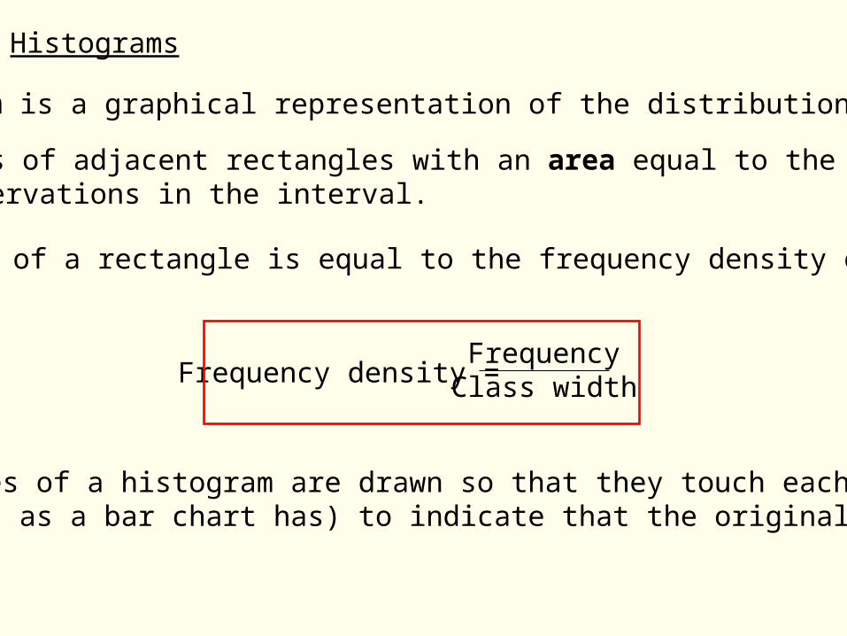
Histograms
A Histogram is a graphical representation of the distribution of data.
The rectangles of a histogram are drawn so that they touch each other (i.e. no gaps as a bar chart has) to indicate that the original variable is continuous.
The height of a rectangle is equal to the frequency density of the interval.
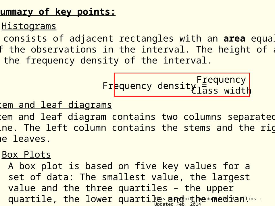
It consists of adjacent rectangles with an area equal to the frequency of the observations in the interval.
FrequencyClass widthFrequency density =
50 60 9070 80
1
6
54
32
Frequency Density
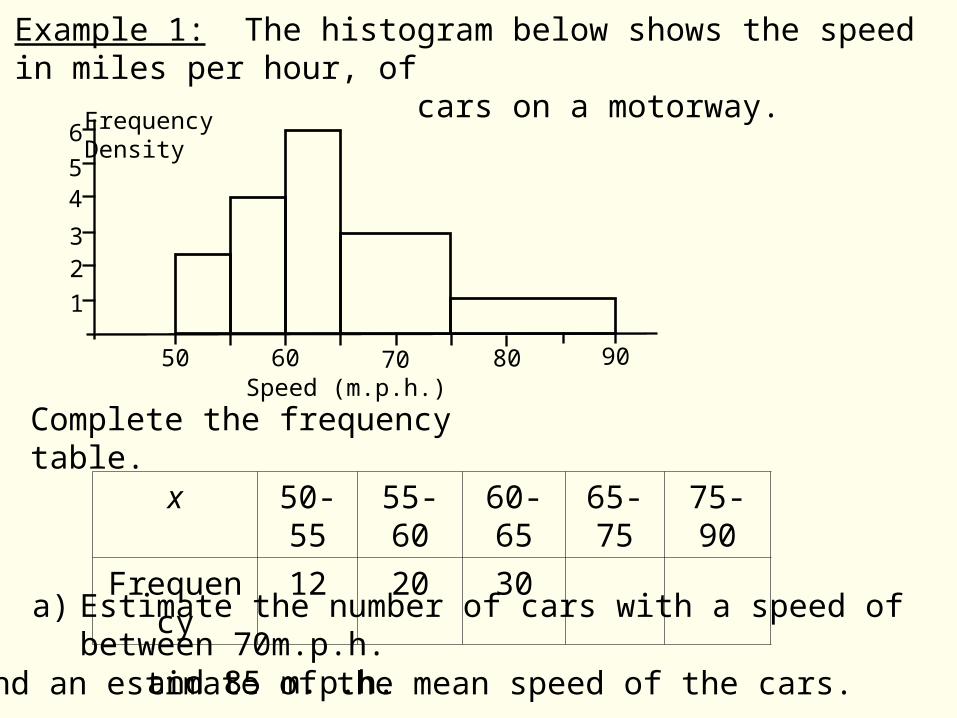
Complete the frequency table.
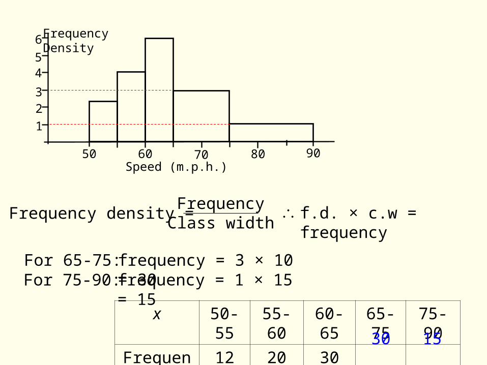
x 50-55 55-60 60-65 65-75 75-90
Frequency 12 20 30
a) Estimate the number of cars with a speed of between 70m.p.h. and 85 m.p.h.b) Find an estimate of the mean speed of the cars.
Speed (m.p.h.)
Example 1: The histogram below shows the speed in miles per hour, of cars on a motorway.
50 60 9070 80
1
6
54
32
Frequency Density
x 50-55 55-60 60-65 65-75 75-90
Frequency 12 20 30
Speed (m.p.h.)
Frequency density = FrequencyClass width
f.d. × c.w = frequency
For 65-75: frequency = 3 × 10 = 30For 75-90: frequency = 1 × 15 = 15
1530
50 60 9070 80
1
6
54
32
Frequency Density
x 50-55 55-60 60-65 65-75 75-90
Frequency 12 20 30 30 15
Speed (m.p.h.)
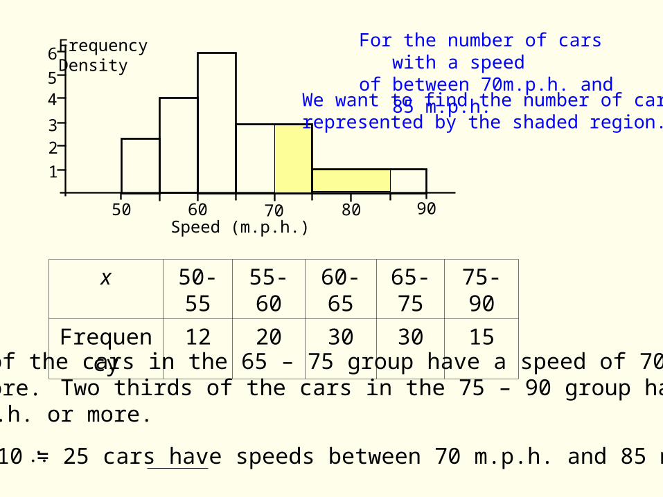
a) Half of the cars in the 65 – 75 group have a speed of 70 m.p.h. or more. Two thirds of the cars in the 75 – 90 group have a speed
of 70 m.p.h. or more.
15 + 10 = 25 cars have speeds between 70 m.p.h. and 85 m.p.h.
For the number of cars with a speedof between 70m.p.h. and 85 m.p.h.
We want to find the number of carsrepresented by the shaded region.
x 50-55 55-60 60-65 65-75 75-90
Frequency 12 20 30 30 15
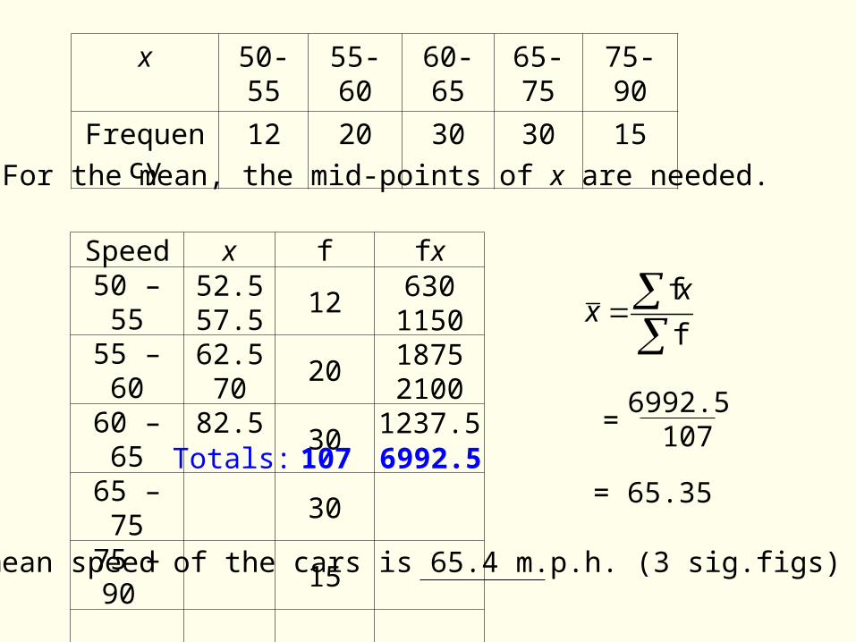
b) For the mean, the mid-points of x are needed.
Speed x f fx50 – 55 1255 – 60 2060 – 65 3065 – 75 3075 – 90 15
52.557.562.5 7082.5
630115018752100
1237.5Totals: 107 6992.5
f
fxx
= 65.35
6992.5 107
=
The mean speed of the cars is 65.4 m.p.h. (3 sig.figs)
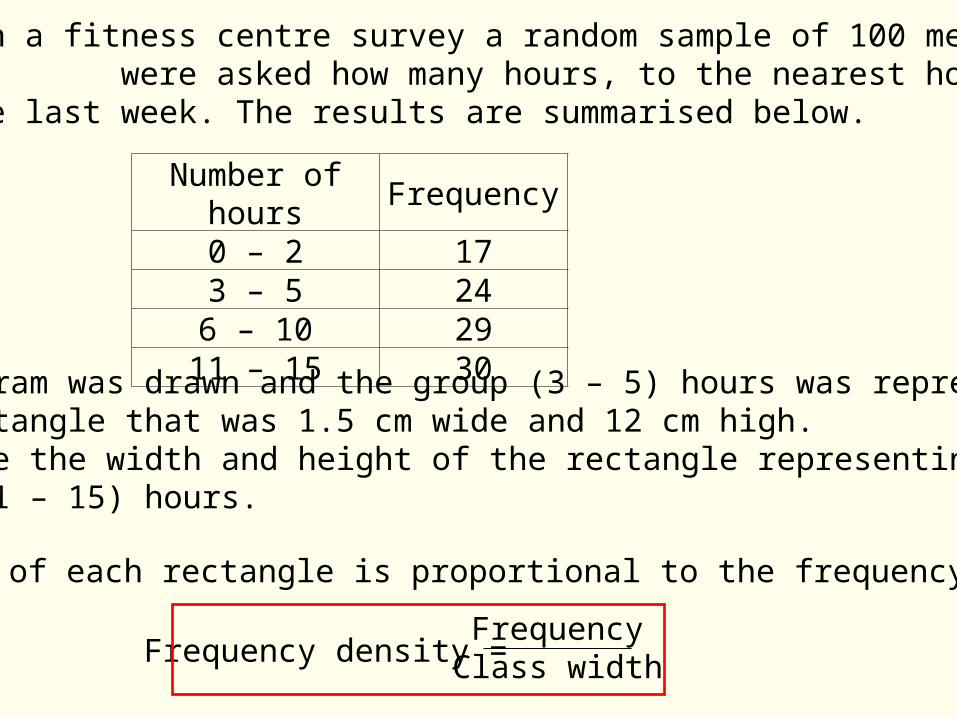
Example 2: In a fitness centre survey a random sample of 100 men were asked how many hours, to the nearest hour, they spent jogging in the last week. The results are summarised below.
A histogram was drawn and the group (3 – 5) hours was represented by a rectangle that was 1.5 cm wide and 12 cm high.Calculate the width and height of the rectangle representing the group (11 – 15) hours.
Number of hours Frequency0 – 2 173 – 5 24
6 – 10 2911 – 15 30
The height of each rectangle is proportional to the frequency density.
FrequencyClass widthFrequency density =
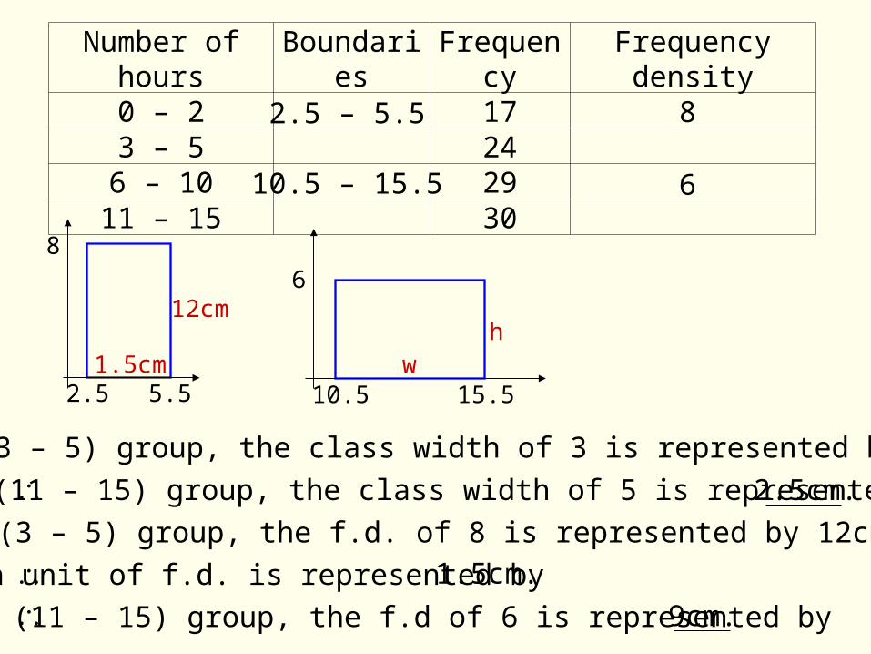
Number of hours Boundaries Frequency Frequency density0 – 2 173 – 5 24
6 – 10 2911 – 15 30
2.5 – 5.5
10.5 – 15.5
8
6
2.5 5.5
8
12cm
1.5cm
6
15.510.5
hw
For the (3 – 5) group, the class width of 3 is represented by 1.5cm.
For the (11 – 15) group, the class width of 5 is represented by 2.5cm.
For the (3 – 5) group, the f.d. of 8 is represented by 12cm.
Each unit of f.d. is represented by
For the (11 – 15) group, the f.d of 6 is represented by 9cm.
1.5cm.
Stem and leaf diagrams
Box Plots
A box plot (or box and whisker diagram) is based on five key values for a set of data:
The smallest value, the largest value and the three quartiles – theupper and lower quartile and the median.
They also show outliers (extreme values).
A stem and leaf diagram is a way of displaying numerical data and shows the shape of the data (the distribution).
A simple stem and leaf diagram contains two columns separated by a vertical line. The left column contains the stems and the right column contains the leaves.
To draw a stem-and-leaf diagram, the data is sorted in ascending order.
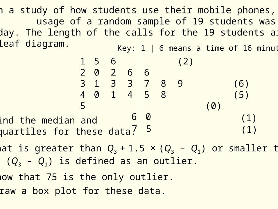
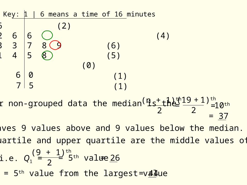
Example 3: In a study of how students use their mobile phones, the usage of a random sample of 19 students was examined for a particular day. The length of the calls for the 19 students are shown inthe stem and leaf diagram.
1 5 6 (2)2 0 2 6 6 (4)3 1 3 3 7 8 9 (6)4 0 1 4 5 8 (5)5 (0)
Key: 1 | 6 means a time of 16 minutes
67 5
0 (1)(1)
a) Find the median and quartiles for these data.
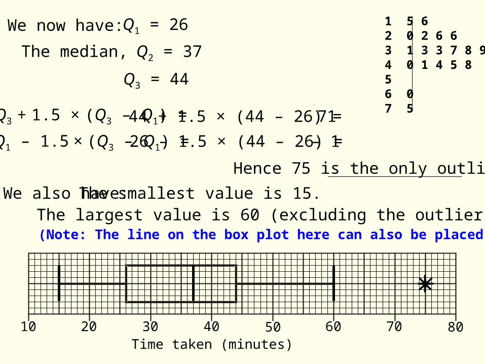
b) Show that 75 is the only outlier.
A value that is greater than Q3 + 1.5 × (Q3 – Q1) or smaller than Q1 – 1.5 × (Q3 – Q1) is defined as an outlier.
c) Draw a box plot for these data.
1 5 6 (2)2 0 2 6 6 (4)3 1 3 3 7 8 9 (6)4 0 1 4 5 8 (5)5 (0)
Key: 1 | 6 means a time of 16 minutes
67 5
0 (1)(1)
a) For non-grouped data the median is the (n + 1)th
2=
(19 + 1)th
2 = 10th
This leaves 9 values above and 9 values below the median.
The lower quartile and upper quartile are the middle values of these sets.
(9 + 1)th
2i.e. Q1 = = 5th value
= 37
= 26
Q3 = 5th value from the largest value = 44
2 0 3 0 4 0 5 0 6 0 7 0 8 0 9 0W eig h t (k g )
2010 4030 6050 70 80Time taken (minutes)
Q3 + 1.5 × (Q3 – Q1) =
Q1 – 1.5 × (Q3 – Q1) =
We now have: Q1 = 26
The median, Q2 = 37
Q3 = 44
44 + 1.5 × (44 – 26) = 71
26 – 1.5 × (44 – 26) = – 1
We also have: The smallest value is 15.The largest value is 60 (excluding the outlier).
Hence 75 is the only outlier.
1 5 62 0 2 6 63 1 3 3 7 8 94 0 1 4 5 856 07 5
(Note: The line on the box plot here can also be placed at 71).
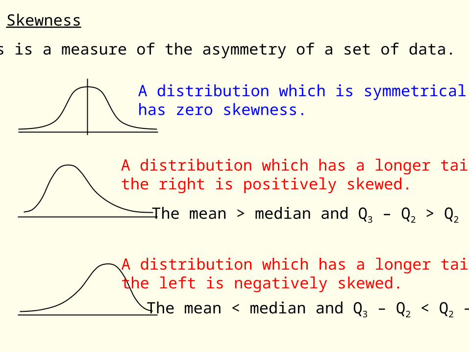
Skewness
Skewness is a measure of the asymmetry of a set of data.
A distribution which is symmetricalhas zero skewness.
A distribution which has a longer tail on the right is positively skewed.
A distribution which has a longer tail on the left is negatively skewed.
The mean > median and Q3 – Q2 > Q2 – Q1.
The mean < median and Q3 – Q2 < Q2 – Q1.
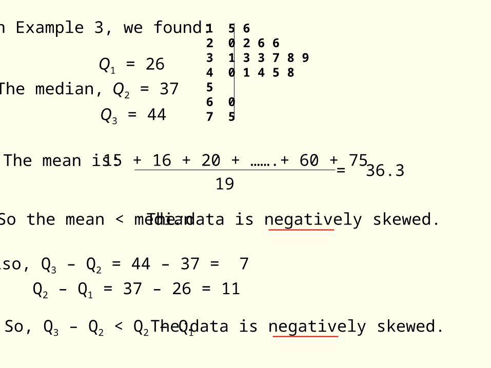
The mean is: 15 + 16 + 20 + …….+ 60 + 75
19= 36.3
So the mean < median The data is negatively skewed.
Also, Q3 – Q2 = 44 – 37 = 7
Q2 – Q1 = 37 – 26 = 11
So, Q3 – Q2 < Q2 – Q1 The data is negatively skewed.
1 5 62 0 2 6 63 1 3 3 7 8 94 0 1 4 5 856 07 5
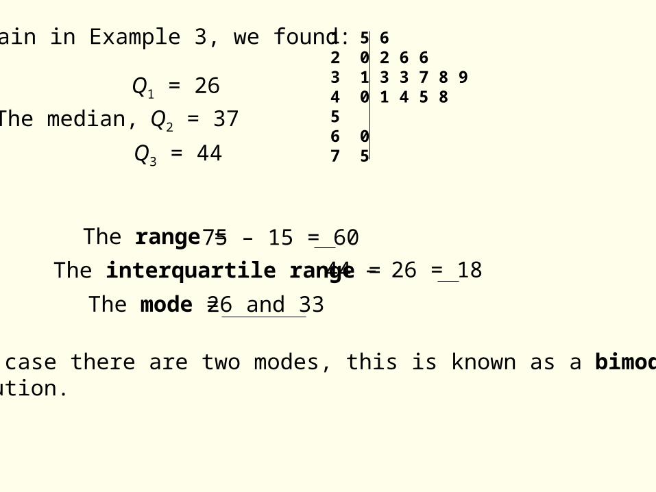
In Example 3, we found:
Q1 = 26
Q3 = 44
The median, Q2 = 37
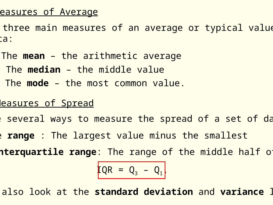
Measures of Average
There are three main measures of an average or typical value for aset of data:
The mean – the arithmetic average
The median – the middle value
The mode – the most common value.
Measures of Spread
There are several ways to measure the spread of a set of data:
The range : The largest value minus the smallest
The interquartile range: The range of the middle half of the data
IQR = Q3 – Q1.
We shall also look at the standard deviation and variance later.
1 5 62 0 2 6 63 1 3 3 7 8 94 0 1 4 5 856 07 5
Again in Example 3, we found:
Q1 = 26
Q3 = 44
The median, Q2 = 37
The range = 75 – 15 = 60
The interquartile range = 44 – 26 = 18
The mode = 26 and 33
In this case there are two modes, this is known as a bimodal distribution.
Summary of key points:
This PowerPoint produced by R.Collins ; Updated Feb. 2014
Histograms
FrequencyClass widthFrequency density =
Stem and leaf diagramsA simple stem and leaf diagram contains two columns separated by a vertical line. The left column contains the stems and the right column contains the leaves.
Box PlotsA box plot is based on five key values for a set of data: The smallest value, the largest value and the three quartiles – the upper quartile, the lower quartile and the median.
A histogram consists of adjacent rectangles with an area equal to the frequency of the observations in the interval. The height of a rectangle is equal to the frequency density of the interval.


![영상처리 실습 #4 Histogram 연산 [ Histogram 대화상자 만들기 ]. Histogram 대화상자 만들기](https://img.dokumen.tips/doc/110x75/5697bfe71a28abf838cb5e1a/-4-histogram-histogram-.jpg)