Embed Size (px)
Citation preview
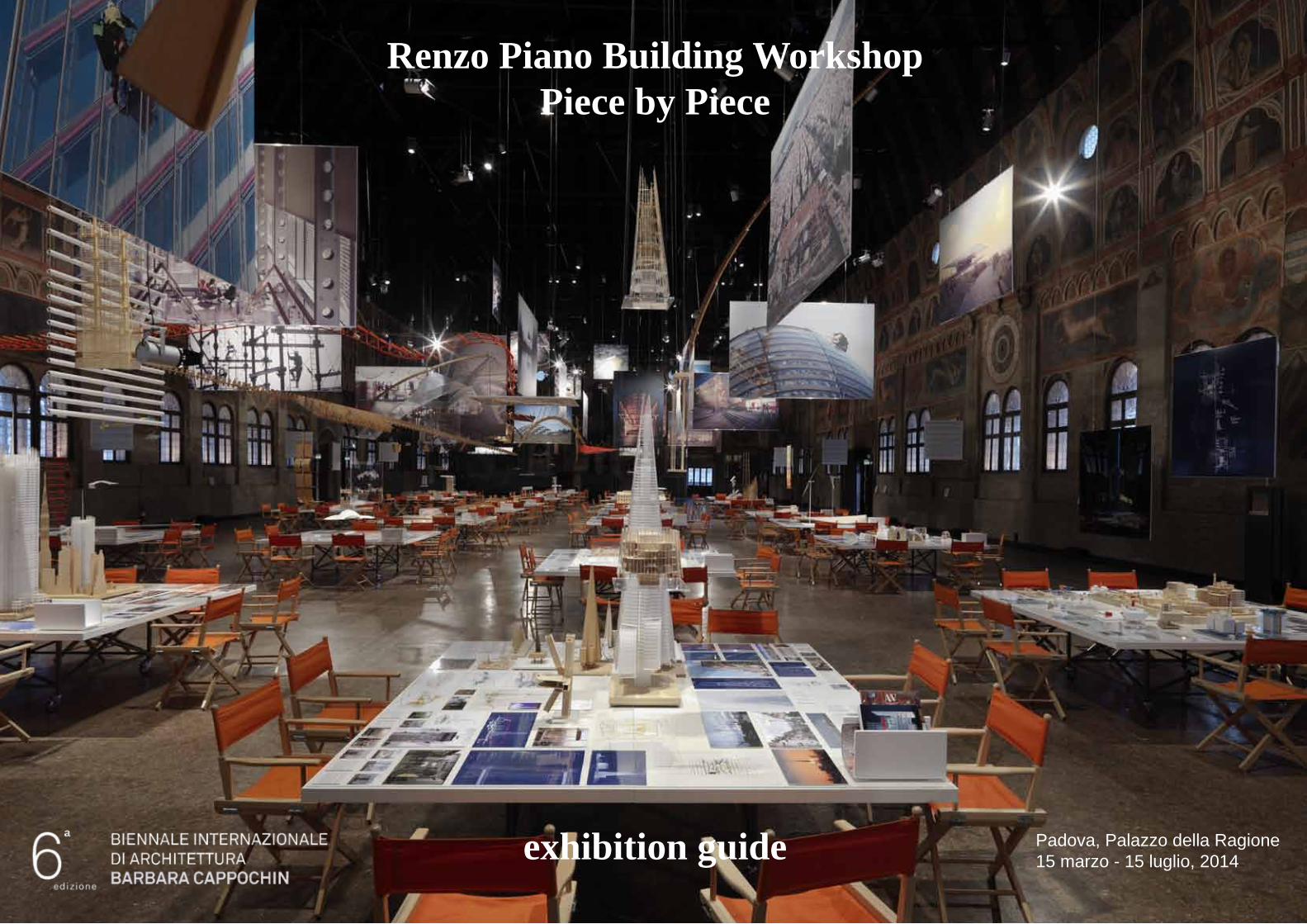
Renzo Piano Building WorkshopPiece by Piece
exhibition guide Padova, Palazzo della Ragione15 marzo - 15 luglio, 2014
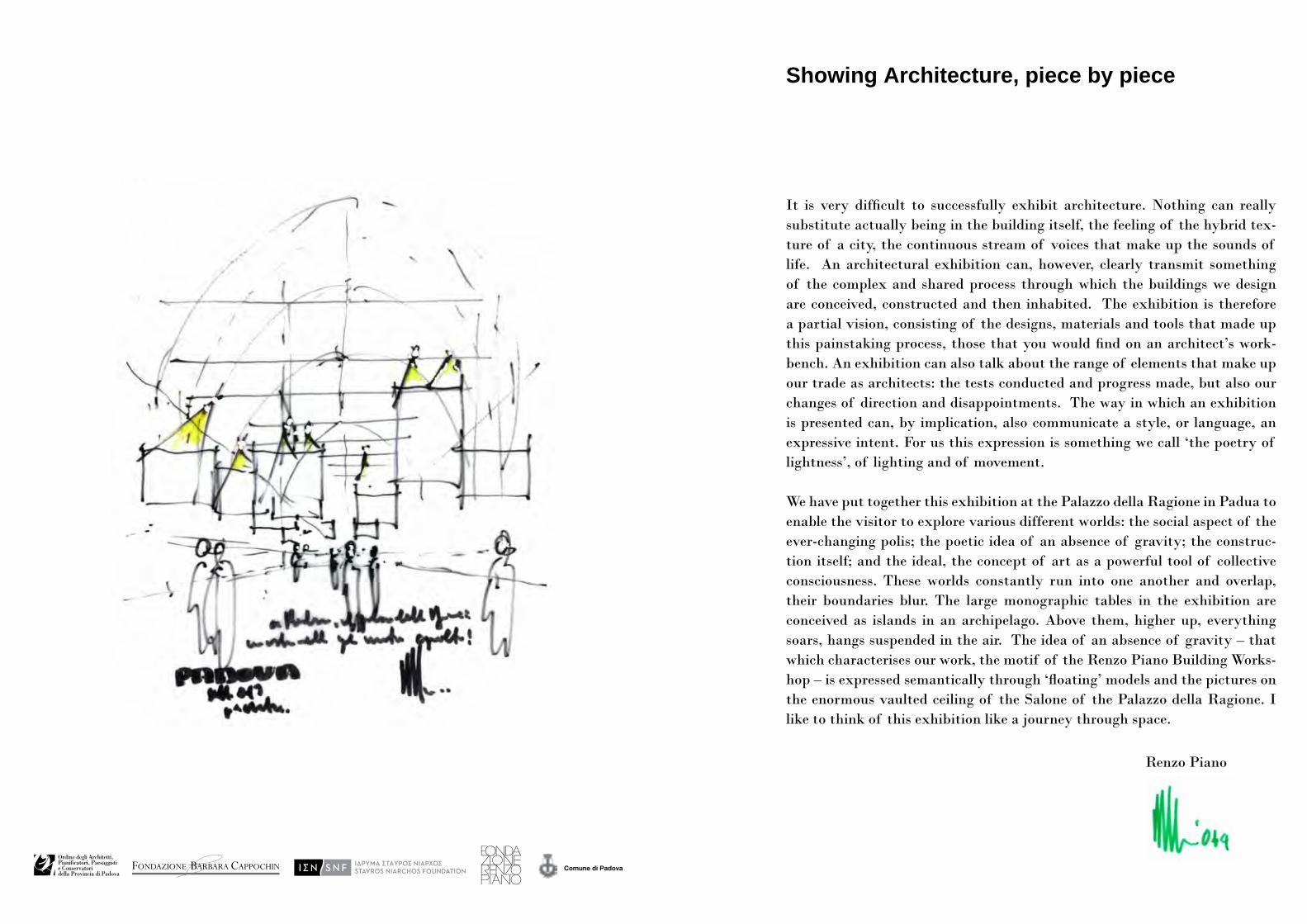
Showing Architecture, piece by piece
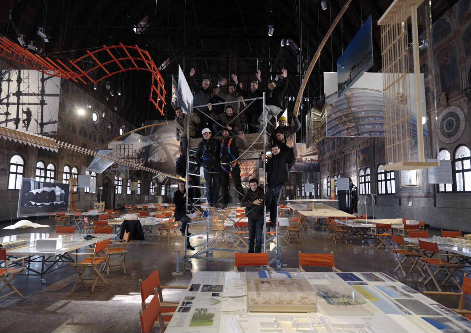
It is very difficult to successfully exhibit architecture. Nothing can really substitute actually being in the building itself, the feeling of the hybrid tex-ture of a city, the continuous stream of voices that make up the sounds of life. An architectural exhibition can, however, clearly transmit something of the complex and shared process through which the buildings we design are conceived, constructed and then inhabited. The exhibition is therefore a partial vision, consisting of the designs, materials and tools that made up this painstaking process, those that you would find on an architect’s work-bench. An exhibition can also talk about the range of elements that make up our trade as architects: the tests conducted and progress made, but also our changes of direction and disappointments. The way in which an exhibition is presented can, by implication, also communicate a style, or language, an expressive intent. For us this expression is something we call ‘the poetry of lightness’, of lighting and of movement.
We have put together this exhibition at the Palazzo della Ragione in Padua to enable the visitor to explore various different worlds: the social aspect of the ever-changing polis; the poetic idea of an absence of gravity; the construc-tion itself; and the ideal, the concept of art as a powerful tool of collective consciousness. These worlds constantly run into one another and overlap, their boundaries blur. The large monographic tables in the exhibition are conceived as islands in an archipelago. Above them, higher up, everything soars, hangs suspended in the air. The idea of an absence of gravity – that which characterises our work, the motif of the Renzo Piano Building Works-hop – is expressed semantically through ‘floating’ models and the pictures on the enormous vaulted ceiling of the Salone of the Palazzo della Ragione. I like to think of this exhibition like a journey through space.
Renzo Piano
Padova, Palazzo della Ragione15 marzo - 15 luglio, 2014
Comune di Padova
Renzo Piano Building Workshop Pezzo per Pezzo
ph.
Enr
ico
Can
o
a
Padova, Palazzo della Ragione15 marzo - 15 luglio, 2014
Comune di Padova
Renzo Piano Building Workshop Pezzo per Pezzo
ph.
Enr
ico
Can
o
a
Padova, Palazzo della Ragione15 marzo - 15 luglio, 2014
Comune di Padova
Renzo Piano Building Workshop Pezzo per Pezzo
ph.
Enr
ico
Can
o
a
Padova, Palazzo della Ragione15 marzo - 15 luglio, 2014
Comune di Padova
Renzo Piano Building Workshop Pezzo per Pezzo
ph.
Enr
ico
Can
o
a
Padova, Palazzo della Ragione15 marzo - 15 luglio, 2014
Comune di Padova
Renzo Piano Building Workshop Pezzo per Pezzo
ph.
Enr
ico
Can
o
a
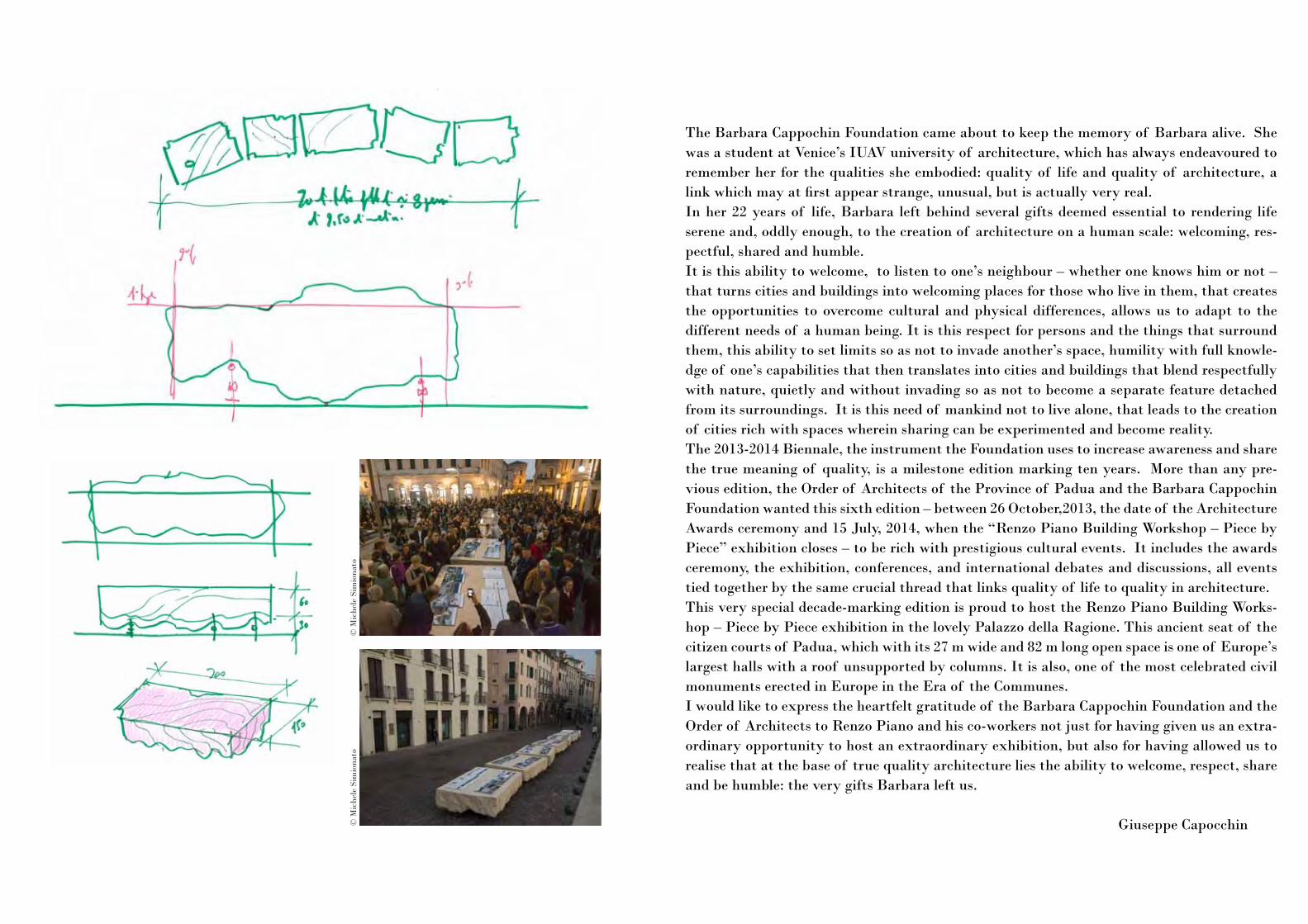
The Barbara Cappochin Foundation came about to keep the memory of Barbara alive. She was a student at Venice’s IUAV university of architecture, which has always endeavoured to remember her for the qualities she embodied: quality of life and quality of architecture, a link which may at first appear strange, unusual, but is actually very real. In her 22 years of life, Barbara left behind several gifts deemed essential to rendering life serene and, oddly enough, to the creation of architecture on a human scale: welcoming, res-pectful, shared and humble. It is this ability to welcome, to listen to one’s neighbour – whether one knows him or not – that turns cities and buildings into welcoming places for those who live in them, that creates the opportunities to overcome cultural and physical differences, allows us to adapt to the different needs of a human being. It is this respect for persons and the things that surround them, this ability to set limits so as not to invade another’s space, humility with full knowle-dge of one’s capabilities that then translates into cities and buildings that blend respectfully with nature, quietly and without invading so as not to become a separate feature detached from its surroundings. It is this need of mankind not to live alone, that leads to the creation of cities rich with spaces wherein sharing can be experimented and become reality. The 2013-2014 Biennale, the instrument the Foundation uses to increase awareness and share the true meaning of quality, is a milestone edition marking ten years. More than any pre-vious edition, the Order of Architects of the Province of Padua and the Barbara Cappochin Foundation wanted this sixth edition – between 26 October,2013, the date of the Architecture Awards ceremony and 15 July, 2014, when the “Renzo Piano Building Workshop – Piece by Piece” exhibition closes – to be rich with prestigious cultural events. It includes the awards ceremony, the exhibition, conferences, and international debates and discussions, all events tied together by the same crucial thread that links quality of life to quality in architecture. This very special decade-marking edition is proud to host the Renzo Piano Building Works-hop – Piece by Piece exhibition in the lovely Palazzo della Ragione. This ancient seat of the citizen courts of Padua, which with its 27 m wide and 82 m long open space is one of Europe’s largest halls with a roof unsupported by columns. It is also, one of the most celebrated civil monuments erected in Europe in the Era of the Communes. I would like to express the heartfelt gratitude of the Barbara Cappochin Foundation and the Order of Architects to Renzo Piano and his co-workers not just for having given us an extra-ordinary opportunity to host an extraordinary exhibition, but also for having allowed us to realise that at the base of true quality architecture lies the ability to welcome, respect, share and be humble: the very gifts Barbara left us.
Giuseppe Capocchin
© M
iche
le S
imio
nato
© M
iche
le S
imio
nato
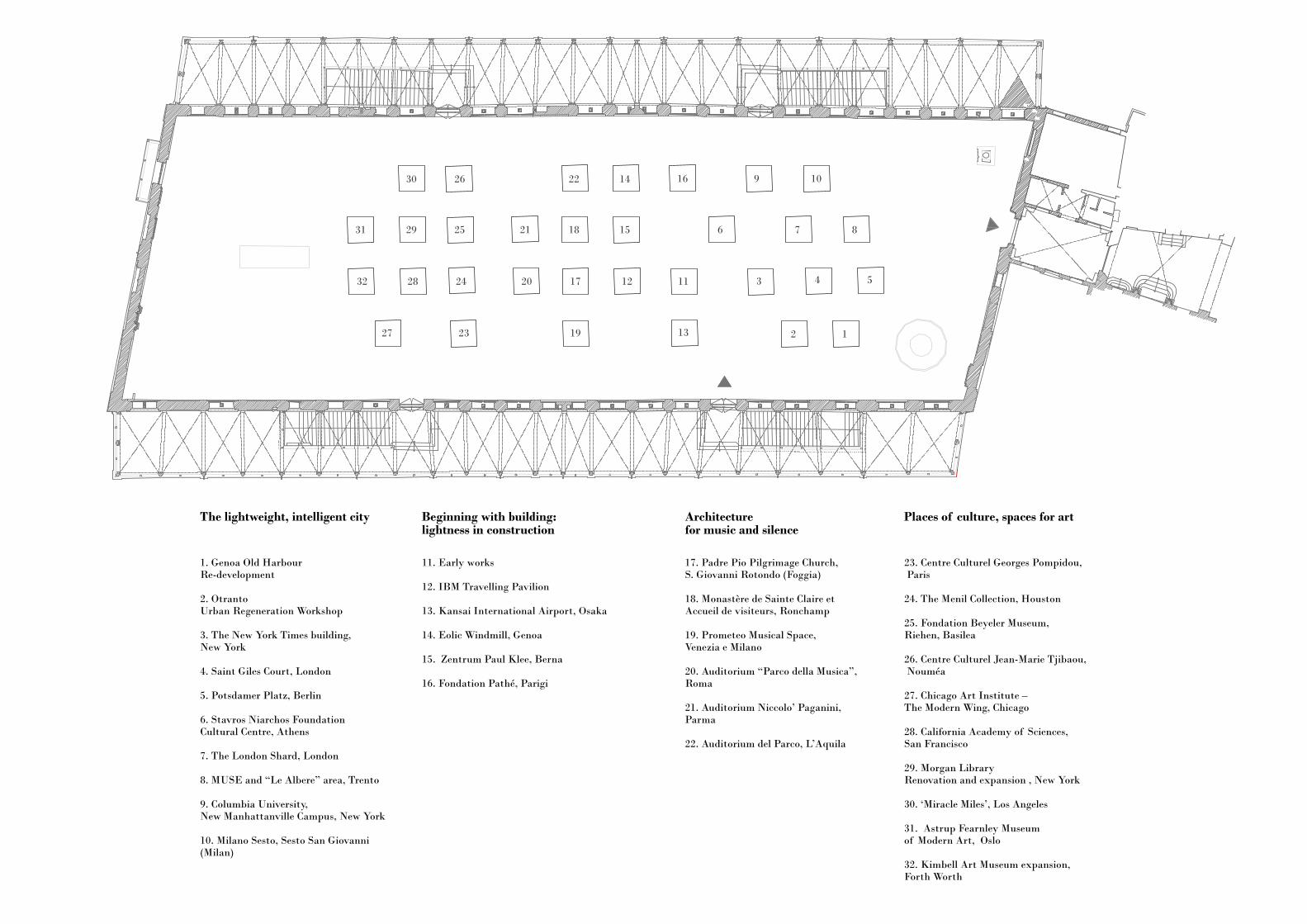
17. Padre Pio Pilgrimage Church, S. Giovanni Rotondo (Foggia)
18. Monastère de Sainte Claire et Accueil de visiteurs, Ronchamp
19. Prometeo Musical Space, Venezia e Milano
20. Auditorium “Parco della Musica”, Roma
21. Auditorium Niccolo’ Paganini, Parma
22. Auditorium del Parco, L’Aquila
23. Centre Culturel Georges Pompidou, Paris
24. The Menil Collection, Houston
25. Fondation Beyeler Museum, Riehen, Basilea
26. Centre Culturel Jean-Marie Tjibaou, Nouméa
27. Chicago Art Institute – The Modern Wing, Chicago
28. California Academy of Sciences, San Francisco
29. Morgan LibraryRenovation and expansion , New York
30. ‘Miracle Miles’, Los Angeles
31. Astrup Fearnley Museum of Modern Art, Oslo
32. Kimbell Art Museum expansion, Forth Worth
10
8
9
7
16
6
11 3 4 5
13 2 1
Architecture for music and silence
Places of culture, spaces for art
1. Genoa Old HarbourRe-development
2. OtrantoUrban Regeneration Workshop
3. The New York Times building, New York
4. Saint Giles Court, London
5. Potsdamer Platz, Berlin
6. Stavros Niarchos Foundation Cultural Centre, Athens
7. The London Shard, London
8. MUSE and “Le Albere” area, Trento
9. Columbia University, New Manhattanville Campus, New York
10. Milano Sesto, Sesto San Giovanni(Milan)
11. Early works
12. IBM Travelling Pavilion
13. Kansai International Airport, Osaka
14. Eolic Windmill, Genoa
15. Zentrum Paul Klee, Berna
16. Fondation Pathé, Parigi
14
15
12
22
18
17
21
20
27
26
25
24
19
29
28
23
The lightweight, intelligent city Beginning with building: lightness in construction
31
32
30
The lightweight, intelligent city
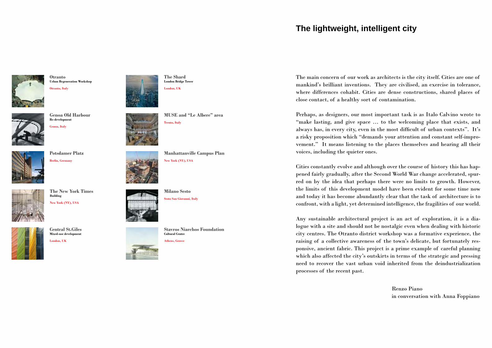
The main concern of our work as architects is the city itself. Cities are one of mankind’s brilliant inventions. They are civilised, an exercise in tolerance, where differences cohabit. Cities are dense constructions, shared places of close contact, of a healthy sort of contamination.
Perhaps, as designers, our most important task is as Italo Calvino wrote to “make lasting, and give space … to the welcoming place that exists, and always has, in every city, even in the most difficult of urban contexts”. It’s a risky proposition which “demands your attention and constant self-impro-vement.” It means listening to the places themselves and hearing all their voices, including the quieter ones.
Cities constantly evolve and although over the course of history this has hap-pened fairly gradually, after the Second World War change accelerated, spur-red on by the idea that perhaps there were no limits to growth. However, the limits of this development model have been evident for some time now and today it has become abundantly clear that the task of architecture is to confront, with a light, yet determined intelligence, the fragilities of our world.
Any sustainable architectural project is an act of exploration, it is a dia-logue with a site and should not be nostalgic even when dealing with historic city centres. The Otranto district workshop was a formative experience, the raising of a collective awareness of the town’s delicate, but fortunately res-ponsive, ancient fabric. This project is a prime example of careful planning which also affected the city’s outskirts in terms of the strategic and pressing need to recover the vast urban void inherited from the deindustrialization processes of the recent past.
Renzo Pianoin conversation with Anna Foppiano
OtrantoUrban Regeneration Workshop
Otranto, Italy
MUSE and “Le Albere” areaTrento, Italy
Potsdamer PlatzBerlin, Germany
Genoa Old HarbourRe-development
Genoa, Italy
Manhattanville Campus PlanNew York (NY), USA
Central St.Giles Mixed-use development
London, UK
Milano Sesto Sesto San Giovanni, Italy
Stavros Niarchos Foundation Cultural Centre
Athens, Greece
The New York Times Building
New York (NY), USA
The ShardLondon Bridge Tower
London, UK
Otranto Urban Regeneration Workshop
Otranto, Italy
1979
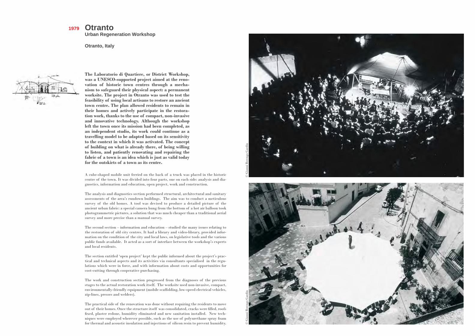
The Laboratorio di Quartiere, or District Workshop, was a UNESCO-supported project aimed at the reno-vation of historic town centres through a mecha-nism to safeguard their physical aspect: a permanent worksite. The project in Otranto was used to test the feasibility of using local artisans to restore an ancient town centre. The plan allowed residents to remain in their homes and actively participate in the restora-tion work, thanks to the use of compact, non-invasive and innovative technology. Although the workshop left the town once its mission had been completed, as an independent studio, its work could continue as a travelling model to be adapted based on its sensitivity to the context in which it was activated. The concept of building on what is already there, of being willing to listen, and patiently renovating and repairing the fabric of a town is an idea which is just as valid today for the outskirts of a town as its centre.
A cube-shaped mobile unit ferried on the back of a truck was placed in the historic centre of the town. It was divided into four parts, one on each side: analysis and dia-gnostics, information and education, open project, work and construction.
The analysis and diagnostics section performed structural, architectural and sanitary assessments of the area’s rundown buildings. The aim was to conduct a meticulous survey of the old homes. A tool was devised to produce a detailed picture of the ancient urban fabric: a special camera hung from the bottom of a hot air balloon took photogrammetric pictures, a solution that was much cheaper than a traditional aerial survey and more precise than a manual survey.
The second section – information and education – studied the many issues relating to the restoration of old city centres. It had a library and video-library, provided infor-mation on the condition of the city and local laws, on legislative tools and the various public funds available. It acted as a sort of interface between the workshop’s experts and local residents.
The section entitled ‘open project’ kept the public informed about the project’s prac-tical and technical aspects and its activities via consultants specialised in the regu-lations which were in force, and with information about costs and opportunities for cost-cutting through cooperative purchasing.
The work and construction section progressed from the diagnoses of the previous stages to the actual restoration work itself. The worksite used non-invasive, compact, environmentally-friendly equipment (mobile scaffolding, low-speed electrical vehicles, zip-lines, presses and welders).
The practical side of the renovation was done without requiring the residents to move out of their homes. Once the structure itself was consolidated, cracks were filled, roofs fixed, plaster redone, humidity eliminated and new sanitation installed. New tech-niques were employed wherever possible, such as the use of polyurethane spray foam for thermal and acoustic insulation and injections of silicon resin to prevent humidity.
© G
iann
i Ber
engo
Gar
din
© G
iann
i Ber
engo
Gar
din
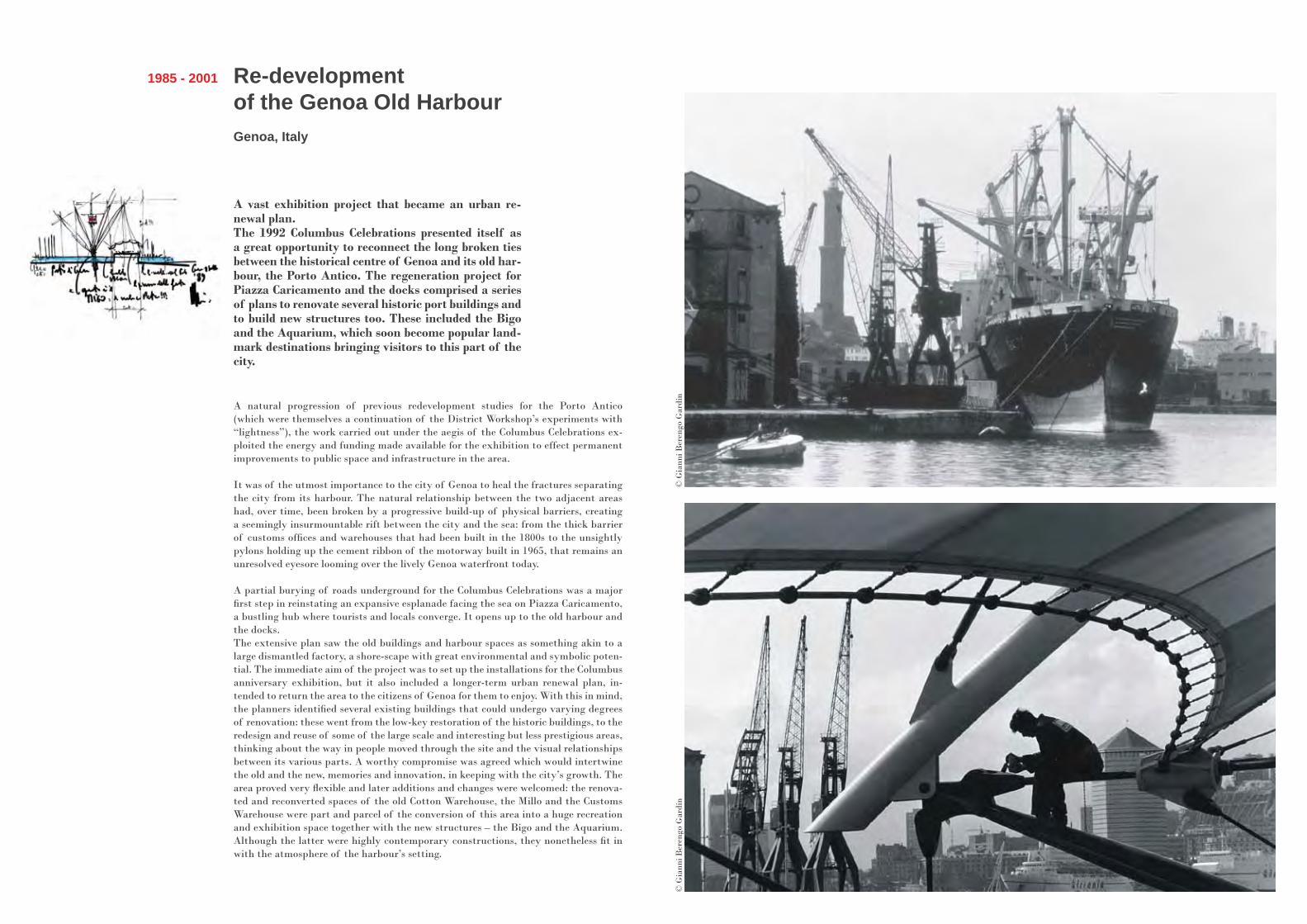
A vast exhibition project that became an urban re-newal plan. The 1992 Columbus Celebrations presented itself as a great opportunity to reconnect the long broken ties between the historical centre of Genoa and its old har-bour, the Porto Antico. The regeneration project for Piazza Caricamento and the docks comprised a series of plans to renovate several historic port buildings and to build new structures too. These included the Bigo and the Aquarium, which soon become popular land-mark destinations bringing visitors to this part of the city.
Re-development of the Genoa Old HarbourGenoa, Italy
1985 - 2001
A natural progression of previous redevelopment studies for the Porto Antico (which were themselves a continuation of the District Workshop’s experiments with “lightness”), the work carried out under the aegis of the Columbus Celebrations ex-ploited the energy and funding made available for the exhibition to effect permanent improvements to public space and infrastructure in the area.
It was of the utmost importance to the city of Genoa to heal the fractures separating the city from its harbour. The natural relationship between the two adjacent areas had, over time, been broken by a progressive build-up of physical barriers, creating a seemingly insurmountable rift between the city and the sea: from the thick barrier of customs offices and warehouses that had been built in the 1800s to the unsightly pylons holding up the cement ribbon of the motorway built in 1965, that remains an unresolved eyesore looming over the lively Genoa waterfront today.
A partial burying of roads underground for the Columbus Celebrations was a major first step in reinstating an expansive esplanade facing the sea on Piazza Caricamento, a bustling hub where tourists and locals converge. It opens up to the old harbour and the docks. The extensive plan saw the old buildings and harbour spaces as something akin to a large dismantled factory, a shore-scape with great environmental and symbolic poten-tial. The immediate aim of the project was to set up the installations for the Columbus anniversary exhibition, but it also included a longer-term urban renewal plan, in-tended to return the area to the citizens of Genoa for them to enjoy. With this in mind, the planners identified several existing buildings that could undergo varying degrees of renovation: these went from the low-key restoration of the historic buildings, to the redesign and reuse of some of the large scale and interesting but less prestigious areas, thinking about the way in people moved through the site and the visual relationships between its various parts. A worthy compromise was agreed which would intertwine the old and the new, memories and innovation, in keeping with the city’s growth. The area proved very flexible and later additions and changes were welcomed: the renova-ted and reconverted spaces of the old Cotton Warehouse, the Millo and the Customs Warehouse were part and parcel of the conversion of this area into a huge recreation and exhibition space together with the new structures – the Bigo and the Aquarium. Although the latter were highly contemporary constructions, they nonetheless fit in with the atmosphere of the harbour’s setting.
© G
iann
i Ber
engo
Gar
din
© G
iann
i Ber
engo
Gar
din

Potsdamer Platz Berlin, Germany
1992 - 2000
Following a competition won in 1992, the dormant wasteland of Potsdamer Platz in the newly reunified capital of Germany, Berlin, was entirely renovated based on an Renzo Piano Building Workshop-desig-ned masterplan. It wasn’t long before the new archi-tecture and fresh vitality triggered by this mixed-use development gave the entire area a new inner energy, reconnecting areas of the city long separated by the Berlin wall. This new centre is defined by two envi-ronmental features typical of the Berlin urban scene: green space and water.
Reconstructing Potsdamer Platz meant creating a project that would give some sort of shape to this place so steeped in memory but devoid of any physical traces offering proof of it. Having been abandoned for so long, attitudes to this part of the city had become deeply contradictory – in terms of urban policy, but also in terms of a divided sentiment that pit nostalgia against the need for a process of collective erasure. The devastation of the war, which reached its apex in the Spring of 1945 with bombing raids on an apocalyptic scale, was seen not as an opportunity for urban renewal but as an episode to forget. This stoppage of time became even more accentuated when the Wall was built in 1961. A vast and abandoned empty expanse in what was once, at the start of the century, one of Europe’s most lively urban centres, now boasted nothing more than traces of old roads and the isolated presence of the Weinhaus Huth.
Staying within the guidelines imposed by urban planning regulations at the time, the RPBW masterplan complied with the Berlin tradition of city blocks and pro-posed a design that was, urbanistically speaking, clear, compact and transparent on the ground floor with buildings for a wide range of different types of tenants: offices, apartments, cinemas, casino, theatres, restaurants and retail. The main hub of the complex was the new Marlene Dietrich Platz. The project called for the creation of 350,000 sq m of space on a site of 68,000 sq m. Streets, sidewalks and paths, trees and water helped to define these new places and new connections.
Once the masterplan had been drawn up, RPBW designed eight of the buildings and called in the other architects who had submitted designs for the competition for the remaining ten. Two towering office buildings stand as sentinels at the entrance to the new neighbourhood and an innovative gallery gives a modern twist to the retail pro-menade. The entertainment complex on the southwest side, housing the theatre and casino, was designed to be in synch with the Hans Scharoun-designed Neue Staats-bibliothek (1967-1978) and, in a more general sense, with the Kulturforum, an area which had once challenged the menacing boundary that the Wall presented.
Potsdamer Platz was also an opportunity for us to experiment with construction methods. An ambitious piece of maritime engineering enabled the foundations for the entire project to be built underwater, and terracotta was used extensively for various architectural solutions on the facades.
© R
PB
W, p
h. E
nric
o Ca
no©
RP
BW
, ph.
Vin
cent
Mos
ch
The New York Times BuildingNew York, USA
2000 - 2007
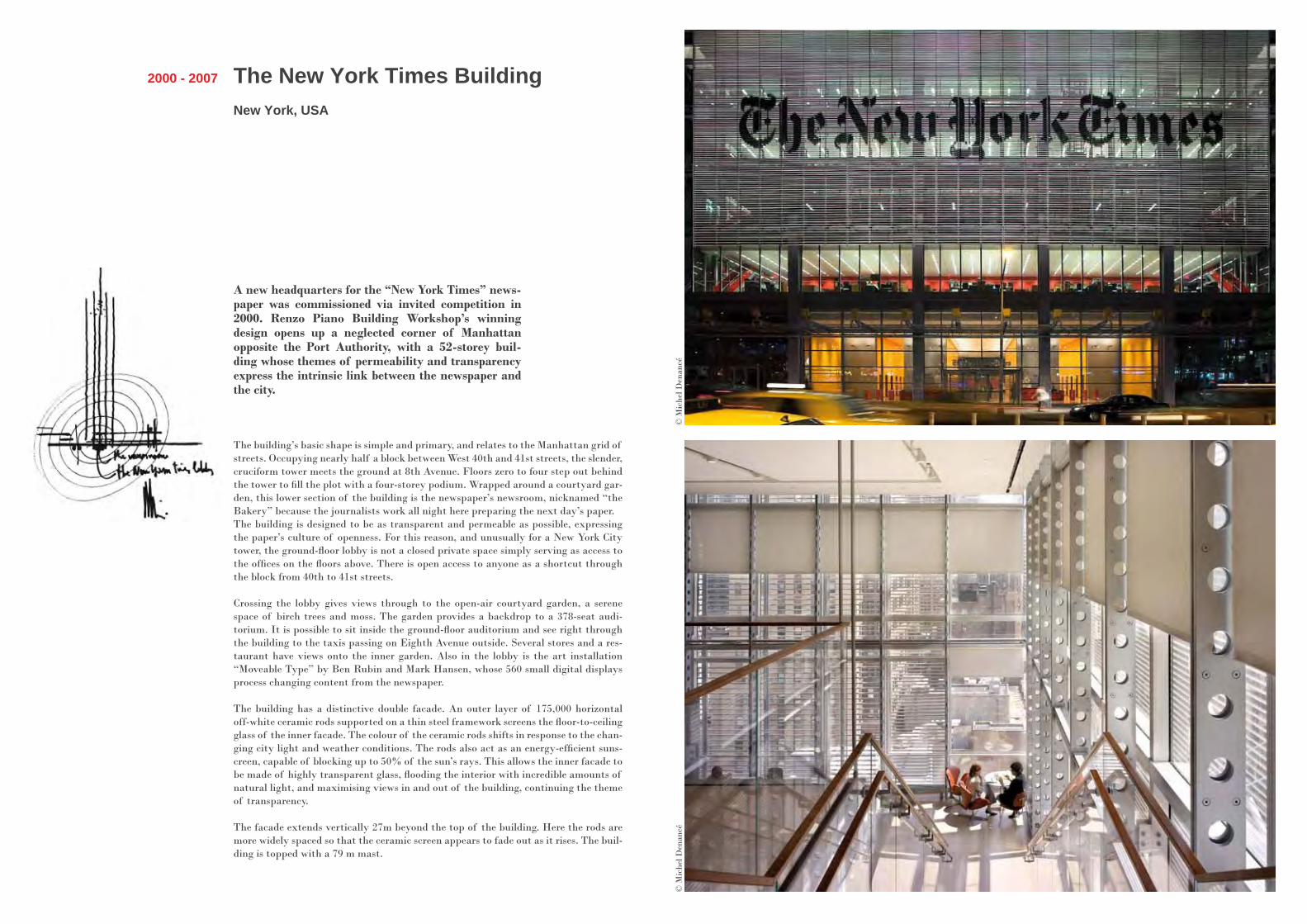
A new headquarters for the “New York Times” news-paper was commissioned via invited competition in 2000. Renzo Piano Building Workshop’s winning design opens up a neglected corner of Manhattan opposite the Port Authority, with a 52-storey buil-ding whose themes of permeability and transparency express the intrinsic link between the newspaper and the city.
The building’s basic shape is simple and primary, and relates to the Manhattan grid of streets. Occupying nearly half a block between West 40th and 41st streets, the slender, cruciform tower meets the ground at 8th Avenue. Floors zero to four step out behind the tower to fill the plot with a four-storey podium. Wrapped around a courtyard gar-den, this lower section of the building is the newspaper’s newsroom, nicknamed “the Bakery” because the journalists work all night here preparing the next day’s paper.The building is designed to be as transparent and permeable as possible, expressing the paper’s culture of openness. For this reason, and unusually for a New York City tower, the ground-floor lobby is not a closed private space simply serving as access to the offices on the floors above. There is open access to anyone as a shortcut through the block from 40th to 41st streets.
Crossing the lobby gives views through to the open-air courtyard garden, a serene space of birch trees and moss. The garden provides a backdrop to a 378-seat audi-torium. It is possible to sit inside the ground-floor auditorium and see right through the building to the taxis passing on Eighth Avenue outside. Several stores and a res-taurant have views onto the inner garden. Also in the lobby is the art installation “Moveable Type” by Ben Rubin and Mark Hansen, whose 560 small digital displays process changing content from the newspaper.
The building has a distinctive double facade. An outer layer of 175,000 horizontal off-white ceramic rods supported on a thin steel framework screens the floor-to-ceiling glass of the inner facade. The colour of the ceramic rods shifts in response to the chan-ging city light and weather conditions. The rods also act as an energy-efficient suns-creen, capable of blocking up to 50% of the sun’s rays. This allows the inner facade to be made of highly transparent glass, flooding the interior with incredible amounts of natural light, and maximising views in and out of the building, continuing the theme of transparency.
The facade extends vertically 27m beyond the top of the building. Here the rods are more widely spaced so that the ceramic screen appears to fade out as it rises. The buil-ding is topped with a 79 m mast.
© M
iche
l Den
ancé
© M
iche
l Den
ancé
Central St.Giles mixed-use development
London, UK
2002 - 2010
Situated between Covent Garden and New Oxford Street in central London, the Central St Giles develop-ment replaces a massive, unloved, impenetrable block of former government offices, with a permeable, vi-brant, sculptural mix of volumes containing offices, apartments, restaurants and retail. Central St Giles fits well with its urban context, responding to the shapes and colours that surround it.
Surrounded by conservation areas (although not one itself), it was essential that this sizeable new development fitted in to the scale and streetscape of this old area of central London. Breaking up the solid island site into a series of volumes, respecting surrounding building heights and creating access onto and through the development were just some of the ways this was done.
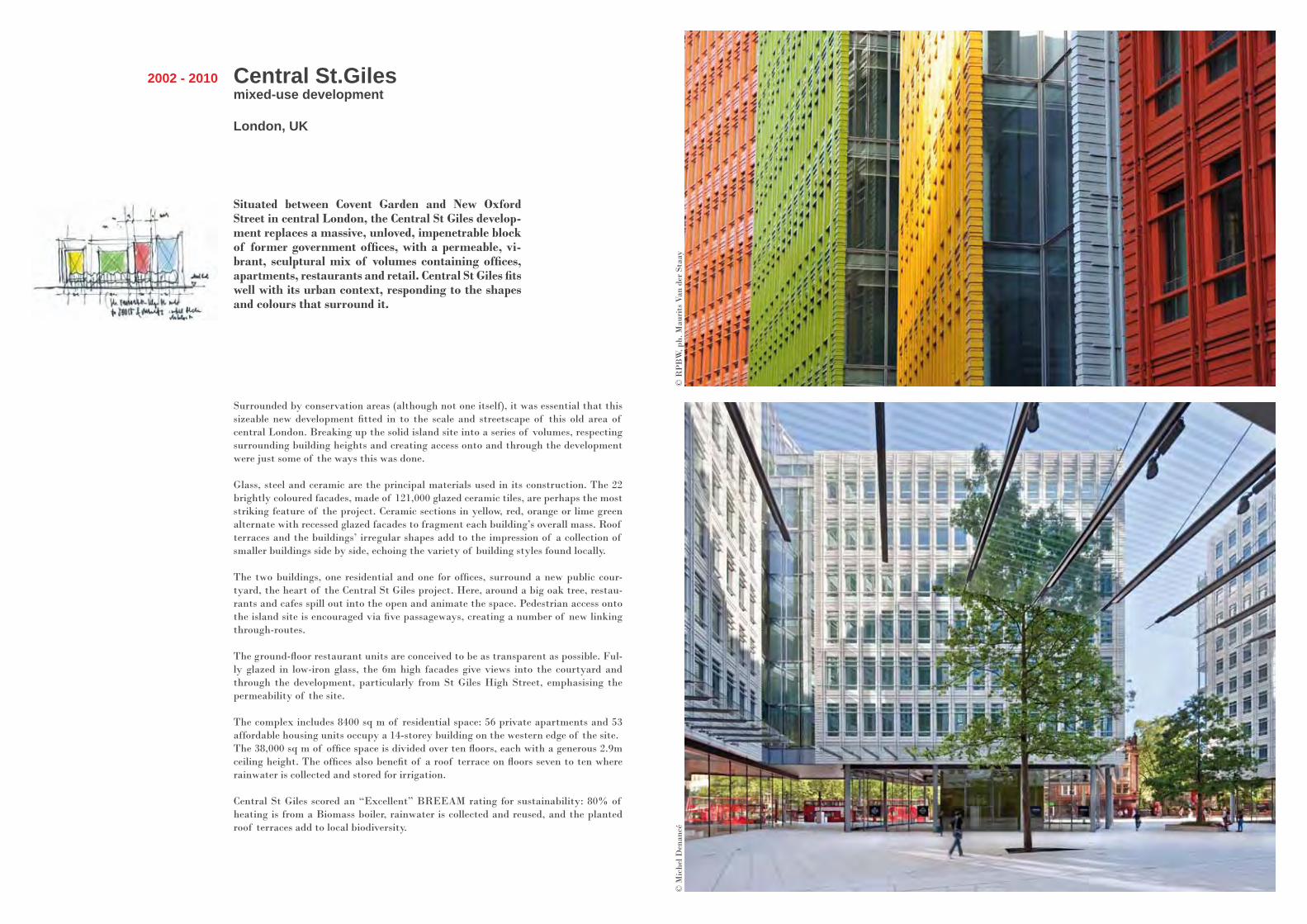
Glass, steel and ceramic are the principal materials used in its construction. The 22 brightly coloured facades, made of 121,000 glazed ceramic tiles, are perhaps the most striking feature of the project. Ceramic sections in yellow, red, orange or lime green alternate with recessed glazed facades to fragment each building’s overall mass. Roof terraces and the buildings’ irregular shapes add to the impression of a collection of smaller buildings side by side, echoing the variety of building styles found locally.
The two buildings, one residential and one for offices, surround a new public cour-tyard, the heart of the Central St Giles project. Here, around a big oak tree, restau-rants and cafes spill out into the open and animate the space. Pedestrian access onto the island site is encouraged via five passageways, creating a number of new linking through-routes.
The ground-floor restaurant units are conceived to be as transparent as possible. Ful-ly glazed in low-iron glass, the 6m high facades give views into the courtyard and through the development, particularly from St Giles High Street, emphasising the permeability of the site.
The complex includes 8400 sq m of residential space: 56 private apartments and 53 affordable housing units occupy a 14-storey building on the western edge of the site.The 38,000 sq m of office space is divided over ten floors, each with a generous 2.9m ceiling height. The offices also benefit of a roof terrace on floors seven to ten where rainwater is collected and stored for irrigation.
Central St Giles scored an “Excellent” BREEAM rating for sustainability: 80% of heating is from a Biomass boiler, rainwater is collected and reused, and the planted roof terraces add to local biodiversity.
© R
PB
W, p
h. M
auri
ts V
an d
er S
taay
© M
iche
l Den
ancé
The ShardLondon Bridge Tower
London, UK
2000 - 2012
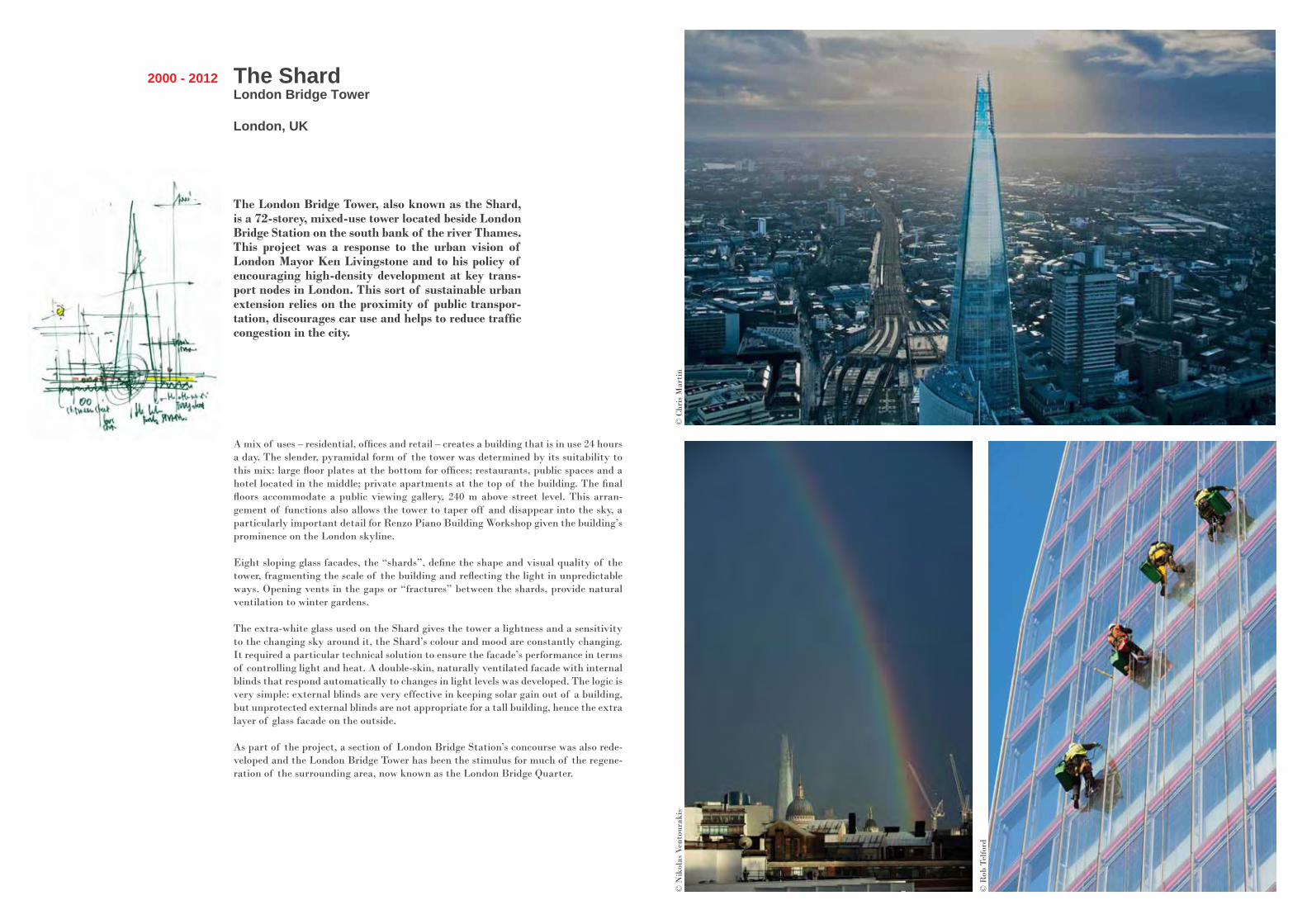
The London Bridge Tower, also known as the Shard, is a 72-storey, mixed-use tower located beside London Bridge Station on the south bank of the river Thames. This project was a response to the urban vision of London Mayor Ken Livingstone and to his policy of encouraging high-density development at key trans-port nodes in London. This sort of sustainable urban extension relies on the proximity of public transpor-tation, discourages car use and helps to reduce traffic congestion in the city.
A mix of uses – residential, offices and retail – creates a building that is in use 24 hours a day. The slender, pyramidal form of the tower was determined by its suitability to this mix: large floor plates at the bottom for offices; restaurants, public spaces and a hotel located in the middle; private apartments at the top of the building. The final floors accommodate a public viewing gallery, 240 m above street level. This arran-gement of functions also allows the tower to taper off and disappear into the sky, a particularly important detail for Renzo Piano Building Workshop given the building’s prominence on the London skyline.
Eight sloping glass facades, the “shards”, define the shape and visual quality of the tower, fragmenting the scale of the building and reflecting the light in unpredictable ways. Opening vents in the gaps or “fractures” between the shards, provide natural ventilation to winter gardens.
The extra-white glass used on the Shard gives the tower a lightness and a sensitivity to the changing sky around it, the Shard’s colour and mood are constantly changing. It required a particular technical solution to ensure the facade’s performance in terms of controlling light and heat. A double-skin, naturally ventilated facade with internal blinds that respond automatically to changes in light levels was developed. The logic is very simple: external blinds are very effective in keeping solar gain out of a building, but unprotected external blinds are not appropriate for a tall building, hence the extra layer of glass facade on the outside.
As part of the project, a section of London Bridge Station’s concourse was also rede-veloped and the London Bridge Tower has been the stimulus for much of the regene-ration of the surrounding area, now known as the London Bridge Quarter.
© N
ikol
as V
ento
urak
is
© R
ob T
elfo
rd
© C
hris
Mar
tin
MUSE and “Le Albere” areaTrento, Italy
2002 - in progress
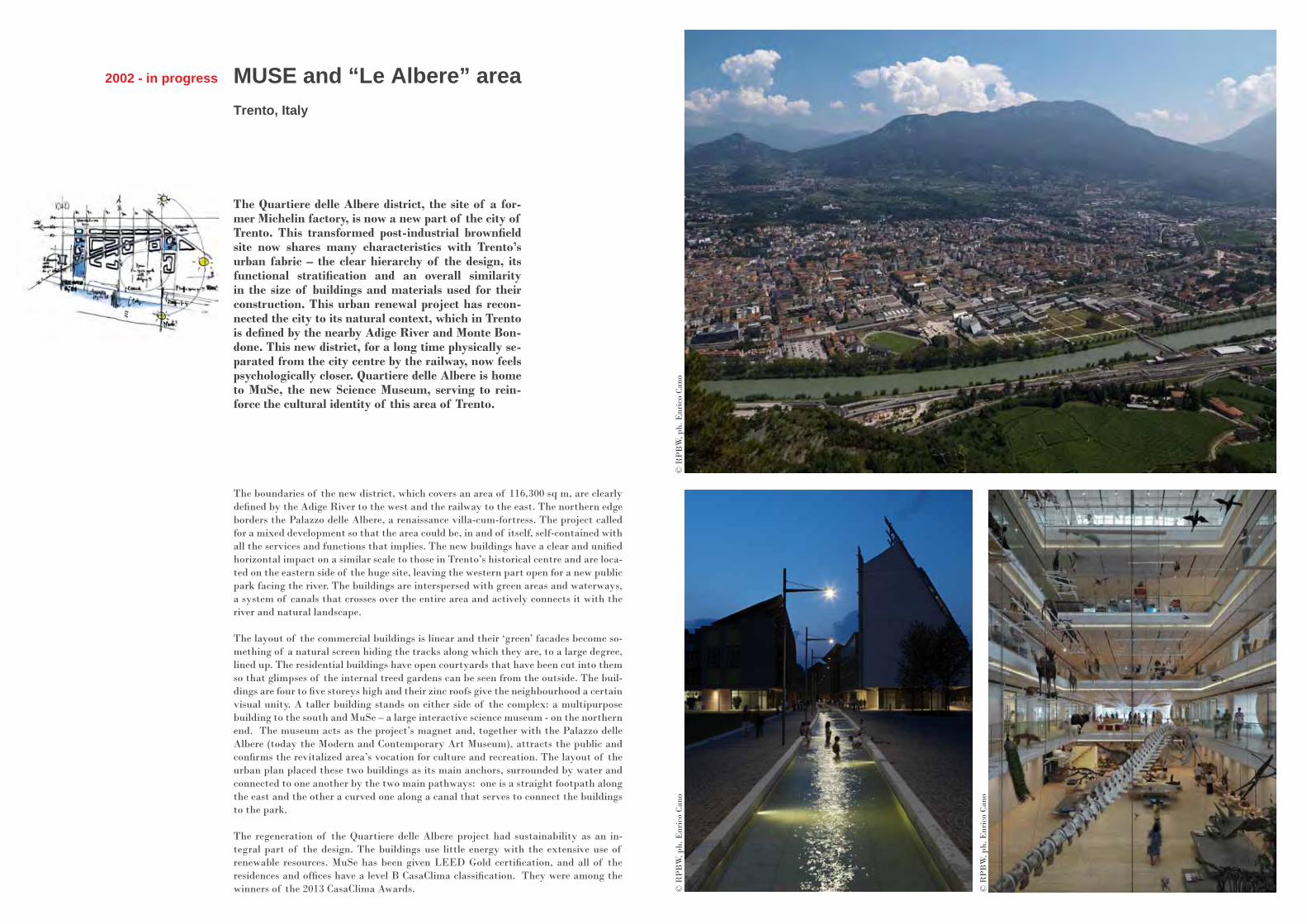
The Quartiere delle Albere district, the site of a for-mer Michelin factory, is now a new part of the city of Trento. This transformed post-industrial brownfield site now shares many characteristics with Trento’s urban fabric – the clear hierarchy of the design, its functional stratification and an overall similarity in the size of buildings and materials used for their construction. This urban renewal project has recon-nected the city to its natural context, which in Trento is defined by the nearby Adige River and Monte Bon-done. This new district, for a long time physically se-parated from the city centre by the railway, now feels psychologically closer. Quartiere delle Albere is home to MuSe, the new Science Museum, serving to rein-force the cultural identity of this area of Trento.
The boundaries of the new district, which covers an area of 116,300 sq m, are clearly defined by the Adige River to the west and the railway to the east. The northern edge borders the Palazzo delle Albere, a renaissance villa-cum-fortress. The project called for a mixed development so that the area could be, in and of itself, self-contained with all the services and functions that implies. The new buildings have a clear and unified horizontal impact on a similar scale to those in Trento’s historical centre and are loca-ted on the eastern side of the huge site, leaving the western part open for a new public park facing the river. The buildings are interspersed with green areas and waterways, a system of canals that crosses over the entire area and actively connects it with the river and natural landscape.
The layout of the commercial buildings is linear and their ‘green’ facades become so-mething of a natural screen hiding the tracks along which they are, to a large degree, lined up. The residential buildings have open courtyards that have been cut into them so that glimpses of the internal treed gardens can be seen from the outside. The buil-dings are four to five storeys high and their zinc roofs give the neighbourhood a certain visual unity. A taller building stands on either side of the complex: a multipurpose building to the south and MuSe – a large interactive science museum - on the northern end. The museum acts as the project’s magnet and, together with the Palazzo delle Albere (today the Modern and Contemporary Art Museum), attracts the public and confirms the revitalized area’s vocation for culture and recreation. The layout of the urban plan placed these two buildings as its main anchors, surrounded by water and connected to one another by the two main pathways: one is a straight footpath along the east and the other a curved one along a canal that serves to connect the buildings to the park.
The regeneration of the Quartiere delle Albere project had sustainability as an in-tegral part of the design. The buildings use little energy with the extensive use of renewable resources. MuSe has been given LEED Gold certification, and all of the residences and offices have a level B CasaClima classification. They were among the winners of the 2013 CasaClima Awards.
© R
PB
W, p
h. E
nric
o Ca
no©
RP
BW
, ph.
Enr
ico
Cano
© R
PB
W, p
h. E
nric
o Ca
no

2002 - in progress
Renzo Piano Building Workshop teamed up with SOM on the master plan of Columbia University’s new Manhattanville Campus. The first phase of the Harlem development is on site, and will include four buildings desi-gned by RPBW: the Jerome L. Greene Science Center, the Lenfest Cen-ter for the Arts, the Forum, and the School of International and Public Affairs. Columbia University has always been an urban institution. The new campus will be a place of research and knowledge production inte-grated with the city, in close contact with its social reality, street culture and energy.
The proposed Manhattanville Campus is a vision for a new campus of the 21st century, rooted in a commitment to diversity and accessibility, while at the same time meeting the growing space needs of the University. This 631,740 sq m long-term master plan will include academic, research, recreational, residential, administrative, and support space for the University, as well as publicly accessible open space and commercial, cultural, and social spaces, seeking to actively engage with the community.
Perhaps the overriding feature of the overall scheme is its permeability. Unlike the gated campus just five blocks south at Morningside Heights, the Manhattanville deve-lopment is designed to be part of the neighbourhood and open to all. University pro-grams have been pushed up a floor or more above street level, creating what has been termed the “Urban Layer”, whereby the ground floor of each building on the new campus will be devoted to public activity. Retail, restaurants, galleries and perfor-mance spaces, health clinics, community meeting space and a variety of University–community partnerships will fill this hybrid space, accessible to all.
Throughout the new Manhattanville Campus, all streets will remain public and open to vehicular traffic, and pedestrian access through the campus will be enhanced by tree-lined streets and widened sidewalks connecting the campus and the neighbou-rhood to the Hudson River Waterfront Park. Together with the “Urban Layer”, a network of large and small open spaces and a north–south pedestrian route weaves the campus together.
The master plan will be completed in successive phases, the first of which is a trian-gular area located at the southern end of the overall site between 125th Street and 130th Street, and bound on the east and west by Broadway and Riverside Drive. This first phase, already under construction, includes the Jerome L. Greene Science Center (housing the Zuckerman Mind Brain Behavior Institute), the Lenfest Center for the Arts (housing the School of the Arts and the Wallach Gallery), a shared meeting buil-ding called the Forum, and potentially the future School of International and Public Affairs. These buildings are to be centred around a public open space, landscaped with trees and lawns, which will serve as the threshold and entrance lobby into the development.The accessibility and transparency of the street level throughout the new develop-ment has largely been achieved by the relegation of support space to underground levels, with the construction of a central energy plant which will eventually provide for phase 1 andphase 2.
The US Green Building Council has awarded Columbia University’s Manhattan-ville Campus plan its highest LEED Platinum. This designation represents the first LEED-ND Platinum certification in New York City and the first for a university plan nationwide.The first buildings of the new campus, the Jerome L. Greene Science Center and the Lenfest Center, are due to be completed in June 2016. The Forum will be achieved early 2017.
Columbia University New Manhattanville Campus
New York, USA
© C
ourt
esy
of C
olum
bia
Uni
vers
ity
© R
PB
W
Milano SestoSesto San Giovanni (Milan), Italy
2005 - in progress
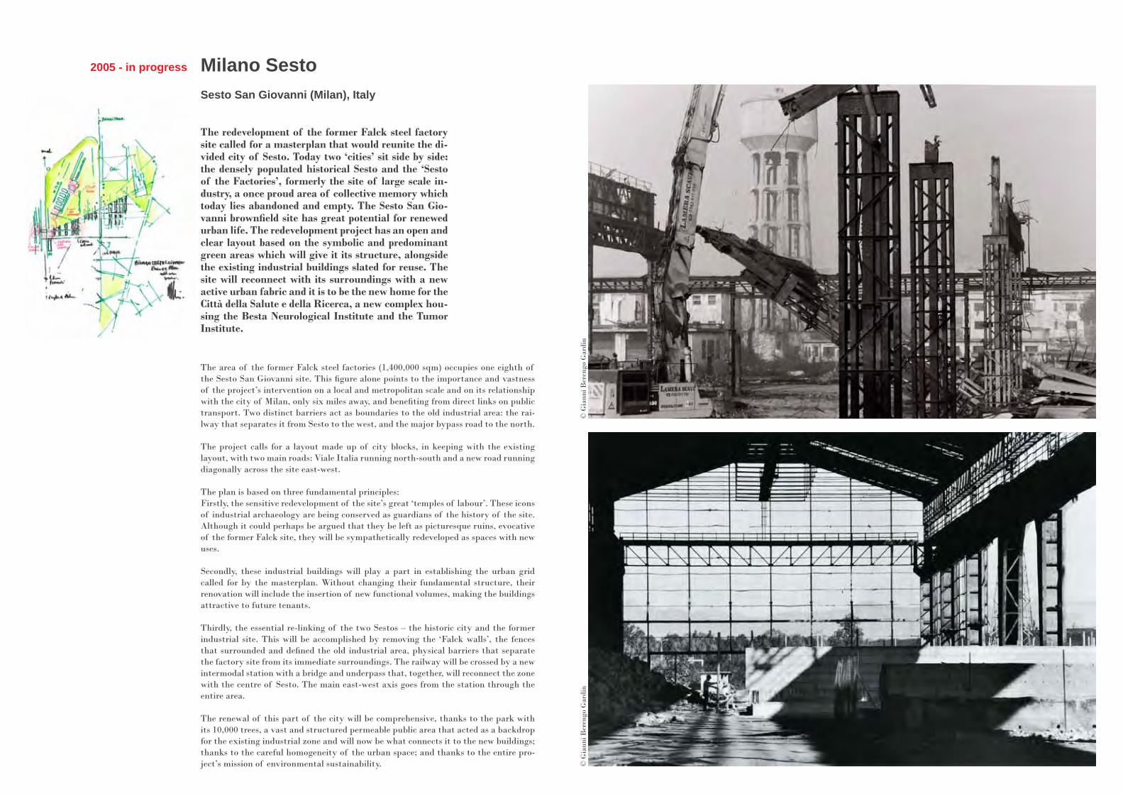
The redevelopment of the former Falck steel factory site called for a masterplan that would reunite the di-vided city of Sesto. Today two ‘cities’ sit side by side: the densely populated historical Sesto and the ‘Sesto of the Factories’, formerly the site of large scale in-dustry, a once proud area of collective memory which today lies abandoned and empty. The Sesto San Gio-vanni brownfield site has great potential for renewed urban life. The redevelopment project has an open and clear layout based on the symbolic and predominant green areas which will give it its structure, alongside the existing industrial buildings slated for reuse. The site will reconnect with its surroundings with a new active urban fabric and it is to be the new home for the Città della Salute e della Ricerca, a new complex hou-sing the Besta Neurological Institute and the Tumor Institute.
The area of the former Falck steel factories (1,400,000 sqm) occupies one eighth of the Sesto San Giovanni site. This figure alone points to the importance and vastness of the project’s intervention on a local and metropolitan scale and on its relationship with the city of Milan, only six miles away, and benefiting from direct links on public transport. Two distinct barriers act as boundaries to the old industrial area: the rai-lway that separates it from Sesto to the west, and the major bypass road to the north.
The project calls for a layout made up of city blocks, in keeping with the existing layout, with two main roads: Viale Italia running north-south and a new road running diagonally across the site east-west.
The plan is based on three fundamental principles: Firstly, the sensitive redevelopment of the site’s great ‘temples of labour’. These icons of industrial archaeology are being conserved as guardians of the history of the site. Although it could perhaps be argued that they be left as picturesque ruins, evocative of the former Falck site, they will be sympathetically redeveloped as spaces with new uses.
Secondly, these industrial buildings will play a part in establishing the urban grid called for by the masterplan. Without changing their fundamental structure, their renovation will include the insertion of new functional volumes, making the buildings attractive to future tenants.
Thirdly, the essential re-linking of the two Sestos – the historic city and the former industrial site. This will be accomplished by removing the ‘Falck walls’, the fences that surrounded and defined the old industrial area, physical barriers that separate the factory site from its immediate surroundings. The railway will be crossed by a new intermodal station with a bridge and underpass that, together, will reconnect the zone with the centre of Sesto. The main east-west axis goes from the station through the entire area. The renewal of this part of the city will be comprehensive, thanks to the park with its 10,000 trees, a vast and structured permeable public area that acted as a backdrop for the existing industrial zone and will now be what connects it to the new buildings; thanks to the careful homogeneity of the urban space; and thanks to the entire pro-ject’s mission of environmental sustainability.
© G
iann
i Ber
engo
Gar
din
© G
iann
i Ber
engo
Gar
din
Stavros Niarchos Foundation Cultural CentreAthens, Greece
2008 - in progress
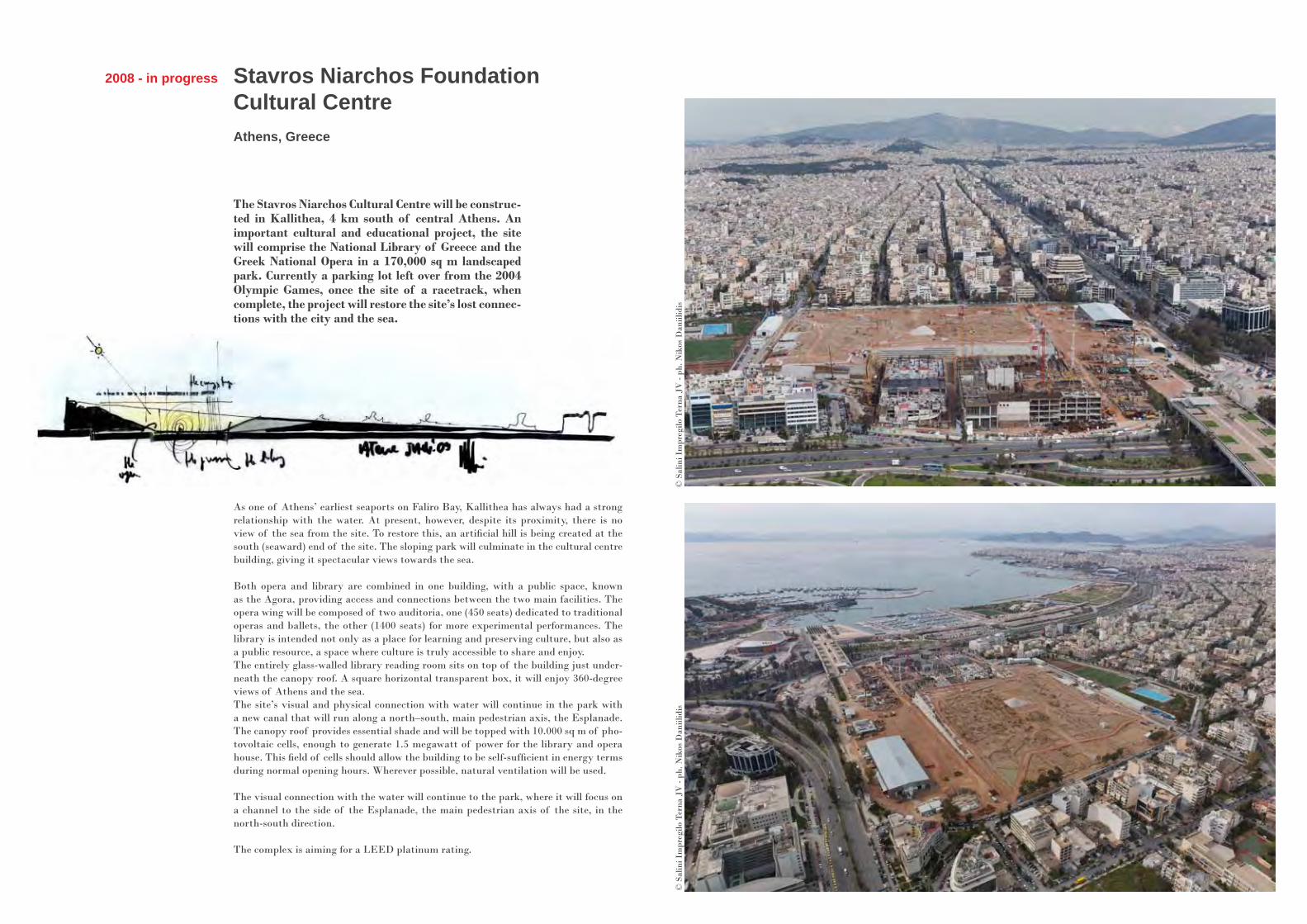
The Stavros Niarchos Cultural Centre will be construc-ted in Kallithea, 4 km south of central Athens. An important cultural and educational project, the site will comprise the National Library of Greece and the Greek National Opera in a 170,000 sq m landscaped park. Currently a parking lot left over from the 2004 Olympic Games, once the site of a racetrack, when complete, the project will restore the site’s lost connec-tions with the city and the sea.
As one of Athens’ earliest seaports on Faliro Bay, Kallithea has always had a strong relationship with the water. At present, however, despite its proximity, there is no view of the sea from the site. To restore this, an artificial hill is being created at the south (seaward) end of the site. The sloping park will culminate in the cultural centre building, giving it spectacular views towards the sea.
Both opera and library are combined in one building, with a public space, known as the Agora, providing access and connections between the two main facilities. The opera wing will be composed of two auditoria, one (450 seats) dedicated to traditional operas and ballets, the other (1400 seats) for more experimental performances. The library is intended not only as a place for learning and preserving culture, but also as a public resource, a space where culture is truly accessible to share and enjoy.The entirely glass-walled library reading room sits on top of the building just under-neath the canopy roof. A square horizontal transparent box, it will enjoy 360-degree views of Athens and the sea.The site’s visual and physical connection with water will continue in the park with a new canal that will run along a north–south, main pedestrian axis, the Esplanade. The canopy roof provides essential shade and will be topped with 10.000 sq m of pho-tovoltaic cells, enough to generate 1.5 megawatt of power for the library and opera house. This field of cells should allow the building to be self-sufficient in energy terms during normal opening hours. Wherever possible, natural ventilation will be used.
The visual connection with the water will continue to the park, where it will focus on a channel to the side of the Esplanade, the main pedestrian axis of the site, in the north-south direction.
The complex is aiming for a LEED platinum rating.
© S
alin
i Im
preg
ilo T
erna
JV
- ph
. Nik
os D
aniil
idis
© S
alin
i Im
preg
ilo T
erna
JV
- ph
. Nik
os D
aniil
idis

Beginning with building: Lightness in construction
At the beginning there’s the pleasure of building, an interest in concrete things. The passion and the sheer fun of constructing small or large buil-dings, piece by piece. The invention of prototypes, the trying out of new materials, learning about their potential and their limitations. When it comes down to it, transforming materials is the first step to transforming the world itself.
In Italy, we use the word costruttore, but English has a nicer term: ‘master builder’. A master builder is someone responsible, he is authoritative, a man focused on his work who invents something new every day and then builds it with his own hands.
Then there’s the search for lightness, the idea of constructing something weightless, if you will, The idea of designing with immaterial elements such as lightness, and also transparency, light and its vibrations, shadows, or sounds. Used together, these elements can contribute to defining a space in much the same way as shape and volume do.
Architects should always experiment. And to increase their level of inde-pendence they should also design the tools they work with. All of this is tied in with the noble idea of the master craftsman and building with integrity. A construction site is an extraordinary universe, always in movement, where new discoveries are constantly being made, a place of invention where pro-blems can be prioritised so that decisions can be made.
Even when designing a large-scale, complex building, the initial impulse is a study of the construction process. This is not an afterthought, not something considered only after the building’s form has been conceived, like fake scaffol-ding supporting a pre-conceived idea or finished shape. And, in fact, this image of the architect-builder, the architect-inventor remains an image which deep down corresponds to the mythical figure of Homo faber, or ‘Man the Creator’.
Renzo Pianoin conversation with Anna Foppiano
Early Works
Zentrum Paul KleeBern, Switzerland
IBMTraveling Pavilion
Kansai International Airport Passenger Terminal Building
Osaka, Japan
Pathé FoundationParis, France
Eolic WindmillGenoa, Italy
Early works
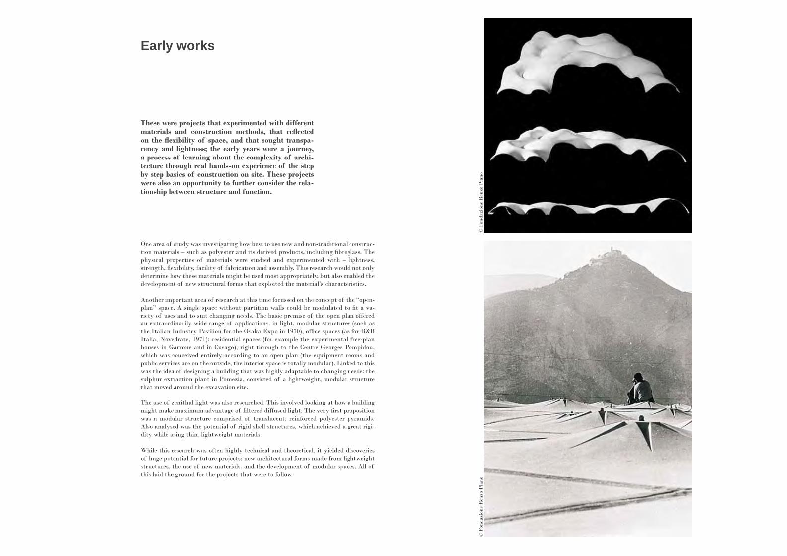
These were projects that experimented with different materials and construction methods, that reflected on the flexibility of space, and that sought transpa-rency and lightness; the early years were a journey, a process of learning about the complexity of archi-tecture through real hands-on experience of the step by step basics of construction on site. These projects were also an opportunity to further consider the rela-tionship between structure and function.
One area of study was investigating how best to use new and non-traditional construc-tion materials – such as polyester and its derived products, including fibreglass. The physical properties of materials were studied and experimented with – lightness, strength, flexibility, facility of fabrication and assembly. This research would not only determine how these materials might be used most appropriately, but also enabled the development of new structural forms that exploited the material’s characteristics.
Another important area of research at this time focussed on the concept of the “open-plan” space. A single space without partition walls could be modulated to fit a va-riety of uses and to suit changing needs. The basic premise of the open plan offered an extraordinarily wide range of applications: in light, modular structures (such as the Italian Industry Pavilion for the Osaka Expo in 1970); office spaces (as for B&B Italia, Novedrate, 1971); residential spaces (for example the experimental free-plan houses in Garrone and in Cusago); right through to the Centre Georges Pompidou, which was conceived entirely according to an open plan (the equipment rooms and public services are on the outside, the interior space is totally modular). Linked to this was the idea of designing a building that was highly adaptable to changing needs: the sulphur extraction plant in Pomezia, consisted of a lightweight, modular structure that moved around the excavation site.
The use of zenithal light was also researched. This involved looking at how a building might make maximum advantage of filtered diffused light. The very first proposition was a modular structure comprised of translucent, reinforced polyester pyramids. Also analysed was the potential of rigid shell structures, which achieved a great rigi-dity while using thin, lightweight materials.
While this research was often highly technical and theoretical, it yielded discoveries of huge potential for future projects: new architectural forms made from lightweight structures, the use of new materials, and the development of modular spaces. All of this laid the ground for the projects that were to follow.
© F
onda
zion
e R
enzo
Pia
no©
Fon
dazi
one
Ren
zo P
iano

In 1983, IBM devised a travelling exhibition to pro-mote advances in computer technology for telecom-munications. Reinforcing their message that works-tations could be virtually located anywhere, this temporary structure was designed to be assembled, exhibit for a month, and then dismantled at each of its 20 European destinations.
IBMTraveling Pavilion
Venice and Milan, Italy
1983 - 1986
The pavilion is a transparent tunnel, sitting on a raised platform that houses its sup-porting services. It is 48m long, 12m wide and 6m high. In order to facilitate easy as-sembly, disassembly and transportation, the enclosure is made of modular, repetitive elements of wood and polycarbonate. These elements are connected together by care-fully crafted aluminium joints to form the weathering envelope as well as its structure.
The tunnel vault is composed of 34 self-supporting segments, each of which contains a row of 12 polycarbonate pyramids. The pyramids sit on a pair of timber arches and are also connected at their apex by timber arches. Together, these arches and pyra-mids form a three-dimensional lattice truss, with the timber as the top and bottom elements, connected by the polycarbonate surfaces. In order to keep the arches to a suitable size, each one is composed of two sections pinned together at their apex. They are also pinned at their connection to the supporting base.The polycarbonate is manufactured using thermoforming techniques. The timber is glulaminated beech – composed of thin timber laminations that are glued together to give structural uniformity. The timber connections are in cast aluminium.
The temperature and humidity inside the pavilion had to be carefully controlled in order to ensure the correct functioning of the sophisticated electronic equipment, as well as creating a comfortable environment for the user. All environmental services were housed in the base so that when erected, all that was required for a fully opera-tional building was connection to an electrical power supply.
This travelling exhibition, which brought a vision of the future of technology from city to city, was seen by 1.5 million people between 1983 and 1986. The transparent pavilion, installed in green spaces in urban parks, was like a temporary winter garden full of high-tech tools and new information. The pavilion has not been reassembled since it was permanently dismantled following the completion of the exhibition in 1986.
© G
iann
i Ber
engo
Gar
din
© F
onda
zion
e R
enzo
Pia
no, p
hFul
vio
Roi
ter

Kansai airport is located on a specially built island in the Bay of Osaka. The terminal is 1.7km long, with 42 boarding gates, and can handle 100,000 passengers a day. Its long and light structure was designed to wit-hstand the violent earthquakes that often affect this region of Japan.
Kansai International Airport Passenger Terminal Building
Osaka, Japan
1988 – 1994
Kansai airport rests upon the island like a glider seen in plan – the main body of the airport forming its fuselage, and the boarding gates positioned in its wings.
A notable feature, and one of primary importance in the organisation of the airport, is the unobstructed visibility of the planes themselves thanks to the uninterrupted lines of vision through the open departures level Main Terminal Building. The depar-ture level is covered by a large, clear-span, undulating roof of asymmetrical form. It is perhaps this shape that is the project’s main innovation.The form of the roof developed from extensive study of structural and ventilation requirements undertaken with Peter Rice and Tom Barker, Ove Arup’s structural and services engineers respectively. It was decided that the air could simply be projected across the space, from the rear of the building towards the front, runway side. It is the predicted trajectory of this airflow that is mimicked by the form of the roof we see today. Having thus avoided enclosed air distribution ducts suspended from the cei-ling, the vast structure is left exposed. Beneath, blade-like deflectors serve not only to guide the airflow, but also to reflect the light coming in through skylights in the roof. Mobile sculptures (by sculptor Susumu Shingu) affixed to the ceiling are in continuous movement, testimony to these moving air streams.
In the Main terminal Building the geometry of the roof ’s undulating cross-section is formed of a series of arcs of different radii connected at tangent points. Three-dimen-sional beams spanning 80m follow the cross-sectional asymmetrical form of the roof, supported at their extremities by pairs of inclined columns.
The 42 boarding gates are housed within the “wings” of the glider. Their glazed fa-cades address the runway, while their opaque, curved roof sweeps down to turn its back on the distant coastline. The height of the “wings” decreases to the buildings’ extremities, with the roofs following an almost imperceptible curve, just sufficient to ensure the control tower’s lateral line of vision.
Geometrical studies led to the development of a mathematical model that would gua-rantee the maximum standardisation of components for the building. The final result is that all of Kansai Airport’s 82.000 stainless steel panels of the roof are absolutely identical (this is also thanks to the building’s overall size, which allowed the curves to be absorbed with low tolerances).
© K
IAC_
Kaw
atet
su©
Gia
nni B
eren
go G
ardi
n

Zentrum Paul Klee
Bern, Switzerland
1999 - 2005
The complex nature of the shapes and articulations of the body of work of German-Swiss artist Paul Klee is reflected in the architecture of the Zentrum. The mu-seum is part and parcel of the rolling hills and blends in with the natural landscape of the countryside out-side of Bern. Its curved roof made of long steel beams welded together one by one, houses one of the most extensive monographic collections in the world.
The museum was commissioned by the artist’s heirs and was the fruit of the genero-sity of arts patron Maurice E. Müller. Built to house over 4,000 of Paul Klee’s works of art under a single roof, the Zentrum is located in the eastern outskirts of Bern, an area marked on one side by the curve of a motorway and on the other by the distant profile of the Alps. One of the inspirations for the project’s design was the morpho-logy of the region, its vast expanse of hills and cultivated fields.
The architecture of the Zentrum was conceived as a gentle wave contouring the land. It is barely visible from a distance, the curvature of the structure creating three arti-ficial hills containing the exhibition space, a concert hall, a conference centre and a centre for the study, research and promotion of Klee’s works, as well as an interactive museum for children known as Creaviva, which also organises workshops on topics revolving around art. If the artistic themes encompassed by the museum reflect the multidisciplinary talent of the German-Swiss Klee – an artist and teacher with close ties to music and poetry -, the design of the building and the physiognomy of its space interpret his passion for harmony of form and the proportions of nature.
From a topographical point of view, the Zentrum project is an enlargement of the scale of the land, its space and peaceful silence. The tranquility here is not just acous-tic, but visual as well, a fundamental goal of this structure.
The three rolling ‘hills’ are connected by a covered pathway that runs along the entire length of the western façade. Because of the complex geometric curvature of each piece of the undulating roof covering the structure, the steel beams were individually hand-welded. The resulting complex sculpture appears to sew the landscape together and flow alongside the cultivated fields that surround it. The steel and glass facade of the building faces west and is equipped with sushading devices in textile, partially fixed and partially motorized, which filter natural light into the interior. For Klee’s watercolours, canvases and drawings to be properly preserved, they require a lumino-sity of between 50 and 100 lux, so artificial light is filtered onto them through white screens.
© M
iche
l Den
ancé
© M
iche
l Den
ancé
Eolic WindmillGenoa, Italy
2009 - 2011
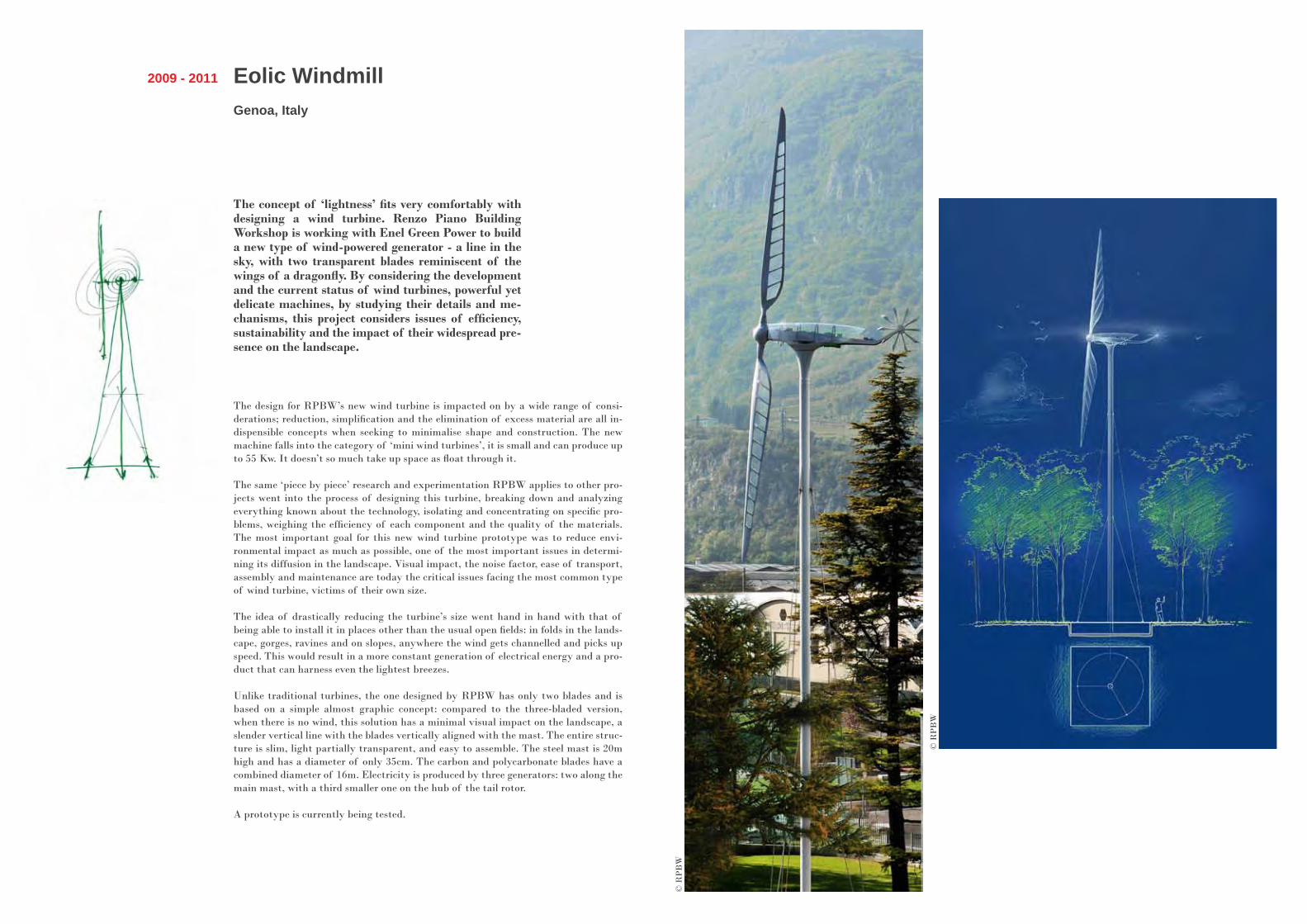
The concept of ‘lightness’ fits very comfortably with designing a wind turbine. Renzo Piano Building Workshop is working with Enel Green Power to build a new type of wind-powered generator - a line in the sky, with two transparent blades reminiscent of the wings of a dragonfly. By considering the development and the current status of wind turbines, powerful yet delicate machines, by studying their details and me-chanisms, this project considers issues of efficiency, sustainability and the impact of their widespread pre-sence on the landscape.
The design for RPBW’s new wind turbine is impacted on by a wide range of consi-derations; reduction, simplification and the elimination of excess material are all in-dispensible concepts when seeking to minimalise shape and construction. The new machine falls into the category of ‘mini wind turbines’, it is small and can produce up to 55 Kw. It doesn’t so much take up space as float through it.
The same ‘piece by piece’ research and experimentation RPBW applies to other pro-jects went into the process of designing this turbine, breaking down and analyzing everything known about the technology, isolating and concentrating on specific pro-blems, weighing the efficiency of each component and the quality of the materials. The most important goal for this new wind turbine prototype was to reduce envi-ronmental impact as much as possible, one of the most important issues in determi-ning its diffusion in the landscape. Visual impact, the noise factor, ease of transport, assembly and maintenance are today the critical issues facing the most common type of wind turbine, victims of their own size.
The idea of drastically reducing the turbine’s size went hand in hand with that of being able to install it in places other than the usual open fields: in folds in the lands-cape, gorges, ravines and on slopes, anywhere the wind gets channelled and picks up speed. This would result in a more constant generation of electrical energy and a pro-duct that can harness even the lightest breezes.
Unlike traditional turbines, the one designed by RPBW has only two blades and is based on a simple almost graphic concept: compared to the three-bladed version, when there is no wind, this solution has a minimal visual impact on the landscape, a slender vertical line with the blades vertically aligned with the mast. The entire struc-ture is slim, light partially transparent, and easy to assemble. The steel mast is 20m high and has a diameter of only 35cm. The carbon and polycarbonate blades have a combined diameter of 16m. Electricity is produced by three generators: two along the main mast, with a third smaller one on the hub of the tail rotor.
A prototype is currently being tested.
© R
PB
W
© R
PB
W
Pathé FoundationParis, France
2006 - in progress
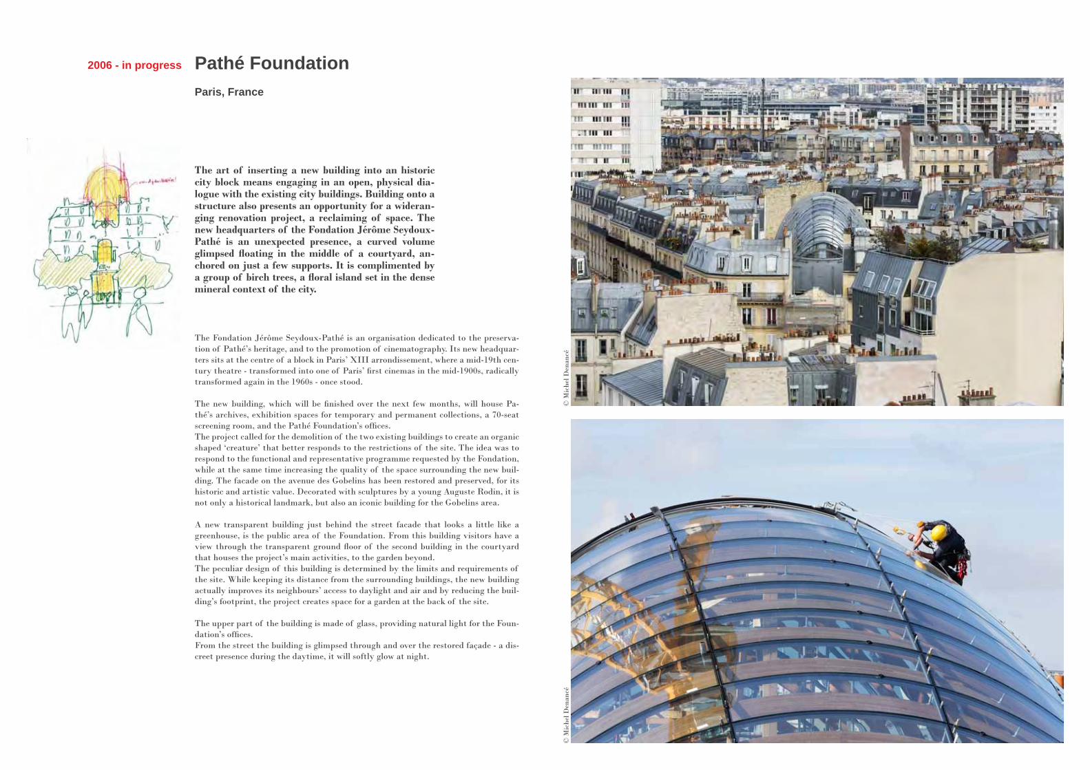
The art of inserting a new building into an historic city block means engaging in an open, physical dia-logue with the existing city buildings. Building onto a structure also presents an opportunity for a wideran-ging renovation project, a reclaiming of space. The new headquarters of the Fondation Jérôme Seydoux-Pathé is an unexpected presence, a curved volume glimpsed floating in the middle of a courtyard, an-chored on just a few supports. It is complimented by a group of birch trees, a floral island set in the dense mineral context of the city.
The Fondation Jérôme Seydoux-Pathé is an organisation dedicated to the preserva-tion of Pathé’s heritage, and to the promotion of cinematography. Its new headquar-ters sits at the centre of a block in Paris’ XIII arrondissement, where a mid-19th cen-tury theatre - transformed into one of Paris’ first cinemas in the mid-1900s, radically transformed again in the 1960s - once stood.
The new building, which will be finished over the next few months, will house Pa-thé’s archives, exhibition spaces for temporary and permanent collections, a 70-seat screening room, and the Pathé Foundation’s offices.The project called for the demolition of the two existing buildings to create an organic shaped ‘creature’ that better responds to the restrictions of the site. The idea was to respond to the functional and representative programme requested by the Fondation, while at the same time increasing the quality of the space surrounding the new buil-ding. The facade on the avenue des Gobelins has been restored and preserved, for its historic and artistic value. Decorated with sculptures by a young Auguste Rodin, it is not only a historical landmark, but also an iconic building for the Gobelins area.
A new transparent building just behind the street facade that looks a little like a greenhouse, is the public area of the Foundation. From this building visitors have a view through the transparent ground floor of the second building in the courtyard that houses the project’s main activities, to the garden beyond.The peculiar design of this building is determined by the limits and requirements of the site. While keeping its distance from the surrounding buildings, the new building actually improves its neighbours’ access to daylight and air and by reducing the buil-ding’s footprint, the project creates space for a garden at the back of the site.
The upper part of the building is made of glass, providing natural light for the Foun-dation’s offices.From the street the building is glimpsed through and over the restored façade - a dis-creet presence during the daytime, it will softly glow at night.
© M
iche
l Den
ancé
© M
iche
l Den
ancé

Architecture for music and silence
Simply stated, architecture can be defined as a service, an art that produces objects that serve a function. An architect’s task is to hold on to the identi-ties of places and objects, and be honest about their functions: we must never forget what the building we are constructing is actually meant to do.
But architecture is also the art of understanding the emotion of a space. Through architecture we can create spaces for music and spaces for silence, for meditation. Although you might associate silence in architecture with sacred places, it also has a secular value that corresponds to society’s need for places to gather, and share in silence. Concentration is a fundamental condition that allows us to understand the essence of a space and of works of art.
Of all the arts, music is the most intangible and architecture the most tan-gible. If you lack the talent to become a good musician, perhaps you might turn your hand to constructing spaces for music, like being a luthier on a grand scale! In creating a space for sound, you seek to define that space through sound, and then design it. And this is another way of rendering vi-sible something that is intangible. It’s a fascinating theme that we have spent a great deal of time exploring, starting with the experiments we conducted at the Paris IRCAM and the musical space for Luigi Nono’s Prometheus.
Truth be told, there are many similarities between architecture and music. Both use technique in a virtuoso manner and both consist of logical and struc-tural mechanisms. Both music and architecture are constructed with meticu-lous care based on the laws of mathematics and geometry, a strict structure from which you can, maybe even should, deviate. And both feature vibration and colour as fundamental components.
Renzo Pianoin conversation with Anna Foppiano
Prometeo Musical Space
Venice and Milan, Italy
Niccolo’ Paganini AuditoriumParma, Italy
Padre Pio Pilgrimage ChurchS. Giovanni Rotondo (Foggia), Italy
“Parco della Musica”Auditorium
Rome, Italy
RonchampGatehouse and Monastery
Ronchamp, France
Auditorium del ParcoL’Aquila, Italy
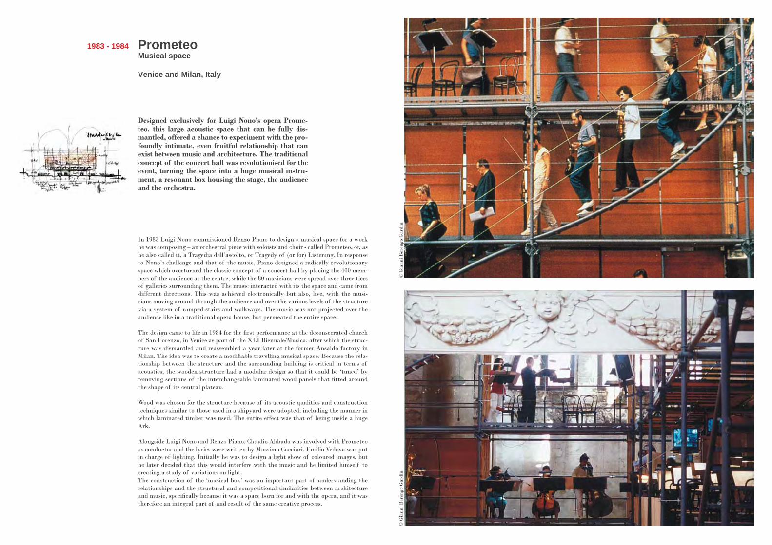
Designed exclusively for Luigi Nono’s opera Prome-teo, this large acoustic space that can be fully dis-mantled, offered a chance to experiment with the pro-foundly intimate, even fruitful relationship that can exist between music and architecture. The traditional concept of the concert hall was revolutionised for the event, turning the space into a huge musical instru-ment, a resonant box housing the stage, the audience and the orchestra.
PrometeoMusical space
Venice and Milan, Italy
1983 - 1984
In 1983 Luigi Nono commissioned Renzo Piano to design a musical space for a work he was composing – an orchestral piece with soloists and choir - called Prometeo, or, as he also called it, a Tragedia dell’ascolto, or Tragedy of (or for) Listening. In response to Nono’s challenge and that of the music, Piano designed a radically revolutionary space which overturned the classic concept of a concert hall by placing the 400 mem-bers of the audience at the centre, while the 80 musicians were spread over three tiers of galleries surrounding them. The music interacted with its the space and came from different directions. This was achieved electronically but also, live, with the musi-cians moving around through the audience and over the various levels of the structure via a system of ramped stairs and walkways. The music was not projected over the audience like in a traditional opera house, but permeated the entire space.
The design came to life in 1984 for the first performance at the deconsecrated church of San Lorenzo, in Venice as part of the XLI Biennale/Musica, after which the struc-ture was dismantled and reassembled a year later at the former Ansaldo factory in Milan. The idea was to create a modifiable travelling musical space. Because the rela-tionship between the structure and the surrounding building is critical in terms of acoustics, the wooden structure had a modular design so that it could be ‘tuned’ by removing sections of the interchangeable laminated wood panels that fitted around the shape of its central plateau.
Wood was chosen for the structure because of its acoustic qualities and construction techniques similar to those used in a shipyard were adopted, including the manner in which laminated timber was used. The entire effect was that of being inside a huge Ark.
Alongside Luigi Nono and Renzo Piano, Claudio Abbado was involved with Prometeo as conductor and the lyrics were written by Massimo Cacciari. Emilio Vedova was put in charge of lighting. Initially he was to design a light show of coloured images, but he later decided that this would interfere with the music and he limited himself to creating a study of variations on light. The construction of the ‘musical box’ was an important part of understanding the relationships and the structural and compositional similarities between architecture and music, specifically because it was a space born for and with the opera, and it was therefore an integral part of and result of the same creative process.
© G
iann
i Ber
engo
Gar
din
© G
iann
i Ber
engo
Gar
din
“Parco della Musica” Auditorium
Rome, Italy
1994 - 2002
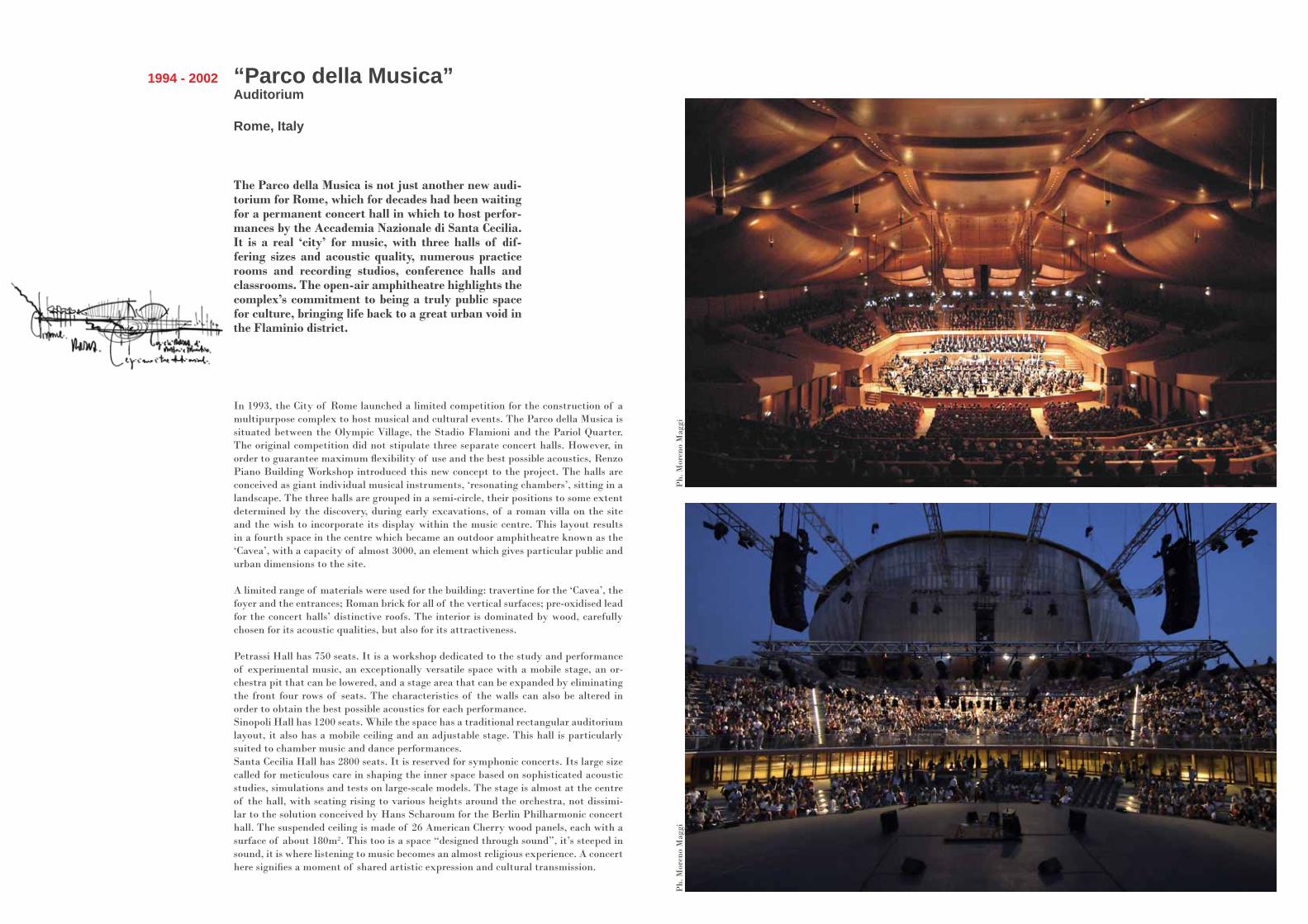
The Parco della Musica is not just another new audi-torium for Rome, which for decades had been waiting for a permanent concert hall in which to host perfor-mances by the Accademia Nazionale di Santa Cecilia. It is a real ‘city’ for music, with three halls of dif-fering sizes and acoustic quality, numerous practice rooms and recording studios, conference halls and classrooms. The open-air amphitheatre highlights the complex’s commitment to being a truly public space for culture, bringing life back to a great urban void in the Flaminio district.
In 1993, the City of Rome launched a limited competition for the construction of a multipurpose complex to host musical and cultural events. The Parco della Musica is situated between the Olympic Village, the Stadio Flamioni and the Pariol Quarter. The original competition did not stipulate three separate concert halls. However, in order to guarantee maximum flexibility of use and the best possible acoustics, Renzo Piano Building Workshop introduced this new concept to the project. The halls are conceived as giant individual musical instruments, ‘resonating chambers’, sitting in a landscape. The three halls are grouped in a semi-circle, their positions to some extent determined by the discovery, during early excavations, of a roman villa on the site and the wish to incorporate its display within the music centre. This layout results in a fourth space in the centre which became an outdoor amphitheatre known as the ‘Cavea’, with a capacity of almost 3000, an element which gives particular public and urban dimensions to the site.
A limited range of materials were used for the building: travertine for the ‘Cavea’, the foyer and the entrances; Roman brick for all of the vertical surfaces; pre-oxidised lead for the concert halls’ distinctive roofs. The interior is dominated by wood, carefully chosen for its acoustic qualities, but also for its attractiveness. Petrassi Hall has 750 seats. It is a workshop dedicated to the study and performance of experimental music, an exceptionally versatile space with a mobile stage, an or-chestra pit that can be lowered, and a stage area that can be expanded by eliminating the front four rows of seats. The characteristics of the walls can also be altered in order to obtain the best possible acoustics for each performance. Sinopoli Hall has 1200 seats. While the space has a traditional rectangular auditorium layout, it also has a mobile ceiling and an adjustable stage. This hall is particularly suited to chamber music and dance performances.Santa Cecilia Hall has 2800 seats. It is reserved for symphonic concerts. Its large size called for meticulous care in shaping the inner space based on sophisticated acoustic studies, simulations and tests on large-scale models. The stage is almost at the centre of the hall, with seating rising to various heights around the orchestra, not dissimi-lar to the solution conceived by Hans Scharoum for the Berlin Philharmonic concert hall. The suspended ceiling is made of 26 American Cherry wood panels, each with a surface of about 180m². This too is a space “designed through sound”, it’s steeped in sound, it is where listening to music becomes an almost religious experience. A concert here signifies a moment of shared artistic expression and cultural transmission.
Ph.
Mor
eno
Mag
giP
h. M
oren
o M
aggi
Ph.
Enr
ico
Cano
Ph.
Enr
ico
Cano
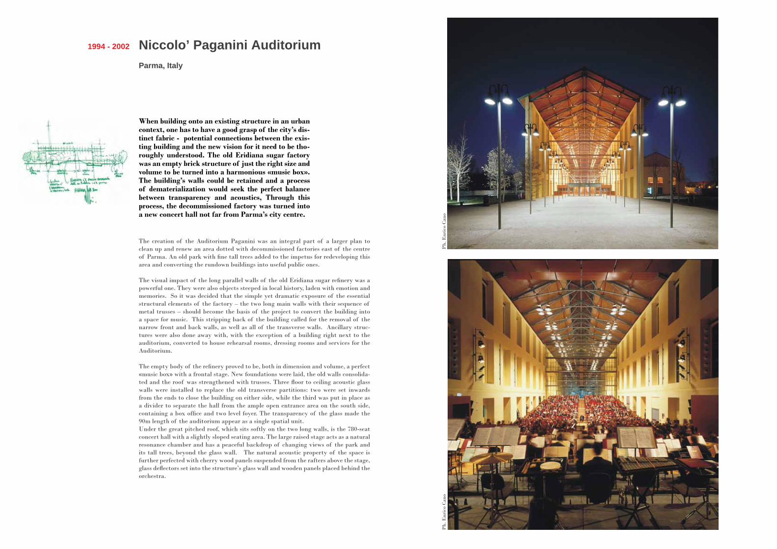
When building onto an existing structure in an urban context, one has to have a good grasp of the city’s dis-tinct fabric - potential connections between the exis-ting building and the new vision for it need to be tho-roughly understood. The old Eridiana sugar factory was an empty brick structure of just the right size and volume to be turned into a harmonious «music box». The building’s walls could be retained and a process of dematerialization would seek the perfect balance between transparency and acoustics, Through this process, the decommissioned factory was turned into a new concert hall not far from Parma’s city centre.
Niccolo’ Paganini Auditorium Parma, Italy
1994 - 2002
The creation of the Auditorium Paganini was an integral part of a larger plan to clean up and renew an area dotted with decommissioned factories east of the centre of Parma. An old park with fine tall trees added to the impetus for redeveloping this area and converting the rundown buildings into useful public ones.
The visual impact of the long parallel walls of the old Eridiana sugar refinery was a powerful one. They were also objects steeped in local history, laden with emotion and memories. So it was decided that the simple yet dramatic exposure of the essential structural elements of the factory – the two long main walls with their sequence of metal trusses – should become the basis of the project to convert the building into a space for music. This stripping back of the building called for the removal of the narrow front and back walls, as well as all of the transverse walls. Ancillary struc-tures were also done away with, with the exception of a building right next to the auditorium, converted to house rehearsal rooms, dressing rooms and services for the Auditorium.
The empty body of the refinery proved to be, both in dimension and volume, a perfect «music box» with a frontal stage. New foundations were laid, the old walls consolida-ted and the roof was strengthened with trusses. Three floor to ceiling acoustic glass walls were installed to replace the old transverse partitions: two were set inwards from the ends to close the building on either side, while the third was put in place as a divider to separate the hall from the ample open entrance area on the south side, containing a box office and two level foyer. The transparency of the glass made the 90m length of the auditorium appear as a single spatial unit. Under the great pitched roof, which sits softly on the two long walls, is the 780-seat concert hall with a slightly sloped seating area. The large raised stage acts as a natural resonance chamber and has a peaceful backdrop of changing views of the park and its tall trees, beyond the glass wall. The natural acoustic property of the space is further perfected with cherry wood panels suspended from the rafters above the stage, glass deflectors set into the structure’s glass wall and wooden panels placed behind the orchestra.
Padre Pio Pilgrimage ChurchS. Giovanni Rotondo (Foggia), Italy
1991 - 2004
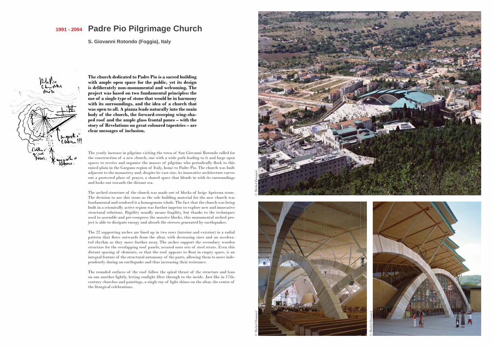
The church dedicated to Padre Pio is a sacred building with ample open space for the public, yet its design is deliberately non-monumental and welcoming. The project was based on two fundamental principles: the use of a single type of stone that would be in harmony with its surroundings, and the idea of a church that was open to all. A piazza leads naturally into the main body of the church, the forward-sweeping wing-sha-ped roof and the ample glass frontal panes – with the story of Revelations on great coloured tapestries – are clear messages of inclusion.
The yearly increase in pilgrims visiting the town of San Giovanni Rotondo called for the construction of a new church, one with a wide path leading to it and large open spaces to receive and organise the masses of pilgrims who periodically flock to this raised plain in the Gargano region of Italy, home to Padre Pio. The church was built adjacent to the monastery and, despite its vast size, its innovative architecture carves out a protected place of prayer, a shared space that blends in with its surroundings and looks out towards the distant sea.
The arched structure of the church was made out of blocks of beige Apricena stone. The decision to use this stone as the sole building material for the new church was fundamental and rendered it a homogenous whole. The fact that the church was being built in a seismically active region was further impetus to explore new and innovative structural solutions. Rigidity usually means fragility, but thanks to the techniques used to assemble and pre-compress the massive blocks, this monumental arched pro-ject is able to dissipate energy and absorb the stresses generated by earthquakes.
The 22 supporting arches are lined up in two rows (interior and exterior) in a radial pattern that flows outwards from the altar, with decreasing sizes and an accelera-ted rhythm as they move further away. The arches support the secondary wooden structure for the overlapping roof panels, secured onto sets of steel struts. Even this distant spacing of elements, so that the roof appears to float in empty space, is an integral feature of the structural autonomy of the parts, allowing them to move inde-pendently during an earthquake and thus increasing their resistance.
The rounded surfaces of the roof follow the spiral thrust of the structure and lean on one another lightly, letting sunlight filter through to the inside. Just like in 17th-century churches and paintings, a single ray of light shines on the altar, the centre of the liturgical celebrations.
© M
iche
l Den
ancé
© M
iche
l Den
ancé
© M
iche
l Den
ancé
Ronchamp Gatehouse and Monastery
Ronchamp, France
2006 - 2011
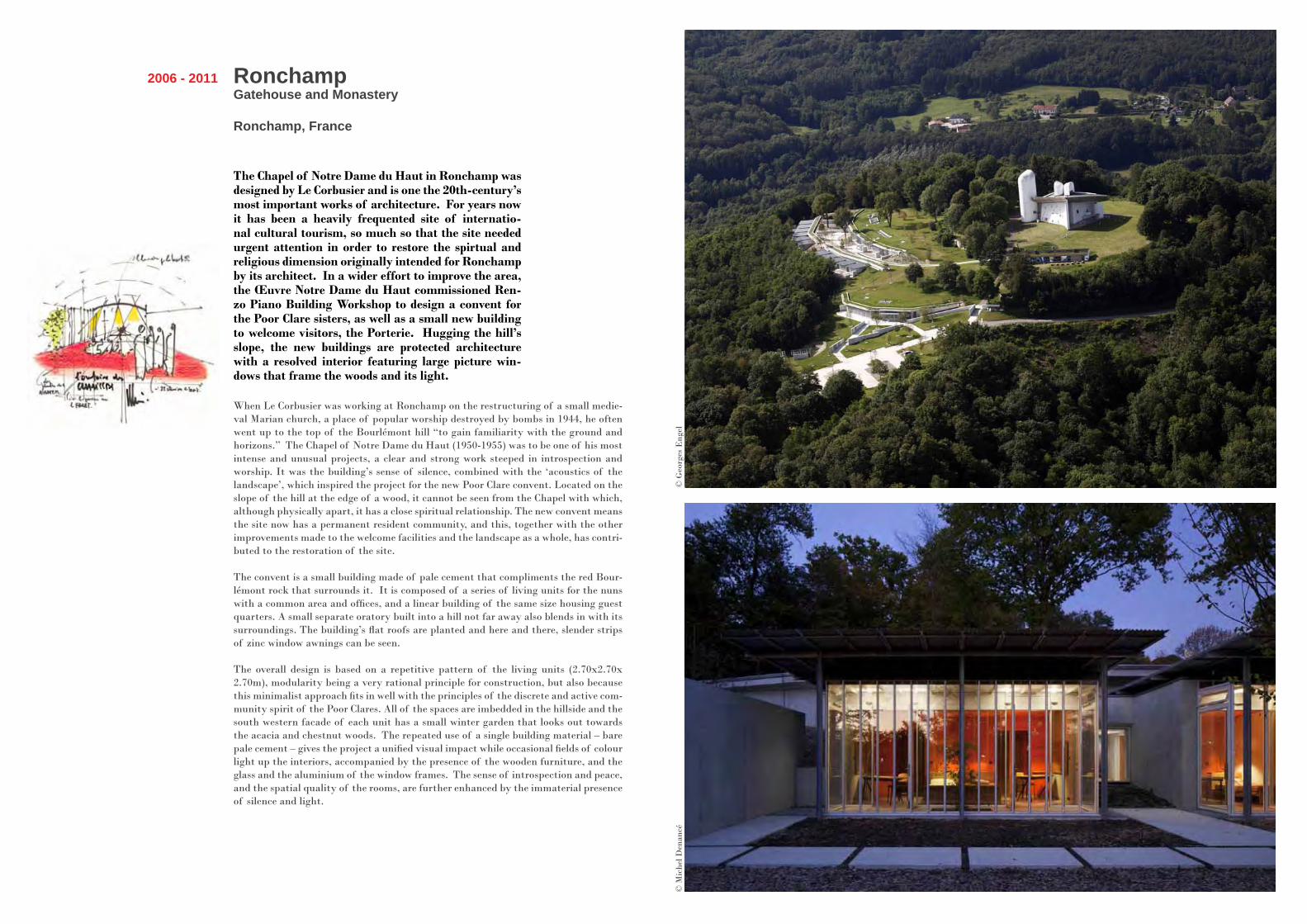
The Chapel of Notre Dame du Haut in Ronchamp was designed by Le Corbusier and is one the 20th-century’s most important works of architecture. For years now it has been a heavily frequented site of internatio-nal cultural tourism, so much so that the site needed urgent attention in order to restore the spirtual and religious dimension originally intended for Ronchamp by its architect. In a wider effort to improve the area, the Œuvre Notre Dame du Haut commissioned Ren-zo Piano Building Workshop to design a convent for the Poor Clare sisters, as well as a small new building to welcome visitors, the Porterie. Hugging the hill’s slope, the new buildings are protected architecture with a resolved interior featuring large picture win-dows that frame the woods and its light.
When Le Corbusier was working at Ronchamp on the restructuring of a small medie-val Marian church, a place of popular worship destroyed by bombs in 1944, he often went up to the top of the Bourlémont hill “to gain familiarity with the ground and horizons.” The Chapel of Notre Dame du Haut (1950-1955) was to be one of his most intense and unusual projects, a clear and strong work steeped in introspection and worship. It was the building’s sense of silence, combined with the ‘acoustics of the landscape’, which inspired the project for the new Poor Clare convent. Located on the slope of the hill at the edge of a wood, it cannot be seen from the Chapel with which, although physically apart, it has a close spiritual relationship. The new convent means the site now has a permanent resident community, and this, together with the other improvements made to the welcome facilities and the landscape as a whole, has contri-buted to the restoration of the site.
The convent is a small building made of pale cement that compliments the red Bour-lémont rock that surrounds it. It is composed of a series of living units for the nuns with a common area and offices, and a linear building of the same size housing guest quarters. A small separate oratory built into a hill not far away also blends in with its surroundings. The building’s flat roofs are planted and here and there, slender strips of zinc window awnings can be seen.
The overall design is based on a repetitive pattern of the living units (2.70x2.70x 2.70m), modularity being a very rational principle for construction, but also because this minimalist approach fits in well with the principles of the discrete and active com-munity spirit of the Poor Clares. All of the spaces are imbedded in the hillside and the south western facade of each unit has a small winter garden that looks out towards the acacia and chestnut woods. The repeated use of a single building material – bare pale cement – gives the project a unified visual impact while occasional fields of colour light up the interiors, accompanied by the presence of the wooden furniture, and the glass and the aluminium of the window frames. The sense of introspection and peace, and the spatial quality of the rooms, are further enhanced by the immaterial presence of silence and light.
© M
iche
l Den
ancé
© G
eorg
es E
ngel
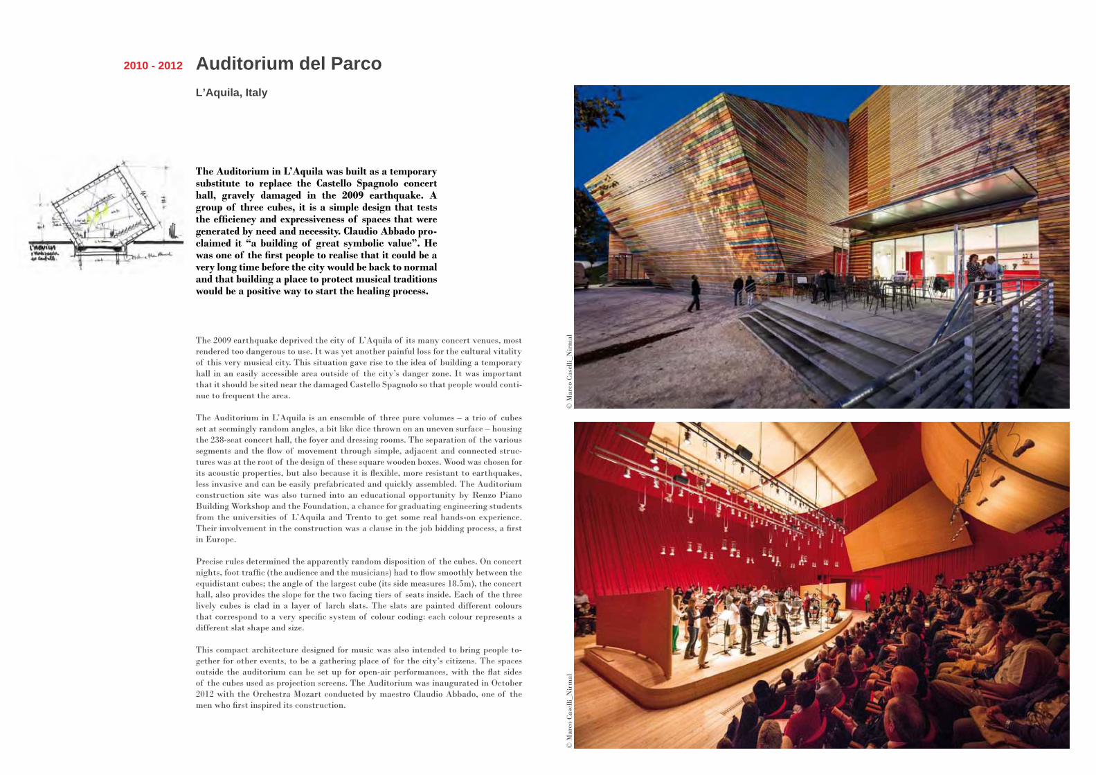
Auditorium del ParcoL’Aquila, Italy
2010 - 2012
The Auditorium in L’Aquila was built as a temporary substitute to replace the Castello Spagnolo concert hall, gravely damaged in the 2009 earthquake. A group of three cubes, it is a simple design that tests the efficiency and expressiveness of spaces that were generated by need and necessity. Claudio Abbado pro-claimed it “a building of great symbolic value”. He was one of the first people to realise that it could be a very long time before the city would be back to normal and that building a place to protect musical traditions would be a positive way to start the healing process.
The 2009 earthquake deprived the city of L’Aquila of its many concert venues, most rendered too dangerous to use. It was yet another painful loss for the cultural vitality of this very musical city. This situation gave rise to the idea of building a temporary hall in an easily accessible area outside of the city’s danger zone. It was important that it should be sited near the damaged Castello Spagnolo so that people would conti-nue to frequent the area.
The Auditorium in L’Aquila is an ensemble of three pure volumes – a trio of cubes set at seemingly random angles, a bit like dice thrown on an uneven surface – housing the 238-seat concert hall, the foyer and dressing rooms. The separation of the various segments and the flow of movement through simple, adjacent and connected struc-tures was at the root of the design of these square wooden boxes. Wood was chosen for its acoustic properties, but also because it is flexible, more resistant to earthquakes, less invasive and can be easily prefabricated and quickly assembled. The Auditorium construction site was also turned into an educational opportunity by Renzo Piano Building Workshop and the Foundation, a chance for graduating engineering students from the universities of L’Aquila and Trento to get some real hands-on experience. Their involvement in the construction was a clause in the job bidding process, a first in Europe.
Precise rules determined the apparently random disposition of the cubes. On concert nights, foot traffic (the audience and the musicians) had to flow smoothly between the equidistant cubes; the angle of the largest cube (its side measures 18.5m), the concert hall, also provides the slope for the two facing tiers of seats inside. Each of the three lively cubes is clad in a layer of larch slats. The slats are painted different colours that correspond to a very specific system of colour coding: each colour represents a different slat shape and size.
This compact architecture designed for music was also intended to bring people to-gether for other events, to be a gathering place of for the city’s citizens. The spaces outside the auditorium can be set up for open-air performances, with the flat sides of the cubes used as projection screens. The Auditorium was inaugurated in October 2012 with the Orchestra Mozart conducted by maestro Claudio Abbado, one of the men who first inspired its construction.
© M
arco
Cas
elli_
Nir
mal
© M
arco
Cas
elli_
Nir
mal
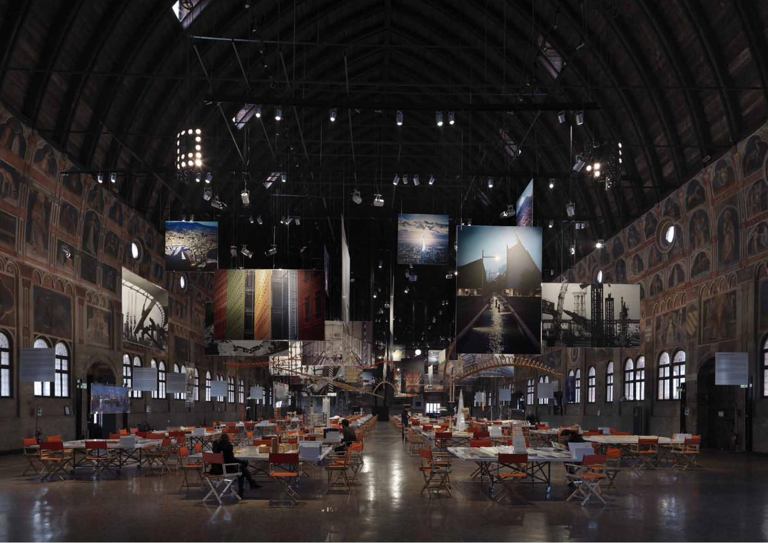
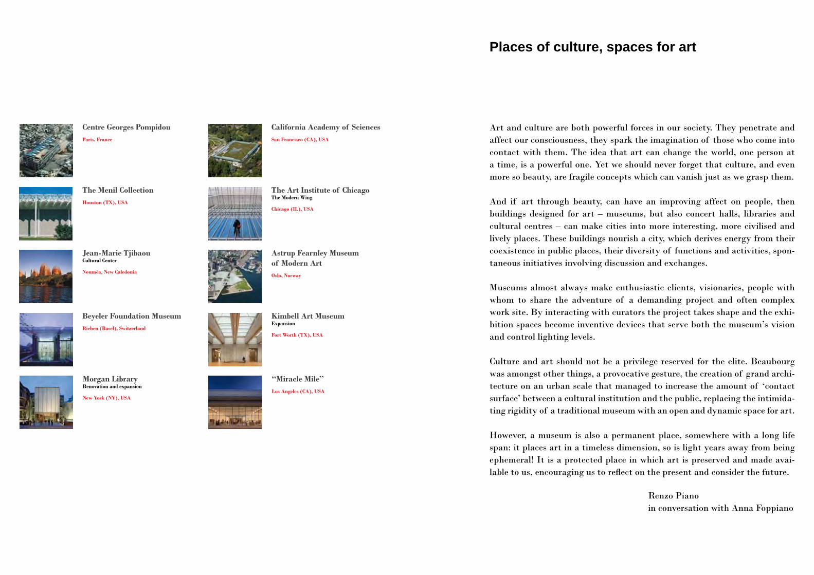
Places of culture, spaces for art
Art and culture are both powerful forces in our society. They penetrate and affect our consciousness, they spark the imagination of those who come into contact with them. The idea that art can change the world, one person at a time, is a powerful one. Yet we should never forget that culture, and even more so beauty, are fragile concepts which can vanish just as we grasp them.
And if art through beauty, can have an improving affect on people, then buildings designed for art – museums, but also concert halls, libraries and cultural centres – can make cities into more interesting, more civilised and lively places. These buildings nourish a city, which derives energy from their coexistence in public places, their diversity of functions and activities, spon-taneous initiatives involving discussion and exchanges.
Museums almost always make enthusiastic clients, visionaries, people with whom to share the adventure of a demanding project and often complex work site. By interacting with curators the project takes shape and the exhi-bition spaces become inventive devices that serve both the museum’s vision and control lighting levels.
Culture and art should not be a privilege reserved for the elite. Beaubourg was amongst other things, a provocative gesture, the creation of grand archi-tecture on an urban scale that managed to increase the amount of ‘contact surface’ between a cultural institution and the public, replacing the intimida-ting rigidity of a traditional museum with an open and dynamic space for art.
However, a museum is also a permanent place, somewhere with a long life span: it places art in a timeless dimension, so is light years away from being ephemeral! It is a protected place in which art is preserved and made avai-lable to us, encouraging us to reflect on the present and consider the future.
Renzo Pianoin conversation with Anna Foppiano
California Academy of Sciences San Francisco (CA), USA
Centre Georges PompidouParis, France
Astrup Fearnley Museum of Modern ArtOslo, Norway
Beyeler Foundation MuseumRiehen (Basel), Switzerland
Kimbell Art MuseumExpansion
Fort Worth (TX), USA
Jean-Marie TjibaouCultural Center
Nouméa, New Caledonia
The Art Institute of Chicago The Modern Wing
Chicago (IL), USA
The Menil CollectionHouston (TX), USA
‘‘Miracle Mile’’ Los Angeles (CA), USA
Morgan LibraryRenovation and expansion
New York (NY), USA
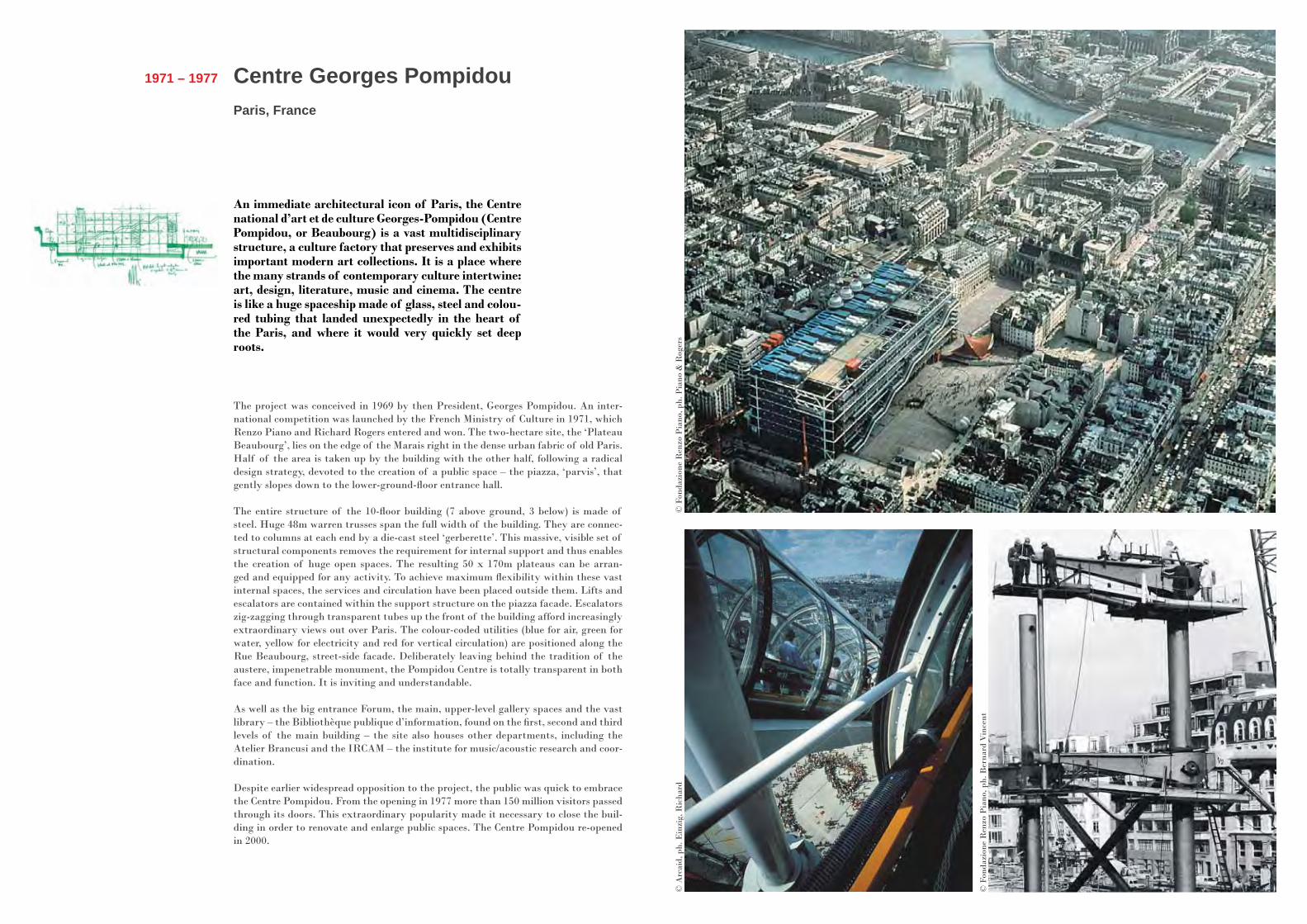
Centre Georges PompidouParis, France
1971 – 1977
An immediate architectural icon of Paris, the Centre national d’art et de culture Georges-Pompidou (Centre Pompidou, or Beaubourg) is a vast multidisciplinary structure, a culture factory that preserves and exhibits important modern art collections. It is a place where the many strands of contemporary culture intertwine: art, design, literature, music and cinema. The centre is like a huge spaceship made of glass, steel and colou-red tubing that landed unexpectedly in the heart of the Paris, and where it would very quickly set deep roots.
The project was conceived in 1969 by then President, Georges Pompidou. An inter-national competition was launched by the French Ministry of Culture in 1971, which Renzo Piano and Richard Rogers entered and won. The two-hectare site, the ‘Plateau Beaubourg’, lies on the edge of the Marais right in the dense urban fabric of old Paris. Half of the area is taken up by the building with the other half, following a radical design strategy, devoted to the creation of a public space – the piazza, ‘parvis’, that gently slopes down to the lower-ground-floor entrance hall.
The entire structure of the 10-floor building (7 above ground, 3 below) is made of steel. Huge 48m warren trusses span the full width of the building. They are connec-ted to columns at each end by a die-cast steel ‘gerberette’. This massive, visible set of structural components removes the requirement for internal support and thus enables the creation of huge open spaces. The resulting 50 x 170m plateaus can be arran-ged and equipped for any activity. To achieve maximum flexibility within these vast internal spaces, the services and circulation have been placed outside them. Lifts and escalators are contained within the support structure on the piazza facade. Escalators zig-zagging through transparent tubes up the front of the building afford increasingly extraordinary views out over Paris. The colour-coded utilities (blue for air, green for water, yellow for electricity and red for vertical circulation) are positioned along the Rue Beaubourg, street-side facade. Deliberately leaving behind the tradition of the austere, impenetrable monument, the Pompidou Centre is totally transparent in both face and function. It is inviting and understandable.
As well as the big entrance Forum, the main, upper-level gallery spaces and the vast library – the Bibliothèque publique d’information, found on the first, second and third levels of the main building – the site also houses other departments, including the Atelier Brancusi and the IRCAM – the institute for music/acoustic research and coor-dination.
Despite earlier widespread opposition to the project, the public was quick to embrace the Centre Pompidou. From the opening in 1977 more than 150 million visitors passed through its doors. This extraordinary popularity made it necessary to close the buil-ding in order to renovate and enlarge public spaces. The Centre Pompidou re-opened in 2000.
© A
rcai
d, p
h. E
inzi
g, R
icha
rd©
Fon
dazi
one
Ren
zo P
iano
, ph.
Pia
no &
Rog
ers
© F
onda
zion
e R
enzo
Pia
no, p
h. B
erna
rd V
ince
nt
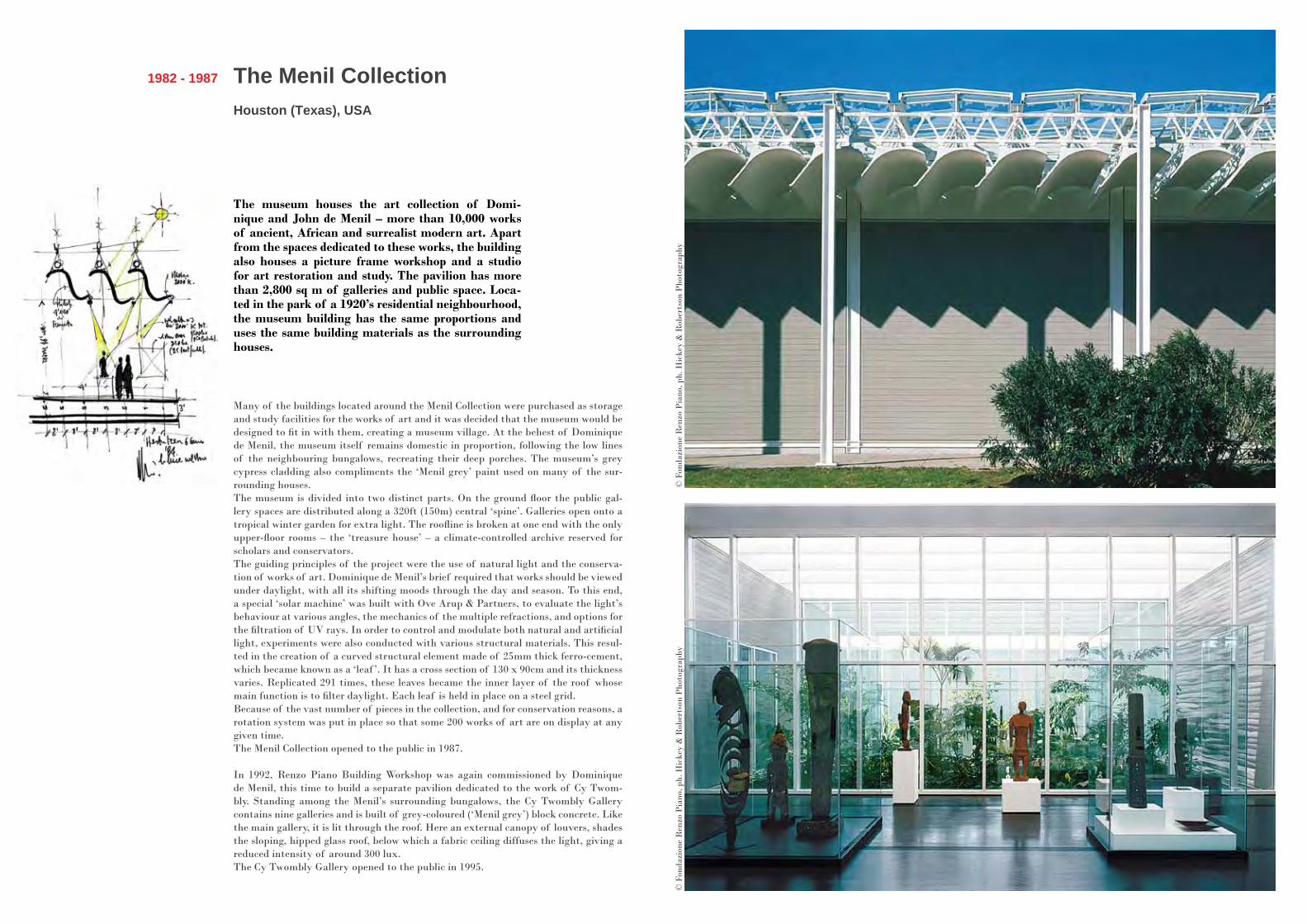
The Menil CollectionHouston (Texas), USA
1982 - 1987
The museum houses the art collection of Domi-nique and John de Menil – more than 10,000 works of ancient, African and surrealist modern art. Apart from the spaces dedicated to these works, the building also houses a picture frame workshop and a studio for art restoration and study. The pavilion has more than 2,800 sq m of galleries and public space. Loca-ted in the park of a 1920’s residential neighbourhood, the museum building has the same proportions and uses the same building materials as the surrounding houses.
Many of the buildings located around the Menil Collection were purchased as storage and study facilities for the works of art and it was decided that the museum would be designed to fit in with them, creating a museum village. At the behest of Dominique de Menil, the museum itself remains domestic in proportion, following the low lines of the neighbouring bungalows, recreating their deep porches. The museum’s grey cypress cladding also compliments the ‘Menil grey’ paint used on many of the sur-rounding houses. The museum is divided into two distinct parts. On the ground floor the public gal-lery spaces are distributed along a 320ft (150m) central ‘spine’. Galleries open onto a tropical winter garden for extra light. The roofline is broken at one end with the only upper-floor rooms – the ‘treasure house’ – a climate-controlled archive reserved for scholars and conservators. The guiding principles of the project were the use of natural light and the conserva-tion of works of art. Dominique de Menil’s brief required that works should be viewed under daylight, with all its shifting moods through the day and season. To this end, a special ‘solar machine’ was built with Ove Arup & Partners, to evaluate the light’s behaviour at various angles, the mechanics of the multiple refractions, and options for the filtration of UV rays. In order to control and modulate both natural and artificial light, experiments were also conducted with various structural materials. This resul-ted in the creation of a curved structural element made of 25mm thick ferro-cement, which became known as a ‘leaf ’. It has a cross section of 130 x 90cm and its thickness varies. Replicated 291 times, these leaves became the inner layer of the roof whose main function is to filter daylight. Each leaf is held in place on a steel grid. Because of the vast number of pieces in the collection, and for conservation reasons, a rotation system was put in place so that some 200 works of art are on display at any given time.The Menil Collection opened to the public in 1987.
In 1992, Renzo Piano Building Workshop was again commissioned by Dominique de Menil, this time to build a separate pavilion dedicated to the work of Cy Twom-bly. Standing among the Menil’s surrounding bungalows, the Cy Twombly Gallery contains nine galleries and is built of grey-coloured (‘Menil grey’) block concrete. Like the main gallery, it is lit through the roof. Here an external canopy of louvers, shades the sloping, hipped glass roof, below which a fabric ceiling diffuses the light, giving a reduced intensity of around 300 lux.The Cy Twombly Gallery opened to the public in 1995.
© F
onda
zion
e R
enzo
Pia
no, p
h. H
icke
y &
Rob
erts
on P
hoto
grap
hy©
Fon
dazi
one
Ren
zo P
iano
, ph.
Hic
key
& R
ober
tson
Pho
togr
aphy
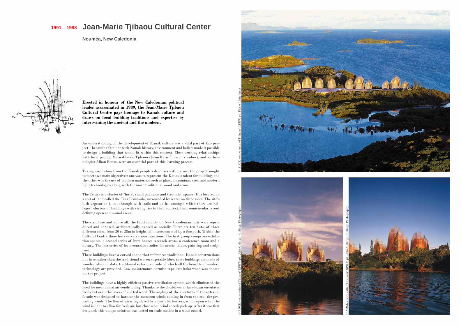
Jean-Marie Tjibaou Cultural CenterNouméa, New Caledonia
1991 – 1998
Erected in honour of the New Caledonian political leader assassinated in 1989, the Jean-Marie Tjibaou Cultural Centre pays homage to Kanak culture and draws on local building traditions and expertise by intertwining the ancient and the modern.
An understanding of the development of Kanak culture was a vital part of this pro-ject – becoming familiar with Kanak history, environment and beliefs made it possible to design a building that would fit within this context. Close working relationships with local people, Marie-Claude Tjibaou (Jean-Marie Tjibaou’s widow), and anthro-pologist Alban Bensa, were an essential part of this learning process.
Taking inspiration from the Kanak people’s deep ties with nature, the project sought to meet two main objectives: one was to represent the Kanak’s talent for building, and the other was the use of modern materials such as glass, aluminium, steel and modern light technologies along with the more traditional wood and stone.
The Centre is a cluster of ‘huts’, small pavilions and tree-filled spaces. It is located on a spit of land called the Tina Peninsula, surrounded by water on three sides. The site’s lush vegetation is cut through with trails and paths, amongst which there are ‘vil-lages’: clusters of buildings with strong ties to their context, their semicircular layout defining open communal areas.
The structure and above all, the functionality of New Caledonian huts were repro-duced and adapted, architecturally as well as socially. There are ten huts, of three different sizes, from 20 to 28m in height, all interconnected by a footpath. Within the Cultural Centre these huts serve various functions. The first group comprises exhibi-tion spaces, a second series of huts houses research areas, a conference room and a library. The last series of huts contains studios for music, dance, painting and sculp-ture.These buildings have a curved shape that references traditional Kanak constructions but here rather than the traditional woven vegetable fibre, these buildings are made of wooden ribs and slats: traditional exteriors inside of which all the benefits of modern technology are provided. Low-maintenance, termite-repellent iroko wood was chosen for the project.
The buildings have a highly efficient passive ventilation system which eliminated the need for mechanical air conditioning. Thanks to the double outer facade, air circulates freely between the layers of slatted wood. The angling of the apertures of the external facade was designed to harness the monsoon winds coming in from the sea, the pre-vailing winds. The flow of air is regulated by adjustable louvers, which open when the wind is light to allow for fresh air, but close when wind speeds pick up. After it was first designed, this unique solution was tested on scale models in a wind tunnel.
© A
DCK
-cen
tre
cult
urel
Tjib
aou/
RP
BW
, ph.
Pie
rre
Ala
in P
antz
© A
DCK
-cen
tre
cult
urel
Tjib
aou/
RP
BW
, ph.
Joh
n G
ollin
gs -
Gol
lings
Pho
togr
aphy
© A
DCK
-cen
tre
cult
urel
Tjib
aou/
RP
BW
, ph.
Joh
n G
ollin
gs -
Gol
lings
Pho
togr
aphy
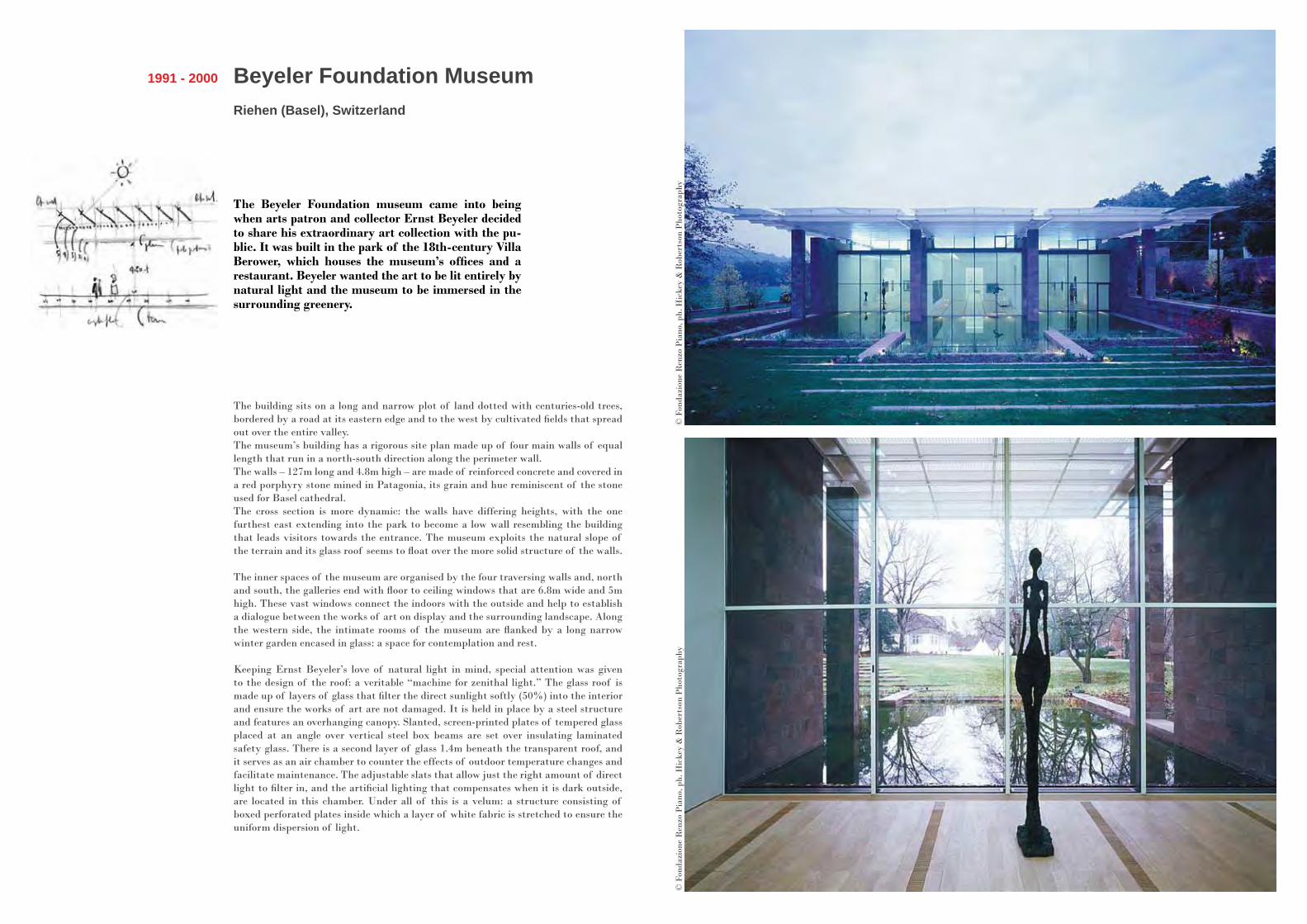
Beyeler Foundation MuseumRiehen (Basel), Switzerland
1991 - 2000
The Beyeler Foundation museum came into being when arts patron and collector Ernst Beyeler decided to share his extraordinary art collection with the pu-blic. It was built in the park of the 18th-century Villa Berower, which houses the museum’s offices and a restaurant. Beyeler wanted the art to be lit entirely by natural light and the museum to be immersed in the surrounding greenery.
The building sits on a long and narrow plot of land dotted with centuries-old trees, bordered by a road at its eastern edge and to the west by cultivated fields that spread out over the entire valley. The museum’s building has a rigorous site plan made up of four main walls of equal length that run in a north-south direction along the perimeter wall.The walls – 127m long and 4.8m high – are made of reinforced concrete and covered in a red porphyry stone mined in Patagonia, its grain and hue reminiscent of the stone used for Basel cathedral. The cross section is more dynamic: the walls have differing heights, with the one furthest east extending into the park to become a low wall resembling the building that leads visitors towards the entrance. The museum exploits the natural slope of the terrain and its glass roof seems to float over the more solid structure of the walls.
The inner spaces of the museum are organised by the four traversing walls and, north and south, the galleries end with floor to ceiling windows that are 6.8m wide and 5m high. These vast windows connect the indoors with the outside and help to establish a dialogue between the works of art on display and the surrounding landscape. Along the western side, the intimate rooms of the museum are flanked by a long narrow winter garden encased in glass: a space for contemplation and rest.
Keeping Ernst Beyeler’s love of natural light in mind, special attention was given to the design of the roof: a veritable “machine for zenithal light.” The glass roof is made up of layers of glass that filter the direct sunlight softly (50%) into the interior and ensure the works of art are not damaged. It is held in place by a steel structure and features an overhanging canopy. Slanted, screen-printed plates of tempered glass placed at an angle over vertical steel box beams are set over insulating laminated safety glass. There is a second layer of glass 1.4m beneath the transparent roof, and it serves as an air chamber to counter the effects of outdoor temperature changes and facilitate maintenance. The adjustable slats that allow just the right amount of direct light to filter in, and the artificial lighting that compensates when it is dark outside, are located in this chamber. Under all of this is a velum: a structure consisting of boxed perforated plates inside which a layer of white fabric is stretched to ensure the uniform dispersion of light.
© F
onda
zion
e R
enzo
Pia
no, p
h. H
icke
y &
Rob
erts
on P
hoto
grap
hy©
Fon
dazi
one
Ren
zo P
iano
, ph.
Hic
key
& R
ober
tson
Pho
togr
aphy

Morgan Library renovation and expansionNew York, USA
2000 - 2006
Creating additional space for the Morgan Library in the heart of Manhattan was a particular challenge. This elegant group of buildings, a ‘village of memory’ is surrounded by the dense urban fabric of New York City, a seemingly solid physical barrier around the site. Rather than building upwards, Renzo Piano Building Workshop decided to dig downwards into the hard rock to build a sort of underground vault in which to house the library’s rare book collection. With surgical precision, new steel and glass units were inserted in and amongst the existing buildings.
The Morgan Library required new public spaces, safe and organized storage areas for the collection itself, an auditorium for chamber music, and a new reading room, all whilst preserving the Library’s original classified buildings: the McKim’s building (1906), the Annex (1928), and the brownstone Morgan House at 231 Madison Avenue, former home of the Morgan family. The requested total expansion of nearly 10,000 sq m within the tight confines of the site was achieved by taking the site back to its original three buildings and recovering additional space underground, excavating to a depth of 17m.
RPBW designed three new pavilions connected to the historic buildings, leaving a large open ‘plaza’ at the centre of the Morgan complex that could be used for public functions and as a metaphorical breathing space for visitors. The three historic buil-dings, the plaza and the new pavilions meet under a steel and glass transparent roof.
The largest pavilion, located on Madison Avenue between Morgan House and the An-nex, provides a new entrance at ground level, an exhibition area on the first floor and the new Reading room on the second floor. The smaller cube-shaped pavilion, located on the 36th Street between the Annex and the McKim building, is an exhibition space. This pavilion and the new Reading room are naturally lit from above. The third pavi-lion, adjacent to the Morgan House, contains office space and a number of service areas. All of the exhibition buildings are clad in steel panels.
Below ground is the Gilder Lehrman Hall, an auditorium with a capacity of 299. While its acoustics have been designed for chamber music concerts, the auditorium can also be used as a conference or projection room thanks to the acoustic modularity of the room. New temperature and humidity-controlled storage for the Library collec-tion is laid out over three communicating floors.
© M
iche
l Den
ancé
© M
iche
l Den
ancé
© M
iche
l Den
ancé
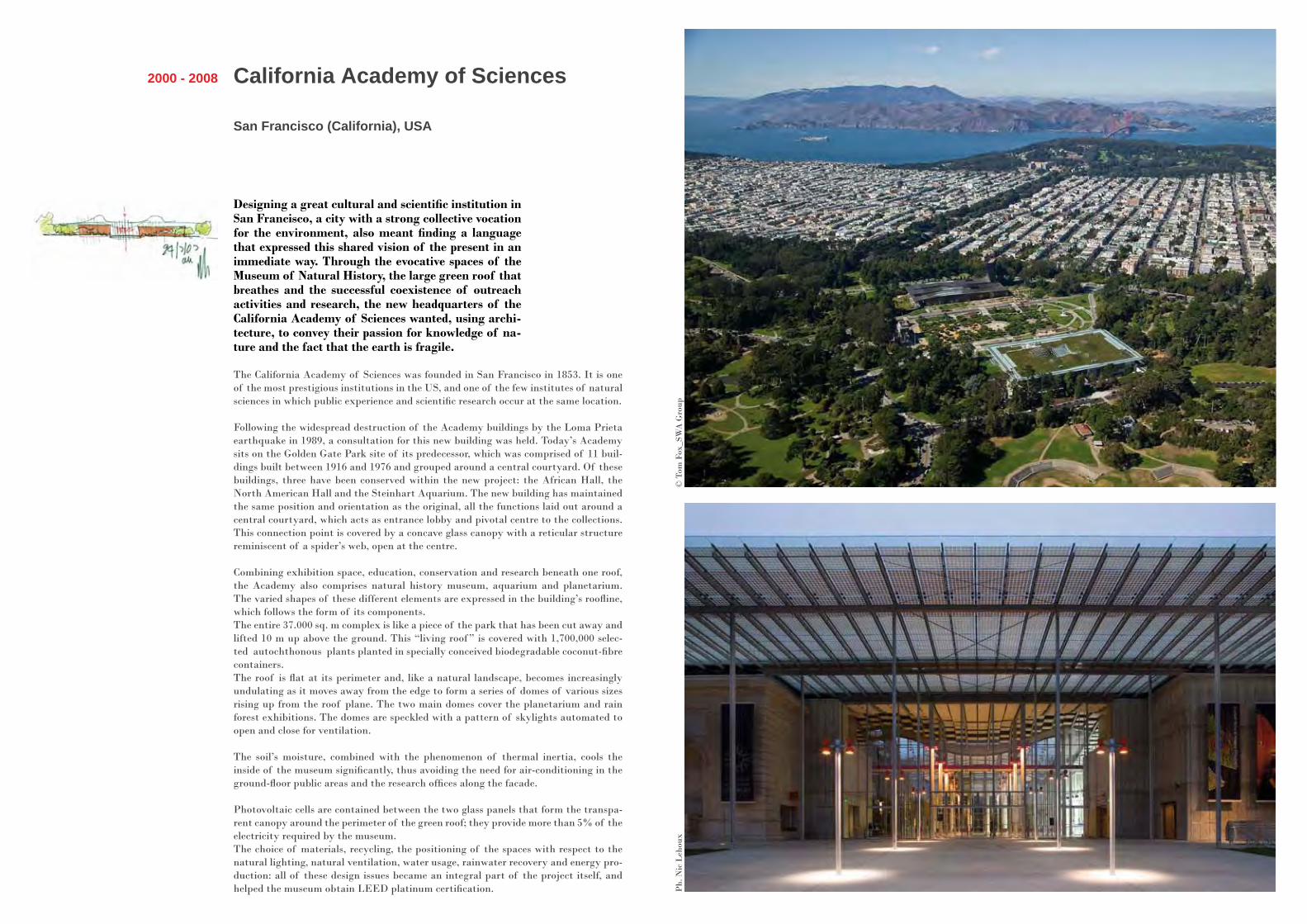
California Academy of Sciences
San Francisco (California), USA
2000 - 2008
Designing a great cultural and scientific institution in San Francisco, a city with a strong collective vocation for the environment, also meant finding a language that expressed this shared vision of the present in an immediate way. Through the evocative spaces of the Museum of Natural History, the large green roof that breathes and the successful coexistence of outreach activities and research, the new headquarters of the California Academy of Sciences wanted, using archi-tecture, to convey their passion for knowledge of na-ture and the fact that the earth is fragile.
The California Academy of Sciences was founded in San Francisco in 1853. It is one of the most prestigious institutions in the US, and one of the few institutes of natural sciences in which public experience and scientific research occur at the same location.
Following the widespread destruction of the Academy buildings by the Loma Prieta earthquake in 1989, a consultation for this new building was held. Today’s Academy sits on the Golden Gate Park site of its predecessor, which was comprised of 11 buil-dings built between 1916 and 1976 and grouped around a central courtyard. Of these buildings, three have been conserved within the new project: the African Hall, the North American Hall and the Steinhart Aquarium. The new building has maintained the same position and orientation as the original, all the functions laid out around a central courtyard, which acts as entrance lobby and pivotal centre to the collections. This connection point is covered by a concave glass canopy with a reticular structure reminiscent of a spider’s web, open at the centre.
Combining exhibition space, education, conservation and research beneath one roof, the Academy also comprises natural history museum, aquarium and planetarium. The varied shapes of these different elements are expressed in the building’s roofline, which follows the form of its components.The entire 37.000 sq. m complex is like a piece of the park that has been cut away and lifted 10 m up above the ground. This “living roof ” is covered with 1,700,000 selec-ted autochthonous plants planted in specially conceived biodegradable coconut-fibre containers.The roof is flat at its perimeter and, like a natural landscape, becomes increasingly undulating as it moves away from the edge to form a series of domes of various sizes rising up from the roof plane. The two main domes cover the planetarium and rain forest exhibitions. The domes are speckled with a pattern of skylights automated to open and close for ventilation.
The soil’s moisture, combined with the phenomenon of thermal inertia, cools the inside of the museum significantly, thus avoiding the need for air-conditioning in the ground-floor public areas and the research offices along the facade.
Photovoltaic cells are contained between the two glass panels that form the transpa-rent canopy around the perimeter of the green roof; they provide more than 5% of the electricity required by the museum. The choice of materials, recycling, the positioning of the spaces with respect to the natural lighting, natural ventilation, water usage, rainwater recovery and energy pro-duction: all of these design issues became an integral part of the project itself, and helped the museum obtain LEED platinum certification.
© T
om F
ox_S
WA
Gro
upP
h. N
ic L
ehou
x

The Art Institute of ChicagoThe Modern Wing
Chicago (Illinois), USA
2000 - 2009
The Modern Wing of the Art Institute of Chicago, a 25,000 sq m expansion that houses collections of Eu-ropean contemporary art, also unifies and completes the cultural and urban campus of the Art Institute.
Located in Grant Park, a green space on the banks of the lake, the Art Institute sits between Michigan Avenue and Columbus Drive, its site bisected by railroad tracks.The limestone Beaux-Art building dates from 1893 and faces the western side of the city. Just behind it the Modern Wing sits rotated 90° towards the north, providing a new point of access to the museum from Millennium Park, the venue of many of Chicago’s cultural events. The lightweight, transparent vertical facade of the Modern Wing features glass and metal referencing the Chicago skyline, while the solid limestone walls that punctuate the glass facade pay homage to the architecture of the original Art Institute building.
The Modern Wing is laid out around Griffin Court and the new entrance from Monroe Street. The large double-height foyer is naturally lit and flanked by a learning centre, ticket counters, the museum gift shop, a cloakroom, lavatories, temporary exhibition space and a garden. Griffin Court orients the visitors and separates the exhibition spaces to the east of the railroad track from those to west. From the Court one can access the two upper floors of the Modern Wing or cross through the gallery that leads over the tracks to the museum’s original building. The entire second and third floors of the Modern Wing house the art collection; in naturally daylit galleries.
The Millennium Park and the museum are both physically and visually connected: the Nichols Bridgeway, an elegant footbridge, crosses over the park, past Monroe Street and into the upper floor of the museum, passing through the restaurant. Once inside, the floor to ceiling windows frame views of the park and the city skyline – a perfect backdrop for the sculpture collection.The roof, sometimes described as a “flying carpet”, appears to float over the building. The curved aluminium panels filter the daylight that then penetrates into the buil-ding below. The ideal north-south layout of the sunshades notwithstanding, additio-nal canopies filter out the glare of the sun reflected off of the adjacent lake’s surface. The machinery running the building, storage space for works of art, and the technical and mechanical equipment are all housed in new spaces buried below street level.
© T
he A
rt I
nsti
tute
of
Chic
ago,
ph.
Jam
es I
ska
Pho
togr
aphy
© R
PB
W, p
h. C
harl
es G
. You
ng/I
DE
A
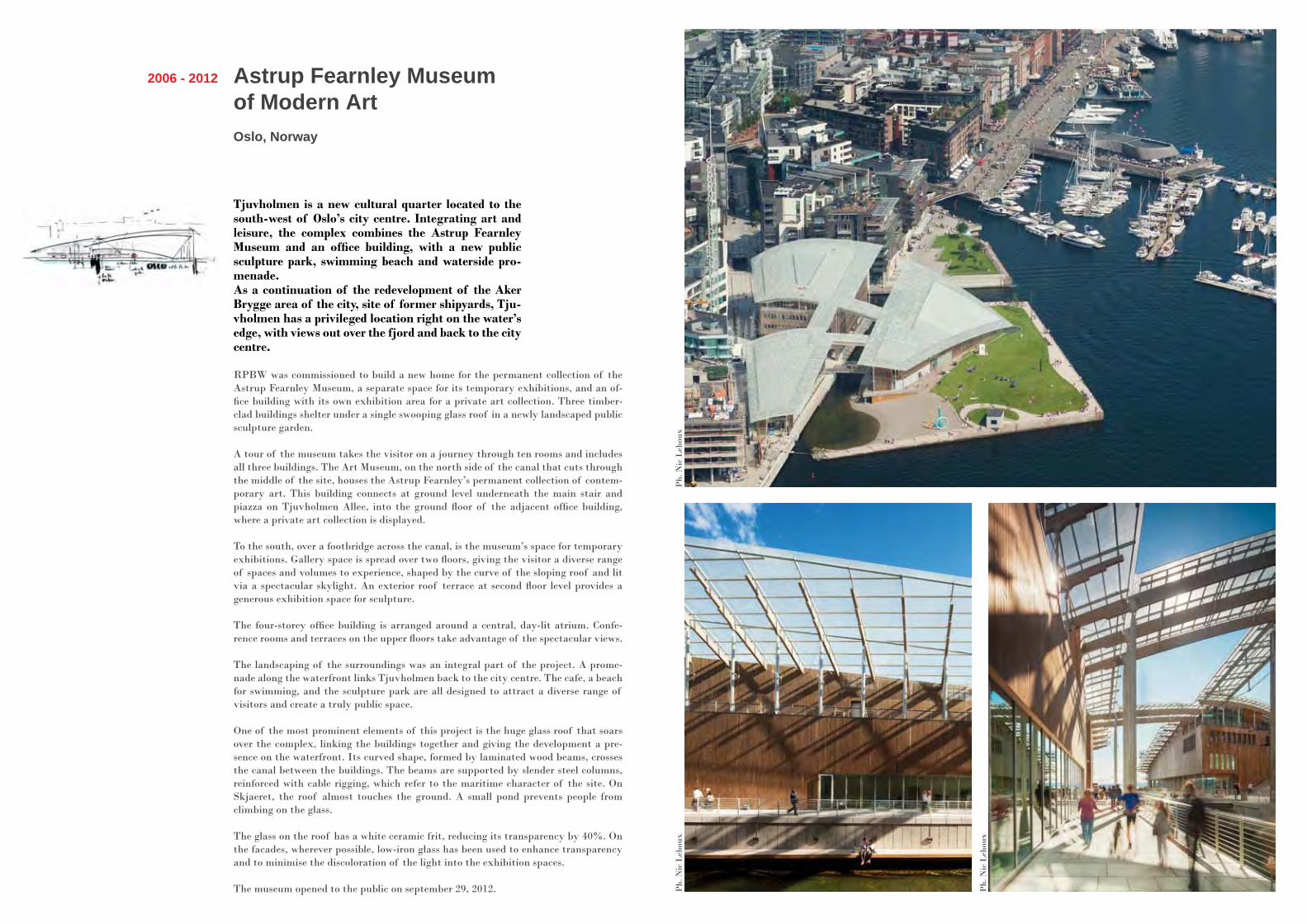
Astrup Fearnley Museum of Modern ArtOslo, Norway
2006 - 2012
Tjuvholmen is a new cultural quarter located to the south-west of Oslo’s city centre. Integrating art and leisure, the complex combines the Astrup Fearnley Museum and an office building, with a new public sculpture park, swimming beach and waterside pro-menade.As a continuation of the redevelopment of the Aker Brygge area of the city, site of former shipyards, Tju-vholmen has a privileged location right on the water’s edge, with views out over the fjord and back to the city centre.
RPBW was commissioned to build a new home for the permanent collection of the Astrup Fearnley Museum, a separate space for its temporary exhibitions, and an of-fice building with its own exhibition area for a private art collection. Three timber-clad buildings shelter under a single swooping glass roof in a newly landscaped public sculpture garden.
A tour of the museum takes the visitor on a journey through ten rooms and includes all three buildings. The Art Museum, on the north side of the canal that cuts through the middle of the site, houses the Astrup Fearnley’s permanent collection of contem-porary art. This building connects at ground level underneath the main stair and piazza on Tjuvholmen Allee, into the ground floor of the adjacent office building, where a private art collection is displayed.
To the south, over a footbridge across the canal, is the museum’s space for temporary exhibitions. Gallery space is spread over two floors, giving the visitor a diverse range of spaces and volumes to experience, shaped by the curve of the sloping roof and lit via a spectacular skylight. An exterior roof terrace at second floor level provides a generous exhibition space for sculpture.
The four-storey office building is arranged around a central, day-lit atrium. Confe-rence rooms and terraces on the upper floors take advantage of the spectacular views.
The landscaping of the surroundings was an integral part of the project. A prome-nade along the waterfront links Tjuvholmen back to the city centre. The cafe, a beach for swimming, and the sculpture park are all designed to attract a diverse range of visitors and create a truly public space.
One of the most prominent elements of this project is the huge glass roof that soars over the complex, linking the buildings together and giving the development a pre-sence on the waterfront. Its curved shape, formed by laminated wood beams, crosses the canal between the buildings. The beams are supported by slender steel columns, reinforced with cable rigging, which refer to the maritime character of the site. On Skjaeret, the roof almost touches the ground. A small pond prevents people from climbing on the glass.
The glass on the roof has a white ceramic frit, reducing its transparency by 40%. On the facades, wherever possible, low-iron glass has been used to enhance transparency and to minimise the discoloration of the light into the exhibition spaces.
The museum opened to the public on september 29, 2012.
Ph.
Nic
Leh
oux
Ph.
Nic
Leh
oux
Ph.
Nic
Leh
oux
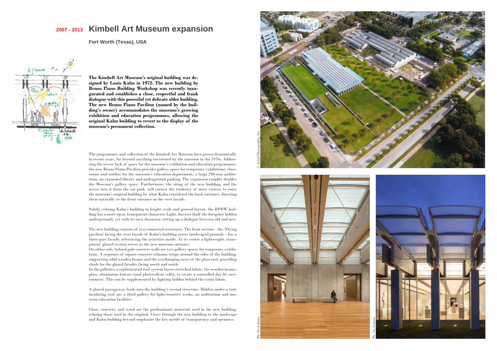
Kimbell Art Museum expansionFort Worth (Texas), USA
2007 - 2013
The Kimbell Art Museum’s original building was de-signed by Louis Kahn in 1972. The new building by Renzo Piano Building Workshop was recently inau-gurated and establishes a close, respectful and frank dialogue with this powerful yet delicate older building. The new Renzo Piano Pavilion (named by the buil-ding’s owner) accommodates the museum’s growing exhibition and education programmes, allowing the original Kahn building to revert to the display of the museum’s permanent collection.
The programmes and collection of the Kimbell Art Museum have grown dramatically in recent years, far beyond anything envisioned by the museum in the 1970s. Addres-sing the severe lack of space for the museum’s exhibition and education programmes, the new Renzo Piano Pavilion provides gallery space for temporary exhibitions, class-rooms and studios for the museum’s education department, a large 298-seat audito-rium, an expanded library and underground parking. The expansion roughly doubles the Museum’s gallery space. Furthermore, the siting of the new building, and the access into it from the car park, will correct the tendency of most visitors to enter the museum’s original building by what Kahn considered the back entrance, directing them naturally to the front entrance in the west facade.
Subtly echoing Kahn’s building in height, scale and general layout, the RPBW buil-ding has a more open, transparent character. Light, discreet (half the footprint hidden underground), yet with its own character, setting up a dialogue between old and new.
The new building consists of two connected structures. The front section – the ‘Flying pavilion’ facing the west façade of Kahn’s building across landscaped grounds – has a three-part facade, referencing the activities inside. At its centre a lightweight, trans-parent, glazed section serves as the new museum entrance.On either side, behind pale concrete walls are two gallery spaces for temporary exhibi-tions. A sequence of square concrete columns wraps around the sides of the building, supporting solid wooden beams and the overhanging eaves of the glass roof, providing shade for the glazed facades facing north and south. In the galleries, a sophisticated roof system layers stretched fabric, the wooden beams, glass, aluminium louvres (and photovoltaic cells), to create a controlled day-lit envi-ronment. This can be supplemented by lighting hidden behind the scrim fabric.
A glazed passageway leads into the building’s second structure. Hidden under a turf, insulating roof are a third gallery for light-sensitive works, an auditorium and mu-seum education facilities.
Glass, concrete, and wood are the predominant materials used in the new building, echoing those used in the original. Views through the new building to the landscape and Kahn building beyond emphasise the key motifs of transparency and openness.
© A
eria
l Pho
togr
aphy
_Inc
Ph.
Nic
Leh
oux
Ph.
Nic
Leh
oux
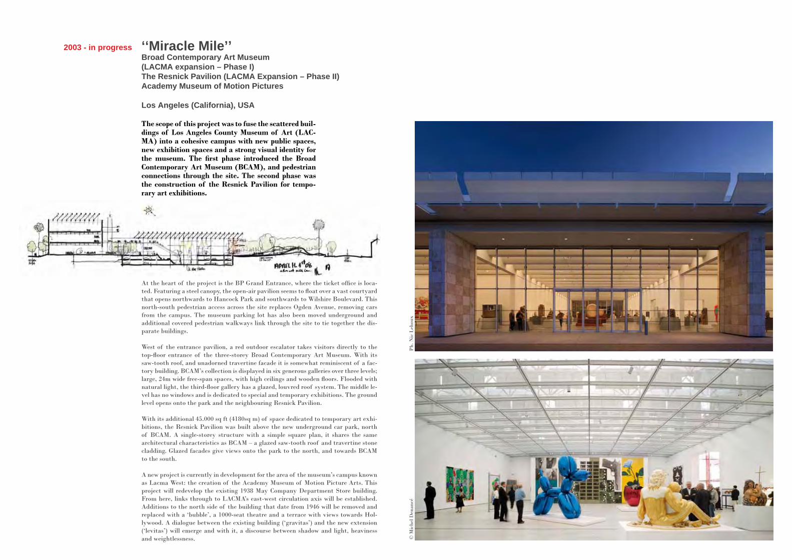
‘‘Miracle Mile’’ Broad Contemporary Art Museum (LACMA expansion – Phase I)The Resnick Pavilion (LACMA Expansion – Phase II)Academy Museum of Motion Pictures
Los Angeles (California), USA
2003 - in progress
The scope of this project was to fuse the scattered buil-dings of Los Angeles County Museum of Art (LAC-MA) into a cohesive campus with new public spaces, new exhibition spaces and a strong visual identity for the museum. The first phase introduced the Broad Contemporary Art Museum (BCAM), and pedestrian connections through the site. The second phase was the construction of the Resnick Pavilion for tempo-rary art exhibitions.
At the heart of the project is the BP Grand Entrance, where the ticket office is loca-ted. Featuring a steel canopy, the open-air pavilion seems to float over a vast courtyard that opens northwards to Hancock Park and southwards to Wilshire Boulevard. This north-south pedestrian access across the site replaces Ogden Avenue, removing cars from the campus. The museum parking lot has also been moved underground and additional covered pedestrian walkways link through the site to tie together the dis-parate buildings.
West of the entrance pavilion, a red outdoor escalator takes visitors directly to the top-floor entrance of the three-storey Broad Contemporary Art Museum. With its saw-tooth roof, and unadorned travertine facade it is somewhat reminiscent of a fac-tory building. BCAM’s collection is displayed in six generous galleries over three levels; large, 24m wide free-span spaces, with high ceilings and wooden floors. Flooded with natural light, the third-floor gallery has a glazed, louvred roof system. The middle le-vel has no windows and is dedicated to special and temporary exhibitions. The ground level opens onto the park and the neighbouring Resnick Pavilion.
With its additional 45.000 sq ft (4180sq m) of space dedicated to temporary art exhi-bitions, the Resnick Pavilion was built above the new underground car park, north of BCAM. A single-storey structure with a simple square plan, it shares the same architectural characteristics as BCAM – a glazed saw-tooth roof and travertine stone cladding. Glazed facades give views onto the park to the north, and towards BCAM to the south.
A new project is currently in development for the area of the museum’s campus known as Lacma West: the creation of the Academy Museum of Motion Picture Arts. This project will redevelop the existing 1938 May Company Department Store building. From here, links through to LACMA’s east-west circulation axis will be established. Additions to the north side of the building that date from 1946 will be removed and replaced with a ‘bubble’, a 1000-seat theatre and a terrace with views towards Hol-lywood. A dialogue between the existing building (‘gravitas’) and the new extension (‘levitas’) will emerge and with it, a discourse between shadow and light, heaviness and weightlessness.
Ph.
Nic
Leh
oux
© M
iche
l Den
ancé

In 1991 Renzo Piano had designed an installation for an exhibit about Galileo to be held in the Palazzo della Ragione, the vast 14th century city hall and symbol of Padua. The show, however, never happened. Still, looking over the drawings, one perceives a close tie to the exhibition that wasn’t and the one now showing in that same space: the Renzo Piano Buil-ding Workshop – Piece by Piece. Open to the public until 15 July, the exhibit was organised by the Barbara Cappochin Foundation and features utterly amazing pieces from the studio’s archives that tell the story of 32 projects on 32 tables. Everything from the famous light weight structures of the 1960s to projects in the US and Europe currently being built, highli-ghting the most celebrated ones: from the Jean-Marie Tjibaou Cultural Centre to the Fonda-tion Beyeler, from the Morgan Library to the Shard. The tables have been placed freely inside the huge hall - “extremely noteworthy” said Palladio of the space – grouped into four clus-ters of islands divided by type: city projects, experimental ones, architecture for music and places of culture. Visitors are invited to “sail” from one “archipelago” to another, pushing off and docking here and there without any preset course. Still, as had been planned for the original Galileo project, one’s gaze is inexorably drawn to the “belly of the ship”, towards this vast overturned wooden hull that rises 26 meters into the air and closes one end of the mighty hall. Images and models have been artfully set in this great upturned timber hull void: from the gerberette from Beaubourg to the “leaves” from the Menil Collection project, from a section of the Kansai International Airport to a piece of the IBM pavilion and the ceramic baguettes of the New York Times building. The choice of not breaking up the plan of the hall nor the huge void above the tables has pro-ven to be a wise one, as it exalts the essential nature of the space: an awesome vastness. The “pieces” and images in flight compliment the interior architecture without obstructing one’s vision and allows one’s eyes to roam over the vaulted ceiling to the walls, which feature one on the world’s most extensive astrological fresco sequences, an expression of what was known of this science in medieval and proto-Renaissance times. But there’s more here: the images of the works overlap with those of saints, mythological figures and the allegories of the months, and they seem like bits of frescoes taken from the walls and placed in the void they enclose. Oddly enough, it is the very grace and lightness of the flying pieces that unleashes the stun-ning panorama that greets you as you step into the Palazzo della Ragione. It’s a feeling that every visitor to this hall experiences and it bears witness to the perfect symbiosis achieved between the design of the exhibition and that of the 14th century building, between the content and the container, if you will. As is the case with many of the works on display, the architects of the Renzo Piano Building Workshop were adept at “listening to the place” and exalting its importance with a project which, nonetheless, expresses itself with its own artis-tic voice. The multi-coloured images hang in the shade of the vaulted ceiling and the levitas of the pieces plays with the gravitas of the medieval building. As Milan Kundera tells us: «One thing is certain: the contrast between heavy and light is the most mysterious and, of all contrasts, the most ambiguous.”
In the Belly of the Ship
Lorenzo Ciccarelli“Padua and Galileo” Exhibition1991, Padua, Italy
An exhibition designed byRenzo Piano Building Workshop and Fondazione Renzo Piano
Renzo PianoGiorgio BianchiStefania CantaMilly Rossato Pianowith Chiara Casazza Lorenzo Ciccarelli Christophe Colson Andrea MalgeriAntonio Porcile Elisabetta Trezzaniand Chiara BennatiNicoletta DuranteAnne-Cecile GuthmannGiovanna LangascoElena Spadavecchia
All rights reserved. No part of this document may be reproduced, stored in a retrieval system or trans-mitted, in any form or by any means without the prior permission of Renzo Piano Building Workshop, Fondazione Renzo Piano and photographers.
Photos of the expositionPh. Enrico CanoPh. Stefano Goldberg - Publifoto
Sketches© Renzo Piano Building Workshop© Fondazione Renzo Piano
Document realisationRPBW, Elena Spadavecchia
Renzo Piano Building WorkshopPIECE BY PIECE
sotto l’Alto Patronato del Presidente della Repubblica Italiana Giorgio Napolitano
Renzo Piano Building WorkshopPezzo per pezzo
mostra a cura diRenzo Piano Building Workshop Fondazione Renzo Piano
Renzo Piano, Giorgio Bianchi, Stefania Canta, Milly Rossato Piano
con Chiara Casazza, Lorenzo Ciccarelli, Christophe Colson, Andrea Malgeri,Antonio Porcile, Elisabetta Trezzani
e Chiara Bennati, Anne-Cecile Guthmann, Elena Spadavecchia
consulenza strutturale Milan Ingegneria e ing. Claudio Modena
testiRenzo Piano Building Workshop / Anna Foppiano, Lorenzo Ciccarelli
traduzione Verto Group SrlAnnabel Gray, Miranda Westwood
un ringraziamento speciale a tutto lo staff del Renzo Piano Building Workshop, Genova, Parigi, New York e della Fondazione Renzo Piano
PRESIDENZA DEL CONSIGLIO DEI MINISTRI
Ministero per i Beni e le Attività Culturali PARLAMENTO EUROPEO
MINISTERO DEGLIAFFARI ESTERI
MINISTERO DELLOSVILUPPO ECONOMICO
Federazione OrdiniArchitetti P.P. e C. del Veneto
Istituto Italiano di Cultura di Tokyo
Università di Padova
Università Iuav di Venezia
UIAUnione InternazionaleArchitetti
UNION INTERNATIONALE DES ARCHITECTES INTERNATIONAL UNION OF ARCHITECTS
Istituto Nazionale di Architettura
Legambiente
Consiglio NazionaleArchitetti P.P. e C
Consiglio NazionaleArchitetti P.P. e C
SPONSOR
CON IL PATROCINIO
PARTNERS ISTITUZIONALI
MAIN SPONSORPREMIER SPONSOR
SPONSOR TECNICI THANKS TO
Consultants Milan Ingegneria e Ing. Claudio Modena
TextsRenzo Piano Building WorkshopAnna FoppianoLorenzo Ciccarelli
Translation Verto Group SrlAnnabel Gray, Miranda Westwood
Special thanks toRenzo Piano Building Workshop, Genova, Parigi, New York and Fondazione Renzo Piano