Embed Size (px)
Citation preview

Problem-Solving Application: Using Data
from Graphs
Lesson 1-13Lesson 1-13
Pg. # 32-33Pg. # 32-33
CA Content StandardsStatistics, Data Analysis, and Probability 2.3:
I can analyze data and explain why the way in which the results are displayed might have influenced the conclusions reached.
Mathematical Reasoning 2.4:I use a variety of methods, such as words, numbers,
graphs, and tables to explain mathematical reasoning.
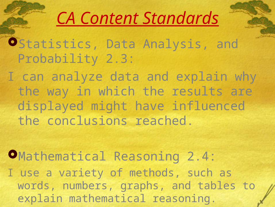
Vocabulary: BAR GRAPH
A convenient tool for organizing statistical data. Provides a quick summary of the data and relationships among data.
Bars are used to show quantities.

Objective
Analyze and interpret data in bar graphs.
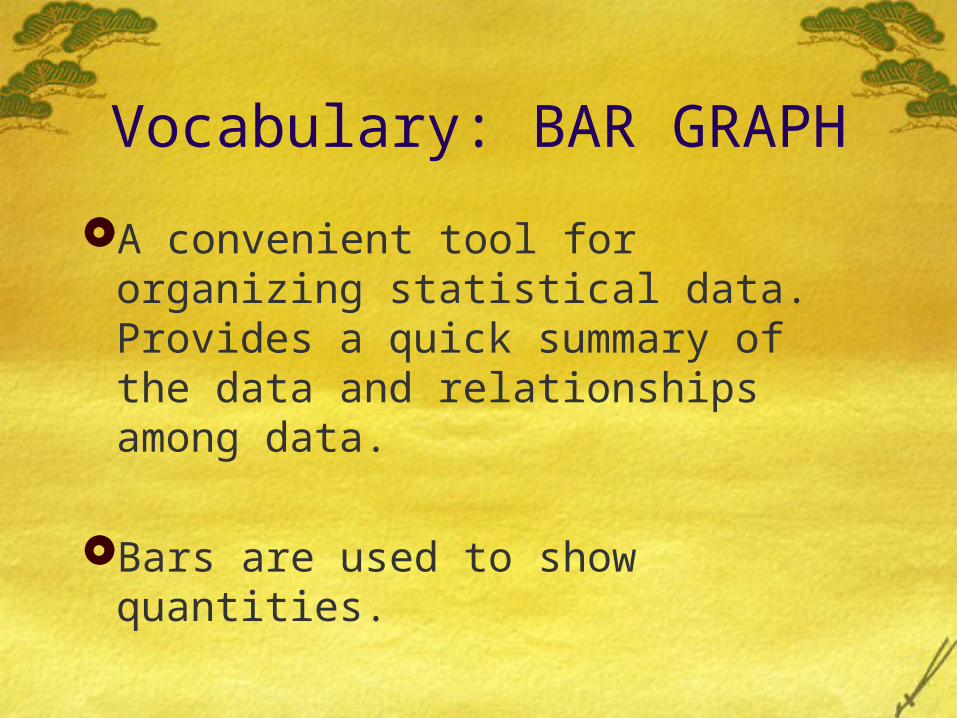
Example 1.
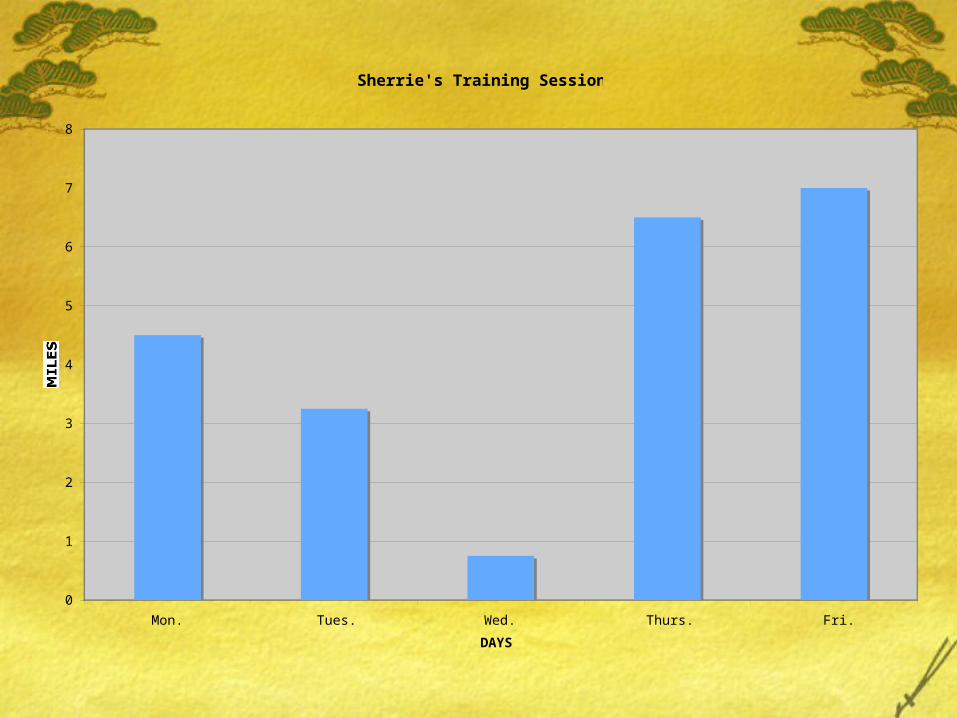
Sherrie is training for the LA Marathon, which is approximately 26 miles long. The table below shows a week’s worth of Sherrie’s training days.
Sherrie’s Training Sessions
Day # of Miles Ran
Monday 4.5
Tuesday 3.25
Wednesday 0.75
Thursday 6.5
Friday 7
Sherrie's Training Sessions
0
1
2
3
4
5
6
7
8
Mon. Tues. Wed. Thurs. Fri.
DAYS
MILES
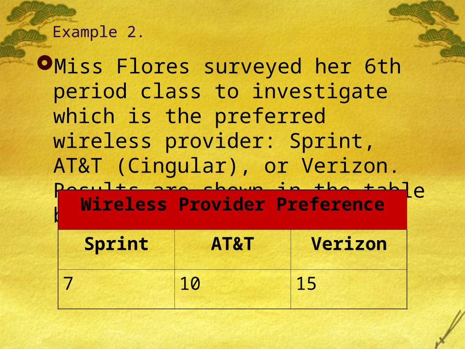
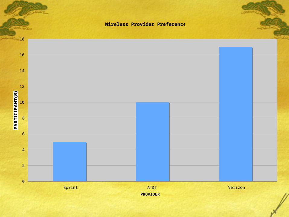
Example 2.
Miss Flores surveyed her 6th period class to investigate which is the preferred wireless provider: Sprint, AT&T (Cingular), or Verizon. Results are shown in the table below.
Wireless Provider Preference
Sprint AT&T Verizon
7 10 15
Wireless Provider Preference
0
2
4
6
8
10
12
14
16
18
Sprint AT&T Verizon
PROVIDER
PARTICIPANT(S)
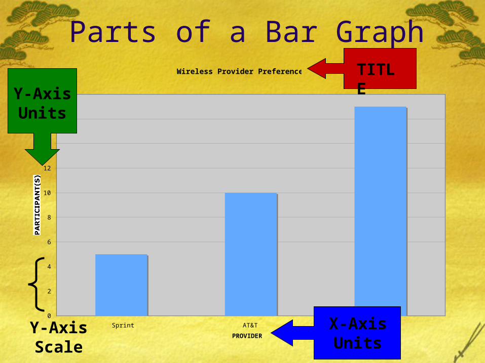
Parts of a Bar GraphWireless Provider Preference
0
2
4
6
8
10
12
14
16
18
Sprint AT&T Verizon
PROVIDER
PARTICIPANT(S)
TITLE
X-Axis Units
Y-Axis Units
Y-Axis Scale
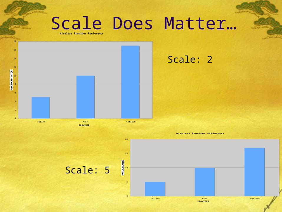
Scale Does Matter…Wireless Provider Preference
0
2
4
6
8
10
12
14
16
18
Sprint AT&T Verizon
PROVIDER
PARTICIPANT(S)
Wireless Provider Preference
0
5
10
15
20
Sprint AT&T Verizon
PROVIDER
PARTICIPANT(S)
Scale: 2
Scale: 5
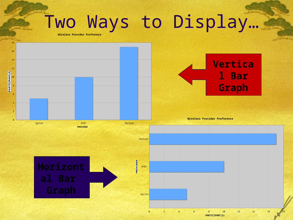
Two Ways to Display…Wireless Provider Preference
0
2
4
6
8
10
12
14
16
18
Sprint AT&T Verizon
PROVIDER
PARTICIPANT(S)
Wireless Provider Preference
0 2 4 6 8 10 12 14 16 18
Sprint
AT&T
Verizon
PROVIDER
PARTICIPANT(S)
Vertical Bar
Graph
Horizontal Bar
Graph
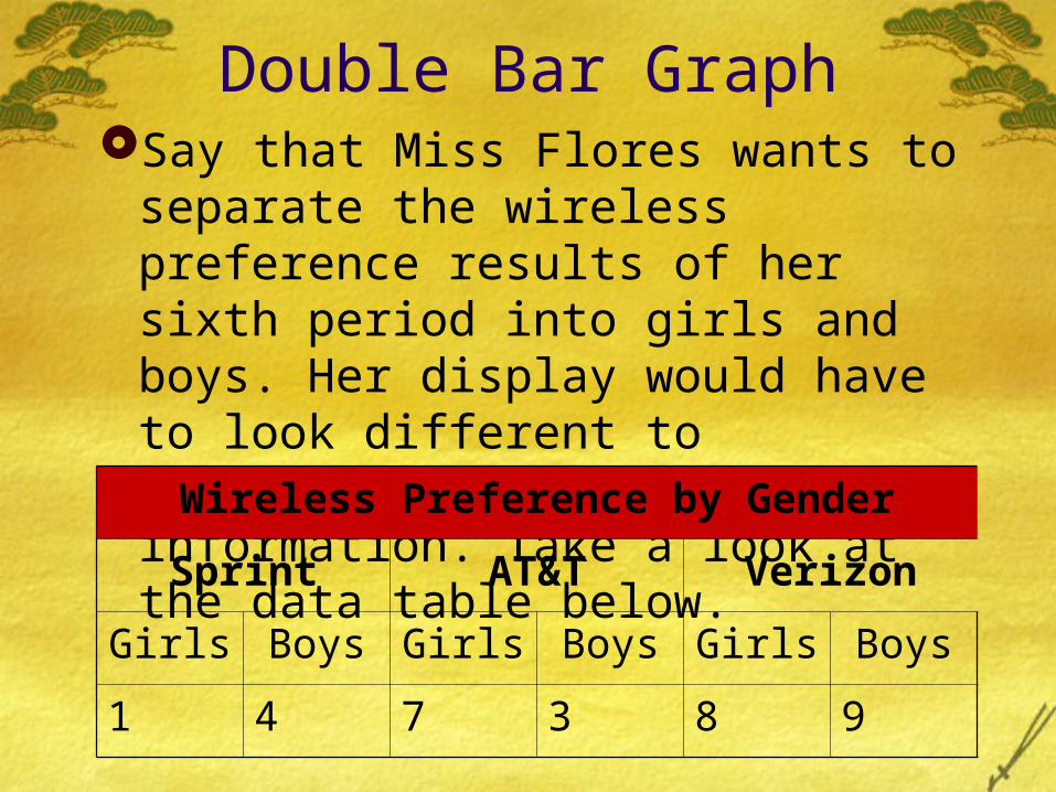
Double Bar GraphSay that Miss Flores wants to separate
the wireless preference results of her sixth period into girls and boys. Her display would have to look different to incorporate this new information. Take a look at the data table below.
Wireless Preference by Gender
Sprint AT&T Verizon
Girls Boys Girls Boys Girls Boys
1 4 7 3 8 9
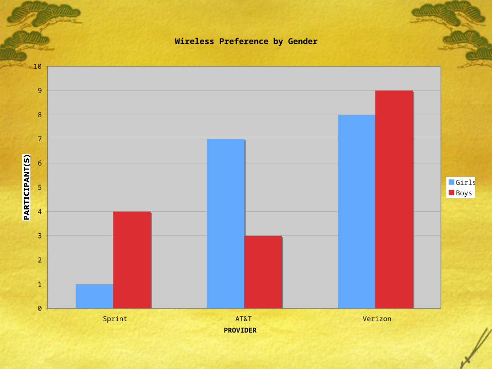
Wireless Preference by Gender
0
1
2
3
4
5
6
7
8
9
10
Sprint AT&T Verizon
PROVIDER
PARTICIPANT(S)
Girls
Boys
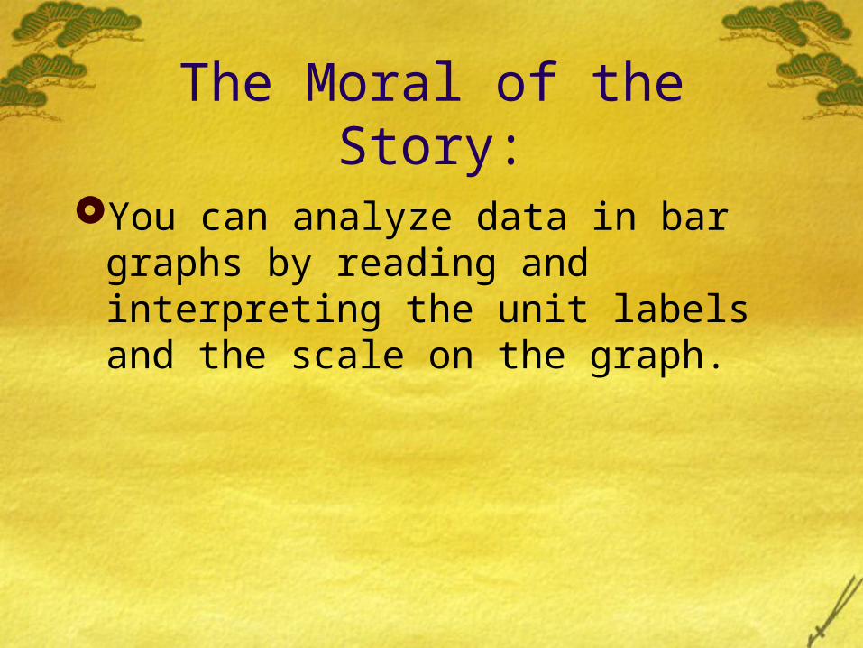
The Moral of the Story:
You can analyze data in bar graphs by reading and interpreting the unit labels and the scale on the graph.