Embed Size (px)
Citation preview
December, 2012Working Paper number 98
International
Centre for Inclusive Growth
POVERTY WHERE PEOPLE LIVE:
WHAT DO NATIONAL POVERTY LINES TELLUS ABOUT GLOBAL POVERTY?
Ugo GentiliniWorld Food Programme
Andy SumnerInstitute of Development Studies, University of Sussex
Copyright© 2012International Policy Centre for Inclusive GrowthUnited Nations Development Programme
The International Policy Centre for Inclusive Growth is jointly supported by the Poverty Practice,Bureau for Development Policy, UNDP and the Government of Brazil.
Rights and Permissions
All rights reserved.
The text and data in this publication may be reproduced as long as the source is cited.Reproductions for commercial purposes are forbidden.
International Policy Centre for Inclusive Growth (IPC - IG)Poverty Practice, Bureau for Development Policy, UNDP
Esplanada dos Ministérios, Bloco O, 7º andar
70052-900 Brasilia, DF - BrazilTelephone: +55 61 2105 5000
E-mail: [email protected] URL: www.ipc-undp.org
The International Policy Centre for Inclusive Growth disseminates the findings of its work inprogress to encourage the exchange of ideas about development issues. The papers aresigned by the authors and should be cited accordingly. The findings, interpretations, andconclusions that they express are those of the authors and not necessarily those of theUnited Nations Development Programme or the Government of Brazil.
Working Papers are available online at www.ipc-undp.org and subscriptions can be requestedby email to [email protected]
Print ISSN: 1812-108X
POVERTY WHERE PEOPLE LIVE:
WHAT DO NATIONAL POVERTY LINES TELL US ABOUT GLOBAL POVERTY?
Ugo Gentilini, World Food Programme and
Andy Sumner, Institute of Development Studies, University of Sussex
1 INTRODUCTION
Debate about national and international poverty measurement continued to evolve (see for example, Abu-Ismail et al., 2012). The basic question of how many poor people there are in the world generally assumes that poverty is measured according to international poverty lines (IPLs). Yet, an equally relevant question could be how many poor people there are in the world, based on how poverty is defined where those people live. In short, rather than a comparison based on monetary values, the latter question is germane to estimates based on a concept—‘poverty’—as defined by countries’ specific circumstances and institutions.
Clearly, in such case global metrics such as the IPL of US$1.25/day—the construction of which is ultimately based on a pool of 15 national poverty lines (NPLs)—could be less informative (see Chen and Ravallion (2008) for details and Deaton (2010) for critique). Furthermore, as Deaton (2011: 17) has noted, estimates of poverty by NPLs and IPLs operate within quite different policy spaces: “…global measures of development (...) operate in an entirely different political environment than do domestic measures. The latter (...) feed into domestic policymaking are typically subject to oversight procedures that constrain both the statisticians who produce the data and the politicians and policymakers who use them.”
This begs the question as to whether poverty viewed with an IPL lens looks quite different from poverty viewed from countries themselves using the NPL. Thus an important question is how different are national and international poverty line estimates? By addressing the question of poverty as defined where those poor people live, this paper seeks to offer a new perspective on global poverty and at the same time extend thinking on the ‘middle-income countries poverty paradox’—meaning that most of the world’s poor people do not live in the world’s poorest countries (Sumner 2010; 2012a). Indeed, one could ask whether such patterns are more or less pronounced when one considers ‘poverty’ as nationally defined by quantifying and analysing global and national poverty, including in high-, middle- and low-income countries, based on their country-specific, official, country-defined NPLs.
The paper is structured as follows. Section 2 reprises and reviews recent changes in global distribution of poverty based on IPLs. Section 3 sets out the methodology and key findings from NPLs analysis. Section 4 concludes by discussing the implications of the emerging results.
2 International Policy Centre for Inclusive Growth
2 CHANGES IN GLOBAL POVERTY
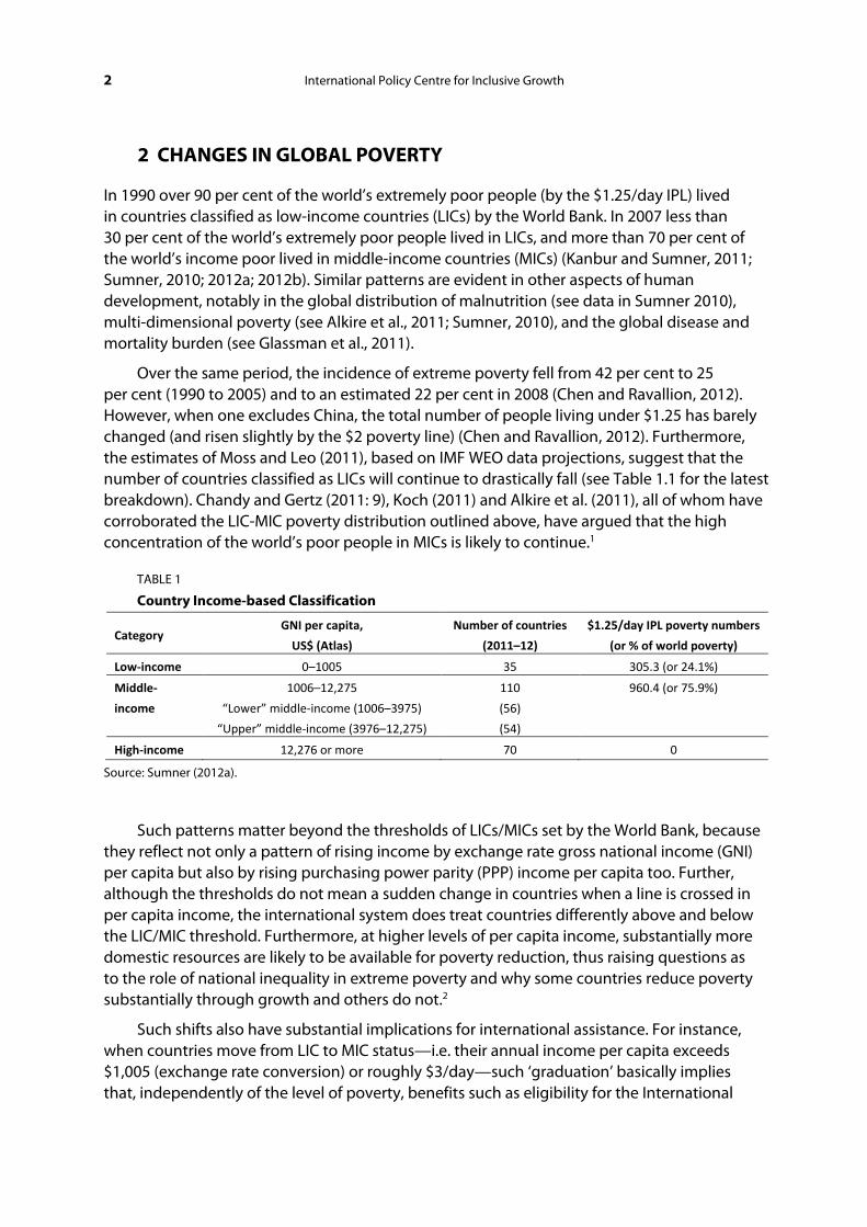
In 1990 over 90 per cent of the world’s extremely poor people (by the $1.25/day IPL) lived in countries classified as low-income countries (LICs) by the World Bank. In 2007 less than 30 per cent of the world’s extremely poor people lived in LICs, and more than 70 per cent of the world’s income poor lived in middle-income countries (MICs) (Kanbur and Sumner, 2011; Sumner, 2010; 2012a; 2012b). Similar patterns are evident in other aspects of human development, notably in the global distribution of malnutrition (see data in Sumner 2010), multi-dimensional poverty (see Alkire et al., 2011; Sumner, 2010), and the global disease and mortality burden (see Glassman et al., 2011).
Over the same period, the incidence of extreme poverty fell from 42 per cent to 25 per cent (1990 to 2005) and to an estimated 22 per cent in 2008 (Chen and Ravallion, 2012). However, when one excludes China, the total number of people living under $1.25 has barely changed (and risen slightly by the $2 poverty line) (Chen and Ravallion, 2012). Furthermore, the estimates of Moss and Leo (2011), based on IMF WEO data projections, suggest that the number of countries classified as LICs will continue to drastically fall (see Table 1.1 for the latest breakdown). Chandy and Gertz (2011: 9), Koch (2011) and Alkire et al. (2011), all of whom have corroborated the LIC-MIC poverty distribution outlined above, have argued that the high concentration of the world’s poor people in MICs is likely to continue.1
TABLE 1
Country Income-based Classification
Category GNI per capita,
US$ (Atlas)
Number of countries
(2011–12)
$1.25/day IPL poverty numbers
(or % of world poverty)
Low-income 0–1005 35 305.3 (or 24.1%)
Middle-
income
1006–12,275
“Lower” middle-income (1006–3975)
“Upper” middle-income (3976–12,275)
110
(56)
(54)
960.4 (or 75.9%)
High-income 12,276 or more 70 0
Source: Sumner (2012a).
Such patterns matter beyond the thresholds of LICs/MICs set by the World Bank, because they reflect not only a pattern of rising income by exchange rate gross national income (GNI) per capita but also by rising purchasing power parity (PPP) income per capita too. Further, although the thresholds do not mean a sudden change in countries when a line is crossed in per capita income, the international system does treat countries differently above and below the LIC/MIC threshold. Furthermore, at higher levels of per capita income, substantially more domestic resources are likely to be available for poverty reduction, thus raising questions as to the role of national inequality in extreme poverty and why some countries reduce poverty substantially through growth and others do not.2
Such shifts also have substantial implications for international assistance. For instance, when countries move from LIC to MIC status—i.e. their annual income per capita exceeds $1,005 (exchange rate conversion) or roughly $3/day—such ‘graduation’ basically implies that, independently of the level of poverty, benefits such as eligibility for the International
Working Paper 3
Development Association (IDA, i.e. World Bank grant assistance) are reduced and removed, and repayment of outstanding ‘soft’ loans is steeply accelerated (Kanbur, 2012).
These changes in global poverty raise various methodological questions, not least about the thresholds themselves (discussed in depth in Sumner, 2012a). One can say that most of the world’s poor people, by $1.25 or $2 poverty lines, live in countries where average income is considerably higher than the LIC/MIC threshold (the population weighted group average for the LMIC group where most of the world’s poor people live is approaching $10/day PPP per capita or five times the higher IPL), suggesting that the changes reflect real changes in average income and not just problems with the country thresholds used (see Sumner (2012b) for detailed discussion on sensitivity of analysis).
While possessing the key advantage of being comparable across countries, IPLs may disguise some important issues—notably with regard to MICs’ poverty levels. Although the standard $1.25/day line, for example, is itself the mean of the NPLs in the poorest 15 countries,3 it may not give a full account of the factors that shape the experience of being poor in different contexts. Chen and Ravallion (2012: 1) note that, “… $1.25 is the average of the national poverty lines found in the poorest 10–20 countries... Naturally, better off countries tend to have higher poverty lines than this frugal standard. $2 a day is the median poverty line for all developing countries.”
Indeed, that the IPL may not account for the experience of poverty in some contexts underpinned the UN recommendation to use NPLs “whenever available” to track countries’ individual progress on Millennium Development Goal (MDG) 1 (United Nations 2001).
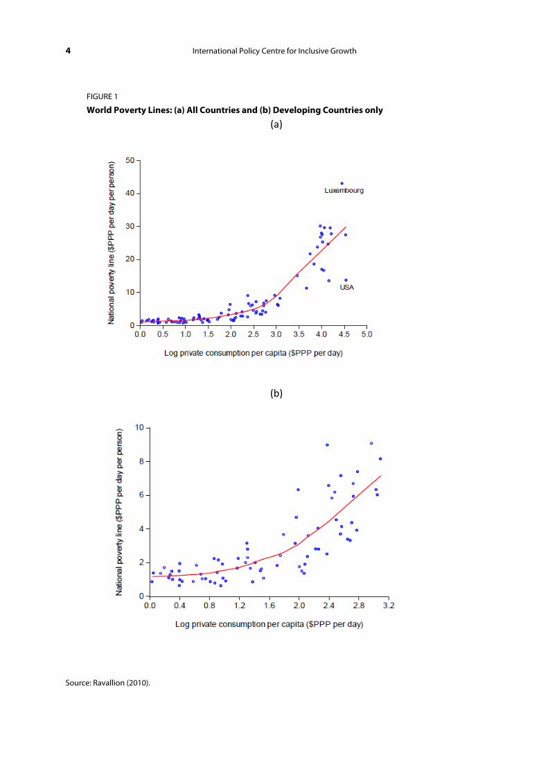
Clearly, the debate around absolute versus relative poverty is longstanding, and the definition of NPLs varies by context (Chen and Ravallion, 2011). For example, Ravallion (2010: 3) showed that NPLs could range from $0.62 to $43/day (see Figure 1) and “the mean line for the poorest 15 countries in terms of consumption per capita is $1.25, while the mean for the richest 15 is $25 a day.” For this reason—the use of relative poverty lines in high-income countries (HICs)—we present analysis below with and without HICs.
While there is increasing convergence on how lines are constructed (including around methods to identify and quantify a basic set of food and non-food needs), various technical factors still hinder their comparison across countries. At the same time, NPLs may provide a more realistic snapshot of the locally defined state of ‘poverty’ at country level. This is particularly compelling for the many countries whose NPLs are not among the 15 that form the $1.25/day. Further, IPLs have the unintended effect of limiting the poverty discourse to developing countries broadly defined or ‘them’ (as argued by Saith, 2006) and arguably just to the very poorest countries, with HICs invariably showing ‘no poverty’. Yet, recent economic crises and financial turmoil in HICs have reopened a debate around domestic poverty, safety nets, conditional loans and other issues that were until recently only relevant to the development discourse in the global South.4
Quantifying global poverty as defined on a context-specific basis, and not as measured by cross-country standards, will be the main thrust of the next section.
4 International Policy Centre for Inclusive Growth
FIGURE 1
World Poverty Lines: (a) All Countries and (b) Developing Countries only
(a)
(b)
Source: Ravallion (2010).
Working Paper 5
3 WHAT DO NATIONAL POVERTY LINES TELL US ABOUT GLOBAL POVERTY?
3.1 METHODOLOGY
Data for national poverty rates are provided by the World Bank’s World Development Indicators (WDI) database (last accessed on 10 February 2012). For country data not included in the WDI dataset, statistics were collected from other institutional sources. These include Eurostat for various European Union (EU) members (Eurostat, 2012) and the Organisation for Economic Co-operation and Development’s (OECD) Income Distribution and Poverty Database for other HICs (OECD, 2012). In some cases, data sources included direct survey or census data5 and country statistics provided by the Central Intelligence Agency (CIA) World Factbook. Annex 1 offers the full list of data and statistical sources.
In some instances, governments are in the process of revisiting the method for determining NPLs. For example, in India the recommendations from an expert group, the ‘Tendulkar Committee’, were endorsed by the government (Government of India 2009; 2012) with the result that “…the new poverty line happens to be close to, but less than, the 2005 PPP $1.25 per day poverty norm used by the World Bank in its latest world poverty estimates” (Government of India 2009: 8).
In China, the government has recently set a new NPL (against which access to safety nets is provided), resulting in a considerably higher level and rates of poverty than previously released.6
No NPL-based data were available for Cuba, DPR Korea, Libya, Somalia and a number of Persian Gulf countries. No IPL data are available for Afghanistan, Eritrea, Korea Dem. Rep., Myanmar, Somalia, Zimbabwe, Kiribati, Kosovo, Marshall Islands, Federated States of Micronesia, Mongolia, Samoa, Solomon Islands, Tonga, Tuvalu, Uzbekistan, Vanuatu, American Samoa, Antigua and Barbuda, Argentina, Cuba, Dominica, Grenada, Lebanon, Libya, Mauritius, Mayotte, Palau, St. Kitts and Nevis, St. Vincent and the Grenadines.
Demographic data on country population were used to calculate the number of poor people at national level. Population data corresponding to the year of the poverty rate were provided by the World Bank’s online PovCalNet in its latest version (last accessed on 2 March 2012).7 When not available for the respective year, figures were drawn from the UNDESA World Population Prospects 2010 database which includes yearly country population statistics for the period 1950–2010 (UNDESA, 2011). In total, our dataset includes statistics on poverty rates and numbers as defined by NPLs for 160 countries spanning over all income categories.
We also present rates and numbers based on the latest World Bank poverty estimates (Chen and Ravallion, 2012). The latter are extracted from PovCal Net (last accessed on 2 March 2012). When comparing NPLs and IPLs, we refer to a total of 146 countries for which data on both are available.8
3.2 FINDINGS IN LICS AND MICS
Our analysis shows that more than one-fifth (22.5 per cent) of the world’s population, or some 1.5 billion people, live in ‘poverty’ as locally defined (Table 2). This is about 16.6 per cent higher
6 International Policy Centre for Inclusive Growth
than the level of poverty (1.29 billion people) as measured by the $1.25/day IPL or approximately 60 per cent of the level of poverty (2.47 billion people) as measured by the $2/day IPL.
In terms of distribution across income categories, there are some 170 million people living in ‘poverty’ as locally defined in HICs, or 11 per cent of global poverty. However, to reiterate, poverty in HICs is typically measured in relative terms, not in absolute terms (Eurostat, 2012). Indeed, poverty levels (and NPLs) are generally defined in terms of percentage points (for example, 60 per cent) of median income. While this does not exclude the co-existence of absolute poverty or deprivation (Coleman-Jensen et al., 2011), relative poverty implies that some levels of poverty, or ‘low-income households’, will always exist in those contexts to a certain extent. It is for this reason we provide data below both with and without HICs.
As shown in Table 2, over 1 billion poor people (1.054 billion)—or 68.3 per cent of locally defined poor people—live in MICs, 44.3 per cent of which in lower-MICs (LMICs). Poverty in MICs accounts for a slightly lower share compared to the $1.25/day IPL (75.9 or 70.9 per cent),9 but for higher numbers compared to the same (960 million or 836 million). China and India combined account for about one-third (31.3 per cent) of global poverty.
TABLE 2
Global Poverty Distribution by Country Classification
Country classification Poverty NPL (mill) Percentage of total (%)
LIC 318.3 20.6
LMIC
only India
683.7
354.6
44.3
23 UMIC
only China
370.2
128
24.0
8.3
HIC 170.9 11.1
Total global poverty 1543.2 23.1*
Total global poverty minus HICs 1372.2 88.9
Total MIC 1053.9 68.3
China and India combined 482.6 31.3
* Percentage of world population, where the reference year of the latter corresponds to the average survey year for the 160 countries, namely 2006.7 or 2007; global population in 2007 = 6.661 billion as per UNDESA (2011).
The geographical distribution of NPL-based estimates shows that South Asia is the region with the highest proportion of world poverty (30.4 per cent), followed by sub-Saharan Africa (23.8 per cent) and East Asia and the Pacific (17.2 per cent). Table 3 offers a regional breakdown with and without HICs, hence only including countries with absolute poverty. In the latter case, the relative regional distribution would be the same (for example, South Asia showing the highest prevalence), with global poverty accounting for 20.5 per cent of the world population, or about 1.37 billion people.
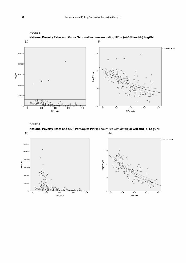
These findings show that poverty exists, and often significantly, at all levels of average per capita income. For example, Figure 1a illustrates the prevalence of poverty at different levels of GNI per capita (Atlas method) (see Figure 2). The lines on the left-hand graphs are the
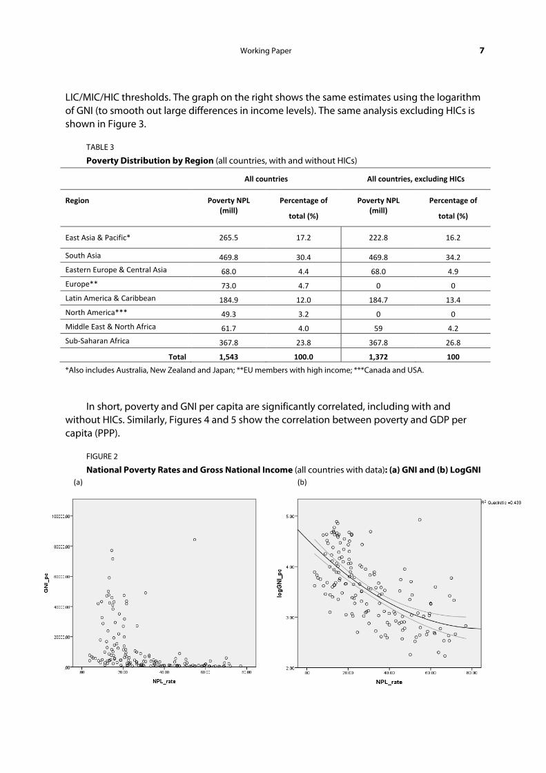
Working Paper 7
LIC/MIC/HIC thresholds. The graph on the right shows the same estimates using the logarithm of GNI (to smooth out large differences in income levels). The same analysis excluding HICs is shown in Figure 3.
TABLE 3
Poverty Distribution by Region (all countries, with and without HICs)
All countries All countries, excluding HICs
Region Poverty NPL (mill)
Percentage of
total (%)
Poverty NPL (mill)
Percentage of
total (%)
East Asia & Pacific* 265.5 17.2 222.8 16.2
South Asia 469.8 30.4 469.8 34.2
Eastern Europe & Central Asia 68.0 4.4 68.0 4.9
Europe** 73.0 4.7 0 0
Latin America & Caribbean 184.9 12.0 184.7 13.4
North America*** 49.3 3.2 0 0
Middle East & North Africa 61.7 4.0 59 4.2
Sub-Saharan Africa 367.8 23.8 367.8 26.8
Total 1,543 100.0 1,372 100
*Also includes Australia, New Zealand and Japan; **EU members with high income; ***Canada and USA.
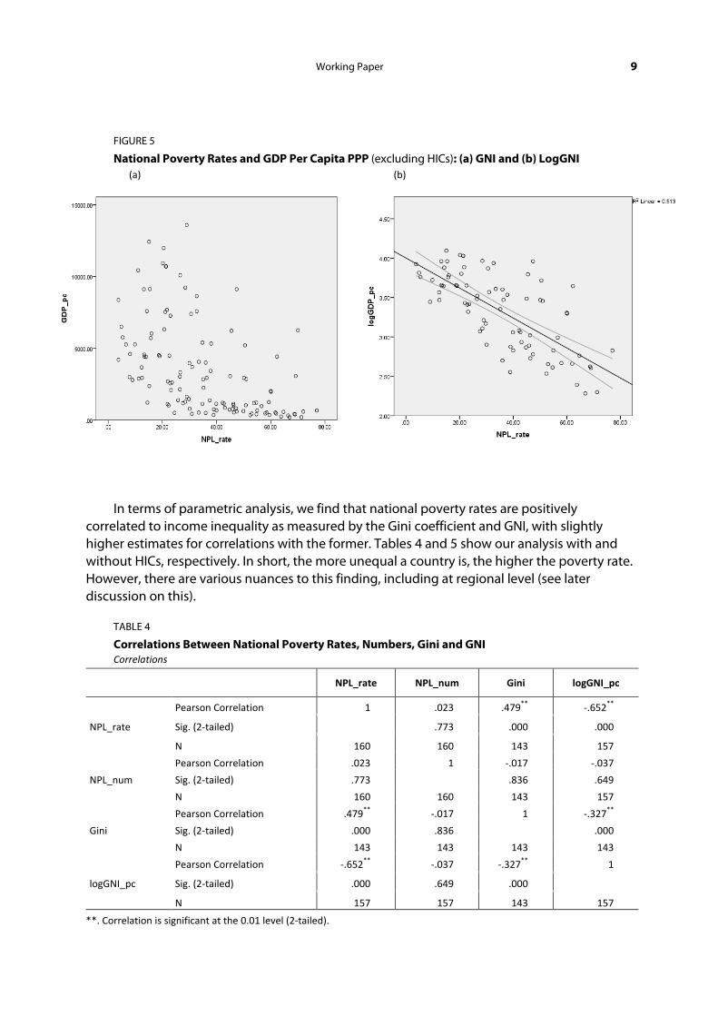
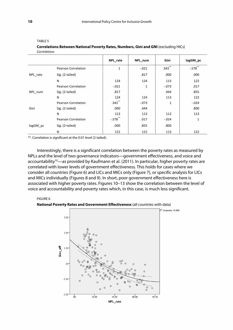
In short, poverty and GNI per capita are significantly correlated, including with and without HICs. Similarly, Figures 4 and 5 show the correlation between poverty and GDP per capita (PPP).
FIGURE 2
National Poverty Rates and Gross National Income (all countries with data): (a) GNI and (b) LogGNI (a) (b)
8 International Policy Centre for Inclusive Growth
FIGURE 3
National Poverty Rates and Gross National Income (excluding HICs): (a) GNI and (b) LogGNI (a) (b)
FIGURE 4
National Poverty Rates and GDP Per Capita PPP (all countries with data): (a) GNI and (b) LogGNI (a) (b)
Working Paper 9
FIGURE 5
National Poverty Rates and GDP Per Capita PPP (excluding HICs): (a) GNI and (b) LogGNI (a) (b)
In terms of parametric analysis, we find that national poverty rates are positively correlated to income inequality as measured by the Gini coefficient and GNI, with slightly higher estimates for correlations with the former. Tables 4 and 5 show our analysis with and without HICs, respectively. In short, the more unequal a country is, the higher the poverty rate. However, there are various nuances to this finding, including at regional level (see later discussion on this).
TABLE 4
Correlations Between National Poverty Rates, Numbers, Gini and GNI Correlations
NPL_rate NPL_num Gini logGNI_pc
NPL_rate
Pearson Correlation 1 .023 .479** -.652**
Sig. (2-tailed) .773 .000 .000
N 160 160 143 157
NPL_num
Pearson Correlation .023 1 -.017 -.037
Sig. (2-tailed) .773 .836 .649
N 160 160 143 157
Gini
Pearson Correlation .479** -.017 1 -.327**
Sig. (2-tailed) .000 .836 .000
N 143 143 143 143
logGNI_pc
Pearson Correlation -.652** -.037 -.327** 1
Sig. (2-tailed) .000 .649 .000
N 157 157 143 157
**. Correlation is significant at the 0.01 level (2-tailed).
10 International Policy Centre for Inclusive Growth
TABLE 5
Correlations Between National Poverty Rates, Numbers, Gini and GNI (excluding HICs) Correlations
NPL_rate NPL_num Gini logGNI_pc
NPL_rate
Pearson Correlation 1 -.021 .343** -.578**
Sig. (2-tailed) .817 .000 .000
N 124 124 113 122
NPL_num
Pearson Correlation -.021 1 -.073 .017
Sig. (2-tailed) .817 .444 .855
N 124 124 113 122
Gini
Pearson Correlation .343** -.073 1 -.024
Sig. (2-tailed) .000 .444 .800
N 113 113 113 113
logGNI_pc
Pearson Correlation -.578** .017 -.024 1
Sig. (2-tailed) .000 .855 .800
N 122 122 113 122
**. Correlation is significant at the 0.01 level (2-tailed).
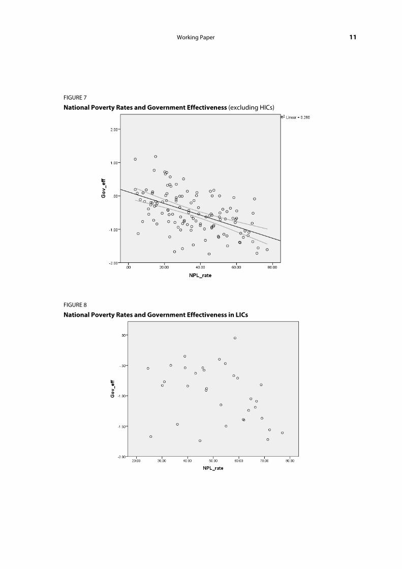
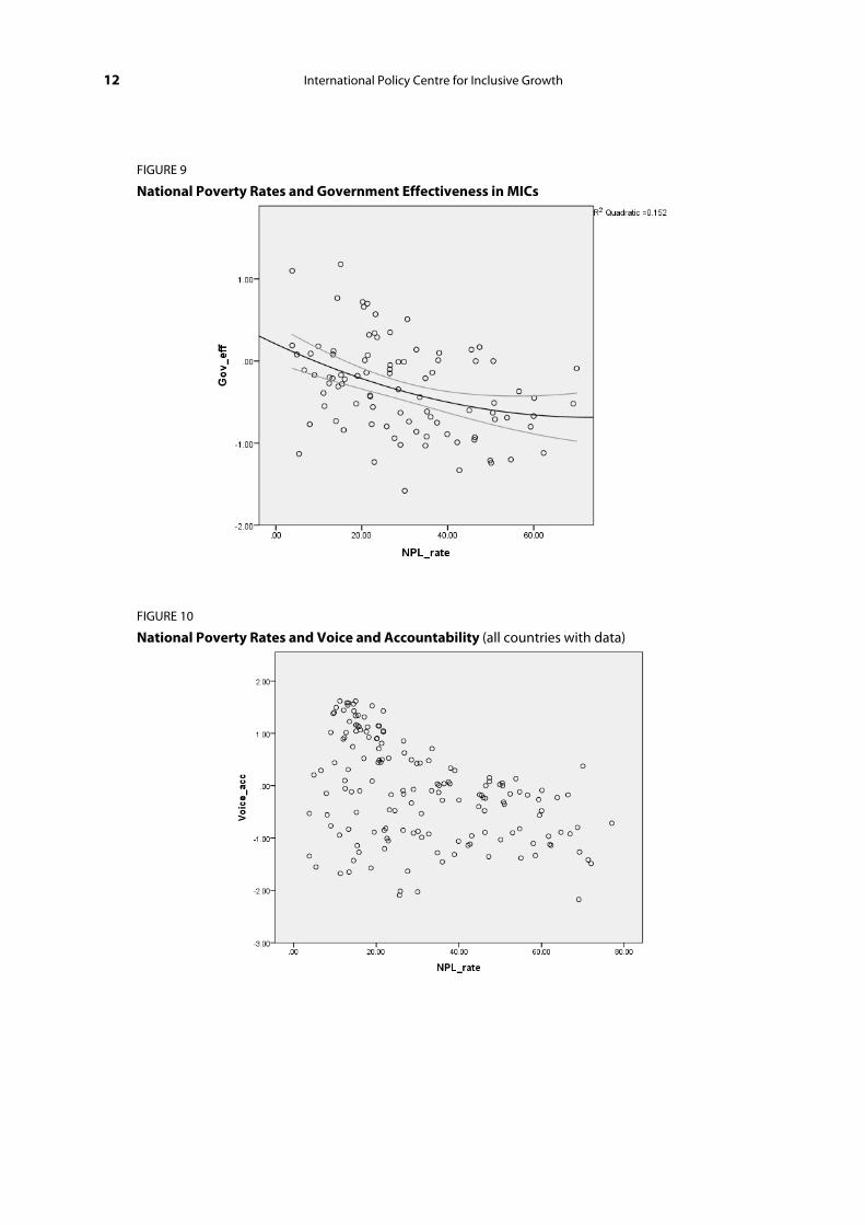
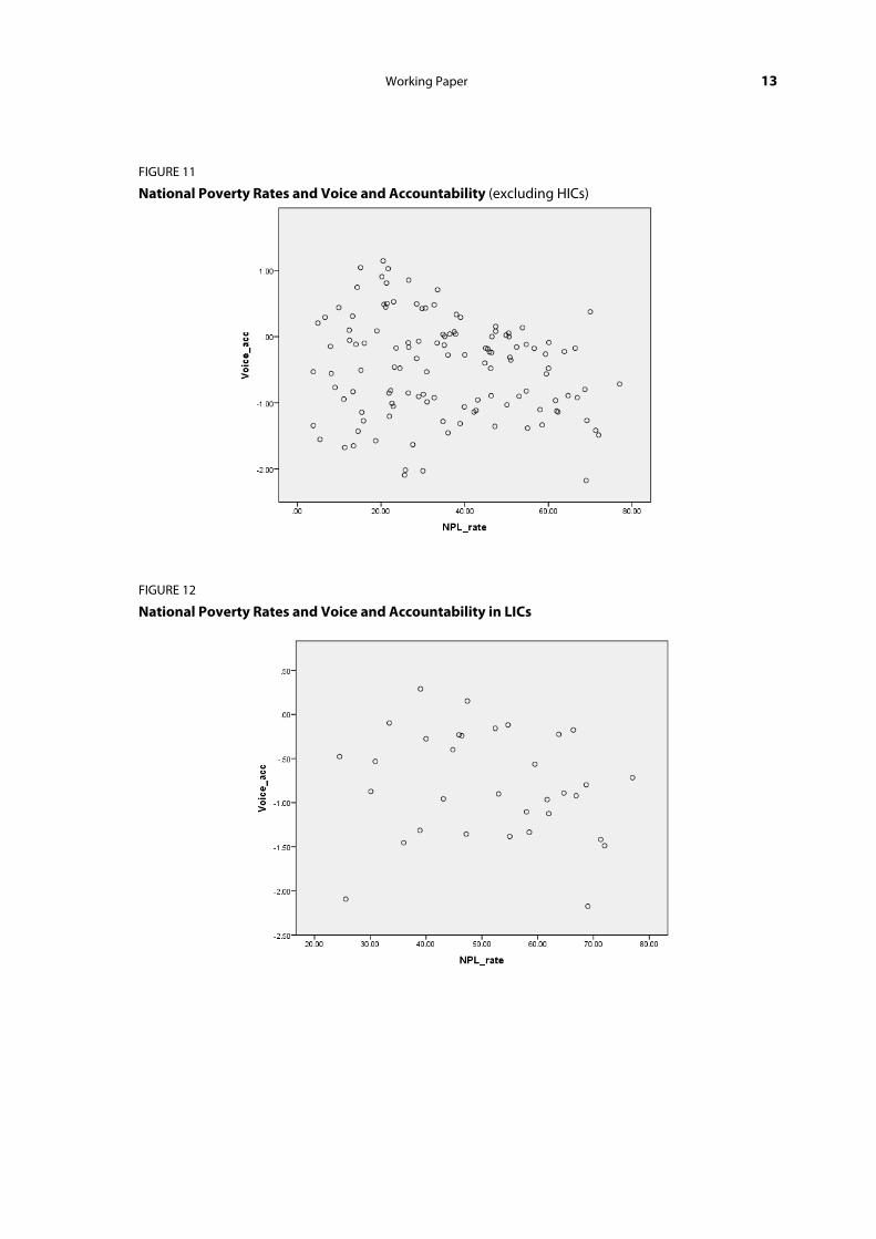
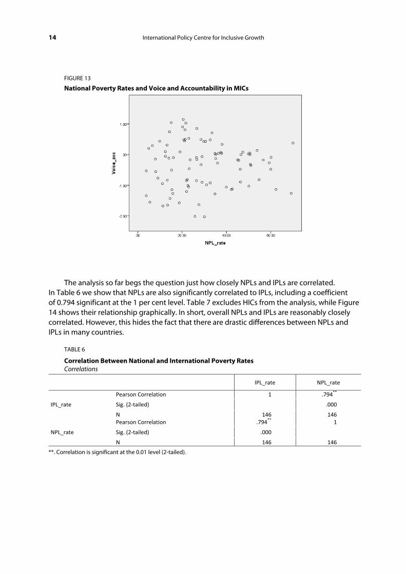
Interestingly, there is a significant correlation between the poverty rates as measured by NPLs and the level of two governance indicators—government effectiveness, and voice and accountability10—as provided by Kaufmann et al. (2011). In particular, higher poverty rates are correlated with lower levels of government effectiveness. This holds for cases where we consider all countries (Figure 6) and LICs and MICs only (Figure 7), or specific analysis for LICs and MICs individually (Figures 8 and 9). In short, poor government effectiveness here is associated with higher poverty rates. Figures 10–13 show the correlation between the level of voice and accountability and poverty rates which, in this case, is much less significant.
FIGURE 6
National Poverty Rates and Government Effectiveness (all countries with data)
Working Paper 11
FIGURE 7
National Poverty Rates and Government Effectiveness (excluding HICs)
FIGURE 8
National Poverty Rates and Government Effectiveness in LICs
12 International Policy Centre for Inclusive Growth
FIGURE 9
National Poverty Rates and Government Effectiveness in MICs
FIGURE 10
National Poverty Rates and Voice and Accountability (all countries with data)
Working Paper 13
FIGURE 11
National Poverty Rates and Voice and Accountability (excluding HICs)
FIGURE 12
National Poverty Rates and Voice and Accountability in LICs
14 International Policy Centre for Inclusive Growth
FIGURE 13
National Poverty Rates and Voice and Accountability in MICs
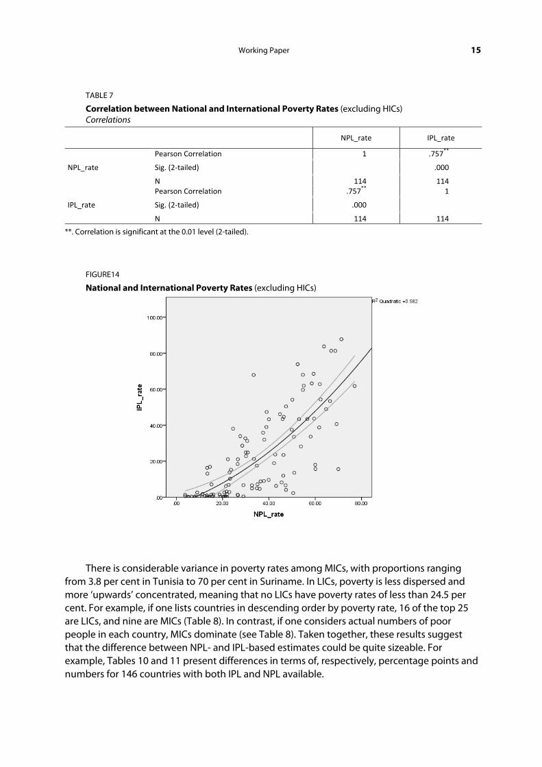
The analysis so far begs the question just how closely NPLs and IPLs are correlated. In Table 6 we show that NPLs are also significantly correlated to IPLs, including a coefficient of 0.794 significant at the 1 per cent level. Table 7 excludes HICs from the analysis, while Figure 14 shows their relationship graphically. In short, overall NPLs and IPLs are reasonably closely correlated. However, this hides the fact that there are drastic differences between NPLs and IPLs in many countries.
TABLE 6
Correlation Between National and International Poverty Rates Correlations
IPL_rate NPL_rate
IPL_rate
Pearson Correlation 1 .794**
Sig. (2-tailed) .000
N 146 146
NPL_rate
Pearson Correlation .794** 1
Sig. (2-tailed) .000 N 146 146
**. Correlation is significant at the 0.01 level (2-tailed).
Working Paper 15
TABLE 7
Correlation between National and International Poverty Rates (excluding HICs) Correlations
NPL_rate IPL_rate
NPL_rate
Pearson Correlation 1 .757**
Sig. (2-tailed) .000
N 114 114
IPL_rate
Pearson Correlation .757** 1
Sig. (2-tailed) .000 N 114 114
**. Correlation is significant at the 0.01 level (2-tailed).
FIGURE14
National and International Poverty Rates (excluding HICs)
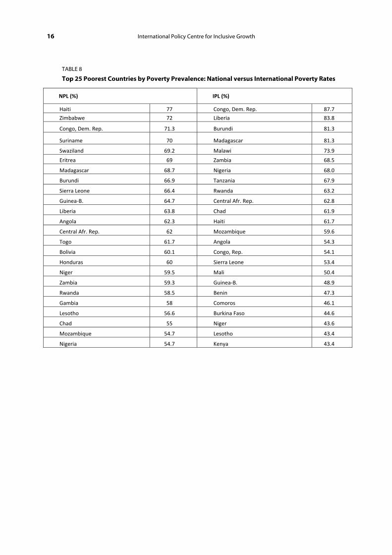
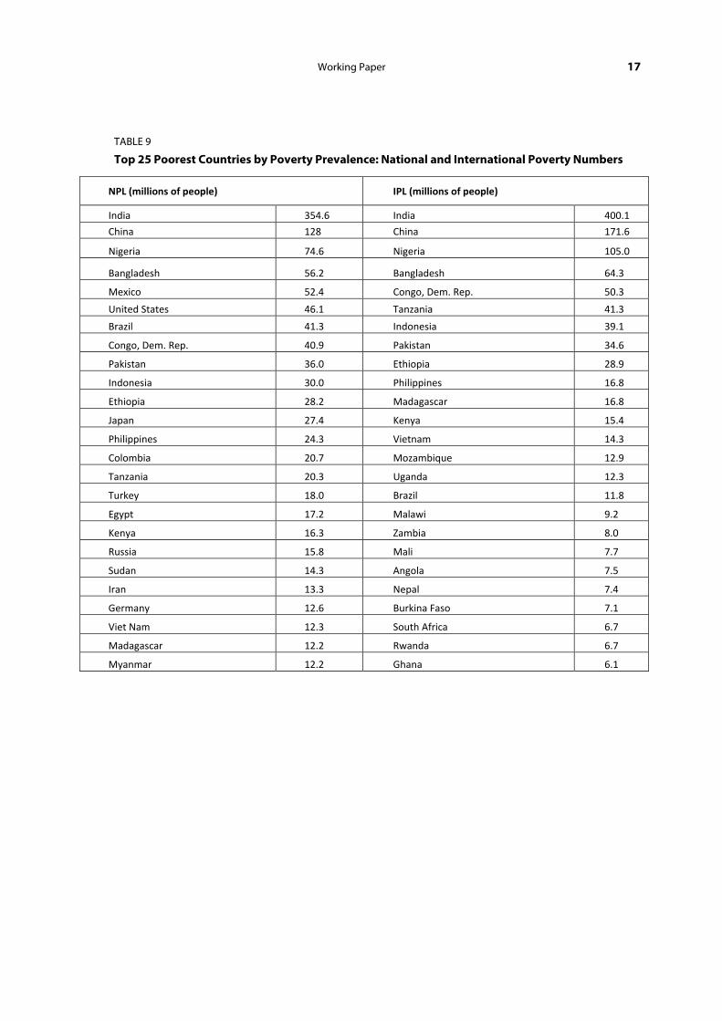
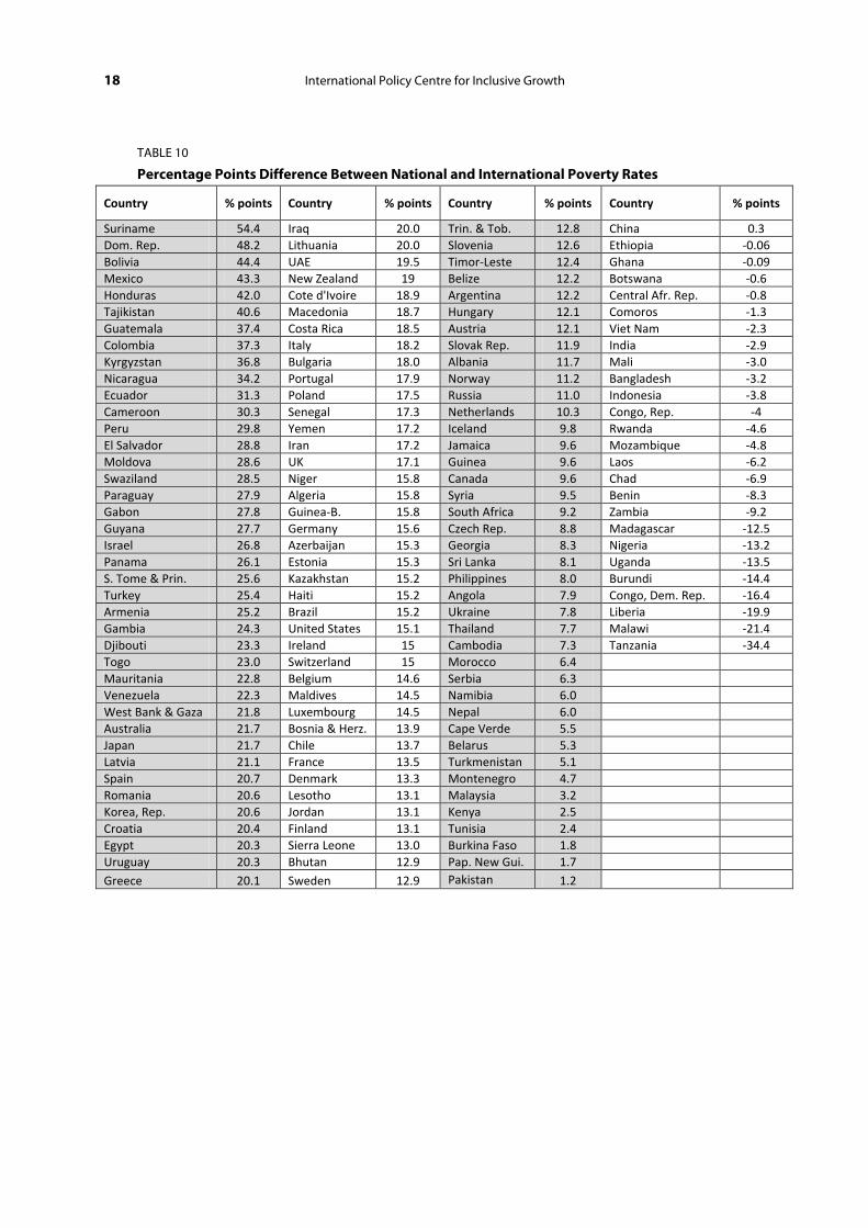
There is considerable variance in poverty rates among MICs, with proportions ranging from 3.8 per cent in Tunisia to 70 per cent in Suriname. In LICs, poverty is less dispersed and more ‘upwards’ concentrated, meaning that no LICs have poverty rates of less than 24.5 per cent. For example, if one lists countries in descending order by poverty rate, 16 of the top 25 are LICs, and nine are MICs (Table 8). In contrast, if one considers actual numbers of poor people in each country, MICs dominate (see Table 8). Taken together, these results suggest that the difference between NPL- and IPL-based estimates could be quite sizeable. For example, Tables 10 and 11 present differences in terms of, respectively, percentage points and numbers for 146 countries with both IPL and NPL available.
16 International Policy Centre for Inclusive Growth
TABLE 8
Top 25 Poorest Countries by Poverty Prevalence: National versus International Poverty Rates
NPL (%) IPL (%)
Haiti 77 Congo, Dem. Rep. 87.7
Zimbabwe 72 Liberia 83.8
Congo, Dem. Rep. 71.3 Burundi 81.3
Suriname 70 Madagascar 81.3
Swaziland 69.2 Malawi 73.9
Eritrea 69 Zambia 68.5
Madagascar 68.7 Nigeria 68.0
Burundi 66.9 Tanzania 67.9
Sierra Leone 66.4 Rwanda 63.2
Guinea-B. 64.7 Central Afr. Rep. 62.8
Liberia 63.8 Chad 61.9
Angola 62.3 Haiti 61.7
Central Afr. Rep. 62 Mozambique 59.6
Togo 61.7 Angola 54.3
Bolivia 60.1 Congo, Rep. 54.1
Honduras 60 Sierra Leone 53.4
Niger 59.5 Mali 50.4
Zambia 59.3 Guinea-B. 48.9
Rwanda 58.5 Benin 47.3
Gambia 58 Comoros 46.1
Lesotho 56.6 Burkina Faso 44.6
Chad 55 Niger 43.6
Mozambique 54.7 Lesotho 43.4
Nigeria 54.7 Kenya 43.4
Working Paper 17
TABLE 9
Top 25 Poorest Countries by Poverty Prevalence: National and International Poverty Numbers
NPL (millions of people) IPL (millions of people)
India 354.6 India 400.1
China 128 China 171.6
Nigeria 74.6 Nigeria 105.0
Bangladesh 56.2 Bangladesh 64.3
Mexico 52.4 Congo, Dem. Rep. 50.3
United States 46.1 Tanzania 41.3
Brazil 41.3 Indonesia 39.1
Congo, Dem. Rep. 40.9 Pakistan 34.6
Pakistan 36.0 Ethiopia 28.9
Indonesia 30.0 Philippines 16.8
Ethiopia 28.2 Madagascar 16.8
Japan 27.4 Kenya 15.4
Philippines 24.3 Vietnam 14.3
Colombia 20.7 Mozambique 12.9
Tanzania 20.3 Uganda 12.3
Turkey 18.0 Brazil 11.8
Egypt 17.2 Malawi 9.2
Kenya 16.3 Zambia 8.0
Russia 15.8 Mali 7.7
Sudan 14.3 Angola 7.5
Iran 13.3 Nepal 7.4
Germany 12.6 Burkina Faso 7.1
Viet Nam 12.3 South Africa 6.7
Madagascar 12.2 Rwanda 6.7
Myanmar 12.2 Ghana 6.1
18 International Policy Centre for Inclusive Growth
TABLE 10
Percentage Points Difference Between National and International Poverty Rates
Country % points Country % points Country % points Country % points
Suriname 54.4 Iraq 20.0 Trin. & Tob. 12.8 China 0.3 Dom. Rep. 48.2 Lithuania 20.0 Slovenia 12.6 Ethiopia -0.06 Bolivia 44.4 UAE 19.5 Timor-Leste 12.4 Ghana -0.09 Mexico 43.3 New Zealand 19 Belize 12.2 Botswana -0.6 Honduras 42.0 Cote d'Ivoire 18.9 Argentina 12.2 Central Afr. Rep. -0.8 Tajikistan 40.6 Macedonia 18.7 Hungary 12.1 Comoros -1.3 Guatemala 37.4 Costa Rica 18.5 Austria 12.1 Viet Nam -2.3 Colombia 37.3 Italy 18.2 Slovak Rep. 11.9 India -2.9 Kyrgyzstan 36.8 Bulgaria 18.0 Albania 11.7 Mali -3.0 Nicaragua 34.2 Portugal 17.9 Norway 11.2 Bangladesh -3.2 Ecuador 31.3 Poland 17.5 Russia 11.0 Indonesia -3.8 Cameroon 30.3 Senegal 17.3 Netherlands 10.3 Congo, Rep. -4 Peru 29.8 Yemen 17.2 Iceland 9.8 Rwanda -4.6 El Salvador 28.8 Iran 17.2 Jamaica 9.6 Mozambique -4.8 Moldova 28.6 UK 17.1 Guinea 9.6 Laos -6.2 Swaziland 28.5 Niger 15.8 Canada 9.6 Chad -6.9 Paraguay 27.9 Algeria 15.8 Syria 9.5 Benin -8.3 Gabon 27.8 Guinea-B. 15.8 South Africa 9.2 Zambia -9.2 Guyana 27.7 Germany 15.6 Czech Rep. 8.8 Madagascar -12.5 Israel 26.8 Azerbaijan 15.3 Georgia 8.3 Nigeria -13.2 Panama 26.1 Estonia 15.3 Sri Lanka 8.1 Uganda -13.5 S. Tome & Prin. 25.6 Kazakhstan 15.2 Philippines 8.0 Burundi -14.4 Turkey 25.4 Haiti 15.2 Angola 7.9 Congo, Dem. Rep. -16.4 Armenia 25.2 Brazil 15.2 Ukraine 7.8 Liberia -19.9 Gambia 24.3 United States 15.1 Thailand 7.7 Malawi -21.4 Djibouti 23.3 Ireland 15 Cambodia 7.3 Tanzania -34.4 Togo 23.0 Switzerland 15 Morocco 6.4 Mauritania 22.8 Belgium 14.6 Serbia 6.3 Venezuela 22.3 Maldives 14.5 Namibia 6.0 West Bank & Gaza 21.8 Luxembourg 14.5 Nepal 6.0 Australia 21.7 Bosnia & Herz. 13.9 Cape Verde 5.5 Japan 21.7 Chile 13.7 Belarus 5.3 Latvia 21.1 France 13.5 Turkmenistan 5.1 Spain 20.7 Denmark 13.3 Montenegro 4.7 Romania 20.6 Lesotho 13.1 Malaysia 3.2 Korea, Rep. 20.6 Jordan 13.1 Kenya 2.5 Croatia 20.4 Finland 13.1 Tunisia 2.4 Egypt 20.3 Sierra Leone 13.0 Burkina Faso 1.8 Uruguay 20.3 Bhutan 12.9 Pap. New Gui. 1.7 Greece 20.1 Sweden 12.9 Pakistan 1.2

Working Paper 19
TABLE 11
Difference Between National and International Poverty Numbers (millions)
Country Mill Country Mill Country Mill Country Mill
Mexico 47.8 Greece 2.2 Lithuania 0.6 Iceland 0.03 United States 46.1 Morocco 2.0 UAE 0.6 Comoros -0.01 Brazil 29.4 Portugal 1.9 Slovak Rep. 0.6 Central Afr. Rep. -0.04 Japan 27.4 Israel 1.9 Uruguay 0.6 Congo, Rep. -0.1 Turkey 17.2 Kyrgyzstan 1.8 Sierra Leone 0.6 Laos -0.3 Colombia 16.9 Senegal 1.8 Norway 0.5 Chad -0.4 Egypt 15.9 Nicaragua 1.8 Bosnia & Herz. 0.5 Benin -0.6 Russia 15.7 El Salvador 1.7 Belarus 0.5 Liberia -0. Germany 12.6 Paraguay 1.7 Latvia 0.4 Ethiopia -0.7 Iran 12.3 Netherlands 1.6 Serbia 0.4 Mozambique -0.7 Italy 10.9 Sri Lanka 1.6 Mauritania 0.4 Burkina Faso -0.9 UK 10.5 Syria 1.6 Gabon 0.3 Burundi -1.0 Korea, Rep. 9.8 Belgium 1.5 Macedonia 0.3 Zambia -1.0 Spain 9.4 Pakistan 1.4 Albania 0.3 Rwanda -1.1 Peru 8.5 Bulgaria 1.3 Georgia 0.3 Mali -1.3 France 8.2 Azerbaijan 1.3 Gambia 0.3 Viet Nam -2.0 Philippines 7.4 Haiti 1.3 Guinea-B 0.3 Malawi -2.6 Poland 6.5 Togo 1.2 Turkmenistan 0.3 Uganda -4.3 Venezuela 6.4 Sweden 1.2 Lesotho 0.2 Madagascar -4.5 Iraq 5.8 Hungary 1.1 Swaziland 0.2 Bangladesh -8.0 Cameroon 5.5 Switzerland 1.1 Suriname 0.2 Indonesia -9.1 Thailand 5.3 Angola 1.1 Jamaica 0.2 Congo, Dem. Rep. -9.4 Guatemala 4.8 Moldova 1.0 Slovenia 0.2 Tanzania -21.0 Dom. Rep. 4.6 Austria 1.0 Tunisia 0.2 Nigeria -30.4 Australia 4.5 Cambodia 0.9 Estonia 0.2 China -43.7 Argentina 4.5 Malaysia 0.9 Guyana 0.2 India -45.5 Ecuador 4.4 Czech Rep. 0.9 Djibouti 0.1 Romania 4.4 Guinea 0.9 Trin. & Tob. 0.1 Algeria 4.4 Kenya 0.9 Timor-Leste 0.1 Bolivia 4.1 West Bank & Gaza 0.8 Ghana 0.1 South Africa 4.1 Panama 0.8 Namibia 0.1 Ukraine 3.6 Croatia 0.8 Bhutan 0.09 Cote d'Ivoire 3.6 Costa Rica 0.8 Botswana 0.09 Yemen 3.5 Nepal 0.8 Pap. New Gui. 0.08 Honduras 3.2 New Zealand 0.8 Luxembourg 0.07 Canada 3.1 Armenia 0.7 Maldives 0.04 Tajikistan 2.7 Jordan 0.7 Belize 0.04 Chile 2.3 Denmark 0.7 S. Tome & Princ. 0.04 Kazakhstan 2.2 Finland 0.6 Cape Verde 0.03 Niger 2.2 Ireland 0.6 Montenegro 0.03
With regards to numbers, the difference could range from +47.8 million to -45.48 million, a total absolute difference of nearly 100 million people. In this case, poverty in China and India combined based on NPLs could ‘understate’ poverty by some 90 million people compared to IPLs. In the case of percentage points difference between NPLs and IPLs, estimates could range from +54.4 to -34.4, or an absolute difference of about 90 percentage points. For example, poverty in Mexico is 1 per cent by the $1.25 IPL (and 5 per cent by the $2 IPL). But if we measure poverty based on NPLs, half of the Mexican population is poor.
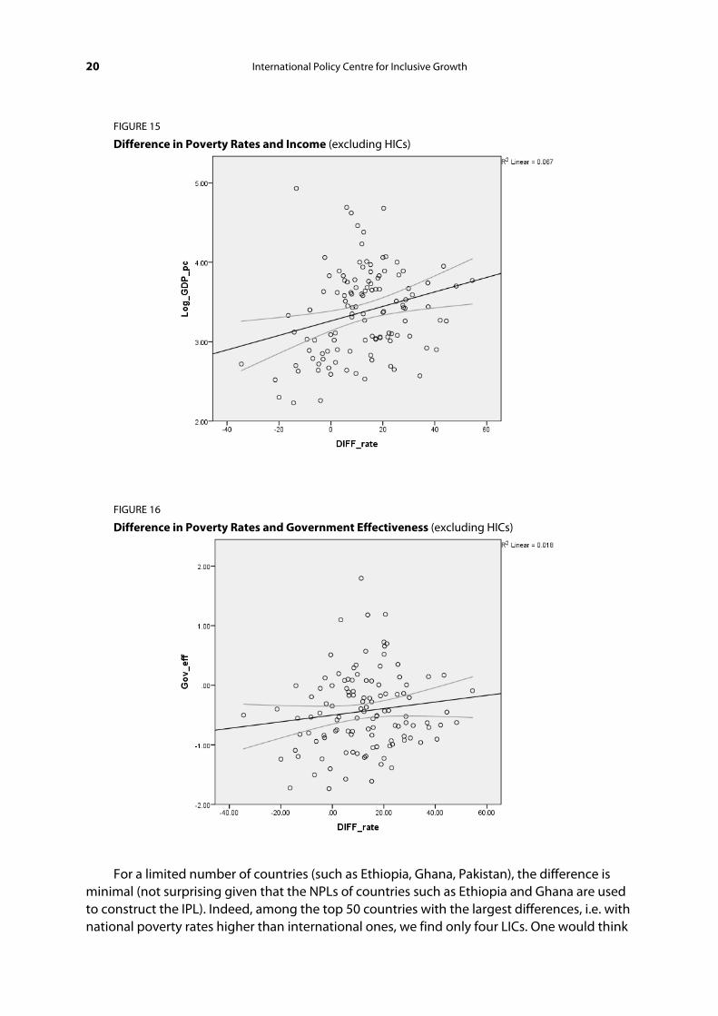
20 International Policy Centre for Inclusive Growth
FIGURE 15
Difference in Poverty Rates and Income (excluding HICs)
FIGURE 16
Difference in Poverty Rates and Government Effectiveness (excluding HICs)
For a limited number of countries (such as Ethiopia, Ghana, Pakistan), the difference is minimal (not surprising given that the NPLs of countries such as Ethiopia and Ghana are used to construct the IPL). Indeed, among the top 50 countries with the largest differences, i.e. with national poverty rates higher than international ones, we find only four LICs. One would think

Working Paper 21
this presumably reflects higher NPLs in MICs than LICs in general. However, this is not the case in all MICs. Notably, for China and India the lines only generate, respectively, a +0.3 and -2.87 percentage points difference in poverty rates.11 And in fact LICs have national poverty rates lower than international estimates. However, this could be because NPLs sometimes only cover rural areas (and most of the population is rural) or because of technical factors in the construction of the poverty lines. Indeed, Figure 15 shows that the difference between national and international poverty rates (excluding HICs) tends to be positive and larger at higher levels of per capita income, while negative at lower levels of per capita income (reflecting the basis of the IPL on poverty lines of LICs). A similar pattern is also observed between the difference in poverty rates and government effectiveness (Figure 16).
FIGURE 17
Percentage Points Difference Between National and International Poverty Rates, Selected Countries
-40.0 -20.0 0.0 20.0 40.0 60.0
Tanzania
Liberia
Uganda
Zambia
Rwanda
Bangladesh
Viet Nam
Ethiopia
Pakistan
Kenya
Namibia
Thailand
Philippines
Russia
Brazil
Iraq
Cameroon
Tajikistan
22 International Policy Centre for Inclusive Growth
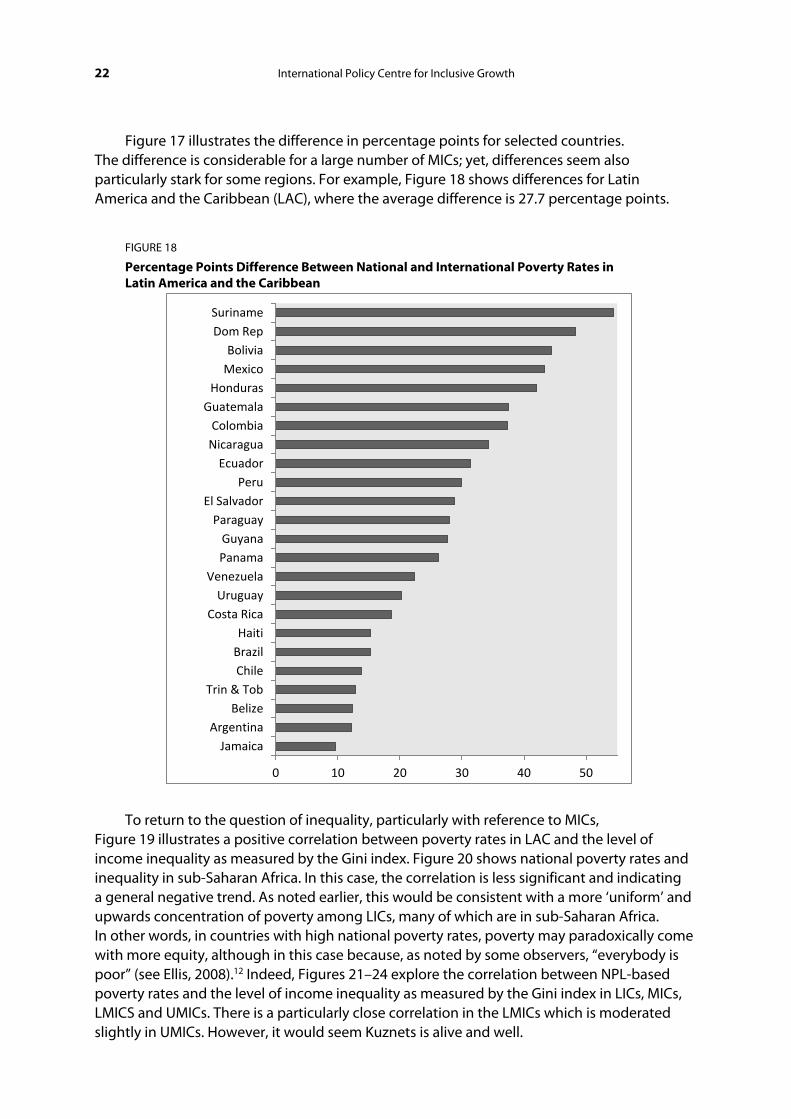
Figure 17 illustrates the difference in percentage points for selected countries. The difference is considerable for a large number of MICs; yet, differences seem also particularly stark for some regions. For example, Figure 18 shows differences for Latin America and the Caribbean (LAC), where the average difference is 27.7 percentage points.
FIGURE 18
Percentage Points Difference Between National and International Poverty Rates in Latin America and the Caribbean
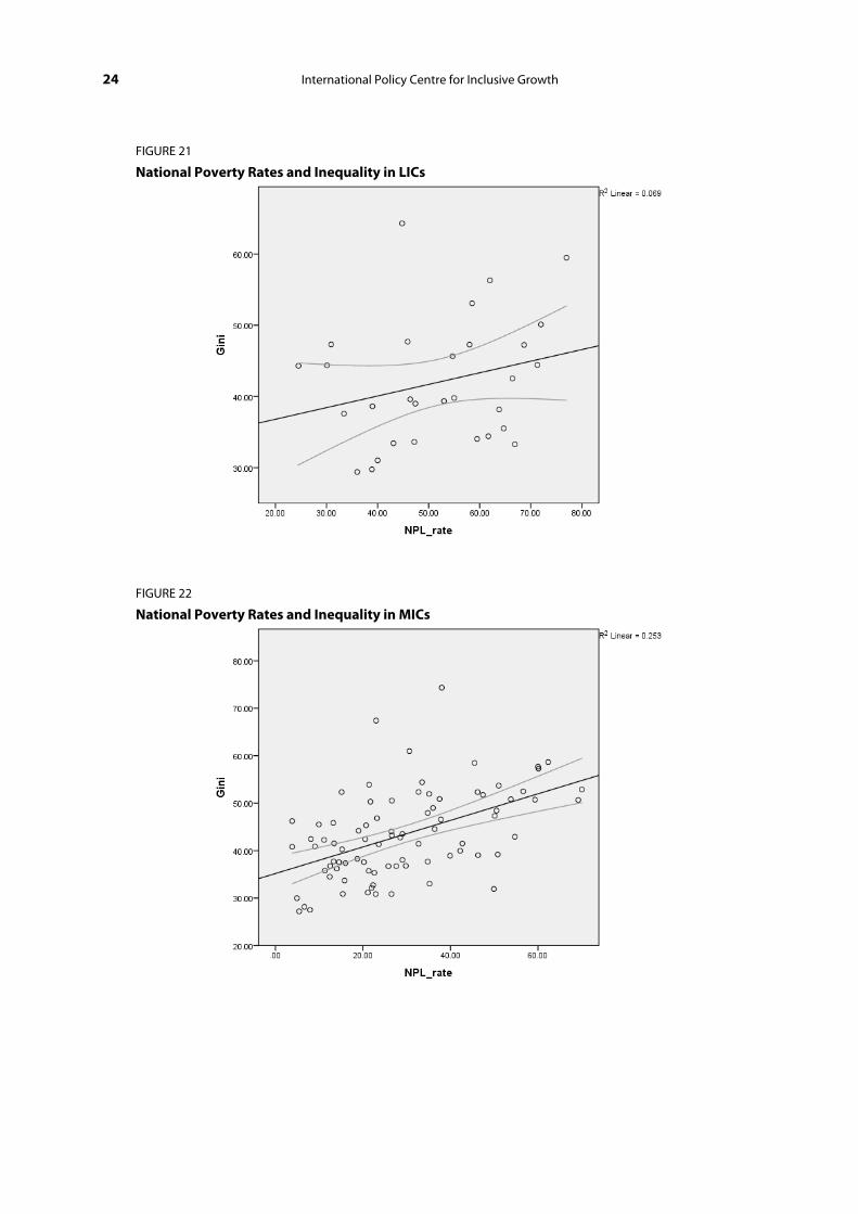
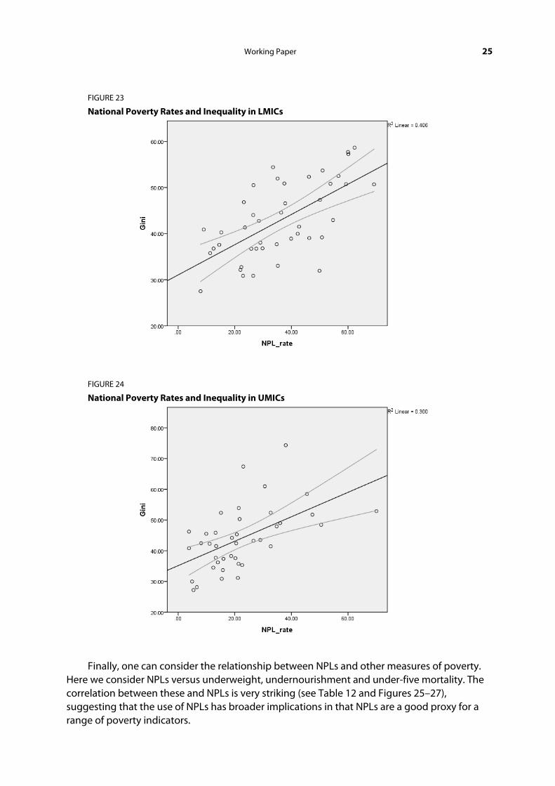
To return to the question of inequality, particularly with reference to MICs, Figure 19 illustrates a positive correlation between poverty rates in LAC and the level of income inequality as measured by the Gini index. Figure 20 shows national poverty rates and inequality in sub-Saharan Africa. In this case, the correlation is less significant and indicating a general negative trend. As noted earlier, this would be consistent with a more ‘uniform’ and upwards concentration of poverty among LICs, many of which are in sub-Saharan Africa. In other words, in countries with high national poverty rates, poverty may paradoxically come with more equity, although in this case because, as noted by some observers, “everybody is poor” (see Ellis, 2008).12 Indeed, Figures 21–24 explore the correlation between NPL-based poverty rates and the level of income inequality as measured by the Gini index in LICs, MICs, LMICS and UMICs. There is a particularly close correlation in the LMICs which is moderated slightly in UMICs. However, it would seem Kuznets is alive and well.
0 10 20 30 40 50
Jamaica Argentina
Belize Trin & Tob
Chile Brazil Haiti
Costa Rica Uruguay
Venezuela Panama Guyana
Paraguay El Salvador
Peru Ecuador
Nicaragua Colombia
Guatemala Honduras
Mexico Bolivia
Dom Rep Suriname

Working Paper 23
FIGURE 19
National Poverty Rates and Inequality in Latin America and Caribbean
FIGURE 20
National Poverty Rates and Inequality in Sub-Saharan Africa
24 International Policy Centre for Inclusive Growth
FIGURE 21
National Poverty Rates and Inequality in LICs
FIGURE 22
National Poverty Rates and Inequality in MICs
Working Paper 25
FIGURE 23
National Poverty Rates and Inequality in LMICs
FIGURE 24
National Poverty Rates and Inequality in UMICs
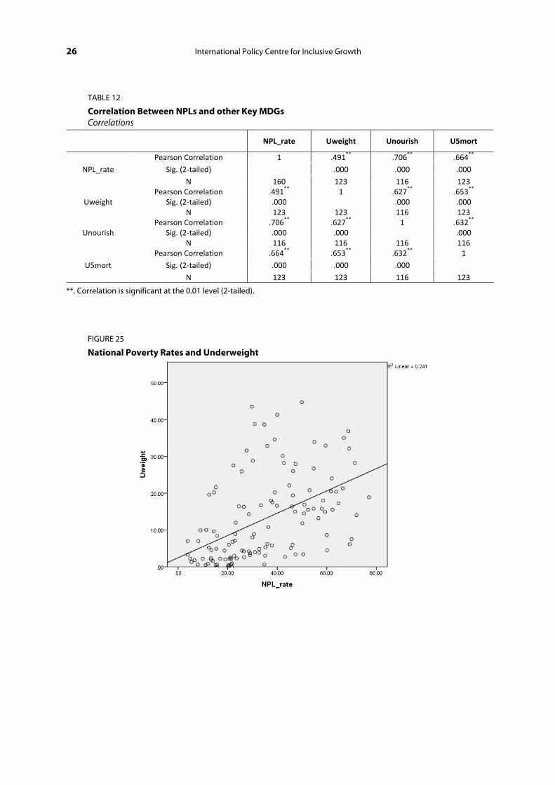
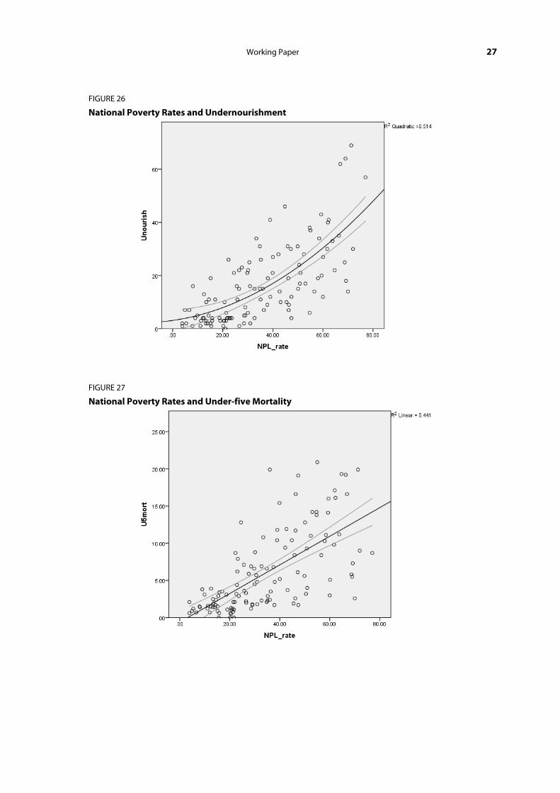
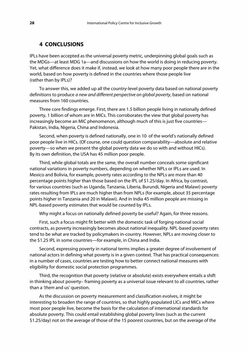
Finally, one can consider the relationship between NPLs and other measures of poverty. Here we consider NPLs versus underweight, undernourishment and under-five mortality. The correlation between these and NPLs is very striking (see Table 12 and Figures 25–27), suggesting that the use of NPLs has broader implications in that NPLs are a good proxy for a range of poverty indicators.
26 International Policy Centre for Inclusive Growth
TABLE 12
Correlation Between NPLs and other Key MDGs Correlations
NPL_rate Uweight Unourish U5mort
NPL_rate
Pearson Correlation 1 .491** .706** .664**
Sig. (2-tailed) .000 .000 .000
N 160 123 116 123
Uweight Pearson Correlation .491** 1 .627** .653**
Sig. (2-tailed) .000 .000 .000 N 123 123 116 123
Unourish Pearson Correlation .706** .627** 1 .632**
Sig. (2-tailed) .000 .000 .000 N 116 116 116 116
U5mort
Pearson Correlation .664** .653** .632** 1
Sig. (2-tailed) .000 .000 .000
N 123 123 116 123
**. Correlation is significant at the 0.01 level (2-tailed).
FIGURE 25
National Poverty Rates and Underweight
Working Paper 27
FIGURE 26
National Poverty Rates and Undernourishment
FIGURE 27
National Poverty Rates and Under-five Mortality
28 International Policy Centre for Inclusive Growth
4 CONCLUSIONS
IPLs have been accepted as the universal poverty metric, underpinning global goals such as the MDGs—at least MDG 1a—and discussions on how the world is doing in reducing poverty. Yet, what difference does it make if, instead, we look at how many poor people there are in the world, based on how poverty is defined in the countries where those people live (rather than by IPLs)?
To answer this, we added up all the country-level poverty data based on national poverty definitions to produce a new and different perspective on global poverty, based on national measures from 160 countries.
Three core findings emerge. First, there are 1.5 billion people living in nationally defined poverty, 1 billion of whom are in MICs. This corroborates the view that global poverty has increasingly become an MIC phenomenon, although much of this is just five countries—Pakistan, India, Nigeria, China and Indonesia.
Second, when poverty is defined nationally, one in 10 of the world’s nationally defined poor people live in HICs. (Of course, one could question comparability—absolute and relative poverty—so when we present the global poverty data we do so with and without HICs). By its own definition, the USA has 45 million poor people.
Third, while global totals are the same, the overall number conceals some significant national variations in poverty numbers, depending on whether NPLs or IPLs are used. In Mexico and Bolivia, for example, poverty rates according to the NPLs are more than 40 percentage points higher than those based on the IPL of $1.25/day. In Africa, by contrast, for various countries (such as Uganda, Tanzania, Liberia, Burundi, Nigeria and Malawi) poverty rates resulting from IPLs are much higher than from NPLs (for example, about 35 percentage points higher in Tanzania and 20 in Malawi). And in India 45 million people are missing in NPL-based poverty estimates that would be counted by IPLs.
Why might a focus on nationally defined poverty be useful? Again, for three reasons.
First, such a focus might fit better with the domestic task of forging national social contracts, as poverty increasingly becomes about national inequality. NPL-based poverty rates tend to be what are tracked by policymakers in-country. However, NPLs are moving closer to the $1.25 IPL in some countries—for example, in China and India.
Second, expressing poverty in national terms implies a greater degree of involvement of national actors in defining what poverty is in a given context. That has practical consequences: in a number of cases, countries are testing how to better connect national measures with eligibility for domestic social protection programmes.
Third, the recognition that poverty (relative or absolute) exists everywhere entails a shift in thinking about poverty– framing poverty as a universal issue relevant to all countries, rather than a ‘them and us’ question.
As the discussion on poverty measurement and classification evolves, it might be interesting to broaden the range of countries, so that highly populated LICs and MICs where most poor people live, become the basis for the calculation of international standards for absolute poverty. This could entail establishing global poverty lines (such as the current $1.25/day) not on the average of those of the 15 poorest countries, but on the average of the
Working Paper 29
countries with the highest numbers of poor people—80 per cent of the world’s poor people live in just 10 countries, and 90 per cent in 20 populous countries (most of which are not currently part of the $1.25 calculation). Such a process would perhaps better synchronise global measurement to the shifts in global poverty.
REFERENCES
Abu-Ismail, K., Abou Taleb, G. and Ramadan, R. (2012). Rethinking Global Poverty Measurement, IPC-IG Working Paper, No. 93. Brasilia, IPC-IG.
Addison, T. and Niño-Zarazúa, M. (2012). Redefining Poverty in China and India: Making Growth more Inclusive. Helsinki, UNU-WIDER.
Alkire, S., Roche, J., Santos, E. and Seth, S. (2011). Multidimensional Poverty Index 2011. Oxford, OPHI.
Chandy, L. and Gertz, G. (2011). ‘Poverty in Numbers: the Changing State of Global Poverty from 2005 to 2015’, Policy Brief, No. 2011-01. Washington, DC, The Brookings Institution.
Chen, S. and Ravallion, M. (2007). ‘Absolute Poverty Measures for the Developing World, 1981–2004’, Policy Research Working Paper, No. 4211. Washington, DC, World Bank.
Chen, S. and Ravallion, M. (2010). ‘The Developing World is Poorer Than We Thought, But No Less Successful in the Fight Against Poverty’, Quarterly Journal of Economics, 125(4): 1577–1625.
Chen, S. and Ravallion, M. (2011). ‘Weakly Relative Poverty’, Review of Economics and Statistics, 93(4): 1251–1261.
Chen, S. and Ravallion, M. (2012). An Update to the World Bank’s Estimates of Consumption Poverty in the Developing World. Briefing Note. Washington, DC, World Bank.
Coleman-Jensen, A., Nord, M., Andrews, M. and Carlson, S. (2011). ‘Household Food Security in the United States in 2010’, Economic Research Report, No. 125. Washington, DC, USDA Economic Research Service.
Deaton, A. (2010). ‘Price Indexes, Inequality, and the Measurement of World Poverty’, American Economic Review, 100(1): 5–34.
Deaton, A. (2011). ‘Measuring Development: Different Data, Different Conclusions? In Measure for Measure How Well Do We Measure Development?’. Proceedings of the 8th AFD-EUDN Conference, Paris.
Ellis, F. (2008). ‘We Are All Poor Here: Economic Difference, Social Divisiveness, and Targeting Cash Transfers in Sub-Saharan Africa’. Paper presented at the conference ‘Social Protection for the Poorest in Africa: Learning from Experience’, Entebbe, 8–10 September 2008.
Eurostat (2012). ‘Population and Social Conditions’, Statistics in Focus, No. 9/2012. Brussels, European Commission.
Fischer, A. (2010). ‘Towards Genuine Universalism within Contemporary Development Policy’, IDS Bulletin, 41(1): 36–44.
30 International Policy Centre for Inclusive Growth
Gentilini, U. and Omamo, S.W. (2011). ‘Social Protection 2.0: Exploring Issues, Evidence and Debates in a Globalizing World’, Food Policy, 36(3): 329–340.
Gentilini, U. and Webb P. (2008). ‘How Are We Doing on Poverty and Hunger Reduction? A New Measure of Country Performance’, Food Policy, 33(6): 521–532.
Glassman, A., Duran, D. and Sumner, A. (2011). ‘Global Health and the New Bottom Billion: What Do Shifts in Global Poverty and the Global Disease Burden Mean for GAVI and the Global Fund?’, Working Paper, No. 270. Washington, DC, Center for Global Development.
Government of Afghanistan and World Bank (2010). Setting the Official Poverty Line for Afghanistan: Technical Report. Kabul, Central Statistics Organization.
Government of Canada (2012). ‘CANSIM Table 202-0802’, Statistics Canada, <http://www5.statcan.gc.ca/cansim/pick-choisir?lang=eng&p2=33&id=2020802> (accessed 1 August 2012).
Government of Guyana (2000). National Development Strategy: Eradicating Poverty and Unifying Guyana. Georgetown, Government of Guyana.
Government of India (2009). Report of the Expert Group to Review the Methodology for Estimation of Poverty. New Delhi, Planning Commission.
Government of India (2012). Press Note on Poverty Estimates, 2009–10. New Delhi, Planning Commission.
Government of Indonesia (2012). ‘Number and Percentage of Poor People, Poverty Line, Poverty Gap Index, Poverty Severity Index by Province 2007–2009 (March), 2010–2011’, Budan Pusat Statistik, <http://dds.bps.go.id/eng/tab_sub/view.php?tabel=1&daftar=1&id_subyek=23¬ab=1> (accessed 1 August 2012).
Government of Lebanon (2011). The National Social Development Strategy of Lebanon 2011. Beirut, Ministry of Social Affairs.
Government of Myanmar (2011). Integrated Household Living Conditions Survey in Myanmar (2009–2010): Poverty Profile. Yangon, Government of Myanmar.
Government of Southern Sudan (2010). Poverty in Southern Sudan: Estimates from NBHS 2009. Juba, Southern Sudan Centre for Census Statistics and Evaluation.
Government of Sudan (2011). Sudan Millennium Development Goals Progress Report 2010. Khartoum, Ministry of Welfare and Social Security.
Government of the USA (2011). Income, Poverty, and Health Insurance Coverage in the United States: 2010. Washington, DC, Department of Commerce, Census Bureau.
Kanbur, R. (2009). Systemic Crises and the Social Protection System: Three Proposals for World Bank Action. Ithaca, NY, Cornell University.
Kanbur, R. (2011) ‘Getting Ready for the Next Crisis’. Keynote Address to World Bank Vice Presidents Round Table. Washington, DC, World Bank.
Kanbur, R. (2012). ‘Aid to the Poor in Middle Income Countries and the Future of IDA’, Working Paper, No. 2012-02. Ithaca, NY, Cornell University.
Working Paper 31
Kanbur, R. and Sumner, A. (2011). ‘Poor Countries or Poor People? Development Assistance and the New Geography of Global Poverty’, Working Paper, No. 2011-08. Ithaca, NY, Cornell University.
Kaufmann, D., Kraay, A. and Mastruzzi, M. (2011). The Worldwide Governance Indicators, 2011 Update: Aggregate Indicators of Governance 1996–2010. Washington, DC, World Bank, <http://info.worldbank.org/governance/wgi/index.asp> (accessed 1 August 2012).
Koch, S. (2011). ‘Poverty Reduction in a Changing Development Landscape’. Paper presented at DSA-EADI Conference, York.
Moss, T. and Leo, B. (2011). ‘IDA at 65: Heading Toward Retirement or a Fragile Lease on Life?’, Working Paper, No. 246. Washington, DC, Center for Global Development.
Ravallion, M. (2010). ‘Poverty Lines Across the World’, Policy Research Working Paper, No. 5284. Washington, DC, World Bank.
Ravallion, M. (2011). ‘New Brookings Study is Overly Optimistic on Progress Against Poverty’, World Bank, <blogs.worldbank.org/developmenttalk/node/585> (accessed 1 August 2012).
Saith, A. (2006). ‘From Universal Values to Millennium Development Goals: Lost in Translation’, Development and Change, 37: 1167–1199.
Sumner, A. (2010). Global Poverty and the New Bottom Billion: What if Three-Quarters of the World Poor Lives in Middle-Income Countries?. Brighton, IDS.
Sumner, A. (2012a). ‘Where Do the Poor Live?’, World Development (in press).
Sumner, A. (2012b). Is Global Poverty Becoming a Matter of National Inequality?. Brighton, IDS.
UNDESA (2011). World Population Prospects: The 2010 Revision. New York, NY, UNDESA.
UNICEF (2007). Working Paper of the Task Force on UNICEF Engagement in Countries with Low Child Mortality. New York, NY, UNICEF.
United Nations (2001). Road Map Towards the Implementation of the United Nations Millennium Declaration. General Assembly A/56/326. New York, NY, United Nations.

32 International Policy Centre for Inclusive Growth
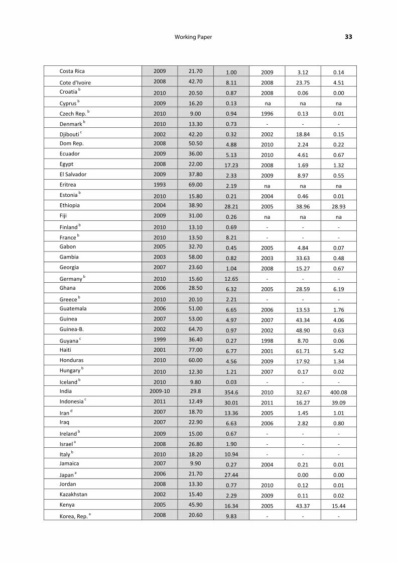
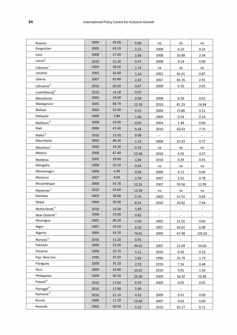
ANNEX 1
COUNTRY POVERTY RATES AND NUMBERS BASED ON NATIONAL AND INTERNATIONAL ($1.25/DAY) POVERTY LINES
National Poverty Lines International Poverty Line
Country Year Rate (%) Mill Year Rate (%) Mill
Afghanistan 2007 36.00 11.38 na na na
Albania 2008 12.40 0.39 2008 0.62 0.02
Algeria 1995 22.60 6.34 1995 6.79 1.92
Angola 2000 62.30 8.68 2000 54.31 7.57
Argentina 2009 13.20 4.88 2010 0.92 0.34
Armenia 2009 26.50 0.82 2008 1.28 0.04
Australia a 2007 21.70 4.58 - - -
Austria b 2010 12.10 1.00 - - -
Azerbaijan 2008 15.80 1.38 2008 0.43 0.04
Bangladesh 2005 40.00 56.24 2010 43.25 64.31
Belarus 2009 5.40 0.52 2008 0.10 0.01
Belgium b 2010 14.60 1.57 - - -
Belize 2002 33.50 0.09 1999 21.21 0.05
Benin 2003 39.00 2.79 2003 47.33 3.39
Bhutan 2007 23.20 0.16 2007 10.22 0.07
Bolivia 2007 60.10 5.69 2008 15.61 1.50
Bosnia & Herz. 2007 14.00 0.53 2007 0.04 0.00
Botswana 2003 30.60 0.56 1994 31.23 0.47
Brazil 2009 21.40 41.36 2009 6.14 11.87
Bulgaria b 2010 20.70 1.57 2001 2.64 0.21
Burkina Faso 2003 46.40 6.22 2009 44.60 7.13
Burundi 2006 66.90 5.00 2006 81.32 6.07
Cambodia 2007 30.10 4.11 2008 22.75 3.14
Cameroon 2007 39.90 7.32 2007 9.56 1.75
Canada c 2009 9.60 3.16 - - -
Cape Verde 2007 26.60 0.13 2001 21.02 0.09
Cent Afr Rep 2008 62.00 2.63 2008 62.83 2.66
Chad 2003 55.00 5.03 2002 61.94 5.47
Chile 2009 15.10 2.56 2009 1.35 0.23
China e 2010 13.40 128.00 2008 13.06 171.68
Colombia 2009 45.50 20.77 2010 8.16 3.78
Comoros 2004 44.80 0.28 2004 46.11 0.29
Congo, Dem. Rep. 2005 71.30 40.94 2006 87.72 50.37
Congo, Rep 2005 50.10 1.77 2005 54.10 1.91
Working Paper 33
Costa Rica 2009 21.70 1.00 2009 3.12 0.14
Cote d'Ivoire 2008 42.70 8.11 2008 23.75 4.51
Croatia b 2010 20.50 0.87 2008 0.06 0.00
Cyprus b 2009 16.20 0.13 na na na
Czech Rep. b 2010 9.00 0.94 1996 0.13 0.01
Denmark b 2010 13.30 0.73 - - -
Djibouti c 2002 42.20 0.32 2002 18.84 0.15
Dom Rep. 2008 50.50 4.88 2010 2.24 0.22
Ecuador 2009 36.00 5.13 2010 4.61 0.67
Egypt 2008 22.00 17.23 2008 1.69 1.32
El Salvador 2009 37.80 2.33 2009 8.97 0.55
Eritrea 1993 69.00 2.19 na na na
Estonia b 2010 15.80 0.21 2004 0.46 0.01
Ethiopia 2004 38.90 28.21 2005 38.96 28.93
Fiji 2009 31.00 0.26 na na na
Finland b 2010 13.10 0.69 - - -
France b 2010 13.50 8.21 - - -
Gabon 2005 32.70 0.45 2005 4.84 0.07
Gambia 2003 58.00 0.82 2003 33.63 0.48
Georgia 2007 23.60 1.04 2008 15.27 0.67
Germany b 2010 15.60 12.65 - - -
Ghana 2006 28.50 6.32 2005 28.59 6.19
Greece b 2010 20.10 2.21 - - -
Guatemala 2006 51.00 6.65 2006 13.53 1.76
Guinea 2007 53.00 4.97 2007 43.34 4.06
Guinea-B. 2002 64.70 0.97 2002 48.90 0.63
Guyana c 1999 36.40 0.27 1998 8.70 0.06
Haiti 2001 77.00 6.77 2001 61.71 5.42
Honduras 2010 60.00 4.56 2009 17.92 1.34
Hungary b 2010 12.30 1.21 2007 0.17 0.02
Iceland b 2010 9.80 0.03 - - -
India 2009-10 29.8 354.6 2010 32.67 400.08
Indonesia c 2011 12.49 30.01 2011 16.27 39.09
Iran d 2007 18.70 13.36 2005 1.45 1.01
Iraq 2007 22.90 6.63 2006 2.82 0.80
Ireland b 2009 15.00 0.67 - - -
Israel a 2008 26.80 1.90 - - -
Italy b 2010 18.20 10.94 - - -
Jamaica 2007 9.90 0.27 2004 0.21 0.01
Japan a 2006 21.70 27.44 0.00 0.00
Jordan 2008 13.30 0.77 2010 0.12 0.01
Kazakhstan 2002 15.40 2.29 2009 0.11 0.02
Kenya 2005 45.90 16.34 2005 43.37 15.44
Korea, Rep. a 2008 20.60 9.83 - - -
34 International Policy Centre for Inclusive Growth
Kosovo 2006 45.00 0.80 na na na
Kyrgyzstan 2005 43.10 2.22 2009 6.23 0.33
Laos 2008 27.60 1.66 2008 33.88 2.04
Latvia b 2010 21.30 0.47 2008 0.14 0.00
Lebanon c 2004 28.50 1.14 na na na
Lesotho 2003 56.60 1.14 2002 43.41 0.87
Liberia 2007 63.80 2.22 2007 83.76 2.91
Lithuania b 2010 20.20 0.67 2008 0.16 0.01
Luxembourg b 2010 14.50 0.07 - - -
Macedonia 2006 19.00 0.39 2008 0.29 0.01
Madagascar 2005 68.70 12.29 2010 81.29 16.84
Malawi 2004 52.40 6.53 2004 73.86 9.21
Malaysia 2009 3.80 1.06 2004 0.54 0.14
Maldives d 2008 16.00 0.05 2004 1.48 0.00
Mali 2006 47.40 6.44 2010 50.43 7.75
Malta b 2010 15.50 0.06 - - -
Mauritania 2000 46.30 1.22 2008 23.43 0.77
Mauritius c 2006 14.30 0.24 na na na
Mexico 2008 47.40 52.44 2010 4.03 4.57
Moldova 2005 29.00 1.04 2010 0.39 0.01
Mongolia 2008 35.20 0.94 na na na
Montenegro 2008 4.90 0.03 2008 0.12 0.00
Morocco 2007 9.00 2.79 2007 2.52 0.78
Mozambique 2008 54.70 12.21 2007 59.58 12.99
Myanmar c 2010 25.60 12.28 na na na
Namibia 2003 38.00 0.76 2003 31.91 0.64
Nepal 2004 30.90 8.25 2010 24.82 7.44
Netherlands b 2010 10.30 1.69 - - -
New Zealand a 2008 19.00 0.81 - - -
Nicaragua 2005 46.20 2.50 2005 11.91 0.65
Niger 2007 59.50 8.30 2007 43.62 6.08
Nigeria 2004 54.70 74.61 2009 67.98 105.02
Norway b 2010 11.20 0.55 - - -
Pakistan 2006 22.30 36.02 2007 21.04 34.60
Panama 2008 32.70 1.11 2010 6.56 0.23
Pap. New Gui. 1996 37.50 1.82 1996 35.79 1.73
Paraguay 2009 35.10 2.23 2010 7.16 0.46
Peru 2009 34.80 10.01 2010 4.91 1.43
Philippines 2009 26.50 24.30 2009 18.42 16.89
Poland b 2010 17.60 6.59 2009 0.05 0.02
Portugal b 2010 17.90 1.90 - - -
Romania b 2010 21.10 4.52 2009 0.41 0.09
Russia 2006 11.10 15.82 2007 0.02 0.03
Rwanda 2006 58.50 5.52 2010 63.17 6.71

Working Paper 35
S. Tome & Princ. 2001 53.80 0.08 2000 28.18 0.04
Senegal 2005 50.80 5.52 2005 33.50 3.64
Serbia 2007 6.60 0.49 2009 0.26 0.02
Sierra Leone 2003 66.40 3.14 2003 53.37 2.52
Slovak Rep. b 2010 12.00 0.65 2009 0.06 0.00
Slovenia b 2010 12.70 0.25 2004 0.06 0.00
South Africa 2005 23.00 10.86 2008 13.77 6.72
South Sudan c 2009 50.60 4.18 na na na
Spain b 2010 20.70 9.49 - - -
Sri Lanka 2007 15.20 3.08 2006 7.04 1.41
Sudan c 2009 46.50 14.36 na na na
Suriname d 2002 70.00 0.34 1999 15.54 0.07
Swaziland 2001 69.20 0.74 2009 40.63 0.48
Sweden b 2010 12.90 1.21 - - -
Switzerland b 2010 15.00 1.12 - - -
Syria c 2003 11.30 1.98 2004 1.71 0.31
Tajikistan 2009 47.20 3.20 2009 6.56 0.44
Tanzania 2007 33.40 20.37 2007 67.87 41.39
Thailand 2009 8.10 5.57 2009 0.37 0.25
Timor-Leste 2007 49.90 0.53 2007 37.44 0.40
Togo 2006 61.70 3.41 2006 38.68 2.14
Trin. & Tob. d 2007 17.00 0.22 1992 4.16 0.05
Tunisia 2005 3.80 0.38 2005 1.35 0.14
Turkey b 2006 26.60 18.02 2007 1.13 0.79
Turkmenistan d 2004 30.00 1.41 1998 24.82 1.09
UAE d 2003 19.50 0.66 na na na
Uganda 2009 24.50 7.93 2009 38.01 12.30
UK b 2010 17.10 10.52 - - -
Ukraine 2005 7.90 3.72 2009 0.06 0.03
United States c 2010 15.10 46.18 - - -
Uruguay 2008 20.50 0.63 2010 0.20 0.01
Uzbekistan c 2005 25.80 6.69 na na na
Venezuela 2009 29.00 8.27 2006 6.63 1.79
Viet Nam 2008 14.50 12.34 2008 16.85 14.34
West Bank & Gaza 2009 21.90 0.88 2009 0.04 0.00
Yemen 2005 34.80 7.19 2005 17.53 3.62
Zambia 2006 59.30 6.97 2006 68.51 8.05
Zimbabwe 2003 72.00 9.08 na na na
Source: National rates from World Development Indicator online database (accessed 10 February 2012), unless otherwise indicated: a OECD Income Distribution and Poverty Database; b Eurostat; c Survey/census data; d CIA World Factbook; e See footnote no. 6. All international rates are from PovCal Net (accessed 2 March 2012). When not available, population data are from UNDESA (2010). In the case of Indonesia, population figures (for NPLs and IPL) are from Government of Indonesia (2012), since 2011 figures are not available in PovCalNet or UNDESA (2010). All IPL data are from PovCalNet (accessed 2 March 2012). For China, India and Indonesia, IPL figures are population-weighted rural-urban averages. .
NOTES
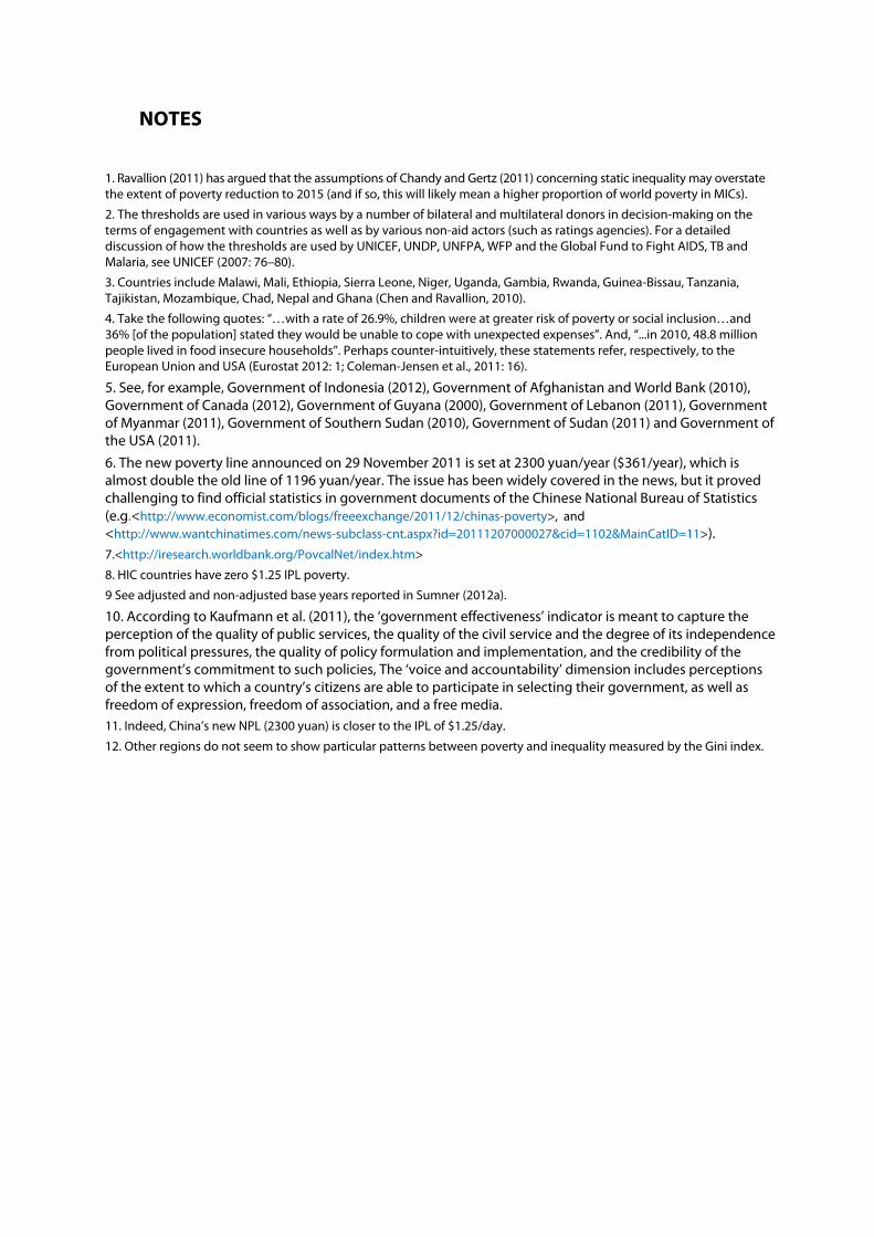
1. Ravallion (2011) has argued that the assumptions of Chandy and Gertz (2011) concerning static inequality may overstate the extent of poverty reduction to 2015 (and if so, this will likely mean a higher proportion of world poverty in MICs).
2. The thresholds are used in various ways by a number of bilateral and multilateral donors in decision-making on the terms of engagement with countries as well as by various non-aid actors (such as ratings agencies). For a detailed discussion of how the thresholds are used by UNICEF, UNDP, UNFPA, WFP and the Global Fund to Fight AIDS, TB and Malaria, see UNICEF (2007: 76–80).
3. Countries include Malawi, Mali, Ethiopia, Sierra Leone, Niger, Uganda, Gambia, Rwanda, Guinea-Bissau, Tanzania, Tajikistan, Mozambique, Chad, Nepal and Ghana (Chen and Ravallion, 2010).
4. Take the following quotes: “…with a rate of 26.9%, children were at greater risk of poverty or social inclusion…and 36% [of the population] stated they would be unable to cope with unexpected expenses”. And, “...in 2010, 48.8 million people lived in food insecure households”. Perhaps counter-intuitively, these statements refer, respectively, to the European Union and USA (Eurostat 2012: 1; Coleman-Jensen et al., 2011: 16).
5. See, for example, Government of Indonesia (2012), Government of Afghanistan and World Bank (2010), Government of Canada (2012), Government of Guyana (2000), Government of Lebanon (2011), Government of Myanmar (2011), Government of Southern Sudan (2010), Government of Sudan (2011) and Government of the USA (2011).
6. The new poverty line announced on 29 November 2011 is set at 2300 yuan/year ($361/year), which is almost double the old line of 1196 yuan/year. The issue has been widely covered in the news, but it proved challenging to find official statistics in government documents of the Chinese National Bureau of Statistics (e.g.<http://www.economist.com/blogs/freeexchange/2011/12/chinas-poverty>, and <http://www.wantchinatimes.com/news-subclass-cnt.aspx?id=20111207000027&cid=1102&MainCatID=11>). 7.<http://iresearch.worldbank.org/PovcalNet/index.htm>
8. HIC countries have zero $1.25 IPL poverty.
9 See adjusted and non-adjusted base years reported in Sumner (2012a).
10. According to Kaufmann et al. (2011), the ‘government effectiveness’ indicator is meant to capture the perception of the quality of public services, the quality of the civil service and the degree of its independence from political pressures, the quality of policy formulation and implementation, and the credibility of the government’s commitment to such policies, The ‘voice and accountability’ dimension includes perceptions of the extent to which a country’s citizens are able to participate in selecting their government, as well as freedom of expression, freedom of association, and a free media. 11. Indeed, China’s new NPL (2300 yuan) is closer to the IPL of $1.25/day.
12. Other regions do not seem to show particular patterns between poverty and inequality measured by the Gini index.
International
Centre for Inclusive Growth
International Policy Centre for Inclusive Growth (IPC - IG)Poverty Practice, Bureau for Development Policy, UNDPEsplanada dos Ministérios, Bloco O, 7º andar70052-900 Brasilia, DF - BrazilTelephone: +55 61 2105 5000
E-mail: [email protected] URL: www.ipc-undp.org