Embed Size (px)
Citation preview

�
Poster Design
A guide for FIMS students & staff:How to produce effective & attractive scientific posters
www.glasgow.ac.uk/fims
�
Foreword
The design and creation of an eye-catching and informative poster is a great way to communicate your research at scientific meetings and conferences. The material presented should convey the essence of your message and is one of your key transferable skills.
You are also encouraged to attend the Graduate School’s complementary workshop on poster design provided by the FBLS Graphic Support Unit and participate in our annual poster event.
As you will see from this guide, we recommend that you use the FBLS Graphic Support Unit for poster printing services. The Unit is situated on the university campus and offers a competitive and friendly service. You may of course use other print services as you wish.
We hope that you enjoy learning more about poster design using the guidelines here which should help you present your work to a high standard and make the most of your poster in a relaxed and informal way with the opportunity for good audience interaction.
Finally, the Faculty of Information & Mathematical Sciences would like to acknowledge with gratitude the input of the FBLS Graphics Unit whose design expertise has gone into the production of this guide.
Dr Ian Strachan
Associate Dean (Postgraduate) andHead of the FIMS Graduate School
�
Introduction
Content overview
Planning: first things first
Booking your poster printing slot Planning your poster content
The 6 principles of design and layout
Colours and fonts
Top 10 tips
Use of the university crest
An academic word on presenting a poster at a conference
Useful links
4
5
6
7
8
10
12
14
16
17
18

�
What is the purpose of a poster?
1. Attract attention -– The first thing that a poster needs to do is attract the attention of passers-by.
2. Convey a message -– Once the poster has caught the attention of the viewer it can then convey its message.
3. Call to action -– This is the activity that the poster is trying to coax from the viewer, the result you are trying to get.
In the context of a scientific poster, these principles remain the same:
1. Attract attention -– If your poster is going to inform your target audience about your work, they have first of all got to want to stop and read your poster.
2. Convey a message -– The information that you want people to know about your work.
3. Call to action -– Your call to action is more than likely going to be to create interest in your subject/study and initiate discussion and feedback.
This booklet should help you to produce high quality, professional looking, large format posters that will be eye-catching, and will effectively and clearly convey and promote your work at scientific conferences, meetings and other events.
This booklet aims to:
• Give you a better understanding of all the components and considerations involved in producing effective posters.
• Give you an advantage in what is a highly competitive environment – at scientific conferences and meetings your poster will be competing for attention along with many others. This booklet will help you to increase the chances of your poster being read by your target audience.
• Make the process of creating your poster much less stressful as you will be better prepared and equipped with the knowledge and confidence to produce a successful poster.
• Develop hidden talent.
• Help students of all abilities to develop their skills and confidence.
• Provide greater focus.
• Ensure consistent quality and enhance the image of FIMS – as a representative of FIMS and the University it is important that your poster ‘hits the right note’ and reflects this professionalism.
Introduction

�
What this booklet covers
• Planning: first things first There are many important things to think about before you begin. For example, where and when your poster will be displayed, poster size, how to transport your poster to the venue etc.
• Booking your poster slot with FBLS Graphic Support Unit We recommend that you book a printing slot with the Graphics Unit well in advance of your event. Dont leave it till the last minute - the Unit can be booked out solidly at some points in the year.
• Planning the content of your poster How to prepare the content (text, images, etc) of your poster; what to include and what to leave out.
• The 6 principles of design The design rules that will help to create professional looking poster designs.
• Colours and fonts What your colour and font choices may convey to people viewing your poster.
• Top 10 tips The do’s and don’ts to remember throughout your poster making process to produce an effective design and avoid the more common pitfalls.
By the end of this booklet you should feel more knowledgeable, prepared and confident about producing scientific posters.
Overview

�
There are some important things to consider before you start to put your poster together.
Where will your poster be displayed?
Conferences each have their own set of guidelines regarding poster sizes. There is no ‘standard poster size’ so you will need to find out the dimensions (width and height) and orientation (landscape, portrait or square) that are recommended before starting to construct your poster. You do not want to have to change your poster at a later stage.
We find that the most popular sizes is A0 - 8��mm x ��89mm.Please note: The maximum poster width that can be printed at the FBLS Graphic Support Unit is 8��mm.
When is your poster going to be displayed?
Allow yourself plenty of time to create your poster and have it printed. Don’t be tempted to leave it to the last minute! Your poster should convey your work in a professional, carefully considered way – not look like it was hastily put together and possibly containing errors or typos.
Knowing when your poster is to be displayed will allow you to work backwards from your deadline in order to set a timeline for completing the artwork and have the poster printed.
How is your poster going to be transported?
• How will you protect your poster when travelling?
• You must NOT get it wet. You can purchase a poster tube holder from:
The Art Store9� Queen Street, Glasgowwww.artstore.co.ukLarge poster tube £7.99Small poster tube £�.99
Millers�8 Stockwell Street, Glasgowwww.millers-art.co.ukLarge poster tube £�.�0
Planning: first things first
841mm
1189mmA0
7
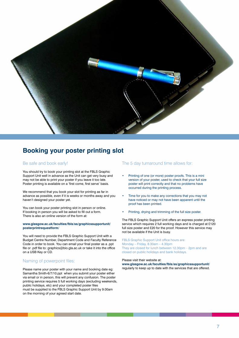
Be safe and book early!
You should try to book your printing slot at the FBLS Graphic Support Unit well in advance as the Unit can get very busy and may not be able to print your poster if you leave it too late. Poster printing is available on a ‘first come, first serve’ basis.
We recommend that you book your slot for printing as far in advance as possible, even if it is weeks or months away and you haven’t designed your poster yet.
You can book your poster printing slot in person or online. If booking in person you will be asked to fill out a form. There is also an online version of the form at:
www.glasgow.ac.uk/faculties/fbls/ss/graphicssupportunit/posterprintrequestform/ You will need to provide the FBLS Graphic Support Unit with a Budget Centre Number, Department Code and Faculty Reference Code in order to book. You can email your final poster as a .ppt file or .pdf file to: [email protected] or take it into the office on a USB Key or CD.
Naming of powerpoint files:
Please name your poster with your name and booking date eg: Samantha Smith-�/7/�0.ppt when you submit your poster either via email or in person, this will prevent any confusion. The poster printing service requires � full working days (excluding weekends, public holidays, etc) and your completed poster files must be supplied to the FBLS Graphic Support Unit by 9.00am on the morning of your agreed start date.
The 5 day turnaround time allows for:
• Printing of one (or more) poster proofs. This is a mini version of your poster, used to check that your full size poster will print correctly and that no problems have occurred during the printing process.
• Time for you to make any corrections that you may not have noticed or may not have been apparent until the proof has been printed.
• Printing, drying and trimming of the full size poster.
The FBLS Graphic Support Unit offers an express poster printing service which requires � full working days and is charged at £��0 full size poster and £�0 for the proof. However this service may not be available if the Unit is busy.
FBLS Graphic Support Unit office hours are:Monday – Friday, 8.�0am – �.�0pm They are closed for lunch between ��.�0pm – �pm and are closed on public holidays and bank holidays.
Please visit their website at:www.glasgow.ac.uk/faculties/fbls/ss/graphicssupportunit/regularly to keep up to date with the services that are offered.
Booking your poster printing slot

8
Text:
Start by having a think about and writing down all the things that you would like to have on your poster, keeping in mind your target audience.
Your poster content will consist of:• text• pictorial information
Be organised - save everything in one place
Create a folder for your poster with sub folders for text, graphs, pictures and Powerpoint files. This will help you in the future and save time by having everything in one place to access and update. Do not save anything on your desktop
Tips for writing and saving your text:
• Key your text straight into Powerpoint.
• If you are cutting and pasting from other documents, it would be advisable for PC users to enter text into NotePad before pasting into Powerpoint as this removes any unwanted formats from previous documents. Mac users, please use Text Editor. • Or if you are using Word save your final text format as Text Only and copy and paste this into Powerpoint.
Keep it brief and keep your word count as low as possible. What are your key points? Find the essence of what you are saying. Create manageable chunks of text – people generally do not want to stop and read lengthy, densely packed blocks of text. Keep sentences to one or two points and keep paragraphs as short as possible.
In summary, the golden rule is to write in a style that is clear, concise, and easily scanned by the reader. You could produce a handout along with your poster. This would give the reader more in depth information.
Structure your text by using headings and sections. A typical scientific poster will consist of the following sections in the following order:
• Title and subtitle This section usually contains the poster title, the names of the people involved in the work and their institutional affiliation (e.g. FIMS, University of Glasgow).• Introduction You would typically find a brief overview of the project, stating what you set out to do, what you did, the main results and key findings. This may also include a declaration of the project aims/objectives.• Methods This section would give a more detailed account of the procedure that was followed in completing the work discussed in the poster.• Results You would use this section to show illustrative examples of the main results of the work.• Conclusions List the main findings of your work in this section.• References Sources of information.
Planning your poster content

9
Pictorial information:
By this term we mean photographic images, graphs, charts, diagrams, logos, drawings, etc. Visual additions help attract and inform viewers much more effectively than text alone.
Images should be scanned at a resolution of at least �00dpi (dots per inch) at the actual size they are to appear on the poster, .jpg files produce the best quality prints.
Do not use images from the web unless you know that they are of a high enough resolution for printing. If they are not, they will come out pixellated.
“A picture is worth a thousand words”Graphs and charts can express statistical data more easily than text. We recommend that you save your graphs/charts as a graphic file such as .jpg and import them into your poster file rather than copying and pasting. If you are importing any other type of file ungroup everything on your poster; please note you might have to ungroup several times as subgroups can form.
Graphics should be attractive, clear and specific.
Crop photographs to focus attention on significant details and eliminate unnecessary information. Also, provide captions for your graphics – viewers see what they are told to see.
Rough draft:
You may find it useful to sketch out quickly on paper how you might organise your poster before starting to create your poster on the computer. Remember to include, title, introduction, method, result, conclusion and references.
Picture Banner
HeadlineSub heading
Introduction
2 column grid Body copy/ images
HeadlineSub heading
Introduction
3 column grid
Body copy/ images
Body copy/ images
Picture Banner
HeadlineSub heading
Introduction
4 column
grid
Image
Body copy/
images
Body copy/
images
Body copy/
images
HeadlineSub heading
Introduction
3 column grid
Body copy/ images
Body copy/ images
Tip:
Have some attention grabbers on your poster. You don’t have much time to attract the attention of your audience so it is important fo your poster to have immediate impact.
Try using:
• a catching and interesting statement• striking photographs/graphics• distinctive colour scheme• unusual layout
All of these play an important part in attracting viewers to your poster.
You can download Powerpoint templates to get you started at:
www.glasgow.ac.uk/fims/postgraduatestudy/currentstudents/posterdesign
Example of poster
Eckman faces were used in Emotion Rating Tasks (ERT)
Result 1: Sleep Deprived individuals rated the
expressions of Anger and Fear as less intense than
rested controls.
Conclusions: Sleep deprivation and disrupted sleep alter the ability
to perceive certain emotions in faces. Sleep
deprivation-related affective alterations of emotional
perception may have critical implications for
interpersonal functioning in real-world settings.
Results:
References
Haack, M. and Mullington, J. M. Pain, 2005, 119: 56–64.Ochsner, K. N. and Gross, J. J. Trends Cogn. Sci., 2005, 9: 242–249.Payne J.D, Stickgold R, Swanberg K et al. Psychological Science – August 2008 – In PressSterpenich V, Albouy G, Boly M, et al. PLoS Biol, 2007, 5(11): e282. doi:10.1371/journal.pbio.0050282Thomas, M. L., Sing, H. C., Belenky, G., Thalamus Related Systems, 2003, 2: 199–229.
Yoo, S.S., Hu, P.T., Gujar, N., and Walker, M.P. Nat. Neurosci. 2007, 10, 385–392.Results:
0
0.5
1
1.5
2
2.5
3
3.5
4
4.5
5
Happy Anger Suprise Fear Disgust Sad
Rati
ng
B.Izci Balserak 1,2, Stephany M. Biello 1 Markus Bindemann 1, Nicola Forsberg 1 and Colin Espie 2
Introduction:
There has been little research on the impact of sleep loss on emotions and their relationship to social interactions. Sleep loss has
been found to have adverse effects on prefrontal regions, which are significantly involved in emotional and mood regulation (Thomas
2003, Haack 2005, Ochsner 2005, Sterpenich 2007, Yoo 2007, Payne 2008). Thus, sleep deprivation-related affective impairments
may result in serious outcomes in interpersonal functioning in real-world settings. This study investigated the influence of sleep
deprivation and disrupted sleep on the ability to process faces displaying six basic emotions.
Recognition of facial emotions
under conditions of sleep deprivation
Experiment 1 Methods:
Five healthy subjects (22.2±3.7) who had been deprived of
sleep for one night and also five age matched control subjects
were recruited. Subjects were shown a standardised set of six
basic facial emotions (anger, disgust, fear, happiness,
sadness and surprise) and three neutral faces for a total of 39
stimuli, and asked to rate each on the intensity of six facial
emotions (figure 1).
* *
Expt 1 Sleep Deprivation Expt 2 Sleep Disruption: a different pattern?
Experiment 2a Methods: Sleep Disruption
Experiment 2a Methods: 14 healthy subjects (37+/-4.3; 7 males and 7
females) completed our emotion recognition task. On one occasion they
completed the task when they had experienced at least 3 consecutive
nights of sleep restriction (defined as less than 5 hours of sleep). The
same group of people also completed the task after 3 consecutive nights
of normal sleep (defined as more than 7 hours of sleep). Below we report
their error rates in recognising emotions.
Result 2: Individuals were better at recognising
Angry faces, and worse at recognising Happy faces
after sleep disruption.
Experiment 2b Methods: 46 healthy subjects (24 males and 22 females)
completed our emotion recognition task. After testing, scores were grouped
according to PSQI ratings such that individuals with scores below 5, were
classed as poor sleepers and individuals with scores above 6, were
classified as poor sleepers.
Result 3: Poor sleepers were also better at
recognising Angry faces and worse at recognising
Happy faces
Significant differences (indicated by the stars) were found in the intensity ratings for
Anger (p=0.047) and Fear (p=0.016).
There were significant differences in the % of errors made when recognising Angry (p=0.039)and Happy (p=0.042)faces between individuals when they were rested or had experienced
sleep disruption.
While there were no significant differences in percent errors between good and poor sleepers
from the normal population, the same pattern of results was seen as for those experiencing
sleep disruption in the within subjects experiment above.
0
5
10
15
20
25
30
35
Angry Fear Sad Happy
good sleepers
poor sleepers
% e
rro
rs
0
5
10
15
20
25
30
angryfe
arsa
d
disgust
surp
rise
happy
rested
sleep restricted
%e
rro
rs
*
*
0
5
10
15
20
25
30
35
Angry Fear Sad Happy
good sleepers
poor sleepers

�0
Designers each have their own idea of the basic principles of design but these can generally be categorised into the following � topics:
• Balance• Proximity• Alignment• Repetition/Consistency• Contrast• White space
Balance:
For most of our reading, our eyes and minds are most comfortable with evenly balanced layouts where the graphics don’t overpower the text and the page doesn’t seem to tilt to one side or the other. Visual balance comes from arranging elements on the poster so that no one part is heavier than the others.
Proximity:
In design, proximity creates a relationship between elements on a page. How close together or far apart elements are placed suggests a relationship, or lack of, between those parts. For instance, if you have a photographic image on your poster that illustrates a point you have made in one of your sections you should place the image close to the text that refers to it and not on the other side of the page.
Alignment/Grid:
Alignment or grid is the placement oftext and graphics so that they line up with each other in an organised way.
Use alignment to:
• Create order• Organise page elements• Group items• Create visual connections
Good alignment usually goes unnoticed as most readers will not consciously notice that everything is lined up neatly, but lack of alignment of the elements of the page creates a sloppy and disorganised look that viewers of your poster will pick up on.
For very simple poster layouts, the automatic alignment options of your software can be used. For more complex layouts, the use of guidelines and grids aid the precise placement of elements.
Repetition/Consistency:
For the most part, people prefer visual information presented in an organised way. Posters, newsletters, magazines, brochures, books, etc often have many visual elements – columns of text, headlines, photographs, illustrations, and work within a grid system. Being consistent with your use of type, column width and graphic elements will enhance the readability of your poster.
The 6 principles of design and layout
Left justified text
Equal space around image
Even spacingbetween columns
Grid structure(in red)

��
Contrast:
Contrast adds interest to the page and provides a means of emphasising what is important at a glance, directing the viewer’s eye. On a page without contrast, the viewer doesn’t know where to look first or what is important.
Contrast aids in readability by making headlines and subheadings stand out. It shows what is important by making smaller or lighter elements recede on the page to allow other elements to take centre stage.
White space:
White space does not literally mean space that is ‘white’, it is a term referring to the areas of the page that are devoid of text and graphics. White space provides visual breathing room for the eye and helps to make a page less cramped, confusing and overwhelming.
You can add white space to your poster by:
• Increasing your paragraph spacing Use a line of space or a deep indent (but not both) between paragraphs to break text up and make it easier to read.
• Increasing space between columns of text Create enough white space between columns of text to ensure that the eye doesn’t skip over to the next column.
• Increasing page margins Use generous margins at the top, bottom, left and right hand sides of the page to ensure that your poster content does not get too close to the edge of the page.
• Leaving enough space around the edges of graphics Don’t run text right up to the edge of photographs, provide plenty of stand off white space.
• Increasing space around headlines Leave space between headlines, subheadings and body text. Increasing space between lines of body text: Increase the leading or ‘line spacing’ to make blocks of text appear less cramped and easier to read.
at least 10mm Page margin all round
Leave space around heading
Work to grid format
Equal spacing between grid and headlines

��
All elements of your poster should be appropriate to your poster content and the message that you are conveying. Colours and different styles of fonts can have perceived meanings so you should choose colours and fonts based on the poster content and message rather than your personal preferences. Consider the purpose of your poster, your intended audience and what the poster is about when choosing colours and fonts.
Colour blindness
Roughly � in �0 people have some sort of colour vision deficiency. The world looks different to these people: they often find it hard to tell red and green things apart. This often means that they sometimes can’t see things that ‘colour normal’ people can see, please take this into consideration when you are preparing your poster e.g. below:
The meaning of colour:
Understanding the meaning of colour and how colours interact in order to convey the right tone, message and evoke the desired response to your poster. Colours are not simply cosmetic, they are a form of non-verbal communication and create a subconscious physical and emotional reaction. For instance, a muted colour scheme would be appropriate for a serious message, whilst bright primary colours would be appropriate to convey a fun and childlike message.
Blue is said to convey:intelligence, communication, clarity, nature, trust, serenity, logic, reflection, calm
Green is said to convey:nature and the environment, refreshment, reassurance, peace
Yellow is said to convey:optimism, confidence, friendliness
Orange is said to convey:warmth, fun
Red is said to convey:strength, warmth, energy, passion
Pink is said to convey:warmth, femininity
Purple is said to convey:luxury, sincerity, spirituality, royalty
Brown is said to convey:warmth, reliability, seriousness, nature, earthiness
Black is said to convey:seriousness, sophistication, security
White is said to convey:simplicity, clarity, purity, sterility
Grey is said to convey:neutrality
Colours and fonts
Apple as seen without colour blindness.
Apple as they would appear to someone who is red/green colour blind.

��
Colour schemes from the colour wheel:
Complementary colours� contrasting colours located directly opposite each other on the colour wheel, complementary colour combinations create maximum contrast and maximum stability just like black and white.
Colour wheel showing complementary colours.
Analogous coloursA combination of � colours side by side on the colour wheel, using one as a dominant colour and the others to enrich the scheme.
Colour Wheel showing analogous colours.
Fonts:
When starting to put your poster together you may be tempted to pick out a couple of unusual striking fonts and use them to spice up your layout. However, there is a limited number of fonts that you can depend on to be installed on most systems, and if the fonts that you have used are not installed on the computer connected to the large format printer in the FBLS Graphic Support Unit they will not print.
Therefore we are forced to compromise – we recommend choosing system fonts.
The most common fonts on PC and Mac systems are:
Keep it simple and choose � or � clear, easily read fonts for your poster text and headings – if you use too many different fonts your poster may end up looking like a ransom note! Text is measured in point sizes (pt). To ensure your posters are easily readable use.
Poster A� – (w��0 x h�9�mm)Heading – ��ptSub heading – ��ptIntroduction – ��ptMethod – ��ptType of paragraph – ��pt
Poster A� – (w�9� x h8��mm)Heading – ��ptSub heading – ��ptIntroduction – �8ptMethod – ��ptType of paragraph – ��pt
Poster A0 – (w8�� x h��89mm)Heading – 7�ptSub heading – ��ptIntroduction – �8ptMethod – ��ptType of paragraph – �8pt
Tips:
• USING ALL CAPITAL LETTERS MAKES POSTERS HARDER TO READ, NOT EASIER. Use a mixture of upper and lower case text.• Text is generally easier to read when it is ranged left rather than centred, right or justified.• Proof read your poster
��
1. Keep up to date
Make sure you visit the FBLS Graphic Support Unit website on a regular basis for updates on services and office opening times at:www.glasgow.ac.uk/faculties/fbls/ss/graphicssupportunit/
2. Be safe and book early
We recommend you book your printing slot well in advance, even if it is weeks or months away and you haven’t designed your poster yet, as the Unit can get very busy at certain times of the year. When you book your poster printing slot you will be asked to fill in a booking form in the office or online (� form per poster) and made aware of the terms and conditions. All artwork must be supplied before 9.00am on the agreed date – if not you may lose your slot. The preferred booking method is for you to fill in the online booking form and send your poster via email as a .ppt file or .pdf file.
3. Graphs and diagrams: Save in .jpg format
All graphs and diagrams should be saved as .jpg at appropriate resolution, don’t import straight from the program you created them in. Make sure all lines are a minimum of �-�pt and there are no hairlines (these may be too thin to print).
4. Labels for graphs and diagrams
When preparing graphs and diagrams it is worth considering adding any labels separately in the program from the .jpg as this will save time if you need to make alterations.
5. Mind your margins
Normally we recommend that you keep text and other objects at least �0mm from the ‘trim’ edge to avoid anything being chopped off.
6. Watch your resolution
Large format posters are designed to be read from a distance. This means that images don’t need to be as high resolution as is required for litho printed jobs. We recommend that you use images at a maximum resolution of �00dpi. Any higher won’t make much of a difference to the final print, but will take much longer to process and may delay your job. Minimum resolution should be ��0dpi or images may appear pixellated.
7. Be careful with colour
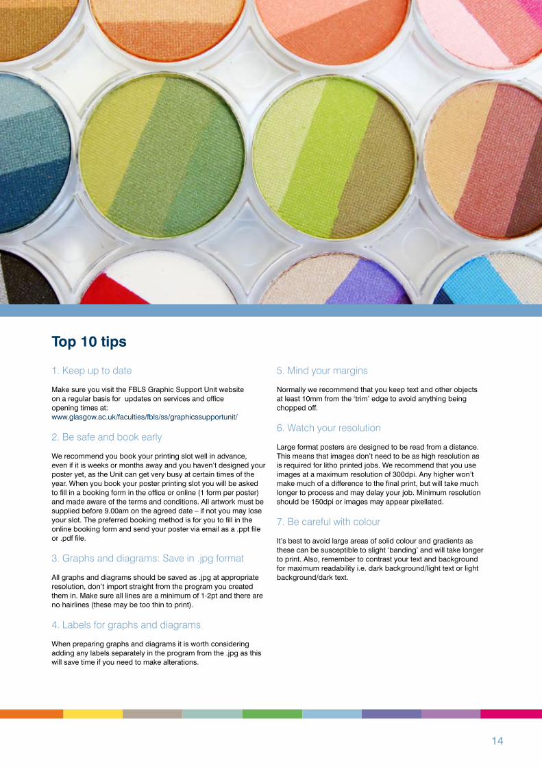
It’s best to avoid large areas of solid colour and gradients as these can be susceptible to slight ‘banding’ and will take longer to print. Also, remember to contrast your text and background for maximum readability i.e. dark background/light text or light background/dark text.
Top 10 tips

��
8. Pay attention to your text
With such a wide range of fonts at your fingertips there is a temptation to let the artistic juices flow and while we don’t want to stifle creativity, you should remember that if the fonts you are using are not installed on the computer connected to the large format printer in the FBLS Graphic Support Unit they will not print.
Use system fonts.
The most common fonts on Mac and PC systems are:
• Arial• Helvetica• Times New Roman• Times• Courier New• Courier• Verdana• Georgia• Palatino
Make sure you use appropriate point sizes for your text and headings. Use a mixture of upper and lower case, not all capitals. Text is easier to read ranged left rather than centred, right or justified.
9. Proofing
As part of their service, the FBLS Graphic Support Unit can provide you with a proof. What you see on screen is not colour accurate and the proof will give you an idea of what the full size poster will look like. It is also used to check that text hasn’t re-flowed and no items are missing.
10. Remember the 5 easy steps:
• Book your poster printing slot in plenty of time• Supply your poster files for printing on time as a .ppt file or .pdf file• You will be supplied with a proof (if requested)• Once proof approved, your large format poster will be printed• Collect your poster

��
Use of university crest
1. Our visual identity
The University of Glasgow crest is made up of the shield and the logotype. The two elements should always sit together as shown and must not be used on their own.
2. Exclusion zone
Every crest needs a little space to breathe in, so a zone aroundit has been set. Other elements – such as words, photography or illustration – should not be placed within this space.
3. Recommended sizes
The crest should appear at certain sizes depending on the size of the item. Documents A� size should have a crest size of �0mm wide and A� sized documents should have a logo size of 80mm wide.
For items larger than A�, the crest should increase roughly in proportion and positioning in the top left corner.
4. Adding a faculty/department title
In many cases it will be important to clarify which faculty or department is authoring a piece of communication. A simple structure has been set up to ensure consistency. For example:

�7
An academic word on presenting a poster at a conference ….
1. Check out the conference program carefullyLook up by keyword, but also by author name. You want to be clued up on the other things people in your field are working on that may relate to your work. Pick out the big names in your field, and make sure you see their posters that are up before your assigned presentation time, and be prepared to talk about how the work relates to your own.
2. Consult significant others Most importantly, you are strongly encouraged to speak with your supervisor and research group BEFORE you prepare your poster. Different fields and subfields have different norms. This means there are at times different standards for what is included on a poster at a particular conference. You may want to ask your advisor or grad students in your lab to show you some posters of their work.
3. Figure titlesSome conferences are very large, and colleagues will be viewing a lot of posters. Try to design your figure titles to contain the result, so for example, rather than your figure legend of experimental results saying, ‘Bubbles technique reveals which portion of the face individuals of different cultures use to recognise emotion in faces.’ Say something like, ‘Westerners focus more on the mouth region than Easterners when deciding how happy a face looks’ By telling the viewer what they can expect when they look at your figure, you make it easier for them to get the take home message, and also catch those fatigued viewers who are only looking at the pictures by the time they get to your poster!
4.Your addressWrite the address of your hotel on your poster tube or on a note inside. If you accidently leave your poster on a plane or train, you want them to try to get it back to you while at the conference, not back to Glasgow University to be sitting on your desk when you return.
5.Answering questionsAbsolutely be by your poster and be prepared to answer questions at your allotted time - other attendees will be cross if they have made the time to come to look at your work and you are not there.
Don’t put off the readers. Avoid being overly solicitous and constantly asking if they have questions. Make sure people know you are there to answer questions they may have, but then let them get on with reading the details if that’s what they want. Often someone who is quietly absorbing the specifics of your poster will come out with the most carefully considered point when they are done.
6. Be prepared Absolutely know the details of your own data, and be able to explain it. In addition, carefully review papers you may cite which led up to your current research question, and be able to explain how your work moves on the question. Know why you chose to “attack” the problem you did in the way that you did. It’s a good idea to do some trial runs of walking people through your poster and see what questions they come up with.
7. Walk throughPrepare a ‘walk through’ of your poster. This is a very brief synopsis of the key points necessary to understand why you considered the problem you did, how you did it, and what your conclusions are. This is useful for bleary eyed colleagues who are becoming numb from information overload.
8. Position yourselfStand next to and not in front of, your poster. Make sure people who might want to read the poster can get a view!
9. Additional dataIt is often a good idea to bring extra related data that is not on your poster.
10. Exchange ideasPosters sessions are a GOLDEN opportunity to talk to interested parties on a one-to-one basis and exchange ideas - use this time to ask others how they would interpret your results - the feedback from colleagues in peripheral areas of research may stimulate new and exciting directions for your own work. Keep a small notebook in your pocket to write down the name of someone interesting who has visited your poster that you may forget, or a novel insight that deserves some thinking time later on when you are home.
11. Making contactsPosters are a useful lead-in for those new to giving conference presentations, or those presenting work at an earlier stage of development. They are an excellent way to make contacts with others in your field. It can be a good idea to have a business card with your contact details, or an A� printout of your poster with your email address on it to hand out to people.
Oh and wear comfortable shoes…

�8
Useful links:FIMS poster powerpoint templates:www.glasgow.ac.uk/fims/postgraduatestudy/currentstudents/posterdesign
Copyright free images:commons.wikimedia.org/wiki/Category:Images
Colour blindness:www.vischeck.com/vischeck/simple.wikipedia.org/wiki/Color_blind
Classic colour schemes:www.color-wheel-pro.com/color-schemes.html Colour meaning:www.color-wheel-pro.com/color-meaning.html
Notes:

�9
Notes

�0
www.glasgow.ac.uk/fims
Design: FBLS Graphic Support Unit, University of GlasgowThe University of Glasgow, charity number SC00��0�