Embed Size (px)
Citation preview
University of Bern Social Sciences Working Paper No. 1 Plotting regression coefficients and other estimates in Stata Ben Jann A shorter version of this paper has been published in: The Stata Journal 14(4): 708-737 (2014) see: http://www.stata-journal.com/article.html?article=gr0059 Current version: September 18, 2017 First version: August 25, 2013 http://ideas.repec.org/p/bss/wpaper/1.html http://econpapers.repec.org/paper/bsswpaper/1.htm
Faculty of Business, Economics and Social Sciences Department of Social Sciences
University of Bern Department of Social Sciences Fabrikstrasse 8 CH-3012 Bern
Tel. +41 (0)31 631 48 11 Fax +41 (0)31 631 48 17 [email protected] www.sowi.unibe.ch
source: https://doi.org/10.7892/boris.48527 | downloaded: 5.3.2020
Plotting regression coefficients and other estimates in Stata
Ben Jann
Institute of Sociology
University of Bern
September 18, 2017
Abstract
Graphical presentation of regression results has become increasingly popular in the scientificliterature, as graphs are much easier to read than tables in many cases. In Stata such plots can beproduced by the marginsplot command ([R] marginsplot). However, while marginsplot is veryversatile and flexible, it has two major limitations: it can only process results left behind by margins
([R] margins) and it can only handle one set of results at the time. In this article I introduce a newcommand called coefplot that overcomes these limitations. It plots results from any estimationcommand and combines results from several models into a single graph. The default behavior ofcoefplot is to plot markers for coefficients and horizontal spikes for confidence intervals. However,coefplot can also produce various other types of graphs. The capabilities of coefplot are illustratedin this article using a series of examples.
Keywords: coefplot, marginsplot, margins, regression plot, coefficients plot
Contents
1 Introduction 2
2 Syntax 42.1 Types and placement of options . . . . . . . . . . . . . . . . . . . . . . . . . . . . . . . . . 4
2.2 Model options . . . . . . . . . . . . . . . . . . . . . . . . . . . . . . . . . . . . . . . . . . . 5
2.3 Plot options . . . . . . . . . . . . . . . . . . . . . . . . . . . . . . . . . . . . . . . . . . . . 7
2.4 Subgraph options . . . . . . . . . . . . . . . . . . . . . . . . . . . . . . . . . . . . . . . . . 8
2.5 Global options . . . . . . . . . . . . . . . . . . . . . . . . . . . . . . . . . . . . . . . . . . 8
2.6 Accessing internal temporary variables . . . . . . . . . . . . . . . . . . . . . . . . . . . . . 10
3 Examples 113.1 Plotting a single model . . . . . . . . . . . . . . . . . . . . . . . . . . . . . . . . . . . . . . 11
3.1.1 Odds ratios . . . . . . . . . . . . . . . . . . . . . . . . . . . . . . . . . . . . . . . . 12
3.1.2 Plotting results from margins . . . . . . . . . . . . . . . . . . . . . . . . . . . . . . 12
3.1.3 Plotting standardized coefficients . . . . . . . . . . . . . . . . . . . . . . . . . . . . 13
3.2 Plotting multiple models . . . . . . . . . . . . . . . . . . . . . . . . . . . . . . . . . . . . . 14
3.2.1 Models as plots . . . . . . . . . . . . . . . . . . . . . . . . . . . . . . . . . . . . . . 14
3.2.2 Subgraphs . . . . . . . . . . . . . . . . . . . . . . . . . . . . . . . . . . . . . . . . . 16
3.2.3 Appending models . . . . . . . . . . . . . . . . . . . . . . . . . . . . . . . . . . . . 18
3.2.4 How coefficients and equations are matched . . . . . . . . . . . . . . . . . . . . . . 18
3.2.5 How coefficients are ordered . . . . . . . . . . . . . . . . . . . . . . . . . . . . . . . 21
3.3 Labeling the categorical axis . . . . . . . . . . . . . . . . . . . . . . . . . . . . . . . . . . . 24
3.3.1 Custom coefficient labels . . . . . . . . . . . . . . . . . . . . . . . . . . . . . . . . . 25
3.3.2 Headings and groups . . . . . . . . . . . . . . . . . . . . . . . . . . . . . . . . . . . 26
3.3.3 Equation labels . . . . . . . . . . . . . . . . . . . . . . . . . . . . . . . . . . . . . . 27
3.3.4 Labels on opposite side . . . . . . . . . . . . . . . . . . . . . . . . . . . . . . . . . 28
3.3.5 Left-aligned labels . . . . . . . . . . . . . . . . . . . . . . . . . . . . . . . . . . . . 30
3.4 Confidence intervals . . . . . . . . . . . . . . . . . . . . . . . . . . . . . . . . . . . . . . . 31
3.5 Alternate plot types and advanced examples . . . . . . . . . . . . . . . . . . . . . . . . . . 32
3.5.1 Vertical mode . . . . . . . . . . . . . . . . . . . . . . . . . . . . . . . . . . . . . . . 32
3.5.2 Using the recast() option . . . . . . . . . . . . . . . . . . . . . . . . . . . . . . . . 33
3.5.3 Adding marker labels . . . . . . . . . . . . . . . . . . . . . . . . . . . . . . . . . . 34
3.5.4 Weighted markers . . . . . . . . . . . . . . . . . . . . . . . . . . . . . . . . . . . . 37
3.5.5 Selecting coefficients to be plotted . . . . . . . . . . . . . . . . . . . . . . . . . . . 38
3.5.6 Plotting transformed results . . . . . . . . . . . . . . . . . . . . . . . . . . . . . . . 39
3.5.7 Arranging subgraphs by coefficients . . . . . . . . . . . . . . . . . . . . . . . . . . 40
3.5.8 Using a continuous axis . . . . . . . . . . . . . . . . . . . . . . . . . . . . . . . . . 42
3.5.9 Plotting results from matrices . . . . . . . . . . . . . . . . . . . . . . . . . . . . . . 43
1 Introduction
Tabulating regression coefficients has long been the preferred way of communicating results from sta-
tistical models. However, researchers now more and more employ graphs to present regression results.
This has several reasons. On the one hand, interpretation of regression tables can be very challenging,
especially if there are interaction effects, categorical variables, or nonlinear functional forms. Moreover,
in nonlinear models, the original regression coefficients are often not the primary interest of researchers.
For example, in logistic regression the raw coefficients represent effects on log odds. However, most people
would be more comfortable with effects expressed on the probability scale. Since probability effects are
not constant in such a model, it can be helpful, for example, to plot effect functions. On the other hand,
and more fundamentally, it has been recognized that the display of results in form of graphs can me much
more effective than tabulation, especially in presentations and lectures, but also in written work. This
is due to the fact that the “reexpression of data in pictorial form capitalizes upon one of the most highly
developed human information processing capabilities – the ability to recognize, classify, and remember
visual patterns” (Lewandowsky and Spence, 1989, 200). Tables are well suited as a look-up source for
specific values, but gaining an overview of results presented as numbers in tables is difficult for humans.
In general, graphs do a much better job in “revealing patterns, trends, and relative quantities” (Jacoby,
1997, 7), as graphs translate differences among numbers into spacial distances, thereby emphasizing the
main features of the data and abstracting from irrelevant details. As a bonus, pictorial representations
of information seem to be easier to remember (Lewandowsky and Spence, 1989).
1
Appreciating the merits of pictorial displays, graphics are very present in science in many fields.
Most prominently, graphs are used to depict univariate distributions (e.g. histograms, bar chars of
proportions), bivariate distributions (e.g. scatter plots) or changes over time (line diagrams). They are
used as a tool for data analysis – for example, to get a quick overview of important features of the data
1For a brief review of the literature on the merits of graphical displays over tabular representations see Gelman et al.
(2002). For results on graphical perceptions and general principles on designing effective graphics see the works by Chambers
et al. (1983), Lewandowsky and Spence (1989), or Cleveland (1993, 1994). As a rich source of inspiration also consider
Tufte (1983) and Wainer (1997).
2
or evaluate assumptions imposed by statistical models – or for presentation of final results (Healy and
Moody, 2014). One type of presentation plot that has become increasingly popular recently, sometimes
called a “ropeladder” plot, displays regression coefficients or other statistics of interest against a common
scale, using markers for point estimates and spikes for confidence intervals (for examples see Kastellec
and Leoni, 2007, Harrell, 2001, Cleveland, 1994, 217-220, Cleveland and McGill, 1985, Dice and Leraas,
1936, Student, 1927, or Chapin, 1924
2). Presenting statistical results in this way can be very effective
because it capitalizes on two of the most accurate and powerful perceptional capabilities of humans –
evaluating the position of points along a common scale and judging the length of lines (Cleveland and
McGill, 1985). Furthermore, ropeladder plots provide an immediate and accurate impression of the
statistical precision of results, much preferred over p-values and significance stars in regression tables.
Unfortunately, creating such graphs in Stata is tedious, hindering their more widespread use (although
see Newson, 2003). The coefficients and variances have to be gathered from the e()-returns, confidence
intervals have to be computed, and the results have to be appropriately stored as variables in the data
set. Then a suitable variable for the category axis has to be generated and coefficient labels have to be
defined. Finally, a complicated graph command has to be issued to plot the coefficients and confidence
intervals.
With the introduction of marginsplot ([R] marginsplot) in Stata 12 this task has been greatly
simplified. It is now possible to plot coefficients and confidence intervals with just a few lines of code.
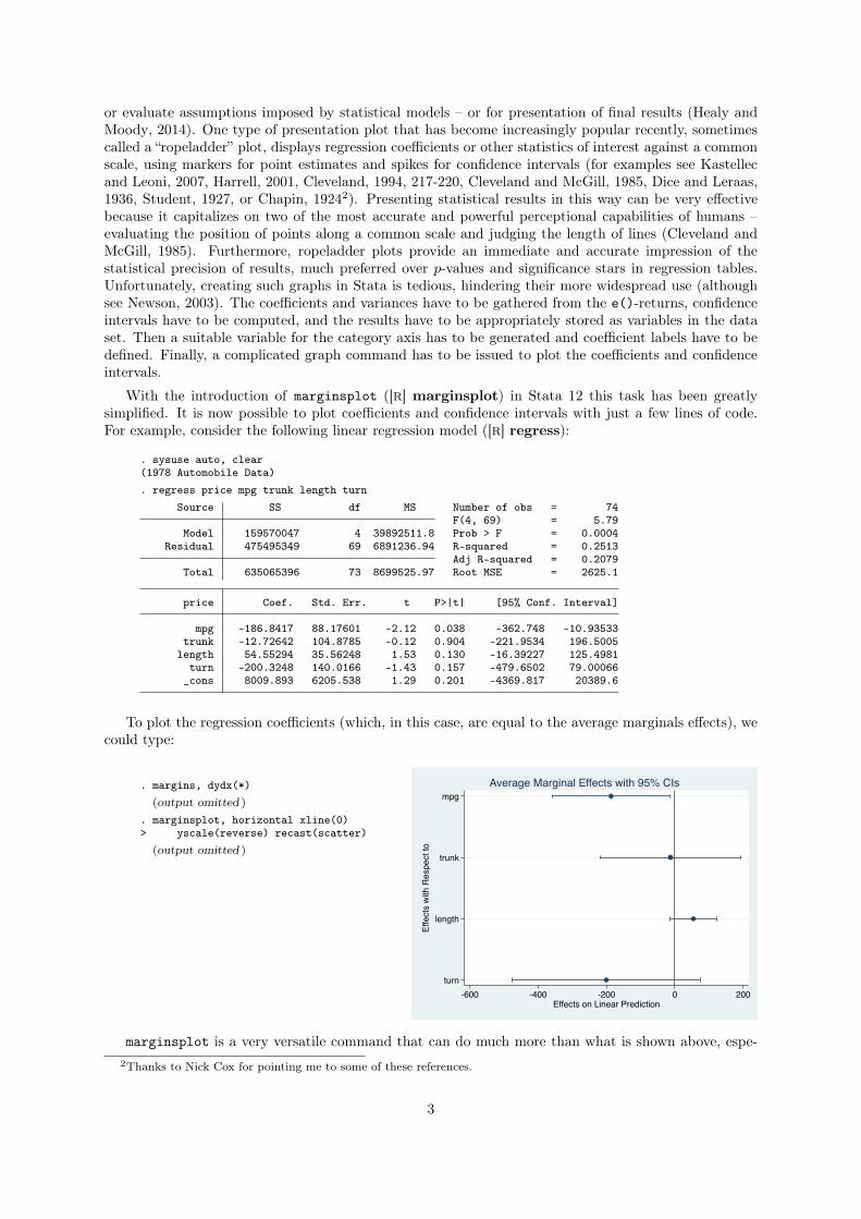
For example, consider the following linear regression model ([R] regress):
. sysuse auto, clear(1978 Automobile Data). regress price mpg trunk length turn
Source SS df MS Number of obs = 74F(4, 69) = 5.79
Model 159570047 4 39892511.8 Prob > F = 0.0004Residual 475495349 69 6891236.94 R-squared = 0.2513
Adj R-squared = 0.2079Total 635065396 73 8699525.97 Root MSE = 2625.1
price Coef. Std. Err. t P>|t| [95% Conf. Interval]
mpg -186.8417 88.17601 -2.12 0.038 -362.748 -10.93533trunk -12.72642 104.8785 -0.12 0.904 -221.9534 196.5005
length 54.55294 35.56248 1.53 0.130 -16.39227 125.4981turn -200.3248 140.0166 -1.43 0.157 -479.6502 79.00066
_cons 8009.893 6205.538 1.29 0.201 -4369.817 20389.6
To plot the regression coefficients (which, in this case, are equal to the average marginals effects), we
could type:
. margins, dydx(*)(output omitted )
. marginsplot, horizontal xline(0)> yscale(reverse) recast(scatter)
(output omitted )
mpg
trunk
length
turn
Effe
cts
with
Res
pect
to
-600 -400 -200 0 200Effects on Linear Prediction
Average Marginal Effects with 95% CIs
marginsplot is a very versatile command that can do much more than what is shown above, espe-
2Thanks to Nick Cox for pointing me to some of these references.
3
cially when plotting predictive margins, the area of application marginsplot was primarily designed for.
However, two main drawbacks prevent marginsplot from being easily employed as a general tool for
plotting coefficients or other estimation results. First, marginsplot can only process results left behind
by margins ([R] margins). Second, marginsplot can only deal with one set of results at the time (i.e.
the results from one call of margins).
I therefore wrote a command that can be applied to any estimation results and can combine results
from several estimation sets into one graph. The new coefplot command can be seen as a graphical
equivalent to popular tabulation programs such as outreg (Gallup, 2012) or estout (Jann, 2007).
To install the coefplot package, type
. ssc install coefplot, replace
Stata 11 or newer is required. After installation, type
. help coefplot
to view the help file. Also see http://repec.sowi.unibe.ch/stata/coefplot/.
2 Syntax
The basic syntax of coefplot is:
coefplot subgraph
⇥|| subgraph || ...
⇤ ⇥, globalopts
⇤
where subgraph is defined as
(plot)
⇥(plot) ...
⇤ ⇥, subgropts
⇤
and plot is either _skip (to skip a plot) or
model
⇥\ model \ ...
⇤⇥, plotopts
⇤
and model is
namelist
⇥, modelopts
⇤
where namelist is a list of names of stored models (see [R] estimates; type . or leave blank to refer to
the active model; the * and ? wildcards are allowed in namelist to refer to multiple models). Parentheses
around plot can be omitted if plot does not contain spaces.
Alternatively, model can be
matrix(mspec)
⇥, modelopts
⇤
to plot results from a matrix (see [P] matrix) where mspec is:
name use the first row of matrix name
name[#,.] use row # of matrix name; may also type name[#,] or name[#]
name[.,#] use column # of matrix name; may also type name[,#]
2.1 Types and placement of options
coefplot has four levels of options:
1. modelopts are options that apply to a single model (or matrix). They specify the information to
be collected and displayed (see Section 2.2).
2. plotopts are options that apply to a single plot, possibly containing results from multiple models.
They affect the rendition of markers and confidence intervals and provide a label for the plot (see
4
Section 2.3).
3. subgropts are options that apply to a single subgraph, possibly containing multiple plots (see Section
2.4).
4. globalopts are options that apply to the overall graph (see Section 2.5).
The options levels are nested in the sense that upper level options include all lower level options. That
is, globalopts includes subgropts, plotopts, and modelopts; subgropts includes plotopts and modelopts;
plotopts includes modelopts. However, upper level options may not be specified at a lower level.
If lower level options are specified at an upper level, they serve as defaults for all included lower levels
elements. For example, if you want to draw 99% and 95% confidence intervals for all included models,
specify levels(99 95) as global option:
. coefplot model1 model2 model3, levels(99 95)
Options specified with an individual lower-level element override the defaults set by upper level
options. For example, if you want to draw 99% and 95% confidence intervals for model1 and model2 and
90% confidence intervals for model 3, you could type:
. coefplot model1 model2 (model3, level(90)), levels(99 95)
There are some fine distinctions about the placement of options and how they are interpreted. For
example, if you type
. coefplot m1, opts1 || m2, opts2 opts3
then opts2 and opts3 are interpreted as global options. If you want to apply opts2 only to m2 then type
. coefplot m1, opts1 || m2, opts2 ||, opts3
Similarly, if you type
. coefplot (m1, opts1 \ m2, opts2)
then opts2 will be applied to both models. To apply opts2 only to m2 type
. coefplot (m1, opts1 \ m2, opts2 \)
or, if you also want to include opts3 to be applied to both models, type
. coefplot (m1, opts1 \ m2, opts2 \, opts3)
or
. coefplot (m1, opts1 \ m2, opts2 \), opts3
In case of multiple subgraphs there is some ambiguity about where to specify the plot options (unless
global option norecycle is specified; see section 3.2.2). You can provide plot options within any of the
subgraphs as plot options are collected across subgraphs. However, in case of conflict, the plot options
from the rightmost subgraph usually take precedence over earlier plot options. In addition, you can also
use global options p1(), p2(), etc. to provide options for specific plots (see Section 2.5). In case of
conflict, options specified within a plot take precedence over options provided via p1(), p2(), etc.
2.2 Model options
Main
omitted includes omitted coefficients.
baselevels includes base levels of factor variables.
b(mspec) specifies the source to be plotted; default is to plot e(b) (or e(b_mi) if plotting results from
mi estimate); mspec may be:
5
name use the first row of e(name)
name[#,.] use row # of e(name); may also type name[#,] or name[#]
name[.,#] use column # of e(name); may also type name[,#]
at
⇥(spec)
⇤retrieves plot positions from e(at) or as specified by spec. spec is
⇥atspec
⇤ ⇥, transform(exp)
⇤
where atspec may be
mspec as above for b()
# use #th at-dimension (margins) or #th row/column of main matrix
matrix(mspec) read from matrix instead of e()
_coef use coefficient names as plot positions
_eq use equation names as plot positions
transform(exp) transforms the plot positions; use @ as a placeholder in exp, e.g. transform(ln(@)).
keep(coeflist) keeps specified coefficients, where coeflist is a space-separated list of elements such as:
coef coefficient coef
eq: all coefficients from equation eq
eq:coef coefficient coef from equation eq
eq and coef may contain * (any string) and ? (any nonzero character) wildcards.
drop(coeflist) drops specified coefficients, where coeflist is as above for keep().
Confidence intervals
noci omits confidence intervals.
levels(numlist) sets the level(s) for confidence intervals; default is level(95) or as set by set level
(see [R] level).ci(spec) provides confidence intervals, where spec is
cispec
⇥cispec ...
⇤
and cispec is name to get the lower and upper confidence limits from rows 1 and 2 of e(name),
respectively. Alternatively, cispec may be (mspec mspec) to identify the lower and upper confidence
limits, with mspec as above for b(). cispec may also be # for a specific confidence level as in levels()
above.
v(name) retrieves variances from the diagonal of e(name); default is to use e(V) (or e(V_mi) if plotting
results from mi estimate).
se(mspec) provides standard errors, where mspec is as above for b().
df(spec) provides degrees of freedom, where spec is either # or mspec as above for b(). Degrees of
freedom are automatically taken into account for results from mi estimate or if e(df_r) is defined.
citype(logit|normal) determines the method to compute confidence intervals; the default is
citype(normal). Type citype(logit) to use the logit transformation to compute confidence inter-
vals (only relevant for proportions).
Transform results
eform
⇥(coeflist)
⇤plots exponentiated point estimates and confidence intervals, where coeflist is as above
for keep().
rescale(spec) rescales point estimates and confidence intervals; spec is either # or
coeflist = #
⇥coeflist = # ...
⇤
with coeflist is as above for keep().
transform(matchlist) transforms point estimates and confidence intervals. machlist is:
6
coeflist = "exp"
⇥coeflist = "exp" ...
⇤
with coeflist is as above for keep(). Within exp, use @ as a placeholder for the value to be transformed.
For example, to take the square root of all coefficients type transform(* = sqrt(@)).
Names and labels
rename(spec) renames coefficients, where spec is
coeflist = newname
⇥coeflist = newname ...
⇤⇥, regex
⇤
and coeflist is as above for keep(), except that wildcards are only allowed in eq and coef can be
specified as prefix* to replace a prefix or *suffix to replace a suffix. Option regex causes coefficient
specifications (but not equation specifications) to be interpreted as regular expressions. newname
may contain \0, ..., \9 to reference back to matched subexpressions in this case.
eqrename(matchlist) renames equations, where matchlist is
eqlist = newname
⇥eqlist = newname ...
⇤⇥, regex
⇤
and eqlist is a space separated list of equation names; type equation names as prefix* to replace a
prefix or *suffix to replace a suffix. Option regex causes equation specifications to be interpreted as
regular expressions. newname may contain \0, ..., \9 to reference back to matched subexpressions in
this case.
asequation
⇥(string)
⇤sets the equation for all coefficients to the name of the model or to string .
swapnames swaps coefficient names and equation names.
mlabels(matchlist) specifies marker labels for selected coefficients. matchlist is:
coeflist = # "label"
⇥coeflist = # "label" ...
⇤
where coeflist is as above for keep() and # is a number 0–12 for the location of the marker label
(see [G] clockposstyle).
Auxiliary results
aux(mspec
⇥mspec ...
⇤) collects additional results and makes them available as internal variables
@aux1, @aux2, etc. mspec is as above for b().
2.3 Plot options
Main
label(string) specifies a label to be used for the plot in the legend.
key
⇥(ci
⇥#
⇤)
⇤determines the key symbol to be used for the plot in the legend. key without argument
uses the marker symbol; this is the default. key(ci) determines the key symbol from the (first)
confidence interval. key(ci #) determines the key symbol from the #th confidence interval.
nokey prevents including the plot in the legend.
pstyle(pstyle) determines overall style of the plot; see [G] pstyle.
axis(#) specifies the scale axis (1–9) to be used for the plot.
offset(#) provides a custom offset for the plot positions.
if(exp) restricts the contents of the plot to coefficients satisfying exp. The option is useful when you
want to select coefficients based on their values, their plot positions, or their confidence limits. Within
exp refer to internal temporary variables as explained in Section 2.6. For example, to include positive
coefficients only, you could type if(@b>=0).
weight(exp) scales the size of the markers according to the size of the specified weights. Within exp refer
to internal temporary variables as explained in Section 2.6. For example, to scale markers according
7
to the inverse of standard errors, you could type weight(1/@se).
Rendition of coefficient markers
marker_options change the look of markers (color, size, etc.); see [G] marker_options.
mlabel
⇥(spec)
⇤adds marker labels to the plot. For adding custom labels to specific markers also see the
mlabels() option above. The mlabel option can be used in three different ways:
1. mlabel without argument adds the values of the point estimates as marker labels. Use global
option format() to set the display format.
2. mlabel(varname) uses the values of the specified variable as marker labels. varname may be an
internal variable (see Section 2.6).
3. mlabel(strexp) sets the marker labels to the evaluation of the specified string expression. Internal
variables can be used within strexp (see Section 2.6). For example, you can type mlabel("p
= " + string(@pval,"%9.3f")) to display labels such as “p = 0.001” or “p = 0.127”. Fur-
thermore, mlabel(cond(@pval<.001, "***", cond(@pval<.01, "**", cond(@pval<.05, "*",
"")))) would display significance stars.
marker_label_options change the look and position of marker labels; see [G] marker_label_options.
recast(plottype) plots the markers using plottype; supported plot types are scatter (default), line,
connected, area, bar, spike, dropline, and dot.
Rendition of confidence intervals
cionly causes markers for point estimates to be suppressed.
citop draws confidence intervals in front of markers.
ciopts(options) affect the rendition of confidence intervals; options are line_options to change the look
of the spikes (see [G] line_options), pstyle(pstyle) to set the overall style, and recast(plottype) to
set the plot type; supported plot types are rspike (default), rarea, rbar, rcap, rcapsym, rscatter,
rline, rconnected, pcspike, pccapsym, pcarrow (or pcrarrow for the reverse), pcbarrow, and
pcscatter. [G] stylelists may be used within options in case of multiple confidence intervals.
cismooth
⇥(options)
⇤adds smoothed confidence intervals. options are n(#) to set the number of
(equally) spaced confidence levels, default is n(50); lwidth(min max) to set the range of (rela-
tive) line widths, default is lwidth(2 15); intensity(min max) to set the range of color intensities,
default is intensity(min 100), where min depends on n() and is about 14 for n(50); color(color)
to set the color (without intensity multiplier); and pstyle(pstyle) to set the overall style.
2.4 Subgraph options
bylabel(string) specifies a label to be used for the subgraph.
2.5 Global options
Main
horizontal places coefficient values on the X axis; this is the general default.
vertical places coefficient values on the Y axis; this is the default with at().
eqstrict specifies to be strict about equations (match coefficients by equation names and plot equation
labels even if there is only one equation per model).
8
order(coeflist) orders coefficients, where coeflist is as above for keep(); may specify . instead of coef
to introduce gaps; not allowed with at().
orderby(
⇥#:
⇤⇥#
⇤) orders the coefficients by a specific model, where the first # identifies the relevant
subgraph and the second # identifies the relevant plot.
sort
⇥(spec)
⇤sorts the coefficients by size; spec is
⇥#:
⇤⇥#
⇤⇥, descending by(stat)
⇤
where the first # identifies the subgraph and the second # the plot by which the coefficients be
sorted, descending requests a descending sort order, and by(stat) sorts by the specified statistic.
stat may be b (point estimate; the default), v (variance), se (standard error), t (t or z statistic),
tabs (absolute t or z statistic), p (p-value), df (degrees of freedom), ll
⇥#
⇤(#th lower confidence
limit), ul
⇥#
⇤(#th upper confidence limit), or aux
⇥#
⇤(#th auxiliary variable).
relocate(spec) repositions coefficients, where spec is
⇥eq:
⇤coef = #
⇥⇥eq:
⇤coef = # ...
⇤
bycoefs arranges subgraphs by coefficients; not allowed with at().
norecycle increments plot styles across subgraphs.
nooffsets suppresses automatic offsets of plot positions.
format(format) sets the display format for coefficient values; format may be a numeric format or a date
format as described in [D] format.p#(plotopts) specifies options for the #th plot, where plotopts are as described in Section 2.3. For
example, type p2(nokey) to exclude plot 2 from the legend.
Labels and grid lines
nolabels uses variable names instead of labels.
coeflabels(spec) specifies custom labels for coefficients; not allowed with at(); spec is
⇥coeflist = label
⇥coeflist = label ...
⇤⇤ ⇥, truncate(#) wrap(#) nobreak
interaction(string) suboptions
⇤
where coeflist is as above for keep(), truncate(#) truncates coefficient labels to a maximum length
of # characters, wrap(#) divides coefficient labels into multiple lines with a maximum length of
# characters, nobreak prevents splitting long words, interaction() specifies the string to be used
as delimiter in labels for interaction terms, and suboptions are axis label suboptions as described in
[G] axis_label_options.
noeqlabels suppresses equation labels.
eqlabels(spec) specifies custom labels for equations; not allowed with at(); spec is
⇥label
⇥label ...
⇤⇤ ⇥, labels
⇥(string)
⇤ ⇥no
⇤gap
⇥(#)
⇤asheadings offset(#)
truncate(#) wrap(#) nobreak suboptions
⇤
label() requests reading labels from variables (and optionally specifies the interaction symbol).
gap() specifies the gap between equations; default is gap(1). asheadings treats equation labels
as headings; see headings(). offset(#) offsets the labels by # (only allowed with asheadings).
truncate(), wrap(), nobreak, and suboptions are as above for coeflabels().
headings(spec) adds headings between coefficients; not allowed with at(); spec is
coeflist = label
⇥coeflist = label ...
⇤ ⇥,
⇥no
⇤gap
⇥(#)
⇤offset(#) truncate(#) wrap(#)
nobreak suboptions
⇤
where coeflist is as above for keep(). gap() and offset() are as above for eqlabels(). truncate(),
wrap(), nobreak, and suboptions are as above for coeflabels().
groups(spec) adds labels for groups of coefficients; not allowed with at(); spec is
9
coeflist = label
⇥coeflist = label ...
⇤ ⇥,
⇥no
⇤gap
⇥(#)
⇤truncate(#) wrap(#) nobreak
suboptions
⇤
where coeflist is as above for keep(). gap() is as above for eqlabels(). truncate(), wrap(),
nobreak, and suboptions are as above for coeflabels().
plotlabels(spec) specifies labels for the plots to be used in the legend; spec is
⇥label
⇥label ...
⇤⇤ ⇥, truncate(#) wrap(#) nobreak
⇤
where truncate(), wrap(), and nobreak are as above for coeflabels().
bylabels(spec) specifies labels for the subgraphs; spec is
⇥label
⇥label ...
⇤⇤ ⇥, truncate(#) wrap(#) nobreak
⇤
where truncate(), wrap(), and nobreak are as above for coeflabels().
grid(options) affects the rendition of grid lines on the category axis; not allowed with at(). options
are between (grid lines between coefficients), within (grid lines within coefficients), or none (omit
grid lines), and suboptions as described in [G] axis_label_options.
Save results
generate
⇥(prefix)
⇤generates variables containing the graph data; default prefix is __.
replace overwrites existing variables.
Add plots
addplot(plot) adds other plots to the graph; see [G] addplot_option.
Y axis, X axis, Titles, Legend, Overall, By
twoway_options are twoway options, other than by(), as documented in [G] twoway_options.
byopts(byopts) determines how subgraphs are combined; byopts are as described in [G] by_option.
2.6 Accessing internal temporary variables
coefplot maintains a number of internal variables that can be used within if(), weight(),
transform(), mlabel(), mlabvposition(), and addplot(). These variables are:
@b point estimates
@ll# lower limits of confidence interval # (may use @ll for @ll1)
@ul# upper limits of confidence interval # (may use @ul for @ul1)
@V variances
@se standard errors
@t t or z statistics
@df degrees of freedom
@at plot positions
@pval p-values
@plot plot ID (labeled)
@by subgraph ID (labeled)
@mlbl Marker labels set by mlabels() (string variable)
@mlpos Marker label positions set by mlabels()
@aux# auxiliary variables collected by aux() (may use @aux for @aux1)
The internal variables can be used like other variables in the dataset. For example, option
mlabel(@plot) would add plot labels as marker labels or option addplot(line @at @b) would draw a
connecting line through all point estimates in the graph.
10
3 Examples
3.1 Plotting a single model
The syntax to produce a plot of the coefficients of a single model is
coefplot
⇥name
⇤ ⇥, options
⇤
where name is the name of a stored model (see [R] estimates), or . or empty string for the active
model.
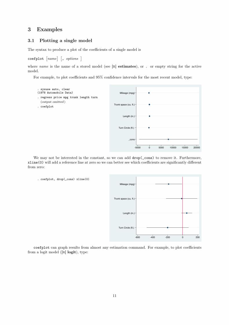
For example, to plot coefficients and 95% confidence intervals for the most recent model, type:
. sysuse auto, clear(1978 Automobile Data). regress price mpg trunk length turn
(output omitted )
. coefplot
Mileage (mpg)
Trunk space (cu. ft.)
Length (in.)
Turn Circle (ft.)
_cons
-5000 0 5000 10000 15000 20000
We may not be interested in the constant, so we can add drop(_cons) to remove it. Furthermore,
xline(0) will add a reference line at zero so we can better see which coefficients are significantly different
from zero:
. coefplot, drop(_cons) xline(0)
Mileage (mpg)
Trunk space (cu. ft.)
Length (in.)
Turn Circle (ft.)
-600 -400 -200 0 200
coefplot can graph results from almost any estimation command. For example, to plot coefficients
from a logit model ([R] logit), type:
11
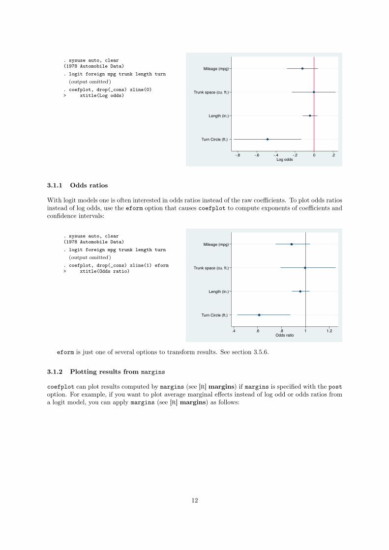
. sysuse auto, clear(1978 Automobile Data). logit foreign mpg trunk length turn
(output omitted )
. coefplot, drop(_cons) xline(0)> xtitle(Log odds)
Mileage (mpg)
Trunk space (cu. ft.)
Length (in.)
Turn Circle (ft.)
-.8 -.6 -.4 -.2 0 .2Log odds
3.1.1 Odds ratios
With logit models one is often interested in odds ratios instead of the raw coefficients. To plot odds ratios
instead of log odds, use the eform option that causes coefplot to compute exponents of coefficients and
confidence intervals:
. sysuse auto, clear(1978 Automobile Data). logit foreign mpg trunk length turn
(output omitted )
. coefplot, drop(_cons) xline(1) eform> xtitle(Odds ratio)
Mileage (mpg)
Trunk space (cu. ft.)
Length (in.)
Turn Circle (ft.)
.4 .6 .8 1 1.2Odds ratio
eform is just one of several options to transform results. See section 3.5.6.
3.1.2 Plotting results from margins
coefplot can plot results computed by margins (see [R] margins) if margins is specified with the post
option. For example, if you want to plot average marginal effects instead of log odd or odds ratios from
a logit model, you can apply margins (see [R] margins) as follows:
12
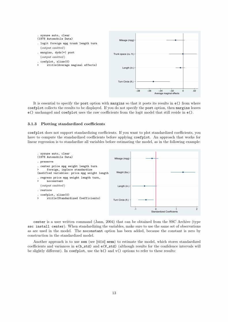
. sysuse auto, clear(1978 Automobile Data). logit foreign mpg trunk length turn
(output omitted )
. margins, dydx(*) post(output omitted )
. coefplot, xline(0)> xtitle(Average maginal effects)
Mileage (mpg)
Trunk space (cu. ft.)
Length (in.)
Turn Circle (ft.)
-.08 -.06 -.04 -.02 0 .02Average maginal effects
It is essential to specify the post option with margins so that it posts its results in e() from where
coefplot collects the results to be displayed. If you do not specify the post option, then margins leaves
e() unchanged and coefplot uses the raw coefficients from the logit model that still reside in e().
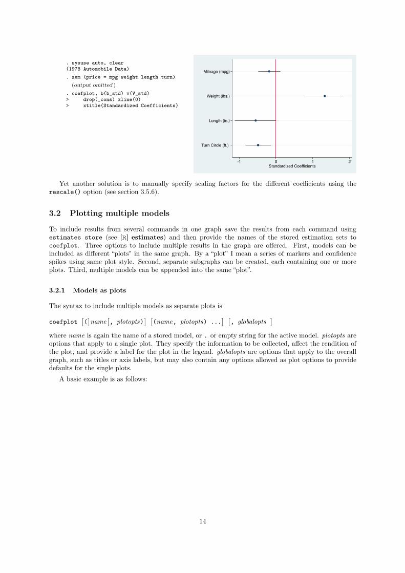
3.1.3 Plotting standardized coefficients
coefplot does not support standardizing coefficients. If you want to plot standardized coefficients, you
have to compute the standardized coefficients before applying coefplot. An approach that works for
linear regression is to standardize all variables before estimating the model, as in the following example:
. sysuse auto, clear(1978 Automobile Data). preserve. center price mpg weight length turn> foreign, inplace standardize(modified variables: price mpg weight length turn foreign). regress price mpg weight length turn,> noconstant
(output omitted )
. restore
. coefplot, xline(0)> xtitle(Standardized Coefficients)
Mileage (mpg)
Weight (lbs.)
Length (in.)
Turn Circle (ft.)
-1 0 1 2Standardized Coefficients
center is a user written command (Jann, 2004) that can be obtained from the SSC Archive (type
ssc install center). When standardizing the variables, make sure to use the same set of observations
as are used in the model. The noconstant option has been added, because the constant is zero by
construction in the standardized model.
Another approach is to use sem (see [SEM] sem) to estimate the model, which stores standardized
coefficients and variances in e(b_std) and e(V_std) (although results for the confidence intervals will
be slightly different). In coefplot, use the b() and v() options to refer to these results:
13
. sysuse auto, clear(1978 Automobile Data). sem (price = mpg weight length turn)
(output omitted )
. coefplot, b(b_std) v(V_std)> drop(_cons) xline(0)> xtitle(Standardized Coefficients)
Mileage (mpg)
Weight (lbs.)
Length (in.)
Turn Circle (ft.)
-1 0 1 2Standardized Coefficients
Yet another solution is to manually specify scaling factors for the different coefficients using the
rescale() option (see section 3.5.6).
3.2 Plotting multiple models
To include results from several commands in one graph save the results from each command using
estimates store (see [R] estimates) and then provide the names of the stored estimation sets to
coefplot. Three options to include multiple results in the graph are offered. First, models can be
included as different “plots” in the same graph. By a “plot” I mean a series of markers and confidence
spikes using same plot style. Second, separate subgraphs can be created, each containing one or more
plots. Third, multiple models can be appended into the same “plot”.
3.2.1 Models as plots
The syntax to include multiple models as separate plots is
coefplot
⇥(
⇤name
⇥, plotopts)
⇤ ⇥(name, plotopts) ...
⇤ ⇥, globalopts
⇤
where name is again the name of a stored model, or . or empty string for the active model. plotopts are
options that apply to a single plot. They specify the information to be collected, affect the rendition of
the plot, and provide a label for the plot in the legend. globalopts are options that apply to the overall
graph, such as titles or axis labels, but may also contain any options allowed as plot options to provide
defaults for the single plots.
A basic example is as follows:
14
. sysuse auto, clear(1978 Automobile Data). regress price mpg trunk length turn> if foreign==0
(output omitted )
. estimates store D
. regress price mpg trunk length turn> if foreign==1
(output omitted )
. estimates store F
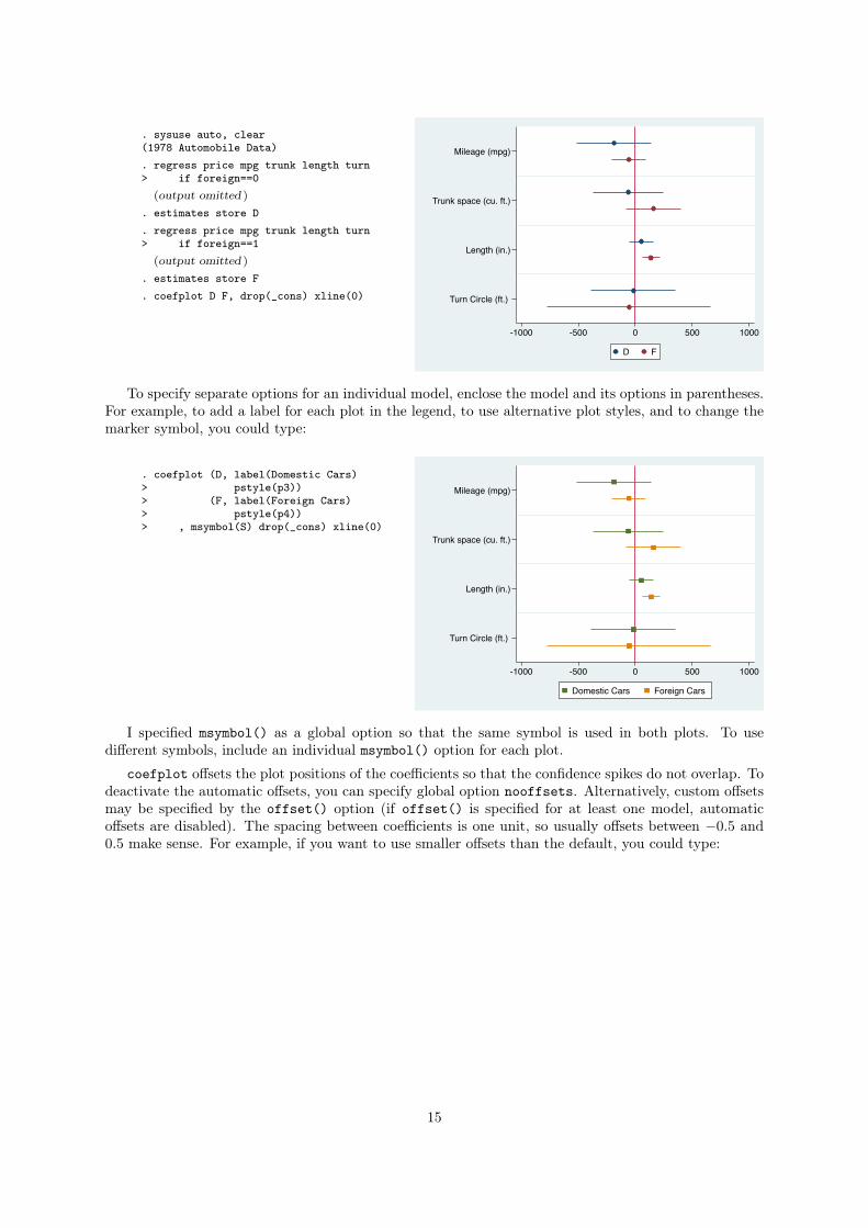
. coefplot D F, drop(_cons) xline(0)
Mileage (mpg)
Trunk space (cu. ft.)
Length (in.)
Turn Circle (ft.)
-1000 -500 0 500 1000
D F
To specify separate options for an individual model, enclose the model and its options in parentheses.
For example, to add a label for each plot in the legend, to use alternative plot styles, and to change the
marker symbol, you could type:
. coefplot (D, label(Domestic Cars)> pstyle(p3))> (F, label(Foreign Cars)> pstyle(p4))> , msymbol(S) drop(_cons) xline(0)
Mileage (mpg)
Trunk space (cu. ft.)
Length (in.)
Turn Circle (ft.)
-1000 -500 0 500 1000
Domestic Cars Foreign Cars
I specified msymbol() as a global option so that the same symbol is used in both plots. To use
different symbols, include an individual msymbol() option for each plot.
coefplot offsets the plot positions of the coefficients so that the confidence spikes do not overlap. To
deactivate the automatic offsets, you can specify global option nooffsets. Alternatively, custom offsets
may be specified by the offset() option (if offset() is specified for at least one model, automatic
offsets are disabled). The spacing between coefficients is one unit, so usually offsets between �0.5 and
0.5 make sense. For example, if you want to use smaller offsets than the default, you could type:
15
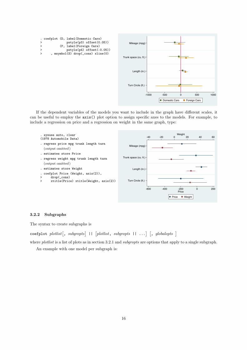
. coefplot (D, label(Domestic Cars)> pstyle(p3) offset(0.05))> (F, label(Foreign Cars)> pstyle(p4) offset(-0.05))> , msymbol(S) drop(_cons) xline(0)
Mileage (mpg)
Trunk space (cu. ft.)
Length (in.)
Turn Circle (ft.)
-1000 -500 0 500 1000
Domestic Cars Foreign Cars
If the dependent variables of the models you want to include in the graph have different scales, it
can be useful to employ the axis() plot option to assign specific axes to the models. For example, to
include a regression on price and a regression on weight in the same graph, type:
. sysuse auto, clear(1978 Automobile Data). regress price mpg trunk length turn
(output omitted )
. estimates store Price
. regress weight mpg trunk length turn(output omitted )
. estimates store Weight
. coefplot Price (Weight, axis(2)),> drop(_cons)> xtitle(Price) xtitle(Weight, axis(2))
Mileage (mpg)
Trunk space (cu. ft.)
Length (in.)
Turn Circle (ft.)
-40 -20 0 20 40 60Weight
-600 -400 -200 0 200Price
Price Weight
3.2.2 Subgraphs
The syntax to create subgraphs is
coefplot plotlist
⇥, subgropts
⇤||
⇥plotlist, subgropts || ...
⇤ ⇥, globalopts
⇤
where plotlist is a list of plots as in section 3.2.1 and subgropts are options that apply to a single subgraph.
An example with one model per subgraph is:
16
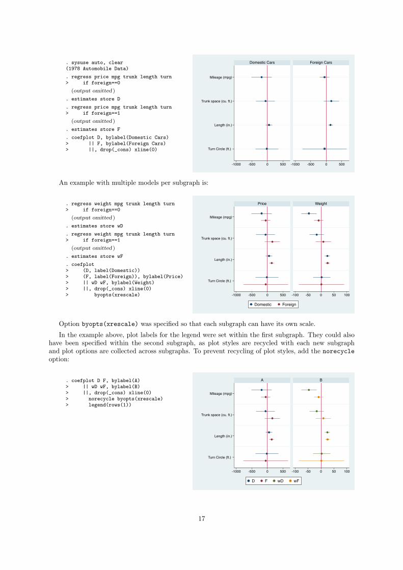
. sysuse auto, clear(1978 Automobile Data). regress price mpg trunk length turn> if foreign==0
(output omitted )
. estimates store D
. regress price mpg trunk length turn> if foreign==1
(output omitted )
. estimates store F
. coefplot D, bylabel(Domestic Cars)> || F, bylabel(Foreign Cars)> ||, drop(_cons) xline(0)
Mileage (mpg)
Trunk space (cu. ft.)
Length (in.)
Turn Circle (ft.)
-1000 -500 0 500 -1000 -500 0 500
Domestic Cars Foreign Cars
An example with multiple models per subgraph is:
. regress weight mpg trunk length turn> if foreign==0
(output omitted )
. estimates store wD
. regress weight mpg trunk length turn> if foreign==1
(output omitted )
. estimates store wF
. coefplot> (D, label(Domestic))> (F, label(Foreign)), bylabel(Price)> || wD wF, bylabel(Weight)> ||, drop(_cons) xline(0)> byopts(xrescale)
Mileage (mpg)
Trunk space (cu. ft.)
Length (in.)
Turn Circle (ft.)
-1000 -500 0 500 -100 -50 0 50 100
Price Weight
Domestic Foreign
Option byopts(xrescale) was specified so that each subgraph can have its own scale.
In the example above, plot labels for the legend were set within the first subgraph. They could also
have been specified within the second subgraph, as plot styles are recycled with each new subgraph
and plot options are collected across subgraphs. To prevent recycling of plot styles, add the norecycle
option:
. coefplot D F, bylabel(A)> || wD wF, bylabel(B)> ||, drop(_cons) xline(0)> norecycle byopts(xrescale)> legend(rows(1))
Mileage (mpg)
Trunk space (cu. ft.)
Length (in.)
Turn Circle (ft.)
-1000 -500 0 500 -100 -50 0 50 100
A B
D F wD wF
17
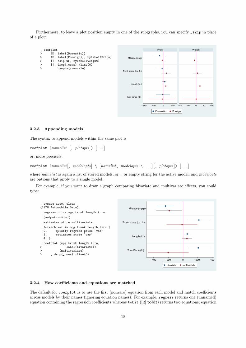
Furthermore, to leave a plot position empty in one of the subgraphs, you can specify _skip in place
of a plot:
. coefplot> (D, label(Domestic))> (F, label(Foreign)), bylabel(Price)> || _skip wF, bylabel(Weight)> ||, drop(_cons) xline(0)> byopts(xrescale)
Mileage (mpg)
Trunk space (cu. ft.)
Length (in.)
Turn Circle (ft.)
-1000 -500 0 500 -100 -50 0 50 100
Price Weight
Domestic Foreign
3.2.3 Appending models
The syntax to append models within the same plot is
coefplot (namelist
⇥, plotopts
⇤)
⇥...
⇤
or, more precisely,
coefplot (namelist
⇥, modelopts
⇤\
⇥namelist, modelopts \ ...
⇤⇥, plotopts
⇤)
⇥...
⇤
where namelist is again a list of stored models, or . or empty string for the active model, and modelopts
are options that apply to a single model.
For example, if you want to draw a graph comparing bivariate and multivariate effects, you could
type:
. sysuse auto, clear(1978 Automobile Data). regress price mpg trunk length turn
(output omitted )
. estimates store multivariate
. foreach var in mpg trunk length turn {2. quietly regress price `var'3. estimates store `var'4. }
. coefplot (mpg trunk length turn,> label(bivariate))> (multivariate)> , drop(_cons) xline(0)
Mileage (mpg)
Trunk space (cu. ft.)
Length (in.)
Turn Circle (ft.)
-400 -200 0 200 400
bivariate multivariate
3.2.4 How coefficients and equations are matched
The default for coefplot is to use the first (nonzero) equation from each model and match coefficients
across models by their names (ignoring equation names). For example, regress returns one (unnamed)
equation containing the regression coefficients whereas tobit ([R] tobit) returns two equations, equation
18
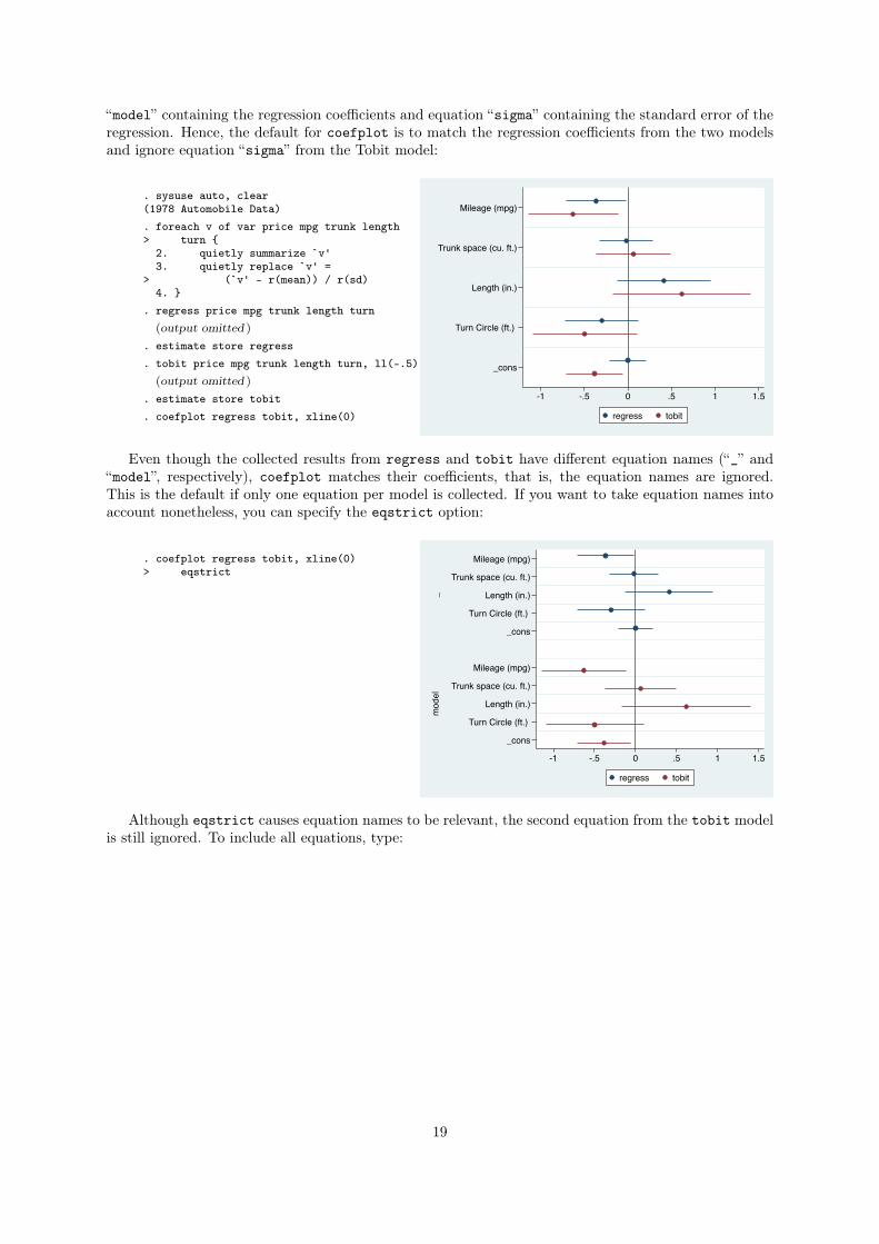
“model” containing the regression coefficients and equation “sigma” containing the standard error of the
regression. Hence, the default for coefplot is to match the regression coefficients from the two models
and ignore equation “sigma” from the Tobit model:
. sysuse auto, clear(1978 Automobile Data). foreach v of var price mpg trunk length> turn {
2. quietly summarize `v'3. quietly replace `v' =
> (`v' - r(mean)) / r(sd)4. }
. regress price mpg trunk length turn(output omitted )
. estimate store regress
. tobit price mpg trunk length turn, ll(-.5)(output omitted )
. estimate store tobit
. coefplot regress tobit, xline(0)
Mileage (mpg)
Trunk space (cu. ft.)
Length (in.)
Turn Circle (ft.)
_cons
-1 -.5 0 .5 1 1.5
regress tobit
Even though the collected results from regress and tobit have different equation names (“_” and
“model”, respectively), coefplot matches their coefficients, that is, the equation names are ignored.
This is the default if only one equation per model is collected. If you want to take equation names into
account nonetheless, you can specify the eqstrict option:
. coefplot regress tobit, xline(0)> eqstrict
_m
odel
Mileage (mpg)
Trunk space (cu. ft.)
Length (in.)
Turn Circle (ft.)
_cons
Mileage (mpg)
Trunk space (cu. ft.)
Length (in.)
Turn Circle (ft.)
_cons
-1 -.5 0 .5 1 1.5
regress tobit
Although eqstrict causes equation names to be relevant, the second equation from the tobit model
is still ignored. To include all equations, type:
19
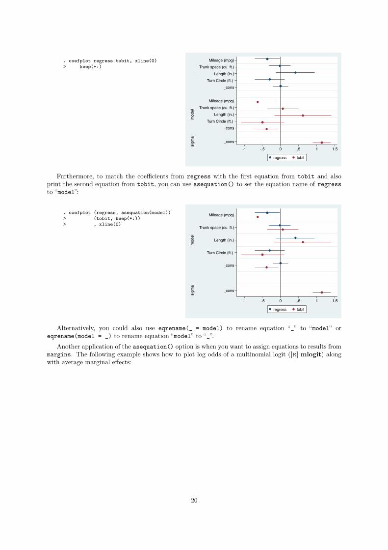
. coefplot regress tobit, xline(0)> keep(*:)
_m
odel
sigm
a
Mileage (mpg)Trunk space (cu. ft.)
Length (in.)Turn Circle (ft.)
_cons
Mileage (mpg)Trunk space (cu. ft.)
Length (in.)Turn Circle (ft.)
_cons
_cons
-1 -.5 0 .5 1 1.5
regress tobit
Furthermore, to match the coefficients from regress with the first equation from tobit and also
print the second equation from tobit, you can use asequation() to set the equation name of regress
to “model”:
. coefplot (regress, asequation(model))> (tobit, keep(*:))> , xline(0)
mod
elsi
gma
Mileage (mpg)
Trunk space (cu. ft.)
Length (in.)
Turn Circle (ft.)
_cons
_cons
-1 -.5 0 .5 1 1.5
regress tobit
Alternatively, you could also use eqrename(_ = model) to rename equation “_” to “model” or
eqrename(model = _) to rename equation “model” to “_”.
Another application of the asequation() option is when you want to assign equations to results from
margins. The following example shows how to plot log odds of a multinomial logit ([R] mlogit) along
with average marginal effects:
20
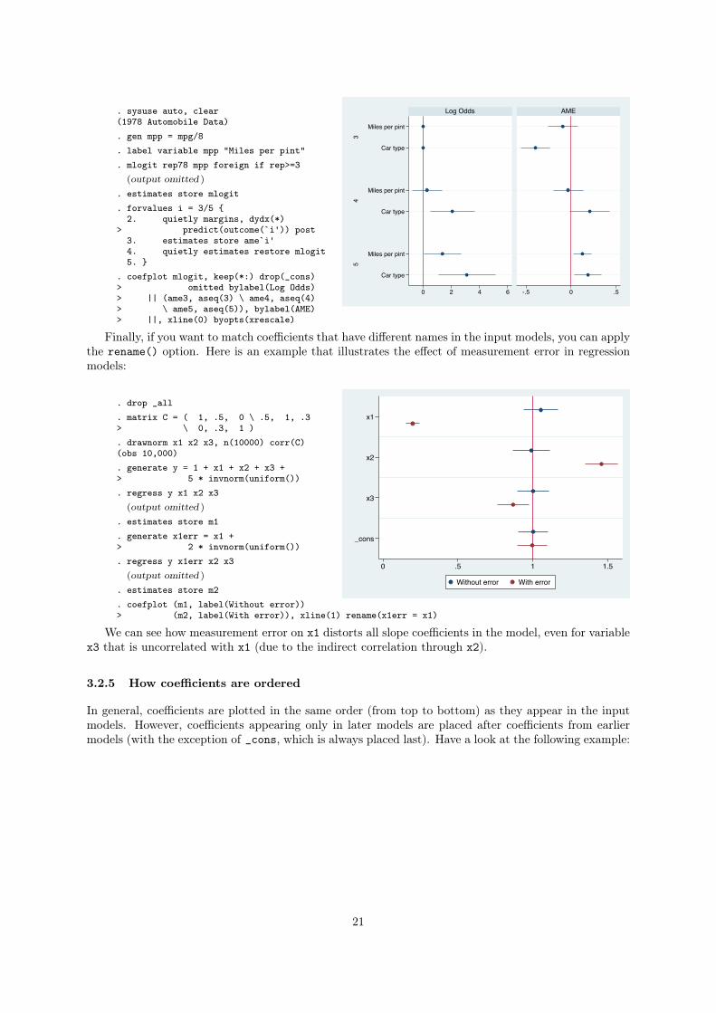
. sysuse auto, clear(1978 Automobile Data). gen mpp = mpg/8. label variable mpp "Miles per pint". mlogit rep78 mpp foreign if rep>=3
(output omitted )
. estimates store mlogit
. forvalues i = 3/5 {2. quietly margins, dydx(*)
> predict(outcome(`i')) post3. estimates store ame`i'4. quietly estimates restore mlogit5. }
. coefplot mlogit, keep(*:) drop(_cons)> omitted bylabel(Log Odds)> || (ame3, aseq(3) \ ame4, aseq(4)> \ ame5, aseq(5)), bylabel(AME)> ||, xline(0) byopts(xrescale)
34
5
Miles per pint
Car type
Miles per pint
Car type
Miles per pint
Car type
0 2 4 6 -.5 0 .5
Log Odds AME
Finally, if you want to match coefficients that have different names in the input models, you can apply
the rename() option. Here is an example that illustrates the effect of measurement error in regression
models:
. drop _all
. matrix C = ( 1, .5, 0 \ .5, 1, .3> \ 0, .3, 1 ). drawnorm x1 x2 x3, n(10000) corr(C)(obs 10,000). generate y = 1 + x1 + x2 + x3 +> 5 * invnorm(uniform()). regress y x1 x2 x3
(output omitted )
. estimates store m1
. generate x1err = x1 +> 2 * invnorm(uniform()). regress y x1err x2 x3
(output omitted )
. estimates store m2
. coefplot (m1, label(Without error))> (m2, label(With error)), xline(1) rename(x1err = x1)
x1
x2
x3
_cons
0 .5 1 1.5
Without error With error
We can see how measurement error on x1 distorts all slope coefficients in the model, even for variable
x3 that is uncorrelated with x1 (due to the indirect correlation through x2).
3.2.5 How coefficients are ordered
In general, coefficients are plotted in the same order (from top to bottom) as they appear in the input
models. However, coefficients appearing only in later models are placed after coefficients from earlier
models (with the exception of _cons, which is always placed last). Have a look at the following example:
21
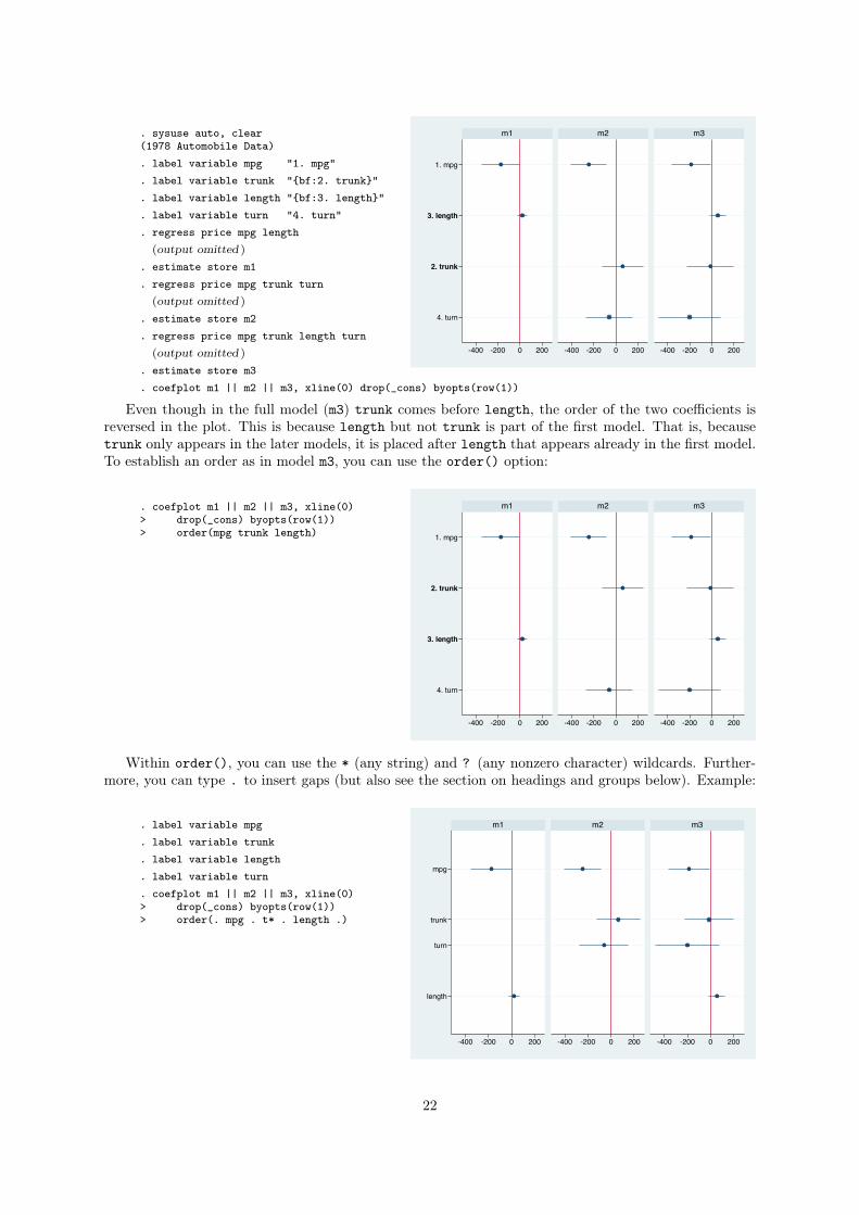
. sysuse auto, clear(1978 Automobile Data). label variable mpg "1. mpg". label variable trunk "{bf:2. trunk}". label variable length "{bf:3. length}". label variable turn "4. turn". regress price mpg length
(output omitted )
. estimate store m1
. regress price mpg trunk turn(output omitted )
. estimate store m2
. regress price mpg trunk length turn(output omitted )
. estimate store m3
. coefplot m1 || m2 || m3, xline(0) drop(_cons) byopts(row(1))
1. mpg
3. length
2. trunk
4. turn
-400 -200 0 200 -400 -200 0 200 -400 -200 0 200
m1 m2 m3
Even though in the full model (m3) trunk comes before length, the order of the two coefficients is
reversed in the plot. This is because length but not trunk is part of the first model. That is, because
trunk only appears in the later models, it is placed after length that appears already in the first model.
To establish an order as in model m3, you can use the order() option:
. coefplot m1 || m2 || m3, xline(0)> drop(_cons) byopts(row(1))> order(mpg trunk length) 1. mpg
2. trunk
3. length
4. turn
-400 -200 0 200 -400 -200 0 200 -400 -200 0 200
m1 m2 m3
Within order(), you can use the * (any string) and ? (any nonzero character) wildcards. Further-
more, you can type . to insert gaps (but also see the section on headings and groups below). Example:
. label variable mpg
. label variable trunk
. label variable length
. label variable turn
. coefplot m1 || m2 || m3, xline(0)> drop(_cons) byopts(row(1))> order(. mpg . t* . length .)
mpg
trunk
turn
length
-400 -200 0 200 -400 -200 0 200 -400 -200 0 200
m1 m2 m3
22
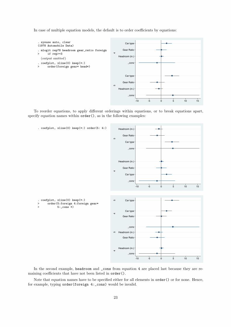
In case of multiple equation models, the default is to order coefficients by equations:
. sysuse auto, clear(1978 Automobile Data). mlogit rep78 headroom gear_ratio foreign> if rep>=3
(output omitted )
. coefplot, xline(0) keep(*:)> order(foreign gear* head*)
45
Car type
Gear Ratio
Headroom (in.)
_cons
Car type
Gear Ratio
Headroom (in.)
_cons
-10 -5 0 5 10 15
To reorder equations, to apply different orderings within equations, or to break equations apart,
specify equation names within order(), as in the following examples:
. coefplot, xline(0) keep(*:) order(5: 4:)
54
Headroom (in.)
Gear Ratio
Car type
_cons
Headroom (in.)
Gear Ratio
Car type
_cons
-10 -5 0 5 10 15
. coefplot, xline(0) keep(*:)> order(5:foreign 4:foreign gear*> 5:_cons *)
54
54
Car type
Car type
Gear Ratio
_cons
Headroom (in.)
Gear Ratio
Headroom (in.)
_cons
-10 -5 0 5 10 15
In the second example, headroom and _cons from equation 4 are placed last because they are re-
maining coefficients that have not been listed in order().
Note that equation names have to be specified either for all elements in order() or for none. Hence,
for example, typing order(foreign 4:_cons) would be invalid.
23
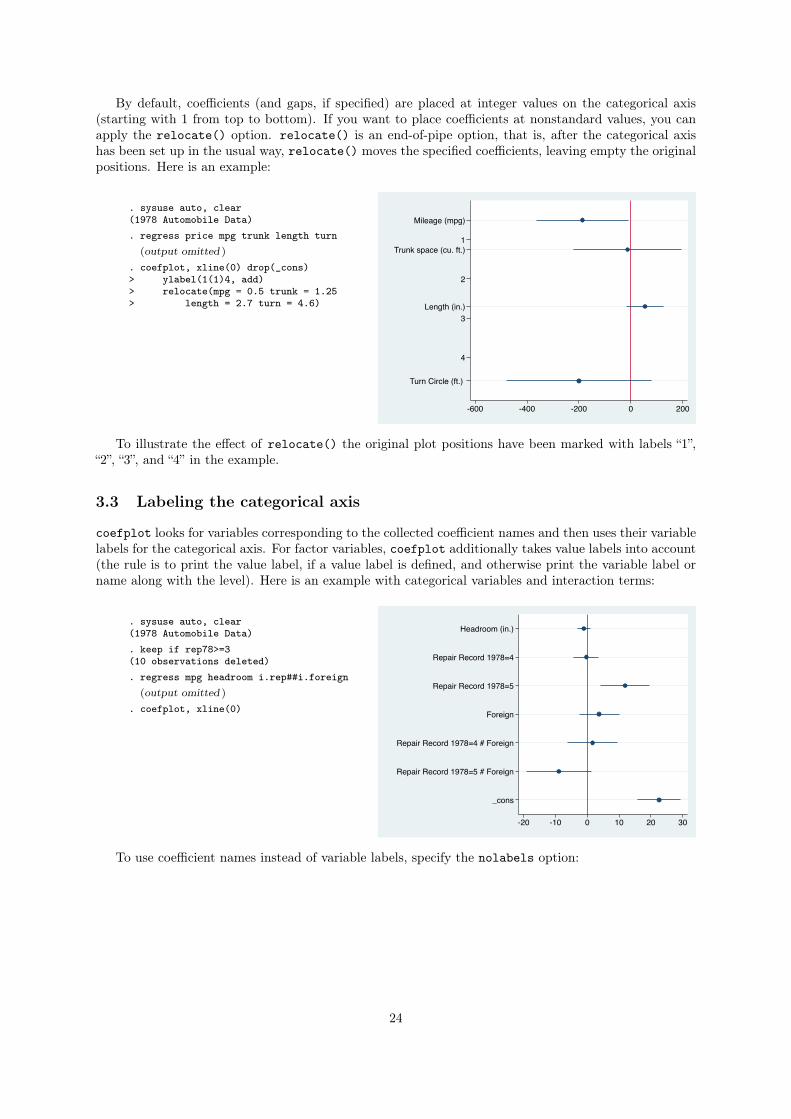
By default, coefficients (and gaps, if specified) are placed at integer values on the categorical axis
(starting with 1 from top to bottom). If you want to place coefficients at nonstandard values, you can
apply the relocate() option. relocate() is an end-of-pipe option, that is, after the categorical axis
has been set up in the usual way, relocate() moves the specified coefficients, leaving empty the original
positions. Here is an example:
. sysuse auto, clear(1978 Automobile Data). regress price mpg trunk length turn
(output omitted )
. coefplot, xline(0) drop(_cons)> ylabel(1(1)4, add)> relocate(mpg = 0.5 trunk = 1.25> length = 2.7 turn = 4.6)
1
2
3
4
Mileage (mpg)
Trunk space (cu. ft.)
Length (in.)
Turn Circle (ft.)
-600 -400 -200 0 200
To illustrate the effect of relocate() the original plot positions have been marked with labels “1”,
“2”, “3”, and “4” in the example.
3.3 Labeling the categorical axis
coefplot looks for variables corresponding to the collected coefficient names and then uses their variable
labels for the categorical axis. For factor variables, coefplot additionally takes value labels into account
(the rule is to print the value label, if a value label is defined, and otherwise print the variable label or
name along with the level). Here is an example with categorical variables and interaction terms:
. sysuse auto, clear(1978 Automobile Data). keep if rep78>=3(10 observations deleted). regress mpg headroom i.rep##i.foreign
(output omitted )
. coefplot, xline(0)
Headroom (in.)
Repair Record 1978=4
Repair Record 1978=5
Foreign
Repair Record 1978=4 # Foreign
Repair Record 1978=5 # Foreign
_cons
-20 -10 0 10 20 30
To use coefficient names instead of variable labels, specify the nolabels option:
24
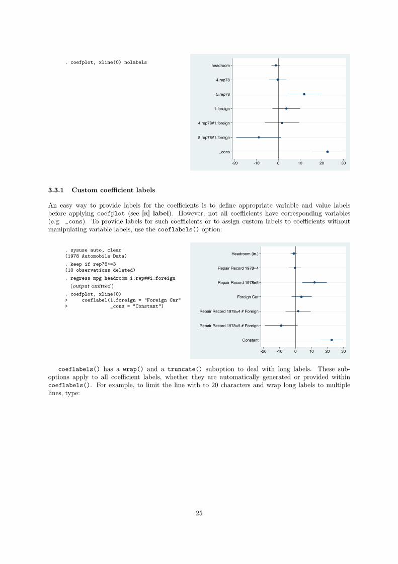
. coefplot, xline(0) nolabelsheadroom
4.rep78
5.rep78
1.foreign
4.rep78#1.foreign
5.rep78#1.foreign
_cons
-20 -10 0 10 20 30
3.3.1 Custom coefficient labels
An easy way to provide labels for the coefficients is to define appropriate variable and value labels
before applying coefplot (see [R] label). However, not all coefficients have corresponding variables
(e.g. _cons). To provide labels for such coefficients or to assign custom labels to coefficients without
manipulating variable labels, use the coeflabels() option:
. sysuse auto, clear(1978 Automobile Data). keep if rep78>=3(10 observations deleted). regress mpg headroom i.rep##i.foreign
(output omitted )
. coefplot, xline(0)> coeflabel(1.foreign = "Foreign Car"> _cons = "Constant")
Headroom (in.)
Repair Record 1978=4
Repair Record 1978=5
Foreign Car
Repair Record 1978=4 # Foreign
Repair Record 1978=5 # Foreign
Constant
-20 -10 0 10 20 30
coeflabels() has a wrap() and a truncate() suboption to deal with long labels. These sub-
options apply to all coefficient labels, whether they are automatically generated or provided within
coeflabels(). For example, to limit the line with to 20 characters and wrap long labels to multiple
lines, type:
25
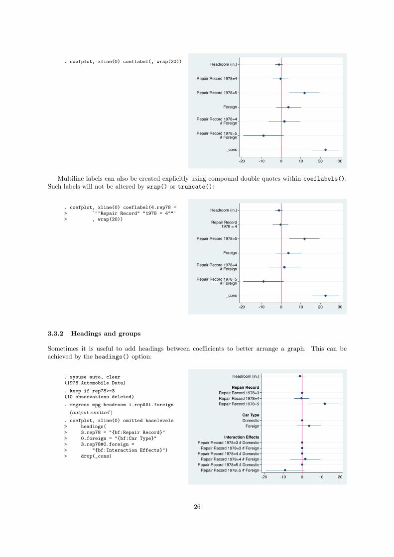
. coefplot, xline(0) coeflabel(, wrap(20)) Headroom (in.)
Repair Record 1978=4
Repair Record 1978=5
Foreign
Repair Record 1978=4# Foreign
Repair Record 1978=5# Foreign
_cons
-20 -10 0 10 20 30
Multiline labels can also be created explicitly using compound double quotes within coeflabels().
Such labels will not be altered by wrap() or truncate():
. coefplot, xline(0) coeflabel(4.rep78 => `""Repair Record" "1978 = 4""'> , wrap(20))
Headroom (in.)
Repair Record1978 = 4
Repair Record 1978=5
Foreign
Repair Record 1978=4# Foreign
Repair Record 1978=5# Foreign
_cons
-20 -10 0 10 20 30
3.3.2 Headings and groups
Sometimes it is useful to add headings between coefficients to better arrange a graph. This can be
achieved by the headings() option:
. sysuse auto, clear(1978 Automobile Data). keep if rep78>=3(10 observations deleted). regress mpg headroom i.rep##i.foreign
(output omitted )
. coefplot, xline(0) omitted baselevels> headings(> 3.rep78 = "{bf:Repair Record}"> 0.foreign = "{bf:Car Type}"> 3.rep78#0.foreign => "{bf:Interaction Effects}")> drop(_cons)
Headroom (in.)
Repair Record 1978=3Repair Record 1978=4Repair Record 1978=5
DomesticForeign
Repair Record 1978=3 # DomesticRepair Record 1978=3 # Foreign
Repair Record 1978=4 # DomesticRepair Record 1978=4 # Foreign
Repair Record 1978=5 # DomesticRepair Record 1978=5 # Foreign
Repair Record
Car Type
Interaction Effects
-20 -10 0 10 20
26
In this example, omit requests to plot omitted coefficients and baselevels requests to plot base level
coefficients. Omitted coefficients and base levels coefficients are always equal to zero, but in some cases
it can be helpful to include them in a graph for reasons of clarity. The {bf} tag changes text to bold;
see [G] text for details on text in graphs.
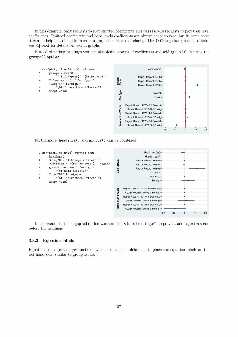
Instead of adding headings you can also define groups of coefficients and add group labels using the
groups() option:
. coefplot, xline(0) omitted base> groups(?.rep78 => `""{bf:Repair}" "{bf:Record}""'> ?.foreign = "{bf:Car Type}"> ?.rep78#?.foreign => "{bf:Interaction Effects}")> drop(_cons)
Rep
air
Rec
ord
Car
Typ
eIn
tera
ctio
n Ef
fect
s
Headroom (in.)
Repair Record 1978=3Repair Record 1978=4Repair Record 1978=5
DomesticForeign
Repair Record 1978=3 # DomesticRepair Record 1978=3 # Foreign
Repair Record 1978=4 # DomesticRepair Record 1978=4 # Foreign
Repair Record 1978=5 # DomesticRepair Record 1978=5 # Foreign
-20 -10 0 10 20
Furthermore, headings() and groups() can be combined:
. coefplot, xline(0) omitted base> headings(> 3.rep78 = "{it:Repair record:}"> 0.foreign = "{it:Car type:}", nogap)> groups(headroom 1.foreign => "{bf:Main Effects}"> ?.rep78#?.foreign => "{bf:Interaction Effects}")> drop(_cons)
Mai
n Ef
fect
sIn
tera
ctio
n Ef
fect
s
Headroom (in.)
Repair Record 1978=3Repair Record 1978=4Repair Record 1978=5
DomesticForeign
Repair Record 1978=3 # DomesticRepair Record 1978=3 # Foreign
Repair Record 1978=4 # DomesticRepair Record 1978=4 # Foreign
Repair Record 1978=5 # DomesticRepair Record 1978=5 # Foreign
Repair record:
Car type:
-20 -10 0 10 20
In this example, the nogap suboption was specified within headings() to prevent adding extra space
before the headings.
3.3.3 Equation labels
Equation labels provide yet another layer of labels. The default is to place the equation labels on the
left hand side, similar to group labels:
27
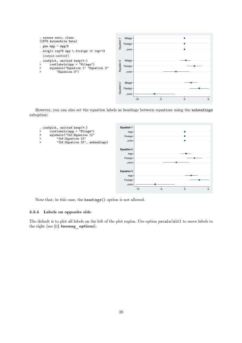
. sysuse auto, clear(1978 Automobile Data). gen mpp = mpg/8. mlogit rep78 mpp i.foreign if rep>=3
(output omitted )
. coefplot, omitted keep(*:)> coeflabels(mpp = "Milage")> eqlabels("Equation 1" "Equation 2"> "Equation 3")
Equa
tion
1Eq
uatio
n 2
Equa
tion
3
Milage
Foreign
_cons
Milage
Foreign
_cons
Milage
Foreign
_cons
-10 -5 0 5
However, you can also set the equation labels as headings between equations using the asheadings
suboption:
. coefplot, omitted keep(*:)> coeflabels(mpg = "Milage")> eqlabels("{bf:Equation 1}"> "{bf:Equation 2}"> "{bf:Equation 3}", asheadings)
mppForeign_cons
mppForeign_cons
mppForeign_cons
Equation 1
Equation 2
Equation 3
-10 -5 0 5
Note that, in this case, the headings() option is not allowed.
3.3.4 Labels on opposite side
The default is to plot all labels on the left of the plot region. Use option yscale(alt) to move labels to
the right (see [G] twoway_options):
28
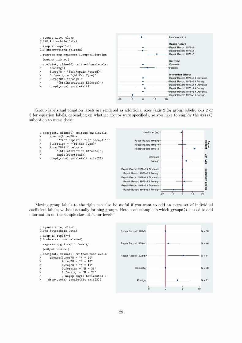
. sysuse auto, clear(1978 Automobile Data). keep if rep78>=3(10 observations deleted). regress mpg headroom i.rep##i.foreign
(output omitted )
. coefplot, xline(0) omitted baselevels> headings(> 3.rep78 = "{bf:Repair Record}"> 0.foreign = "{bf:Car Type}"> 3.rep78#0.foreign => "{bf:Interaction Effects}")> drop(_cons) yscale(alt)
Headroom (in.)
Repair Record 1978=3Repair Record 1978=4Repair Record 1978=5
DomesticForeign
Repair Record 1978=3 # DomesticRepair Record 1978=3 # ForeignRepair Record 1978=4 # DomesticRepair Record 1978=4 # ForeignRepair Record 1978=5 # DomesticRepair Record 1978=5 # Foreign
Repair Record
Car Type
Interaction Effects
-20 -10 0 10 20
Group labels and equation labels are rendered as additional axes (axis 2 for group labels; axis 2 or
3 for equation labels, depending on whether groups were specified), so you have to employ the axis()
suboption to move these:
. coefplot, xline(0) omitted baselevels> groups(?.rep78 => `""{bf:Repair}" "{bf:Record}""'> ?.foreign = "{bf:Car Type}"> ?.rep78#?.foreign => "{bf:Interaction Effects}",> angle(rvertical))> drop(_cons) yscale(alt axis(2))
Repair
Record
Car Type
Interaction Effects
Headroom (in.)
Repair Record 1978=3Repair Record 1978=4Repair Record 1978=5
DomesticForeign
Repair Record 1978=3 # DomesticRepair Record 1978=3 # Foreign
Repair Record 1978=4 # DomesticRepair Record 1978=4 # Foreign
Repair Record 1978=5 # DomesticRepair Record 1978=5 # Foreign
-20 -10 0 10 20
Moving group labels to the right can also be useful if you want to add an extra set of individual
coefficient labels, without actually forming groups. Here is an example in which groups() is used to add
information on the sample sizes of factor levels:
. sysuse auto, clear(1978 Automobile Data). keep if rep78>=3(10 observations deleted). regress mpg i.rep i.foreign
(output omitted )
. coefplot, xline(0) omitted baselevels> groups(3.rep78 = "N = 30"> 4.rep78 = "N = 18"> 5.rep78 = "N = 11"> 0.foreign = "N = 38"> 1.foreign = "N = 21"> , nogap angle(horizontal))> drop(_cons) yscale(alt axis(2))
N = 30
N = 18
N = 11
N = 38
N = 21
Repair Record 1978=3
Repair Record 1978=4
Repair Record 1978=5
Domestic
Foreign
-5 0 5 10
29
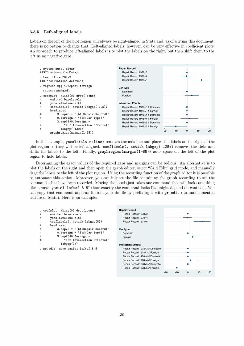
3.3.5 Left-aligned labels
Labels on the left of the plot region will always be right-aligned in Stata and, as of writing this document,
there is no option to change that. Left-aligned labels, however, can be very effective in coefficient plots.
An approach to produce left-aligned labels is to plot the labels on the right, but then shift them to the
left using negative gaps:
. sysuse auto, clear(1978 Automobile Data). keep if rep78>=3(10 observations deleted). regress mpg i.rep##i.foreign
(output omitted )
. coefplot, xline(0) drop(_cons)> omitted baselevels> yscale(noline alt)> coeflabels(, notick labgap(-125))> headings(> 3.rep78 = "{bf:Repair Record}"> 0.foreign = "{bf:Car Type}"> 3.rep78#0.foreign => "{bf:Interaction Effects}"> , labgap(-130))> graphregion(margin(l=65))
Repair Record 1978=3Repair Record 1978=4Repair Record 1978=5
DomesticForeign
Repair Record 1978=3 # DomesticRepair Record 1978=3 # ForeignRepair Record 1978=4 # DomesticRepair Record 1978=4 # ForeignRepair Record 1978=5 # DomesticRepair Record 1978=5 # Foreign
Repair Record
Car Type
Interaction Effects
-20 -10 0 10 20
In this example, yscale(alt noline) removes the axis line and places the labels on the right of the
plot region so they will be left-aligned. coeflabels(, notick labgap(-125)) removes the ticks and
shifts the labels to the left. Finally, graphregion(margin(l=65)) adds space on the left of the plot
region to hold labels.
Determining the exact values of the required gaps and margins can be tedious. An alternative is to
plot the labels on the right and then open the graph editor, select “Grid Edit” grid mode, and manually
drag the labels to the left of the plot region. Using the recording function of the graph editor it is possible
to automate this action. Moreover, you can inspect the file containing the graph recording to see the
commands that have been recorded. Moving the labels just takes one command that will look something
like “.move yaxis1 leftof 8 5” (how exactly the command looks like might depend on context). You
can copy that command and run it from your do-file by prefixing it with gr_edit (an undocumented
feature of Stata). Here is an example:
. coefplot, xline(0) drop(_cons)> omitted baselevels> yscale(noline alt)> coeflabels(, notick labgap(5))> headings(> 3.rep78 = "{bf:Repair Record}"> 0.foreign = "{bf:Car Type}"> 3.rep78#0.foreign => "{bf:Interaction Effects}"> , labgap(0)). gr_edit .move yaxis1 leftof 8 5
Repair Record 1978=3Repair Record 1978=4Repair Record 1978=5
DomesticForeign
Repair Record 1978=3 # DomesticRepair Record 1978=3 # ForeignRepair Record 1978=4 # DomesticRepair Record 1978=4 # ForeignRepair Record 1978=5 # DomesticRepair Record 1978=5 # Foreign
Repair Record
Car Type
Interaction Effects
-20 -10 0 10 20
30
3.4 Confidence intervals
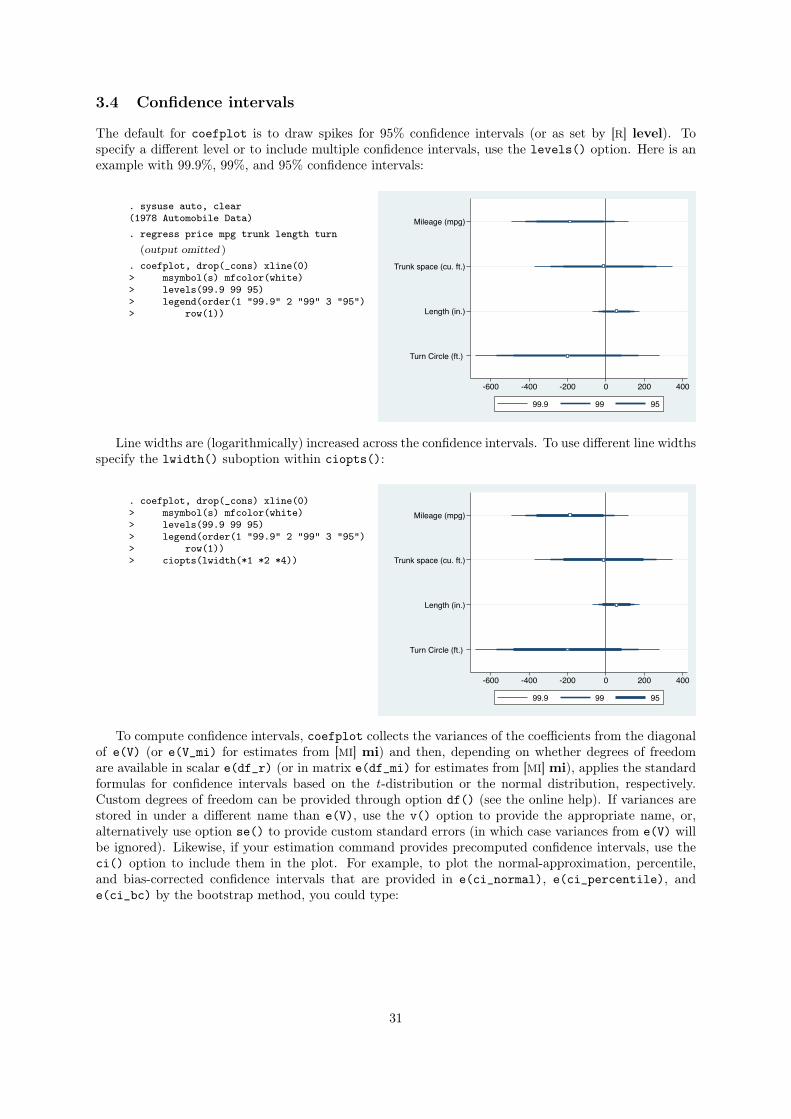
The default for coefplot is to draw spikes for 95% confidence intervals (or as set by [R] level). To
specify a different level or to include multiple confidence intervals, use the levels() option. Here is an
example with 99.9%, 99%, and 95% confidence intervals:
. sysuse auto, clear(1978 Automobile Data). regress price mpg trunk length turn
(output omitted )
. coefplot, drop(_cons) xline(0)> msymbol(s) mfcolor(white)> levels(99.9 99 95)> legend(order(1 "99.9" 2 "99" 3 "95")> row(1))
Mileage (mpg)
Trunk space (cu. ft.)
Length (in.)
Turn Circle (ft.)
-600 -400 -200 0 200 400
99.9 99 95
Line widths are (logarithmically) increased across the confidence intervals. To use different line widths
specify the lwidth() suboption within ciopts():
. coefplot, drop(_cons) xline(0)> msymbol(s) mfcolor(white)> levels(99.9 99 95)> legend(order(1 "99.9" 2 "99" 3 "95")> row(1))> ciopts(lwidth(*1 *2 *4))
Mileage (mpg)
Trunk space (cu. ft.)
Length (in.)
Turn Circle (ft.)
-600 -400 -200 0 200 400
99.9 99 95
To compute confidence intervals, coefplot collects the variances of the coefficients from the diagonal
of e(V) (or e(V_mi) for estimates from [MI] mi) and then, depending on whether degrees of freedom
are available in scalar e(df_r) (or in matrix e(df_mi) for estimates from [MI] mi), applies the standard
formulas for confidence intervals based on the t-distribution or the normal distribution, respectively.
Custom degrees of freedom can be provided through option df() (see the online help). If variances are
stored in under a different name than e(V), use the v() option to provide the appropriate name, or,
alternatively use option se() to provide custom standard errors (in which case variances from e(V) will
be ignored). Likewise, if your estimation command provides precomputed confidence intervals, use the
ci() option to include them in the plot. For example, to plot the normal-approximation, percentile,
and bias-corrected confidence intervals that are provided in e(ci_normal), e(ci_percentile), and
e(ci_bc) by the bootstrap method, you could type:
31

. regress price mpg trunk length turn,> vce(bootstrap)
(output omitted )
. coefplot> (, ci(ci_normal) label(normal))> (, ci(ci_percentile) label(percent))> (, ci(ci_bc) label(bc))> , drop(_cons) xline(0) legend(row(1))
Mileage (mpg)
Trunk space (cu. ft.)
Length (in.)
Turn Circle (ft.)
-600 -400 -200 0 200
normal percent bc
In addition to level() and ci() you can also use option cismooth to add smoothed confidence
intervals.
3By default, cismooth generates confidence intervals for 50 equally spaced levels (1, 3, . . . ,
99) width graduated color intensities and varying line widths, as illustrated in the following example:
. coefplot, drop(_cons) xline(0)> cismooth grid(none) Mileage (mpg)
Trunk space (cu. ft.)
Length (in.)
Turn Circle (ft.)
-1000 -500 0 500
The smoothed confidence intervals are produced independently from levels() and ci() and are not
affected by ciopts(). Their appearance, however, can be set by a number of suboptions (see the online
help). If cismooth is specified together with levels() or ci(), then the smoothed confidence intervals
are placed behind the confidence intervals from levels() or ci().
3.5 Alternate plot types and advanced examples
3.5.1 Vertical mode
By default, coefplot produces a horizontal graph with labels on the Y axis and values on the X axis.
To flip axes specify the vertical option:
3The cismooth option has been inspired by code by David B. Sparks to produce smoothed confidence interval plots in
R (see http://dsparks.wordpress.com/2011/02/21/choropleth-tutorial-and-regression-coefficient-plots/).
32
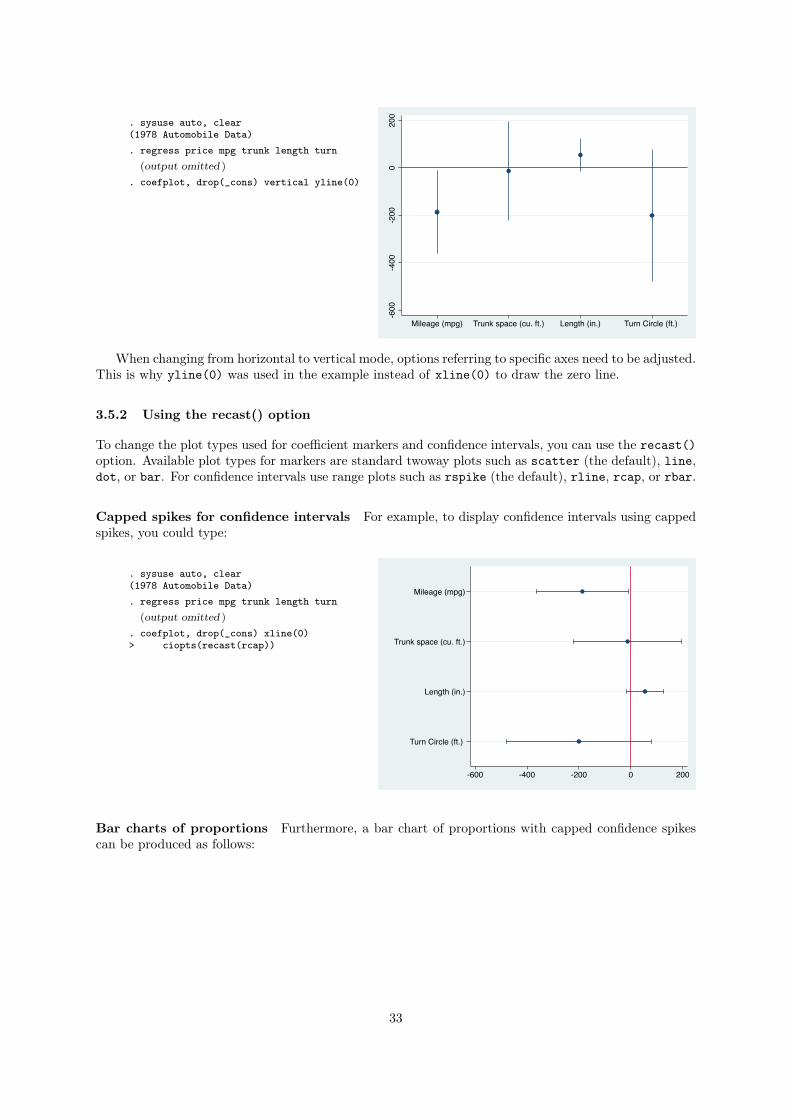
. sysuse auto, clear(1978 Automobile Data). regress price mpg trunk length turn
(output omitted )
. coefplot, drop(_cons) vertical yline(0)
-600
-400
-200
020
0
Mileage (mpg) Trunk space (cu. ft.) Length (in.) Turn Circle (ft.)
When changing from horizontal to vertical mode, options referring to specific axes need to be adjusted.
This is why yline(0) was used in the example instead of xline(0) to draw the zero line.
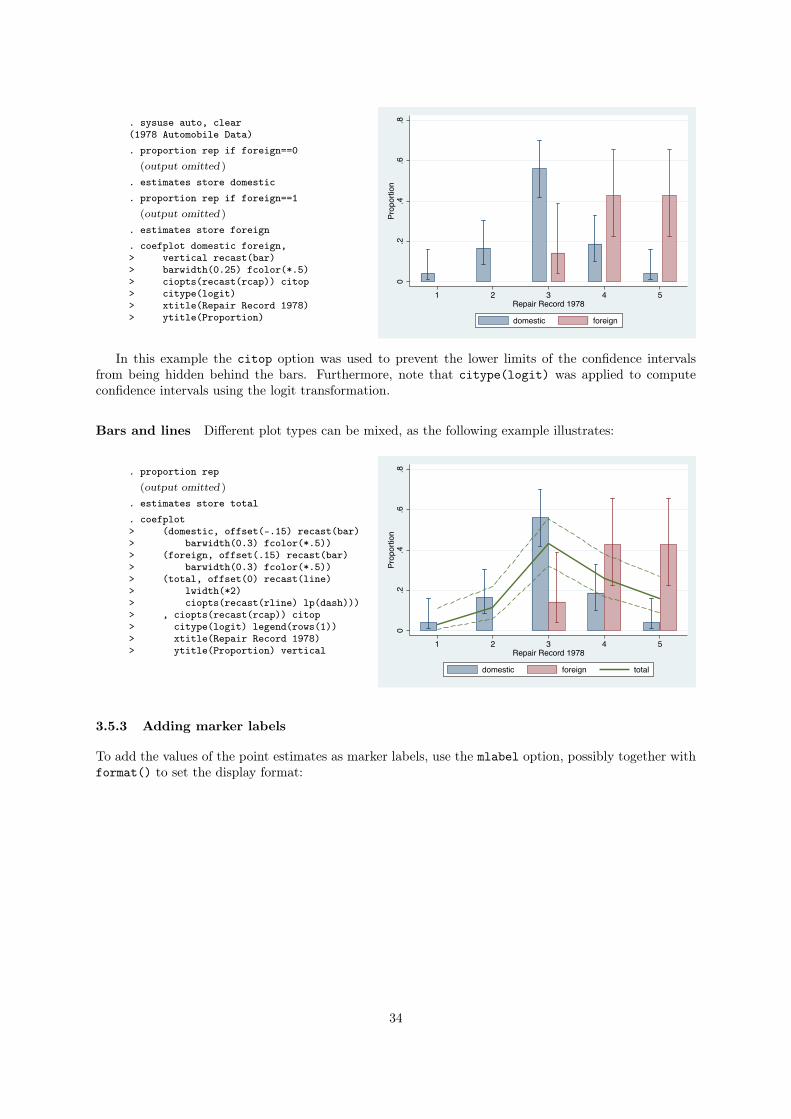
3.5.2 Using the recast() option
To change the plot types used for coefficient markers and confidence intervals, you can use the recast()
option. Available plot types for markers are standard twoway plots such as scatter (the default), line,
dot, or bar. For confidence intervals use range plots such as rspike (the default), rline, rcap, or rbar.
Capped spikes for confidence intervals For example, to display confidence intervals using capped
spikes, you could type:
. sysuse auto, clear(1978 Automobile Data). regress price mpg trunk length turn
(output omitted )
. coefplot, drop(_cons) xline(0)> ciopts(recast(rcap))
Mileage (mpg)
Trunk space (cu. ft.)
Length (in.)
Turn Circle (ft.)
-600 -400 -200 0 200
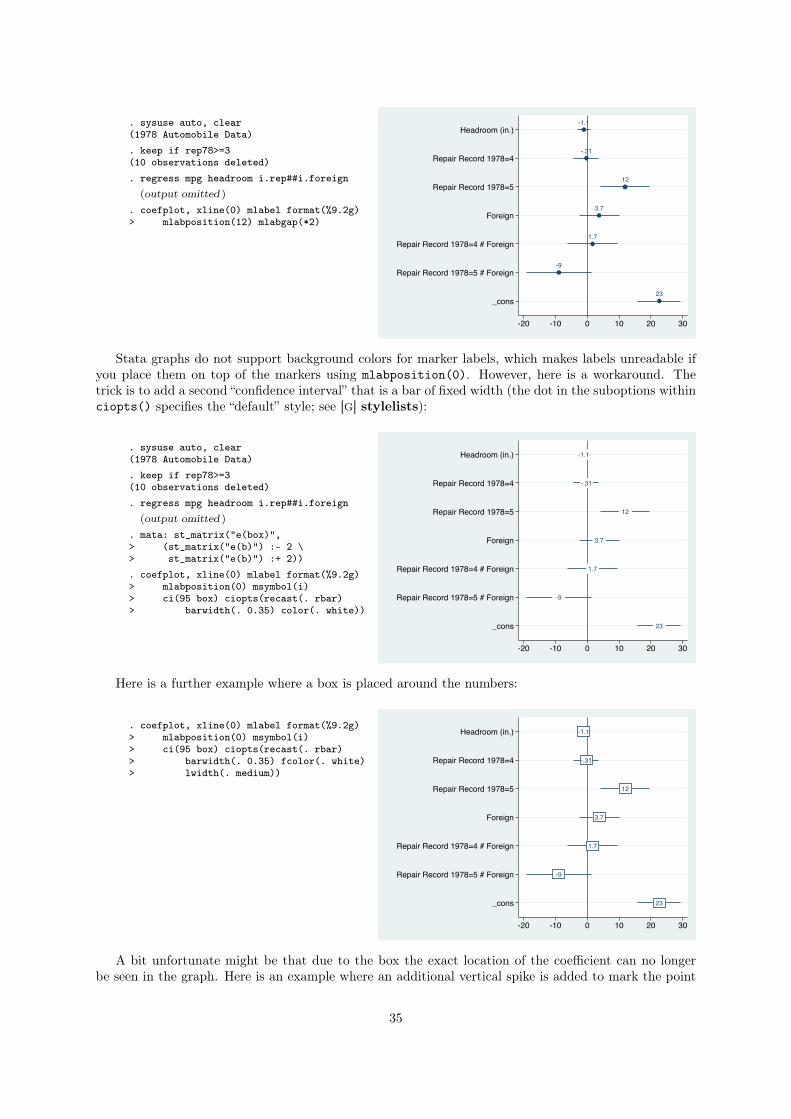
Bar charts of proportions Furthermore, a bar chart of proportions with capped confidence spikes
can be produced as follows:
33
. sysuse auto, clear(1978 Automobile Data). proportion rep if foreign==0
(output omitted )
. estimates store domestic
. proportion rep if foreign==1(output omitted )
. estimates store foreign
. coefplot domestic foreign,> vertical recast(bar)> barwidth(0.25) fcolor(*.5)> ciopts(recast(rcap)) citop> citype(logit)> xtitle(Repair Record 1978)> ytitle(Proportion)
0.2
.4.6
.8Pr
opor
tion
1 2 3 4 5Repair Record 1978
domestic foreign
In this example the citop option was used to prevent the lower limits of the confidence intervals
from being hidden behind the bars. Furthermore, note that citype(logit) was applied to compute
confidence intervals using the logit transformation.
Bars and lines Different plot types can be mixed, as the following example illustrates:
. proportion rep(output omitted )
. estimates store total
. coefplot> (domestic, offset(-.15) recast(bar)> barwidth(0.3) fcolor(*.5))> (foreign, offset(.15) recast(bar)> barwidth(0.3) fcolor(*.5))> (total, offset(0) recast(line)> lwidth(*2)> ciopts(recast(rline) lp(dash)))> , ciopts(recast(rcap)) citop> citype(logit) legend(rows(1))> xtitle(Repair Record 1978)> ytitle(Proportion) vertical
0.2
.4.6
.8Pr
opor
tion
1 2 3 4 5Repair Record 1978
domestic foreign total
3.5.3 Adding marker labels
To add the values of the point estimates as marker labels, use the mlabel option, possibly together with
format() to set the display format:
34
. sysuse auto, clear(1978 Automobile Data). keep if rep78>=3(10 observations deleted). regress mpg headroom i.rep##i.foreign
(output omitted )
. coefplot, xline(0) mlabel format(%9.2g)> mlabposition(12) mlabgap(*2)
-1.1
-.31
12
3.7
1.7
-9
23
Headroom (in.)
Repair Record 1978=4
Repair Record 1978=5
Foreign
Repair Record 1978=4 # Foreign
Repair Record 1978=5 # Foreign
_cons
-20 -10 0 10 20 30
Stata graphs do not support background colors for marker labels, which makes labels unreadable if
you place them on top of the markers using mlabposition(0). However, here is a workaround. The
trick is to add a second “confidence interval” that is a bar of fixed width (the dot in the suboptions within
ciopts() specifies the “default” style; see [G] stylelists):
. sysuse auto, clear(1978 Automobile Data). keep if rep78>=3(10 observations deleted). regress mpg headroom i.rep##i.foreign
(output omitted )
. mata: st_matrix("e(box)",> (st_matrix("e(b)") :- 2 \> st_matrix("e(b)") :+ 2)). coefplot, xline(0) mlabel format(%9.2g)> mlabposition(0) msymbol(i)> ci(95 box) ciopts(recast(. rbar)> barwidth(. 0.35) color(. white))
-1.1
-.31
12
3.7
1.7
-9
23
Headroom (in.)
Repair Record 1978=4
Repair Record 1978=5
Foreign
Repair Record 1978=4 # Foreign
Repair Record 1978=5 # Foreign
_cons
-20 -10 0 10 20 30
Here is a further example where a box is placed around the numbers:
. coefplot, xline(0) mlabel format(%9.2g)> mlabposition(0) msymbol(i)> ci(95 box) ciopts(recast(. rbar)> barwidth(. 0.35) fcolor(. white)> lwidth(. medium))
-1.1
-.31
12
3.7
1.7
-9
23
Headroom (in.)
Repair Record 1978=4
Repair Record 1978=5
Foreign
Repair Record 1978=4 # Foreign
Repair Record 1978=5 # Foreign
_cons
-20 -10 0 10 20 30
A bit unfortunate might be that due to the box the exact location of the coefficient can no longer
be seen in the graph. Here is an example where an additional vertical spike is added to mark the point
35
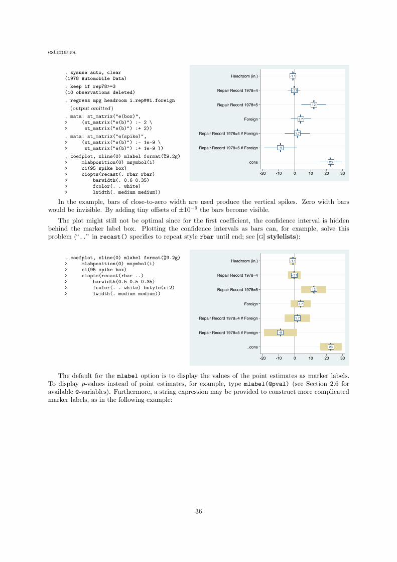
estimates.
. sysuse auto, clear(1978 Automobile Data). keep if rep78>=3(10 observations deleted). regress mpg headroom i.rep##i.foreign
(output omitted )
. mata: st_matrix("e(box)",> (st_matrix("e(b)") :- 2 \> st_matrix("e(b)") :+ 2)). mata: st_matrix("e(spike)",> (st_matrix("e(b)") :- 1e-9 \> st_matrix("e(b)") :+ 1e-9 )). coefplot, xline(0) mlabel format(%9.2g)> mlabposition(0) msymbol(i)> ci(95 spike box)> ciopts(recast(. rbar rbar)> barwidth(. 0.6 0.35)> fcolor(. . white)> lwidth(. medium medium))
-1.1
-.31
12
3.7
1.7
-9
23
Headroom (in.)
Repair Record 1978=4
Repair Record 1978=5
Foreign
Repair Record 1978=4 # Foreign
Repair Record 1978=5 # Foreign
_cons
-20 -10 0 10 20 30
In the example, bars of close-to-zero width are used produce the vertical spikes. Zero width bars
would be invisible. By adding tiny offsets of ±10�9the bars become visible.
The plot might still not be optimal since for the first coefficient, the confidence interval is hidden
behind the marker label box. Plotting the confidence intervals as bars can, for example, solve this
problem (“..” in recast() specifies to repeat style rbar until end; see [G] stylelists):
. coefplot, xline(0) mlabel format(%9.2g)> mlabposition(0) msymbol(i)> ci(95 spike box)> ciopts(recast(rbar ..)> barwidth(0.5 0.5 0.35)> fcolor(. . white) bstyle(ci2)> lwidth(. medium medium))
-1.1
-.31
12
3.7
1.7
-9
23
Headroom (in.)
Repair Record 1978=4
Repair Record 1978=5
Foreign
Repair Record 1978=4 # Foreign
Repair Record 1978=5 # Foreign
_cons
-20 -10 0 10 20 30
The default for the mlabel option is to display the values of the point estimates as marker labels.
To display p-values instead of point estimates, for example, type mlabel(@pval) (see Section 2.6 for
available @-variables). Furthermore, a string expression may be provided to construct more complicated
marker labels, as in the following example:
36
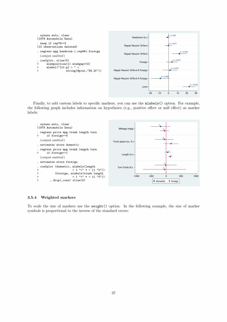
. sysuse auto, clear(1978 Automobile Data). keep if rep78>=3(10 observations deleted). regress mpg headroom i.rep##i.foreign
(output omitted )
. coefplot, xline(0)> mlabposition(1) mlabgap(*2)> mlabel("{it:p} = " +> string(@pval,"%9.3f"))
p = 0.262
p = 0.877
p = 0.003
p = 0.244
p = 0.673
p = 0.086
p = 0.000
Headroom (in.)
Repair Record 1978=4
Repair Record 1978=5
Foreign
Repair Record 1978=4 # Foreign
Repair Record 1978=5 # Foreign
_cons
-20 -10 0 10 20 30
Finally, to add custom labels to specific markers, you can use the mlabels() option. For example,
the following graph includes information on hypotheses (e.g., positive effect or null effect) as marker
labels:
. sysuse auto, clear(1978 Automobile Data). regress price mpg trunk length turn> if foreign==0
(output omitted )
. estimates store domestic
. regress price mpg trunk length turn> if foreign==1
(output omitted )
. estimates store foreign
. coefplot (domestic, mlabels(length> = 1 "+" * = 11 "0"))> (foreign, mlabels(trunk length> = 1 "+" * = 11 "0"))> , drop(_cons) xline(0)
0
0
+
0
0
+
+
0
Mileage (mpg)
Trunk space (cu. ft.)
Length (in.)
Turn Circle (ft.)
-1000 -500 0 500 1000
domestic foreign
3.5.4 Weighted markers
To scale the size of markers use the weight() option. In the following example, the size of marker
symbols is proportional to the inverse of the standard errors:
37
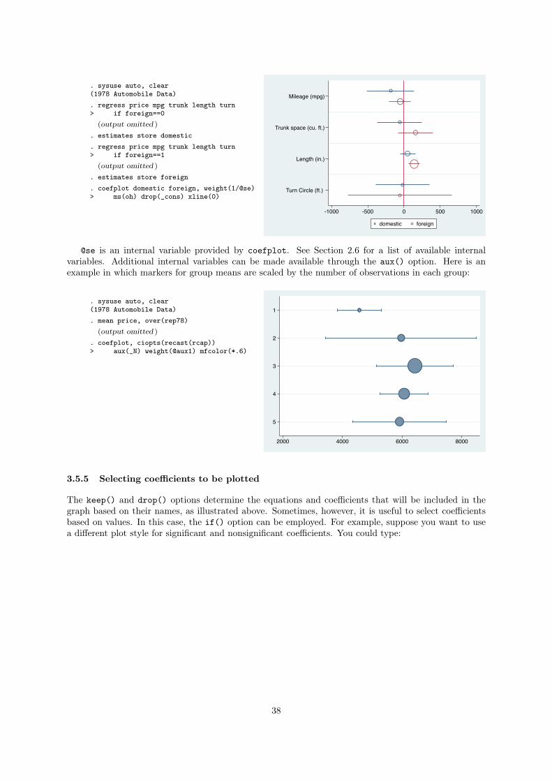
. sysuse auto, clear(1978 Automobile Data). regress price mpg trunk length turn> if foreign==0
(output omitted )
. estimates store domestic
. regress price mpg trunk length turn> if foreign==1
(output omitted )
. estimates store foreign
. coefplot domestic foreign, weight(1/@se)> ms(oh) drop(_cons) xline(0)
Mileage (mpg)
Trunk space (cu. ft.)
Length (in.)
Turn Circle (ft.)
-1000 -500 0 500 1000
domestic foreign
@se is an internal variable provided by coefplot. See Section 2.6 for a list of available internal
variables. Additional internal variables can be made available through the aux() option. Here is an
example in which markers for group means are scaled by the number of observations in each group:
. sysuse auto, clear(1978 Automobile Data). mean price, over(rep78)
(output omitted )
. coefplot, ciopts(recast(rcap))> aux(_N) weight(@aux1) mfcolor(*.6)
1
2
3
4
5
2000 4000 6000 8000
3.5.5 Selecting coefficients to be plotted
The keep() and drop() options determine the equations and coefficients that will be included in the
graph based on their names, as illustrated above. Sometimes, however, it is useful to select coefficients
based on values. In this case, the if() option can be employed. For example, suppose you want to use
a different plot style for significant and nonsignificant coefficients. You could type:
38
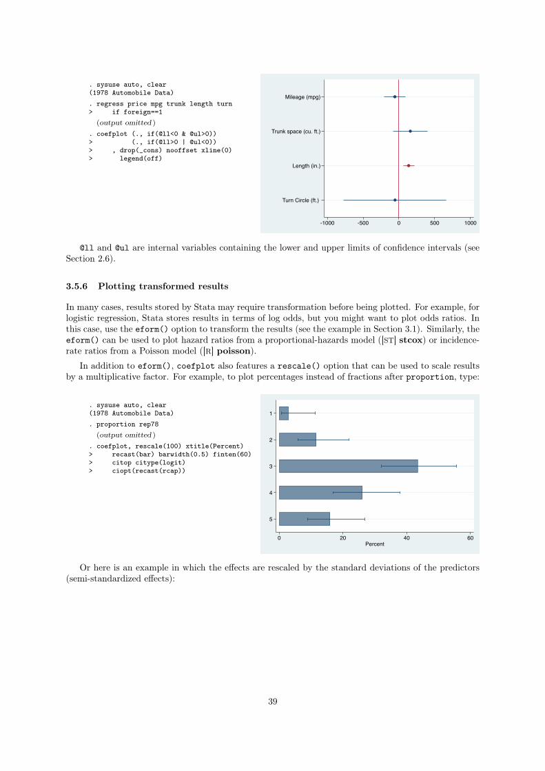
. sysuse auto, clear(1978 Automobile Data). regress price mpg trunk length turn> if foreign==1
(output omitted )
. coefplot (., if(@ll<0 & @ul>0))> (., if(@ll>0 | @ul<0))> , drop(_cons) nooffset xline(0)> legend(off)
Mileage (mpg)
Trunk space (cu. ft.)
Length (in.)
Turn Circle (ft.)
-1000 -500 0 500 1000
@ll and @ul are internal variables containing the lower and upper limits of confidence intervals (see
Section 2.6).
3.5.6 Plotting transformed results
In many cases, results stored by Stata may require transformation before being plotted. For example, for
logistic regression, Stata stores results in terms of log odds, but you might want to plot odds ratios. In
this case, use the eform() option to transform the results (see the example in Section 3.1). Similarly, the
eform() can be used to plot hazard ratios from a proportional-hazards model ([ST] stcox) or incidence-
rate ratios from a Poisson model ([R] poisson).
In addition to eform(), coefplot also features a rescale() option that can be used to scale results
by a multiplicative factor. For example, to plot percentages instead of fractions after proportion, type:
. sysuse auto, clear(1978 Automobile Data). proportion rep78
(output omitted )
. coefplot, rescale(100) xtitle(Percent)> recast(bar) barwidth(0.5) finten(60)> citop citype(logit)> ciopt(recast(rcap))
1
2
3
4
5
0 20 40 60Percent
Or here is an example in which the effects are rescaled by the standard deviations of the predictors
(semi-standardized effects):
39
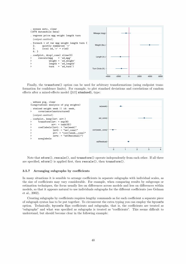
. sysuse auto, clear(1978 Automobile Data). regress price mpg weight length turn
(output omitted )
. foreach v of var mpg weight length turn {2. quietly summarize `v'3. local sd_`v' = r(sd)4. }
. coefplot, drop(_cons) xline(0)> rescale(mpg = `sd_mpg'> weight = `sd_weight'> length = `sd_length'> turn = `sd_turn')
Mileage (mpg)
Weight (lbs.)
Length (in.)
Turn Circle (ft.)
-4000 -2000 0 2000 4000 6000
Finally, the transform() option can be used for arbitrary transformations (using endpoint trans-
formation for confidence limits). For example, to plot standard deviations and correlations of random
effects after a mixed-effects model ([XT] xtmixed), type:
. webuse pig, clear(Longitudinal analysis of pig weights). xtmixed weight week || id: week,> covariance(unstructured)
(output omitted )
. coefplot, keep(ln*: at*:)> transform(ln*: = exp(@)> at*: = tanh(@))> coeflabels(ln*1: = "se(week)"> ln*2: = "se(_cons)"> at*: = "corr(week,_cons)"> ln*e: = "sd(Residual)")> noeqlabels
se(week)
se(_cons)
corr(week,_cons)
sd(Residual)
0 1 2 3 4
Note that eform(), rescale(), and transform() operate independently from each other. If all three
are specified, eform() is applied first, then rescale(), then transform().
3.5.7 Arranging subgraphs by coefficients
In many situations it is sensible to arrange coefficients in separate subgraphs with individual scales, as
the size of coefficients may vary considerable. For example, when comparing results by subgroups or
estimation techniques, the focus usually lies on differences across models and less on differences within
models, so that it appears natural to use individuals subgraphs for the different coefficients (see Gelman
et al., 2002).
Creating subgraphs by coefficients requires lengthy commands as for each coefficient a separate piece
of subgraph syntax has to be put together. To circumvent the extra typing you can employ the bycoefs
option. Technically, bycoefs flips coefficients and subgraphs, that is, the coefficients are treated as
“subgraphs” and what was specified as subgraphs is treated as “coefficients”. This seems difficult to
understand, but should become clear in the following example:
40
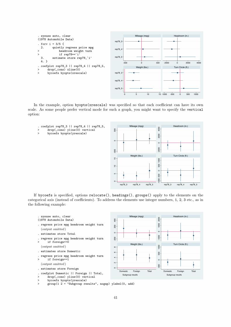
. sysuse auto, clear(1978 Automobile Data). forv i = 3/5 {
2. quietly regress price mpg> headroom weight turn> if rep78==`i'
3. estimate store rep78_`i'4. }
. coefplot rep78_3 || rep78_4 || rep78_5,> drop(_cons) xline(0)> bycoefs byopts(xrescale)
rep78_3
rep78_4
rep78_5
rep78_3
rep78_4
rep78_5
-500 0 500 -2000 0 2000 4000
0 5 10 15 -1000 -500 0 500 1000
Mileage (mpg) Headroom (in.)
Weight (lbs.) Turn Circle (ft.)
In the example, option byopts(xrescale) was specified so that each coefficient can have its own
scale. As some people prefer vertical mode for such a graph, you might want to specify the vertical
option:
. coefplot rep78_3 || rep78_4 || rep78_5,> drop(_cons) yline(0) vertical> bycoefs byopts(yrescale)
-500
050
0
-200
00
2000
4000
05
1015
-100
0-5
000
500
1000
rep78_3 rep78_4 rep78_5 rep78_3 rep78_4 rep78_5
Mileage (mpg) Headroom (in.)
Weight (lbs.) Turn Circle (ft.)
If bycoefs is specified, options relocate(), headings(), groups() apply to the elements on the
categorical axis (instead of coefficients). To address the elements use integer numbers, 1, 2, 3 etc., as in
the following example:
. sysuse auto, clear(1978 Automobile Data). regress price mpg headroom weight turn
(output omitted )
. estimates store Total
. regress price mpg headroom weight turn> if foreign==0
(output omitted )
. estimates store Domestic
. regress price mpg headroom weight turn> if foreign==1
(output omitted )
. estimates store Foreign
. coefplot Domestic || Foreign || Total,> drop(_cons) yline(0) vertical> bycoefs byopts(yrescale)> group(1 2 = "Subgroup results", nogap) ylabel(0, add)
-200
200
400
0
-100
010
0020
000
24
68
0 -500
500
1000
0
Subgroup results Subgroup results
Domestic Foreign Total Domestic Foreign Total
Mileage (mpg) Headroom (in.)
Weight (lbs.) Turn Circle (ft.)
41
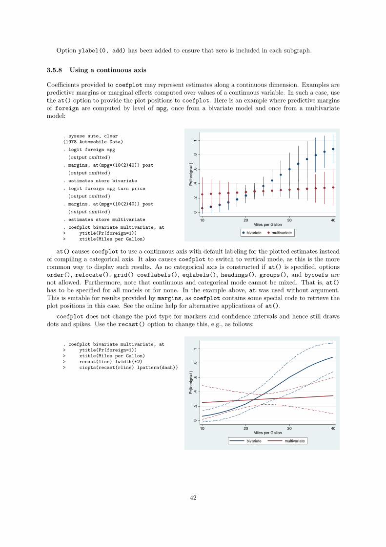
Option ylabel(0, add) has been added to ensure that zero is included in each subgraph.
3.5.8 Using a continuous axis
Coefficients provided to coefplot may represent estimates along a continuous dimension. Examples are
predictive margins or marginal effects computed over values of a continuous variable. In such a case, use
the at() option to provide the plot positions to coefplot. Here is an example where predictive margins
of foreign are computed by level of mpg, once from a bivariate model and once from a multivariate
model:
. sysuse auto, clear(1978 Automobile Data). logit foreign mpg
(output omitted )
. margins, at(mpg=(10(2)40)) post(output omitted )
. estimates store bivariate
. logit foreign mpg turn price(output omitted )
. margins, at(mpg=(10(2)40)) post(output omitted )
. estimates store multivariate
. coefplot bivariate multivariate, at> ytitle(Pr(foreign=1))> xtitle(Miles per Gallon)
0.2
.4.6
.81
Pr(fo
reig
n=1)
10 20 30 40Miles per Gallon
bivariate multivariate
at() causes coefplot to use a continuous axis with default labeling for the plotted estimates instead
of compiling a categorical axis. It also causes coefplot to switch to vertical mode, as this is the more
common way to display such results. As no categorical axis is constructed if at() is specified, options
order(), relocate(), grid() coeflabels(), eqlabels(), headings(), groups(), and bycoefs are
not allowed. Furthermore, note that continuous and categorical mode cannot be mixed. That is, at()
has to be specified for all models or for none. In the example above, at was used without argument.
This is suitable for results provided by margins, as coefplot contains some special code to retrieve the
plot positions in this case. See the online help for alternative applications of at().
coefplot does not change the plot type for markers and confidence intervals and hence still draws
dots and spikes. Use the recast() option to change this, e.g., as follows:
. coefplot bivariate multivariate, at> ytitle(Pr(foreign=1))> xtitle(Miles per Gallon)> recast(line) lwidth(*2)> ciopts(recast(rline) lpattern(dash))
0.2
.4.6
.81
Pr(fo
reig
n=1)
10 20 30 40Miles per Gallon
bivariate multivariate
42
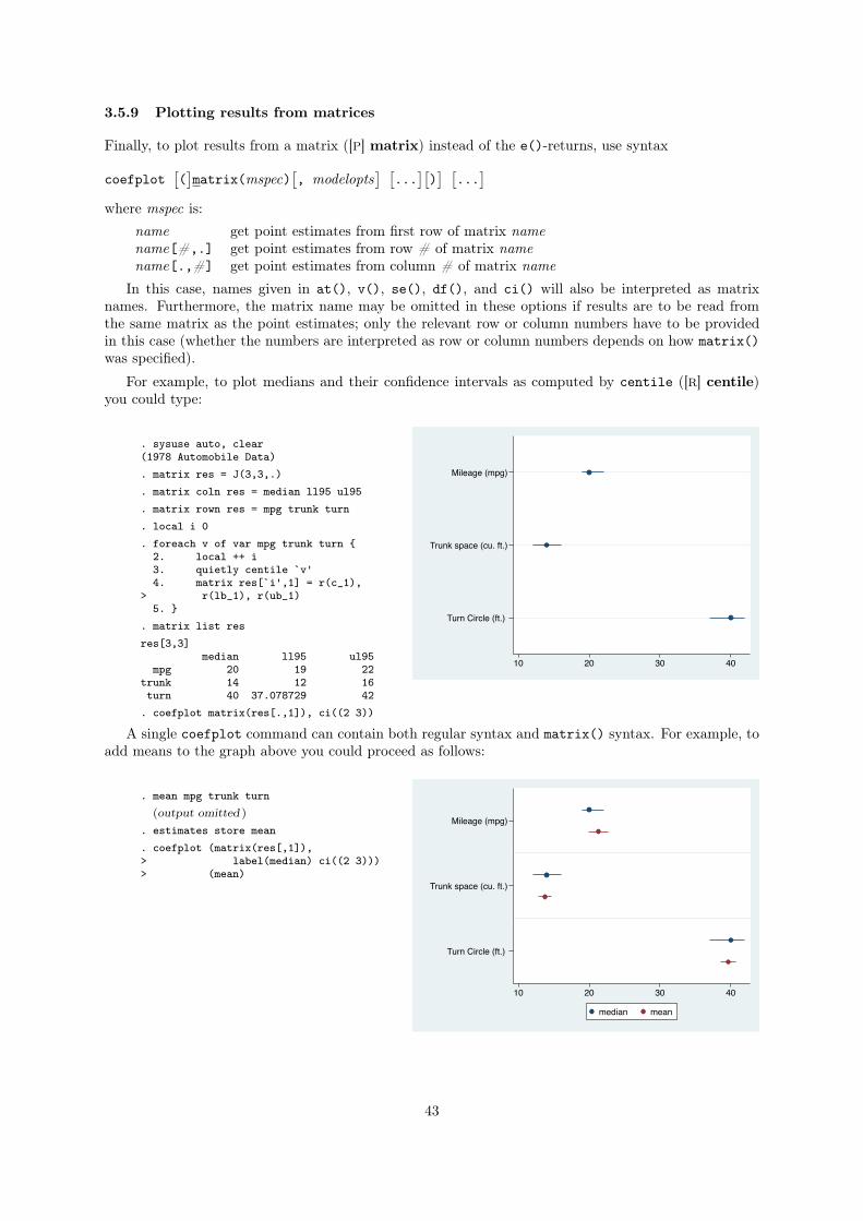
3.5.9 Plotting results from matrices
Finally, to plot results from a matrix ([P] matrix) instead of the e()-returns, use syntax
coefplot
⇥(
⇤matrix(mspec)
⇥, modelopts
⇤ ⇥...
⇤⇥)
⇤ ⇥...
⇤
where mspec is:
name get point estimates from first row of matrix name
name[#,.] get point estimates from row # of matrix name
name[.,#] get point estimates from column # of matrix name
In this case, names given in at(), v(), se(), df(), and ci() will also be interpreted as matrix
names. Furthermore, the matrix name may be omitted in these options if results are to be read from
the same matrix as the point estimates; only the relevant row or column numbers have to be provided
in this case (whether the numbers are interpreted as row or column numbers depends on how matrix()
was specified).
For example, to plot medians and their confidence intervals as computed by centile ([R] centile)
you could type:
. sysuse auto, clear(1978 Automobile Data). matrix res = J(3,3,.). matrix coln res = median ll95 ul95. matrix rown res = mpg trunk turn. local i 0. foreach v of var mpg trunk turn {
2. local ++ i3. quietly centile `v'4. matrix res[`i',1] = r(c_1),
> r(lb_1), r(ub_1)5. }
. matrix list resres[3,3]
median ll95 ul95mpg 20 19 22
trunk 14 12 16turn 40 37.078729 42
. coefplot matrix(res[.,1]), ci((2 3))
Mileage (mpg)
Trunk space (cu. ft.)
Turn Circle (ft.)
10 20 30 40
A single coefplot command can contain both regular syntax and matrix() syntax. For example, to
add means to the graph above you could proceed as follows:
. mean mpg trunk turn(output omitted )
. estimates store mean
. coefplot (matrix(res[,1]),> label(median) ci((2 3)))> (mean)
Mileage (mpg)
Trunk space (cu. ft.)
Turn Circle (ft.)
10 20 30 40
median mean
43
References
Chambers, J. M., W. S. Cleveland, B. Kleiner, and P. A. Tukey. 1983. Graphical Methods for Data
Analysis. Belmont, CA: Wadsworth.
Chapin, F. S. 1924. The Statistical Definition of a Societal Variable. American Journal of Sociology
30(2): 154–171.
Cleveland, W. S. 1993. Visualizing Data. Murray Hill, NJ: AT&T Bell Laboratories.
———. 1994. The Elements of Graphing Data. Revised edition ed. Murray Hill, NJ: AT&T Bell
Laboratories.
Cleveland, W. S., and R. McGill. 1985. Graphical Perception and Graphical Methods for Analyzing
Scientific Data. Science 299(4716): 828–833.
Dice, L. R., and H. J. Leraas. 1936. A graphic method for comparing several sets of measurements.
Contributions from the Laboratory of Vertebrate Genetics (3): 1–3.
Gallup, J. L. 2012. A new system for formatting estimation tables. The Stata Journal 12(1): 3–28.
Gelman, A., C. Pasarica, and R. Dodhia. 2002. Let’s Practice What We Preach. The American Statis-
tician 56(2): 121–130.
Harrell, F. E., Jr. 2001. Regression Modeling Strategies. With Applications to Linear Models, Logistic
Regression, and Survival Analysis. New York: Springer.
Healy, K., and J. Moody. 2014. Data Visualization in Sociology. Annual Review of Sociology 40: 105–128.
Jacoby, W. G. 1997. Statistical Graphics for Univariate and Bivariate Data. Thousand Oaks, CA: Sage.
Jann, B. 2004. CENTER: Stata module to center (or standardize) variables. Statistical Software Com-
ponents S4444102, Boston College Department of Economics.
———. 2007. Making regression tables simplified. The Stata Journal 7(2): 227–244.
Kastellec, J. P., and E. L. Leoni. 2007. Using Graphs Instead of Tables in Political Science. Perspectives
on Politics 5(4): 755–771.
Lewandowsky, S., and I. Spence. 1989. The Perception of Statistical Graphs. Sociological Methods &
Research 18(2 & 3): 200–242.
Newson, R. 2003. Confidence intervals and p-values for delivery to the end user. The Stata Journal 3(3):
245–269.
Student. 1927. Errors of Routine Analysis. Biometrika 19(1/2): 151–164.
Tufte, E. R. 1983. The Visual Display of Quantitative Information. Cheshire, CT: Graphics Press.
Wainer, H. 1997. Visual revelations. Graphical Tales of Fate and Deception from Napoleon Bonaparte to
Ross Perot. New York: Copernicus.
44