Embed Size (px)
Citation preview
Copyright © 2007 Stephen Few, Perceptual Edge Page 1 of 19
FYI VisualThe Story of a Product that was Built on a Fault
Stephen Few, Perceptual EdgeVisual Business Intelligence Newsletter
June 2007
perceptualedge
This is a story about three men and a software product named FYI Visual. This story is true. Like all the best stories, there is a moral to this one: good intentions do not guarantee good results. The three men are a physician who dreams of solving an important problem, a CEO who strives to make a software company successful, and an Associate Professor, who lends his academic credentials to support them.
This story tells of an attempt to solve a critical problem that affects the lives of many, which fails because of inexpert design and misdirected research. Failure isn’t always recognized, however, when dreams and passions are involved. In this case, failure didn’t stop the development of a commercial software product that is being used by the U.S. military and others, nor has it stopped FYI Corporation from attempting for years to sell into the business intelligence market. This attempt continues today, which is one of the reasons why I’m telling this story.
Actually, I am telling this story for several reasons. First, I want to warn potential buyers against a product that does not work. Perhaps more importantly, however, I want to illustrate the kind of critique to which all software products ought to be subjected to test their claims and confi rm their effectiveness. And fi nally, I want to encourage everyone who dreams of developing a product to solve real problems to do their homework and build on a solid foun-dation. This is a tragic story, which in telling, I hope to dissuade others from repeating.
First, Some BackgroundI fi rst heard about FYI Visual two years ago when I was told that the company FYI Corpora-tion would be sponsoring a webcast that I was scheduled to do for DM Review magazine. It’s important to me that any software company with which I’m associated, even in this casual way, exhibit the effective data visualization practices that I teach. With this concern in mind, I immediately visited the website of FYI Corporation to learn about my proposed sponsor. I quickly learned that FYI Visual encodes data in the form of glyphs. In the fi eld of information visualization, a glyph is “a graphical object designed to convey multiple data values” (Dr. Colin Ware, Information Visualization: Perception for Design). Different parts or visual at-tributes of an object each encode a different value. For instance, if the glyph encodes patient health information, its parts or attributes might display such values as age, weight, blood pressure, body temperature, resting heart rate, blood sugar level, and so on. If you wish to identify multivariate patterns among a collection of patients, in theory you could use glyphs, one for each patient, to examine similarities and differences among them, or to look for
“Good intentions do not guarantee good results.”
Copyright © 2007 Stephen Few, Perceptual Edge Page 2 of 19
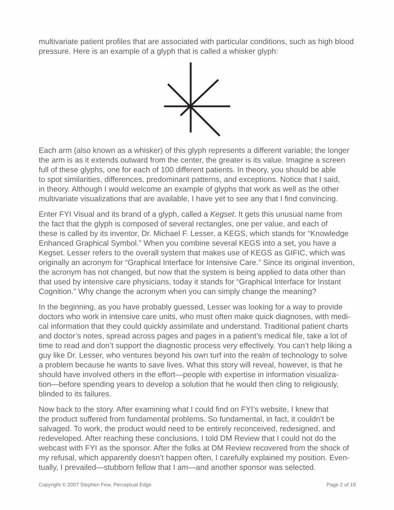
multivariate patient profi les that are associated with particular conditions, such as high blood pressure. Here is an example of a glyph that is called a whisker glyph:
Each arm (also known as a whisker) of this glyph represents a different variable; the longer the arm is as it extends outward from the center, the greater is its value. Imagine a screen full of these glyphs, one for each of 100 different patients. In theory, you should be able to spot similarities, differences, predominant patterns, and exceptions. Notice that I said, in theory. Although I would welcome an example of glyphs that work as well as the other multivariate visualizations that are available, I have yet to see any that I fi nd convincing.
Enter FYI Visual and its brand of a glyph, called a Kegset. It gets this unusual name from the fact that the glyph is composed of several rectangles, one per value, and each of these is called by its inventor, Dr. Michael F. Lesser, a KEGS, which stands for “Knowledge Enhanced Graphical Symbol.” When you combine several KEGS into a set, you have a Kegset. Lesser refers to the overall system that makes use of KEGS as GIFIC, which was originally an acronym for “Graphical Interface for Intensive Care.” Since its original invention, the acronym has not changed, but now that the system is being applied to data other than that used by intensive care physicians, today it stands for “Graphical Interface for Instant Cognition.” Why change the acronym when you can simply change the meaning?
In the beginning, as you have probably guessed, Lesser was looking for a way to provide doctors who work in intensive care units, who must often make quick diagnoses, with medi-cal information that they could quickly assimilate and understand. Traditional patient charts and doctor’s notes, spread across pages and pages in a patient’s medical fi le, take a lot of time to read and don’t support the diagnostic process very effectively. You can’t help liking a guy like Dr. Lesser, who ventures beyond his own turf into the realm of technology to solve a problem because he wants to save lives. What this story will reveal, however, is that he should have involved others in the effort—people with expertise in information visualiza-tion—before spending years to develop a solution that he would then cling to religiously, blinded to its failures.
Now back to the story. After examining what I could fi nd on FYI’s website, I knew that the product suffered from fundamental problems. So fundamental, in fact, it couldn’t be salvaged. To work, the product would need to be entirely reconceived, redesigned, and redeveloped. After reaching these conclusions, I told DM Review that I could not do the webcast with FYI as the sponsor. After the folks at DM Review recovered from the shock of my refusal, which apparently doesn’t happen often, I carefully explained my position. Even-tually, I prevailed—stubborn fellow that I am—and another sponsor was selected.
Copyright © 2007 Stephen Few, Perceptual Edge Page 3 of 19
Not long afterwards, I was once again reminded of FYI when I received a request from Intelligent Enterprise magazine to review the product for publication. FYI had contacted Intelligent Enterprise and requested the review.
While preparing for the review, this time I examined the product more thoroughly, based on a briefi ng by FYI, a review of their literature, and conversations with some of their customers. As you can imagine, my review was not favorable, but Intelligent Enterprise did not demure. The article bore the title “Visual Detraction.”
A year or so after the review was published, I received a courteous email from Dr. Lesser, which began, “As the inventor of GIFIC (Graphical Interface for Information Cognition) and KEGS I was surprised by some parts of your analysis.” His next words contained what I took to be the heart of his message: “GIFIC is a true grammer [sic]...The true downside of GIFIC is not the visualization strategy, but rather the need for displays to be developed by domain experts that have a full understanding of the language/grammer.”
I wasn’t certain that GIFIC did not qualify as a language, despite my doubts that a linguist would support this claim, but I was sure that the “visualization strategy” was ill-conceived. I couldn’t ignore the blatant problems that I found in GIFIC displays, no matter who developed them. I responded to Dr. Lesser, attempting to match his courtesy, but made it clear that my concerns remained.
That was nearly a year ago. I thought I had heard the last of FYI, but their persistence to infi ltrate the business intelligence market recently brought them to my attention once again last month (May, 2007). Out of the blue, I received an email from a friend (who prefers to remain anonymous), who is a respected leader in business intelligence industry. Prior to contacting me, she received a request from Ron Powell of the Business Intelligence Network, asking if she might be interested in assisting Howard Murray, the new CEO of FYI Corporation. Apparently, Murray of FYI contacted Powell looking for help with the business intelligence market. To entice her interest, Powell assured my friend with the words, “FYI has developed an excellent data visualization product.” Publishers of industry periodicals, like Powell, sometimes judge the excellence of a product by how much advertising the vendor is willing to buy. Whether this was Powell’s motivation in this case, I can’t say for sure, but this is how it’s often done. Because my friend’s schedule was tight, she thought that I might be interested, and sent me an email to inquire.
Even though I declined the opportunity, my friend had mentioned my name to Howard Mur-ray of FYI, so he looked me up and contacted me directly. He found my earlier review of his product, which was written before he took over the company, and took the time to inquire about it. “I have read some of your material, specifi cally about FYI and wanted to chat with you about your current view.” I admire him for taking this step. Many CEOs in similar circum-stances would have simply put my name on their list of people to avoid and moved on. Here are excerpts from my response:
Copyright © 2007 Stephen Few, Perceptual Edge Page 4 of 19
Dear Howard,
As you’ve no doubt discovered from reading my review of FYI Visual, I believe that the core assumptions on which the product was built are faulty. I’m familiar with glyphs, the generic name for your Kegsets, and have seen no empirical evidence that they work. In fact, all of the evidence of which I’m aware suggests otherwise. When I originally spoke with [your predecessor] before writing the review, I was told that an independent study had been done, which demonstrated the effectiveness of FYI Vi-sual. I asked for and was promised a copy of that study, but even after sending many reminders, I never received it. Based on a quick glance at your website, it appears that the basic premise of the software has not changed, so my evaluation of its merits today remain the same as when I wrote the review. If you have any evidence that you think might lead me to reconsider, I would be happy to take a look.
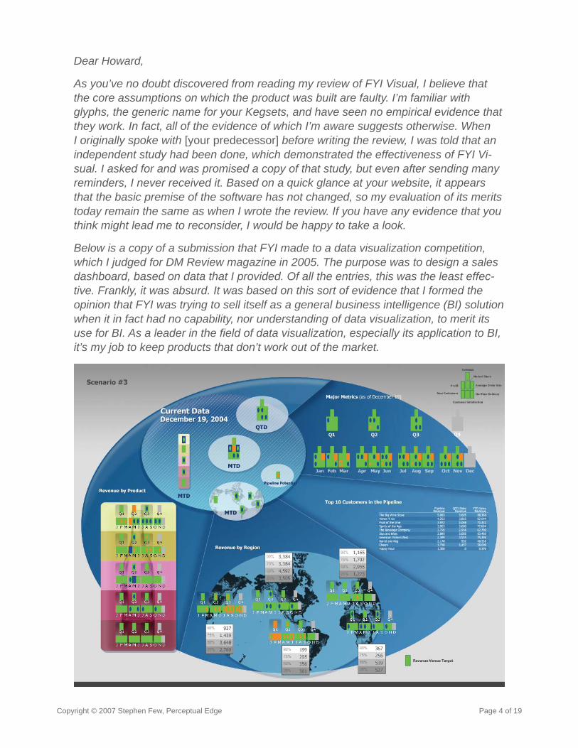
Below is a copy of a submission that FYI made to a data visualization competition, which I judged for DM Review magazine in 2005. The purpose was to design a sales dashboard, based on data that I provided. Of all the entries, this was the least effec-tive. Frankly, it was absurd. It was based on this sort of evidence that I formed the opinion that FYI was trying to sell itself as a general business intelligence (BI) solution when it in fact had no capability, nor understanding of data visualization, to merit its use for BI. As a leader in the fi eld of data visualization, especially its application to BI, it’s my job to keep products that don’t work out of the market.
Copyright © 2007 Stephen Few, Perceptual Edge Page 5 of 19
I know that these statements seem harsh, but they represent the truth as I understand it.
Sincerely,
Steve
As you can see, I didn’t pull any punches, despite the politeness of Howard’s inquiry about my opinion. As the CEO, who is the primary person responsible for this product’s impact on the world, I wanted Howard to hear the truth as I understood it in no uncertain terms. Throughout our correspondence, Howard never ceased to be thoughtful, courteous, profes-sional, and to my dismay, unfl appable. I guess it was unreasonable to think that I could convince him to remove FYI Visual from the market. Oh well, one can dream.
This pretty much brings us to the present, except for the content of several emails in the last few days that have gone back and forth between Howard Murray and me, and between me and the other major character in this story, Michael Workman, an Associate Professor at Florida State University. These remaining interactions dealt with the heart of the product, its origins, evidence (or lack thereof) of its effectiveness, its commercial success so far, and my evaluation of its merits.
Does FYI Visual Really Work?After I sent the email to Howard Murray reprinted above, he forwarded it to Michael Work-man, who Howard introduced as “Dr. Workman, who heads up our R&D.” Murray forwarded Workman’s response to me, and it was then that I learned of his association with Florida State University. Shortly into the email Workman made the following statement:
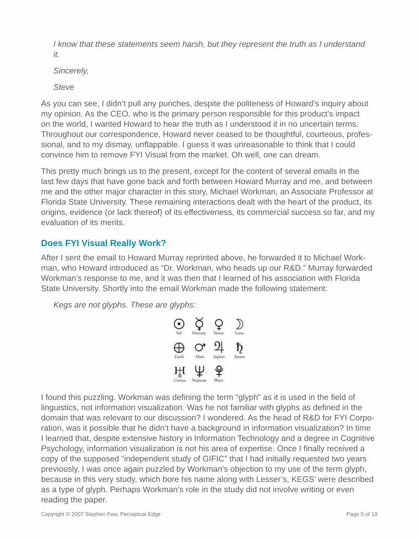
Kegs are not glyphs. These are glyphs:
I found this puzzling. Workman was defi ning the term “glyph” as it is used in the fi eld of linguistics, not information visualization. Was he not familiar with glyphs as defi ned in the domain that was relevant to our discussion? I wondered. As the head of R&D for FYI Corpo-ration, was it possible that he didn’t have a background in information visualization? In time I learned that, despite extensive history in Information Technology and a degree in Cognitive Psychology, information visualization is not his area of expertise. Once I fi nally received a copy of the supposed “independent study of GIFIC” that I had initially requested two years previously, I was once again puzzled by Workman’s objection to my use of the term glyph, because in this very study, which bore his name along with Lesser’s, KEGS’ were described as a type of glyph. Perhaps Workman’s role in the study did not involve writing or even reading the paper.
Copyright © 2007 Stephen Few, Perceptual Edge Page 6 of 19
What you might have noticed in what I described above is that the “independent study” was performed by the product’s inventor and the professor who later became the company’s head of R&D. Studies of this type are not usually called independent. To be fair to the folks currently at FYI, however, the people who described the study as independent no longer work at FYI. Both the old and the new guard of FYI claimed that the study demonstrates the effectiveness of FYI Visual. Let’s turn now to this question and consider the validity of this claim.
Does the Research Validate the Theory?I will begin by describing how the product works when used to present patient data to intensive care physicians, which was its original intention, and is still the primary focus of its inventor, Dr. Lesser. What follows is a synopsis of a research paper written by Dr. Lesser in 1997, entitled “GIFIC: A Graphical Interface for Intensive Care.”
Intensive care physicians and others who must review information under stress and make decisions based on their understanding of its implications must be able to consider “relation-ships among many variables (integrated tasks) as well as the values of individual variables (focused tasks).” He continues:
Very little importance has been placed on the presentation and display of the specifi c information which the physician needs to make decisions on an individual patient…Most modern intensive care units, despite using all sorts of sophisticated medical diagnostic technology, continue to used the standard patient chart and fl ow sheet…for information display…Performance can be improved by providing displays that allow the observer to utilize the more effi cient processes of memory, integration, and inference.
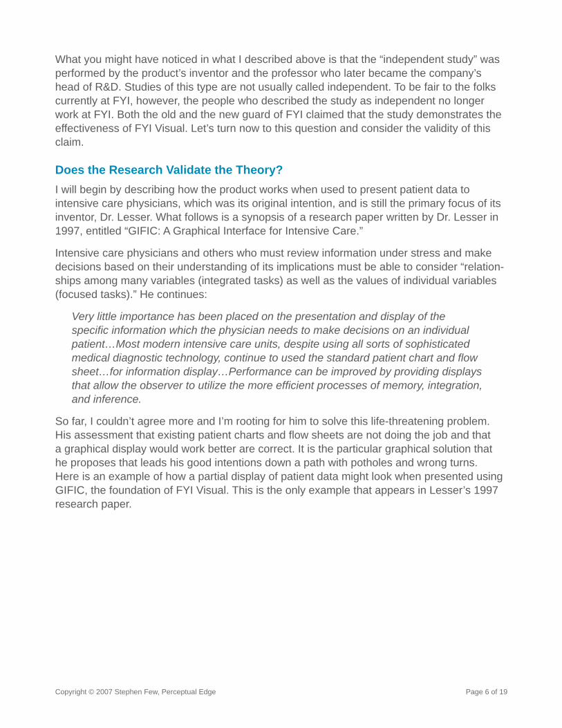
So far, I couldn’t agree more and I’m rooting for him to solve this life-threatening problem. His assessment that existing patient charts and fl ow sheets are not doing the job and that a graphical display would work better are correct. It is the particular graphical solution that he proposes that leads his good intentions down a path with potholes and wrong turns. Here is an example of how a partial display of patient data might look when presented using GIFIC, the foundation of FYI Visual. This is the only example that appears in Lesser’s 1997 research paper.
Copyright © 2007 Stephen Few, Perceptual Edge Page 7 of 19
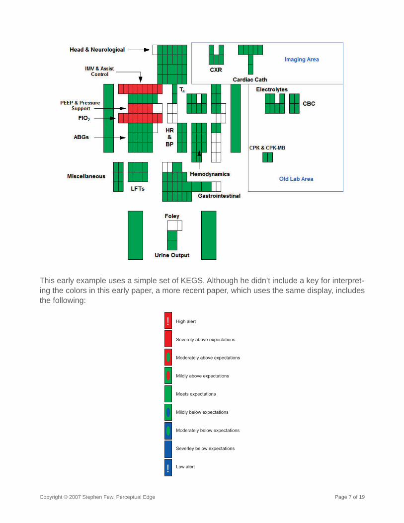
This early example uses a simple set of KEGS. Although he didn’t include a key for interpret-ing the colors in this early paper, a more recent paper, which uses the same display, includes the following:
!
!
Meets expectations
Mildly above expectations
Moderately above expectations
Severely above expectations
High alert
Mildly below expectations
Moderately below expectations
Severley below expectations
Low alert
Copyright © 2007 Stephen Few, Perceptual Edge Page 8 of 19
Based on this key, I assume that an actual display used by a physician would exhibit KEGS (rectangles) with a greater variety of colors. Some would appear as a solid color, others would include an oval of a different color within, and extreme values would include an excla-mation point. Unfortunately, neither research paper includes an example of an actual display that was used to test subjects. It is diffi cult to establish the merits of these studies without being able to examine the actual displays that were shown to the test subjects.
To describe the two tests that comprised the 1997 study, Lesser wrote:
After approximately 3 years of preliminary work (designing, writing and debugging software) as well as training data entry personnel, developing a routine for patient data entry, and a routine for reporting, two separate, but related studies of the GIFIC® display were completed. Both were performed in the same manner. The fi rst at-tempted to access the relative time, as compared to a standard chart and fl ow sheet, that it would take a physician, experienced in the GIFIC® language (the author) to review patient information using the GIFIC® printout. Accuracy and relative time were assessed by comparing performance to a similarly trained, board certifi ed intensivist who reviewed the standard chart and fl ow sheet in the usual manner. Both physi-cians were timed, and then had to answer a standardized questionnaire regarding diagnosis, physiologic abnormalities, level of illness, treatment plans, etc. regarding the patient. The questionnaires were then independently reviewed by a third, board certifi ed intensivist for accuracy scored on a scale of 1 to 10, without knowledge of which questionnaire was fi lled out by the “GIFIC” or “Chart” physician.
This initial study, with no controls and but a single physician (Lesser himself) reading and responding only to the GIFIC printouts and another single physician doing the same with the standard patient charts and fl ow sheets, probably was not meant to stand up to scrutiny. Each physician read and responded to 10 sets of patient data. Lesser reports that while use of standard patient records produced higher diagnostic accuracy (8.7 compared to 8.0 out of 10 for the GIFIC display), the mean time it took to review each patient’s data was 9:50 (minutes:seconds) for the standard records compared to 4:33 for the GIFIC display. In his concluding remarks, Lesser states “In a time where greater and greater demands are being placed on health care providers, development of technologies that enhance physician productivity, without decreasing their accuracy of assessment are essential.” Before com-menting on this outcome, because this initial study was at best exploratory in nature, let’s jump forward 10 years to the only other research study that has tested GIFIC, which was published this year (2007).
The recent study was published in the International Journal for Quality in Health Care Advance Access, March 8, 2007, with the title “An Exploratory Study of Cognitive Load in Diagnosing Patient Conditions.” In addition to the being published in a medical journal, this study bears two names besides Lesser’s: Michael Workman and Joonmin Kim of Florida State University. Besides the extra clout associated with publication in a journal and the involvement of academics, this study involved some controls (not enough however, as you’ll see) and more test subjects. Two studies were conducted: one involving 42 third and fourth year medical students to test “cognitive load,” and another involving three board-certifi ed expert intensivists trained in reading and interpreting KEGS. Two of the physicians evaluated
Copyright © 2007 Stephen Few, Perceptual Edge Page 9 of 19
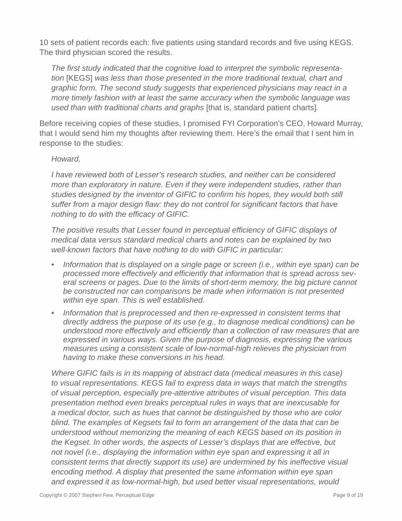
10 sets of patient records each: fi ve patients using standard records and fi ve using KEGS. The third physician scored the results.
The fi rst study indicated that the cognitive load to interpret the symbolic representa-tion [KEGS] was less than those presented in the more traditional textual, chart and graphic form. The second study suggests that experienced physicians may react in a more timely fashion with at least the same accuracy when the symbolic language was used than with traditional charts and graphs [that is, standard patient charts].
Before receiving copies of these studies, I promised FYI Corporation’s CEO, Howard Murray, that I would send him my thoughts after reviewing them. Here’s the email that I sent him in response to the studies:
Howard,
I have reviewed both of Lesser’s research studies, and neither can be considered more than exploratory in nature. Even if they were independent studies, rather than studies designed by the inventor of GIFIC to confi rm his hopes, they would both still suffer from a major design fl aw: they do not control for signifi cant factors that have nothing to do with the effi cacy of GIFIC.
The positive results that Lesser found in perceptual effi ciency of GIFIC displays of medical data versus standard medical charts and notes can be explained by two well-known factors that have nothing to do with GIFIC in particular:
Information that is displayed on a single page or screen (i.e., within eye span) can be processed more effectively and effi ciently that information that is spread across sev-eral screens or pages. Due to the limits of short-term memory, the big picture cannot be constructed nor can comparisons be made when information is not presented within eye span. This is well established. Information that is preprocessed and then re-expressed in consistent terms that directly address the purpose of its use (e.g., to diagnose medical conditions) can be understood more effectively and effi ciently than a collection of raw measures that are expressed in various ways. Given the purpose of diagnosis, expressing the various measures using a consistent scale of low-normal-high relieves the physician from having to make these conversions in his head.
Where GIFIC fails is in its mapping of abstract data (medical measures in this case) to visual representations. KEGS fail to express data in ways that match the strengths of visual perception, especially pre-attentive attributes of visual perception. This data presentation method even breaks perceptual rules in ways that are inexcusable for a medical doctor, such as hues that cannot be distinguished by those who are color blind. The examples of Kegsets fail to form an arrangement of the data that can be understood without memorizing the meaning of each KEGS based on its position in the Kegset. In other words, the aspects of Lesser’s displays that are effective, but not novel (i.e., displaying the information within eye span and expressing it all in consistent terms that directly support its use) are undermined by his ineffective visual encoding method. A display that presented the same information within eye span and expressed it as low-normal-high, but used better visual representations, would
•
•
Copyright © 2007 Stephen Few, Perceptual Edge Page 10 of 19
produce signifi cantly better results, and one could learn how to use them in a few minutes rather than the eight hours of instruction that GIFIC requires [according to Lesser’s own account].
Others have attempted to display medical information for diagnostic purposes much more effectively than Lesser. It is interesting that Lesser’s two research papers completely ignore these earlier and much more effective efforts, such as information designs that were proposed by Edward Tufte many years ago. Some commercial software vendors have specialized in much more effective medical information displays, such as Stottler Henke using its product DataMontage. In addition to better visual representations of data, these displays also provide contextual information that is missing from the GIFIC displays, mostly in the form of history, which is required by physicians to diagnose medical conditions.
If FYI Visual suffered from superfi cial problems only, I could suggest ways to improve it. Unfortunately, it is built on an ineffective foundation. It doesn’t even effectively address the needs of its intended audience (i.e., physicians), so why apply it to other purposes for which it is equally unsuited, such as the business intelligence (BI) market? Michael Workman stated in an email that the proof of the product will be in its sales. I disagree. Many products perform miserably, but still sell. You can sell FYI Visual as a BI solution, and might succeed, but should you? As CEO, I believe that this is a question that you should ask.
Take care,
Howard Murray forwarded my email to Michael Workman, the Assistant Professor from Florida State University whose name appears along with Lesser’s on the second study of GIFIC. Workman’s response, which appears in part below, was more challenging than those that I received from Murray.
Thanks Stephen,
I regard your feedback similar to some of the reviews I have received from manu-scripts to peer-reviewed journals with questions about how to support our claims. I take this to mean that we have not proven the point we are trying to make and the burden is on us to address the questions you raise. Fair enough!
“If FYI Visual suffered from superfi cial problems only, I could suggest ways to improve it. Unfortunately, it is built on an ineffective foundation.”
Copyright © 2007 Stephen Few, Perceptual Edge Page 11 of 19
That said, I do think you have missed a signifi cant point, that empirical research is always provisional my friend! You say that there is no evidence that KEGS makes a difference, I have an empirical study that says otherwise. Regardless of it’s [sic] exploratory nature, it raises the provocative question that you seem too readily to dismiss because of what appears to me to be your prejudice and even perhaps a lack of experience in the fi eld of cognition. You have not encountered evidence to refute it. All you have is an opinion, which we all have (called Naïve theories).
I think… you should be willing to open your mind to what may not be obvious to you working from your cognitive paradigm (to borrow from Kuhn).
FWIW --- Mike
The empirical study that supposedly demonstrates the effectiveness of KEGS is the one I reviewed. Workman failed to respond to my objections to the study and explanation of the results. He failed to demonstrate that anything inherent to KEGS, rather than the two obvious factors that I identifi ed, caused the increase in effi ciency. In fact, he didn’t address my critique at all except to refer to my position as naïve, prejudiced, inexperienced, closed minded, and nothing but my opinion. I think he protests too much. These traits are more commonly found in the creator of the thing being tested and the person who is being paid to support him, especially when they are venturing into unfamiliar territory.
Does It Solve Any Real-World Problems?Let’s look more closely at how FYI Visual works and consider its effectiveness. The ef-fectiveness of any software can only be determined in relation to specifi c goals. What are the goals of FYI Visual? What was it designed to do? In the beginning, it was designed to display patient information that intensive care physicians could use to diagnose the patient’s condition. This involves looking at a single Kegset. Today, it positions itself as the solution for a broader range of objectives. Based on Lesser’s original intentions and some of the other examples of its use, which I’ve found in FYI Corporation’s literature and website, let’s examine its effectiveness for the following four applications:
Diagnosis of a single patient performed by an intensive care physicianMultivariate data analysisMultivariate monitoringDashboards
The fi rst application involves viewing a single Kegset, the second and third, a large collec-tions of the same Kegset, and the fourth a collection of different Kegsets.
Diagnosis of a Single Patient
When used for patient diagnosis, FYI Visual presents a full set of medical data on a single screen or page. Each measure of the patient’s health is represented by a single KEGS (rectangle). These are arranged into related collections of measures, called a Kegset. An at-
••••
Copyright © 2007 Stephen Few, Perceptual Edge Page 12 of 19
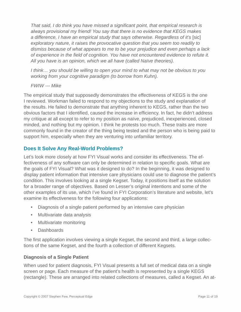
tempt is made to arrange the Kegsets to roughly emulate the shape of the human body, with measures regarding the head positioned at the top, and so on. The position of each KEGS determines what it measures. Despite the good intentions of this structure, to make sense of the display, you must memorize the meaning of each KEGS, based on its location. I assume that most of the eight hours of training that is required for a physician to learn how to use an FYI Visual display involves memorizing, fi rst, the meaning of each of the symbols (rectangles that contain various colors and patterns), and second, the meaning of each location. Looking at the partial example below, you can get a sense of what’s involved.
No matter how the measures are represented, by bringing them all together on a single screen or page and expressing them all using the same simplifi ed terms of low-normal-high, rather than separate units of measure (body temperature in Fahrenheit, blood pressure in mmHg, etc.), effi ciency is improved. The question is, does FYI Visual’s specifi c means of encoding this information communicate what physicians need for diagnostic purposes effec-tively, compared to other means, and is this information all that they need to make informed diagnoses? The answer to both of these questions is “No.”
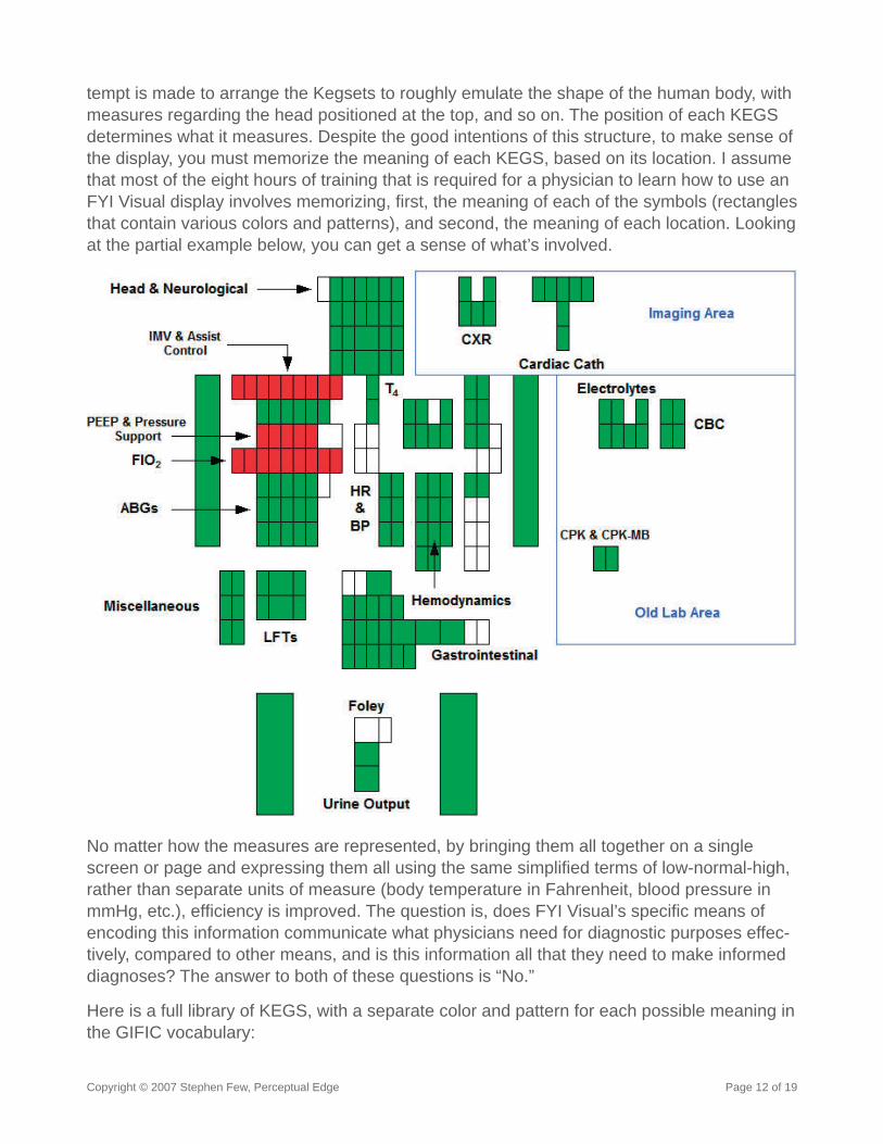
Here is a full library of KEGS, with a separate color and pattern for each possible meaning in the GIFIC vocabulary:
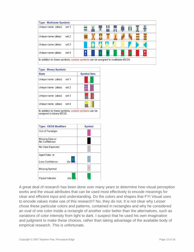
Copyright © 2007 Stephen Few, Perceptual Edge Page 13 of 19
A great deal of research has been done over many years to determine how visual perception works and the visual attributes that can be used most effectively to encode meanings for clear and effi cient input and understanding. Do the colors and shapes that FYI Visual uses to encode values make use of this research? No, they do not. It is not clear why Lesser chose these particular colors and patterns, contained in rectangles and why he considered an oval of one color inside a rectangle of another color better than the alternatives, such as variations of color intensity from light to dark. I suspect that he used his own imagination and judgment to make these choices, rather than taking advantage of the available body of empirical research. This is unfortunate.
Copyright © 2007 Stephen Few, Perceptual Edge Page 14 of 19
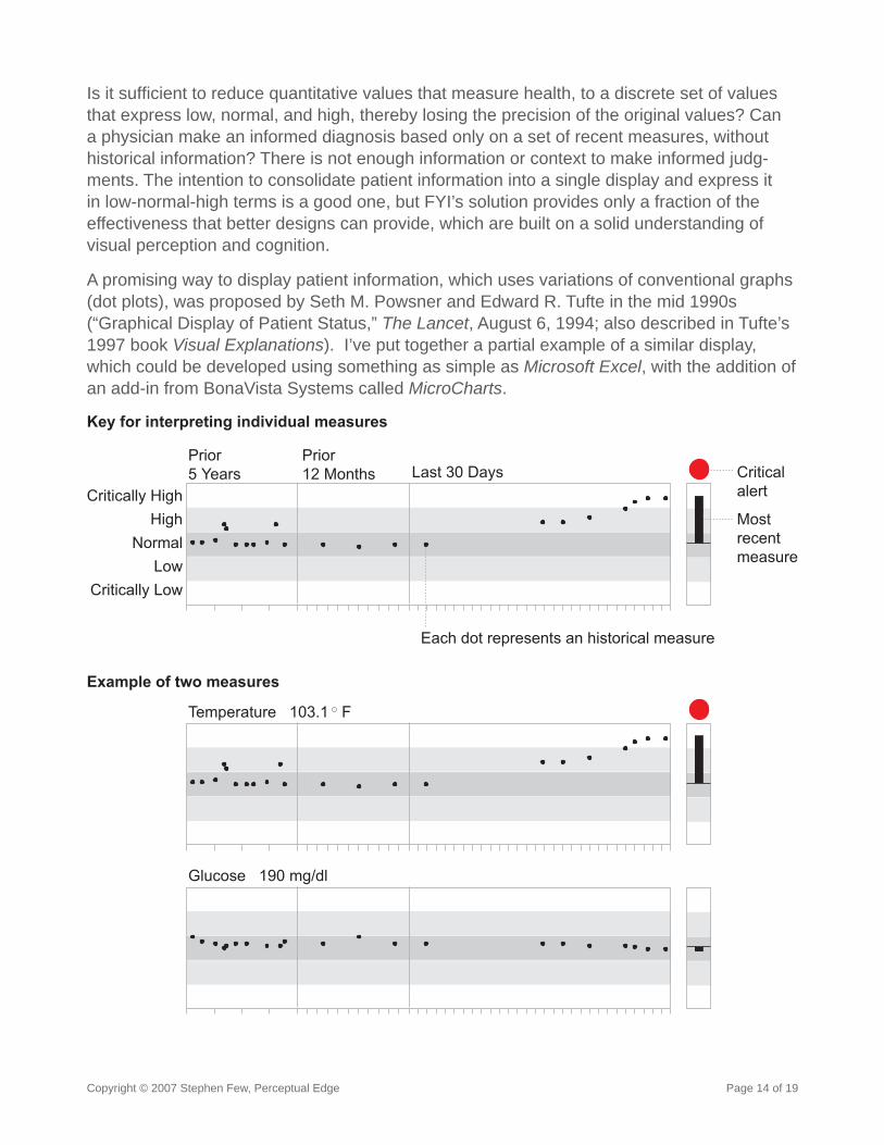
Is it suffi cient to reduce quantitative values that measure health, to a discrete set of values that express low, normal, and high, thereby losing the precision of the original values? Can a physician make an informed diagnosis based only on a set of recent measures, without historical information? There is not enough information or context to make informed judg-ments. The intention to consolidate patient information into a single display and express it in low-normal-high terms is a good one, but FYI’s solution provides only a fraction of the effectiveness that better designs can provide, which are built on a solid understanding of visual perception and cognition.
A promising way to display patient information, which uses variations of conventional graphs (dot plots), was proposed by Seth M. Powsner and Edward R. Tufte in the mid 1990s (“Graphical Display of Patient Status,” The Lancet, August 6, 1994; also described in Tufte’s 1997 book Visual Explanations). I’ve put together a partial example of a similar display, which could be developed using something as simple as Microsoft Excel, with the addition of an add-in from BonaVista Systems called MicroCharts.
Prior5 Years
Prior12 Months Last 30 Days
NormalLow
HighCritically High
Critically Low
Temperature 103.1 F
Glucose 190 mg/dl
Mostrecentmeasure
Criticalalert
Key for interpreting individual measures
Example of two measures
Each dot represents an historical measure
Copyright © 2007 Stephen Few, Perceptual Edge Page 15 of 19
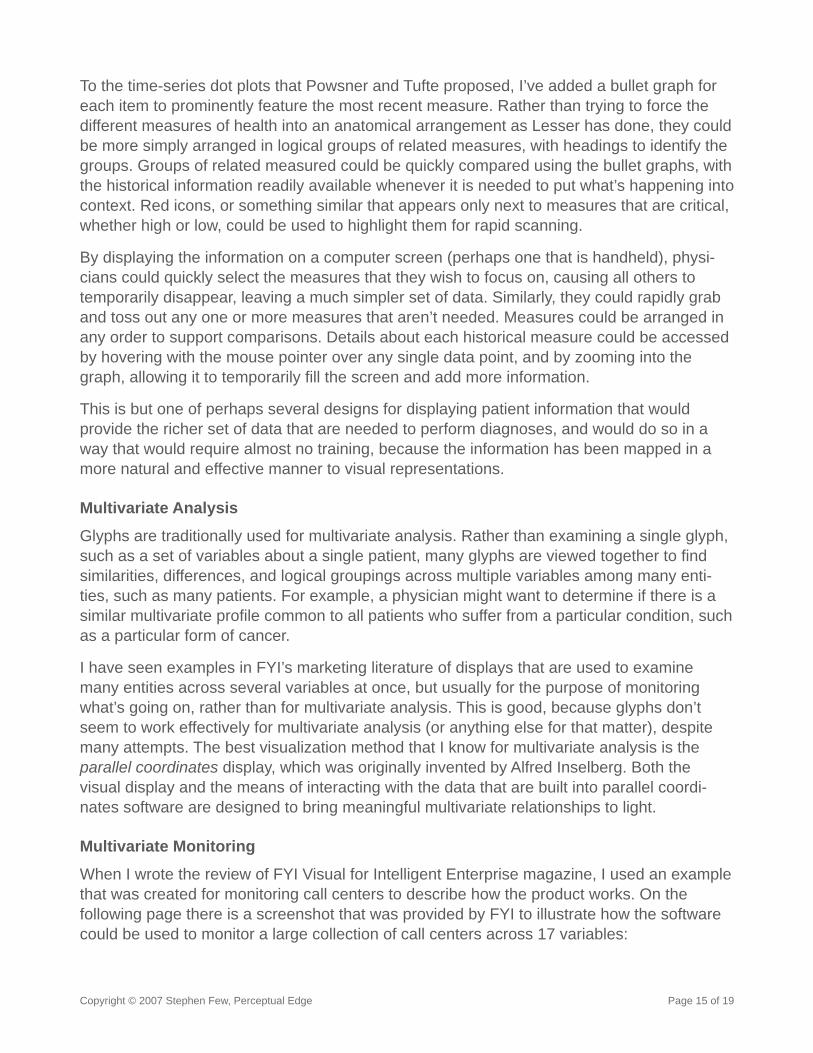
To the time-series dot plots that Powsner and Tufte proposed, I’ve added a bullet graph for each item to prominently feature the most recent measure. Rather than trying to force the different measures of health into an anatomical arrangement as Lesser has done, they could be more simply arranged in logical groups of related measures, with headings to identify the groups. Groups of related measured could be quickly compared using the bullet graphs, with the historical information readily available whenever it is needed to put what’s happening into context. Red icons, or something similar that appears only next to measures that are critical, whether high or low, could be used to highlight them for rapid scanning.
By displaying the information on a computer screen (perhaps one that is handheld), physi-cians could quickly select the measures that they wish to focus on, causing all others to temporarily disappear, leaving a much simpler set of data. Similarly, they could rapidly grab and toss out any one or more measures that aren’t needed. Measures could be arranged in any order to support comparisons. Details about each historical measure could be accessed by hovering with the mouse pointer over any single data point, and by zooming into the graph, allowing it to temporarily fi ll the screen and add more information.
This is but one of perhaps several designs for displaying patient information that would provide the richer set of data that are needed to perform diagnoses, and would do so in a way that would require almost no training, because the information has been mapped in a more natural and effective manner to visual representations.
Multivariate Analysis
Glyphs are traditionally used for multivariate analysis. Rather than examining a single glyph, such as a set of variables about a single patient, many glyphs are viewed together to fi nd similarities, differences, and logical groupings across multiple variables among many enti-ties, such as many patients. For example, a physician might want to determine if there is a similar multivariate profi le common to all patients who suffer from a particular condition, such as a particular form of cancer.
I have seen examples in FYI’s marketing literature of displays that are used to examine many entities across several variables at once, but usually for the purpose of monitoring what’s going on, rather than for multivariate analysis. This is good, because glyphs don’t seem to work effectively for multivariate analysis (or anything else for that matter), despite many attempts. The best visualization method that I know for multivariate analysis is the parallel coordinates display, which was originally invented by Alfred Inselberg. Both the visual display and the means of interacting with the data that are built into parallel coordi-nates software are designed to bring meaningful multivariate relationships to light.
Multivariate Monitoring
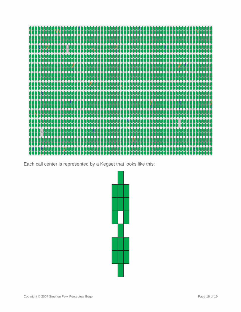
When I wrote the review of FYI Visual for Intelligent Enterprise magazine, I used an example that was created for monitoring call centers to describe how the product works. On the following page there is a screenshot that was provided by FYI to illustrate how the software could be used to monitor a large collection of call centers across 17 variables:
Copyright © 2007 Stephen Few, Perceptual Edge Page 16 of 19
Each call center is represented by a Kegset that looks like this:
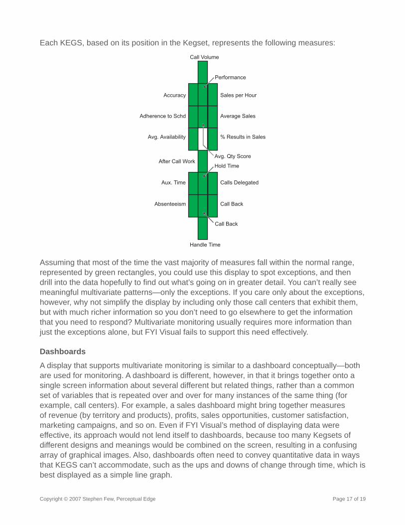
Copyright © 2007 Stephen Few, Perceptual Edge Page 17 of 19
Each KEGS, based on its position in the Kegset, represents the following measures:
Call Volume
Performance
Sales per Hour
Average Sales
% Results in Sales
Calls Delegated
Call Back
Handle Time
Absenteeism
Aux. Time
After Call Work
Avg. Availability
Adherence to Schd
Accuracy
Call Back
Hold Time
Avg. Qty Score
Assuming that most of the time the vast majority of measures fall within the normal range, represented by green rectangles, you could use this display to spot exceptions, and then drill into the data hopefully to fi nd out what’s going on in greater detail. You can’t really see meaningful multivariate patterns—only the exceptions. If you care only about the exceptions, however, why not simplify the display by including only those call centers that exhibit them, but with much richer information so you don’t need to go elsewhere to get the information that you need to respond? Multivariate monitoring usually requires more information than just the exceptions alone, but FYI Visual fails to support this need effectively.
Dashboards
A display that supports multivariate monitoring is similar to a dashboard conceptually—both are used for monitoring. A dashboard is different, however, in that it brings together onto a single screen information about several different but related things, rather than a common set of variables that is repeated over and over for many instances of the same thing (for example, call centers). For example, a sales dashboard might bring together measures of revenue (by territory and products), profi ts, sales opportunities, customer satisfaction, marketing campaigns, and so on. Even if FYI Visual’s method of displaying data were effective, its approach would not lend itself to dashboards, because too many Kegsets of different designs and meanings would be combined on the screen, resulting in a confusing array of graphical images. Also, dashboards often need to convey quantitative data in ways that KEGS can’t accommodate, such as the ups and downs of change through time, which is best displayed as a simple line graph.
Copyright © 2007 Stephen Few, Perceptual Edge Page 18 of 19
Final ThoughtsIf GIFIC is a language, it is only a language that can be used to form a single sentence structure: “[Item] is [value],” for example, “Body temperature is above normal.” Every expres-sion that can be formed with KEGS follows this same structure. The identity of the item that an individual KEGS expresses must be memorized, based on its position in a pre-defi ned Kegset. The values associated with the items must also be memorized.
If it is a language, GIFIC qualifi es as a symbolic language, one that uses symbols with meanings that must be memorized, not a visual language, which uses visual attributes to encode meanings in a manner that we can understand naturally, without memorization. GIFIC encodes values using arbitrary hues and patterns. Examples of visual language, such as 2-D X and Y axis graphs, represent values as higher and lower positions or longer and shorter bars, to encode greater and lesser values naturally.
FYI Visual must be judged on the merits of its method of encoding individual values as KEGS positioned within Kegsets. While it was a good choice of its inventor to place all of the information on a single screen or page and to express values in terms of low-normal-high, thereby converting raw measures into terms of performance relative to the norm, any means of encoding values can exhibit these features and derive the same benefi ts. The only relevant questions we should asked when evaluating FYI Visual are “Does its method of encoding values into hues and patterns contained in rectangles present the information as well as or better than other methods?” and “Does it provide all the information that people need to make good decisions?”
When determining the merits of software, one question trumps them all: “How well does it work?” It can look cool and might even have been developed by people with good intentions, but the merits of software must be judged solely on how well it does the job. The software industry, including the business intelligence industry, will continue to turn out sloppy products as long as consumers fail to demand better.
I advocate a brand of business ethics that would probably cause most software companies to snicker. I believe that products and services should only be developed and sold if they are worthwhile and if they really work. I believe that marketing should focus on spreading the truth about worthwhile and effective products and services, not on creating demand for things that aren’t needed or obscuring the truth about things that don’t work. I know this is not how business usually works, but I believe this is how it ought to work. Rather than set-tling for the system that exists, let’s fi ght for a better world.
“When determining the merits of software, one question trumps them all: ‘How well does it work?’”

Copyright © 2007 Stephen Few, Perceptual Edge Page 19 of 19
About the AuthorStephen Few has worked for over 20 years as an IT innovator, consultant, and teacher. Today, as Principal of the consultancy Perceptual Edge, Stephen focuses on data visualiza-tion for analyzing and communicating quantitative business information. He provides training and consulting services, writes the monthly Visual Business Intelligence Newsletter, speaks frequently at conferences, and teaches in the MBA program at the University of California, Berkeley. He is the author of two books: Show Me the Numbers: Designing Tables and Graphs to Enlighten and Information Dashboard Design: The Effective Visual Communica-tion of Data. You can learn more about Stephen’s work and access an entire library of articles at www.perceptualedge.com. Between articles, you can read Stephen’s thoughts on the industry in his blog.