Embed Size (px)
Citation preview
1
Perceptual organization of colour
Smithson, H. E.
Department of Experimental Psychology, University of Oxford, U.K.
To appear in:
Oxford Handbook of Perceptual Organization
Oxford University Press
Edited by Johan Wagemans
Abstract
“Everything that is visible has certain colour-properties” (Katz, 1911, p. 1). In this chapter we first
discuss the structure and perceptual dimensions that are inherent to the attribute of colour itself.
We then consider the strong organisational influence that colour can have on scenes, before
considering the interplay of colour, form, depth and movement, to the extent that these
interactions influence our perceptual organisation. We discuss spatial factors as they bear on
colour, in classical displays of colour contrast and assimilation and the way in which these are
modified by perceptual grouping. Finally we consider a world of illuminated objects, highlighting the
spatio-chromatic signatures associated with changes in illumination or spectrally selective filtering,
and the subtle chromatic cues to material properties. Colour emerges as a subject of perception,
that “draws its beauty from the marvellous co-operation of colour-substance and illumination”
(Katz, 1911, p. 2), and as the perceptual correlate of a physical signature that supports our visual
appreciation of things made of particular stuff.
Keywords: colour, cones, unique hues, colour and form, colour constancy, colour contrast, colour
assimilation, perceptual grouping, chromatic transparency, illuminant estimation, material
perception
2
1. Trichromacy and human colour perception
1.1. Overview
Human perception of colour starts with the comparison of signals from three classes of cone
photoreceptor, with peak sensitivities in the long-, middle- and short-wavelength regions of the
visible spectrum. Colorimetry – the measurement and specification of colour – allows prediction of
metameric matches in which two lights with different spectral energy distributions are
indiscriminable, at least under well-controlled viewing conditions, because they offer the same
triplet of cone signals. The success of these predictions however belies the difficulties of predicting
colour appearance. In this chapter we discuss the perceptual space in which colour resides. We
start by considering the perceptual organisation of colour in terms of the structure of colour spaces
designed to represent relationships between colours. We then consider the dependence of
perceived colour on the spatial and temporal context in which colours are seen, and on the
perception of lights and surfaces.
1.2. Background
Trichromacy suggests a three dimensional space for the organization of colour. In his Bakerian
Lecture to the Royal Society, Thomas Young (1802) made the explicit connection between the
three-dimensionality of human colour vision – that any spectral light can be matched by
combination of just three independent lights – and the existence of three types of physiological
receptor, distinguished by the wavelengths of light to which they respond most vigorously. At the
start of the 18th Century, trichromacy had been exploited extensively for the practical purpose of
colour reproduction for which only three primaries are needed, and indeed, by the late 18th
Century, George Palmer (1777) and John Elliot (1780) had also made explicit early statements of
biological trichromacy (see Mollon 2003 for review).
In a remarkable short treatise from the 13th Century, Robert Grosseteste sets out a three
dimensional space of colour in which three bipolar qualities – specifically the Latin pairings multa-
pauca, clara-obscura and purum-impurum – are used in combination to account for all possible
colours (Dinkova-Bruun et al. 2013). The qualities multa-pauca and clara-obscura are considered as
properties of the light, and purum-impurum is considered as a property of the “diaphanous
medium” in which light is incorporated. According to Grosseteste, whiteness is associated with
multa-clara-purum; and blackness with pauca-obscura-impurum. But, Grosseteste moves away
from the Aristotelian one-dimensional scale of seven colours between white and black, instead
defining seven colours close to whiteness that are generated by diminishing the three bipolar
qualities one at a time (to give three different colours), or two at once (to give a further three) or all
three at once (to give the seventh). A further seven colours are produced by increasing the qualities
from blackness. By allowing infinite degrees of intensification and diminution of the bipolar
qualities, he describes a continuous three-dimensional space of colour (Smithson et al. 2012).
Without wanting to over-interpret this particular text, it is worth noting several important points
that it raises about the perceptual organization of colour. Firstly, for Grosseteste, the perceptual
experience of colour resides in a three-dimensional space, which can be conveniently navigated via
a combinatorial system. Secondly, the space of colours is continuous, but some directions in this
space have a special status, for they identify discrete categories of colour. Thirdly, the interaction of
light and materials is fundamental to our experience of colour – an observation reiterated
throughout the treatise and summarised in the opening statement, “Colour is light embodied in a
diaphanous medium”. These three themes, albeit recast rather differently from the 13th Century
account, form the basis of the present chapter.
3
2. The dimensionality of the perceptual experience of colour
2.1. Lights in a void
Trichromatic colour space describes the signals that are available to downstream stages of the
visual system; it in no way describes the sensations that these signals evoke. Multidimensional
scaling methods have been applied to similarity judgments of pairs of colour samples in an attempt
to extract the fundamental dimensions that best capture these relationships (Indow & Kanazawa
1960; Indow & Uchizono 1960). Such analyses have suggested that the perceptual qualities of an
isolated light, seen as if through an aperture and unrelated to other lights, are usefully described in
terms of the dimensions of hue, brightness and saturation (although note that, as described by
Wyszecki and Stiles (1982), the technically correct terms are hue, lightness, and chroma). Using
these qualities to navigate the perceptual space of colour requires a test of whether these qualities
are truly independent perceptual dimensions. It is clear that the physical variables that correlate
strongly with one perceptual quality do not modify that quality independently of other perceptual
qualities. Two striking examples are the e old- r c e effect in which a change in intensity is
accompanied by a shift in hue (see Boynton & Gordon 1965 for review) and the Abney effect in
which lines of constant hue are curved when plotted in a colour space that would show a change in
spectral purity (the physical quality that correlates strongly with saturation) as a straight line from
white to a point on the spectral locus (Burns et al. 1984). Burns and Shepp (1988) have provided an
explicit test of the independence of subjective dimensions of colour, asking whether the organizing
principles of one particular set of experiences are independent of experiences along a second
subjective dimension. They used dissimilarity judgments and both spontaneous- and instructed-
classification tasks. Like other researchers before them (Garner 1974; Shepard 1964), they argue
that colour experiences are generally integral or unitary – processed as homogeneous wholes –
rather than analyzable or separable (Townsend & Wenger 2013 this volume) – processed according
to their component dimensions of hue, brightness and saturation. A subset of participants with
considerable skill and training were able to identify shared levels of value or of chroma in the
presence of variation in hue, but could not identify shared levels of hue in the context of variation
in the other two dimensions.
Multidimensional scaling is not a good method by which to test the underlying geometry of colour
space (Indow 1980), for the analysis itself rests on evaluation of distance according to some chosen
metric (e.g. Euclidian or city-block distance). Wuerger, Maloney and Krauskopf (1995) explicitly
tested whether human judgments on three different colour-proximity tasks were consistent with a
Euclidean geometry on a trichromatic colour-matching space. They tested for additivity of angles
and for increased variability of judgements with increased colour-separation between test and
comparison stimuli. All three colour-proximity tasks failed these tests, suggesting that observers do
not employ a Euclidian distance measure when judging the similarity of coloured lights. The growth
of the variability of judgements was consistent with the assumption that observers use a city-block
metric.
2.2. Lights in context
Metamerism – in which two lights with different spectral energy distributions are indiscriminable
because they offer the same triplet of cone signals – implies that the three-dimensional space of
cone signals is exhaustive in describing the gamut of colour experience. This is true under certain
limited conditions of observation, for example when a small patch of light is seen in isolation
against a black surround, as if through an aperture. However, if we consider regions of extended
spatial extent, descriptions of colour perception become more complex.
4
For extended spatial regions that are nonhomogeneous in colour and luminance, the dominant
mode of perception is that of illuminated surfaces. The spectral composition of light reaching the
eye from a point in a scene of illuminated surfaces is a function of the spectrally selective
reflectances of the surfaces, and the spectral composition of the illuminant. The extent to which
observers compensate for changes in the illuminant to extract a stable representation of the colour
properties of a surface is known as colour constancy, and will be discussed later (see §0). The
tendency for human observers to exhibit at least partial colour constancy means that colour
perception of objects, and of the materials from which they are made, is categorically different
from the perception of isolated lights, or of surfaces viewed through an aperture.
Furthermore, object-colours have additional qualitative dimensions: for example they can appear
glossy or matte; rough or smooth; cloudy or transparent. These qualities are associated with
particular signatures of colour and luminance variation across space. Katz (1911) dedicates the first
chapter of his book on colour to classifying modes of appearance of colour and the phenomenology
of illumination. He draws distinctions between “film colours and surface colours”; “transparent film,
surface and volume colours”; “mirrored colour and lustre” and “luminosity and glow”. These terms
all refer to how colours appear in space. Kat ’s examples frequently refer to material dimensions of
colour, such as metallic lustre or the lustre of silk or of graphite, yet he is careful to distinguish
between the phenomena and the conditions of their production. One hundred years on, the
correspondences between the physical and perceptual variables associated with these higher
qualities remain relatively poorly understood (for reviews see Adelson 2001; Anderson 2011;
Anderson 2013 this volume). With advances in computer graphics, it has become possible to
generate physically accurate renders of materials and their interaction with the light that
illuminates them, thus allowing carefully controlled experiments on perception of object-colours. It
is clear that perceptual qualities associated with colour variation across space provide systematic
information about the stuff from which objects are made (Fleming et al. 2013). It is also clear that
these judgements are often based on a range of simple but imperfect images measurements that
correlate with material properties, rather than physically “correct” inverse-optics computations (see
§5.3).
2.3. When human colour perception is not trichromatic
With signals from three univariant photoreceptor mechanisms, metamerism is a strict limit that
downstream visual stages can do nothing to overcome. Adaptation for example may change the
appearance of coloured lights, but cannot render metamers distinct (Rushton 1972). But, if the
effective spectral sensitivity of the underlying mechanisms is changed, Grassman’s laws of
proportionality and additivity of metameric matches (Grassmann 1853) can fail (see Koenderink
2010 for review). These subtleties in colorimetry impose important constraints on the perceptual
organization of colour across the visual field, and across the lifetime. The extent to which colour
appearance is maintained despite such changes suggests the operation of sophisticated re-
calibration or constancy mechanisms (Webster et al. 2010; Werner & Schefrin 1993), discussed in
more detail below (see §3.5).
Individuals who are missing one of the three classes of cone are described as having dichromatic
colour vision. A subset of the dichromat’s colour matches will fail to match for the normal
trichromat, but all of the normal trichromat’s matches will be acceptable to the dichromat. In this
way, dichromacy is a reduction, rather than an alteration, of trichromatic colour vision. However,
individuals who are described as anomalous trichromats, by virtue of possessing a cone class with
spectral sensitivity shifted from that of the normal trichromat, will require different ratios of
matching lights in a colour matching experiment. There will therefore be pairs of lights with
different spectral power distributions that are metamers for the normal trichromat but that are
5
discriminable to the anomalous trichromat. Deuteranomalous individuals – about 6% of men – rely
on signals from S-cones and two forms of long-wavelength cone (L’ and L). The spectral sensitivities
of the L’- and L-cones are similar, but sufficiently different that comparison of their signals yields a
useful chromatic signal. By designing a set of stimuli that were separated along this
deuteranomalous dimension (but intermingled along the standard L versus M opponent dimension)
Bosten, Robinson et al. (2005) obtained multidimensional scaling data that revealed a colour
dimension unique to these so-called ‘colour deficient’ observers.
A female carrier of anomalous trichromacy has the potential to exhibit tetrachromatic vision, since
she expresses in her retina four cone classes that differ in their spectral selectivity – the standard S,
M and L cones, plus cones expressing the anomalous M’ or L’ pigment. However, merely expressing
four classes of cone photoreceptors does not imply that the signals from these photoreceptors can
be neurally compared to support tetrachromatic perception. From a targeted search for
tetrachromatic women, in which 17 obligate carriers of deuteranomaly and 7 obligate carriers of
protanomaly were tested, Jordan, Deeb et al. (2010) found only one participant who could make
reliable discriminations along the fourth dimension of colour space – the colour dimension she
shares with her deuteranomalous son.
3. The special status of some colours: Cardinal axes and unique hues
3.1. Opponent colour processing
Most observers agree that some hues – red, green, yellow and blue – appear phenomenologically
unmixed, and as such cannot be broken-down into component hues (although see Saunders & van
Brakel 1997 for critical discussion of the existence of unique hues). These so-called unique hues
have been adopted in opponent-process theory (Hurvich & Jameson 1957) as the end-points of two
colour channels, one encoding the opposed directions of redness and greenness and the other
encoding the opposed directions of yellowness and blueness. While cone opponency – broadly
defined as drawing inputs of opposed sign from different cone classes – is a prerequisite for the
extraction of a signal that disentangles changes in wavelength from changes in radiance, the
psychophysical evidence for just two chromatically opponent mechanisms is subtle.
After viewing a coloured light, the appearance of a broadband light that previously appeared
achromatic is shifted towards the colour associated with the complement of the adapting light. The
“opposite” nature of these coloured after-effects does not require that the sensitivity adjustment
occurs at an opponent site. Since complementary coloured after-effects can be obtained with any
coloured adapting light, they are consistent with either a reduction in sensitivity of the three cone
classes by an amount that depends on the extent to which each class was stimulated by the
adapting light, or with a rebound response at an opponent post-receptoral site.
With intense adapting lights, the resulting sensitivity adjustments show independence between
cone classes (Williams & MacLeod 1979), but at these levels the photochemical process of
bleaching within the cones dominates over neural adjustments. Below bleaching levels coloured
after-effects may still be obtained, and independent adjustments of neural gain within cone classes
– as suggested by von Kries (1878) – are likely to contribute to colour appearance. To a first
approximation, Weber’s law holds independently for the three cone classes, but two significant
failures – transient tritanopia (Mollon & Polden 1975; Stiles 1949) and combinative euchromatopsia
(Polden & Mollon 1980) – provide evidence for sensitivity adjustments at a post-receptoral
opponent site.
Slow temporal modulations of coloured lights – from achromatic to saturated and back to
achromatic – produce time-varying sensations. If the modulated region forms a figure against an
6
achromatic surround the figure merges with the background before figure and ground are
objectively equal and a figure with the complementary colour is apparent when there is no physical
difference between the figure and ground. The temporal signature of these after effects, measured
psychophysically, matches the time-varying response and rebound-response of retinal ganglion
cells, suggesting that the after-image signals are generated in the retina, though they may
subsequently be modified by cortical processing (Zaidi et al. 2012).
3.2. The physiology of early post-receptoral processing
Looking to the physiology gives some help with understanding the post-receptoral organization of
colour. Early in the visual pathway, retinal ganglion cells compare and combine cone signals. The so-
called midget ganglion cells are silent to lights that modulate only the signal in the S-cones, but they
exhibit strong responses to lights that change the ratio of L- to M-cone signals whilst holding their
sum constant. The small-bistratified ganglion cells show the opposite pattern: They respond
strongly to S-cone isolating stimuli but not to exchanges of L- and M-cone excitations (Dacey & Lee
1994). Chromatic tuning in the lateral geniculate nucleus (LGN) duplicates this pattern of
comparisons, such that the null planes of chromatic responses of LGN neurons cluster along the
constant-S and constant-(L and M) directions (Derrington et al. 1984). These results suggest that
there is a physiological basis for some directions in colour space having a special status. However,
the appearance of the lights that correspond to these directions in colour space does not
correspond to the phenomenologically unique hues. Starting from white, an increase or decrease in
the S-cone signal corresponds to moving in a violet or lime-green direction, whilst exchanging L and
M-signals moves along an axis that varies between cherry red (high L, low M) and teal (high M, low
L). The relative independence of the effects of adaptation to modulations along the constant-S or
constant-(L and M) axes on detection thresholds has been used to define these axes as the cardinal
axes of colour space (Krauskopf et al. 1982).
3.3. Asymmetries in the trichromatic scheme
Asymmetries in the organization of colour processing could arise from the differences between the
S-cones and the M- and L-cones. The S-cones comprise less than 10% of cones in the retina and can
be identified as morphologically distinct from the other cones (Curcio et al. 1991). The S-cone
pigment is coded on chromosome seven whereas both the M- and L-cone pigment genes are
carried on the X-chromosome and are 96% homologous (Nathans et al. 1986). The dichromatic
system shared by most mammals achieves a two-dimensional colour discrimination by comparing
the outputs of a short-wave sensitive receptor and a receptor in the middle to long wavelength
region of the spectrum. It is thought that the L- and M-cone pigment genes diverged only 50 million
years ago in our evolutionary history, perhaps conferring a behavioural advantage to our primate
ancestors in selecting ripe fruit against a background of young leaves at a distance (Bompas,
Kendall, et al. 2013; Regan et al. 2001; Sumner & Mollon 2000a, 2000b) or at arms reach (Parraga et
al. 2002), and piggy-backing on the machinery of spatial vision that operated with the longer
wavelength receptor (Martin et al. 2011).
There is some evidence that the S-cone signal, the basis of the ancient colour vision system,
remains distinct from the machinery dedicated to the main business of photopic vision. The S-
cones, for example, show minimal projections to the subcortical pathways, and S-cone stimuli are
processed differently from M- and L-cone stimuli in saccadic (but not attentional) tasks (Sumner et
al. 2002). This asymmetry suggests a further way in which not all “colours” are equal in specifying
and shaping our perceptual world. S-cone isolating stimuli additionally elicit longer reaction times
than L/M-opponent stimuli (Smithson & Mollon 2004) and their signals are delayed before
7
combination with L- and M-cone signals (Lee et al. 2009). Within the colour vision system this
presents a specific temporal binding problem (Blake et al. 2008).
3.4. The physiology of later colour processing
The chromatic tuning of cells in primary and secondary visual cortex (V1 and V2) shows narrower
tuning of individual units and a more uniform distribution of preferred directions around the hue
circle (Solomon & Lennie 2005) than LGN units. While the colour sensitivities of neurons in V1 are
substantially invariant to changes in spatial structure and contrast, the colour sensitivities of
neurons in V2 are modified by surrounding context (Solomon et al. 2004). These characteristics that
are associated with mid-level vision – concerned with the colour of surfaces and the identification
of regions that go together – have traditionally been associated with distinctive properties of
neurons in macaque V4 (and its presumed homologue in humans). Indeed, lesions in this area are
associated with cerebral achromatopisa, and a particular impairment in perceiving the colour of
surfaces. On the basis of behavioural and neuroimaging data from normal participants and
neuropsychological patients, Cavina-Pratesi et al. (2010a; 2010b) argue that geometric and surface
properties are dealt with separately within the lateral occipital cortex (LOC) and the collateral sulcus
(CoS) respectively, and that the medial occipitotemporal cortex houses separate foci for color
(within anterior CoS and lingual gyrus) and texture (caudally within posterior CoS). The visual
recognition of real objects depends on more than shape, size and orientation. Surface properties
such as colour and texture are equally important sources of information, and may be particularly
useful in judging what an object is made of, and how it should be handled. Functional separation of
cortical regions for extracting colour and texture might indicate differences in the nature of the
computations required to extract these characteristics (see also §5.3).
Globs – regions of posterior inferior temporal cortex (including V4, PITd and posterior TEO) that
show higher fMRI responses to equiluminant color than to black-and-white – have been identified
as candidates for the explicit encoding of unique hues (Stoughton & Conway 2008). Over-
representation of units tuned to particular directions would provide a physiological basis for the
special status of some hues. However, there is a practical difficultly with testing this hypothesis. For
a meaningful discussion of the density with which cell-tuning samples the hue continuum, we need
to know how to scale the hue and saturation axes. Clumping of neurons’ preferred directions in one
region of hue-space is to be expected if the scaling of the underlying variable is non-uniform or if
some colour directions are stimulated more strongly. One candidate scale is the wavelength scale,
but wavelength discrimination thresholds follow a “w”-shaped function of wavelength (Pokorny &
Smith 1970), so this is far from a perceptually uniform space. Stoughton and Conway instead used
test stimuli that were linear mixtures of the outputs of a RGB display (i.e. R-G, G-B and B-R). But this
in itself may have meant that the strongest modulations of early opponent cells were aligned with
the unique hue directions, so that the responses of downstream neurons inevitably showed a
tuning preference for these directions (Mollon 2009).
3.5. Organisation imposed by environmental factors
It is clear that the locations of the unique hues are not predicted in any simple way from the
underlying physiology of early colour vision mechanisms. An alternative is to look to regularities in
the external world. One signature of a material with uniform spectral reflectance is that it will
exhibit no difference between the wavelengths reflected from the body of the material and
specular reflections from the glossy surface; whereas materials whose pigment selectively absorbs
some wavelengths will necessarily show a difference in wavelength content between these two
components. Gaspard Monge outlined this process in a lecture in 1789 (Mollon 2006), thereby
8
identifying a characteristic of materials that might appear unbiased in their colour, perceptually
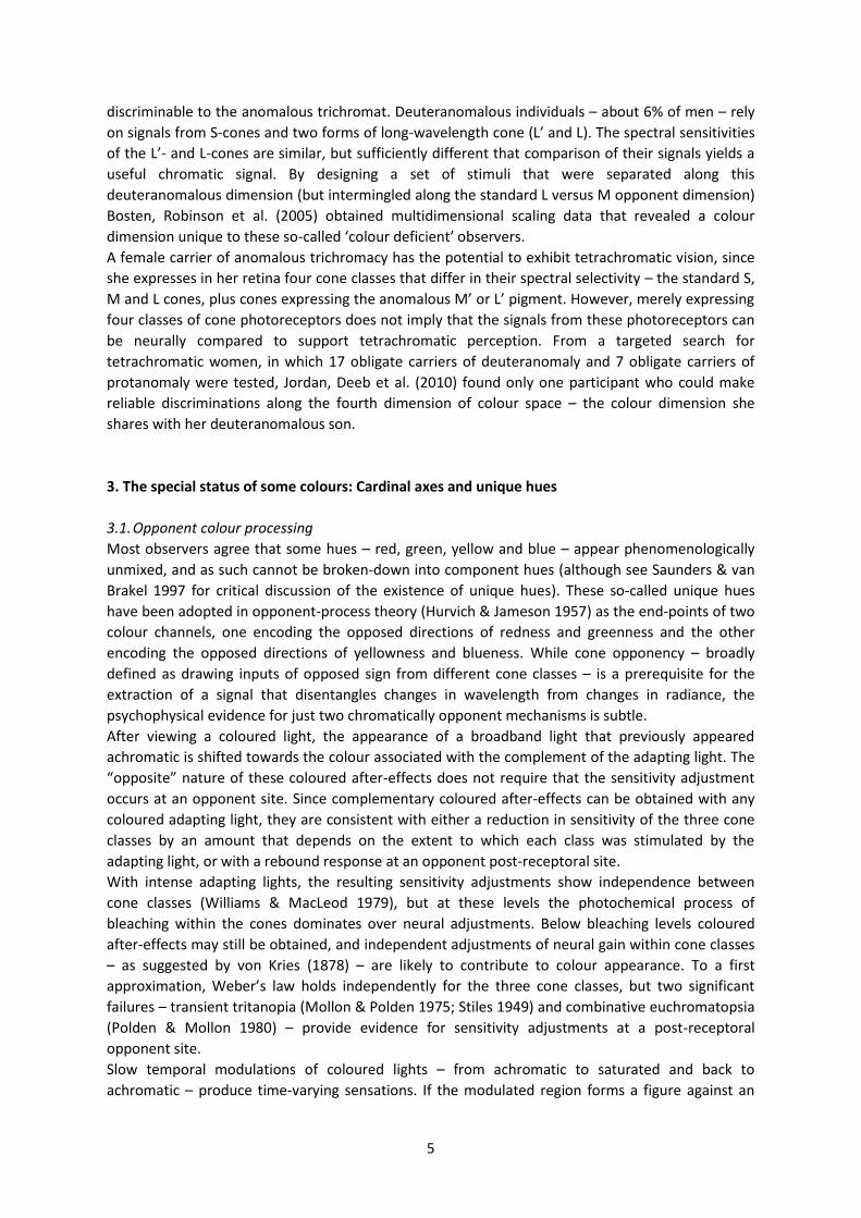
white (see figure 1).
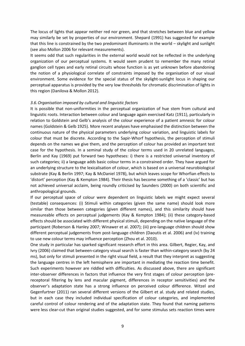
Figure 1: Illuminated glossy objects that illustrate several points about the interaction of
light and surfaces. The light reflected to the camera comes either from (i) direct specular
reflections from the surface in which the spectral content of the reflected light matches
that of the illuminant, or (ii) reflections from the body of the material in which the
spectral content of the reflected light is given by the illuminant modified by the spectral
reflectance of the surface. Monge’s observation is clear in the parts of the scene
dominated by a single source of illumination, such as the front of the purple mug.
Significant chromatic variation is apparent across the purple-coloured surface, fading
from purple to desaturated purple (mixed with white), whereas little chromatic variation
is apparent across the white-coloured surface of the same mug.
Image: uncommongoods.com with permission.
Other unique hues might similarly be determined by characteristics of the environment. If that were
true, observers should be less variable in judging coloured papers than coloured lights (Mollon
2006). A curious quirk of unique green settings with monochromatic lights is that they correlate
with iris colour. This is understandable if observers agree on the broadband stimulus that is green
and then differ when tested with narrowband lights (Jordan & Mollon 1997). Similar compensations
for spectrally selective pre-retinal filtering occur with age, as the physical light associated with the
percept of white remains relatively constant despite the yellowing of the eye’s lens, resetting over
the course of months following lens replacement as part of cataract surgery (Delahunt et al. 2004),
and with retinal eccentricity, as the perceived colour of both narrowband and broadband stimuli
remains similar at 0° and 8° loci, despite the distribution of yellowish macular pigment in the central
visual field (Webster et al. 2010). However, this compensation is not complete, and although
differences between central and peripheral vision imposed by filtering by macular pigment are
relatively stable across the lifetime, and impose systematic chromaticity shifts for a range of natural
and man-made stimuli, the visual system fails to correct as well as it might (Bompas, Powell, et al.
2013).
9
The locus of lights that appear neither red nor green, and that stretches between blue and yellow
may similarly be set by properties of our environment. Shepard (1991) has suggested for example
that this line is constrained by the two predominant illuminants in the world – skylight and sunlight
(see also Mollon 2006 for relevant measurements).
It seems odd that such regularities in the external world would not be reflected in the underlying
organization of our perceptual systems. It would seem prudent to remember the many retinal
ganglion cell types and early retinal circuits whose function is as yet unknown before abandoning
the notion of a physiological correlate of constraints imposed by the organisation of our visual
environment. Some evidence for the special status of the skylight-sunlight locus in shaping our
perceptual apparatus is provided by the very low thresholds for chromatic discrimination of lights in
this region (Danilova & Mollon 2012).
3.6. Organisation imposed by cultural and linguistic factors
It is possible that non-uniformities in the perceptual organization of hue stem from cultural and
linguistic roots. Interaction between colour and language again exercised Katz (1911), particularly in
relation to Goldstein and Gelb’s analysis of the colour experience of a patient amnesic for colour
names (Goldstein & Gelb 1925). More recent analyses have emphasised the distinction between the
continuous nature of the physical parameters underlying colour variation, and linguistic labels for
colour that must be discrete. According to the Sapir-Whorf hypothesis, the perception of stimuli
depends on the names we give them, and the perception of colour has provided an important test
case for the hypothesis. In a seminal study of the colour terms used in 20 unrelated languages,
Berlin and Kay (1969) put forward two hypotheses: i) there is a restricted universal inventory of
such categories; ii) a language adds basic colour terms in a constrained order. They have argued for
an underlying structure to the lexicalisation of colour, which is based on a universal neurobiological
substrate (Kay & Berlin 1997; Kay & McDaniel 1978), but which leaves scope for Whorfian effects to
‘distort’ perception (Kay & Kempton 1984). Their thesis has become something of a ‘classic’ but has
not achieved universal acclaim, being roundly criticised by Saunders (2000) on both scientific and
anthropological grounds.
If our perceptual space of colour were dependent on linguistic labels we might expect several
(testable) consequences: (i) Stimuli within categories (given the same name) should look more
similar than those between categories (given different names), and this similarity should have
measureable effects on perceptual judgements (Kay & Kempton 1984); (ii) these category-based
effects should be associated with different physical stimuli, depending on the native language of the
participant (Roberson & Hanley 2007; Winawer et al. 2007); (iii) pre-language children should show
different perceptual judgements from post-language children (Daoutis et al. 2006) and (iv) training
to use new colour terms may influence perception (Zhou et al. 2010).
One study in particular has sparked significant research effort in this area. Gilbert, Regier, Kay, and
Ivry (2006) claimed that between-category visual search is faster than within-category search (by 24
ms), but only for stimuli presented in the right visual field, a result that they interpret as suggesting
the language centres in the left hemisphere are important in mediating the reaction time benefit.
Such experiments however are riddled with difficulties. As discussed above, there are significant
inter-observer differences in factors that influence the very first stages of colour perception (pre-
receptoral filtering by lens and macular pigment, differences in receptor sensitivities) and the
observer’s adaptation state has a strong influence on perceived colour difference. Witzel and
Gegenfurtner (2011) ran several different versions of the Gilbert et al. study and related studies,
but in each case they included individual specification of colour categories, and implemented
careful control of colour rendering and of the adaptation state. They found that naming patterns
were less clear-cut than original studies suggested, and for some stimulus sets reaction times were
10
better predicted by JNDs than by category effects. As we saw with the search for the neural
encoding of unique hues, a recurrent difficulty is the choice of an appropriate space from within
which to select test stimuli. Brown, Lindsey and Guckes (2011) identified this need for an
appropriate null hypothesis – if linguistic category effects do not predict reaction times for visual
search, what are they predicted by? They replicated the Gilbert et al. study, making methodological
improvements that were similar to those introduced by Witzel and Gegenfurtner (2011), but added
an independent measurement of the perceived difference between stimuli (assessed via Maximum
Likelihood Difference Scaling, MLDS). They were unable to replicate Gilbert et al.’s result and
reaction times were simply predicted by the reciprocal of the scaled perceived difference between
colours.
4. Colour and form
4.1. Processing of colour- and luminance-defined contours
It is widely held that the primary signals for form perception are carried in variations of luminance.
But empirical evidence for the strong segregation of colour and form responses in cortex is weak.
Staining with the mitochondrial enzyme cytochrome oxidase (CO) reveals CO-rich blobs in V1 and
thin bands in V2. Although these anatomical sub-regions have been shown by several labs to
contain a high proportion of cells that are selective for colour and a high proportion of cells that are
not selective for orientation (see Gegenfurtner 2003 for review), it cannot be concluded from these
measurements that it is, for example, the colour selective cells in the thin stripes that are not
orientation selective. Within-cell measurements of colour- and form-selectivity in a large number of
neurons in V1 and V2 of awake behaving monkeys show no correlation between colour and form
responses (Friedman et al. 2003), providing no evidence for segregation.
Sumner et al. (2008) tested fMRI responses to orientation signals that were defined by luminance,
or by L/M-opponent or S-opponent chromatic modulation. At arrival in V1, S-cone information is
segregated from the pathways carrying form information, while L/M-opponent information is not.
Nevertheless Sumner et al. found successful orientation discrimination, in V1 and in V2 and V3, for
luminance and for both colour dimensions, suggesting that a proportion of cells show joint
selectivity to both colour and orientation.
Friedman et al. (2003) have explicitly tested the contributions of colour selective cells to the
analysis of edges and surfaces. They found no difference in edge-enhancement between colour-
and luminance-selective cells. This contradicts the “colouring boo ” notion that the form of an
object is processed through achromatic channels, with colour being filled in later, and by separate
mechanisms. Instead we see colour, orientation and edge-polarity multiplexed in cortical signals.
4.2. Availability of colour- and luminance-defined contours
This is not to say that there are not important differences in the constraints on the information that
can be extracted about colour and luminance variation across space. Certainly, the L-M opponent
cells in the parvocellular layers of the LGN are bandpass for luminance and lowpass for
equiluminant chromatic stimuli (Derrington et al. 1984; Lee et al. 2012). For spatial forms that are
defined only by chromatic variation in the S-cone signal the situation is particularly marked. The S-
cones constitute only 5 to 10% of human cones. They are absent from a central region of about 0.4°
with a ring of relatively high S-cone density just outside this region, and are otherwise fairly evenly
distributed across the retina (Curcio et al. 1991). So, the S-cones necessarily sample the visual
image rather sparsely and convey correspondingly coarse spatial information.
11
For most real stimulus displays, the relative strength of luminance and chromatic defined contours
is further biased in favour of luminance by the maximal achievable chromatic contrast in
equiliminant stimuli: The substantial overlap between the L- and M-cone sensitivities limits the L- or
M-cone Weber contrast to about 0.3. Psychophysical studies reinforce the argument that the
processing of form defined by colour is limited mainly by the contrast in the cones and not by
subsequent processing (Webster et al. 1990).
4.3. Organisation imposed by luminance-defined contours
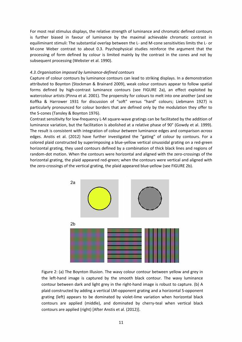
Capture of colour contours by luminance contours can lead to striking displays. In a demonstration
attributed to Boynton (Stockman & Brainard 2009), weak colour contours appear to follow spatial
forms defined by high-contrast luminance contours (see FIGURE 2a), an effect exploited by
watercolour artists (Pinna et al. 2001). The propensity for colours to melt into one another (and see
Koff a & Harrower 1931 for discussion of “soft” versus “hard” colours; Liebmann 1927) is
particularly pronounced for colour borders that are defined only by the modulation they offer to
the S-cones (Tansley & Boynton 1976).
Contrast sensitivity for low-frequency L-M square-wave gratings can be facilitated by the addition of
luminance variation, but the facilitation is abolished at a relative phase of 90° (Gowdy et al. 1999).
The result is consistent with integration of colour between luminance edges and comparison across
edges. Anstis et al. (2012) have further investigated the “gating” of colour by contours. For a
colored plaid constructed by superimposing a blue-yellow vertical sinusoidal grating on a red-green
horizontal grating, they used contours defined by a combination of thick black lines and regions of
random-dot motion. When the contours were horizontal and aligned with the zero-crossings of the
horizontal grating, the plaid appeared red-green; when the contours were vertical and aligned with
the zero-crossings of the vertical grating, the plaid appeared blue-yellow (see FIGURE 2b).
Figure 2: (a) The Boynton Illusion. The wavy colour contour between yellow and grey in
the left-hand image is captured by the smooth black contour. The wavy luminance
contour between dark and light grey in the right-hand image is robust to capture. (b) A
plaid constructed by adding a vertical LM-opponent grating and a horizontal S-opponent
grating (left) appears to be dominated by violet-lime variation when horizontal black
contours are applied (middle), and dominated by cherry-teal when vertical black
contours are applied (right) [After Anstis et al. (2012)].
12
4.4. Organisation imposed by colour
Colour similarity is sufficient to impose a perceptual organisation when spatial proximity is
matched, and indeed such effects have been used to measure the relative salience of colour
differences along cardinal axes in normal and anomalous trichromats (Regan & Mollon 1997).
McIlhagga and Mullen (1996) tested contour integration for colour- and luminance-defined stimuli,
and found that colour alone is sufficient to delineate a contour, provided that contrast is sufficiently
high. If contrast is first scaled according to discrimination thresholds for orientation, equivalent
performance is obtained for colour- and luminance-defined contours if the colour-defined contours
are presented with a further two-fold increase in contrast. When contours are defined by
alternating elements of colour and luminance, performance declines significantly, but not as much
as would be expected from entirely independent processing of colour and luminance edges.
Texture gradients provide a strong monocular cue to depth. Zaidi and Li (2006) showed that
chromatic orientation flows are sufficient for accurate perception of 3-D shape. The cone-contrast
required to convey shape in chromatic flows is less than the cone-contrast required in achromatic
flows, indicating that sufficient signal is present in orientation-tuned mechanisms that are also
colour-selective. Identification of shape from chromatic flows is masked by luminance modulations,
indicating either joint processing of colour and luminance in orientation tuned neurons, or
competing organisations imposed by colour and luminance.
Troscianko et al. (1991) had previously shown that estimates of the slant of a surface defined by
texture gradients are the same for textures defined by chromaticity and those defined by
chromaticity and luminance. These authors also find that gradients of brightness and saturation (in
the absence of texture gradients, or in addition to texture gradients) can modify perceived depth,
consistent with the gradual changes in luminance or saturation that are produced as a result of the
increase in atmospheric scattering with distance. Luminance gradients are important in conveying
3-D shape, through a process described as shape-from-shading, and interactions between
luminance and colour gradients have been interpreted with respect to the correspondence
between luminance and colour gradients in the natural environment of illuminated surfaces
(Kingdom 2003), which we discuss below (see §5.6).
Colour can facilitate object segmentation. For example, colour vision can reveal objects that are
camouflaged in a grey-scale image. Random chromatic variations can also hamper segmentation of
luminance-defined texture boundaries – a phenomenon that is exploited in both natural and man-
made camouflage (Osorio & Cuthill 2013 this volume). Interestingly this presents an opportunity for
dichromatic observers to break such camouflage, since they do not perceive the chromatic variation
(Morgan et al. 1992).
In the classical random-dot stereogram, the arrays presented to left and right eyes are composed of
binary luminance noise. If the random-dot pattern is made equiluminant, such that the
correspondence of matching elements is defined only by their chromaticity, stereopsis fails
(Gregory 1977). However, introducing colour similarity to matching elements improves stereopsis
(Jordan et al. 1990), and in global motion the introduction of a colour difference between target
and distractor elements reduces the number of target dots required to identify the direction of
motion (Croner & Albright 1997).
Improvement in thresholds for luminance defined global motion in the presence of colour similarity
between target elements suggests that colour may be a useful cue for grouping elements that
would otherwise be camouflaged. This colour advantage however is dependent on selective
attention, and disappears in displays that are designed to render selective attention useless (Li &
Kingdom 2001). The “Colour Wagon Wheel” illusion (Shapiro et al. 2012) lends further support to
the idea that colour provides a feature-based motion signal that can become perceptually
uncoupled from the motion energy signal.
13
4.5. Combination of colour-defined features
A recurrent finding in the integration and combination of features defined by colour is the relative
selectivity of responses to stimuli defined along cardinal directions in colour space (see §0).
Contour-shape mechanisms, which show after-effects for shape-frequency and shape-amplitude,
are selective for contours defined for the S-opponent and L/M-opponent cardinal axes (Gheorghiu
& Kingdom 2007). Contrast-contrast effects, in which a region of fixed contrast appears to have a
lower contrast when surrounded by a region of high contrast, are selective for contrast within a
cardinal mechanism (Singer & Dzmura 1994). Plaids comprised of drifting gratings modulated along
different cardinal directions appear to slip with respect to one another, whereas gratings
modulated along intermediate directions in colour space tend to cohere (Krauskopf & Farell 1990).
McKeefry, Laviers and McGraw (2006) present a more nuanced account of the separablility of
colour inputs to motion processing. They found that the traditional motion after-effect, where
prolonged viewing of a stimulus moving in one direction causes a stationary stimulus to appear to
move in the opposite direction, exhibited a high degree of chromatic selectivity. However, biases in
the perceived position of a stationary stimulus following motion adaptation, were insensitive to
chromatic composition. The dissociation between the two types of after-effect suggests that
chromatic inputs remain segregated at early stages of motion analysis, while at later processing
stages, there is integration across chromatic and achromatic inputs.
Grouping of elements that are similar in terms of the underlying physiological mechanisms that
process them is a recurrent theme in several modern accounts of perceptual organisation. For
example, Gilchrist (2013, this volume) shows how simultaneous contrast can be strengthened or
diminished by manipulating the relative spatial frequencies of the figure and ground of the standard
display. Anderson (2013, this volume) presents a strong argument for analysing scenes in terms of
physiologically relevant parameters, such as contrast ratios rather than luminance-difference ratios.
Whilst the Gestalt psychologists were critical of analyses that carve perception into underlying
channels or modules, the organisation of the underlying physiology may still be used to inform us
about the emergence of structure in perceptual experience. For it is likely that the organisation of
our neural system at least in part reflects the organisation of our sensory world.
4.6. Colour and form in after-effects
From a sequence of short experiments, Daw (1962) argues that coloured after-images do not
generally trouble us in day-to-day visual experience simply because they are inhibited except in the
special situation where the (luminance-defined) scene is in geometric registry with the after-image.
Powell, Bompas and Sumner (2012) concur, additionally presenting evidence that luminance edges
enhance afterimages more than they enhance physical stimuli of similar appearance.
Anstis et al. (2012) show conditions in which the same adapting pattern can generate two different
afterimage patterns, depending on the luminance contours that are presented during the test
phase. Their adapting stimulus is a four-colour plaid constructed by adding a vertical blue-yellow
grating and a horizontal red-green grating. When tested with vertical achromatic contours, the
after-effect is yellow-blue; when tested with horizontal achromatic contours, the after-effect is
green-red. The effect is consistent with spatial averaging of after-image colours within contours, but
not across contours – a result that echoes the result for the appearance of real plaids with
superimposed contours (see §4.3).
Orientation-dependent coloured after-effects have been described by McCollough (1965).
Adaptation to, for example, red-black vertical gratings and green-black horizontal gratings causes
white-black vertical and horizontal gratings to appear tinged with green and with red respectively.
The effect is particularly long lasting, documented to last days at least (Jones & Holding 1975). Such
contingent after-effects have been demonstrated for several combinations of features, and their
14
long-lasting effects may simply reflect the rarity in the natural world of those stimulus combinations
that would be required to re-adapt the observer to a different norm (Vul et al. 2008).
Under conditions of binocular rivalry, it is possible for a pink-grey vertical grating presented to the
left eye and a green-grey horizontal grating presented to the right eye to be perceived as either a
horizontal or vertical pink-green grating – a perceptual misbinding of colour from one eye into a
spatially selective part of the form defined in the other eye (Hong & Shevell 2006). It is also possible
to obtain afterimages of the misbound percept. Importantly, Shevell, St.Clair and Hong (2008) argue
that the afterimage is derived from a central representation of the misbound percept, rather than
as a result of resolution of rivalrous monocular afterimages. They showed that when adapting
stimuli were pulsed, simultaneously or in alternation to the two eyes, misbound afterimages were
obtained only in the simultaneous condition. Since it is only this condition that has rivalrous
dichoptic stimuli, their results imply adaptation of a cortical mechanism that encodes the observer’s
(misbound) percept.
4.7. Colour induction and perceptual grouping
When one coloured light is presented in close spatial and temporal proximity to another its
appearance may change. Such colour induction may shift the appearance of the test light towards
the appearance of the inducing light (an assimilation effect) or away from the appearance of the
inducing light (a contrast effect). Some authors consider colour induction and perceptual grouping
as inherently linked, for example by interpreting assimilation as a by-product of the integration of
parts into one whole (Fuchs 1923; Musatti 1931) and by interpreting contrast as a result of
maintaining separate wholes (e.g. King 1988, 2001).
Empirical studies that connect colour induction and perceptual grouping are relatively rare. Xian
and Shevell (2004) have shown how the colour appearance of a test patch depends on the colour
appearance of other elements of the display with which it is grouped. In their experiment, the test
patch was a small square that was grouped with a set of horizontal bars of different lengths
arranged in an hour-glass configuration above and below the test. They modified the appearance of
the grouped elements by local induction from a striped background (rather than by a physical
change in the elements themselves), and they found that the measured influences on the
appearance of the test are consistent with the hypothesis that chromatic assimilation occurs among
elements belonging to the same group.
However, this experiment is a rather indirect test of the influence of grouping on assimilation, since
it is the colour appearance of the grouped elements that is manipulated, and not the strength of
the grouping per se. In a coherent set of follow-up experiments Xian and Shevell have performed
multiple tests of the hypothesis that the stronger the perceptual grouping the larger the shift in
appearance toward the co-grouped elements (Xian 2004). In particular, they showed that weaker
colour shifts were obtained when (i) motion of the test and inducing bars was in opposite directions
rather than the same direction; (ii) the test and inducing bars were dissimilar in their chromaticity
or luminance; and (iii) binocular disparity was introduced such that the inducing bars were
perceived in a single depth plane in front of the test, but not when the test and inducing bars were
perceived as belonging to a three-dimensional “V”-shaped hour-glass structure. These findings
provide strong evidence that perceptual grouping causes chromatic assimilation among
components that are grouped together. Since any effect of binocular disparity must be due to
binocularly driven cortical cells, the last experiment points to involvement of a central neural
mechanism in colour assimilation. A similar conclusion was reached by de Weert and van
Kruysbergen (1997) on the basis that assimilation occurs after the figure-ground segregation has
taken place.
15
5. Objects and illumination
5.1. A segmentation problem
Our sensory experience is of a world comprised of objects of particular shapes and sizes, which are
made of particular stuff and illuminated by particular light sources. As such, our perception is the
result of a process of segmentation in which sensory stimulation is interpreted as coming from
discrete sets of causal sources in the world. The light imaged at a particular location on the retina
does not contain separable information about the reflectance characteristics of materials, the
spectral energy distributions of the lights that illuminate them, and the spectral transmittance of
any intervening filters. So colour perception for any of these constituents must rely on geometric
and chromatic relationships across an extended spatial area, and on how these change over time.
Anderson (2013, this volume) discusses transparency, lightness and gloss within a similar
conceptual framework. In lightness perception, we can identify scission models in which the
illuminant and surface reflectance are explicitly segmented; equivalent illumination models in which
an estimate of the illuminant is derived and then used to recover reflectance properties from the
image data; anchoring theory in which luminance ratios are used to derive information about
relative lightness and the resultant scale is anchored by mapping one image luminance (e.g. the
highest) onto a fixed lightness value (e.g. white); and filtering or filling-in models in which percepts
are simply the outputs of local image filters applied directly to the image.
Lightness constancy (in an achromatic world in which surface reflectance and illumination are
specified by scalar values) and colour constancy (in a chromatic world in which surface reflectance
and illumination are functions of wavelength) share many of the same computational problems.
Indeed, many models of lightness and colour constancy share similar computational tricks. The well-
known retinex algorithms of Land (1986) and Land and McCann (1971) rely heavily on relational
coding, making assumptions about the mean colour of a scene (e.g. grey world) or about the
brightest elements in a scene (e.g. brightest is white) to anchor the relational code. While relational
coding is a central notion from Gestalt psychology, it is also the Achilles’ heel of the retinex models.
For, the normalisation performed in retinex depends heavily on the set of surfaces available in the
scene (Brainard & Wandell 1986). Human vision on the other hand maintains approximate colour
constancy despite variation both in the spectral composition of the illuminant and variation in the
spectral reflectances of nearby surfaces (an issue to which we return in §5.6).
Equivalent illumination models have been particularly successful in providing a compact description
of the effect of changing illumination on colour appearance (see Brainard & Maloney 2011 for
review and detailed discussion). One powerful feature of these models is that they separate the
modelling problem into two parts. Firstly, what is the parametric form of the transformation
imposed on the raw image signals by a change in illumination and secondly, how are the
parameters of this transformation determined from the image data? For lightness constancy, the
physical parameters of reflectance and illumination allow the transformation to be fully described
by a multiplicative scaling of the luminance values in the image. In this case there is no question of
how well a multiplicative transformation accounts for the physical situation, though there may be
uncertainty as to whether the visual system uses such a transformation to derive perceived
lightness from the raw luminance signals, and indeed how the appropriate scale factor is
determined. For colour constancy, the parametric form of the transformation is not immediately
obvious, as we shall discuss next.
5.2. Colour conversions with spectral filters and illuminant changes
A set of surfaces with particular spectral reflectances, viewed under a particular illumination (or
through a thin filter with a particular transmittance), is associated with a spatial distribution of cone
16
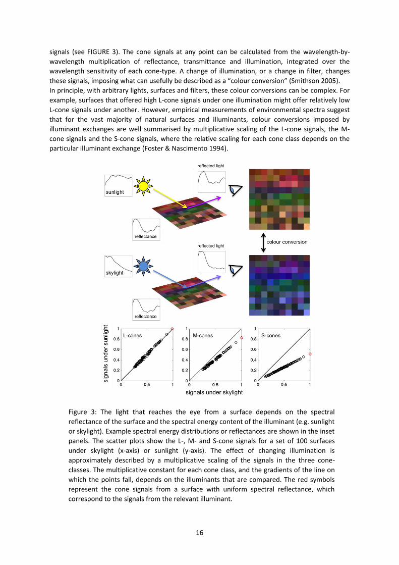
signals (see FIGURE 3). The cone signals at any point can be calculated from the wavelength-by-
wavelength multiplication of reflectance, transmittance and illumination, integrated over the
wavelength sensitivity of each cone-type. A change of illumination, or a change in filter, changes
these signals, imposing what can usefully be described as a “colour conversion” (Smithson 2005).
In principle, with arbitrary lights, surfaces and filters, these colour conversions can be complex. For
example, surfaces that offered high L-cone signals under one illumination might offer relatively low
L-cone signals under another. However, empirical measurements of environmental spectra suggest
that for the vast majority of natural surfaces and illuminants, colour conversions imposed by
illuminant exchanges are well summarised by multiplicative scaling of the L-cone signals, the M-
cone signals and the S-cone signals, where the relative scaling for each cone class depends on the
particular illuminant exchange (Foster & Nascimento 1994).
Figure 3: The light that reaches the eye from a surface depends on the spectral
reflectance of the surface and the spectral energy content of the illuminant (e.g. sunlight
or skylight). Example spectral energy distributions or reflectances are shown in the inset
panels. The scatter plots show the L-, M- and S-cone signals for a set of 100 surfaces
under skylight (x-axis) or sunlight (y-axis). The effect of changing illumination is
approximately described by a multiplicative scaling of the signals in the three cone-
classes. The multiplicative constant for each cone class, and the gradients of the line on
which the points fall, depends on the illuminants that are compared. The red symbols
represent the cone signals from a surface with uniform spectral reflectance, which
correspond to the signals from the relevant illuminant.
17
Do observers exploit these regularities in the statistics of the natural world? If, for each cone class,
the visual system encoded the spatial ratios of signals from different surfaces, this code could be
used by observers to discriminate between scenes that changed in illumination and scenes that
changed in reflectance: The code would be virtually unchanged by a change in illumination but
would be disturbed by a change in the surfaces comprising the scene. It has been suggested that
this signal might support operational colour constancy, i.e. the ability to distinguish between a
change in illumination and a change in surface reflectance (Craven & Foster 1992). Observers are
certainly highly sensitive to violations of the invariance of spatial cone-excitation ratios, at least
when the two images are presented in quick succession (Linnell & Foster 1996). When asked to
detect changes in surface reflectance that are made to accompany a fast illuminant change,
multiple simultaneous surface changes can be detected almost independent of the number of
surfaces. This performance suggests that violations of the invariance of spatial cone-excitation
ratios are detected pre-attentively, via a spatially parallel process (Foster et al. 2001).
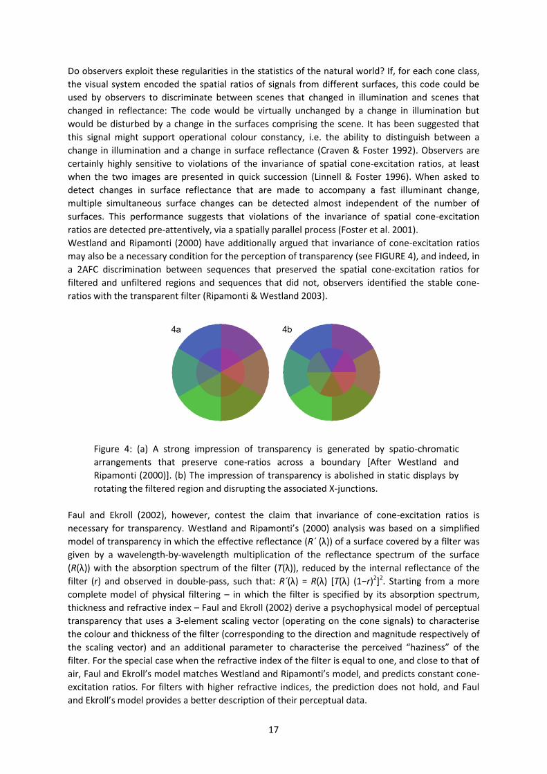
Westland and Ripamonti (2000) have additionally argued that invariance of cone-excitation ratios
may also be a necessary condition for the perception of transparency (see FIGURE 4), and indeed, in
a 2AFC discrimination between sequences that preserved the spatial cone-excitation ratios for
filtered and unfiltered regions and sequences that did not, observers identified the stable cone-
ratios with the transparent filter (Ripamonti & Westland 2003).
Figure 4: (a) A strong impression of transparency is generated by spatio-chromatic
arrangements that preserve cone-ratios across a boundary [After Westland and
Ripamonti (2000)]. (b) The impression of transparency is abolished in static displays by
rotating the filtered region and disrupting the associated X-junctions.
Faul and Ekroll (2002), however, contest the claim that invariance of cone-excitation ratios is
necessary for transparency. Westland and Ripamonti’s (2000) analysis was based on a simplified
model of transparency in which the effective reflectance (R´ (λ)) of a surface covered by a filter was
given by a wavelength-by-wavelength multiplication of the reflectance spectrum of the surface
(R(λ)) with the absorption spectrum of the filter (T(λ)), reduced by the internal reflectance of the
filter (r) and observed in double-pass, such that: R´(λ) = R(λ) [T(λ) (1−r)2]2. Starting from a more
complete model of physical filtering – in which the filter is specified by its absorption spectrum,
thickness and refractive index – Faul and Ekroll (2002) derive a psychophysical model of perceptual
transparency that uses a 3-element scaling vector (operating on the cone signals) to characterise
the colour and thickness of the filter (corresponding to the direction and magnitude respectively of
the scaling vector) and an additional parameter to characterise the perceived “ha iness” of the
filter. For the special case when the refractive index of the filter is equal to one, and close to that of
air, Faul and E roll’s model matches Westland and Ripamonti’s model, and predicts constant cone-
excitation ratios. For filters with higher refractive indices, the prediction does not hold, and Faul
and E roll’s model provides a better description of their perceptual data.
18
5.3. Perceptual correlates of material properties
These experiments highlight the way in which structured changes of colour – namely the consistent
remapping of cone-signals under changes in the spectral content of the illumination or the spectral
transmittance of a filter – provide strong cues about perceptual organisation. Interestingly,
chromatic transparency reveals perceptual heuristics that are hidden in the achromatic case. With
achromatic transparency, additive colour mixture, encompassed by variants of Metelli’s epicoster
model, provides a reasonably accurate account of our perception (see Gerbino 2013 this volume).
Yet, for chromatic transparency, our perception is dominated by subtractive colour mixture, as
described by filter models.
Perception, considered as the estimation of the intrinsic properties of objects in the world, cannot
depend on a full characterisation of the physical interactions between light and matter, not least
because our perceptual apparatus is limited by the sensory data available. One alternative
suggestion is that human vision relies on a number of image statistics that correlate, albeit
imperfectly, with object attributes (e.g. Fleming et al. 2003; Ho et al. 2008). A second alternative is
that the visual system “corrects” the image data by estimating and discounting the contribution of
incidental factors, such as illumination (e.g. D'Zmura & Iverson 1993; Maloney & Wandell 1986).
Signatures of both suggestions can be found in perceptual data, and it is likely that their relative
strengths depend on the information available under the particular viewing circumstance. The
“recovery” of physical parameters of the scene from perceptual information is necessarily under-
constrained, and our task is not to evaluate perception against veridical extraction of these physical
parameters to but to understand the relationship between sensory input and perceptual experience
(see Anderson 2013 this volume for discussion of this approach). Research on material perception is
a growing field, particularly as physically accurate computer rendering of surface properties, such as
gloss (Olkkonen & Brainard 2010), and volume properties, such as transparency and translucency
(Fleming & Bülthoff 2005; Fleming et al. 2011), is becoming possible. Wavelength-dependent
signatures of the interaction between light and matter may well be important in constraining our
perceptions in previously unrecognised ways.
5.4. Dimensionality of colour experience in a world of illuminated objects
A distinction can usefully be made here between performance- and appearance-based measures
(Koenderink 2013 this volume). The ability to perceptually identify particular surfaces across
conditions of observing, such as a change in the spectral content of the illumination, does not imply
that these objects remain unchanging in their appearance. Such associations can often be made
despite large changes in appearance. The asymmetric matching task, in which the observer is asked
to adjust the light from a surface under a reference illuminant until it matches the appearance of a
test surface under a test illuminant, typically permits only imperfect “matches”. rainard et al.
(1997) comment, “At this match point, however, the test and the match surfaces looked different,
and the observers felt as if further adjustments of the match surface should produce a better
correspondence. Yet turning any of the knobs or combinations of knobs only increased the
perceptual difference” (p. 2098). Lichtenberg raised just this issue. In a letter to Goethe (7 October
1793), he writes, “In ordinary life we call white, not what loo s white, but what would loo white if
it was set out in pure sunlight… we believe at every moment that we sense something which we
really only conclude” (Joost et al. 2002).
An interesting issue is the extent to which observers can represent simultaneously the colour of a
surface and that of the light illuminating it (MacLeod 2003). In addition to extracting a perceptual
signal associated with the unchanging property of a material’s surface reflectance, would it not also
be useful to retain information about the properties of different illuminants (c.f. Jansch 1921; Katz
1911)? Tokunaga and Logvinenko (2010) used multidimensional scaling to show that the perceptual
19
distance between papers that were uniformly illuminated could be accommodated within a three-
dimensional configuration, while under variegated illumination three further dimensions emerged.
They describe their results as revealing “lighting dimensions” of object colour that can be
distinguished from the traditional three dimensions referred to as “material dimensions”. The
distinction is one that echoes discussion by Katz and by Koffka on the more-than-one
dimensionality of neutral colours (Koffka 1936).
We can also as about observers’ explicit judgements of the illuminant on a scene. In a strong
version of the illuminant estimation hypothesis, the illuminant estimate is associated with the
explicitly perceived illuminant, but there is also the intriguing possibility that the same physical
quantity has multiple psychological representations (Rutherford & Brainard 2002). In the limited
number of studies that have obtained explicit estimates of scene illuminant, the estimates are not
consistent with the equivalent illuminant parameters required to account for surface perception in
the same scene (Brainard & Maloney 2011).
5.5. The relationship between colour contrast and colour constancy
The standard simultaneous colour contrast situation has been likened to a colour constancy task, in
which the chromatic bias in the surround is attributed to a bias in the spectrum of illumination.
Compensation for this bias shifts the appearance of the test region away from the surround. Koffka
(1931) compares two observations: A small grey patch on a yellow background, and a small area
reflecting neutral light within a room under yellow illumination. In both cases, an objectively neutral
region appears blue when it is surrounded by a yellow environment. But in the first example, the
yellow background appears saturated, but the effect on the neutral region is weak; whereas in the
second example, the yellow background appears close to white, but the effect on the neutral region
is strong. Koffka identifies factors that might account for the difference, such as the full spatial
extent of the scene and the likely spectral composition of natural illuminants – explanations that
might now sit comfortably within a Bayesian framework (Feldman 2013 this volume).
Simple figure-ground displays are compatible with many different perceptual organisations. The
central disc may be an opaque surface lying on a coloured background both illuminated by a neutral
light; the central disc may be an opaque surface lying on a neural background both under spectrally
biased illumination; or the central disc may be transparent so that the light reaching the eye is a
mixture of the properties of the transparent layer and of the underlying surface.
Ekroll et al. have argued for transparency-based interpretations of classical demonstrations of
simultaneous colour contrast (Ekroll & Faul 2013). Whilst it is true that the simple displays typically
used to show simultaneous colour contrast do not include the multiple surfaces that are required to
appropriately parse the contributions from a transparent layer and from the background or
illumination, ambiguous arrangements may also be perceived in terms of surfaces, filters and
illuminants. A transparency-based interpretation suggests new laws of simultaneous contrast that
have some empirical support, particularly when temporal von Kries adaptation is taken into account
(Ekroll & Faul 2012). Bosten and Mollon (2012) provide a detailed discussion of different theories of
simultaneous contrast.
20
5.6. Configural effects
Colour constancy is often cast as the problem of perceiving stable colour appearance of a surface
under changes in the illumination of the surface. We might also consider positional colour
constancy, which describes the invariance of surface colour under changes in position (von
Helmholtz 1867; Young 1807). Illuminant colour constancy requires the chromatic context of the
surface to be taken into account, since for isolated matte surfaces there is no other way to
disentangle illuminant and reflectance. Positional colour constancy requires the chromatic context
to be discounted, since colour perception would otherwise be an accident of location (Whittle &
Challands 1969). Amano and Foster (2004) obtained surface colour matches in Mondrian displays in
which they were able to change the simulated illuminant and the position of the test surface.
Accuracy was almost as good for positional and illuminant constancy as for illuminant constancy
alone. A reliable cue in these cases was provided by the ratios of cone excitations between the test
surfaces and a spatial average over the whole pattern.
In natural viewing, shadows or multiple light sources mean that it is common for scenes to include
multiple regions of illumination. If a perceptual system is to “discount” the illumination in such
scenes, elements that share the same illumination must grouped together to allow the appropriate
corrections to be applied. Gilchrist’s anchoring theory of lightness (Gilchrist et al. 1999) adopts the
term “framewor ” to specify the frame of reference within which the target stimulus belongs (see
also Duncker 1929; Koffka 1935; and Her og & Öğmen 2013 this volume, for their discussion of the
perceived motion of a target within a frame of reference which may itself be in motion). The
principles that promote grouping according to common illumination are discussed in detail by
Gilchrist (2013 this volume).
Schirillo and Shevell (2000) tested the relationship between colour appearance of a small test patch
and the spatial organisation of surrounding patches. They used a small set of chromatic stimuli and
varied only the spatial arrangement in different conditions of the experiment, whilst keeping
constant the immediate surround of the test patch, the space-average chromaticity of the whole
scene, and the range and ensemble of chromaticities present. Strong colour appearance effects
were found with spatial arrangements that allowed the left and right halves of the display to be
interpreted as areas with identical objects under different illuminations. In achromatic cases,
Schrillo and Shevell (2002) showed that arranging grey-level patches to be consistent with surfaces
covered by a luminance edge (i.e. one with a constant contrast-ratio) caused shifts in brightness
that were in the direction predicted by a change in a real illuminant. Perceptual judgments of colour
that are specific to the illuminant simulated in particular regions of the display can be maintained
even when eye-movements cause images of different regions to be interleaved on the retina,
implying that the regional specificity does not derive from peripheral sensory mechanisms (Lee &
Smithson 2012).
Geometric cues, such as X-junctions formed by the continuation of underlying contours across the
edges of a transparency, are vital for the perception of transparency in static scenes (see FIGURE 4).
However, whilst X-junctions can promote perceptual scission, they are not necessarily beneficial in
identifying perceptual correlates of the spectral transmittance of the transparent region, at least in
cases where scission is supported by other cues, such as common motion. With simulations of
transparent overlays moving over a pattern of surface reflectances, rotating the image region
corresponding to the transparency by 180° disrupts X-junctions but does not impair performance in
the task of identifying identical overlays across different illuminant regions and over different
surfaces (Khang & Zaidi 2002). It seems that the identification of spectrally selective transparencies
in these conditions is well predicted by a process of colour matching that operates with parameters
estimated from the mean values in relevant image regions (Khang & Zaidi 2002; Zaidi 1998).
21
Geometric configuration is particularly important for the perception of three-dimensional surfaces
and their interaction with illumination. Bloj et al. (1999) showed that colour perception is strongly
influenced by three-dimensional shape perception. A concave folded card with trapezoidal sides can
be perceived correctly as an inward-pointing corner, or can be misperceived as a “roof” if viewed
through a pseudoscope which reverses the binocular disparities between the two eyes. Bloj et al.
painted the left side of the folded card magenta, and the right side white. The light reflected from
the left side illuminated the right side, generating a strong chromatic gradient across the white-
painted area. Switching viewing mode from “corner” to “roof” caused large changes in colour
appearance matches to the white-painted side, from a desaturated pink to a more saturated
magenta.
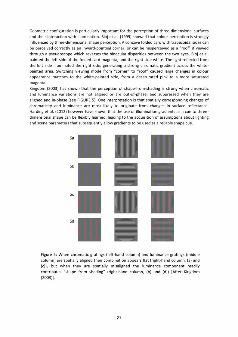
Kingdom (2003) has shown that the perception of shape-from-shading is strong when chromatic
and luminance variations are not aligned or are out-of-phase, and suppressed when they are
aligned and in-phase (see FIGURE 5). One interpretation is that spatially corresponding changes of
chromaticity and luminance are most likely to originate from changes in surface reflectance.
Harding et al. (2012) however have shown that the use of illumination gradients as a cue to three-
dimensional shape can be flexibly learned, leading to the acquisition of assumptions about lighting
and scene parameters that subsequently allow gradients to be used as a reliable shape cue.
Figure 5: When chromatic gratings (left-hand column) and luminance gratings (middle
column) are spatially aligned their combination appears flat (right-hand column, (a) and
(c)), but when they are spatially misaligned the luminance component readily
contributes “shape from shading” (right-hand column, (b) and (d)) [After Kingdom
(2003)].
22
6. Concluding remarks
The perceptual attribute of colour has its own inherent structure. Colours can be ordered and
grouped according to their perceptual similarities. For lights in a void, colour resides in a three-
dimensional space, constrained by the spectral sensitivities of the three, univariant cone
mechanisms and conveniently described by the perceptual qualities of hue, saturation and
brightness. However, once placed in a spatial and temporal context, and related to other lights, the
same spectral distribution of light reaching the retina can change dramatically in appearance.
Additionally, some hues or colour directions have a special status, and the relative influences of
physiological, environmental and linguistic factors in conferring this status remain fiercely debated.
Colour has a strong organisational influence on scenes. Colour can be used to impose spatial
structure, for example when pitted against spatial proximity in conferring rival perceptual
organisations or in supporting contour integration. It allows grouping of elements that aid
extraction of depth from random-dot-stereograms, motion from global-motion stimuli and form
from camouflage. Although colour has traditionally been studied in isolation from other perceptual
attributes, and has often been considered as secondary to form perception, there is increasing
evidence that colour and form processing interact in subtle and flexible ways.
Colour perception is strongly influenced by scene organisation, particularly when the spatial
arrangement of surfaces introduces spatio-chromatic signatures that are consistent with the
chromatic transformations imposed by changes in illumination or by spectrally selective filtering.
Many stimulus arrangements are ambiguous in that they could have been produced by multiple
different arrangements of surfaces, filters and illuminants, and perhaps some of the differences
between the colour percepts elicited by simple stimulus arrangements stem from the observers’
relative willingness to adopt different interpretations of the scene.
A large body of work has considered surface colour perception for arrays of flat, matte surfaces. As
with all perceptual constancies, when there are more cues to the real-world arrangement of lights
and objects, constancy improves. High levels of performance-based or operational constancy can be
achieved however without the need for constancy of appearance across different conditions of
observing. More recently, it has become possible to use computer rendered images to study the
perception of three-dimensional objects formed from glossy or translucent materials. The
interaction of light and the materials from which objects are made provides a rich source of spatio-
chromatic variation. Understanding the constraints that these interactions impose on the pattern of
cone signals across the retina will be important in unravelling competing perceptual organisations
as they relate to stimuli in the external world.
In Gelb’s words, “from the very beginning, the functioning of our sensory apparatus depends upon
conditions in such a way that, in accordance with external stimulus constellations and internal
attitudes we find ourselves confronted by a world of “things”…” (Gelb 1938 p. 207). With our
increased understanding of the physiology of colour vision, and the sophistication with which we
are now able to manipulate stimuli according to the optical physics of light-material interactions,
the world of colour remains a rich testing-ground for principles of perceptual organisation.
23
7. References
Adelson, E. H. (2001). On seeing stuff: The perception of materials by humans and machines.
Human Vision and Electronic Imaging V I, 4299, 1-12.
Amano, K., & Foster, D. H. (2004). Colour constancy under simultaneous changes in surface position
and illuminant. Proceedings of the Royal Society B-Biological Sciences, 271(1555), 2319-2326.
Anderson, B. L. (2011). Visual perception of materials and surfaces. Current Biology, 21(24), R978-
R983.
Anderson, B.L. (2013). The perceptual representation of transparency, lightness, and gloss. In J.
Wagemans (Ed.), Oxford Handbook of Perceptual Organization. Oxford, U.K.: Oxford
University Press.
Anstis, S., Vergeer, M., & Van Lier, R. (2012). Luminance contours can gate afterimage colors and
"real" colors. Journal of Vision, 12(10).
Berlin, Brent, & Kay, Paul. (1969). Basic color terms: Their universality and evolution. Berkeley:
University of California Press.
Blake, Z., Land, T., & Mollon, J. (2008). Relative latencies of cone signals measured by a moving
vernier task. Journal of Vision, 8(16).
Bloj, M. G., Kersten, D., & Hurlbert, A. C. (1999). Perception of three-dimensional shape influences
colour perception through mutual illumination. Nature, 402(6764), 877-879.
Bompas, A. E. D., Kendall, G. E., & Sumner, P. (2013). Spotting fruit versus picking fruit as the
selective advantage of human colour vision. iPerception, 4(2), 84-94.
Bompas, A., Powell, G., & Sumner, P. (2013). Systematic biases in adult color perception persist
despite lifelong information sufficient to calibrate them. Journal of Vision, 13(1).
Bosten, J. M., & Mollon, J. D. (2012). Kirschmann's Fourth Law. Vision Research, 53(1), 40-46.
Bosten, J. M., Robinson, J. D., Jordan, G., & Mollon, J. D. (2005). Multidimensional scaling reveals a
color dimension unique to 'color deficient' observers. Current Biology, 15(23), R950-R952.
Boynton, R. M., & Gordon, J. (1965). Bezold-Brucke hue shift measured by color-naming technique.
Journal of the Optical Society of America, 55(1), 78-86.
Brainard, D. H., Brunt, W. A., & Speigle, J. M. (1997). Color constancy in the nearly natural image .1.
Asymmetric matches. Journal of the Optical Society of America A: Optics Image Science and
Vision, 14(9), 2091-2110.
Brainard, D. H., & Maloney, L. T. (2011). Surface color perception and equivalent illumination
models. Journal of Vision, 11(5).
Brainard, D. H., & Wandell, B. A. (1986). Analysis of the Retinex Theory of Color-Vision. Journal of
the Optical Society of America a-Optics Image Science and Vision, 3(10), 1651-1661.
Burns, B., & Shepp, B. E. (1988). Dimensional interactions and the structure of psychological space -
the representation of hue, saturation, and brightness. Perception & Psychophysics, 43(5),
494-507.
Burns, S. A., Elsner, A. E., Pokorny, J., & Smith, V. C. (1984). The Abney effect - chromaticity
coordinates of unique and other constant hues. Vision Research, 24(5), 479-489.
Cavina-Pratesi, C., Kentridge, R., Heywood, C. A., & Milner, A. D. (2010a). Separate Channels for
Processing Form, Texture, and Color: Evidence from fMRI Adaptation and Visual Object
Agnosia. Cerebral Cortex, 20(10), 2319-2332.
Cavina-Pratesi, C., Kentridge, R. W., Heywood, C. A., & Milner, A. D. (2010b). Separate Processing of
Texture and Form in the Ventral Stream: Evidence from fMRI and Visual Agnosia. Cerebral
Cortex, 20(2), 433-446.
Craven, B. J., & Foster, D. H. (1992). An operational approach to color constancy. Vision Research,
32(7), 1359-1366.
24
Croner, L. J., & Albright, T. D. (1997). Image segmentation enhances discrimination of motion in
visual noise. Vision Research, 37(11), 1415-1427.
Curcio, C. A., Allen, K. A., Sloan, K. R., et al. (1991). Distribution and morphology of human cone
photoreceptors stained with anti-blue opsin. Journal of Comparative Neurology, 312(4), 610-
624.
D'Zmura, M., & Iverson, G. (1993). Color Constancy .1. Basic Theory of 2-Stage Linear Recovery of
Spectral Descriptions for Lights and Surfaces. Journal of the Optical Society of America A:
Optics Image Science and Vision, 10(10), 2148-2163.
Dacey, D. M., & Lee, B. B. (1994). The blue-on opponent pathway in primate retina originates from a
distinct bistratified ganglion-cell type. Nature, 367(6465), 731-735.
Danilova, M. V., & Mollon, J. D. (2012). Foveal color perception: Minimal thresholds at a boundary
between perceptual categories. Vision Research, 62, 162-172.
Daoutis, C. A., Franklin, A., Riddett, A., Clifford, A., & Davies, I. R. L. (2006). Categorical effects in
children's colour search: A cross-linguistic comparison. British Journal of Developmental
Psychology, 24, 373-400.
Daw, N. W. (1962). Why after-images are not seen in normal circumstances. Nature, 196(4860),
1143-&.
de Weert, C. M. M., & van Kruysbergen, N. A. W. H. (1997). Assimilation: central and peripheral
effects. Perception, 26, 1217-1224.
Delahunt, P. B., Webster, M. A., Ma, L., & Werner, J. S. (2004). Long-term renormalization of
chromatic mechanisms following cataract surgery. Visual Neuroscience, 21(3), 301-307.
Derrington, A. M., Krauskopf, J., & Lennie, P. (1984). Chromatic mechanisms in lateral geniculate
nucleus of macaque. Journal of Physiology-London, 357(Dec), 241-265.
Dinkova-Bruun, G., Gasper, G. E. M., Huxtable, M., McLeish, T. C. B., Panti, C., & Smithson, H. (2013).
The Dimensions of Colour: Robert Grosseteste's De colore (Edition, Translation and
Interdisciplinary Analysis). Toronto, Canada: PIMS.
Duncker, D. K. (1929). Uber induzierte Bewegung (Ein Beitrag zur Theorie optisch wahrgenommener
Bewegung). Psychologische Forschung, 12, 180-259.
Ekroll, V., & Faul, F. (2012). New Laws of Simultaneous Contrast? Seeing and Perceiving, 25(2), 107-
141.
Ekroll, V., & Faul, F. (2013). Transparency perception: the key to understanding simultaneous color
contrast. Journal of the Optical Society of America A: Optics Image Science and Vision, 30(3),
342-352.
Elliot, J. (1780). Philosophical Observations on the Senses of Vision and Hearing. London: J. Murry.
Faul, F., & Ekroll, V. (2002). Psychophysical model of chromatic perceptual transparency based on
substractive color mixture. Journal of the Optical Society of America A: Optics Image Science
and Vision, 19(6), 1084-1095.
Feldman, j. (2013). Bayesian models of perceptual organization. In J. Wagemans (Ed.), Oxford
Handbook of Perceptual Organization (in press). Oxford, U.K.: Oxford University Press.
Fleming, R. W., & Bülthoff, H. H. (2005). Low-level image cues in the perception of translucent
materials. ACM Transactions on Applied Perception, 2(3), 346-382.
Fleming, R. W., Dror, R. O., & Adelson, E. H. (2003). Real-world illumination and the perception of
surface reflectance properties. Journal of Vision, 3(5), 347-368.
Fleming, R. W., Jakel, F., & Maloney, L. T. (2011). Visual perception of thick transparent materials.
Psychological Science, 22(6), 812-820.
Fleming, R. W., Wiebel, C., & Gegenfurtner, K. (2013). Perceptual qualities and material classes.
Journal of Vision, 13(8).
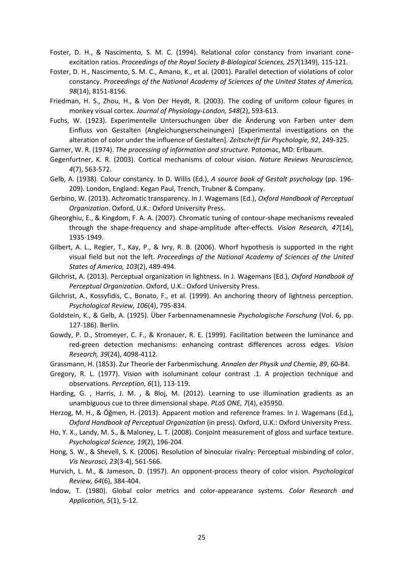
25
Foster, D. H., & Nascimento, S. M. C. (1994). Relational color constancy from invariant cone-
excitation ratios. Proceedings of the Royal Society B-Biological Sciences, 257(1349), 115-121.
Foster, D. H., Nascimento, S. M. C., Amano, K., et al. (2001). Parallel detection of violations of color
constancy. Proceedings of the National Academy of Sciences of the United States of America,
98(14), 8151-8156.
Friedman, H. S., Zhou, H., & Von Der Heydt, R. (2003). The coding of uniform colour figures in
monkey visual cortex. Journal of Physiology-London, 548(2), 593-613.
Fuchs, W. (1923). Experimentelle Untersuchungen über die Änderung von Farben unter dem
Einfluss von Gestalten (Angleichungserscheinungen) [Experimental investigations on the
alteration of color under the influence of Gestalten]. Zeitschrift für Psychologie, 92, 249-325.
Garner, W. R. (1974). The processing of information and structure. Potomac, MD: Erlbaum.
Gegenfurtner, K. R. (2003). Cortical mechanisms of colour vision. Nature Reviews Neuroscience,
4(7), 563-572.
Gelb, A. (1938). Colour constancy. In D. Willis (Ed.), A source book of Gestalt psychology (pp. 196-
209). London, England: Kegan Paul, Trench, Trubner & Company.
Gerbino, W. (2013). Achromatic transparency. In J. Wagemans (Ed.), Oxford Handbook of Perceptual
Organization. Oxford, U.K.: Oxford University Press.
Gheorghiu, E., & Kingdom, F. A. A. (2007). Chromatic tuning of contour-shape mechanisms revealed
through the shape-frequency and shape-amplitude after-effects. Vision Research, 47(14),
1935-1949.
Gilbert, A. L., Regier, T., Kay, P., & Ivry, R. B. (2006). Whorf hypothesis is supported in the right
visual field but not the left. Proceedings of the National Academy of Sciences of the United
States of America, 103(2), 489-494.
Gilchrist, A. (2013). Perceptual organization in lightness. In J. Wagemans (Ed.), Oxford Handbook of
Perceptual Organization. Oxford, U.K.: Oxford University Press.
Gilchrist, A., Kossyfidis, C., Bonato, F., et al. (1999). An anchoring theory of lightness perception.
Psychological Review, 106(4), 795-834.
Goldstein, K., & Gelb, A. (1925). Über Farbennamenamnesie Psychologische Forschung (Vol. 6, pp.
127-186). Berlin.
Gowdy, P. D., Stromeyer, C. F., & Kronauer, R. E. (1999). Facilitation between the luminance and
red-green detection mechanisms: enhancing contrast differences across edges. Vision
Research, 39(24), 4098-4112.
Grassmann, H. (1853). Zur Theorie der Farbenmischung. Annalen der Physik und Chemie, 89, 60-84.
Gregory, R. L. (1977). Vision with isoluminant colour contrast .1. A projection technique and
observations. Perception, 6(1), 113-119.
Harding, G. , Harris, J. M. , & Bloj, M. (2012). Learning to use illumination gradients as an
unambiguous cue to three dimensional shape. PLoS ONE, 7(4), e35950.
Her og, M. H., & Öğmen, H. (2013). Apparent motion and reference frames. In J. Wagemans (Ed.),
Oxford Handbook of Perceptual Organization (in press). Oxford, U.K.: Oxford University Press.
Ho, Y. X., Landy, M. S., & Maloney, L. T. (2008). Conjoint measurement of gloss and surface texture.
Psychological Science, 19(2), 196-204.
Hong, S. W., & Shevell, S. K. (2006). Resolution of binocular rivalry: Perceptual misbinding of color.
Vis Neurosci, 23(3-4), 561-566.
Hurvich, L. M., & Jameson, D. (1957). An opponent-process theory of color vision. Psychological
Review, 64(6), 384-404.
Indow, T. (1980). Global color metrics and color-appearance systems. Color Research and
Application, 5(1), 5-12.
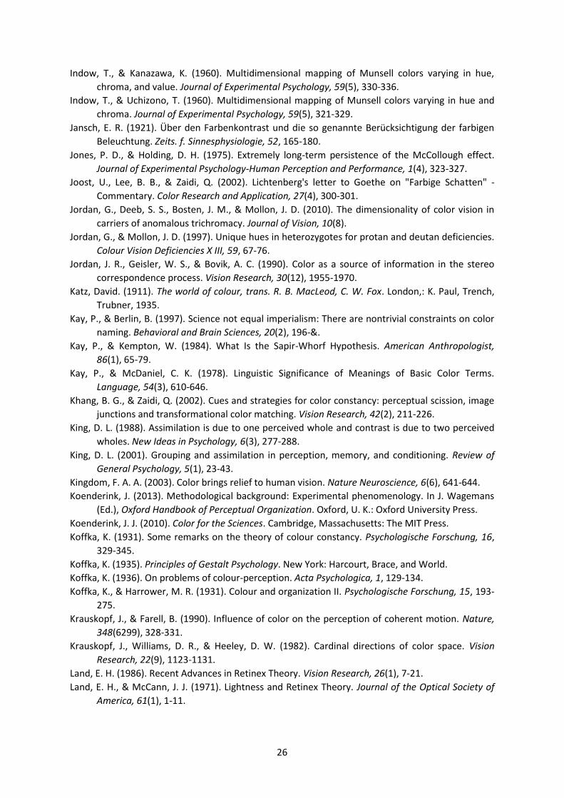
26
Indow, T., & Kanazawa, K. (1960). Multidimensional mapping of Munsell colors varying in hue,
chroma, and value. Journal of Experimental Psychology, 59(5), 330-336.
Indow, T., & Uchizono, T. (1960). Multidimensional mapping of Munsell colors varying in hue and
chroma. Journal of Experimental Psychology, 59(5), 321-329.
Jansch, E. R. (1921). Über den Farbenkontrast und die so genannte Berücksichtigung der farbigen
Beleuchtung. Zeits. f. Sinnesphysiologie, 52, 165-180.
Jones, P. D., & Holding, D. H. (1975). Extremely long-term persistence of the McCollough effect.
Journal of Experimental Psychology-Human Perception and Performance, 1(4), 323-327.
Joost, U., Lee, B. B., & Zaidi, Q. (2002). Lichtenberg's letter to Goethe on "Farbige Schatten" -
Commentary. Color Research and Application, 27(4), 300-301.
Jordan, G., Deeb, S. S., Bosten, J. M., & Mollon, J. D. (2010). The dimensionality of color vision in
carriers of anomalous trichromacy. Journal of Vision, 10(8).
Jordan, G., & Mollon, J. D. (1997). Unique hues in heterozygotes for protan and deutan deficiencies.
Colour Vision Deficiencies X III, 59, 67-76.
Jordan, J. R., Geisler, W. S., & Bovik, A. C. (1990). Color as a source of information in the stereo
correspondence process. Vision Research, 30(12), 1955-1970.
Katz, David. (1911). The world of colour, trans. R. B. MacLeod, C. W. Fox. London,: K. Paul, Trench,
Trubner, 1935.
Kay, P., & Berlin, B. (1997). Science not equal imperialism: There are nontrivial constraints on color
naming. Behavioral and Brain Sciences, 20(2), 196-&.
Kay, P., & Kempton, W. (1984). What Is the Sapir-Whorf Hypothesis. American Anthropologist,
86(1), 65-79.
Kay, P., & McDaniel, C. K. (1978). Linguistic Significance of Meanings of Basic Color Terms.
Language, 54(3), 610-646.
Khang, B. G., & Zaidi, Q. (2002). Cues and strategies for color constancy: perceptual scission, image
junctions and transformational color matching. Vision Research, 42(2), 211-226.
King, D. L. (1988). Assimilation is due to one perceived whole and contrast is due to two perceived
wholes. New Ideas in Psychology, 6(3), 277-288.
King, D. L. (2001). Grouping and assimilation in perception, memory, and conditioning. Review of
General Psychology, 5(1), 23-43.
Kingdom, F. A. A. (2003). Color brings relief to human vision. Nature Neuroscience, 6(6), 641-644.
Koenderink, J. (2013). Methodological background: Experimental phenomenology. In J. Wagemans
(Ed.), Oxford Handbook of Perceptual Organization. Oxford, U. K.: Oxford University Press.
Koenderink, J. J. (2010). Color for the Sciences. Cambridge, Massachusetts: The MIT Press.
Koffka, K. (1931). Some remarks on the theory of colour constancy. Psychologische Forschung, 16,
329-345.
Koffka, K. (1935). Principles of Gestalt Psychology. New York: Harcourt, Brace, and World.
Koffka, K. (1936). On problems of colour-perception. Acta Psychologica, 1, 129-134.
Koffka, K., & Harrower, M. R. (1931). Colour and organization II. Psychologische Forschung, 15, 193-
275.
Krauskopf, J., & Farell, B. (1990). Influence of color on the perception of coherent motion. Nature,
348(6299), 328-331.
Krauskopf, J., Williams, D. R., & Heeley, D. W. (1982). Cardinal directions of color space. Vision
Research, 22(9), 1123-1131.
Land, E. H. (1986). Recent Advances in Retinex Theory. Vision Research, 26(1), 7-21.
Land, E. H., & McCann, J. J. (1971). Lightness and Retinex Theory. Journal of the Optical Society of
America, 61(1), 1-11.
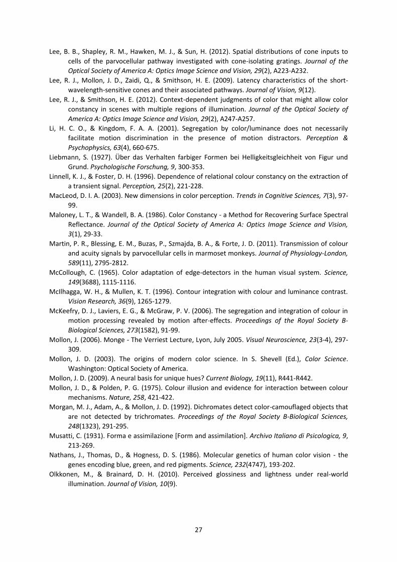
27
Lee, B. B., Shapley, R. M., Hawken, M. J., & Sun, H. (2012). Spatial distributions of cone inputs to
cells of the parvocellular pathway investigated with cone-isolating gratings. Journal of the
Optical Society of America A: Optics Image Science and Vision, 29(2), A223-A232.
Lee, R. J., Mollon, J. D., Zaidi, Q., & Smithson, H. E. (2009). Latency characteristics of the short-
wavelength-sensitive cones and their associated pathways. Journal of Vision, 9(12).
Lee, R. J., & Smithson, H. E. (2012). Context-dependent judgments of color that might allow color
constancy in scenes with multiple regions of illumination. Journal of the Optical Society of
America A: Optics Image Science and Vision, 29(2), A247-A257.
Li, H. C. O., & Kingdom, F. A. A. (2001). Segregation by color/luminance does not necessarily
facilitate motion discrimination in the presence of motion distractors. Perception &
Psychophysics, 63(4), 660-675.
Liebmann, S. (1927). ber das Verhalten farbiger Formen bei Hellig eitsgleichheit von Figur und
Grund. Psychologische Forschung, 9, 300-353.
Linnell, K. J., & Foster, D. H. (1996). Dependence of relational colour constancy on the extraction of
a transient signal. Perception, 25(2), 221-228.
MacLeod, D. I. A. (2003). New dimensions in color perception. Trends in Cognitive Sciences, 7(3), 97-
99.
Maloney, L. T., & Wandell, B. A. (1986). Color Constancy - a Method for Recovering Surface Spectral
Reflectance. Journal of the Optical Society of America A: Optics Image Science and Vision,
3(1), 29-33.
Martin, P. R., Blessing, E. M., Buzas, P., Szmajda, B. A., & Forte, J. D. (2011). Transmission of colour
and acuity signals by parvocellular cells in marmoset monkeys. Journal of Physiology-London,
589(11), 2795-2812.
McCollough, C. (1965). Color adaptation of edge-detectors in the human visual system. Science,
149(3688), 1115-1116.
McIlhagga, W. H., & Mullen, K. T. (1996). Contour integration with colour and luminance contrast.
Vision Research, 36(9), 1265-1279.
McKeefry, D. J., Laviers, E. G., & McGraw, P. V. (2006). The segregation and integration of colour in
motion processing revealed by motion after-effects. Proceedings of the Royal Society B-
Biological Sciences, 273(1582), 91-99.
Mollon, J. (2006). Monge - The Verriest Lecture, Lyon, July 2005. Visual Neuroscience, 23(3-4), 297-
309.
Mollon, J. D. (2003). The origins of modern color science. In S. Shevell (Ed.), Color Science.
Washington: Optical Society of America.
Mollon, J. D. (2009). A neural basis for unique hues? Current Biology, 19(11), R441-R442.
Mollon, J. D., & Polden, P. G. (1975). Colour illusion and evidence for interaction between colour
mechanisms. Nature, 258, 421-422.
Morgan, M. J., Adam, A., & Mollon, J. D. (1992). Dichromates detect color-camouflaged objects that
are not detected by trichromates. Proceedings of the Royal Society B-Biological Sciences,
248(1323), 291-295.
Musatti, C. (1931). Forma e assimilazione [Form and assimilation]. Archivo Italiano di Psicologica, 9,
213-269.
Nathans, J., Thomas, D., & Hogness, D. S. (1986). Molecular genetics of human color vision - the
genes encoding blue, green, and red pigments. Science, 232(4747), 193-202.
Olkkonen, M., & Brainard, D. H. (2010). Perceived glossiness and lightness under real-world
illumination. Journal of Vision, 10(9).
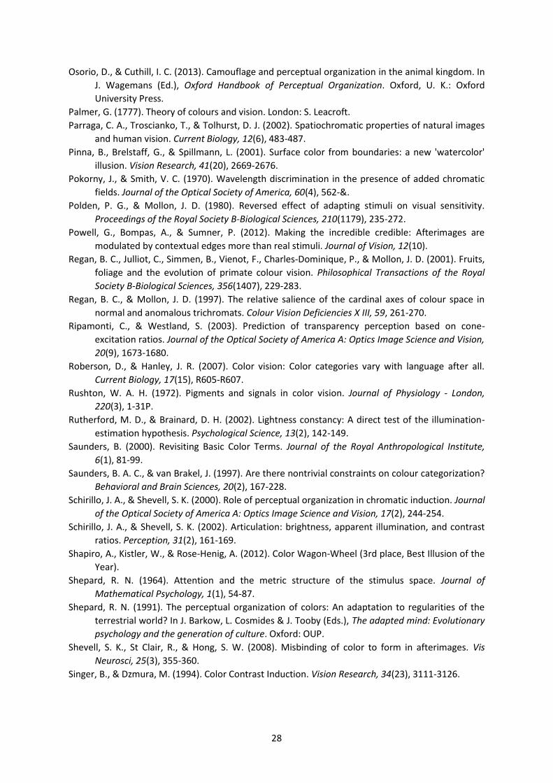
28
Osorio, D., & Cuthill, I. C. (2013). Camouflage and perceptual organization in the animal kingdom. In
J. Wagemans (Ed.), Oxford Handbook of Perceptual Organization. Oxford, U. K.: Oxford
University Press.
Palmer, G. (1777). Theory of colours and vision. London: S. Leacroft.
Parraga, C. A., Troscianko, T., & Tolhurst, D. J. (2002). Spatiochromatic properties of natural images
and human vision. Current Biology, 12(6), 483-487.
Pinna, B., Brelstaff, G., & Spillmann, L. (2001). Surface color from boundaries: a new 'watercolor'
illusion. Vision Research, 41(20), 2669-2676.
Pokorny, J., & Smith, V. C. (1970). Wavelength discrimination in the presence of added chromatic
fields. Journal of the Optical Society of America, 60(4), 562-&.
Polden, P. G., & Mollon, J. D. (1980). Reversed effect of adapting stimuli on visual sensitivity.
Proceedings of the Royal Society B-Biological Sciences, 210(1179), 235-272.
Powell, G., Bompas, A., & Sumner, P. (2012). Making the incredible credible: Afterimages are
modulated by contextual edges more than real stimuli. Journal of Vision, 12(10).
Regan, B. C., Julliot, C., Simmen, B., Vienot, F., Charles-Dominique, P., & Mollon, J. D. (2001). Fruits,
foliage and the evolution of primate colour vision. Philosophical Transactions of the Royal
Society B-Biological Sciences, 356(1407), 229-283.
Regan, B. C., & Mollon, J. D. (1997). The relative salience of the cardinal axes of colour space in
normal and anomalous trichromats. Colour Vision Deficiencies X III, 59, 261-270.
Ripamonti, C., & Westland, S. (2003). Prediction of transparency perception based on cone-
excitation ratios. Journal of the Optical Society of America A: Optics Image Science and Vision,
20(9), 1673-1680.
Roberson, D., & Hanley, J. R. (2007). Color vision: Color categories vary with language after all.
Current Biology, 17(15), R605-R607.
Rushton, W. A. H. (1972). Pigments and signals in color vision. Journal of Physiology - London,
220(3), 1-31P.
Rutherford, M. D., & Brainard, D. H. (2002). Lightness constancy: A direct test of the illumination-
estimation hypothesis. Psychological Science, 13(2), 142-149.
Saunders, B. (2000). Revisiting Basic Color Terms. Journal of the Royal Anthropological Institute,
6(1), 81-99.
Saunders, B. A. C., & van Brakel, J. (1997). Are there nontrivial constraints on colour categorization?
Behavioral and Brain Sciences, 20(2), 167-228.
Schirillo, J. A., & Shevell, S. K. (2000). Role of perceptual organization in chromatic induction. Journal
of the Optical Society of America A: Optics Image Science and Vision, 17(2), 244-254.
Schirillo, J. A., & Shevell, S. K. (2002). Articulation: brightness, apparent illumination, and contrast
ratios. Perception, 31(2), 161-169.
Shapiro, A., Kistler, W., & Rose-Henig, A. (2012). Color Wagon-Wheel (3rd place, Best Illusion of the
Year).
Shepard, R. N. (1964). Attention and the metric structure of the stimulus space. Journal of
Mathematical Psychology, 1(1), 54-87.
Shepard, R. N. (1991). The perceptual organization of colors: An adaptation to regularities of the
terrestrial world? In J. Barkow, L. Cosmides & J. Tooby (Eds.), The adapted mind: Evolutionary
psychology and the generation of culture. Oxford: OUP.
Shevell, S. K., St Clair, R., & Hong, S. W. (2008). Misbinding of color to form in afterimages. Vis
Neurosci, 25(3), 355-360.
Singer, B., & Dzmura, M. (1994). Color Contrast Induction. Vision Research, 34(23), 3111-3126.
29
Smithson, H. E. (2005). Sensory, computational and cognitive components of human colour
constancy. Philosophical Transactions of the Royal Society B-Biological Sciences, 360(1458),
1329-1346.
Smithson, H. E., Dinkova-Bruun, G., Gasper, G. E. M., Huxtable, M., McLeish, T. C. B., & Panti, C.
(2012). A three-dimensional color space from the 13th century. Journal of the Optical Society
of America A: Optics Image Science and Vision, 29(2), A346-A352.
Smithson, H. E., & Mollon, J. D. (2004). Is the S-opponent chromatic sub-system sluggish? Vision
Research, 44(25), 2919-2929.
Solomon, S. G., & Lennie, P. (2005). Chromatic gain controls in visual cortical neurons. Journal of
Neuroscience, 25(19), 4779-4792.
Solomon, S. G., Peirce, J. W., & Lennie, P. (2004). The impact of suppressive surrounds on chromatic
properties of cortical neurons. Journal of Neuroscience, 24(1), 148-160.
Stiles, W. S. (1949). Increment thresholds and the mechanisms of colour vision. Documenta
Ophthalmologica, 3(1), 138-165.
Stockman, A., & Brainard, D. H. (2009). Color vision mechanisms. In B. M., C. DeCusatis, J. Enoch, V.
Lakshminarayanan, G. Li, C. Macdonald, V. Mahajan & E. van Stryland (Eds.), Vision and Vision
Optics. The Optical Society of America Handbook of Optics (3rd ed., Vol. 3). New York:
McGraw Hill.
Stoughton, C. M., & Conway, B. R. (2008). Neural basis for unique hues. Current Biology, 18(16),
R698-R699.
Sumner, P., Adamjee, T., & Mollon, J. D. (2002). Signals invisible to the collicular and magnocellular
pathways can capture visual attention. Current Biology, 12(15), 1312-1316.
Sumner, P., Anderson, E. J., Sylvester, R., Haynes, J. D., & Rees, G. (2008). Combined orientation and
colour information in human V1 for both L-M and S-cone chromatic axes. Neuroimage, 39(2),
814-824.
Sumner, P., & Mollon, J. D. (2000a). Catarrhine photopigments are optimized for detecting targets
against a foliage background. Journal of Experimental Biology, 203(13), 1963-1986.
Sumner, P., & Mollon, J. D. (2000b). Chromaticity as a signal of ripeness in fruits taken by primates.
Journal of Experimental Biology, 203(13), 1987-2000.
Tansley, B. W., & Boynton, R. M. (1976). A line, not a space, represents visual distinctness of
borders formed by different colors. Science, 191(4230), 954-957.
Tokunaga, R., & Logvinenko, A. D. (2010). Material and lighting dimensions of object colour. Vision
Research, 50(17), 1740-1747.
Townsend, J. T., & Wenger, M. J. (2013). On the dynamic perceptual characteristics of Gestalten:
Theory-based methods. In J. Wagemans (Ed.), Oxford Handbook of Perceptual Organization.
Oxford, U. K.: Oxford University Press.
Troscianko, T., Montagnon, R., Leclerc, J., Malbert, E., & Chanteau, P. L. (1991). The role of color as
a monocular depth cue. Vision Research, 31(11), 1923-1929.
von Helmholtz, H. (1867). Handbuch der physiologischen Optik (Vol. II, 1st edn. Translation of 3rd
edn, Helmholt ’s treatise on physiological optics, 1909 (ed. J. P. C. Southall), pp. 286–287.
Washington, DC: Optical Society of America, 1924). Leipzig: Leopold Voss.
von Kries, J. (1878). Beitrag zur Physiologie der Gesichtsempfindungen. . [Transl. Physiology of visual
sensations. In Sources of color science, (ed. D. L. MacAdam), pp. 101–108, 1st edn. Cambridge,
MA: MIT press.].
Vul, E., Krizay, E., & MacLeod, D. I. A. (2008). The McCollough effect reflects permanent and
transient adaptation in early visual cortex. Journal of Vision, 8(12).
30
Webster, M. A., Devalois, K. K., & Switkes, E. (1990). Orientation and spatial-frequency
discrimination for luminance and chromatic gratings. Journal of the Optical Society of America
A: Optics Image Science and Vision, 7(6), 1034-1049.
Webster, M. A., Halen, K., Meyers, A. J., Winkler, P., & Werner, J. S. (2010). Colour appearance and
compensation in the near periphery. Proceedings of the Royal Society B-Biological Sciences,
277(1689), 1817-1825.
Werner, J. S., & Schefrin, B. E. (1993). Loci of achromatic points throughout the life span. Journal of
the Optical Society of America A: Optics Image Science and Vision, 10(7), 1509-1516.
Westland, S., & Ripamonti, C. (2000). Invariant cone-excitation ratios may predict transparency.
Journal of the Optical Society of America A: Optics Image Science and Vision, 17(2), 255-264.
Whittle, P., & Challands, P. D. C. (1969). Effect of Background Luminance on Brightness of Flashes.
Vision Research, 9(9), 1095-1110.
Williams, D. R., & MacLeod, D. I. A. (1979). Interchangeable backgrounds for cone afterimages.
Vision Research, 19(8), 867-877.
Winawer, J., Witthoft, N., Frank, M. C., Wu, L., Wade, A. R., & Boroditsky, L. (2007). Russian blues
reveal effects of language on color discrimination. Proceedings of the National Academy of
Sciences of the United States of America, 104(19), 7780-7785.
Witzel, C., & Gegenfurtner, K. R. (2011). Is there a lateralized category effect for color? Journal of
Vision, 11(12).
Wuerger, S. M., Maloney, L. T., & Krauskopf, J. (1995). Proximity judgments in color space - tests of
a Euclidean color geometry. Vision Research, 35(6), 827-835.
Wyszecki, G., & Stiles, W. S. (1982). Color science: Concepts and methods. quantitative data and
formulae. New York: Wiley.
Xian, S. X. (2004). Perceptual grouping in colour perception. (Doctor of Philosophy), The University
of Chicago, Chicago, Illinois.
Xian, S. X., & Shevell, S. K. (2004). Changes in color appearance caused by perceptual grouping.
Visual Neuroscience, 21(3), 383-388.
Young, T. (1802). The Bakerian Lecture. On the Theory of Light and Colours. Philosophical
Transactions of the Royal Society of London, 92, 12-48.
Young, T. (1807). A course of lectures on natural philosophy and the mechanical arts (Vol. I, lecture
XXXVIII). London: Joseph Johnson.
Zaidi, Q. (1998). Identification of illuminant and object colors: heuristic-based algorithms. Journal of
the Optical Society of America A: Optics Image Science and Vision, 15(7), 1767-1776.
Zaidi, Q., Ennis, R., Cao, D. C., & Lee, B. (2012). Neural locus of color afterimages. Current Biology,
22(3), 220-224.
Zaidi, Q., & Li, A. (2006). Three-dimensional shape perception from chromatic orientation flows.
Visual Neuroscience, 23(3-4), 323-330.
Zhou, K., Mo, L., Kay, P., Kwok, V. P. Y., Ip, T. N. M., & Tan, L. H. (2010). Newly trained lexical
categories produce lateralized categorical perception of color. Proceedings of the National
Academy of Sciences of the United States of America, 107(22), 9974-9978.