Embed Size (px)
Citation preview

A Sales Dashboard for Contoso
A solution scenario using Microsoft Business Intelligence applications, including SQL Server 2008 R2, Microsoft SharePoint Server 2010, and Microsoft Office 2010.
Authors:Diane DiazJoanne HendricksonCarla Sabotta Heidi SteenDenise StenderaMarianne Willumsen
Date published:June 2010
Summary:The following solution scenario provides detailed guidance on how to create a sample Corporate Sales dashboard that uses the Business Intelligence capabilities in SQL Server 2008 R2, Microsoft SharePoint Server 2010, and Microsoft Office 2010. This scenario covers the creation of a dashboard that uses PerformancePoint to include a variety of reports, including a KPI details report, Analytic bar and pie charts, Reporting Services report, Excel Services report, and a Web Page report. This document is presented to assist you to create a similar dashboard in your environment.
© 2010 Microsoft Corporation. All rights reserved.Microsoft, SQL Server, Windows, and SharePoint are trademarks of the Microsoft group of companies.All other trademarks are property of their respective owners.

ContentsOverview.....................................................................................................................................................4
Phase I: Preparing the environment............................................................................................................5
Step 1: Install and configure software and tools.....................................................................................5
Resources for Your Dashboard............................................................................................................5
Step 2: Create a database........................................................................................................................5
Resources for Your Dashboard............................................................................................................5
Step 3: Learn how to use Dashboard Designer........................................................................................6
Resources for Your Dashboard............................................................................................................6
Step 4: Learn how to use Report Builder.................................................................................................6
Resources for Your Dashboard............................................................................................................6
Phase II: Planning the dashboard................................................................................................................7
Resources for Your Dashboard............................................................................................................8
Phase III: Building the dashboard................................................................................................................8
Step 1: Create a connection to the data source......................................................................................8
Resources for Your Dashboard............................................................................................................9
Step 2: Create dashboard items..............................................................................................................9
Page 1: Sales Performance................................................................................................................10
Page 2: Sales Analysis........................................................................................................................17
Page 3: (OPTIONAL) Additional Information.....................................................................................20
Step 3: Create and assemble the dashboard pages...............................................................................23
Step 4: Preview, test, and deploy the dashboard..................................................................................24
Resources for Your Dashboard..........................................................................................................24
Phase IV: Use the dashboard.....................................................................................................................25
Resources for Your Dashboard..............................................................................................................25
Appendix A. Additional Resources.............................................................................................................26
Resources for SQL Server PowerPivot and PerformancePoint Services.................................................26
Resources for Reporting Services Reports.............................................................................................26
Getting Data from a Cube..................................................................................................................26
Drillthrough Reports..........................................................................................................................26
Data Visualization..............................................................................................................................26
Data Regions and Data Formatting....................................................................................................26
Parameters........................................................................................................................................26
Expressions........................................................................................................................................26
Saving Reports...................................................................................................................................27
Tutorials and Samples........................................................................................................................27
Videos................................................................................................................................................27
Resources for Creating Cubes and Dimensions.....................................................................................27
Appendix B. Cross-Functional Flowchart...................................................................................................27
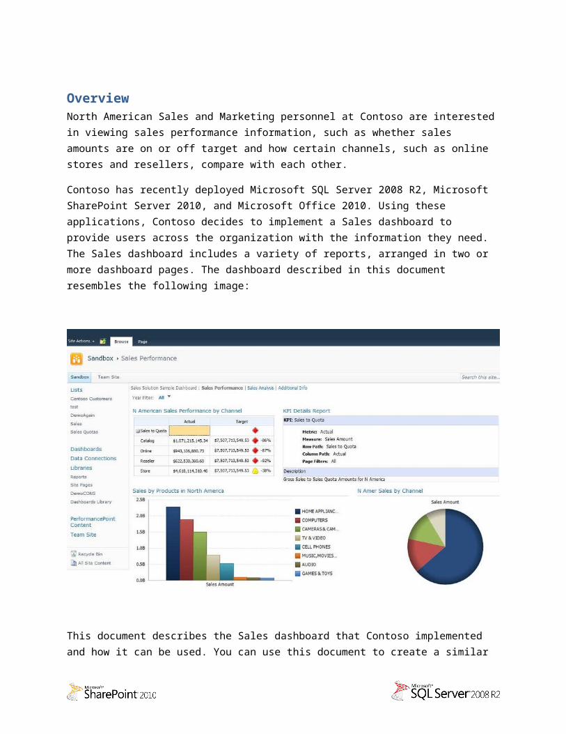
OverviewNorth American Sales and Marketing personnel at Contoso are interested in viewing sales performance information, such as whether sales amounts are on or off target and how certain channels, such as online stores and resellers, compare with each other.
Contoso has recently deployed Microsoft SQL Server 2008 R2, Microsoft SharePoint Server 2010, and Microsoft Office 2010. Using these applications, Contoso decides to implement a Sales dashboard to provide users across the organization with the information they need. The Sales dashboard includes a variety of reports, arranged in two or more dashboard pages. The dashboard described in this document resembles the following image:
This document describes the Sales dashboard that Contoso implemented and how it can be used. You can use this document to create a similar dashboard in your organization. See Appendix B for a cross-functional flowchart of the high-level steps used to create this dashboard.
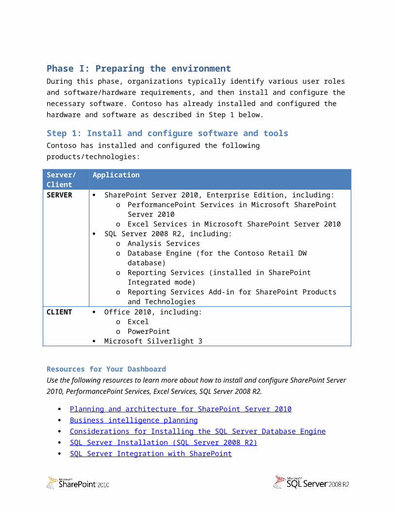
Phase I: Preparing the environmentDuring this phase, organizations typically identify various user roles and software/hardware requirements, and then install and configure the necessary software. Contoso has already installed and configured the hardware and software as described in Step 1 below.
Step 1: Install and configure software and toolsContoso has installed and configured the following products/technologies:
Server/Client ApplicationSERVER SharePoint Server 2010, Enterprise Edition, including:
o PerformancePoint Services in Microsoft SharePoint Server 2010o Excel Services in Microsoft SharePoint Server 2010
SQL Server 2008 R2, including:o Analysis Serviceso Database Engine (for the Contoso Retail DW database)o Reporting Services (installed in SharePoint Integrated mode)o Reporting Services Add-in for SharePoint Products and Technologies
CLIENT Office 2010, including:o Excelo PowerPoint
Microsoft Silverlight 3
Resources for Your DashboardUse the following resources to learn more about how to install and configure SharePoint Server 2010, PerformancePoint Services, Excel Services, SQL Server 2008 R2.
Planning and architecture for SharePoint Server 2010 Business intelligence planning Considerations for Installing the SQL Server Database Engine SQL Server Installation (SQL Server 2008 R2) SQL Server Integration with SharePoint
Step 2: Create a databaseDuring this step, Contoso creates the database to be used. For this Sales dashboard, a data cube is created by using SQL Server Analysis Services. The database is called the Contoso Retail DW database. The data cube is called the Contoso Retail DW cube.
Resources for Your DashboardThe Contoso BI Demo Dataset for Retail Industry contains the Contoso Retail DW database and the Contoso Retail DW cube.

Download the dataset and view instructions on how to use it from Microsoft Contoso BI Demo Dataset for Retail Industry on the Microsoft Download Center.
Step 3: Learn how to use Dashboard DesignerContoso uses PerformancePoint Dashboard Designer to create the dashboard pages and most of the dashboard content, including a scorecard, KPI Details report, analytic charts, and a filter. Contoso also uses applications, such as Excel and Report Builder 3.0, to create reports that are used by various other groups and managers. Dashboard Designer makes it easy to integrate all of these kinds of reports in a single dashboard.
Resources for Your DashboardUse the following resources to learn how to open and navigate Dashboard Designer.
Task DescriptionInstall and open Dashboard Designer
If you are brand new to PerformancePoint Services and you do not know how to open Dashboard Designer, see Open Dashboard Designer.
Get acquainted with Dashboard Designer
If you are new to Dashboard Designer and would like an overview of what this tool is and how it works, see Getting Started: PerformancePoint Dashboard Designer.
Tour Dashboard Designer and see how it works
If you would like to see Dashboard Designer in action, view the video series Up to Speed: PerformancePoint Dashboard Designer. This video series walks you through the user interface and shows you how to create, deploy, and edit dashboards by using Dashboard Designer.
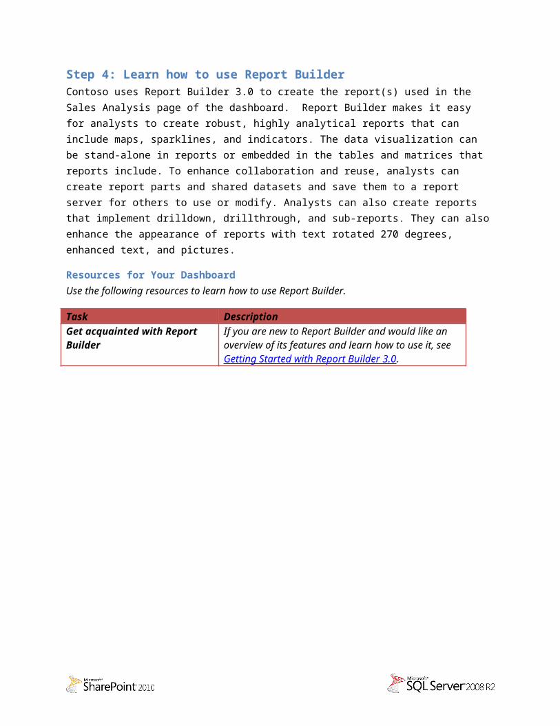
Step 4: Learn how to use Report BuilderContoso uses Report Builder 3.0 to create the report(s) used in the Sales Analysis page of the dashboard. Report Builder makes it easy for analysts to create robust, highly analytical reports that can include maps, sparklines, and indicators. The data visualization can be stand-alone in reports or embedded in the tables and matrices that reports include. To enhance collaboration and reuse, analysts can create report parts and shared datasets and save them to a report server for others to use or modify. Analysts can also create reports that implement drilldown, drillthrough, and sub-reports. They can also enhance the appearance of reports with text rotated 270 degrees, enhanced text, and pictures.
Resources for Your DashboardUse the following resources to learn how to use Report Builder.
Task DescriptionGet acquainted with Report Builder If you are new to Report Builder and would like an
overview of its features and learn how to use it, see Getting Started with Report Builder 3.0.
Phase II: Planning the dashboardDuring this phase, Contoso creates a plan for the dashboard.
The dashboard will enable users, such as Sales and Marketing managers, to view sales information across different products and channels in North America. The dashboard will contain up to three pages, as follows:
Sales Performance. Provides basic information about overall sales performance in North America. The dashboard items on this page will be created by using Dashboard Designer.
Sales Analysis. Provides more detailed information for sales in the North American online and reseller channels in a SQL Server Reporting Services report. The report on this page will be created by using Report Builder 3.0.
Additional Information. (This is optional) This page might be used to display an Excel Services report, a Web Page report, or other kinds of reports to provide additional information that could be useful to the sales team. The reports on this page can be created by using Excel or another application, and can then be displayed in a PerformancePoint Web Part (which is configured by using Dashboard Designer).
Dashboard authors can choose from multiple tools to create dashboards. For this Sales dashboard, Contoso selected Dashboard Designer because of the following capabilities:
Integration with Excel Services and Reporting Services. Dashboard Designer makes it easy to create dashboards that include a combination of reports, including PerformancePoint reports, Excel Services reports, and Reporting Services reports in a single dashboard, and even connect dashboard filters to these reports.
Integration with SharePoint Server. Dashboards that are created by using Dashboard Designer are easily deployed to SharePoint Server 2010. This enables dashboard users to utilize powerful SharePoint Server capabilities, including collaboration, easy access to various SharePoint lists and document libraries, and the ability to export most kinds of reports and scorecards to PowerPoint or Excel.
Reusable dashboard content. PerformancePoint dashboard content is automatically saved to designated SharePoint lists and libraries, making it easy for other analysts and dashboard authors to share and reuse dashboard items. For example, a dashboard author can create a dashboard filter and use it across multiple pages in a single dashboard and across multiple dashboards. Other dashboard authors can use that filter in their dashboards, too.

Resources for Your DashboardUse the following resources to learn more about planning a dashboard:
Task DescriptionPlan your PerformancePoint dashboard
To get an overview of things to consider before you create and deploy a dashboard by using PerformancePoint Dashboard Designer, see Plan your PerformancePoint dashboard.
Learn about user permissions
To learn about the user permissions that are needed to create and use PerformancePoint dashboards, see About user permissions for PerformancePoint Services in Microsoft SharePoint Server 2010.
Phase III: Building the dashboardAfter the dashboard plan has been created, Contoso is ready to begin creating the dashboard. The overall process includes four main steps:
1. Create a connection to the data sources 2. Create the dashboard items, such as the reports, scorecards, and filters 3. Create and assemble the dashboard pages 4. Preview, test, and deploy the dashboard
Step 1: Create a connection to the data sourceDuring Phase I, when Contoso’s IT administrators set up and configured the necessary hardware and software, IT also created a data cube. The cube is called the Contoso Retail DW cube, and it was created by using Analysis Services.
During this phase, Contoso creates a connection in Dashboard Designer to the Contoso Retail DW cube. This data connection will then be used to create many of the dashboard items for Contoso’s Sales dashboard.
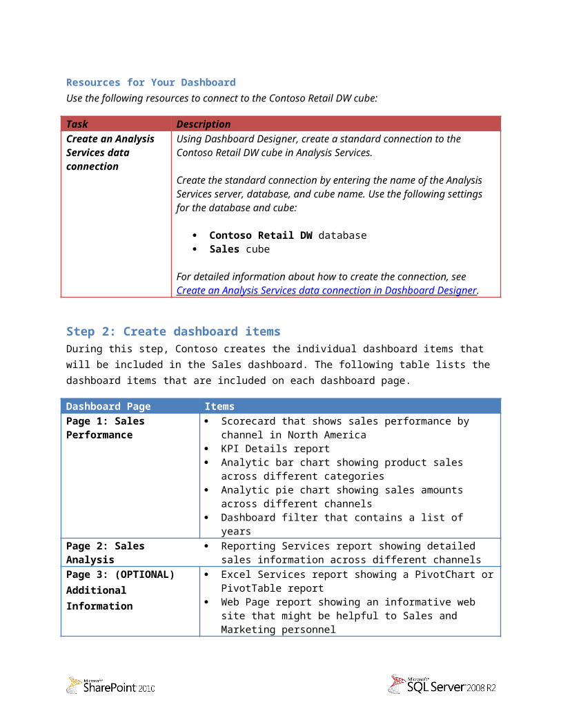
Resources for Your DashboardUse the following resources to connect to the Contoso Retail DW cube:
Task DescriptionCreate an Analysis Services data connection
Using Dashboard Designer, create a standard connection to the Contoso Retail DW cube in Analysis Services.
Create the standard connection by entering the name of the Analysis Services server, database, and cube name. Use the following settings for the database and cube:
Contoso Retail DW database Sales cube
For detailed information about how to create the connection, see Create an Analysis Services data connection in Dashboard Designer.
Step 2: Create dashboard itemsDuring this step, Contoso creates the individual dashboard items that will be included in the Sales dashboard. The following table lists the dashboard items that are included on each dashboard page.
Dashboard Page ItemsPage 1: Sales Performance Scorecard that shows sales performance by channel in North
America KPI Details report Analytic bar chart showing product sales across different
categories Analytic pie chart showing sales amounts across different channels Dashboard filter that contains a list of years
Page 2: Sales Analysis Reporting Services report showing detailed sales information across different channels
Page 3: (OPTIONAL) Additional Information
Excel Services report showing a PivotChart or PivotTable report Web Page report showing an informative web site that might be
helpful to Sales and Marketing personnel
Page 1: Sales PerformanceThe “Sales Performance” dashboard page contains a variety of dashboard items to display high-level information, such as overall sales performance and sales amounts across different product categories and sales channels.
Scorecard showing sales performance by channel in North AmericaA scorecard is useful for showing at a glance where performance is on or off target for one or more metrics, which are often called KPIs. For example, you might use a scorecard that contains a “Sales to Quota” KPI to show how sales amounts compare to sales quota amounts across different channels.
Scorecards can vary greatly in size and complexity. For the Contoso Sales dashboard, a basic scorecard is used to show sales performance by channel in North America. The scorecard resembles the following image:

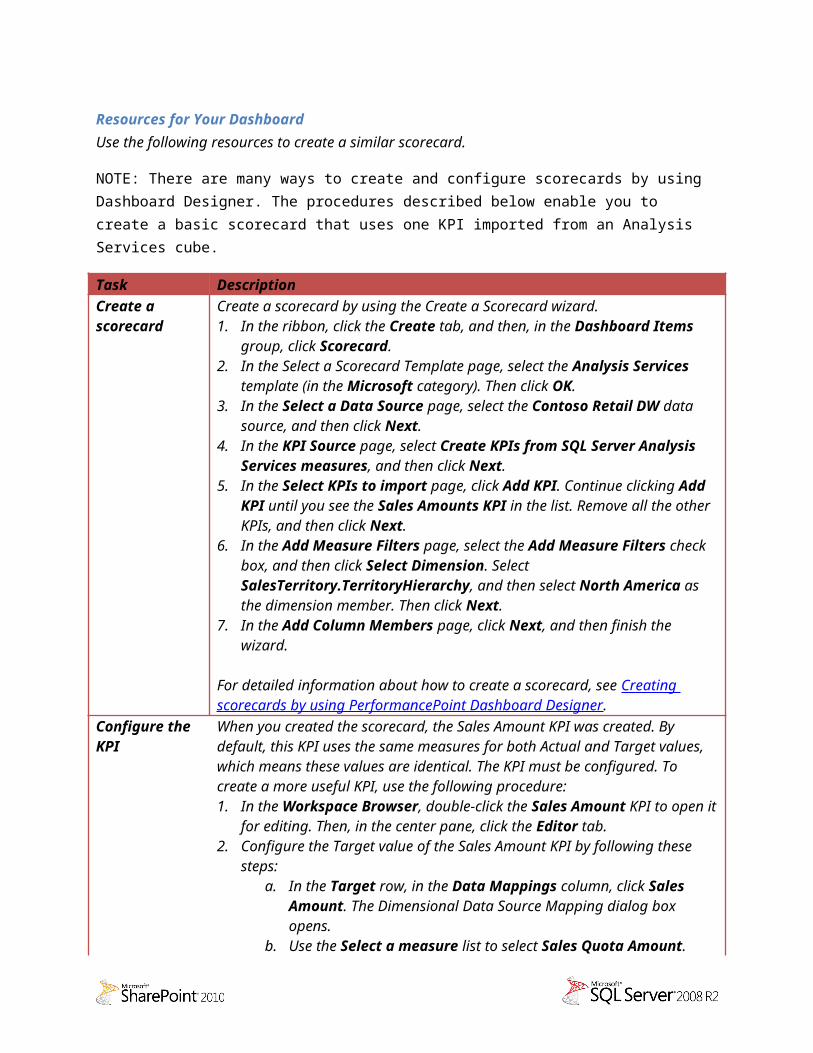
Resources for Your DashboardUse the following resources to create a similar scorecard.
NOTE: There are many ways to create and configure scorecards by using Dashboard Designer. The procedures described below enable you to create a basic scorecard that uses one KPI imported from an Analysis Services cube.
Task DescriptionCreate a scorecard
Create a scorecard by using the Create a Scorecard wizard.1. In the ribbon, click the Create tab, and then, in the Dashboard Items group, click
Scorecard.2. In the Select a Scorecard Template page, select the Analysis Services template
(in the Microsoft category). Then click OK.3. In the Select a Data Source page, select the Contoso Retail DW data source, and
then click Next.4. In the KPI Source page, select Create KPIs from SQL Server Analysis Services
measures, and then click Next.5. In the Select KPIs to import page, click Add KPI. Continue clicking Add KPI until
you see the Sales Amounts KPI in the list. Remove all the other KPIs, and then click Next.
6. In the Add Measure Filters page, select the Add Measure Filters check box, and then click Select Dimension. Select SalesTerritory.TerritoryHierarchy, and then select North America as the dimension member. Then click Next.
7. In the Add Column Members page, click Next, and then finish the wizard.
For detailed information about how to create a scorecard, see Creating scorecards by using PerformancePoint Dashboard Designer.
Configure the KPI When you created the scorecard, the Sales Amount KPI was created. By default, this KPI uses the same measures for both Actual and Target values, which means these values are identical. The KPI must be configured. To create a more useful KPI, use the following procedure:1. In the Workspace Browser, double-click the Sales Amount KPI to open it for
editing. Then, in the center pane, click the Editor tab.2. Configure the Target value of the Sales Amount KPI by following these steps:
a. In the Target row, in the Data Mappings column, click Sales Amount. The Dimensional Data Source Mapping dialog box opens.
b. Use the Select a measure list to select Sales Quota Amount.c. In the Select a dimension section, click New Dimension Filter. The Select
Dimension dialog box opens.d. Select Scenario.Scenario Description, and then click OK to close the
Select Dimension dialog box.e. In the Scenario.Scenario Description row, click the text that says
Default to open the Select Members dialog box.f. Expand All Scenario, and then select Forecast.g. Repeat steps a-f, selecting SalesTerritory.TerritoryHierarchy for the
Dimension in Step d, and North America as the dimension member in
Step f.h. Click OK to close the Select Member dialog box, and then click OK to
close the Dimensional Data Source Mapping dialog box.3. Configure the Actual value of the Sales Amount KPI by following these steps:
a. In the Actual row, in the Data Mappings column, click Sales Amount. The Dimensional Data Source Mapping dialog box opens.
b. Use the Select a measure list to select Sales Quota Amount.c. In the Select a dimension section, click New Dimension Filter. The Select
Dimension dialog box opens.d. Select Scenario.Scenario Description, and then click OK to close the
Select Dimension dialog box.e. In the Scenario.Scenario Description row, click the text that says
Default to open the Select Members dialog box.f. Expand All Scenario, and then select Actual.g. Repeat steps a-f, selecting SalesTerritory.TerritoryHierarchy for the
Dimension in Step d, and North America as the dimension member in Step f.
h. Click OK to close the Select Member dialog box, and then click OK to close the Dimensional Data Source Mapping dialog box.
4. In the Actual row, click in the Number column to open the Number Formatting dialog box.
5. Use the Formatting list to select Currency, and then click OK.6. Repeat Steps 10-11 for the Target row.7. In the Workspace Browser, right-click the KPI, and then click Save.
For detailed information on how to configure a KPI, see Create and configure a KPI.Add dimension members as rows in the scorecard
Beginning with the scorecard open for editing in Dashboard Designer, add the Channel dimension to the scorecard by using the following procedure:1. In the Details pane, expand Dimensions, and then expand Channel.2. Drag the Description hierarchy to the scorecard and put it below the Sales
Amounts KPI. The Select Members dialog box opens.3. Expand All Channel, and then select Catalog, Online, Reseller, and Store. Then
click OK to close the Select Members dialog box.4. In the ribbon, on the Edit tab, in the Header group, use the Decrease Indent
toolbar command to put the dimension members that you added one level below the KPI.
5. Click the Update button to update the scorecard.
For detailed information about how to create a scorecard, see Creating scorecards by using PerformancePoint Dashboard Designer.
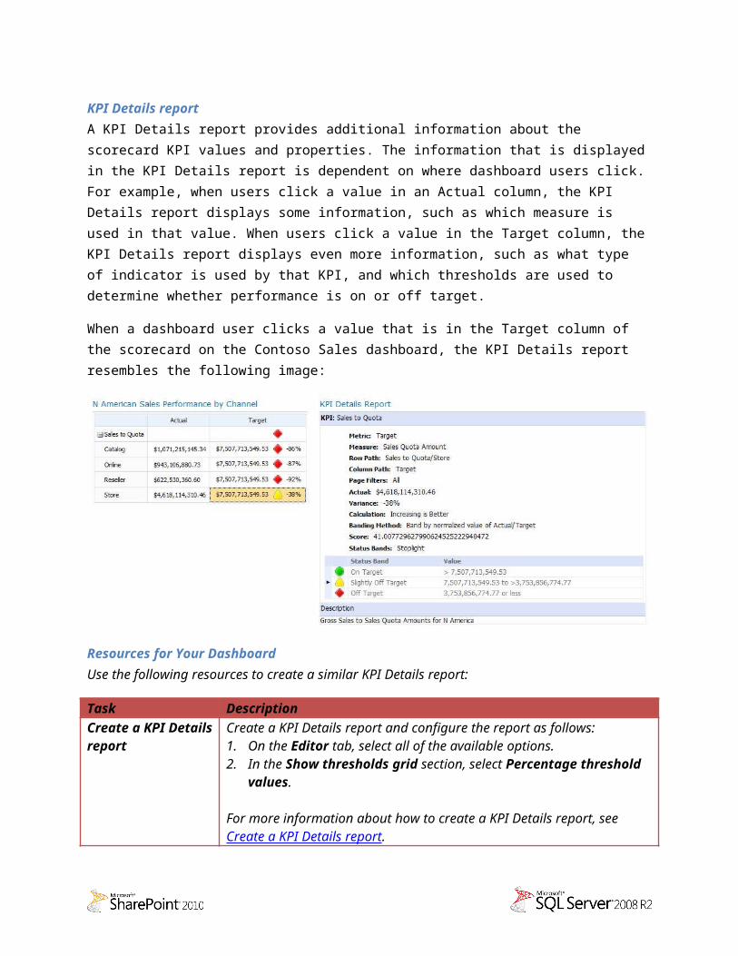
KPI Details reportA KPI Details report provides additional information about the scorecard KPI values and properties. The information that is displayed in the KPI Details report is dependent on where dashboard users click. For example, when users click a value in an Actual column, the KPI Details report displays some information, such as which measure is used in that value. When users click a value in the Target column, the KPI Details report displays even more information, such as what type of indicator is used by that KPI, and which thresholds are used to determine whether performance is on or off target.
When a dashboard user clicks a value that is in the Target column of the scorecard on the Contoso Sales dashboard, the KPI Details report resembles the following image:
Resources for Your DashboardUse the following resources to create a similar KPI Details report:
Task DescriptionCreate a KPI Details report
Create a KPI Details report and configure the report as follows:1. On the Editor tab, select all of the available options.2. In the Show thresholds grid section, select Percentage threshold values.
For more information about how to create a KPI Details report, see Create a KPI Details report.
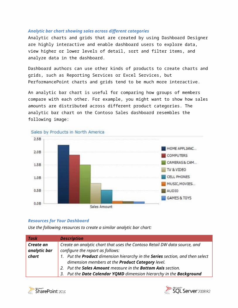
Analytic bar chart showing sales across different categoriesAnalytic charts and grids that are created by using Dashboard Designer are highly interactive and enable dashboard users to explore data, view higher or lower levels of detail, sort and filter items, and analyze data in the dashboard.
Dashboard authors can use other kinds of products to create charts and grids, such as Reporting Services or Excel Services, but PerformancePoint charts and grids tend to be much more interactive.

An analytic bar chart is useful for comparing how groups of members compare with each other. For example, you might want to show how sales amounts are distributed across different product categories. The analytic bar chart on the Contoso Sales dashboard resembles the following image:
Resources for Your DashboardUse the following resources to create a similar analytic bar chart:
Task DescriptionCreate an analytic bar chart
Create an analytic chart that uses the Contoso Retail DW data source, and configure the report as follows:1. Put the Product dimension hierarchy in the Series section, and then select
dimension members at the Product Category level.2. Put the Sales Amount measure in the Bottom Axis section.3. Put the Date Calendar YQMD dimension hierarchy in the Background section, and
keep the default selection of Default Member (All).4. Put the Sales Territory Territory Hierarchy dimension hierarchy in the Background
section, and then select the North America dimension hierarchy. (This serves as a background filter for the report.)
5. Using the Edit tab in Dashboard Designer, sort items from least to greatest and make sure to filter out empty series and bottom axis members.
6. Using the Edit tab in Dashboard Designer, use the Report Type list, and then select Bar Chart.
For detailed information about how to create an analytic chart, see Create an analytic chart or grid.

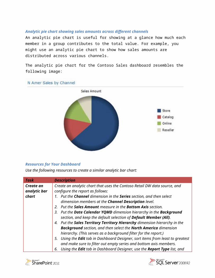
Analytic pie chart showing sales amounts across different channelsAn analytic pie chart is useful for showing at a glance how much each member in a group contributes to the total value. For example, you might use an analytic pie chart to show how sales amounts are distributed across various channels.
The analytic pie chart for the Contoso Sales dashboard resembles the following image:
Resources for Your DashboardUse the following resources to create a similar analytic bar chart:
Task DescriptionCreate an analytic bar chart
Create an analytic chart that uses the Contoso Retail DW data source, and configure the report as follows:1. Put the Channel dimension in the Series section, and then select dimension
members at the Channel Description level.2. Put the Sales Amount measure in the Bottom Axis section.3. Put the Date Calendar YQMD dimension hierarchy in the Background section, and
keep the default selection of Default Member (All).4. Put the Sales Territory Territory Hierarchy dimension hierarchy in the Background
section, and then select the North America dimension hierarchy. (This serves as a background filter for the report.)
5. Using the Edit tab in Dashboard Designer, sort items from least to greatest and make sure to filter out empty series and bottom axis members.
6. Using the Edit tab in Dashboard Designer, use the Report Type list, and then select Pie Chart.
For detailed information about how to create an analytic chart, see Create an analytic chart or grid.
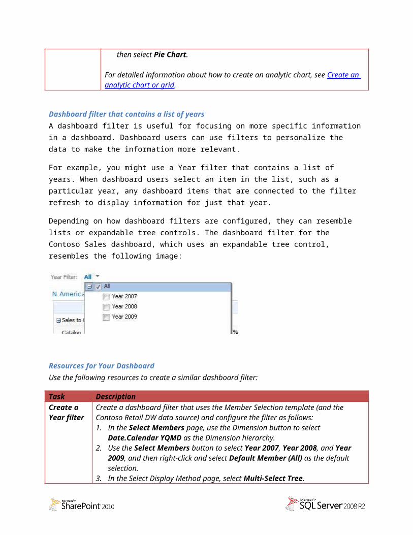
Dashboard filter that contains a list of yearsA dashboard filter is useful for focusing on more specific information in a dashboard. Dashboard users can use filters to personalize the data to make the information more relevant.
For example, you might use a Year filter that contains a list of years. When dashboard users select an item in the list, such as a particular year, any dashboard items that are connected to the filter refresh to display information for just that year.
Depending on how dashboard filters are configured, they can resemble lists or expandable tree controls. The dashboard filter for the Contoso Sales dashboard, which uses an expandable tree control, resembles the following image:
Resources for Your DashboardUse the following resources to create a similar dashboard filter:
Task DescriptionCreate a Year filter
Create a dashboard filter that uses the Member Selection template (and the Contoso Retail DW data source) and configure the filter as follows:1. In the Select Members page, use the Dimension button to select Date.Calendar
YQMD as the Dimension hierarchy.2. Use the Select Members button to select Year 2007, Year 2008, and Year 2009, and
then right-click and select Default Member (All) as the default selection.3. In the Select Display Method page, select Multi-Select Tree.
For detailed information about how to create a Member Selection filter, see Create a Member Selection filter.
Page 2: Sales AnalysisThe “Sales Analysis” dashboard page contains more detailed information. Although dashboard pages can contain numerous reports, this page contains just one SQL Server Reporting Services report.
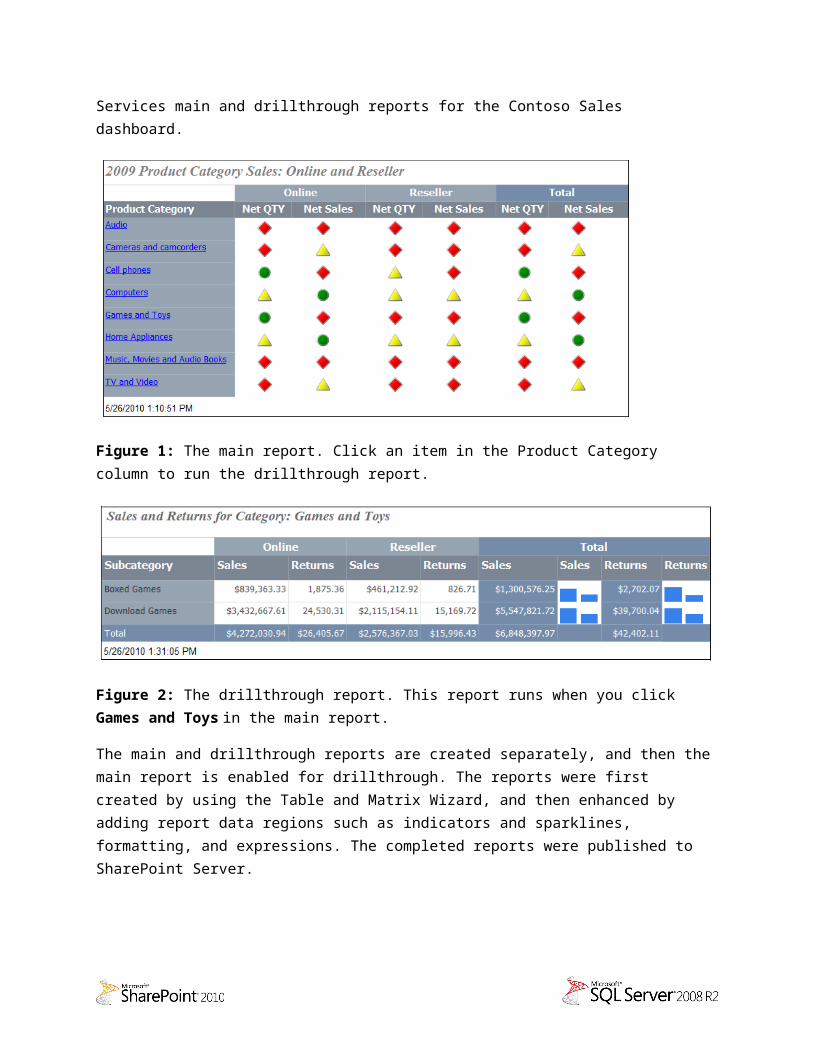
Reporting Services reportsThe Reporting Services report is an analytical view that displays summary information for the Online and Reseller channels' sales and returns. Indicators show 2009 sales and returns for product categories. The product category field in the report is enabled for drillthrough, making it easy for users to drill through data to view increasingly more detailed information or different views of the same data.
Presenting complex information effectively in a report can be a challenge, especially if the report is hosted in a dashboard. Consumers typically expect succinct information in a dashboard. Reporting Services provides many features in support of dashboard reports. The Reporting Services reports used in this dashboard use drillthrough, expressions, data visualization, and aggregated data values.
Another advantage of including a Reporting Services report in a PerformancePoint dashboard is the ability to include view types that are not otherwise available in Dashboard Designer. The report is created by using Report Builder 3.0, is published as a SQL Server Reporting Services report, and is also displayed in a PerformancePoint dashboard.
ReportsThe main report shows net sales and returns for the Online and Reseller channels for 2009. Indicators depict the data values. The drillthrough report shows detailed information about each subcategory within the category and sparklines show the sales and returns for the Online and Reseller channels.
The value of the fields in the product category column is passed from the main report to the drillthrough report and displays in the title of the drillthrough report. The following images show the Reporting Services main and drillthrough reports for the Contoso Sales dashboard.

Figure 1: The main report. Click an item in the Product Category column to run the drillthrough report.
Figure 2: The drillthrough report. This report runs when you click Games and Toys in the main report.
The main and drillthrough reports are created separately, and then the main report is enabled for drillthrough. The reports were first created by using the Table and Matrix Wizard, and then enhanced by adding report data regions such as indicators and sparklines, formatting, and expressions. The completed reports were published to SharePoint Server.
Resources for Your Dashboard
Main ReportUse the following resources to create a similar report.
Task DescriptionUsing Report Builder 3.0 to create the main report
Follow the steps in the tutorial to do the following tasks:1. Create the data source for the report2. Write the MDX query to retrieve report data3. Create the calculated members to use in the report dataset4. Add and configure a report parameter5. Organize data into groups and specify report layout6. Enable a field for drillthrough7. Replace numeric values with indicators8. Add a report title9. Publish the report to SharePoint Server
For more information, see Tutorial: Creating Drillthrough and Main Reports (Report Builder 3.0).
Drillthrough ReportUse the following resources to create a similar report.
Task DescriptionUsing Report Builder 3.0 to create the drillthrough report
Follow the steps in the tutorial to do the following tasks:1. Create the data source for the report2. Write the MDX query to retrieve report data3. Add and configure a report parameter4. Organize data into groups and specify report layout5. Format data as currency6. Add columns to display data in sparklines7. Add and configure sparklines8. Add a dynamically changing report title9. Publish the report
For more information, see Tutorial: Creating Drillthrough and Main Reports (Report Builder 3.0).
PerformancePoint Web Part to display the Main ReportUse the following resources to create a PerformancePoint Web Part to display the Main Report that was created by using Report Builder 3.0.
Task DescriptionUsing Dashboard Designer, create a Reporting Services report
Create a report that uses the Reporting Services template, and configure the report as follows:1. Configure the report to use SharePoint Integrated mode.2. In the Report Parameters section, set the
ProductProductCategoryName value to All Products.
For detailed information about how to display a Reporting Services report in a PerformancePoint dashboard, see Create a Reporting Services report.
Page 3: (OPTIONAL) Additional InformationThe “Additional Information” dashboard page is optional and can include one or more reports that provide additional information that might be of interest to dashboard users. In the Contoso Sales dashboard, the “Additional Information” can include one of the following reports:
An Excel Services report, such as the one described in the Reporting scenario solution. This report shows detailed information about product sales, all the way to the individual product name level.
A Web Page report that might display a useful website, such as a financial news site for the retail industry.
Excel Services reportAn Excel Services report is a view of an Excel workbook that has been published to Excel Services. One advantage of adding an Excel Services report to a PerformancePoint dashboard is flexibility; an individual item, such as a chart, a worksheet, or the entire workbook can be displayed in a PerformancePoint dashboard.
Excel Services reports are also useful for displaying view types that are not otherwise available in Dashboard Designer, and for reusing reports that have already been created. In addition, dashboard authors can connect a dashboard filter to an Excel Services report along with other kinds of reports in the dashboard.
Excel Services reports vary greatly. The report for the Contoso Sales dashboard resembles the following image:
Resources for Your DashboardUse the following resources to create a similar Excel Services report:
Task DescriptionUsing Microsoft Excel, create and publish the report
Follow the instructions provided in the Reporting scenario. See the Business Intelligence Reporting Scenario.
Using Dashboard Designer, create an Excel Services report
Create a report by using the Excel Services template, and configure the report as follows:1. In the SharePoint site box, type the web site address that contains
the document library where the Excel Services report is published.2. Use the Document Library list to select the document library
where the report is published.3. Use the Excel Services list to select the Excel Services report.4. Do not use the Item Name list.
For detailed information about how to display an Excel Services report in a PerformancePoint dashboard, see Create an Excel Services report.
Web Page reportA Web Page report is useful for displaying a Web site alongside other dashboard items. For example, an internal site describing KPIs that are used in the dashboard could be included, along with guidance on what to do when performance is off target. Or an industry news site with up-to-date information that might be relevant to organizations can be displayed in a dashboard.
A Web Page report displayed in the Contoso Sales dashboard might resemble the following image:
Resources for Your DashboardUse the following resources to create a similar Web Page report:
Task DescriptionUsing Dashboard Designer, create a Web Page report
Create a report by using the Web Page template, and configure the report to display a web site.
For more information, see Create a Web Page report.
Step 3: Create and assemble the dashboard pagesAfter the dashboard items have been created, the dashboard author is ready to create and assemble the dashboard pages by using Dashboard Designer. For each page, a page layout template is selected. Each template contains one or more sections, which are called zones. Then, the dashboard author can configure specific sizes of the zones that are in the page.
After the page has been created and configured, the dashboard author adds items to the page, and connects some items, such as filters, to reports.
Resources for Your DashboardUse the following resources to create and assemble dashboard pages
Task DescriptionCreate the dashboard pages Create dashboard pages by using the following templates:
1. For Page 1, select the Header, 2 Columns template.o In the left column, right-click, and then click Split Zone.o In the right column, right-click, and then click Split Zone.
2. For Page 2 (and Page 3), select the 1 Zone template.
For more information, see Create a dashboard page.(Optional) Configure specific sizes of dashboard items
To make changes to the sizes of dashboard zones in a dashboard page layout template, see Configure specific sizes of dashboard items.
Assemble each dashboard page
Assemble Page 1 as follows:1. Put the filter in the top zone.2. Put the scorecard in the upper left zone (below the top zone).3. Put the KPI Details report in the upper right zone (below the top
zone).4. Put the analytic bar chart in the lower left zone.5. Put the analytic pie chart in the lower right zone.
Assemble Page 2 (and Page 3, if there) as follows:1. Put the Reporting Services report in the single, large zone on Page 2.2. Put the Excel Services report or the Web Page reports in the single
large zone on Page 3.
For more information, see Assemble a dashboard page.Connect a filter to a report or a scorecard
On Page 1, connect the Year filter to the scorecard and both analytic charts.
For more information, see Connect a filter to a report or a scorecard .Connect a KPI Details report to a scorecard
On Page 1, connect the KPI Details report to the scorecard.
For more information, see Connect a KPI Details report to a scorecard.

Step 4: Preview, test, and deploy the dashboardAfter the dashboard has been created and assembled, Contoso publishes the dashboard to SharePoint Server where it can be previewed and tested. When the dashboard is published, all the dashboard items are automatically saved to designated lists and libraries on SharePoint Server, as follows:
Data source connections are saved to a SharePoint document library called Data Connections Reports, scorecards, filters, dashboard pages, KPIs, and other dashboard items are saved to a
SharePoint list called PerformancePoint Content Published dashboards are saved to a SharePoint document library called Dashboards
Resources for Your DashboardUse the following resources to preview, test, and deploy the dashboard
Task DescriptionPublish the dashboard
To publish a dashboard, you deploy it to SharePoint Server.
For more information, see Deploy a PerformancePoint dashboard.Preview and test the dashboard
View the published dashboard in a web browser. Click each page to make sure the reports display correctly. Also use the dashboard filter on the Sales Performance page to make sure it works correctly.
(Optional) Make changes to the dashboard
To make changes to a PerformancePoint dashboard, open it in Dashboard Designer. Then modify the dashboard items that you want to change. Save and redeploy the dashboard.
For more information, see Deploy a PerformancePoint dashboard . Notify dashboard users
After the dashboard has been finalized and deployed to SharePoint Server, tell potential dashboard users about it so they can open and use it. You can send a link to the dashboard by using e-mail or by posting it in a centrally used location.
Phase IV: Use the dashboardNow that Contoso has deployed the Sales dashboard, users across the organization can use the dashboard to explore data and hone in and get answers to specific questions.
Using Page 1, “Sales Performance,” find answers to the following questions:
Which product category has the highest amount of sales? Which channel in North America contributes the greatest amount of sales? Are sales amounts at or above quota? Which channel is the most off target in terms of sales compared to quota?
Using Page 2, “Sales Analysis,” find answers to the following questions:
In North America, which channel sold more products over the past two years: online or reseller? In North America, have computer products sold more successfully during certain
seasons/holidays? Which season/holiday tends to have the highest amount of computer sales?
Resources for Your DashboardUse the following resources to learn more about exploring data:
Task DescriptionLearn how to navigate the dashboard See How to navigate PerformancePoint
dashboards and explore dataSee how to use a dashboard View the Up to Speed with PerformancePoint
dashboards video seriesTake a short training course on using dashboards to improve decisions making
See Make Better Business Decisions
Appendix A. Additional Resources
Resources for SQL Server PowerPivot and PerformancePoint ServicesMicrosoft SQL Server PowerPivot Planning and DeploymentPublished April 2010
PowerPivot Technical Diagram: PowerPivot Client/Server ArchitecturePublished April 23
Creating Custom BI Solutions with PerformancePoint Services
Resources for Reporting Services ReportsThe following resources provide additional information that you might find useful when building dashboards, similar to this one, that include Reporting Services reports.
Getting Data from a CubeGetting Data from an Analysis Services Cube (MDX) (Report Builder 3.0)
Analysis Services MDX Query Designer (Report Builder 3.0)
Querying Multidimensional Data (Analysis Services - Multidimensional Data)
Drillthrough ReportsDrillthrough Reports (Report Builder 3.0)
Parameters (Report Builder 3.0)
Using Parameters to Connect to Other Reports (Report Builder 3.0)
Data VisualizationSparklines and Data Bars (Report Builder 3.0)
Indicators
Data Regions and Data FormattingTables, Matrices, and Lists (Report Builder 3.0)
ParametersFormatting Text and Placeholders (Report Builder 3.0)
Formatting Numbers and Dates (Report Builder 3.0)
ExpressionsExpressions (Report Builder 3.0)
Expression Examples (Report Builder 3.0)
Advanced Expressions
Saving ReportsSaving Reports (Report Builder 3.0)
How to: Save a Report to a SharePoint Library (Report Builder 3.0)
Tutorials and SamplesTutorials (Report Builder 3.0)
AdventureWorks2008R2 and Report Builder 3.0 Sample Reports
VideosDeveloping Reports with the New Features of SQL Server 2008 R2 Reporting Services
Visualizing Data with Maps in SQL Server 2008 R2 Reporting Services
Using the Map Wizard in SQL Server 2008 R2 Reporting Services
Working with Shared Components in SQL Server 2008 R2 Reporting Services
Using Shared Component Libraries in SQL Server 2008 R2 Reporting Services
Working with ATOM Data Feeds in SQL Server 2008 R2 Reporting Services
Using SQL Server 2008 R2 Reporting Services Report Feeds
Resources for Creating Cubes and DimensionsDesigning Cubes
Designing Dimensions
Appendix B. Cross-Functional FlowchartThe following cross-functional flowchart shows the high-level steps for creating a Sales dashboard, as described in this document.


![[MS PPSAS]: PerformancePoint Services Authoring Service … · 2016-05-11 · PPSAS]: PerformancePoint Services Authoring Service Protocol Specification. Intellectual Property Rights](https://img.dokumen.tips/doc/110x75/5e9193e44339ee3be509fd2c/ms-ppsas-performancepoint-services-authoring-service-2016-05-11-ppsas-performancepoint.jpg)


![[MS-PPSRS]: PerformancePoint Services …download.microsoft.com/.../[MS-PPSRS].pdf · [MS-PPSRS]: PerformancePoint Services RenderingService Protocol Specification ... PerformancePoint](https://img.dokumen.tips/doc/110x75/5ade1e867f8b9aa5088dbe37/ms-ppsrs-performancepoint-services-ms-ppsrspdfms-ppsrs-performancepoint.jpg)


![[MS PPSAS]: PerformancePoint Services Authoring Service ...MS-PPSAS... · PPSAS]: PerformancePoint Services Authoring Service Protocol Specification. Intellectual Property Rights](https://img.dokumen.tips/doc/110x75/5e77bb8a55df05688b23f62f/ms-ppsas-performancepoint-services-authoring-service-ms-ppsas-ppsas.jpg)
![[MS-PPSAS]: PerformancePoint Services Authoring Service ...MS-PPSAS... · [MS-PPSAS]: PerformancePoint Services Authoring Service Protocol Intellectual Property Rights Notice for](https://img.dokumen.tips/doc/110x75/5e8baf4081fceb260d1511a9/ms-ppsas-performancepoint-services-authoring-service-ms-ppsas-ms-ppsas.jpg)


![[MS-PPSDECO]: PerformancePoint Services Decomposition Tree](https://img.dokumen.tips/doc/110x75/61cfb61a2ced9a6ed43f9bf1/ms-ppsdeco-performancepoint-services-decomposition-tree-.jpg)


