Embed Size (px)
Citation preview

Usability Study: Overture
This report details the purpose, methods, findings and recommendations of a usability study for Overture Marketplace conducted in April 2016
David Mahan Jackie Ortega
Lindsey Pherson Hannah Rowe Sam Tjahjono
Erin Zeller Dom Hudson
2
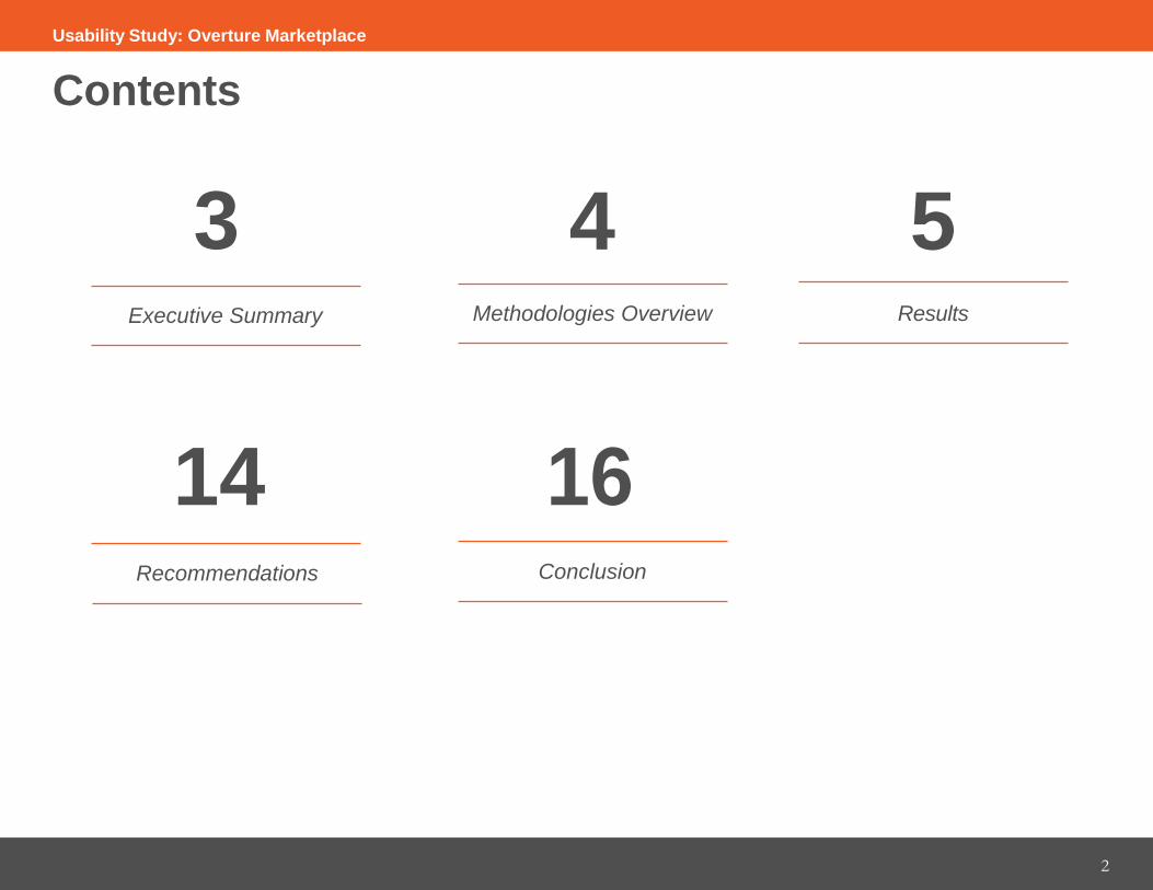
Contents
3 4 5 Executive Summary Methodologies Overview Results
14 16 Recommendations Conclusion
Usability Study: Overture Marketplace
3
Executive Summary To determine ways Overture Technologies can improve the user experience of their Marketplace website, we conducted a usability study which featured user test sessions with four male and female students aged 20-25 who have researched and taken out students loans. We also conducted expert reviews of the website using a set of expert heuristics based on research, user testing and web design best practices.
These evaluation methods yielded the following results: ● The “Get Started” interview generally works well but frustrates users by hiding requirements
and results● The site is unnavigable due to links opening in multiple tabs without discrete titles● The homepage fosters a good first impression, but users do not feel comfortable enough with the site
overall to enter personal information
Based on these results, we recommend that Overture take the following actions: ● Increase the usability of the “Get Started” interview and user accounts
• Allow users to receive results without creating an account or prompt them to create an account beforecompleting the form
• Allow users to respond to questions with more options or include a “no preference/I don’t know” option● Enhance site navigation by funneling information from homepage in a way that users expect
• Eliminate multiple tabs that open when links are clicked• Give users feedback on their current location within the site by using an active sidebar
● Foster confidence by diversifying visual design and maintaining professionalism• Maintain professionalism by eliminating all caps, using consistent fonts, and using consistent graphic elements• Remove flashing “Completely Free” text that inspires suspicion in users
Usability Study: Overture Marketplace

4
Methodologies Overview To conduct two of the user test sessions, we used Morae, an application that records screen activity and audio of the session to facilitate usability testing. For our Morae tests, we did the following: ● Selected participants to complete four tasks on the website● Recorded participants’ comments and screen activity● Noted significant comments, observations, successes and struggles each participant experienced
We also conducted two user test sessions without Morae. In these sessions, a moderator and scribe performed the same tasks as Morae only manually and with face-to-face engagement. The benefit of all four of these user test sessions was that we were able to collect the direct, unfiltered opinions of users in Overture Marketplace’s key demographic. The participants included male and female students aged 20-25 who have researched and taken out student loans.
To conduct the expert reviews, our seven team members used heuristics based on research, user testing, and web design best practices to determine the most urgent issues with the site. As a team, we compared each individual evaluators’ most urgent findings and notated which findings appeared most often in each evaluation. The most urgent issues listed in this report were identified by all or most of the evaluators.
Usability Study: Overture Marketplace

5
Results: User Test Sessions To determine the most severe issues with the Marketplace site, we compared the results of the user test sessions. We also noted what struggles and comments the test users had, as well as what most often prevented them from completing the tasks. We also asked them what was good about the site.
We gathered the following positive responses about the site: ● Overture Marketplace fosters good first impressions due to professional homepage design● Questions on the “Get Started” interview are clear● Interview results are “satisfying” to obtain● Users are extremely frustrated that they are prompted to create an account after they have entered all
the information but before they can view any results● Users do not have enough trust or confidence in the site to create accounts● Users are frustrated that they spend so much time answering questions and receive no results due to
restrictions such as bankruptcy
Usability Study: Overture Marketplace
6
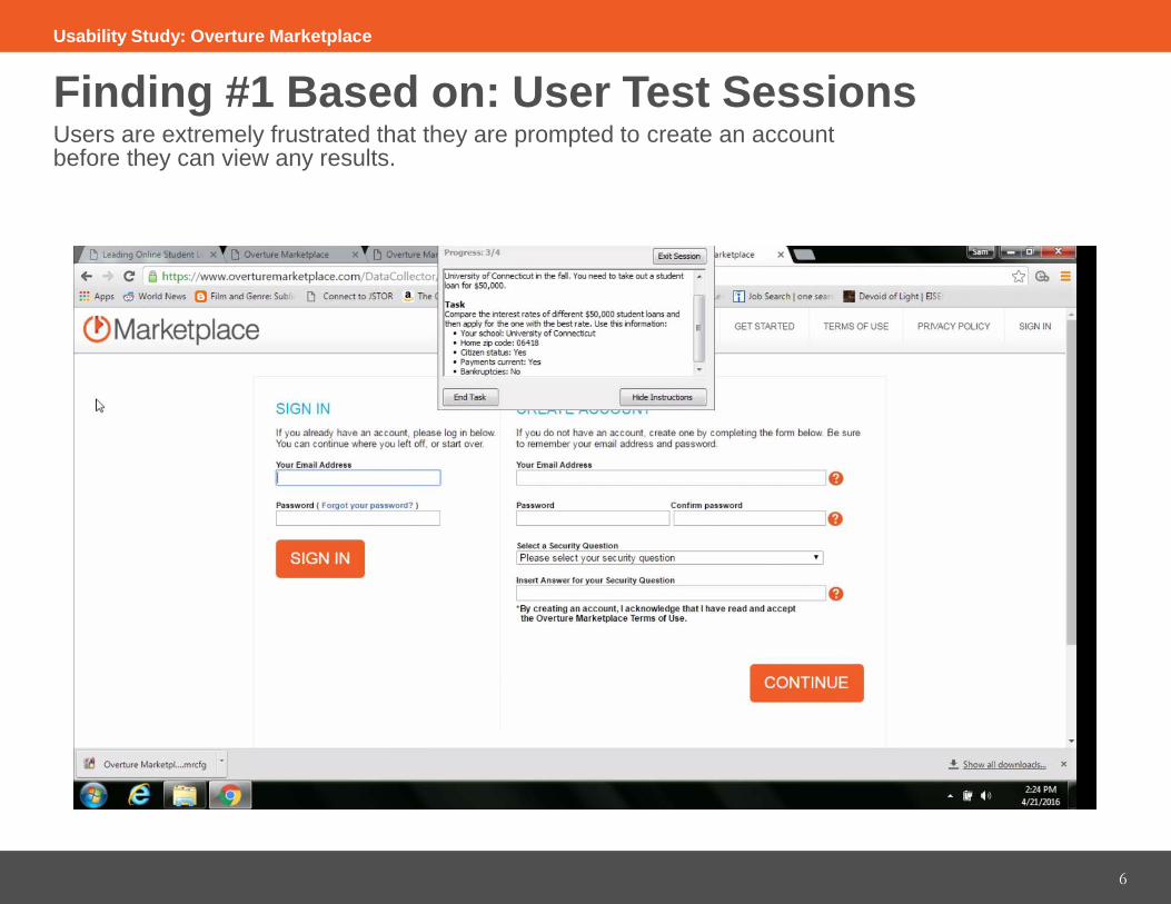
Finding #1 Based on: User Test Sessions Users are extremely frustrated that they are prompted to create an account before they can view any results.
6
Usability Study: Overture Marketplace

Finding #2 Based on: User Test Sessions Users are frustrated that they spend so much time answering questions and receive no results due to restrictions such as bankruptcy.
7
Usability Study: Overture Marketplace
8
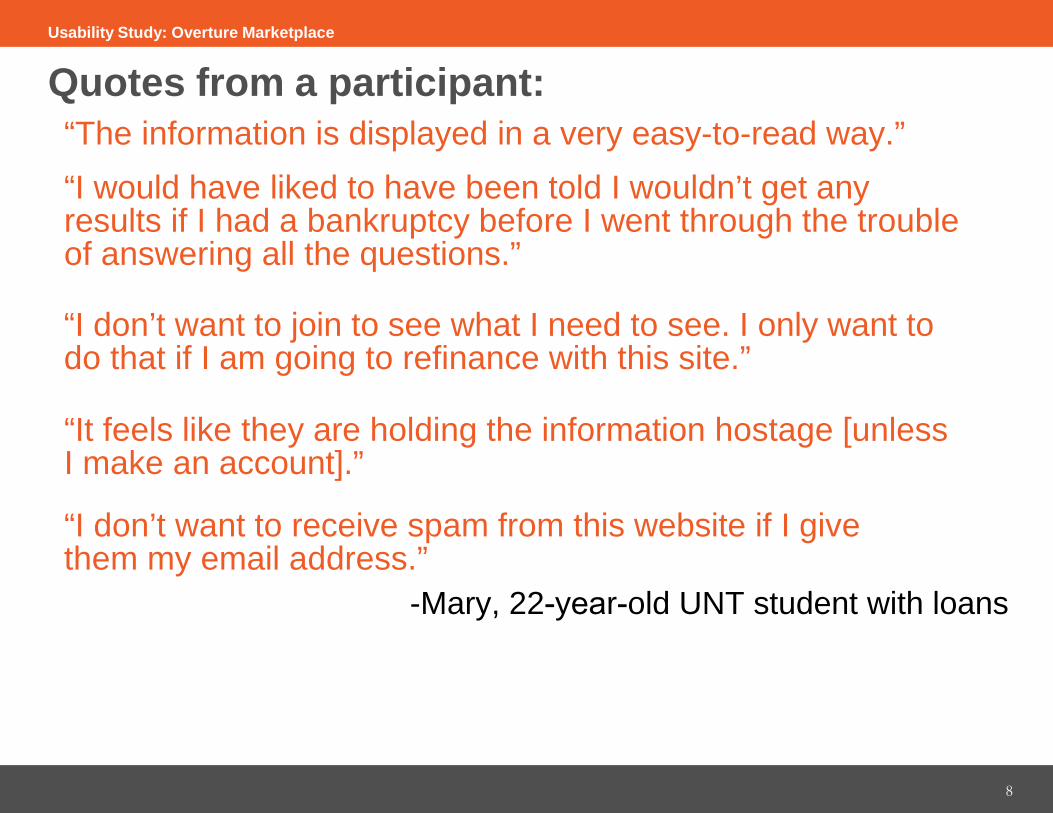
Quotes from a participant: “The information is displayed in a very easy-to-read way.” “I would have liked to have been told I wouldn’t get any results if I had a bankruptcy before I went through the trouble of answering all the questions.”
“I don’t want to join to see what I need to see. I only want to do that if I am going to refinance with this site.”
“It feels like they are holding the information hostage [unless I make an account].”
“I don’t want to receive spam from this website if I give them my email address.”
-Mary, 22-year-old UNT student with loans
Usability Study: Overture Marketplace
9
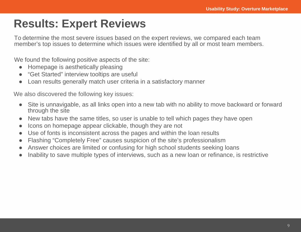
Results: Expert Reviews To determine the most severe issues based on the expert reviews, we compared each team member’s top issues to determine which issues were identified by all or most team members.
We found the following positive aspects of the site: ● Homepage is aesthetically pleasing● “Get Started” interview tooltips are useful● Loan results generally match user criteria in a satisfactory manner
We also discovered the following key issues:
● Site is unnavigable, as all links open into a new tab with no ability to move backward or forward through the site
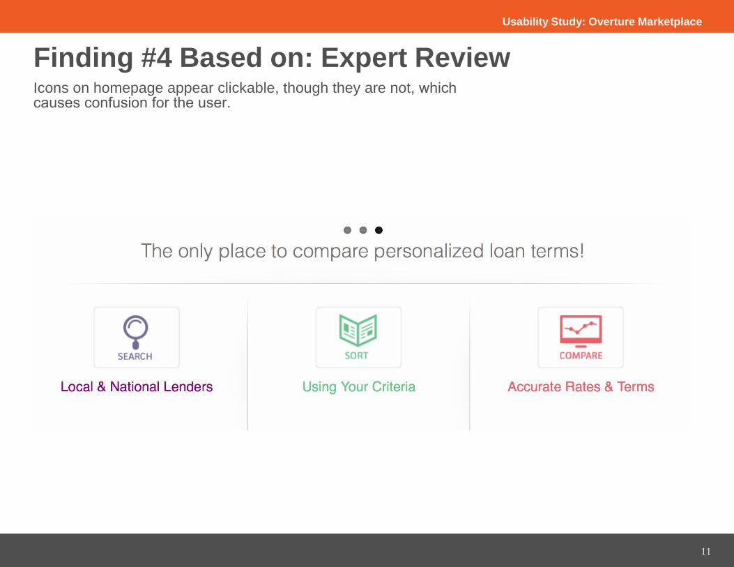
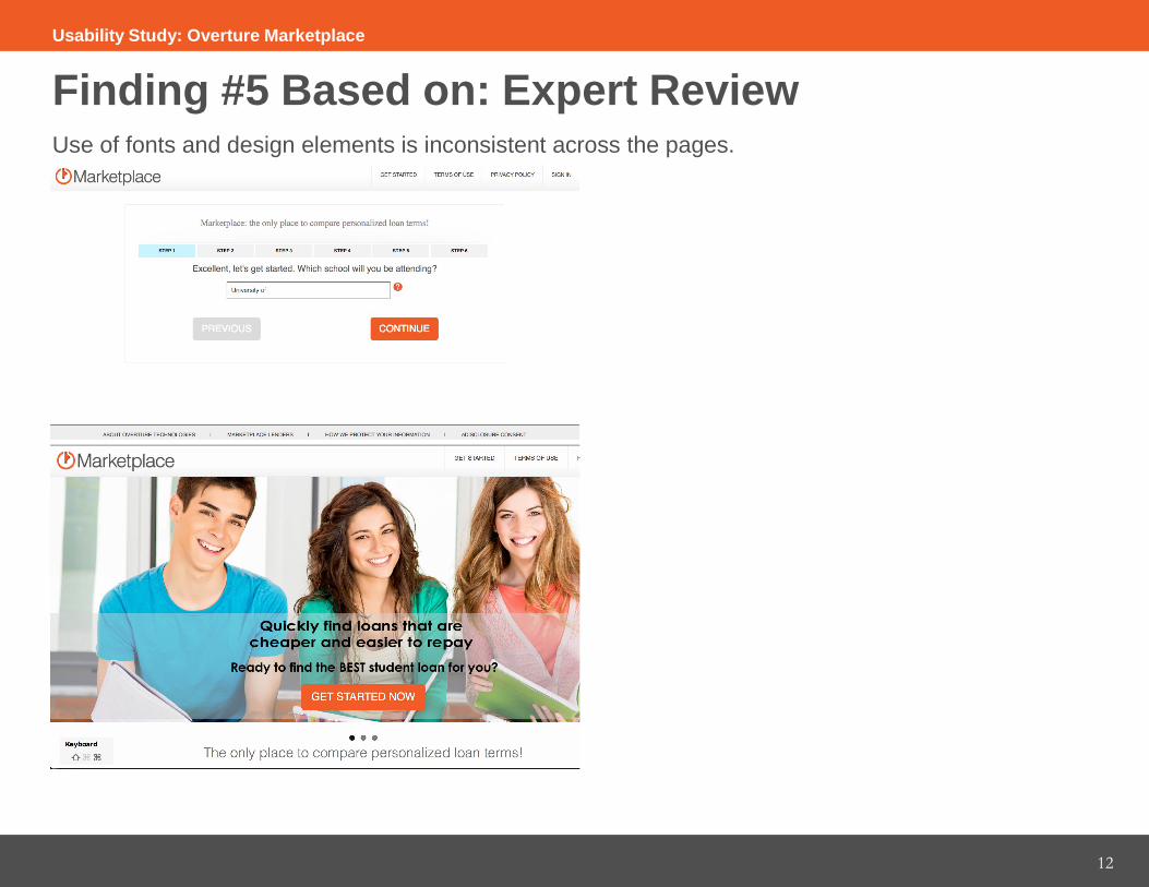
● New tabs have the same titles, so user is unable to tell which pages they have open● Icons on homepage appear clickable, though they are not● Use of fonts is inconsistent across the pages and within the loan results● Flashing “Completely Free” causes suspicion of the site’s professionalism● Answer choices are limited or confusing for high school students seeking loans● Inability to save multiple types of interviews, such as a new loan or refinance, is restrictive
Usability Study: Overture Marketplace
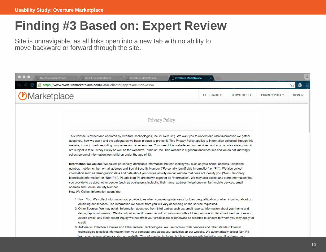
Finding #3 Based on: Expert Review Site is unnavigable, as all links open into a new tab with no ability to move backward or forward through the site.
10
Usability Study: Overture Marketplace
11
Finding #4 Based on: Expert Review Icons on homepage appear clickable, though they are not, which causes confusion for the user.
Usability Study: Overture Marketplace
12
Finding #5 Based on: Expert Review Use of fonts and design elements is inconsistent across the pages.
Usability Study: Overture Marketplace

13
Finding #6 Based on: Expert Review Flashing “Completely Free” causes suspicion of the site’s professionalism.
Usability Study: Overture Marketplace
14
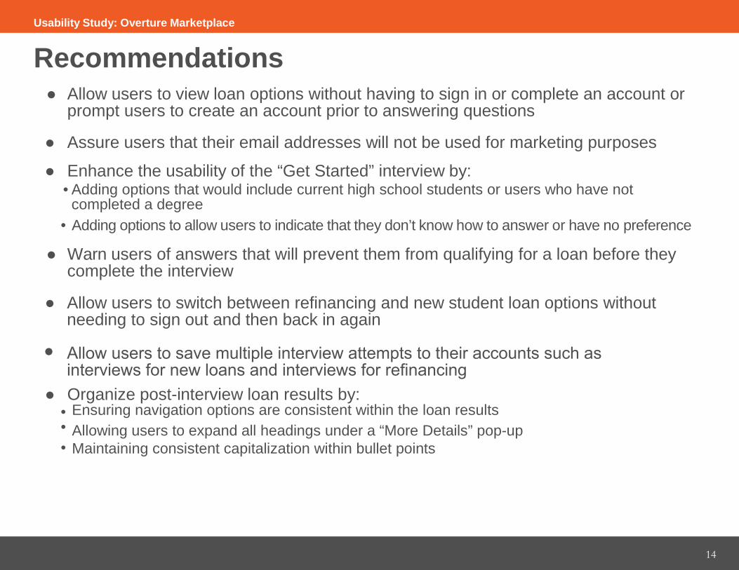
Recommendations ● Allow users to view loan options without having to sign in or complete an account or
prompt users to create an account prior to answering questions
● Assure users that their email addresses will not be used for marketing purposes
● Enhance the usability of the “Get Started” interview by:• Adding options that would include current high school students or users who have not
completed a degree• Adding options to allow users to indicate that they don’t know how to answer or have no preference
● Warn users of answers that will prevent them from qualifying for a loan before theycomplete the interview
● Allow users to switch between refinancing and new student loan options without needing to sign out and then back in again
Allow users to save multiple interview attempts to their accounts such as interviews for new loans and interviews for refinancing
● Organize post-interview loan results by:• Ensuring navigation options are consistent within the loan results• Allowing users to expand all headings under a “More Details” pop-up• Maintaining consistent capitalization within bullet points
Usability Study: Overture Marketplace
●
15
Recommendations ● Restrict new tabs from opening whenever user clicks on a navigation bar or footer link
● Give each page a discrete title
● Maintain a consistent, active sidebar that keeps users informed of their location on the site
● Eliminate the flashing “Completely Free” banner that appears after users complete the interview
● Use consistent fonts and text cases throughout the site: one for headings and one for body text
● Create a “Contact Us” page
● Make “About Us” more visible in the top navigation
Usability Study: Overture Marketplace

16
Conclusion Overture Marketplace already does an effective job of creating a good first impression for users. Users find the interview process easy. They are satisfied when they receive their results and find the results easy to read.
Overture Marketplace can improve the service they provide on the site by following these recommendations on how to address user concerns: ● Increase the usability of the “Get Started” interview by prompting users to create an account
before they enter information or allowing them to receive information without creating an account● Increase user satisfaction by informing them of restrictions that would prevent them from seeing
results before they complete the form● Enhance site navigation by restricting l inks from opening in new tabs, giving users locational
feedback such as page titles or an active sidebar, and by increasing the visibility of high-profile information like the “About Us” and “Contact Us” pages
● Foster confidence and trust in the site by maintaining professionalism through adding relevant visuals and removing inconsistent design elements such as changing fonts and unclickable icons
Usability Study: Overture Marketplace