Embed Size (px)
Citation preview
Open Source Visualization with OpenGraphiti
Thibault Reuille (@ThibaultReuille)
Andrew Hay (@andrewsmhay) [email protected]
Abstract The way a human efficiently digests information varies from person to person. Scientific studies have shown that some people learn better through the presentation of visual/spatial information compared to simply reading text. Why then, do vendors expect customers to consume presented data following only the written word method, as opposed to advanced graphical representations of the data? We believe the written approach is dated. To help visually inclined forensic analysts, incident responders, researchers, and data scientists, we decided to create a free and Open Source engine to remove the complexity of creating advanced data visualizations. The ultimate goal of the project was to allow for the visualization of any loosely related data without having to endlessly reformat that data. For the visual/spatial learners the engine will interpret their data, whether it be a simple or complex system, and present the results in a way that their brains can understand. Learning for visualspatial learners takes place all at once, with large chunks of information grasped in intuitive leaps, rather than in the gradual accretion of isolated facts or small steps. For example, a visualspatial learner can grasp all of the multiplication
facts as a related set in a chart much easier and faster than memorizing each fact independently. We believe that some security practitioners might be able to better use their respective data sets if provided with an investigative model that their brains can understand.
Introduction With the right tools you can take any relational data set, quickly massage the format, and visualize the results. Observations and conclusions can also be drawn from the results of the visualization that may not have appeared in simple text form. The engine and methodologies discussed have been used by OpenDNS to track CryptoLocker and CryptoDefense ransomware, Red October malware, and the Kelihos botnet. Additionally, specific Syrian Electronic Army (SEA) campaigns, carding sites, and even a map of the Internet through Autonomous Systems have been visualized using OpenGraphiti. Interesting data can also be isolated through the use of Python and JavaScriptbased plugins that can be easily added to the engine framework. These plugins affect the way the data is visualized and allow analysts to make sense of their data as it relates to the question they’re trying to answer. The "big picture" model will help visually inclined incident responders, security analysts, and malware researchers stitch together complex data sets.
Why Visualize the Data? Some people learn better by doing, some by reading, and others by listening to a lecture. Other people however, may learn better through visual methods. One such communication tool, often employed by visuallyinclined learners, is known as a graphic organizer. Graphic organizers are visual representations of knowledge, concepts, thoughts, or ideas. A graphic organizer, also known as a knowledge
map, concept map, story map, cognitive organizer, advance organizer, or concept diagram, is a communication tool that uses visual symbols to express knowledge, concepts, thoughts, or ideas, and the relationships between them. The main purpose of a graphic organizer is to provide a visual aid to facilitate learning and instruction. According to a study conducted by The Institute for the Advancement of Research in Education at AEL, using graphic organizers improves 1
student performance in the following areas:
Retention Students remember information better and can better recall it when it is represented and taught visually and verbally.
Reading comprehension The use of graphic organizers helps improving the reading comprehension of students.
Student achievement Students with and without learning disabilities improve achievement across content areas and grade levels.
Thinking and learning skills; critical thinking When students develop and use a graphic organizer their higher order thinking and critical thinking skills are enhanced.
Some students build data literacy as they collect and explore information in a dynamic inquiry process, using tables and plots to visually investigate and manipulate and analyze data. As students explore the way data moves through various plot types, such as Venn, stack, pie, and axis, they formulate pathways that link visual images to areas that store knowledge in the brain. To show the relationships between the parts, the symbols are linked with each other; words can be used to further clarify meaning. By representing information spatially and with images, students are able
1 http://www.inspiration.com/sites/default/files/documents/DetailedSummary.pdf
to focus on meaning, reorganize and group similar ideas easily, and make better use of their visual memory. 2
This linkage model transfers very well to applied graph theory and the visualization of related data sets.
From Data to Visualization When it comes to representing knowledge, semantic networks are an extremely useful data structure. They can be used to model nearly everything and can be applied to a wide range of problems. But before we dig into more details, let us consider the definition of a semantic network. A semantic network, or frame network, is a network which represents semantic relations between concepts. This is often used as a form of knowledge representation. It is often represented as a directed or undirected graph consisting of vertices and edges, which represent relationships. In other words, a semantic network can be represented as a graph connecting any kind of information by any kind of relationship. From detailed to very highlevel data, it is up to the user to design a model to describe relevant and meaningful knowledge. Consider the example shown in Figure 1.
2 http://en.wikipedia.org/wiki/Visual_learning
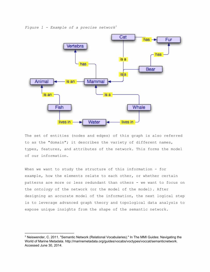
Figure 1 Example of a precise network 3
The set of entities (nodes and edges) of this graph is also referred to as the "domain"; it describes the variety of different names, types, features, and attributes of the network. This forms the model of our information. When we want to study the structure of this information for example, how the elements relate to each other, or whether certain patterns are more or less redundant than others we want to focus on the ontology of the network (or the model of the model). After designing an accurate model of the information, the next logical step is to leverage advanced graph theory and topological data analysis to expose unique insights from the shape of the semantic network.
3 Neiswender, C. 2011. "Semantic Network (Relational Vocabularies)." In The MMI Guides: Navigating the World of Marine Metadata. http://marinemetadata.org/guides/vocabs/voctypes/voccat/semanticnetwork. Accessed June 30, 2014.
Transforming Raw Data Into Relational Information To transform a raw data file into a relational graph, before jumping into any script implementation, the first thing to do is to identify the various entities and relationships contained in the data. The following are a few entities and relationships that may be used:
Social Network: Facebook, Twitter, Linkedin Nodes: People, Companies, Bands
Attributes: Name, Age, Creation Date Edges: Friends, Couple, Employer, Fan, Subscriber
UML class diagram: Nodes: Classes, Namespaces Attribute: Members, Methods Edges: Inheritance, Association, Aggregation, Dependency
Network map: Nodes: IPs, Servers, Hosts, Routers, Firewalls Attributes: Port, Hostname, Country Edges: Protocol, Bandwidth, Latency
Of course, there is more than one representation for any given problem. The designer should align their perspective with the data. When the structural model has been decided, the source data should be parsed to populate a relational data set following the design.
Visualizing Knowledge There are many approaches to the problem of graph visualization. One such methodology revolves around the use of forcedirected layouts. Because the main purpose of the engine is to analyze the topology of our knowledge base, it is necessary to choose a visualization technique that will let the data drive its own layout.
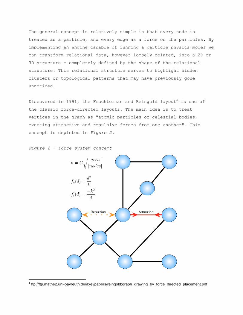
The general concept is relatively simple in that every node is treated as a particle, and every edge as a force on the particles. By implementing an engine capable of running a particle physics model we can transform relational data, however loosely related, into a 2D or 3D structure completely defined by the shape of the relational structure. This relational structure serves to highlight hidden clusters or topological patterns that may have previously gone unnoticed. Discovered in 1991, the Fruchterman and Reingold layout is one of 4
the classic forcedirected layouts. The main idea is to treat vertices in the graph as "atomic particles or celestial bodies, exerting attractive and repulsive forces from one another". This concept is depicted in Figure 2.
Figure 2 Force system concept
4 ftp://ftp.mathe2.unibayreuth.de/axel/papers/reingold:graph_drawing_by_force_directed_placement.pdf
Without entering into excessive technical depth about the math supporting the model, the principles are relatively elementary:
Connected nodes attract each other Nonconnected nodes repulse each other
Using a slightly more detailed explanation, the attractive force fa(d) and the repulsive force fr(d) both depend on the distance between the nodes and a constant k controlling the density of the layout. The algorithm also adds a notion of temperature which controls the displacement of the vertices; the higher the temperature, the faster the movement. The physics represent a system inspired by electrical or celestial forces with a general technique called "simulated annealing," where increasing/decreasing the temperature affects the particles’ thermodynamic vibration, helping them to progressively reach an equilibrium state where all the node forces become even. That state usually looks like a visually pleasing moleculeshaped layout where relational clusters will aggregate in the same areas.
Dealing With Large Graphs Most modern databases include millions or billions of entries, so a modern tool to analyze them must handle large data sets efficiently. All 3D engines and particle systems have their physical limitations, and forcedirected. Also, forcedirected layout algorithms usually increase in complexity as the size of the graph grows. How do we work around these issues?
Entity Grouping One way is to decrease the amount of information by looking at the data from a higher level. Instead of dealing with individual entities, you can create nodes that represent groups of entities. The
possibilities are endless depending on the subject you want to visualize. For instance, if you want to visualize the whole known universe with its planets and stars, it would make sense to structure your representation by a fractal approach where you would look first at galaxies, followed by stars, planets, continents, countries, and cities to reduce the size of the point cloud. You could then interactively decide to add more details as necessary as you move closer to a certain city. This would give access to the whole of the information without having to deal with all of it at once.
Sampling Another interesting way to limit the size of a dataset, without completely losing the big picture, is to use sampling methods taking a certain percentage or a random sample of the complete dataset. The random subset could be built using a uniform or normal distribution, or any other userdefined distribution. Using the previous universe analogy, you would randomly remove half the galaxies, half the planets/stars, and half the cities before processing the result. The data scientist will have to adjust the hypotheses or assumptions based on the way the data is pruned. When dealing with graphs, an easy way to take random sample of a large graph is to use a Random Walk approach. You would select random entry points in the graph and trace a random path in the graph starting from those points, as depicted in Figure 3.
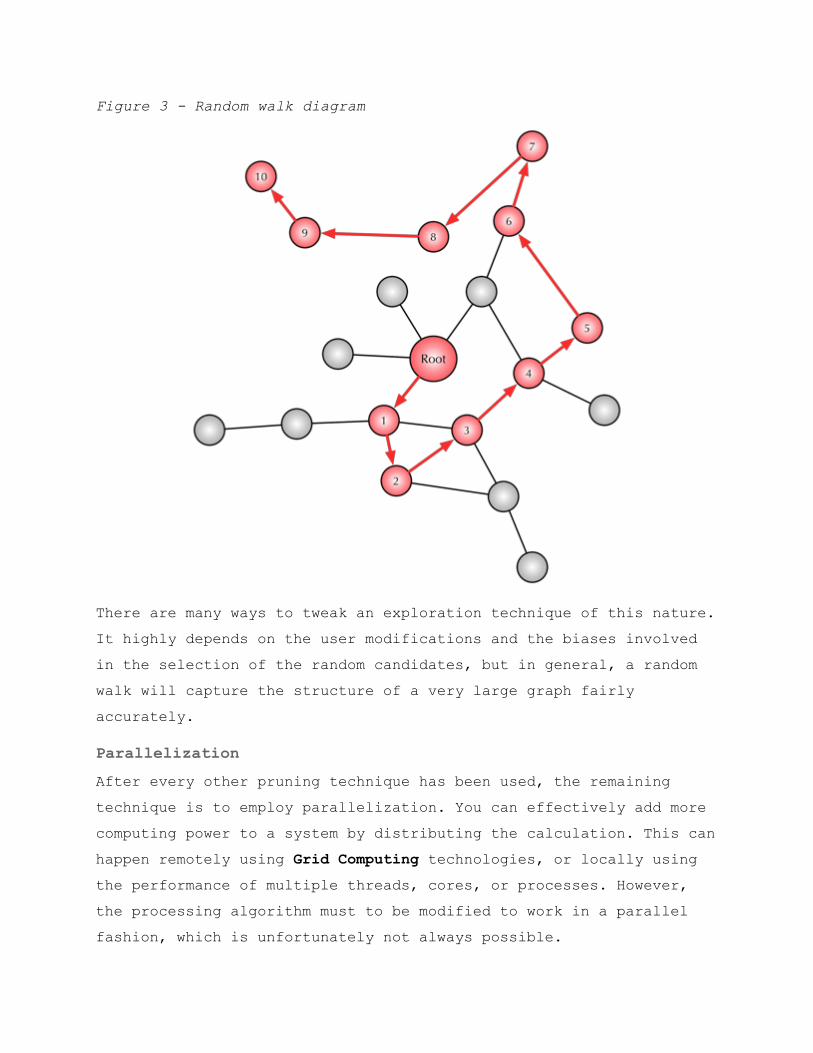
Figure 3 Random walk diagram
There are many ways to tweak an exploration technique of this nature. It highly depends on the user modifications and the biases involved in the selection of the random candidates, but in general, a random walk will capture the structure of a very large graph fairly accurately.
Parallelization After every other pruning technique has been used, the remaining technique is to employ parallelization. You can effectively add more computing power to a system by distributing the calculation. This can happen remotely using Grid Computing technologies, or locally using the performance of multiple threads, cores, or processes. However, the processing algorithm must to be modified to work in a parallel fashion, which is unfortunately not always possible.
With current graphic card technology, we can take advantage of efficient graphics processing units (GPUs) and distribute the calculation across their ever increasing number of cores and threads. GPUs are becoming exceptionally efficient at processing geometrical data such as vectors, colors, matrices, textures, or any kind of computation involving a combination of the aforementioned data types. Using technologies such as Open Graphics Library (OpenGL) rendering, OpenGL Shading Language (GLSL) shaders and Open Computing Language (OpenCL) physics seems like the obvious choice to leverage the power of GPUs. Learning how to leverage GPUs (or any parallel platform) with technologies such as OpenGL, GLSL and OpenCL (among many others) is definitely one key to push through the theoretical barrier. With OpenCL for example, a task can be fully, or even partially, distributed over several compute units. The efficiency of the whole system can then be maximized by optimizing the different parts of the algorithm (Memory access, Instructions, and Concurrency, etc.).
About OpenGraphiti To simplify the visualization process we have created a tool named OpenGraphiti. OpenGraphiti is an open source 2D and 3D data visualization engine for data scientists to visualize semantic networks and to work with them. It offers an easytouse API with several associated libraries to create custommade datasets. It leverages the power of GPUs to process and explore the data and sits on a homemade 3D engine. Here is list of the technologies used:
C/C++ source code OpenGL rendering library Python scripts
Web integration with Emscripten Javascript scripts OpenCL parallel programming library GLSL Shaders GLM math library GLSL Shader NetworkX
Like any good visualization tool, data is required. In addition, the data set must be formatted in such a way that OpenGraphiti can apply the algorithms to affect the spatial representation and interconnectivity of the data nodes and edges.
Creation of Data Files Suppose you have a graph G = (V,E) where V = 0, 1, 2, 3 and E = (0, 1), (0, 2), (1, 2), (2, 3). Suppose further that:
Vertex 0 has the attributes: "type": "A", "id": 0 Vertex 1 has the attributes: "type": "B", "id": 1 Vertex 2 has the attributes: "type": "C", "id": 2 Vertex 3 has the attributes: "type": "D", "id": 3
And that:
Edge (0, 1) has the attributes: 'src': 0, 'dst': 1, 'type': 'belongs', 'id': 0
Edge (0, 2) has the attributes: 'src': 0, 'dst': 2, 'type': 'owns', 'id': 1
Edge (1, 2) has the attributes: 'src': 1, 'dst': 2, 'type': 'has', 'id': 1
Edge (2, 3) has the attributes: 'src': 2, 'dst': 3, 'type': 'owns', 'id': 1
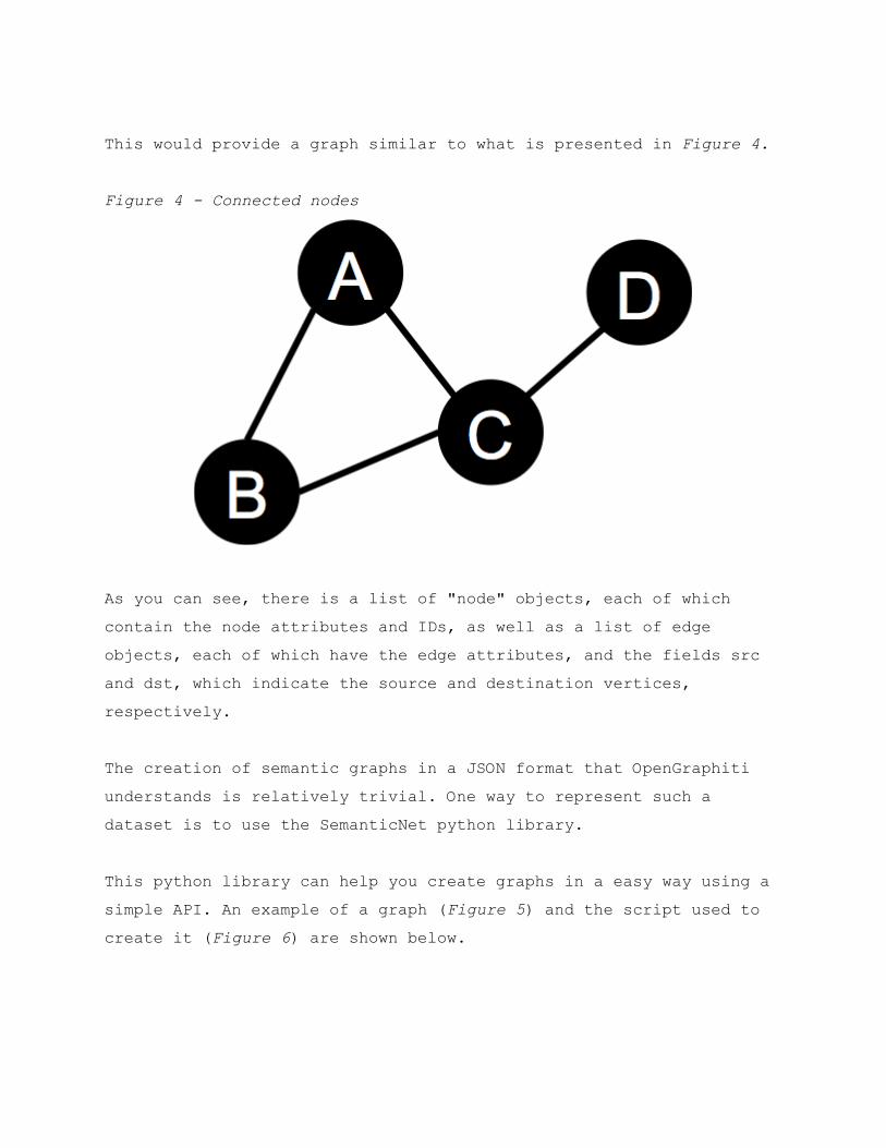
This would provide a graph similar to what is presented in Figure 4. Figure 4 Connected nodes
As you can see, there is a list of "node" objects, each of which contain the node attributes and IDs, as well as a list of edge objects, each of which have the edge attributes, and the fields src and dst, which indicate the source and destination vertices, respectively. The creation of semantic graphs in a JSON format that OpenGraphiti understands is relatively trivial. One way to represent such a dataset is to use the SemanticNet python library.
This python library can help you create graphs in a easy way using a simple API. An example of a graph (Figure 5) and the script used to create it (Figure 6) are shown below.
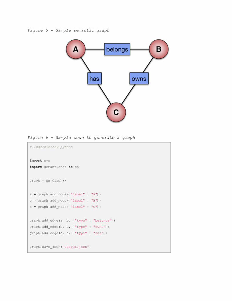
Figure 5 Sample semantic graph
Figure 6 Sample code to generate a graph
#!/usr/bin/env python
import sys import semanticnet as sn graph = sn.Graph() a = graph.add_node("label" : "A") b = graph.add_node("label" : "B") c = graph.add_node("label" : "C") graph.add_edge(a, b, "type" : "belongs") graph.add_edge(b, c, "type" : "owns") graph.add_edge(c, a, "type" : "has") graph.save_json("output.json")
This trivial example shows how easy it is to create customized graphs. The user can define any attribute (type or other) for the nodes or edges and then connect the elements as needed. When the graph is saved (or loaded) it can be analyzed using the NetworkX graph theory library or/and combined with OpenGraphiti.
Use Cases with OpenGraphiti There are a seemingly endless number of applicable use cases for the visualization of loosely related data. Some examples include the analysis of security data, such as firewall, intrusion detection and prevention systems (IDS/IPS), and malware infection alerts could be visualized to expose a previously unrecognized patterns in a malicious actor activity, or even a misconfiguration of a technical control that allows too much, or too little, access to data, files, or networks. Financial analysts could, for example, analyze data to track venture investment with data points such as the investor, the type of company being invested in (the target), its vertical market, or even the success (or failure) of the target before, during, or after the merger or acquisition. Trends may be observed to support a new model for investment and exit success above and beyond a simple spreadsheet. Social network analysis (SNA) can be visualized to show relationships between people and their relationships with other people or things. Data could be visualized to articulate the interconnections across related networks in the fields of anthropology, biology, communication studies, economics, geography, history, information science, organizational studies, political science, social psychology, development studies, and sociolinguistics, among others.
Conclusion We feel that OpenGraphiti should help lower the barrier to entry for those looking to visualize complex related data sets. The engine will allow for the visualization of any data, however loosely related, in a medium that is easy to generate, navigate, and articulate. The use cases presented here only scratch the surface of what is possible. We are confident, however, that the potential may be limited only by the imagination and diligence of those leveraging the tool. Combining intelligent data mining techniques with smart data visualization is the key to better understand the complex problems we are trying to solve. To take a significant step in the monitoring and managing of a large scale state machine in constant evolution, passive introspection is not enough. It is necessary to build an interface which acts on the system through manual or algorithmic modification. By presenting and opensourcing OpenGraphiti, we hope to put in place the first blocks in the foundation of a nextgeneration data analysis tool aimed at surfacing new techniques to build a largescale, distributed, and graphbased data monitoring system. Documentation and source code for OpenGraphiti shall be made available via GitHub at: https://github.com/opendns/graphiti.
References http://en.wikipedia.org/wiki/Graphics_processing_unit http://en.wikipedia.org/wiki/OpenGL http://www.opengl.org/documentation/glsl/
http://en.wikipedia.org/wiki/OpenCL http://en.wikipedia.org/wiki/Social_network_analysis http://en.wikipedia.org/wiki/Glossary_of_graph_theory http://en.wikipedia.org/wiki/Graphic_organizer http://en.wikipedia.org/wiki/Visual_learning http://www.inspiration.com/sites/default/files/documents/DetailedSummary.pdf https://github.com/ThibaultReuille/semanticnet/ https://networkx.github.io/ http://cs.brown.edu/~rt/gdhandbook/chapters/forcedirected.pdf http://en.wikipedia.org/wiki/Simulated_annealing http://en.wikipedia.org/wiki/Random_walk http://en.wikipedia.org/wiki/Grid_computing https://github.com/opendns/graphiti ftp://ftp.mathe2.unibayreuth.de/axel/papers/reingold:graph_drawing_by_force_directed_placement.pdf