Embed Size (px)
Citation preview

By Ashley OlsenLook Book

LOOK BOOKAshley Olsen
May 5, 2014
ADES 1540.501
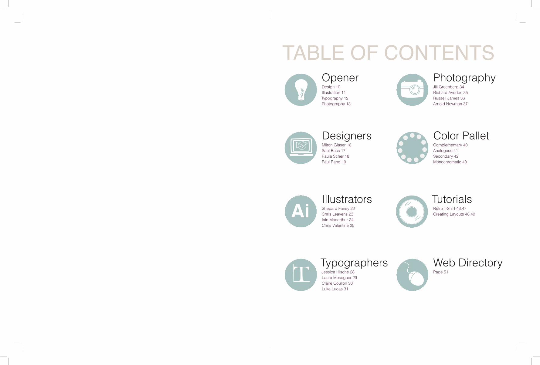
TABLE OF CONTENTS
Ai
T
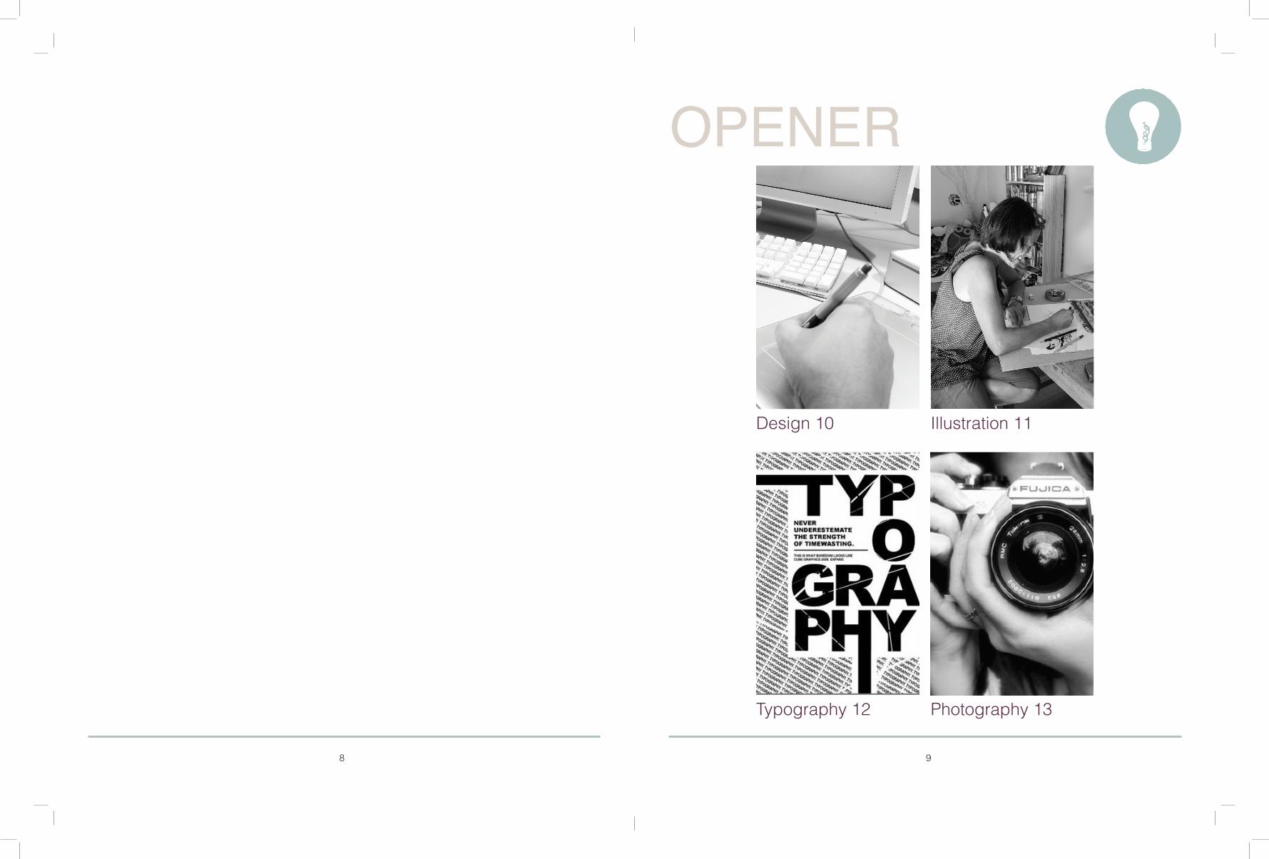
Design 10Illustration 11Typography 12Photography 13
Milton Glaser 16Saul Bass 17Paula Scher 18Paul Rand 19
Complementary 40Analogous 41Secondary 42Monochromatic 43
Retro T-Shirt 46,47Creating Layouts 48,49
Shepard Fairey 22Chris Leavens 23Iain Macarthur 24Chris Valentine 25
Jessica Hische 28Laura Meseguer 29Claire Coullon 30Luke Lucas 31
Page 51
Jill Greenberg 34Richard Avedon 35Russell James 36Arnold Newman 37
Opener
Designers
Illustrators
Photography
Color Pallet
Tutorials
Web DirectoryTypographers
8 9
Typography 12 Photography 13
Illustration 11Design 10
OPENER

10 11
Design is the creation of a plan or convention for the construction of an object or a system (as in architectural blueprints, engineering drawings, business processes, circuit diagrams and sewing patterns). Design has different connotations in different fields. In some cases the direct construction of an object (as in pottery, engineering, management, cowboy coding and graphic design) is also considered to be design.
Designing often necessitates considering the aesthetic, functional, economic and sociopolitical dimensions of both the design object and design process. It may involve considerable research, thought, modeling, interactive adjustment, and re-design. Meanwhile, diverse kinds of objects may be designed, including clothing, graphical user interfaces, skyscrapers, corporate identities, business processes and even methods of designing.
Architecture DesignInterior Design
Fashion DesignGraphic Design
An illustration is a visualization or a depiction made by an artist, such as a drawing, sketch, painting, photograph, or other kind of image of things seen, remembered or imagined, using a graphical representation.
Printing is the current process for reproducing illustrations, typically with ink on paper using a printing press. Illustrations can be artistic images illustrating for example a text, poem, fashion, magazines, stamps or a book and very often illustrations were made for children’s books. The aim of an illustration is to elucidate or decorate a story, poem or piece of textual information by providing a visual representation of something described in the text.Illustrations can be executed in different techniques, like watercolor, gouache, ink, oil, charcoal chalk or woodcut. Paintings are usually original works made on canvas or wood, while illustrations are printed. Illustrations are often carried out as a large-scale industrial process, and is an essential part of publishing and transaction printing.
Sketch or Drawing Illustration Vector Illustration
Watercolor IllustrationChildren’s Book Illustrations
ILLUSTRATIONDESIGN

12 13
Portrait PhotographyBy Sean Archer
Landscape Photography
Still Life PhotographyAerial photography
PHOTOGRAPHY
SizeScale
Typography is the art and technique of arranging type in order to make the language it forms most appealing to transparent learning and recognition. The arrangement of type involves the selection of typefaces, point size, line length, leading (line spacing), adjusting the spaces between groups of letters (tracking) and adjusting the space between pairs of letters (kerning). Type design is a closely related craft, which some consider distinct and others a part of typography; most typographers do not design typefaces, and some type designers do not consider themselves typographers. In modern times, typography has been put into motion—in film, television and online broadcasts—to add emotion to mass communication.
Typography is performed by typesetters, compositors, typographers, graphic designers, art directors, mangakas, comic book artists, graffiti artists, clerical workers, and anyone else who arranges type for a product. Until the Digital Age, typography was a specialized occupation.
Photography is the art, science and practice of creating durable images by recording light or other electromagnetic radiation, either chemically by means of a light-sensitive material such as photographic film, or electronically by means of an image sensor. Typically, a lens is used to focus the light reflected or emitted from objects into a real image on the light-sensitive surface inside a camera during a timed exposure. The result in an electronic image sensor is an electrical charge at each pixel, which is electronically processed and stored in a digital image file for subsequent display or processing.
The result in a photographic emulsion is an invisible latent image, which is later chemically developed into a visible image, either negative or positive depending on the purpose of the photographic material and the method of processing. A negative image on film is traditionally used to photographically create a positive image on a paper base, known as a print, either by using an enlarger or by contact printing.
Anatomy: How Letters Sit on a Line Letter Anatomy
TYPOGRAPHY

14 15
Paul Rand 19Paula Scher 18
Saul Bass 17Milton Glaser 16
DESIGNERS
16 17
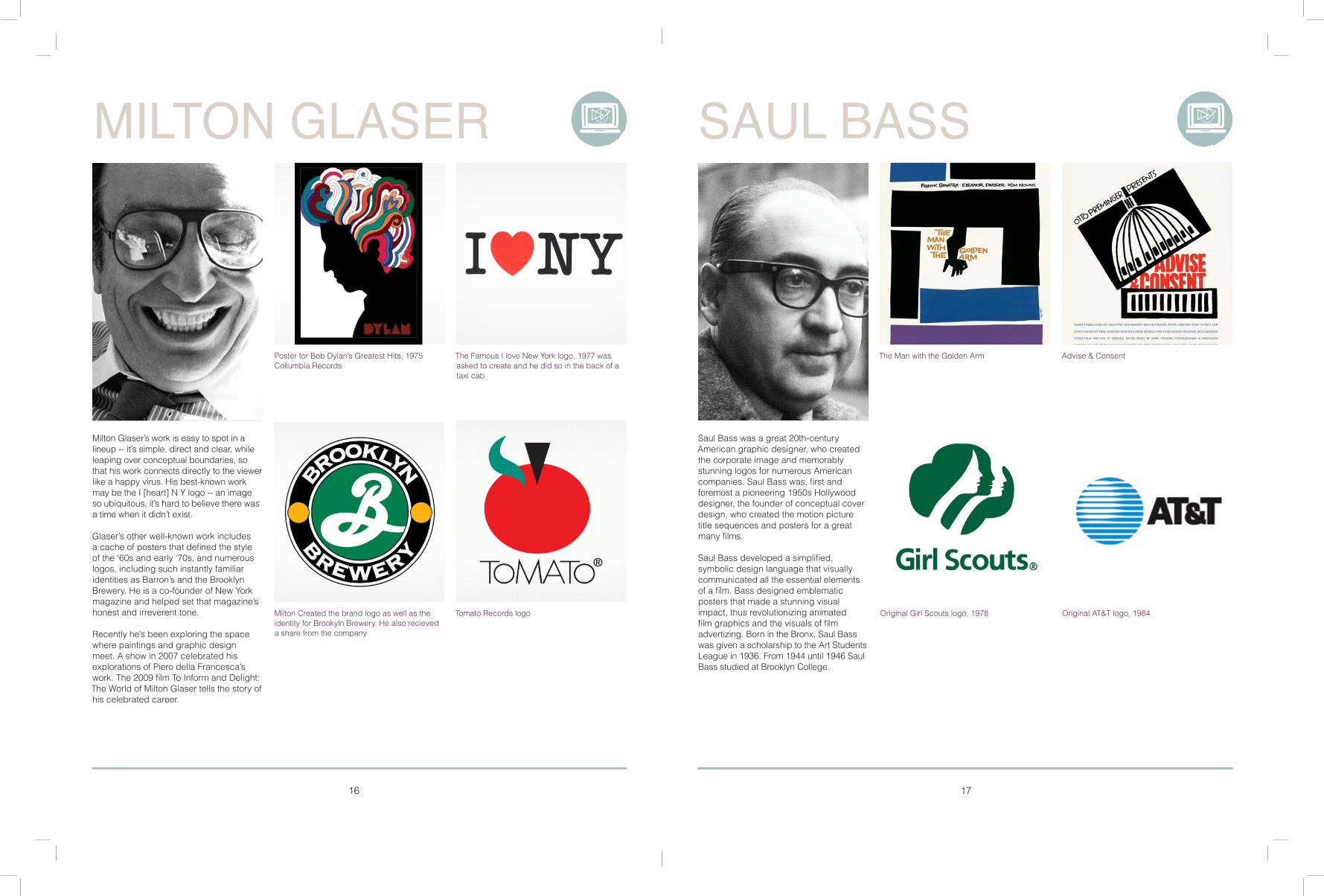
Tomato Records logo Original Girl Scouts logo, 1978 Original AT&T logo, 1984
Advise & ConsentThe Man with the Golden Arm
Milton Created the brand logo as well as the identity for Brookyln Brewery. He also recieved a share from the company
The Famous I love New York logo, 1977 was asked to create and he did so in the back of a taxi cab
Poster for Bob Dylan’s Greatest Hits, 1975Collumbia Records
Saul Bass was a great 20th-century American graphic designer, who created the corporate image and memorably stunning logos for numerous American companies. Saul Bass was, first and foremost a pioneering 1950s Hollywooddesigner, the founder of conceptual cover design, who created the motion picture title sequences and posters for a great many films.
Saul Bass developed a simplified, symbolic design language that visually communicated all the essential elementsof a film. Bass designed emblematic posters that made a stunning visual impact, thus revolutionizing animated film graphics and the visuals of film advertizing. Born in the Bronx, Saul Basswas given a scholarship to the Art Students League in 1936. From 1944 until 1946 Saul Bass studied at Brooklyn College.
Milton Glaser’s work is easy to spot in a lineup -- it’s simple, direct and clear, while leaping over conceptual boundaries, so that his work connects directly to the viewer like a happy virus. His best-known work may be the I [heart] N Y logo -- an image so ubiquitous, it’s hard to believe there was a time when it didn’t exist.
Glaser’s other well-known work includes a cache of posters that defined the style of the ‘60s and early ‘70s, and numerous logos, including such instantly familiar identities as Barron’s and the Brooklyn Brewery. He is a co-founder of New York magazine and helped set that magazine’s honest and irreverent tone.
Recently he’s been exploring the space where paintings and graphic design meet. A show in 2007 celebrated his explorations of Piero della Francesca’s work. The 2009 film To Inform and Delight: The World of Milton Glaser tells the story of his celebrated career.
SAUL BASSMILTON GLASER

18 19
Identity for New York City Ballet, 2008
Part of her typographic map collection Citi logo was drawn on a napkin
United Parcel Service (UPS), 1961Ford logo, 1966
International Business Machines (IBM),13-bar variation 1967(IBM)8-bar variation 1972“A logo does not sell (directly), it identifies.”
American Broadcasting Corporation,1962
For the public theater
Paula has exhibited intricate hand-drawn maps, produced CD covers and given TED Talks, and in the 1990s she became the first female partner in an era-defining creative agency. Yes, Scher has come a long way from her first job as a layout artist at Random House.
Not only is she one of the most respected designers in the US, with many of her images now part of the American vernacular, she has a reputation for being both an inspirational educator and a deep thinker about graphic design. Scher has worked with Coca-Cola, The New York Philharmonic, The United States Holocaust Memorial Museum and The Daily Show.
Paul Rand was born August 15, 1914 – November 26, 1996 was a well-known American graphic designer, best known for his corporate logo designs. Rand was educated at the Pratt Institute (1929-1932), the Parsons School of Design (1932-1933), and the Art Students League (1933-1934). He was one of the originators of the Swiss Style of graphic design. From 1956 to 1969, and beginning again in 1974, Rand taught design at Yale University in New Haven, Connecticut. Rand was inducted into the New York Art Directors Club Hall of Fame in 1972. He designed many posters and corporate identities, including the logos for IBM, UPS and ABC. Rand died of cancer in 1996.
PAUL RANDPAULA SCHER
20 21
Chris Valentine 25Iain Macarthur 24
Chris Leavens 23Shepard Fairey 22
ILLUSTRATORS Ai

22 23
Peace Girl, 2005 Kiss Me Deadly Red,2007
Barack Obama “Hope” poster, 2008 Self Portrait
Frank Shepard Fairey was born February 15, 1970. He is an American contemporary street artist, graphic designer activist and illustrator who emerged from the skateboarding scene. He first became known for his “Andre the Giant Has a Posse” (…OBEY…) sticker campaign, in which he appropriated images from the comedic supermarket tabloid Weekly World News.
He became widely known during the 2008 U.S. presidential election for his Barack Obama “Hope” poster. The Institute of Contemporary Art, Boston calls him one of today’s best known and most influential street artists.His work is included in the collections at The Smithsonian, the Los Angeles County Museum of Art, the Museum of Modern Art in New York City, the Museum of Contemporary Art San Diego, the National Portrait Gallery in Washington, D.C., the Virginia Museum of Fine Arts in Richmond, and the Victoria and Albert Museum in London.
Chris was born and raised in Pennsylvania. He breezed through school and passed a good deal of time doodling, drawing robots, spaceships, and bizarre creatures.
He continued both his education and his doodling at Penn State University, where he graduated with a BA in film and video. A few months after graduating, Chris migrated west to Los Angeles in search of work in the film industry. Many adventures followed, including a brief career as a video editor and motion graphics designer.Chris decided to take a break from the film biz and began working as an illustrator, graphic designer, and web designer. This “break” has more than outlived Chris’s Hollywood career and continues to this day. Chris currently lives in the foothills of Los Angeles, CA with his wife and their daughter and son.
Renmen Collaboration Approaching the Hacienda at Sunset
The Bowl EscapesHang it up
CHRIS LEAVENSSHEPARD FAIREY AiAi

24 25
Sherlock Holmes illustration
Born in Swindon, England, Iain became a fanatic of art at the age of eight when he was first introduced to art through the medium of cartoon television shows and comic books. His first ever comic book was from the Batman series. Ever since then he has been obsessed with art, drawing odd fantasy drawings and Anime characters.
He is influenced by many artists and illustrators – all with differing styles and mediums – and have turned to their work for artistic stimulation over the years. Among them are Alphonse Mucha, Gustav Klimt, Lucian Freud, Jenny Saville, James Jean, David Choong Lee, Sergio Toppi and Ashley Wood. He has also gained much inspiration through cartoons art and lighting; people’s facial expressions, eyes and different forms of organic patterns and shapes.
He specializes in shirt designs, print designs, posters, album art, logos, branding, editorial illustration and private commissions.
Illustration is South African artist Chris Valentine’s passion. And with a talent like his, who can blame him? Valentine’s portfolio is filled with stunning illustrations, many of which are detailed, close-up portraits. The illustrator drew this one of Steve Jobs after being commissioned to do a series of pencil portraits of famous entrepreneurs and successful people for the Liquid Capital group in South Africa.
He is a young designer fresh out of school and is currently working at Rivers Church in Sandton as a graphic designer and illustrator. He is absolutely passionate about all things art or music related and is a creative freak!
Lightman Fun IllustrationLiquid Capital Portraits
Oil painting of Eddie Vedder from Pearl Jam.
Commission for Luke Klein’s ‘The Tourists’, 2013
Front magazine commission on the band Slayer, 2012
Nike T-shirt design, 2012
The Skull Mistress, Skull & Heart, 2013
CHRIS VALENTINEIAIN MACARTHUR AiAi

26 27
Luke Lucas 31Claire Coullon 30
Laura Meseguer 29Jessica Hische 28
TYPOGRAPHY T

28 29
Lettering and poster for an exhibition on capital letters
A decorative display typeface.GUAPA™
A versatile and custom sans serif typeface family for newspapers
Exhibition graphics and curatorship.Helvetica. A New Typeface?
Pretty Happy Feeling for Land Gallery Pretty Happy Feeling
BBDO for Starbucks
Barney’s COOP for Philadelphia MagazineMess it up for Gianni Clifford for Movember
Laura is a freelance type designer based in Barcelona and available for work worldwide.
She specializes in custom lettering and type design projects for identity and editorial design, but also keeps busy with self-initiated projects. Her design approach is to create unique solutions for every assignment, based on the concept and the context, always in close collaboration with art directors and designers.
Jessica has been on her own as a letterer, illustrator, type designer, and relentless procrastinator since 2009 and worked for (and continue to work for) a lot of wonderful clients like Wes Anderson and Penguin Books. She shared studios with amazing people including the folks over at Studio mates and of course my beloved Pencil Factory, where she continues to spend time on return trips to Brooklyn. She split her days (not evenly enough) between Brooklyn and San Francisco—the place she now call home and where she set up a collaborative studio and workshop space with her brother from another mother, Erik Marinovich.
When she’s not manipulating beziers or working on fun projects, you can find her at the airport en route to a speaking engagement. She loves what she does for a living and tries as hard as she can to help others find a way to do what they love.
LAURA MESEGUERJESSICA HISCHE TT
30 31
Crust – Slice of TypeThe Anorexic Brain – Science News
Whoomp! – 5280 The Denver MagazineFirst Choice – All You Can CampaignLogo-type design, custom lettering, visual identity, pattern design for Tierra L. Dobry Foundation
Poster design for TypeTogether using Coranto 2 letter type
Custom lettering, colour exploration, print design
Logo-type design, custom lettering, branding development for Rally
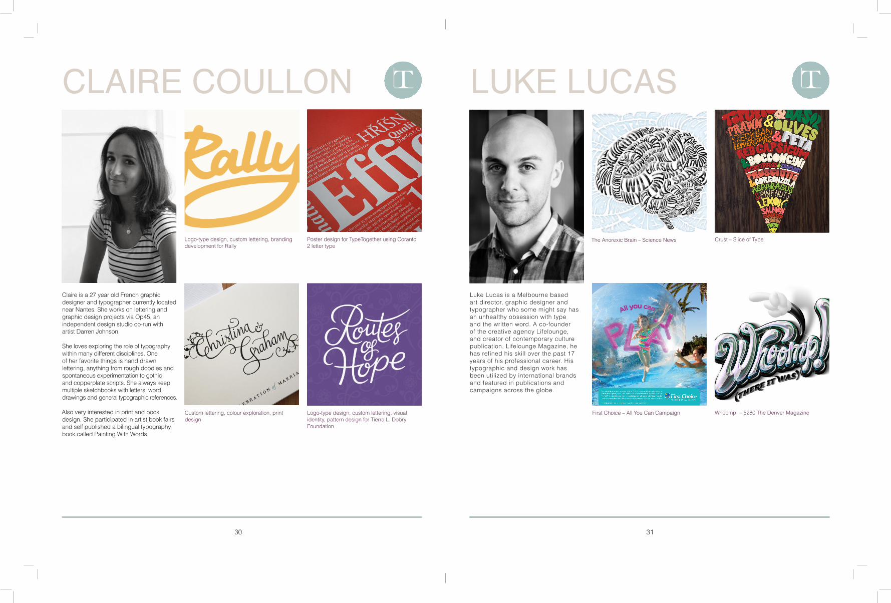
Luke Lucas is a Melbourne based art director, graphic designer and typographer who some might say has an unhealthy obsession with type and the written word. A co-founder of the creative agency Lifelounge, and creator of contemporary culture publication, Lifelounge Magazine, he has refined his skill over the past 17 years of his professional career. His typographic and design work has been utilized by international brands and featured in publications and campaigns across the globe.
Claire is a 27 year old French graphic designer and typographer currently located near Nantes. She works on lettering and graphic design projects via Op45, an independent design studio co-run with artist Darren Johnson.
She loves exploring the role of typography within many different disciplines. One of her favorite things is hand drawn lettering, anything from rough doodles and spontaneous experimentation to gothic and copperplate scripts. She always keep multiple sketchbooks with letters, word drawings and general typographic references.
Also very interested in print and book design, She participated in artist book fairs and self published a bilingual typography book called Painting With Words.
LUKE LUCASCLAIRE COULLON TT

32 33
Arnold Newman 37Russell James 36
Richard Avedon 35Jill Greenberg 34
PHOTOGRAPHY

34 35
Marilyn Monroe, 1957
In Memory of the Late Mr. and Mrs. Comfort The New Yorker
Rudolf Nureyev, “en pointe”, 1967
Tilda Swinton, 1993
Worried, 2004Shock, 2005
Glass Ceiling 2-247, 2010Balloon Group, 2011
Richard Avedon born in May 1923 in New York , was an American portrait and fashion photographer. His mother owned a apparel company and hence, encouraged Avedon’s love for art and fashion. As early as age 12, Avedon developed an interest in photography and so joined YMHA (Young Men’s Hebrew Association), a photographers society. In order to explore things around him and to fulfill his desire of photography he used, a Kodak Box Brownie, family’s camera. All these facets shaped Richard Avedon’s personal and professional life.
In 1946, Richard Avedon opened his own personal studio and began offering services to popular magazines like Life and Vogue. Eventually, he became the head photographer at Harper’s Bazaar. Starting from 1950’s he also photographed for Look, Graphis and Life. In 1952, he became the photographer and Staff Editor of Theatre Arts Magazine.
An American artist and photographer, Jill Greenberg is famous for her fine art pieces and portraits. She was born in 1967 in Montreal and raised in Detroit. She graduated from Rhode Island School of Design with an honors degree in photography in 1989. She then shifted to New York city to work as a photographer. In 2000, Greenberg went to Los Angeles where she met Robert, her future husband. Then again in 2013 she returned to New York since Robert got a job with Condé Nast. In 2007, Greenberg got a chance to present forty most significant photographers, by French Photo Magazine.
She has worked on commercial campaigns for Microsoft, Dreamworks, Polaroid, Philip Morris, MGM, Fox, Disney, MTV, Sony Music, Warner Bros, Paramount Pictures, Atlantic Records, Sony Pictures, Pepsi, Coca Cola, and Smirnoff.
RICHARD AVEDONJILL GREENBERG
36 37
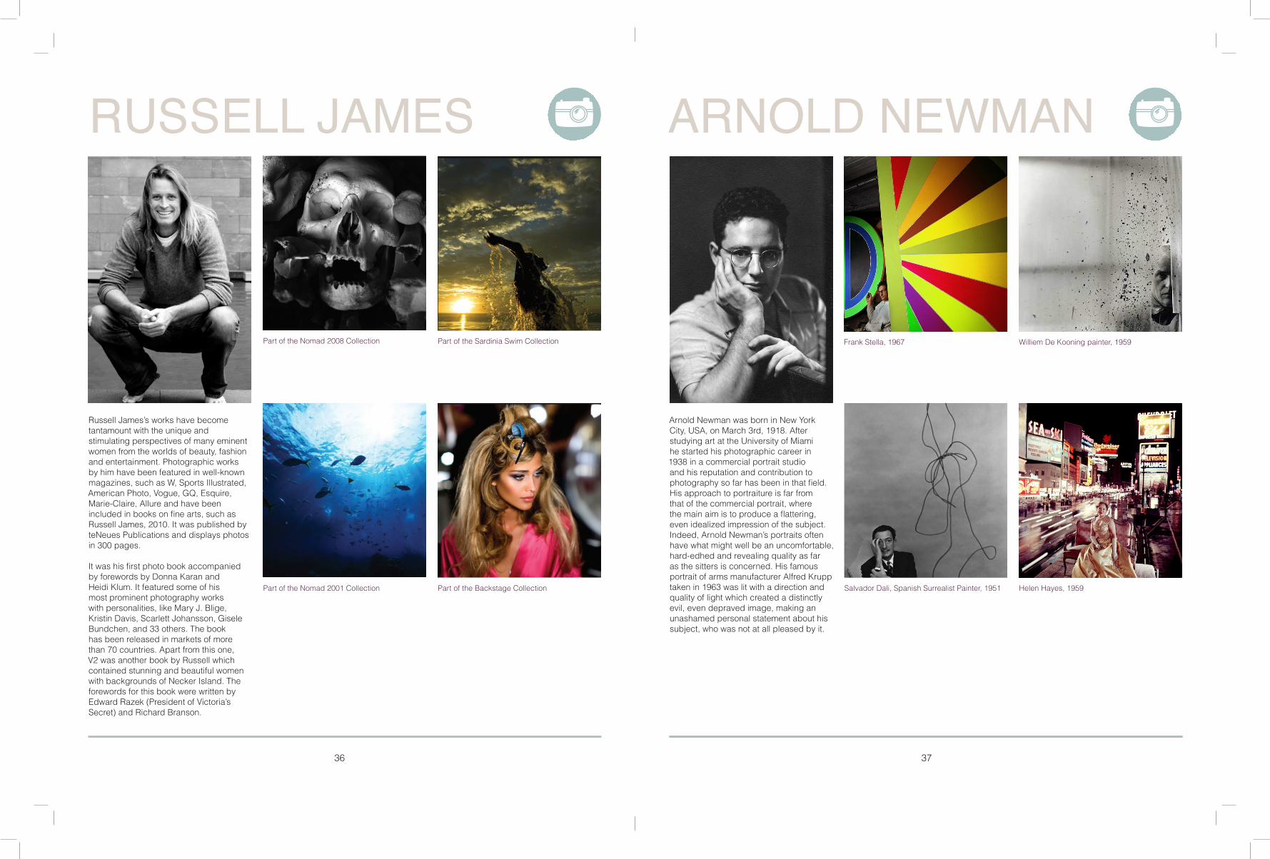
Part of the Nomad 2008 Collection Part of the Sardinia Swim Collection
Part of the Backstage CollectionPart of the Nomad 2001 Collection Salvador Dali, Spanish Surrealist Painter, 1951
Williem De Kooning painter, 1959
Helen Hayes, 1959
Frank Stella, 1967
Russell James’s works have become tantamount with the unique and stimulating perspectives of many eminent women from the worlds of beauty, fashion and entertainment. Photographic works by him have been featured in well-known magazines, such as W, Sports Illustrated, American Photo, Vogue, GQ, Esquire, Marie-Claire, Allure and have been included in books on fine arts, such as Russell James, 2010. It was published by teNeues Publications and displays photos in 300 pages.
It was his first photo book accompanied by forewords by Donna Karan and Heidi Klum. It featured some of his most prominent photography works with personalities, like Mary J. Blige, Kristin Davis, Scarlett Johansson, Gisele Bundchen, and 33 others. The book has been released in markets of more than 70 countries. Apart from this one, V2 was another book by Russell which contained stunning and beautiful women with backgrounds of Necker Island. The forewords for this book were written by Edward Razek (President of Victoria’s Secret) and Richard Branson.
Arnold Newman was born in New York City, USA, on March 3rd, 1918. After studying art at the University of Miami he started his photographic career in 1938 in a commercial portrait studio and his reputation and contribution to photography so far has been in that field. His approach to portraiture is far from that of the commercial portrait, where the main aim is to produce a flattering, even idealized impression of the subject. Indeed, Arnold Newman’s portraits often have what might well be an uncomfortable, hard-edhed and revealing quality as far as the sitters is concerned. His famous portrait of arms manufacturer Alfred Krupp taken in 1963 was lit with a direction and quality of light which created a distinctly evil, even depraved image, making an unashamed personal statement about his subject, who was not at all pleased by it.
ARNOLD NEWMANRUSSELL JAMES

39
Secondary 42 Monochromatic 43
Complementary 40 Analogous 41
COLOR PALLET
38 39

4140
Analogous colors are groups of colors that are adjacent to each other on the color wheel, with one being the dominant color, which tends to be a primary or secondary color, and two on either side complementing, which tend to be tertiary.
The term analogous refers to the having analogy, or corresponding to something in particular. An analogous color scheme creates a rich, monochromatic look. It’s best used with either warm or cool colors, creating a look that has a certain temperature as well as proper color harmony. While this is true, the scheme also lacks contrast and is less vibrant than complementary schemes.Red, yellow, and orange are examples of analogous colors.
RBG 22/119/162
Cmyk 87/46/20/1
Hex 1677a2
RBG 142/181/102
Cmyk 49/12/77/0
Hex 8EB566
RBG 160/243/249
CMYK 31/0/7/0
HEX A0F3F9
RBG 80/126/162
CMYK 73/44/22/1
HEX 507EA2
RBG 85/112/97
CMYK 68/41/61/20
HEX 557061
ANALOGOUSCOMPLEMENTARY
Complementary colors are pairs of colors which, when combined in the right proportions, produce white or black. When placed next to each other, they create the strongest contrast and reinforce each other. They are widely used in art and design. The pairs of complementary colors vary depending upon the color model, and how the color is made. In painting, which uses subtractive colors, the traditional primary–secondary complementary color pairs, described since at least the early 18th century, were red–green, yellow–violet, and blue–orange. In the more accurate RGB color model, used to make colors on computer and television displays, red, green and blue light are combined at various intensities to make all the other colors. In this system, using additive colors, the complementary pairs are red–cyan, green–magenta, and blue–yellow. In color printing, another system of subtractive colors, the colors cyan, magenta, yellow and black are used to produce all printed colors; the CMYK-system complementary pairs are the same as in the RGB system: red–cyan, green–magenta, and blue–yellow.
RBG 16/31/98
Cmyk 100/97/31/25
Hex 101F62
RBG 225/120/32
CMYK 0/66/96/0
HEX E17820
RBG 160/199/206
CMYK 37/10/16/0
HEX A0C7CE
RBG 165/179/180
Cmyk 37/22/25/0
Hex A5B3B4
RBG 227/211/196
Cmyk 10/15/20/0
Hex E3D3C4
42 43
When you combine any two of the Pure Primary Hues, you get three new mixtures called Secondary Colors.
Think of the three Secondaries as the Children in the family of colors.
Orange, Purple and green are the secondary colors.
Monochrome describes paintings, drawings, design, or photographs in one color or shades of one color. A monochromatic object or image has colors in shades of limited colors or hues.[clarification needed] Images using only shades of grey (with or without black and/or white) are called grayscale or black-and-white. However, scientifically speaking, monochromatic light refers to visible light of a narrow band of wavelengths.
RBG 148/109/32
CMYK 36/52/100/18
HEX 946D20
RBG 228/211/7
CMYK 6/4/100/7
HEX E4D307
RBG 222/177/16
CMYK 15/29/100/0
HEX DEB110
RBG 2/7/52/0
CMYK 251/229/145
HEX FBE591
RBG 194/167/135
CMYK 25/32/49/0
HEX C2A787
RBG 158/10/150
CMYK 82/21/77
HEX 9E0A96
RBG 28/44/44
CMYK 80/61/64/65
HEX 1C2C2C
RBG 83/1/77
CMYK 67/100/33/37
HEX 53014D
RBG 252/178/79
CMYK 0/34/78/0
HEX FCB24F
RBG 77/106/52
CMYK 70/38/96/26
HEX 4D6A34
SECONDARY MONOCHROMATIC

TUTORIALS
44 45
Retro T-Shirt 46,47 Creating Layouts 48,49

46 47
RETRO T-SHIRT RETRO T-SHIRT
Software: Illustrator CS4 or later
Project time: 1-2 hours
Skills: Use the Pathfinder panel to knock out and combine shapes, Apply vector textures to shapes
In this tutorial, I’ll explain how to create a T-shirt design by creating some cool retro graphics just a few simple steps. Using Illustrator, we’ll form some simple vector shapes with the Pen tool and then add textures for a retro aesthetic.
We’ll also use the Pathfinder panel extensively, particularly the ‘Add to shape area’ and ‘Subtract from shape area’ commands. I’ll then walk through how to add interest with a limited colour panel.
First of all, open T-shirt.ai from the support files: this will act as the background for your design. Build some geometric hand shapes in Illustrator using the Ellipse and Rounded Rectangle tools. The fingers are rounded rectangles that have been cut in half using the 'Subtract from shape area' command on the Pathfinder panel. The top shape will always subtract from the one below. When you're happy, hit 'Add to shape area' on the Pathfinder panel to make the hand one big shape. Make sure that you select 'Make Compound Shape' after you subtract or add, and then hit Expand.
Round off the areas where the digits join the hand by creating some curved shapes and hitting 'Subtract from shape area'. Next, duplicate the hand so that there's another one below. Rotate it 180deg to make a rectangle area: this is where we'll place the camera, as seen in the final image.
Using the Pen, Rectangle and Ellipse tools, create a range of geometric shapes. Then combine them to build up the image of a camera (or whatever you like). When you're happy, fill in the shapes with colour. Notice how you can use the dark blue in the background as a third colour for some in-laid shapes.
Let's add some detail to the eye using a dashed stroke. Select the Ellipse tool and create a circle just larger than the pupil. Click the dashed line option on the Stroke panel, and adjust the weight and dash values to form thin segments that go around the circle evenly. In the Stroke panel, change 'Align Stroke to Centre' to 'Align Stroke to Inside'. Next, select the shape and go to Object>Expand Appearance to change the selection from a dashed stroke to a shape. Use the 'Add to shape area' command to join it together. Do this again to make the 'click-wheel' shape at the top of the camera.
Open the vector_textures.ai file. Copy and paste the woodgrain texture over your T-shirt filew, and scale and position it so that it fits over the camera appropriately. Now select both the wood grain and the shape you wish to subtract from.
Use the 'Subtract from shape area' command, select Make Compound Shape and hit Expand. Now we have a retro woodgrain panel on our camera. Head back to the vector_textures.ai file. Copy and paste the splatter shape over to your T-shirt file. Scale and position it over the camera, and select both the splatter and some of the circles that make up the lens shape. Go to 'Subtract from shape area', select Make Compound Shape and hit Expand to knock out some splatter. Go to Object>Arrange to keep the shapes in order once the splatter has been subtracted.
Let's add some dimension to the camera without using a third colour, gradients or anything that will complicate the T-shirt printing process. Select the Pen tool and draw some shapes around the camera. Combine these using the 'Add to shape area' command (don't forget to select Make Compound Shape and hit Expand).
Copy and paste the vector_textures.ai file over to your T-shirt and place it in the areas underneath the camera shape using Object>Arrange (paste it multiple times if needed). Combine your halftone shapes using the addition function. Now use the 'Intersect shape areas' command in the Pathfinder panel to cut what you want from the halftones. Select both the camera dimension shape and the halftone shape, hit 'Intersect shape areas', choose Make Compound Shape, then Expand. Make it the colour of the shirt.
We need to add some texture to the hands. Combine both hands with the 'Add to shape area' command. Duplicate them and move the copies so that they offset the original hands. Paste and arrange the halftones so that they're under the offset hands. Combine the halftone shapes and use the subtract tool to knock out the halftones with the duplicated hands. Now copy and paste the original hands in place. Arrange them so that they're above the dots. Select the new hands and the remaining dots, and use the 'Intersect shape areas' command to reveal a shadow on the hands. Make the dots light blue.
Draw some rectangles for 'arms' and arrange them so they're behind the camera. Now use the Pen tool to draw a shape that looks like a flash burst. Paste the halftone dots under the shape and use the 'Intersect shape areas' command to reveal a halftone flash burst. Lastly, delete some of the dots on the palm of the bottom hand and draw a rectangle to close the rounded parts of the hand. Use the 'Add to shape area' command to combine the hand and the rectangle. This hand now looks like the backside is facing forward. And you're done.
1 2
3 4
5 6 7
1098

48 49
CREATE LAYOUTS CREATE LAYOUTS
Software: InDesign CS5-CC
Project time: 1 hour
Skills: Scale and resize different gaps between objects, use Live Corner Effects, quickly edit layouts without leaving the spread
Since InDesgin CS5, you’ve been able to distribute layout elements, resize gaps and customise frame corners faster using the interactive Gap tool and Live Corner Effects.
These intuitive features enable you to manipulate objects without having to leave the spread or constantly switch tools – shaving valuable seconds off repetitive tasks.
To get started, first switch your screen workspace to the Typography setting under Workspace or through the drop-down menu. Typography is a good option when you’re working with magazine layouts because it gives you all of the tools you need, enabling you to work very efficiently.
Let’s start by creating a grid of frames within your layout. Before dropping your images into each one, select all the frames and hit Object>Fitting>Frame Fitting Options. Set Fitting to Fill Frame Proportionately and set Align From in the centre by clicking on the centre square. Finally, select Auto-Fit, which will enable your images to scale to fit the frame automatically. This will come in handy when you start changing the size of the frames. Now click OK and go back to your layout.
It’s time to load your images into the grid of frames you’ve created. Click on File and choose Place. Select all the images you’d like to bring into the layout and hit Open. This will load the images into a brush and you’ll simply need to click on each frame to load them.
When hovering over an image you’ll notice the content indicator – a transparent circle in the middle of the picture. If you place your mouse in the centre of the circle, the cursor will change to a hand symbol. This enables you to reposition images easily by clicking and dragging them to look exactly as you wish.
You can use the Gap tool to adjust the space between two or more objects without having to individually size the elements on the page. Select the Gap tool. Hover it between the frames you’d like to adjust and a highlight appears with two directional arrows. By dragging the highlighted space left, right, up and down, you can simultaneously manipulate the spaces between the objects.
You’ll notice that by default the shared gap boundary is affected and therefore all images within the same row or column will scale together. If you’d like to select only two objects to be resized, hold the Shift key and drag between the two images.
Let’s say that you want to change the size of the gap between the objects. Hit Ctrl/Cmd and drag to make the gap bigger or smaller.
The Gap tool can also easily be used to measure the gap between two objects. Place the Gap tool between the objects, and then click and hold. The Smart Dimensions feature displays the width and height of the gap.
Now that you have a grid of images positioned the way you want, let’s make the layout more dynamic by changing the shape of the frames. Switch back to the Selection tool and click on one of the images. You’ll notice a yellow square on the right edge of the frame. Click on this square and all four corners now have yellow diamonds.
Press Shift and start dragging one of the yellow diamonds on the corner to change the radius dynamically to 15pt. In order to adjust all four corners at the same time, simply click on one of the yellow diamonds and drag until you have your desired radius on all four corners.
1 2
3 4
5 6 7
1098
WEB DIRECTORY
50 51
Anatomy of a Characterhttp://www.fonts.com/content/learning/fontology/level-1/type-anatomy/anatomy
9 Amazing Type Designershttp://webelemint.com/round-ups/9-amazing-type-designers-to-inspire-you/
892 Unique Ways to Partition A 3x4 Gridhttp://observatory.designobserver.com/feature/892-unique-ways-to-partition-a-3x4-grid/26298/
Thinking with Typehttp://thinkingwithtype.com/
25 Inspiring Typography portfolios on Behancehttp://www.creativebloq.com/typography/typographers-follow-behance-11121295
Beautiful Illustrator Artworks By Artists Around The Worldhttp://www.smashingmagazine.com/2010/03/04/100-beautiful-illustrator-artworks-by-artists-around-the-world/
Retro T-Shirt using Illustratorhttp://www.creativebloq.com/illustrator/create-retro-graphics-illustrator-5132644
56 Absolutely Brilliant And Intriguing Photoshop Video Tutorialshttp://www.hongkiat.com/blog/56-absolutely-brilliant-and-intriguing-photoshop-video-tutorials/
Designer of the Apple Logohttp://robjanoff.com/applelogo/
50 High-Quality Adobe InDesign Tutorialshttp://designm.ag/tutorials/indesign/
50 Excellent Adobe Illustrator Video Tutorialshttp://www.smashingmagazine.com/2009/01/04/50-excellent-adobe-illustrator-video-tutorials/