Embed Size (px)
Citation preview
National A&E Dashboard: User guide February 2018

We support providers to give patients
safe, high quality, compassionate care
within local health systems that are
financially sustainable.
1 | Contents
Contents
What is the National A&E Dashboard? .................................................................. 2
Accessing the dashboard ...................................................................................... 2
Dashboard overview .............................................................................................. 3
Cover page ............................................................................................................ 4
Scorecard screen .................................................................................................. 5
Demand screen ................................................................................................... 11
Bed Capacity screen ........................................................................................... 15
Performance screen ............................................................................................ 18
One Pager screen ............................................................................................... 21
Sentinel Dashboard ............................................................................................. 21
A&E Daily Performance with Rank ...................................................................... 27
Daily Activity Report ............................................................................................ 28
Daily Performance Report ................................................................................... 30
Daily Missing Submission screen ........................................................................ 31
Community – Bed Capacity ................................................................................. 32
Indicator Descriptions screen .............................................................................. 33
2 | National A&E Dashboard: user guide
What is the National A&E Dashboard?
The National A&E Dashboard has been developed to provide a consolidated view
of A&E information that can be shared between various central NHS bodies. This
provides a consistent understanding of A&E performance through the collection of
daily situation report (SitRep) data, and enables the NHS to identify pressure points
in the system and intervene accordingly.
Data is submitted by trusts on a daily basis for the previous 24 hours of activity
(midnight to 11:59pm) and snapshots of the data are taken at 8am. Trusts submit
this data in the morning and submissions close in the afternoon for reporting
purposes.
Accessing the dashboard
To access the dashboard, open the following web address in your internet
browser:
https://analytics.improvement.nhs.uk/views/NationalAEDashboard/CoverPage
The Sign In screen for your NHS Improvement
account will now be displayed. This will give you
access to the Tableau Analytics section and
subsequently the A&E dashboard itself.
Enter your user name (which typically ends in
…@nhs.net but may differ for some providers) and
corresponding password.
Tick the Remember me box to avoid having to re-
enter your log-in details in future.
Click Sign In.
3 | National A&E Dashboard: user guide
Quick tip:
• If you don’t have an NHS Improvement account, the Registration screen
will be displayed instead of the Sign In screen. Once registered, reopen the
national A&E dashboard via your internet browser. You will either need to
sign in with your new account details or be taken straight to the A&E
dashboard cover page.
For more information about the OKTA
registration process and general
functionality of the OKTA portal, including
creating an NHS Improvement hub account
and/or accessing business tools and other
applications via the portal, please contact
for a copy of the OKTA registration and
user guide.
Dashboard overview
The National A&E Dashboard provides a summary of operational performance for
acute trusts with a type 1 A&E and community trusts. It consists of a cover page
and various reports: Scorecard, Demand, Bed Capacity, Performance, the One
Pager report, the Sentinel Dashboard, A&E Daily Performance with Rank, the
Daily Activity Report, the Daily Performance Report, the Daily Missing
Submission report and the Community – Bed Capacity report.
The dashboard also includes an Indicator Descriptions tab which contains a
description of each indicator found throughout the dashboard, and explains how
these indicators are calculated.
4 | National A&E Dashboard: user guide
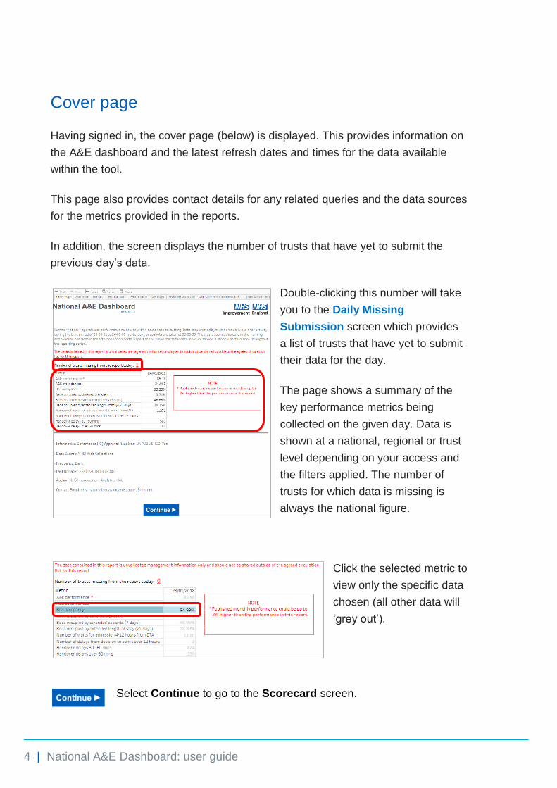
Cover page
Having signed in, the cover page (below) is displayed. This provides information on
the A&E dashboard and the latest refresh dates and times for the data available
within the tool.
This page also provides contact details for any related queries and the data sources
for the metrics provided in the reports.
In addition, the screen displays the number of trusts that have yet to submit the
previous day’s data.
Double-clicking this number will take
you to the Daily Missing
Submission screen which provides
a list of trusts that have yet to submit
their data for the day.
The page shows a summary of the
key performance metrics being
collected on the given day. Data is
shown at a national, regional or trust
level depending on your access and
the filters applied. The number of
trusts for which data is missing is
always the national figure.
Click the selected metric to
view only the specific data
chosen (all other data will
‘grey out’).
Select Continue to go to the Scorecard screen.
5 | National A&E Dashboard: user guide
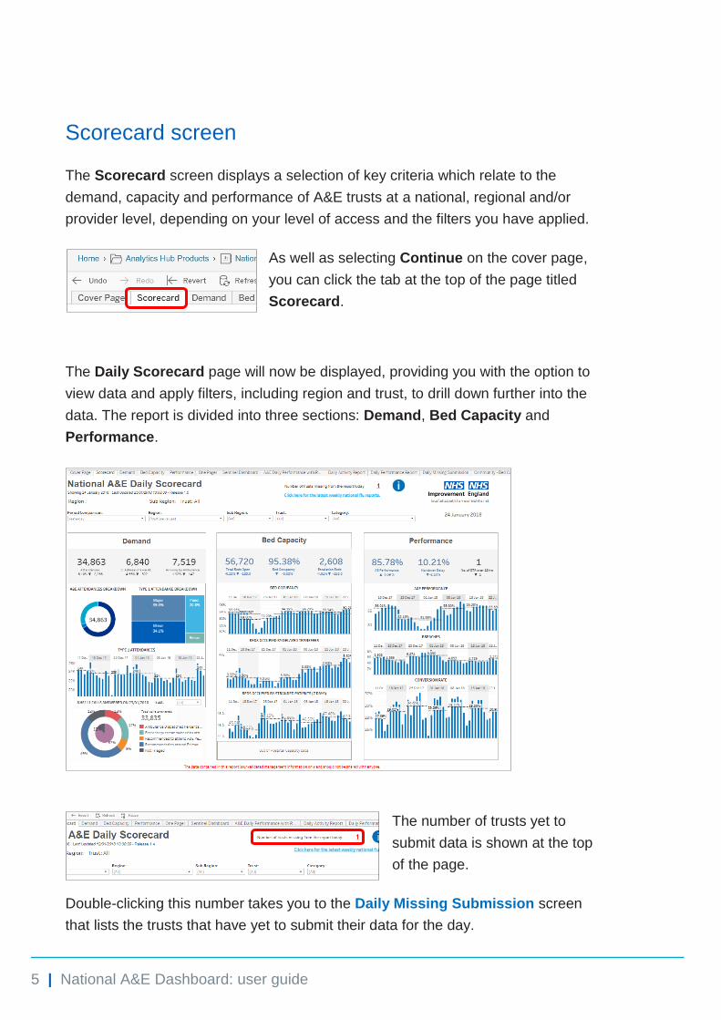
Scorecard screen
The Scorecard screen displays a selection of key criteria which relate to the
demand, capacity and performance of A&E trusts at a national, regional and/or
provider level, depending on your level of access and the filters you have applied.
As well as selecting Continue on the cover page,
you can click the tab at the top of the page titled
Scorecard.
The Daily Scorecard page will now be displayed, providing you with the option to
view data and apply filters, including region and trust, to drill down further into the
data. The report is divided into three sections: Demand, Bed Capacity and
Performance.
The number of trusts yet to
submit data is shown at the top
of the page.
Double-clicking this number takes you to the Daily Missing Submission screen
that lists the trusts that have yet to submit their data for the day.

6 | National A&E Dashboard: user guide
A number of filters allow you to
specify how you view the data.
Select the parameters for the time period
you wish to compare with by clicking the
drop-down arrow in the Period
Comparison field.
The Period Comparison filter allows you to compare the current day’s data with:
• yesterday’s (in this context ‘today’ is the previous day and ‘yesterday’ the
day before that; as such, on Wednesday you would be comparing
Tuesday’s A&E data with Monday’s)
• the one-week average (as such, on Wednesday you would be comparing
Tuesday’s A&E data with the average for the last seven days from the
previous Tuesday to this Monday)
• the six-week average (as such, on Wednesday you would be comparing
Tuesday’s data with the average for the previous 42 days from Tuesday six
weeks ago to this Monday)
• the same-day six-week average – the average for the previous six same
days (as such, on Wednesday you would be comparing Tuesday’s with the
average of every Tuesday for the previous six weeks).
Use the drop-down arrows to
select the Region, Sub Region
and Category.
Ensure you select Apply to
activate your chosen filters.
7 | National A&E Dashboard: user guide
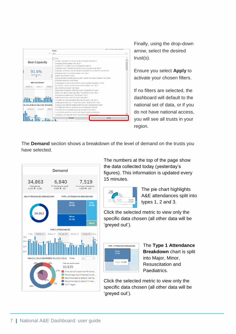
Finally, using the drop-down
arrow, select the desired
trust(s).
Ensure you select Apply to
activate your chosen filters.
If no filters are selected, the
dashboard will default to the
national set of data, or if you
do not have national access,
you will see all trusts in your
region.
The Demand section shows a breakdown of the level of demand on the trusts you
have selected.
The numbers at the top of the page show
the data collected today (yesterday’s
figures). This information is updated every
15 minutes.
The pie chart highlights
A&E attendances split into
types 1, 2 and 3.
Click the selected metric to view only the
specific data chosen (all other data will be
‘greyed out’).
The Type 1 Attendance
Breakdown chart is split
into Major, Minor,
Resuscitation and
Paediatrics.
Click the selected metric to view only the
specific data chosen (all other data will be
‘greyed out’).
8 | National A&E Dashboard: user guide
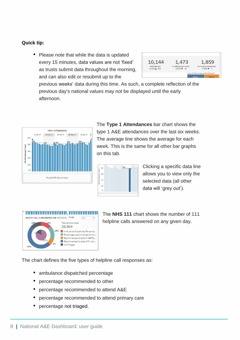
Quick tip:
• Please note that while the data is updated
every 15 minutes, data values are not ‘fixed’
as trusts submit data throughout the morning,
and can also edit or resubmit up to the
previous weeks’ data during this time. As such, a complete reflection of the
previous day’s national values may not be displayed until the early
afternoon.
The Type 1 Attendances bar chart shows the
type 1 A&E attendances over the last six weeks.
The average line shows the average for each
week. This is the same for all other bar graphs
on this tab.
Clicking a specific data line
allows you to view only the
selected data (all other
data will ‘grey out’).
The NHS 111 chart shows the number of 111
helpline calls answered on any given day.
The chart defines the five types of helpline call responses as:
• ambulance dispatched percentage
• percentage recommended to other
• percentage recommended to attend A&E
• percentage recommended to attend primary care
• percentage not triaged.
9 | National A&E Dashboard: user guide
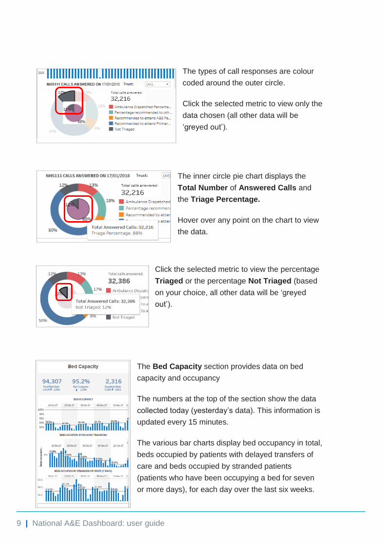
The types of call responses are colour
coded around the outer circle.
Click the selected metric to view only the
data chosen (all other data will be
‘greyed out’).
The inner circle pie chart displays the
Total Number of Answered Calls and
the Triage Percentage.
Hover over any point on the chart to view
the data.
Click the selected metric to view the percentage
Triaged or the percentage Not Triaged (based
on your choice, all other data will be ‘greyed
out’).
The Bed Capacity section provides data on bed
capacity and occupancy
The numbers at the top of the section show the data
collected today (yesterday’s data). This information is
updated every 15 minutes.
The various bar charts display bed occupancy in total,
beds occupied by patients with delayed transfers of
care and beds occupied by stranded patients
(patients who have been occupying a bed for seven
or more days), for each day over the last six weeks.
10 | National A&E Dashboard: user guide
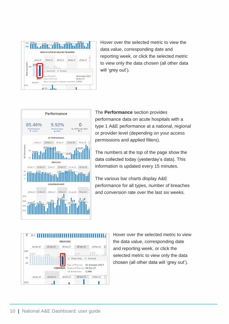
Hover over the selected metric to view the
data value, corresponding date and
reporting week, or click the selected metric
to view only the data chosen (all other data
will ‘grey out’).
The Performance section provides
performance data on acute hospitals with a
type 1 A&E performance at a national, regional
or provider level (depending on your access
permissions and applied filters).
The numbers at the top of the page show the
data collected today (yesterday’s data). This
information is updated every 15 minutes.
The various bar charts display A&E
performance for all types, number of breaches
and conversion rate over the last six weeks.
Hover over the selected metric to view
the data value, corresponding date
and reporting week, or click the
selected metric to view only the data
chosen (all other data will ‘grey out’).
11 | National A&E Dashboard: user guide
Quick tip:
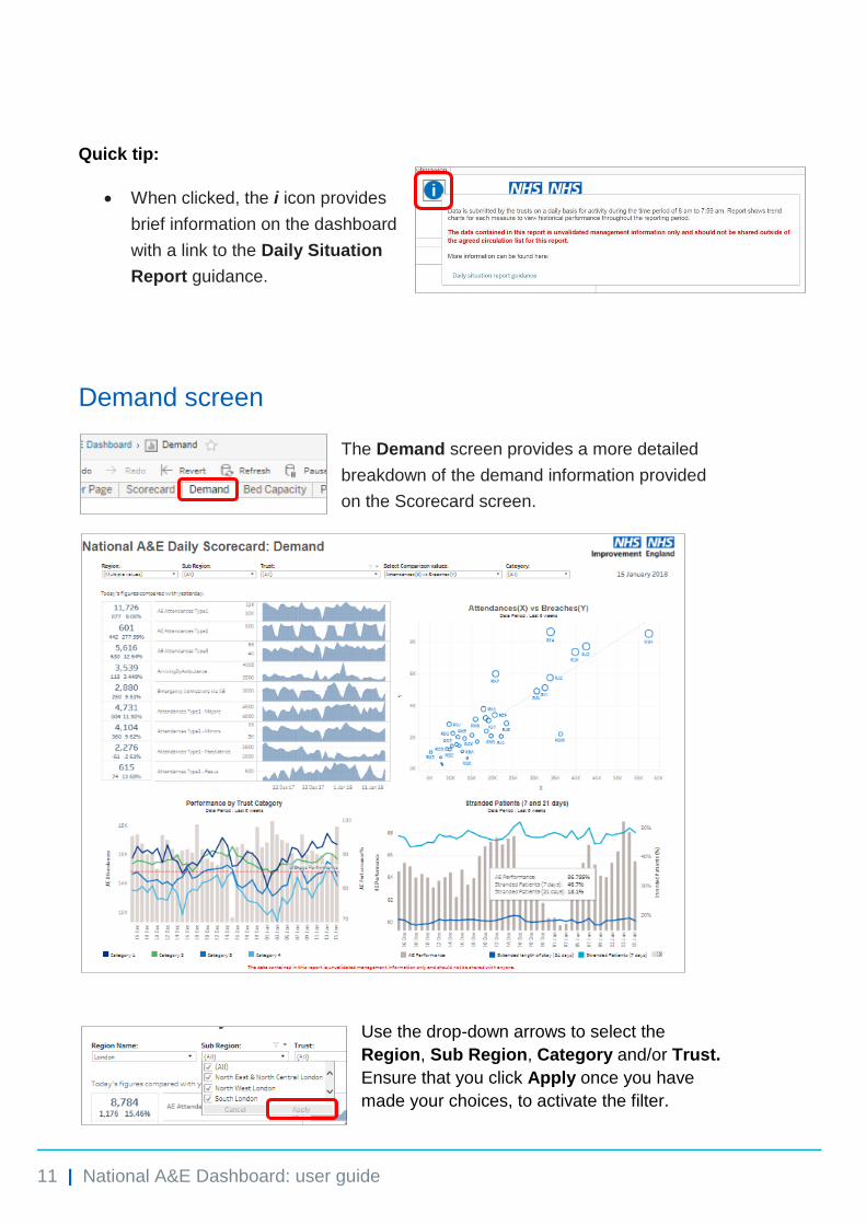
When clicked, the i icon provides
brief information on the dashboard
with a link to the Daily Situation
Report guidance.
Demand screen
The Demand screen provides a more detailed
breakdown of the demand information provided
on the Scorecard screen.
Use the drop-down arrows to select the
Region, Sub Region, Category and/or Trust.
Ensure that you click Apply once you have
made your choices, to activate the filter.
12 | National A&E Dashboard: user guide
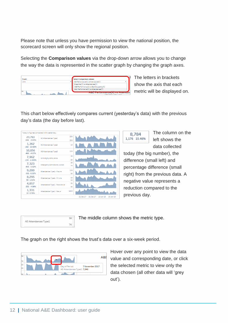
Please note that unless you have permission to view the national position, the
scorecard screen will only show the regional position.
Selecting the Comparison values via the drop-down arrow allows you to change
the way the data is represented in the scatter graph by changing the graph axes.
The letters in brackets
show the axis that each
metric will be displayed on.
This chart below effectively compares current (yesterday’s data) with the previous
day’s data (the day before last).
The column on the
left shows the
data collected
today (the big number), the
difference (small left) and
percentage difference (small
right) from the previous data. A
negative value represents a
reduction compared to the
previous day.
The middle column shows the metric type.
The graph on the right shows the trust’s data over a six-week period.
Hover over any point to view the data
value and corresponding date, or click
the selected metric to view only the
data chosen (all other data will ‘grey
out’).
13 | National A&E Dashboard: user guide
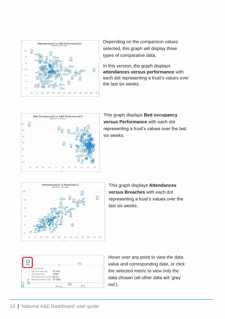
Depending on the comparison values
selected, this graph will display three
types of comparative data.
In this version, the graph displays
attendances versus performance with
each dot representing a trust’s values over
the last six weeks.
This graph displays Bed occupancy
versus Performance with each dot
representing a trust’s values over the last
six weeks.
This graph displays Attendances
versus Breaches with each dot
representing a trust’s values over the
last six weeks.
Hover over any point to view the data
value and corresponding date, or click
the selected metric to view only the
data chosen (all other data will ‘grey
out’).
14 | National A&E Dashboard: user guide
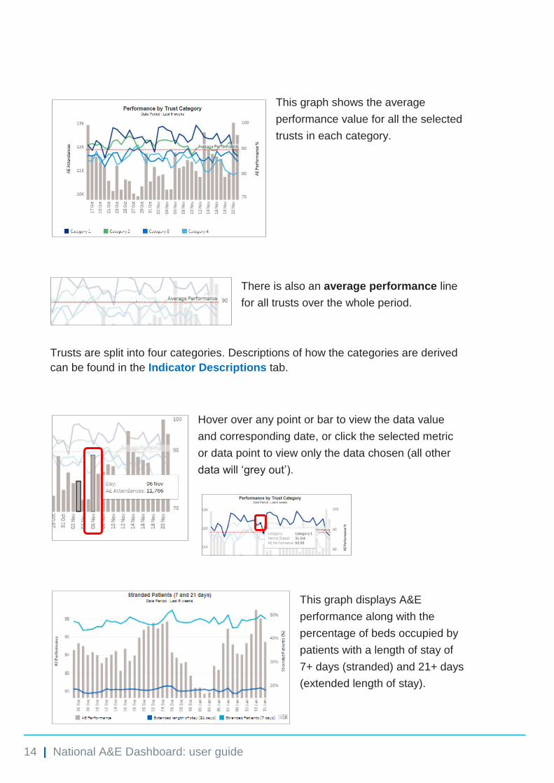
This graph shows the average
performance value for all the selected
trusts in each category.
There is also an average performance line
for all trusts over the whole period.
Trusts are split into four categories. Descriptions of how the categories are derived
can be found in the Indicator Descriptions tab.
Hover over any point or bar to view the data value
and corresponding date, or click the selected metric
or data point to view only the data chosen (all other
data will ‘grey out’).
This graph displays A&E
performance along with the
percentage of beds occupied by
patients with a length of stay of
7+ days (stranded) and 21+ days
(extended length of stay).
15 | National A&E Dashboard: user guide
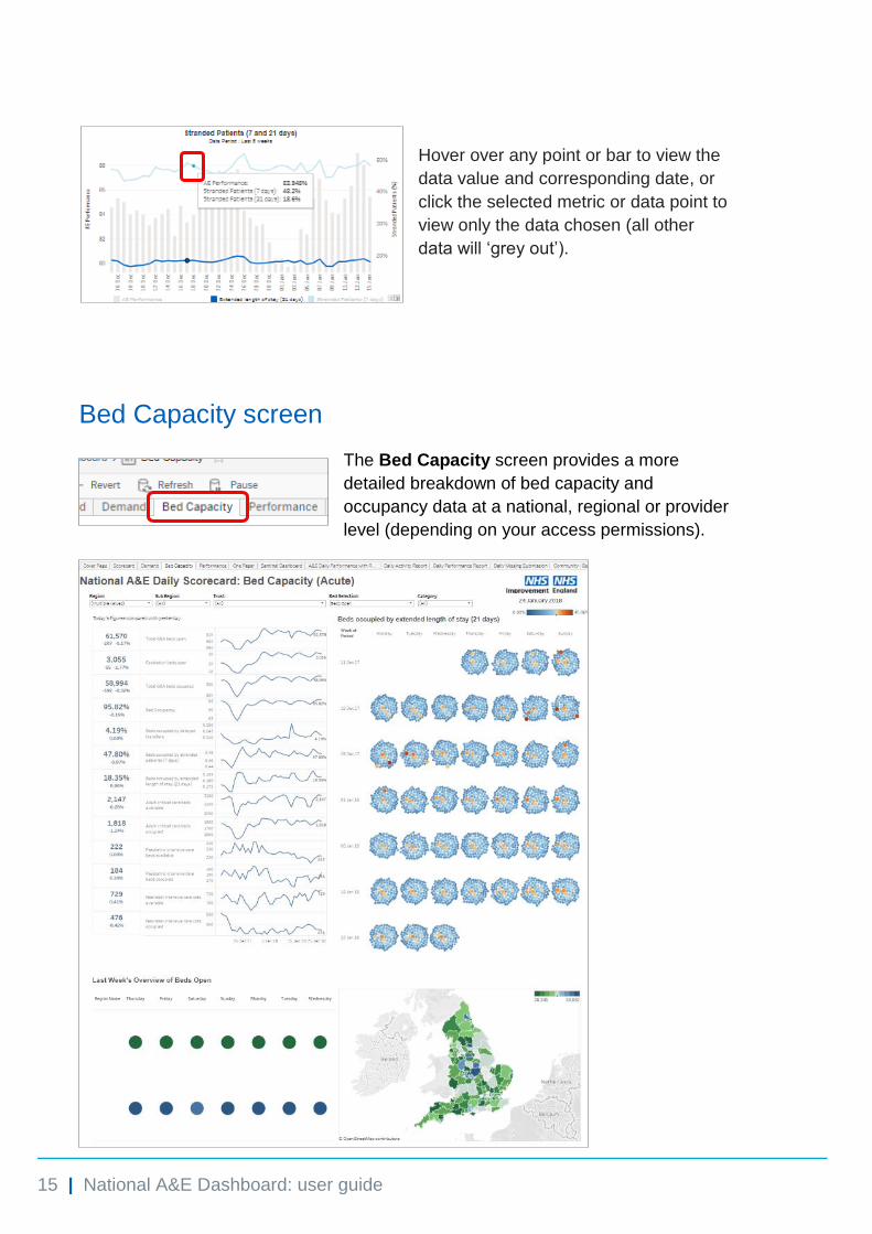
Hover over any point or bar to view the
data value and corresponding date, or
click the selected metric or data point to
view only the data chosen (all other
data will ‘grey out’).
Bed Capacity screen
The Bed Capacity screen provides a more
detailed breakdown of bed capacity and
occupancy data at a national, regional or provider
level (depending on your access permissions).
16 | National A&E Dashboard: user guide
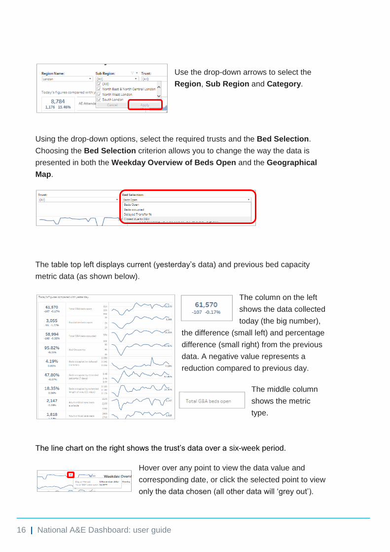
Use the drop-down arrows to select the
Region, Sub Region and Category.
Using the drop-down options, select the required trusts and the Bed Selection.
Choosing the Bed Selection criterion allows you to change the way the data is
presented in both the Weekday Overview of Beds Open and the Geographical
Map.
The table top left displays current (yesterday’s data) and previous bed capacity
metric data (as shown below).
The column on the left
shows the data collected
today (the big number),
the difference (small left) and percentage
difference (small right) from the previous
data. A negative value represents a
reduction compared to previous day.
The middle column
shows the metric
type.
The line chart on the right shows the trust’s data over a six-week period.
Hover over any point to view the data value and
corresponding date, or click the selected point to view
only the data chosen (all other data will ‘grey out’).
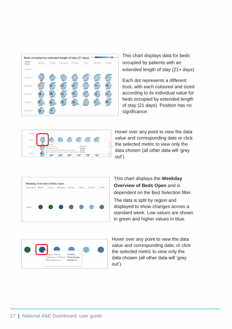
17 | National A&E Dashboard: user guide
This chart displays data for beds
occupied by patients with an
extended length of stay (21+ days)
Each dot represents a different
trust, with each coloured and sized
according to its individual value for
beds occupied by extended length
of stay (21 days). Position has no
significance.
Hover over any point to view the data
value and corresponding date or click
the selected metric to view only the
data chosen (all other data will ‘grey
out’)
This chart displays the Weekday
Overview of Beds Open and is
dependent on the Bed Selection filter.
The data is split by region and
displayed to show changes across a
standard week. Low values are shown
in green and higher values in blue.
Hover over any point to view the data
value and corresponding date, or click
the selected metric to view only the
data chosen (all other data will ‘grey
out’)
18 | National A&E Dashboard: user guide
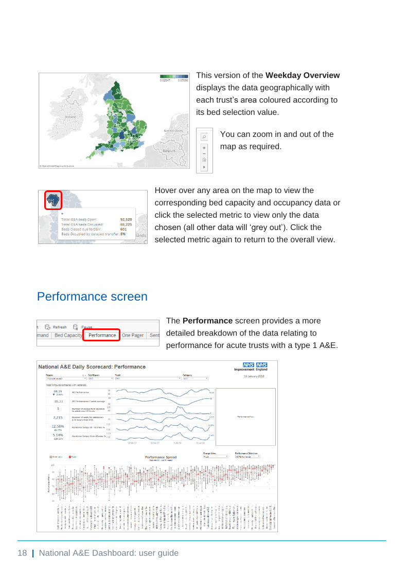
This version of the Weekday Overview
displays the data geographically with
each trust’s area coloured according to
its bed selection value.
You can zoom in and out of the
map as required.
Hover over any area on the map to view the
corresponding bed capacity and occupancy data or
click the selected metric to view only the data
chosen (all other data will ‘grey out’). Click the
selected metric again to return to the overall view.
Performance screen
The Performance screen provides a more
detailed breakdown of the data relating to
performance for acute trusts with a type 1 A&E.
19 | National A&E Dashboard: user guide
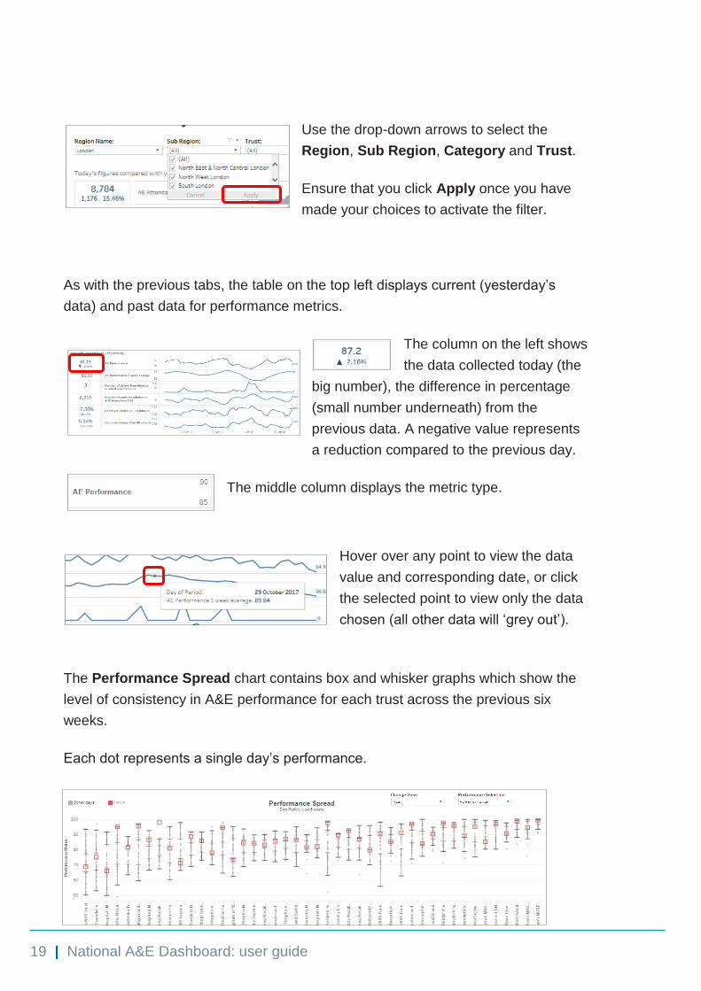
Use the drop-down arrows to select the
Region, Sub Region, Category and Trust.
Ensure that you click Apply once you have
made your choices to activate the filter.
As with the previous tabs, the table on the top left displays current (yesterday’s
data) and past data for performance metrics.
The column on the left shows
the data collected today (the
big number), the difference in percentage
(small number underneath) from the
previous data. A negative value represents
a reduction compared to the previous day.
The middle column displays the metric type.
Hover over any point to view the data
value and corresponding date, or click
the selected point to view only the data
chosen (all other data will ‘grey out’).
The Performance Spread chart contains box and whisker graphs which show the
level of consistency in A&E performance for each trust across the previous six
weeks.
Each dot represents a single day’s performance.
20 | National A&E Dashboard: user guide
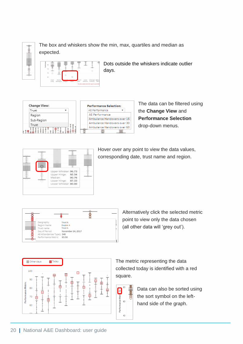
The box and whiskers show the min, max, quartiles and median as
expected.
Dots outside the whiskers indicate outlier
days.
The data can be filtered using
the Change View and
Performance Selection
drop-down menus.
Hover over any point to view the data values,
corresponding date, trust name and region.
Alternatively click the selected metric
point to view only the data chosen
(all other data will ‘grey out’).
The metric representing the data
collected today is identified with a red
square.
Data can also be sorted using
the sort symbol on the left-
hand side of the graph.
21 | National A&E Dashboard: user guide
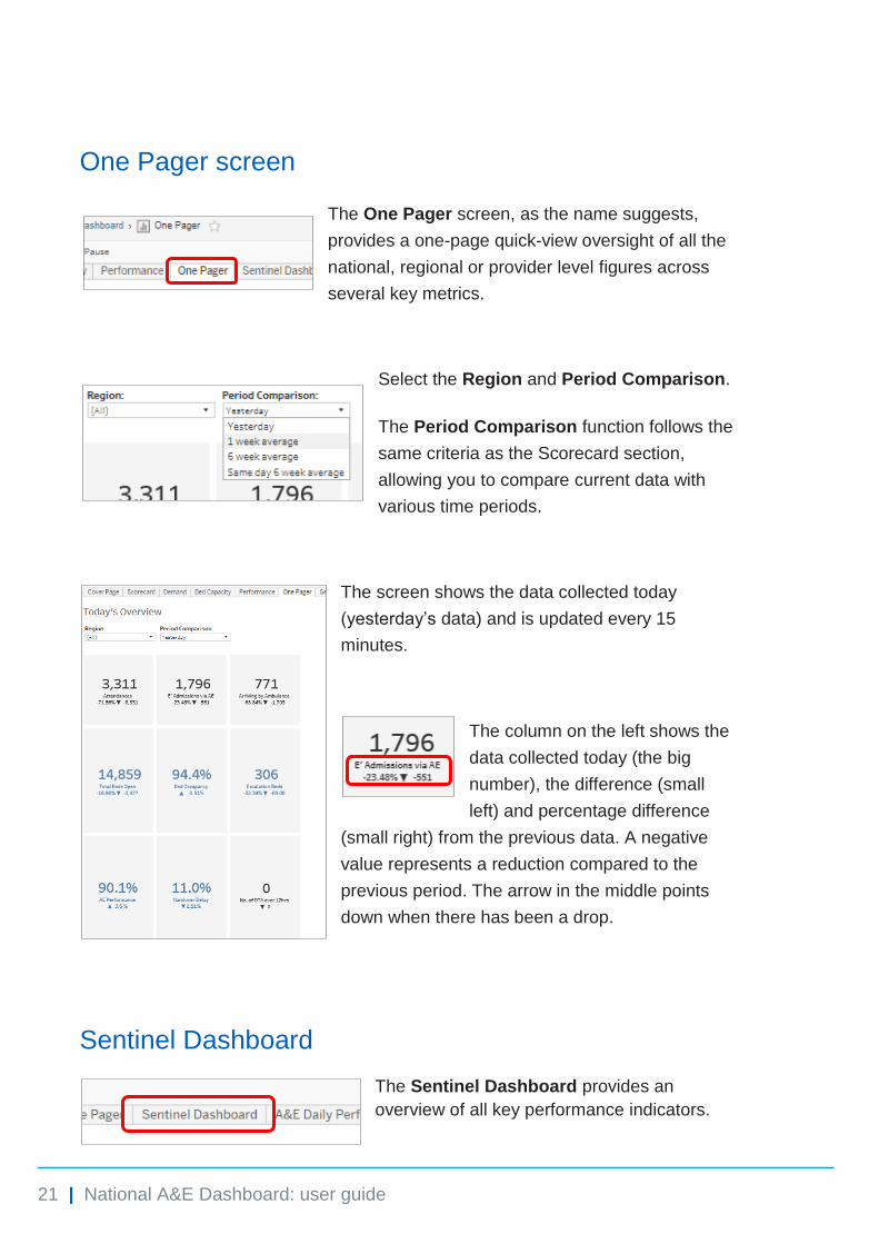
One Pager screen
The One Pager screen, as the name suggests,
provides a one-page quick-view oversight of all the
national, regional or provider level figures across
several key metrics.
Select the Region and Period Comparison.
The Period Comparison function follows the
same criteria as the Scorecard section,
allowing you to compare current data with
various time periods.
The screen shows the data collected today
(yesterday’s data) and is updated every 15
minutes.
The column on the left shows the
data collected today (the big
number), the difference (small
left) and percentage difference
(small right) from the previous data. A negative
value represents a reduction compared to the
previous period. The arrow in the middle points
down when there has been a drop.
Sentinel Dashboard
The Sentinel Dashboard provides an
overview of all key performance indicators.

22 | National A&E Dashboard: user guide
Use the drop-down arrows to select the
Region and Sub Region.
Continue filtering the data using the
drop-down arrows to select the required
Trust(s) as well as the Category.
Ensure that you click Apply once you
have made you choices to activate the
filter.
The page is split into two sections; Front Door Metrics and Operational Metrics.
The Front Door Metrics section shows the metrics which indicate direct pressure
on A&E departments.
The table outlines performance
across the previous seven days
as well as providing a one-week
and six-week (last 42 days)
average.
23 | National A&E Dashboard: user guide
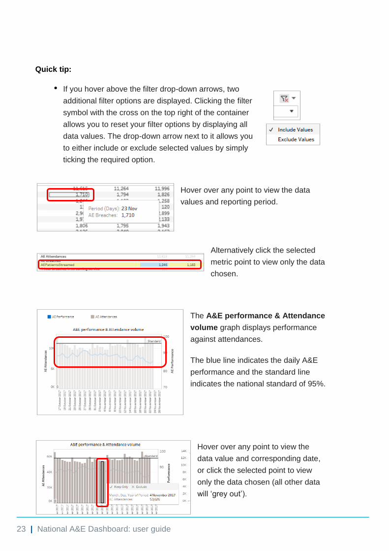
Quick tip:
• If you hover above the filter drop-down arrows, two
additional filter options are displayed. Clicking the filter
symbol with the cross on the top right of the container
allows you to reset your filter options by displaying all
data values. The drop-down arrow next to it allows you
to either include or exclude selected values by simply
ticking the required option.
Hover over any point to view the data
values and reporting period.
Alternatively click the selected
metric point to view only the data
chosen.
The A&E performance & Attendance
volume graph displays performance
against attendances.
The blue line indicates the daily A&E
performance and the standard line
indicates the national standard of 95%.
Hover over any point to view the
data value and corresponding date,
or click the selected point to view
only the data chosen (all other data
will ‘grey out’).
24 | National A&E Dashboard: user guide
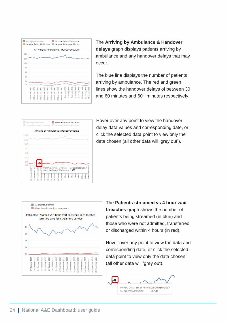
The Arriving by Ambulance & Handover
delays graph displays patients arriving by
ambulance and any handover delays that may
occur.
The blue line displays the number of patients
arriving by ambulance. The red and green
lines show the handover delays of between 30
and 60 minutes and 60+ minutes respectively.
Hover over any point to view the handover
delay data values and corresponding date, or
click the selected data point to view only the
data chosen (all other data will ‘grey out’).
The Patients streamed vs 4 hour wait
breaches graph shows the number of
patients being streamed (in blue) and
those who were not admitted, transferred
or discharged within 4 hours (in red).
Hover over any point to view the data and
corresponding date, or click the selected
data point to view only the data chosen
(all other data will ‘grey out).
25 | National A&E Dashboard: user guide
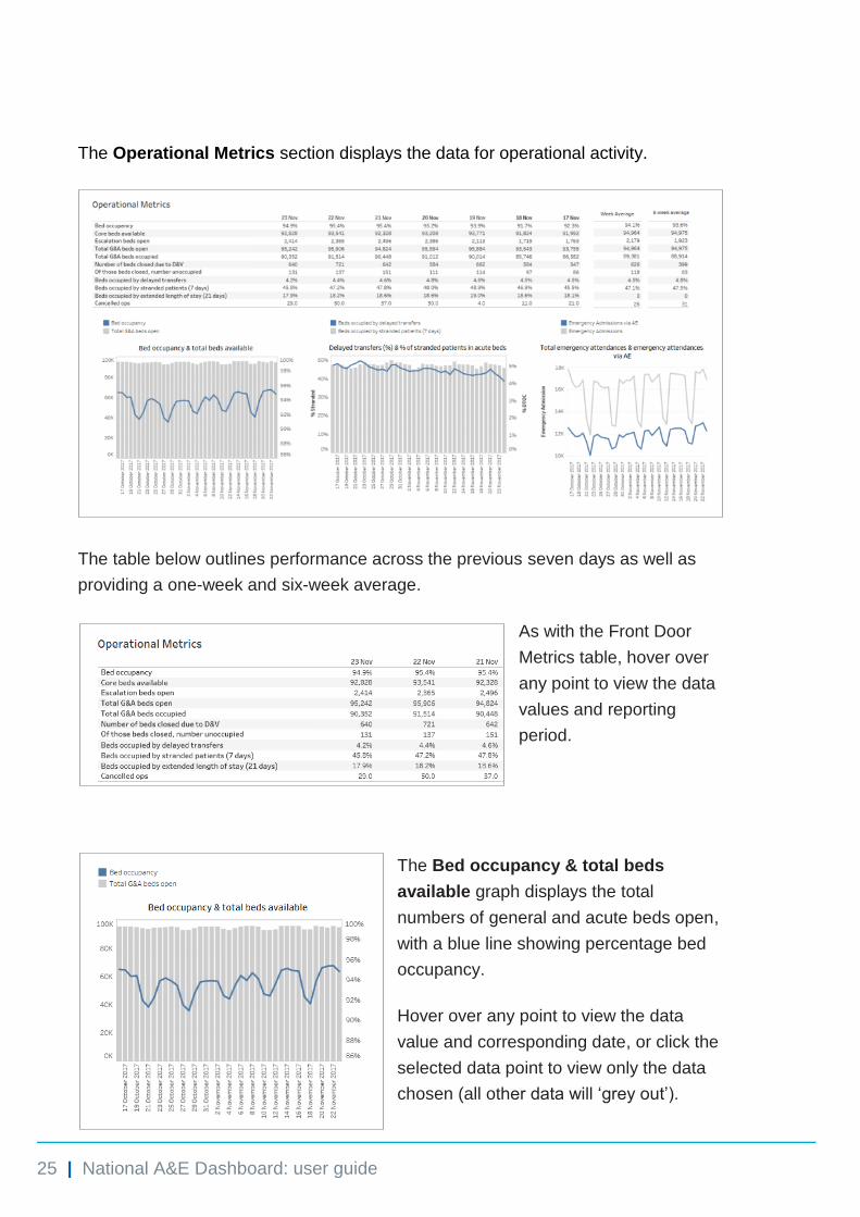
The Operational Metrics section displays the data for operational activity.
The table below outlines performance across the previous seven days as well as
providing a one-week and six-week average.
As with the Front Door
Metrics table, hover over
any point to view the data
values and reporting
period.
The Bed occupancy & total beds
available graph displays the total
numbers of general and acute beds open,
with a blue line showing percentage bed
occupancy.
Hover over any point to view the data
value and corresponding date, or click the
selected data point to view only the data
chosen (all other data will ‘grey out’).

26 | National A&E Dashboard: user guide
The Delayed transfers (%) & % of
stranded patients in acute beds graph
displays the beds occupied by stranded
patients (7+ days) coupled with a line
chart for delayed transfers of care.
Hover over any point to view the data
value and corresponding date, or click the
selected data point to view only the data
chosen (all other data will ‘grey out’).
The Total emergency admissions &
emergency admissions via A&E graph
displays the total emergency admissions
(grey line) and total emergency
admissions via A&E (blue line).
Hover over any point on either data line to
view the data value and corresponding date,
or click the selected data point to view only
the data chosen (all other data will ‘grey out’).
27 | National A&E Dashboard: user guide
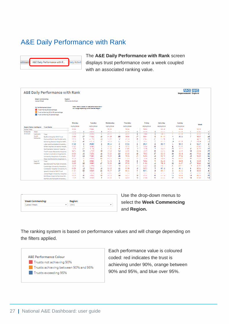
A&E Daily Performance with Rank
The A&E Daily Performance with Rank screen
displays trust performance over a week coupled
with an associated ranking value.
Use the drop-down menus to
select the Week Commencing
and Region.
The ranking system is based on performance values and will change depending on
the filters applied.
Each performance value is coloured
coded: red indicates the trust is
achieving under 90%, orange between
90% and 95%, and blue over 95%.
28 | National A&E Dashboard: user guide
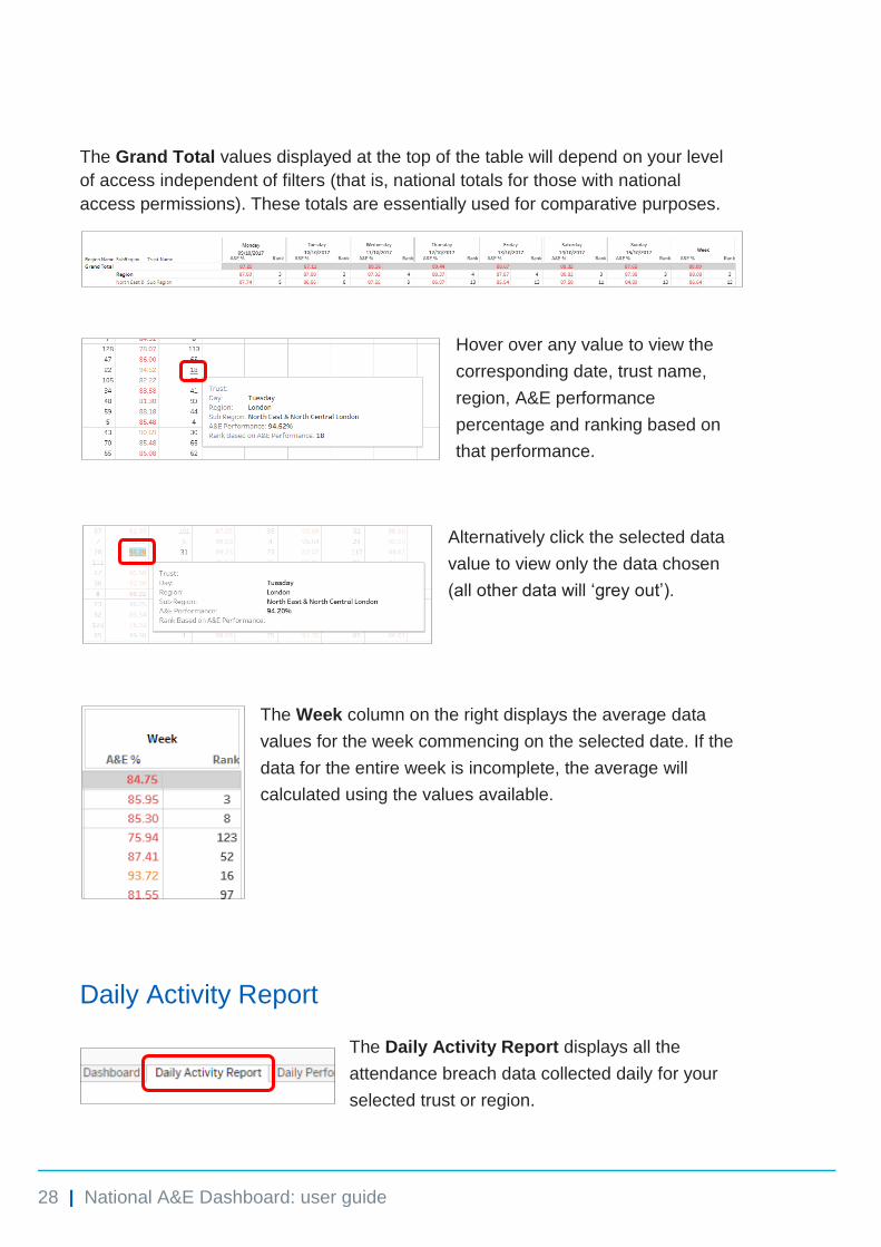
The Grand Total values displayed at the top of the table will depend on your level
of access independent of filters (that is, national totals for those with national
access permissions). These totals are essentially used for comparative purposes.
Hover over any value to view the
corresponding date, trust name,
region, A&E performance
percentage and ranking based on
that performance.
Alternatively click the selected data
value to view only the data chosen
(all other data will ‘grey out’).
The Week column on the right displays the average data
values for the week commencing on the selected date. If the
data for the entire week is incomplete, the average will
calculated using the values available.
Daily Activity Report
The Daily Activity Report displays all the
attendance breach data collected daily for your
selected trust or region.
29 | National A&E Dashboard: user guide
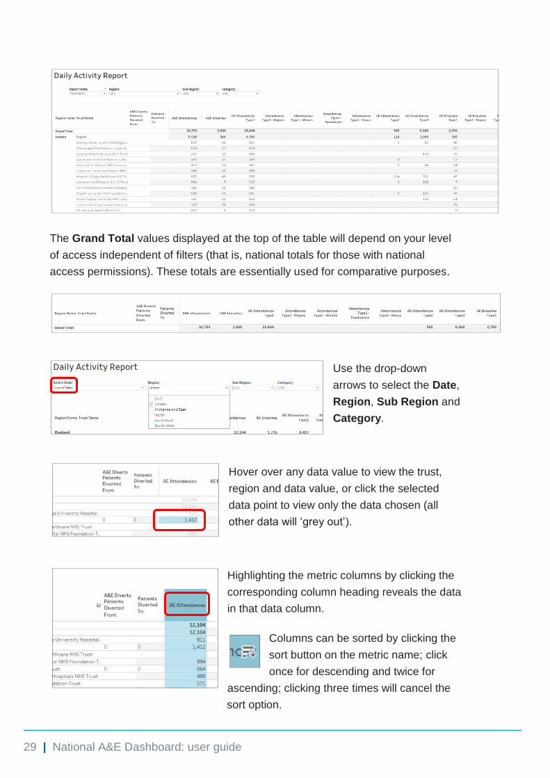
The Grand Total values displayed at the top of the table will depend on your level
of access independent of filters (that is, national totals for those with national
access permissions). These totals are essentially used for comparative purposes.
Use the drop-down
arrows to select the Date,
Region, Sub Region and
Category.
Hover over any data value to view the trust,
region and data value, or click the selected
data point to view only the data chosen (all
other data will ‘grey out’).
Highlighting the metric columns by clicking the
corresponding column heading reveals the data
in that data column.
Columns can be sorted by clicking the
sort button on the metric name; click
once for descending and twice for
ascending; clicking three times will cancel the
sort option.
30 | National A&E Dashboard: user guide
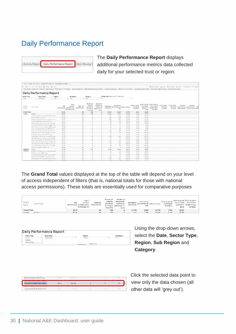
Daily Performance Report
The Daily Performance Report displays
additional performance metrics data collected
daily for your selected trust or region.
The Grand Total values displayed at the top of the table will depend on your level
of access independent of filters (that is, national totals for those with national
access permissions). These totals are essentially used for comparative purposes
Using the drop-down arrows,
select the Date, Sector Type,
Region, Sub Region and
Category.
Click the selected data point to
view only the data chosen (all
other data will ‘grey out’).
31 | National A&E Dashboard: user guide
Highlighting the metric columns by clicking the
corresponding column heading reveals the data in
that data column.
These columns can be sorted by clicking
the sort button on the metric name; click
once for descending and twice for
ascending; clicking three times will cancel the sort.
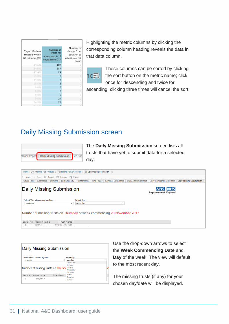
Daily Missing Submission screen
The Daily Missing Submission screen lists all
trusts that have yet to submit data for a selected
day.
Use the drop-down arrows to select
the Week Commencing Date and
Day of the week. The view will default
to the most recent day.
The missing trusts (if any) for your
chosen day/date will be displayed.
1 Region A Hospital N
1 Region A Hospital NHS Trust
32 | National A&E Dashboard: user guide
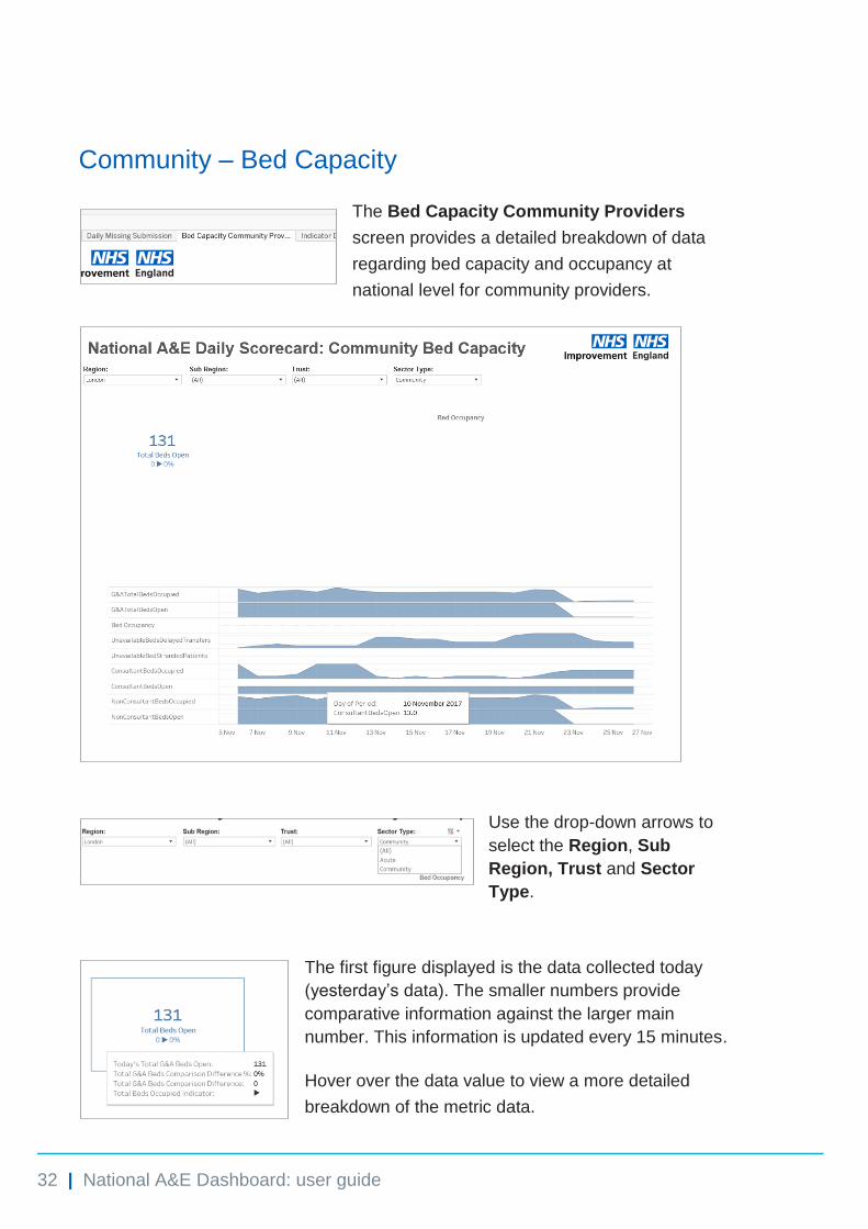
Community – Bed Capacity
The Bed Capacity Community Providers
screen provides a detailed breakdown of data
regarding bed capacity and occupancy at
national level for community providers.
Use the drop-down arrows to
select the Region, Sub
Region, Trust and Sector
Type.
The first figure displayed is the data collected today
(yesterday’s data). The smaller numbers provide
comparative information against the larger main
number. This information is updated every 15 minutes.
Hover over the data value to view a more detailed
breakdown of the metric data.
33 | National A&E Dashboard: user guide
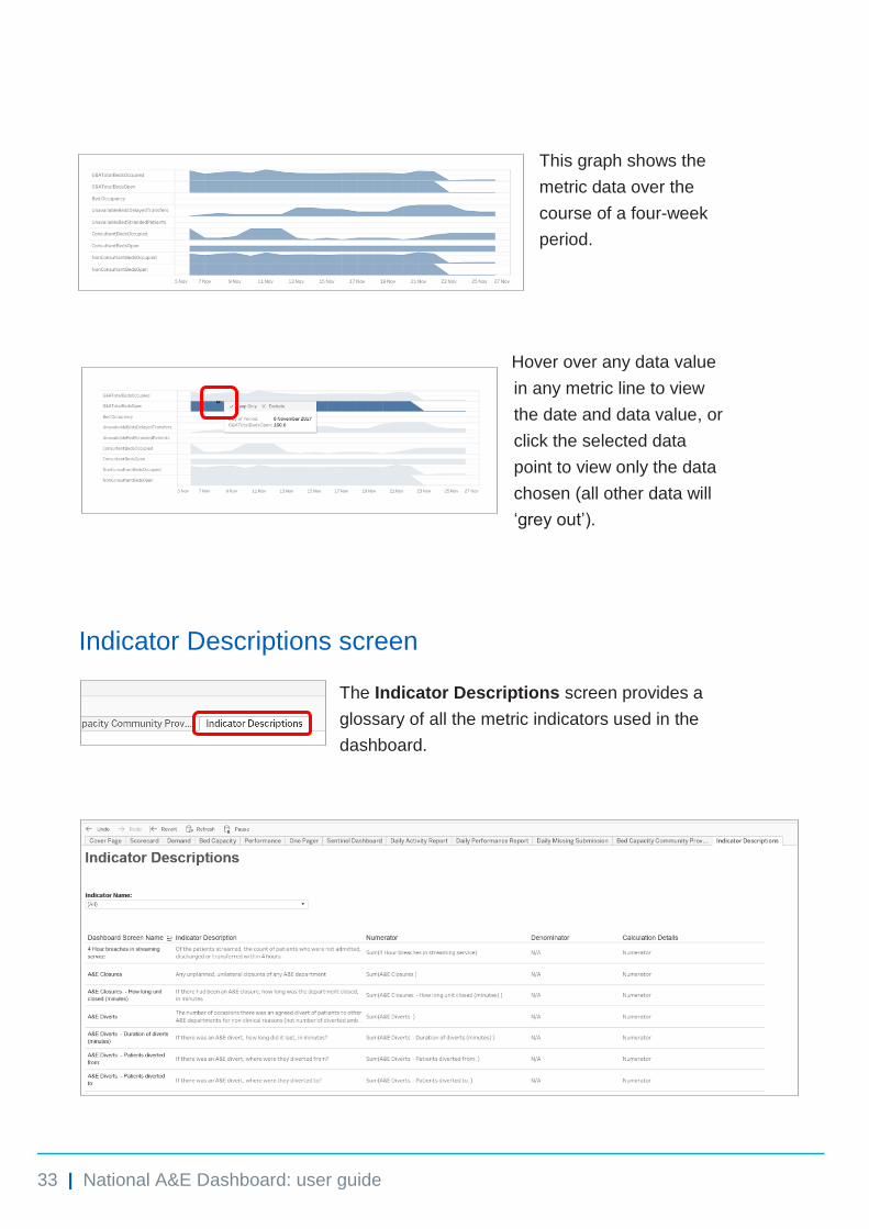
This graph shows the
metric data over the
course of a four-week
period.
Hover over any data value
in any metric line to view
the date and data value, or
click the selected data
point to view only the data
chosen (all other data will
‘grey out’).
Indicator Descriptions screen
The Indicator Descriptions screen provides a
glossary of all the metric indicators used in the
dashboard.
34 | National A&E Dashboard: user guide
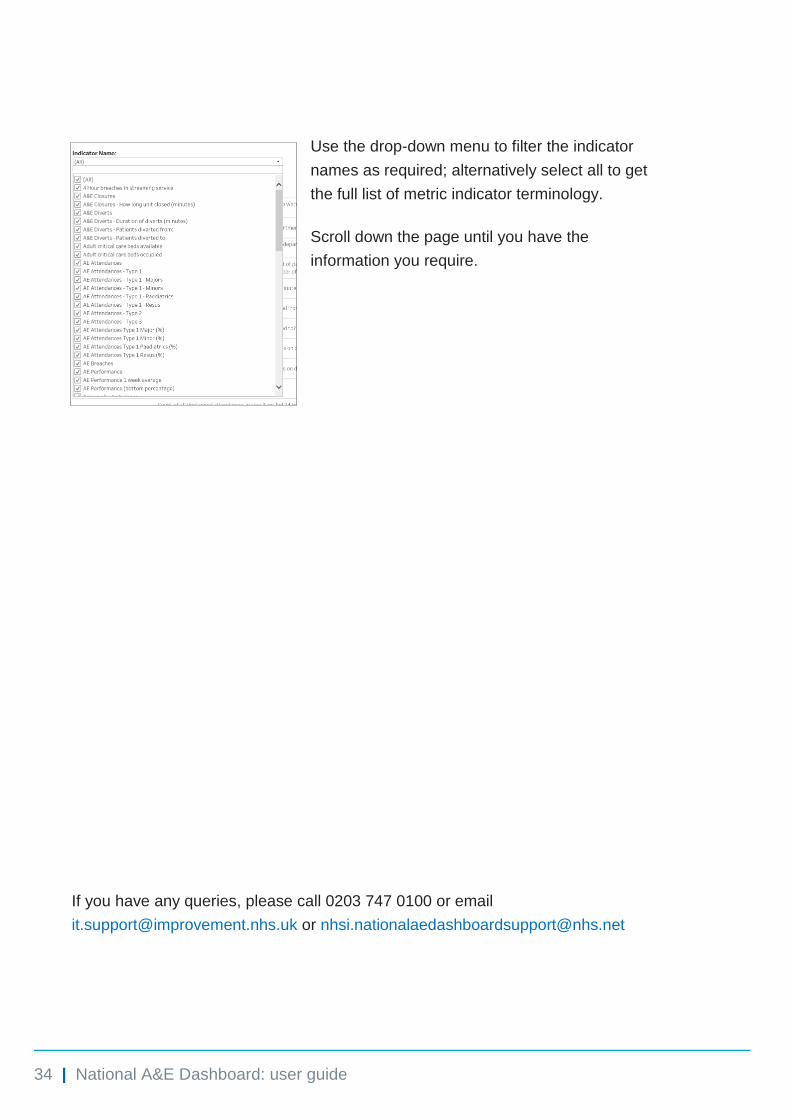
Use the drop-down menu to filter the indicator
names as required; alternatively select all to get
the full list of metric indicator terminology.
Scroll down the page until you have the
information you require.
If you have any queries, please call 0203 747 0100 or email
© NHS Improvement 20188
Contact us:
NHS Improvement
Wellington House
133-155 Waterloo Road
London
SE1 8UG
0300 123 2257
improvement.nhs.uk
Follow us on Twitter @NHSImprovement
This publication can be made available in a number of other formats on request.


![National Dashboard Handout[1]](https://img.dokumen.tips/doc/110x75/5552db14b4c90532498b4ae9/national-dashboard-handout1.jpg)