Embed Size (px)
Citation preview

Country Data ProjectAuthor(s): Henry A. KranendonkSource: The Mathematics Teacher, Vol. 100, No. 4, Making Mathematics Meaningful(NOVEMBER 2006), pp. 284-290Published by: National Council of Teachers of MathematicsStable URL: http://www.jstor.org/stable/27972221 .
Accessed: 24/04/2014 14:58
Your use of the JSTOR archive indicates your acceptance of the Terms & Conditions of Use, available at .http://www.jstor.org/page/info/about/policies/terms.jsp
.JSTOR is a not-for-profit service that helps scholars, researchers, and students discover, use, and build upon a wide range ofcontent in a trusted digital archive. We use information technology and tools to increase productivity and facilitate new formsof scholarship. For more information about JSTOR, please contact [email protected].
.
National Council of Teachers of Mathematics is collaborating with JSTOR to digitize, preserve and extendaccess to The Mathematics Teacher.
http://www.jstor.org
This content downloaded from 188.81.194.42 on Thu, 24 Apr 2014 14:58:43 PMAll use subject to JSTOR Terms and Conditions

Country
Project Henry A. Kranendonk
;jr hen asked to define math
3$ ematics, several eighth-grade ^ / ̂ students simply stated: "Math
Ifif iHf ematics is working with IB? ':??0 numbers:" They probably
do not fully appreciate what "working with"
means, but clearly "numbers" highlights an
important concept in their definition. This \ article describes how numbers summariz
ing the population distribution of various countries were connected to the shapes outlined by population pyramid graphs. This
process resulted in students forming meaning ful descriptions of the people of the various
countries. Throughout this article, the concept of "working with numbers" (i.e., mathematics) involved interpreting meaningful data.
The Country Data Project was developed for eighth-grade students in Milwaukee public schools during summer programs held in 2004 and 2005. Approximately 400 students who had not met achievement levels considered necessary for
completion of their K-8 or middle school programs were chosen to participate in each of the programs. Classroom assessments administered during the
previous academic year indicated particularly poor achievement in interpreting information from
graphs and tables, in calculating and interpreting
284 MATHEMATICS TEACHER | Vol. 100r No. 4 ? November 2006
This content downloaded from 188.81.194.42 on Thu, 24 Apr 2014 14:58:43 PMAll use subject to JSTOR Terms and Conditions

percents, and in developing constructed responses to open-ended questions or tasks. The six-week summer sessions were designed, therefore, to target these deficiencies through a mathematics class that
met approximately two hours each day. Students were also involved for about two additional hours in a reading and social studies class.
The Country Data Project was organized around four lessons. Completion of the mathematics les sons was a primary goal of the summer session. The project began with students examining data
displayed in population pyramid graphs that at first
glance were simply "odd graphs." A short descrip tion of the lessons will indicate, however, how
mathematics topics emerged that addressed the achievement topics noted above. Although pyramid graphs are used in biology, geography, and econom
ics to study various conditions of countries, this
project explored the connections of the shapes of
pyramid graphs to basic numeric summaries and an
understanding of these summaries.
POPULATION PYRAMID GRAPHS, MEANS, AND BALANCE Lesson 1 of the project introduced students to a
simplified population pyramid graph (see fig. 1). A population pyramid graph displays a side-by-side histogram of the count of people in specific age cat
egories by gender. Figure 1 summarizes a group of
people attending an event. This lesson challenged students to conjecture what event these people were
attending. Students started the process by estimat
ing the counts of people in each age category, then calculated the number and percent of females and
males, the number and percent of people 65 or older, the number and percent of teenagers, the percent of people under 10, and the mean and median ages of females and males. As these calculations were
determined, the conjectures identifying the event the
people were attending became more focused.
Throughout this lesson, students were directed to stand back and examine the general shape the
graph displayed as they calculated the summaries. Students verbally explained their interpretations of the information from the graph. These explanations
were then written as part of the questions incorpo rated in the lesson.
The mean ages of males, of females, and of the entire population were estimated using two meth ods. The first involved assigning a "centered" age to each person in an age category. For example, four males were counted in the age category 0 to 4.
Although the specific ages of the four males were not known, each was assigned an age estimate of 2
years (that is, the "centered" age of the category 0 to 4). This estimate attempts to balance the possible number of males older than 2 with the number less
What event are these people attending?
Males Females
Population
Fig. 1 Introducing a population pyramid graph This graph introduced students to a population pyramid graph. Students were directed to read the information sum
marizing the number of people versus the ages of the people by males and females. Ages are summarized in the center
column of the graph. This graph follows the same format as
the population pyramid graphs generated by the U.S. Census Bureau and used in the next three lessons of this project.
than 2. In the same way, the six females in this age category were each considered to be 2 years old. By continuing this pattern of assigning the "centered"
age to each person in an age category, students were able to estimate the mean ages of various
groups. Students were asked to explain how calcu
lating the mean ages in this way might not be the actual means if the age of each person were actually known. Teachers noted that verbal responses to this question were generally correct, but students'
written responses were weak (or nonexistent). As a result, students revisited some of the details of the
graph that provided language to develop written
responses to these questions. Teachers indicated that students needed a lot of confidence regarding
what the graph summarized before they were able to write their constructed responses.
The mean ages were also derived by a second method that developed a visual representation of balance. After turning the pyramid graph on its
side, students placed a pencil at approximately the middle of the age axis of the males and perpendicu lar to it. Each student moved the pencil along the axis to a position that appeared to balance the dis tribution of the bars. The balance point identified
by each student represented the mean age of males and was compared with the value calculated in the first method. The process was then repeated to esti mate the mean age of females.
A few students conjectured very early in the
process about the event attended by the people
Vol. 100, No. 4 ? November 2006 | MATHEMATICS TEACHER 285
This content downloaded from 188.81.194.42 on Thu, 24 Apr 2014 14:58:43 PMAll use subject to JSTOR Terms and Conditions

ou .9 2.0 1.9 1.0 0.9 0.0 0.0 0.9 1.0 1.9 2.0 2.9
Population (in Billions) bouree: U.S. Census Bureau? International Data Base._
(a)
|2.9 2.0 1.9 1.0 0.9 0.0 0.0 0.9 1.0 1.9 Population (in Millions)
jSource: U.S. Census Bureau, International Data Base.
(b)
Fig. 2 Population estimates, Kenya
Notes on Kenya: Students were immediately able to rec
ognize that Kenya was a bottom-layered country in 2000.
They were less confident about the 2050 graph. After
estimating a value for several layers, the students indicated
that there were important changes projected for Kenya in
2050; however, it still remained a bottom-layered country.
Several students recognized that the shape was narrowing
on the bottom layers and widening on the middle layers.
The longest layer moved very close to the classification that would indicate it was a middle-layered graph. This
observation was summarized as a country that was pro
jected to be getting older with fewer births.
counted in the graph. Several other students formed their guesses as more summaries of the data were
derived. The key summaries cited by students in
forming their guesses were the greater percent of
females, the relatively young ages of the adults, and the small percent of teenagers and children. An estimated mean age of 22 years for both females and males was also significant. Each of these sum maries was connected to the shape displayed by the distribution in this pyramid graph. This graph was
prepared from a summary of people attending a
parent-teacher conference at a local daycare center for 3-year-olds. (And yes, some students correctly identified the event!)
CLASSIFICATION OF PYRAMID SHAPES After working with the simplified population pyra mid graph in lesson 1, students were presented the more complex pyramid graphs of sixteen countries
representing each country's population in 2000 and its projected population in 2050. As students moved
through the remaining lessons, questions involving interpretations of the data were raised that attempted to connect these pyramid graphs to the general ques
United State?: 2888
16 14 12 10 8 6 4 0 0 2 4 6 8 10 12 14 16 Population (in Millions)
Isourcei U.S. Census Bureau, International Data Base._\
(a) United States: 2898
r 16 14 12 10 8 6 4 2 0 0 2 4 6 8 10 12 14 16
Population (in Millions) ISource: O.S. Census Bureau,. International Data Base._
(b)
Fig. 3 Population estimates, the United States Notes on the United States: Student classified the 2000
graph as middle-layered, since its longest layer was in the 40
44 age range. The students also described the increased area
of the 2050 graph as representing a population increase. The
longest combined layer for the United States in 2050 would be the bottom layer, indicating a classification of the graph as
bottom-layered. The shape of the 2050 graph intrigued stu
dents, as it was more "solid" than most of the other graphs.
tion "What does this information tell us about the
people of a country now and in the future?" Lesson 2 began with the task of designing a
method to organize, by shape, the sixteen pyramid graphs of the countries' 2000 population. Students
explained their ideas to each other and to their teachers. Most students initially developed a clas sification system based on what the shapes resem
bled. For example, Japan (among other countries) was classified as a ship or boat. Some graphs were
described as "blobs" or a layered cake. After this
discussion, a classification of the different shapes of the graphs based on a "layered" pattern was intro duced. This classification would provide a way to connect calculations of the population distributions to the shapes of the population pyramid graphs.
A pyramid graph in which the longest combined
layer (or bar) of males and females was located in
the first six layers (ages 0 to 29) was classified as a bottom-layered graph (see Kenya, fig. 2). Others were classified as middle-layered or top-layered, depending on where the longest layer was located. Students did not classify countries as top-layered when the topmost layer was the longest, since they realized the age scale for this layer did not display the ages of a specific five-year category as the other
layers did (see the U.S. 2050 graph, fig. 3b). For some graphs, students were not able to determine
286 MATHEMATICS TEACHER | Vol. 100, No. 4 ? November 2006
This content downloaded from 188.81.194.42 on Thu, 24 Apr 2014 14:58:43 PMAll use subject to JSTOR Terms and Conditions

which classification applied until they specifically estimated the values of several layers. Two or more
layers were nearly identical in length in a few coun
tries; therefore, even this relatively simple classifica tion system generated some discussion and debate.
Note: The pyramid graphs for each country were
provided to students in two sizes. In the interest of
space, the smaller sizes are presented in this article. When it was important for students to determine more accurate estimates from the graphs, they used the larger versions. All graphs were obtained from the U.S. Census Bureau Web site (see www
.census.gov/ipc/www/idbpyr.html). Some selected
graphs appear in the appendix to this article.
CALCULATIONS AND THEIR CONNECTIONS TO THE PYRAMID SHAPES After the generalizations about shapes, students were directed to determine several numeric sum maries of the population distributions in lesson 3. At this point in the project, students worked in
pairs and were either assigned or selected one coun
try other than the United States to study. Using the
pyramid graphs, the students developed several numeric summaries by analyzing the data. The summaries the students developed were called the "almanac summaries," since they resembled the
type of descriptions generally found in an almanac, including the mean ages of the males and females, an estimate of the mean age of the total population, the percent of females and the percent of males, the
percent of children under the age of 10, and the per cent of teenagers. Mean ages were estimated using the balance point idea and the "centered age" esti
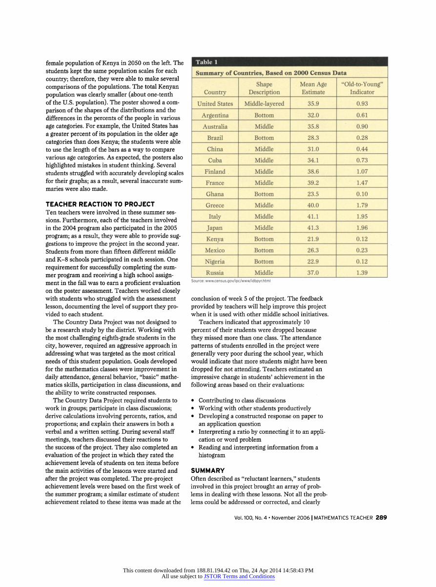
mates developed in lesson 1. One specific summary students derived was
used to discuss the spread of the distribution, con
sidering just a few top and bottom layers of the
pyramid graphs. This summary was defined as the
"old-to-young" indicator and was a decimal number formed by reducing the ratio of the number of peo ple aged 65 and older to the number of people aged 9 and under (see table 1, p. 289). As the class orga nized the indicators derived for each country, the
layered classification labels became more meaning ful. For example, Kenya's bottom-layered classifica tion explains its very small "old-to-young" indicator
(approximately 0.12). Bottom-layered countries
produced "old-to-young" indicators within the
range of 0 to 0.7. The United States has an "old
to-young" indicator of approximately 1.0. Most
middle-layered countries produced indicators in the
ranges of 0.7 to 2.0. The countries with the great est "old-to-young" indicators (Greece, Japan, Italy) are also the countries projected to be top-layered in 2050. Students also connected the indicators to the balance points representing the mean ages.
Fiq. 4 Population estimates, Japan
Notes on Japan: Students were challenged by the 2000
graph. Two layers (the 25-29 year olds and the 50-54
year olds) were estimated as nearly identical. Therefore,
students had a split classification for Japan. In class discus
sions, teachers explained that this graph demonstrated an
approximately bimodal distribution. Most students sum
marized that the area of the 2050 graph is less than that of Japan's 2000 graph, indicating that Japan is projected to decline in population. Students also classified the graph in 2050 as top-layered. Many students asked why Japan's
graph was the only one to have this shape, and their ques
tions generated several special online investigations of
Japan.
The value of the "old-to-young" indicator could be visualized as the pull that the older age categories (for an indicator greater than 1) or the younger age categories (for an indicator less than 1) exert on the balance point of the distribution.
SHAPES AND SCALES The shapes of the pyramid graphs provided insights about countries that required students to explain their thinking and not simply derive a number. For
example, two questions initially challenged both stu dents and teachers as they attempted to explain the
connections, yet the discussion from these questions highlighted the degree to which students understood the graphs. The first question asked students to
identify the country projected to have the greatest increase in the number of people from 2000 to 2050. The second question asked the students to identify the countries projected to have the greatest percent increase in the population from 2000 to 2050.
At first, students were concerned that they were expected to find the total population of each
country in 2000 and 2050 to answer these ques
Vol. 100, No. 4 ? November 2006 | MATHEMATICS TEACHER 287
This content downloaded from 188.81.194.42 on Thu, 24 Apr 2014 14:58:43 PMAll use subject to JSTOR Terms and Conditions

tions. Clearly, they did not welcome this tedious task! Teachers then developed a series of questions to help students select a subset of the countries to
study based on the changes in the pyramid graphs from 2000 to 2050. How do the pyramid shapes change for a country that would increase in popula tion? Further, how would the change in the graphs indicate a greater percent change for a specific country? Some countries, like Japan (see fig. 4), show a smaller graph in the 2050 projections than in the population of 2000; therefore, those coun
tries are projected to experience a decline in popu lation from 2000 to 2050. Recognizing countries
Nigeria: !
Niearia: 2?5?
6420 0 2 46 Population Cln alllions)
Census Bureau, International Data Bi
(b)
Fiq. 5 Nigeria represents one of the greatest percent
increases in population from 2000-2050. Note the change in
size of the graph from 2000 to 2050.
Fig. 6 Students' poster comparing populations of Kenya and the United States
demonstrating a similar change in their graphs eliminated some countries from consideration.
From the list of countries with graphs that increased from 2000 to 2050 (therefore indicating an increase in the population), students studied the scales representing population values. The magni tude of these scales for the largest countries was used to highlight that even a small increase in the size of a
graph could indicate a large increase in the number of people. By simply examining the magnitude of the
scales, students were able to eliminate some coun
tries from the list of those possibly projecting the
largest population increase. The students explained through their written summaries that the coun
tries with the greatest increase in the size of their
graphs would be the countries most likely to have the greatest percent increase in population. Nigeria
was a country demonstrating one of the more vis ible increases in the size of the pyramid graphs from 2000 to 2050 (see fig. 5). This insight was signifi cant in understanding the meaning of percent.
FINAL ASSESSMENT Lesson 4 represents an important formative assess ment of the project. Again, students worked in
pairs and were provided chart paper with grid lines, markers, and construction paper. They were
directed to develop a poster that compared the
country they studied with the United States. At least five items had to be connected to summaries obtained from the pyramid graphs of the two coun
tries. Students were allowed to use their answers
from the lessons and discussion questions as well as from any other resources they collected. Several teachers provided computer resource opportunities for students to obtain additional information about their countries using Web sites.
The posters represented the primary assess ment to determine the level of understanding of the graphs and calculations derived in the lessons.
Generally, a comparative study of this type will indicate whether students have understood the con
cepts and ideas. As a result, the posters proved to
be a valuable summative assessment of the previous lessons. Teachers displayed the posters around the classrooms and involved each group of students in
explaining their summarized data. Students were
further allowed to revise or modify their posters, since the information they summarized was not
always accurate. In this way, the posters became a
formative assessment process.
Two students developed the poster pictured in
figure 6, which compares Kenya with the United States. They developed a side-by-side histogram, similar to the histograms of the pyramid graphs, in which they displayed the female population of the United States in 2050 on the right and the
288 MATHEMATICS TEACHER | Vol. 100, No. 4 ? November 2006
This content downloaded from 188.81.194.42 on Thu, 24 Apr 2014 14:58:43 PMAll use subject to JSTOR Terms and Conditions
female population of Kenya in 2050 on the left. The students kept the same population scales for each
country; therefore, they were able to make several
comparisons of the populations. The total Kenyan
population was clearly smaller (about one-tenth of the U.S. population). The poster showed a com
parison of the shapes of the distributions and the differences in the percents of the people in various
age categories. For example, the United States has a greater percent of its population in the older age
categories than does Kenya; the students were able to use the length of the bars as a way to compare various age categories. As expected, the posters also
highlighted mistakes in student thinking. Several students struggled with accurately developing scales for their graphs; as a result, several inaccurate sum
maries were also made.
TEACHER REACTION TO PROJECT Ten teachers were involved in these summer ses
sions. Furthermore, each of the teachers involved in the 2004 program also participated in the 2005
program; as a result, they were able to provide sug gestions to improve the project in the second year. Students from more than fifteen different middle and K-8 schools participated in each session. One
requirement for successfully completing the sum mer program and receiving a high school assign ment in the fall was to earn a proficient evaluation on the poster assessment. Teachers worked closely with students who struggled with the assessment
lesson, documenting the level of support they pro vided to each student.
The Country Data Project was not designed to be a research study by the district. Working with the most challenging eighth-grade students in the
city, however, required an aggressive approach in
addressing what was targeted as the most critical needs of this student population. Goals developed for the mathematics classes were improvement in
daily attendance, general behavior, "basic" mathe matics skills, participation in class discussions, and the ability to write constructed responses.
The Country Data Project required students to work in groups; participate in class discussions; derive calculations involving percents, ratios, and
proportions; and explain their answers in both a
verbal and a written setting. During several staff
meetings, teachers discussed their reactions to the success of the project. They also completed an evaluation of the project in which they rated the achievement levels of students on ten items before the main activities of the lessons were started and after the project was completed. The pre-project achievement levels were based on the first week of the summer program; a similar estimate of student achievement related to these items was made at the
Table 1
Summary of Countries, Based on 2000 Census Data
Country
United States
Argentina
Australia
Brazil
China
Cuba
Finland
France
Ghana
Greece
Italy
Japan
Kenya
Mexico
Nigeria
Russia
Shape ... Description
Middle-layered
Bottom
Middle
Bottom
Middle
Middle
Middle
Middle
Bottom
Middle
Middle
Middle
Bottom
Bottom
Bottom
Middle
Mean Age Estimate
35.9
32.0
35.8
28.3
31.0
34.1
38.6
39.2
23.5
40.0
41.1
41.3
21.9
26.3
22.9
37.0
"Old-to-Young"
Indicator
Source: www.census.gov/ipc/www/idbpyr.html
conclusion of week 5 of the project. The feedback
provided by teachers will help improve this project when it is used with other middle school initiatives.
Teachers indicated that approximately 10
percent of their students were dropped because
they missed more than one class. The attendance
patterns of students enrolled in the project were
generally very poor during the school year, which would indicate that more students might have been
dropped for not attending. Teachers estimated an
impressive change in students' achievement in the
following areas based on their evaluations:
Contributing to class discussions
Working with other students productively Developing a constructed response on paper to an application question Interpreting a ratio by connecting it to an appli cation or word problem Reading and interpreting information from a
histogram
SUMMARY Often described as "reluctant learners," students involved in this project brought an array of prob lems in dealing with these lessons. Not all the prob lems could be addressed or corrected, and clearly
0.93
0.61
0.90
0.28
0.44
0.73
1.07
1.47
0.10
1.79
1.95
1.96
0.12
0.23
0.12
1.39
Vol. 100, No. 4 ? November 2006 | MATHEMATICS TEACHER 289
This content downloaded from 188.81.194.42 on Thu, 24 Apr 2014 14:58:43 PMAll use subject to JSTOR Terms and Conditions

Appendix Countries and Their shapes
Argentina Australia Brazil
3B M?. 1.4 1.2 ?J? ? ? ?A Oj 0.0 0,0 0.1 0.? ?. OJ 1.? l?\
Cuba
n U.S. Carum Bureau, Infrnrtlcml Urti Bu?.
Greece
9o?~T?"1S?omoo nf?*m~ |sourc*t U.S. cw Pur?, lnfmtlon.1 Pata m?.
Mexico
Population tin Millier?)
Finland France
200 190 100 99 ? 90 100 190 200 2901 2.9 2.0 1.9 1.0 0.9 0.0 0.0 Population Cin ? *?*) Populrtlan (in Nlltiom?
Isowoti IM, Cinau* irw, Intarnatlonal Data taa?._ - "
Italy Japan
|3.0 2.9 2.0 1.9 1
bourcn U.S. Cm? Population (in ?llllona)
Nigeria Russia
Population <ln.nllUont) *r*mr International Oatf taae.
^^ ^^ -
"^^^^ nllUont) Population (In nilllona)
Source: U.S. Census Bureau?2000 shapes
(wwnv.census.gov/ipc/www/idbpyr .html)
China
Ghana
Population (In allliona) -?? CM? fatamatlonal Pata I
Kenya
United States
many challenges remained for these students as
they entered their high school programs. Yet the efforts directed at connecting something meaning ful in mathematics were observed and documented
using student work. The teachers had evidence in short essays and posters that "reluctant learners"
were less resistant as they found something mean
ingful in mathematics. They were sharing insights that had been derived from data and were now a
part of their language. "Wow! If I lived in Kenya, I would be almost middle-aged!" claimed one young man as he derived an estimate of 21 for the mean
age of males in that country. "The ratio of teenag ers to the whole population is really small! Doubt if I would find a lot of people my age," said one student as she derived an estimate of the percent of teens in Italy. Teachers felt at the conclusion of this summer program that they had evidence of math ematical ideas changing the way teenagers com municated information. For that alone, this project will continue to be studied.
REFERENCE U.S. Census Bureau. IDB Population Pyramids. U.S.
Census Bureau, 2005. Available at www.census
.gov/ipc/www/idbpyr .html.
(Note: This URL is part of the Web site developed by the U.S. Census Bureau. The main page is www
.census.gov. From this home page, navigate from the
Projections link to the International Demographic Data link to the Population Pyramid Graphs). <?
^A HENRY KRANENDONK, hkranendonk ^^^^^H m @earthlink.net, is the mathematics ^^^^^^^H
:? 'jjtf curriculum specialist for the Milwau-
^^^^^^^H ?i kee Public Schools. Before taking ^^^^^^^H that position, he taught for more than 25 years ^^^^^^^H in high schools in the district. His primary focus ^^^^^^^H is to find real data that will provide students a ^^^^^^^H
meaningful understanding of the significance of ^^^^^^^H mathematics in the world around them. ^^^^^^^H
290 MATHEMATICS TEACHER | Vol. 100r No. 4 ? November 2006
This content downloaded from 188.81.194.42 on Thu, 24 Apr 2014 14:58:43 PMAll use subject to JSTOR Terms and Conditions