Embed Size (px)
Citation preview

Life expectancy

What is Life Expectancy?
• Life expectancy at birth of a girl in the England now is 80.9 years. This means that a baby born now will live 80.9 years if…………..
• that baby experiences the same age-specific mortality rates as are currently operating in the England.
• Life expectancy is a shorthand way of describing the current age-specific mortality rates.

How is it calculated?

Population in age intervalNumber of deaths in the age interval.Age-specific death rate.Conditional probability that an individual who has survived to start of the age interval will die in the age interval. Conditional probability that an individual entering the age interval will survive the age intervalLife table cohort population. The hypothetical population of newborn babies on which the life table is based.Number of life table deaths in the age intervalNumber of years lived during the age interval.Cumulative number of years lived by the cohort population in the age interval and all subsequent age intervals. Life expectancy at the beginning of the age interval.Width of the 19 age intervals used in this abridged life table.Fraction of the age interval lived by those in the cohort population who die in the interval.
Because deaths in year 1 are not evenly distributed during the year (they are closer to birth), infants deaths contribute less than ½ a year.

Issues with Life Expectancy
Advantages
• Single figure easily understood
• Directly comparable between populations
• Easy to calculate with available calculators
• Life tables are flexible tools allow modelling ‘what if’ scenarios
Disadvantages
• More complex to calculate than standardised rates
• Confidence intervals more difficult to construct than standardised rates
• To understand why differences exist between populations need to look at age-specific rates

Monitoring trends over time
Mortality from Suicide in England 1993-2004
0
2
4
6
8
10
12
1993 1994 1995 1996 1997 1998 1999 2000 2001 2002 2003 2004 2005 2006 2007 2008 2009 2010
Dir
ec
tly
ag
e s
tan
da
rdis
ed
ra
te p
er
10
0,0
00
2010 target
Are we going to reach the target?
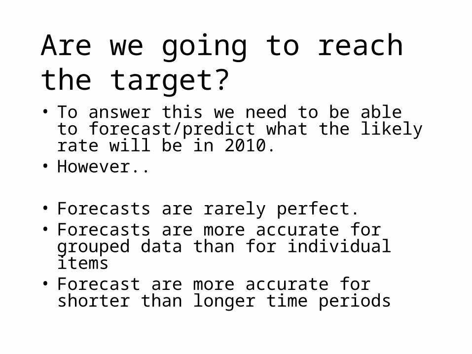
• To answer this we need to be able to forecast/predict what the likely rate will be in 2010.
• However..
• Forecasts are rarely perfect.• Forecasts are more accurate for grouped data than
for individual items• Forecast are more accurate for shorter than longer
time periods
Are we going to reach the target?

Time series
• Assumes the future will follow same patterns as the past
• Forecasting using linear regression

Trend analysis forecasting
First• There should be a sufficient correlation
between the time parameter and the values of the time-series data
• This can be checked be looking at the correlation coefficient.

Trend analysis method
• Trend analysis uses a technique called least squares to fit a trend line to a set of time series data and then project the line into the future for a forecast.
• Trend analysis is a special case of regression analysis where the dependent variable is the variable to be forecasted and the independent variable is time.

The general equation for a trend line
F=a+bt Where:• F – forecast,• t – time value,• a – y intercept,• b – slope of the line.
•Least square method determines the values for a and b so that the resulting line is the best-fit line through a set of the historical data. •After a and b have been determined, the equation can be used to forecast future values.

The trend line is the “best-fit” lineMortality from Suicide in England 1993-2004
y = -0.1167x + 10.78
0
2
4
6
8
10
12
1993 1994 1995 1996 1997 1998 1999 2000 2001 2002 2003 2004 2005 2006 2007 2008 2009 2010
Dire
ctly
age
sta
ndar
dise
d ra
te p
er 1
00,0
00
2010 target
Line fitted using add trend line
Excel provides the equation
So are we going to reach the target?

Trend analysis forecasting method
• Advantages: Simple to use, Excel function Trend( ) gives the predicted values at each time point, adding trendline to graph plots the trend
• Disadvantages: not always applicable for the long-term time series (because there exist several trends in such cases)

Forecasting using exponential growth curve
• Another method which produces linear forecasts using an exponential growth curve.
• It fits the best exponential curve to the data• In this case produce very similar results • However if predicting further into the future this
method gives more conservative estimates in which the yearly drop decreases over time.

Mortality from Suicide in England 1993-2004
0
2
4
6
8
10
12
1993 1994 1995 1996 1997 1998 1999 2000 2001 2002 2003 2004 2005 2006 2007 2008 2009 2010
Dire
ctly
age
sta
ndar
dise
d ra
te p
er 1
00,0
00
2010 target
Very little difference between linear black line and exponential blue line

Non-linear trends
• Logarythmic
• Polynomial
• Power
• Exponential
Excel provides easy calculation of the following trends

Logarithmic trend
y = 4,6613Ln(x) + 1,0724
R2 = 0,9963
02
46
810
12
0 2 4 6 8

Trend (power)
y = 0,4826x1,5097
R2 = 0,9919
02468
10
0 2 4 6 8

Trend (exponential)
y = 0,0509e1,0055x
R2 = 0,9808
0
20
40
60
80
0 2 4 6 8

Trend (polynomial)
y = -0,1142x3 + 1,6316x2 - 5,9775x + 7,7564
R2 = 0,9975
0
2
4
6
8
0 2 4 6 8

Using values from National Surveys

Body mass index (BMI), by survey year, age and sex
Adults aged 16 and over with a valid height and weight measurement 1993-2004
BMI (kg/m2) Age Total
16-24 25-34 35-44 45-54 55-64 65-74 75+
Men % % % % % % % %
2004 (unweighted)c
20 or under 20.0 4.1 2.1 0.5 0.7 1.6 2.6 3.8
Over 20-25 48.6 35.8 22.6 21.5 21.7 22.3 24.2 27.2
Over 25-30 23.1 41.2 50.8 48.5 47.6 48.3 55.3 45.5
Over 30a 8.2 18.8 24.5 29.5 30.0 27.9 17.9 23.6
Over 40 1.6 - 0.4 1.5 1.9 0.6 - 0.9
Mean 24.0 26.4 27.7 28.2 28.3 28.0 26.9 27.3
Standard error of the mean 0.31 0.21 0.19 0.22 0.21 0.23 0.25 0.09
2004 (weighted)c
20 or under 20.2 4.1 2.1 0.5 0.7 1.6 2.5 4.7
Over 20-25 48.8 37.0 22.4 21.7 21.7 22.2 24.1 28.8
Over 25-30 23.1 41.0 50.3 48.2 47.5 48.4 54.4 43.9
Over 30a 7.9 17.9 25.2 29.6 30.1 27.8 19.0 22.7
Over 40 1.4 - 0.4 1.6 2.0 0.7 - 0.9
Mean 23.9 26.3 27.8 28.2 28.3 28.0 26.9 27.1
Standard error of the mean 0.31 0.22 0.20 0.23 0.23 0.24 0.24 0.10
Bases (Men)
Why are there two sets of estimates?
What does weighted mean?
Which should we use?

Why should we weight?
1. Adjust for non response
2. Adjust for unequal selection probabilities
3. Adjust our sample to match known population totals

Adjust for unequal selection probabilities
• EG. in surveys where only one adult per household is interviewed, those living in households with more than one adult will have a less of a chance of being selected than those adults living on their own.
• A sample design weight is 1 divided by the probability of selection due to the survey design.
• However, these are usually scaled, so we define the weight as proportional to this number.
• If there are 3 adults in a given household the resulting sample design weight for the single interviewed adult will be proportional to 1/(1/3), i.e. proportional to 3.
• The influence of the respondent is being increased threefold to compensate for the fact the respondent was three times less likely to be included in the sample.

Nonresponse weights

Adjust for non response
• Non-response weights compensate for when someone refuses to take part in the survey.
• Weighting for total nonresponse involves giving each respondent a weight so that they represent the non-respondents who are similar to them in terms of survey characteristics.
• The non-response rate weight is proportional to 1 divided by the response rate for the weighting class
• Example: General Household Survey• Work was conducted to match Census addresses with the sampled
addresses of the GHS. • It was possible to match the address details of the GHS respondents as
well as the non-respondents with corresponding information gathered from the Census for the same address.
• It was then possible to identify any types of household that were being under-represented in the survey.

Adjust our sample to match known population totals
• Applied to make the data more representative of the population.
• Information on the population is usually derived from the decennial Census of Population.
• These weights allow for more accurate population totals of estimates.
• Whereas sample design (probability) and non-response weights result from a very simple computation (1/selection probability), post-stratification weights are mathematically complex.

• Should we use the weighted or unweighted estimates?
• Should we ever use the unweighted versions?

measuring inequalities

Inequality means:• …differences between parts of a population
• …considering DISTRIBUTIONS
• …considering the way a “good” (e.g. life expectancy, income, educational attainment, access to public transport, etc.) is distributed throughout a population
• …may consider “fairness” (i.e. equity) [but don’t forget that being equitable sometimes means being unequal

Inequality and its measurement
The existence of inequalities in health and death is rarely disputed, but there is contention over:
– Causes of inequality– Methods to monitor and measure– Extent of inequality, increase or decrease – What can be done

Inequalities indicators incorporate
• a measure (e.g. mortality rate, low birthweight rate, unemployment rate)
– Eg births < 2500 gms / 1000 live births
• an inequalities dimension (e.g. social class, ethnicity, geographical area)
• a comparison (e.g. rate, ratio, range, relative or absolute differences)

Inequalities indicators incorporate:Health gain indicator only
– Change over time without reference to a comparitor population
BUTHealth inequalities indicator
– Involves a comparison between: • LAs, PCTs: eg compare Derby City PCT with
East Midlands average• Compare between different age and sex groups
within a single PCT • Compare between the most and least deprived
wards within a LA etc

Different Health Gaps
A
C D
X axis: health measure eg teenage conception rates by LA
Y axis: frequency
Range = difference between best and worst (B-A)
B
National target measure (eg for life expectancy) = D – C (difference between average and bottom 20%)
Ratio between highest and lowest = B/A (eg relative mortality rate between Social Class V and Social Class I)
Bottom 20%

Gini Coefficient
• The Gini coefficient is a measure of inequality of a distribution.
• It is defined as a ratio with values between 0 and 1: the numerator is the area between the Lorenz curve of the distribution and the uniform distribution line; the denominator is the area under the uniform distribution line.

A population where there is a perfectly equally and equitably distribution of a resource.
Cumulative percentage of the population
Cum
ulat
ive
perc
enta
ge o
f a
reso
urce
th
roug
hout
the
pop
ulat
ion
20 40 60 80 100
2040
6080
100
20
20
20
20
20
20% of the population own 20% of the resource
40% of the population own 40% of the resource
60% of the population own 60% of the resource
80% of the population own 80% of the resource
100% of the population own 100% of the resource

A population where there is an unequal and inequitable distribution of a resource.
Cumulative percentage of the population
Cum
ulat
ive
perc
enta
ge o
f a
reso
urce
th
roug
hout
the
pop
ulat
ion
20 40 60 80 100
2040
6080
100
20
20
20
20
20
20% of the population own 8% of the resource
40% of the population own 17% of the resource
60% of the population own 37% of the resource
80% of the population own 62% of the resource
100% of the population own 100% of the resource
8%
A
B8%
9%
20%
25%
38%

A population where there is an unequal and inequitable distribution of a resource.
Cumulative percentage of the population
Cum
ulat
ive
perc
enta
ge o
f a
reso
urce
th
roug
hout
the
pop
ulat
ion
20 40 60 80 100
2040
6080
100
20
20
20
20
20
8%
A
B8
17
37
62
100
80
80
250
250
540
540
910
990
1610
1,620
3,480 = B
= A + B5,000
Gini coefficient =
A / (A+B) =
1,520 / 5,000 = 0.3
1,520 = A

A real example
• Divide all the wards in the East of England into quintiles (5 groups) in order of educational deprivation (IMD2000 methodology)
• Calculate how many:– a) Teenage conceptions occur in each group– b) Live births occur in each group
• The numbers will not be evenly spread throughout the 5 groups
• This can both be displayed and quantified using Lorenz curves and Gini coefficients respectively.

a) Teenage conceptions

A population where there is an unequal and inequitable distribution of a resource (<18 yr conceptions)
Cumulative percentage of the wards
Cum
ulat
ive
perc
enta
ge o
f a
reso
urce
th
roug
hout
the
war
ds
20 40 60 80 100
2040
6080
100
20
20
20
20
20
20% of the wards experience 6% of the <18 yr conceptions
40% of the wards experience 15% of the <18 yr conceptions60% of the wards experience 27% of the <18 yr conceptions80% of the wards experience 53% of the <18 yr conceptions100% of the wards experience 100% of the <18 yr conceptions
6%
A
B6%
9%
12%
26%
47%
Wards – quintiles - by educational deprivation score
Least……………………………………………. Most
15
27
53

A population where there is an unequal and inequitable distribution of a resource (<18 yr conceptions)
Cumulative percentage of the wards
Cum
ulat
ive
perc
enta
ge o
f a
reso
urce
th
roug
hout
the
war
ds
20 40 60 80 100
2040
6080
100
20
20
20
20
20
6%
A
B6%
9%
12%
26%
47%
Wards – quintiles - by educational deprivation score
Least……………………………………………. Most
15
27
53
60210
420
790
1,530
3,010 = B
= A + B5,000
Gini coefficient =
A / (A+B) =
1,990 / 5,000 = 0.4
1,990 = A
(Source: VS Conceptions; IMD 2000 DETR; erpho: 2001 Annual Profile)
60 210 420 790 1,520

Measures of Spatial Inequalities in Health within PCTs
The trend in premature mortality rates is examined for each City deprivation quintile. A regression line is fit through the data for each quintile.
On X axis: plot time banded (3 year intervals)
On Y axis: plot DSR < 75 all causes per City deprivation quintile
Slope comparison across deprivation quintiles reveals progress in the most disadvantaged areas vs most affluent areas

Slope index of inequality
A regression line is drawn through a health measure stratified by a measure of socio-economic status
On X axis: plot average IMD2000 scores for ward deprivation quintiles in N&S
On Y axis: plot DSR < 75 all causes for ward deprivation quintiles in N&S
If slope reduces over time evidence of reduction in health inequalities

Funnel Plot for Teenage Conception Rates 1998/99 East Midlands: source PCTs dataset ERPHO/SEPHO
Nottingham City
South LeicestershireMelton,Rutland,Harborough
Rushcliffe
Central Derby
Leicester City West
Ashfield
0.0
20.0
40.0
60.0
80.0
100.0
120.0
140.0
0 1000 2000 3000 4000 5000 6000 7000
Volume per Year
Rat
e pe
r 100
0 fe
mal
es 1
5-17 average
95 % limit lower
95 % limit upper
99.9 % limit lower
99.9 % limit upper
Series6
• Funnel Plots can be used to demonstrate health inequality variation
• traffic lighting approach used in Regional Public Health Indicators
• 4 bands of performance: Red Alert = ‘investigate further’, Amber = ‘cause for concern’, Green = ‘doing well’
• If within the 2 limits then the area is indistinguishable from the average
• those in favour of this approach argue that it discourages inappropriate ranking as per caterpillar charts
• emphasizes visually the increased variability expected of smaller PCTs, LADs


![Proposals to Extend Healthy Life Expectancy in Shizuoka ...€¦ · [Gap between life expectancy and healthy life expectancy in Shizuoka Prefecture] Healthy life expectancy *Source:](https://img.dokumen.tips/doc/110x75/5f427921a09c2479a15262fb/proposals-to-extend-healthy-life-expectancy-in-shizuoka-gap-between-life-expectancy.jpg)