Embed Size (px)
Citation preview

More on relationships between two variables
Unit 5-2Transforming to achieve linearity

Body and brain weight of 96 species of mammals
For this data, r = 0.86, but why might we not trust the given correlation?
If we remove the elephant, the correlation changes to r = 0.5!
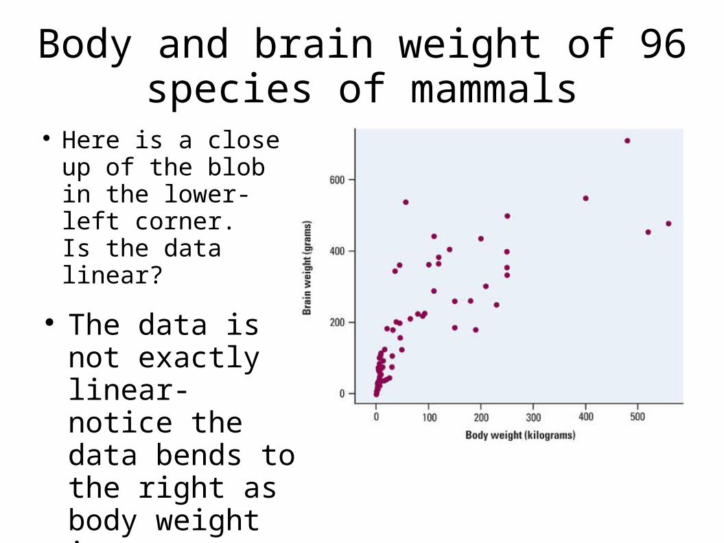
Body and brain weight of 96 species of mammals
Here is a close up of the blob in the lower-left corner. Is the data linear?
The data is not exactly linear- notice the data bends to the right as body weight increases.
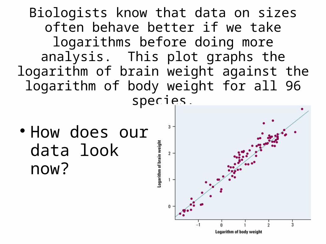
Biologists know that data on sizes often behave better if we take logarithms before doing more
analysis. This plot graphs the logarithm of brain weight against the logarithm of body weight for all
96 species.
How does our data look now?
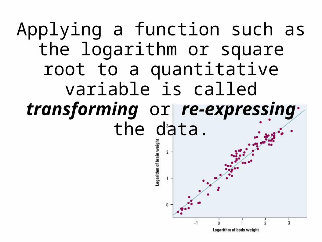
Applying a function such as the logarithm or square root to a quantitative variable is called
transforming or re-expressing the data.
Why transform?
And so you ask, why would we transform our data?
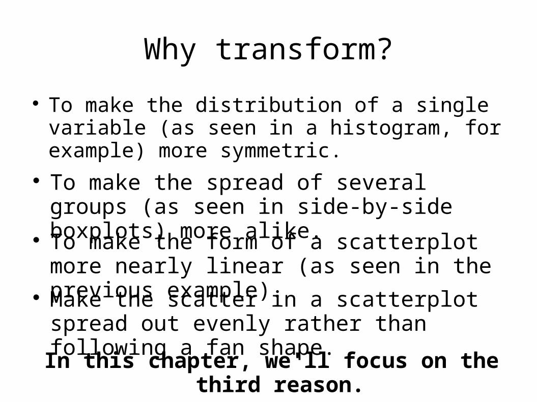
Why transform?
To make the distribution of a single variable (as seen in a histogram, for example) more symmetric.
To make the spread of several groups (as seen in side-by-side boxplots) more alike.
To make the form of a scatterplot more nearly linear (as seen in the previous example).
Make the scatter in a scatterplot spread out evenly rather than following a fan shape.
In this chapter, we'll focus on the third reason.
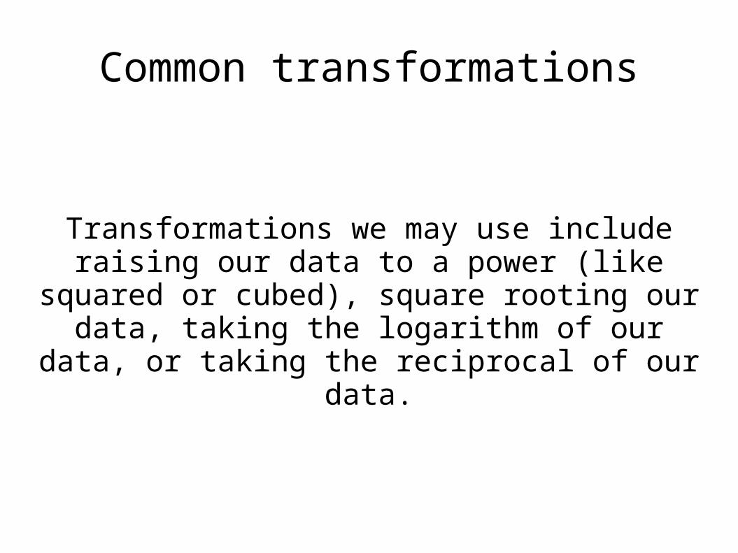
Common transformations
Transformations we may use include raising our data to a power (like squared or cubed), square
rooting our data, taking the logarithm of our data, or taking the reciprocal of our data.

Common transformations
The situation may help us know which transformations will best achieve linearity. For example...
A problem dealing with area might benefit from squaring the data (power of 2) since area involves square units.
A problem dealing with weight or volume might benefit from cubing or cube-rooting (a power of 3 or one-third) the data since volume involves cubic units.
Data involving a ratio (like miles per gallon) might benefit from a reciprocal transformation (power of -1).
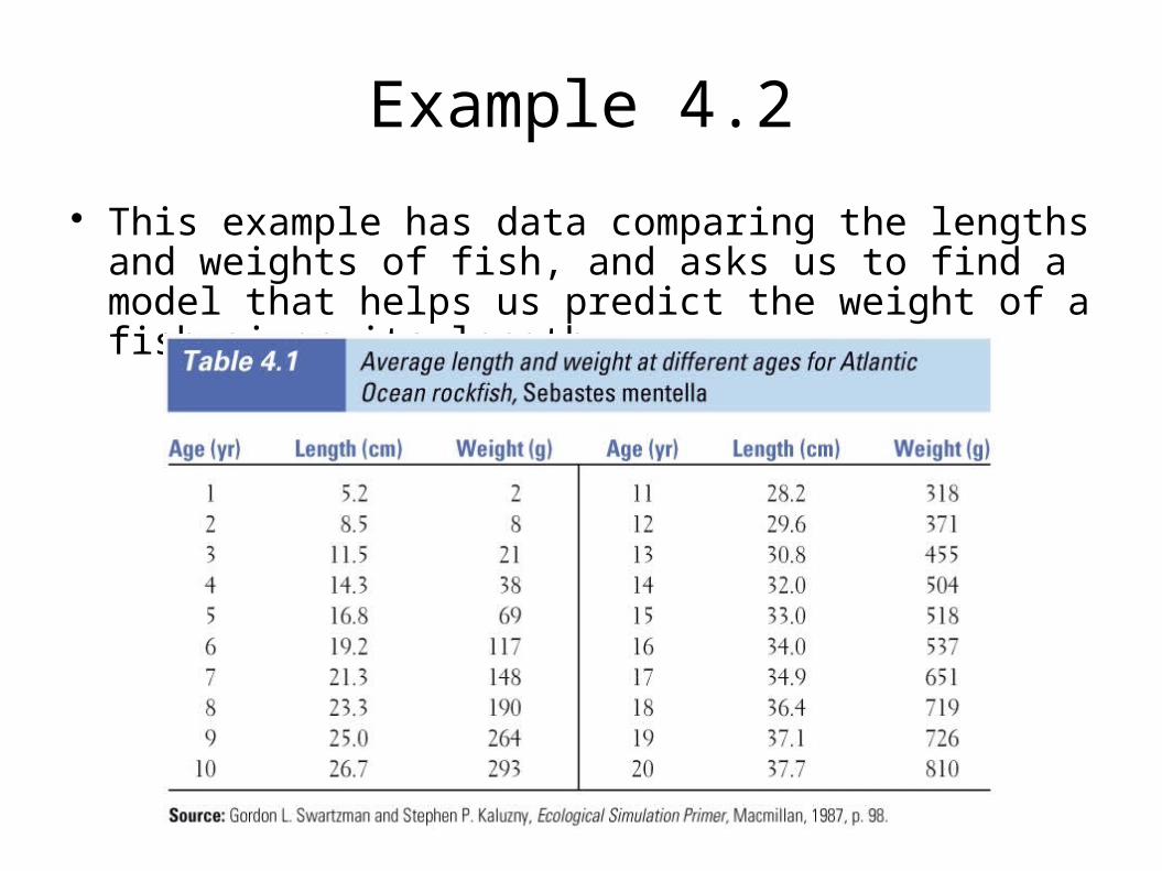
Example 4.2
This example has data comparing the lengths and weights of fish, and asks us to find a model that helps us predict the weight of a fish given its length.
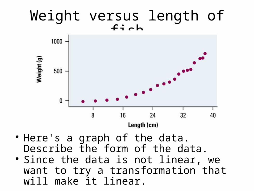
Weight versus length of fish
Here's a graph of the data. Describe the form of the data.
Since the data is not linear, we want to try a transformation that will make it linear.
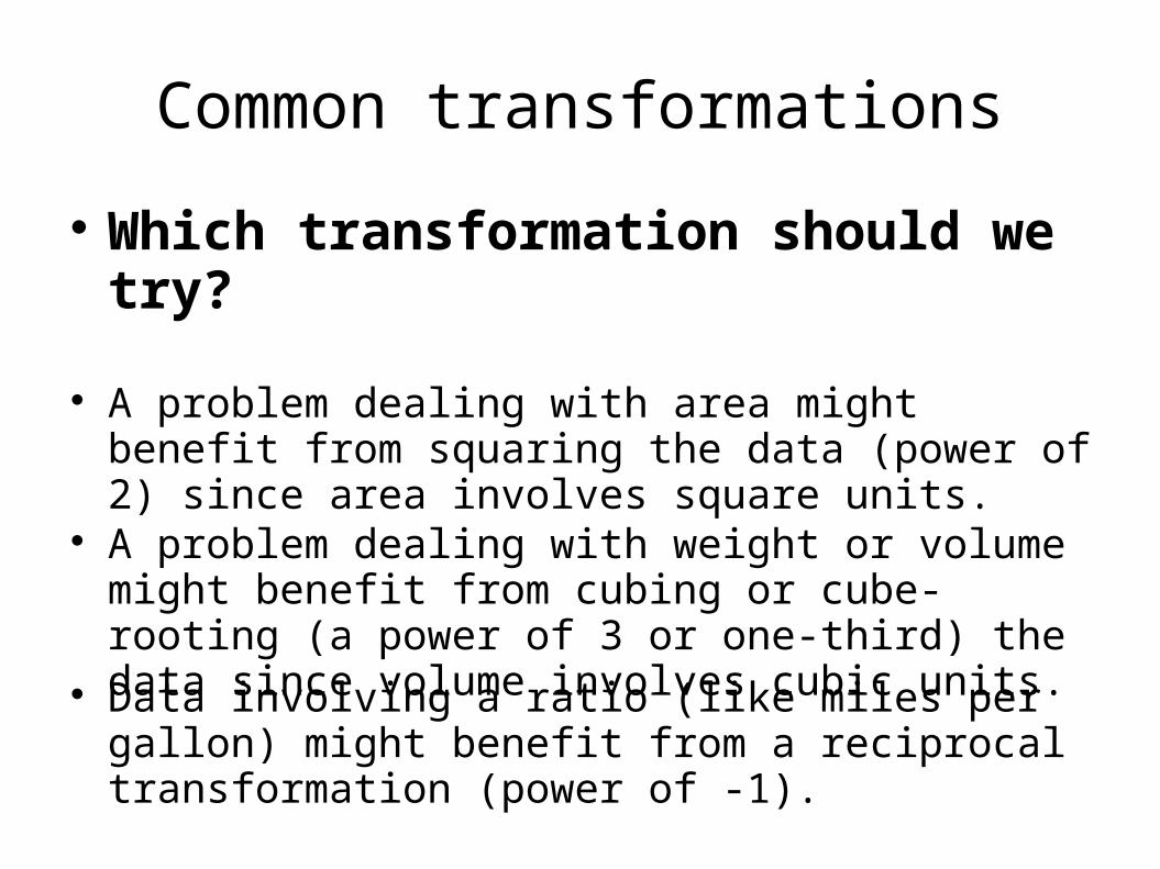
Common transformations
Which transformation should we try?
A problem dealing with area might benefit from squaring the data (power of 2) since area involves square units.
A problem dealing with weight or volume might benefit from cubing or cube-rooting (a power of 3 or one-third) the data since volume involves cubic units.
Data involving a ratio (like miles per gallon) might benefit from a reciprocal transformation (power of -1).
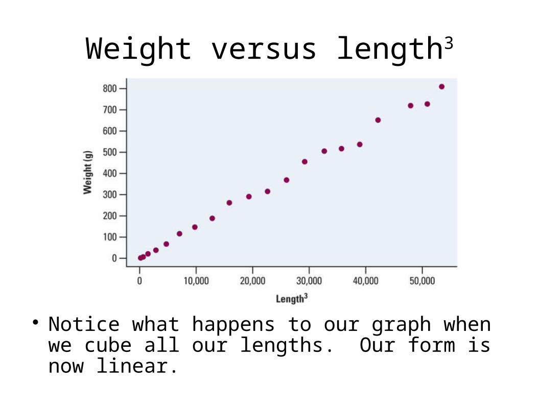
Weight versus length3
Notice what happens to our graph when we cube all our lengths. Our form is now linear.
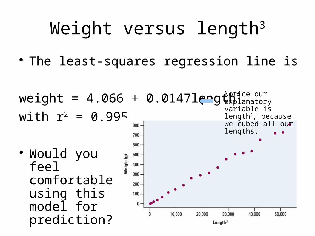
Weight versus length3
The least-squares regression line is
weight = 4.066 + 0.0147length3
with r2 = 0.995
Would you feel comfortable using this model for prediction?
Notice our explanatory variable is length3, because we cubed all our lengths.
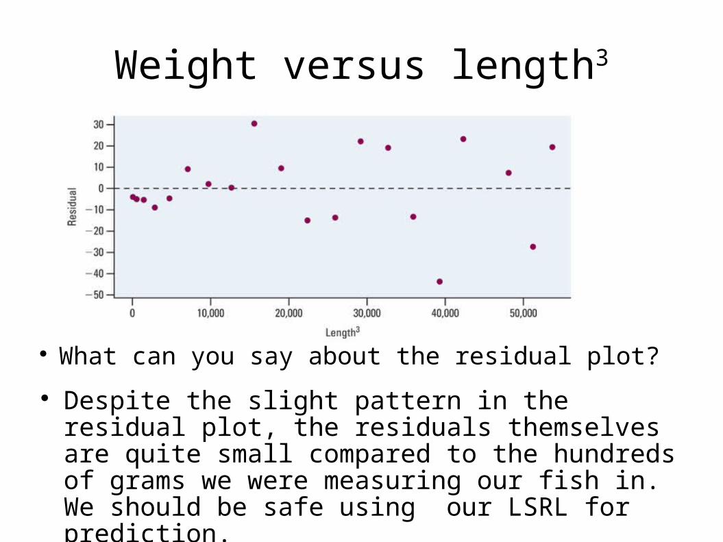
Weight versus length3
What can you say about the residual plot? Despite the slight pattern in the residual plot, the
residuals themselves are quite small compared to the hundreds of grams we were measuring our fish in. We should be safe using our LSRL for prediction.
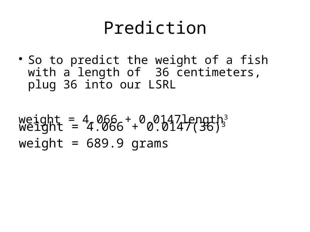
Prediction
So to predict the weight of a fish with a length of 36 centimeters, plug 36 into our LSRL
weight = 4.066 + 0.0147length3
weight = 4.066 + 0.0147(36)3
weight = 689.9 grams

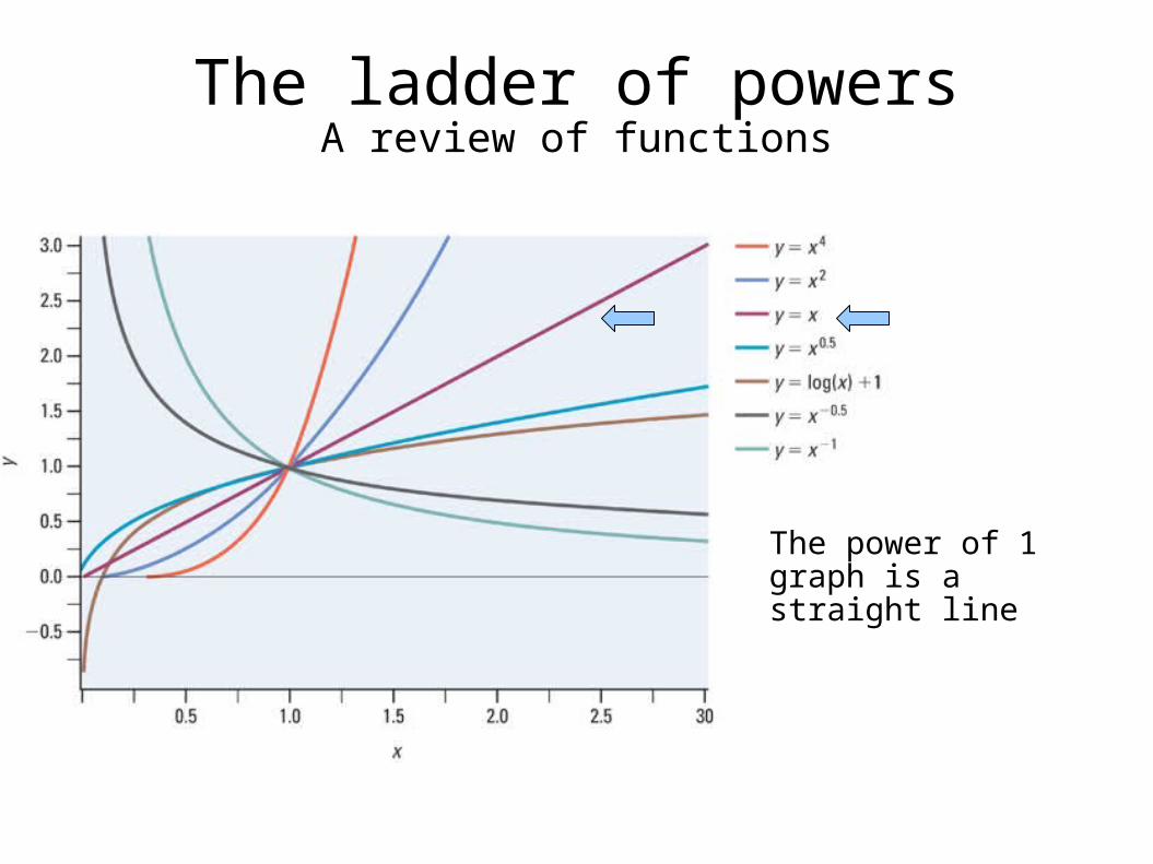
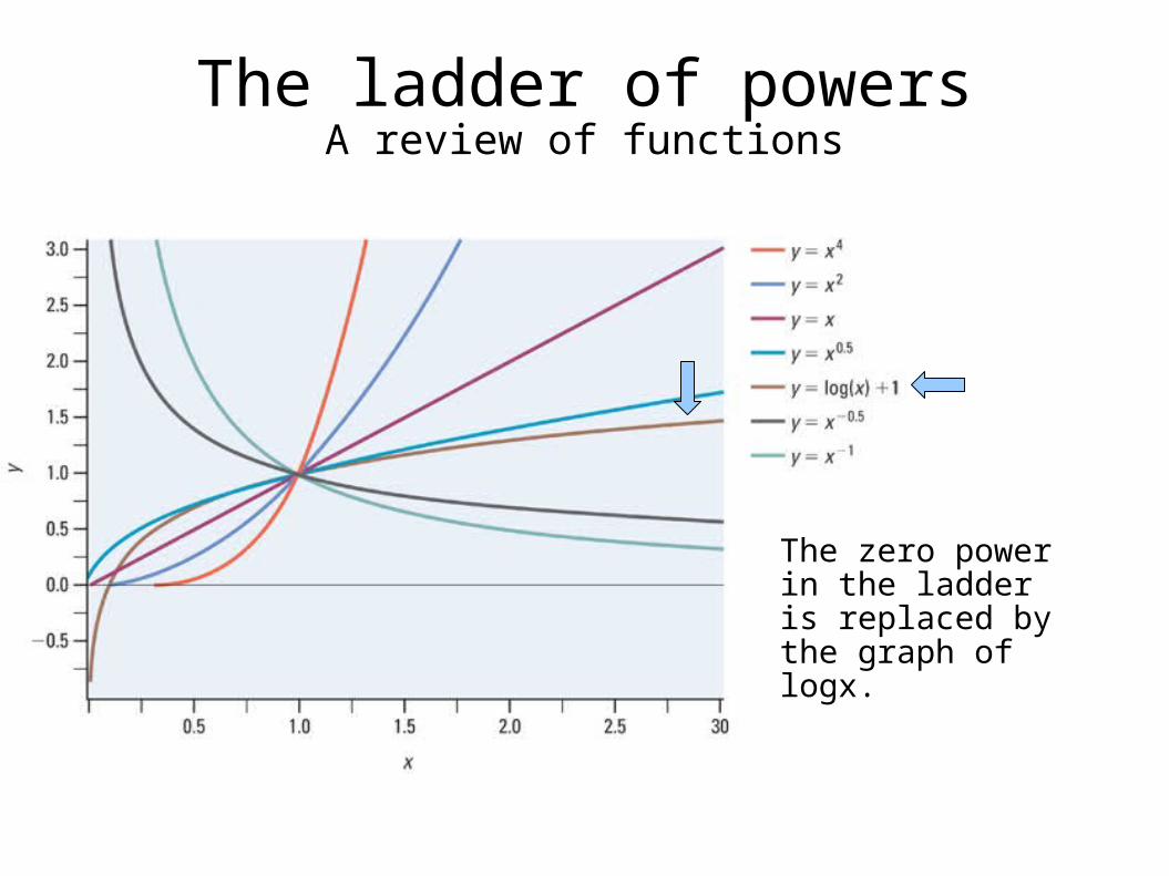
The ladder of powersA review of functions
When transforming with powers (like in the last example), a general understanding of
different power functions can sometimes help, since we could use any of these powers
in transforming our data.
The ladder of powersA review of functions
The power of 1 graph is a straight line
The ladder of powersA review of functions
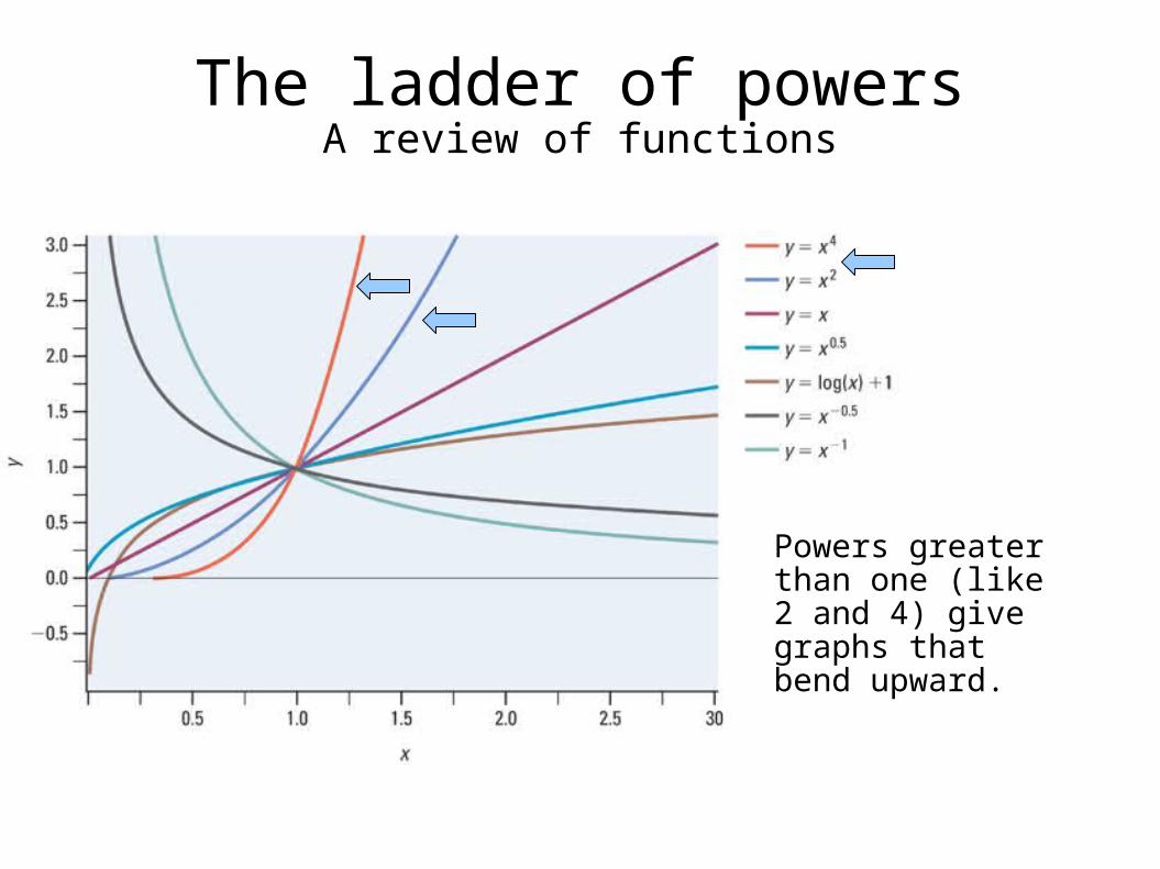
Powers greater than one (like 2 and 4) give graphs that bend upward.
The ladder of powersA review of functions
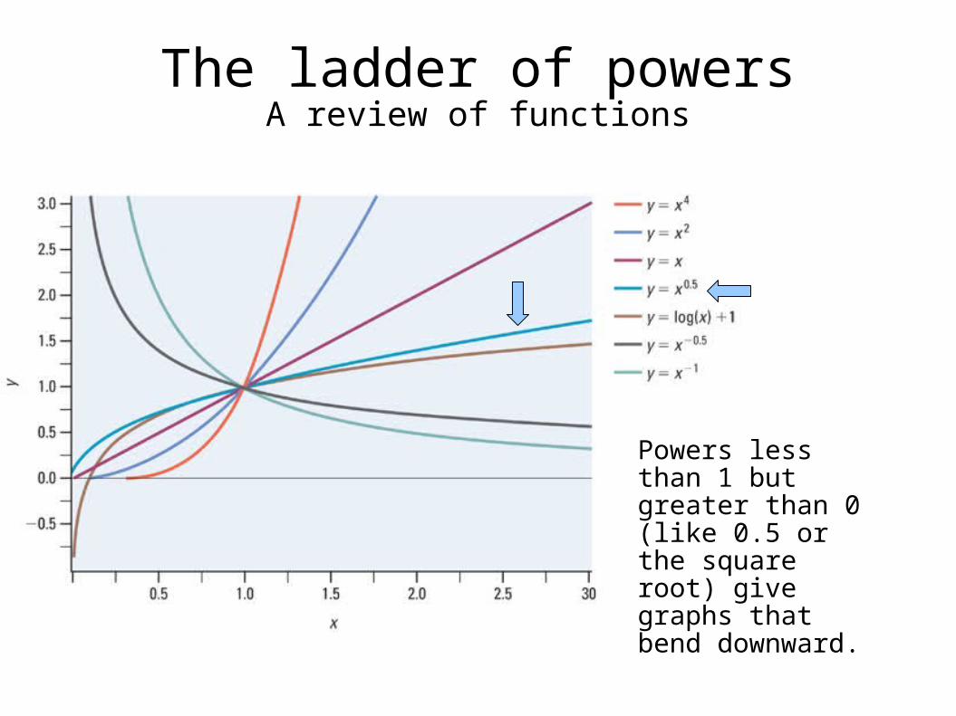
Powers less than 1 but greater than 0 (like 0.5 or the square root) give graphs that bend downward.

The ladder of powersA review of functions
Powers less than zero (like -1 or the reciprocal transformation) give graphs that decrease as x increases.
The ladder of powersA review of functions
The zero power in the ladder is replaced by the graph of logx.
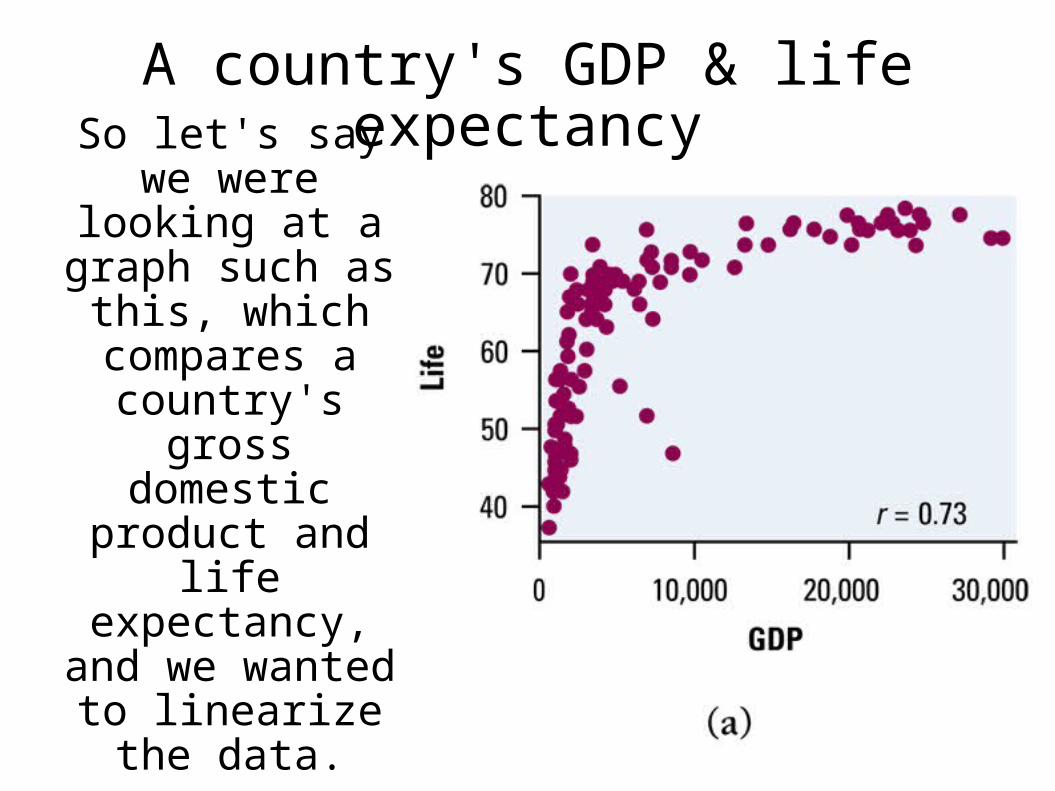
A country's GDP & life expectancy
So let's say we were looking at a
graph such as this, which
compares a country's gross
domestic product and life
expectancy, and we wanted to
linearize the data.
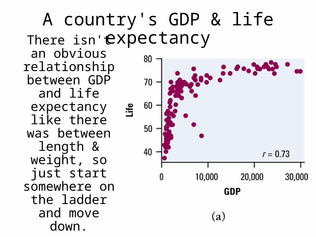
A country's GDP & life expectancy
There isn't an obvious
relationship between GDP and
life expectancy like there was
between length & weight, so just
start somewhere on the ladder and
move down.
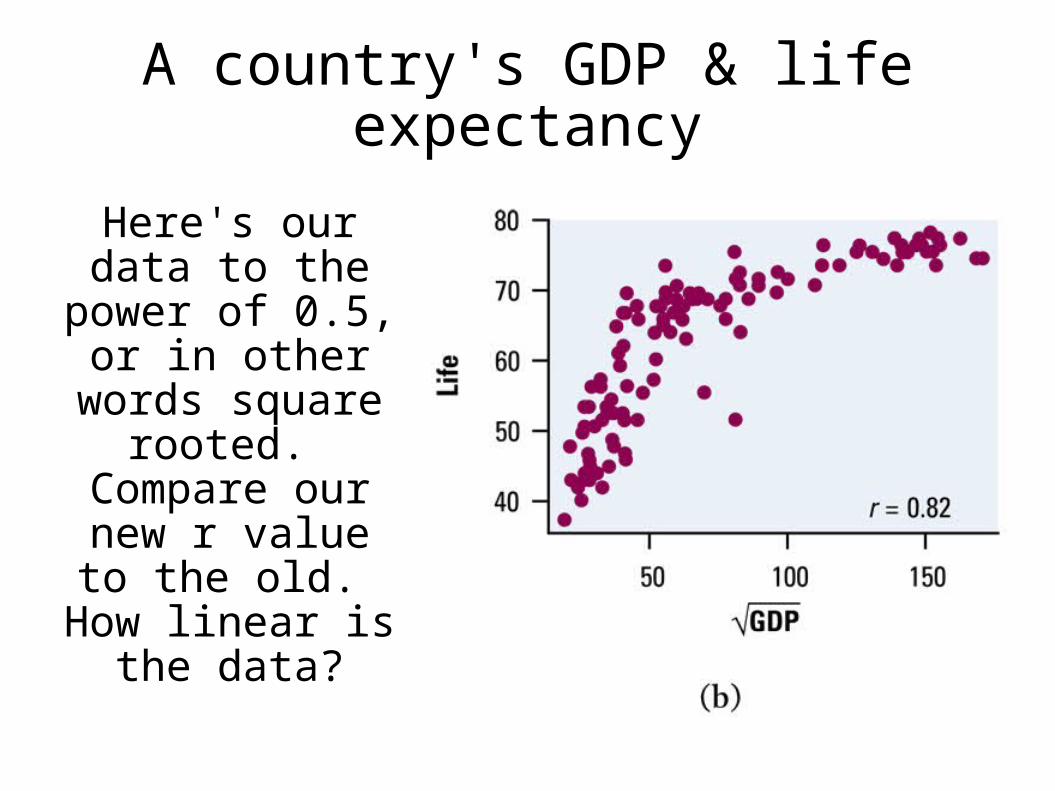
A country's GDP & life expectancy
Here's our data to the power of 0.5, or in other words square rooted.
Compare our new r value to the old. How linear is the
data?
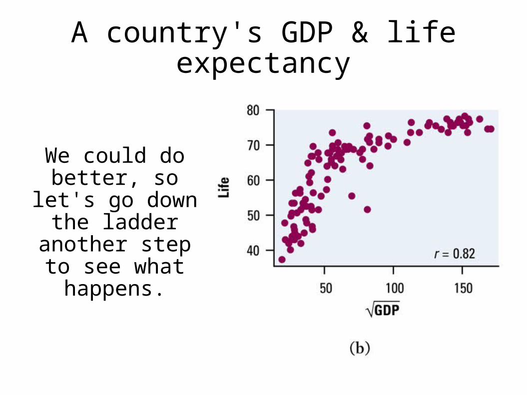
A country's GDP & life expectancy
We could do better, so let's go down the ladder another step to
see what happens.
A country's GDP & life expectancy
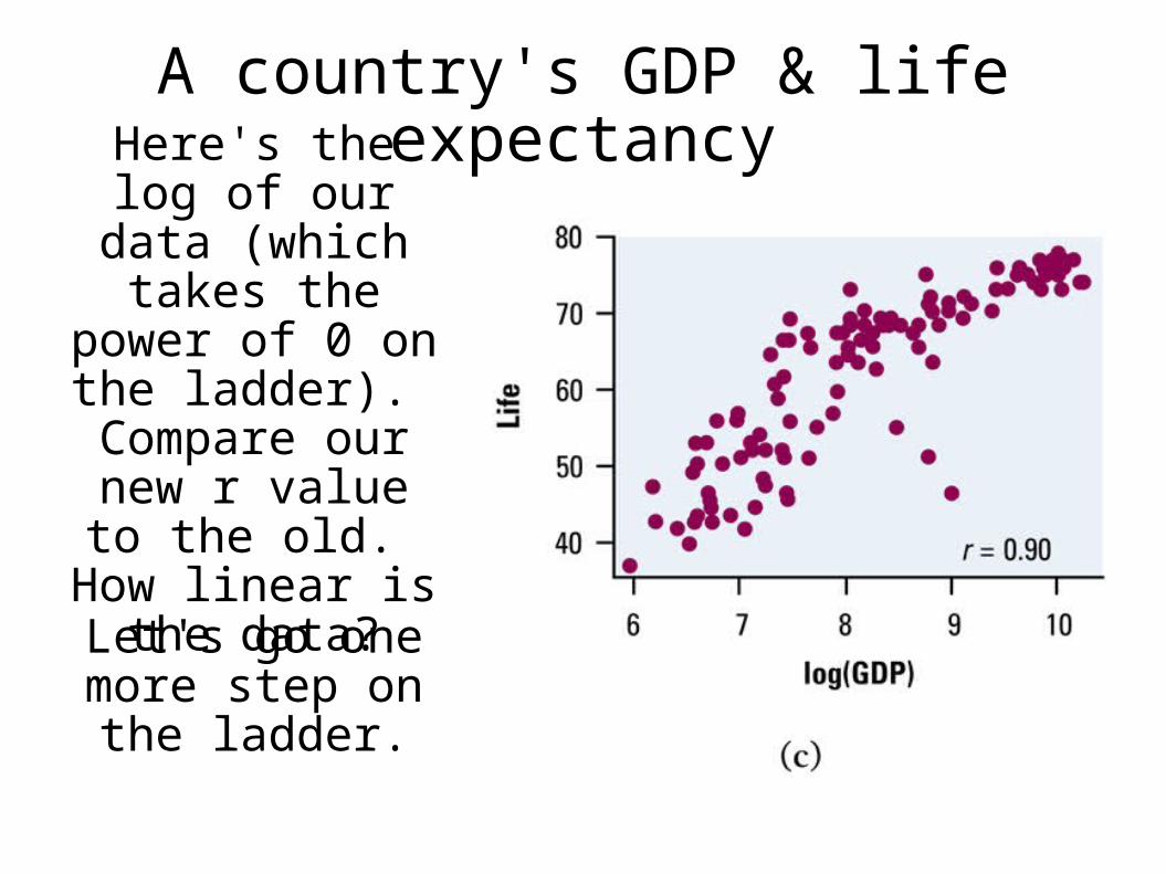
Here's the log of our data (which
takes the power of 0 on the ladder). Compare our new r value to the old. How linear is the
data?
Let's go one more step on the ladder.

A country's GDP & life expectancy
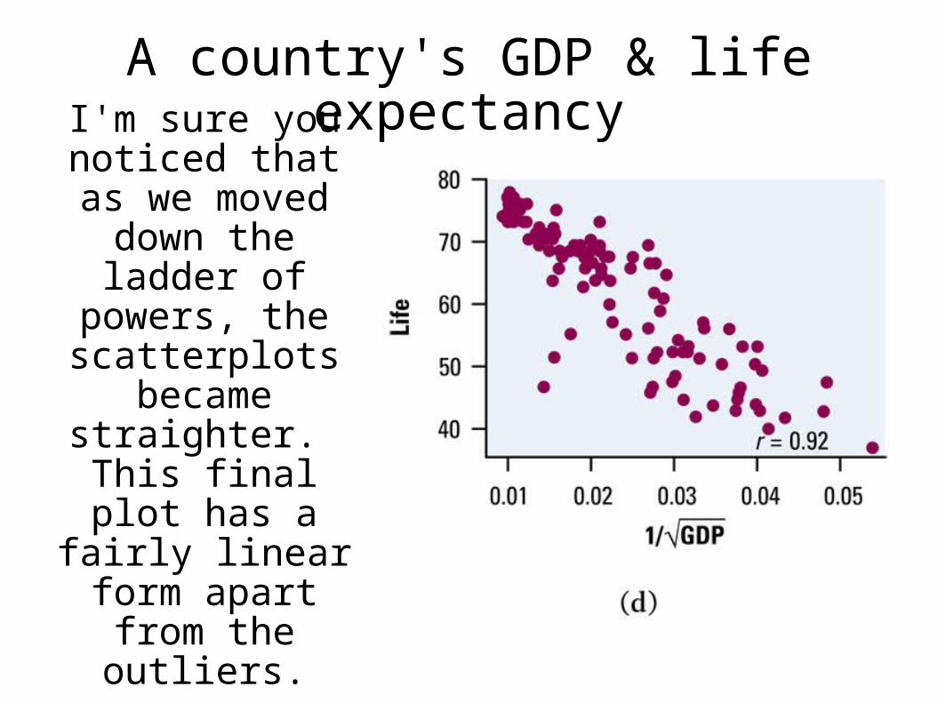
Here's our data to the power of -0.5, or in other words
the reciprocal square rooted.
Compare our new r value to the old. How linear is the
data?
A country's GDP & life expectancy
I'm sure you noticed that as we moved down the ladder of powers, the scatterplots
became straighter. This final plot has a fairly linear form
apart from the outliers.
NOTE
Although this guess and check method ultimately accomplished the goal of achieving linearity, the
ladder of powers is rarely used in practice.
It is much more satisfactory to begin with a theory or mathematical model that we expect to describe a relationship, (as in the length and weight of fish
example.)
Also note that not all data will become linear with a transformation.
Transformations on the TI
We will use the next example to show YOU how to perform your own transformations on your
calculator, as well as to make a very important point about a particular type of model.
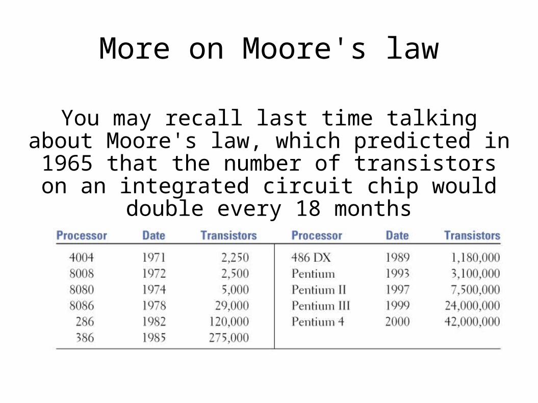
More on Moore's law
You may recall last time talking about Moore's law, which predicted in 1965 that the number of transistors on an integrated circuit chip would
double every 18 months
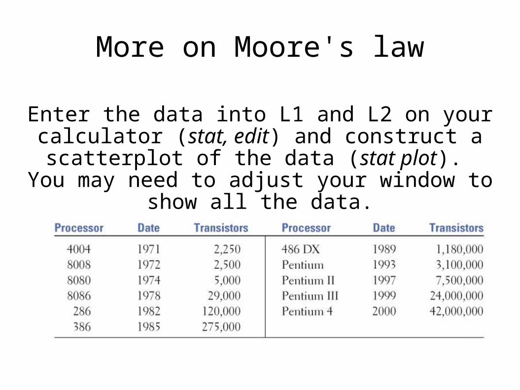
More on Moore's law
Enter the data into L1 and L2 on your calculator (stat, edit) and construct a scatterplot of the data (stat plot). You may need to adjust your window
to show all the data.
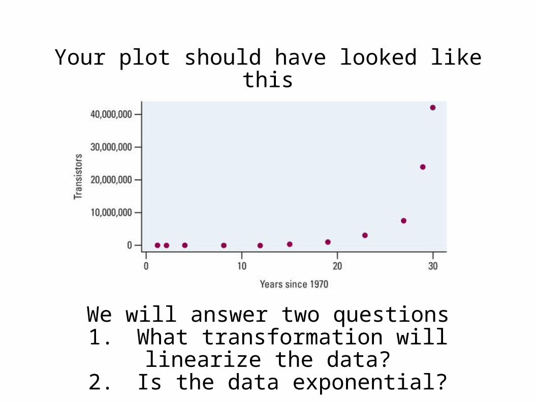
Your plot should have looked like this
We will answer two questions1. What transformation will linearize the data?
2. Is the data exponential?
The answer to question 1:Taking the log of the response variable will
linearize the data
The answer to questions 2:the data is exponential
Verifying exponential growth
In fact, logs can be used to verify exponential growth, because the log of exponential data will
always produce a linear relationship!
Verifying exponential growth
In other words, if our data are growing exponentially and we plot the logarithm (base 10 or base e) or y against x, we should observe a
straight line for the transformed data.
Verifying exponential growth
Go back to our calculator data on Moore's law. To perform the transformation, go back to your lists
(stat, edit). Highlight L3 by scrolling all the way up in that column.
With L3 highlighted, you can type in a formula. Type “ln (L2)” and hit enter. This takes the natural log of our response variable. (Take a quick note
of the range of your values).
Verifying exponential growth
Now graph the points (x, lny) by going to stat plot and changing your lists to
x list: L1y list: L3
Remember you will need to adjust your window again.

Verifying exponential growth
Your graph should look like this. It's fairly linear. Let's perform a regression to see how linear.
Verifying exponential growth
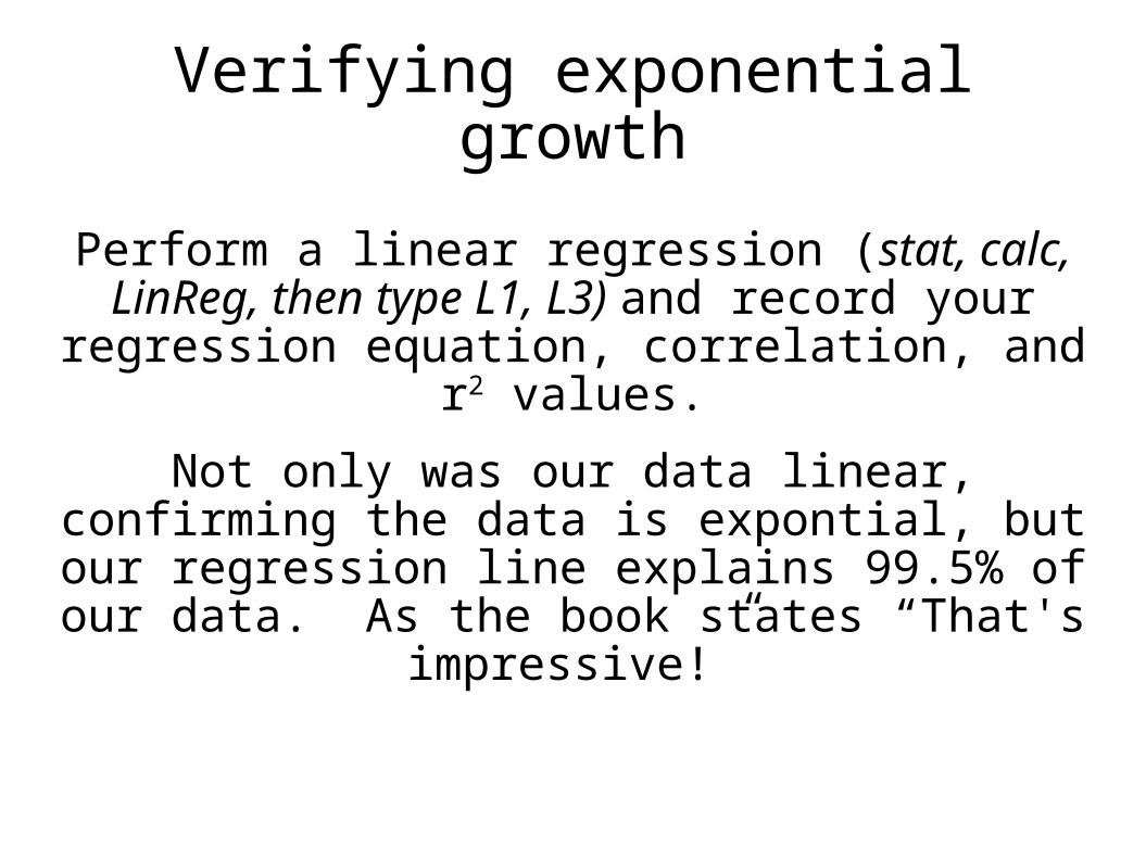
Perform a linear regression (stat, calc, LinReg, then type L1, L3) and record your regression
equation, correlation, and r2 values.
Not only was our data linear, confirming the data is expontial, but our regression line explains
99.5% of our data. As the book states “That's impressive!”
Verifying exponential growth
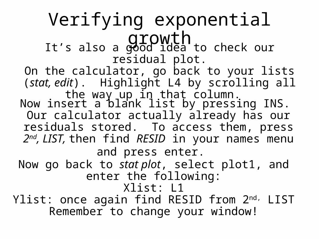
It’s also a good idea to check our residual plot.On the calculator, go back to your lists (stat, edit).
Highlight L4 by scrolling all the way up in that column.
Now insert a blank list by pressing INS. Our calculator actually already has our residuals stored. To access them, press 2nd, LIST, then find RESID in your names
menu and press enter.
Now go back to stat plot, select plot1, and enter the following:Xlist: L1
Ylist: once again find RESID from 2nd, LISTRemember to change your window!

Verifying Exponential Growth
The residual plot is shown on page 274 of your text
Once again, there is a slight pattern to our residuals, but they are so small that we can justify using our model to make predictions.
Predictions using our LSRL
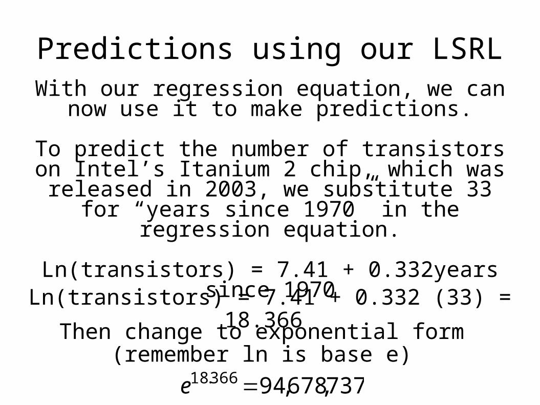
With our regression equation, we can now use it to make predictions.
To predict the number of transistors on Intel’s Itanium 2 chip, which was released in 2003, we
substitute 33 for “years since 1970” in the regression equation.
Ln(transistors) = 7.41 + 0.332years since 1970Ln(transistors) = 7.41 + 0.332 (33) = 18.366
Then change to exponential form (remember ln is base e)
737,678,94366.18 e