Embed Size (px)
Citation preview
LATER RETIREMENT, INEQUALITY
IN OLD AGE, AND THE GROWING
GAP IN LONGEVITY BETWEEN
RICH AND POOR
Barry Bosworth & Gary Burtless, The Brookings Institution
Kan Zhang, George Washington University
January 2016

The Brookings Economic Studies program analyzes current and emerging economic issues facing the United States and the world, focusing on ideas to achieve broad-based economic growth, a strong labor market, sound fiscal and monetary policy, and economic opportunity and social mobility. The research aims to increase understanding of how the economy works and what can be done to make it work better.
The authors offer their grateful acknowledgements to Mattan Alalouf and Eric Koepcke for their terrific research assistance in the project, to Kathleen Elliott Yinug for her excellent organizational efforts in support of the October 30, 2015 conference where this research was first presented, and to the formal discussants of our research at the October 30 conference: Joyce Manchester, Richard Johnson, Hilary Waldron, Julie Topoleski, Henry Aaron, Stephen C. Goss, James Carpetta, and Peter Orszag, as well as the many other participants at the conference who made helpful comments on our first draft. In addition, they would like to acknowledge the warm and sustained support of Kathleen Christensen, the Program Director of the Alfred P. Sloan Foundation’s Working Longer program, which provided generous funding for the project. All errors are the authors’ alone. The views expressed herein are solely those of the authors and should not be imputed to the Brookings Institution or the Alfred P. Sloan Foundation.
Chapter 1. IntroductionPage 1
Chapter 2. Delayed retirementPage 7
Chapter 3. Rising old-age inequalityPage 26
Chapter 4. Differential mortalityPage 61
EndnotesPage 97
ReferencesPage 107
Appendix APage 114
Appendix BPage 126
Endnotes, Appendix A and BPage 163
Table of Contents

Income Inequality of Families by Householder Age, 1995-2013Page 2
Labor Force Participation, Aged and Non-aged, 1980-2014Page 7-8
Full-time and Part-time Employment, Ages 65+, 1980-2014Page 9
Evolution of Labor Force Participation Rates, Age 60-74, 1985 to 2013Page 14
Cumulative Distribution of Social Security Claiming Age by Birth YearPage 17
Age Distribution of Benefit Claiming By Position in Earnings Distribution, 1943-45 Birth CohortsPage 20
Last Age with Earnings, 1943-45 Birth Cohortsby Thirds of Career EarningsPage 21
List of FiguresTable II-1
CHAPTER 3
Figure III-1
Figure III-2
Figure III-3
Figure III-4
Figure III-5
Figure III-6
Figure III-7
Probit Model of Continued Labor Force Participation in the HRS Sample, 1996-2010Page 23
Gini Coefficient of Income Inequality under Alternative Income Definitions, 1979-2013Page 27
Relative Incomes of the Population Past 65 under Money Income Definition and More Comprehensive Income Definition at Selected Points in the Income Distribution, 1997 and 2011Page 30
Trends in the Gini Coefficient of Money Income Inequality, All Persons Regardless of Age of Family Head, 1979-2012Page 33
Trends in the Gini Coefficient of Money Income Inequality among Persons, by Age of Family Head, 1979-2012Page 33
Annual Percent Change in Real Equivalent Money Income by Centile of Income Distribution for Persons in Aged and Nonaged Families, 1979-2012Page 34
Gini Coefficient by Age of Family Head, 1979-1982 and 2009-2012Page 36
Percent Change in Gini Coefficient between 1979-82 and 2009-12, by Age of Family HeadPage 37
CHAPTER 1
Table I-1
CHAPTER 2
Figure II-1
Figure II-2
Figure II-3
Figure II-4
Figure II-5
Figure II-6

50/10 Percentile Income Ratio among Families Headed by a Person in the Indicated Age Groups, by Birth CohortPage 39
90 / 50 Percentile Income Ratio among Families Headed by a Person in the Indicated Age Groups, by Birth CohortPage 39
Labor Force Participation Rates of 62-, 65-, 70-, and 74-Year-Old Men, 1980-2014Page 42
Percent of People Who Are Members of a Family with a “Not Retired” Head, by Age of Family Head, 1979-2012Page 44
Percent Change in Fraction of People Who Are Members of Families with a “Not Retired” Head, by Age of Family Head, 1991-2012Page 44
Annual Percent Change in Real Equivalent Money Income by Centile of Income Distribution for Persons in “Retired” and “Not Retired” Families, by Age of Family Head, 1991-2012Page 57
TAverage Percent Change in Inequality in Birth Cohorts as They Age Three Years at Selected Ages, 1979-2012Page 40
Percent of Persons in Families with at Least One Family Head Who Is Not Retired, by Age of Family Head and Income Quintile, 1991-2012Page 46
Gini Coefficient of Equivalent Personal Income under Alternative Assumptions about Earnings Inequality and Employment Levels, by Age Group, 1979-2012Page 49
Gini Coefficient of Equivalent Personal Income under Alternative Assumptions about Earnings Inequality and Employment Levels, by Age Group, 1979-2012Page 50
Gini Coefficient of Equivalent Personal Income under Alternative Assumptions about Retirement Rates and Mean Income Levels, by Age Group, 1991-2012Page 55
Mortality Samples of the SIPP and HRS by Respondents’ Decade of Birth Page 72
Mortality Regressions using Alternative SES Indicators with Birthyear Interaction, SIPPPage 81
Mortality Regressions Using Alternative SES Indicators, Health and Retirement StudyPage 82
Life Expectancy by Income Decile, SIPP and HRS SamplesPage 87
Distribution of Annual and Lifetime OASDI Benefits by Equivalized Earnings DecilesPage 89
Distribution of Annual and Lifetime OASDI Benefits by Equivalized Earnings Deciles (Excludes Disabled)Page 90
Figure III-8
Figure III-9
Figure III-10
Figure III-11a
Figure III-11b
Figure III-12
Table III-1
Table III-2
Table III-3a
Table III-3b
Table III-4
CHAPTER 4
Table IV-1
Table IV-2
Table IV-3
Table IV-4
Table IV-5
Table IV-5a
ECONOMIC STUDIES AT BROOKINGS1 BOSWORTH, BURTLESS, ZHANG
Estimated Life Expectancies and Expected Years of Benefits by Equivalized Household Earnings Deciles, 1920 and 1940 BirthyearsPage 93
Estimated Life Expectancies and Expected Years of Benefits by Equivalized Household Earnings Deciles, 1920 and 1940 Birthyears (Excludes Disabled)Page 93
Distribution of Lifetime OASDI-Covered Earnings, 1920 and 1940 Birth CohortsPage 77
In an era of disappointing income gains for the average American family, the aged have done remarkably well. While the average income (adjusted for inflation) of households with a head below the age of 65 fell by 4 percent over the ten years between 2003 and 2013, the income of those with a head 65 and over rose by 15 percent. The rising relative affluence of the aged is part of a long-standing trend as the average income of those over age 65 has grown from about 50 percent of the income of those below age 65 in 1970 to two-thirds today. Most of the aged were relatively untouched by the recent financial crisis and recession. The median and average incomes of the elderly increased substantially in the years after the recession’s onset in 2007, rising 12 and 8 percent, respectively. As further indication of their relative gains, the aged have markedly lower rates of poverty, 9.5 percent compared with 16.9 percent for families with children under the age of 18, and that rate has continued to decline in the face increased poverty among other age groups.1
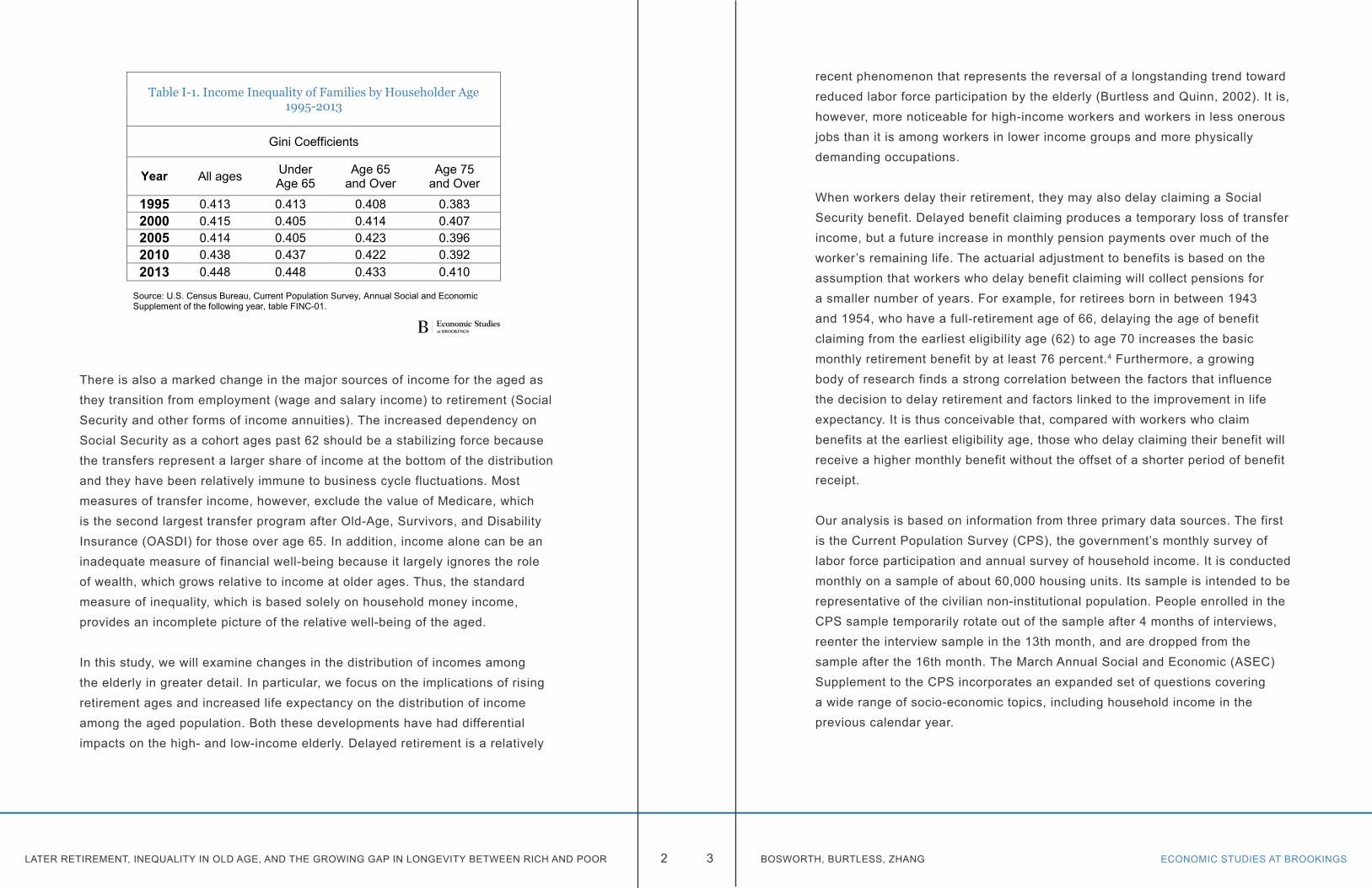
On the other hand, incomes vary widely across aged households with dispersion equal or greater than for younger households, a result that seems surprising given the highly progressive structure of the Social Security system. With Social Security providing about half of their cash income, we might have expected a more dramatic compression of the distribution. Furthermore, as shown in Table I-1, the inequality of money incomes has increased over the past two decades among those aged 65 and older, albeit by less than among those below age 65.2 It has been driven by many of the same factors that exacerbated the inequality among younger households—in particular, widening disparity in the distribution of earnings.3 The disparity in wages during the working years leads to greater differences in pensions and other forms of wealth accumulation for retirement.
Chapter 1. Introduction
Table IV-6
Table IV-6a
Figure IV-1
LATER RETIREMENT, INEQUALITY IN OLD AGE, AND THE GROWING GAP IN LONGEVITY BETWEEN RICH AND POOR ECONOMIC STUDIES AT BROOKINGS2 3 BOSWORTH, BURTLESS, ZHANG
There is also a marked change in the major sources of income for the aged as they transition from employment (wage and salary income) to retirement (Social Security and other forms of income annuities). The increased dependency on Social Security as a cohort ages past 62 should be a stabilizing force because the transfers represent a larger share of income at the bottom of the distribution and they have been relatively immune to business cycle fluctuations. Most measures of transfer income, however, exclude the value of Medicare, which is the second largest transfer program after Old-Age, Survivors, and Disability Insurance (OASDI) for those over age 65. In addition, income alone can be an inadequate measure of financial well-being because it largely ignores the role of wealth, which grows relative to income at older ages. Thus, the standard measure of inequality, which is based solely on household money income, provides an incomplete picture of the relative well-being of the aged.
In this study, we will examine changes in the distribution of incomes among the elderly in greater detail. In particular, we focus on the implications of rising retirement ages and increased life expectancy on the distribution of income among the aged population. Both these developments have had differential impacts on the high- and low-income elderly. Delayed retirement is a relatively
Table I-1. Income Inequality of Families by Householder Age 1995-2013
Gini Coefficients
Year All ages Under Age 65
Age 65 and Over
Age 75and Over
1995 0.413 0.413 0.408 0.3832000 0.415 0.405 0.414 0.4072005 0.414 0.405 0.423 0.3962010 0.438 0.437 0.422 0.3922013 0.448 0.448 0.433 0.410
Source: U.S. Census Bureau, Current Population Survey, Annual Social and Economic Supplement of the following year, table FINC-01.
recent phenomenon that represents the reversal of a longstanding trend toward reduced labor force participation by the elderly (Burtless and Quinn, 2002). It is, however, more noticeable for high-income workers and workers in less onerous jobs than it is among workers in lower income groups and more physically demanding occupations.
When workers delay their retirement, they may also delay claiming a Social Security benefit. Delayed benefit claiming produces a temporary loss of transfer income, but a future increase in monthly pension payments over much of the worker’s remaining life. The actuarial adjustment to benefits is based on the assumption that workers who delay benefit claiming will collect pensions for a smaller number of years. For example, for retirees born in between 1943 and 1954, who have a full-retirement age of 66, delaying the age of benefit claiming from the earliest eligibility age (62) to age 70 increases the basic monthly retirement benefit by at least 76 percent.4 Furthermore, a growing body of research finds a strong correlation between the factors that influence the decision to delay retirement and factors linked to the improvement in life expectancy. It is thus conceivable that, compared with workers who claim benefits at the earliest eligibility age, those who delay claiming their benefit will receive a higher monthly benefit without the offset of a shorter period of benefit receipt.
Our analysis is based on information from three primary data sources. The first is the Current Population Survey (CPS), the government’s monthly survey of labor force participation and annual survey of household income. It is conducted monthly on a sample of about 60,000 housing units. Its sample is intended to be representative of the civilian non-institutional population. People enrolled in the CPS sample temporarily rotate out of the sample after 4 months of interviews, reenter the interview sample in the 13th month, and are dropped from the sample after the 16th month. The March Annual Social and Economic (ASEC) Supplement to the CPS incorporates an expanded set of questions covering a wide range of socio-economic topics, including household income in the previous calendar year.
LATER RETIREMENT, INEQUALITY IN OLD AGE, AND THE GROWING GAP IN LONGEVITY BETWEEN RICH AND POOR ECONOMIC STUDIES AT BROOKINGS4 5 BOSWORTH, BURTLESS, ZHANG
The second main data set we use is the Health and Retirement Study (HRS). It is a smaller longitudinal survey, currently interviewing about 30,000 individuals, that focuses on the population over age 50. Through a series of repeated biennial interviews, the HRS has accumulated a large volume of information on longitudinal changes in the economic, health, and employment status of its aged sample members. The original wave of enrollees, born between 1931 and 1940, has been interviewed eleven times through 2012. Third, we also have had access to the ongoing earnings and benefit records of the Social Security administration for a representative sample of households that were included in the Surveys of Income and Program Participation (SIPP) for the 1984, 1993, 1996, 2001, and 2004 panels. We use those records for individuals born between 1910 and 1950. One objective of our study is to compare the results of the analysis across all three data sources as a test of the consistency of the research results.
In Part II, we examine several aspects of the transition from employment to retirement. Average retirement ages have been rising, both among women and men, since the early 1990s. Who is delaying retirement and what are the reasons they do so? Is the trend the result of inadequate financial resources and older workers’ continued need for labor income? Or is it the happy result of improvements in health, rising life expectancy, and the declining physical requirements of paid work?
Part III examines trends in inequality among the aged, and the ways that it has been influenced by changes in retirement patterns and differential rates of mortality. We use money income data from the CPS and comparable data from the HRS to calculate trends in old-age income inequality using alternative measures of income and inequality. The economic resources of the elderly differ in important respects from those available to younger households. Two major differences are the existence of a national health program for Americans past 65 (Medicare), and the much greater importance of accumulated wealth. Both these factors are ignored in conventional income measures. We explore the implications for the distributional measures by adding the money value of health insurance and the annuitized value of financial wealth to the conventional
definition of money income. Has income inequality among the aged followed the trend among younger households?
In Part IV, we focus on the implications of the increase in life expectancy. In particular, we explore the finding of a growing number of studies that recent life span gains have been greater at the top of the income and education distributions than at the bottom. The fact that mortality differences between rich and poor may be increasing pushes us to reconsider the equity of benefit flows to the aged. Social insurance benefits such as Medicare and Social Security begin at a fixed age, either 62 or 65. If gains in longevity are concentrated on the well-to-do, affluent Americans will derive an outsized share of the gains in lifetime benefits associated with longer life spans. An increase in the retirement age may be seen as an appropriate response to general increases in life expectancy, but when the gains are limited to those at the top of the distribution, it seems unfair to lower-income workers whose life expectancy may be constant or falling.
Trends in differential mortality uncovered in recent research raise profound questions about the equity of old-age pension formulas. The Social Security retirement-worker pension provides a basic benefit at the normal retirement age, known as the Primary Insurance Amount or PIA. The formula for this pension is highly redistributive. It provides a more generous replacement rate for low-lifetime-wage workers than for workers with high average earnings. This kind of redistribution may be necessary to compensate low-wage workers for their shorter expected life spans. Differences in mortality mean that, for any given age at which benefits are claimed, high-wage workers can expect to collect benefits longer than low-wage workers who claim benefits at the same age. If gains in expected life spans are increasingly concentrated among high-wage workers, we may not want to ask less affluent workers to bear a large share of the financial burden of an aging society. A common suggestion to deal with funding shortfalls in Social Security and Medicare is to lift the age of eligibility for benefits. This policy would make sense if the gain in expected life spans is enjoyed equally by rich and poor alike. It seems less equitable to ask low-wage
ECONOMIC STUDIES AT BROOKINGS7 BOSWORTH, BURTLESS, ZHANGLATER RETIREMENT, INEQUALITY IN OLD AGE, AND THE GROWING GAP IN LONGEVITY BETWEEN RICH AND POOR 6
workers to wait longer for retirement benefits when a disproportionate share of the gain in life expectancy has been enjoyed by the affluent.
Part IV examines mortality in two large national surveys, the HRS and the SIPP. These have been matched to Social Security administrative files on worker earnings, retirement and other kinds of monthly benefits, and dates of death. After estimating mortality patterns in these files, we use the results to assess the implications of widening mortality differentials for lifetime benefits payable to high-income and low-income workers.
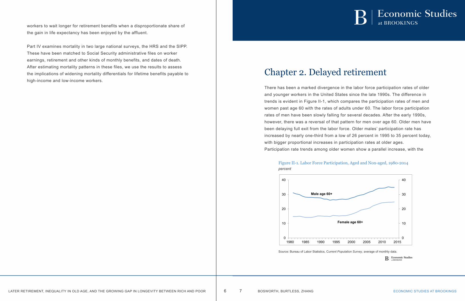
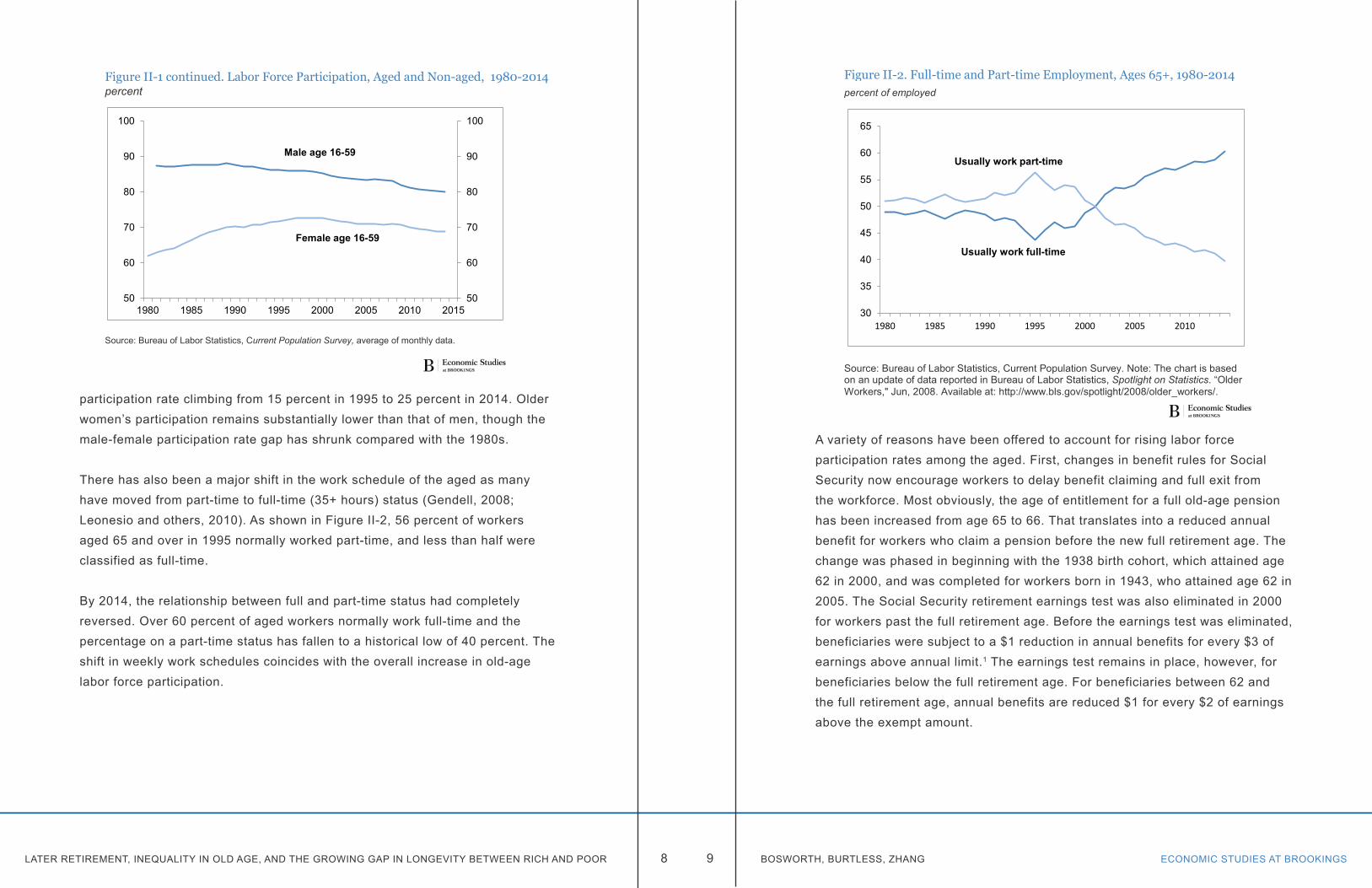
There has been a marked divergence in the labor force participation rates of older and younger workers in the United States since the late 1990s. The difference in trends is evident in Figure II-1, which compares the participation rates of men and women past age 60 with the rates of adults under 60. The labor force participation rates of men have been slowly falling for several decades. After the early 1990s, however, there was a reversal of that pattern for men over age 60. Older men have been delaying full exit from the labor force. Older males’ participation rate has increased by nearly one-third from a low of 26 percent in 1995 to 35 percent today, with bigger proportional increases in participation rates at older ages. Participation rate trends among older women show a parallel increase, with the
Chapter 2. Delayed retirement
Figure II-1. Labor Force Participation, Aged and Non-aged, 1980-2014percent
Source: Bureau of Labor Statistics, Current Population Survey, average of monthly data.
Figure II-1 continued. Labor Force Participation, Aged and Non-aged, 1980-2014percent
Source: Bureau of Labor Statistics, Current Population Survey, average of monthly data.
0
10
20
30
40
0
10
20
30
40
1980 1985 1990 1995 2000 2005 2010 2015
Female age 60+
Male age 60+
50
60
70
80
90
100
50
60
70
80
90
100
1980 1985 1990 1995 2000 2005 2010 2015
Male age 16-59
Female age 16-59
LATER RETIREMENT, INEQUALITY IN OLD AGE, AND THE GROWING GAP IN LONGEVITY BETWEEN RICH AND POOR ECONOMIC STUDIES AT BROOKINGS8 9 BOSWORTH, BURTLESS, ZHANG
participation rate climbing from 15 percent in 1995 to 25 percent in 2014. Older women’s participation remains substantially lower than that of men, though the male-female participation rate gap has shrunk compared with the 1980s.
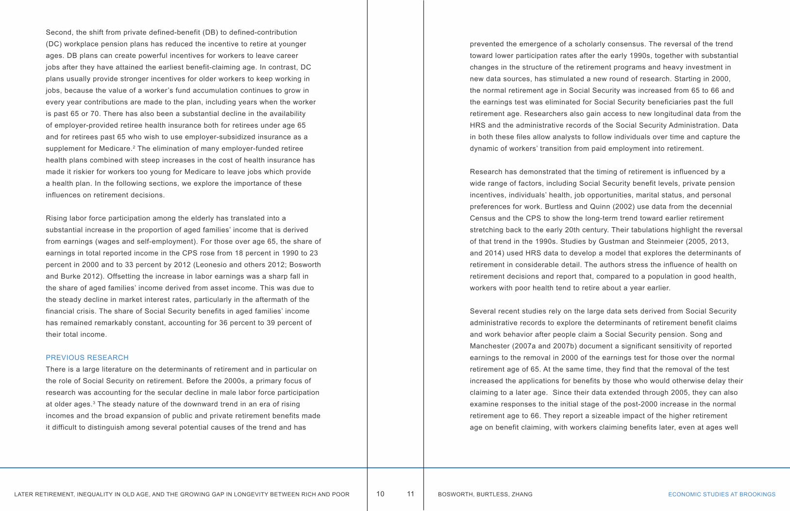
There has also been a major shift in the work schedule of the aged as many have moved from part-time to full-time (35+ hours) status (Gendell, 2008; Leonesio and others, 2010). As shown in Figure II-2, 56 percent of workers aged 65 and over in 1995 normally worked part-time, and less than half were classified as full-time.
By 2014, the relationship between full and part-time status had completely reversed. Over 60 percent of aged workers normally work full-time and the percentage on a part-time status has fallen to a historical low of 40 percent. The shift in weekly work schedules coincides with the overall increase in old-age labor force participation.
Figure II-1. Labor Force Participation, Aged and Non-aged, 1980-2014percent
Source: Bureau of Labor Statistics, Current Population Survey, average of monthly data.
Figure II-1 continued. Labor Force Participation, Aged and Non-aged, 1980-2014percent
Source: Bureau of Labor Statistics, Current Population Survey, average of monthly data.
0
10
20
30
40
0
10
20
30
40
1980 1985 1990 1995 2000 2005 2010 2015
Female age 60+
Male age 60+
50
60
70
80
90
100
50
60
70
80
90
100
1980 1985 1990 1995 2000 2005 2010 2015
Male age 16-59
Female age 16-59
A variety of reasons have been offered to account for rising labor force participation rates among the aged. First, changes in benefit rules for Social Security now encourage workers to delay benefit claiming and full exit from the workforce. Most obviously, the age of entitlement for a full old-age pension has been increased from age 65 to 66. That translates into a reduced annual benefit for workers who claim a pension before the new full retirement age. The change was phased in beginning with the 1938 birth cohort, which attained age 62 in 2000, and was completed for workers born in 1943, who attained age 62 in 2005. The Social Security retirement earnings test was also eliminated in 2000 for workers past the full retirement age. Before the earnings test was eliminated, beneficiaries were subject to a $1 reduction in annual benefits for every $3 of earnings above annual limit.1 The earnings test remains in place, however, for beneficiaries below the full retirement age. For beneficiaries between 62 and the full retirement age, annual benefits are reduced $1 for every $2 of earnings above the exempt amount.
Figure II-2. Full-time and Part-time Employment, Ages 65+, 1980-2014percent of employed
Source: Bureau of Labor Statistics, Current Population Survey. Note: The chart is based on an update of data reported in Bureau of Labor Statistics, Spotlight on Statistics. “Older Workers," Jun, 2008. Available at: http://www.bls.gov/spotlight/2008/older_workers/.
30
35
40
45
50
55
60
65
1980 1985 1990 1995 2000 2005 2010
Usually work full-time
Usually work part-time
LATER RETIREMENT, INEQUALITY IN OLD AGE, AND THE GROWING GAP IN LONGEVITY BETWEEN RICH AND POOR ECONOMIC STUDIES AT BROOKINGS10 11 BOSWORTH, BURTLESS, ZHANG
Second, the shift from private defined-benefit (DB) to defined-contribution (DC) workplace pension plans has reduced the incentive to retire at younger ages. DB plans can create powerful incentives for workers to leave career jobs after they have attained the earliest benefit-claiming age. In contrast, DC plans usually provide stronger incentives for older workers to keep working in jobs, because the value of a worker’s fund accumulation continues to grow in every year contributions are made to the plan, including years when the worker is past 65 or 70. There has also been a substantial decline in the availability of employer-provided retiree health insurance both for retirees under age 65 and for retirees past 65 who wish to use employer-subsidized insurance as a supplement for Medicare.2 The elimination of many employer-funded retiree health plans combined with steep increases in the cost of health insurance has made it riskier for workers too young for Medicare to leave jobs which provide a health plan. In the following sections, we explore the importance of these influences on retirement decisions.
Rising labor force participation among the elderly has translated into a substantial increase in the proportion of aged families’ income that is derived from earnings (wages and self-employment). For those over age 65, the share of earnings in total reported income in the CPS rose from 18 percent in 1990 to 23 percent in 2000 and to 33 percent by 2012 (Leonesio and others 2012; Bosworth and Burke 2012). Offsetting the increase in labor earnings was a sharp fall in the share of aged families’ income derived from asset income. This was due to the steady decline in market interest rates, particularly in the aftermath of the financial crisis. The share of Social Security benefits in aged families’ income has remained remarkably constant, accounting for 36 percent to 39 percent of their total income.
PREVIOUS RESEARCHThere is a large literature on the determinants of retirement and in particular on the role of Social Security on retirement. Before the 2000s, a primary focus of research was accounting for the secular decline in male labor force participation at older ages.3 The steady nature of the downward trend in an era of rising incomes and the broad expansion of public and private retirement benefits made it difficult to distinguish among several potential causes of the trend and has
prevented the emergence of a scholarly consensus. The reversal of the trend toward lower participation rates after the early 1990s, together with substantial changes in the structure of the retirement programs and heavy investment in new data sources, has stimulated a new round of research. Starting in 2000, the normal retirement age in Social Security was increased from 65 to 66 and the earnings test was eliminated for Social Security beneficiaries past the full retirement age. Researchers also gain access to new longitudinal data from the HRS and the administrative records of the Social Security Administration. Data in both these files allow analysts to follow individuals over time and capture the dynamic of workers’ transition from paid employment into retirement.
Research has demonstrated that the timing of retirement is influenced by a wide range of factors, including Social Security benefit levels, private pension incentives, individuals’ health, job opportunities, marital status, and personal preferences for work. Burtless and Quinn (2002) use data from the decennial Census and the CPS to show the long-term trend toward earlier retirement stretching back to the early 20th century. Their tabulations highlight the reversal of that trend in the 1990s. Studies by Gustman and Steinmeier (2005, 2013, and 2014) used HRS data to develop a model that explores the determinants of retirement in considerable detail. The authors stress the influence of health on retirement decisions and report that, compared to a population in good health, workers with poor health tend to retire about a year earlier.
Several recent studies rely on the large data sets derived from Social Security administrative records to explore the determinants of retirement benefit claims and work behavior after people claim a Social Security pension. Song and Manchester (2007a and 2007b) document a significant sensitivity of reported earnings to the removal in 2000 of the earnings test for those over the normal retirement age of 65. At the same time, they find that the removal of the test increased the applications for benefits by those who would otherwise delay their claiming to a later age. Since their data extended through 2005, they can also examine responses to the initial stage of the post-2000 increase in the normal retirement age to 66. They report a sizeable impact of the higher retirement age on benefit claiming, with workers claiming benefits later, even at ages well
LATER RETIREMENT, INEQUALITY IN OLD AGE, AND THE GROWING GAP IN LONGEVITY BETWEEN RICH AND POOR ECONOMIC STUDIES AT BROOKINGS12 13 BOSWORTH, BURTLESS, ZHANG
below the new normal retirement age.
Gorodnichendo, Song, and Stolyarov (2013) use the administrative earnings records to classify individuals as fully employed, partially employed, or retired. They define a worker as “partially retired” if the worker earns less than 50 percent of his or her maximum career earnings. The proportion of people classified as retired or partially retired in the age range from 60 to 65 rose substantially between 1960 and 1990, but it has stabilized in recent years. At older ages the researchers find a clear rise in employment rates. Notably, the probability of remaining in full employment has risen sharply for 67 year olds. On the other hand, they find a substantially higher rate of early full retirement among workers who have low career earnings, defined as average earnings between ages 25 and 54. Finally, the analysts find that the retirement decision is highly sensitive to the economy-wide unemployment rate, with retirements occurring at younger ages when the jobless rate is high. The rising probability of partial retirement seems inconsistent with our tabulations of the CPS, which show a shift toward full-time work. However, the concept of “fully employed” and “full-time work” are not the same. The partially retired are defined on the basis of their earnings, whereas the part-time/full-time distinction is based on hours worked.
A third research study by Card, Maestas, and Purcell (2014) uses the Social Security administrative data to array individuals by birth cohort and then computes the fraction of each cohort initiating benefit claims at successive ages. While age 62 has long been and remains the most common claiming age, its frequency has slowly declined in successive cohorts. The proportion of workers who claim Social Security at the normal retirement age or later has increased to nearly 50 percent.4 Card et al. then tabulate workers’ earnings over the age range from 57 to 70 and show a pattern of large systematic declines in earnings between ages 57 and 61 for those who claim benefits at age 62. Workers who claim benefits at ages 62, 63, and 64 who are not already retired also exit the work force relatively quickly within a year or two after claiming their pensions. This pattern of early retirement is consistent with the buildup of a substantial number of workers who wish to retire before age 62 for a variety of
reasons (including poor health and underemployment), but who cannot afford to stop working without replacement income from Social Security.5 In contrast, late benefit-claimers have only modest earnings slumps prior to claiming and many continue to have substantial earnings in years after their benefits begin.
LABOR FORCE PARTICIPATIONBased on our analysis of the CPS files, we believe a large part of the increase in the participation rate of older Americans can be traced to changes in the composition of the older population. In particular, the composition of the 60-74 year-old population has shifted away from high school dropouts and toward college attendees and graduates (Blau and Goldstein 2010; and Burtless 2013a). The shift is particularly marked in the case of men. Workers with higher levels of education have better paying and more enjoyable jobs, and they tend to remain in the workforce longer than those with less schooling. This was true in the 1980s and early 1990s when early retirement was more common, and it remains true today. The educational attainment of successive cohorts of workers increased substantially throughout the 20th century, even though this trend slowed abruptly for men after the baby-boom generation completed its schooling. Between 1985 and 2013, the proportion of the population between age 60 and 74 with less than a high school education fell from 42 to 12 percent; the fraction with at least a college diploma rose from 11 to 30 percent.
Figure II-3 shows changes in the labor force participation rate of 60-74 year-old men and women between 1985 and 2013. The chart shows the separate contributions of changes in the age composition and the distribution of educational attainment in this population. The labor force participation rate for men age 60-74 increased by 8.7 percentage points between 1985 and 2013 (compare the left-hand and right-had bars in the top panel of the chart). The second bar shows the predicted male participation rate in 2013 assuming that the only factor that changed was the age distribution of men in the 60-74 year-old age group. This bar shows that the male participation rate in the age group would have increased 0.5 percentage points between 1985 and 2013, from 34.9 percent to 35.4 percent, solely because of an age shift toward somewhat younger workers. The third bar shows the much larger effect on male

LATER RETIREMENT, INEQUALITY IN OLD AGE, AND THE GROWING GAP IN LONGEVITY BETWEEN RICH AND POOR ECONOMIC STUDIES AT BROOKINGS14 15 BOSWORTH, BURTLESS, ZHANG
participation arising from changes in older men’s educational attainment.
We estimate that rising school attainment boosted the participation rate of older men by 4.6 percentage points, from 35.4 percent to 41.0 percent. Thus, over half of the overall 8.7-percentage-point rise in the participation rate of older men was due to compositional changes within the 60-74 year-old population. Changes in the age and educational composition of women had very similar
Figure II-3. Evolution of Labor Force Participation Rates, Age 60-74,
1985 to 2013
Source: Authors' calculations from the 1985-2013 CPS. Note: Predicted rates assume that participation rates remain constant at 1985 values for three age groups (60-64, 65-69, and 70-74), and then for age and four education groups (less than high school, high school, some college, and college).
34.9% 35.4%
41.0%
43.6%
32%
36%
40%
44%
ACTUAL LFP AGE ONLY AGE AND EDUC ACTUAL LFP1985 1985 1985 2013
Men
19.9% 20.7%
24.5%
34.4%
18%
22%
26%
30%
34%
ACTUAL LFP AGE ONLY AGE AND EDUC ACTUAL LFP1985 1985 1985 2013
Women
effects on the labor force participation rate of those aged 60-74 (lower panel). Because older women’s participation rate increased much faster than that of men, the compositional shifts account for a smaller proportion of the overall change.
Improvements in the educational attainment of the aged will slow substantially in future years. For men in particular, the gap between the educational attainment of 60-74 year-olds and younger prime-age males has become much smaller. The improvement in educational attainment by successive cohorts of women has continued, however, and the youngest cohorts now have levels of education well above those of men the same age. Nonetheless, the education attainment gap across age cohorts of women is narrowing. The future slowdown in gains of educational attainment among 60-74 year-olds should lead to a slowing of the trend toward later retirement.
SOCIAL SECURITY RECORDSThe administrative records of Social Security provide a crucial source of information on retirement patterns. We had access to the earnings and benefit records of most respondents to the SIPP for survey waves begun in selected years between 1984 and 2004. The administrative records are of enormous research value because of the historical information they provide on the earrings of individuals over their full work life and on the size and timing of their Social Security benefits. The link to the SIPP provides additional information on a wide range of social, economic, and health characteristics.
The matched SIPP-SSA record sample gives us information about 43,000 men and 47,000 women who have at least one year of earnings.6 A detailed description of the data sample is provided in Appendix A. In our evaluation of changes in the pattern of retirements, we focus on the age at which individuals first claim a benefit and the age at which they leave the labor force as measured by the last year of their reported earnings. We use data covering the birth cohorts of 1910 to 1950. Respondents’ earnings and benefit records cover calendar years up through 2012. This means we have benefit data extending up through age 70 only for SIPP respondents born in 1942 and earlier years. In the
LATER RETIREMENT, INEQUALITY IN OLD AGE, AND THE GROWING GAP IN LONGEVITY BETWEEN RICH AND POOR ECONOMIC STUDIES AT BROOKINGS16 17 BOSWORTH, BURTLESS, ZHANG
analysis described immediately below we exclude workers who claim DI benefits in order to focus on the behavior of the nondisabled. Two critical birth cohorts are 1937, the last cohort with a full retirement age of 65, and 1943, the first cohort with a full retirement age of 66. In the transitional years, the retirement age increased by two months each year.
The administrative data plainly show that the age at which people stop working and the age at which they begin to receive benefits represent quite distinct milestones. First-time retirement benefit claiming is strongly clustered at the earliest eligibility age (62) and at the age for full retirement benefits (now 66). The ages at which people stop working, however, are much more diverse. Even when we exclude the disabled, we can easily identify a group of workers who struggle to earn modest incomes before the early eligibility age (EEA). At older ages, other workers continue to work beyond the full retirement age (FRA). A substantial number of individuals both receive a benefit and continue to engage in significant employment. We can use the SSA earnings data to construct a measure of average career earnings (an indicator of permanent income) in order to determine whether workers who delay benefit claiming or continue working are more likely to be in the top parts of the income distribution or to have high levels of schooling. We find that late benefit claimers and workers who exit the labor force later tend to have higher than average career earnings. That finding seems inconsistent with the common view that delayed retirement is mainly the result of inadequate retirement income.
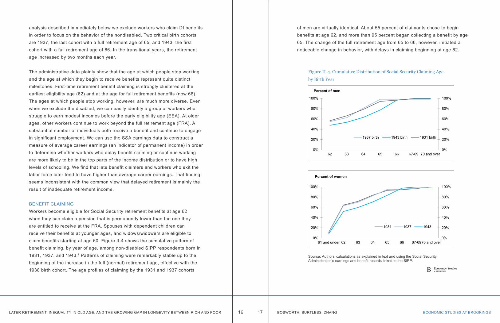
BENEFIT CLAIMINGWorkers become eligible for Social Security retirement benefits at age 62 when they can claim a pension that is permanently lower than the one they are entitled to receive at the FRA. Spouses with dependent children can receive their benefits at younger ages, and widows/widowers are eligible to claim benefits starting at age 60. Figure II-4 shows the cumulative pattern of benefit claiming, by year of age, among non-disabled SIPP respondents born in 1931, 1937, and 1943.7 Patterns of claiming were remarkably stable up to the beginning of the increase in the full (normal) retirement age, effective with the 1938 birth cohort. The age profiles of claiming by the 1931 and 1937 cohorts
of men are virtually identical. About 55 percent of claimants chose to begin benefits at age 62, and more than 95 percent began collecting a benefit by age 65. The change of the full retirement age from 65 to 66, however, initiated a noticeable change in behavior, with delays in claiming beginning at age 62.
Figure II-4. Cumulative Distribution of Social Security Claiming Age
by Birth Year
Source: Authors' calculations as explained in text and using the Social SecurityAdministration's earnings and benefit records linked to the SIPP.
0%
20%
40%
60%
80%
100%
0%
20%
40%
60%
80%
100%
62 63 64 65 66 67-69 70 and over
1937 birth 1943 birth 1931 birth
Percent of men
0%
20%
40%
60%
80%
100%
0%
20%
40%
60%
80%
100%
61 and under 62 63 64 65 66 67-6970 and over
1931 1937 1943
Percent of women
LATER RETIREMENT, INEQUALITY IN OLD AGE, AND THE GROWING GAP IN LONGEVITY BETWEEN RICH AND POOR ECONOMIC STUDIES AT BROOKINGS18 19 BOSWORTH, BURTLESS, ZHANG
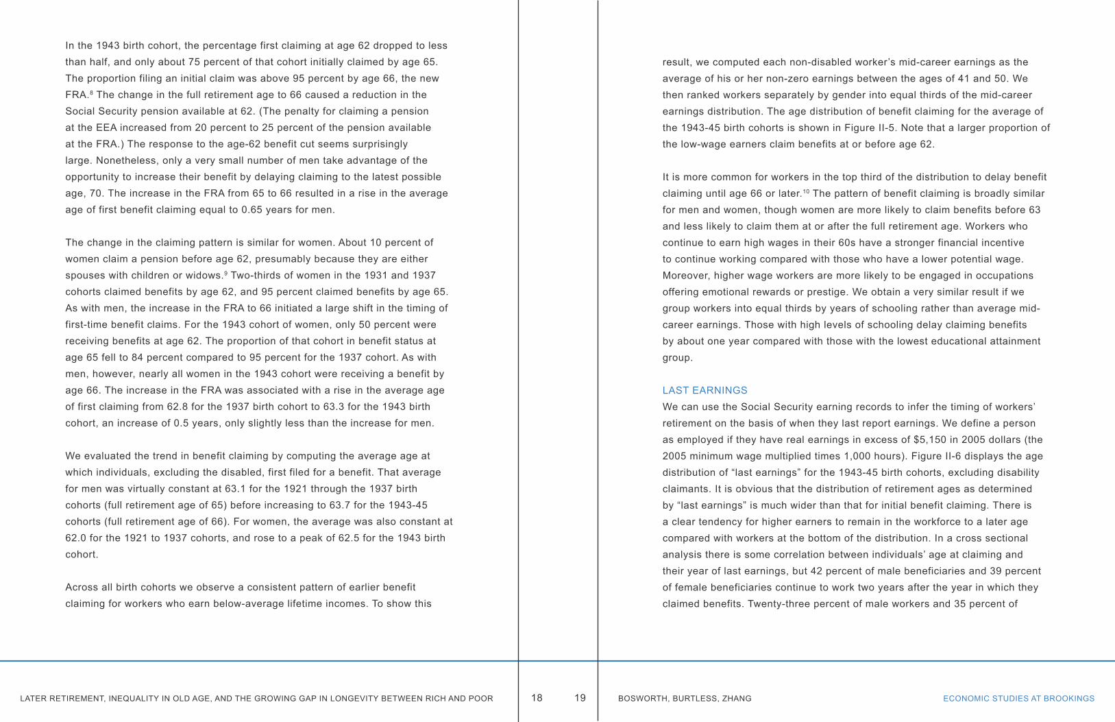
In the 1943 birth cohort, the percentage first claiming at age 62 dropped to less than half, and only about 75 percent of that cohort initially claimed by age 65. The proportion filing an initial claim was above 95 percent by age 66, the new FRA.8 The change in the full retirement age to 66 caused a reduction in the Social Security pension available at 62. (The penalty for claiming a pension at the EEA increased from 20 percent to 25 percent of the pension available at the FRA.) The response to the age-62 benefit cut seems surprisingly large. Nonetheless, only a very small number of men take advantage of the opportunity to increase their benefit by delaying claiming to the latest possible age, 70. The increase in the FRA from 65 to 66 resulted in a rise in the average age of first benefit claiming equal to 0.65 years for men.
The change in the claiming pattern is similar for women. About 10 percent of women claim a pension before age 62, presumably because they are either spouses with children or widows.9 Two-thirds of women in the 1931 and 1937 cohorts claimed benefits by age 62, and 95 percent claimed benefits by age 65. As with men, the increase in the FRA to 66 initiated a large shift in the timing of first-time benefit claims. For the 1943 cohort of women, only 50 percent were receiving benefits at age 62. The proportion of that cohort in benefit status at age 65 fell to 84 percent compared to 95 percent for the 1937 cohort. As with men, however, nearly all women in the 1943 cohort were receiving a benefit by age 66. The increase in the FRA was associated with a rise in the average age of first claiming from 62.8 for the 1937 birth cohort to 63.3 for the 1943 birth cohort, an increase of 0.5 years, only slightly less than the increase for men.
We evaluated the trend in benefit claiming by computing the average age at which individuals, excluding the disabled, first filed for a benefit. That average for men was virtually constant at 63.1 for the 1921 through the 1937 birth cohorts (full retirement age of 65) before increasing to 63.7 for the 1943-45 cohorts (full retirement age of 66). For women, the average was also constant at 62.0 for the 1921 to 1937 cohorts, and rose to a peak of 62.5 for the 1943 birth cohort.
Across all birth cohorts we observe a consistent pattern of earlier benefit claiming for workers who earn below-average lifetime incomes. To show this
result, we computed each non-disabled worker’s mid-career earnings as the average of his or her non-zero earnings between the ages of 41 and 50. We then ranked workers separately by gender into equal thirds of the mid-career earnings distribution. The age distribution of benefit claiming for the average of the 1943-45 birth cohorts is shown in Figure II-5. Note that a larger proportion of the low-wage earners claim benefits at or before age 62.
It is more common for workers in the top third of the distribution to delay benefit claiming until age 66 or later.10 The pattern of benefit claiming is broadly similar for men and women, though women are more likely to claim benefits before 63 and less likely to claim them at or after the full retirement age. Workers who continue to earn high wages in their 60s have a stronger financial incentive to continue working compared with those who have a lower potential wage. Moreover, higher wage workers are more likely to be engaged in occupations offering emotional rewards or prestige. We obtain a very similar result if we group workers into equal thirds by years of schooling rather than average mid-career earnings. Those with high levels of schooling delay claiming benefits by about one year compared with those with the lowest educational attainment group.
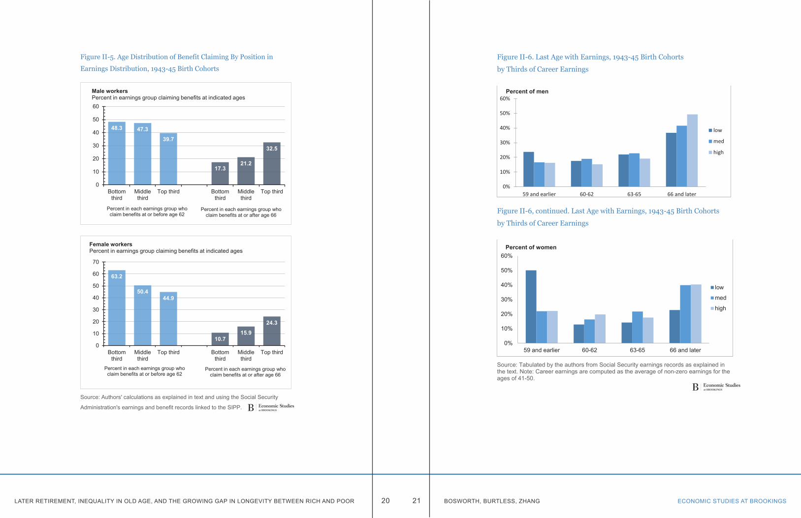
LAST EARNINGSWe can use the Social Security earning records to infer the timing of workers’ retirement on the basis of when they last report earnings. We define a person as employed if they have real earnings in excess of $5,150 in 2005 dollars (the 2005 minimum wage multiplied times 1,000 hours). Figure II-6 displays the age distribution of “last earnings” for the 1943-45 birth cohorts, excluding disability claimants. It is obvious that the distribution of retirement ages as determined by “last earnings” is much wider than that for initial benefit claiming. There is a clear tendency for higher earners to remain in the workforce to a later age compared with workers at the bottom of the distribution. In a cross sectional analysis there is some correlation between individuals’ age at claiming and their year of last earnings, but 42 percent of male beneficiaries and 39 percent of female beneficiaries continue to work two years after the year in which they claimed benefits. Twenty-three percent of male workers and 35 percent of
LATER RETIREMENT, INEQUALITY IN OLD AGE, AND THE GROWING GAP IN LONGEVITY BETWEEN RICH AND POOR ECONOMIC STUDIES AT BROOKINGS20 21 BOSWORTH, BURTLESS, ZHANG
Figure II-5. Age Distribution of Benefit Claiming By Position in
Earnings Distribution, 1943-45 Birth Cohorts
Source: Authors' calculations as explained in text and using the Social Security
Administration's earnings and benefit records linked to the SIPP.
48.3 47.3
39.7
17.321.2
32.5
0
10
20
30
40
50
60
Bottomthird
Middlethird
Top third Bottomthird
Middlethird
Top third
Male workers Percent in earnings group claiming benefits at indicated ages
Percent in each earnings group who claim benefits at or before age 62
Percent in each earnings group who claim benefits at or after age 66
63.2
50.444.9
10.715.9
24.3
0
10
20
30
40
50
60
70
Bottomthird
Middlethird
Top third Bottomthird
Middlethird
Top third
Female workersPercent in earnings group claiming benefits at indicated ages
Percent in each earnings group who claim benefits at or before age 62
Percent in each earnings group who claim benefits at or after age 66
Figure II-6. Last Age with Earnings, 1943-45 Birth Cohorts
by Thirds of Career Earnings
Figure II-6, continued. Last Age with Earnings, 1943-45 Birth Cohorts
by Thirds of Career Earnings
Source: Tabulated by the authors from Social Security earnings records as explained in the text. Note: Career earnings are computed as the average of non-zero earnings for the ages of 41-50.
0%
10%
20%
30%
40%
50%
60%
59 and earlier 60-62 63-65 66 and later
low
med
high
Percent of men
0%
10%
20%
30%
40%
50%
60%
59 and earlier 60-62 63-65 66 and later
low
med
high
Percent of women
LATER RETIREMENT, INEQUALITY IN OLD AGE, AND THE GROWING GAP IN LONGEVITY BETWEEN RICH AND POOR ECONOMIC STUDIES AT BROOKINGS22 23 BOSWORTH, BURTLESS, ZHANG
female workers terminated their employment two years before the year in which they first claimed a benefit. It is particularly striking that a large proportion of men and women have a final year of employment that is well before the earliest age for claiming a benefit, and this fraction is particularly high for workers in the lowest one-third of the distribution of mid-career earnings.11 A quarter of men and nearly half of women in the bottom one-third of the mid-career earnings distribution have permanently left the workforce before attaining age 60. It might seem tempting to attribute the early labor force exits to disability, but we have excluded workers who receive DI benefits from these tabulations.
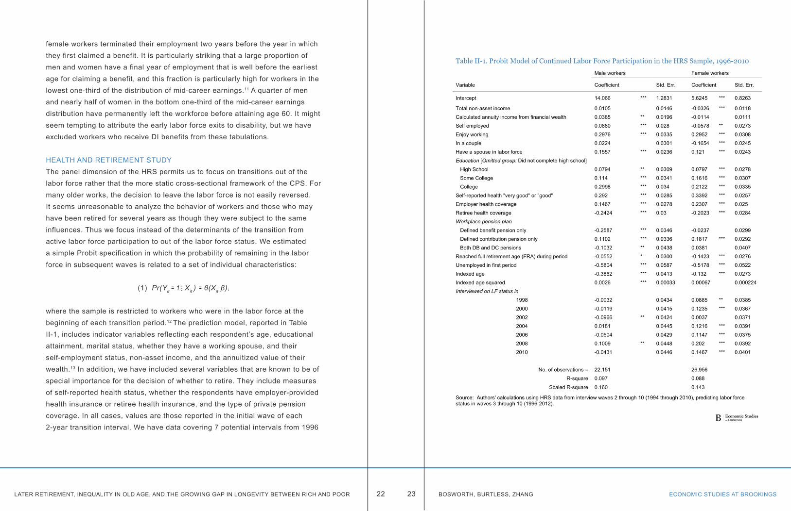
HEALTH AND RETIREMENT STUDYThe panel dimension of the HRS permits us to focus on transitions out of the labor force rather that the more static cross-sectional framework of the CPS. For many older works, the decision to leave the labor force is not easily reversed. It seems unreasonable to analyze the behavior of workers and those who may have been retired for several years as though they were subject to the same influences. Thus we focus instead of the determinants of the transition from active labor force participation to out of the labor force status. We estimated a simple Probit specification in which the probability of remaining in the labor force in subsequent waves is related to a set of individual characteristics:
(1) Pr(Yit ꞊ 1 Xit ) ꞊ θ(X it β),
where the sample is restricted to workers who were in the labor force at the beginning of each transition period.12 The prediction model, reported in Table II-1, includes indicator variables reflecting each respondent’s age, educational attainment, marital status, whether they have a working spouse, and their self-employment status, non-asset income, and the annuitized value of their wealth.13 In addition, we have included several variables that are known to be of special importance for the decision of whether to retire. They include measures of self-reported health status, whether the respondents have employer-provided health insurance or retiree health insurance, and the type of private pension coverage. In all cases, values are those reported in the initial wave of each 2-year transition interval. We have data covering 7 potential intervals from 1996
…
Table II-1. Probit Model of Continued Labor Force Participation in the HRS Sample, 1996-2010
Male workers Female workers
Variable Coefficient Std. Err. Coefficient Std. Err.
Intercept 14.066 *** 1.2831 5.6245 *** 0.8263
Total non-asset income 0.0105 0.0146 -0.0326 *** 0.0118
Calculated annuity income from financial wealth 0.0385 ** 0.0196 -0.0114 0.0111
Self employed 0.0880 *** 0.028 -0.0578 ** 0.0273
Enjoy working 0.2976 *** 0.0335 0.2952 *** 0.0308
In a couple 0.0224 0.0301 -0.1654 *** 0.0245
Have a spouse in labor force 0.1557 *** 0.0236 0.121 *** 0.0243Education [Omitted group: Did not complete high school]
High School 0.0794 ** 0.0309 0.0797 *** 0.0278
Some College 0.114 *** 0.0341 0.1616 *** 0.0307
College 0.2998 *** 0.034 0.2122 *** 0.0335
Self-reported health "very good" or "good" 0.292 *** 0.0285 0.3392 *** 0.0257
Employer health coverage 0.1467 *** 0.0278 0.2307 *** 0.025
Retiree health coverage -0.2424 *** 0.03 -0.2023 *** 0.0284Workplace pension plan
Defined benefit pension only -0.2587 *** 0.0346 -0.0237 0.0299
Defined contribution pension only 0.1102 *** 0.0336 0.1817 *** 0.0292
Both DB and DC pensions -0.1032 ** 0.0438 0.0381 0.0407
Reached full retirement age (FRA) during period -0.0552 * 0.0300 -0.1423 *** 0.0276
Unemployed in first period -0.5804 *** 0.0587 -0.5178 *** 0.0522
Indexed age -0.3862 *** 0.0413 -0.132 *** 0.0273
Indexed age squared 0.0026 *** 0.00033 0.00067 0.000224Interviewed on LF status in
1998 -0.0032 0.0434 0.0885 ** 0.0385
2000 -0.0119 0.0415 0.1235 *** 0.0367
2002 -0.0966 ** 0.0424 0.0037 0.0371
2004 0.0181 0.0445 0.1216 *** 0.0391
2006 -0.0504 0.0429 0.1147 *** 0.0375
2008 0.1009 ** 0.0448 0.202 *** 0.0392
2010 -0.0431 0.0446 0.1467 *** 0.0401
No. of observations = 22,151 26,956
R-square 0.097 0.088
Scaled R-square 0.160 0.143
Source: Authors' calculations using HRS data from interview waves 2 through 10 (1994 through 2010), predicting labor force status in waves 3 through 10 (1996-2012).

LATER RETIREMENT, INEQUALITY IN OLD AGE, AND THE GROWING GAP IN LONGEVITY BETWEEN RICH AND POOR ECONOMIC STUDIES AT BROOKINGS24 25 BOSWORTH, BURTLESS, ZHANG
to 2010. There are a total of about 49,000 observations for which the individual was initially in the workforce must make the binary decision of continuing to work or exiting the workforce.
In view of our earlier results it is not surprising that workers’ level of education has a strong influence on their decision to remain in the workforce. A high level of schooling attainment increases the probability a worker will remain in the labor force. Among males with average values of all of the variables except educational attainment, a male with a college degree is about 7 percentage points more likely to remain in the labor force compared with a male worker with less than a high school diploma. Among women the gap is about 5 percentage points. Workers who report that they are in good health and enjoy working are also much more liked to remain in the labor market. Both male and female respondents with mean values of the other independent variables are about 8 percentage points more likely to remain in the workforce if they enjoy working.
At these older ages, unemployment is very likely to trigger an exit from the workforce. Health insurance coverage as an employee or retiree also has strong influence on continued participation, and in the expected direction. We find no consistent effects of income on the labor force exit decisions. High levels of income encourage women to leave the workforce, but the effect is only significant for non-asset income. Non-asset income has a negative effect on the labor force decisions of men, but asset income has a positive effect.
It is also interesting to note that a worker’s enrollment in a defined-benefit pension plan encourages retirement, whereas enrollment in a defined-contribution plans has the opposite effect. Defined-benefit plans provide a lifetime benefit that is typically based on a worker’s years of service and final salary. Once the worker attains the early or standard eligibility age to begin collecting a pension, he or she sacrifices a year of pension benefits for each additional year of employment under the plan. It is frequently the case that the sacrifice of a year’s pension payment is bigger than gains the worker can obtain as a result of accumulating an additional year of service under the plan. In
those cases, the pension accrual acts as a disincentive rather than an incentive to continue working under the plan. In contrast, workers enrolled in defined-contribution plans continue to accrue increases in their pension wealth no matter how long they continue to work, so long as they remain enrolled in the plan. As a result the two kinds of plan offer long-service workers very different financial incentives for continued work.14

ECONOMIC STUDIES AT BROOKINGS27 BOSWORTH, BURTLESS, ZHANGLATER RETIREMENT, INEQUALITY IN OLD AGE, AND THE GROWING GAP IN LONGEVITY BETWEEN RICH AND POOR 26
Chapter 3. Rising old-age inequalityIn this section we examine trends in old-age inequality, in particular its connection to the trends toward wider wage disparities and later retirement. We use evidence on money income obtained in the Census Bureau’s annual CPS income survey supplemented with information from the HRS sample of older Americans to examine inequality among the elderly and within narrow age groups in the elderly population. We show how inequality within narrow subpopulations has changed over time and how inequality within individual birth cohorts shifts as birth cohorts grow older.
Money income inequality has increased considerably since the late 1970s. This is true for the U.S. population generally and also within narrower age groups. The growth of inequality has differed in the aged and nonaged populations, however. First, inequality has increased faster among the nonaged than among the aged. Second, at least in the lower half of the income distribution some measures of inequality now tend to decline with advancing age starting around age 62 when workers and their dependent spouses become eligible for early retired-worker benefits. When a birth cohort transitions from ages when labor income provides the bulk of its income to ages when Social Security and pensions provide most family income, families at the bottom of the income distribution see some improvement in their spendable incomes compared with the median family in their age group.
MEASURING INEQUALITYMoney income inequality has increased noticeably since 1979 (DeNavas-Walt and Proctor 2014, Table A-2). Although the amount of increase differs depending on the
measure of income used, there is little question that inequality has risen under virtually any measure of either pre-tax or post-tax income (U.S. Congressional Budget Office 2014). Figure III-1 shows the trend in overall inequality under three income measures, the Census Bureau’s household money income definition and the CBO’s estimates of pre-tax and post-tax household-size-adjusted income.
The Census Bureau’s inequality measure focuses solely on pre-tax cash income and makes no distinction between households based on the number of adults and children in the household. In contrast, the CBO uses more expansive definitions of pre-tax and post-tax incomes, ones that include in-kind benefits, such as health insurance, provided by employers and the government. In addition, the CBO tries to measure inequality at the personal level, with household incomes adjusted to reflect the number of members in each family
Figure III-1. Gini Coefficient of Income Inequality under Alternative Income Definitions, 1979-2013
Sources: U.S. Census Bureau, Historical income data, Table H-4, and CBO, The Distribution of Household Income and Federal Taxes, 2011 (November 2014).
0.30
0.35
0.40
0.45
0.50
0.55
1978 1982 1986 1990 1994 1998 2002 2006 2010 2014
Census money income
CBO before-tax income
CBO after-tax income
LATER RETIREMENT, INEQUALITY IN OLD AGE, AND THE GROWING GAP IN LONGEVITY BETWEEN RICH AND POOR ECONOMIC STUDIES AT BROOKINGS28 29 BOSWORTH, BURTLESS, ZHANG
and the economies of scale that larger families enjoy in consumption. In spite of the notable definitional and conceptual differences, all three measures show a similar proportional increase in income disparities since the late 1970s. Between 1979 and 2011 the Gini coefficient of inequality increased 18 percent under the Census Bureau’s money income measure and 19 percent and 22 percent, respectively, under CBO’s pre-tax and post-tax income definitions.
Theories to explain rising income disparities abound. One factor pushing up overall inequality has been the rise in labor income inequality (Burtless 1999; Daly and Valletta 2006). Workers at the bottom of the earnings distribution have seen negligible or even negative changes in their real earnings since 1980. Workers at the top have seen their real earnings climb, and nowhere has the ascent been faster than among the top 1 percent of earners. The trends primarily affect working-age breadwinners and their dependents, because labor income constitutes an overwhelming share of these families’ incomes. Rising earnings inequality can also boost inequality in old age to the extent that labor income inequality leads to increased inequality in family savings and breadwinners’ pension accumulations. Aged Americans are far more dependent on government transfers, including Social Security benefits, than are the nonaged. Since transfers tend to represent a larger percentage of the incomes of families with low incomes, the fact that public benefits for the aged have been largely protected over the past three decades means that incomes of the low-income elderly have fared better than those of low-income working-age adults and their dependents.
The comparative success of the aged in maintaining or improving their incomes is particularly noticeable when income is measured under a more comprehensive income definition, one that includes the insurance value of employer- and government-provided health insurance and the annuity value of householders’ wealth holdings (Bosworth, Burtless, and Anders 2007; Burtless and Svaton 2010). The CPS files contain no information on respondents’ wealth holdings, but the HRS interviews asked sample members about their money income sources, health insurance coverage, and financial and nonfinancial wealth. Starting in calendar 1997 the HRS sample contains enough information
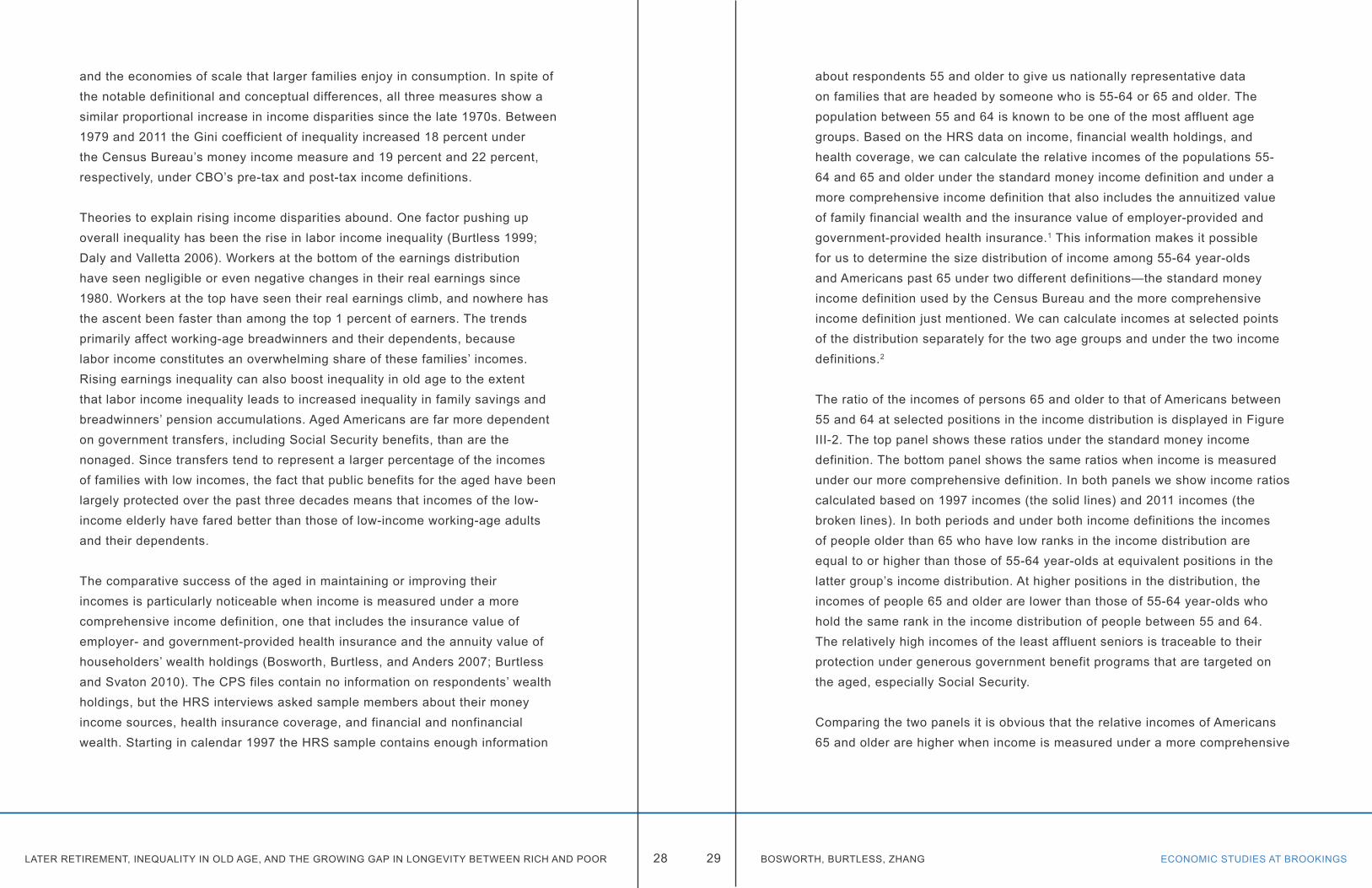
about respondents 55 and older to give us nationally representative data on families that are headed by someone who is 55-64 or 65 and older. The population between 55 and 64 is known to be one of the most affluent age groups. Based on the HRS data on income, financial wealth holdings, and health coverage, we can calculate the relative incomes of the populations 55-64 and 65 and older under the standard money income definition and under a more comprehensive income definition that also includes the annuitized value of family financial wealth and the insurance value of employer-provided and government-provided health insurance.1 This information makes it possible for us to determine the size distribution of income among 55-64 year-olds and Americans past 65 under two different definitions—the standard money income definition used by the Census Bureau and the more comprehensive income definition just mentioned. We can calculate incomes at selected points of the distribution separately for the two age groups and under the two income definitions.2
The ratio of the incomes of persons 65 and older to that of Americans between 55 and 64 at selected positions in the income distribution is displayed in Figure III-2. The top panel shows these ratios under the standard money income definition. The bottom panel shows the same ratios when income is measured under our more comprehensive definition. In both panels we show income ratios calculated based on 1997 incomes (the solid lines) and 2011 incomes (the broken lines). In both periods and under both income definitions the incomes of people older than 65 who have low ranks in the income distribution are equal to or higher than those of 55-64 year-olds at equivalent positions in the latter group’s income distribution. At higher positions in the distribution, the incomes of people 65 and older are lower than those of 55-64 year-olds who hold the same rank in the income distribution of people between 55 and 64. The relatively high incomes of the least affluent seniors is traceable to their protection under generous government benefit programs that are targeted on the aged, especially Social Security.
Comparing the two panels it is obvious that the relative incomes of Americans 65 and older are higher when income is measured under a more comprehensive
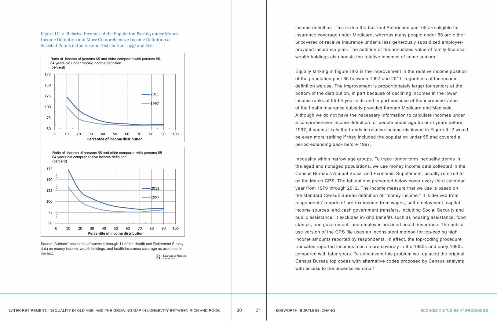
LATER RETIREMENT, INEQUALITY IN OLD AGE, AND THE GROWING GAP IN LONGEVITY BETWEEN RICH AND POOR ECONOMIC STUDIES AT BROOKINGS30 31 BOSWORTH, BURTLESS, ZHANG
Figure III-2. Relative Incomes of the Population Past 65 under Money Income Definition and More Comprehensive Income Definition at Selected Points in the Income Distribution, 1997 and 2011
Source: Authors' tabulations of waves 4 through 11 of the Health and Retirement Survey data on money income, wealth holdings, and health insurance coverage as explained in the text.
50
75
100
125
150
175
0 10 20 30 40 50 60 70 80 90 100Percentile of income distribution
Ratio of income of persons 65 and older compared with persons 55-64 years old under money income definition (percent)
2011
1997
50
75
100
125
150
175
0 10 20 30 40 50 60 70 80 90 100Percentile of income distribution
Ratio of income of persons 65 and older compared with persons 55-64 years old comprehensive income definition (percent)
2011
1997
income definition. This is due the fact that Americans past 65 are eligible for insurance coverage under Medicare, whereas many people under 65 are either uncovered or receive insurance under a less generously subsidized employer-provided insurance plan. The addition of the annuitized value of family financial wealth holdings also boosts the relative incomes of some seniors.
Equally striking in Figure III-2 is the improvement in the relative income position of the population past 65 between 1997 and 2011, regardless of the income definition we use. The improvement is proportionately larger for seniors at the bottom of the distribution, in part because of declining incomes in the lower income ranks of 55-64 year-olds and in part because of the increased value of the health insurance subsidy provided through Medicare and Medicaid. Although we do not have the necessary information to calculate incomes under a comprehensive income definition for people under age 55 or in years before 1997, it seems likely the trends in relative income displayed in Figure III-2 would be even more striking if they included the population under 55 and covered a period extending back before 1997.
Inequality within narrow age groups. To trace longer term inequality trends in the aged and nonaged populations, we use money income data collected in the Census Bureau’s Annual Social and Economic Supplement, usually referred to as the March CPS. The tabulations presented below cover every third calendar year from 1979 through 2012. The income measure that we use is based on the standard Census Bureau definition of “money income.” It is derived from respondents’ reports of pre-tax income from wages, self-employment, capital income sources, and cash government transfers, including Social Security and public assistance. It excludes in-kind benefits such as housing assistance, food stamps, and government- and employer-provided health insurance. The public use version of the CPS file uses an inconsistent method for top-coding high income amounts reported by respondents. In effect, the top-coding procedure truncates reported incomes much more severely in the 1980s and early 1990s compared with later years. To circumvent this problem we replaced the original Census Bureau top codes with alternative codes proposed by Census analysts with access to the uncensored data.3
LATER RETIREMENT, INEQUALITY IN OLD AGE, AND THE GROWING GAP IN LONGEVITY BETWEEN RICH AND POOR ECONOMIC STUDIES AT BROOKINGS32 33 BOSWORTH, BURTLESS, ZHANG
In order to divide the population into age groups, we classified each family by the age of the head of family or, in the case of married-couple families, the older of the head and the spouse of the head. Single-person households and unrelated individuals are also classified by the person’s age, and they are designated as family units.If more than one family resides in the same household, each family is separately classified by the age of its head. We ranked families according to their family-size-adjusted incomes and then used these family ranks to determine the income ranks of people who were members of the families. These person ranks are based on families’ rank in the size-adjusted income distribution.4 Inequality is ascertained by calculating standard measures of income disparity for persons rather than families and is based on each person’s family-size-adjusted income.
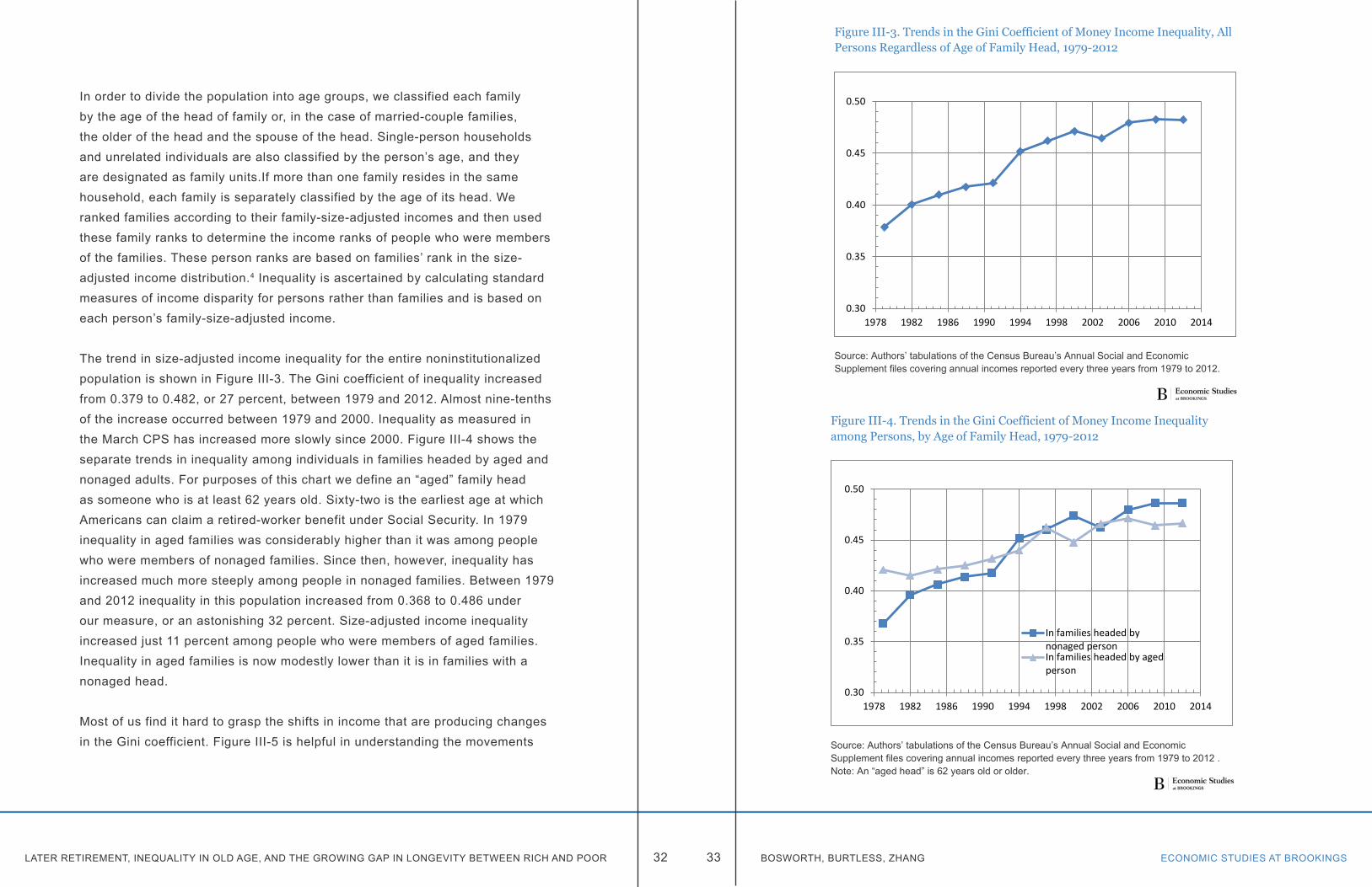
The trend in size-adjusted income inequality for the entire noninstitutionalized population is shown in Figure III-3. The Gini coefficient of inequality increased from 0.379 to 0.482, or 27 percent, between 1979 and 2012. Almost nine-tenths of the increase occurred between 1979 and 2000. Inequality as measured in the March CPS has increased more slowly since 2000. Figure III-4 shows the separate trends in inequality among individuals in families headed by aged and nonaged adults. For purposes of this chart we define an “aged” family head as someone who is at least 62 years old. Sixty-two is the earliest age at which Americans can claim a retired-worker benefit under Social Security. In 1979 inequality in aged families was considerably higher than it was among people who were members of nonaged families. Since then, however, inequality has increased much more steeply among people in nonaged families. Between 1979 and 2012 inequality in this population increased from 0.368 to 0.486 under our measure, or an astonishing 32 percent. Size-adjusted income inequality increased just 11 percent among people who were members of aged families. Inequality in aged families is now modestly lower than it is in families with a nonaged head.
Most of us find it hard to grasp the shifts in income that are producing changes in the Gini coefficient. Figure III-5 is helpful in understanding the movements
Figure III-3. Trends in the Gini Coefficient of Money Income Inequality, All Persons Regardless of Age of Family Head, 1979-2012
Source: Authors’ tabulations of the Census Bureau’s Annual Social and Economic Supplement files covering annual incomes reported every three years from 1979 to 2012.
0.30
0.35
0.40
0.45
0.50
1978 1982 1986 1990 1994 1998 2002 2006 2010 2014
Figure III-4. Trends in the Gini Coefficient of Money Income Inequality among Persons, by Age of Family Head, 1979-2012
Source: Authors’ tabulations of the Census Bureau’s Annual Social and Economic Supplement files covering annual incomes reported every three years from 1979 to 2012 .Note: An “aged head” is 62 years old or older.
0.30
0.35
0.40
0.45
0.50
1978 1982 1986 1990 1994 1998 2002 2006 2010 2014
In families headed bynonaged personIn families headed by agedperson
LATER RETIREMENT, INEQUALITY IN OLD AGE, AND THE GROWING GAP IN LONGEVITY BETWEEN RICH AND POOR ECONOMIC STUDIES AT BROOKINGS34 35 BOSWORTH, BURTLESS, ZHANG
in real personal equivalent income that caused the Gini coefficients to change between 1979 and 2012.
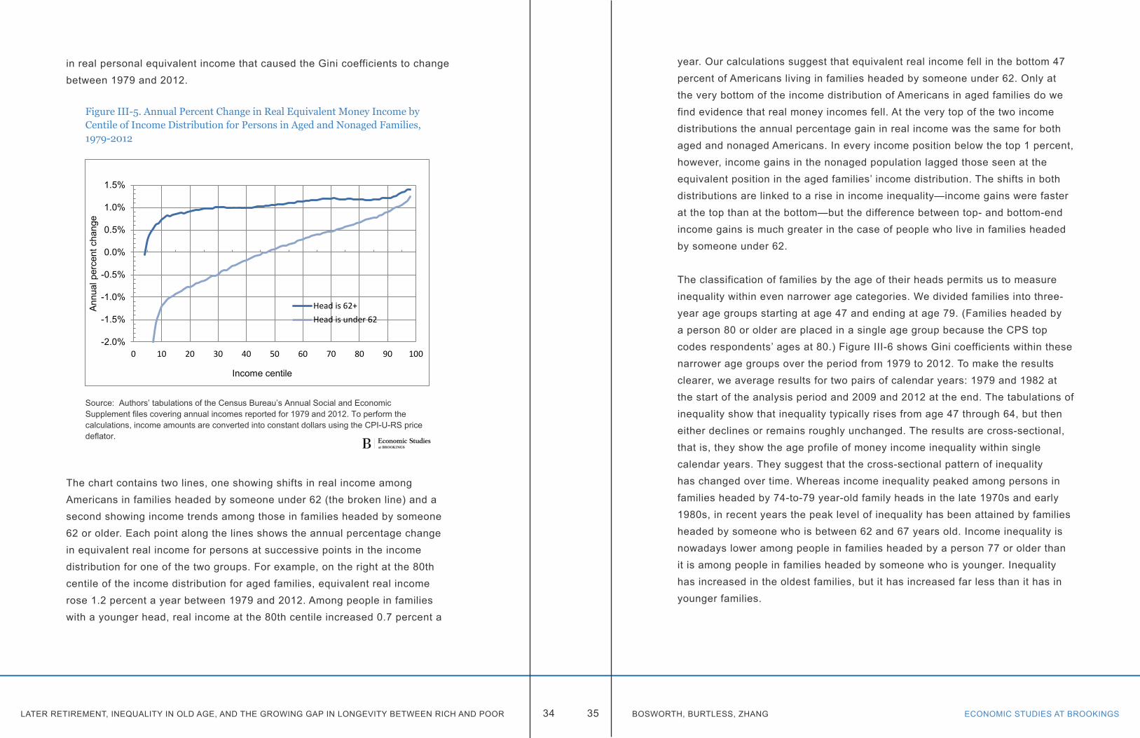
The chart contains two lines, one showing shifts in real income among Americans in families headed by someone under 62 (the broken line) and a second showing income trends among those in families headed by someone 62 or older. Each point along the lines shows the annual percentage change in equivalent real income for persons at successive points in the income distribution for one of the two groups. For example, on the right at the 80th centile of the income distribution for aged families, equivalent real income rose 1.2 percent a year between 1979 and 2012. Among people in families with a younger head, real income at the 80th centile increased 0.7 percent a
Figure III-5. Annual Percent Change in Real Equivalent Money Income by Centile of Income Distribution for Persons in Aged and Nonaged Families, 1979-2012
Source: Authors’ tabulations of the Census Bureau’s Annual Social and Economic Supplement files covering annual incomes reported for 1979 and 2012. To perform the calculations, income amounts are converted into constant dollars using the CPI-U-RS price deflator.
-2.0%
-1.5%
-1.0%
-0.5%
0.0%
0.5%
1.0%
1.5%
0 10 20 30 40 50 60 70 80 90 100
Annu
al p
erce
nt c
hang
e
Income centile
Head is 62+Head is under 62
year. Our calculations suggest that equivalent real income fell in the bottom 47 percent of Americans living in families headed by someone under 62. Only at the very bottom of the income distribution of Americans in aged families do we find evidence that real money incomes fell. At the very top of the two income distributions the annual percentage gain in real income was the same for both aged and nonaged Americans. In every income position below the top 1 percent, however, income gains in the nonaged population lagged those seen at the equivalent position in the aged families’ income distribution. The shifts in both distributions are linked to a rise in income inequality—income gains were faster at the top than at the bottom—but the difference between top- and bottom-end income gains is much greater in the case of people who live in families headed by someone under 62.
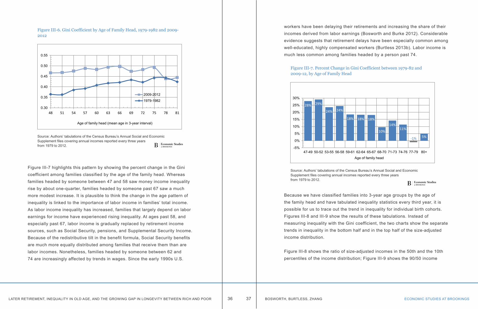
The classification of families by the age of their heads permits us to measure inequality within even narrower age categories. We divided families into three-year age groups starting at age 47 and ending at age 79. (Families headed by a person 80 or older are placed in a single age group because the CPS top codes respondents’ ages at 80.) Figure III-6 shows Gini coefficients within these narrower age groups over the period from 1979 to 2012. To make the results clearer, we average results for two pairs of calendar years: 1979 and 1982 at the start of the analysis period and 2009 and 2012 at the end. The tabulations of inequality show that inequality typically rises from age 47 through 64, but then either declines or remains roughly unchanged. The results are cross-sectional, that is, they show the age profile of money income inequality within single calendar years. They suggest that the cross-sectional pattern of inequality has changed over time. Whereas income inequality peaked among persons in families headed by 74-to-79 year-old family heads in the late 1970s and early 1980s, in recent years the peak level of inequality has been attained by families headed by someone who is between 62 and 67 years old. Income inequality is nowadays lower among people in families headed by a person 77 or older than it is among people in families headed by someone who is younger. Inequality has increased in the oldest families, but it has increased far less than it has in younger families.
LATER RETIREMENT, INEQUALITY IN OLD AGE, AND THE GROWING GAP IN LONGEVITY BETWEEN RICH AND POOR ECONOMIC STUDIES AT BROOKINGS36 37 BOSWORTH, BURTLESS, ZHANG
Figure III-7 highlights this pattern by showing the percent change in the Gini coefficient among families classified by the age of the family head. Whereas families headed by someone between 47 and 58 saw money income inequality rise by about one-quarter, families headed by someone past 67 saw a much more modest increase. It is plausible to think the change in the age pattern of inequality is linked to the importance of labor income in families’ total income. As labor income inequality has increased, families that largely depend on labor earnings for income have experienced rising inequality. At ages past 58, and especially past 67, labor income is gradually replaced by retirement income sources, such as Social Security, pensions, and Supplemental Security Income. Because of the redistributive tilt in the benefit formula, Social Security benefits are much more equally distributed among families that receive them than are labor incomes. Nonetheless, families headed by someone between 62 and 74 are increasingly affected by trends in wages. Since the early 1990s U.S.
Figure III-6. Gini Coefficient by Age of Family Head, 1979-1982 and 2009-2012
Source: Authors’ tabulations of the Census Bureau’s Annual Social and Economic Supplement files covering annual incomes reported every three years from 1979 to 2012.
0.30
0.35
0.40
0.45
0.50
0.55
48 51 54 57 60 63 66 69 72 75 78 81
Age of family head (mean age in 3-year interval)
2009-2012
1979-1982
workers have been delaying their retirements and increasing the share of their incomes derived from labor earnings (Bosworth and Burke 2012). Considerable evidence suggests that retirement delays have been especially common among well-educated, highly compensated workers (Burtless 2013b). Labor income is much less common among families headed by a person past 74.
Because we have classified families into 3-year age groups by the age of the family head and have tabulated inequality statistics every third year, it is possible for us to trace out the trend in inequality for individual birth cohorts. Figures III-8 and III-9 show the results of these tabulations. Instead of measuring inequality with the Gini coefficient, the two charts show the separate trends in inequality in the bottom half and in the top half of the size-adjusted income distribution.
Figure III-8 shows the ratio of size-adjusted incomes in the 50th and the 10th percentiles of the income distribution; Figure III-9 shows the 90/50 income
Figure III-7. Percent Change in Gini Coefficient between 1979-82 and 2009-12, by Age of Family Head
Source: Authors’ tabulations of the Census Bureau’s Annual Social and Economic Supplement files covering annual incomes reported every three years from 1979 to 2012.
28% 29%
24% 24%
18% 18% 18%
10%
14% 11%
-1% 5%
-5%
0%
5%
10%
15%
20%
25%
30%
47-49 50-52 53-55 56-58 59-61 62-64 65-67 68-70 71-73 74-76 77-79 80+
Age of family head
LATER RETIREMENT, INEQUALITY IN OLD AGE, AND THE GROWING GAP IN LONGEVITY BETWEEN RICH AND POOR ECONOMIC STUDIES AT BROOKINGS38 39 BOSWORTH, BURTLESS, ZHANG
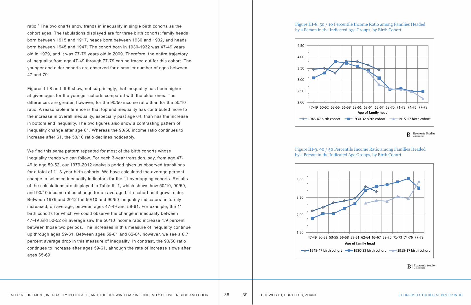
ratio.5 The two charts show trends in inequality in single birth cohorts as the cohort ages. The tabulations displayed are for three birth cohorts: family heads born between 1915 and 1917, heads born between 1930 and 1932, and heads born between 1945 and 1947. The cohort born in 1930-1932 was 47-49 years old in 1979, and it was 77-79 years old in 2009. Therefore, the entire trajectory of inequality from age 47-49 through 77-79 can be traced out for this cohort. The younger and older cohorts are observed for a smaller number of ages between 47 and 79.
Figures III-8 and III-9 show, not surprisingly, that inequality has been higher at given ages for the younger cohorts compared with the older ones. The differences are greater, however, for the 90/50 income ratio than for the 50/10 ratio. A reasonable inference is that top end inequality has contributed more to the increase in overall inequality, especially past age 64, than has the increase in bottom end inequality. The two figures also show a contrasting pattern of inequality change after age 61. Whereas the 90/50 income ratio continues to increase after 61, the 50/10 ratio declines noticeably.
We find this same pattern repeated for most of the birth cohorts whose inequality trends we can follow. For each 3-year transition, say, from age 47-49 to age 50-52, our 1979-2012 analysis period gives us observed transitions for a total of 11 3-year birth cohorts. We have calculated the average percent change in selected inequality indicators for the 11 overlapping cohorts. Results of the calculations are displayed in Table III-1, which shows how 50/10, 90/50, and 90/10 income ratios change for an average birth cohort as it grows older. Between 1979 and 2012 the 50/10 and 90/50 inequality indicators uniformly increased, on average, between ages 47-49 and 59-61. For example, the 11 birth cohorts for which we could observe the change in inequality between 47-49 and 50-52 on average saw the 50/10 income ratio increase 4.9 percent between those two periods. The increases in this measure of inequality continue up through ages 59-61. Between ages 59-61 and 62-64, however, we see a 6.7 percent average drop in this measure of inequality. In contrast, the 90/50 ratio continues to increase after ages 59-61, although the rate of increase slows after ages 65-69.
Figure III-8. 50 / 10 Percentile Income Ratio among Families Headed by a Person in the Indicated Age Groups, by Birth Cohort
2.00
2.50
3.00
3.50
4.00
4.50
47-49 50-52 53-55 56-58 59-61 62-64 65-67 68-70 71-73 74-76 77-79Age of family head
1945-47 birth cohort 1930-32 birth cohort 1915-17 birth cohort
Figure III-9. 90 / 50 Percentile Income Ratio among Families Headed by a Person in the Indicated Age Groups, by Birth Cohort
1.50
2.00
2.50
3.00
47-49 50-52 53-55 56-58 59-61 62-64 65-67 68-70 71-73 74-76 77-79Age of family head
1945-47 birth cohort 1930-32 birth cohort 1915-17 birth cohort
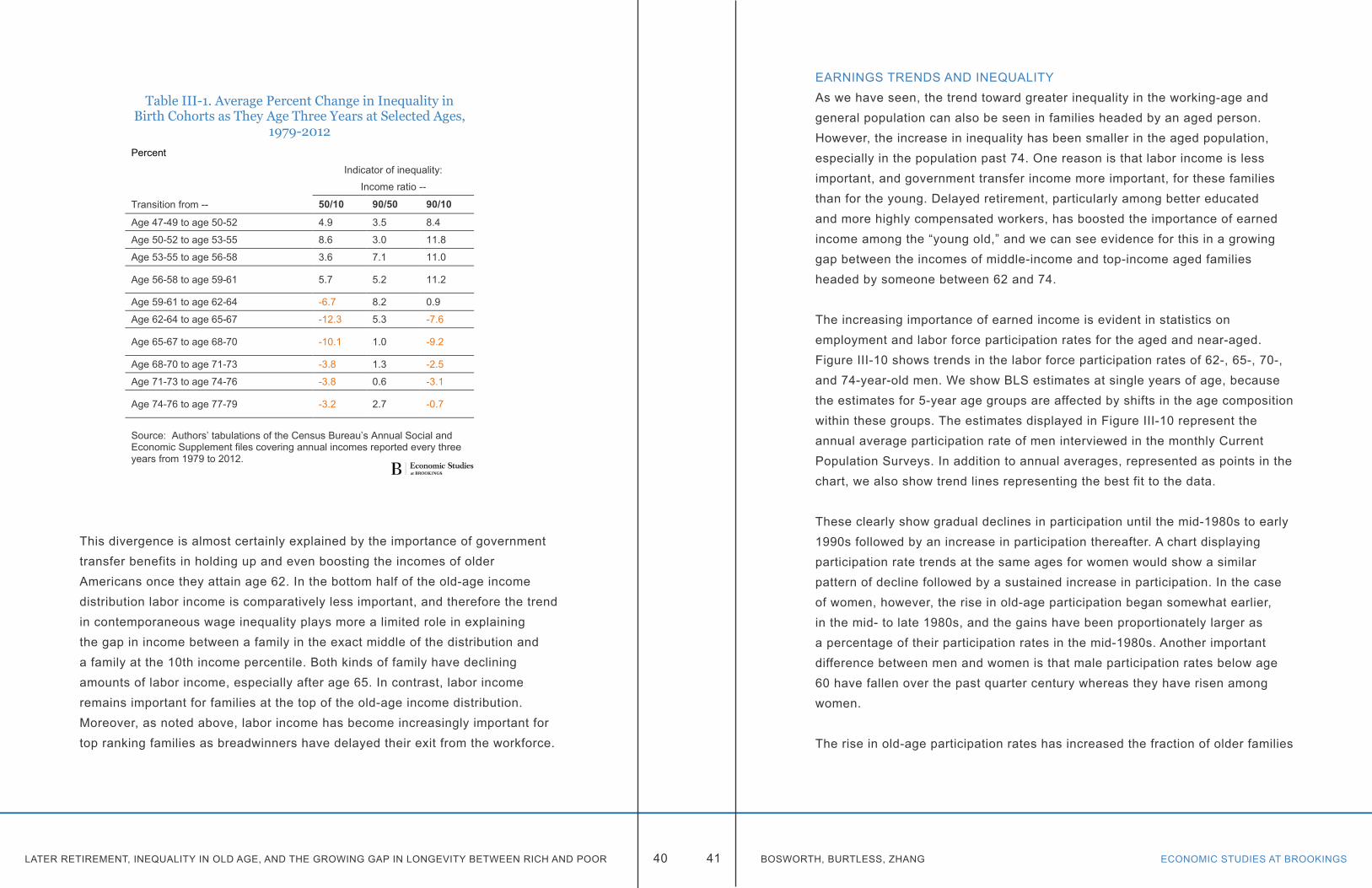
LATER RETIREMENT, INEQUALITY IN OLD AGE, AND THE GROWING GAP IN LONGEVITY BETWEEN RICH AND POOR ECONOMIC STUDIES AT BROOKINGS40 41 BOSWORTH, BURTLESS, ZHANG
This divergence is almost certainly explained by the importance of government transfer benefits in holding up and even boosting the incomes of older Americans once they attain age 62. In the bottom half of the old-age income distribution labor income is comparatively less important, and therefore the trend in contemporaneous wage inequality plays more a limited role in explaining the gap in income between a family in the exact middle of the distribution and a family at the 10th income percentile. Both kinds of family have declining amounts of labor income, especially after age 65. In contrast, labor income remains important for families at the top of the old-age income distribution. Moreover, as noted above, labor income has become increasingly important for top ranking families as breadwinners have delayed their exit from the workforce.
Table III-1. Average Percent Change in Inequality in Birth Cohorts as They Age Three Years at Selected Ages,
1979-2012Percent
Indicator of inequality:
Income ratio --
Transition from -- 50/10 90/50 90/10
Age 47-49 to age 50-52 4.9 3.5 8.4
Age 50-52 to age 53-55 8.6 3.0 11.8
Age 53-55 to age 56-58 3.6 7.1 11.0
Age 56-58 to age 59-61 5.7 5.2 11.2
Age 59-61 to age 62-64 -6.7 8.2 0.9
Age 62-64 to age 65-67 -12.3 5.3 -7.6
Age 65-67 to age 68-70 -10.1 1.0 -9.2
Age 68-70 to age 71-73 -3.8 1.3 -2.5
Age 71-73 to age 74-76 -3.8 0.6 -3.1
Age 74-76 to age 77-79 -3.2 2.7 -0.7
Source: Authors’ tabulations of the Census Bureau’s Annual Social and Economic Supplement files covering annual incomes reported every three years from 1979 to 2012.
EARNINGS TRENDS AND INEQUALITYAs we have seen, the trend toward greater inequality in the working-age and general population can also be seen in families headed by an aged person. However, the increase in inequality has been smaller in the aged population, especially in the population past 74. One reason is that labor income is less important, and government transfer income more important, for these families than for the young. Delayed retirement, particularly among better educated and more highly compensated workers, has boosted the importance of earned income among the “young old,” and we can see evidence for this in a growing gap between the incomes of middle-income and top-income aged families headed by someone between 62 and 74.
The increasing importance of earned income is evident in statistics on employment and labor force participation rates for the aged and near-aged. Figure III-10 shows trends in the labor force participation rates of 62-, 65-, 70-, and 74-year-old men. We show BLS estimates at single years of age, because the estimates for 5-year age groups are affected by shifts in the age composition within these groups. The estimates displayed in Figure III-10 represent the annual average participation rate of men interviewed in the monthly Current Population Surveys. In addition to annual averages, represented as points in the chart, we also show trend lines representing the best fit to the data.
These clearly show gradual declines in participation until the mid-1980s to early 1990s followed by an increase in participation thereafter. A chart displaying participation rate trends at the same ages for women would show a similar pattern of decline followed by a sustained increase in participation. In the case of women, however, the rise in old-age participation began somewhat earlier, in the mid- to late 1980s, and the gains have been proportionately larger as a percentage of their participation rates in the mid-1980s. Another important difference between men and women is that male participation rates below age 60 have fallen over the past quarter century whereas they have risen among women.
The rise in old-age participation rates has increased the fraction of older families
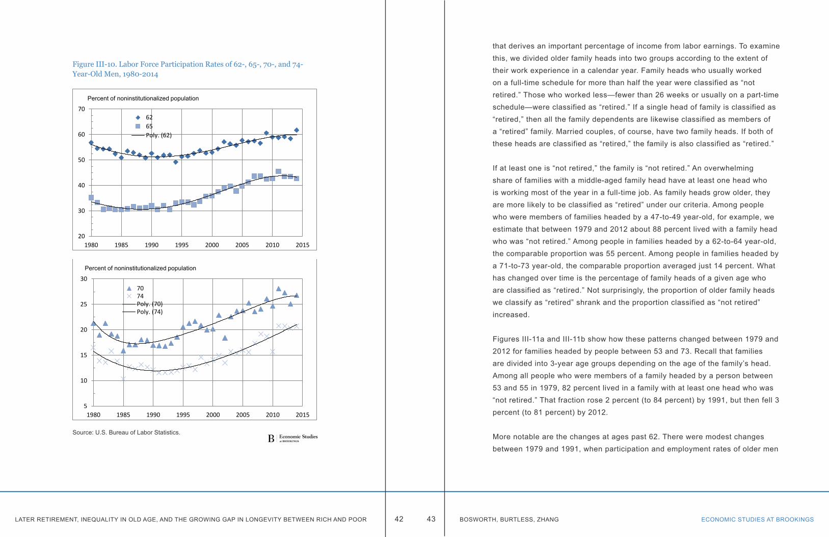
LATER RETIREMENT, INEQUALITY IN OLD AGE, AND THE GROWING GAP IN LONGEVITY BETWEEN RICH AND POOR ECONOMIC STUDIES AT BROOKINGS42 43 BOSWORTH, BURTLESS, ZHANG
Figure III-10. Labor Force Participation Rates of 62-, 65-, 70-, and 74-Year-Old Men, 1980-2014
Source: U.S. Bureau of Labor Statistics.
20
30
40
50
60
70
1980 1985 1990 1995 2000 2005 2010 2015
Percent of noninstitutionalized population
6265Poly. (62)
5
10
15
20
25
30
1980 1985 1990 1995 2000 2005 2010 2015
Percent of noninstitutionalized population
7074Poly. (70)Poly. (74)
that derives an important percentage of income from labor earnings. To examine this, we divided older family heads into two groups according to the extent of their work experience in a calendar year. Family heads who usually worked on a full-time schedule for more than half the year were classified as “not retired.” Those who worked less—fewer than 26 weeks or usually on a part-time schedule—were classified as “retired.” If a single head of family is classified as “retired,” then all the family dependents are likewise classified as members of a “retired” family. Married couples, of course, have two family heads. If both of these heads are classified as “retired,” the family is also classified as “retired.”
If at least one is “not retired,” the family is “not retired.” An overwhelming share of families with a middle-aged family head have at least one head who is working most of the year in a full-time job. As family heads grow older, they are more likely to be classified as “retired” under our criteria. Among people who were members of families headed by a 47-to-49 year-old, for example, we estimate that between 1979 and 2012 about 88 percent lived with a family head who was “not retired.” Among people in families headed by a 62-to-64 year-old, the comparable proportion was 55 percent. Among people in families headed by a 71-to-73 year-old, the comparable proportion averaged just 14 percent. What has changed over time is the percentage of family heads of a given age who are classified as “retired.” Not surprisingly, the proportion of older family heads we classify as “retired” shrank and the proportion classified as “not retired” increased.
Figures III-11a and III-11b show how these patterns changed between 1979 and 2012 for families headed by people between 53 and 73. Recall that families are divided into 3-year age groups depending on the age of the family’s head. Among all people who were members of a family headed by a person between 53 and 55 in 1979, 82 percent lived in a family with at least one head who was “not retired.” That fraction rose 2 percent (to 84 percent) by 1991, but then fell 3 percent (to 81 percent) by 2012.
More notable are the changes at ages past 62. There were modest changes between 1979 and 1991, when participation and employment rates of older men
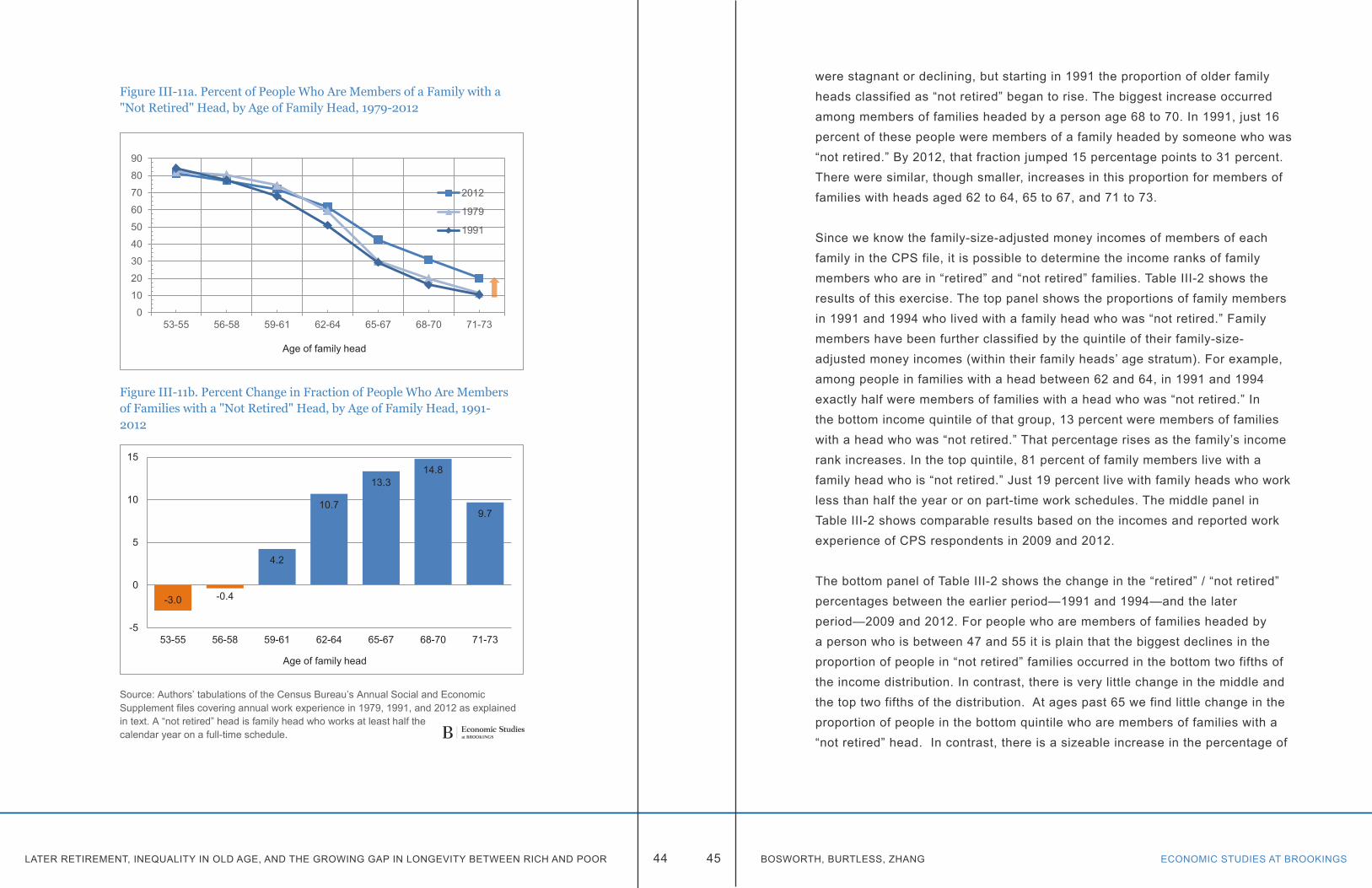
LATER RETIREMENT, INEQUALITY IN OLD AGE, AND THE GROWING GAP IN LONGEVITY BETWEEN RICH AND POOR ECONOMIC STUDIES AT BROOKINGS44 45 BOSWORTH, BURTLESS, ZHANG
Figure III-11a. Percent of People Who Are Members of a Family with a "Not Retired" Head, by Age of Family Head, 1979-2012
Figure III-11b. Percent Change in Fraction of People Who Are Members of Families with a "Not Retired" Head, by Age of Family Head, 1991-2012
Source: Authors’ tabulations of the Census Bureau’s Annual Social and Economic Supplement files covering annual work experience in 1979, 1991, and 2012 as explained in text. A “not retired” head is family head who works at least half the calendar year on a full-time schedule.
0
10
20
30
40
50
60
70
80
90
53-55 56-58 59-61 62-64 65-67 68-70 71-73
Age of family head
2012
1979
1991
-3.0 -0.4
4.2
10.7
13.314.8
9.7
-5
0
5
10
15
53-55 56-58 59-61 62-64 65-67 68-70 71-73
Age of family head
were stagnant or declining, but starting in 1991 the proportion of older family heads classified as “not retired” began to rise. The biggest increase occurred among members of families headed by a person age 68 to 70. In 1991, just 16 percent of these people were members of a family headed by someone who was “not retired.” By 2012, that fraction jumped 15 percentage points to 31 percent. There were similar, though smaller, increases in this proportion for members of families with heads aged 62 to 64, 65 to 67, and 71 to 73.
Since we know the family-size-adjusted money incomes of members of each family in the CPS file, it is possible to determine the income ranks of family members who are in “retired” and “not retired” families. Table III-2 shows the results of this exercise. The top panel shows the proportions of family members in 1991 and 1994 who lived with a family head who was “not retired.” Family members have been further classified by the quintile of their family-size-adjusted money incomes (within their family heads’ age stratum). For example, among people in families with a head between 62 and 64, in 1991 and 1994 exactly half were members of families with a head who was “not retired.” In the bottom income quintile of that group, 13 percent were members of families with a head who was “not retired.” That percentage rises as the family’s income rank increases. In the top quintile, 81 percent of family members live with a family head who is “not retired.” Just 19 percent live with family heads who work less than half the year or on part-time work schedules. The middle panel in Table III-2 shows comparable results based on the incomes and reported work experience of CPS respondents in 2009 and 2012.
The bottom panel of Table III-2 shows the change in the “retired” / “not retired” percentages between the earlier period—1991 and 1994—and the later period—2009 and 2012. For people who are members of families headed by a person who is between 47 and 55 it is plain that the biggest declines in the proportion of people in “not retired” families occurred in the bottom two fifths of the income distribution. In contrast, there is very little change in the middle and the top two fifths of the distribution. At ages past 65 we find little change in the proportion of people in the bottom quintile who are members of families with a “not retired” head. In contrast, there is a sizeable increase in the percentage of
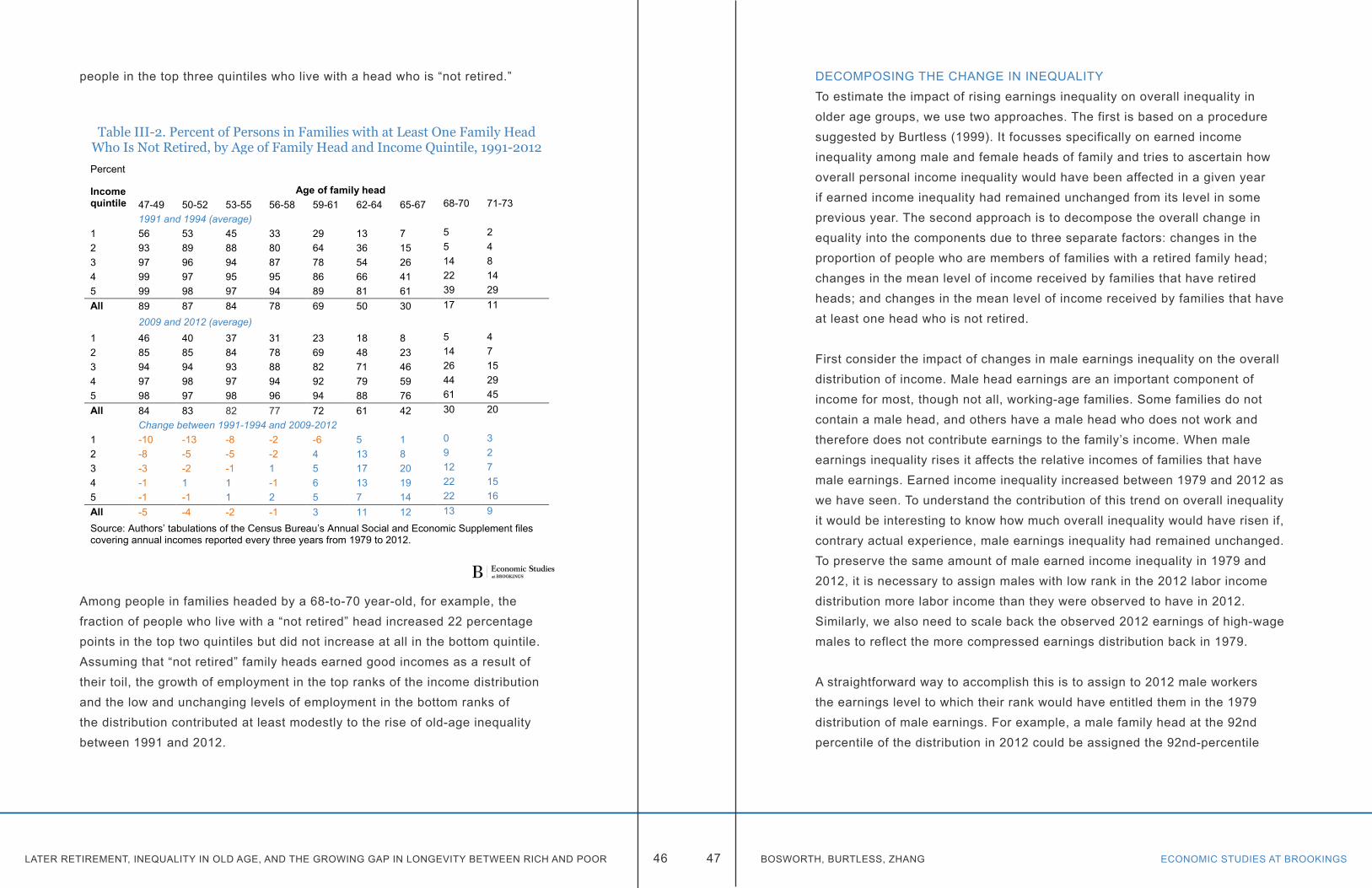
LATER RETIREMENT, INEQUALITY IN OLD AGE, AND THE GROWING GAP IN LONGEVITY BETWEEN RICH AND POOR ECONOMIC STUDIES AT BROOKINGS46 47 BOSWORTH, BURTLESS, ZHANG
people in the top three quintiles who live with a head who is “not retired.”
Among people in families headed by a 68-to-70 year-old, for example, the fraction of people who live with a “not retired” head increased 22 percentage points in the top two quintiles but did not increase at all in the bottom quintile. Assuming that “not retired” family heads earned good incomes as a result of their toil, the growth of employment in the top ranks of the income distribution and the low and unchanging levels of employment in the bottom ranks of the distribution contributed at least modestly to the rise of old-age inequality between 1991 and 2012.
Table III-2. Percent of Persons in Families with at Least One Family Head Who Is Not Retired, by Age of Family Head and Income Quintile, 1991-2012Percent
Income quintile
Age of family head47-49 50-52 53-55 56-58 59-61 62-64 65-67 68-70 71-731991 and 1994 (average)
1 56 53 45 33 29 13 7 5 22 93 89 88 80 64 36 15 5 43 97 96 94 87 78 54 26 14 84 99 97 95 95 86 66 41 22 145 99 98 97 94 89 81 61 39 29All 89 87 84 78 69 50 30 17 11
2009 and 2012 (average)1 46 40 37 31 23 18 8 5 42 85 85 84 78 69 48 23 14 73 94 94 93 88 82 71 46 26 154 97 98 97 94 92 79 59 44 295 98 97 98 96 94 88 76 61 45All 84 83 82 77 72 61 42 30 20
Change between 1991-1994 and 2009-20121 -10 -13 -8 -2 -6 5 1 0 32 -8 -5 -5 -2 4 13 8 9 23 -3 -2 -1 1 5 17 20 12 74 -1 1 1 -1 6 13 19 22 155 -1 -1 1 2 5 7 14 22 16All -5 -4 -2 -1 3 11 12 13 9
Source: Authors’ tabulations of the Census Bureau’s Annual Social and Economic Supplement files covering annual incomes reported every three years from 1979 to 2012.
DECOMPOSING THE CHANGE IN INEQUALITYTo estimate the impact of rising earnings inequality on overall inequality in older age groups, we use two approaches. The first is based on a procedure suggested by Burtless (1999). It focusses specifically on earned income inequality among male and female heads of family and tries to ascertain how overall personal income inequality would have been affected in a given year if earned income inequality had remained unchanged from its level in some previous year. The second approach is to decompose the overall change in equality into the components due to three separate factors: changes in the proportion of people who are members of families with a retired family head; changes in the mean level of income received by families that have retired heads; and changes in the mean level of income received by families that have at least one head who is not retired.
First consider the impact of changes in male earnings inequality on the overall distribution of income. Male head earnings are an important component of income for most, though not all, working-age families. Some families do not contain a male head, and others have a male head who does not work and therefore does not contribute earnings to the family’s income. When male earnings inequality rises it affects the relative incomes of families that have male earnings. Earned income inequality increased between 1979 and 2012 as we have seen. To understand the contribution of this trend on overall inequality it would be interesting to know how much overall inequality would have risen if, contrary actual experience, male earnings inequality had remained unchanged. To preserve the same amount of male earned income inequality in 1979 and 2012, it is necessary to assign males with low rank in the 2012 labor income distribution more labor income than they were observed to have in 2012. Similarly, we also need to scale back the observed 2012 earnings of high-wage males to reflect the more compressed earnings distribution back in 1979.
A straightforward way to accomplish this is to assign to 2012 male workers the earnings level to which their rank would have entitled them in the 1979 distribution of male earnings. For example, a male family head at the 92nd percentile of the distribution in 2012 could be assigned the 92nd-percentile
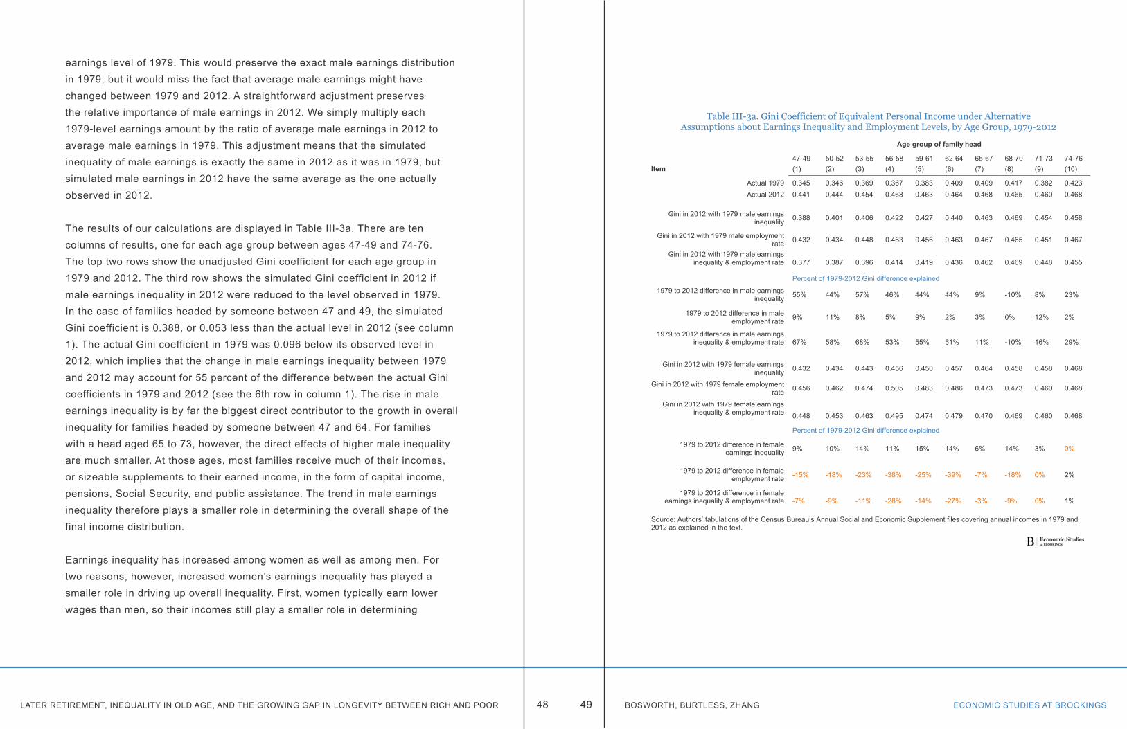
LATER RETIREMENT, INEQUALITY IN OLD AGE, AND THE GROWING GAP IN LONGEVITY BETWEEN RICH AND POOR ECONOMIC STUDIES AT BROOKINGS48 49 BOSWORTH, BURTLESS, ZHANG
earnings level of 1979. This would preserve the exact male earnings distribution in 1979, but it would miss the fact that average male earnings might have changed between 1979 and 2012. A straightforward adjustment preserves the relative importance of male earnings in 2012. We simply multiply each 1979-level earnings amount by the ratio of average male earnings in 2012 to average male earnings in 1979. This adjustment means that the simulated inequality of male earnings is exactly the same in 2012 as it was in 1979, but simulated male earnings in 2012 have the same average as the one actually observed in 2012.
The results of our calculations are displayed in Table III-3a. There are ten columns of results, one for each age group between ages 47-49 and 74-76. The top two rows show the unadjusted Gini coefficient for each age group in 1979 and 2012. The third row shows the simulated Gini coefficient in 2012 if male earnings inequality in 2012 were reduced to the level observed in 1979. In the case of families headed by someone between 47 and 49, the simulated Gini coefficient is 0.388, or 0.053 less than the actual level in 2012 (see column 1). The actual Gini coefficient in 1979 was 0.096 below its observed level in 2012, which implies that the change in male earnings inequality between 1979 and 2012 may account for 55 percent of the difference between the actual Gini coefficients in 1979 and 2012 (see the 6th row in column 1). The rise in male earnings inequality is by far the biggest direct contributor to the growth in overall inequality for families headed by someone between 47 and 64. For families with a head aged 65 to 73, however, the direct effects of higher male inequality are much smaller. At those ages, most families receive much of their incomes, or sizeable supplements to their earned income, in the form of capital income, pensions, Social Security, and public assistance. The trend in male earnings inequality therefore plays a smaller role in determining the overall shape of the final income distribution.
Earnings inequality has increased among women as well as among men. For two reasons, however, increased women’s earnings inequality has played a smaller role in driving up overall inequality. First, women typically earn lower wages than men, so their incomes still play a smaller role in determining
Table III-3a. Gini Coefficient of Equivalent Personal Income under Alternative Assumptions about Earnings Inequality and Employment Levels, by Age Group, 1979-2012
Age group of family head
47-49 50-52 53-55 56-58 59-61 62-64 65-67 68-70 71-73 74-76Item (1) (2) (3) (4) (5) (6) (7) (8) (9) (10)
Actual 1979 0.345 0.346 0.369 0.367 0.383 0.409 0.409 0.417 0.382 0.423Actual 2012 0.441 0.444 0.454 0.468 0.463 0.464 0.468 0.465 0.460 0.468
Gini in 2012 with 1979 male earnings inequality 0.388 0.401 0.406 0.422 0.427 0.440 0.463 0.469 0.454 0.458
Gini in 2012 with 1979 male employment rate 0.432 0.434 0.448 0.463 0.456 0.463 0.467 0.465 0.451 0.467
Gini in 2012 with 1979 male earnings inequality & employment rate 0.377 0.387 0.396 0.414 0.419 0.436 0.462 0.469 0.448 0.455
Percent of 1979-2012 Gini difference explained
1979 to 2012 difference in male earnings inequality 55% 44% 57% 46% 44% 44% 9% -10% 8% 23%
1979 to 2012 difference in male employment rate 9% 11% 8% 5% 9% 2% 3% 0% 12% 2%
1979 to 2012 difference in male earnings inequality & employment rate 67% 58% 68% 53% 55% 51% 11% -10% 16% 29%
Gini in 2012 with 1979 female earnings inequality 0.432 0.434 0.443 0.456 0.450 0.457 0.464 0.458 0.458 0.468
Gini in 2012 with 1979 female employment rate 0.456 0.462 0.474 0.505 0.483 0.486 0.473 0.473 0.460 0.468
Gini in 2012 with 1979 female earnings inequality & employment rate 0.448 0.453 0.463 0.495 0.474 0.479 0.470 0.469 0.460 0.468
Percent of 1979-2012 Gini difference explained
1979 to 2012 difference in female earnings inequality 9% 10% 14% 11% 15% 14% 6% 14% 3% 0%
1979 to 2012 difference in female employment rate -15% -18% -23% -38% -25% -39% -7% -18% 0% 2%
1979 to 2012 difference in female earnings inequality & employment rate -7% -9% -11% -28% -14% -27% -3% -9% 0% 1%
Source: Authors’ tabulations of the Census Bureau’s Annual Social and Economic Supplement files covering annual incomes in 1979 and 2012 as explained in the text.
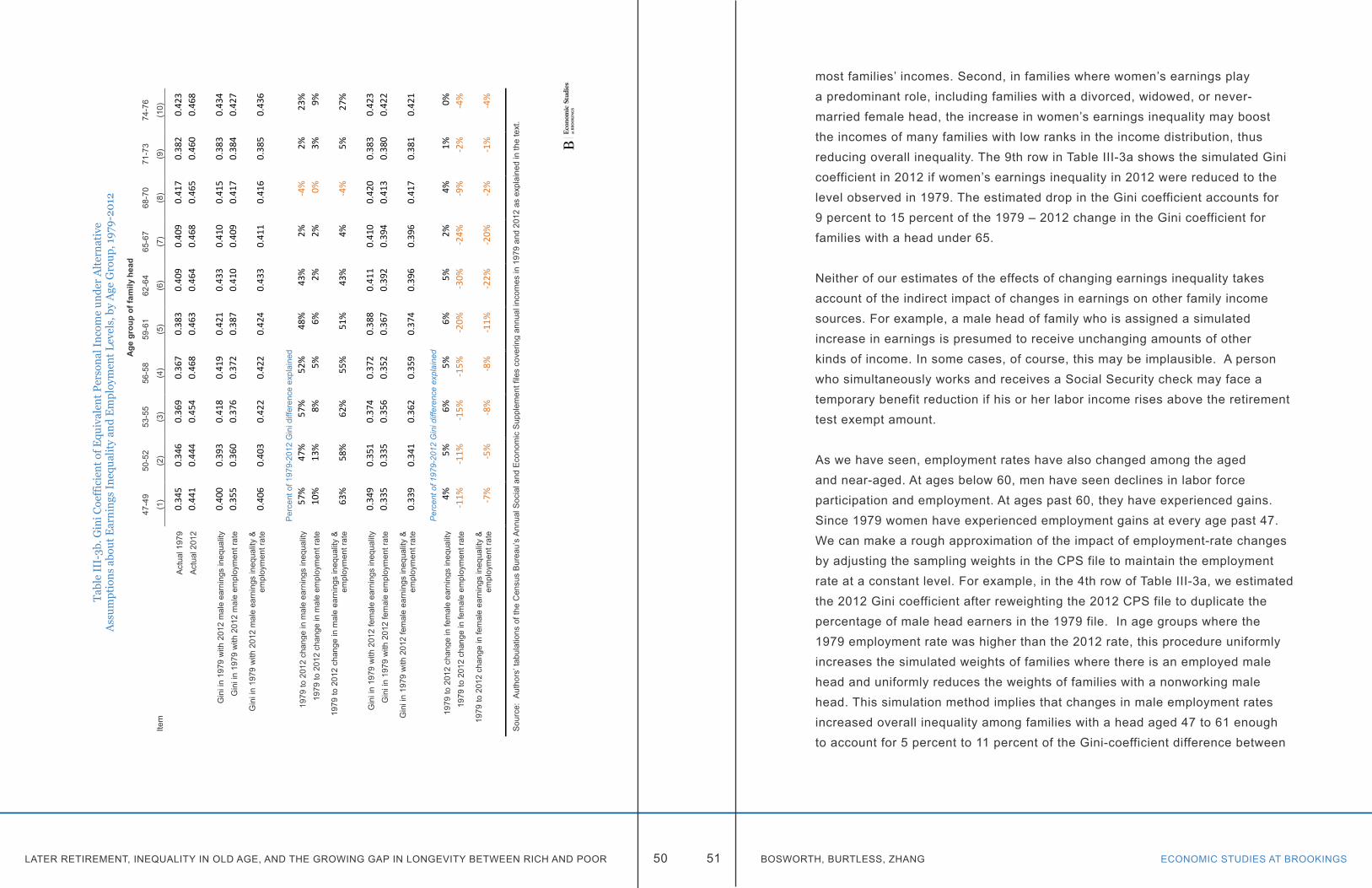
LATER RETIREMENT, INEQUALITY IN OLD AGE, AND THE GROWING GAP IN LONGEVITY BETWEEN RICH AND POOR ECONOMIC STUDIES AT BROOKINGS50 51 BOSWORTH, BURTLESS, ZHANG
Tabl
e II
I-3b
. Gin
i Coe
ffic
ient
of E
quiv
alen
t Per
sona
l Inc
ome
unde
r A
lter
nati
ve
Ass
umpt
ions
abo
ut E
arni
ngs
Ineq
ualit
y an
d E
mpl
oym
ent L
evel
s, b
y A
ge G
roup
, 197
9-20
12
Age
gro
up o
f fam
ily h
ead
47-4
950
-52
53-5
556
-58
59-6
162
-64
65-6
768
-70
71-7
374
-76
Item
(1)
(2)
(3)
(4)
(5)
(6)
(7)
(8)
(9)
(10)
Act
ual 1
979
0.34
5 0.
346
0.36
9 0.
367
0.38
3 0.
409
0.40
9 0.
417
0.38
2 0.
423
Act
ual 2
012
0.44
1 0.
444
0.45
4 0.
468
0.46
3 0.
464
0.46
8 0.
465
0.46
0 0.
468
Gin
i in
1979
with
201
2 m
ale
earn
ings
ineq
ualit
y0.
400
0.39
3 0.
418
0.41
9 0.
421
0.43
3 0.
410
0.41
5 0.
383
0.43
4 G
ini i
n 19
79 w
ith 2
012
mal
e em
ploy
men
t rat
e0.
355
0.36
0 0.
376
0.37
2 0.
387
0.41
0 0.
409
0.41
7 0.
384
0.42
7
Gin
i in
1979
with
201
2 m
ale
earn
ings
ineq
ualit
y &
em
ploy
men
t rat
e
0.
406
0.40
3 0.
422
0.42
2 0.
424
0.43
3 0.
411
0.41
6 0.
385
0.43
6
Per
cent
of 1
979-
2012
Gin
i diff
eren
ce e
xpla
ined
1979
to 2
012
chan
ge in
mal
e ea
rnin
gs in
equa
lity
57%
47
%
57%
52
%
48%
43
%
2%
-4%
2%
23
%
1979
to 2
012
chan
ge in
mal
e em
ploy
men
t rat
e10
%
13%
8%
5%
6%
2%
2%
0%
3%
9%
1979
to 2
012
chan
ge in
mal
e ea
rnin
gs in
equa
lity
&
empl
oym
ent r
ate
63%
58
%
62%
55
%
51%
43
%
4%
-4%
5%
27
%
Gin
i in
1979
with
201
2 fe
mal
e ea
rnin
gs in
equa
lity
0.34
9 0.
351
0.37
4 0.
372
0.38
8 0.
411
0.41
0 0.
420
0.38
3 0.
423
Gin
i in
1979
with
201
2 fe
mal
e em
ploy
men
t rat
e0.
335
0.33
5 0.
356
0.35
2 0.
367
0.39
2 0.
394
0.41
3 0.
380
0.42
2
Gin
i in
1979
with
201
2 fe
mal
e ea
rnin
gsin
equa
lity
&
empl
oym
ent r
ate
0.33
9 0.
341
0.36
2 0.
359
0.37
4 0.
396
0.39
6 0.
417
0.38
1 0.
421
Per
cent
of 1
979-
2012
Gin
i diff
eren
ce e
xpla
ined
1979
to 2
012
chan
ge in
fem
ale
earn
ings
ineq
ualit
y4%
5%
6%
5%
6%
5%
2%
4%
1%
0%
19
79 to
201
2 ch
ange
in fe
mal
e em
ploy
men
t rat
e-1
1%
-11%
-1
5%
-15%
-2
0%
-30%
-2
4%
-9%
-2
%
-4%
1979
to 2
012
chan
ge in
fem
ale
earn
ings
ineq
ualit
y &
em
ploy
men
t rat
e
-7
%
-5%
-8
%
-8%
-1
1%
-22%
-2
0%
-2%
-1
%
-4%
Sou
rce:
Aut
hors
’ tab
ulat
ions
of t
he C
ensu
s B
urea
u’s
Ann
ual S
ocia
l and
Eco
nom
ic S
uppl
emen
t file
s co
verin
g an
nual
inco
mes
in 1
979
and
2012
as
expl
aine
d in
the
text
.
most families’ incomes. Second, in families where women’s earnings play a predominant role, including families with a divorced, widowed, or never-married female head, the increase in women’s earnings inequality may boost the incomes of many families with low ranks in the income distribution, thus reducing overall inequality. The 9th row in Table III-3a shows the simulated Gini coefficient in 2012 if women’s earnings inequality in 2012 were reduced to the level observed in 1979. The estimated drop in the Gini coefficient accounts for 9 percent to 15 percent of the 1979 – 2012 change in the Gini coefficient for families with a head under 65.
Neither of our estimates of the effects of changing earnings inequality takes account of the indirect impact of changes in earnings on other family income sources. For example, a male head of family who is assigned a simulated increase in earnings is presumed to receive unchanging amounts of other kinds of income. In some cases, of course, this may be implausible. A person who simultaneously works and receives a Social Security check may face a temporary benefit reduction if his or her labor income rises above the retirement test exempt amount.
As we have seen, employment rates have also changed among the aged and near-aged. At ages below 60, men have seen declines in labor force participation and employment. At ages past 60, they have experienced gains. Since 1979 women have experienced employment gains at every age past 47. We can make a rough approximation of the impact of employment-rate changes by adjusting the sampling weights in the CPS file to maintain the employment rate at a constant level. For example, in the 4th row of Table III-3a, we estimated the 2012 Gini coefficient after reweighting the 2012 CPS file to duplicate the percentage of male head earners in the 1979 file. In age groups where the 1979 employment rate was higher than the 2012 rate, this procedure uniformly increases the simulated weights of families where there is an employed male head and uniformly reduces the weights of families with a nonworking male head. This simulation method implies that changes in male employment rates increased overall inequality among families with a head aged 47 to 61 enough to account for 5 percent to 11 percent of the Gini-coefficient difference between
LATER RETIREMENT, INEQUALITY IN OLD AGE, AND THE GROWING GAP IN LONGEVITY BETWEEN RICH AND POOR ECONOMIC STUDIES AT BROOKINGS52 53 BOSWORTH, BURTLESS, ZHANG
1979 and 2012. In the case of women, the impact of changing employment rates was precisely the opposite. Because employment rates increased markedly and almost uniformly across age groups, the effect of female employment gains was to reduce inequality of one family income source—the female head’s earnings. While inequality among female earners was growing, the sizeable reduction in the number of families without any female head earnings at all tended to reduce overall inequality.
Table III-3a also shows our estimates of the combined impact of earnings inequality trends and changes in the employment rate. The effects are not necessarily additive. In the case of families headed by someone aged 47 to 64, between one-half and two-thirds of the change in inequality between 1979 and 2012 is accounted for by the combined impacts of higher male earnings inequality and shifts in the employment rate. The latter effect is quite small after age 61. In the case of women, rising earnings inequality among women who have labor income has tended to boost overall inequality, but this effect is more than offset by the equalizing impact of increased female employment rates.6 On balance the labor market trends for both sexes combined have pushed up overall inequality, with the biggest impact occurring as a result of widening pay differentials. Only at younger ages, between 47 and 55, do these factors account for half or more of the jump in overall inequality. Changes in family composition, in the inequality of other income sources, and in the correlation between labor income and other income sources, such as Social Security and pension, may account for the remainder.
It seems plain that the direct effects of labor market trends on the growth of inequality past age 64 have been muted, especially compared with direct effects we see on families headed by a person under 62. This analysis does not rule out the possibility that indirect effects of rising labor market inequality are important, even past age 64. As noted above, disparities in labor income when workers are under 64 almost certainly have an influence on disparities in pensions, Social Security, and capital income flows when workers retire. It is possible to investigate this issue by tracking inequality trends in the retirement income sources most likely to be linked to workers’ earlier earned incomes. That
research will not be undertaken here.
We can use our classification scheme for dividing older family heads into “retired” and “not retired” groups to decompose changes in the Gini coefficient in a different way. Each quantile of the income distribution contains some people who live in families headed by a “retired” person and others who live in families headed by a person who is “not retired.” We can decompose changes in overall inequality into the portion that is due to increases in the percentage of people in each quantile who are members of the two kinds of families and into two other contributors to inequality change—changes in the average incomes of retired families within each of the quantiles and changes in the average incomes of families with a “not retired” family head. One way to perform this decomposition is to calculate how much inequality would change if only one of the components had changed between an earlier and a later year, to repeat the exercise for each of the three components, and then to see how much of the total change in inequality is explained if all three components are added. There is no reason to believe the components will account for 100 percent of the change in the Gini coefficient, because there may be interactions between the separate effects that cause the sum of their independent effects to be larger or smaller than the observed change in overall inequality.
To calculate the separate effects of these three contributors to higher inequality, we begin with tabulations of inequality, “retirement” rates, and average incomes in 1991 and 2012. We chose 1991 as our starting point because it is close to the turning point of old-age employment and labor force participation among men. In the previous decade, old-age employment and participation rates declined; in the next two decades, they increased. We calculated equivalent incomes for people in our 3-year age groups and then divided them into 20 equal size groups (or vingtiles) depending on their income rank within their age group. We also calculated the percentage of people in “retired” and “not retired” families within each vingtile, as well as the average size-adjusted real incomes of people in “retired” families and in “not retired” families in the vingtile.
To calculate the impact of a change in the percentage of “retired” people in a
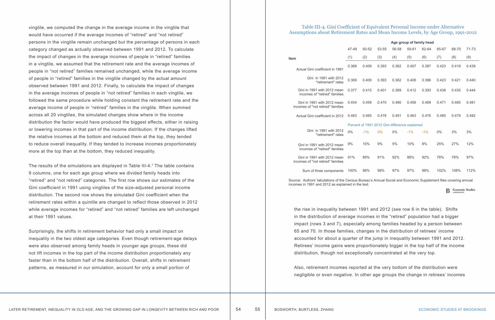
LATER RETIREMENT, INEQUALITY IN OLD AGE, AND THE GROWING GAP IN LONGEVITY BETWEEN RICH AND POOR ECONOMIC STUDIES AT BROOKINGS54 55 BOSWORTH, BURTLESS, ZHANG
vingtile, we computed the change in the average income in the vingtile that would have occurred if the average incomes of “retired” and “not retired” persons in the vingtile remain unchanged but the percentage of persons in each category changed as actually observed between 1991 and 2012. To calculate the impact of changes in the average incomes of people in “retired” families in a vingtile, we assumed that the retirement rate and the average incomes of people in “not retired” families remained unchanged, while the average income of people in “retired” families in the vingtile changed by the actual amount observed between 1991 and 2012. Finally, to calculate the impact of changes in the average incomes of people in “not retired” families in each vingtile, we followed the same procedure while holding constant the retirement rate and the average income of people in “retired” families in the vingtile. When summed across all 20 vingtiles, the simulated changes show where in the income distribution the factor would have produced the biggest effects, either in raising or lowering incomes in that part of the income distribution. If the changes lifted the relative incomes at the bottom and reduced them at the top, they tended to reduce overall inequality. If they tended to increase incomes proportionately more at the top than at the bottom, they reduced inequality.
The results of the simulations are displayed in Table III-4.7 The table contains 9 columns, one for each age group where we divided family heads into “retired” and “not retired” categories. The first row shows our estimates of the Gini coefficient in 1991 using vingtiles of the size-adjusted personal income distribution. The second row shows the simulated Gini coefficient when the retirement rates within a quintile are changed to reflect those observed in 2012 while average incomes for “retired” and “not retired” families are left unchanged at their 1991 values.
Surprisingly, the shifts in retirement behavior had only a small impact on inequality in the two oldest age categories. Even though retirement-age delays were also observed among family heads in younger age groups, these did not lift incomes in the top part of the income distribution proportionately any faster than in the bottom half of the distribution. Overall, shifts in retirement patterns, as measured in our simulation, account for only a small portion of
the rise in inequality between 1991 and 2012 (see row 6 in the table). Shifts in the distribution of average incomes in the “retired” population had a bigger impact (rows 3 and 7), especially among families headed by a person between 65 and 70. In those families, changes in the distribution of retirees’ income accounted for about a quarter of the jump in inequality between 1991 and 2012. Retirees’ income gains were proportionately bigger in the top half of the income distribution, though not exceptionally concentrated at the very top.
Also, retirement incomes reported at the very bottom of the distribution were negligible or even negative. In other age groups the change in retirees’ incomes
Table III-4. Gini Coefficient of Equivalent Personal Income under Alternative Assumptions about Retirement Rates and Mean Income Levels, by Age Group, 1991-2012
Age group of family head
47-49 50-52 53-55 56-58 59-61 62-64 65-67 68-70 71-73
Item (1) (2) (3) (4) (5) (6) (7) (8) (9)
Actual Gini coefficient in 19910.369 0.409 0.393 0.362 0.407 0.387 0.423 0.419 0.439
Gini in 1991 with 2012 "retirement" rates 0.369 0.409 0.393 0.362 0.406 0.386 0.423 0.421 0.440
Gini in 1991 with 2012 mean incomes of "retired" families
0.377 0.415 0.401 0.369 0.412 0.393 0.438 0.435 0.444
Gini in 1991 with 2012 mean incomes of "not retired" families
0.454 0.459 0.470 0.480 0.456 0.469 0.471 0.465 0.481
Actual Gini coefficient in 2012 0.463 0.465 0.478 0.491 0.463 0.476 0.485 0.479 0.482
Percent of 1991-2012 Gini difference explainedGini in 1991 with 2012
"retirement" rates0% -1% 0% 0% -1% -1% 0% 3% 3%
Gini in 1991 with 2012 mean incomes of "retired" families
9% 10% 9% 5% 10% 8% 25% 27% 12%
Gini in 1991 with 2012 mean incomes of "not retired" families
91% 89% 91% 92% 88% 92% 78% 78% 97%
Sum of three components 100% 98% 99% 97% 97% 98% 102% 108% 112%
Source: Authors’ tabulations of the Census Bureau’s Annual Social and Economic Supplement files covering annual incomes in 1991 and 2012 as explained in the text.
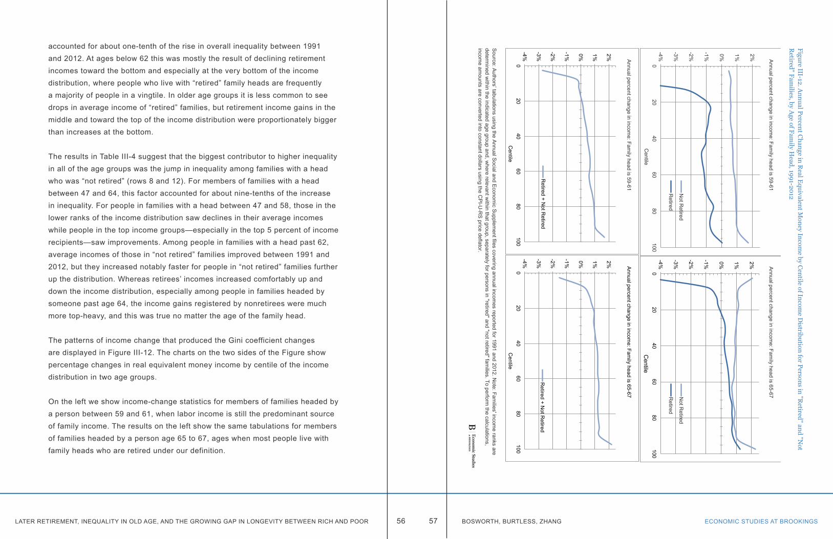
LATER RETIREMENT, INEQUALITY IN OLD AGE, AND THE GROWING GAP IN LONGEVITY BETWEEN RICH AND POOR ECONOMIC STUDIES AT BROOKINGS56 57 BOSWORTH, BURTLESS, ZHANG
accounted for about one-tenth of the rise in overall inequality between 1991 and 2012. At ages below 62 this was mostly the result of declining retirement incomes toward the bottom and especially at the very bottom of the income distribution, where people who live with “retired” family heads are frequently a majority of people in a vingtile. In older age groups it is less common to see drops in average income of “retired” families, but retirement income gains in the middle and toward the top of the income distribution were proportionately bigger than increases at the bottom.
The results in Table III-4 suggest that the biggest contributor to higher inequality in all of the age groups was the jump in inequality among families with a head who was “not retired” (rows 8 and 12). For members of families with a head between 47 and 64, this factor accounted for about nine-tenths of the increase in inequality. For people in families with a head between 47 and 58, those in the lower ranks of the income distribution saw declines in their average incomes while people in the top income groups—especially in the top 5 percent of income recipients—saw improvements. Among people in families with a head past 62, average incomes of those in “not retired” families improved between 1991 and 2012, but they increased notably faster for people in “not retired” families further up the distribution. Whereas retirees’ incomes increased comfortably up and down the income distribution, especially among people in families headed by someone past age 64, the income gains registered by nonretirees were much more top-heavy, and this was true no matter the age of the family head.
The patterns of income change that produced the Gini coefficient changes are displayed in Figure III-12. The charts on the two sides of the Figure show percentage changes in real equivalent money income by centile of the income distribution in two age groups.
On the left we show income-change statistics for members of families headed by a person between 59 and 61, when labor income is still the predominant source of family income. The results on the left show the same tabulations for members of families headed by a person age 65 to 67, ages when most people live with family heads who are retired under our definition.
Figure III-12. Annual Percent C
hange in Real E
quivalent Money Incom
e by Centile of Incom
e Distribution for Persons in "R
etired" and "Not
Retired" Fam
ilies, by Age of Fam
ily Head, 1991-2012
Source: A
uthors’ tabulations using the Annual Social and E
conomic Supplem
ent files covering annual incomes reported for 1991 and 2012.N
ote: Families' incom
e ranks are determ
ined within the indicated age group and, w
here relevant within that group, separately for persons in "retired" and "not retired" fam
ilies. To perform the calculations,
income am
ounts are converted into constant dollars using the CP
I-U-R
S price deflator.
-4%
-3%
-2%
-1% 0% 1% 2%
020
4060
80100
Centile
Annual percent change in incom
e: Family head is 59-61
Not R
etired
Retired
-4%
-3%
-2%
-1% 0% 1% 2%
020
4060
80100
Centile
Annual percent change in incom
e: Family head is 65-67N
ot Retired
Retired
-4%
-3%
-2%
-1% 0% 1% 2%
020
4060
80100
Centile
Annual percent change in incom
e: Family head is 59-61
Retired + N
ot Retired
-4%
-3%
-2%
-1% 0% 1% 2%
020
4060
80100
Centile
Annual percent change in incom
e: Family head is 65-67
Retired + N
ot Retired
LATER RETIREMENT, INEQUALITY IN OLD AGE, AND THE GROWING GAP IN LONGEVITY BETWEEN RICH AND POOR ECONOMIC STUDIES AT BROOKINGS58 59 BOSWORTH, BURTLESS, ZHANG
The bottom panels show the annual rates of size-adjusted income growth, by income centile, for all members of these families, whether or not the head is retired. The top panels show tabulations separately for people in “retired” and “not retired” families. In each case the income ranks of families are separately calculated within the indicated age group and, where relevant, separately within the “retired” and “not retired” populations of the age group. To make our estimates of income gains, we convert 1991 incomes into 2012 dollars using the CPI-U-RS deflator.
Both of the lower panels show a basic pattern of income change that implies inequality rose in the two age groups. The top panels show the distinctive patterns of income change among “retired” and “not retired” families that produced this result. Note that people in “not retired” families experienced at least modest income gains all across the income distribution. In contrast, low-income people in families headed by a retiree experienced sizable income losses. Among people living with a “retired” family head aged 59-61, income losses were experienced across the income spectrum. In contrast, at positions above the 20th centile, people in “not retired” families headed by someone between 65 and 67 experienced at least modest gains in real income, with bigger gains toward the top of the distribution. The shift of 65-67 year-old family heads away from early retirement and toward later employment tended to boost income gains in this age group, especially in the middle and at the top of the distribution. It is nonetheless clear that family heads who could not or chose not to postpone retirement did not enjoy equal improvement in real income.
SUMMARYInequality increased among the nation’s elderly over the past three decades, but it increased much more slowly than it did among the nonelderly. Our analysis suggests one reason for the difference is that low-income Americans past 62 receive better protection against very low incomes than their counterparts who are under 62. Our findings do not imply the low-income aged are totally exempt from the income declines that have afflicted low-income children and nonaged adults. On the contrary, income statistics in the Census Bureau’s March CPS files show that at the very bottom of the income distribution, real incomes have
fallen in recent decades, at least under the Census Bureau’s money income definition (Figures III-5 and III-12). They have simply fared better than nonaged Americans who have a similar position in the income distribution. The Census Bureau’s standard income statistics should probably be viewed with some skepticism, however. Under broader income definitions that include the value of subsidized health insurance and the flow of services from owner-occupied homes, the elderly fare better—and, for many low-income elderly, far better—than they do when the income definition is limited to cash income items.
Our analysis suggests that an important factor boosting inequality among the aged is the same as the main driver of inequality among the nonaged, namely, increased earnings inequality, especially among men. Our tabulations imply that the trend toward later retirement has played little direct role in pushing up inequality among the aged, although it may have played an indirect role because of the composition of the population that has delayed retirement. Earned income inequality among older breadwinners may have increased not only because pay disparities are rising, but also because the best educated and most generously compensated workers are those most likely to delay their retirement. If highly compensated workers exit the workforce at later ages than their counterparts two decades ago, while more poorly paid workers continue to retire at the same ages, the new retirement patterns may be reinforcing the trend toward bigger pay disparities at older ages.
One reason for delayed retirement among well paid workers is that they rationally expect to live longer than their counterparts in earlier generations. There are three ways to deal privately with the prospect of a longer life. Workers can save a bigger percentage of their pay, accumulating larger nest eggs to pay for their retirement. They can reconcile themselves to a lower standard of living during retirement relative to the one they enjoy while at work. Or they can delay their retirement, thereby increasing their nest egg and reducing the added number of years that must be financed out of pre-retirement savings. As we show in the next section, well paid workers are rational in believing their life expectancy will be longer than their parents’. The expectation is founded on powerful evidence on trends in life expectancy among high- and
ECONOMIC STUDIES AT BROOKINGS61 BOSWORTH, BURTLESS, ZHANGLATER RETIREMENT, INEQUALITY IN OLD AGE, AND THE GROWING GAP IN LONGEVITY BETWEEN RICH AND POOR 60
low-income Americans. Recent gains in life expectancy have tended to favor men and women who have high lifetime earnings or other indicators of economic and social advantage. If well-compensated workers expect to live longer than their parents, while poorly paid workers do not face the same hopeful prospect, we can account for some of the difference in retirement behavior between high- and low-pay workers.
Chapter 4. Differential mortalityThe basic structure of the U.S. Social Security system is highly progressive in redistributing income from retirees with high average lifetime earnings to those with lower earnings. The progressivity of the benefit structure is reflected in the relatively low rates of cash income poverty among the aged compared with working-age families. However, researchers have also demonstrated that a large portion of point-in-time redistribution is offset on a lifetime basis by the fact that lower-income retirees have a shorter life expectancy and thus collect benefits for a shorter period.1 The issue has added significance today because of proposals to raise the retirement age in line with increased average life expectancy as a policy response to the funding shortfalls in Social Security and Medicare. This proposal would make sense if the gains in expected life spans are enjoyed equally by rich and poor. However, if life expectancy is increasing only for those at the top of the income distribution, an increase in the retirement age seems unjust for lower income groups which have unchanged or only marginally improved life expectancy. In view of changing relationship between workers’ average lifetime earnings and their chances of surviving into late old age, how can we recalibrate the retirement system to protect the interests of low-wage workers?
A large empirical literature has firmly established that overall life expectancy is strongly correlated with a range of different measures of socioeconomic status (SES), such as income, education, wealth, and occupation. The fact that the rich live longer than the poor should surprise no one. Worryingly, recent studies show that the differential in mortality rates across social and economic status groups has widened in the United States and perhaps in other high-income countries since the 1970s, reversing a long trend toward greater equality in expected life spans (Waldron 2007). Growing inequality of U.S. income seems to be compounded by
LATER RETIREMENT, INEQUALITY IN OLD AGE, AND THE GROWING GAP IN LONGEVITY BETWEEN RICH AND POOR ECONOMIC STUDIES AT BROOKINGS62 63 BOSWORTH, BURTLESS, ZHANG
increased disparity in life expectancy. Earlier we examined the influence of changes in the age of labor force exit on the distribution of economic well-being in early old age. In this chapter, we estimate the distribution of increases in life expectancy across alternative measures of SES. We examine the implications of these changes for the distribution of lifetime Social Security benefits. Our estimates are based on lifetime earnings and benefit records as well as mortality observations in Social Security files matched to interview information obtained in two nationally representative surveys. We then calculate the impact of mortality changes on the distribution of Social Security benefits when the latter are measured on a lifetime basis.
PREVIOUS RESEARCHResearch on disparities in mortality by socioeconomic status (SES) was greatly stimulated by a 1975 study by Kitagawa and Hauser who analyzed a large sample of death records from 1960 that were matched with individual records from the long form of the Decennial Census conducted in that year. One strength of their study was the availability of extensive information on socioeconomic characteristics–including income, education, sex, race, marital status, and occupation–available from the census. The study provided a foundation for future studies that focused on changes in mortality differentials over time. Relatively few studies, however, have had equivalent access to mortality data combined with detailed and comprehensive measures of socioeconomic status available in the long-form Census files. One exception is a study by Pappas and others (1993) that replicated and updated the Kitagawa and Hauser analysis. Pappas and his colleagues found that the disparities in mortality increased between 1960 and 1986. This finding was based on both annual income and education as indicators of SES in a sample in which there were a total of 13,500 deaths.
There are two main strands in the U.S. research on trends in differential mortality. The first focuses on income as the principal measure of SES. Early studies using this indicator relied on Census records; later studies have used longer term measures of career earnings available from the records of the Social Security Administration. A second strand of research uses educational
attainment as the principal measure of SES. These studies often rely on the national mortality database of the National Vital Statistics System and the U.S. Census. After a 1989 reform, U.S. death notices typically include information on decedents’ educational attainment.
All of the data sources used in these analyses have important limitations. For example, the studies relying on Census records to determine each person’s income typically have information on only a single year’s personal or family income. This measure can be criticized because it includes a large transitory component, introducing the possibility that estimated effect sizes are biased downward as a result of measurement error. The multi-year measures of income available in Social Security earnings records reduce this problem. Unfortunately, many workers were excluded from Social Security coverage before the 1970s, possibly affecting the representativeness of workers who have covered earnings records. Before the late 1970s there was a relatively low ceiling on taxable earnings recorded in the Social Security files. In some years during the 1960s, almost half of prime-age men with an annual earnings record earned more than the ceiling amount. The resulting censorship of reported earnings can create problems for comparing men whose prime earning years occurred when the earnings ceiling was low with men whose prime earning years occurred when the ceiling was high. The Social Security earnings of women pose a different kind of challenge. In years when the taxable cap was low relative to economy-wide average wages—1951 through the mid-1970s—women’s earnings were also comparatively low. As women’s average earnings increased, so too did the annual earnings cap. Thus, we have quite accurate measures of women’s earnings in the Social Security files. However, changes in married women’s employment behavior over time affect the usefulness of Social-Security-covered earnings as a measure of their SES. Until the 1980s a large percentage of married women were not in the workforce or only worked intermittently or part-time. Hence their earnings records may provide poor indicators of their SES. One final problem with the Social Security records is that researchers’ access to them is severely restricted as a result of privacy concerns.
LATER RETIREMENT, INEQUALITY IN OLD AGE, AND THE GROWING GAP IN LONGEVITY BETWEEN RICH AND POOR ECONOMIC STUDIES AT BROOKINGS64 65 BOSWORTH, BURTLESS, ZHANG
Information on educational attainment is available for persons independently of their participation in the labor force Education is unquestionably linked to both income and status, and it is easily ascertained. In comparison with income or mid-career earnings, schooling attainment is also less influenced by health conditions that may develop in middle age. However, in some data files, including death record files, education is subject to sizeable reporting error (Boies, Rostron, and Arias 2010). Educational attainment is a relatively gross measure of SES. The data are limited in their variation because a large percentage of adults in each birth cohort have exactly the same level of schooling, high school and college graduation being the two most common levels of education in recent cohorts. As measures of SES, both income and education need to be interpreted as relative to broader societal averages. Average income and schooling attainment increased significantly over the past century. When estimating the effects of SES over an extended span of years it therefore makes sense to measure an individual’s status relative to that of other Americans born in the same year.
Empirical studies using both indicators of SES show increasing divergence in mortality across income classes and levels of educational attainment. In her survey of the empirical literature, Hilary Waldron (2007) argues that mortality differences by SES in the United States were generally narrowing in the first half to the 20th century—probably due to improvements in public health—but they have been widening since the 1960s. Broadly similar patterns have been found in some other rich countries.
EARNINGS-BASED CLASSIFICATION OF SOCIOECONOMIC STATUSThe research based on Social Security earnings records has the advantage of providing a relatively good measure of career income by averaging individual earnings over multiple years. The records provide information for distinguishing between transitory and more permanent measures of income. Waldron (2007) used average nonzero earnings of men for ages 45 to 55 from the administrative records as her measure of mid-career earnings. Her sample included workers in birth cohorts born between 1912 and 1941. The reliance on years with nonzero
earnings does exclude some low-wage workers with poor health. The exclusion probably leads to an understatement of the mortality risk for the disabled and workers near the bottom of the income distribution. Waldron’s analysis excluded women and focused solely on men. The long upward trend in women’s labor force participation and earnings means that women’s own earnings provides an imperfect indicator of their own SES. Waldron estimated the dif¬ference in rates of mortality improvement between the top and bottom half of the male career earnings distribution over the 1972–2001 period. If the difference con¬tinues to grow at the estimated rate, men born in 1941 in the top half of the earnings distribution would be expected to live 5.8 years longer than men in the bottom half of the distribution, up from a difference of only 1.2 years observed for men born in 1912. The result implies an extremely large increase in differential mortality. In a 2013 paper, Waldron expanded her analysis to estimate changes in male mortality risk across deciles of the male earnings distribution. She used that analysis to argue against any notion of a threshold effect of career earnings on mortality risks, favoring a continuous gradient model of risk.
Duggan, Gillingham and Greenlees (2007) conducted a similar study using the same basic data source. They applied slightly different selection criteria than Waldron by explicitly excluding the disabled and limiting their sample to retired workers born between 1900 and 1942. Like Waldron they find a very strong positive relationship between career income and life expectancy, with an estimated difference of 2-3 years between the top and bottom deciles. Their study does not address the issue of a widening mortality differential over time. Their results show that workers who exhibit a rising trend in earnings live significantly longer. They also find that the income-related differences in mortality between whites and blacks are most pronounced in the lower parts of the income distribution. Cristia (2009) used career earnings from Social Security records as the indicator of SES. His results show substantial increases in differential mortality for the period 1983-2003.
EDUCATION-BASED CLASSIFICATION OF SOCIOECONOMIC STATUSEducation has been frequently used as the indicator of SES because it is

LATER RETIREMENT, INEQUALITY IN OLD AGE, AND THE GROWING GAP IN LONGEVITY BETWEEN RICH AND POOR ECONOMIC STUDIES AT BROOKINGS66 67 BOSWORTH, BURTLESS, ZHANG
available for everyone at an early stage of life and is less sensitive to transitory factors compared with annual income. As discussed above, educational attainment is nowadays included in individual death certificates. Completion of schooling also precedes most of the adverse health and other life events that would be expected to influence mortality. Since publication of the Kitagawa and Hauser (1975) study, analysts have completed a number of studies focusing on the question of whether mortality differentials between educational groups have been increasing. Preston and Elo (1995) reviewed a number of those studies and reported a mixed story in which the differential had clearly widened since 1960 for males, but it appeared to have declined or remained stationary for women.2
The most recent studies have confirmed an increase in the mortality differential. Meara, Richards, and Cutler (2008) examined mortality patterns from the Multiple Cause of Death data file (1990 and 2000) and the National Longitudinal Mortality Study (1981-88 and 1991-98). They restricted their analysis to non-Hispanic blacks and whites. They found that the increase in life expectancy at age 25 in both surveys was largely limited to those at the top of the educational distribution and that life expectancy gains were larger for men than women. Mortality differentials have actually declined across both gender and race.
Olshansky and others (2012) used mortality data from the Multiple Cause of Death file matched with estimates of the population by age, sex, race and educational attainment from the Census Bureau for the period of 1990 to 2008. They found evidence of rapidly widening mortality differentials. Life expectancy at birth actually fell for white males and females with less than 12 years of schooling, while it increased for blacks and Hispanics. It rose for all racial and sex groups with education in excess of 12 years, except for Hispanic males, and the increases were largest for those with 16 and more years of schooling.
Finally, area studies have matched mortality records with SES information from the Census data at the level of counties and even Census tracks in which the decedent lived. Thus, the studies compare individuals’ mortality experience with average SES characteristics of the county in which individuals
lived. A recent study by Singh and Siahpush (2006) used data from the 1980, 1990, and 2000 Censuses to develop a factor-based composite index of deprivation (equivalent to SES) at the level of about four thousand counties. These counties were assigned to ten decile groups from the most to the least deprived. Corresponding mortality data by age, sex, and county were obtained for 1980-82, 1989-1991, and 1998-2000 from the national mortality database. The analysts calculated life expectancy within 5-year age intervals from birth to age 85. Differentials in life expectancy between the 1st and 10th deciles of deprivation consistently decline by age, but the differential at any given age increased substantially between 1980 and 2000 for both men and women. For men, the differential at age 25 increased from 3 years in 1980 to 4.5 years in 2000. At age 65 it rose from 0.4 years to 1.9 years. For women, the differential increased from 0.8 to 2.8 years at age 25, and from 0 to 1.5 years at age 65. It should be noted, however, that cross-county migration as well as demographic change within counties may mean that area-level analyses could disguise the full impact of SES differences on mortality rates disparities at the individual level.
INTERNATIONAL EVIDENCE Research in other high-income countries demonstrates that large differences in mortality by SES is an international phenomenon. The international results are important because it might otherwise to be tempting to attribute the correlation between life expectancy and the various measures of SES in the United States to inequalities in access to the health care system. The international evidence, however, suggests that increased differential mortality is a common phenomenon whose causes are more complex than income-related variations in access to health care. Most other rich countries have some version of universal health coverage whereas the United States does not. The most relevant studies also focus on the population of older persons (age 50 and above).3
A National Research Council (2011) report and its supporting documents (2010) provide a detailed review of mortality differences among those over age 50 within a sample of high-income countries. While that research is largely focused on education as the measure of SES, it found that high rates of mortality among

LATER RETIREMENT, INEQUALITY IN OLD AGE, AND THE GROWING GAP IN LONGEVITY BETWEEN RICH AND POOR ECONOMIC STUDIES AT BROOKINGS68 69 BOSWORTH, BURTLESS, ZHANG
U.S. men relative to comparable males in Europe were most evident at lower levels of educational attainment, whereas the rate for those with the highest level of education were equal to or below those of similar males in Europe. The results were somewhat different for women, where the U.S. mortality rate for those over age 50 was higher across all levels of educational attainment relative to outcomes in most Northern and Western European countries.
The Whitehall studies of male employees in the British civil service, initiated in 1967, documented a steep inverse relationship between civil service grade and health and mortality outcomes (Marmot and others 1984). Men in the lowest grade had a mortality risk three times higher than that of those in the highest grade. In focusing on civil servants, the study largely excluded Britons who would be classified as poor, demonstrating that premature mortality was not limited to the poor and near poor and that the relationship between mortality and an index of SES was best described as a continuous gradient. This was also one of the first studies to show that only a small proportion of the difference in mortality outcomes could be traced to behavioral risks or lack of access to health care.4
Canada provides a useful comparison to the United States because, while it shares some similarities in measures of SES, it has long provided a high-quality national health care system open to all. An analysis of a database linking SES information from the Census long-form with administrative records of 2.7 million individuals, who were followed from 1991 to 2001, revealed a strong inverse correlation between mortality risk and a variety of SES indicators (Wilkins and others 2008). Another study, using administrative data from the Canadian pension system, found a strong negative relationship between a measure of career earnings and mortality at ages 65-74 (Wolfson and others, 1993).
The international research on the question of whether the size of differential mortality is increasing over time remains surprisingly limited. While agreeing that there is a global pattern of large differences in mortality across educational categories, the National Research Council panel was reluctant to draw a firm conclusion about trends in the mortality differentials. The panel did cite a study
(Mackenbach and others, 2003) which concluded that differential mortality, as measured by educational attainment and occupational class, had increased in six European countries. The United States stands out, however, for having a larger volume of research aimed at analyzing the secular trend in differential mortality.
IMPLICATIONS FOR THE PROGRESSIVITY OF SOCIAL SECURITYThere have now been a substantial number of studies of the distributional aspects of OASDI and the influence of differential mortality. Many of the major issues have been identified and generally agreed upon. First, the basic benefit formula of the retirement program is highly progressive with respect to point-in-time benefits, but some of the progressivity is offset on a lifetime basis by the longer expected lifetimes of high-income recipients.5 Second, the conclusions are strongly affected by whether disability and survivor benefits (both of which are very progressive) are included in the analysis (U.S. Congressional Budget Office 2006). Finally, the results vary depending on whether the progressivity is evaluated on an individual or couple basis, because of the important role of spousal benefits and the complex interaction between two the spouse’s own retired-worker benefits (Smith and others 2003; Gustman and Steinmeier 2001).
The Congressional Budget Office (2006) used its long-term micro-simulation model to evaluate the progressivity of overall Social Security program (including retired workers, disabled workers, and their dependents and survivors). Its study showed that the OASDI system was progressive in terms of the ratio of lifetime benefits to lifetime contributions. CBO’s progressivity measure was based on the income and net benefits (lifetime benefits minus lifetime contributions) of individuals. It took account of the option of a spouse to receive a spousal benefit, but it did not treat married couples as a single entity. The largest contribution to the program’s progressivity was the result of the disability and survivor programs. Steuerle, Carraso, and Cohen (2004) conducted a similar study using the Modeling Income in the Near Term (MINT) model of the Social Security Administration. Their conclusions closely matched those of the CBO, and they found that the overall system is progressive.
LATER RETIREMENT, INEQUALITY IN OLD AGE, AND THE GROWING GAP IN LONGEVITY BETWEEN RICH AND POOR ECONOMIC STUDIES AT BROOKINGS70 71 BOSWORTH, BURTLESS, ZHANG
Goda, Shoven, and Slavov (2009) focused on the role of differential mortality, but limited their analysis to the retired-worker portion of Social Security and a set of hypothetical earnings profiles. They conclude that inclusion of estimated magnitudes of differential mortality from Waldron (2007) and Cristia (2009) results in a near-complete offset of the progressivity normally shown for the retired-worker program. Harris and Sabelhaus (2005) used the CBO simulation model (discussed above) to evaluate the role of differential mortality in more detail. Starting from the projections of the Social Security Trustees as a baseline, they simulated a range of alternative assumptions about relative mortality rates. Surprisingly, they conclude that differential mortality had only a small impact on the progressivity of the overall system.
BASIC DATA SOURCESOur analysis of the trend in differential mortality is based on information collected in two household surveys. The survey data were matched to Social Security Administration data on career earnings, benefit payments, and individual mortality. The first household survey is the SIPP. The second is the HRS. The SIPP began in 1984, and in this chapter we use combined data from the 1984, 1993, 1996, 2001, and 2004 panels for individuals born between 1910 and 1950. The HRS was started in 1992 with an initial sample of individuals born between 1931 and 1941. The survey was expanded in 1993 to include a sample of individuals born before 1924 and again in 1998 with samples of those born in 1924-30 and 1943-47. Younger cohorts continue to be brought into the study every six years. Our analysis sample includes individuals born between 1910 and 1950. The individual-level data in both surveys are linked to Social Security records containing information on respondents’ birth years, lifetime earnings, OASDI benefits, and deaths.
For people enrolled by the Census Bureau in the SIPP sample, we were able to match about 80 percent of the respondents to their corresponding Social Security earnings and death records.6 As discussed later, the sample was further reduced to limit it to members of families in which the respondent or spouse had positive earnings between ages 41 and 50. The result is a total sample of 41,000 men and 46,000 women (see the top panel in Table IV-1).7
We were able to match about 95 percent of respondents who were “married, with spouse present” at the time of the SIPP interview to their spouse’s Social Security record. However, in the SIPP we do not have up-to-date information about respondents’ past or post-interview marriage partners. In our sample there was a total of 29,000 deaths. We created a person-year dataset, in which each respondent enters the sample in the year corresponding to their initial SIPP interview (beginning as early as 1984) and remains in the sample until the year of their death or until 2012 (the last year for which we have reliable death data). That final dataset has 487,000 person-year observations for men and 573,000 observations for women.
The HRS is a considerably smaller data set, containing information on 13,000 men and 17,000 women. However, surviving sample members continue to be re-interviewed on a biennial basis, giving researchers updated information on respondents’ social, economic, and health situation. Unfortunately, organizers of the HRS had greater difficulty in obtaining respondents’ permission to use their Social Security administrative records. As a result, only about 60 percent of workers in the HRS sample have records containing information from the Social Security administrative files. We are not restricted to the SSA administrative records for reported death dates, however, because the HRS maintains its own tracker file. The HRS sample consists of an older group of respondents compared with the SIPP sample, and it has a higher overall death rate. As shown in Table IV-1, however, the death rates in the two survey files are comparable for the individual birth cohorts.
The design of the HRS survey raises some question about its representativeness, especially in the case of the oldest birth cohorts. The original HRS sample, covering non-institutionalized Americans born in 1931-1941, was first surveyed in 1992 when sample members were in their 50s and early 60s. The study was later expanded to include the older AHEAD sample (born before 1924) in 1993 and the CODA sample (born in 1924-1930) in 1998. The AHEAD sample was already past age 70 when it entered the study. We have no information on deaths in the AHEAD birth cohorts that occurred before the AHEAD sample was enrolled. The youngest members of the CODA sample
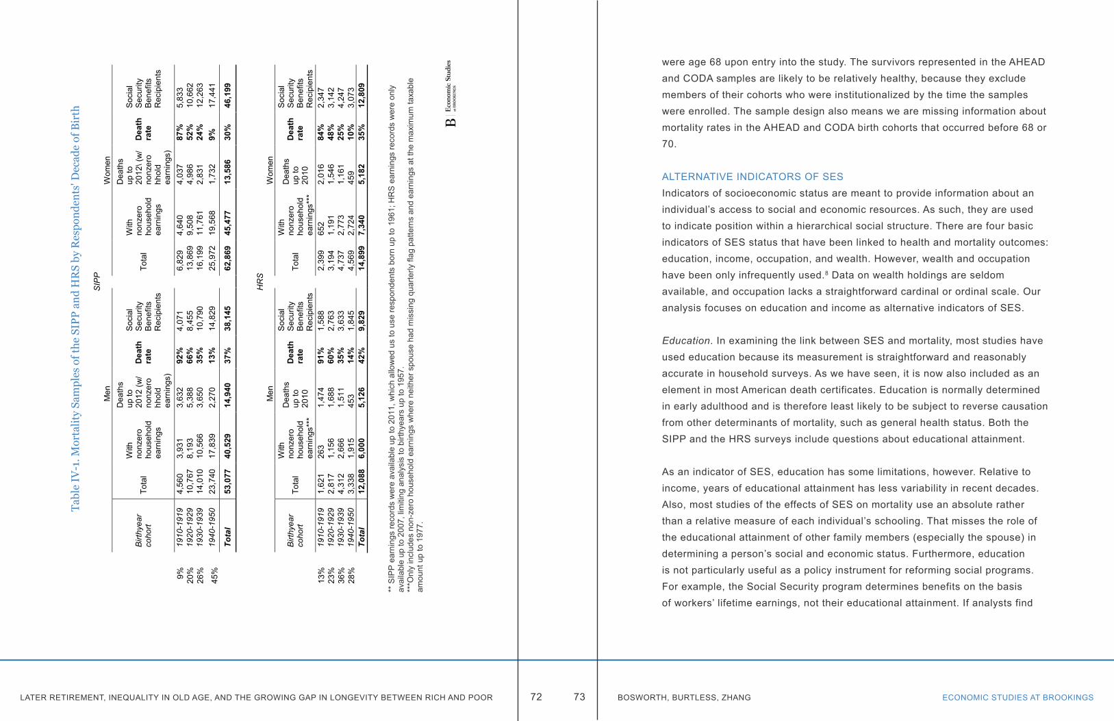
LATER RETIREMENT, INEQUALITY IN OLD AGE, AND THE GROWING GAP IN LONGEVITY BETWEEN RICH AND POOR ECONOMIC STUDIES AT BROOKINGS72 73 BOSWORTH, BURTLESS, ZHANG
Tabl
e IV
-1. M
orta
lity
Sam
ples
of t
he S
IPP
and
HR
S by
Res
pond
ents
' Dec
ade
of B
irth
SIP
PM
enW
omen
Birt
hyea
r co
hort
Tota
l
With
no
nzer
o ho
useh
old
earn
ings
Dea
ths
up to
20
12 (w
/ no
nzer
o hh
old
earn
ings
)
Dea
th
rate
Soc
ial
Sec
urity
B
enef
its
Rec
ipie
nts
Tota
l
With
no
nzer
o ho
useh
old
earn
ings
Dea
ths
up to
20
12\(
w/
nonz
ero
hhol
d ea
rnin
gs)
Dea
th
rate
Soc
ial
Sec
urity
B
enef
its
Rec
ipie
nts
9%19
10-1
919
4,56
03,
931
3,63
292
%4,
071
6,82
94,
640
4,03
787
%5,
833
20%
1920
-192
910
,767
8,19
35,
388
66%
8,45
513
,869
9,50
84,
986
52%
10,6
6226
%19
30-1
939
14,0
1010
,566
3,65
035
%10
,790
16,1
9911
,761
2,83
124
%12
,263
45%
1940
-195
023
,740
17,8
392,
270
13%
14,8
2925
,972
19,5
681,
732
9%17
,441
Tota
l53
,077
40,5
2914
,940
37%
38,1
4562
,869
45,4
7713
,586
30%
46,1
99
HR
SM
enW
omen
Birt
hyea
r co
hort
Tota
l
With
no
nzer
o ho
useh
old
earn
ings
***
Dea
ths
up to
20
10
Dea
th
rate
Soc
ial
Sec
urity
B
enef
its
Rec
ipie
nts
Tota
l
With
no
nzer
o ho
useh
old
earn
ings
***
Dea
ths
up to
20
10
Dea
th
rate
Soc
ial
Sec
urity
B
enef
its
Rec
ipie
nts
13%
1910
-191
91,
621
263
1,47
491
%1,
588
2,39
965
22,
016
84%
2,34
723
%19
20-1
929
2,81
71,
156
1,68
860
%2,
763
3,19
41,
191
1,54
648
%3,
142
36%
1930
-193
94,
312
2,66
61,
511
35%
3,63
34,
737
2,77
31,
161
25%
4,24
728
%19
40-1
950
3,33
81,
915
453
14%
1,84
54,
569
2,72
445
910
%3,
073
Tota
l12
,088
6,00
05,
126
42%
9,82
914
,899
7,34
05,
182
35%
12,8
09
** S
IPP
ear
ning
s re
cord
s w
ere
avai
labl
e up
to 2
011,
whi
ch a
llow
ed u
s to
use
resp
onde
nts
born
up
to 1
961;
HR
S e
arni
ngs
reco
rds
wer
e on
ly
avai
labl
e up
to 2
007,
lim
iting
ana
lysi
s to
birt
hyea
rs u
p to
195
7.**
*Onl
y in
clud
es n
on-z
ero
hous
ehol
d ea
rnin
gs w
here
nei
ther
spo
use
had
mis
sing
qua
rterly
flag
pat
tern
s an
d ea
rnin
gsat
the
max
imum
taxa
ble
amou
nt u
p to
197
7.
were age 68 upon entry into the study. The survivors represented in the AHEAD and CODA samples are likely to be relatively healthy, because they exclude members of their cohorts who were institutionalized by the time the samples were enrolled. The sample design also means we are missing information about mortality rates in the AHEAD and CODA birth cohorts that occurred before 68 or 70.
ALTERNATIVE INDICATORS OF SESIndicators of socioeconomic status are meant to provide information about an individual’s access to social and economic resources. As such, they are used to indicate position within a hierarchical social structure. There are four basic indicators of SES status that have been linked to health and mortality outcomes: education, income, occupation, and wealth. However, wealth and occupation have been only infrequently used.8 Data on wealth holdings are seldom available, and occupation lacks a straightforward cardinal or ordinal scale. Our analysis focuses on education and income as alternative indicators of SES.
Education. In examining the link between SES and mortality, most studies have used education because its measurement is straightforward and reasonably accurate in household surveys. As we have seen, it is now also included as an element in most American death certificates. Education is normally determined in early adulthood and is therefore least likely to be subject to reverse causation from other determinants of mortality, such as general health status. Both the SIPP and the HRS surveys include questions about educational attainment.
As an indicator of SES, education has some limitations, however. Relative to income, years of educational attainment has less variability in recent decades. Also, most studies of the effects of SES on mortality use an absolute rather than a relative measure of each individual’s schooling. That misses the role of the educational attainment of other family members (especially the spouse) in determining a person’s social and economic status. Furthermore, education is not particularly useful as a policy instrument for reforming social programs. For example, the Social Security program determines benefits on the basis of workers’ lifetime earnings, not their educational attainment. If analysts find
LATER RETIREMENT, INEQUALITY IN OLD AGE, AND THE GROWING GAP IN LONGEVITY BETWEEN RICH AND POOR ECONOMIC STUDIES AT BROOKINGS74 75 BOSWORTH, BURTLESS, ZHANG
evidence that mortality differentials are widening and policymakers believe a recalibration of the benefit formula is needed to compensate low-income contributors for their relatively small gains in longevity, it is not easy to see how measures of widening mortality differentials by educational attainment can be directly used to adjust the benefit formula.
Finally, in a recent critique of the 2012 paper by Olshansky and others, Bound and others (2014) note that there has been a substantial improvement in average levels of educational attainment over the range of birth cohorts included in the Olshansky et al. analysis. Thus, it is possible that classifying individuals by completed grade or degree attained does not yield a consistent measure of SES rank across birth cohorts. Educational attainment has risen considerably over time. In the 1962 Current Population Survey, 58 percent of the men who were between 48 and 52 years old (and born between 1910 and 1914) reported they had not completed high school; just 9 percent reported they had completed college. In the 1998 Current Population Survey, only 14 percent of 48-52 year-old men (born between 1946 and 1950) reported they had failed to complete high school; 33 percent reported they had obtained a college degree. Clearly, the lack of a high school diploma was an indicator of much more serious disadvantage for 48-52 year-old men in 1998 than it was in 1962. Completion of college was a more marked indicator of social and economic advantage in 1962 than it was in 1998. If we find that failure to complete high school is associated with a much bigger increase in mortality among men born in 1946-1950 compared with men born in 1910-1914, we should hardly be surprised. Men who failed to complete high school represented a much smaller and economically more disadvantaged population in 2010 compared with 1962.
We deal with this problem by converting respondents’ educational attainment reports into number of years of schooling and then normalizing each person’s years of schooling relative to the average of the educational attainment of their immediately surrounding birth cohorts (people born within two years before or after the person’s birth year). The calculations were done separately for men and women and effectively eliminated any trend in our measure of “relative education.”9
Income and earnings. Some of the early studies of the effects of SES on mortality used current income as an indicator of SES because it was the only available measure of income in the Census or other household survey. It has long been recognized, however, that current income is a poor basic indicator of SES because of its sensitivity to adverse health shocks or other transitory, income-reducing events. Our access to Social Security earnings records makes it possible for us to construct an average of past earnings–what we shall label “mid-career earnings.” This measure of SES avoids many of the problems caused by using a single year’s income. A 10-year average of mid-career earnings dilutes the role of transitory influences and comes close to the concept of permanent income. Our use of average earnings in middle age also reduces, though it does not eliminate, the potential for reverse causation flowing from health to income.
The quality and limitations of the Social Security earnings data have varied over the years. Until 1978, the Social Security Administration maintained its own earnings records based on quarterly reports of employers. In 1978 SSA switched to reliance on annual earnings information. Between 1951 and 1977 the earnings data were limited to covered earnings up to the annual taxable wage ceiling. Unfortunately, the ceiling wage was not regularly adjusted to reflect changes in the distribution of earnings. The ceiling wage was only 3 percent above the economy-wide average earnings level in 1965 but 69 percent above average earnings in 1977. In this chapter we impute workers’ earnings above the taxable wage ceiling using information on the quarter in which a worker’s earnings reached the maximum taxed amount. For workers who reached the ceiling with 4 quarters of reported earnings the imputed annual total wage was set to 1.14 times the taxable maximum; for those with 3 quarters we assigned an imputed amount equal to 1.53 times the taxable maximum; for those with two quarters, the imputed ratio was 2.36; and for those who reached the ceiling in the 1st quarter, the imputed ratio was set at 5 times the taxable maximum.10 The annual earnings data available since the early 1980s has the major advantage of providing measures of earnings in excess of the taxable wage ceiling. In addition, it includes earnings from both Social Security covered and uncovered jobs. In this chapter we cap the annual earnings distribution
LATER RETIREMENT, INEQUALITY IN OLD AGE, AND THE GROWING GAP IN LONGEVITY BETWEEN RICH AND POOR ECONOMIC STUDIES AT BROOKINGS76 77 BOSWORTH, BURTLESS, ZHANG
at the 98th percentile to reduce the impact on our results of a few very large values in the post-1977 data.11
In Appendix B we show results using an alternative procedure to measure mid-career earnings. That procedure uses only information on workers’ reported SSA earnings below a maximum percentile level. In the case of men the maximum percentile is less the median earnings level in each year. We selected the maximum percentile so that the earnings we counted in each calendar year would be measured in a consistent way, regardless of whether the maximum taxable amount in the year was high or low in relation to the earnings distribution in that year. Obviously, the alternative method does not permit us to distinguish between the earnings of male workers’ who earn average and well-above-average earnings, but it does give a consistent method for distinguishing low-earnings men from men with higher incomes. In the remainder of this chapter, we will use information about the full range of earnings reported in the Social Security records, including plausible imputations of earnings above the maximum taxable earnings amount.
We created a measure of average or career earnings by first deflating the nominal annual earnings using the SSA average wage index with a base of 2005. This procedure largely eliminates the influence of secular economy-wide wage growth on our measure of workers’ annual earnings. Career earnings were computed as an average of each worker’s real nonzero earnings in the age range from 41 to 50.12 The resulting average values from the SIPP sample are shown separately for men and women by birth year in Figure IV-1. These earnings estimates raise some of the same issues we have already mentioned in our discussion of educational indicators of SES. Because women have been increasingly likely to be employed in successive birth cohorts, their career earnings are steadily rising relative to those of men. Meanwhile, the average (indexed) wage of men is declining for the youngest birth cohorts. Note that the economy-wide earnings index includes the annual wages of all workers in a given calendar year, rather than only those of workers between 41 and 50, so our indexed estimates of mid-career earnings will be affected by changes in the age distribution of the overall work force as well as the average wage of
Figure IV-1. Male and Female Mid-Career Earnings by Birth Year 1910-1965. Thousands of 2005 dollars
Source: Authors' calculations as explained in text.
0
10000
20000
30000
40000
50000
60000
70000
1910 1920 1930 1940 1950 1960
Males Females
LATER RETIREMENT, INEQUALITY IN OLD AGE, AND THE GROWING GAP IN LONGEVITY BETWEEN RICH AND POOR ECONOMIC STUDIES AT BROOKINGS78 79 BOSWORTH, BURTLESS, ZHANG
41-50 year-olds relative to other earners. To eliminate any secular drift in our estimates of average earnings across birth cohorts we employed an adjustment similar to the one we used to convert individuals’ educational attainment into a relative measure of education. We measured individual career earnings relative to the average mid-career earnings of the birth cohorts born within two years before or two years after each worker’s own birth year. We calculated these estimates of workers’ relative earnings separately for men and women.
A final complication involves the treatment of married individuals. Many married women, born in the 1940s and earlier decades, did not work outside the home, making mid-career earnings a problematic indicator of their socioeconomic status. Therefore, we combined husband-and-wife earnings as our primary income-based measure of household-level SES. We define “equivalized” household earnings for individuals with a spouse as the sum of the two mid-career earnings amounts divided by the square root of two.13 For respondents who do not have a spouse, we use individual mid-career earnings. Our measurement procedure requires us to exclude from the analysis individuals who were single in the SIPP and did not have positive earnings between ages 41 and 50.
The HRS has matched Social Security records for a smaller percentage of HRS respondents than does the SIPP. There were also problems with the Social Security records workers who entered the HRS sample in the survey’s early years.14 As a result, the proportion of the HRS sample with observed mid-career earnings is less than 50 percent (Table IV-1).15 In order to extend our HRS analysis beyond the workers with Social Security earnings records, we estimated earnings-prediction models separately for men and women enrolled in the SIPP. The specification includes education and additional variables that can be matched across the HRS and SIPP surveys (appendix Table A1). We use the regression results shown in columns 2 and 4 of Table A1 to generate predicted mid-career earnings values for the full HRS sample. This gives us a measure of individual and equivalized household earnings for nearly everyone in the HRS sample. While we report some of the mortality results based on the restricted sample using only HRS observations with Social-Security-reported earnings, our
analysis of mortality in the HRS sample relies largely on predicted mid-career earnings as our income-based indicator of SES.
OTHER VARIABLESWe perform separate statistical analyses of mortality risk among men and women. In addition to the SES indicators already described, our specification includes categorical variables measuring race/ethnicity and marital status. Both the SIPP and HRS surveys also include a self-reported measure of health status, which is of interest because it identifies one of the channels through which variations in SES might influence mortality. For the SIPP, we have a single measure of health status from the individual’s first interview. That value can range from a value of 1 for those in excellent health to 5 for those in poor health. The same health measure is available in the HRS, but respondents are asked to reassess their health status in each biennial wave. We used the self-reported value of health status in each HRS respondent’s entry interview to reduce the potential for reverse causation. We also experimented with inclusion of an indicator showing whether the respondent was ever disabled. For the HRS, it is derived from a question in the survey; for SIPP sample members, the information is derived from the individual’s Social Security benefit record, which shows whether the person claimed Disability Insurance benefit.
ESTIMATION OF MORTALITY RISKSWe constructed an annual data file in which each respondent is included beginning from the year of entry into the sample or in the year in which they reach age 50, whichever is later. Sample members remain in our analysis sample through the year 201216 (the last year of reliable death information) or their year of death, whichever occurs earlier. For the SIPP, our analysis file includes individuals with birth years from 1910 to 1950. The earliest year of entry into the sample is 1984 and the latest is 2004. The resulting data set contains 487,000 person-year observations for men and 573,000 for women. For the HRS, the file includes individuals with birth years from 1910 to 1957. The earliest entry year is 1992 and the latest is 2004, when the early baby boom cohorts were first enrolled. There is a maximum of 155,000 person-year observations for men and 203,000 for women.

LATER RETIREMENT, INEQUALITY IN OLD AGE, AND THE GROWING GAP IN LONGEVITY BETWEEN RICH AND POOR ECONOMIC STUDIES AT BROOKINGS80 81 BOSWORTH, BURTLESS, ZHANG
The statistical analysis is based on a logit regression of mortality risk that takes the form:
(hit/(1-hit )) = exp(β ij * Xijt ), where hit = Pr(Yit = 1 / Yit-1 = 0) is the hazard that person i will die in year t;
and X ijt is a vector of potential determinants of mortality risk. The determinants include the person’s SES, age, birth year, and categorical variables for race/ethnicity, marital status, and disability.17 Ages range from 50 to 100. Our indicator of birth year is the person’s birth year minus 1900. The birth year is our basic indicator of cohort effects. We employ two alternative indicators of SES (mid-career earnings and educational attainment), social and economic indicators that are potentially linked to differential mortality. For each of these measures we also include the interaction of SES with the birth year in order to estimate a rise or decline in differential mortality across successive birth cohorts.
The fact that that the age-specific mortality rate is constrained to increase by a fixed proportional amount at every age and across successive cohorts may impose too great of a functional form restriction on the analysis. We experimented with alternative nonlinear measures of age, but they were never statistically significant. In Appendix B we show the effect of estimating widening mortality differentials in narrower age groups that the age 50-to-100 age group examined in this chapter.
REGRESSION ANALYSISWe report the regression results for the SIPP and HRS data sets separately in Tables IV-2 and IV-3. Mortality risks for men and women are estimated individually, and in Table IV-2 we show three regressions for each sex using data from the SIPP. The first column reports a regression with age, birth year, and the two alternative measures of SES (mid-career earnings and educational attainment). There is a strong age profile for both men and women, showing an increasing one-year probability of death as respondents age. The coefficient on
Table IV-2. M
ortality Regressions using A
lternative SES Indicators w
ith Birthyear Interaction, SIPP
Men
Wom
en
No S
ES
Interaction
Equivalized
Midcareer
Earnings
($1000's)
Relative
Education
No S
ES
Interaction
Equivalized
Midcareer
Earnings
($1000's)
Relative Education
(1)(2)
(3)(4)
(5)(6)
Intercept-8.3905
***-8.8043
***-8.9317
***-9.8098
***-10.1610
***-10.4118
***
Age
0.0824***
0.0819***
0.0820***
0.093***
0.0928***
0.0930***
Birthyear (-1900)
-0.0222***
-0.0054*
0.0004-0.0126
***0.0022
0.0125**
SE
SH
ousehold Earnings
-0.00408***
0.0054***
-0.0038***
-0.00425***
0.0060***
-0.0040***
Earnings x
Birthyear
Interaction-0.0004
***-0.0004
***
Relative E
ducation-0.2661
***-0.2729
***0.3150
***-0.3252
***-0.3288
***0.2915
**E
ducation x Birthyear
Interaction -0.0236
***-0.0259
***
Race / ethnicity
Black (yes=1)
0.1002**
0.1083***
0.1068***
0.03660.0438
0.0473W
hite, Hispanic, O
ther R
eference Group
Reference G
roup
Marital S
tatusN
ever (yes=1)0.3071
***0.2789
***0.3081
***0.2253
***0.1811
***0.2210
***S
eparated / Divorced (yes=1)
0.3341***
0.3128***
0.3360***
0.1159***
0.0745*
0.1204***
Married / W
idowed (yes=1)
Reference G
roupR
eference Group
Ever D
isabled0.8643
***0.8388
***0.8489
***0.9186
***0.8933
***0.9078
***First-year in Survey (yes = 1)
-0.7202***
-0.7220***
-0.7202***
-0.9014***
-0.9010***
-0.9014***
No.of observations
487,061487,061
487,061573,188
573,188573,188
Psuedo R
-square0.028
0.0280.028
0.0240.024
0.024
*** : p < 0.001; ** : p < 0.01; * : p < 0.1
LATER RETIREMENT, INEQUALITY IN OLD AGE, AND THE GROWING GAP IN LONGEVITY BETWEEN RICH AND POOR ECONOMIC STUDIES AT BROOKINGS82 83 BOSWORTH, BURTLESS, ZHANG
the birth year is negative, indicating that mortality risk is declining for successive age cohorts–they are living longer. We include both SES indicators, and their coefficients are negative with high statistical significance.18 Thus, consistent with earlier research we find strong statistical evidence of differential mortality. People with high equivalized earnings or educational attainment have lower rates of mortality than those who have less earnings or less schooling. Marital status and past disability are also highly significant predictors of mortality risk. The role of race is more marginal, however, once we include measures of mid-career earnings and educational attainment.
Table IV-3. Mortality Regressions Using Alternative SES Indicators, Health and Retirement Study
Men Women
Predicted Midcareer Earnings ($1000's)
Relative Education
Predicted Midcareer Earnings ($1000's)
Relative Education
(1) (2) (3) (4)
Intercept -9.3043 *** -9.1677 *** -11.1159 *** -11.1387 ***
Age 0.0833 *** 0.0835 *** 0.0976 *** 0.0982 ***
Birthyear (- 1900) 0.0072 -0.0018 0.0220 *** 0.0196 ***
SES 0.0053 * 0.1139 0.0077 ** 0.3311 **SES x Birthyear -0.0004 *** -0.0148 ** -0.0006 *** -0.0264 ***
Race / ethnicityBlack (yes=1) 0.1328 ** 0.1791 *** 0.0984 * 0.1753 ***
White, Hispanic, Other Reference Group Reference Group
Marital StatusNever (yes=1) 0.2352 ** 0.3123 *** 0.0874 0.2121 **Separated / Divorced 0.2776 *** 0.3418 *** -0.0635 0.1585 **
Married / Widowed Reference Group Reference Group
Ever Disabled 0.6659 *** 0.7439 *** 0.7104 *** 0.7447 ***First-year in Survey -1.6996 *** -1.6990 *** -2.2539 *** -2.2911 ***
No. of observations 155,220 155,450 203,202 205,721Psuedo R-square 0.029 0.029 0.027 0.0279
*** : p < 0.001; ** : p < 0.01; * : p < 0.1
Our test for increasing differential mortality is displayed in columns 3 and 4 which show results when we add an interaction between birth year and one of the two measures of SES. While the interaction complicates the interpretation of the other coefficients, a negative coefficient on the interaction term implies that the magnitude of differential mortality across levels of mid-career earning or educational attainment is increasing in later birth cohorts. Surprisingly, there is very little to choose between the two indicators of SES: they both yield very significant negative coefficients on the interaction of the SES indicator with the birth year, implying strongly increasing differential mortality. The measures of overall explanatory power are also virtually identical. The interaction of education with birth year has a larger negative coefficient than the interaction of mid-career earnings with birth year, appearing to suggest a more pronounced pattern of increasing differential mortality. However, the larger coefficient is due to the limited range of variation in educational attainment compared to mid-career earnings.
The coefficient estimates for men and women show very similar influences for many of the determinants of mortality. For both sexes there is powerful evidence of increasing differential mortality using either mid-career earnings or educational attainment as an indicator of SES. It is noticeable, however, that marital status has a consistently smaller impact on female mortality. Women’s mortality is apparently less adversely affected by living in an unmarried state.
Comparable results from the HRS are displayed in Table IV-3. The problem of constructing a measure of mid-career earnings based on Social Security earnings records, discussed above, results in a considerable loss of observations. We therefore emphasize predicted mid-career earnings as the best income-based indicator of SES for the HRS sample. Not surprisingly, education is one of the strongest predictors of mid-career earnings, which makes it hard to statistically distinguish the separate effects of education and predicted earnings on mortality. Consequently, we modified the HRS mortality regression to incorporate only one measure of SES—mid-career earnings or education—in each specification.19 As we found in the SIPP sample, our results based on the HRS indicate strongly increasing differential mortality
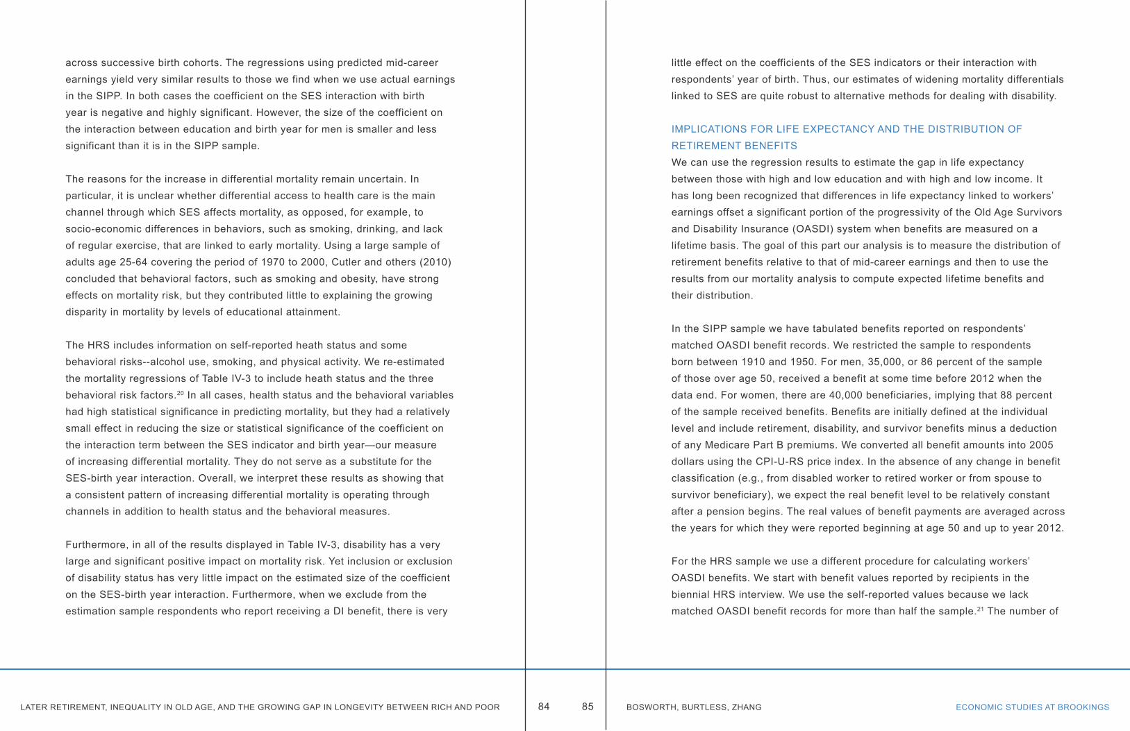
LATER RETIREMENT, INEQUALITY IN OLD AGE, AND THE GROWING GAP IN LONGEVITY BETWEEN RICH AND POOR ECONOMIC STUDIES AT BROOKINGS84 85 BOSWORTH, BURTLESS, ZHANG
across successive birth cohorts. The regressions using predicted mid-career earnings yield very similar results to those we find when we use actual earnings in the SIPP. In both cases the coefficient on the SES interaction with birth year is negative and highly significant. However, the size of the coefficient on the interaction between education and birth year for men is smaller and less significant than it is in the SIPP sample.
The reasons for the increase in differential mortality remain uncertain. In particular, it is unclear whether differential access to health care is the main channel through which SES affects mortality, as opposed, for example, to socio-economic differences in behaviors, such as smoking, drinking, and lack of regular exercise, that are linked to early mortality. Using a large sample of adults age 25-64 covering the period of 1970 to 2000, Cutler and others (2010) concluded that behavioral factors, such as smoking and obesity, have strong effects on mortality risk, but they contributed little to explaining the growing disparity in mortality by levels of educational attainment.
The HRS includes information on self-reported heath status and some behavioral risks--alcohol use, smoking, and physical activity. We re-estimated the mortality regressions of Table IV-3 to include heath status and the three behavioral risk factors.20 In all cases, health status and the behavioral variables had high statistical significance in predicting mortality, but they had a relatively small effect in reducing the size or statistical significance of the coefficient on the interaction term between the SES indicator and birth year—our measure of increasing differential mortality. They do not serve as a substitute for the SES-birth year interaction. Overall, we interpret these results as showing that a consistent pattern of increasing differential mortality is operating through channels in addition to health status and the behavioral measures.
Furthermore, in all of the results displayed in Table IV-3, disability has a very large and significant positive impact on mortality risk. Yet inclusion or exclusion of disability status has very little impact on the estimated size of the coefficient on the SES-birth year interaction. Furthermore, when we exclude from the estimation sample respondents who report receiving a DI benefit, there is very
little effect on the coefficients of the SES indicators or their interaction with respondents’ year of birth. Thus, our estimates of widening mortality differentials linked to SES are quite robust to alternative methods for dealing with disability.
IMPLICATIONS FOR LIFE EXPECTANCY AND THE DISTRIBUTION OF RETIREMENT BENEFITSWe can use the regression results to estimate the gap in life expectancy between those with high and low education and with high and low income. It has long been recognized that differences in life expectancy linked to workers’ earnings offset a significant portion of the progressivity of the Old Age Survivors and Disability Insurance (OASDI) system when benefits are measured on a lifetime basis. The goal of this part our analysis is to measure the distribution of retirement benefits relative to that of mid-career earnings and then to use the results from our mortality analysis to compute expected lifetime benefits and their distribution.
In the SIPP sample we have tabulated benefits reported on respondents’ matched OASDI benefit records. We restricted the sample to respondents born between 1910 and 1950. For men, 35,000, or 86 percent of the sample of those over age 50, received a benefit at some time before 2012 when the data end. For women, there are 40,000 beneficiaries, implying that 88 percent of the sample received benefits. Benefits are initially defined at the individual level and include retirement, disability, and survivor benefits minus a deduction of any Medicare Part B premiums. We converted all benefit amounts into 2005 dollars using the CPI-U-RS price index. In the absence of any change in benefit classification (e.g., from disabled worker to retired worker or from spouse to survivor beneficiary), we expect the real benefit level to be relatively constant after a pension begins. The real values of benefit payments are averaged across the years for which they were reported beginning at age 50 and up to year 2012.
For the HRS sample we use a different procedure for calculating workers’ OASDI benefits. We start with benefit values reported by recipients in the biennial HRS interview. We use the self-reported values because we lack matched OASDI benefit records for more than half the sample.21 The number of
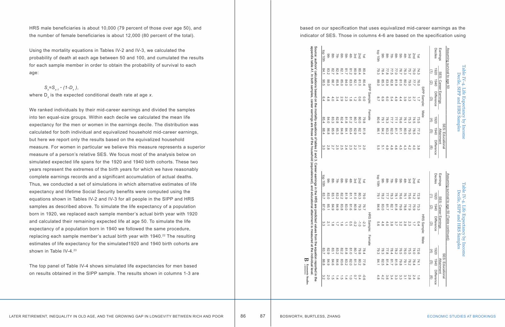
LATER RETIREMENT, INEQUALITY IN OLD AGE, AND THE GROWING GAP IN LONGEVITY BETWEEN RICH AND POOR ECONOMIC STUDIES AT BROOKINGS86 87 BOSWORTH, BURTLESS, ZHANG
HRS male beneficiaries is about 10,000 (79 percent of those over age 50), and the number of female beneficiaries is about 12,000 (80 percent of the total).
Using the mortality equations in Tables IV-2 and IV-3, we calculated the probability of death at each age between 50 and 100, and cumulated the results for each sample member in order to obtain the probability of survival to each age:
Sx=Sx-1 * (1-Dx ),where Dx is the expected conditional death rate at age x.
We ranked individuals by their mid-career earnings and divided the samples into ten equal-size groups. Within each decile we calculated the mean life expectancy for the men or women in the earnings decile. The distribution was calculated for both individual and equivalized household mid-career earnings, but here we report only the results based on the equivalized household measure. For women in particular we believe this measure represents a superior measure of a person’s relative SES. We focus most of the analysis below on simulated expected life spans for the 1920 and 1940 birth cohorts. These two years represent the extremes of the birth years for which we have reasonably complete earnings records and a significant accumulation of actual deaths. Thus, we conducted a set of simulations in which alternative estimates of life expectancy and lifetime Social Security benefits were computed using the equations shown in Tables IV-2 and IV-3 for all people in the SIPP and HRS samples as described above. To simulate the life expectancy of a population born in 1920, we replaced each sample member’s actual birth year with 1920 and calculated their remaining expected life at age 50. To simulate the life expectancy of a population born in 1940 we followed the same procedure, replacing each sample member’s actual birth year with 1940.22 The resulting estimates of life expectancy for the simulated1920 and 1940 birth cohorts are shown in Table IV-4.23
The top panel of Table IV-4 shows simulated life expectancies for men based on results obtained in the SIPP sample. The results shown in columns 1-3 are
based on our specification that uses equivalized mid-career earnings as the indicator of SES. Those in columns 4-6 are based on the specification using
Table IV-4. Life E
xpectancy by Income
Decile, SIPP and H
RS Sam
plesTable IV
-4. Life Expectancy by Incom
eD
ecile, SIPP and HR
S Samples
Assum
ing survival to age 50A
ssuming survival to age 50 (Table continued)
Earnings
SE
S: C
areer Earnings
SE
S: E
ducational A
ttainment
Earnings
SE
S: C
areer Earnings
SE
S: E
ducational A
ttainment
Deciles
19201940
Difference
19201940
Difference
Deciles
19201940
Difference
19201940
Difference
(1)(2)
(3)(4)
(5)(6)
(1)(2)
(3)(4)
(5)(6)
SIP
P S
ample: M
aleH
RS
Sam
ple: Male
1st74.3
76.01.7
73.577.3
3.81st
72.973.3
0.472.6
74.11.6
2nd75.0
77.72.7
74.578.5
4.02nd
74.275.9
1.774.0
76.42.4
3rd75.7
79.03.3
75.379.5
4.23rd
75.677.9
2.375.5
78.22.8
4th76.3
80.23.9
76.180.5
4.34th
76.178.8
2.876.0
79.13.1
5th76.7
81.04.4
76.681.1
4.55th
76.679.8
3.276.5
79.83.3
6th77.0
81.94.9
77.181.7
4.66th
78.181.8
3.778.2
81.53.3
7th77.5
82.85.4
77.782.5
4.87th
78.382.1
3.878.4
81.73.4
8th77.8
83.96.0
78.383.2
4.98th
77.781.7
4.077.8
81.43.6
9th78.4
85.36.9
79.184.2
5.19th
78.283.0
4.878.3
82.54.2
top 10th79.3
88.08.7
80.686.1
5.5top 10th
79.184.6
5.679.3
84.14.8
SIP
P S
ample: Fem
aleH
RS
Sam
ple: Female
1st80.4
80.40.0
79.881.9
2.01st
79.076.7
-2.378.4
77.8-0.6
2nd80.4
81.00.6
80.082.1
2.12nd
80.379.3
-1.079.8
80.20.4
3rd80.9
82.11.2
80.782.9
2.23rd
81.080.8
-0.280.7
81.30.7
4th81.2
83.01.8
81.283.4
2.34th
81.181.6
0.581.0
82.01.0
5th81.7
84.02.3
81.884.1
2.45th
81.983.0
1.181.8
83.21.4
6th82.1
85.02.9
82.484.8
2.56th
82.283.8
1.682.2
83.61.5
7th82.4
85.83.4
82.885.3
2.57th
83.284.9
1.783.2
84.61.4
8th82.7
86.74.0
83.385.9
2.78th
83.184.9
1.883.1
84.61.5
9th83.2
88.04.8
84.086.8
2.89th
83.085.1
2.182.9
84.92.0
top 10th84.1
90.56.4
85.488.4
3.0top 10th
83.787.0
3.383.7
86.83.2
Source: authors' calculations based on the m
ortality equations of tables 2 and 3. Career earnings in the H
RS
are predicted values from the equation reported in the
appendixtable A
1. In both samples, career earnings are those of the household (equivalenced), and educational attainm
ent is measured at the individual level.

LATER RETIREMENT, INEQUALITY IN OLD AGE, AND THE GROWING GAP IN LONGEVITY BETWEEN RICH AND POOR ECONOMIC STUDIES AT BROOKINGS88 89 BOSWORTH, BURTLESS, ZHANG
relative educational attainment as the SES indicator. The implied differences in life expectancy between SES groups are very large. The simulation results for the 1920 cohort suggest that men in the top decile of mid-career earnings could expect to live 5.0 years longer than men in the bottom decile–79.3 versus 74.3 years. For men born twenty years later in 1940, the simulated increases in life expectancy added an average of 5.0 years to male life spans. However, the gain in life expectancy was only 1.7 years for men in the lowest decile compared to 8.7 years for men in the top decile. The gains are thus heavily skewed towards men at the top of the income distribution. When we use education as the primary SES indicator (columns 4-6), the increase in average life expectancy is nearly identical, but the differential gains in life expectancy at the top of the SES distribution are smaller. The simulated increase in life expectancy is 3.8 years in the bottom income decile compared with a gain of 5.5 years in the top decile. Because educational outcomes are becoming increasingly clustered at the levels of high school and college completion, educational attainment cannot not account for the wide range of observed earnings.24
We observe a smaller increase in simulated average life expectancy among women between the 1920 and 1940 birth cohorts. The average gain implied by the SIPP results is only 2.7 years. The gains are highly correlated with women’s SES, however. When we use equivalized mid-career earnings as our indicator of SES, there is in fact no apparent increase in life expectancy in the lowest income decile. This compares to a gain of 6.4 years in life expectancy for women in the top earnings decile. Because of the slower simulated life expectancy gains among women, there is a considerable narrowing of the life expectancy gap between women and men. When we use educational attainment as out primary indicator of SES, there is somewhat weaker evidence that the increase in life expectancy is correlated with higher levels of household earnings. The simulated gain in life expectancy is 2.0 years in the lowest decile and 3.0 years at the top.
Life expectancy estimates based on our results for the HRS sample are displayed in the bottom two panels of Table IV-4. As discussed previously, we lack Social Security records of mid-career earnings for a large percentage of
the HRS sample and consequently rely on predicted mid-career earnings to measure respondents’ SES. The resulting decile distribution of predicted mid-career earnings varies over a narrower range than the mid-career earnings observed in Social Security earnings records. Simulation results based on the HRS estimates imply a smaller simulated increase in average life expectancy
Table IV-5. D
istribution of Annual and Lifetim
e OA
SDI B
enefits by Equivalized E
arnings Deciles
Men
Wom
en
Hhold
Earnings
Decile
Equivalized
earnings (ratio to m
ean)
Annual
equivalized benefits (ratio to m
ean)
Lifetime
equivalized benefits (ratio to m
ean)
Est. Life
Expectancy
at age 50
Est.
Years of B
enefits received
Equivalized
earnings (ratio to m
ean)
Annual
equivalized benefits (ratio to m
ean)
Lifetime
equivalized benefits (ratio to m
ean)
Est. Life
Expectancy
atage 50
Est.
Years of B
enefits received
(1)(2)
(3)(4)
(5)(6)
(7)(8)
(9)(10)
SIP
P1
0.180.56
0.4725.6
17.50.12
0.800.76
30.422.2
20.43
0.730.65
27.018.4
0.310.86
0.8031.0
22.03
0.600.87
0.7928.2
18.90.48
0.920.85
31.922.1
40.74
0.980.92
29.319.5
0.660.95
0.9032.7
22.55
0.871.03
1.0030.0
20.00.83
1.000.96
33.623.0
61.00
1.081.07
30.820.5
1.001.01
1.0034.4
23.67
1.141.10
1.1231.7
21.11.18
1.041.05
35.124.1
81.31
1.151.21
32.621.7
1.391.08
1.1235.9
24.89
1.561.21
1.3133.9
22.51.68
1.141.22
37.125.5
102.13
1.281.47
36.123.7
2.341.20
1.3639.1
26.9M
ean$55,839
$11,961$246,795
30.520.4
$45,922$8,394
$198,80534.1
23.6
HR
S (P
redicted Earnings)
10.40
0.760.64
23.315.8
0.340.82
0.7127.7
19.22
0.670.88
0.8025.3
17.20.62
0.910.84
29.920.5
30.81
0.970.92
27.018.1
0.780.97
0.9231.0
21.44
0.911.00
0.9727.8
18.60.92
0.970.96
31.721.9
50.99
0.980.96
28.518.6
1.041.03
1.0332.8
22.46
1.101.06
1.1030.4
19.81.14
1.031.05
33.322.9
71.11
1.061.11
30.619.9
1.181.03
1.0834.4
23.48
1.151.06
1.1030.3
19.71.18
1.041.07
34.423.3
91.33
1.091.15
31.320.2
1.261.06
1.1134.7
23.510
1.511.16
1.2532.5
20.71.53
1.141.22
36.024.2
Mean
$54,471$12,060
$227,49428.7
18.8$44,273
$9,119$202,383
32.622.3
Source: A
uthors' calculations as described in text. Eqivalized earnings and benefits use the com
bined total for couples divided by the square root of 2.
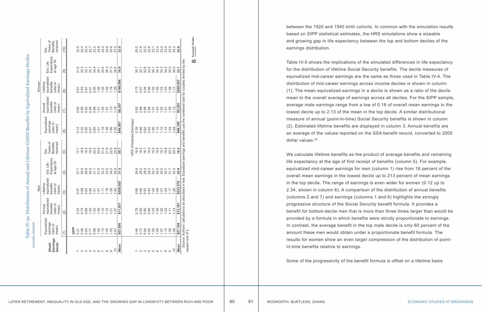
LATER RETIREMENT, INEQUALITY IN OLD AGE, AND THE GROWING GAP IN LONGEVITY BETWEEN RICH AND POOR ECONOMIC STUDIES AT BROOKINGS90 91 BOSWORTH, BURTLESS, ZHANG
between the 1920 and 1940 birth cohorts. In common with the simulation results based on SIPP statistical estimates, the HRS simulations show a sizeable and growing gap in life expectancy between the top and bottom deciles of the earnings distribution.
Table IV-5 shows the implications of the simulated differences in life expectancy for the distribution of lifetime Social Security benefits. The decile measures of equivalized mid-career earnings are the same as those used in Table IV-4. The distribution of mid-career earnings across income deciles is shown in column (1). The mean equivalized earnings in a decile is shown as a ratio of the decile mean to the overall average of earnings across all deciles. For the SIPP sample, average male earnings range from a low of 0.18 of overall mean earnings in the lowest decile up to 2.13 of the mean in the top decile. A similar distributional measure of annual (point-in-time) Social Security benefits is shown in column (2). Estimated lifetime benefits are displayed in column 3. Annual benefits are an average of the values reported on the SSA benefit record, converted to 2005 dollar values.25
We calculate lifetime benefits as the product of average benefits and remaining life expectancy at the age of first receipt of benefits (column 5). For example, equivalized mid-career earnings for men (column 1) rise from 18 percent of the overall mean earnings in the lowest decile up to 213 percent of mean earnings in the top decile. The range of earnings is even wider for women (0.12 up to 2.34, shown in column 6). A comparison of the distribution of annual benefits (columns 2 and 7) and earnings (columns 1 and 6) highlights the strongly progressive structure of the Social Security benefit formula. It provides a benefit for bottom-decile men that is more than three times larger than would be provided by a formula in which benefits were strictly proportionate to earnings. In contrast, the average benefit in the top male decile is only 60 percent of the amount these men would obtain under a proportionate benefit formula. The results for women show an even larger compression of the distribution of point-in-time benefits relative to earnings.
Some of the progressivity of the benefit formula is offset on a lifetime basis
Tabl
e IV
-5a.
Dis
trib
utio
n of
Ann
ual a
nd L
ifeti
me
OA
SDI
Ben
efit
s by
Equ
ival
ized
Ear
ning
s D
ecile
sex
clud
es d
isab
led
Men
Wom
en
Hho
ld
Earn
ings
D
ecile
Equ
ival
ized
ea
rnin
gs
(rat
io to
m
ean)
Ann
ual
equi
valiz
ed
bene
fits
(rat
io to
m
ean)
Life
time
equi
valiz
ed
bene
fits
(r
atio
to
mea
n)
Est
. Life
E
xpec
tanc
y at
age
50
Est
. Ye
ars
of
Ben
efits
re
ceiv
ed
Equ
ival
ized
ea
rnin
gs
(rat
io to
m
ean)
Ann
ual
equi
valiz
ed
bene
fits
(rat
io to
m
ean)
Life
time
equi
valiz
ed
bene
fits
(r
atio
to
mea
n)
Est
. Life
E
xpec
tanc
y at
age
50
Est
. Ye
ars
of
Ben
efits
re
ceiv
ed
(1)
(2)
(3)
(4)
(5)
(6)
(7)
(8)
(9)
(10)
SIPP
10.
210.
530.
4727
.717
.70.
120.
820.
8131
.622
.52
0.46
0.74
0.68
29.0
18.8
0.32
0.86
0.83
32.4
22.4
30.
630.
890.
8329
.919
.40.
500.
920.
8733
.122
.44
0.77
1.00
0.95
30.6
19.9
0.67
0.95
0.91
33.7
22.7
50.
881.
031.
0131
.120
.50.
850.
980.
9534
.423
.26
1.00
1.08
1.07
31.6
20.9
1.01
1.01
1.00
35.1
23.8
71.
131.
101.
1132
.221
.41.
181.
051.
0535
.624
.28
1.30
1.15
1.19
33.0
21.9
1.38
1.07
1.09
36.3
24.9
91.
531.
211.
2834
.022
.61.
661.
131.
1837
.325
.610
2.07
1.27
1.40
35.9
23.9
2.30
1.19
1.29
39.0
27.0
Mea
n$5
7,65
6$1
1,93
1$2
50,0
5231
.520
.7$4
6,58
7$8
,357
$199
,586
34.9
23.9
HR
S (P
redi
cted
Ear
ning
s)1
0.46
0.78
0.68
26.6
16.9
0.39
0.82
0.75
30.7
20.5
20.
730.
900.
8528
.218
.20.
660.
960.
9132
.121
.63
0.84
0.95
0.92
28.9
18.7
0.82
0.96
0.94
32.8
22.2
40.
920.
960.
9429
.319
.00.
940.
990.
9933
.422
.65
1.02
1.03
1.04
30.1
19.5
1.06
1.01
1.02
34.1
23.1
61.
051.
061.
0830
.519
.81.
121.
031.
0534
.323
.47
1.07
1.05
1.07
30.5
19.7
1.12
1.02
1.04
34.3
23.2
81.
151.
021.
0430
.719
.81.
141.
011.
0334
.523
.49
1.29
1.11
1.17
31.7
20.3
1.24
1.06
1.09
35.0
23.5
101.
461.
141.
2032
.520
.51.
481.
121.
1736
.024
.2M
ean
$57,
164
$12,
181
$233
,570
29.9
19.2
$46,
106
$9,2
83$2
09,5
5733
.722
.8S
ourc
e: A
utho
rs' c
alcu
latio
ns a
s de
scrib
ed in
text
. Eqi
valiz
ed e
arni
ngs
and
bene
fits
use
the
com
bine
d to
tal f
or c
oupl
es d
ivid
ed b
y th
e sq
uare
root
of 2
.
LATER RETIREMENT, INEQUALITY IN OLD AGE, AND THE GROWING GAP IN LONGEVITY BETWEEN RICH AND POOR ECONOMIC STUDIES AT BROOKINGS92 93 BOSWORTH, BURTLESS, ZHANG
because workers at the top of the earnings distribution live longer than workers at the bottom. Thus, lifetime benefits for men in the lowest decile of mid-career earnings are reduced by about 15 percent with a comparable gain for men in the top (compare columns 2 and 3). However, the effect on lifetime benefits is less than we might expect given the large differences in life expectancy across the income distribution. That is because individuals in the lowest deciles of the earnings distribution begin receiving benefits at a younger age than workers at the top, counterbalancing part of the difference in life expectancy. While remaining life expectancy for men at age 50 varies from 25.6 years to 36.1 years (column 4), a range of 10.5 years, the range in expected benefit years is only 6.2 years (column 6).26 We see a similar pattern of variation across the earnings distribution for women, but compared with men, women have a less unequal distribution of benefits on both an annual and lifetime basis.
The lower panel of Table IV-5 presents comparable calculations based on mortality estimates and OASDI benefits for the HRS sample. The distribution of predicted mid-career earnings in the HRS is more compressed than that for actual mid-career earnings in the SIPP, and that compression is also seen in the slightly more compressed distribution of life expectancy and actual and mid-career earnings. On the whole, however, the results from the HRS are comparable to those from the larger SIPP sample.They show a large equalizing pattern of annual benefits relative to earnings that is only partially offset on a lifetime basis because of differences in expected life spans linked to SES.
Table IV-6 provides evidence on the pattern of change in OASDI benefit distribution over time. We show changes the distribution based on our simulated life expectancies for the 1920 and 1940 birth cohorts. Using the results from the SIPP sample (top panel), average remaining life expectancy at age 50 for men is projected to rise from 26.8 to 31.6 years, and the number of benefit years is projected to increase from 17.5 to 21.5 years between the 1920 and 1940 birth cohorts. However, the distribution of gains is skewed across the income distribution. The increase in life expectancy between the 1920 and the 1940 birth cohorts is 8.7 years for the top earnings decile compared to just 1.7 years for those in the bottom decile, and the change in expected years of benefit
Table IV-6. Estimated Life Expectancies and Expected Years of Benefits by Equivalized Household Earnings Deciles, 1920 and 1940 Birthyears
Equivalized household earnings decile
Men Women
Life Expectancy at age 50
Expected Years of Benefits
Lifetime Equivalized Benefits (ratio to 1920 mean)
Life Expectancy at age 50
Expected Years of Benefits
Lifetime Equivalized Benefits (ratio to 1920 mean)
1920 1940 1920 1940 1920 1940 1920 1940 1920 1940 1920 1940(1) (2) (3) (4) (5) (6) (7) (8) (9) (10) (11) (12)
SIPP1 24.3 26.0 16.4 17.8 0.52 0.57 30.4 30.4 22.2 22.2 0.83 0.832 25.0 27.7 16.7 19.0 0.70 0.79 30.4 31.0 21.5 22.0 0.85 0.873 25.7 29.0 16.9 19.7 0.83 0.98 30.9 32.1 21.3 22.3 0.89 0.934 26.3 30.2 17.2 20.5 0.96 1.14 31.2 33.0 21.2 22.8 0.92 0.995 26.7 31.0 17.4 21.1 1.02 1.24 31.7 34.0 21.4 23.4 0.97 1.066 27.0 31.9 17.6 21.7 1.08 1.33 32.1 35.0 21.7 24.2 1.00 1.127 27.5 32.8 17.8 22.4 1.11 1.40 32.4 35.8 21.8 24.8 1.04 1.188 27.8 33.9 18.0 23.1 1.18 1.51 32.7 36.7 22.1 25.6 1.08 1.269 28.4 35.3 18.3 24.1 1.25 1.65 33.2 38.0 22.3 26.6 1.16 1.3810 29.3 38.0 18.8 26.0 1.36 1.89 34.1 40.5 22.9 28.5 1.25 1.57Mean 26.8 31.6 17.5 21.5 $209,382 31.9 34.7 21.8 24.2 $182,307
HRS (Predicted Earnings)1 22.9 23.3 15.5 15.9 0.68 0.70 29.0 26.7 20.1 18.1 0.76 0.682 24.2 25.9 16.4 17.8 0.83 0.90 30.3 29.3 20.8 19.9 0.88 0.843 25.6 27.9 17.0 19.0 0.94 1.05 31.0 30.8 21.3 21.1 0.94 0.944 26.1 28.8 17.3 19.7 0.98 1.12 31.1 31.6 21.5 21.9 0.97 0.985 26.6 29.8 17.3 20.0 0.97 1.12 31.9 33.0 21.7 22.7 1.03 1.076 28.1 31.8 18.2 21.4 1.10 1.29 32.2 33.8 22.0 23.4 1.04 1.117 28.3 32.1 18.2 21.4 1.11 1.30 33.2 34.9 22.4 23.9 1.07 1.148 27.7 31.7 18.0 21.4 1.09 1.29 33.1 34.9 22.3 23.8 1.06 1.139 28.2 33.0 18.1 22.0 1.12 1.37 33.0 35.1 22.3 24.1 1.09 1.1710 29.1 34.6 18.3 23.0 1.20 1.51 33.7 37.0 22.4 25.3 1.17 1.32Mean 26.7 29.9 17.4 20.1 $210,283 31.9 32.7 21.7 22.4 $197,389Source: Authors' calculations as described in text. Eqivalized benefits uses the combined total for couples divided by the square root of 2.
Table IV-6a. Estimated Life Expectancies and Expected Years of Benefits by Equivalized Household Earnings Deciles, 1920 and 1940 Birthyears
excludes disabled
Equivalized household earnings decile
Men Women
Life Expectancy at age 50
Expected Years of Benefits
Lifetime Equivalized Benefits (ratio to 1920 mean)
Life Expectancy at age 50
Expected Years of Benefits
Lifetime Equivalized Benefits (ratio to 1920 mean)
1920 1940 1920 1940 1920 1940 1920 1940 1920 1940 1920 1940(1) (2) (3) (4) (5) (6) (7) (8) (9) (10) (11) (12)
SIPP1 26.3 28.2 16.6 18.2 0.47 0.46 31.6 31.6 22.5 22.5 0.82 0.812 27.0 30.0 17.1 19.6 0.68 0.67 31.9 32.5 21.9 22.4 0.84 0.833 27.4 31.0 17.4 20.4 0.84 0.83 32.1 33.4 21.5 22.6 0.87 0.874 27.7 31.8 17.6 21.0 0.96 0.96 32.3 34.2 21.5 23.1 0.91 0.915 27.9 32.5 17.9 21.7 1.01 1.01 32.6 35.0 21.7 23.8 0.95 0.956 28.1 33.1 17.9 22.2 1.07 1.07 32.8 35.8 21.9 24.4 1.00 1.007 28.3 33.8 18.1 22.8 1.11 1.11 33.0 36.5 22.0 25.0 1.04 1.058 28.6 34.7 18.3 23.5 1.18 1.18 33.3 37.4 22.3 25.8 1.09 1.099 29.0 35.9 18.5 24.4 1.27 1.28 33.6 38.5 22.5 26.7 1.18 1.1810 29.7 38.4 18.9 26.3 1.40 1.41 34.4 40.8 23.0 28.6 1.29 1.30Mean 28.0 32.9 17.8 22.0 $213,103 32.8 35.5 22.0 24.5 $183,394
HRS (Predicted Earnings)1 26.0 26.8 16.4 17.1 0.72 0.64 31.6 29.6 21.2 19.4 0.79 0.692 26.8 29.0 17.3 19.0 0.87 0.82 32.2 31.6 21.6 21.0 0.93 0.873 27.2 29.9 17.5 19.8 0.93 0.90 32.4 32.6 21.9 22.0 0.95 0.924 27.4 30.5 17.7 20.3 0.95 0.93 32.6 33.4 22.0 22.6 0.99 0.975 28.0 31.6 18.0 21.0 1.04 1.04 33.0 34.4 22.2 23.4 1.02 1.026 28.4 32.1 18.3 21.5 1.08 1.09 33.1 34.8 22.4 23.9 1.05 1.077 28.3 32.1 18.3 21.5 1.07 1.08 33.2 34.9 22.3 23.8 1.03 1.058 28.2 32.4 18.1 21.6 1.03 1.05 33.2 35.0 22.4 23.9 1.03 1.059 28.7 33.6 18.3 22.4 1.13 1.19 33.3 35.5 22.2 24.1 1.07 1.1110 29.1 34.8 18.3 23.1 1.16 1.25 33.8 37.1 22.5 25.4 1.13 1.22Mean 27.8 31.3 17.8 20.7 $216,356 32.8 33.9 22.1 23.0 $203,699
Source: Authors' calculations as described in text. Eqivalized benefits uses the combined total for couples divided by the square root of 2.
LATER RETIREMENT, INEQUALITY IN OLD AGE, AND THE GROWING GAP IN LONGEVITY BETWEEN RICH AND POOR ECONOMIC STUDIES AT BROOKINGS94 95 BOSWORTH, BURTLESS, ZHANG
receipt is roughly proportionate to the change in life expectancy.27
Because the years of benefit receipt rise throughout the distribution, lifetime benefits also increase, but the magnitude of the benefit increase varies substantially. Expected lifetime benefits increase about 10 percent for men in the lowest decile and by about 40 percent in the top decile. Thus, the increase in differential mortality leads to a substantial widening of the distribution of lifetime benefits. For the 1940 birth cohort, lifetime benefits of men in the top decile of earners are 3.3 times those of men in the bottom decile, compared to a multiple of just 2.6 for the 1920 birth cohort. The distributional change is similar for women, but because there is no increase in life expectancy for women in the bottom decile, expected lifetime benefits in the bottom decile remain unchanged, and there is a smaller 25 percent gain for those in the top decile. Also, the range of lifetime benefits is more compressed for women than for men.
The results for the analysis of HRS sample are qualitatively similar to those for the SIPP, but the simulated distributional shifts in lifetime benefits are smaller. The simulated average increase in benefit years is only 2.7 years for men and 0.8 years for women. Also, the simulated number of benefit years actually declines in the bottom three equivalized household earnings deciles of women between the 1920 and 1940 birth cohorts while it increases by three years in the top decile. As a result, there is a sizeable redistribution of lifetime benefits for women. The average woman’s benefit increases by only 11 percent, but the gain is 25 percent in the top decile while there is a loss of 4 percent in the bottom decile. As noted earlier, the smaller simulated changes of life expectancy in the HRS may be due to the difficulty of identifying the extremes when using predicted as opposed to actual mid-career earnings. We find some support for this conjecture when we consider our simulation results based on using educational attainment as the primary measure of SES (results not shown). These simulations produced results that were more similar in the HRS and SIPP samples.
A recent report of the National Academies of Sciences, Engineering, and
Medicine (2015) also found evidence of a growing gap in life expectancy across income groups that is similar to that reported in this study. However, the National Academy report includes a wider range of benefit programs than our focus on OASDI. Persons with lower SES rank (income and education) receive larger benefit payments from Medicaid and Supplemental Social Insurance, and Medicare payments are relatively evenly distributed across income groups. Thus, OASI payments are a smaller share of total benefits in the lower portions of the income distribution, and program changes have a smaller effect on their total benefits.Furthermore the report computes future lifetime benefits on a discounted basis, which reduces the importance of longer retirement lives.
CONCLUSIONSOur principal conclusions from this analysis are that, first, we find large mortality rate differences among aged Americans when they are ranked by their socioeconomic status (SES) and, second, those differences have grown significantly in recent years. It matters little whether we use education or mid-career earnings to measure SES, though earnings are more closely related to the income concept used to determine Social Security benefits. We find the statistical evidence of increasing differential mortality to be strong in two large data samples constructed by combining Social Security records with the demographic, social, health, and economic information available in the SIPP and HRS interviews. The conclusions are also robust across samples that include or exclude workers who claim disability benefits.
The basic results in this chapter are strongly confirmed when we use an alternative procedure for translating earnings reported in the Social Security Administration files into indicators of workers’ and spouses’ socioeconomic status. They are also strongly confirmed when we estimate changes in mortality differentials within narrower age groups in the population older than 50 (see Appendix B).
The secular changes in differential mortality are very large, but their influence on the length of time for which people receive benefits is damped by the fact that low SES individuals tend to claim Social Security at younger ages while
LATER RETIREMENT, INEQUALITY IN OLD AGE, AND THE GROWING GAP IN LONGEVITY BETWEEN RICH AND POOR ECONOMIC STUDIES AT BROOKINGS96 97 BOSWORTH, BURTLESS, ZHANG
high SES workers are more likely to postpone retirement and benefit claiming. Differences in mortality across the earnings distribution offset some of the progressivity built into the Social Security benefit formula, but the resulting pattern of lifetime benefits nonetheless remains progressive.
We also explored potential causes of the growing gap in life expectancy between those in the top and bottom ranks of SES. We have information from the HRS on individuals’ self-assessment of their health status and measures of several behaviors associated with early mortality, including smoking, drinking, and lack of regular exercise. Each of these variables has significant effects on mortality when they are added to the basic mortality equations, but each has only a minor influence on the size of the coefficient on the SES indicator and its interaction with birth year. Thus, we cannot account for the fundamental causes of the growing gap in life expectancy. We can only confirm that it exists.
We believe that these findings about the pervasiveness of the pattern of increasing differential mortality have important implications for policy because they suggest that the current emphasis on increasing the retirement age in line with increases in average life expectancy may have large unintended distributional consequences. Recent mortality gains have been concentrated among the well-educated and those at the top of the income distribution. In that sense, life expectancy mirrors the pattern of increasing disparities in earnings and household income.
Endnotes
1. The estimates of household income and poverty rates are drawn from the Current Population Survey tables of the U.S. Census Bureau.
2. The Census Bureau calculates the Gini coefficient of money income for individuals by age beginning in the 1990s. For 2013, see http://www.census.gov/hhes/www/income/data/incpovhlth/2013/index.html.
3. The evolution of income inequality among the aged and non-aged, extending back to 1967, is shown in Rubin, White-Means and Daniel (2000). They report a dramatic improvement in income equality between 1967 and 1977 among households with a head aged 65 and over. They also provide a useful summary of some the earlier research.
4. This conservative estimate assumes workers’ earnings between 62 and 69 will not lift the average lifetime earnings amount that is the basis for calculating their monthly pensions. In many cases, of course, earnings in those ages will increase workers’ average lifetime earnings, boosting pensions first claimed at age 70 by even more than 76 percent.
CHAPTER 1. INTRODUCTION
1. Rationally, the reduction in the current benefit should have no substantial effect on the employment decision since the worker’s future lifetime benefits are increased to offset short-term benefit reductions caused by the earnings test. If workers are myopic, are liquidity constrained, or are unaware that their benefit losses will be compensated in later years, they may refrain from working because of the perceived employment penalty represented by the earnings test.
CHAPTER 2. DELAYED RETIREMENT

LATER RETIREMENT, INEQUALITY IN OLD AGE, AND THE GROWING GAP IN LONGEVITY BETWEEN RICH AND POOR ECONOMIC STUDIES AT BROOKINGS98 99 BOSWORTH, BURTLESS, ZHANG
2. Between 1997 and 2010, the percentage of retirees over the age of 65 with private coverage fell from 20 to 16 percent and employers raised the retiree portion of the premiums to reduce further the value relative to private market-based options (Fronstin and Adams 2012). There was an even bigger drop in employer-provided retiree health insurance before 1997 when employers were required to recognize future retiree insurance liabilities in the financial states as a result of FASB Standard 106, effective for company fiscal years after 1992 (GAO 1998). [U.S. General Accounting Office. Private Health Insurance: Declining Employer Coverage May Affect Access for 55- to 64-Year-Olds. GAO/HEHS-98-133, June 1998.]
3. A recent overview of that research is provided by Blau and Goodstein (2010). The contribution of shifts in retirement incentives is emphasized by Burtless and Quinn (2002).
4. The sample is restricted to the 1934-1947 birth cohorts and workers with positive earnings at age 57 who did not receive disability insurance benefits before that age.
5. Workers in poor health below the age of 62 can apply for disability insurance benefits, but it is a long administrative process with an uncertain outcome. This may deter many potential applicants, especially those currently holding a job, from taking the steps needed to file a claim. The first step for those currently employed is to stop working.
6. A slightly smaller number, 41,000 men and 42,000 women, met the criteria of having at least one year of earnings between ages 41 and 50.
7. The sample is reduced to 30,000 men and 39,000 women because of the exclusion of the disabled as well as of younger workers who have not yet claimed a benefit.
8. The pattern of change in claiming behavior is consistent with that reported by Song and Manchester (2007b) using a larger data set from the
1. We calculate the annuitized value of income flows from a family’s financial wealth holdings as the stable income stream the family could obtain by converting its financial wealth into a single- or joint-life annuity, depending
CHAPTER 3. RISING OLD-AGE INEQUALITY
Continuous Work History Sample for 2004. However, we only identify the age at first entitlement in annual units, while Song and Manchester examine narrower 2-month intervals. Since our data extend through 2012, however, we observe the full implementation of the increase in the FRA to age 66. See also Haaga and Johnson (2012).
9. While age 62 is normally the earliest age for claiming benefits, exceptions are made for spouses with dependent children and widows/widowers at age 60.
10. A similar pattern of benefit claiming by income level is reported by Knoll and Olsen (2014).
11. A similar finding is reported by Gorodnichenko, Song, and Stolyarov (2013).
12. Pr denotes probability, Ө is the cumulative of a standard normal distribution, Y it is an indicator which equals 1 if the person remains in the labor force in the second period and zero otherwise, X it is a set of time-varying characteristics, and β is a vector of coefficients.
13. Both types of income are expressed in constant prices, and the incomes of couples are converted into equivalent income amounts for single people and assigned to both spouses in the couple.
14. Our findings are similar to those of Munnell, Triest, and Jivan (2004), who also reported that the two types of pension plans offered sharply opposing incentives for continued employment.
LATER RETIREMENT, INEQUALITY IN OLD AGE, AND THE GROWING GAP IN LONGEVITY BETWEEN RICH AND POOR ECONOMIC STUDIES AT BROOKINGS100 101 BOSWORTH, BURTLESS, ZHANG
on whether the family has an unmarried or married head. When including this projected annuity income flow in families’ incomes we subtract the interest and dividend income they reported in the income interview. The insurance value of employer-sponsored insurance and Medicare and Medicaid are derived from data sources described in Appendix A.
2. Because the HRS lacks detailed information about the incomes and wealth holdings of family members except the HRS respondent and his or her spouse, the estimates reported in Figure III-2 focus solely on respondents and their spouses. They show estimates of personal income inequality with a family-size adjustment to reflect economies of scale in the consumption of married couples compared with the unmarried aged (see below).
3. See explanation by U.S. Census Bureau, “Revised Income Topcodes for the Annual Social and Economic Survey (ASEC) Public Use Files,” Visit http://www.census.gov/housing/extract_files/toc/data/ See also Larrimore et al. (2008).
4. The family size adjustment is intended to determine families’ income rank using their “equivalent” or “size-adjusted” incomes, that is, their family income adjusted to reflect the effects of family size. The adjustment we use divides each family’s unadjusted income by the square root of the number of family members. This adjustment implies that a family consisting of four members requires twice as much income to have the same “equivalent” income as a household containing just one member. Note that each income quantile contains an equal number of persons rather than an equal number of families.
5. Since sample sizes are small within 3-year age groups, to calculate the 50/10 ratio we computed the ratio of average income in the 46th through the 55th centiles to the average income in the 6th through the 15th centiles. An equivalent procedure was used to calculate the 90/50 income ratio.
6. The results in Table III-3a simulate the impacts on the 2012 income distribution of changing the shape of the earnings distribution or varying
the employment rate so that these patterns conform to ones observed in 1979. It is of course also possible to perform the reverse simulation, namely, to use sample statistics in 1979 as the base case and determine how the 1979 Gini would be affected if we simulate the 2012 earnings distribution or employment rate. The results from this simulation are presented in Table III-3b. They are very similar to those displayed in Table III-3a.
7. The reported Gini coefficients for 2012 differ from those reported Table III-3a because the Gini coefficient is calculated based on income vingtiles rather than the finer grained income categories used in the simulation analyses described above. This has little impact on our findings, however, for the proportional changes in inequality within age groups are similar whether we use vingtiles or fine-grained income categories to calculate the trend in inequality.
CHAPTER 4. DIFFERENTIAL MORTALITY
1. Changing views of the effect of mortality differences on the progressivity of Social Security are illustrated in the chain of articles by Friedman (1972), Aaron (1977 and 1982), Smith and others (2003), and CBO (2006). Most of that debate centered on the lifetime progressivity of retired-worker benefits, but as emphasized in the CBO report, most of the lifetime progressivity of Social Security occurs as a result of the disability and survivor portions of the program.
2. The major studies that they reviewed included Feldman and others (1989), Pappas and others (1993), and some of their own tabulations.
3. According to the latest life table published by the National Center for Health Statistics, 93 percent of males and 96 percent of females in the United States survive to at least age 50.
4. Marmot and Shipley (1996) and Hoffman (2005) demonstrated that
LATER RETIREMENT, INEQUALITY IN OLD AGE, AND THE GROWING GAP IN LONGEVITY BETWEEN RICH AND POOR ECONOMIC STUDIES AT BROOKINGS102 103 BOSWORTH, BURTLESS, ZHANG
the mortality differences persisted in older ages, but Hoffman suggested that they came to be dominated by health conditions at older ages with SES playing a decreasing independent role.
5. The importance of mortality also depends upon the age range of persons included in the analysis since some workers will contribute to the system, but die before they are eligible for any benefit. Others may receive a survivor’s benefit based on the contributions of a deceased worker.
6. In the early years of the survey, respondents were asked for their Social Security numbers, but the refusal rate rose rapidly in later years, particularly for interviews conducted by telephone. After 2001, unless respondents specifically opt out, the linkage to their administrative record is based on a probabilistic match and no formal approval is required.
7. The sample cannot be viewed as fully representative of the population of Americans over age 50. Particularly in the early years of the Social Security program, many employees of governments and nonprofits were excluded and consequently would not have earnings records. In constructing our income indicator, we required that individuals or their spouses have nonzero earnings between the ages of 41 and 50. It is also worth remembering that the SIPP samples were limited to the non-institutionalized population. People in institutions, such as long-term care facilities, were therefore excluded from the sample. Finally, some respondents refused permission to access their Social Security records. However, Cristia (2009) found only small differences between a similar mortality sample and the distribution in the SIPP by age, sex, and race. We assume that the 20 percent of respondents that could not be matched are randomly distributed across the full SIPP sample.
8. Attanasio and Hoynes (2000) did use wealth data form the SIPP to measure the relationship between wealth and mortality. However, their observations on deaths are limited to a 2½ year interval covered by the survey. The short period of time between the observation on wealth and possible deaths heightens the concern about the potential for a reverse correlation in which
poor health is associated with a decline in wealth. Occupation encompasses elements of both education and income.
9. There is also a change in the education question on the SIPP interview in the 1996 and later surveys compared with earlier survey instruments. In the 1984 and 1993 surveys, respondents were asked for highest grade attended and whether they completed that grade. In later years, interviewers asked about highest degree received for those with post-secondary schooling.
10. The adjustment ratios were originally derived for a report to SSA (Toder and others, 1999). Class intervals were set under an assumption of steady earnings throughout the year, and the class means were derived from the distribution of wages in various reports of the Current Population Survey. Less than one percent of the workers in the sample reached the taxable maximum in the first quarter. A similar methodology was also used more recently in Cristia (2009) and Kopczuk, Saez, and Song (2010). Additional problems with the changeover to W-2 records in 1978-80 led us to use an interpolation of individuals’ earnings above the taxable ceiling between 1977 and 1981. No adjustment could be made for the self-employed who were above the taxable wage ceiling as they file on an annual basis.
11. Even after our adjustments, the pre-1977 data are not fully compatible with the later years because of considerable bunching of imputed earnings after adjusting for the quarter in which individuals reach the taxable wage ceiling.
12. The computation of career earnings is adapted from Waldron (2007). As she noted, the reliance on years with of non-zero earnings excludes some low-wage workers with poor health, and it likely leads to an understatement of the mortality risk for the disabled and workers near the bottom of the earnings distribution.
13. This is a common procedure for converting the total income of
LATER RETIREMENT, INEQUALITY IN OLD AGE, AND THE GROWING GAP IN LONGEVITY BETWEEN RICH AND POOR ECONOMIC STUDIES AT BROOKINGS104 105 BOSWORTH, BURTLESS, ZHANG
a two-person family into the “equivalent income” of a one-person household. Economists estimate equivalent incomes by determining the change in expenditure that is required to hold living standards constant when a household gets larger or smaller. One popular adjustment, which we use here, assumes that a household’s spending requirements increase in proportion to the square root of the number of household members.
14. For some members of the original HRS and the older members in the AHEAD sample, we are unable to adjust earrings above the taxable maximum due to suppression of information regarding the quarter in which earners reached the taxable maximum. This problem further reduces the size and age distribution of the HRS sample.
15. In addition, details of the post-1977 earnings are suppressed at the top by restricting values to a range of $250-300 thousand, $300-500 thousand, and over $500 thousand. We replaced those ranges with $275, $400, and $500 thousand, respectively.
16. For the HRS, the death data appear to be less reliable beginning in year 2011, limiting our analysis to years up through calendar year 2010.
17. We also included a categorical variable for the first calendar year of a respondent’s enrollment in recognition of the fact that respondents were exposed to the risk of dying for less than a full 12 months in that calendar year.
18. We estimated versions of the mortality equations that limited the measure of SES to either career earnings or educational attainment, but the combination of both variables yielded a superior overall statistical relationship without altering the coefficients on the non-SES indicators.
19. Predicted earnings and education are highly correlated, somewhat reducing the significance of their coefficients when both are included in the regression. However, an alternative formulation that followed the SIPP model by including both SES indicators still resulted in highly significant coefficients on
the SES indicators and the interaction with birth cohort.
20. Including the number of alcoholic drinks consumed in a typical day averaged across all survey waves, whether individuals ever smoked or were smoking at the time of the last interview, and whether they engaged in vigorous physical activity at least three times per week.
21. We compared the administrative and self-reported values for the observations with administrative benefit records. The simple correlation between the two series was 0.83, the self-reported values were 6 percent higher than the administrative reports, and the variances of the two series differed by less than three percent.
22. The analysis is based on a simple exercise in which the estimated mortality equation is used to generate a predicted mortality rate for each age from 50 to 100, using the birth years of 1920 and 1940 in turn.
23. Note that the characteristics of the populations represented in Table IV-4 are those of the entire SIPP or HRS sample, not just the portions of those samples that were born in 1920 or 1940. We are attempting to measure the change in life expectancy between the 1920 and 1940 birth cohorts, and we are estimating that change in populations with the characteristics of our entire estimation samples.
24. We also constructed decile distributions based on educational attainment and with educational attainment as the SES indicator. The simulated increase in life expectancy between the 1920 and 1940 birth cohorts is 2.2 years at the bottom and 6.5 years in the top decile.
25. For most beneficiaries, the real value of the benefit (adjusted for inflation) will remain constant over their retirement. We also equivalized the benefit for couples, which reduces the benefit change associated with a shift among the categories of retiree, spouse, and survivor.
LATER RETIREMENT, INEQUALITY IN OLD AGE, AND THE GROWING GAP IN LONGEVITY BETWEEN RICH AND POOR ECONOMIC STUDIES AT BROOKINGS106 107 BOSWORTH, BURTLESS, ZHANG
26. This conclusion is particularly influenced by our decision to include the disabled throughout the analysis. An alternative version of the analysis that excludes the disabled yields a range of benefit years across the earnings distribution more similar to that for life expectancy.
27. The simulation of the change in benefits allows only for increased life expectancy. It does not incorporate any change in the age of benefit claiming or change in the benefit formula.
Aaron, Henry. 1977. “Demographic Effects on the Equity of Social Security Benefits,” in Martin Feldstein and Ronald Inman, Economics of Public Services, Macmillan Press, 1977, pp. 151-173.
. 1982. Economic Effects of Social Security. Brookings Institution: Washington, DC.Attanasio, Orazio, and Hilary Williamson Hoynes. 2000. “Differential Mortality and Wealth Accumulation,” The Journal of Human Resources 35(1) (Winter), pp. 1-29Blau, David M., and Ryan M. Goodstein. 2010. “Can Social Security Explain Trends in Labor Force Participation of Older Men in the United States?” The Journal of Human Resources 45(2): 328–63.Boies, John, Brian Rostron, and Elizabeth Arias. 2010. “Education Reporting and Classification On Death Certificates In The United States,” National Center for Health Statistics. Vital Health Stat 2 (151). Bosworth, Barry P., and Kathleen Burke. 2012. “Changing Sources of Income among the Aged Population.” CRR WP 2012-27. (Chestnut Hill, MA: Center for Retirement Research at Boston College).Bosworth, Barry P., Gary Burtless, and Sarah Anders. 2007. “Capital Income Flows and the Relative Well-Being of America’s Aged Population.” CRR WP 2007-21. (Chestnut Hill, MA: Center for Retirement Research at Boston College).Bosworth, Barry, and Gary Burtless, and Mattan Alalouf. 2015. “Do Retired Americans Annuitize Too Little? Trends in the Share of Annuitized Income,” CRR WP 2015-9. (Chestnut Hill, MA: Center for Retirement Research at Boston College).Bound, John, Arline Geronimus, and Javier Rodriguez. 2014. “The Implications of Differential Trends in Mortality for Social Security Policy,” paper presented at the 16th Annual Joint Meeting of the Retirement Research Consortium, August 7-8.Burkhauser, Richard and Kosali Simon. 2010. “Measuring the Impact of Health Insurance on Levels and Trends in Inequality,” NBER Working Paper No.
References
LATER RETIREMENT, INEQUALITY IN OLD AGE, AND THE GROWING GAP IN LONGEVITY BETWEEN RICH AND POOR ECONOMIC STUDIES AT BROOKINGS108 109 BOSWORTH, BURTLESS, ZHANG
15811. (Cambridge, MA: National Bureau of Economic Research).Burtless, Gary. 1999. “Effects of Growing Wage Disparities and Changing Family Composition on the US Income Distribution,” European Economic Review 43(4-6) (April): 853-65.
. 2013a. “The Impact of Population Aging and Delayed Retirement on Workforce Productivity.” CRR Working Paper 2013-11. (Chestnut Hill, MA: Boston College Center for Retirement Research). . 2013b. “Who Is Delaying Retirement? Analyzing the Increase in Employment at Older Ages,” in Henry Aaron and Gary Burtless (eds). Closing the Deficit: How Much Can Later Retirement Help? (Washington, DC: Brookings).Burtless, Gary, and Joseph Quinn. 2002. Is Working Longer the Answer for an Aging Workforce? Issue in Brief #11 (Chestnut Hill, MA: Retirement Research Center at Boston College).Burtless, Gary, and Pavel Svaton. 2010. “Health care, health insurance, and the distribution of American incomes.” Forum for Health Economics & Policy 13(1) (February).Butrica, Barbara A., Howard M. Iams, James H. Moore, and Mikki D. Waid. 2001. “Methods in Modeling Income in the Near Term (MINT I).” ORES Working Paper Series Number 91. (Washington, DC: Social Security Administration, Office of Research, Evaluation, and Statistics).Card, David, Nicole Maestas, and Patrick Purcell. 2014. “Labor Market Shocks and Early Social Security Benefit Claiming.” MRRC Working Paper 2014-317. Ann Arbor MI: University of Michigan Retirement Research Center. Coile, C.C., and P.B. Levine. 2013. “Recessions, Retirement, and Social Security.” American Economic Review: Papers & Proceedings 101(3): 23- 28.Compson, Michael. 2011. “The 2006 Earnings Public-Use Microdata File: An Introduction.” Social Security Bulletin 71, no. 4: 33-59.Daly, M.C., and R.G. Valletta. 2006. “Inequality and Poverty in United States: The Effects of Rising Dispersion of Men’s Earnings and Changing Family Behavior,” Economica 73(289) (February), 75-98.DeNavas-Walt, Carmen, and Bernadette D. Proctor. 2014. Income and Poverty
in the United States: 2013. U.S. Census Bureau, Current Population Reports, P60-249. (Washington, DC: U.S. Government Printing Office).Cristia, Julian. 2009. “Rising mortality and life expectancy differentials by lifetime earnings in the United States,” Journal of Health Economics, 28: 984-995.Cutler, David, Angus Deaton, and Adriana Lleras-Muney. 2006. “The Determinants of Mortality.” Journal of Economic Perspectives, 20(3): 97- 120.Cutler, David, Fabian Lange, Ellen Meara, Seth Richards, and Christopher Ruhm. 2010. “Explaining the Rise in Educational Gradients in Mortality,” NBER Working Paper 15678 (January). Cambridge, MA: National Bureau of Economic Research.Czajka, John, Jonathan E. Jacobson, and Scott Cody. 2004. “Survey Estimates of Wealth: A Comparative Analysis and Review of the Survey of Income and Program Participation,” Social Security Bulletin, Vol. 65, No. 1: 63- 69.Duggan, James E., Robert Gillingham, and John S. Greenlees. 2007. “Mortality and Lifetime Income: Evidence from U.S. Social Security Records.” IMF Fiscal Affairs Department Working Paper. Feldman, Jacob J., Diane M. Makuc, Joel C. Kleinman and Joan Cornoni- Huntley. 1989. National trends in educational differentials in mortality. American Journal of Epidemiology 129(5): 919–933.Friedman, Milton. 1972. “Second Lecture,” in W. Cohen and M. Friedman, Social Security: Universal or Selective? American Enterprise Institute: Washington, DC.Frontin, Paul, and Nevin Adams. 2012. “Employment-Based Retiree Health Benefits: Trends in Access and Coverage, 1997- 2010,” EBRI Notes No. 377 (Washington D.C., Employee Benefit Research Institute) Gendell, Murray. 2008. “Older workers: increasing their labor force participation and hours of work, Monthly Labor Review (January):41-54. Goda, Gopi Shah, John B. Shoven and Sita Nataraj Slavov. 2011. “Differential Mortality by Income and Social Security Progressivity”. In David A. Wise, Editor, Explorations in the Economics of Aging. Chicago: University of Chicago Press for NBER: 189-204.
LATER RETIREMENT, INEQUALITY IN OLD AGE, AND THE GROWING GAP IN LONGEVITY BETWEEN RICH AND POOR ECONOMIC STUDIES AT BROOKINGS110 111 BOSWORTH, BURTLESS, ZHANG
Gorodnichenko, Jae Song, and Dmitriy Stolyarov. 2013. “Macroeconomic Determinants of Retirement Timing,” NBER Working Papers19638, National Bureau of Economic Research, Inc.Gustman, Alan and Thomas Steinmeier. 2001. “How Effective is Redistribution Under the Social Security Benefit Formula?” Journal of Public Economics, Vol. 82, pp. 1-28, 2001.
. 2005. “The Social Security Early Entitlement Age in a Structural Model of Retirement and Wealth.” Journal of Public Economics 89(2-3), (February): 441-63.
. 2013. “Effects of Social Security Policies on Benefit Claiming, Retirement and Saving. NBER Working Paper No. 19071, May.
.2014. “The Role of Health in Retirement,” NBER Working Paper No 19902Haaga, Owen, and Richard W. Johnson. 2012. “Social Security Claiming: Trends and Business Cycle Effects.” Urban Institute Retirement Policy Discussion Paper Series (March).Harris, Amy Rehder, and John Sabelhaus. 2005. “How Does Differential Mortality Affect Social Security Finances and Progressivity?”Congressional Budget Office (May) working paper.Hoffman, Rasmus. 2005. “Do Socioeconomic Mortality Differences Decrease With Rising Age?” Demographic Research, Vol. 13 No. 2:35-62.Kitagawa, Evelyn M, and Philip M Hauser. 1973. Differential Mortality in the United States: A Study in Socioeconomic Epidemiology. Vol. 35. Harvard University Press Cambridge, MA.Knoll, Melissa, and Anya Olsen. 2014. “Incentivizing Delayed Claiming of Social Security Retirement Benefits Before Reaching the Full Retirement Age,” Social Security Bulletin, Vol 74, No. 4: 21-43.Kopczuk Wojciech, Emmanuel Saez, and Jae Song. 2010. “Earnings Inequality And Mobility In The United States: Evidence From Social Security Data Since 1983,” The Quarterly Journal of Economics, Vol. 125 (1): 91-128. Larrimore, Jeff, Richard V. Burkhauser, Shuaizhang Feng, and Laura Zayatz. 2008. “Consistent Cell Means for Topcoded Incomes in the Public Use March CPS (1976–2007),” Journal of Economic and Social Measurement 33(2): 89-128.
Leonesio, Michael V., Benjamin Bridges, Robert Gesumaria, and Linda Del Bene. 2012. “The Increasing Labor Force Participation of Older Workers and Its Effect on the Income of the Aged.” Social Security Bulletin 72(1): 59–77. https://www.ssa.gov/policy/docs/ssb/v72n1/v72n1p59.html.Levy, Helen, and Italo Gutierrez. 2009. “Documentation and Benchmarking of Health Insurance Measures in the Health and Retirement Study,” Mimeo. (Ann Arbor, MI: Institute for Social Research, University of Michigan). Available online at: http://hrsonline.isr.umich.edu/sitedocs/
userg/HRS_HealthInsuranceMeasures.pdf.Mackenbach, Johan, Vivian Bos, Otto Andersen, Mario Cardano, Giuseppe Costa, Seeromanie Harding, Alison Reid, Örjan Hemström, Tapani Valkonen, and Anton E Kunst. 2003.”Widening Socioeconomic Inequalities in Mortality in Six Western European Countries.” International Journal of Epidemiology, vol 32(5): 830–37Marmot, Michael, Martin Shipley, and Geoffrey Rose. 1984. “Inequalities in Death: Specific Explanations of a General Pattern?” Lancet, 323(8384), 1003–1006.Marmot, Michael and Martin Shipley. 1996. “Do socioeconomic differences in mortality persist after retirement? A 25 year follow-up of civil servants from the first Whitehall Study. British Medical Journal, 313, 1177–1180.Meara, Ellen, Seth Richards and David M. Cutler. 2008 “The Gap Gets Bigger: Changes in Mortality and Life Expectancy, by Education, 1981-2000.” Health Affairs (March) vol. 27 no. 2: 350-360. Munnell, Alicia, Robert K. Triest and Natalia A. Jivan, 2004. “How Do Pensions Affect Actual and Expected Retirement Ages?” Working Paper 2004-27. Chestnut Hill, MA: Center for Retirement Research at Boston College. National Research Council. 2010. International Differences in Mortality at Older Ages: Dimensions and Sources. Eileen M. Crimmins, Samuel H. Preston, and Barney Cohen ( eds). Panel on Understanding Divergent Trends in Longevity in High-Income Countries. Committee on Population, Division of Behavioral and Social Sciences and Education. Washington, DC: The National Academies Press.National Research Council. 2011. Explaining Divergent Levels of Longevity in High-Income Countries, Eileen M. Crimmins, Samuel H. Preston,
LATER RETIREMENT, INEQUALITY IN OLD AGE, AND THE GROWING GAP IN LONGEVITY BETWEEN RICH AND POOR ECONOMIC STUDIES AT BROOKINGS112 113 BOSWORTH, BURTLESS, ZHANG
and Barney Cohen ( eds). Panel on Understanding Divergent Trends in Longevity in High-Income Countries. Committee on Population, Division of Behavioral and Social Sciences and Education. Washington, DC: The National Academies Press.National Academies of Sciences, Engineering, and Medicine. 2015. The Growing Gap in Life Expectancy by Income: Implications for Federal Programs and Policy Responses. Committee on the Long-Run Macroeconomic Effects of the Aging U.S. Population-Phase II. Committee on Population, Division of Behavioral and Social Sciences and Education. Board on Mathematical Sciences and Their Applications, Division on Engineering and Physical Sciences. Washington, DC: The National Academies Press.Olshansky, S. Jay, and others. 2012. “Differences in Life Expectancy Due to Race and Educational Differences Are Widening, and Many May Not Catch Up,” Health Affairs, 31, no.8 (2012):1803-1813Pappas, Gregory, Susan Queen, Wilbur Hadden, and Gail Fisher. 1993. “The Increasing Disparity in Mortality between Socioeconomic Groups in the United States, 1960 and 1986,” Vol. 329,2:103-109.Preston, Samuel and Irma Elo. 1995. “Are Educational Differentials in Adult Mortality Increasing in the United States?” Journal of Aging and Health, 7: 476-96.Rubin, Rose, Shelley White-Means, and Luojia Mao Daniels. 2000. “Income Distribution of Older Americans,” Monthly Labor Review (November); 19- 30.Singh, Gopal, and Mohammad Siahpush. 2006. “Widening Socioeconomic Inequalities in US Life Expectancy, 1980–2000,” International Journal of Epidemiology 35:969–979.Smith, Karen, Eric Toder, and Howard Iams. 2003. “Lifetime Distributional Effects of Social Security Retirement Benefits.” Social Security Bulletin 65(1): 33–61 Song, Jae G., and Joyce Manchester. 2007a. “How Have People Responded to Changes in the Retirement Earnings Test in 2000?” Social Security Bulletin 67(1): 1–15. https://www.ssa.gov/policy/docs/ssb/v67n1/v67n1p1.html.
Song, Jae G., and Joyce Manchester. 2007. “New Evidence on Earnings and Benefit Claims Following Changes in the Retirement Earnings Test in 2000.” Journal of Public Economics 91(3-4): 669–700.Steuerle, Eugene, Lee Cohen, and Adam Carraso. 2004. “How Progressive is Social Security and Why” and “How Progressive is Social Security When Old Age and Disability Insurance Are Treated As a Whole?” Straight Talk on Social Security and Retirement Policy, Briefs 37 and 38. Toder, Eric, Cori E. Uccello, John O’Hare, Melissa M. Favreault, Caroline Ratcliffe, and Karen E. Smith. 1999. Modeling Income in the Near Term Projections of Retirement Income Through 2020 for the 1931-60 Birth Cohorts. Washington, D.C.: Urban Institute.U.S. Congressional Budget Office (CBO). 2006. “Is Social Security Progressive,” Economic and Budget Issue Brief (December).
. 2014. The Distribution of Household Income and Federal Taxes, 2011 (November 2014). Washington, DC: U.S. Congressional Budget Office.Waldron, Hillary. 2007. “Trends in Mortality Differentials and Life Expectancy for Male Social Security-Covered Workers, by Socioeconomic Status.” Social Security Bulletin Vol. 67, No.3: 1-28.
. 2013. “Mortality Differentials by Lifetime Earnings Decile: Implications for Evaluations of Proposed Social Security Law Changes,” Social Security Bulletin, Vol. 73, No. 1:1-37.Wilkins, Russell, Michael Tjepkema, Cameron Mustard, and Robert Choinière. 2008. “The Canadian Census Mortality Follow-up Study, 1991 through 2001.” Health Reports; Vol. 19(3): 25-43.Wolfson, Michael, Geoff Rowe, Jane F. Gentleman, and Monica Tomiak. 1993. “Career Earnings and Death: A Longitudinal Analysis of Older Canadian Men.” Journal of Gerontology 48(4): S167–S179.
LATER RETIREMENT, INEQUALITY IN OLD AGE, AND THE GROWING GAP IN LONGEVITY BETWEEN RICH AND POOR ECONOMIC STUDIES AT BROOKINGS114 115 BOSWORTH, BURTLESS, ZHANG
Appendix ASECTION 1: INCOME COMPARISONS OF THE HRS AND CPS
This section of the appendix defines the measures of income used in our analysis of survey data from the March Current Population Survey (CPS) and the Health and Retirement Study (HRS). The CPS is used by the Social Security Administration (SSA) to compile a report on the incomes of older Americans (SSA, 2014). We follow the classifications of money income as used in that report to compute the incomes of aged units by major income source for the survey years of 1998 to 2012. An aged unit is defined as either a nonmarried person or a married couple, and a couple is classified by the age of the oldest person. Reported incomes are for the calendar year prior to the survey, and exclude the incomes of other household members. The five major income categories are earnings (wages, self-employment, and farm income), Old Age, Survivors and Disability Insurance (OASDI), pension income (public and private employees), asset income (dividends, interest, and rent), and transfers. The CPS includes only regular payments from pension accounts (thereby excluding most withdrawals from defined contribution plans), and it excludes capital gains and losses. The variables are defined more specifically at the end of this appendix, and are obtained from the CPS Utilities files of Unicon Research Corporation.
The public use version of the CPS file truncates reported incomes at the highest levels with a methodology that has varied substantially over the years, creating inconsistent time series measures. To circumvent this problem, the original Census Bureau top codes have been replaced with alternative values using a rank proximity swapping method that switches income amounts above the top code for respondents that are of similar income rank.1 The method is already employed in the public use version of the March CPS for 2011 and later years, and the Census Bureau provides values for earlier years.
We make corresponding estimates of income by major source for the HRS
beginning in 1998. Prior to 1998, the HRS did not provide separate tabulations of business and asset income, and the age distribution of persons over age 65 was incomplete until the study was expanded in 1993 and 1998 to include individuals born before 1931. The basic income data are drawn from Version N of the Rand HRS Data file.2 The income categories are designed to match those of the CPS and also refer to the calendar year prior to the survey. Thus, we removed the SNAP payments from the public transfers and lump-sum payments from other transfers to align with their exclusion from the CPS. We also made an imputation to the pension income for what appears to be a changed questionnaire in 2012 that results in a much lower frequency of pension income.3 Furthermore, self-employment and business incomes were transferred from the capital income category to earnings to match their treatment within the CPS.Table A1 provides a comparison of the income data from the two sources, extending over eight waves of the HRS from 1998 to 2012. We believe that the concepts and sampling frames are comparable between the CPS and HRS over that interval. The HRS consistently indicates a higher level of total income, averaging about 20 percent, but without any evidence of a significant trend in the discrepancy.
The largest difference is in the category of self-employment income. The values reported in the HRS are several times larger than those of the CPS. In previous work, we showed that the March CPS consistently estimated self-employment income well-below the values reported in the national accounts (Bosworth, Burtless, and Anders, 2007). In comparing survey responses, some confusion is also introduced by the treatment of income from s-corporations. In the national accounts and income tax returns, the income of s-corporations is classified as form of dividends. However, owners of small businesses who have adopted the s-corporation structure may continue to report their income as being derived from self-employment. The higher level of business income in the HRS than the CPS also may be related to integrating the questions on asset values and income in the basic questionnaire. Inquiring first about the value of the business may elicit more informed responses to the question about income from those assets.

LATER RETIREMENT, INEQUALITY IN OLD AGE, AND THE GROWING GAP IN LONGEVITY BETWEEN RICH AND POOR ECONOMIC STUDIES AT BROOKINGS116 117 BOSWORTH, BURTLESS, ZHANG
The estimate of wage and salary income is consistently smaller in the HRS than in the CPS and the estimate for OASDI income is larger, but the discrepancies are less than 10 percent. Asset income falls substantially in the HRS after 2004 for those aged 55-64, and there is a large shortfall relative to the CPS in reported pension income in 2012. We adjusted the 2012 HRS for an implausibly large decline in the incidence of a pension, which appears to be related to changes in the organization of the pension questions. We replaced the zero values in the 2012 wave with an average of the values reported in the 2008 and 2010 waves. The adjustment reduced, but did not eliminate, the discrepancy between the HRS and the CPS.
In addition, the differences in income between the two surveys are concentrated in the upper potions of the income distribution. Thus, if we use the decile breakpoints of the CPS to distribute both populations, the HRS has about 30 percent fewer units in the bottom quintile, but about 20 percent more in the top quintile. That pattern is largely the result of finding larger amounts of business income in the HRS. Business income is concentrated among the high-income households.
VARIABLE DEFINITIONSCPS income components:4
• Earnings (ICERN) - Wages and salaries (INCWG1 + INCER1 if ERNSRC = 1) - farm self-employment (INCFR1 + INCER1 if ERNSRC = 3) - nonfarm self-employment (INCSE1 + INCER1 if ERNSRC = 2)
Information is obtained for main job and all other work. Division between wage and self-employment is based on answer to type of job (employed, self-employed, unincorporated)
• Private Retirement - Retirement income (INCSR1 & INCSR2) - Survivors income (INCSI1 & INCSI2) - Disability Income (INCDS1 & INCDS2)
• Social Security Income ( INCSS) - Value of OASDI social security payments, excluding SSI
• Asset Income (INCINT + INCDV2 + INCRNT) - Sum of interest, rent and dividends
• Transfers - Unemployment, worker’s comp, public assistance, other payments people
receive regularly
HRS INCOME COMPONENTSThe Rand files include self-employment and business income as part of capital income. Lump-sum payments from IRAs, insurance and pensions are also included as part of other income, whereas the CPS restricts income to regular payments. The self-employment and business incomes were shifted to earnings using the more detailed Fat files from Rand. The other income category was re-computed to exclude lump-sum payments, again to match the CPS. Food stamp income also was not included. The variable names are those of the Rand Files.
Total Income (itot – iluyr1 – iluyr2 – iluyr3 - ifood )• Earnings
- Wages and Salaries (iearn – itrad) - Self-employment ( isemp + itrad + ibusin)
• Private Retirement (ipena)• Social Security (isret + isdi)• Asset Income (icap –isemp –ibusin)• Transfers
- public tranfers (iunwc + igxfr + issdi – isdi – ifood) - other transfers (iother - iluyr1 – iluyr2 – iluyr3)
SECTION 2: CONSTRUCTION OF BROADER MEASURES OF INCOME
Most studies of household income inequality have focused on cash income. However, that seems particularly inappropriate for measuring the economic wellbeing the aged because of the importance of accumulated wealth, and the provision of health insurance by third parties, both of which are excluded from the standard measures of income. Thus, we have expanded the analysis by providing calculations of income inclusive of annuitized wealth and third-party
LATER RETIREMENT, INEQUALITY IN OLD AGE, AND THE GROWING GAP IN LONGEVITY BETWEEN RICH AND POOR ECONOMIC STUDIES AT BROOKINGS118 119 BOSWORTH, BURTLESS, ZHANG
provision of health insurance based on data from the Health and Retirement Study. Reliance on the HRS is motivated by the availability of wealth estimates, a dimension that is absent from the CPS.
The biennial waves of the HRS contain estimates of wealth defined as the value of total assets less liabilities. The data are largely drawn from the Rand HRS Data file and include imputations for missing values. The HRS is limited to aged households but we can compare its wealth estimates with those for comparable birth cohorts from the Survey of Consumer Finances, which incorporates a far more detailed set of questions on wealth holdings and makes special efforts to capture high-wealth families. As shown in figure A1, the gap between the SCF and HRS estimates of average wealth holdings is very large. Clearly the HRS is not representative at the top of the wealth distribution. In 2010, the last year in common, average wealth holdings in the HRS were less than half those of the SCF. But, if we limited the estimates to less than the 95th percentile of the SCF, mean wealth in the HRS was 83 percent of that of the SCF. In addition, the two surveys show very similar trends in wealth holdings below the top decile.
The annuitized value of financial wealth is the most practical means of combining wealth and income into a single measure of economic well-being. The basic method for computing the annuity value is taken from Bosworth, Burtless, and Alalouf (2014). It is meant to replicate a hypothetical exercise in which the household converts its total financial wealth to an annuity. We subtract any reported cash income from assets and replace it with the estimated annuitized value of financial wealth (exclusive of residence and business assets). The annuitized value depends on market interest rates and the life expectancy of the householder. We also incorporate separate annuity estimates of males, females, and married couples.
The calculation of imputed income from health insurance follows the methodology of Burkhauser and Simon (2010) to compute the value of the insurance coverage and we use Levy and Gutierrez (2009) for guidance in estimating the incidence of coverage for Medicare, Medicaid, and employer-provided insurance in the HRS sample. The effective cost of the insurance
varies by geographical area and differs for singles and couples, but we made no adjustments for other factors, such as the size of the employment unit.5 The alternative income measures consist of: cash income, cash income plus annuitized value of wealth, cash income plus imputed health insurance, and the sum of all three components. The data are summarized in table A2 for those aged 55-64 and 65 and across the 8 waves of the HRS from 1998 to 2012. The income values are adjusted for variation in the size of the aged unit by dividing by the square root of family size (value of 1 or 2, no children).
SECTION 3: SIPP DATA AND CAREER EARNINGS
Our SIPP sample in chapter IV consists of survey respondents born between 1910 and 1950, from survey panels 1984, 1993, 1996, 2001, and 2004. The matched SIPP-SSA sample used in Appendix B is drawn from the same survey panels but includes respondents born between 1910 and 1956. The discussion of career earnings that follows focuses on the methods we used to construct midcareer earnings estimates in chapter IV. Details about the methods used in Appendix B are included in that appendix.
The SIPP survey data is linked to the Social Security Administration’s Master Earnings File (MEF), which allowed us to construct a measure of SES based on career (or permanent) earnings—defined as the average of non-zero earnings between ages 41 to 50, when most reach their career peaks. The earnings data in the MEF are collected using information from W-2 forms, quarter earnings records, as well as annual income tax forms; and cover regular wages and salaries, tips, self-employment income, as well as deferred compensation.
Between 1951 and 1977, wages were reported quarterly by employers up to the OASDI taxable maximum.6 The MEF data for those years therefore covers earnings only up to the taxable ceiling, but we were able to impute earnings for workers at the ceiling using the quarter in which they attained it, which is also contained in the file. Under the assumption that earnings are constant throughout the year, we estimated the annual earnings to be 1.14 times the maximum for those reaching the ceiling in the fourth quarter. Similarly, for
LATER RETIREMENT, INEQUALITY IN OLD AGE, AND THE GROWING GAP IN LONGEVITY BETWEEN RICH AND POOR ECONOMIC STUDIES AT BROOKINGS120 121 BOSWORTH, BURTLESS, ZHANG
those reaching the ceiling in the third, second, and first quarters, we set estimated earnings to be the maximum adjusted by factors of 1.53, 2.36, and 5, respectively. These factors were originally developed in Butrica and others (2001).
Beginning in 1978, SSA switched to using W-2 forms to capture workers’ wage and salary information, and thus accurate earnings above the OASDI taxable maximum became available in the MEF. However, the new method of collecting wage information was not reliable during the first three years of implementation, and given that quarterly earnings patterns were no longer reported by then, we used weighted averages of earnings from 1977 and 1981 to impute each worker’s earnings for years 1978, 1979, and 1980.
We then adjusted our imputed earnings from 1951 to 1980, and accurate earnings from 1981 to 2010 in the MEF file by the SSA average wage index with a base of 2005. In order to eliminate extreme values, we also capped each calendar year’s earnings among 41 to 50 year old workers at the 98th percentile, separately for men and women. Career earnings for each worker were then computed as the mean of non-zero earnings attained between ages 41 and 50. In order to eliminate any trends in career earnings across birth cohorts, we further adjusted individual career earnings by an index of 5-year birth cohort averages with a base of the 1940 cohort, separately for men and women. Finally, we constructed household career earnings to better capture SES for women, especially for those born in the earlier years, whereby most had little or inconsistent earnings. For respondents successfully matched to their spouses, household career earnings is the square root of the sum of both spouses’ career earnings; and for never married or unmatched respondents, household earnings is the same as own earnings. In our SIPP sample, approximately 41,500 men and 42,000 women had non-zero individual career earnings; and approximately 41,000 men7 and 46,000 women had non-zero household career earnings.
The SIPP data is additionally linked to SSA’s Master Beneficiary Records (MBR) and NUMIDENT files. The MBR contains the date and type8 of the first Social
Security benefits each worker has ever received, as well as monthly records of the amount and type of Social Security benefits received subsequently. We used the date of first benefits to determine the age at which each worker first claims Social Security benefits; and the type of first benefits to identify those who retired early from the labor force due to disabilities. Among the 36,500 men and 44,000 women who we observe to have begun receiving SS benefits, 15 percent and 10 percent were respectively reported as having claimed benefits under the “disabled worker” and “adult disabled in childhood” categories. Among the remaining claimants, the majority of men claimed “retired worker” benefits, and women claimed either “retired worker,” “aged spouse,” or “aged widow” benefits. For each worker, we summed nominal monthly benefits for each year, adjusted the annual amounts using the CPI-U-RS index with a base of 2005, and computed the mean of all observed annual benefits between 1962 and 2012.9 The NUMIDENT file contains respondent death records, and we observe just over 30,000 total deaths over age 50 in our sample by 2010.
The HRS data is also linked to the MEF, and we were able to use the same methods to compute individual and household career earnings. However, we decided to also estimate household career earnings for HRS respondents using regression results from the SIPP sample10 due to a number of limitations. Among HRS respondents, we were missing earnings records for approximately one third of the sample, who did not give permission to release their earnings at the time that they were surveyed (compared to 80-90% of SIPP respondents in each panel with successfully matched earnings records).11 Additionally, the information on the quarter in which workers reached the OASDI taxable maximum between 1951 and 1977 is missing for most workers in the AHEAD and HRS cohorts due to an administrative error, and we were unable to use our imputation method to estimate a wage for who earned over the maximum. Finally, earnings above $250,000 from 1978 onwards were also obscured to protect confidentiality in the version of the MEF linked to the HRS sample.
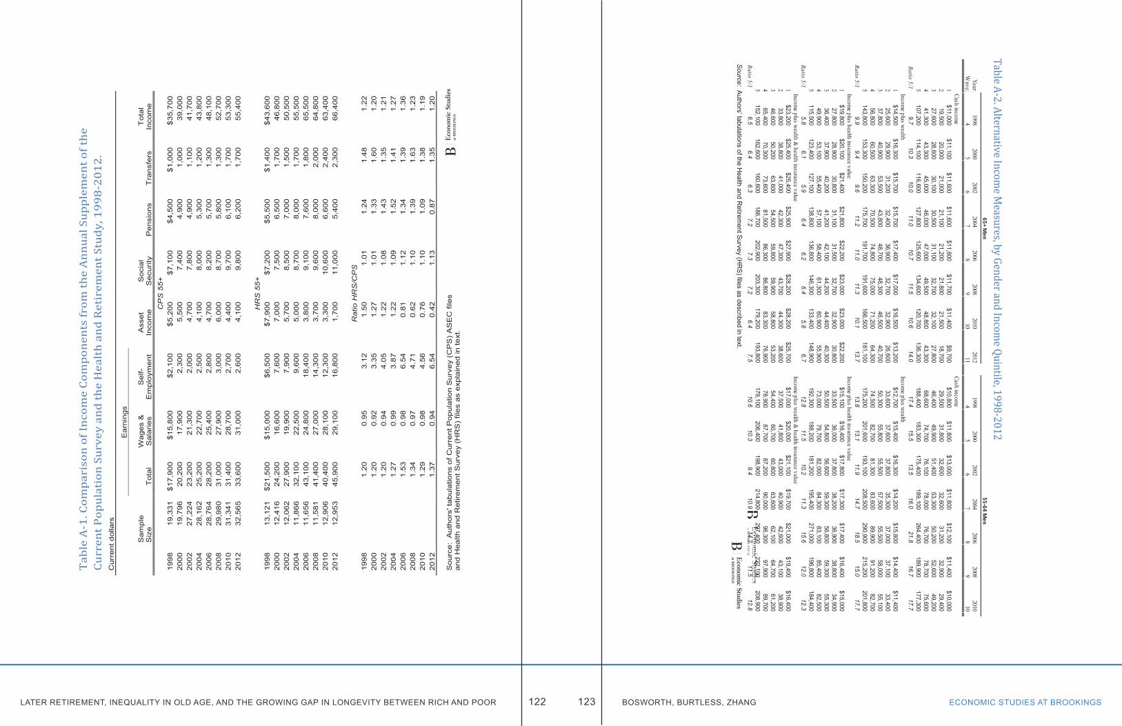
LATER RETIREMENT, INEQUALITY IN OLD AGE, AND THE GROWING GAP IN LONGEVITY BETWEEN RICH AND POOR ECONOMIC STUDIES AT BROOKINGS122 123 BOSWORTH, BURTLESS, ZHANG
Tab
le A
-1. C
ompa
riso
n of
Inco
me
Com
pone
nts
from
the
Ann
ual S
uppl
emen
t of t
he
Curr
ent P
opul
atio
n Su
rvey
and
the
Hea
lth
and
Ret
irem
ent S
tudy
, 199
8-20
12.
Cur
rent
dol
lars
Ear
ning
s
Sam
ple
Siz
eT
otal
Wag
es &
S
alar
ies
Sel
f-E
mpl
oym
ent
Ass
et
Inco
me
Soc
ial
Sec
urity
Pen
sion
sT
rans
fers
Tot
al
Inco
me
CP
S 5
5+19
9819
,331
$17,
900
$15,
800
$2,1
00$5
,200
$7,1
00$4
,500
$1,0
00$3
5,70
020
0019
,796
20,2
0017
,900
2,30
05,
500
7,40
04,
900
1,00
039
,000
2002
27,2
2423
,200
21,3
002,
000
4,70
07,
800
4,90
01,
100
41,7
0020
0428
,162
25,2
0022
,700
2,50
04,
100
8,00
05,
300
1,20
043
,800
2006
28,7
6428
,200
25,4
002,
800
4,70
08,
200
5,70
01,
300
48,1
0020
0829
,980
31,0
0027
,900
3,00
06,
000
8,70
05,
800
1,30
052
,700
2010
31,3
4131
,400
28,7
002,
700
4,40
09,
700
6,10
01,
700
53,3
0020
1232
,565
33,6
0031
,000
2,60
04,
100
9,80
06,
200
1,70
055
,400
HR
S 5
5+19
9813
,121
$21,
500
$15,
000
$6,5
00$7
,900
$7,2
00$5
,500
$1,4
00$4
3,60
020
0012
,416
24,2
0016
,600
7,60
07,
000
7,50
06,
500
1,70
046
,800
2002
12,0
6227
,900
19,9
007,
900
5,70
08,
500
7,00
01,
500
50,5
0020
0411
,866
32,1
0022
,500
9,60
05,
000
8,70
08,
000
1,70
055
,500
2006
11,6
5643
,100
24,8
0018
,400
3,80
09,
100
7,60
01,
800
65,5
0020
0811
,581
41,4
0027
,000
14,3
003,
700
9,60
08,
000
2,00
064
,800
2010
12,9
0640
,400
28,1
0012
,300
3,30
010
,600
6,60
02,
400
63,4
0020
1212
,953
45,9
0029
,100
16,8
001,
700
11,0
005,
400
2,30
066
,400
Rat
io H
RS
/CP
S19
981.
200.
953.
121.
501.
011.
241.
481.
2220
001.
200.
923.
351.
271.
011.
331.
601.
2020
021.
200.
944.
051.
221.
081.
431.
351.
2120
041.
270.
993.
871.
221.
091.
521.
411.
2720
061.
530.
986.
540.
811.
121.
341.
391.
3620
081.
340.
974.
710.
621.
101.
391.
631.
2320
101.
290.
984.
560.
761.
101.
091.
381.
1920
121.
370.
946.
540.
421.
130.
871.
351.
20
Sou
rce:
Aut
hors
' tab
ulat
ions
of C
urre
nt P
opul
atio
n S
urve
y (C
PS
) A
SE
C fi
les
and
Hea
lth a
nd R
etire
men
t Sur
vey
(HR
S)
files
as
expl
aine
d in
text
.
Table A-2. Alternative Income Measures, by Gender and Incom
e Quintile, 1998-2012
Source: Authors’ tabulations of the H
ealth and Retirem
ent Survey (HR
S) files as described in text.
Table A-2. Alternative Income M
easures, by Gender and Incom
e Quintile, 1998-2012
Year:1998
20002002
20042006
20082010
20121998
20002002
20042006
20082010
2012W
ave:4
56
78
910
114
56
78
910
11
Cash incomeCash income
1$11,000
$11,100$11,600
$11,600$11,800
$11,700$11,400
$9,700$10,800
$11,800$13,000
$11,800$12,100
$11,400$10,000
$7,4002
19,50020,000
21,00021,100
21,20021,800
21,50018,700
29,50031,800
32,60032,600
31,20032,900
29,40024,500
327,600
28,60030,100
30,50031,100
32,70032,100
27,80046,400
49,90051,400
53,30050,200
52,60049,200
45,2004
41,30043,300
45,00046,000
47,00049,500
48,80043,300
68,60074,700
76,10078,000
76,70078,700
75,60072,900
5107,200
114,100116,600
127,800125,600
134,600120,700
136,300188,400
183,300175,400
189,100264,400
189,900177,300
184,800Ratio 5/1
9.710.3
10.011.0
10.711.5
10.614.0
17.415.5
13.516.0
21.816.7
17.725.1
Income plus wealthIncome plus wealth
1$14,500
$16,300$15,700
$15,700$17,400
$17,000$16,500
$13,200$12,700
$15,400$16,300
$14,200$15,800
$14,400$11,400
$9,2002
25,60029,900
31,20032,400
36,90032,700
32,90026,600
33,60037,600
37,80035,300
37,00037,100
33,40028,200
337,800
40,90053,500
43,80048,700
48,30046,500
40,70050,300
55,80055,500
57,50055,500
58,00055,100
50,3004
56,80060,500
63,30070,500
74,80075,000
71,20064,300
74,50082,700
81,30083,600
89,90091,200
82,70082,300
5143,800
153,300150,200
175,700191,700
191,600166,500
181,100175,200
201,600193,100
208,500290,900
215,200201,800
204,300Ratio 5/1
9.99.4
9.611.2
11.011.3
10.113.7
13.813.1
11.914.7
18.515.0
17.722.3
Income plus health insurance valueIncome plus health insurance value
1$19,800
$20,100$21,400
$21,800$22,200
$23,000$23,000
$22,200$15,100
$16,400$17,800
$17,300$17,400
$16,400$15,000
$12,9002
27,80028,900
30,80031,100
31,50032,700
32,90030,800
33,50036,000
37,80038,200
36,90038,800
34,90029,800
336,400
37,90040,200
41,20042,100
44,20044,400
40,30050,500
54,80056,600
59,30056,800
59,30055,300
51,4004
49,90053,100
55,40057,100
58,40061,300
60,90055,900
73,00079,700
82,00084,300
83,10085,400
82,50079,400
5115,500
123,400127,100
138,800136,800
146,300133,400
148,900192,300
188,200181,200
195,400271,000
196,800184,400
191,700Ratio 5/1
5.86.1
5.96.4
6.26.4
5.86.7
12.811.5
10.211.3
15.612.0
12.314.9
Income plus wealth & health insurance value
Income plus wealth & health insurance value
1$23,200
$25,400$25,400
$25,900$27,900
$28,200$28,200
$25,700$17,000
$20,000$21,100
$19,700$21,000
$19,400$16,400
$14,7002
33,80038,800
41,00042,300
47,30043,700
44,30038,600
37,50041,800
43,00040,900
42,60043,100
38,90033,500
346,600
50,20063,600
54,50059,800
59,90058,800
53,20054,400
60,70060,800
63,60062,100
64,70061,200
56,5004
65,40070,300
73,60081,500
86,30086,800
83,30076,900
78,90087,700
87,20090,000
96,30097,900
89,70088,800
5152,100
162,600160,600
186,700202,900
203,300179,200
193,800179,100
206,400198,900
214,800297,400
222,100208,900
211,300Ratio 5/1
6.56.4
6.37.2
7.37.2
6.47.5
10.610.3
9.410.9
14.211.5
12.814.4
55-64 Men
65+ Men
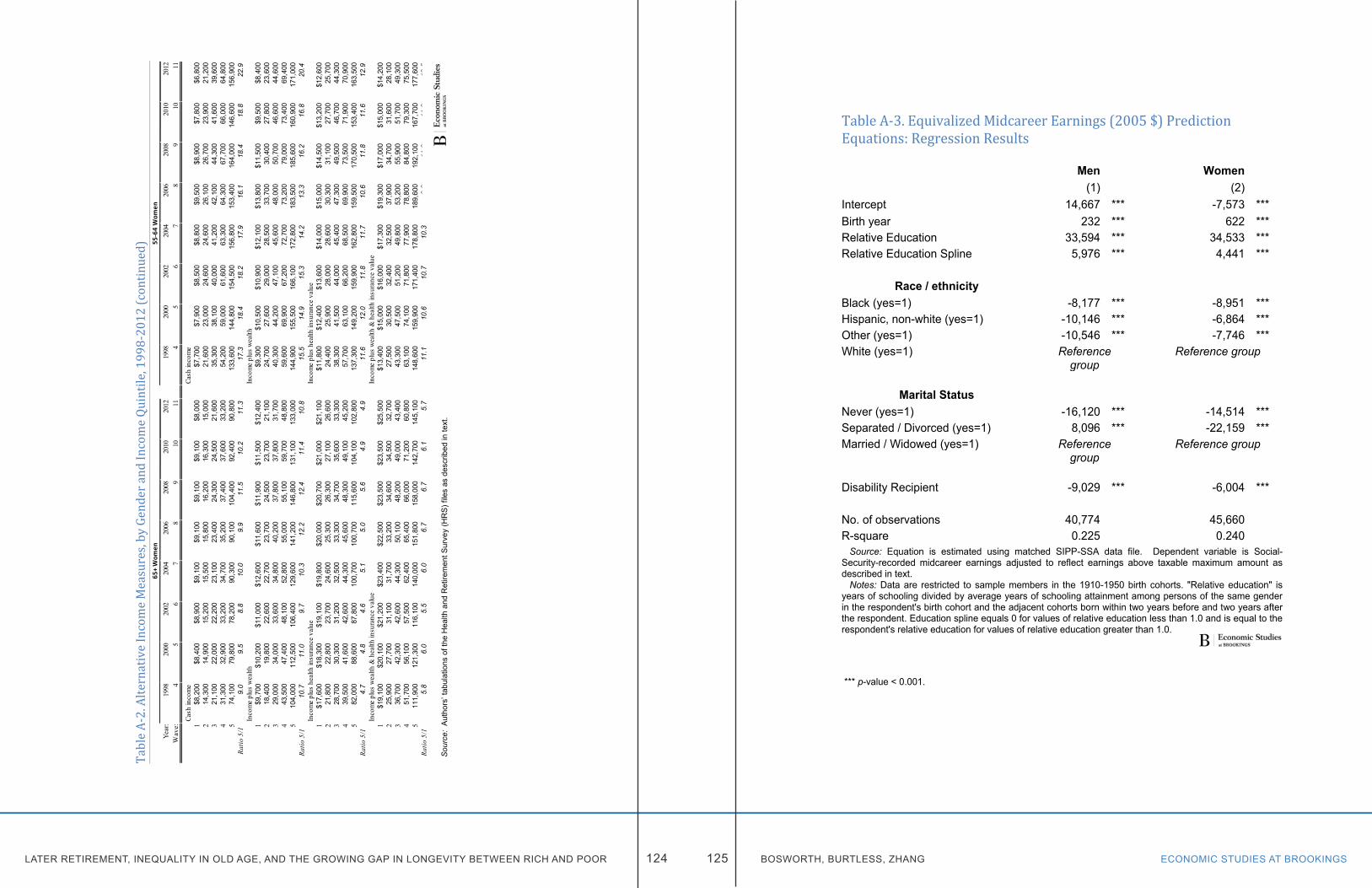
LATER RETIREMENT, INEQUALITY IN OLD AGE, AND THE GROWING GAP IN LONGEVITY BETWEEN RICH AND POOR ECONOMIC STUDIES AT BROOKINGS124 125 BOSWORTH, BURTLESS, ZHANG
Tabl
e A-2
. Alte
rnat
ive In
com
e Mea
sure
s, by
Gen
der a
nd In
com
e Qui
ntile
, 199
8-20
12 (c
ontin
ued)
So
urce
: Au
thor
s’ ta
bula
tions
of t
he H
ealth
and
Ret
irem
ent S
urve
y (H
RS)
file
s as
des
crib
ed in
text
.
Tabl
e A
-2. A
ltern
ativ
e In
com
e M
easu
res,
by
Gen
der a
nd In
com
e Q
uint
ile, 1
998-
2012
(con
tinue
d)
Year
:19
9820
0020
0220
0420
0620
0820
1020
1219
9820
0020
0220
0420
0620
0820
1020
12W
ave:
45
67
89
1011
45
67
89
1011
Cash
inco
me
Cash
inco
me
1$8
,200
$8,4
00$8
,900
$9,1
00$9
,100
$9,1
00$9
,100
$8,0
00$7
,700
$7,9
00$8
,500
$8,8
00$9
,500
$8,9
00$7
,800
$6,8
002
14,3
0014
,900
15,2
0015
,500
15,8
0016
,200
16,3
0015
,000
21,6
0023
,000
24,6
0024
,600
26,1
0026
,700
23,9
0021
,200
321
,100
22,0
0022
,200
23,1
0023
,400
24,3
0024
,500
21,6
0035
,300
38,1
0040
,000
41,2
0042
,100
44,3
0041
,600
39,6
004
31,3
0032
,900
33,2
0034
,700
35,2
0037
,400
37,6
0033
,200
54,2
0059
,000
61,6
0063
,300
64,3
0067
,700
66,0
0064
,800
574
,100
79,8
0078
,200
90,3
0090
,100
104,
400
92,4
0090
,800
133,
600
144,
800
154,
500
156,
800
153,
400
164,
000
146,
600
156,
900
Ratio
5/1
9.
09.
58.
810
.09.
911
.510
.211
.317
.318
.418
.217
.916
.118
.418
.822
.9In
com
e pl
us w
ealth
Inco
me
plus
wea
lth1
$9,7
00$1
0,20
0$1
1,00
0$1
2,60
0$1
1,60
0$1
1,90
0$1
1,50
0$1
2,40
0$9
,300
$10,
500
$10,
900
$12,
100
$13,
800
$11,
500
$9,5
00$8
,400
218
,400
19,8
0022
,600
22,7
0023
,700
24,5
0023
,700
21,1
0024
,700
27,6
0029
,000
28,5
0033
,700
30,4
0027
,800
23,6
003
29,0
0034
,000
33,6
0034
,800
40,2
0037
,800
37,8
0031
,700
40,3
0044
,200
47,1
0045
,600
48,0
0050
,700
46,6
0044
,600
443
,500
47,4
0048
,100
52,8
0055
,000
55,1
0059
,700
48,8
0059
,600
69,9
0067
,200
72,7
0073
,200
79,0
0073
,400
69,4
005
104,
000
112,
500
106,
400
129,
600
141,
200
146,
800
131,
100
133,
000
144,
900
155,
500
166,
100
172,
800
183,
500
185,
600
160,
900
171,
000
Ratio
5/1
10
.711
.09.
710
.312
.212
.411
.410
.815
.514
.915
.314
.213
.316
.216
.820
.4In
com
e pl
us h
ealth
insu
ranc
e va
lue
Inco
me
plus
hea
lth in
sura
nce
valu
e1
$17,
600
$18,
300
$19,
100
$19,
800
$20,
000
$20,
700
$21,
000
$21,
100
$11,
800
$12,
400
$13,
600
$14,
000
$15,
000
$14,
500
$13,
200
$12,
600
221
,800
22,8
0023
,700
24,6
0025
,300
26,3
0027
,100
26,6
0024
,400
25,9
0028
,000
28,6
0030
,300
31,1
0027
,700
25,7
003
28,7
0030
,300
31,2
0032
,500
33,3
0034
,700
35,6
0033
,300
38,3
0041
,500
44,0
0045
,400
47,3
0049
,500
46,7
0044
,300
439
,500
41,6
0042
,600
44,3
0045
,600
48,3
0049
,100
45,2
0057
,700
63,1
0066
,200
68,5
0069
,900
73,5
0071
,900
70,9
005
82,0
0088
,600
87,8
0010
0,70
010
0,70
011
5,60
010
4,10
010
2,80
013
7,30
014
9,20
015
9,90
016
2,80
015
9,50
017
0,50
015
3,40
016
3,50
0Ra
tio 5
/1
4.7
4.8
4.6
5.1
5.0
5.6
4.9
4.9
11.6
12.0
11.8
11.7
10.6
11.8
11.6
12.9
Inco
me
plus
wea
lth &
hea
lth in
sura
nce
valu
eIn
com
e pl
us w
ealth
& h
ealth
insu
ranc
e va
lue
1$1
9,10
0$2
0,10
0$2
1,20
0$2
3,40
0$2
2,50
0$2
3,50
0$2
3,50
0$2
5,50
0$1
3,40
0$1
5,00
0$1
6,00
0$1
7,30
0$1
9,30
0$1
7,00
0$1
5,00
0$1
4,20
02
25,9
0027
,700
31,1
0031
,700
33,2
0034
,600
34,5
0032
,700
27,5
0030
,500
32,4
0032
,500
37,9
0034
,700
31,6
0028
,100
336
,700
42,3
0042
,600
44,3
0050
,100
48,2
0049
,000
43,4
0043
,300
47,5
0051
,200
49,8
0053
,200
55,9
0051
,700
49,3
004
51,7
0056
,100
57,5
0062
,400
65,4
0066
,000
71,2
0060
,800
63,1
0074
,100
71,8
0077
,900
78,8
0084
,800
79,3
0075
,500
511
1,90
012
1,30
011
6,10
014
0,00
015
1,80
015
8,00
014
2,70
014
5,10
014
8,60
015
9,90
017
1,40
017
8,80
018
9,60
019
2,10
016
7,70
017
7,60
0Ra
tio 5
/1
5.8
6.0
5.5
6.0
6.7
6.7
6.1
5.7
11.1
10.6
10.7
10.3
9.8
11.3
11.2
12.5
65+
Wom
en55
-64
Wom
en
Table A-3. Equivalized Midcareer Earnings (2005 $) Prediction Equations: Regression Results Men Women (1) (2) Intercept 14,667 *** -7,573 *** Birth year 232 *** 622 *** Relative Education 33,594 *** 34,533 *** Relative Education Spline 5,976 *** 4,441 ***
Race / ethnicity Black (yes=1) -8,177 *** -8,951 *** Hispanic, non-white (yes=1) -10,146 *** -6,864 *** Other (yes=1) -10,546 *** -7,746 *** White (yes=1) Reference
group Reference group
Marital Status
Never (yes=1) -16,120 *** -14,514 *** Separated / Divorced (yes=1) 8,096 *** -22,159 *** Married / Widowed (yes=1) Reference
group Reference group
Disability Recipient -9,029 *** -6,004 *** No. of observations 40,774 45,660 R-square 0.225 0.240 Source: Equation is estimated using matched SIPP-SSA data file. Dependent variable is Social-Security-recorded midcareer earnings adjusted to reflect earnings above taxable maximum amount as described in text. Notes: Data are restricted to sample members in the 1910-1950 birth cohorts. "Relative education" is years of schooling divided by average years of schooling attainment among persons of the same gender in the respondent's birth cohort and the adjacent cohorts born within two years before and two years after the respondent. Education spline equals 0 for values of relative education less than 1.0 and is equal to the respondent's relative education for values of relative education greater than 1.0.
*** p-value < 0.001.
LATER RETIREMENT, INEQUALITY IN OLD AGE, AND THE GROWING GAP IN LONGEVITY BETWEEN RICH AND POOR ECONOMIC STUDIES AT BROOKINGS126 127 BOSWORTH, BURTLESS, ZHANG
Appendix BALTERNATIVE ESTIMATES OF MORTALITY TRENDS IN THE MATCHED SIPP-SSA FILE
This appendix sheds additional light on the growing mortality difference between Americans who have high and low midcareer earnings. It focuses solely on information available in the file containing matched data from the Census Bureau’s Survey of Income and Program Participation (SIPP) and the Social Security Administration’s lifetime earnings records and mortality files. As we show in chapter IV, these data permit us to analyze determinants of mortality within a large sample of SIPP respondents. In this appendix we examine the mortality experience of respondents born between 1910 and 1956 during the period between 1984 and 2012.
Besides gaining access to the confidential matched data, the most challenging part of our research was devising markers of socioeconomic status that permit us to make evenhanded comparisons between generations born over a 46-year time span. This is a formidable challenge because measures of annual earnings in the SSA administrative files were subject to different reporting limits between 1951 and 2006, the period over which we measured the midcareer earnings of workers in our sample. In chapter IV of this study we report results based on one way of dealing with the limitations of the earnings amounts reported in the Social Security Administration files. This appendix chapter offers mortality estimates obtained using an alternative method for dealing with the limitations. Both methods yield an identical basic conclusion: The mortality difference between Americans with low and high midcareer earnings has increased significantly over time. The rising difference has in turn offset part of the intended redistributive impact of the basic Social Security benefit formula. This follows from the fact that recent gains in life expectancy have differentially favored high average-earnings workers compared with workers who have below-average earnings. However, the results in this appendix also show that estimates of the growth in the mortality differential are sensitive to the way we
measure midcareer earnings and to our method for estimating the growth in the mortality differential.
THE MATCHED SIPP-SSA DATAOur data file contains records for SIPP respondents born between 1910 and 1956 who were sampled in the 1984, 1993, 1996, 2001, and 2004 panels.1 We were able to successfully match about 80 percent of the respondents to their corresponding Social Security earnings and death records, yielding a total sample of over 70,000 men and over 81,000 women.2 Among these, about 100,000 respondents were “married, with spouse present” at the time of the SIPP interview. We were able to successfully match slightly less than 98 percent of these married respondents to their spouse’s Social Security record. We then created a person-year dataset, in which each respondent enters the sample in the year corresponding to their initial SIPP interview (beginning in 1984) and remains in the sample until the year of their death or until 2012 (the last year for which we have reliable death data).
In estimating mortality functions for men, we used as an indicator of economic status each male’s own nonzero earnings between the ages of 41 and 50. Earnings records for those ages are available for almost 55,000 male respondents, providing us with 680,000 person-year observations of potential mortality for men. About 15,000 of the 55,000 male respondents died during the observation period (see Table B-1).
It is less obvious how to measure the social and economic status of married women. A woman’s own earnings can provide a clear indication of social and economic status for never-married women, but may offer a poor indicator of economic status for married women, especially those who earn relatively little during years they are rearing children. In this appendix we nonetheless show results using a classification of women’s economic status based solely on their average nonzero earnings between ages 41 and 50, the same earnings indicator just described for men. Women without a matched earnings record or with no recorded earnings between ages 41 and 50 are excluded from this estimation sample. Earnings and mortality records meeting our criteria are available
LATER RETIREMENT, INEQUALITY IN OLD AGE, AND THE GROWING GAP IN LONGEVITY BETWEEN RICH AND POOR ECONOMIC STUDIES AT BROOKINGS128 129 BOSWORTH, BURTLESS, ZHANG
for slightly more than 56,000 female respondents, providing us with 725,000 person-year observations of potential mortality for women. About 11,500 of the 56,000 female respondents died over the observation period (see Table B-1). In addition, we derived an alternative indicator of economic status based on the earnings of never-married women and the combined husband-and-wife earnings of married women with a successfully matched spouse record. Widowed and divorced women did not have a spouse at the time of the SIPP survey, so the spouse’s SSA earnings record was missing for these women. In addition, some women were married to men whose SSA earnings record could not be matched or to husbands who had no recorded earnings between ages 41 and 50. Those married women were also dropped from our estimation sample when we used combined husband-and-wife earnings to measure a woman’s socio-economic status. These sample criteria give us an estimation sample of about 38,000 never-married plus currently married SIPP respondents, or a total of 525,000 person-year observations. Over the course of the observation period, approximately 7,000 respondents in this sample died.
MEASURING WORKERS’ EARNINGS RANKS IN A CONSISTENT WAYAs noted in chapter IV, a shortcoming of the earnings records maintained by SSA is that in most years the earnings amounts reported in the file are top-coded. Before the 1980s, the amounts recorded in the file were capped at an annual amount equal to the maximum earnings subject to the Social Security payroll tax in the year.3 The problem is especially severe for male earnings reported in the 1950s and 1960s, when the taxable earnings cap was low in relation to the annual wages earned by men between 41 and 50 years old. It is impossible based on internal evidence in the SSA earnings records to deduce the exact importance of the earnings cap on successive birth cohorts, in particular, for calendar years between 1951 and the early 1980s.
The taxable earnings cap raises two problems for classifying workers based on their reported earnings in the SSA earnings file. First, the percentage of workers who earned more than the Social Security taxable maximum varies greatly by workers’ ages and across calendar years. For male workers in their 40s, up to 69 percent had their annual earnings capped at the maximum taxed amount
in the middle of the 1960s. In 2005 only about 15 percent of male earners in the same age range earned more than the maximum taxed amount. A much smaller percentage of women had earnings above the capped amount. In the mid-1960s only about 20 percent of women in their 40s earned more than the taxable maximum, and that fraction fell to about 5 percent by 2000. Thus, the earnings cap represents a serious challenge for classifying male earners but a less serious problem for classifying women.
A second problem for classifying earners in a consistent way is that the matched SIPP sample represents a random cross-section of the noninstitutionalized population in the calendar years when it was drawn, that is, in 1984, 1993, 1996, 2001, or 2004. An ideal estimation sample for purposes of determining the effect of socio-economic status on mortality would be drawn from the populations in successive birth cohorts that survive to a given age, say, age 50. The first SIPP sample available to us was drawn in 1984, however. Americans born in 1910 were already 74 years old, and a sizeable percentage of the people in that birth cohort who survived to age 50 were already deceased or institutionalized. On the other hand, Americans born in 1956 were only 28 years old in 1984. Even in the last SIPP sample we use, drawn in 2004, people born in 1956 were only 48 years old. It is clear that for the oldest birth cohorts, the SIPP sample does not include a random sample of the population that survives to age 50. Instead, it includes only those respondents who survived long enough to be enrolled in the SIPP interview sample. The sample selection problem makes it hazardous to classify earners based solely on the earnings data recorded in the SSA earnings records for SIPP sample members. For cohorts born since the middle 1930s, the SIPP sample arguably gives us samples that are representative of Americans who survived to age 50. For earlier cohorts, however, our sample excludes the people who survive to 50 but died soon afterwards. The exclusion means that the earnings information within the matched SIPP-SSA file cannot give us a representative sample of earnings records for workers in successive cohorts who earned Social-Security-covered income between ages 41 and 50.
In this appendix we address this problem by turning to the SSA Earnings Public-Use File (EPUF). That file contains summary earnings information on individual-
LATER RETIREMENT, INEQUALITY IN OLD AGE, AND THE GROWING GAP IN LONGEVITY BETWEEN RICH AND POOR ECONOMIC STUDIES AT BROOKINGS130 131 BOSWORTH, BURTLESS, ZHANG
level Social-Security-covered earnings before 1951 as well as individual-year data on covered earnings between 1951 and 2006 (Compson 2011). The data set includes information for a random sample of 3.13 million Americans who had covered earnings in at least one year between 1951 and 2006. The data in this file can be used to determine the exact percentile of the male earnings distribution that is just below the taxable earnings cap for each birth cohort when it is between 41 and 50 years old. We determined that the lowest earnings cap was slightly above the 31st percentile of earnings for the male birth-year cohort that experienced the lowest annual earnings cap (relative to the cohort’s annual earnings distribution).4 In order to construct an indicator of workers’ positions in the male earnings distribution, we therefore used workers’ annual earnings up to the 31st percentile in the EPUF file. The 31st percentile annual earnings amount was estimated using the EPUF earnings for a given birth cohort and separately for each year of age for that cohort between 41 and 50. These estimates of a low earnings level are based on reports in the EPUF file for all males in the population who reported nonzero Social-Security-covered earnings in the year. They are therefore unaffected by the subsequent mortality experience of workers in each cohort.
After identifying the 31st percentile earnings amount for each male birth cohort and each year of age between 41 and 50, we constructed alternative classification schemes to identify “persistent low earners,” “low earners,” and “likely low earners.” Workers in the matched SIPP-SSA sample who had nonzero earnings equal to or less than the 31st percentile amount in all years for which they reported nonzero earnings between ages 41 and 50 can be reliably classified as “persistent low earners.”5 About 15 percent of the men in our SIPP sample meet the earnings criteria to fall in this category (see Table B-2). Our more expansive definition of a “low earner” requires that the worker earn less than the 31st-percentile amount in at least three-quarters of the years between ages 41 and 50 in which he reports nonzero earnings. Slightly more than one-fifth of male earners fall into this category. Finally, our most expansive definition of low earners requires only that they earn less than the 31st-percentile amount in at least one-half of their nonzero earnings years between ages 41 and 50. This class of earners constitutes about 30 percent of the male workers in our
sample. Clearly it would be preferable to classify workers by their average earnings over a longer part of their careers and using all earnings, rather than just Social-Security-taxed earnings. However, the limits of the Social Security earnings file make this impossible. The classification scheme used in this appendix permits us to identify low earners in a consistent way given the varying limits on the annual income amounts reported in the Social Security earnings file.
Women’s reported earnings are much less affected by the maximum taxable earnings amount. In years when the taxable cap was low relative to economy-wide average wages, in 1951 through the mid-1970s, women’s earnings were also comparatively low. As women’s average earnings increased, so too did the annual earnings cap. As a result, women’s annual wages up through the 80th earnings percentile are observed, even in the calendar year with the lowest earnings cap relative to the female earnings distribution. It is therefore easier for us to classify women earners by their exact position in the female earnings distribution. We simply counted women’s annual earnings up through the 80th percentile and then calculated the average nonzero earnings amount between ages 41 and 50. Within each birth cohort we then ranked women by their position in the distribution of nonzero average earnings. In specifications that used women’s own earnings to indicate their social and economic status, we used straightforward indicators of their earnings rank within their birth year cohort. For example, a “low earner” might be one whose average nonzero earnings placed her in the bottom half of her cohort’s earnings distribution according to estimates we derived from the EPUF public use file. (In the matched SIPP-SSA file, 47 percent of female earners had earnings that placed them in the low earner category, indicating that female earners in our sample earned slightly higher incomes than earners in the EPUF file.)
It is more complicated to construct a consistent indicator of low household earnings. The fact that reported average male earnings in the 1950s and 1960s have a much lower cap compared with earnings reported in 1977-2012 means that we cannot simply add the earnings of the two spouses to construct a valid and consistent indicator of combined husband and wife earnings. Our solution is
LATER RETIREMENT, INEQUALITY IN OLD AGE, AND THE GROWING GAP IN LONGEVITY BETWEEN RICH AND POOR ECONOMIC STUDIES AT BROOKINGS132 133 BOSWORTH, BURTLESS, ZHANG
to combine our separate indicators of low earnings status for the two spouses to create a composite indicator of low household earnings. For example, married women with a spouse who earns less than the 31st percentile earnings amount are always classified as having low household earnings, as are all unmarried women whose earnings are less than the 50th percentile of average nonzero earnings among women born in the same year (see notes in Table B-3). Slightly less than one-third of women who have enough information to be classified under this scheme are classified as members of low-earning families (see Table B-3). Our tabulations suggest that a rising percentage of women classified as members of low-earnings families are unmarried.
RESULTS FOR ALL AGES 49 THROUGH 91 For this appendix we estimated a parsimonious discrete-time logistic model to summarize observed mortality patterns in the matched SIPP-SSA sample:
(1) log (hit / (1 - hit )) = α0 + β1 Ageit + β2 (Birth Yeari – 1900) + β3 Low Earnings i + β4 (Birth Yeari – 1900) X Low Earningsi + β5 FirstYrit ,where hit = Pr( Yit = 1 / Yit-1 = 0) is the hazard that person i will die in year t; Low Earnings i = 1 if person i is in low earnings group; = 0 otherwise; and FirstYrit = 1 if year t is the first year person i is enrolled in the SIPP sample; = 0 otherwise.
(FirstYrit is included in the specification to reflect the fact that respondents are exposed to the risk of dying for less than a full 12 months in the first calendar year of their enrollment.) The impact of low earnings status on a worker’s mortality is captured by the coefficients β3 and β4. If the impact of Low Earnings increases or shrinks in successive birth cohorts, the size of this impact will be reflected by β4. If the mortality differential due to low economic and social status is growing, β4 will be positive. Unlike the specification we use in chapter IV, equation 1 does not include indicators of respondents’ race, disability status, relative educational attainment, or marital status. Instead, the specification used here focuses solely on respondents’ birth year, age, and Social-Security-
covered earnings level. The simplicity of the specification allows us to perform straightforward simulations of the impact of rising mortality differentials on the lifetime Social Security benefits of low- and average- and high-income SIPP respondents. In addition, as we will see in the next section, it also permits us to examine the change in the mortality differential in different age groups.
Men. Equation 1 was initially estimated for all men in the SIPP-Social Security sample described above, namely, males with positive nonzero earnings between ages 41 and 50 who were born between 1910 and 1956 and who were aged between 49 and 91 in the calendar years of observation we include in the estimation. The first measure of Low Earnings we use is based on the definition of a “persistent low earner” described above. This definition requires that workers earn less than the 31st-percentile amount in all of the years they have nonzero earnings between ages 41 and 50. Recall that this class of earners represents 15 percent of the male workers in our sample. Parameter estimates using this sample and this definition of Low Earnings status are displayed in the top panel of Table B-4. In view of the large sample size, it is hardly surprising that all parameter estimates are highly statistically significant. As expected, the effect of an increase in age is to boost mortality rates while the effect of a later respondent birth year is to reduce it. Older respondents face a higher probability of death, but, holding constant a respondent’s age, those born in later cohorts experience lower mortality rates than those born earlier.6 The estimated effect of Low Earnings status on a respondent’s mortality rate depends on the age of his birth. For workers born before 1912, Low Earnings status is associated with slightly lower mortality rates; for those born in 1912 and later years, Low Earnings is associated with a higher risk of death compared with the mortality risk faced by someone the same age and in the same birth cohort who is not classified as a low earner. This mortality-rate differential increases with successive birth cohorts, implying that the mortality disadvantage associated with having low midcareer earnings is increasing over time.
The second panel in Table B-4 shows results when Low Earnings status is broadened to include all workers who have at least three-quarters of nonzero
LATER RETIREMENT, INEQUALITY IN OLD AGE, AND THE GROWING GAP IN LONGEVITY BETWEEN RICH AND POOR ECONOMIC STUDIES AT BROOKINGS134 135 BOSWORTH, BURTLESS, ZHANG
midcareer earnings years with earnings levels below the 31st percentile of male earnings in their birth cohort. Under this definition, slightly more than a fifth of male earners is classified as having Low Earnings. The results are similar to those we obtain in using a narrower definition of Low Earnings status, but the adverse impact of having Low Earnings appears slightly smaller. Finally, the bottom panel of Table B-4 shows parameter estimates under a definition of Low Earnings status that includes all men who have at least half of their midcareer earnings years with an income level below the 31st percentile of annual male earnings. This definition classifies about 30 percent of earners in our sample as low earners. At most ages the adverse effect of Low Earnings status on worker mortality is similar to that estimated using the narrowest definition of a low earner.
Figure B-1 shows the implied mortality rates predicted by the parameter estimates shown in the bottom panel of Table B-4. The top panel in Figure B-1 shows predicted age-specific mortality rates for men with average- and above-average earnings born in three years, 1915, 1930, and 1945. The horizontal axis shows the men’s age, and the vertical axis indicates the probability a surviving male will die at the indicated age. The three lines in the chart imply that age-specific mortality rates fell for successive birth cohorts. For example, at age 70 the mortality rate of men with average- and above-average earnings fell from 3.7 percent for the cohort born in 1915 to 1.6 percent for men born in 1945. The lower panel of Figure B-1 shows comparable mortality-rate estimates for men who earned annual incomes below the 31st earnings percentile in at least half the years they had nonzero earnings between ages 41 and 50. The results show reductions in mortality rates for later cohorts, but the drop in mortality is substantially less than it was among men with average- and above-average earnings. At age 70, for example, the mortality rate among men with low earnings only fell from 3.9 percent for the cohort born in 1915 to 3.2 percent for men born in 1945. At each year of age the risk of death declined for low-earnings men, but it declined proportionately much more slowly than it did for average- and high-earnings men. The estimated jump in the mortality differential is highly significant. (In this large sample, the p-value of the coefficient on β4 is 0.0001.)
The top panel in Figure B-2 shows the implied ratio of the mortality rate in the low-earnings group compared with high-earnings males across successive birth cohorts. We calculate the ratio at age 60, though results at other ages would differ only slightly. In the cohort born in 1920, the ratio of the age-specific mortality rate among low-earning males to that of high-earning males is 1.18, implying that at age 60 the low-earning male is 18 percent more likely to die than a high-earning male. In the 1935 birth cohort the mortality rate ratio increased to 1.66, and for the 1950 cohort the ratio is 2.33. At ages when the overall probability of death is very low, as for example below age 50, the fact that a low-earnings man faces a higher likelihood of dying may have little practical impact on life expectancy. When the annual probability of dying is greater than 1 percent, as it is for men past 65, the ratios displayed Figure B-2 imply very meaningful differences in remaining life expectancy.
The mortality rate estimates can be converted into life expectancies for men surviving to a given age, say, 62. To see the effect of increasing mortality rate differences on expected life spans, consider the predicted life-expectancy gap between low earners, on the one hand, and average- and high-earnings men, on the other, in cohorts born in 1920 and 1950. Compared with low-earnings 62-year-old men born in 1920, the results in the bottom panel of Table B-4 imply that men who had average or high earnings could expect to live an additional 1.3 years, or 8 percent, longer than men with low earnings. For men born in 1950, the life expectancy gap at age 62 is 6.2 years, or about one-third of the remaining life expectancy of 62-year-olds with low earnings. While life expectancy at age 62 increased for both high and low earners, it increased significantly more for men classified as average or high earners. The longevity gaps implied by the coefficients in the top two panels of Table B-4 are a bit larger than this, but the percentages of male earners who are classified as low earners are smaller.
Women. Table B-5 shows parameter estimates of our discrete-time logistic model of mortality for women in the matched SIPP-SSA sample. The top panel shows results when the model is estimated based on a classification that uses the combined husband and wife earnings of women who are married and have
LATER RETIREMENT, INEQUALITY IN OLD AGE, AND THE GROWING GAP IN LONGEVITY BETWEEN RICH AND POOR ECONOMIC STUDIES AT BROOKINGS136 137 BOSWORTH, BURTLESS, ZHANG
a matched spousal SSA earnings record. This classification method uses the woman’s own earnings record for women who were never married. (The details of the classification are described in Table B-3.) Results in the lower panel are derived using a classification scheme in which women’s low earnings status is determined solely on the basis of their own Social-Security-covered earnings. The sample of women who can be classified using this method is larger, but for women whose primary earnings years were in the 1950s through the mid-1970s the definition of a low earner probably results in the misclassification of a sizeable number of wives who were secondary earners in high-income families.
The results under both classification methods show that there was a significant increase in the mortality differential between low-earnings women and women who are not classified as low earners. The estimated coefficient on the interaction term, β4, is positive in both specifications, and in both cases the coefficient is highly statistically significant. The bottom panel of Figure B-2 shows the implied ratio of the mortality rate in the low-earning group compared with the high-income group when our definition of “low earner” is based on the combined earnings records of the two spouses. The proportional mortality gap between low-earnings women and other women increases noticeably, but it increases more slowly than the gap between low-earnings men and other men.
The coefficients reported in Table B-5 can be translated into life expectancy differences for the women who survive to age 62. In both specifications the life expectancy gap between women in the low-earner and high-earner group was small for women born in 1920. The predicted life expectancy difference was less than 4 percent of the remaining life expectancy of women classified as low earners. For women born in 1950, the gap widened considerably. When women are classified as low earners based on the combined Social-Security-covered earnings of a husband and wife, the life expectancy gap at age 62 was 4 years, or about 18 percent of the remaining life expectancy of women in the low earnings group. When women are classified as low earners based solely on their own earnings, the predicted life expectancy gap in the 1950 birth cohort is somewhat smaller, about 3.4 years or 15 percent of the remaining life expectancy of those in the bottom half of the female earnings distribution.
In sum, our results using a parsimonious specification of the determinants of mortality and a simple classification method for identifying low earners yield the same basic conclusion as the findings presented in chapter IV. Both among men and women we find consistent and strong evidence that mortality differentials between low and high earners are larger in recent birth cohorts compared with cohorts born earlier. The estimated increase in the mortality differential is not only statistically significant but also big enough to have a meaningful impact on the remaining life expectancy of older Americans.
RESULTS FOR NARROWER AGE GROUPS IN THE ELDERLY POPULATIONThe large sample of SIPP respondents permits us to re-estimate equation 1 within narrower age groups to pinpoint the age ranges where widening mortality differentials are largest and most significant. We performed the re-estimation within overlapping 7-year age groups (49-55, 52-58, 55-61, 58-64, 61-67, etc.).
Males. Table B-6 shows coefficient estimates for males in the 12 age groups just described. Our definition of a “low earner” includes all men who have earnings below the 31st percentile of male earnings in at least one-half of the years between ages 41 and 50 in which they have nonzero reported earnings. The remaining male earners are classified as having average or above-average earnings for men in their birth cohort. The crucial parameter of interest is β4, the coefficient on BrthYri x Lowi. A positive value of β4 ordinarily indicates that the mortality differential between low and high earners is increasing in successive generations. As expected, the estimated values of β4 have the expected sign in all of the 12 age groups, and in all but three of the age groups the coefficient is significantly different from zero. (The exceptions are men 49 to 55, 79 to 85, and 82 to 88 years old.) Even though the results indicate that the mortality differential increased by a statistically significant amount in nearly all of the age groups we examine, the pattern of increase differs from the one we find when all age groups are combined in a single estimation sample.
Figure B-3 shows predicted age-specific mortality rates for high-earning men born in 1915, 1920, 1925, 1930, 1935, and 1945. Each highlighted dot along the lines shows the central point estimate of age-specific mortality within an
LATER RETIREMENT, INEQUALITY IN OLD AGE, AND THE GROWING GAP IN LONGEVITY BETWEEN RICH AND POOR ECONOMIC STUDIES AT BROOKINGS138 139 BOSWORTH, BURTLESS, ZHANG
age and cohort group, with the mortality rate calculated at the mean age in the subsample. Each line in the chart traces out the estimated increase in mortality observed in the SIPP sample as a particular birth cohort grows older. For example, the lowest line shows the trend in mortality for men born in 1945 between ages 52 and 67, the oldest age we observe mortality in this birth cohort. At age 67 our sample also gives us observed mortality rates for the cohorts born in 1920, 1925, 1935, and 1940. The data plainly show a drop in mortality at this age for younger cohorts. The estimates of improving mortality correspond closely to the more constrained estimates for the entire sample of men with average and above-average earnings displayed in Figure B-1.
Figure B-4 shows estimated mortality rate differentials between low and high earners in successive cohorts and at different ages based on the estimates reported in Table B-6. The differential is measured as the ratio of the estimated age-specific death rate in the low-earning male group compared with the higher earning group. Again, each highlighted dot on the lines shows the central point estimate of this ratio within a birth cohort and at the indicated age, with the mortality rate ratio calculated at the mean age in the subsample. Even in this more flexible specification it is plain that the mortality differential has widened over time. The parameter that captures this widening is the coefficient β4. This coefficient is highly statistically significant for every age group between ages 52-58 and 76-82. The fact that the differential has not widened significantly at ages past 82 may reflect our small sample sizes at the oldest ages or the fact that low-earning men who survive past 82 are selected from a relatively healthy population.
Women. In the case of women we re-estimated equation 1 separately within overlapping 9-year age groups (49-57, 53-61, 57-65, 61-69, 65-73, etc.). We performed the subgroup analysis for both of our definitions of “low earning” women. The first of these is based on a classification that uses the combined husband and wife earnings of women who are married and the woman’s own earnings record for women who were never married. Our results within the subgroups are generally consistent with those we found when using the full 49-91 year-old sample. Somewhat less than a third of women in this sample are
classified as members of low earnings families. For all but one of the nine age groups β4 has the expected sign. In the youngest age group β4 is negative and close to zero. In four of the nine groups (57-65, 73-81, 77-85, and 85-93) β4 has the expected positive sign and is statistically significantly different from zero. Thus, over much of the age range covered by our full sample we find significant increases in the mortality difference between low earners and women with average- or above-average family earnings.
Our second classification of female earners only counts women’s own earnings in determining whether they are low earners. Spouses’ earnings are ignored. This gives us a somewhat bigger sample, but the estimation results are qualitatively similar to those just described. In all nine age groups the estimate of β4 has the expected sign, and in four of the nine groups (57-65, 65-73, 69-77, and 73-81) the coefficient is significantly different from zero. As noted above, it is challenging to use the Social Security earnings records to construct reliable indicators of married women’s social and economic status. Some married women who have a low rank in the female earnings distribution may nonetheless have a high rank if their combined family earnings, rather than their own earnings, were used to determine their social and economic status. Nonetheless, we find that women in the bottom half of the female earnings distribution have higher mortality rates than women in the top half of the distribution, and the mortality rate differential has widened over time. The estimated increase in the differential is highly statistically significant if all women earners are included in the estimation, but when the sample is restricted to narrower age groups the effect is significant mainly for women between the ages of 57 and 81. At younger and older ages the effect is smaller or the samples are too small to yield a precise estimate of β4.
Figure B-5 shows predicted age-specific mortality rates for high-earnings women born in 1915, 1920, 1925, 1930, 1935, and 1945. The chart shows mortality predictions based on our definition of low earner that only counts the woman’s earnings and disregards the earnings of her spouse. Each highlighted dot on the lines shows the central point estimate of age-specific mortality for the birth cohort, with the mortality rate calculated at the mean age in the subsample.
LATER RETIREMENT, INEQUALITY IN OLD AGE, AND THE GROWING GAP IN LONGEVITY BETWEEN RICH AND POOR ECONOMIC STUDIES AT BROOKINGS140 141 BOSWORTH, BURTLESS, ZHANG
Each line in the chart traces out the estimated increase in mortality observed in the SIPP sample as women in a given birth cohort grow older. The second line from the top, for example, shows the trend in mortality for women born in 1920 when they are between 68 and 80 years old. At age 68 our sample also provides evidence on mortality rates for the cohorts born in 1925, 1930, and 1935. The data show a noticeable drop in mortality at this age in the younger cohorts.
Figure B-6 shows estimated mortality rate differentials between women with low and high earnings in successive cohorts and at different ages. The differential is measured as the ratio of the estimated age-specific death rate in the low-earning female group compared with the higher earning group of women. As in Figure B-4, each highlighted dot on the lines shows the central point estimate of this ratio at the indicated age, with the mortality rate ratio calculated at the mean age in the subsample. The mortality differential has widened over time, but it has increased by different proportional amounts at different ages. At some ages the differential has increased relatively little. At the youngest ages women’s mortality rates are very low, so even a sizeable increase in the mortality rate ratio has very modest impacts on life expectancy.
IMPLICATIONS FOR LIFETIME SOCIAL SECURITY BENEFITS The Social Security benefit formula is redistributional in favor of workers with low lifetime earnings. As noted in chapter IV, however, part of the intended redistribution is undone as a result of differences in the life expectancy of high- and low-income workers. The results reported in this appendix can be used to determine how changing life expectancy may have affected redistribution under Social Security. The analysis is simplified by the fact that the specifications distinguish between only two classes of workers, those with low earnings and those with higher earnings. To perform the analysis we derive calculations for just one specification for men and one specification for women. The specification for men classifies as low earners those who have Social-Security-covered earnings between ages 41 and 50 and have annual earnings in at least half the years with nonzero earnings that are below the 31st percentile of the male earnings distribution. The specification for women classifies as low earners those who have average nonzero earnings between age 41 and 50 that
are in the bottom half of the female earnings distribution for women born in the same year.
We calculated Social Security benefits for relevant populations using earnings information in the EPUF file described earlier. That file contains earnings records for a random sample of all Social Security numbers. We obtained earnings records for workers born in 1950 who had nonzero earnings between ages 41 and 50 and who accumulated at least 40 quarters of Social Security earnings credits before attaining age 62. These selection criteria assure that workers surviving to 62 are eligible to claim benefits at the earliest claiming age. For workers of each gender the Social Security earnings records were then divided between those of low earners, as defined immediately above, and all other earners. We calculated average earnings at each year of age for workers in these samples in order to determine the average age-earnings profile of low earners and other earners, separately by gender. Figure B-7 shows our estimates of the relevant age-earnings profiles. Results in the top panel show the age-earnings profile for men classified as low earners (lower line) and for all men included in the estimation sample who are not classified as low earners (upper line). Similar results are displayed for women in the bottom panel. Earnings amounts in each year are measured in constant 2010 dollars, where the deflator reflects changes in the average nationwide wage rather than consumer prices. For both men and women born in 1950 the workers classified as low earners have substantially lower incomes than workers in the top earnings group. We estimate, for example, that men in the low earnings group had average indexed earnings of just $18,900 per year compared with $54,000 per year for the men in the higher earnings group. Among women the comparable figures are $12,600 in the low earnings group versus $37,200 in the group with above-average earnings.
The income amounts displayed in Figure B-7 can be used to calculate Social Security retirement benefits payable at the early entitlement age (62), the normal retirement age for workers born in 1950 (66), and the latest claiming age (70). We estimate that low male earners qualify for a full retirement pension at age 66 of $973 per month while higher earners would receive a monthly pension
LATER RETIREMENT, INEQUALITY IN OLD AGE, AND THE GROWING GAP IN LONGEVITY BETWEEN RICH AND POOR ECONOMIC STUDIES AT BROOKINGS142 143 BOSWORTH, BURTLESS, ZHANG
of $1,944 per month. The full monthly pension for a low earnings woman is $784 compared with a pension for a high earnings female worker of $1,504. In the case of men, the high earnings worker has 2.86 times the lifetime wages of a low earnings worker, but the full retirement pension of the high earnings worker is just 2.00 times that of a low earnings worker. For women the ratios are comparable. High earnings women earn 2.96 times the lifetime earnings of a low earnings woman, but their monthly pension is just 1.92 times that of a low earnings woman. For retired workers who solely depend on their Social Security benefits for retirement income, the redistributive tilt in the benefit formula reduces old-age inequality compared with the inequality of earned income during working life.
Differences in life expectancy between high- and low-income workers offset part of this redistribution. Tables B-7 and B-8 provide evidence on how the widening mortality difference between high- and low-earnings workers can affect differences in expected lifetime benefits. The top row in Table B-7 shows the career average earnings of the low earnings worker and workers with average and above-average earnings. The second row shows the monthly retirement benefit the worker would receive if benefits are claimed at 66, the full retirement age for workers born in 1950. Lower rows in the table show lifetime benefits calculated from the perspective of a worker who survives to 62, the earliest claiming age. In the top panel of the table the value of lifetime benefits is calculated without discounting. In the bottom panel, the value of benefits is discounted to age 62 using a 3 percent discount rate.
The simplest predictions to understand are those with no discounting that are based on parameter estimates obtained using our entire sample and covering all years of age from 49 to 91. For male earners those estimates are presented in the third through the sixth rows of Table B-7, and for female earners they are displayed in the same rows of Table B-8. The life expectancy predictions for men are based on age-specific mortality rates produced using the parameters reported in the bottom panel of Table B-4. The equivalent life expectancy predictions for women are based on parameter estimates reported in the bottom panel of Table B-5.7
Turning to the lifetime benefit predictions for men, the calculations are made from the perspective of a worker who attains age 62. At that age, males born in 1920 had remaining life expectancy of 16.7 years if they were low-earnings workers and 18.0 years if they had average- or above-average midcareer earnings. We assume that benefits are not claimed until age 66, the full retirement age. Under this assumption, the low earnings worker born in 1920 could expect to receive $150,000 in pensions over the remainder of his life while the average- or above-average earnings worker could expect to receive $330,400. Even though the ratio of the high earner’s monthly pension to that of the low earner’s pension is 2.00, the ratio of their lifetime benefits is 2.20. If we replace the life expectancy table of men born in 1920 with that of men born in 1930 the lifetime benefit ratio rises to 2.45. For men born in 1950 the ratio is 2.84. This ratio is almost exactly the same as the ratio of the two workers’ career average earnings, 2.86 (see the top row of Table B-7). Put another way, the mortality difference between the higher earning and the lower earning male was not nearly large enough to offset the redistributive impact of the benefit formula using the mortality rate table for men born in 1920. Using the mortality rate table for men born in 1950, however, the life expectancy difference is nearly large enough to eliminate the redistributive effect of the monthly benefit formula.
This conclusion must be modified if we assume workers discount their future benefits. The bottom panel in Table B-7 shows how valuations of lifetime benefits are affected if age-62 workers apply a 3-percent discount rate when evaluating benefits that are paid out annually starting at age 66. Not surprisingly, discounting reduces lifetime benefit valuations more in the case of long-lived (high earnings) workers than in the case of short-lived (low earnings) workers. As a result, our calculations show a smaller reduction in the redistributive impact of the Social Security benefit program compared with the assumption that lifetime benefits are discounted at a 0 percent rate.
There is an alternative way to construct mortality rate tables based on the results we have presented so far. The results described immediately above are based on mortality rate estimates derived when all of the SIPP sample information is included in a single regression. We also presented estimates in
LATER RETIREMENT, INEQUALITY IN OLD AGE, AND THE GROWING GAP IN LONGEVITY BETWEEN RICH AND POOR ECONOMIC STUDIES AT BROOKINGS144 145 BOSWORTH, BURTLESS, ZHANG
Table B-6 of the same parameters estimated in narrower 7-year age groups. These estimates do not constrain the increase in the mortality rate to follow the same pattern at each year of age, but instead permit the estimate of mortality-rate change to differ across age groups. In converting these parameter estimates into mortality tables we assume that results obtained for a given 7-year age group determine the mortality rates for the middle three years in the age group. Thus, our parameter estimates for the 58-64 year-old age group are used to predict the mortality rates for men between ages 60 and 62; the parameter estimates for the 61-67 age group are used to predict mortality for men between 63 and 65; and so on.8 The resulting mortality table suggests that at that age 62 men born in 1920 had remaining life expectancy of 16.0 years if they were low-earnings workers and 17.9 years if they had average- or above-average midcareer earnings. The life expectancy gap was 1.9 years. For men born in 1950 the life expectancy gap is predicted to be 4.2 years. Compared with the earlier estimates we discussed, the gap is bigger for men born in 1920 but smaller for men born in 1950. In other words, the mortality difference between low- and high-earnings workers has increased more slowly under this alternative mortality table than under the first table we considered.
Implied lifetime Social Security benefit amounts are displayed in the seventh through the tenth rows in Table B-7. The simulated benefit amounts imply that, compared with low earnings workers, men earning average or above-average wages have enjoyed rising benefit multiples over time. Crucially, however, the simulated increase is slower than predicted when we use the parameter estimates shown in the bottom panel of Table B-4. We infer from this that the mortality differentials are increasing and that the increase is affecting the lifetime redistributive effect of the Social Security benefit formula. However, the precise magnitude of the increase and its implications for lifetime redistribution are sensitive to the statistical method for estimating how fast mortality differences have increased over time.
Table B-8 shows estimates of lifetime Social Security benefits for female workers who claim retired-worker benefits at the full retirement age. Half the results are obtained using mortality model estimates reported in the bottom
panel of Table B-5, the other half are based on mortality model estimates obtained when the same mortality-rate equation is estimated within narrower age groups. In this case the two sets of estimates do not produce notable differences in the estimated increase in the ratio of lifetime benefits received by high-earnings versus low-earnings women. Because gains in life expectancy have been slower among women than among men, we see smaller proportional increases in the lifetime benefits received by recent birth cohorts relative to earlier cohorts compared with the gains we saw among men. As among men, however, the gains in life expectancy have produced bigger gains in lifetime benefits for high earners compared with low earners. The plain fact, however, is that the relative improvement in high earners’ life expectancy has not been large enough to offset a sizeable percentage of the redistribution in the monthly benefit formula, even for the youngest birth cohort included in the table.
One reason for treating these results with caution is that our measure of low earnings is an imperfect instrument for determining the economic position of women. For the oldest women in our SIPP sample it was uncommon for wives to earn a sizeable share of the earned income received by their families. Many women with low earnings lived in families with high incomes. As women’s earnings have increased, women’s own earnings have become a more reliable gauge of their social and economic status. An ideal earnings-based measure of both husbands’ and wives’ economic status would reflect their combined earned incomes in midcareer. The limitations of our data make it impossible to calculate combined earnings for an important fraction of our sample.
Another reason for caution is that the calculations in Table B-8 reflect only the Social Security benefits a woman receives as a retired worker. For many married and once-married women a large percentage of lifetime benefits will be calculated based on the lifetime earnings of a spouse. While a spouse is alive, the woman may receive a dependent spouse benefit, based on the earnings of her husband, rather than a retired-worker benefit, based on her own earnings. When the spouse is widowed she may receive a survivor pension rather than a retired-worker pension. The importance of spouse and survivor benefits makes it complicated to measure the redistributive impact of Social Security pensions
LATER RETIREMENT, INEQUALITY IN OLD AGE, AND THE GROWING GAP IN LONGEVITY BETWEEN RICH AND POOR ECONOMIC STUDIES AT BROOKINGS146 147 BOSWORTH, BURTLESS, ZHANG
and impossible to estimate the impact of increasing mortality differentials with the information available to us in this study.
SUMMARYIn this appendix we use matched data from the SIPP interviews and Social Security Administration earnings and mortality records to estimate mortality rate functions for workers born between 1910 and 1956. In particular, we use alternative methods for estimating the change in mortality rate differences between workers we classify as low earners and those we classify as average or above-average earners.
The methods we use in this appendix are related to but different from those we use in chapter IV, where we also estimate mortality rate trends in most of the same cohorts. One crucial difference is that we only ascertain workers’ position in the midcareer earnings distribution using actual Social-Security-covered earnings amounts reported in the SSA files. We do not use earnings imputations to predict earnings amounts above the Social Security taxable maximum for workers who have incomes above the taxable ceiling. This represents an important limitation on the earnings measure we use in this appendix. The limitation is especially severe in the case of male workers, because in some years in the mid-1960s more than two-thirds of men in the middle of their careers had earnings above the taxable wage ceiling. We therefore adopt another estimation strategy that differs from the one we use in chapter IV. Our classification scheme in this appendix distinguishes between just two classes of workers—“low earners” and all other earners. In chapter IV our calculation of midcareer earnings, including earnings imputations above the taxable wage ceiling, permits us to include a continuous variable to reflect workers’ economic status. (For men, that variable is a worker’s midcareer earnings relative to the average midcareer earnings in the male birth cohorts born within two years before and two years after the worker.) The method used in chapter IV confers an important advantage, because it allows us to estimate mortality rate differences between fine-grained classes of workers.
The estimates in this appendix are consistent with those in chapter IV in
showing a significant increase in the mortality rate difference between low earnings workers and workers with higher Social-Security-covered earnings. We find this pattern both among men and women, although the increase in the mortality rate difference between low- and high-earnings workers is greater in the case of men. When we divide our sample into smaller subsamples restricted to observations in narrow age groups we also find statistically significant and meaningfully large increases in the mortality differential in most of the age groups we analyze. Thus, the additional empirical evidence provided in this appendix strongly confirms the basic conclusions presented in chapter IV.
Finally, we calculated the average age-earnings profiles of workers born in 1950 to examine the impact of changing mortality differentials on lifetime Social Security benefits received by low-earnings and high-earnings workers. The calculations show that widening mortality differences have reduced the lifetime redistribution produced by the Social Security benefit formula. For the representative workers we consider, lifetime redistribution under the formula is lower in recent cohorts than it was in cohorts born earlier. Our calculations imply that the decline in lifetime redistribution is greater in the case of men than of women. In part this is because life expectancy gains have been faster among men than among women during our observation period. All of our empirical estimates and simulation results imply, however, that differential trends in life expectancy have eroded the redistributional impact of the Social Security benefit formula on lifetime incomes.
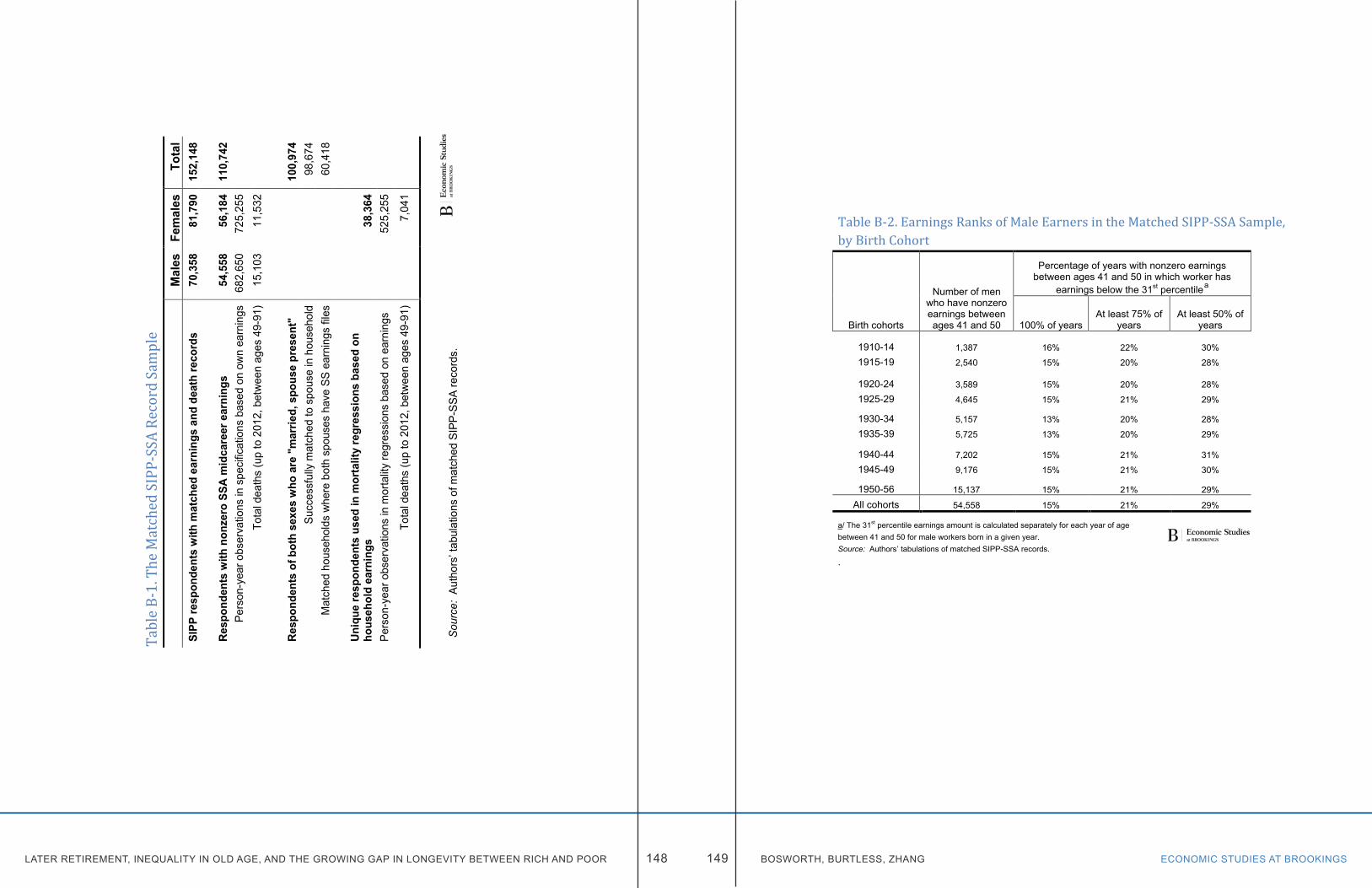
LATER RETIREMENT, INEQUALITY IN OLD AGE, AND THE GROWING GAP IN LONGEVITY BETWEEN RICH AND POOR ECONOMIC STUDIES AT BROOKINGS148 149 BOSWORTH, BURTLESS, ZHANG
Tabl
e B-1
. The
Mat
ched
SIPP
-SSA
Rec
ord S
ampl
e
Mal
es
Fem
ales
To
tal
SIPP
resp
onde
nts
with
mat
ched
ear
ning
s an
d de
ath
reco
rds
70,3
58
81,7
90
152,
148
Res
pond
ents
with
non
zero
SSA
mid
care
er e
arni
ngs
54,5
58
56,1
84
110,
742
Pers
on-y
ear o
bser
vatio
ns in
spe
cific
atio
ns b
ased
on
own
earn
ings
68
2,65
0 72
5,25
5
Tota
l dea
ths
(up
to 2
012,
bet
wee
n ag
es 4
9-91
) 15
,103
11
,532
Res
pond
ents
of b
oth
sexe
s w
ho a
re "
mar
ried,
spo
use
pres
ent"
10
0,97
4 Su
cces
sful
ly m
atch
ed to
spo
use
in h
ouse
hold
98
,674
M
atch
ed h
ouse
hold
s w
here
bot
h sp
ouse
s ha
ve S
S ea
rnin
gs fi
les
60,4
18
Uni
que
resp
onde
nts
used
in m
orta
lity
regr
essi
ons
base
d on
ho
useh
old
earn
ings
38,3
64
Pe
rson
-yea
r obs
erva
tions
in m
orta
lity
regr
essi
ons
base
d on
ear
ning
s
52
5,25
5
Tota
l dea
ths
(up
to 2
012,
bet
wee
n ag
es 4
9-91
)
7,04
1
So
urce
: Au
thor
s’ ta
bula
tions
of m
atch
ed S
IPP-
SSA
reco
rds.
Table B-2. Earnings Ranks of Male Earners in the Matched SIPP-SSA Sample, by Birth Cohort
Birth cohorts
Number of men who have nonzero earnings between ages 41 and 50
Percentage of years with nonzero earnings between ages 41 and 50 in which worker has
earnings below the 31st percentile
a
100% of years At least 75% of
years At least 50% of
years
1910-14 1,387 16% 22% 30%
1915-19 2,540 15% 20% 28%
1920-24 3,589 15% 20% 28%
1925-29 4,645 15% 21% 29%
1930-34 5,157 13% 20% 28%
1935-39 5,725 13% 20% 29%
1940-44 7,202 15% 21% 31%
1945-49 9,176 15% 21% 30%
1950-56 15,137 15% 21% 29%
All cohorts 54,558 15% 21% 29%
a/ The 31st percentile earnings amount is calculated separately for each year of age between 41 and 50 for male workers born in a given year. Source: Authors’ tabulations of matched SIPP-SSA records.
.
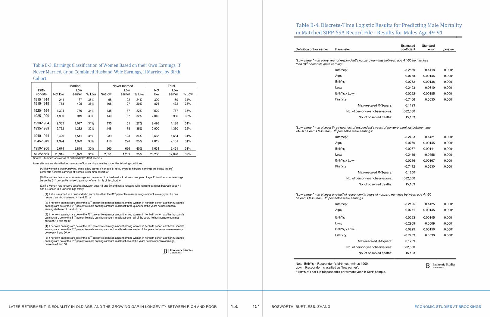
LATER RETIREMENT, INEQUALITY IN OLD AGE, AND THE GROWING GAP IN LONGEVITY BETWEEN RICH AND POOR ECONOMIC STUDIES AT BROOKINGS150 151 BOSWORTH, BURTLESS, ZHANG
Table B-3. Earnings Classification of Women Based on their Own Earnings, If Never Married, or on Combined Husband-Wife Earnings, If Married, by Birth Cohort Married Never married Total
Birth cohorts Not low
Low earner % Low Not low
Low earner % Low
Not low
Low earner % Low
1910-1914 241 137 36% 68 22 24% 309 159 34% 1915-1919 768 405 35% 108 27 20% 876 432 33%
1920-1924 1,394 730 34% 135 37 22% 1,529 767 33% 1925-1929 1,900 919 33% 140 67 32% 2,040 986 33%
1930-1934 2,363 1,077 31% 135 51 27% 2,498 1,128 31% 1935-1939 2,752 1,282 32% 148 78 35% 2,900 1,360 32%
1940-1944 3,429 1,541 31% 239 123 34% 3,668 1,664 31% 1945-1949 4,394 1,923 30% 418 228 35% 4,812 2,151 31%
1950-1956 6,674 2,815 30% 960 636 40% 7,634 3,451 31%
All cohorts 23,915 10,829 31% 2,351 1,269 35% 26,266 12,098 32% Source: Authors’ tabulations of matched SIPP-SSA records.
Note: Women are classified as members of low earnings families under the following conditions:
(A) If a woman is never married, she is a low earner if her age 41-to-50 average nonzero earnings are below the 50th percentile nonzero earnings of women in her birth cohort; or
(B) If a woman has no nonzero earnings and is married to a husband with at least one year of age 41-to-50 nonzero earnings below the 31st percentile nonzero earnings of men in his birth cohort; or
(C) If a woman has nonzero earnings between ages 41 and 50 and has a husband with nonzero earnings between ages 41 and 50, she is in a low earnings family:
(1) If she is married to a husband who earns less than the 31st percentile male earnings amount in every year he has nonzero earnings between 41 and 50; or
(2) If her own earnings are below the 90th percentile earnings amount among women in her birth cohort and her husband’s earnings are below the 31st percentile male earnings amount in at least three-quarters of the years he has nonzero earnings between 41 and 50; or
(3) If her own earnings are below the 70th percentile earnings amount among women in her birth cohort and her husband’s earnings are below the 31st percentile male earnings amount in at least one-half of the years he has nonzero earnings between 41 and 50; or
(4) If her own earnings are below the 50th percentile earnings amount among women in her birth cohort and her husband’s earnings are below the 31st percentile male earnings amount in at least one-quarter of the years he has nonzero earnings between 41 and 50; or
(5) If her own earnings are below the 30th percentile earnings amount among women in her birth cohort and her husband’s earnings are below the 31st percentile male earnings amount in at least one of the years he has nonzero earnings between 41 and 50.
Table B-4. Discrete-Time Logistic Results for Predicting Male Mortality in Matched SIPP-SSA Record File - Results for Males Age 49-91
Definition of low earner Parameter Estimated coefficient
Standard error p-value
"Low earner" – In every year of respondent’s nonzero earnings between age 41-50 he has less than 31st percentile male earning:
Intercept -8.2569 0.1418 0.0001
Ageit 0.0768 0.00145 0.0001
BrthYri -0.0252 0.00138 0.0001
Lowi -0.2493 0.0619 0.0001
BrthYri x Lowi 0.0222 0.00185 0.0001
FirstYrit -0.7406 0.0530 0.0001
Max-rescaled R-Square: 0.1193
No. of person-year observations: 682,650
No. of observed deaths: 15,103
"Low earner" – In at least three-quarters of respondent’s years of nonzero earnings between age 41-50 he earns less than 31st percentile male earnings:
Intercept -8.2493 0.1421 0.0001
Ageit 0.0769 0.00145 0.0001
BrthYri -0.0267 0.00141 0.0001
Lowi -0.2419 0.0556 0.0001
BrthYri x Lowi 0.0216 0.00167 0.0001
FirstYrit -0.7412 0.0530 0.0001
Max-rescaled R-Square: 0.1200
No. of person-year observations: 682,650
No. of observed deaths: 15,103
"Low earner" – In at least one-half of respondent’s years of nonzero earnings between age 41-50 he earns less than 31st percentile male earnings
Intercept -8.2195 0.1425 0.0001
Ageit 0.0771 0.00145 0.0001
BrthYri -0.0293 0.00145 0.0001
Lowi -0.2909 0.0509 0.0001
BrthYri x Lowi 0.0229 0.00156 0.0001
FirstYrit -0.7409 0.0530 0.0001
Max-rescaled R-Square: 0.1209
No. of person-year observations: 682,650
No. of observed deaths: 15,103
Note: BrthYri = Respondent's birth year minus 1900; Lowi = Respondent classified as "low earner"; FirstYrit = Year t is respondent's enrollment year in SIPP sample.
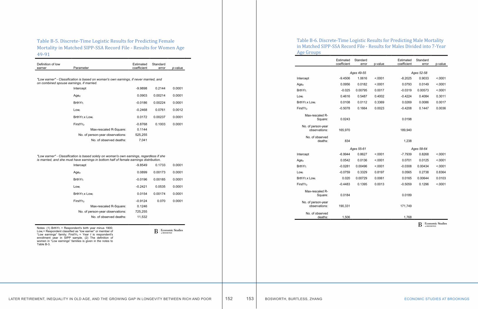
LATER RETIREMENT, INEQUALITY IN OLD AGE, AND THE GROWING GAP IN LONGEVITY BETWEEN RICH AND POOR ECONOMIC STUDIES AT BROOKINGS152 153 BOSWORTH, BURTLESS, ZHANG
Table B-5. Discrete-Time Logistic Results for Predicting Female Mortality in Matched SIPP-SSA Record File - Results for Women Age 49-91 Definition of low earner Parameter
Estimated coefficient
Standard error p-value
"Low earner" - Classification is based on woman's own earnings, if never married, and on combined spouse earnings, if married.
Intercept -9.9898 0.2144 0.0001
Ageit 0.0903 0.00214 0.0001
BrthYri -0.0186 0.00224 0.0001
Lowi -0.2468 0.0761 0.0012
BrthYri x Lowi 0.0172 0.00237 0.0001
FirstYrit -0.8768 0.1003 0.0001
Max-rescaled R-Square: 0.1144
No. of person-year observations: 525,255
No. of observed deaths: 7,041
"Low earner" - Classification is based solely on woman's own earnings, regardless if she is married, and she must have earnings in bottom half of female earnings distribution.
Intercept -9.8549 0.1733 0.0001
Ageit 0.0899 0.00173 0.0001
BrthYri -0.0196 0.00185 0.0001
Lowi -0.2421 0.0535 0.0001
BrthYri x Lowi 0.0154 0.00174 0.0001
FirstYrit -0.9124 0.070 0.0001
Max-rescaled R-Square: 0.1246
No. of person-year observations: 725,255
No. of observed deaths: 11,532
Notes: (1) BrthYri = Respondent's birth year minus 1900; Lowi = Respondent classified as “low earner” or member of “Low earnings” family; FirstYrit = Year t is respondent's enrollment year in SIPP sample. (2) The definition of women in “Low earnings” families is given in the notes to Table B-3.
Table B-6. Discrete-Time Logistic Results for Predicting Male Mortality in Matched SIPP-SSA Record File - Results for Males Divided into 7-Year Age Groups
Estimated coefficient
Standard error p-value
Estimated coefficient
Standard error p-value
Ages 49-55
Ages 52-58
Intercept -9.4506 1.0616 <.0001
-8.2025 0.9033 <.0001
Ageit 0.0956 0.0182 <.0001
0.0793 0.0149 <.0001
BrthYri -0.025 0.00795 0.0017
-0.0319 0.00573 <.0001
Lowi 0.4616 0.5487 0.4002
-0.4224 0.4084 0.3011
BrthYri x Lowi 0.0108 0.0112 0.3369
0.0269 0.0086 0.0017
FirstYrit -0.5078 0.1664 0.0023
-0.4208 0.1447 0.0036
Max-rescaled R-Square: 0.0243
0.0198
No. of person-year
observations: 165,970
189,940
No. of observed deaths: 834
1,238
Ages 55-61
Ages 58-64
Intercept -6.9944 0.8627 <.0001
-7.7939 0.8268 <.0001
Ageit 0.0542 0.0136 <.0001
0.0701 0.0125 <.0001
BrthYri -0.0281 0.00496 <.0001
-0.0308 0.00434 <.0001
Lowi -0.0759 0.3329 0.8197
0.0565 0.2738 0.8364
BrthYri x Lowi 0.020 0.00729 0.0061
0.0165 0.00644 0.0103
FirstYrit -0.4483 0.1395 0.0013
-0.5059 0.1296 <.0001
Max-rescaled R-Square: 0.0184
0.0189
No. of person-year
observations: 190,331
171,749
No. of observed deaths: 1,506 1,768
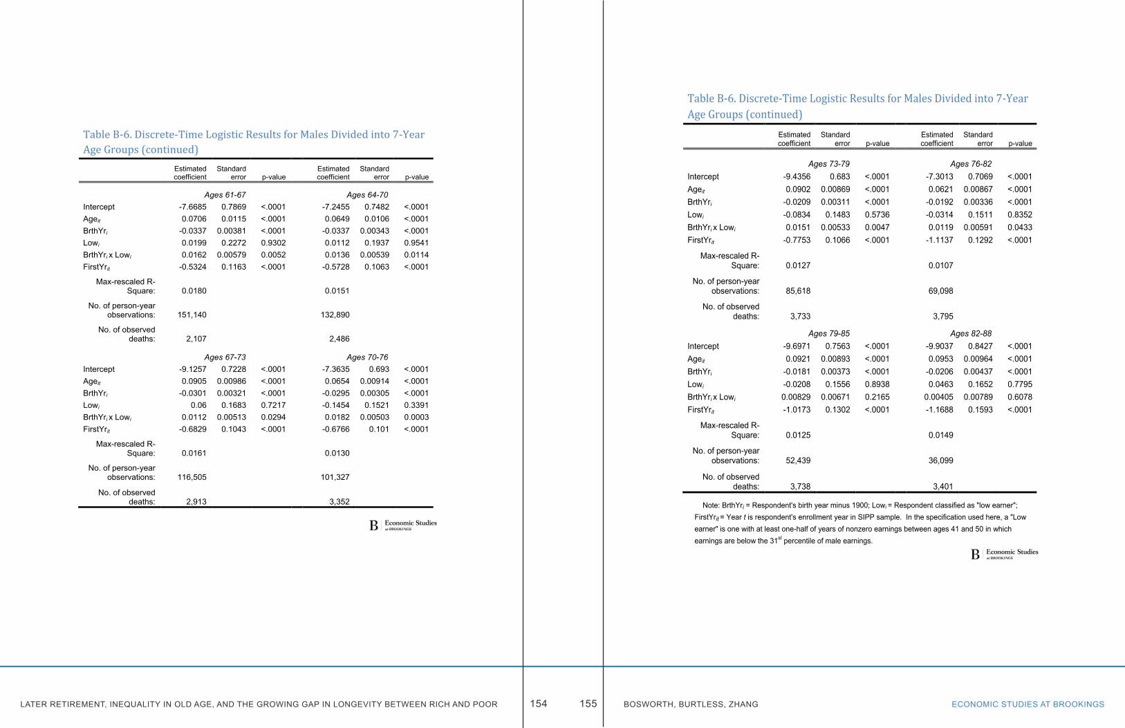
LATER RETIREMENT, INEQUALITY IN OLD AGE, AND THE GROWING GAP IN LONGEVITY BETWEEN RICH AND POOR ECONOMIC STUDIES AT BROOKINGS154 155 BOSWORTH, BURTLESS, ZHANG
Table B-6. Discrete-Time Logistic Results for Males Divided into 7-Year Age Groups (continued)
Estimated coefficient
Standard error p-value
Estimated coefficient
Standard error p-value
Ages 61-67
Ages 64-70
Intercept -7.6685 0.7869 <.0001
-7.2455 0.7482 <.0001 Ageit 0.0706 0.0115 <.0001
0.0649 0.0106 <.0001
BrthYri -0.0337 0.00381 <.0001
-0.0337 0.00343 <.0001 Lowi 0.0199 0.2272 0.9302
0.0112 0.1937 0.9541
BrthYri x Lowi 0.0162 0.00579 0.0052
0.0136 0.00539 0.0114 FirstYrit -0.5324 0.1163 <.0001
-0.5728 0.1063 <.0001
Max-rescaled R-Square: 0.0180
0.0151
No. of person-year
observations: 151,140
132,890
No. of observed deaths: 2,107
2,486
Ages 67-73
Ages 70-76
Intercept -9.1257 0.7228 <.0001
-7.3635 0.693 <.0001 Ageit 0.0905 0.00986 <.0001
0.0654 0.00914 <.0001
BrthYri -0.0301 0.00321 <.0001
-0.0295 0.00305 <.0001 Lowi 0.06 0.1683 0.7217
-0.1454 0.1521 0.3391
BrthYri x Lowi 0.0112 0.00513 0.0294
0.0182 0.00503 0.0003 FirstYrit -0.6829 0.1043 <.0001
-0.6766 0.101 <.0001
Max-rescaled R-Square: 0.0161
0.0130
No. of person-year
observations: 116,505
101,327
No. of observed deaths: 2,913 3,352
Table B-6. Discrete-Time Logistic Results for Males Divided into 7-Year Age Groups (continued)
Estimated coefficient
Standard error p-value
Estimated coefficient
Standard error p-value
Ages 73-79
Ages 76-82
Intercept -9.4356 0.683 <.0001
-7.3013 0.7069 <.0001 Ageit 0.0902 0.00869 <.0001
0.0621 0.00867 <.0001
BrthYri -0.0209 0.00311 <.0001
-0.0192 0.00336 <.0001 Lowi -0.0834 0.1483 0.5736
-0.0314 0.1511 0.8352
BrthYri x Lowi 0.0151 0.00533 0.0047
0.0119 0.00591 0.0433 FirstYrit -0.7753 0.1066 <.0001
-1.1137 0.1292 <.0001
Max-rescaled R-Square: 0.0127
0.0107
No. of person-year
observations: 85,618
69,098
No. of observed deaths: 3,733
3,795
Ages 79-85
Ages 82-88
Intercept -9.6971 0.7563 <.0001
-9.9037 0.8427 <.0001 Ageit 0.0921 0.00893 <.0001
0.0953 0.00964 <.0001
BrthYri -0.0181 0.00373 <.0001
-0.0206 0.00437 <.0001 Lowi -0.0208 0.1556 0.8938
0.0463 0.1652 0.7795
BrthYri x Lowi 0.00829 0.00671 0.2165
0.00405 0.00789 0.6078 FirstYrit -1.0173 0.1302 <.0001
-1.1688 0.1593 <.0001
Max-rescaled R-Square: 0.0125
0.0149
No. of person-year
observations: 52,439
36,099
No. of observed deaths: 3,738 3,401
Note: BrthYri = Respondent's birth year minus 1900; Lowi = Respondent classified as "low earner"; FirstYrit = Year t is respondent's enrollment year in SIPP sample. In the specification used here, a "Low earner" is one with at least one-half of years of nonzero earnings between ages 41 and 50 in which earnings are below the 31st percentile of male earnings.
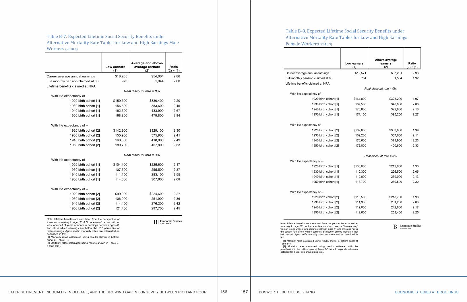
LATER RETIREMENT, INEQUALITY IN OLD AGE, AND THE GROWING GAP IN LONGEVITY BETWEEN RICH AND POOR ECONOMIC STUDIES AT BROOKINGS156 157 BOSWORTH, BURTLESS, ZHANG
Table B-7. Expected Lifetime Social Security Benefits under Alternative Mortality Rate Tables for Low and High Earnings Male Workers (2010 $)
Average and above-average earners
Low earners Ratio
(1) (2) (2) ÷ (1)
Career average annual earnings $18,905 $54,004 2.86 Full monthly pension claimed at 66 973 1,944 2.00 Lifetime benefits claimed at NRA
Real discount rate = 0%
With life expectancy of --
1920 birth cohort [1] $150,300 $330,400 2.20
1930 birth cohort [1] 156,500 383,600 2.45
1940 birth cohort [1] 162,600 433,900 2.67
1950 birth cohort [1] 168,800 479,800 2.84
With life expectancy of --
1920 birth cohort [2] $142,900 $329,100 2.30
1930 birth cohort [2] 155,900 375,900 2.41
1940 birth cohort [2] 168,500 418,800 2.49
1950 birth cohort [2] 180,700 457,800 2.53
Real discount rate = 3%
With life expectancy of --
1920 birth cohort [1] $104,100 $225,600 2.17
1930 birth cohort [1] 107,600 255,500 2.37
1940 birth cohort [1] 111,100 283,100 2.55
1950 birth cohort [1] 114,600 307,600 2.68
With life expectancy of --
1920 birth cohort [2] $99,000 $224,600 2.27
1930 birth cohort [2] 106,900 251,900 2.36
1940 birth cohort [2] 114,400 276,200 2.42
1950 birth cohort [2] 121,400 297,700 2.45
Note: Lifetime benefits are calculated from the perspective of a worker surviving to age 62. A "Low earner" is one with at least one-half of years of nonzero earnings between ages 41 and 50 in which earnings are below the 31st percentile of male earnings. Age-specific mortality rates are calculated as described in text. [1] Mortality rates calculated using results shown in bottom panel of Table B-4. [2] Mortality rates calculated using results shown in Table B-6 (see text).
Table B-8. Expected Lifetime Social Security Benefits under Alternative Mortality Rate Tables for Low and High Earnings Female Workers (2010 $)
Above-average earners
Low earners Ratio (1) (2) (2) ÷ (1)
Career average annual earnings $12,571 $37,231 2.96
Full monthly pension claimed at 66 784 1,504 1.92
Lifetime benefits claimed at NRA
Real discount rate = 0%
With life expectancy of --
1920 birth cohort [1] $164,000 $323,200 1.97
1930 birth cohort [1] 167,500 348,800 2.08
1940 birth cohort [1] 170,800 372,800 2.18
1950 birth cohort [1] 174,100 395,200 2.27
With life expectancy of --
1920 birth cohort [2] $167,600 $333,800 1.99
1930 birth cohort [2] 169,200 357,600 2.11
1940 birth cohort [2] 170,600 379,900 2.23
1950 birth cohort [2] 172,000 400,600 2.33
Real discount rate = 3%
With life expectancy of --
1920 birth cohort [1] $108,600 $212,900 1.96
1930 birth cohort [1] 110,300 226,500 2.05
1940 birth cohort [1] 112,000 239,000 2.13
1950 birth cohort [1] 113,700 250,500 2.20
With life expectancy of --
1920 birth cohort [2] $110,500 $218,700 1.98
1930 birth cohort [2] 111,300 231,200 2.08
1940 birth cohort [2] 112,000 242,800 2.17
1950 birth cohort [2] 112,600 253,400 2.25
Note: Lifetime benefits are calculated from the perspective of a worker surviving to age 62. In the specification used here, a “Low-earning” woman is one whose own earnings between ages 41 and 50 place her in the bottom half of the female earnings distribution among women in her birth cohort. Age-specific mortality rates are calculated as described in text. [1] Mortality rates calculated using results shown in bottom panel of Table B-5. [2] Mortality rates calculated using results estimated with the specification in the bottom panel of Table B-5 but with separate estimates obtained for 9-year age groups (see text).
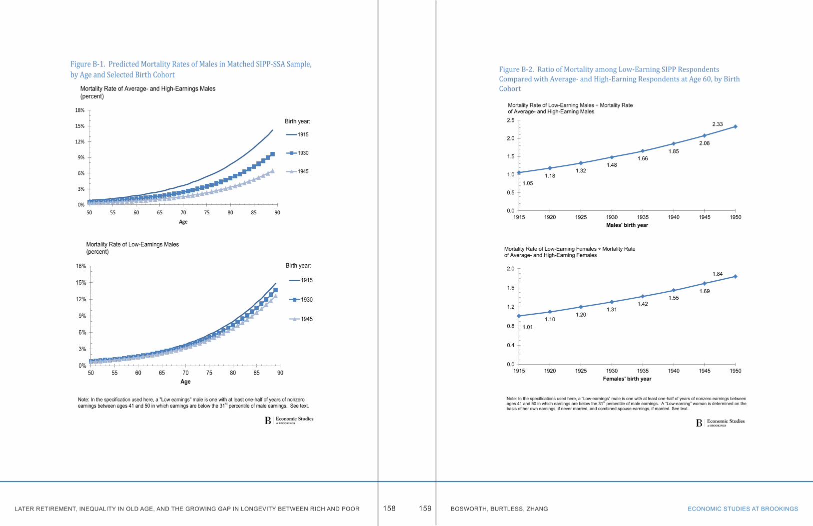
LATER RETIREMENT, INEQUALITY IN OLD AGE, AND THE GROWING GAP IN LONGEVITY BETWEEN RICH AND POOR ECONOMIC STUDIES AT BROOKINGS158 159 BOSWORTH, BURTLESS, ZHANG
Figure B-1. Predicted Mortality Rates of Males in Matched SIPP-SSA Sample, by Age and Selected Birth Cohort
Note: In the specification used here, a "Low earnings" male is one with at least one-half of years of nonzero earnings between ages 41 and 50 in which earnings are below the 31st percentile of male earnings. See text.
0%
3%
6%
9%
12%
15%
18%
50 55 60 65 70 75 80 85 90Age
Mortality Rate of Average- and High-Earnings Males (percent)
1915
1930
1945
Birth year:
0%
3%
6%
9%
12%
15%
18%
50 55 60 65 70 75 80 85 90Age
Mortality Rate of Low-Earnings Males (percent)
1915
1930
1945
Birth year:
Figure B-2. Ratio of Mortality among Low-Earning SIPP Respondents Compared with Average- and High-Earning Respondents at Age 60, by Birth Cohort
Note: In the specifications used here, a “Low-earnings” male is one with at least one-half of years of nonzero earnings between ages 41 and 50 in which earnings are below the 31st percentile of male earnings. A “Low-earning” woman is determined on the basis of her own earnings, if never married, and combined spouse earnings, if married. See text.
1.05 1.18
1.32 1.48
1.66 1.85
2.08
2.33
0.0
0.5
1.0
1.5
2.0
2.5
1915 1920 1925 1930 1935 1940 1945 1950Males' birth year
Mortality Rate of Low-Earning Males ÷ Mortality Rate of Average- and High-Earning Males
1.01 1.10
1.20 1.31
1.42 1.55
1.69
1.84
0.0
0.4
0.8
1.2
1.6
2.0
1915 1920 1925 1930 1935 1940 1945 1950Females' birth year
Mortality Rate of Low-Earning Females ÷ Mortality Rate of Average- and High-Earning Females
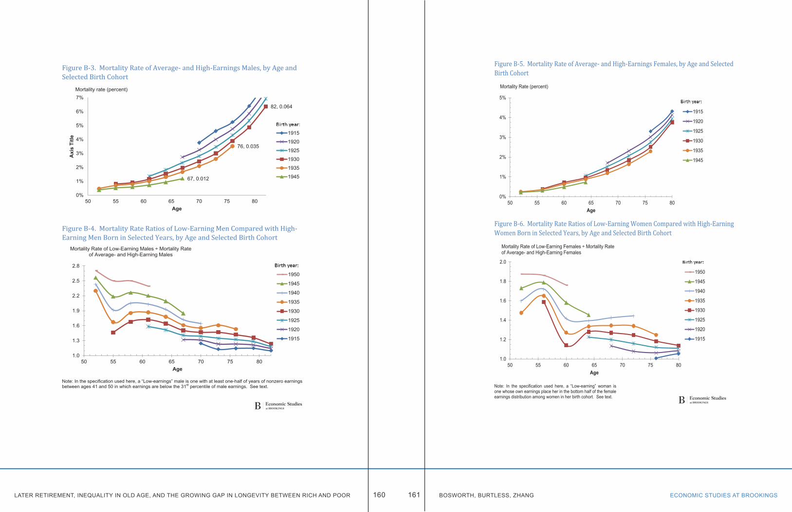
LATER RETIREMENT, INEQUALITY IN OLD AGE, AND THE GROWING GAP IN LONGEVITY BETWEEN RICH AND POOR ECONOMIC STUDIES AT BROOKINGS160 161 BOSWORTH, BURTLESS, ZHANG
Figure B-3. Mortality Rate of Average- and High-Earnings Males, by Age and Selected Birth Cohort
Figure B-4. Mortality Rate Ratios of Low-Earning Men Compared with High-Earning Men Born in Selected Years, by Age and Selected Birth Cohort
Note: In the specification used here, a “Low-earnings” male is one with at least one-half of years of nonzero earnings between ages 41 and 50 in which earnings are below the 31st percentile of male earnings. See text.
82, 0.064
76, 0.035
67, 0.012
0%
1%
2%
3%
4%
5%
6%
7%
50 55 60 65 70 75 80
Axi
s Ti
tle
Age
Mortality rate (percent)
1915
1920
1925
1930
1935
1945
1.0
1.3
1.6
1.9
2.2
2.5
2.8
50 55 60 65 70 75 80Age
Mortality Rate of Low-Earning Males ÷ Mortality Rate of Average- and High-Earning Males
1950
1945
1940
1935
1930
1925
1920
1915
Figure B-5. Mortality Rate of Average- and High-Earnings Females, by Age and Selected Birth Cohort
Figure B-6. Mortality Rate Ratios of Low-Earning Women Compared with High-Earning Women Born in Selected Years, by Age and Selected Birth Cohort
Note: In the specification used here, a “Low-earning” woman is one whose own earnings place her in the bottom half of the female earnings distribution among women in her birth cohort. See text.
0%
1%
2%
3%
4%
5%
50 55 60 65 70 75 80Age
Mortality Rate (percent)
1915
1920
1925
1930
1935
1945
1.0
1.2
1.4
1.6
1.8
2.0
50 55 60 65 70 75 80Age
Mortality Rate of Low-Earning Females ÷ Mortality Rate of Average- and High-Earning Females
1950
1945
1940
1935
1930
1925
1920
1915
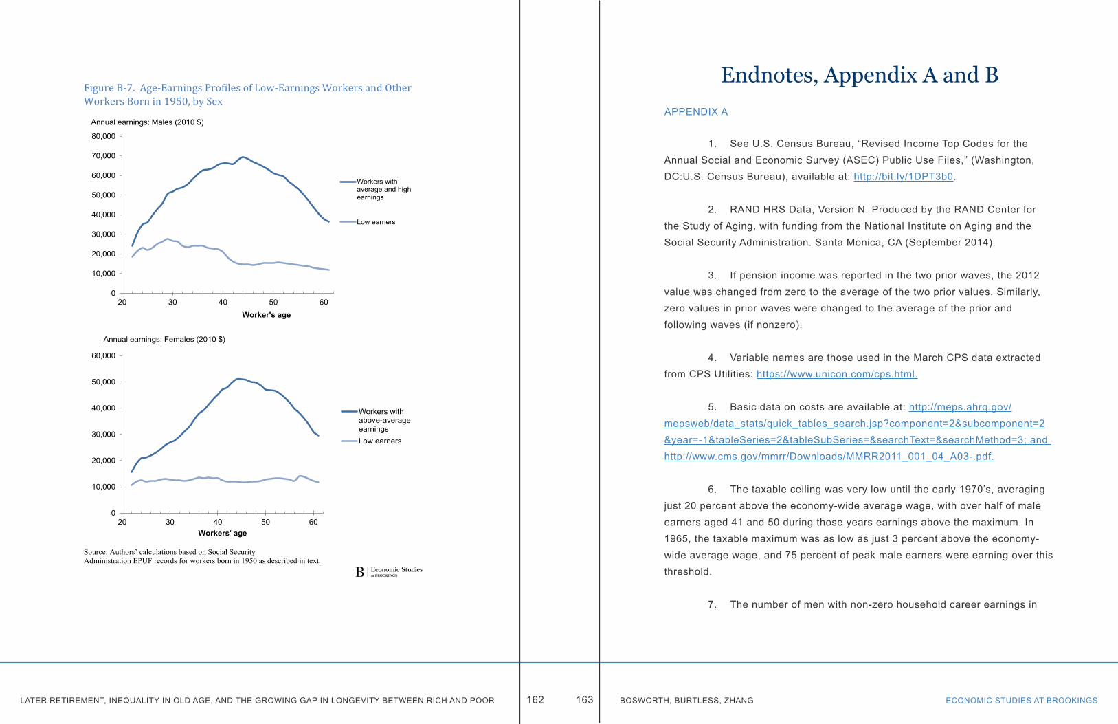
LATER RETIREMENT, INEQUALITY IN OLD AGE, AND THE GROWING GAP IN LONGEVITY BETWEEN RICH AND POOR ECONOMIC STUDIES AT BROOKINGS162 163 BOSWORTH, BURTLESS, ZHANG
Figure B-7. Age-Earnings Profiles of Low-Earnings Workers and Other Workers Born in 1950, by Sex
Source: Authors’ calculations based on Social Security Administration EPUF records for workers born in 1950 as described in text.
0
10,000
20,000
30,000
40,000
50,000
60,000
70,000
80,000
20 30 40 50 60Worker's age
Annual earnings: Males (2010 $)
Workers withaverage and highearnings
Low earners
0
10,000
20,000
30,000
40,000
50,000
60,000
20 30 40 50 60Workers' age
Annual earnings: Females (2010 $)
Workers withabove-averageearningsLow earners
Endnotes, Appendix A and BAPPENDIX A
1. See U.S. Census Bureau, “Revised Income Top Codes for the Annual Social and Economic Survey (ASEC) Public Use Files,” (Washington, DC:U.S. Census Bureau), available at: http://bit.ly/1DPT3b0.
2. RAND HRS Data, Version N. Produced by the RAND Center for the Study of Aging, with funding from the National Institute on Aging and the Social Security Administration. Santa Monica, CA (September 2014).
3. If pension income was reported in the two prior waves, the 2012 value was changed from zero to the average of the two prior values. Similarly, zero values in prior waves were changed to the average of the prior and following waves (if nonzero).
4. Variable names are those used in the March CPS data extracted from CPS Utilities: https://www.unicon.com/cps.html.
5. Basic data on costs are available at: http://meps.ahrq.gov/mepsweb/data_stats/quick_tables_search.jsp?component=2&subcomponent=2&year=-1&tableSeries=2&tableSubSeries=&searchText=&searchMethod=3; and http://www.cms.gov/mmrr/Downloads/MMRR2011_001_04_A03-.pdf.
6. The taxable ceiling was very low until the early 1970’s, averaging just 20 percent above the economy-wide average wage, with over half of male earners aged 41 and 50 during those years earnings above the maximum. In 1965, the taxable maximum was as low as just 3 percent above the economy-wide average wage, and 75 percent of peak male earners were earning over this threshold.
7. The number of men with non-zero household career earnings in
LATER RETIREMENT, INEQUALITY IN OLD AGE, AND THE GROWING GAP IN LONGEVITY BETWEEN RICH AND POOR ECONOMIC STUDIES AT BROOKINGS164 165 BOSWORTH, BURTLESS, ZHANG
lower than the number of men with non-zero individual career earnings, because we did not construct household career earnings for men who were matched to spouses who did not have a linked earnings record from the MEF. Conversely, we were able to construct household career earnings for approximately 4,000 women (linked to earnings records) who themselves had no positive earnings between ages 41 and 50, but who were married to spouses who did.
8. Types of benefits identified include: retired worker, disabled worker, aged spouse, spouse caring for minor children, widow(er) caring for minor children, disabled widow(er), adult disabled in childhood, student child, and minor child.
9. We used only annual benefits received after the age of 50 when computing the mean (and similarly, we bottom-coded first age of benefits to 50). The large majority of respondents began claiming at age 62 or later, which is the earliest age at which one can begin receiving retirement (and spousal) benefits. Those with first claims age before 62 consist of mainly disability claimants, and aged widow(ers) who can begin receiving benefits at age 60. The number of respondents who first claimed as minors and widow(ers) caring for minors is insignificant.
10. The regressions—run separately for men and women—use birthyear, educational attainment, race, marital status, and a dummy variable identifying disability benefits claimants, as the independent variables to predict household career earnings.
11. The exception is the 2001 SIPP panel, where just over half of the respondents were matched to their earnings records. In 2001, survey respondents were asked for permission to release their earnings records and Social Security numbers over the phone. In subsequent years, earnings records were matched probabilistically to SIPP survey respondents, bringing the match rate back up to over 80 percent.
1. For a description of the SIPP samples, sampling methodology, and interview methods. http://www.census.gov/programs-surveys/sipp/methodology/organizing-principles.html.
2. We assume in the remainder of the appendix that the 20 percent of SIPP respondents who could not be matched to their Social Security records are randomly selected. Whether or not this is true is an open question, but not one that will be examined here.
3. After 1980 the administrative records contain information about earnings above the taxable earnings cap. In earlier years, however, a worker’s earnings above the cap must be imputed based on information about the quarterly pattern of earnings reported by a worker.
4. More precisely, for males at each year of age between 41 and 50, the EPUF file shows that the lowest earnings cap was slightly above the 31st percentile of male earnings at that age. This occurred in the mid-1960s, when the maximum taxed earnings amount was exceptionally low relative to the earnings distribution of prime-age male workers.
5. The 31st percentile earnings level for a given year of age and birth year cohort is calculated using earnings information in the EPUF file for all men in the respondent’s birth cohort at the same year of age. Thus, the earnings rank of the respondent at individual years of age between 41 and 50 is determined solely by reference to the earnings distribution of men born in the same calendar year.
6. More precisely, the effect of a respondent’s birth year on expected mortality applies to average and above-average earners. Workers classified as low earners in more recent cohorts may experience a higher mortality rate at given age compared with earlier cohorts of low earnings workers depending on the estimated coefficients β3 and β4.
APPENDIX B

LATER RETIREMENT, INEQUALITY IN OLD AGE, AND THE GROWING GAP IN LONGEVITY BETWEEN RICH AND POOR 166
7. We assume the longest lived person dies by age 100. At ages past 90 we rely on age-specific mortality rates used by the OASDI Trustees in their 2015 Trustees’ Report. http://www.ssa.gov/oact/HistEst/DeathProbabilities2015.html, accessed August 26, 2015. Those death rates are used for both low and high earners past age 90.
8. As before, we assume the longest lived person dies by age 100 and that at ages past 90 both low and high earnings workers have the age-specific mortality rates used by the OASDI Trustees in their 2015 Trustees’ Report.