Embed Size (px)
DESCRIPTION
Â
Citation preview
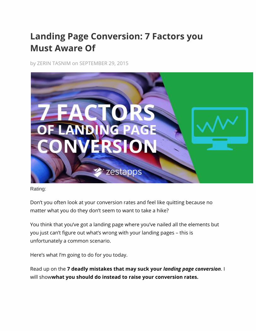
Landing Page Conversion: 7 Factors you
Must Aware Of
by ZERIN TASNIM on SEPTEMBER 29, 2015
Rating:
Don’t you often look at your conversion rates and feel like quitting because no
matter what you do they don’t seem to want to take a hike?
You think that you’ve got a landing page where you’ve nailed all the elements but
you just can’t figure out what’s wrong with your landing pages – this is
unfortunately a common scenario.
Here’s what I’m going to do for you today.
Read up on the 7 deadly mistakes that may suck your landing page conversion. I
will showwhat you should do instead to raise your conversion rates.
I’ll use real life examples that I just found on Google to help explain where you’ve
gone wrong and how best you can fix it.
And after you’ve fixed your landing page accordingly, you’ll be able to sit back and
relax.
Let’s roll!
1. There’s no Perfect Correlation between your Ad and your Landing Page
The first trouble your visitors might have that they can face an incoherent landing
page.
At some point or the other this might’ve happened to you.
In that case you’re likely to be sympathetic.
In the rare case that you haven’t let me tell you how frustrating this can be.
“Imagine you’ve just ordered a chicken burger. While you wait for your burger to
arrive, and your tummy churns in hunger you begin to imagine what you’ll be
served:
A spicy, juicy patty with a good lather of mayonnaise, garlic sauce, pickle and chili
ketchup and for a good measure add a handful of crispy fries to it.
You’ve triggered your saliva glands and you’ve worked up your appetite and the
waiter arrives and serves your dish:
A piece of chicken fry sandwiched between two pieces of bread as dry as the Sahara.
What’s your reaction to that?
Well you shouldn’t be too shocked given that they’ve just delivered you a “chicken’
sandwich.”

This is what the author, Kevin Ryan said about ads not perfectly matching landing
pages:
“Not only was this is a wasted opportunity for the advertiser,
but it created a frustrating experience for consumers”.
So if you’ve just delivered like crap, you’re in for a downward spiral that’s never to
rise ever again.
Here is an example of perfectly correlated ad and their landing page,
It seems their landing page looks relevant and nicely organized. People can
easily get quotes through their page.
2. Title & Headline Offers Nothing
Here’s another thing that’s a must avoid on your landing page if you want to make a
good impression and keep a hold of your visitors.

This mistake is one that a lot of you often make, and it’s also a lot like the previous
error of mismatched ads and landing pages.
The mistake here is that of an incompatible or vague headline.
The headline of a landing page, or in fact anything is expected to serve the purpose
of a one-line summary.
While you should try to make it witty, what you often do is forget to add the most
essential parts: the information and the benefit of your service or product.
There are two ways to go about a headline if you come to think of it.
One, you can tell your customers exactly what it is that you are offering in as few
words as possible.
For the second type of headline you could use the information gap theory.
This hack allows you to bait leads by hinting at, and at the same time concealing the
most crucial information.
That way you’re tempting your potential customer to click on your link,
because that’s the only way they’ll find out what they exactly needs.
So your landing pages have to be coherent in terms of content, your heading also
has to be in line with your content.
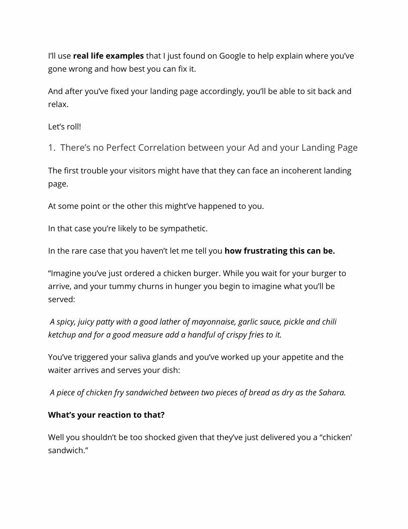
Let’s imagine, someone is searching for ‘concrete supplies’ and he found a
landing page like this,
As we can see, they have used the perfect title so the page’s conversion rate
should definitely higher.
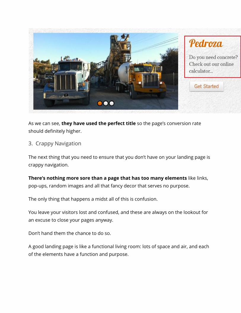
3. Crappy Navigation
The next thing that you need to ensure that you don’t have on your landing page is
crappy navigation.
There’s nothing more sore than a page that has too many elements like links,
pop-ups, random images and all that fancy decor that serves no purpose.
The only thing that happens a midst all of this is confusion.
You leave your visitors lost and confused, and these are always on the lookout for
an excuse to close your pages anyway.
Don’t hand them the chance to do so.
A good landing page is like a functional living room: lots of space and air, and each
of the elements have a function and purpose.
There are only that many elements that you need to put on a landing page but for
most people arranging them in an appealing layout so as to optimize the landing
page becomes a difficult task.
Here’s what you can do to make navigation easy:
Get rid of unnecessary links. You’ve brought people onto your landing page for a
reason. It is here that you want them to commit themselves to you by means of
signing up or subscribing.
But if you leave them with a bunch of links that could lead them elsewhere, chances
are they are going to roam around and never come back.
People on the internet have a very small attention span and like I’ve already said
they can get easily distracted.
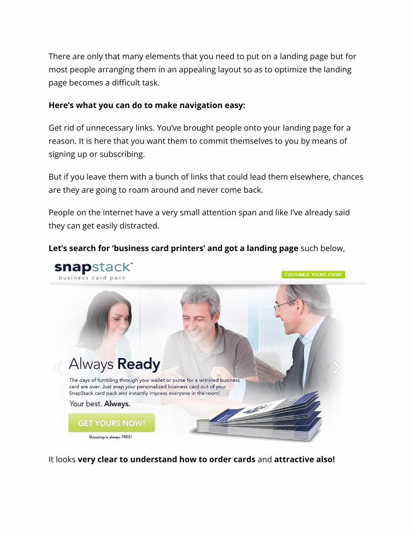
Let’s search for ‘business card printers’ and got a landing page such below,
It looks very clear to understand how to order cards and attractive also!
4. No Clear CTA
Make your CTA button evident. That’s the whole objective of your landing page
right? Getting people to convert by signing up or subscribing?
But what’s the point if people can’t even find your CTA buttons?
Often people have to repeatedly pushed in one direction to get something done.
You could have one clear CTA button at the end of your content. What you could
also do is have two to three CTAs strewn on your page that each achieve a different
goal.
You could ask for them to ‘sign up’ to get you monthly offers or you could ask them
to ‘share’ the post on the various social networking sites. Either way you’ve just
gotten them engaged in a give and take relation.
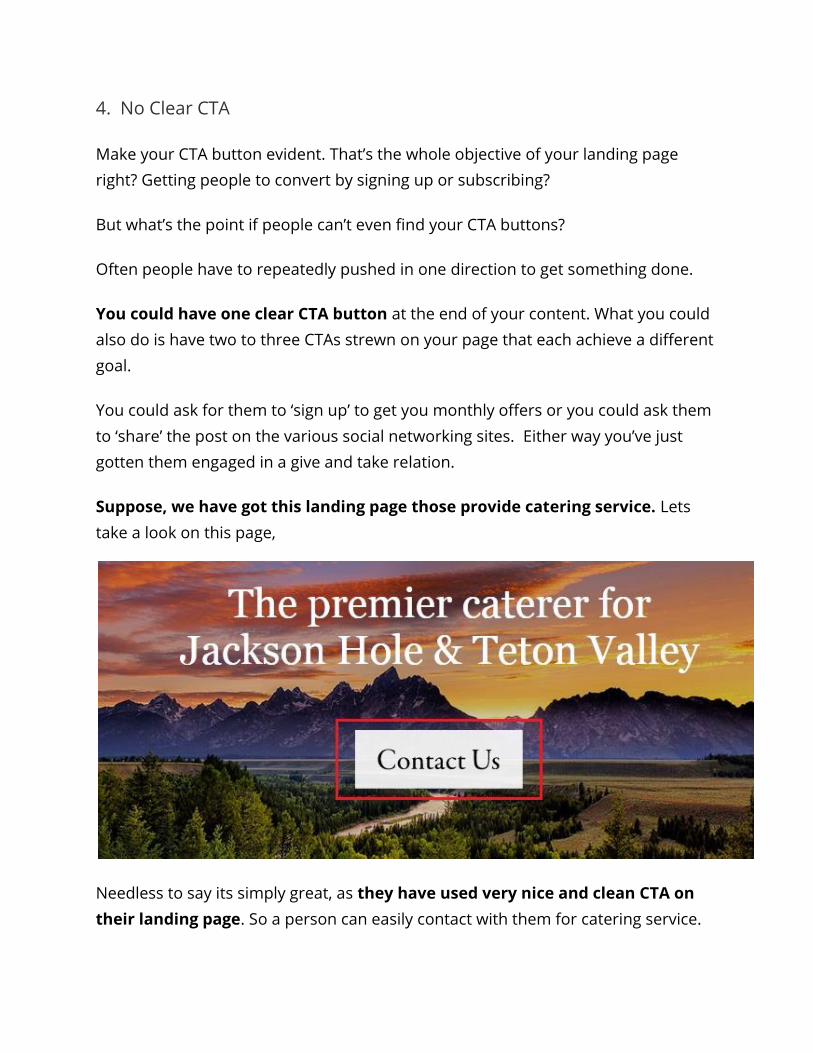
Suppose, we have got this landing page those provide catering service. Lets
take a look on this page,
Needless to say its simply great, as they have used very nice and clean CTA on
their landing page. So a person can easily contact with them for catering service.
5. Inappropriate Length
Have content that’s brief yet precise. What’s important here is that you get the
message through to your customers.
Same goes for the text. At this point you don’t have to go into the finer details – all
you have to give on a landing page is a general description of what’s on offer.
No one wants to be reading an essay.
You could also use images and videos, but only if they’re serving an actual purpose.
What you could do is use an interactive video to convey your content. That way you
wouldn’t have to write anything at all, but would still be able to convey your
message.
Just in case you’re sticking to the traditional text and image layout, remember this
one thing: your landing page is just a brief introductory platform, not your blog
[even though your blog could also be used as a landing page].
The reason I say it’s not your blog is so that you don’t make a massive post.
Keep it light and simple.
As example, let’s search for heating contractors and found this page,
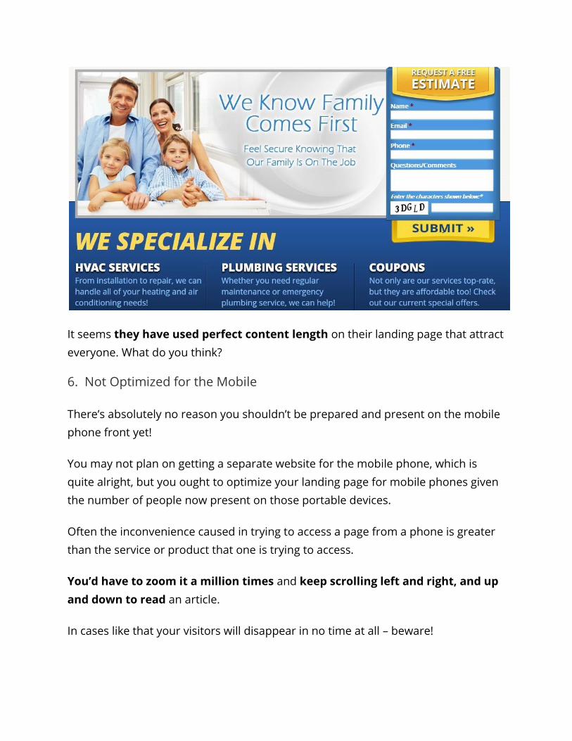
It seems they have used perfect content length on their landing page that attract
everyone. What do you think?
6. Not Optimized for the Mobile
There’s absolutely no reason you shouldn’t be prepared and present on the mobile
phone front yet!
You may not plan on getting a separate website for the mobile phone, which is
quite alright, but you ought to optimize your landing page for mobile phones given
the number of people now present on those portable devices.
Often the inconvenience caused in trying to access a page from a phone is greater
than the service or product that one is trying to access.
You’d have to zoom it a million times and keep scrolling left and right, and up
and down to read an article.
In cases like that your visitors will disappear in no time at all – beware!
That’s why your landing page should be 100% mobile responsive! This is an ideal
approach.
Therefore, remember when you’re planning for your landing pages, don’t only think
desktop, think mobile as well.
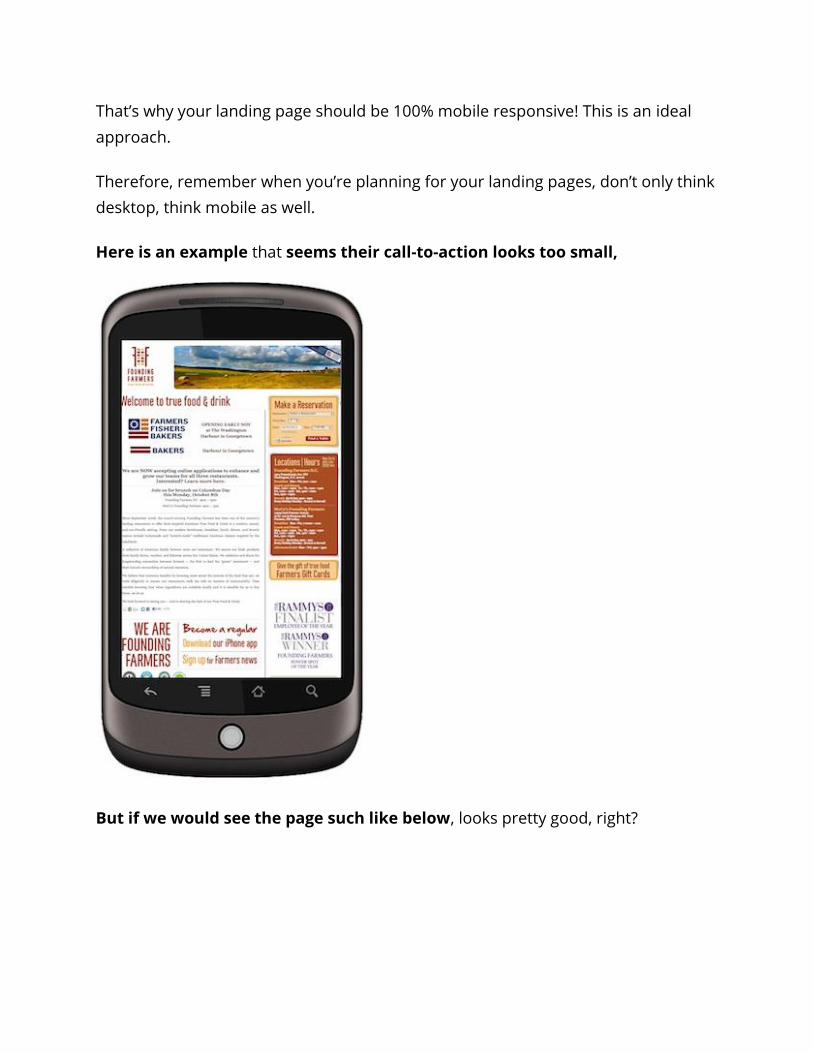
Here is an example that seems their call-to-action looks too small,
But if we would see the page such like below, looks pretty good, right?
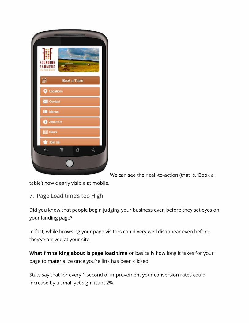
We can see their call-to-action (that is, ‘Book a
table’) now clearly visible at mobile.
7. Page Load time’s too High
Did you know that people begin judging your business even before they set eyes on
your landing page?
In fact, while browsing your page visitors could very well disappear even before
they’ve arrived at your site.
What I’m talking about is page load time or basically how long it takes for your
page to materialize once you’re link has been clicked.
Stats say that for every 1 second of improvement your conversion rates could
increase by a small yet significant 2%.
So what causes the delays that have you biting your nail?
It’s a pretty simple answer.
High quality images, videos, and basically a lot of content bring your speed down.
Before you begin to hack away your content from the landing page, first find out
what your page speed is.
So what do you do after you’ve found out your speed?
The good news is that you don’t have to hack away at your content that you’ve so
loving compiled.
Here are a few things that’ll help you optimize your speed and get you back on
track:
Use GZIP Compression: A GZIP compressor allows you to compress your files and
images. That way, when the server has to retrieve the content to load onto your
page, it’ll have to carry a lighter bulk.
But once the compressed file is retrieved, all the content on your page is loaded
much faster that accounts for a happy user.
Optimize your Images: The first option would be to get rid of images that you
don’t absolutely need. If you think you can make do without images, then that’s
great.
However, chances are that if there are pictures on your page, then they are there
for a reason and there’s really no way you would want to get rid of them.
HTML is a no show. HTML [or wordpress] has a user friendly work station that easily
allows you to resize images to a much smaller size than the original image.
However, that’s all it does.
What resizing really means is that you’re only altering the dimensions of the image
and not the size per say.
Therefore resizing isn’t really helping you with your page load time.
In that case what you can do is use the ‘save for Web’ option in Photoshop or
Fireworks that considerably reduces the image size allowing you to build up on
speed.
Cache it: To cache data is to have browsers save some of your content from
beforehand so that it increases speed to load a page.
This is useful because then the browser won’t have to reload entire pages from
scratch every time.
Now that you’ve seen how you can boost your page load speed, we can move onto
what visitors arrive at next.
Conclusion
So what we’ve got here are the 7 deadly sins of a landing page that are your
shortcut to nightmarish conversion rates.
A cohesive content that starts from headline through the CTA are the only way
you’re going to generate successful conversions.
Keep that in mind and you’re sure to find the conversion treasure ahead.
Ain’t that right?
Leave me a message below saying how this has helped you.


![[E-Book] Create Conversion Optimized Landing Pages](https://img.dokumen.tips/doc/110x75/554bb0a5b4c905b8618b59ac/e-book-create-conversion-optimized-landing-pages.jpg)


![[E-Book] New Habits of Creating Conversion Optimized Landing Pages](https://img.dokumen.tips/doc/110x75/55513147b4c905b3598b4f41/e-book-new-habits-of-creating-conversion-optimized-landing-pages.jpg)


![[Webinar] Multiply Your Landing Page Conversion Rates](https://img.dokumen.tips/doc/110x75/554cda42b4c905d1488b4d5c/webinar-multiply-your-landing-page-conversion-rates.jpg)