Embed Size (px)
Citation preview

5/25/2015 3. Housing Redevelopment - Housing Report
https://3cf5a2465748228bb2f4c1cb74f2637ff9bb1d71.googledrive.com/host/0Bw_2mgcXMb67flpfV2JpY0xBWWJ4NC1BcmtXanJHUHpCUDdHMWdyTjBFS3g… 1/30
I N T R O D U C T I O N
Preparing a Housing Report
Assist others to understand the broader context of housing market health
The objective of a housing report is to assist residents, governments, and businesses tounderstand the broader context of housing market health. Housing markets can beaffected by changes in jobs, population, infrastructure and market conditions. By gettingdata about our area of concern and putting it in context within the larger region, we canbetter understand the housing market and our path towards housing redevelopment.
This tutorial will guide you through the process of creating a housing report at the countylevel. We will use Greene County, Arkansas as our focal point.
To view this document offline, click here:
Click Step 1 in the navigation menu at the top of your screen or scroll down to get started.To return to the main field guide page, click here.
S T E P O N E
5/25/2015 3. Housing Redevelopment - Housing Report
https://3cf5a2465748228bb2f4c1cb74f2637ff9bb1d71.googledrive.com/host/0Bw_2mgcXMb67flpfV2JpY0xBWWJ4NC1BcmtXanJHUHpCUDdHMWdyTjBFS3g… 2/30
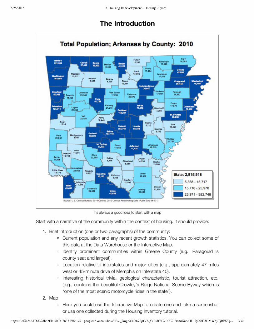
The Introduction
It's always a good idea to start with a map
Start with a narrative of the community within the context of housing. It should provide:
1. Brief Introduction (one or two paragraphs) of the community:Current population and any recent growth statistics. You can collect some ofthis data at the Data Warehouse or the Interactive Map.Identify prominent communities within Greene County (e.g., Paragould iscounty seat and largest).Location relative to interstates and major cities (e.g., approximately 47 mileswest or 45-minute drive of Memphis on Interstate 40).Interesting historical trivia, geological characteristic, tourist attraction, etc.(e.g., contains the beautiful Crowley’s Ridge National Scenic Byway which is“one of the most scenic motorcycle rides in the state”).
2. MapHere you could use the Interactive Map to create one and take a screenshotor use one collected during the Housing Inventory tutorial.
5/25/2015 3. Housing Redevelopment - Housing Report
https://3cf5a2465748228bb2f4c1cb74f2637ff9bb1d71.googledrive.com/host/0Bw_2mgcXMb67flpfV2JpY0xBWWJ4NC1BcmtXanJHUHpCUDdHMWdyTjBFS3g… 3/30
3. Purposes of this report and how it is useful.Here is a good excerpt from another housing report: The 2014 HMS can be used to inform the city’s continued land developmentcode reform efforts by providing both a quantitative estimate of housingneeds, as well as resident-driven information on housing preferences andchallenges. Altogether, this information should be used in future phases ofcode reform to promote and advance the conversation around affordability.
4. Sources used.To add credibility and weight to your report, it is helpful to mention the sourceof your data. For example, if you got data from the data warehouse, thesource would probably be Dun and Bradstreet. If you got data from theUniversity of Arkansas Little Rock's Institute for Economic Advancement(UALR - IEA), the source would be the US Census.
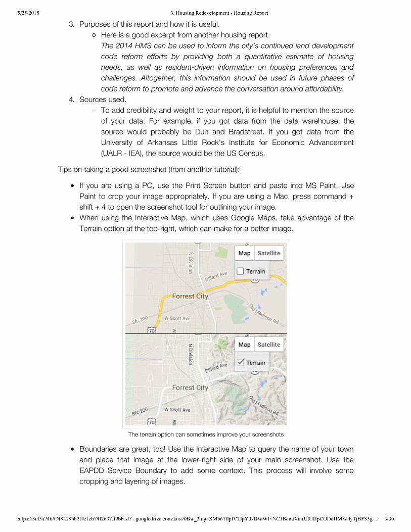
Tips on taking a good screenshot (from another tutorial):
If you are using a PC, use the Print Screen button and paste into MS Paint. UsePaint to crop your image appropriately. If you are using a Mac, press command +shift + 4 to open the screenshot tool for outlining your image.When using the Interactive Map, which uses Google Maps, take advantage of theTerrain option at the top-right, which can make for a better image.
The terrain option can sometimes improve your screenshots
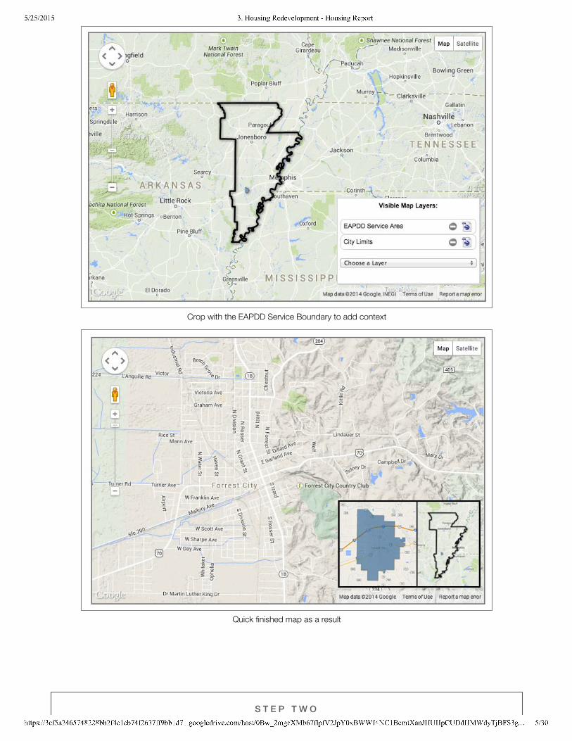
Boundaries are great, too! Use the Interactive Map to query the name of your townand place that image at the lower-right side of your main screenshot. Use theEAPDD Service Boundary to add some context. This process will involve somecropping and layering of images.
5/25/2015 3. Housing Redevelopment - Housing Report
https://3cf5a2465748228bb2f4c1cb74f2637ff9bb1d71.googledrive.com/host/0Bw_2mgcXMb67flpfV2JpY0xBWWJ4NC1BcmtXanJHUHpCUDdHMWdyTjBFS3g… 4/30
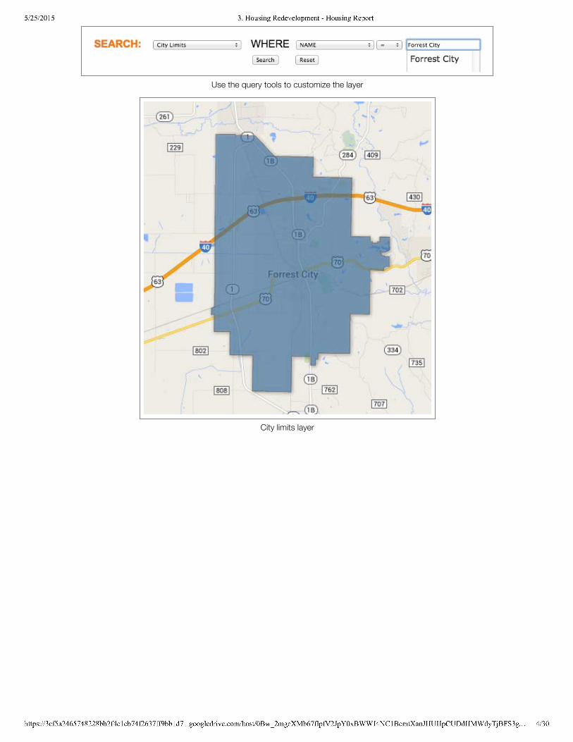
Use the query tools to customize the layer
City limits layer
5/25/2015 3. Housing Redevelopment - Housing Report
https://3cf5a2465748228bb2f4c1cb74f2637ff9bb1d71.googledrive.com/host/0Bw_2mgcXMb67flpfV2JpY0xBWWJ4NC1BcmtXanJHUHpCUDdHMWdyTjBFS3g… 5/30
Crop with the EAPDD Service Boundary to add context
Quick finished map as a result
S T E P T W O
5/25/2015 3. Housing Redevelopment - Housing Report
https://3cf5a2465748228bb2f4c1cb74f2637ff9bb1d71.googledrive.com/host/0Bw_2mgcXMb67flpfV2JpY0xBWWJ4NC1BcmtXanJHUHpCUDdHMWdyTjBFS3g… 6/30
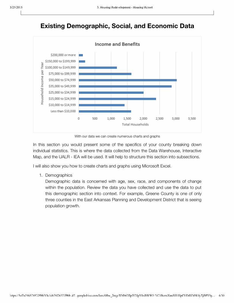
Existing Demographic, Social, and Economic Data
With our data we can create numerous charts and graphs
In this section you would present some of the specifics of your county breaking downindividual statistics. This is where the data collected from the Data Warehouse, InteractiveMap, and the UALR - IEA will be used. It will help to structure this section into subsections.
I will also show you how to create charts and graphs using Microsoft Excel.
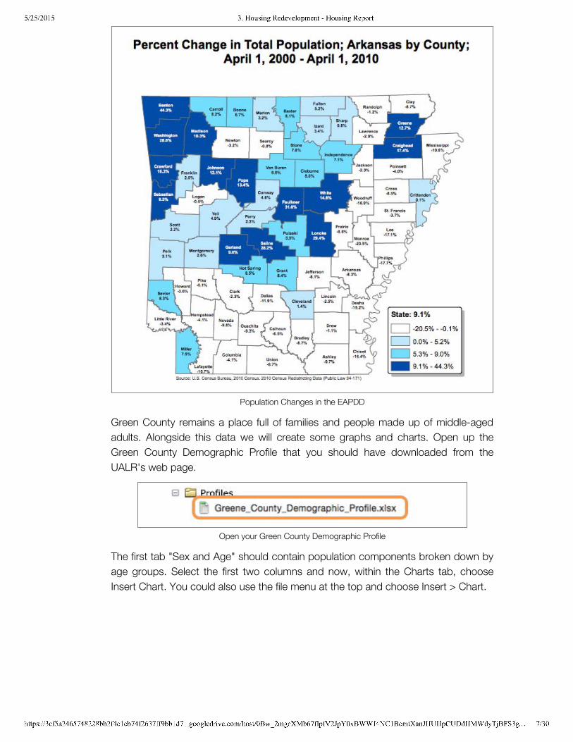
1. DemographicsDemographic data is concerned with age, sex, race, and components of changewithin the population. Review the data you have collected and use the data to putthis demographic section into context. For example, Greene County is one of onlythree counties in the East Arkansas Planning and Development District that is seeingpopulation growth.
5/25/2015 3. Housing Redevelopment - Housing Report
https://3cf5a2465748228bb2f4c1cb74f2637ff9bb1d71.googledrive.com/host/0Bw_2mgcXMb67flpfV2JpY0xBWWJ4NC1BcmtXanJHUHpCUDdHMWdyTjBFS3g… 7/30
Population Changes in the EAPDD
Green County remains a place full of families and people made up of middle-agedadults. Alongside this data we will create some graphs and charts. Open up theGreen County Demographic Profile that you should have downloaded from theUALR's web page.
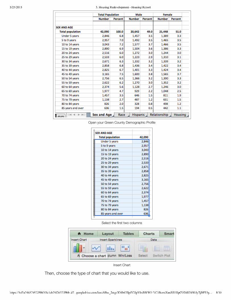
Open your Green County Demographic Profile
The first tab "Sex and Age" should contain population components broken down byage groups. Select the first two columns and now, within the Charts tab, chooseInsert Chart. You could also use the file menu at the top and choose Insert > Chart.
5/25/2015 3. Housing Redevelopment - Housing Report
https://3cf5a2465748228bb2f4c1cb74f2637ff9bb1d71.googledrive.com/host/0Bw_2mgcXMb67flpfV2JpY0xBWWJ4NC1BcmtXanJHUHpCUDdHMWdyTjBFS3g… 8/30
Open your Green County Demographic Profile
Select the first two columns
Insert Chart
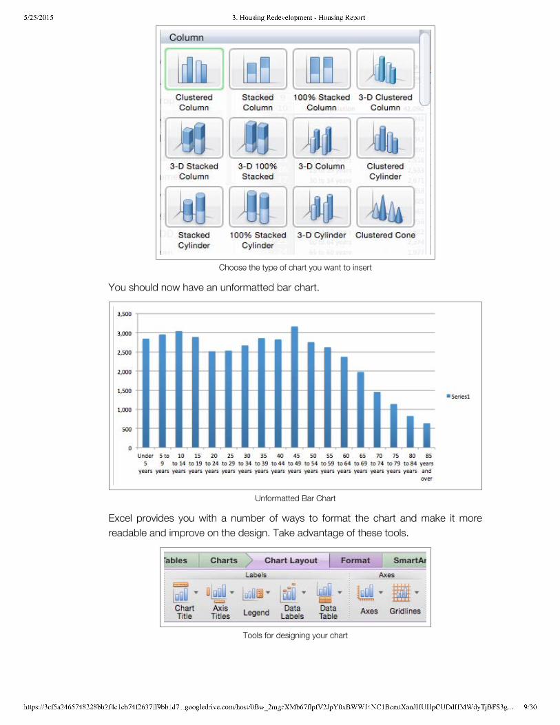
Then, choose the type of chart that you would like to use.
5/25/2015 3. Housing Redevelopment - Housing Report
https://3cf5a2465748228bb2f4c1cb74f2637ff9bb1d71.googledrive.com/host/0Bw_2mgcXMb67flpfV2JpY0xBWWJ4NC1BcmtXanJHUHpCUDdHMWdyTjBFS3g… 9/30
Choose the type of chart you want to insert
You should now have an unformatted bar chart.
Unformatted Bar Chart
Excel provides you with a number of ways to format the chart and make it morereadable and improve on the design. Take advantage of these tools.
Tools for designing your chart
5/25/2015 3. Housing Redevelopment - Housing Report
https://3cf5a2465748228bb2f4c1cb74f2637ff9bb1d71.googledrive.com/host/0Bw_2mgcXMb67flpfV2JpY0xBWWJ4NC1BcmtXanJHUHpCUDdHMWdyTjBFS3… 10/30
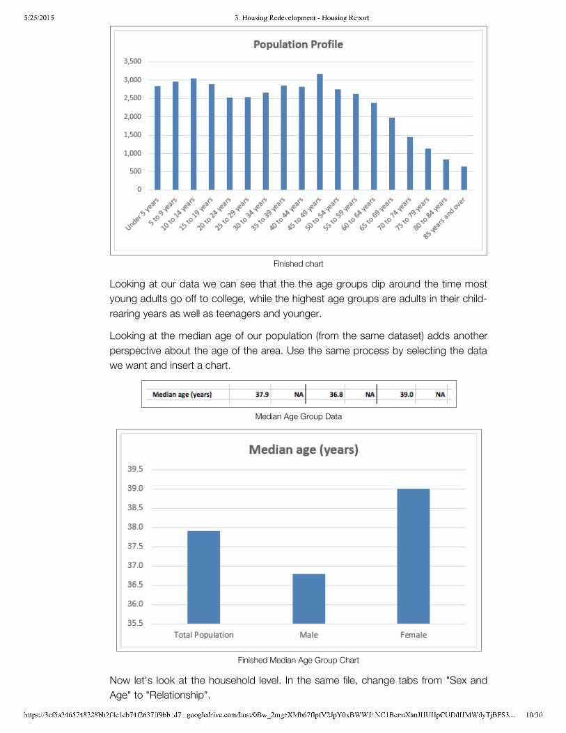
Finished chart
Looking at our data we can see that the the age groups dip around the time mostyoung adults go off to college, while the highest age groups are adults in their child-rearing years as well as teenagers and younger.
Looking at the median age of our population (from the same dataset) adds anotherperspective about the age of the area. Use the same process by selecting the datawe want and insert a chart.
Median Age Group Data
Finished Median Age Group Chart
Now let's look at the household level. In the same file, change tabs from "Sex andAge" to "Relationship".
5/25/2015 3. Housing Redevelopment - Housing Report
https://3cf5a2465748228bb2f4c1cb74f2637ff9bb1d71.googledrive.com/host/0Bw_2mgcXMb67flpfV2JpY0xBWWJ4NC1BcmtXanJHUHpCUDdHMWdyTjBFS3… 11/30
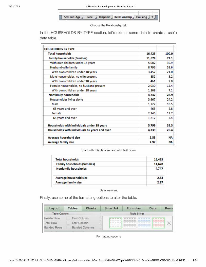
Choose the Relationship tab
In the HOUSEHOLDS BY TYPE section, let's extract some data to create a usefuldata table.
Start with this data set and whittle it down
Data we want
Finally, use some of the formatting options to alter the table.
Formatting options
5/25/2015 3. Housing Redevelopment - Housing Report
https://3cf5a2465748228bb2f4c1cb74f2637ff9bb1d71.googledrive.com/host/0Bw_2mgcXMb67flpfV2JpY0xBWWJ4NC1BcmtXanJHUHpCUDdHMWdyTjBFS3… 12/30
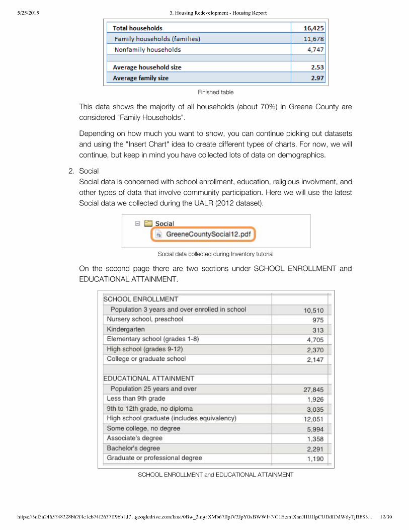
Finished table
This data shows the majority of all households (about 70%) in Greene County areconsidered "Family Households".
Depending on how much you want to show, you can continue picking out datasetsand using the "Insert Chart" idea to create different types of charts. For now, we willcontinue, but keep in mind you have collected lots of data on demographics.
2. SocialSocial data is concerned with school enrollment, education, religious involvment, andother types of data that involve community participation. Here we will use the latestSocial data we collected during the UALR (2012 dataset).
Social data collected during Inventory tutorial
On the second page there are two sections under SCHOOL ENROLLMENT andEDUCATIONAL ATTAINMENT.
SCHOOL ENROLLMENT and EDUCATIONAL ATTAINMENT
5/25/2015 3. Housing Redevelopment - Housing Report
https://3cf5a2465748228bb2f4c1cb74f2637ff9bb1d71.googledrive.com/host/0Bw_2mgcXMb67flpfV2JpY0xBWWJ4NC1BcmtXanJHUHpCUDdHMWdyTjBFS3… 13/30
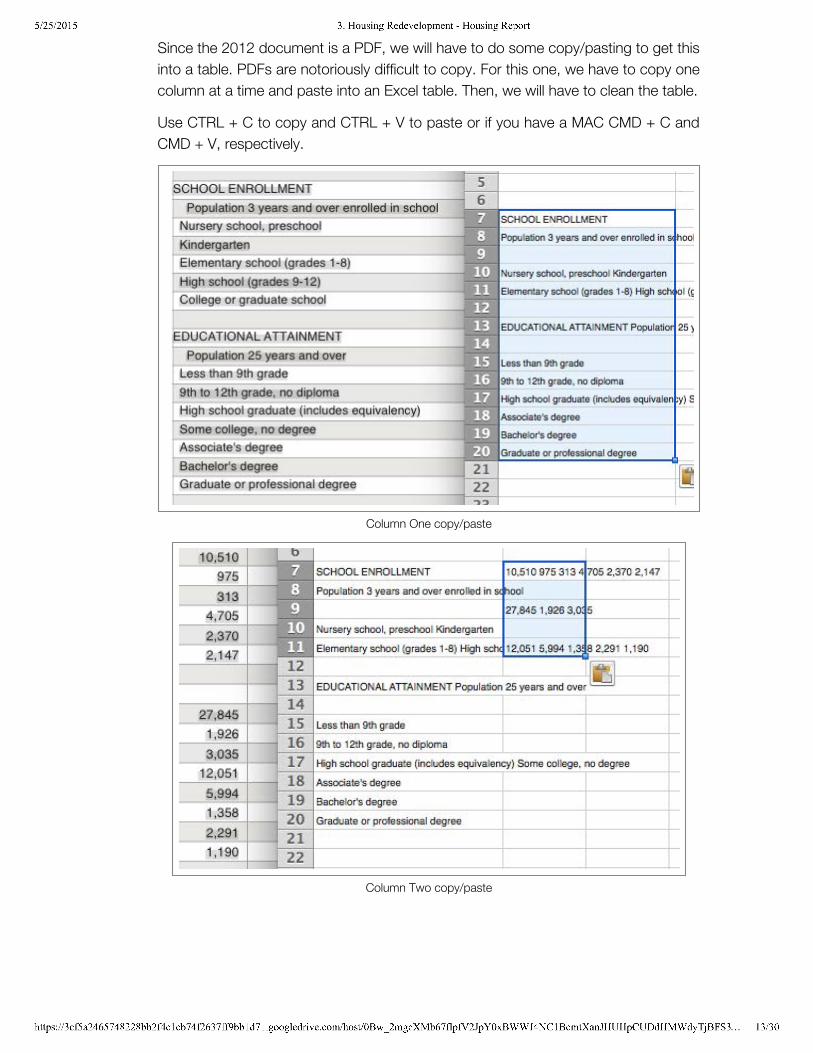
Since the 2012 document is a PDF, we will have to do some copy/pasting to get thisinto a table. PDFs are notoriously difficult to copy. For this one, we have to copy onecolumn at a time and paste into an Excel table. Then, we will have to clean the table.
Use CTRL + C to copy and CTRL + V to paste or if you have a MAC CMD + C andCMD + V, respectively.
Column One copy/paste
Column Two copy/paste
5/25/2015 3. Housing Redevelopment - Housing Report
https://3cf5a2465748228bb2f4c1cb74f2637ff9bb1d71.googledrive.com/host/0Bw_2mgcXMb67flpfV2JpY0xBWWJ4NC1BcmtXanJHUHpCUDdHMWdyTjBFS3… 14/30
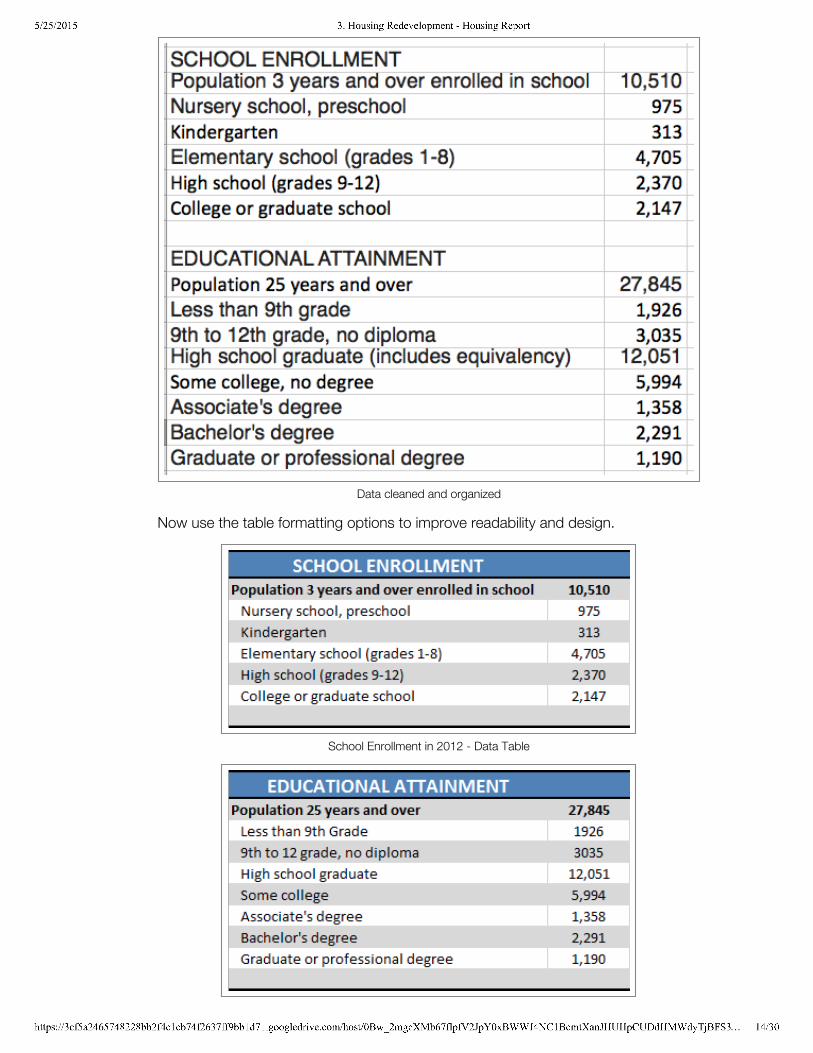
Data cleaned and organized
Now use the table formatting options to improve readability and design.
School Enrollment in 2012 - Data Table
5/25/2015 3. Housing Redevelopment - Housing Report
https://3cf5a2465748228bb2f4c1cb74f2637ff9bb1d71.googledrive.com/host/0Bw_2mgcXMb67flpfV2JpY0xBWWJ4NC1BcmtXanJHUHpCUDdHMWdyTjBFS3… 15/30
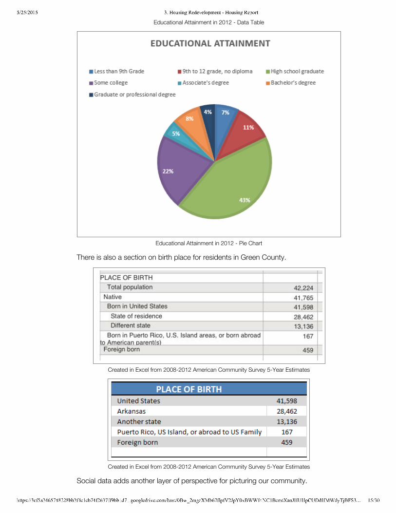
Educational Attainment in 2012 - Data Table
Educational Attainment in 2012 - Pie Chart
There is also a section on birth place for residents in Green County.
Created in Excel from 2008-2012 American Community Survey 5-Year Estimates
Created in Excel from 2008-2012 American Community Survey 5-Year Estimates
Social data adds another layer of perspective for picturing our community.
5/25/2015 3. Housing Redevelopment - Housing Report
https://3cf5a2465748228bb2f4c1cb74f2637ff9bb1d71.googledrive.com/host/0Bw_2mgcXMb67flpfV2JpY0xBWWJ4NC1BcmtXanJHUHpCUDdHMWdyTjBFS3… 16/30
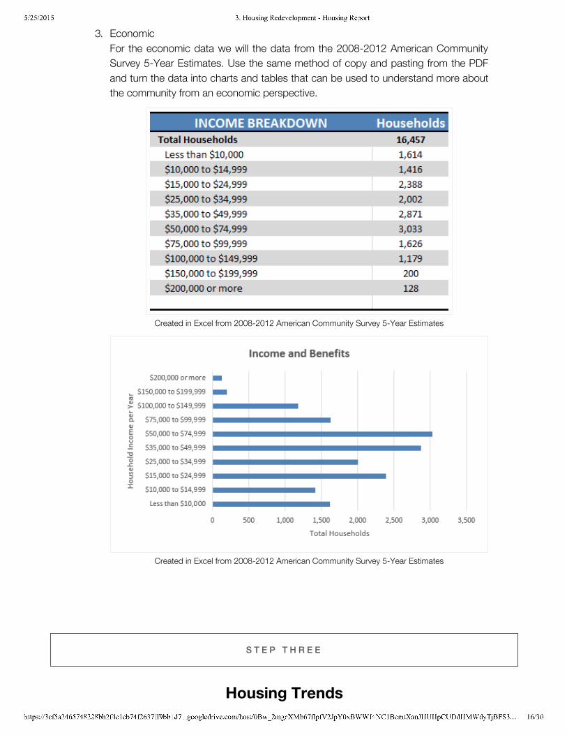
3. EconomicFor the economic data we will the data from the 2008-2012 American CommunitySurvey 5-Year Estimates. Use the same method of copy and pasting from the PDFand turn the data into charts and tables that can be used to understand more aboutthe community from an economic perspective.
Created in Excel from 2008-2012 American Community Survey 5-Year Estimates
Created in Excel from 2008-2012 American Community Survey 5-Year Estimates
S T E P T H R E E
Housing Trends
5/25/2015 3. Housing Redevelopment - Housing Report
https://3cf5a2465748228bb2f4c1cb74f2637ff9bb1d71.googledrive.com/host/0Bw_2mgcXMb67flpfV2JpY0xBWWJ4NC1BcmtXanJHUHpCUDdHMWdyTjBFS3… 17/30
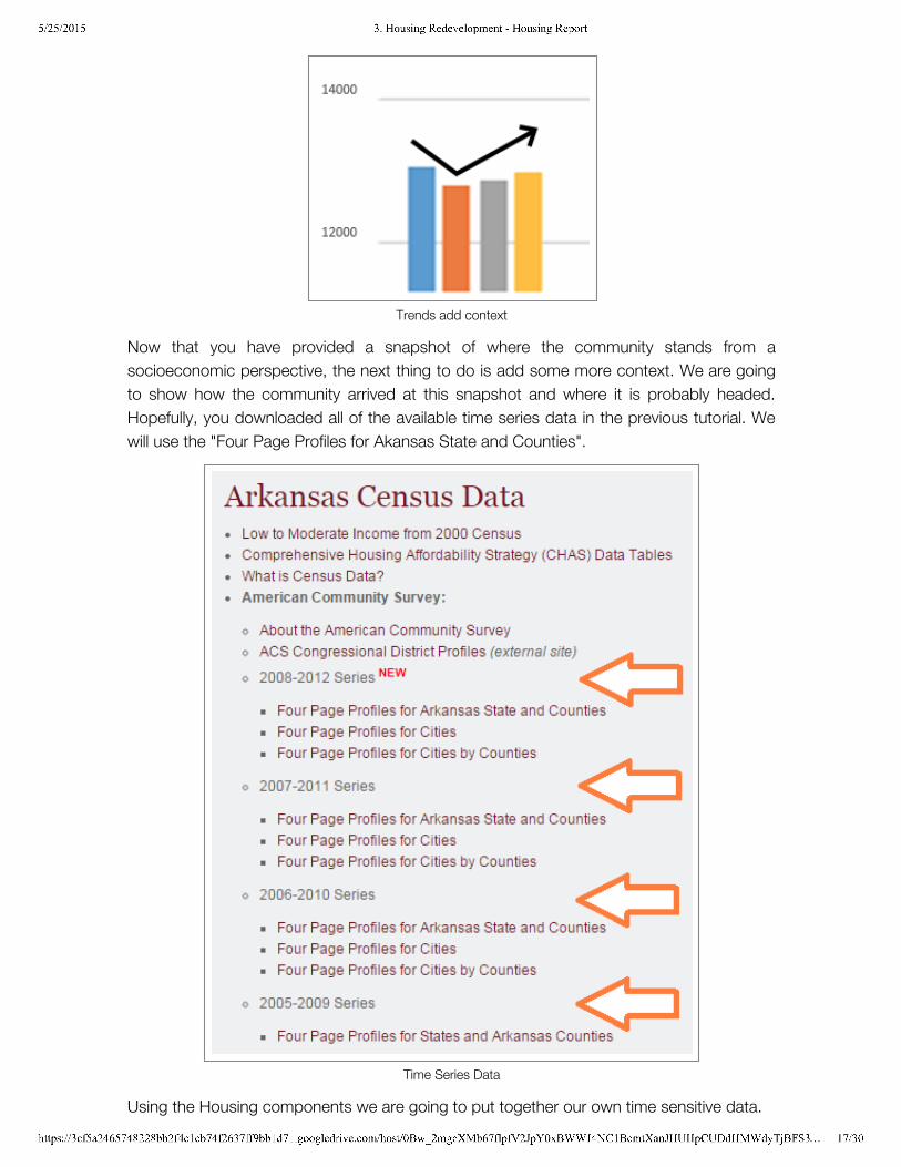
Trends add context
Now that you have provided a snapshot of where the community stands from asocioeconomic perspective, the next thing to do is add some more context. We are goingto show how the community arrived at this snapshot and where it is probably headed.Hopefully, you downloaded all of the available time series data in the previous tutorial. Wewill use the "Four Page Profiles for Akansas State and Counties".
Time Series Data
Using the Housing components we are going to put together our own time sensitive data.
5/25/2015 3. Housing Redevelopment - Housing Report
https://3cf5a2465748228bb2f4c1cb74f2637ff9bb1d71.googledrive.com/host/0Bw_2mgcXMb67flpfV2JpY0xBWWJ4NC1BcmtXanJHUHpCUDdHMWdyTjBFS3… 18/30
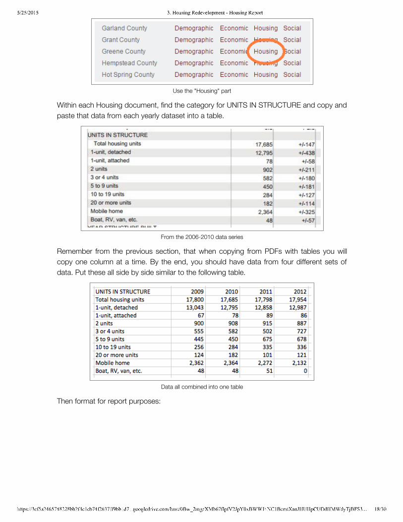
Use the "Housing" part
Within each Housing document, find the category for UNITS IN STRUCTURE and copy andpaste that data from each yearly dataset into a table.
From the 2006-2010 data series
Remember from the previous section, that when copying from PDFs with tables you willcopy one column at a time. By the end, you should have data from four different sets ofdata. Put these all side by side similar to the following table.
Data all combined into one table
Then format for report purposes:
5/25/2015 3. Housing Redevelopment - Housing Report
https://3cf5a2465748228bb2f4c1cb74f2637ff9bb1d71.googledrive.com/host/0Bw_2mgcXMb67flpfV2JpY0xBWWJ4NC1BcmtXanJHUHpCUDdHMWdyTjBFS3… 19/30
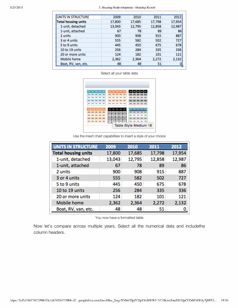
Select all your table data
Use the insert chart capabilities to insert a style of your choice
You now have a formatted table
Now let's compare across multiple years. Select all the numerical data and includethecolumn headers.
5/25/2015 3. Housing Redevelopment - Housing Report
https://3cf5a2465748228bb2f4c1cb74f2637ff9bb1d71.googledrive.com/host/0Bw_2mgcXMb67flpfV2JpY0xBWWJ4NC1BcmtXanJHUHpCUDdHMWdyTjBFS3… 20/30
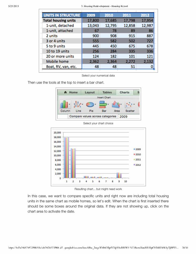
Select your numerical data
Then use the tools at the top to insert a bar chart.
Select your chart choice
Resulting chart... but might need work
In this case, we want to compare specific units and right now are including total housingunits in the same chart as mobile homes, so let's edit. When the chart is first inserted thereshould be some boxes around the original data. If they are not showing up, click on thechart area to activate the date.
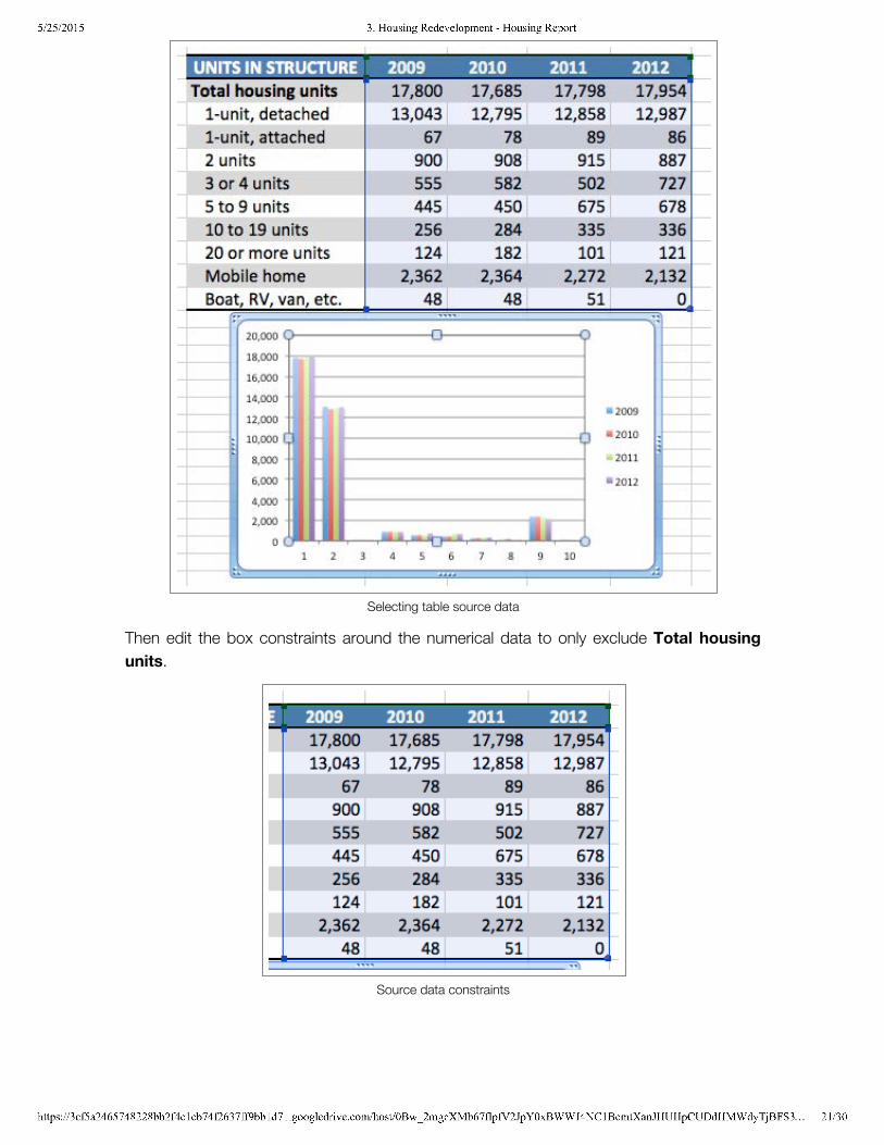
5/25/2015 3. Housing Redevelopment - Housing Report
https://3cf5a2465748228bb2f4c1cb74f2637ff9bb1d71.googledrive.com/host/0Bw_2mgcXMb67flpfV2JpY0xBWWJ4NC1BcmtXanJHUHpCUDdHMWdyTjBFS3… 21/30
Selecting table source data
Then edit the box constraints around the numerical data to only exclude Total housingunits.
Source data constraints
5/25/2015 3. Housing Redevelopment - Housing Report
https://3cf5a2465748228bb2f4c1cb74f2637ff9bb1d71.googledrive.com/host/0Bw_2mgcXMb67flpfV2JpY0xBWWJ4NC1BcmtXanJHUHpCUDdHMWdyTjBFS3… 22/30
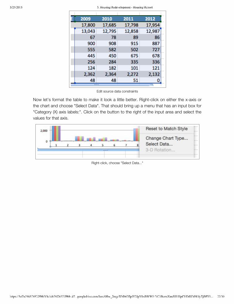
Edit source data constraints
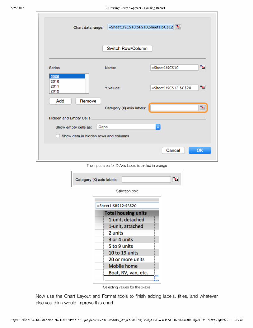
Now let's format the table to make it look a little better. Right-click on either the x-axis orthe chart and choose "Select Data". That should bring up a menu that has an input box for"Category (X) axis labels:". Click on the button to the right of the input area and select thevalues for that axis.
Right-click, choose "Select Data..."
5/25/2015 3. Housing Redevelopment - Housing Report
https://3cf5a2465748228bb2f4c1cb74f2637ff9bb1d71.googledrive.com/host/0Bw_2mgcXMb67flpfV2JpY0xBWWJ4NC1BcmtXanJHUHpCUDdHMWdyTjBFS3… 23/30
The input area for X-Axis labels is circled in orange
Selection box
Selecting values for the x-axis
Now use the Chart Layout and Format tools to finish adding labels, titles, and whateverelse you think would improve this chart.
5/25/2015 3. Housing Redevelopment - Housing Report
https://3cf5a2465748228bb2f4c1cb74f2637ff9bb1d71.googledrive.com/host/0Bw_2mgcXMb67flpfV2JpY0xBWWJ4NC1BcmtXanJHUHpCUDdHMWdyTjBFS3… 24/30
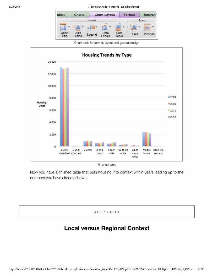
Chart tools for format, layout and general design
Finished table
Now you have a finished table that puts housing into context within years leading up to thenumbers you have already shown.
S T E P F O U R
Local versus Regional Context
5/25/2015 3. Housing Redevelopment - Housing Report
https://3cf5a2465748228bb2f4c1cb74f2637ff9bb1d71.googledrive.com/host/0Bw_2mgcXMb67flpfV2JpY0xBWWJ4NC1BcmtXanJHUHpCUDdHMWdyTjBFS3… 25/30
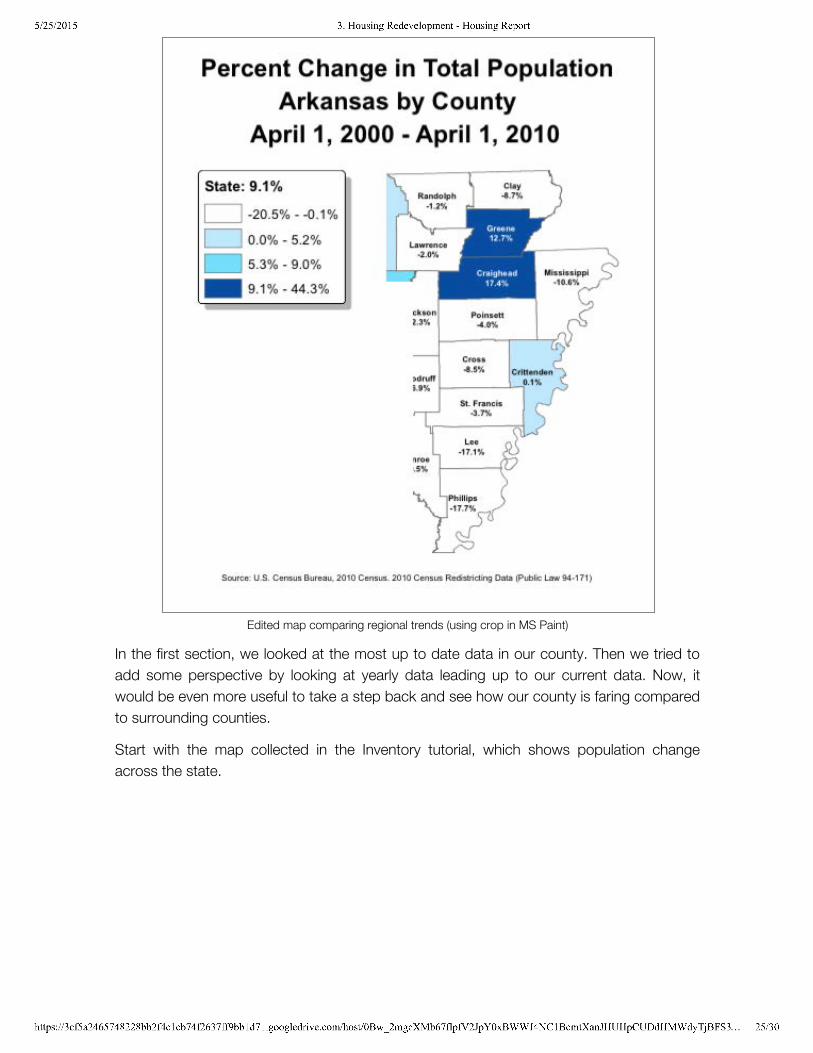
Edited map comparing regional trends (using crop in MS Paint)
In the first section, we looked at the most up to date data in our county. Then we tried toadd some perspective by looking at yearly data leading up to our current data. Now, itwould be even more useful to take a step back and see how our county is faring comparedto surrounding counties.
Start with the map collected in the Inventory tutorial, which shows population changeacross the state.
5/25/2015 3. Housing Redevelopment - Housing Report
https://3cf5a2465748228bb2f4c1cb74f2637ff9bb1d71.googledrive.com/host/0Bw_2mgcXMb67flpfV2JpY0xBWWJ4NC1BcmtXanJHUHpCUDdHMWdyTjBFS3… 26/30
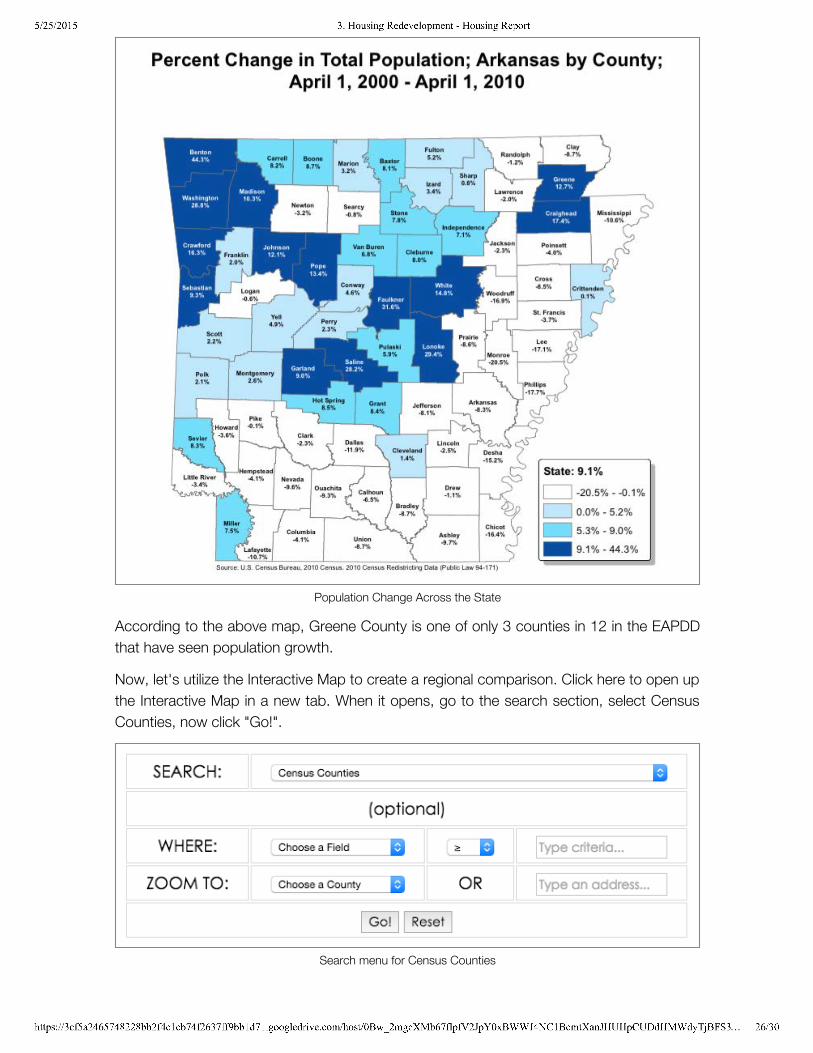
Population Change Across the State
According to the above map, Greene County is one of only 3 counties in 12 in the EAPDDthat have seen population growth.
Now, let's utilize the Interactive Map to create a regional comparison. Click here to open upthe Interactive Map in a new tab. When it opens, go to the search section, select CensusCounties, now click "Go!".
Search menu for Census Counties
5/25/2015 3. Housing Redevelopment - Housing Report
https://3cf5a2465748228bb2f4c1cb74f2637ff9bb1d71.googledrive.com/host/0Bw_2mgcXMb67flpfV2JpY0xBWWJ4NC1BcmtXanJHUHpCUDdHMWdyTjBFS3… 27/30
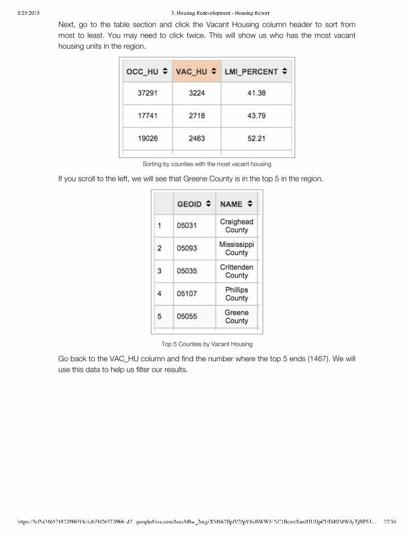
Next, go to the table section and click the Vacant Housing column header to sort frommost to least. You may need to click twice. This will show us who has the most vacanthousing units in the region.
Sorting by counties with the most vacant housing
If you scroll to the left, we will see that Greene County is in the top 5 in the region.
Top 5 Counties by Vacant Housing
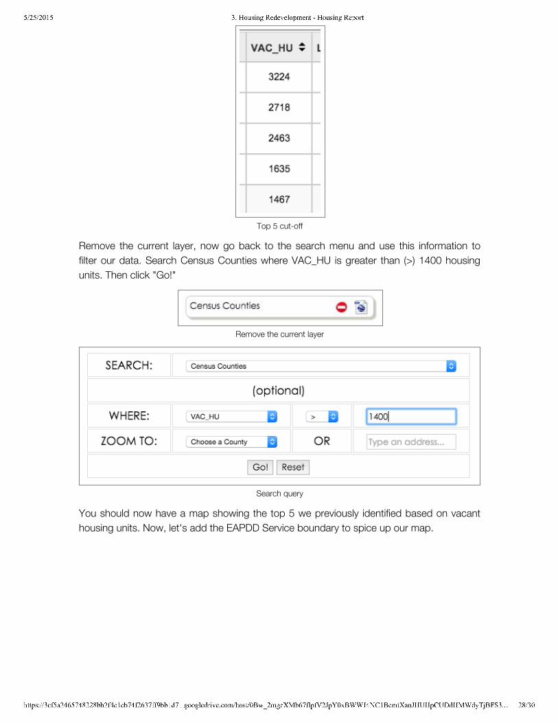
Go back to the VAC_HU column and find the number where the top 5 ends (1467). We willuse this data to help us filter our results.
5/25/2015 3. Housing Redevelopment - Housing Report
https://3cf5a2465748228bb2f4c1cb74f2637ff9bb1d71.googledrive.com/host/0Bw_2mgcXMb67flpfV2JpY0xBWWJ4NC1BcmtXanJHUHpCUDdHMWdyTjBFS3… 28/30
Top 5 cut-off
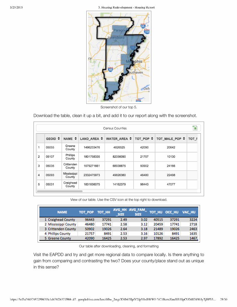
Remove the current layer, now go back to the search menu and use this information tofilter our data. Search Census Counties where VAC_HU is greater than (>) 1400 housingunits. Then click "Go!"
Remove the current layer
Search query
You should now have a map showing the top 5 we previously identified based on vacanthousing units. Now, let's add the EAPDD Service boundary to spice up our map.
5/25/2015 3. Housing Redevelopment - Housing Report
https://3cf5a2465748228bb2f4c1cb74f2637ff9bb1d71.googledrive.com/host/0Bw_2mgcXMb67flpfV2JpY0xBWWJ4NC1BcmtXanJHUHpCUDdHMWdyTjBFS3… 29/30
Screenshot of our top 5.
Download the table, clean it up a bit, and add it to our report along with the screenshot.
View of our table. Use the CSV icon at the top right to download.
Our table after downloading, cleaning, and formatting
Visit the EAPDD and try and get more regional data to compare locally. Is there anything togain from comparing and contrasting the two? Does your county/place stand out as uniquein this sense?
5/25/2015 3. Housing Redevelopment - Housing Report
https://3cf5a2465748228bb2f4c1cb74f2637ff9bb1d71.googledrive.com/host/0Bw_2mgcXMb67flpfV2JpY0xBWWJ4NC1BcmtXanJHUHpCUDdHMWdyTjBFS3… 30/30
S T E P F I V E
Important Notes
Recommended UseIt is impossible to include everything that is needed for an housing study or housing relatedprogram. The goal of this housing profile document is to provide basic information about alocal economy intended for analysts and decision makers unfamiliar with the community.Further, this profile is used to demonstrate a community’s capacity to perform datacollection and analysis and also spur an internal conversation about housing in thecommunity.
Contact InformationInclude contact information for the city official or EAPDD staff member who can answerquestions about information in the profile and conduct follow-up research as needed.
To return to the main field guide page, click the option below:
Housing Redevelopment Homepage
M O R E I N F O
Examples of other housing reports:
City of Austin's Comprehensive Housing Market AnalysisHarvard University's Study on Housing and Aging AmericaUNC-Charlotte's Comprehensive Affordable Housing Market StudyDePaul University's Housing Market Conditions Report
by Civic Analytics