Embed Size (px)
Citation preview

JavaFXUsing JavaFX Charts
Release 2.2
E20487-08
January 2014
This tutorial teaches Java developers how to use JavaFX 2 charts such as pie chart, area chart, bar chart, bubble chart, line chart, and scatter chart to develop rich internet applications.

JavaFX/Using JavaFX Charts, Release 2.2
E20487-08
Copyright © 2011, 2014, Oracle and/or its affiliates. All rights reserved.
Primary Author: Alla Redko
Contributing Author:
Contributor:
This software and related documentation are provided under a license agreement containing restrictions on use and disclosure and are protected by intellectual property laws. Except as expressly permitted in your license agreement or allowed by law, you may not use, copy, reproduce, translate, broadcast, modify, license, transmit, distribute, exhibit, perform, publish, or display any part, in any form, or by any means. Reverse engineering, disassembly, or decompilation of this software, unless required by law for interoperability, is prohibited.
The information contained herein is subject to change without notice and is not warranted to be error-free. If you find any errors, please report them to us in writing.
If this is software or related documentation that is delivered to the U.S. Government or anyone licensing it on behalf of the U.S. Government, the following notice is applicable:
U.S. GOVERNMENT RIGHTS Programs, software, databases, and related documentation and technical data delivered to U.S. Government customers are "commercial computer software" or "commercial technical data" pursuant to the applicable Federal Acquisition Regulation and agency-specific supplemental regulations. As such, the use, duplication, disclosure, modification, and adaptation shall be subject to the restrictions and license terms set forth in the applicable Government contract, and, to the extent applicable by the terms of the Government contract, the additional rights set forth in FAR 52.227-19, Commercial Computer Software License (December 2007). Oracle America, Inc., 500 Oracle Parkway, Redwood City, CA 94065.
This software or hardware is developed for general use in a variety of information management applications. It is not developed or intended for use in any inherently dangerous applications, including applications that may create a risk of personal injury. If you use this software or hardware in dangerous applications, then you shall be responsible to take all appropriate fail-safe, backup, redundancy, and other measures to ensure its safe use. Oracle Corporation and its affiliates disclaim any liability for any damages caused by use of this software or hardware in dangerous applications.
Oracle and Java are registered trademarks of Oracle and/or its affiliates. Other names may be trademarks of their respective owners.
Intel and Intel Xeon are trademarks or registered trademarks of Intel Corporation. All SPARC trademarks are used under license and are trademarks or registered trademarks of SPARC International, Inc. AMD, Opteron, the AMD logo, and the AMD Opteron logo are trademarks or registered trademarks of Advanced Micro Devices. UNIX is a registered trademark of The Open Group.
This software or hardware and documentation may provide access to or information on content, products, and services from third parties. Oracle Corporation and its affiliates are not responsible for and expressly disclaim all warranties of any kind with respect to third-party content, products, and services. Oracle Corporation and its affiliates will not be responsible for any loss, costs, or damages incurred due to your access to or use of third-party content, products, or services.
Contents
1 Introduction to JavaFX Charts
Chart Data .................................................................................................................................................. 1-1Series of Data ............................................................................................................................................ 1-2Chart Settings............................................................................................................................................ 1-2Axis Settings.............................................................................................................................................. 1-2Processing Events for Chart Elements.................................................................................................. 1-3Animated Charts....................................................................................................................................... 1-3Styling Charts............................................................................................................................................ 1-3Custom Chart ............................................................................................................................................ 1-4
2 Pie Chart
Creating a Pie Chart ................................................................................................................................. 2-1Setting a Pie Chart and a Legend .......................................................................................................... 2-3Processing Events for a Pie Chart.......................................................................................................... 2-4
3 Line Chart
Creating a Line Chart............................................................................................................................... 3-1Creating Categories for a Line Chart .................................................................................................... 3-3Adding Series to the Line Chart ............................................................................................................ 3-5
4 Area Chart
Creating an Area Chart............................................................................................................................ 4-1Creating a Stacked Area Chart............................................................................................................... 4-3Setting Axis and Tick Properties ........................................................................................................... 4-5
Adding Negative Values ......................................................................................................................... 4-7Styling Area Charts .................................................................................................................................. 4-9
5 Bubble Chart
Creating a Bubble Chart.......................................................................................................................... 5-1Using the Extra Value Property.............................................................................................................. 5-4Changing the Appearance Visual Setting of the Plot and Tick Marks .......................................... 5-5
6 Scatter Chart
Creating a Scatter Chart .......................................................................................................................... 6-1Managing Chart Data .............................................................................................................................. 6-3Adding Effects to Charts ......................................................................................................................... 6-6Changing the Chart Symbol................................................................................................................... 6-7
7 Bar Chart
Creating a Bar Chart................................................................................................................................. 7-1Horizontal Bar Chart................................................................................................................................ 7-3Creating a Stacked Bar Chart ................................................................................................................. 7-5Animating Data in Charts....................................................................................................................... 7-8
8 Styling Charts with CSS
Modifying Basic Chart Elements .......................................................................................................... 8-1Altering Colors of the Chart Plot .......................................................................................................... 8-5Setting the Axes ........................................................................................................................................ 8-8Setting Chart Colors.............................................................................................................................. 8-10Changing Chart Symbols..................................................................................................................... 8-16
Part I
Part I About This TutorialThis tutorial describes the graphical charts available in the javafx.scene.chart package of the JavaFX SDK and contains the following chapters:
■ Introduction to JavaFX Charts
■ Pie Chart
■ Line Chart
■ Area Chart
■ Bubble Chart
■ Scatter Chart
■ Bar Chart
■ Styling Charts with CSS
Each chapter provides code samples and applications to illustrate how to use a particular chart. You can find the source files of the applications and the corresponding NetBeans projects in the Application Files section.

1
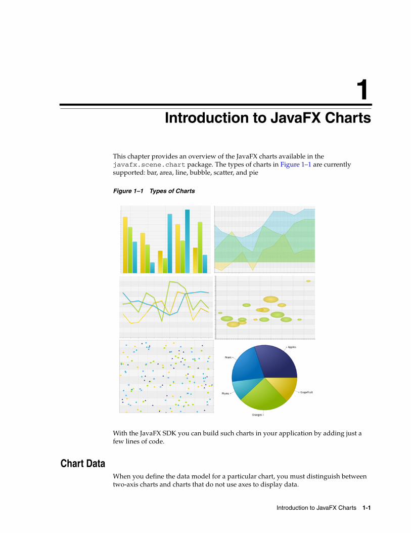
1Introduction to JavaFX ChartsThis chapter provides an overview of the JavaFX charts available in the javafx.scene.chart package. The types of charts in Figure 1–1 are currently supported: bar, area, line, bubble, scatter, and pie
Figure 1–1 Types of Charts
With the JavaFX SDK you can build such charts in your application by adding just a few lines of code.
Chart DataWhen you define the data model for a particular chart, you must distinguish between two-axis charts and charts that do not use axes to display data.
Introduction to JavaFX Charts 1-1
Series of Data
The XYChart class, a super class for all two-axis charts, provides basic capabilities for building area, line, bar, scatter, and bubble charts. Use the XYChart.Data class to specify the data model for these types of charts. The xValue property defines the value of a chart element to be plotted on the X axis, and the yValue property defines the value for the Y axis. You can also set the extra value for each chart element. This value can be plotted in any way the chart needs, or it can be used to store additional information about the chart element. For example, it can be used to define a radius for bubble charts.
Unlike a two-axis chart, the pie chart does not require defining values for x and y axes. You use the PieChart.Data class to specify values for each slice in the pie.
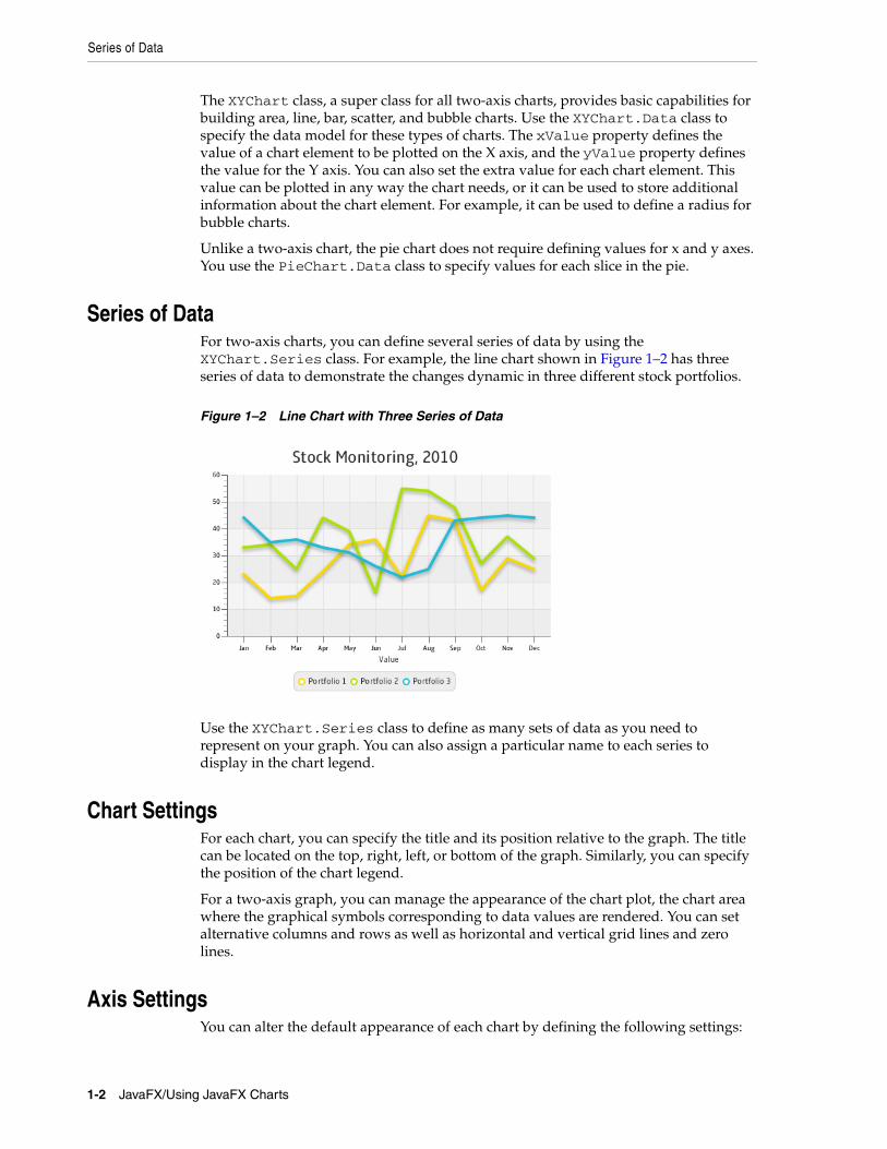
Series of DataFor two-axis charts, you can define several series of data by using the XYChart.Series class. For example, the line chart shown in Figure 1–2 has three series of data to demonstrate the changes dynamic in three different stock portfolios.
Figure 1–2 Line Chart with Three Series of Data
Use the XYChart.Series class to define as many sets of data as you need to represent on your graph. You can also assign a particular name to each series to display in the chart legend.
Chart SettingsFor each chart, you can specify the title and its position relative to the graph. The title can be located on the top, right, left, or bottom of the graph. Similarly, you can specify the position of the chart legend.
For a two-axis graph, you can manage the appearance of the chart plot, the chart area where the graphical symbols corresponding to data values are rendered. You can set alternative columns and rows as well as horizontal and vertical grid lines and zero lines.
Axis SettingsYou can alter the default appearance of each chart by defining the following settings:
1-2 JavaFX/Using JavaFX Charts
Styling Charts
■ The axis label
■ The axis position relative to the chart plot
■ The upper and lower boundaries of the axis range
■ The minimum and maximum tick marks, tick units, the gap between two tick marks, and tick labels
You can also specify that any changes to the axis and its range will be animated, or you can enable the axis to automatically determine its range from the data.
Processing Events for Chart ElementsAll chart classes in the JavaFX SDK API extend the Node class and inherit all methods and properties of that class, which let you apply visual effects or handle mouse and key events. If you need to handle events for a particular chart element that is not a Node object, for example, for a slice of a pie chart, then use the node property and the setNode and getNode methods to associate a particular Node object with an element of the chart. You can process events for this chart element in the way you handle events for any other node: user interface control or shape. Example 1–1 demonstrates a code pattern to process events for a two-axis chart.
Example 1–1 Event Handling
for (final XYChart.Data data : chart.getData()) { data.getNode().addEventHandler( //Event handling );}
Animated ChartsWith the JavaFX SDK, you can make your chart change dynamically as the data changes. Use the animated property and the setAnimated method of the Chart class to toggle this functionality for the chart. You can use the animated property and the setAnimated method of the Axis class to animate any changes to either axis and its range.
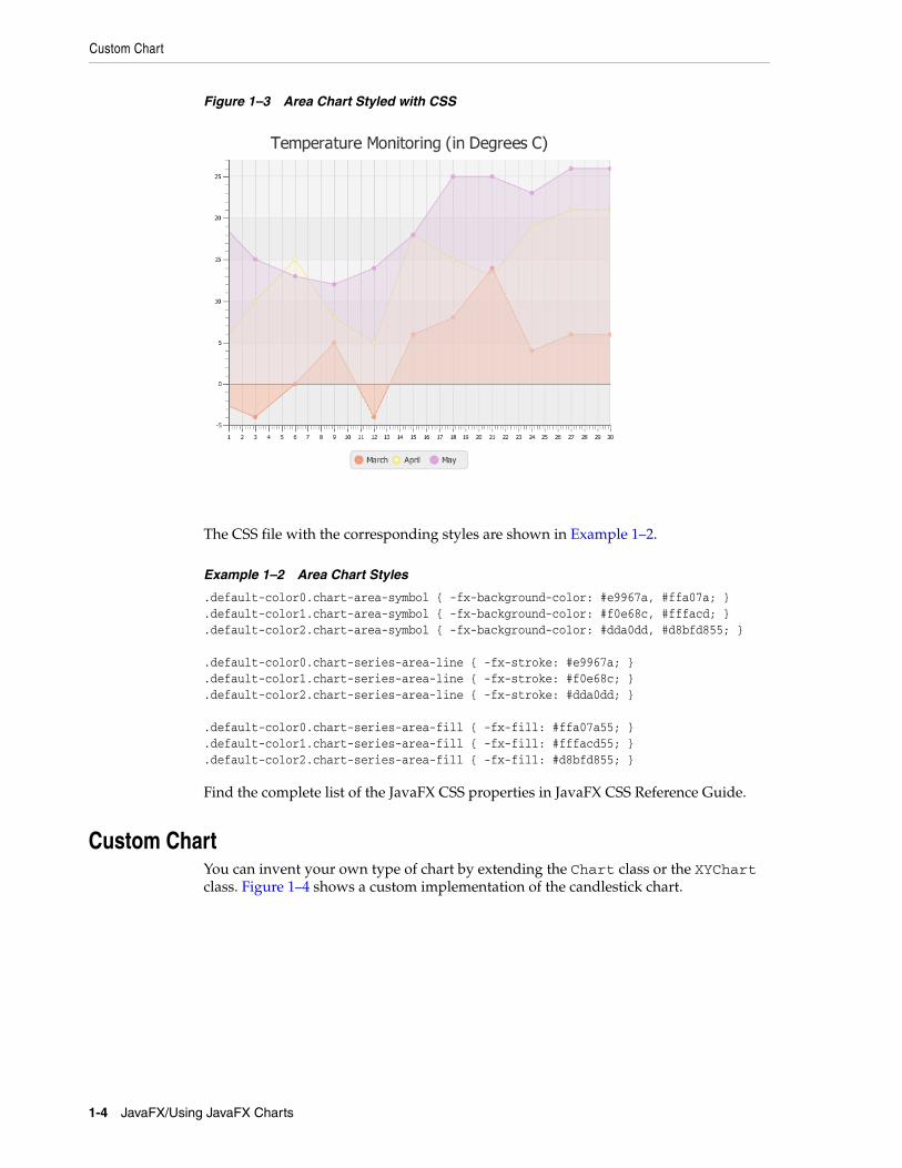
Styling ChartsThe colors of the chart elements are defined by the implementation of each particular chart class. However, you can alter these colors as well as chart symbols by applying CSS styles. Figure 1–3 shows an area chart with the modified colors of its areas, lines, and symbols.
Introduction to JavaFX Charts 1-3
Custom Chart
Figure 1–3 Area Chart Styled with CSS
The CSS file with the corresponding styles are shown in Example 1–2.
Example 1–2 Area Chart Styles
.default-color0.chart-area-symbol { -fx-background-color: #e9967a, #ffa07a; }
.default-color1.chart-area-symbol { -fx-background-color: #f0e68c, #fffacd; }
.default-color2.chart-area-symbol { -fx-background-color: #dda0dd, #d8bfd855; } .default-color0.chart-series-area-line { -fx-stroke: #e9967a; }.default-color1.chart-series-area-line { -fx-stroke: #f0e68c; }.default-color2.chart-series-area-line { -fx-stroke: #dda0dd; } .default-color0.chart-series-area-fill { -fx-fill: #ffa07a55; }.default-color1.chart-series-area-fill { -fx-fill: #fffacd55; }.default-color2.chart-series-area-fill { -fx-fill: #d8bfd855; }
Find the complete list of the JavaFX CSS properties in JavaFX CSS Reference Guide.
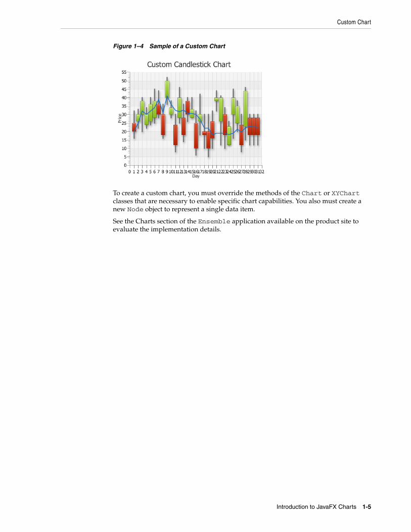
Custom ChartYou can invent your own type of chart by extending the Chart class or the XYChart class. Figure 1–4 shows a custom implementation of the candlestick chart.
1-4 JavaFX/Using JavaFX Charts
Custom Chart
Figure 1–4 Sample of a Custom Chart
To create a custom chart, you must override the methods of the Chart or XYChart classes that are necessary to enable specific chart capabilities. You also must create a new Node object to represent a single data item.
See the Charts section of the Ensemble application available on the product site to evaluate the implementation details.
Introduction to JavaFX Charts 1-5

Custom Chart
1-6 JavaFX/Using JavaFX Charts
2
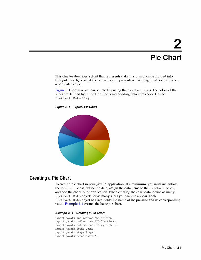
2Pie ChartThis chapter describes a chart that represents data in a form of circle divided into triangular wedges called slices. Each slice represents a percentage that corresponds to a particular value.
Figure 2–1 shows a pie chart created by using the PieChart class. The colors of the slices are defined by the order of the corresponding data items added to the PieChart.Data array.
Figure 2–1 Typical Pie Chart
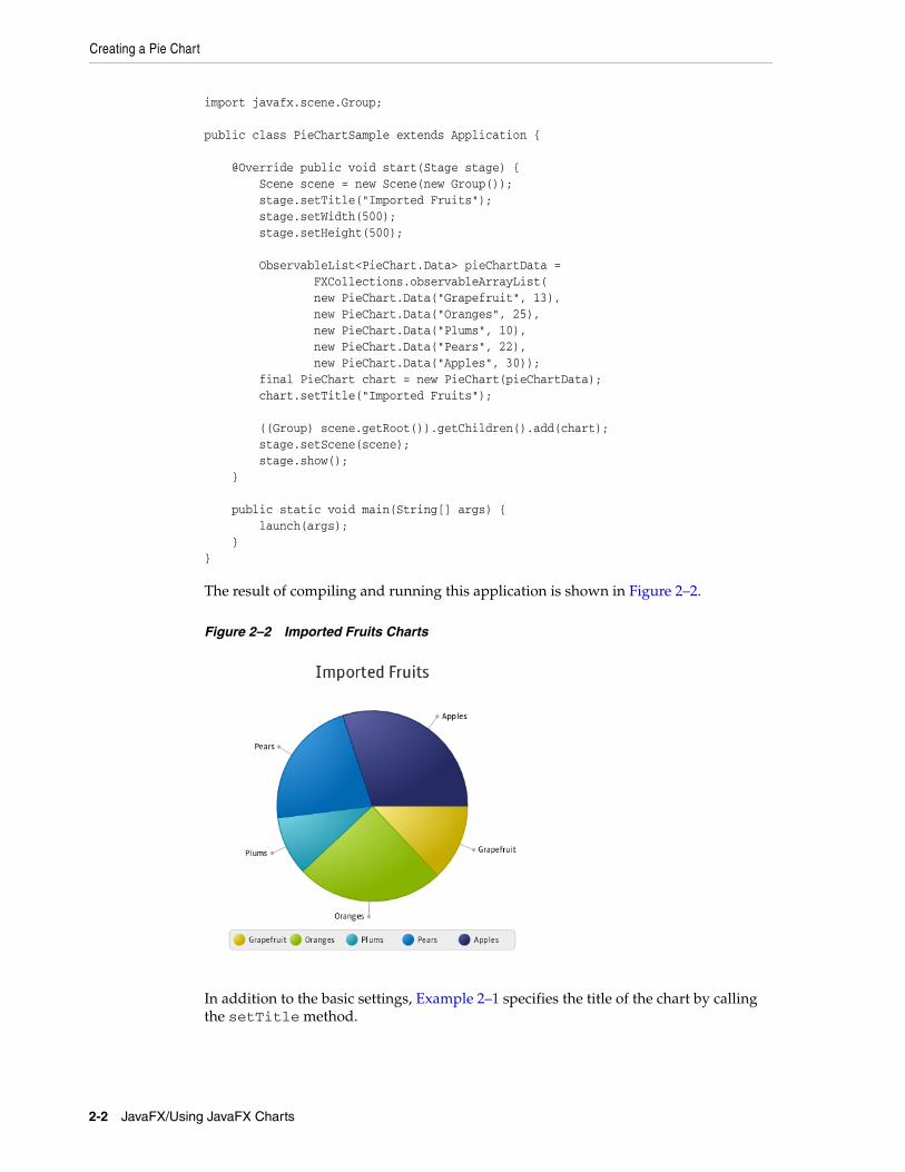
Creating a Pie ChartTo create a pie chart in your JavaFX application, at a minimum, you must instantiate the PieChart class, define the data, assign the data items to the PieChart object, and add the chart to the application. When creating the chart data, define as many PieChart.Data objects for as many slices you want to appear. Each PieChart.Data object has two fields: the name of the pie slice and its corresponding value. Example 2–1 creates the basic pie chart.
Example 2–1 Creating a Pie Chart
import javafx.application.Application;import javafx.collections.FXCollections;import javafx.collections.ObservableList;import javafx.scene.Scene;import javafx.stage.Stage;import javafx.scene.chart.*;
Pie Chart 2-1
Creating a Pie Chart
import javafx.scene.Group; public class PieChartSample extends Application { @Override public void start(Stage stage) { Scene scene = new Scene(new Group()); stage.setTitle("Imported Fruits"); stage.setWidth(500); stage.setHeight(500); ObservableList<PieChart.Data> pieChartData = FXCollections.observableArrayList( new PieChart.Data("Grapefruit", 13), new PieChart.Data("Oranges", 25), new PieChart.Data("Plums", 10), new PieChart.Data("Pears", 22), new PieChart.Data("Apples", 30)); final PieChart chart = new PieChart(pieChartData); chart.setTitle("Imported Fruits");
((Group) scene.getRoot()).getChildren().add(chart); stage.setScene(scene); stage.show(); } public static void main(String[] args) { launch(args); }}
The result of compiling and running this application is shown in Figure 2–2.
Figure 2–2 Imported Fruits Charts
In addition to the basic settings, Example 2–1 specifies the title of the chart by calling the setTitle method.
2-2 JavaFX/Using JavaFX Charts
Setting a Pie Chart and a Legend
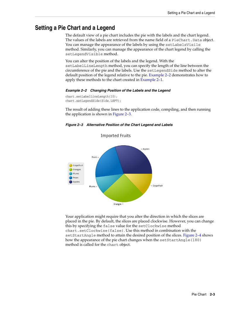
Setting a Pie Chart and a LegendThe default view of a pie chart includes the pie with the labels and the chart legend. The values of the labels are retrieved from the name field of a PieChart.Data object. You can manage the appearance of the labels by using the setLabelsVisile method. Similarly, you can manage the appearance of the chart legend by calling the setLegendVisible method.
You can alter the position of the labels and the legend. With the setLabelLineLength method, you can specify the length of the line between the circumference of the pie and the labels. Use the setLegendSide method to alter the default position of the legend relative to the pie. Example 2–2 demonstrates how to apply these methods to the chart created in Example 2–1.
Example 2–2 Changing Position of the Labels and the Legend
chart.setLabelLineLength(10);chart.setLegendSide(Side.LEFT);
The result of adding these lines to the application code, compiling, and then running the application is shown in Figure 2–3.
Figure 2–3 Alternative Position of the Chart Legend and Labels
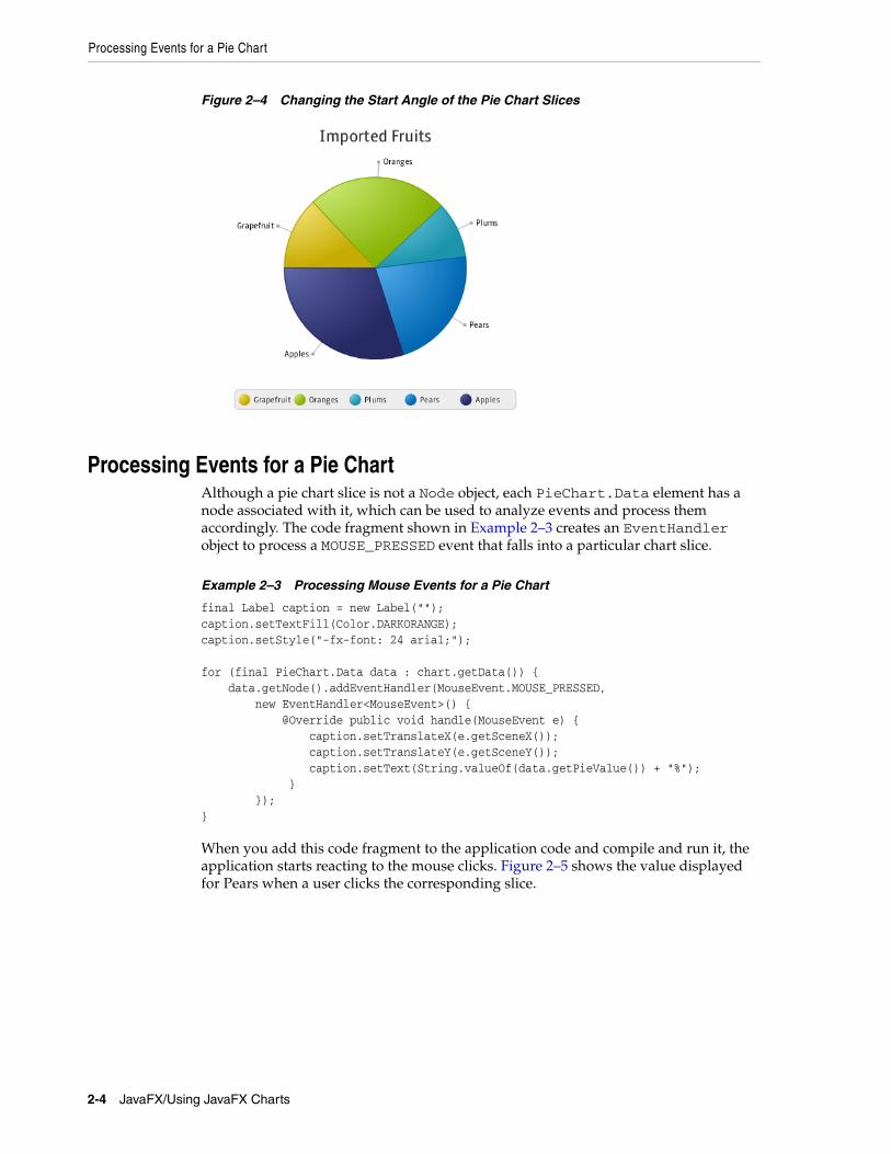
Your application might require that you alter the direction in which the slices are placed in the pie. By default, the slices are placed clockwise. However, you can change this by specifying the false value for the setClockwise method chart.setClockwise(false). Use this method in combination with the setStartAngle method to attain the desired position of the slices. Figure 2–4 shows how the appearance of the pie chart changes when the setStartAngle(180) method is called for the chart object.
Pie Chart 2-3
Processing Events for a Pie Chart
Figure 2–4 Changing the Start Angle of the Pie Chart Slices
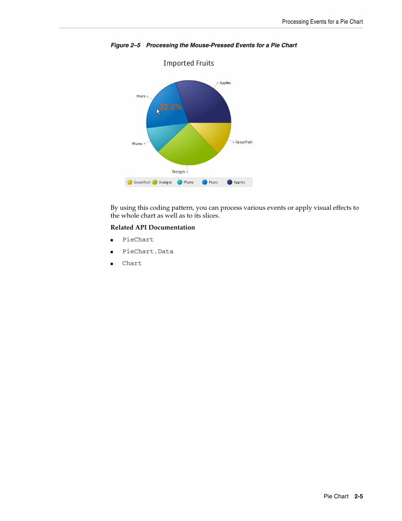
Processing Events for a Pie ChartAlthough a pie chart slice is not a Node object, each PieChart.Data element has a node associated with it, which can be used to analyze events and process them accordingly. The code fragment shown in Example 2–3 creates an EventHandler object to process a MOUSE_PRESSED event that falls into a particular chart slice.
Example 2–3 Processing Mouse Events for a Pie Chart
final Label caption = new Label("");caption.setTextFill(Color.DARKORANGE);caption.setStyle("-fx-font: 24 arial;");
for (final PieChart.Data data : chart.getData()) { data.getNode().addEventHandler(MouseEvent.MOUSE_PRESSED, new EventHandler<MouseEvent>() { @Override public void handle(MouseEvent e) { caption.setTranslateX(e.getSceneX()); caption.setTranslateY(e.getSceneY()); caption.setText(String.valueOf(data.getPieValue()) + "%"); } });}
When you add this code fragment to the application code and compile and run it, the application starts reacting to the mouse clicks. Figure 2–5 shows the value displayed for Pears when a user clicks the corresponding slice.
2-4 JavaFX/Using JavaFX Charts
Processing Events for a Pie Chart
Figure 2–5 Processing the Mouse-Pressed Events for a Pie Chart
By using this coding pattern, you can process various events or apply visual effects to the whole chart as well as to its slices.
Related API Documentation
■ PieChart
■ PieChart.Data
■ Chart
Pie Chart 2-5

Processing Events for a Pie Chart
2-6 JavaFX/Using JavaFX Charts
3
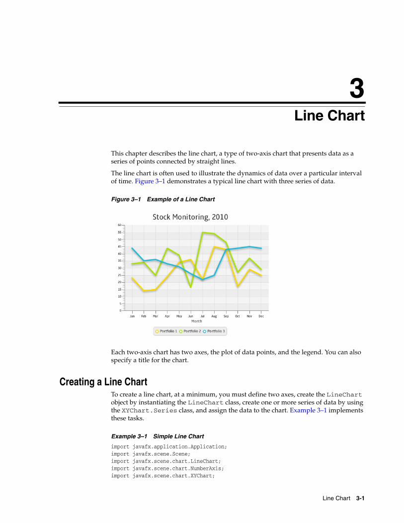
3Line ChartThis chapter describes the line chart, a type of two-axis chart that presents data as a series of points connected by straight lines.
The line chart is often used to illustrate the dynamics of data over a particular interval of time. Figure 3–1 demonstrates a typical line chart with three series of data.
Figure 3–1 Example of a Line Chart
Each two-axis chart has two axes, the plot of data points, and the legend. You can also specify a title for the chart.
Creating a Line ChartTo create a line chart, at a minimum, you must define two axes, create the LineChart object by instantiating the LineChart class, create one or more series of data by using the XYChart.Series class, and assign the data to the chart. Example 3–1 implements these tasks.
Example 3–1 Simple Line Chart
import javafx.application.Application;import javafx.scene.Scene;import javafx.scene.chart.LineChart;import javafx.scene.chart.NumberAxis;import javafx.scene.chart.XYChart;
Line Chart 3-1
Creating a Line Chart
import javafx.stage.Stage; public class LineChartSample extends Application { @Override public void start(Stage stage) { stage.setTitle("Line Chart Sample"); //defining the axes final NumberAxis xAxis = new NumberAxis(); final NumberAxis yAxis = new NumberAxis(); xAxis.setLabel("Number of Month"); //creating the chart final LineChart<Number,Number> lineChart = new LineChart<Number,Number>(xAxis,yAxis); lineChart.setTitle("Stock Monitoring, 2010"); //defining a series XYChart.Series series = new XYChart.Series(); series.setName("My portfolio"); //populating the series with data series.getData().add(new XYChart.Data(1, 23)); series.getData().add(new XYChart.Data(2, 14)); series.getData().add(new XYChart.Data(3, 15)); series.getData().add(new XYChart.Data(4, 24)); series.getData().add(new XYChart.Data(5, 34)); series.getData().add(new XYChart.Data(6, 36)); series.getData().add(new XYChart.Data(7, 22)); series.getData().add(new XYChart.Data(8, 45)); series.getData().add(new XYChart.Data(9, 43)); series.getData().add(new XYChart.Data(10, 17)); series.getData().add(new XYChart.Data(11, 29)); series.getData().add(new XYChart.Data(12, 25)); Scene scene = new Scene(lineChart,800,600); lineChart.getData().add(series); stage.setScene(scene); stage.show(); } public static void main(String[] args) { launch(args); }}
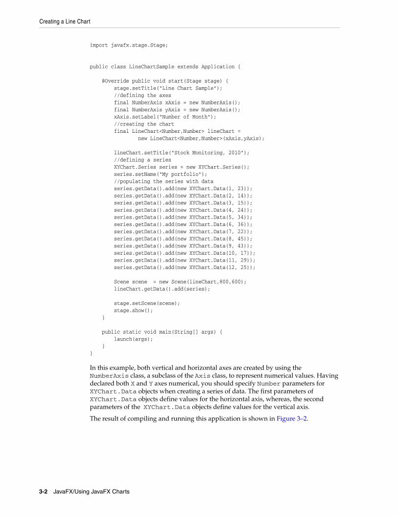
In this example, both vertical and horizontal axes are created by using the NumberAxis class, a subclass of the Axis class, to represent numerical values. Having declared both X and Y axes numerical, you should specify Number parameters for XYChart.Data objects when creating a series of data. The first parameters of XYChart.Data objects define values for the horizontal axis, whereas, the second parameters of the XYChart.Data objects define values for the vertical axis.
The result of compiling and running this application is shown in Figure 3–2.
3-2 JavaFX/Using JavaFX Charts
Creating Categories for a Line Chart
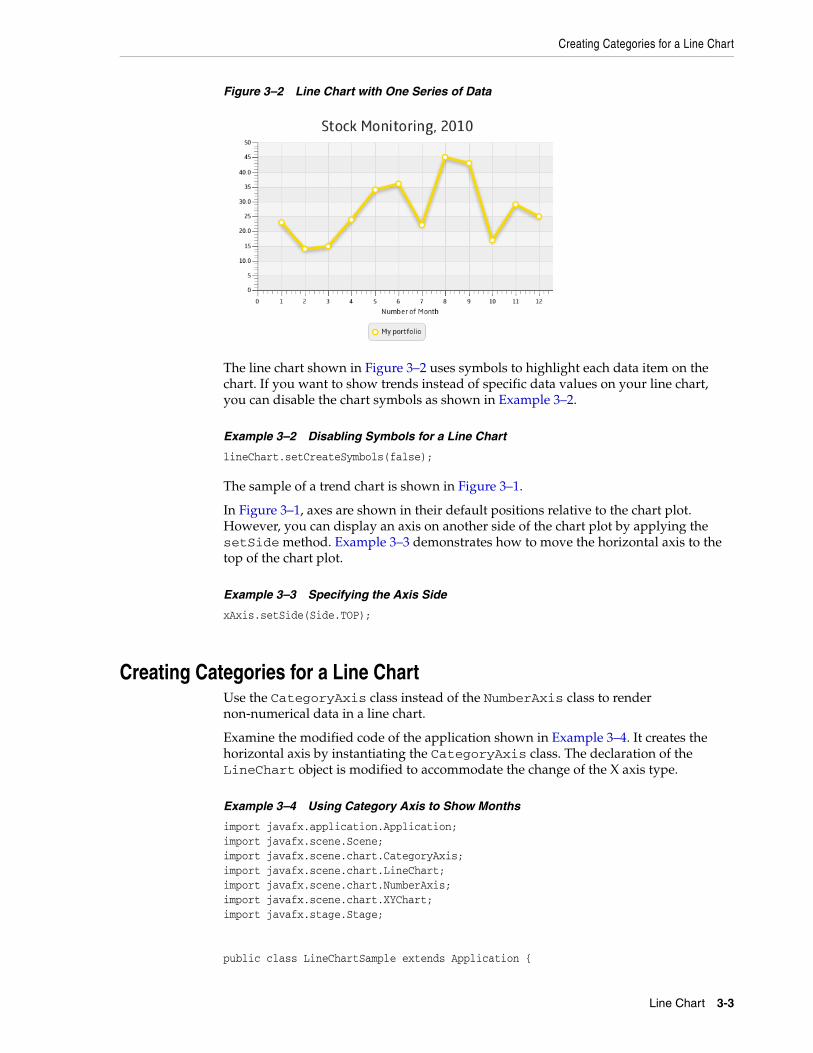
Figure 3–2 Line Chart with One Series of Data
The line chart shown in Figure 3–2 uses symbols to highlight each data item on the chart. If you want to show trends instead of specific data values on your line chart, you can disable the chart symbols as shown in Example 3–2.
Example 3–2 Disabling Symbols for a Line Chart
lineChart.setCreateSymbols(false);
The sample of a trend chart is shown in Figure 3–1.
In Figure 3–1, axes are shown in their default positions relative to the chart plot. However, you can display an axis on another side of the chart plot by applying the setSide method. Example 3–3 demonstrates how to move the horizontal axis to the top of the chart plot.
Example 3–3 Specifying the Axis Side
xAxis.setSide(Side.TOP);
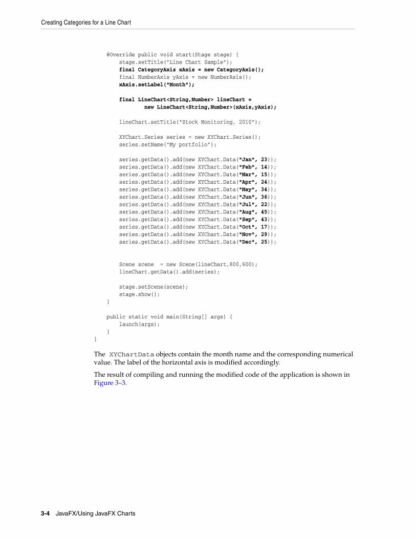
Creating Categories for a Line ChartUse the CategoryAxis class instead of the NumberAxis class to render non-numerical data in a line chart.
Examine the modified code of the application shown in Example 3–4. It creates the horizontal axis by instantiating the CategoryAxis class. The declaration of the LineChart object is modified to accommodate the change of the X axis type.
Example 3–4 Using Category Axis to Show Months
import javafx.application.Application;import javafx.scene.Scene;import javafx.scene.chart.CategoryAxis;import javafx.scene.chart.LineChart;import javafx.scene.chart.NumberAxis;import javafx.scene.chart.XYChart;import javafx.stage.Stage; public class LineChartSample extends Application {
Line Chart 3-3
Creating Categories for a Line Chart
@Override public void start(Stage stage) { stage.setTitle("Line Chart Sample"); final CategoryAxis xAxis = new CategoryAxis(); final NumberAxis yAxis = new NumberAxis(); xAxis.setLabel("Month"); final LineChart<String,Number> lineChart = new LineChart<String,Number>(xAxis,yAxis); lineChart.setTitle("Stock Monitoring, 2010"); XYChart.Series series = new XYChart.Series(); series.setName("My portfolio"); series.getData().add(new XYChart.Data("Jan", 23)); series.getData().add(new XYChart.Data("Feb", 14)); series.getData().add(new XYChart.Data("Mar", 15)); series.getData().add(new XYChart.Data("Apr", 24)); series.getData().add(new XYChart.Data("May", 34)); series.getData().add(new XYChart.Data("Jun", 36)); series.getData().add(new XYChart.Data("Jul", 22)); series.getData().add(new XYChart.Data("Aug", 45)); series.getData().add(new XYChart.Data("Sep", 43)); series.getData().add(new XYChart.Data("Oct", 17)); series.getData().add(new XYChart.Data("Nov", 29)); series.getData().add(new XYChart.Data("Dec", 25)); Scene scene = new Scene(lineChart,800,600); lineChart.getData().add(series); stage.setScene(scene); stage.show(); } public static void main(String[] args) { launch(args); }}
The XYChartData objects contain the month name and the corresponding numerical value. The label of the horizontal axis is modified accordingly.
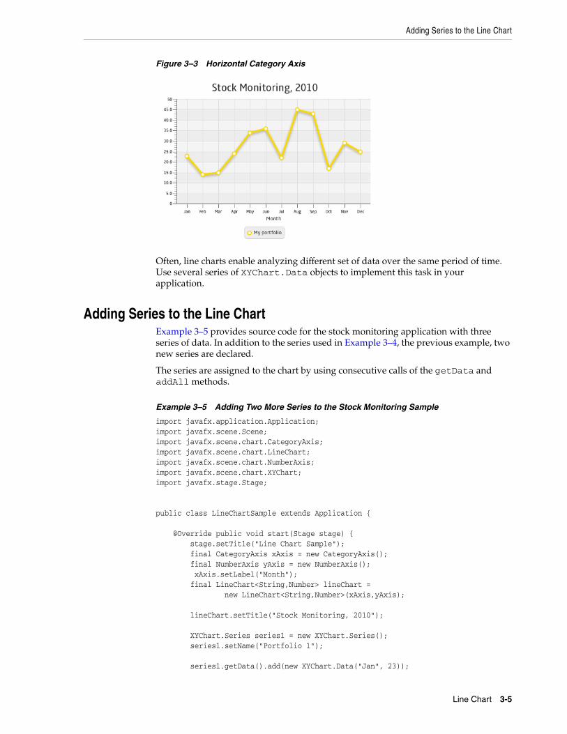
The result of compiling and running the modified code of the application is shown in Figure 3–3.
3-4 JavaFX/Using JavaFX Charts
Adding Series to the Line Chart
Figure 3–3 Horizontal Category Axis
Often, line charts enable analyzing different set of data over the same period of time. Use several series of XYChart.Data objects to implement this task in your application.
Adding Series to the Line ChartExample 3–5 provides source code for the stock monitoring application with three series of data. In addition to the series used in Example 3–4, the previous example, two new series are declared.
The series are assigned to the chart by using consecutive calls of the getData and addAll methods.
Example 3–5 Adding Two More Series to the Stock Monitoring Sample
import javafx.application.Application;import javafx.scene.Scene;import javafx.scene.chart.CategoryAxis;import javafx.scene.chart.LineChart;import javafx.scene.chart.NumberAxis;import javafx.scene.chart.XYChart;import javafx.stage.Stage; public class LineChartSample extends Application { @Override public void start(Stage stage) { stage.setTitle("Line Chart Sample"); final CategoryAxis xAxis = new CategoryAxis(); final NumberAxis yAxis = new NumberAxis(); xAxis.setLabel("Month"); final LineChart<String,Number> lineChart = new LineChart<String,Number>(xAxis,yAxis); lineChart.setTitle("Stock Monitoring, 2010"); XYChart.Series series1 = new XYChart.Series(); series1.setName("Portfolio 1"); series1.getData().add(new XYChart.Data("Jan", 23));
Line Chart 3-5
Adding Series to the Line Chart
series1.getData().add(new XYChart.Data("Feb", 14)); series1.getData().add(new XYChart.Data("Mar", 15)); series1.getData().add(new XYChart.Data("Apr", 24)); series1.getData().add(new XYChart.Data("May", 34)); series1.getData().add(new XYChart.Data("Jun", 36)); series1.getData().add(new XYChart.Data("Jul", 22)); series1.getData().add(new XYChart.Data("Aug", 45)); series1.getData().add(new XYChart.Data("Sep", 43)); series1.getData().add(new XYChart.Data("Oct", 17)); series1.getData().add(new XYChart.Data("Nov", 29)); series1.getData().add(new XYChart.Data("Dec", 25)); XYChart.Series series2 = new XYChart.Series(); series2.setName("Portfolio 2"); series2.getData().add(new XYChart.Data("Jan", 33)); series2.getData().add(new XYChart.Data("Feb", 34)); series2.getData().add(new XYChart.Data("Mar", 25)); series2.getData().add(new XYChart.Data("Apr", 44)); series2.getData().add(new XYChart.Data("May", 39)); series2.getData().add(new XYChart.Data("Jun", 16)); series2.getData().add(new XYChart.Data("Jul", 55)); series2.getData().add(new XYChart.Data("Aug", 54)); series2.getData().add(new XYChart.Data("Sep", 48)); series2.getData().add(new XYChart.Data("Oct", 27)); series2.getData().add(new XYChart.Data("Nov", 37)); series2.getData().add(new XYChart.Data("Dec", 29)); XYChart.Series series3 = new XYChart.Series(); series3.setName("Portfolio 3"); series3.getData().add(new XYChart.Data("Jan", 44)); series3.getData().add(new XYChart.Data("Feb", 35)); series3.getData().add(new XYChart.Data("Mar", 36)); series3.getData().add(new XYChart.Data("Apr", 33)); series3.getData().add(new XYChart.Data("May", 31)); series3.getData().add(new XYChart.Data("Jun", 26)); series3.getData().add(new XYChart.Data("Jul", 22)); series3.getData().add(new XYChart.Data("Aug", 25)); series3.getData().add(new XYChart.Data("Sep", 43)); series3.getData().add(new XYChart.Data("Oct", 44)); series3.getData().add(new XYChart.Data("Nov", 45)); series3.getData().add(new XYChart.Data("Dec", 44)); Scene scene = new Scene(lineChart,800,600); lineChart.getData().addAll(series1, series2, series3); stage.setScene(scene); stage.show(); } public static void main(String[] args) { launch(args); }}
Each series of data has its unique name defined by using the setName method.
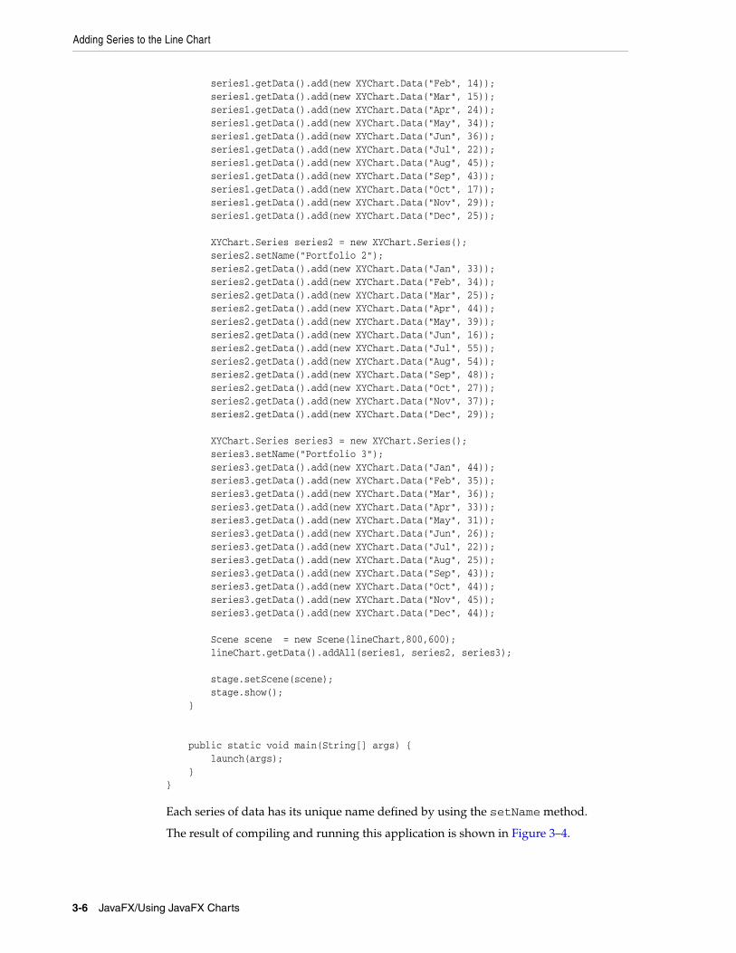
The result of compiling and running this application is shown in Figure 3–4.
3-6 JavaFX/Using JavaFX Charts
Adding Series to the Line Chart
Figure 3–4 Stock Monitoring Example with Tree Series of Data
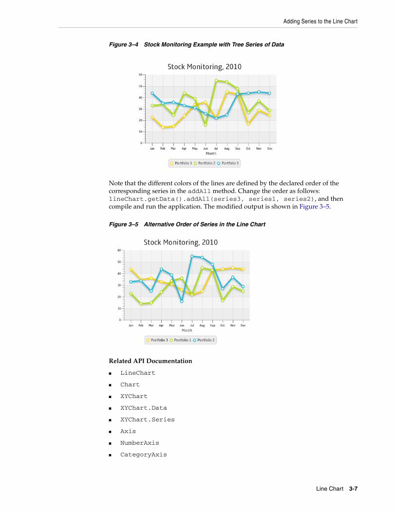
Note that the different colors of the lines are defined by the declared order of the corresponding series in the addAll method. Change the order as follows: lineChart.getData().addAll(series3, series1, series2), and then compile and run the application. The modified output is shown in Figure 3–5.
Figure 3–5 Alternative Order of Series in the Line Chart
Related API Documentation
■ LineChart
■ Chart
■ XYChart
■ XYChart.Data
■ XYChart.Series
■ Axis
■ NumberAxis
■ CategoryAxis
Line Chart 3-7

Adding Series to the Line Chart
3-8 JavaFX/Using JavaFX Charts
4
4Area ChartThis chapter describes the area chart, yet another type of a two-axis chart.
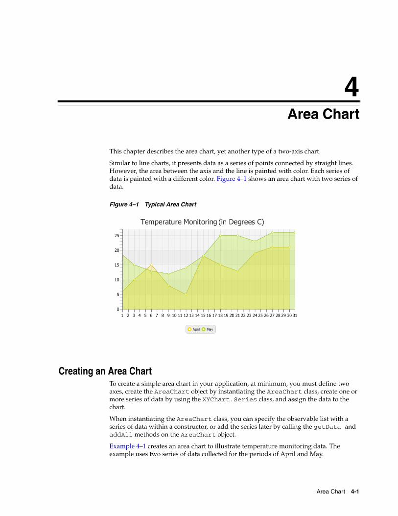
Similar to line charts, it presents data as a series of points connected by straight lines. However, the area between the axis and the line is painted with color. Each series of data is painted with a different color. Figure 4–1 shows an area chart with two series of data.
Figure 4–1 Typical Area Chart
Creating an Area ChartTo create a simple area chart in your application, at minimum, you must define two axes, create the AreaChart object by instantiating the AreaChart class, create one or more series of data by using the XYChart.Series class, and assign the data to the chart.
When instantiating the AreaChart class, you can specify the observable list with a series of data within a constructor, or add the series later by calling the getData and addAll methods on the AreaChart object.
Example 4–1 creates an area chart to illustrate temperature monitoring data. The example uses two series of data collected for the periods of April and May.
Area Chart 4-1
Creating an Area Chart
Example 4–1 Creating an Area Chart
import javafx.application.Application;import javafx.scene.Scene;import javafx.scene.chart.AreaChart;import javafx.scene.chart.NumberAxis;import javafx.scene.chart.XYChart;import javafx.stage.Stage; public class AreaChartSample extends Application { @Override public void start(Stage stage) { stage.setTitle("Area Chart Sample"); final NumberAxis xAxis = new NumberAxis(1, 31, 1); final NumberAxis yAxis = new NumberAxis(); final AreaChart<Number,Number> ac = new AreaChart<Number,Number>(xAxis,yAxis); ac.setTitle("Temperature Monitoring (in Degrees C)"); XYChart.Series seriesApril= new XYChart.Series(); seriesApril.setName("April"); seriesApril.getData().add(new XYChart.Data(1, 4)); seriesApril.getData().add(new XYChart.Data(3, 10)); seriesApril.getData().add(new XYChart.Data(6, 15)); seriesApril.getData().add(new XYChart.Data(9, 8)); seriesApril.getData().add(new XYChart.Data(12, 5)); seriesApril.getData().add(new XYChart.Data(15, 18)); seriesApril.getData().add(new XYChart.Data(18, 15)); seriesApril.getData().add(new XYChart.Data(21, 13)); seriesApril.getData().add(new XYChart.Data(24, 19)); seriesApril.getData().add(new XYChart.Data(27, 21)); seriesApril.getData().add(new XYChart.Data(30, 21)); XYChart.Series seriesMay = new XYChart.Series(); seriesMay.setName("May"); seriesMay.getData().add(new XYChart.Data(1, 20)); seriesMay.getData().add(new XYChart.Data(3, 15)); seriesMay.getData().add(new XYChart.Data(6, 13)); seriesMay.getData().add(new XYChart.Data(9, 12)); seriesMay.getData().add(new XYChart.Data(12, 14)); seriesMay.getData().add(new XYChart.Data(15, 18)); seriesMay.getData().add(new XYChart.Data(18, 25)); seriesMay.getData().add(new XYChart.Data(21, 25)); seriesMay.getData().add(new XYChart.Data(24, 23)); seriesMay.getData().add(new XYChart.Data(27, 26)); seriesMay.getData().add(new XYChart.Data(31, 26)); Scene scene = new Scene(ac,800,600); ac.getData().addAll(seriesApril, seriesMay); stage.setScene(scene); stage.show(); } public static void main(String[] args) { launch(args); }}
This example creates two NumberAxis objects to present numerical data on horizontal and vertical axes. Values rendered on the horizontal axis (X) are retrieved from the first
4-2 JavaFX/Using JavaFX Charts
Creating a Stacked Area Chart
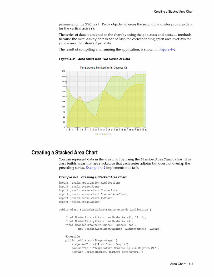
parameter of the XYChart.Data objects, whereas the second parameter provides data for the vertical axis (Y).
The series of data is assigned to the chart by using the getData and addAll methods. Because the seriesMay data is added last, the corresponding green area overlays the yellow area that shows April data.
The result of compiling and running the application, is shown in Figure 4–2.
Figure 4–2 Area Chart with Two Series of Data
Creating a Stacked Area ChartYou can represent data in the area chart by using the StackedAreaChart class. This class builds areas that are stacked so that each series adjoins but does not overlap the preceding series. Example 4–2 implements this task.
Example 4–2 Creating a Stacked Area Chart
import javafx.application.Application;import javafx.scene.Scene;import javafx.scene.chart.NumberAxis;import javafx.scene.chart.StackedAreaChart;import javafx.scene.chart.XYChart;import javafx.stage.Stage; public class StackedAreaChartSample extends Application { final NumberAxis xAxis = new NumberAxis(1, 31, 1); final NumberAxis yAxis = new NumberAxis(); final StackedAreaChart<Number, Number> sac = new StackedAreaChart<Number, Number>(xAxis, yAxis); @Override public void start(Stage stage) { stage.setTitle("Area Chart Sample"); sac.setTitle("Temperature Monitoring (in Degrees C)"); XYChart.Series<Number, Number> seriesApril =
Area Chart 4-3
Creating a Stacked Area Chart
new XYChart.Series<Number, Number>(); seriesApril.setName("April"); seriesApril.getData().add(new XYChart.Data(1, 4)); seriesApril.getData().add(new XYChart.Data(3, 10)); seriesApril.getData().add(new XYChart.Data(6, 15)); seriesApril.getData().add(new XYChart.Data(9, 8)); seriesApril.getData().add(new XYChart.Data(12, 5)); seriesApril.getData().add(new XYChart.Data(15, 18)); seriesApril.getData().add(new XYChart.Data(18, 15)); seriesApril.getData().add(new XYChart.Data(21, 13)); seriesApril.getData().add(new XYChart.Data(24, 19)); seriesApril.getData().add(new XYChart.Data(27, 21)); seriesApril.getData().add(new XYChart.Data(30, 21)); XYChart.Series<Number, Number> seriesMay = new XYChart.Series<Number, Number>(); seriesMay.setName("May"); seriesMay.getData().add(new XYChart.Data(1, 20)); seriesMay.getData().add(new XYChart.Data(3, 15)); seriesMay.getData().add(new XYChart.Data(6, 13)); seriesMay.getData().add(new XYChart.Data(9, 12)); seriesMay.getData().add(new XYChart.Data(12, 14)); seriesMay.getData().add(new XYChart.Data(15, 18)); seriesMay.getData().add(new XYChart.Data(18, 25)); seriesMay.getData().add(new XYChart.Data(21, 25)); seriesMay.getData().add(new XYChart.Data(24, 23)); seriesMay.getData().add(new XYChart.Data(27, 26)); seriesMay.getData().add(new XYChart.Data(31, 26)); Scene scene = new Scene(sac, 800, 600); sac.getData().addAll(seriesApril, seriesMay); stage.setScene(scene); stage.show(); } public static void main(String[] args) { launch(args); }}
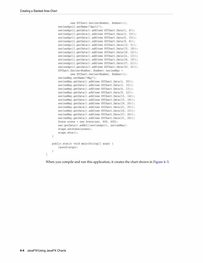
When you compile and run this application, it creates the chart shown in Figure 4–3.
4-4 JavaFX/Using JavaFX Charts
Setting Axis and Tick Properties
Figure 4–3 Stacked Area Chart with Two Areas
Compare the data shown in Figure 4–3 with the same data in Figure 4–2. The areas in the stacked area chart show cumulative values on the vertical axis at any given point along the horizontal axis. For example, the value on the vertical axis shown for May 15th in the stacked area chart is 36, which does not correspond to the actual temperature that day. This value represents the cumulative result for temperatures on April 15th and May 15th.
When you develop area charts in your JavaFX applications, remember that data on the vertical axes is interpreted according to the type of area charts (AreaChart or StackedAreaChart). Choose the data representation best suited for the task of the application.
Setting Axis and Tick PropertiesThe output of the Temperature Monitoring application in Figure 4–2 and Figure 4–3 presents the numerical values on the axes in the default double format., rather than in a user-friendly manner. For example, the month days should be integers and in the range of 1 to 31, instead of float numbers.
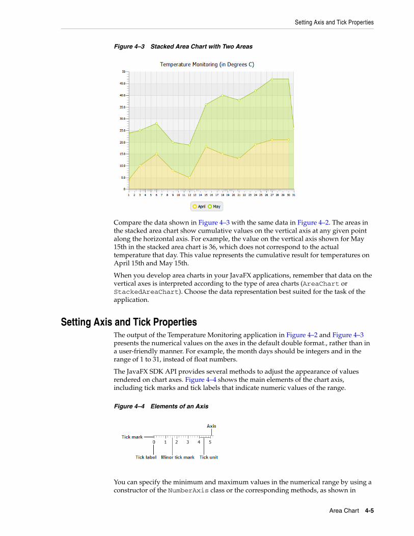
The JavaFX SDK API provides several methods to adjust the appearance of values rendered on chart axes. Figure 4–4 shows the main elements of the chart axis, including tick marks and tick labels that indicate numeric values of the range.
Figure 4–4 Elements of an Axis
You can specify the minimum and maximum values in the numerical range by using a constructor of the NumberAxis class or the corresponding methods, as shown in
Area Chart 4-5
Setting Axis and Tick Properties
Example 4–3.
Example 4–3 Specifying a Data Range for the Horizontal Axis
//Using the NumberAxis constructorfinal NumberAxis xAxis = new NumberAxis(1, 31, 1);//Using the corresponding methodsxAxis.setLowerBound(1);xAxis.setUpperBound(30);xAxis.setTickUnit(1);
When using the three-parameter constructor of the NumberAxis class, remember that the first parameter defines the minimum value in the range, the second parameter is the maximum value in the range, and the third parameter defines the tick unit, a value between two tick marks on the axis.
Additionally, if you want to prohibit showing minor ticks on the horizontal axis, then specify 0 for the minorTickCount property, as shown in Example 4–4.
Example 4–4 Setting Zero Value for Minor Tick Count
xAxis.setMinorTickCount(0);
This property defines the number of minor ticks to be displayed between each major tick mark. By setting its value to 0, you disable the minor ticks for the horizontal axis.
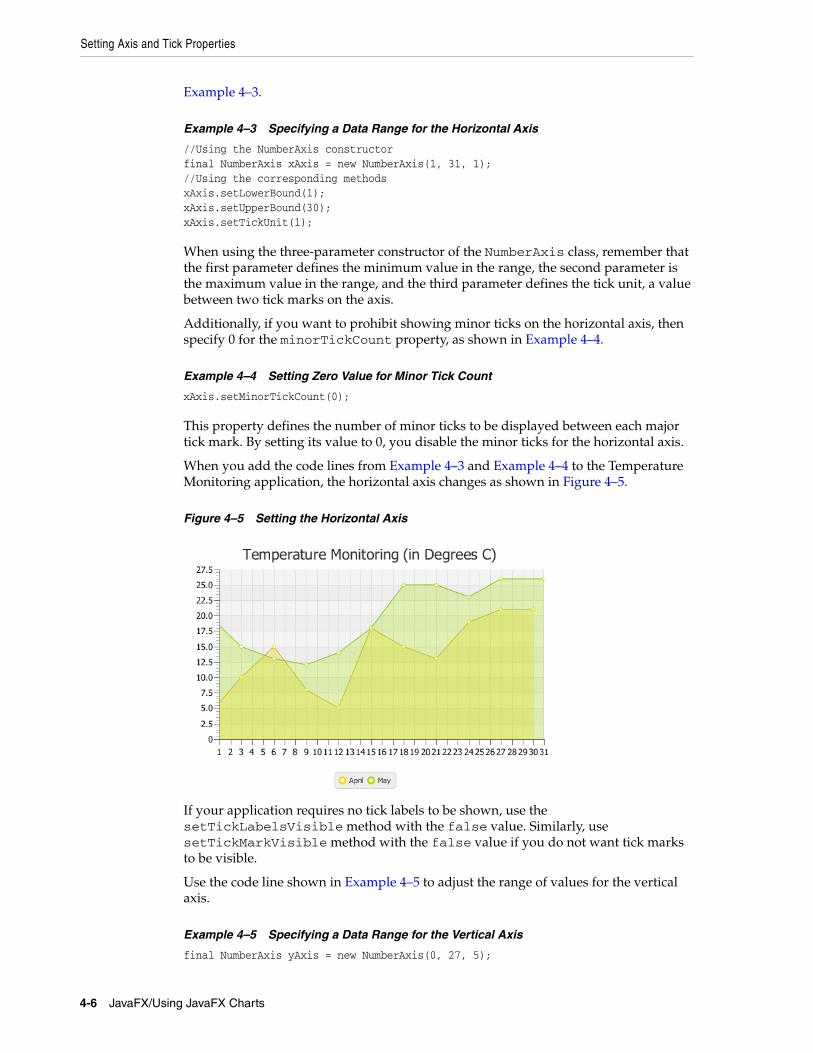
When you add the code lines from Example 4–3 and Example 4–4 to the Temperature Monitoring application, the horizontal axis changes as shown in Figure 4–5.
Figure 4–5 Setting the Horizontal Axis
If your application requires no tick labels to be shown, use the setTickLabelsVisible method with the false value. Similarly, use setTickMarkVisible method with the false value if you do not want tick marks to be visible.
Use the code line shown in Example 4–5 to adjust the range of values for the vertical axis.
Example 4–5 Specifying a Data Range for the Vertical Axis
final NumberAxis yAxis = new NumberAxis(0, 27, 5);
4-6 JavaFX/Using JavaFX Charts
Adding Negative Values
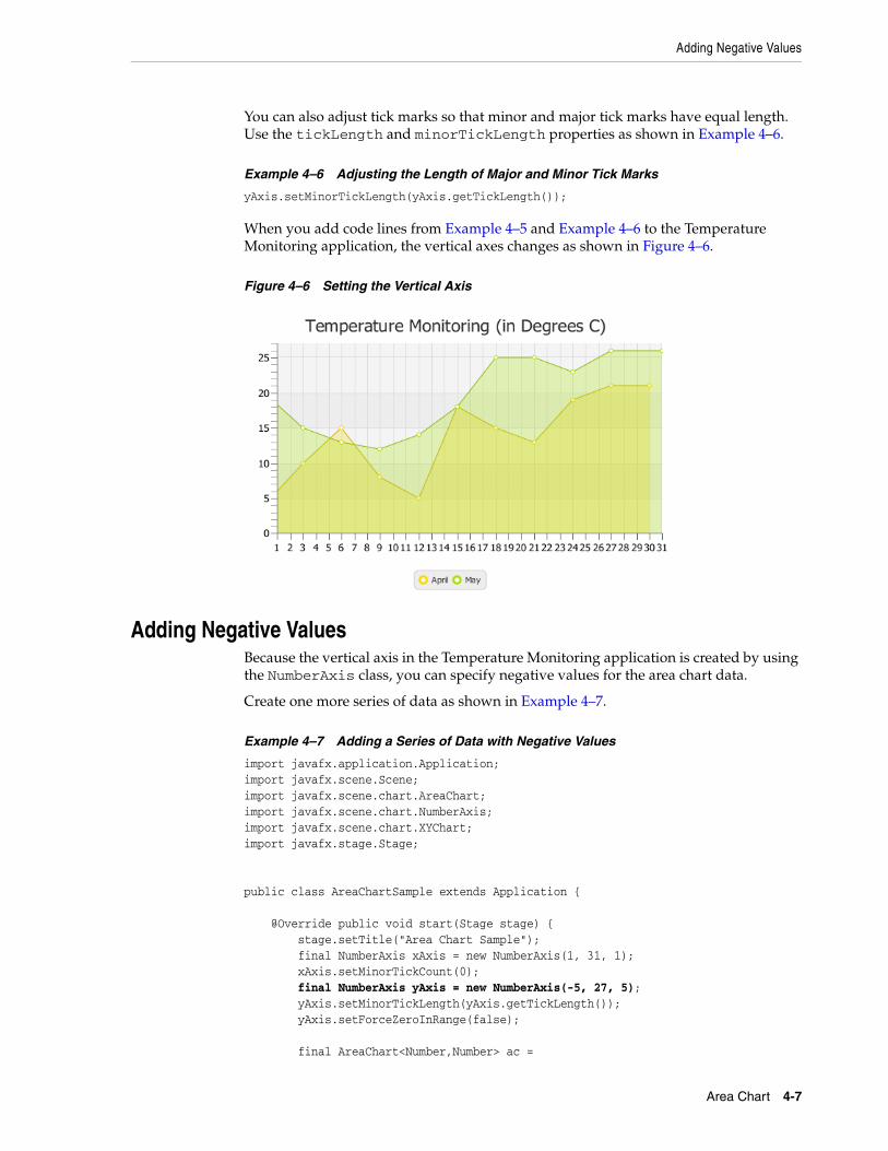
You can also adjust tick marks so that minor and major tick marks have equal length. Use the tickLength and minorTickLength properties as shown in Example 4–6.
Example 4–6 Adjusting the Length of Major and Minor Tick Marks
yAxis.setMinorTickLength(yAxis.getTickLength());
When you add code lines from Example 4–5 and Example 4–6 to the Temperature Monitoring application, the vertical axes changes as shown in Figure 4–6.
Figure 4–6 Setting the Vertical Axis
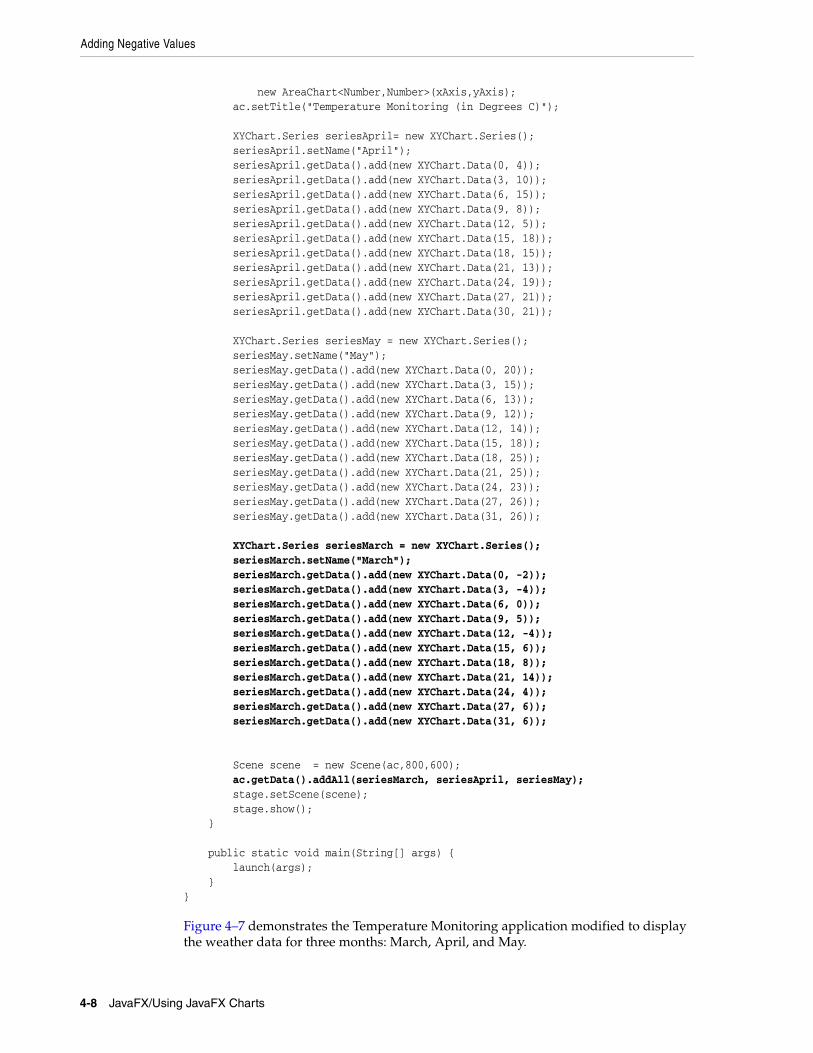
Adding Negative ValuesBecause the vertical axis in the Temperature Monitoring application is created by using the NumberAxis class, you can specify negative values for the area chart data.
Create one more series of data as shown in Example 4–7.
Example 4–7 Adding a Series of Data with Negative Values
import javafx.application.Application;import javafx.scene.Scene;import javafx.scene.chart.AreaChart;import javafx.scene.chart.NumberAxis;import javafx.scene.chart.XYChart;import javafx.stage.Stage; public class AreaChartSample extends Application { @Override public void start(Stage stage) { stage.setTitle("Area Chart Sample"); final NumberAxis xAxis = new NumberAxis(1, 31, 1); xAxis.setMinorTickCount(0); final NumberAxis yAxis = new NumberAxis(-5, 27, 5); yAxis.setMinorTickLength(yAxis.getTickLength()); yAxis.setForceZeroInRange(false); final AreaChart<Number,Number> ac =
Area Chart 4-7
Adding Negative Values
new AreaChart<Number,Number>(xAxis,yAxis); ac.setTitle("Temperature Monitoring (in Degrees C)"); XYChart.Series seriesApril= new XYChart.Series(); seriesApril.setName("April"); seriesApril.getData().add(new XYChart.Data(0, 4)); seriesApril.getData().add(new XYChart.Data(3, 10)); seriesApril.getData().add(new XYChart.Data(6, 15)); seriesApril.getData().add(new XYChart.Data(9, 8)); seriesApril.getData().add(new XYChart.Data(12, 5)); seriesApril.getData().add(new XYChart.Data(15, 18)); seriesApril.getData().add(new XYChart.Data(18, 15)); seriesApril.getData().add(new XYChart.Data(21, 13)); seriesApril.getData().add(new XYChart.Data(24, 19)); seriesApril.getData().add(new XYChart.Data(27, 21)); seriesApril.getData().add(new XYChart.Data(30, 21)); XYChart.Series seriesMay = new XYChart.Series(); seriesMay.setName("May"); seriesMay.getData().add(new XYChart.Data(0, 20)); seriesMay.getData().add(new XYChart.Data(3, 15)); seriesMay.getData().add(new XYChart.Data(6, 13)); seriesMay.getData().add(new XYChart.Data(9, 12)); seriesMay.getData().add(new XYChart.Data(12, 14)); seriesMay.getData().add(new XYChart.Data(15, 18)); seriesMay.getData().add(new XYChart.Data(18, 25)); seriesMay.getData().add(new XYChart.Data(21, 25)); seriesMay.getData().add(new XYChart.Data(24, 23)); seriesMay.getData().add(new XYChart.Data(27, 26)); seriesMay.getData().add(new XYChart.Data(31, 26)); XYChart.Series seriesMarch = new XYChart.Series(); seriesMarch.setName("March"); seriesMarch.getData().add(new XYChart.Data(0, -2)); seriesMarch.getData().add(new XYChart.Data(3, -4)); seriesMarch.getData().add(new XYChart.Data(6, 0)); seriesMarch.getData().add(new XYChart.Data(9, 5)); seriesMarch.getData().add(new XYChart.Data(12, -4)); seriesMarch.getData().add(new XYChart.Data(15, 6)); seriesMarch.getData().add(new XYChart.Data(18, 8)); seriesMarch.getData().add(new XYChart.Data(21, 14)); seriesMarch.getData().add(new XYChart.Data(24, 4)); seriesMarch.getData().add(new XYChart.Data(27, 6)); seriesMarch.getData().add(new XYChart.Data(31, 6)); Scene scene = new Scene(ac,800,600); ac.getData().addAll(seriesMarch, seriesApril, seriesMay); stage.setScene(scene); stage.show(); } public static void main(String[] args) { launch(args); }}
Figure 4–7 demonstrates the Temperature Monitoring application modified to display the weather data for three months: March, April, and May.
4-8 JavaFX/Using JavaFX Charts
Styling Area Charts
Figure 4–7 Adding Negative Data
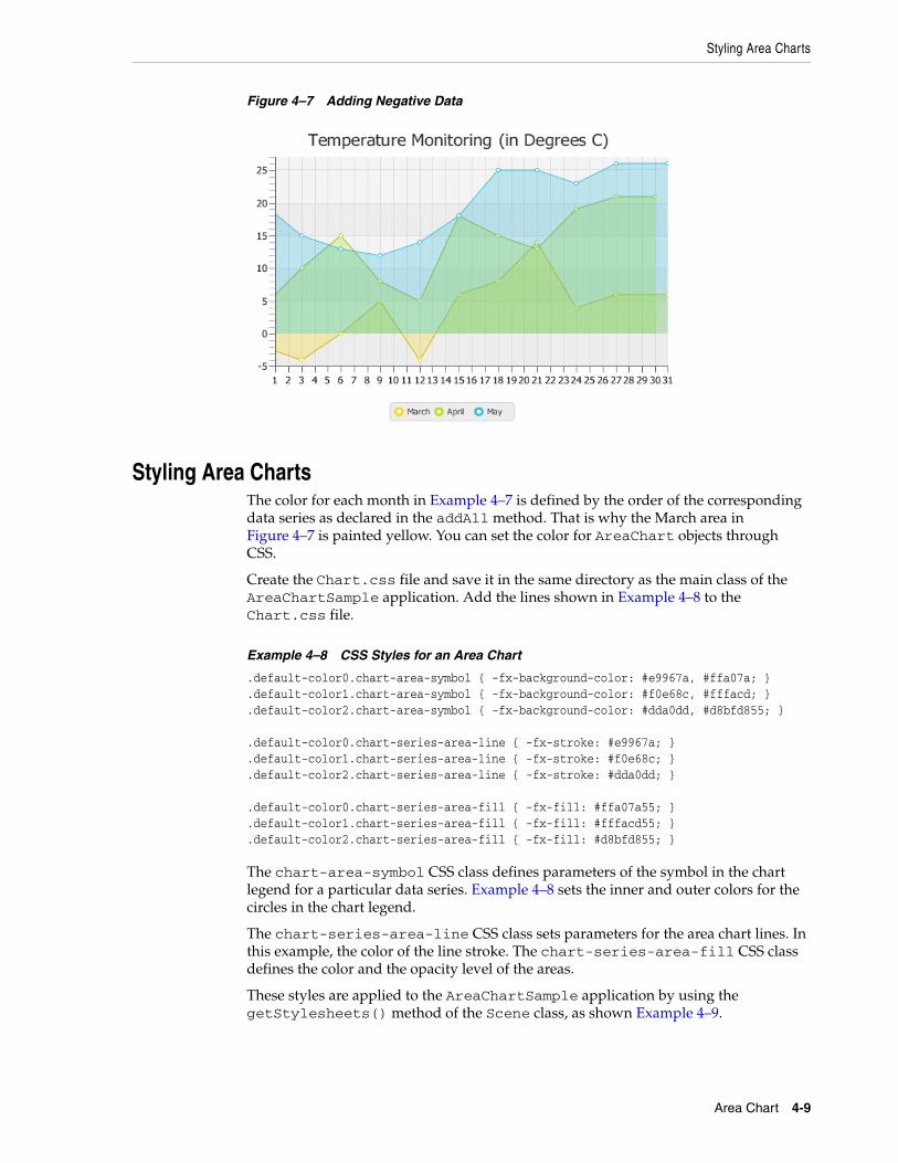
Styling Area ChartsThe color for each month in Example 4–7 is defined by the order of the corresponding data series as declared in the addAll method. That is why the March area in Figure 4–7 is painted yellow. You can set the color for AreaChart objects through CSS.
Create the Chart.css file and save it in the same directory as the main class of the AreaChartSample application. Add the lines shown in Example 4–8 to the Chart.css file.
Example 4–8 CSS Styles for an Area Chart
.default-color0.chart-area-symbol { -fx-background-color: #e9967a, #ffa07a; }
.default-color1.chart-area-symbol { -fx-background-color: #f0e68c, #fffacd; }
.default-color2.chart-area-symbol { -fx-background-color: #dda0dd, #d8bfd855; } .default-color0.chart-series-area-line { -fx-stroke: #e9967a; }.default-color1.chart-series-area-line { -fx-stroke: #f0e68c; }.default-color2.chart-series-area-line { -fx-stroke: #dda0dd; } .default-color0.chart-series-area-fill { -fx-fill: #ffa07a55; }.default-color1.chart-series-area-fill { -fx-fill: #fffacd55; }.default-color2.chart-series-area-fill { -fx-fill: #d8bfd855; }
The chart-area-symbol CSS class defines parameters of the symbol in the chart legend for a particular data series. Example 4–8 sets the inner and outer colors for the circles in the chart legend.
The chart-series-area-line CSS class sets parameters for the area chart lines. In this example, the color of the line stroke. The chart-series-area-fill CSS class defines the color and the opacity level of the areas.
These styles are applied to the AreaChartSample application by using the getStylesheets() method of the Scene class, as shown Example 4–9.
Area Chart 4-9
Styling Area Charts
Example 4–9 Applying CSS Styles to the Scene
scene.getStylesheets().add("areachartsample/Chart.css");
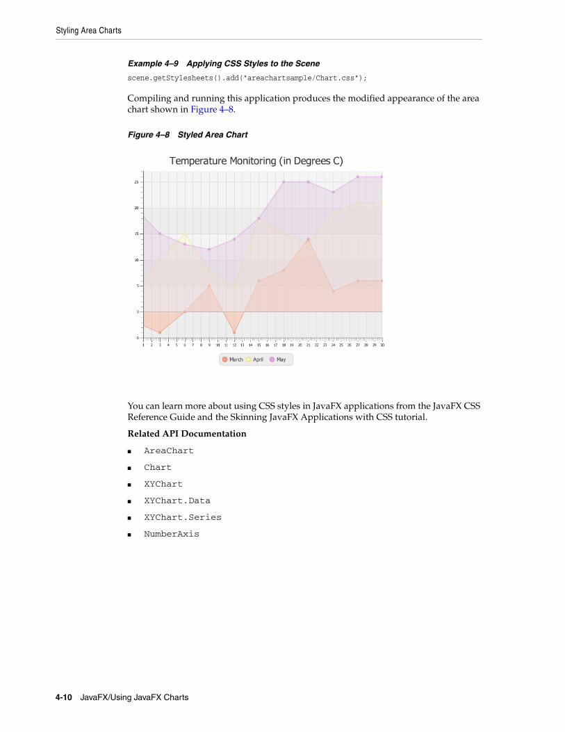
Compiling and running this application produces the modified appearance of the area chart shown in Figure 4–8.
Figure 4–8 Styled Area Chart
You can learn more about using CSS styles in JavaFX applications from the JavaFX CSS Reference Guide and the Skinning JavaFX Applications with CSS tutorial.
Related API Documentation
■ AreaChart
■ Chart
■ XYChart
■ XYChart.Data
■ XYChart.Series
■ NumberAxis
4-10 JavaFX/Using JavaFX Charts
5
5Bubble ChartThis chapter describes the bubble chart, a two-axis chart that plots bubbles for the data points in a series.
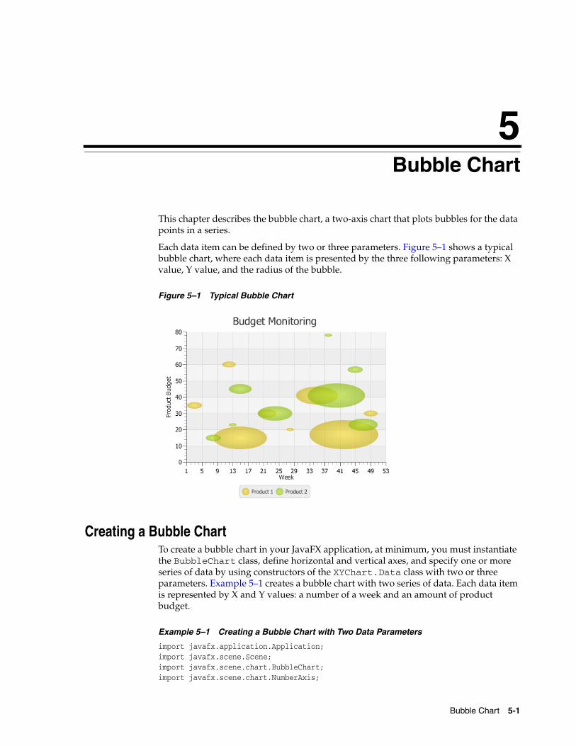
Each data item can be defined by two or three parameters. Figure 5–1 shows a typical bubble chart, where each data item is presented by the three following parameters: X value, Y value, and the radius of the bubble.
Figure 5–1 Typical Bubble Chart
Creating a Bubble ChartTo create a bubble chart in your JavaFX application, at minimum, you must instantiate the BubbleChart class, define horizontal and vertical axes, and specify one or more series of data by using constructors of the XYChart.Data class with two or three parameters. Example 5–1 creates a bubble chart with two series of data. Each data item is represented by X and Y values: a number of a week and an amount of product budget.
Example 5–1 Creating a Bubble Chart with Two Data Parameters
import javafx.application.Application;import javafx.scene.Scene;import javafx.scene.chart.BubbleChart;import javafx.scene.chart.NumberAxis;
Bubble Chart 5-1
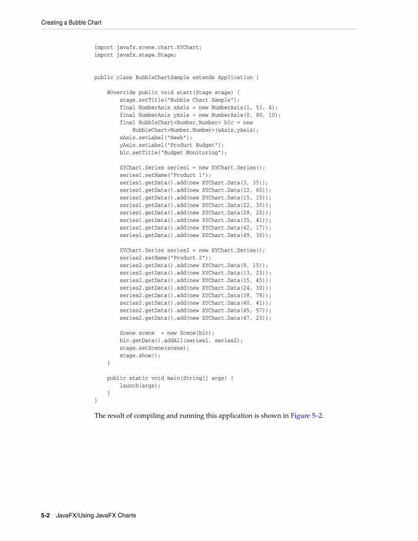
Creating a Bubble Chart
import javafx.scene.chart.XYChart;import javafx.stage.Stage; public class BubbleChartSample extends Application { @Override public void start(Stage stage) { stage.setTitle("Bubble Chart Sample"); final NumberAxis xAxis = new NumberAxis(1, 53, 4); final NumberAxis yAxis = new NumberAxis(0, 80, 10); final BubbleChart<Number,Number> blc = new BubbleChart<Number,Number>(xAxis,yAxis); xAxis.setLabel("Week"); yAxis.setLabel("Product Budget"); blc.setTitle("Budget Monitoring"); XYChart.Series series1 = new XYChart.Series(); series1.setName("Product 1"); series1.getData().add(new XYChart.Data(3, 35)); series1.getData().add(new XYChart.Data(12, 60)); series1.getData().add(new XYChart.Data(15, 15)); series1.getData().add(new XYChart.Data(22, 30)); series1.getData().add(new XYChart.Data(28, 20)); series1.getData().add(new XYChart.Data(35, 41)); series1.getData().add(new XYChart.Data(42, 17)); series1.getData().add(new XYChart.Data(49, 30)); XYChart.Series series2 = new XYChart.Series(); series2.setName("Product 2"); series2.getData().add(new XYChart.Data(8, 15)); series2.getData().add(new XYChart.Data(13, 23)); series2.getData().add(new XYChart.Data(15, 45)); series2.getData().add(new XYChart.Data(24, 30)); series2.getData().add(new XYChart.Data(38, 78)); series2.getData().add(new XYChart.Data(40, 41)); series2.getData().add(new XYChart.Data(45, 57)); series2.getData().add(new XYChart.Data(47, 23)); Scene scene = new Scene(blc); blc.getData().addAll(series1, series2); stage.setScene(scene); stage.show(); } public static void main(String[] args) { launch(args); }}
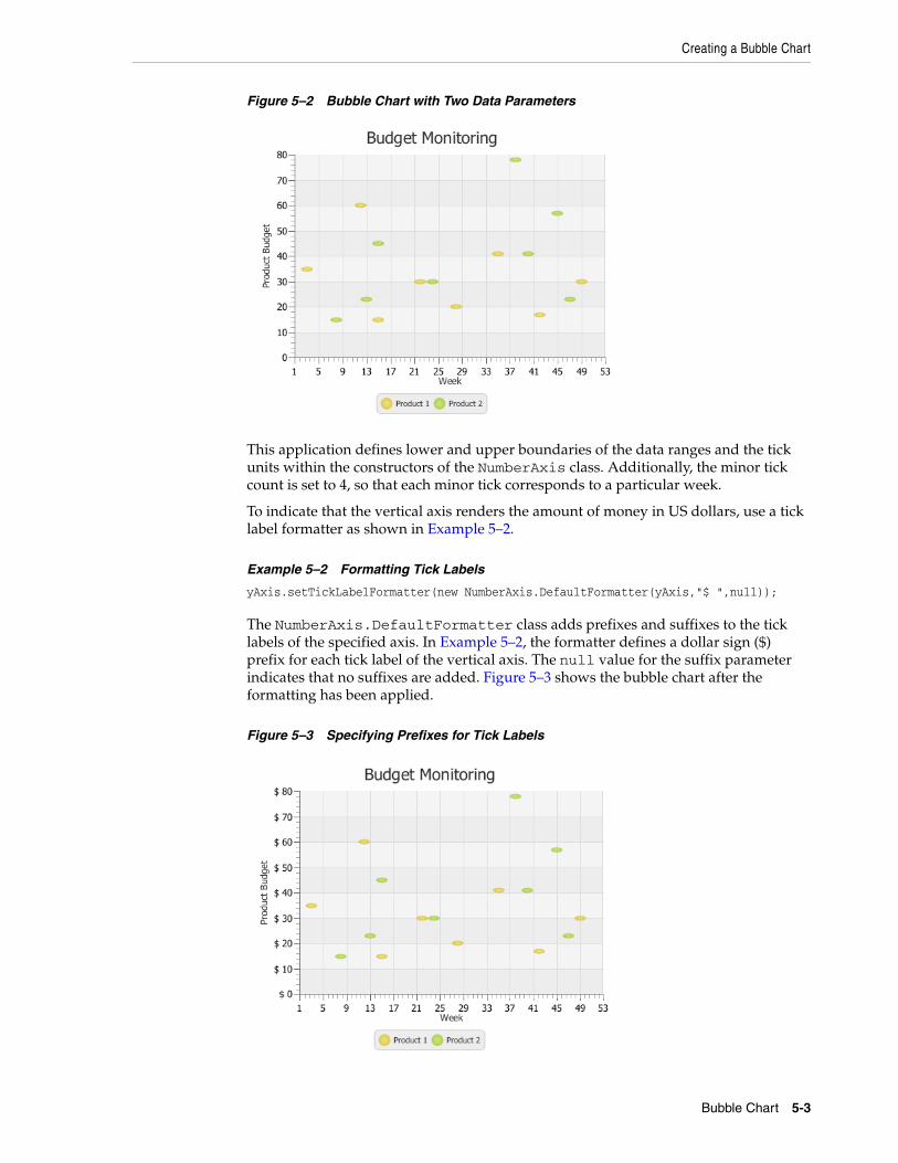
The result of compiling and running this application is shown in Figure 5–2.
5-2 JavaFX/Using JavaFX Charts
Creating a Bubble Chart
Figure 5–2 Bubble Chart with Two Data Parameters
This application defines lower and upper boundaries of the data ranges and the tick units within the constructors of the NumberAxis class. Additionally, the minor tick count is set to 4, so that each minor tick corresponds to a particular week.
To indicate that the vertical axis renders the amount of money in US dollars, use a tick label formatter as shown in Example 5–2.
Example 5–2 Formatting Tick Labels
yAxis.setTickLabelFormatter(new NumberAxis.DefaultFormatter(yAxis,"$ ",null));
The NumberAxis.DefaultFormatter class adds prefixes and suffixes to the tick labels of the specified axis. In Example 5–2, the formatter defines a dollar sign ($) prefix for each tick label of the vertical axis. The null value for the suffix parameter indicates that no suffixes are added. Figure 5–3 shows the bubble chart after the formatting has been applied.
Figure 5–3 Specifying Prefixes for Tick Labels
Bubble Chart 5-3
Using the Extra Value Property
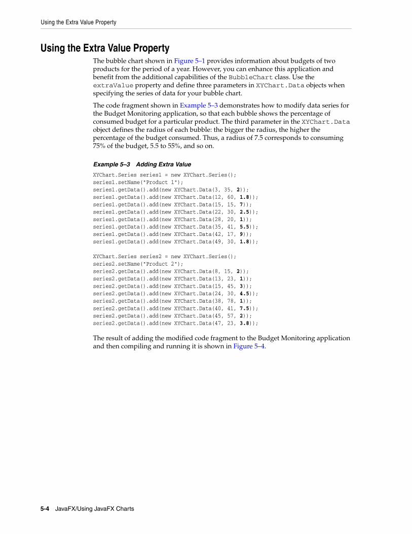
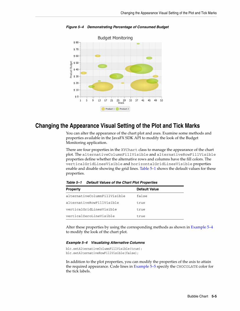
Using the Extra Value PropertyThe bubble chart shown in Figure 5–1 provides information about budgets of two products for the period of a year. However, you can enhance this application and benefit from the additional capabilities of the BubbleChart class. Use the extraValue property and define three parameters in XYChart.Data objects when specifying the series of data for your bubble chart.
The code fragment shown in Example 5–3 demonstrates how to modify data series for the Budget Monitoring application, so that each bubble shows the percentage of consumed budget for a particular product. The third parameter in the XYChart.Data object defines the radius of each bubble: the bigger the radius, the higher the percentage of the budget consumed. Thus, a radius of 7.5 corresponds to consuming 75% of the budget, 5.5 to 55%, and so on.
Example 5–3 Adding Extra Value
XYChart.Series series1 = new XYChart.Series();series1.setName("Product 1");series1.getData().add(new XYChart.Data(3, 35, 2));series1.getData().add(new XYChart.Data(12, 60, 1.8));series1.getData().add(new XYChart.Data(15, 15, 7));series1.getData().add(new XYChart.Data(22, 30, 2.5));series1.getData().add(new XYChart.Data(28, 20, 1));series1.getData().add(new XYChart.Data(35, 41, 5.5));series1.getData().add(new XYChart.Data(42, 17, 9));series1.getData().add(new XYChart.Data(49, 30, 1.8)); XYChart.Series series2 = new XYChart.Series();series2.setName("Product 2");series2.getData().add(new XYChart.Data(8, 15, 2));series2.getData().add(new XYChart.Data(13, 23, 1));series2.getData().add(new XYChart.Data(15, 45, 3));series2.getData().add(new XYChart.Data(24, 30, 4.5));series2.getData().add(new XYChart.Data(38, 78, 1));series2.getData().add(new XYChart.Data(40, 41, 7.5));series2.getData().add(new XYChart.Data(45, 57, 2));series2.getData().add(new XYChart.Data(47, 23, 3.8));
The result of adding the modified code fragment to the Budget Monitoring application and then compiling and running it is shown in Figure 5–4.
5-4 JavaFX/Using JavaFX Charts
Changing the Appearance Visual Setting of the Plot and Tick Marks
Figure 5–4 Demonstrating Percentage of Consumed Budget
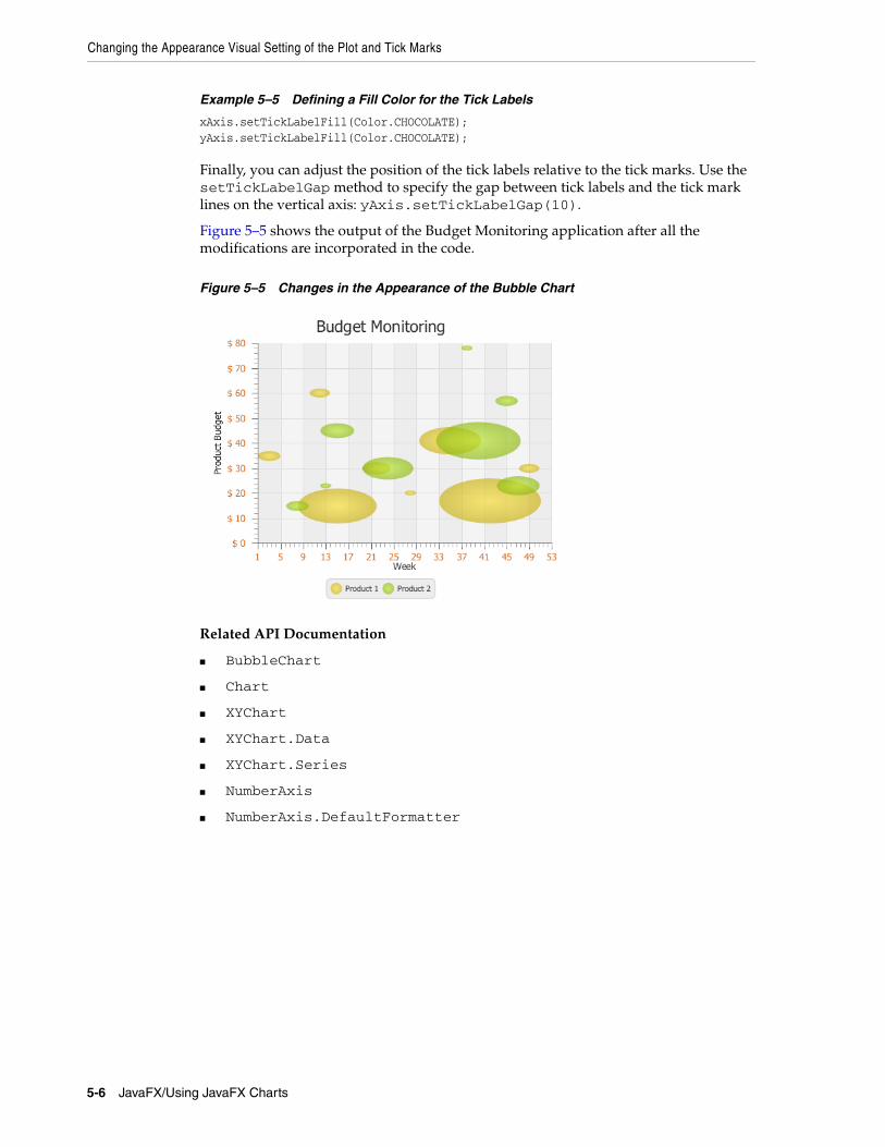
Changing the Appearance Visual Setting of the Plot and Tick MarksYou can alter the appearance of the chart plot and axes. Examine some methods and properties available in the JavaFX SDK API to modify the look of the Budget Monitoring application.
There are four properties in the XYChart class to manage the appearance of the chart plot. The alternativeColumnFillVisible and alternativeRowFillVisible properties define whether the alternative rows and columns have the fill colors. The verticalGridLinesVisible and horizontalGridLinesVisible properties enable and disable showing the grid lines. Table 5–1 shows the default values for these properties.
Alter these properties by using the corresponding methods as shown in Example 5–4 to modify the look of the chart plot.
Example 5–4 Visualizing Alternative Columns
blc.setAlternativeColumnFillVisible(true);blc.setAlternativeRowFillVisible(false);
In addition to the plot properties, you can modify the properties of the axis to attain the required appearance. Code lines in Example 5–5 specify the CHOCOLATE color for the tick labels.
Table 5–1 Default Values of the Chart Plot Properties
Property Default Value
alternativeColumnFillVisible false
alternativeRowFillVisible true
verticalGridLinesVisible true
verticalZeroLineVisible true
Bubble Chart 5-5
Changing the Appearance Visual Setting of the Plot and Tick Marks
Example 5–5 Defining a Fill Color for the Tick Labels
xAxis.setTickLabelFill(Color.CHOCOLATE);yAxis.setTickLabelFill(Color.CHOCOLATE);
Finally, you can adjust the position of the tick labels relative to the tick marks. Use the setTickLabelGap method to specify the gap between tick labels and the tick mark lines on the vertical axis: yAxis.setTickLabelGap(10).
Figure 5–5 shows the output of the Budget Monitoring application after all the modifications are incorporated in the code.
Figure 5–5 Changes in the Appearance of the Bubble Chart
Related API Documentation
■ BubbleChart
■ Chart
■ XYChart
■ XYChart.Data
■ XYChart.Series
■ NumberAxis
■ NumberAxis.DefaultFormatter
5-6 JavaFX/Using JavaFX Charts
6
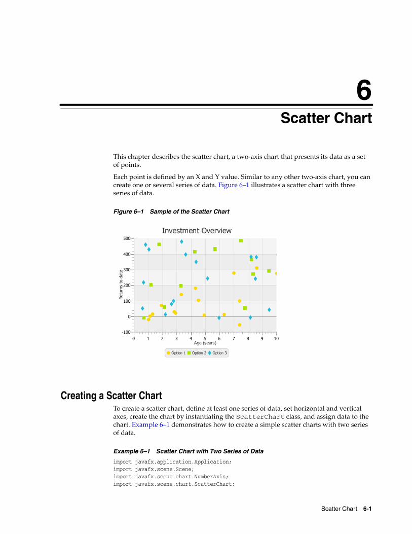
6Scatter ChartThis chapter describes the scatter chart, a two-axis chart that presents its data as a set of points.
Each point is defined by an X and Y value. Similar to any other two-axis chart, you can create one or several series of data. Figure 6–1 illustrates a scatter chart with three series of data.
Figure 6–1 Sample of the Scatter Chart
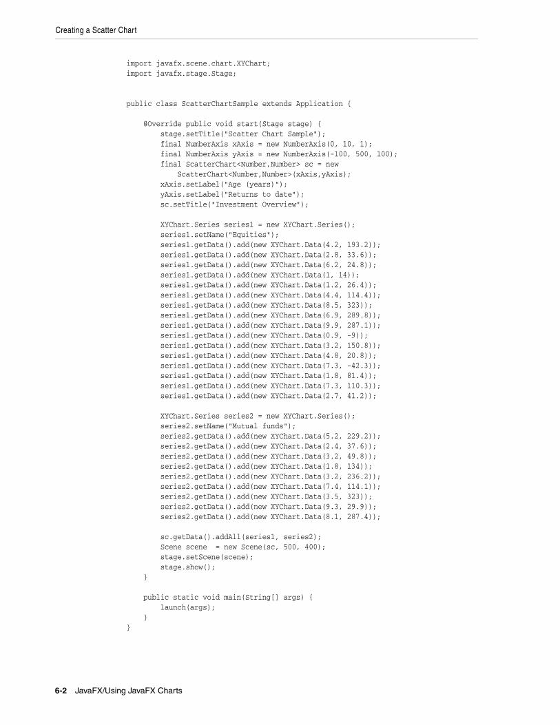
Creating a Scatter ChartTo create a scatter chart, define at least one series of data, set horizontal and vertical axes, create the chart by instantiating the ScatterChart class, and assign data to the chart. Example 6–1 demonstrates how to create a simple scatter charts with two series of data.
Example 6–1 Scatter Chart with Two Series of Data
import javafx.application.Application;import javafx.scene.Scene;import javafx.scene.chart.NumberAxis;import javafx.scene.chart.ScatterChart;
Scatter Chart 6-1
Creating a Scatter Chart
import javafx.scene.chart.XYChart;import javafx.stage.Stage; public class ScatterChartSample extends Application { @Override public void start(Stage stage) { stage.setTitle("Scatter Chart Sample"); final NumberAxis xAxis = new NumberAxis(0, 10, 1); final NumberAxis yAxis = new NumberAxis(-100, 500, 100); final ScatterChart<Number,Number> sc = new ScatterChart<Number,Number>(xAxis,yAxis); xAxis.setLabel("Age (years)"); yAxis.setLabel("Returns to date"); sc.setTitle("Investment Overview"); XYChart.Series series1 = new XYChart.Series(); series1.setName("Equities"); series1.getData().add(new XYChart.Data(4.2, 193.2)); series1.getData().add(new XYChart.Data(2.8, 33.6)); series1.getData().add(new XYChart.Data(6.2, 24.8)); series1.getData().add(new XYChart.Data(1, 14)); series1.getData().add(new XYChart.Data(1.2, 26.4)); series1.getData().add(new XYChart.Data(4.4, 114.4)); series1.getData().add(new XYChart.Data(8.5, 323)); series1.getData().add(new XYChart.Data(6.9, 289.8)); series1.getData().add(new XYChart.Data(9.9, 287.1)); series1.getData().add(new XYChart.Data(0.9, -9)); series1.getData().add(new XYChart.Data(3.2, 150.8)); series1.getData().add(new XYChart.Data(4.8, 20.8)); series1.getData().add(new XYChart.Data(7.3, -42.3)); series1.getData().add(new XYChart.Data(1.8, 81.4)); series1.getData().add(new XYChart.Data(7.3, 110.3)); series1.getData().add(new XYChart.Data(2.7, 41.2)); XYChart.Series series2 = new XYChart.Series(); series2.setName("Mutual funds"); series2.getData().add(new XYChart.Data(5.2, 229.2)); series2.getData().add(new XYChart.Data(2.4, 37.6)); series2.getData().add(new XYChart.Data(3.2, 49.8)); series2.getData().add(new XYChart.Data(1.8, 134)); series2.getData().add(new XYChart.Data(3.2, 236.2)); series2.getData().add(new XYChart.Data(7.4, 114.1)); series2.getData().add(new XYChart.Data(3.5, 323)); series2.getData().add(new XYChart.Data(9.3, 29.9)); series2.getData().add(new XYChart.Data(8.1, 287.4)); sc.getData().addAll(series1, series2); Scene scene = new Scene(sc, 500, 400); stage.setScene(scene); stage.show(); } public static void main(String[] args) { launch(args); }}
6-2 JavaFX/Using JavaFX Charts
Managing Chart Data
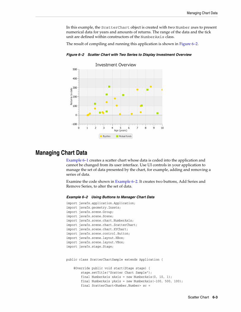
In this example, the ScatterChart object is created with two Number axes to present numerical data for years and amounts of returns. The range of the data and the tick unit are defined within constructors of the NumberAxis class.
The result of compiling and running this application is shown in Figure 6–2.
Figure 6–2 Scatter Chart with Two Series to Display Investment Overview
Managing Chart DataExample 6–1 creates a scatter chart whose data is coded into the application and cannot be changed from its user interface. Use UI controls in your application to manage the set of data presented by the chart, for example, adding and removing a series of data.
Examine the code shown in Example 6–2. It creates two buttons, Add Series and Remove Series, to alter the set of data.
Example 6–2 Using Buttons to Manager Chart Data
import javafx.application.Application;import javafx.geometry.Insets;import javafx.scene.Group;import javafx.scene.Scene;import javafx.scene.chart.NumberAxis;import javafx.scene.chart.ScatterChart;import javafx.scene.chart.XYChart;import javafx.scene.control.Button;import javafx.scene.layout.HBox;import javafx.scene.layout.VBox;import javafx.stage.Stage; public class ScatterChartSample extends Application { @Override public void start(Stage stage) { stage.setTitle("Scatter Chart Sample"); final NumberAxis xAxis = new NumberAxis(0, 10, 1); final NumberAxis yAxis = new NumberAxis(-100, 500, 100); final ScatterChart<Number,Number> sc =
Scatter Chart 6-3
Managing Chart Data
new ScatterChart<Number,Number>(xAxis,yAxis); xAxis.setLabel("Age (years)"); yAxis.setLabel("Returns to date"); sc.setTitle("Investment Overview"); XYChart.Series series1 = new XYChart.Series(); series1.setName("Option 1"); series1.getData().add(new XYChart.Data(4.2, 193.2)); series1.getData().add(new XYChart.Data(2.8, 33.6)); series1.getData().add(new XYChart.Data(6.2, 24.8)); series1.getData().add(new XYChart.Data(1, 14)); series1.getData().add(new XYChart.Data(1.2, 26.4)); series1.getData().add(new XYChart.Data(4.4, 114.4)); series1.getData().add(new XYChart.Data(8.5, 323)); series1.getData().add(new XYChart.Data(6.9, 289.8)); series1.getData().add(new XYChart.Data(9.9, 287.1)); series1.getData().add(new XYChart.Data(0.9, -9)); series1.getData().add(new XYChart.Data(3.2, 150.8)); series1.getData().add(new XYChart.Data(4.8, 20.8)); series1.getData().add(new XYChart.Data(7.3, -42.3)); series1.getData().add(new XYChart.Data(1.8, 81.4)); series1.getData().add(new XYChart.Data(7.3, 110.3)); series1.getData().add(new XYChart.Data(2.7, 41.2)); sc.setPrefSize(500, 400); sc.getData().addAll(series1); Scene scene = new Scene(new Group()); final VBox vbox = new VBox(); final HBox hbox = new HBox(); final Button add = new Button("Add Series"); final Button remove = new Button("Remove Series"); hbox.setSpacing(10); hbox.getChildren().addAll(add, remove); vbox.getChildren().addAll(sc, hbox); hbox.setPadding(new Insets(10, 10, 10, 50)); ((Group)scene.getRoot()).getChildren().add(vbox); stage.setScene(scene); stage.show(); } public static void main(String[] args) { launch(args); }}Whereas Example 6–1 adds the scatter chart directly to the scene, Example 6–2 uses VBox and HBox layout containers to arrange components in the application scene.
Define the setOnAction methods for the Add Series button as shown in Example 6–3. It creates a new series of data by populating the XYChart.Series objects with randomly calculated values. Each new series is assigned to the chart by using the add(series) method.
Example 6–3 Adding Series of Data
add.setOnAction(new EventHandler<ActionEvent>() {
6-4 JavaFX/Using JavaFX Charts
Managing Chart Data
@Override public void handle(ActionEvent e) { if (sc.getData() == null) sc.setData( FXCollections.<XYChart.Series<Number, Number>>observableArrayList()); ScatterChart.Series<Number, Number> series = new ScatterChart.Series<Number, Number>(); series.setName("Option "+(sc.getData().size()+1)); for (int i=0; i<100; i++) series.getData().add( new ScatterChart.Data<Number, Number>(Math.random()*100, Math.random()*500)); sc.getData().add(series); }});
To remove a data series from the chart, define the setOnAction method for the Remove Series button as shown in Example 6–4. The remove(int) method called on the scatter chart removes a series of data by using a randomly generated index.
Example 6–4 Removing Series of Data
remove.setOnAction(new EventHandler<ActionEvent>() { @Override public void handle(ActionEvent e) { if (!sc.getData().isEmpty()) sc.getData().remove((int)(Math.random()*(sc.getData().size()-1))); }});
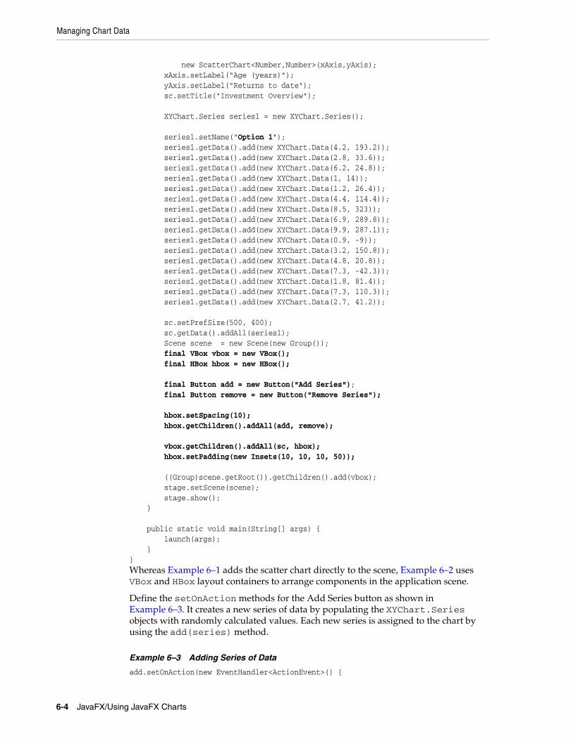
When you add Example 6–3 and Example 6–4 into the application in Example 6–2, the output shown in Figure 6–3 appears. It captures the moment when five series are added to the Option 1 series.
Figure 6–3 Added Series of Data
The symbols used to indicate a series of data are coded into the implementation of the ScatterChart class. Example 6–5 shows the default styles for one of the scatter chart symbols.
Scatter Chart 6-5
Adding Effects to Charts
Example 6–5 Styling a ScatterChart Symbol
.default-color5.chart-symbol { /* hollow circle */ -fx-background-color: #860061, white; -fx-background-insets: 0, 2; -fx-background-radius: 5px; -fx-padding: 5px;}
You can change the styles for this symbol by setting the alternative values for the .default-color5.chart-symbol property. See the JavaFX CSS Reference Guide for more information.
Adding Effects to ChartsAll the chart classes available in the javafx.scene.chart are extensions of the Node class. Therefore, you can apply visual effects or transformation to every type of charts. Examine the code fragment in Example 6–6. It creates and applies a drop shadow effect to the scatter chart.
Example 6–6 Creating and Applying a Drop Shadow
final DropShadow shadow = new DropShadow();shadow.setOffsetX(2);shadow.setColor(Color.GREY);sc.setEffect(shadow);
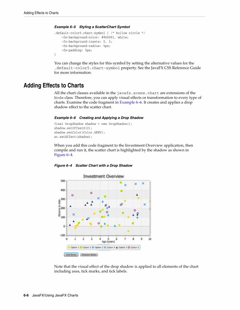
When you add this code fragment to the Investment Overview application, then compile and run it, the scatter chart is highlighted by the shadow as shown in Figure 6–4.
Figure 6–4 Scatter Chart with a Drop Shadow
Note that the visual effect of the drop shadow is applied to all elements of the chart including axes, tick marks, and tick labels.
6-6 JavaFX/Using JavaFX Charts
Changing the Chart Symbol
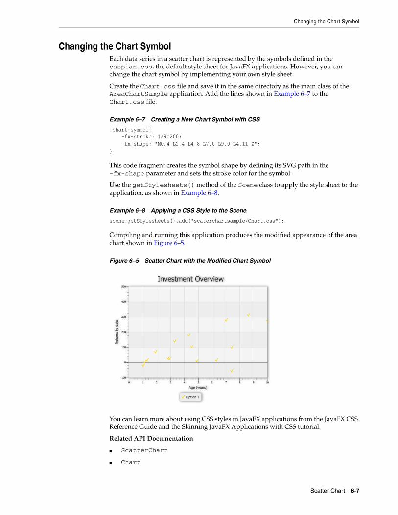
Changing the Chart SymbolEach data series in a scatter chart is represented by the symbols defined in the caspian.css, the default style sheet for JavaFX applications. However, you can change the chart symbol by implementing your own style sheet.
Create the Chart.css file and save it in the same directory as the main class of the AreaChartSample application. Add the lines shown in Example 6–7 to the Chart.css file.
Example 6–7 Creating a New Chart Symbol with CSS
.chart-symbol{ -fx-stroke: #a9e200; -fx-shape: "M0,4 L2,4 L4,8 L7,0 L9,0 L4,11 Z";}
This code fragment creates the symbol shape by defining its SVG path in the -fx-shape parameter and sets the stroke color for the symbol.
Use the getStylesheets() method of the Scene class to apply the style sheet to the application, as shown in Example 6–8.
Example 6–8 Applying a CSS Style to the Scene
scene.getStylesheets().add("scaterchartsample/Chart.css");
Compiling and running this application produces the modified appearance of the area chart shown in Figure 6–5.
Figure 6–5 Scatter Chart with the Modified Chart Symbol
You can learn more about using CSS styles in JavaFX applications from the JavaFX CSS Reference Guide and the Skinning JavaFX Applications with CSS tutorial.
Related API Documentation
■ ScatterChart
■ Chart
Scatter Chart 6-7
Changing the Chart Symbol
■ XYChart
■ XYChart.Data
■ XYChart.Series
■ NumberAxis
■ Button
6-8 JavaFX/Using JavaFX Charts
7
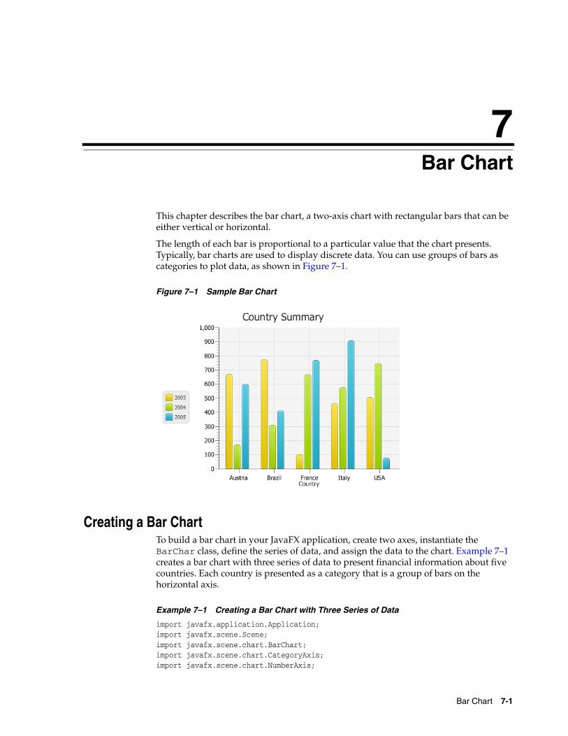
7Bar ChartThis chapter describes the bar chart, a two-axis chart with rectangular bars that can be either vertical or horizontal.
The length of each bar is proportional to a particular value that the chart presents. Typically, bar charts are used to display discrete data. You can use groups of bars as categories to plot data, as shown in Figure 7–1.
Figure 7–1 Sample Bar Chart
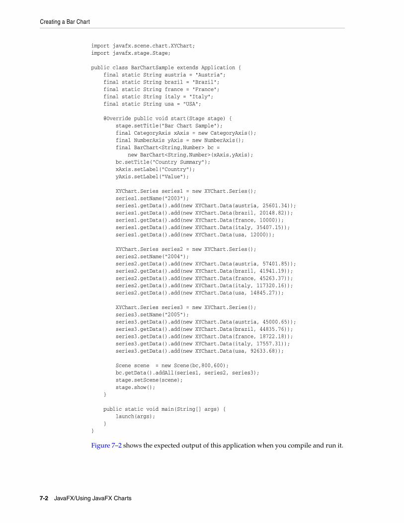
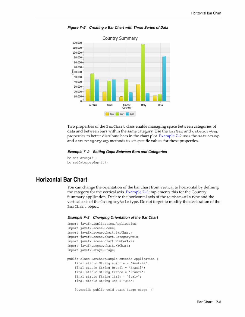
Creating a Bar ChartTo build a bar chart in your JavaFX application, create two axes, instantiate the BarChar class, define the series of data, and assign the data to the chart. Example 7–1 creates a bar chart with three series of data to present financial information about five countries. Each country is presented as a category that is a group of bars on the horizontal axis.
Example 7–1 Creating a Bar Chart with Three Series of Data
import javafx.application.Application;import javafx.scene.Scene;import javafx.scene.chart.BarChart;import javafx.scene.chart.CategoryAxis;import javafx.scene.chart.NumberAxis;
Bar Chart 7-1
Creating a Bar Chart
import javafx.scene.chart.XYChart;import javafx.stage.Stage; public class BarChartSample extends Application { final static String austria = "Austria"; final static String brazil = "Brazil"; final static String france = "France"; final static String italy = "Italy"; final static String usa = "USA"; @Override public void start(Stage stage) { stage.setTitle("Bar Chart Sample"); final CategoryAxis xAxis = new CategoryAxis(); final NumberAxis yAxis = new NumberAxis(); final BarChart<String,Number> bc = new BarChart<String,Number>(xAxis,yAxis); bc.setTitle("Country Summary"); xAxis.setLabel("Country"); yAxis.setLabel("Value"); XYChart.Series series1 = new XYChart.Series(); series1.setName("2003"); series1.getData().add(new XYChart.Data(austria, 25601.34)); series1.getData().add(new XYChart.Data(brazil, 20148.82)); series1.getData().add(new XYChart.Data(france, 10000)); series1.getData().add(new XYChart.Data(italy, 35407.15)); series1.getData().add(new XYChart.Data(usa, 12000)); XYChart.Series series2 = new XYChart.Series(); series2.setName("2004"); series2.getData().add(new XYChart.Data(austria, 57401.85)); series2.getData().add(new XYChart.Data(brazil, 41941.19)); series2.getData().add(new XYChart.Data(france, 45263.37)); series2.getData().add(new XYChart.Data(italy, 117320.16)); series2.getData().add(new XYChart.Data(usa, 14845.27)); XYChart.Series series3 = new XYChart.Series(); series3.setName("2005"); series3.getData().add(new XYChart.Data(austria, 45000.65)); series3.getData().add(new XYChart.Data(brazil, 44835.76)); series3.getData().add(new XYChart.Data(france, 18722.18)); series3.getData().add(new XYChart.Data(italy, 17557.31)); series3.getData().add(new XYChart.Data(usa, 92633.68)); Scene scene = new Scene(bc,800,600); bc.getData().addAll(series1, series2, series3); stage.setScene(scene); stage.show(); } public static void main(String[] args) { launch(args); }}
Figure 7–2 shows the expected output of this application when you compile and run it.
7-2 JavaFX/Using JavaFX Charts
Horizontal Bar Chart
Figure 7–2 Creating a Bar Chart with Three Series of Data
Two properties of the BarChart class enable managing space between categories of data and between bars within the same category. Use the barGap and categoryGap properties to better distribute bars in the chart plot. Example 7–2 uses the setBarGap and setCategoryGap methods to set specific values for these properties.
Example 7–2 Setting Gaps Between Bars and Categories
bc.setBarGap(3);bc.setCategoryGap(20);
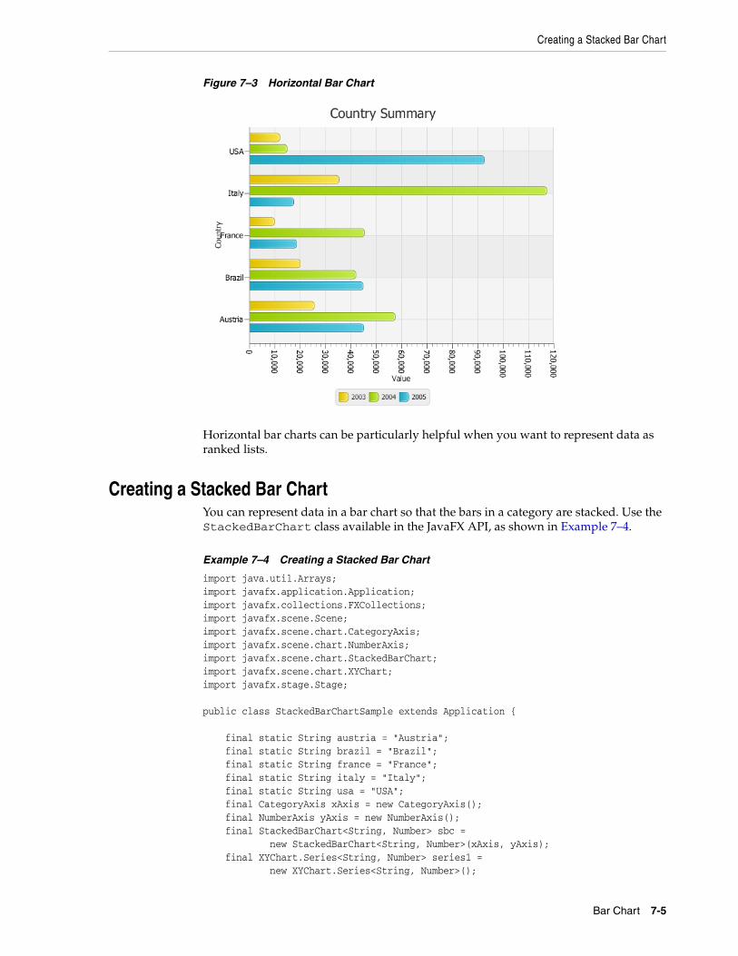
Horizontal Bar ChartYou can change the orientation of the bar chart from vertical to horizontal by defining the category for the vertical axis. Example 7–3 implements this for the Country Summary application. Declare the horizontal axis of the NumberAxis type and the vertical axis of the CategoryAxis type. Do not forget to modify the declaration of the BarChart object.
Example 7–3 Changing Orientation of the Bar Chart
import javafx.application.Application;import javafx.scene.Scene;import javafx.scene.chart.BarChart;import javafx.scene.chart.CategoryAxis;import javafx.scene.chart.NumberAxis;import javafx.scene.chart.XYChart;import javafx.stage.Stage; public class BarChartSample extends Application { final static String austria = "Austria"; final static String brazil = "Brazil"; final static String france = "France"; final static String italy = "Italy"; final static String usa = "USA"; @Override public void start(Stage stage) {
Bar Chart 7-3
Horizontal Bar Chart
stage.setTitle("Bar Chart Sample"); final NumberAxis xAxis = new NumberAxis(); final CategoryAxis yAxis = new CategoryAxis(); final BarChart<Number,String> bc = new BarChart<Number,String>(xAxis,yAxis); bc.setTitle("Country Summary"); xAxis.setLabel("Value"); xAxis.setTickLabelRotation(90); yAxis.setLabel("Country"); XYChart.Series series1 = new XYChart.Series(); series1.setName("2003"); series1.getData().add(new XYChart.Data(25601.34, austria)); series1.getData().add(new XYChart.Data(20148.82, brazil)); series1.getData().add(new XYChart.Data(10000, france)); series1.getData().add(new XYChart.Data(35407.15, italy)); series1.getData().add(new XYChart.Data(12000, usa)); XYChart.Series series2 = new XYChart.Series(); series2.setName("2004"); series2.getData().add(new XYChart.Data(57401.85, austria)); series2.getData().add(new XYChart.Data(41941.19, brazil)); series2.getData().add(new XYChart.Data(45263.37, france)); series2.getData().add(new XYChart.Data(117320.16, italy)); series2.getData().add(new XYChart.Data(14845.27, usa)); XYChart.Series series3 = new XYChart.Series(); series3.setName("2005"); series3.getData().add(new XYChart.Data(45000.65, austria)); series3.getData().add(new XYChart.Data(44835.76, brazil)); series3.getData().add(new XYChart.Data(18722.18, france)); series3.getData().add(new XYChart.Data(17557.31, italy)); series3.getData().add(new XYChart.Data(92633.68, usa)); Scene scene = new Scene(bc,800,600); bc.getData().addAll(series1, series2, series3); stage.setScene(scene); stage.show(); } public static void main(String[] args) { launch(args); }}
Note that the setTickLabelRotation method is called on the horizontal axis to rotate labels and make the value captions easier to read.
The result of compiling and running the modified application is shown in Figure 7–3.
7-4 JavaFX/Using JavaFX Charts
Creating a Stacked Bar Chart
Figure 7–3 Horizontal Bar Chart
Horizontal bar charts can be particularly helpful when you want to represent data as ranked lists.
Creating a Stacked Bar ChartYou can represent data in a bar chart so that the bars in a category are stacked. Use the StackedBarChart class available in the JavaFX API, as shown in Example 7–4.
Example 7–4 Creating a Stacked Bar Chart
import java.util.Arrays;import javafx.application.Application;import javafx.collections.FXCollections;import javafx.scene.Scene;import javafx.scene.chart.CategoryAxis;import javafx.scene.chart.NumberAxis;import javafx.scene.chart.StackedBarChart;import javafx.scene.chart.XYChart;import javafx.stage.Stage; public class StackedBarChartSample extends Application { final static String austria = "Austria"; final static String brazil = "Brazil"; final static String france = "France"; final static String italy = "Italy"; final static String usa = "USA"; final CategoryAxis xAxis = new CategoryAxis(); final NumberAxis yAxis = new NumberAxis(); final StackedBarChart<String, Number> sbc = new StackedBarChart<String, Number>(xAxis, yAxis); final XYChart.Series<String, Number> series1 = new XYChart.Series<String, Number>();
Bar Chart 7-5
Creating a Stacked Bar Chart
final XYChart.Series<String, Number> series2 = new XYChart.Series<String, Number>(); final XYChart.Series<String, Number> series3 = new XYChart.Series<String, Number>(); @Override public void start(Stage stage) { stage.setTitle("Bar Chart Sample"); sbc.setTitle("Country Summary"); xAxis.setLabel("Country"); xAxis.setCategories(FXCollections.<String>observableArrayList( Arrays.asList(austria, brazil, france, italy, usa))); yAxis.setLabel("Value"); series1.setName("2003"); series1.getData().add(new XYChart.Data<String, Number>(austria, 25601.34)); series1.getData().add(new XYChart.Data<String, Number>(brazil, 20148.82)); series1.getData().add(new XYChart.Data<String, Number>(france, 10000)); series1.getData().add(new XYChart.Data<String, Number>(italy, 35407.15)); series1.getData().add(new XYChart.Data<String, Number>(usa, 12000)); series2.setName("2004"); series2.getData().add(new XYChart.Data<String, Number>(austria, 57401.85)); series2.getData().add(new XYChart.Data<String, Number>(brazil, 41941.19)); series2.getData().add(new XYChart.Data<String, Number>(france, 45263.37)); series2.getData().add(new XYChart.Data<String, Number>(italy, 117320.16)); series2.getData().add(new XYChart.Data<String, Number>(usa, 14845.27)); series3.setName("2005"); series3.getData().add(new XYChart.Data<String, Number>(austria, 45000.65)); series3.getData().add(new XYChart.Data<String, Number>(brazil, 44835.76)); series3.getData().add(new XYChart.Data<String, Number>(france, 18722.18)); series3.getData().add(new XYChart.Data<String, Number>(italy, 17557.31)); series3.getData().add(new XYChart.Data<String, Number>(usa, 92633.68)); Scene scene = new Scene(sbc, 800, 600); sbc.getData().addAll(series1, series2, series3); stage.setScene(scene); stage.show(); } public static void main(String[] args) { launch(args); }}
When you define axes for a stacked bar chart in your application, you must explicitly assign the categories of data to a particular axis. In Example 7–4, the categories are assigned to the horizontal axis by using the setCategories method. The bar chart produced by this application is shown in Figure 7–4.
7-6 JavaFX/Using JavaFX Charts
Creating a Stacked Bar Chart
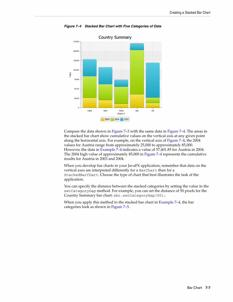
Figure 7–4 Stacked Bar Chart with Five Categories of Data
Compare the data shown in Figure 7–3 with the same data in Figure 7–4. The areas in the stacked bar chart show cumulative values on the vertical axis at any given point along the horizontal axis. For example, on the vertical axis of Figure 7–4, the 2004 values for Austria range from approximately 25,000 to approximately 85,000. However, the data in Example 7–4 indicates a value of 57,401.85 for Austria in 2004. The 2004 high value of approximately 85,000 in Figure 7–4 represents the cumulative results for Austria in 2003 and 2004.
When you develop bar charts in your JavaFX application, remember that data on the vertical axes are interpreted differently for a BarChart than for a StackedBarChart. Choose the type of chart that best illustrates the task of the application.
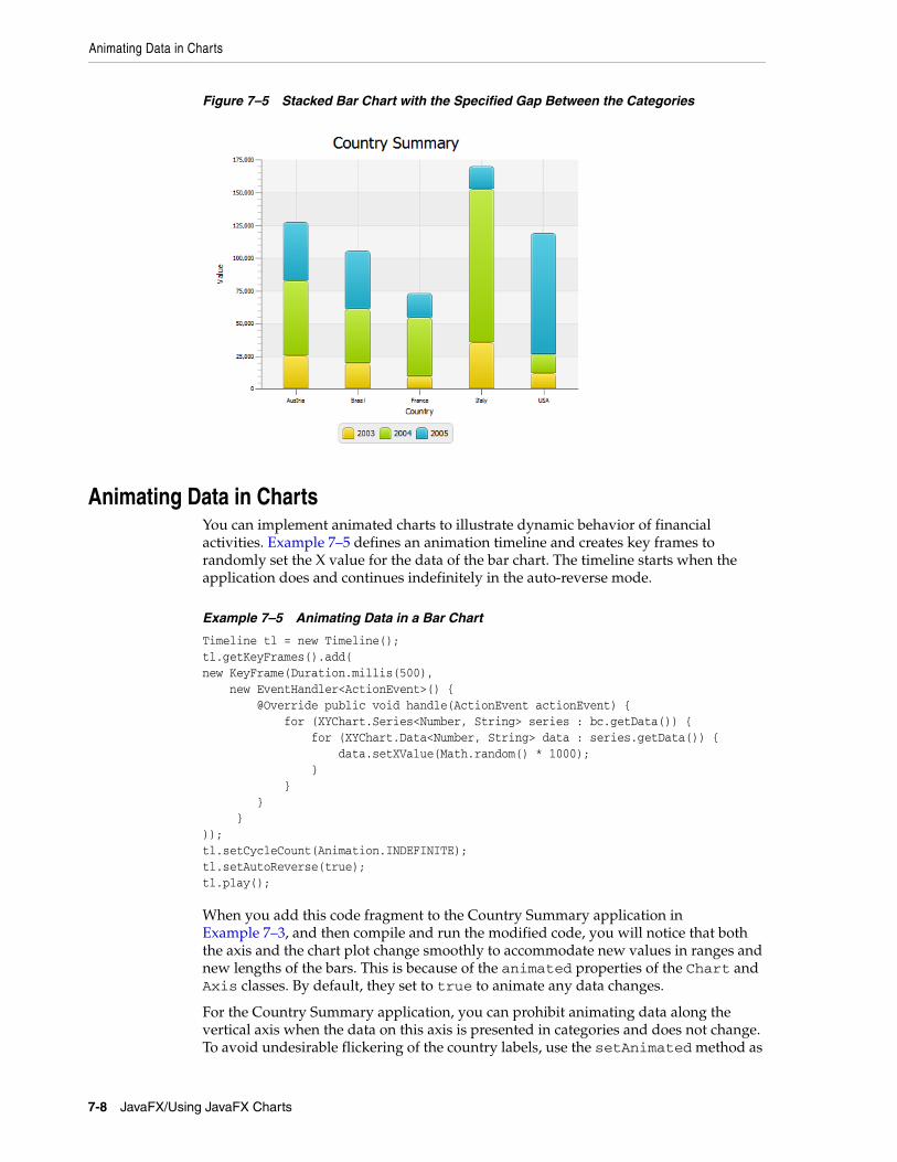
You can specify the distance between the stacked categories by setting the value in the setCategoryGap method. For example, you can set the distance of 50 pixels for the Country Summary bar chart: sbc.setCategoryGap(50);
When you apply this method to the stacked bar chart in Example 7–4, the bar categories look as shown in Figure 7–5.
Bar Chart 7-7
Animating Data in Charts
Figure 7–5 Stacked Bar Chart with the Specified Gap Between the Categories
Animating Data in ChartsYou can implement animated charts to illustrate dynamic behavior of financial activities. Example 7–5 defines an animation timeline and creates key frames to randomly set the X value for the data of the bar chart. The timeline starts when the application does and continues indefinitely in the auto-reverse mode.
Example 7–5 Animating Data in a Bar Chart
Timeline tl = new Timeline();tl.getKeyFrames().add(new KeyFrame(Duration.millis(500), new EventHandler<ActionEvent>() { @Override public void handle(ActionEvent actionEvent) { for (XYChart.Series<Number, String> series : bc.getData()) { for (XYChart.Data<Number, String> data : series.getData()) { data.setXValue(Math.random() * 1000); } } } }));tl.setCycleCount(Animation.INDEFINITE);tl.setAutoReverse(true);tl.play();
When you add this code fragment to the Country Summary application in Example 7–3, and then compile and run the modified code, you will notice that both the axis and the chart plot change smoothly to accommodate new values in ranges and new lengths of the bars. This is because of the animated properties of the Chart and Axis classes. By default, they set to true to animate any data changes.
For the Country Summary application, you can prohibit animating data along the vertical axis when the data on this axis is presented in categories and does not change. To avoid undesirable flickering of the country labels, use the setAnimated method as
7-8 JavaFX/Using JavaFX Charts
Animating Data in Charts
shown in Example 7–6.
Example 7–6 Managing Animation of Data Changes
yAxis.setAnimated(false);
See the Ensemble application and the API documentation for more information about the features and capabilities of JavaFX charts.
Related API Documentation
■ BarChart
■ Chart
■ XYChart
■ XYChart.Data
■ XYChart.Series
■ Axis
■ NumberAxis
■ CategoryAxis
■ Timeline
■ KeyFrame
Bar Chart 7-9

Animating Data in Charts
7-10 JavaFX/Using JavaFX Charts
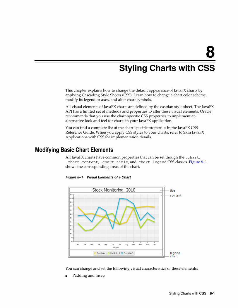
8
8Styling Charts with CSSThis chapter explains how to change the default appearance of JavaFX charts by applying Cascading Style Sheets (CSS). Learn how to change a chart color scheme, modify its legend or axes, and alter chart symbols.
All visual elements of JavaFX charts are defined by the caspian style sheet. The JavaFX API has a limited set of methods and properties to alter these visual elements. Oracle recommends that you use the chart-specific CSS properties to implement an alternative look and feel for charts in your JavaFX application.
You can find a complete list of the chart-specific properties in the JavaFX CSS Reference Guide. When you apply CSS styles to your charts, refer to Skin JavaFX Applications with CSS for implementation details.
Modifying Basic Chart ElementsAll JavaFX charts have common properties that can be set though the .chart, .chart-content, .chart-title, and .chart-legend CSS classes. Figure 8–1 shows the corresponding areas of the chart.
Figure 8–1 Visual Elements of a Chart
You can change and set the following visual characteristics of these elements:
■ Padding and insets
Styling Charts with CSS 8-1
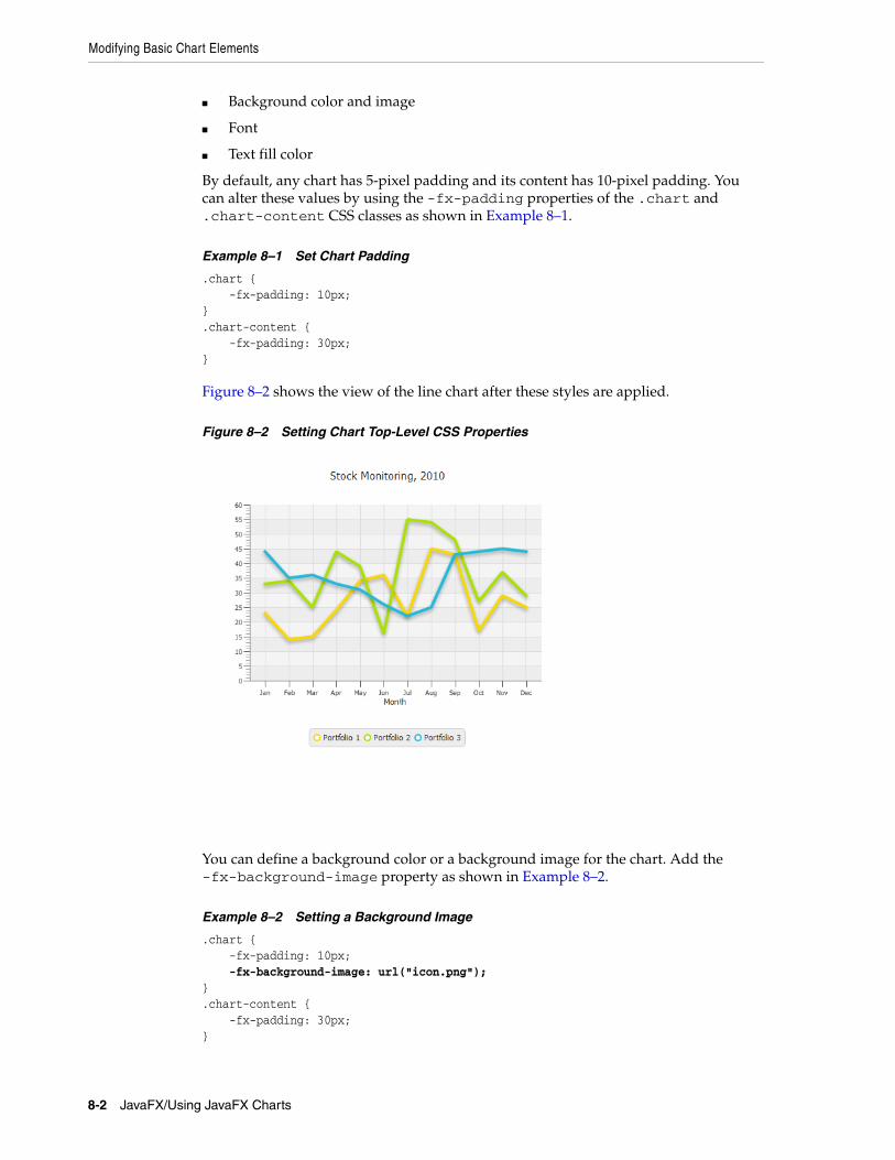
Modifying Basic Chart Elements
■ Background color and image
■ Font
■ Text fill color
By default, any chart has 5-pixel padding and its content has 10-pixel padding. You can alter these values by using the -fx-padding properties of the .chart and .chart-content CSS classes as shown in Example 8–1.
Example 8–1 Set Chart Padding
.chart { -fx-padding: 10px;}.chart-content { -fx-padding: 30px;}
Figure 8–2 shows the view of the line chart after these styles are applied.
Figure 8–2 Setting Chart Top-Level CSS Properties
You can define a background color or a background image for the chart. Add the -fx-background-image property as shown in Example 8–2.
Example 8–2 Setting a Background Image
.chart { -fx-padding: 10px; -fx-background-image: url("icon.png");}.chart-content { -fx-padding: 30px;}
8-2 JavaFX/Using JavaFX Charts
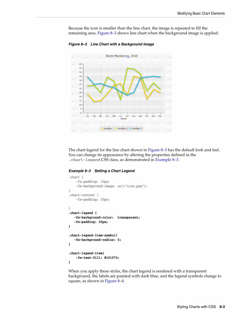
Modifying Basic Chart Elements
Because the icon is smaller than the line chart, the image is repeated to fill the remaining area. Figure 8–3 shows line chart when the background image is applied.
Figure 8–3 Line Chart with a Background Image
The chart legend for the line chart shown in Figure 8–3 has the default look and feel. You can change its appearance by altering the properties defined in the .chart-legend CSS class, as demonstrated in Example 8–3.
Example 8–3 Setting a Chart Legend
.chart { -fx-padding: 10px; -fx-background-image: url("icon.png");}.chart-content { -fx-padding: 30px; }.chart-legend { -fx-background-color: transparent; -fx-padding: 20px;} .chart-legend-item-symbol{ -fx-background-radius: 0;} .chart-legend-item{ -fx-text-fill: #191970;}
When you apply these styles, the chart legend is rendered with a transparent background, the labels are painted with dark blue, and the legend symbols change to square, as shown in Figure 8–4.
Styling Charts with CSS 8-3
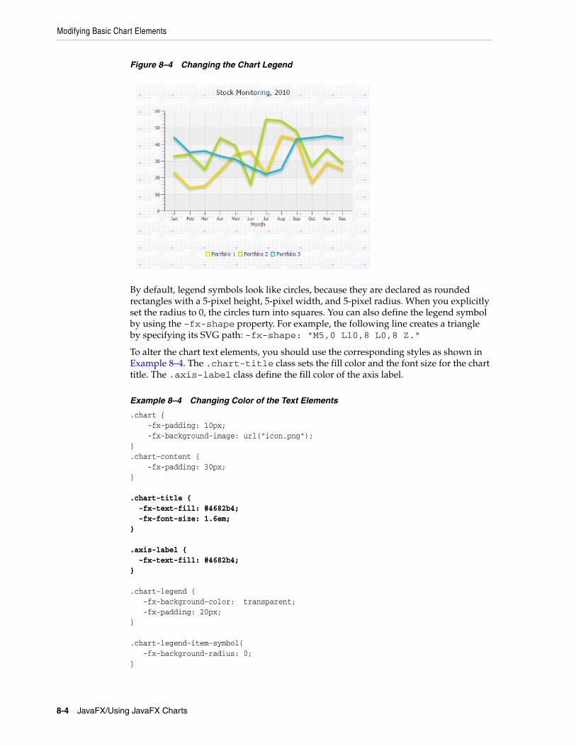
Modifying Basic Chart Elements
Figure 8–4 Changing the Chart Legend
By default, legend symbols look like circles, because they are declared as rounded rectangles with a 5-pixel height, 5-pixel width, and 5-pixel radius. When you explicitly set the radius to 0, the circles turn into squares. You can also define the legend symbol by using the -fx-shape property. For example, the following line creates a triangle by specifying its SVG path: -fx-shape: "M5,0 L10,8 L0,8 Z."
To alter the chart text elements, you should use the corresponding styles as shown in Example 8–4. The .chart-title class sets the fill color and the font size for the chart title. The .axis-label class define the fill color of the axis label.
Example 8–4 Changing Color of the Text Elements
.chart { -fx-padding: 10px; -fx-background-image: url("icon.png"); }.chart-content { -fx-padding: 30px; } .chart-title { -fx-text-fill: #4682b4; -fx-font-size: 1.6em;} .axis-label { -fx-text-fill: #4682b4;} .chart-legend { -fx-background-color: transparent; -fx-padding: 20px;} .chart-legend-item-symbol{ -fx-background-radius: 0;}
8-4 JavaFX/Using JavaFX Charts
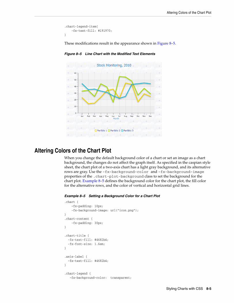
Altering Colors of the Chart Plot
.chart-legend-item{ -fx-text-fill: #191970;}
These modifications result in the appearance shown in Figure 8–5.
Figure 8–5 Line Chart with the Modified Text Elements
Altering Colors of the Chart PlotWhen you change the default background color of a chart or set an image as a chart background, the changes do not affect the graph itself. As specified in the caspian style sheet, the chart plot of a two-axis chart has a light gray background, and its alternative rows are gray. Use the -fx-background-color and -fx-background-image properties of the .chart-plot-background class to set the background for the chart plot. Example 8–5 defines the background color for the chart plot, the fill color for the alternative rows, and the color of vertical and horizontal grid lines.
Example 8–5 Setting a Background Color for a Chart Plot
.chart { -fx-padding: 10px; -fx-background-image: url("icon.png"); }.chart-content { -fx-padding: 30px; } .chart-title { -fx-text-fill: #4682b4; -fx-font-size: 1.6em;} .axis-label { -fx-text-fill: #4682b4;} .chart-legend { -fx-background-color: transparent;
Styling Charts with CSS 8-5
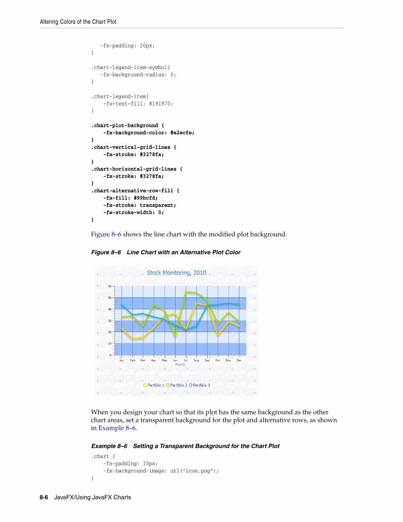
Altering Colors of the Chart Plot
-fx-padding: 20px;} .chart-legend-item-symbol{ -fx-background-radius: 0;} .chart-legend-item{ -fx-text-fill: #191970;} .chart-plot-background { -fx-background-color: #e2ecfe;}.chart-vertical-grid-lines { -fx-stroke: #3278fa;}.chart-horizontal-grid-lines { -fx-stroke: #3278fa;}.chart-alternative-row-fill { -fx-fill: #99bcfd; -fx-stroke: transparent; -fx-stroke-width: 0;}
Figure 8–6 shows the line chart with the modified plot background.
Figure 8–6 Line Chart with an Alternative Plot Color
When you design your chart so that its plot has the same background as the other chart areas, set a transparent background for the plot and alternative rows, as shown in Example 8–6.
Example 8–6 Setting a Transparent Background for the Chart Plot
.chart { -fx-padding: 10px; -fx-background-image: url("icon.png"); }
8-6 JavaFX/Using JavaFX Charts
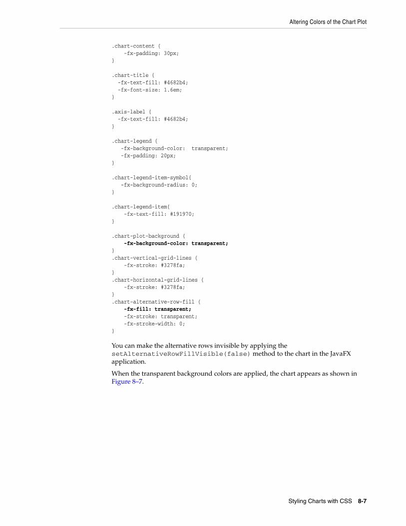
Altering Colors of the Chart Plot
.chart-content { -fx-padding: 30px; } .chart-title { -fx-text-fill: #4682b4; -fx-font-size: 1.6em;} .axis-label { -fx-text-fill: #4682b4;} .chart-legend { -fx-background-color: transparent; -fx-padding: 20px;} .chart-legend-item-symbol{ -fx-background-radius: 0;} .chart-legend-item{ -fx-text-fill: #191970;} .chart-plot-background { -fx-background-color: transparent;}.chart-vertical-grid-lines { -fx-stroke: #3278fa;}.chart-horizontal-grid-lines { -fx-stroke: #3278fa;}.chart-alternative-row-fill { -fx-fill: transparent; -fx-stroke: transparent; -fx-stroke-width: 0;}
You can make the alternative rows invisible by applying the setAlternativeRowFillVisible(false) method to the chart in the JavaFX application.
When the transparent background colors are applied, the chart appears as shown in Figure 8–7.
Styling Charts with CSS 8-7
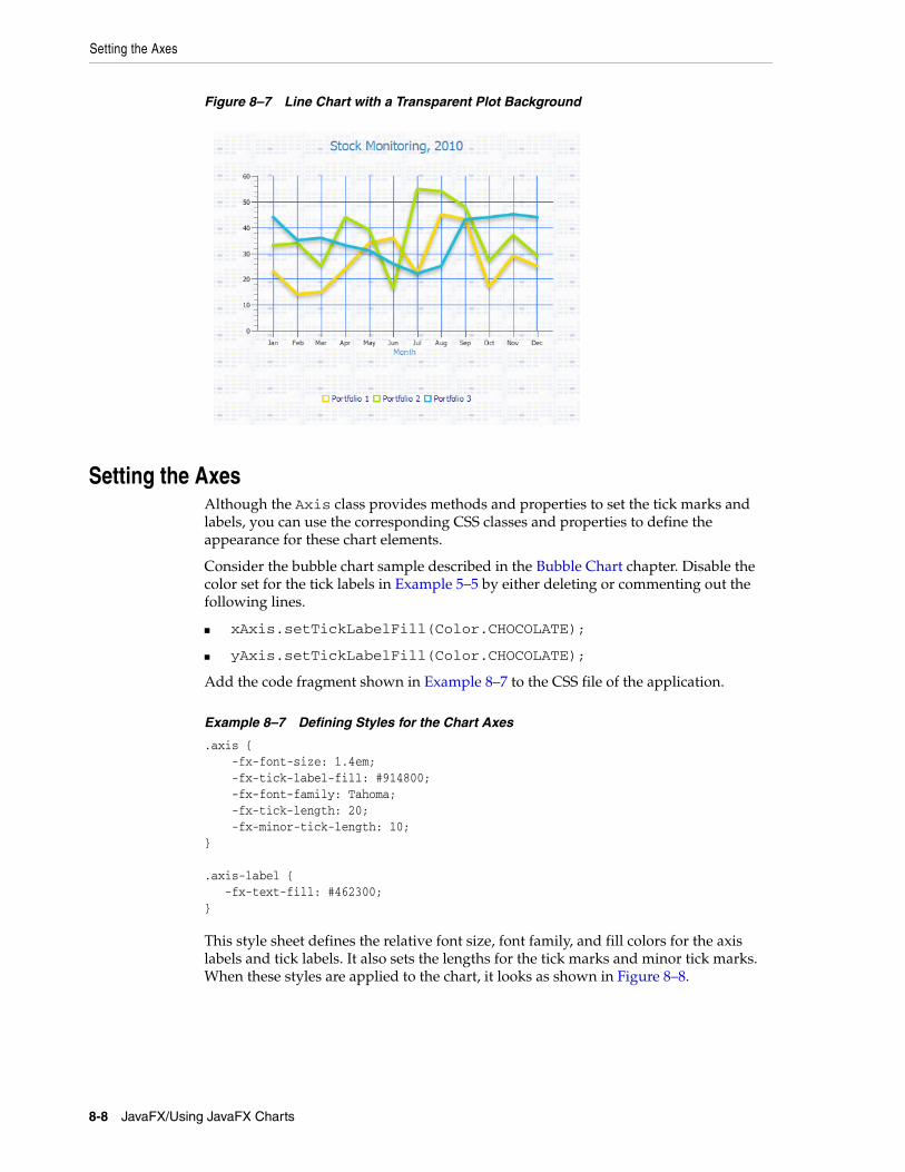
Setting the Axes
Figure 8–7 Line Chart with a Transparent Plot Background
Setting the AxesAlthough the Axis class provides methods and properties to set the tick marks and labels, you can use the corresponding CSS classes and properties to define the appearance for these chart elements.
Consider the bubble chart sample described in the Bubble Chart chapter. Disable the color set for the tick labels in Example 5–5 by either deleting or commenting out the following lines.
■ xAxis.setTickLabelFill(Color.CHOCOLATE);
■ yAxis.setTickLabelFill(Color.CHOCOLATE);
Add the code fragment shown in Example 8–7 to the CSS file of the application.
Example 8–7 Defining Styles for the Chart Axes
.axis { -fx-font-size: 1.4em; -fx-tick-label-fill: #914800; -fx-font-family: Tahoma; -fx-tick-length: 20; -fx-minor-tick-length: 10;} .axis-label { -fx-text-fill: #462300; }
This style sheet defines the relative font size, font family, and fill colors for the axis labels and tick labels. It also sets the lengths for the tick marks and minor tick marks. When these styles are applied to the chart, it looks as shown in Figure 8–8.
8-8 JavaFX/Using JavaFX Charts
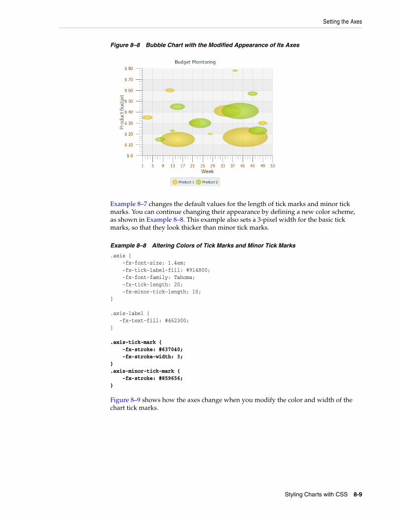
Setting the Axes
Figure 8–8 Bubble Chart with the Modified Appearance of Its Axes
Example 8–7 changes the default values for the length of tick marks and minor tick marks. You can continue changing their appearance by defining a new color scheme, as shown in Example 8–8. This example also sets a 3-pixel width for the basic tick marks, so that they look thicker than minor tick marks.
Example 8–8 Altering Colors of Tick Marks and Minor Tick Marks
.axis { -fx-font-size: 1.4em; -fx-tick-label-fill: #914800; -fx-font-family: Tahoma; -fx-tick-length: 20; -fx-minor-tick-length: 10;} .axis-label { -fx-text-fill: #462300; } .axis-tick-mark { -fx-stroke: #637040; -fx-stroke-width: 3; }.axis-minor-tick-mark { -fx-stroke: #859656;}
Figure 8–9 shows how the axes change when you modify the color and width of the chart tick marks.
Styling Charts with CSS 8-9
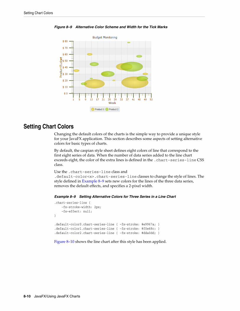
Setting Chart Colors
Figure 8–9 Alternative Color Scheme and Width for the Tick Marks
Setting Chart ColorsChanging the default colors of the charts is the simple way to provide a unique style for your JavaFX application. This section describes some aspects of setting alternative colors for basic types of charts.
By default, the caspian style sheet defines eight colors of line that correspond to the first eight series of data. When the number of data series added to the line chart exceeds eight, the color of the extra lines is defined in the .chart-series-line CSS class.
Use the .chart-series-line class and .default-color<x>.chart-series-line classes to change the style of lines. The style defined in Example 8–9 sets new colors for the lines of the three data series, removes the default effects, and specifies a 2-pixel width.
Example 8–9 Setting Alternative Colors for Three Series in a Line Chart
.chart-series-line { -fx-stroke-width: 2px; -fx-effect: null;} .default-color0.chart-series-line { -fx-stroke: #e9967a; }.default-color1.chart-series-line { -fx-stroke: #f0e68c; }.default-color2.chart-series-line { -fx-stroke: #dda0dd; }
Figure 8–10 shows the line chart after this style has been applied.
8-10 JavaFX/Using JavaFX Charts
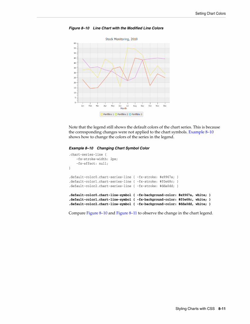
Setting Chart Colors
Figure 8–10 Line Chart with the Modified Line Colors
Note that the legend still shows the default colors of the chart series. This is because the corresponding changes were not applied to the chart symbols. Example 8–10 shows how to change the colors of the series in the legend.
Example 8–10 Changing Chart Symbol Color
.chart-series-line { -fx-stroke-width: 2px; -fx-effect: null;} .default-color0.chart-series-line { -fx-stroke: #e9967a; }.default-color1.chart-series-line { -fx-stroke: #f0e68c; }.default-color2.chart-series-line { -fx-stroke: #dda0dd; } .default-color0.chart-line-symbol { -fx-background-color: #e9967a, white; }.default-color1.chart-line-symbol { -fx-background-color: #f0e68c, white; }.default-color2.chart-line-symbol { -fx-background-color: #dda0dd, white; }
Compare Figure 8–10 and Figure 8–11 to observe the change in the chart legend.
Styling Charts with CSS 8-11
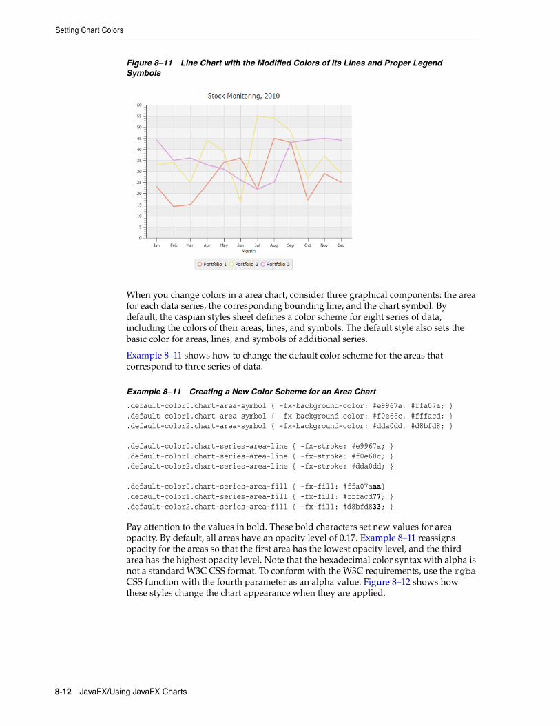
Setting Chart Colors
Figure 8–11 Line Chart with the Modified Colors of Its Lines and Proper Legend Symbols
When you change colors in a area chart, consider three graphical components: the area for each data series, the corresponding bounding line, and the chart symbol. By default, the caspian styles sheet defines a color scheme for eight series of data, including the colors of their areas, lines, and symbols. The default style also sets the basic color for areas, lines, and symbols of additional series.
Example 8–11 shows how to change the default color scheme for the areas that correspond to three series of data.
Example 8–11 Creating a New Color Scheme for an Area Chart
.default-color0.chart-area-symbol { -fx-background-color: #e9967a, #ffa07a; }
.default-color1.chart-area-symbol { -fx-background-color: #f0e68c, #fffacd; }
.default-color2.chart-area-symbol { -fx-background-color: #dda0dd, #d8bfd8; } .default-color0.chart-series-area-line { -fx-stroke: #e9967a; }.default-color1.chart-series-area-line { -fx-stroke: #f0e68c; }.default-color2.chart-series-area-line { -fx-stroke: #dda0dd; } .default-color0.chart-series-area-fill { -fx-fill: #ffa07aaa}.default-color1.chart-series-area-fill { -fx-fill: #fffacd77; }.default-color2.chart-series-area-fill { -fx-fill: #d8bfd833; }
Pay attention to the values in bold. These bold characters set new values for area opacity. By default, all areas have an opacity level of 0.17. Example 8–11 reassigns opacity for the areas so that the first area has the lowest opacity level, and the third area has the highest opacity level. Note that the hexadecimal color syntax with alpha is not a standard W3C CSS format. To conform with the W3C requirements, use the rgba CSS function with the fourth parameter as an alpha value. Figure 8–12 shows how these styles change the chart appearance when they are applied.
8-12 JavaFX/Using JavaFX Charts
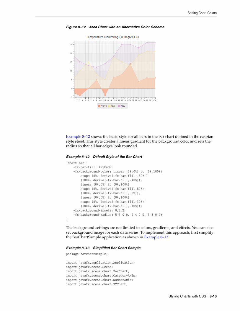
Setting Chart Colors
Figure 8–12 Area Chart with an Alternative Color Scheme
Example 8–12 shows the basic style for all bars in the bar chart defined in the caspian style sheet. This style creates a linear gradient for the background color and sets the radius so that all bar edges look rounded.
Example 8–12 Default Style of the Bar Chart
.chart-bar { -fx-bar-fill: #22bad9; -fx-background-color: linear (0%,0%) to (0%,100%) stops (0%, derive(-fx-bar-fill,-30%)) (100%, derive(-fx-bar-fill,-40%)), linear (0%,0%) to (0%,100%) stops (0%, derive(-fx-bar-fill,80%)) (100%, derive(-fx-bar-fill, 0%)), linear (0%,0%) to (0%,100%) stops (0%, derive(-fx-bar-fill,30%)) (100%, derive(-fx-bar-fill,-10%)); -fx-background-insets: 0,1,2; -fx-background-radius: 5 5 0 0, 4 4 0 0, 3 3 0 0;}
The background settings are not limited to colors, gradients, and effects. You can also set background image for each data series. To implement this approach, first simplify the BarChartSample application as shown in Example 8–13.
Example 8–13 Simplified Bar Chart Sample
package barchartsample; import javafx.application.Application;import javafx.scene.Scene;import javafx.scene.chart.BarChart;import javafx.scene.chart.CategoryAxis;import javafx.scene.chart.NumberAxis;import javafx.scene.chart.XYChart;
Styling Charts with CSS 8-13
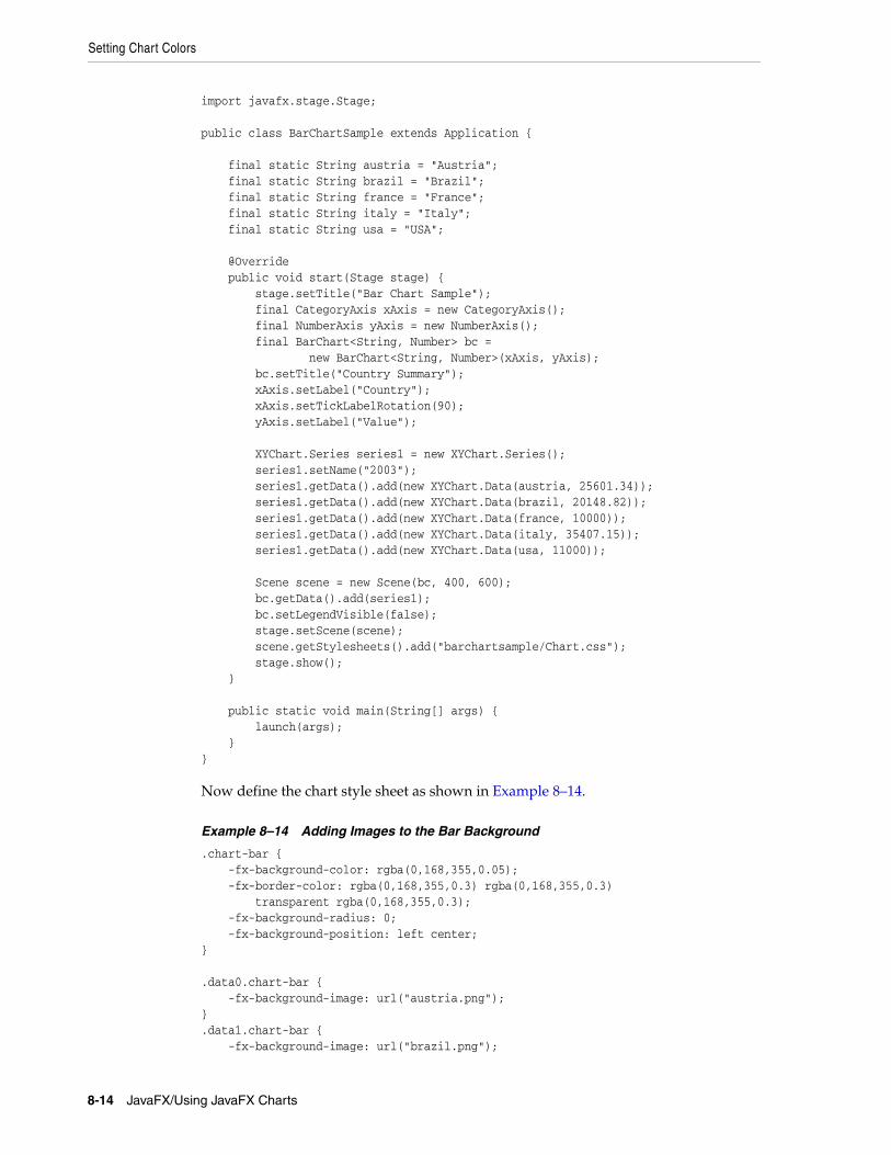
Setting Chart Colors
import javafx.stage.Stage; public class BarChartSample extends Application { final static String austria = "Austria"; final static String brazil = "Brazil"; final static String france = "France"; final static String italy = "Italy"; final static String usa = "USA"; @Override public void start(Stage stage) { stage.setTitle("Bar Chart Sample"); final CategoryAxis xAxis = new CategoryAxis(); final NumberAxis yAxis = new NumberAxis(); final BarChart<String, Number> bc = new BarChart<String, Number>(xAxis, yAxis); bc.setTitle("Country Summary"); xAxis.setLabel("Country"); xAxis.setTickLabelRotation(90); yAxis.setLabel("Value"); XYChart.Series series1 = new XYChart.Series(); series1.setName("2003"); series1.getData().add(new XYChart.Data(austria, 25601.34)); series1.getData().add(new XYChart.Data(brazil, 20148.82)); series1.getData().add(new XYChart.Data(france, 10000)); series1.getData().add(new XYChart.Data(italy, 35407.15)); series1.getData().add(new XYChart.Data(usa, 11000)); Scene scene = new Scene(bc, 400, 600); bc.getData().add(series1); bc.setLegendVisible(false); stage.setScene(scene); scene.getStylesheets().add("barchartsample/Chart.css"); stage.show(); } public static void main(String[] args) { launch(args); }}
Now define the chart style sheet as shown in Example 8–14.
Example 8–14 Adding Images to the Bar Background
.chart-bar { -fx-background-color: rgba(0,168,355,0.05); -fx-border-color: rgba(0,168,355,0.3) rgba(0,168,355,0.3) transparent rgba(0,168,355,0.3); -fx-background-radius: 0; -fx-background-position: left center;} .data0.chart-bar { -fx-background-image: url("austria.png");}.data1.chart-bar { -fx-background-image: url("brazil.png");
8-14 JavaFX/Using JavaFX Charts
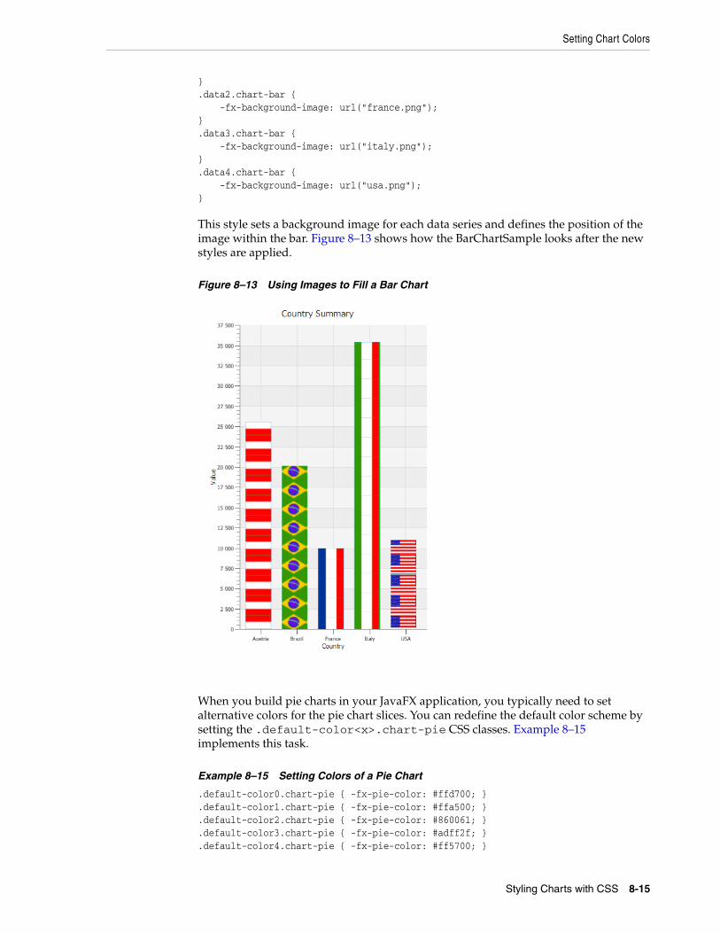
Setting Chart Colors
}.data2.chart-bar { -fx-background-image: url("france.png");}.data3.chart-bar { -fx-background-image: url("italy.png");}.data4.chart-bar { -fx-background-image: url("usa.png");}
This style sets a background image for each data series and defines the position of the image within the bar. Figure 8–13 shows how the BarChartSample looks after the new styles are applied.
Figure 8–13 Using Images to Fill a Bar Chart
When you build pie charts in your JavaFX application, you typically need to set alternative colors for the pie chart slices. You can redefine the default color scheme by setting the .default-color<x>.chart-pie CSS classes. Example 8–15 implements this task.
Example 8–15 Setting Colors of a Pie Chart
.default-color0.chart-pie { -fx-pie-color: #ffd700; }
.default-color1.chart-pie { -fx-pie-color: #ffa500; }
.default-color2.chart-pie { -fx-pie-color: #860061; }
.default-color3.chart-pie { -fx-pie-color: #adff2f; }
.default-color4.chart-pie { -fx-pie-color: #ff5700; }
Styling Charts with CSS 8-15
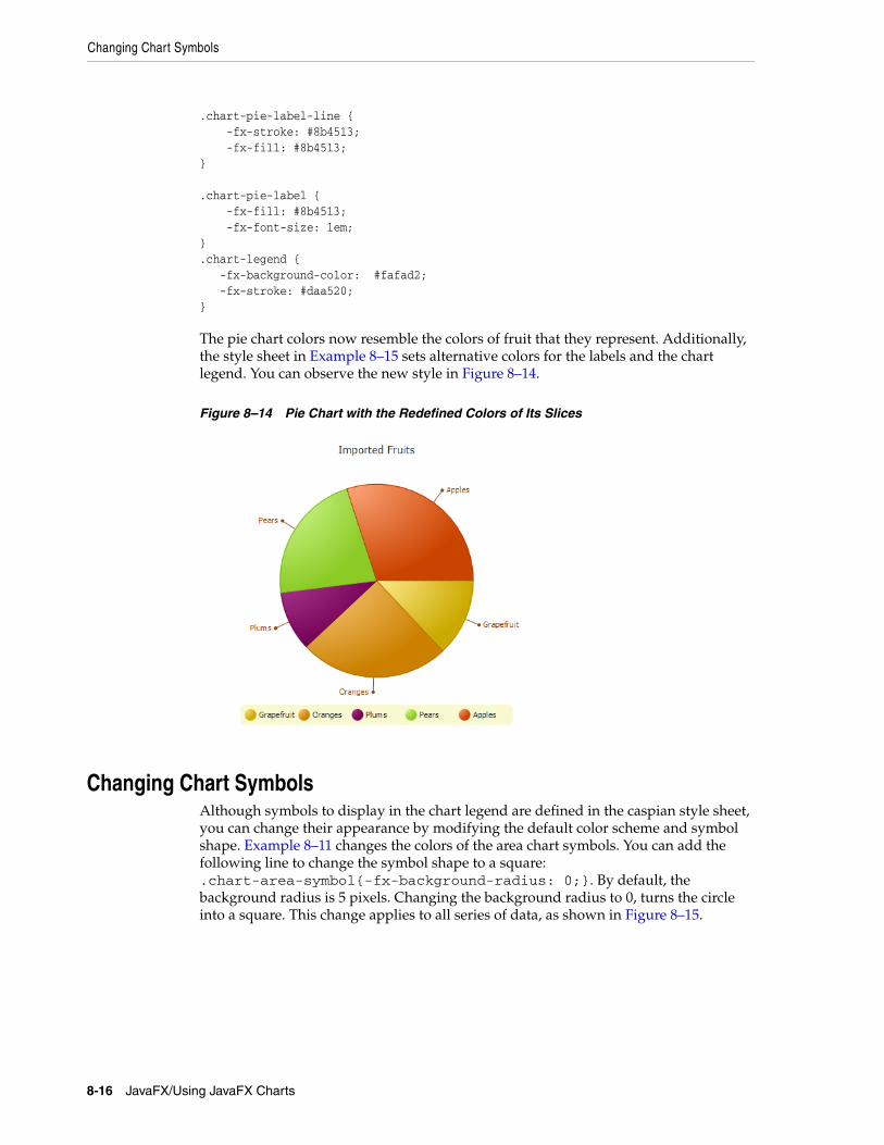
Changing Chart Symbols
.chart-pie-label-line { -fx-stroke: #8b4513; -fx-fill: #8b4513;} .chart-pie-label { -fx-fill: #8b4513; -fx-font-size: 1em;} .chart-legend { -fx-background-color: #fafad2; -fx-stroke: #daa520;}
The pie chart colors now resemble the colors of fruit that they represent. Additionally, the style sheet in Example 8–15 sets alternative colors for the labels and the chart legend. You can observe the new style in Figure 8–14.
Figure 8–14 Pie Chart with the Redefined Colors of Its Slices
Changing Chart SymbolsAlthough symbols to display in the chart legend are defined in the caspian style sheet, you can change their appearance by modifying the default color scheme and symbol shape. Example 8–11 changes the colors of the area chart symbols. You can add the following line to change the symbol shape to a square: .chart-area-symbol{-fx-background-radius: 0;}. By default, the background radius is 5 pixels. Changing the background radius to 0, turns the circle into a square. This change applies to all series of data, as shown in Figure 8–15.
8-16 JavaFX/Using JavaFX Charts
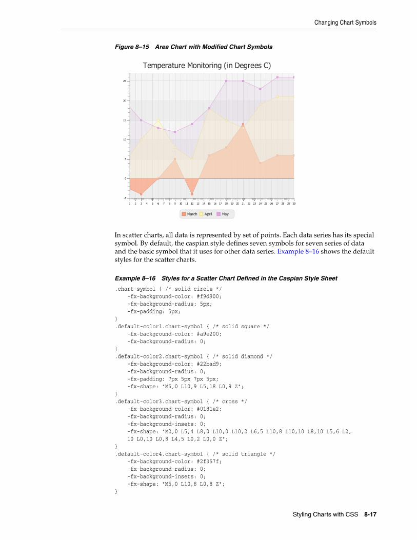
Changing Chart Symbols
Figure 8–15 Area Chart with Modified Chart Symbols
In scatter charts, all data is represented by set of points. Each data series has its special symbol. By default, the caspian style defines seven symbols for seven series of data and the basic symbol that it uses for other data series. Example 8–16 shows the default styles for the scatter charts.
Example 8–16 Styles for a Scatter Chart Defined in the Caspian Style Sheet
.chart-symbol { /* solid circle */ -fx-background-color: #f9d900; -fx-background-radius: 5px; -fx-padding: 5px;}.default-color1.chart-symbol { /* solid square */ -fx-background-color: #a9e200; -fx-background-radius: 0;}.default-color2.chart-symbol { /* solid diamond */ -fx-background-color: #22bad9; -fx-background-radius: 0; -fx-padding: 7px 5px 7px 5px; -fx-shape: "M5,0 L10,9 L5,18 L0,9 Z";}.default-color3.chart-symbol { /* cross */ -fx-background-color: #0181e2; -fx-background-radius: 0; -fx-background-insets: 0; -fx-shape: "M2,0 L5,4 L8,0 L10,0 L10,2 L6,5 L10,8 L10,10 L8,10 L5,6 L2, 10 L0,10 L0,8 L4,5 L0,2 L0,0 Z";}.default-color4.chart-symbol { /* solid triangle */ -fx-background-color: #2f357f; -fx-background-radius: 0; -fx-background-insets: 0; -fx-shape: "M5,0 L10,8 L0,8 Z";}
Styling Charts with CSS 8-17
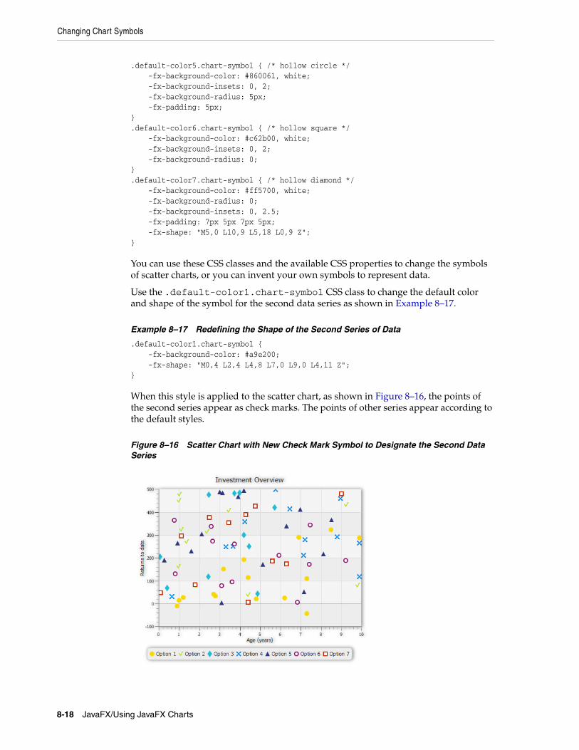
Changing Chart Symbols
.default-color5.chart-symbol { /* hollow circle */ -fx-background-color: #860061, white; -fx-background-insets: 0, 2; -fx-background-radius: 5px; -fx-padding: 5px;}.default-color6.chart-symbol { /* hollow square */ -fx-background-color: #c62b00, white; -fx-background-insets: 0, 2; -fx-background-radius: 0;}.default-color7.chart-symbol { /* hollow diamond */ -fx-background-color: #ff5700, white; -fx-background-radius: 0; -fx-background-insets: 0, 2.5; -fx-padding: 7px 5px 7px 5px; -fx-shape: "M5,0 L10,9 L5,18 L0,9 Z";}
You can use these CSS classes and the available CSS properties to change the symbols of scatter charts, or you can invent your own symbols to represent data.
Use the .default-color1.chart-symbol CSS class to change the default color and shape of the symbol for the second data series as shown in Example 8–17.
Example 8–17 Redefining the Shape of the Second Series of Data
.default-color1.chart-symbol { -fx-background-color: #a9e200; -fx-shape: "M0,4 L2,4 L4,8 L7,0 L9,0 L4,11 Z";}
When this style is applied to the scatter chart, as shown in Figure 8–16, the points of the second series appear as check marks. The points of other series appear according to the default styles.
Figure 8–16 Scatter Chart with New Check Mark Symbol to Designate the Second Data Series
8-18 JavaFX/Using JavaFX Charts
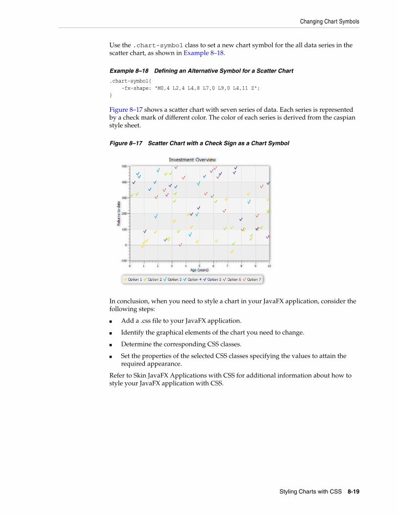
Changing Chart Symbols
Use the .chart-symbol class to set a new chart symbol for the all data series in the scatter chart, as shown in Example 8–18.
Example 8–18 Defining an Alternative Symbol for a Scatter Chart
.chart-symbol{ -fx-shape: "M0,4 L2,4 L4,8 L7,0 L9,0 L4,11 Z";}
Figure 8–17 shows a scatter chart with seven series of data. Each series is represented by a check mark of different color. The color of each series is derived from the caspian style sheet.
Figure 8–17 Scatter Chart with a Check Sign as a Chart Symbol
In conclusion, when you need to style a chart in your JavaFX application, consider the following steps:
■ Add a .css file to your JavaFX application.
■ Identify the graphical elements of the chart you need to change.
■ Determine the corresponding CSS classes.
■ Set the properties of the selected CSS classes specifying the values to attain the required appearance.
Refer to Skin JavaFX Applications with CSS for additional information about how to style your JavaFX application with CSS.
Styling Charts with CSS 8-19

Changing Chart Symbols
8-20 JavaFX/Using JavaFX Charts
![[XLS] · Web viewQuality Tools- Acceptance Sampling by Variables- Accept/Reject Camera.MTW BulbDefect.MTW Control Charts- Attributes Chart- P Chart Telephone.MTW Control Charts- Attributes](https://img.dokumen.tips/doc/110x75/5aebc09f7f8b9ad73f8edd21/xls-viewquality-tools-acceptance-sampling-by-variables-acceptreject-cameramtw.jpg)