Embed Size (px)
Citation preview

© Lake County Camera Club. Material cannot be reproduced without written permission from the Newsletter Editor or the material's specific contributor.
Share Moments - Share PhotographyJanuary 2015 Volume 7, Issue 3
Black & White andMonochrome Photography
In the last issue, I mentioned that it has been said that you can'tbe a good photographer until you understand how to shoot in blackand white. While the last edition focused on color, this edition willfocus on 'plain old' black and white photography.
Black and white and monochrome are definitions that are frequentlyused to explain photographs that do not portray a variety of colors andmost of the time they are used in conjunction with each other. But whatis the actual difference between the two and when do you use one termover the other? An image can be defined as ‘black and white’ when itcontains a pure black and a pure white point and no other colors. The term'monochrome' refers to a photo having one color ('mono' meaning one and'chrome' meaning color). It is frequently used to describe a black and white photo,but it also describes photos which contain a single tone, such as a sepia or rose tint tohelp the image look historical and aged, yet monochromatic and simple. All black andwhite images are monochrome as they are a variation of one color, but not all monochromeimages are black and white.
Black and white photography may be thought of as 'old school', but many photographers still believe that ablack and white image can be the purest form of photography, even more captivating than its color equivalent.Merilee Mitchell writes, "I think black and white photography delves deeply into the psyche and can puncture through the veneerof what we perceive as being real. It simplifies a story, a statement — what it is you’re trying to say with the photograph — andgets to the truth."
All photographs are based upon fundamentals of light, tonal range, patterns and textures. Black and white advocates will tell youthat a black and white photograph takes advantage of these basic fundamentals without being hindered by the
complexity of color. There is no doubt that some black and white images really grab your attentionand imagination, but why? Why do some images look so right in black and white? Check out,
"How to See in Black and White and How HDR can be a Powerful Tool for theMonochrome Photographer" starting on page three.
This edition of EXPOSURES also contains all of the Award winning andHonorable Mention (HM) images from the December competition night.
Julie Boatright shares a valuable lesson in her article "My 365 Project",starting on page 14.
Black and white photography may not appeal to everyone, just asnature photography may not appeal to everyone. At the veryleast, black and white is worth experimenting with, since it cangive even the most devout color photographer a better eyefor light, contrast, patterns, and texture.
Experimenting with any type photography - 365 days ayear - is a great way to share moments and sharephotography.
LCCC DecemberCompetitionLarge MonoPrint of the Month
IN THIS ISSUEPg. Article2 A Message from the President2 Dates To Remember3 How to See in Black and White and
How HDR can be a Powerful Tool for theMonochrome Photographer
7 Navigating the World of Photo Competitions8 December Competition - DPI Awards9 December Competition - DPI Honorable Mentions10 December Competition - Small Monochrome11 December Competition - Small Color12 December Competition - Large Monochrome13 December Competition - Large Color14 My 365 Project15 The Brainerd Building16 LCCC Monthly Challenge17 A Brief History of Photography Part 12
"The Union of Art and Artistry"
© Bob Kruzic

EXPOSURES - January 2015 Volume 7, Issue 3 Page 2
© Lake County Camera Club. Material cannot be reproduced without written permission from the Newsletter Editor or the material's specific contributor.
What’s missing in your photography? You!!
For many of us, behind the camera is the only place to be –me too! Yet far too often we’re “missing” from our family andfriends – vacations, get togethers and holidays. We areactually there, but the photo evidence is missing – we’re not inthe pictures.
Take the time to hand off the camera – or put yours down –and let someone else capture that particular moment – withyou in it. It really matters. To your spouse, parents, childrenand friends. It will also matter to you at some point in thefuture, I’m sure of it. Allow yourself to be part of the memories,the enjoyment of you and loved ones looking back andreminiscing.
This is one time where quality is nowhere as important ascontent. If there’s no one else that can “capture thosememories as good as you can” – that’s ok, they will capturethe full “content” of the moment.
Merry Christmas and Happy Holidays, looking forward toseeing everyone in January!
Stay in focus,
A Message From The Presidentby Mark Theriot
Dates To RememberDecember 31 LCCC: Challenge due - Bokeh
January 3 CACCA: Creative Image DPI due
January 5 PSA: Photojournalism (PJ) due
January 5 PSA: Nature due
January 8 LCCC: Program Night: Printing YourPhotographs with Jeff Bark
January 10 CACCA: Monthly meeting
January 17 LCCC: Shutter Cafe`
January 24 LCCC Photo ExcursionTable Top, Food and Model Shoot
January 29 LCCC: DPI images for competition due
January 31 CACCA: SCI due - Light Painting
January 31 LCCC: Challenge due - Black and White
February 5 LCCC: Competition Night
February 5 PSA: Photojournalism (PJ) due
February 5 PSA: Nature due
February 7 LCCC: Excursion: Johnsburg Churches
February 14 CACCA: Monthly Meeting
PSA Definition of Monochrome
An image is considered to be Monochrome only if it gives theimpression of having no color (i.e. contains only shades ofgray which can include pure black and pure white) OR it givesthe impression of being a grayscale image that has been tonedin one color across the entire image. (For example by Sepia,red, gold, etc.)
A grayscale or multi-colored image modified or giving theimpression of having been modified by partial toning, multitoning or by the inclusion of spot coloring does not meet thedefinition of monochrome and shall be classified as a ColorWork.

EXPOSURES - January 2015 Volume 7, Issue 3 Page 3
© Lake County Camera Club. Material cannot be reproduced without written permission from the Newsletter Editor or the material's specific contributor.
How to See in Black and White and How HDR can be a PowerfulTool for the Monochrome Photographer
by Joseph Eckert
The very first photographs were shot in black and white. Decades later, evenafter the advent of color, many photographers—especially those concerned withcreating works of art—continued to shoot in black and white. The formatremains popular even today: nearly every consumer-level digital camera has ablack and white mode available (for outputting JPEGs directly from the camerain monochrome), and all digital darkroom editing suites have at least one (andusually multiple) means of changing a color photograph to black and white.Indeed, there are expensive plugins available for Photoshop that are entirelydevoted to the process of converting a color shot into black and white, and theredozens of groups on Flickr and Picassa and 500px that are exclusive to blackand white photography.
Why do black and white photographs continue to exercise this hold over the fancy of so many photographers (dabbling, amateur,and pro) when we have cameras and techniques at our disposal that can capture every color under the sun? We can producephotographs of spectacular color range, with arresting reds and blues and greens and yellows, and yet the simple power of aneffective black and white shot can (arguably, of course) leave even the most brilliantly realized color shot in the artistic dust.
Why?
A large part of the reason, as I see it, lay in that very simplicity of themonochrome image. Removing the color from a shot changes the focus—itshifts the viewer’s attention from the colors to things that can be moreabstract, less immediately noticeable, and it presents the world to us in a waythat few of us are used to seeing it. It can, by the very removal of that familiarelement, generate an intense amount of interest and a powerful feeling ofdrama that might otherwise be overwhelmed by the presence of the color.The prosaic can be made into something tremendously interesting, bychanging it, in a sense, into something even more prosaic, something evensimpler.
As a result of the powerful appeal of black and white imagery, photographerswill inevitably continue to try their hand at making monochrome photographs. But it isn’t necessarily as easy as you might expect,and not every color photograph will suddenly make a powerful, dramatic and artistic statement when converted into black andwhite. To create a spectacular black and white image you need to start at the very beginning, when you are first looking out on aninteresting scene, before you ever press down on the shutter button.
A Shift in Sight
Most of us see the world in color. I do, and I’m very happy to have that ability. But to make the most effective black and whitephotograph possible, you need to develop the ability to abstract away those colors, well before you ever take the shot. The greatblack and white photographers of the past used to talk about “Seeing the world in black and white.” They weren’t referring topolitics or some simple dichotomy of good and bad, but rather literally seeing it in monochrome, seeing it as it would appear oncethey processed the shot and had the black and white print in their hands.
A part of being able to see the world in black and white is pure, raw experience: the more black and white photographs you take,the better you will be able to understand what scenes and shots will work better in monochrome than in color. This can mean (andhas meant, in the digital era) taking tons of color photos and then haphazardly trying the black and white conversion on somesubset of them, hoping to get lucky and hit on one or two that really pop in black and white.
Continued on next page

EXPOSURES - January 2015 Volume 7, Issue 3 Page 4
© Lake County Camera Club. Material cannot be reproduced without written permission from the Newsletter Editor or the material's specific contributor.
But you can short circuit this learning process—or at least help yourself on the way—by making yourself aware of what elementsmake the most impact in a black and white shot. Some of this is obvious, or at least may seem obvious, but the value comes fromactually thinking about it, and considering these elements consciously as you shoot (until you reach such a point that you nolonger even need to think about them, because they come so naturally to you). The elements include:
Shapes, Patterns, and TextureLighting and ContrastToneColor
Wait—color? Let me explain the first few, and we’ll circle back to that last one.
Shapes, Patterns, and Texture
When you look past the colors in a scene, some of the first elements you’llbecome aware of are shapes and repeating patterns, and texture. In theabsence of color, these elements come to dominate the image, and can be aguide in your composition.
Look for interesting forms and juxtapositions of angles. Seek out triangles, inparticular, and curves. Try to find shapes that match the Fibonacci Spiral, or atleast conform loosely to the Rule of Thirds in the way they divide up yourframe.
Hunt for patterns—repetitive formations ofstructure. And then look closely for that break in the pattern. A brick wall is agreat pattern, but it’s also boring, unless you have that scrawled bit of amazinggraffiti on it (or whatever it may be that caught your eye and stood out from therepetition around it).
Texture can really pop out of the image in black and white photography. Ofcourse, color shots can have great texture as well, but there is just somethingabout black and white that lends itself to really giving a visceral feeling of theroughness of that bark, or the uneven bumps of that concrete, etc. Forexample, consider the two shots below, the color version versus the black and
white. In my opinion, at least (and your mileage, as always, may vary), the black and white version makes the textures almostcome out off the screen, much more so than the color.
And then, of course, look to combine all three—find repeating patterns of interesting shapes that have eye-catching textures.
Continued from previous page
Continued on next page
All images © Joseph Eckert
EXPOSURES - January 2015 Volume 7, Issue 3 Page 5
© Lake County Camera Club. Material cannot be reproduced without written permission from the Newsletter Editor or the material's specific contributor.
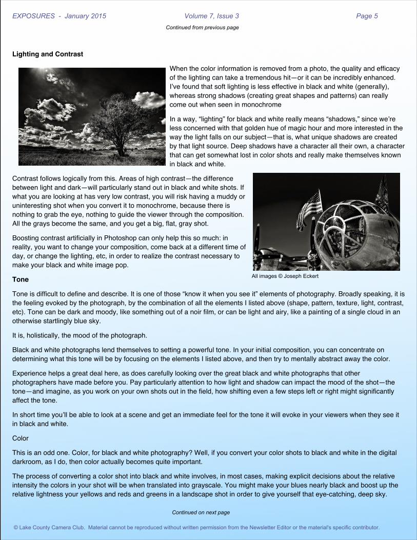
Lighting and Contrast
When the color information is removed from a photo, the quality and efficacyof the lighting can take a tremendous hit—or it can be incredibly enhanced.I’ve found that soft lighting is less effective in black and white (generally),whereas strong shadows (creating great shapes and patterns) can reallycome out when seen in monochrome
In a way, “lighting” for black and white really means “shadows,” since we’reless concerned with that golden hue of magic hour and more interested in theway the light falls on our subject—that is, what unique shadows are createdby that light source. Deep shadows have a character all their own, a characterthat can get somewhat lost in color shots and really make themselves knownin black and white.
Contrast follows logically from this. Areas of high contrast—the differencebetween light and dark—will particularly stand out in black and white shots. Ifwhat you are looking at has very low contrast, you will risk having a muddy oruninteresting shot when you convert it to monochrome, because there isnothing to grab the eye, nothing to guide the viewer through the composition.All the grays become the same, and you get a big, flat, gray shot.
Boosting contrast artificially in Photoshop can only help this so much: inreality, you want to change your composition, come back at a different time ofday, or change the lighting, etc, in order to realize the contrast necessary tomake your black and white image pop.
Tone
Tone is difficult to define and describe. It is one of those “know it when you see it” elements of photography. Broadly speaking, it isthe feeling evoked by the photograph, by the combination of all the elements I listed above (shape, pattern, texture, light, contrast,etc). Tone can be dark and moody, like something out of a noir film, or can be light and airy, like a painting of a single cloud in anotherwise startlingly blue sky.
It is, holistically, the mood of the photograph.
Black and white photographs lend themselves to setting a powerful tone. In your initial composition, you can concentrate ondetermining what this tone will be by focusing on the elements I listed above, and then try to mentally abstract away the color.
Experience helps a great deal here, as does carefully looking over the great black and white photographs that otherphotographers have made before you. Pay particularly attention to how light and shadow can impact the mood of the shot—thetone—and imagine, as you work on your own shots out in the field, how shifting even a few steps left or right might significantlyaffect the tone.
In short time you’ll be able to look at a scene and get an immediate feel for the tone it will evoke in your viewers when they see itin black and white.
Color
This is an odd one. Color, for black and white photography? Well, if you convert your color shots to black and white in the digitaldarkroom, as I do, then color actually becomes quite important.
The process of converting a color shot into black and white involves, in most cases, making explicit decisions about the relativeintensity the colors in your shot will be when translated into grayscale. You might make your blues nearly black and boost up therelative lightness your yellows and reds and greens in a landscape shot in order to give yourself that eye-catching, deep sky.
Continued from previous page
Continued on next page
All images © Joseph Eckert

EXPOSURES - January 2015 Volume 7, Issue 3 Page 6
© Lake County Camera Club. Material cannot be reproduced without written permission from the Newsletter Editor or the material's specific contributor.
If you keep this in mind when you are composing your shot, you can look forregions of strong color differentiation, and use that to, in effect, enhance thecontrast of your final black and white shot. The intensity of the blues and redsin a single shot might be nearly equal, when viewed in color (not giving muchin the way of contrast), but in the conversion process you can darken one andlighten the other, and create that deep sense of contrast that will pop so muchin black and white.
Bonus Section: Using High Dynamic Range to Boost Your Black and White Photography
High Dynamic Range (HDR) photography is controversial and I won’t try tosway you one way or the other if you have strong feelings regarding how it iscommonly used/abused in modern digital photography. However, few can denythat it can be a very powerful tool when composing for black and whiteimagery.
This may initially seem counterintuitive. After all, a major draw of HDRphotographs is that amazing, hyper-real color that seems to jump out of thescreen or print at you. But HDR is really about enhancing the dynamic range ofthe shot—enhancing the difference between the darkest and lightest parts ofthe image, allowing more of each to be seen.
And it is, fundamentally, in the difference between the dark and the light whereall the magic of black and white photography happens.
HDR can’t necessarily enhance the shapes in your shot, or help you with composition, but it can bring out more pattern andtexture than a non-HDR image. It can also significantly increase the perceived intensity of the lighting in a given shot, and, overall,pull up the contrast (or make more room for the contrast to be effectively increased in Photoshop, etc).
If you have always avoided HDR because of those highly over-processed images that you can find anywhere on Flickr or Picassa,I strongly recommend you try it out for yourself. Keep in mind the strengths of HDR, and the advantages it gives you in scenesthat would otherwise be impossible to capture in a single exposure. And remember that you don’t have to over process your shot
like others do, if you don’t happen to like that effect. Instead, subtly tone mapyour exposures with an eye toward bringing out that amazing texture orshadow that you saw in person but couldn’t capture with one exposure alone.
Black and white photography, the oldest form of photography, is here to stay.Its unique qualities help ensure it will never completely die, no matter howamazingly accurate or vivid technology allows the colors in our shots tobecome. There is a very real power inherent in the best black and whiteimages, a power that would often be lessened if that same shot were seeninstead in color. By learning to see the world in terms of shape, pattern,texture, light, contrast, and tone, you can start making powerful black andwhite shots of your own.
Reprinted with permission from Joseph Eckert (12/10/2014)
Joseph Eckert is an avid, self-taught photographer currently living in the beautiful Pacific Northwest with hiswife, cute corgi, and two obnoxious but loveable cats. Read more reviews and musings on photography atJoseph Eckert Photography. http://josepheckertphotography.zenfolio.com/
Continued from previous page
All images © Joseph Eckert

EXPOSURES - January 2015 Volume 7, Issue 3 Page 7
© Lake County Camera Club. Material cannot be reproduced without written permission from the Newsletter Editor or the material's specific contributor.
Navigating the World of Photo Competitionsby Shell Wecker
As you know, there are many competitive opportunities for prints and Digitally Projected Images (DPI) images. I couldn’t find anyquick reference guide that summarized all of the different competitions in one place, so I set off to figure it out. This is what Ilearned.
LCCC Competitions
Held four times per year in October, December, February and April at LCCC meeting.
Individuals compete against other LCCC members.
DPI entries are submitted through the Club website one week before competition, prints on the day of competition.
CACCA Inter-club Competitions
Held monthly from October to May.
Clubs compete against other CACCA clubs.
Images are selected from top scoring LCCC Competitions. These are generally Award and HM winners but additional imagesmay be added. Each Club can enter up to four entries from four different makers per category per month. We can enter fourimages in each of the five categories for both Class A and Class B per month. Since we are two clubs within CACCA, thisamounts to 40 images per month.
CACCA Individual Special Category DPI Competitions
Held monthly from September to May. Each month’s competition has a different theme (Night Without Flash for example). Seethe CACCA website for information on subjects, rules (http://caccaweb.com/competitions/divisions/individual-competitions) andsubmission dates (this information is generally also available on the LCCC Calendar).
Individuals compete against other CACCA club members.
Images are submitted via Picturk (http://dpi.caccaweb.com/home.php). Information on how to set up a Picturk account isavailable on the CACCA website. NOTE: Picturk uses European dating conventions so 11/4/2014 is April 11, 2014 notNovember 4, 2014. The entry deadline is midnight Greenwich Mean Time (GMT) which is 6:00 pm Chicago time.
CACCA Individual Competitions
Competitions are generally held monthly from October through May in a number of Divisions. Divisions are Creative Digital,Nature Prints, Photojournalism Prints, and Portrait Prints. Each Division holds three competitions per year, so you need to checkthe CACCA website to find out what’s happening in any given month (information is also typically available on the LCCCCalendar).
Individuals compete against other CACCA club members.
You must submit your prints to the our CACCA representative any day before the day of the competition. Creative Digitalimages are submitted via Picturk website (see above).
PSA Inter-club Competitions https://www.psa-photo.org/index.php?inter-club-deadline-chart
Competitions are held every month from October to May in a number of Divisions, with each Division holding three or fourcompetitions per year. LCCC Competes in Nature, Photojournalism, Travel and Projected Image Divisions (like our DPI). Linksto each of these Divisions and the specific dates, rules etc. for entry can be found on the PSA Competitions page https://www.psa-photo.org/index.php?psa-competition-dates.
Clubs compete against other clubs worldwide.
Images are submitted via the LCCC Photo Submissions website page. LCCC has a committee and Chair for each of the PSADivisions. The number of images a club can submit varies by Division. For example – Nature accepts 6 images by a minimum of4 members.
PSA Individual Competitions https://www.psa-photo.org/index.php?pid-individual-creative-competition
PSA also holds a number of individual competitions in different Divisions such as Pictorial Print, Projected Image, and PhotoTravel. You must be a PSA Individual Member to enter (dues are $60/yr).
See the PSA website for more details.

EXPOSURES - January 2015 Volume 7, Issue 3 Page 8
© Lake County Camera Club. Material cannot be reproduced without written permission from the Newsletter Editor or the material's specific contributor.
December Competition - Digitally Projected Images (DPI) - AwardsThe DPI competition for December had the most submissions. There were a total of 45 images submitted; 23 in class B and 22 inclass A. 10 percent of all images submitted receive an Award or an Honorable Mention (HM) in each class. For class B, therewere three Awards and three HM. For class A, there were two Awards and three HM. All of the Award winning images competehead-to-head for Projected Image of the Month (PIOM). The images on this page are the Award winning images for December.The PIOM belongs to Larry Chua highlighted by the blue ribbon. (judges score)
"Frosty Morning" Class B Award 24)
© Gary Smith
"Silver Tea Set" Class A Award (24)
© Gary Watanabe
"Bright Eyes" Class B Award (24)
© Jo Herbst
"The Fountain" Class A Award (23)
© Larry Chua
"A Treat in the Snow'" Class B Award (24)
© Sue Matsunaga

EXPOSURES - January 2015 Volume 7, Issue 3 Page 9
© Lake County Camera Club. Material cannot be reproduced without written permission from the Newsletter Editor or the material's specific contributor.
December Competition - Digitally Projected Images (DPI) - HM10 percent of all images submitted receive an Award or an Honorable Mention (HM) in each class. The images on this page arethe HM images for December. (judges score)
"Crane" Class B HM (24)
© Bonnie Dawson
"Civil War Boy" Class A HM (24)
© Dick Navarre
"Gentian" Class A HM (24)
© Egon Schein
"Me And My Donkey" Class B HM (24)
© Leslie Harris
"Roman Mill Ruins" Class A HM (24)
© Mike Trahan
"Crabapples" Class B HM (24)
© Sue Matsunaga

EXPOSURES - January 2015 Volume 7, Issue 3 Page 10
© Lake County Camera Club. Material cannot be reproduced without written permission from the Newsletter Editor or the material's specific contributor.
December Competition - Small Monochrome
There were 18 Small Monochrome images submitted, Five in Class B and 13 in Class A. 10 percent of all images submittedreceive an Award or an Honorable Mention (HM) in each class. For class B, there was one Award. For class A, there was alsoone Award and two HM. The Award winning images compete head-to-head for Small Monochrome Print of the Month (POM).The images on this page are the Award and HM images for December. The POM belongs to Bob Kruzic highlighted by the blueribbon. (judges score)
"The Union of Art and Artistry" Class A Award (24)
© Bob Kruzic © Bonnie Dawson
"Little and Proud" Class B Award (21)
© Liz Rose Fisher
"Buckingham Fountain" Class A HM (23)
XX Image Not Available XX
© Mike Burgquist
"Bridge To Millennium" Class A HM (23)
XX Image Not Available XX

EXPOSURES - January 2015 Volume 7, Issue 3 Page 11
© Lake County Camera Club. Material cannot be reproduced without written permission from the Newsletter Editor or the material's specific contributor.
December Competition - Small Color
There were 31 Small Color images submitted, 14 in Class B and 17 in Class A. 10 percent of all images submitted receive anAward or an Honorable Mention (HM) in each class. For class B, there was one Award and two HM. For class A, there were twoAwards and one HM. All of the Award winning images compete head-to-head for Small Color Print of the Month (POM). Theimages on this page are the Award and HM images for December. The POM belongs to Bob Kruzic highlighted by the blueribbon. (judges score)
"A View From The Altar" Class A Award (25)
© Bob Kruzic
"Flying Crane" Class B Award (24)
© Bonnie Dawson
© Leslie Harris
"Lean On Me" Class B HM (22)
© Sue Matsunaga
"Tunnel Vision" Class B HM (22)
"In Loving Memory" Class A Award (24)
© Ron Sheade
XX Image Not Available XX
"Wind Point Christmas" Class A HM (24)
© Jeff Bark
XX Image Not Available XX

EXPOSURES - January 2015 Volume 7, Issue 3 Page 12
© Lake County Camera Club. Material cannot be reproduced without written permission from the Newsletter Editor or the material's specific contributor.
December Competition - Large Monochrome
There were 26 Large Monochrome images submitted, Seven in Class B and 19 in Class A. 10 percent of all images submittedreceive an Award or an Honorable Mention (HM) in each class. For class B, there was one Award. For class A, there were twoAwards and two HM. All of the Award winning images compete head-to-head for Large Monochrome Print of the Month (POM).The images on this page are the Award and HM images for December. The POM belongs to Bill Sullivan highlighted by the blueribbon. (judges score)
© Anthony Roma
"Silver Pilot" Class B Award (23)
© Bill Sullivan
"Repetitive Insanity" Class A Award (25) "Wrong Way Vertigo" Class A Award (23)
© Bill Sullivan
© Bob Kruciz
"A Hazy Shade of Winter" Class A HM (23)
© Jeff Bark
"Rome War Memorial" Class A HM (2)
XX Image Not Available XX

EXPOSURES - January 2015 Volume 7, Issue 3 Page 13
© Lake County Camera Club. Material cannot be reproduced without written permission from the Newsletter Editor or the material's specific contributor.
December Competition - Large Color
There were 39 Large Color images submitted, 10 in Class B and 29 in Class A. 10 percent of all images submitted receive anAward or an Honorable Mention (HM) in each class. For class B, there was one Award and one HM. For class A, there werethree Awards and four HM. All of the Award winning images compete head-to-head for Large Color Print of the Month (POM).The images on this page are the Award and HM images for December. The POM belongs to Bill Sullivan highlighted by the blueribbon. (judges score)
©Anthony Roma
"On The Right Track" Class B Award (23)
"Chicago Night Lights From Navy Pier"Class A Award (26)
© Bill Sullivan
"Colorful Church Convergence"Class A Award (24)
© Bill Sullivan
© John Williams
"Fourth Presbyterian Church" Class A HM (25)
"Werribee Mansion Stairs"Class A Award (25)
© John Williams
© Linda Kruzic
"Blue Hour at the Temple" Class A HM (24)
"Buckingham Fountain Splendor" Class A HM (25)
© Paul Kurek
© Katie Albeck
XX Image Not Available XX
"Eye of the Tiger" Class B HM (21)
"Brooklyn Bridge" Class A HM (24)
© Krzysztof Hanusiak
XX Image Not Available XX

EXPOSURES - January 2015 Volume 7, Issue 3 Page 14
© Lake County Camera Club. Material cannot be reproduced without written permission from the Newsletter Editor or the material's specific contributor.
My 365 Projectby Julie Boatright
On January 1, 2014, I started a 365 Project. I found this project on the internet and it sounded interesting....take one photo a day!I started to do this in 2013, but it only lasted about two months and I lost interest. This time it really stuck and I’m happy it did.The photos I take are of no particular subject matter, I just take a photo. Of course, I try to put some effort into it. The majority aretaken with my DSLR camera with only a small portion taken with my iPhone.
On February 24th, I came home from work to see a hawk eating a squirrel in my frontyard (image left). Of course I had my camera with me as I always do and snappedabout 10 photos. One of them ended up winning an award in club competition!
While at Crabtree Nature Center inBarrington on May 4th, I heard a rustlingin the woods. I was the only one aroundand wondered what it was. I looked up atthe trees and there was this squirrelpoking its head out and that is how I gotmy 2nd favorite photo of the year (imageright).
Since I had been sharing this project withco-workers, they knew I was interested inphotography and asked if I would like totake some photos at the Joss Stoneconcert at Ravinia on September 10th.Of course I agreed. I just love the photo(image left).
Since starting this project, I have alsostarted noticing some of the little things,like the photo I took on July 20th (imageright). You should always look down, up,and all around. Something cool may bewaiting for you.
My favorite photo of the year was takenon January 30th. I just love it. I was outfor lunch and it was a really windy, snowyday. I pulled the car over and saw thisone tree so clearly and everything elsewas just so snowy (image left). To me, it’s just a beautiful picture.
This project made me think about photography and my camera on a daily basis. Ilearned so much since taking on this endeavor. I have a long way to go with myphotography skills, but doing this 365 project really helped. I have also learned that Ireally like nature photography, which yielded some of my favorite photos.
All images © Julie Boatright
A hearty congratulations - Julie! What a wonderful project. ~Editor

EXPOSURES - January 2015 Volume 7, Issue 3 Page 15
© Lake County Camera Club. Material cannot be reproduced without written permission from the Newsletter Editor or the material's specific contributor.
The Brainerd Buildingby Gary Smith
In 1955, I entered the Brainerd high school building in Libertyville as a freshman. I hadbeen there before when my dad took me to a professional wrestling match with ChiefDon Eagle, Rudy Kay and other professional wrestlers. The Jackson Street gymimpressed me a great deal then and still does to this day (image right). So much so,that it turned into a photographic obsession in the months of October and November of2014.
Since I always loved taking pictures, this new photographic journey just fell in place. Iknew the building was to be torn down and I agreed with the village vote to not spendmillions of dollars to rehabilitate it. I felt a need to preserve something for all thosepeople with fond memories. I slowly became more and more interested in seeing theinside one more time. I also saw some photos of the inside by two of our LCCC
members, Egon Schein and Michelle Cox. Wow! The memories came flooding backand if it happened to me then others might feel the same. I had to get in there andtake some pictures. I called the village and the school for permission but everyone Italked to said, "no". The “No Trespassing” signs on the fences were surely a deterrentalong with the warning “You Will be Arrested” (image left). I believed others wouldwant to remember the great old building where they had spent some of their lives.
I took some photos of the outside of thebuilding and some through the temporaryfence placed around it to keep curiouspeople like me away (image right). Most
pictures were taken on cloudy days and maybe that was fitting for such a grand oldlady, soon to be executed. In November, the heavy machinery (image below right)arrived and I knew its days were getting short. If I wanted to do anything inside, I’dbetter hurry. One day, I walked around the building with my camera to take somephotos and while doing so I was also looking for a way through the fence. It was onthe Jackson Avenue side of the Jackson Gym that the windows, now missing, werethe most reachable (image above right). I was sure I could climb up and in. The nextday, I saw the contractor and asked him if he would allow me to enter the building andtake some pictures. He said no, but in a couple of days he would have a little time totake me inside for a few pictures. He would have to accompany me all the time. I waselated and realized I’d have to be quick as he was very busy with his preparation work.That meant I too had to get prepared. I knew it would be a low light situation, so thatmeant a tripod for sure. I wanted the photos to be sharp, crisp and have a large depthof field, so I preset the camera at f:16. My choice of lens was easy, a 17-40mm Canonon a full frame body for good wide angle shooting. I knew I would be making a videofor posting on YouTube, and that meant making transitions from some scene toanother. I also brought my video camera.
The appointed day arrived and I got insidea little after noon (image left). The contractor was a great guy and he sensed what itmeant to me to be able to do this. He stuck with me for a while, but it wasn’t too longbefore he realized I was on a mission. I was so involved, I didn’t even realize I wasalone. He had things to do and so did I.
The video is now complete except for getting a short scene of the first few bites by thebig machines to take her down. I sure grew to love the old girl and to me, this is whatphotography is all about. Photography is all about the times and places it takes you.
All images © Gary Smith

EXPOSURES - January 2015 Volume 7, Issue 3 Page 16
© Lake County Camera Club. Material cannot be reproduced without written permission from the Newsletter Editor or the material's specific contributor.
LCCC Monthly Challengeby Linda O'Rourke
The last two months have flown by. Our fall season seemed a little short to me, but for the October Theme, FallFoliage there were wonderful images submitted. The theme for November was Wide Angle and here again there wasa wide and varied group of submissions. It is always fun for me to take a look at the many interpretations of theChallenge. Below are a few examples. I hope you take a look at all of the submissions on the LCCC Website.
Let’s make 2015 a great photographic year. Are you up to the Challenge? Images must be newly taken images between the
day the assignment is given and the end of the given month. Up to ten images may be submitted on a monthly basis by an
individual. The January Photo Challenge will be “Black and White” Give it your best shot!
© Krysztof Hanusiak
"House by The Lake"
"Holy Hill Basilica"
© John Williams
© Ron Hahn
"Dome Elk Club"
"Fall Colors in the Rain"
© Judy Reinhardt
"Water"
© Joann Sullivan
"My Town"
© Egon Schein
"Forgotten Homestead"
© Michelle Cox
© Gary Smith
"A Frosty Floor"

EXPOSURES - January 2015 Volume 7, Issue 3 Page 17
© Lake County Camera Club. Material cannot be reproduced without written permission from the Newsletter Editor or the material's specific contributor.
A Brief History of Photography - Part 12Movements: Pictoralism versus Straight Photography
by Mike Kukulski
When George Eastman’s Kodak box camera was introduced in 1888, its popularity spawned an identity crisis of sorts within thephotographic community. The widespread availability and relatively low cost of the Kodak camera and its ease of use resulted inan explosive surge in the number of new photographers. This led to the creation of millions of photographs, characterized by asmall number of strong images obscured in a sea of mediocrity. While the huge “snapshot” market provided the financial strengthto sustain the growing photography industry, it challenged serious amateur and professional photographers to differentiate theirwork from that of casual shooters. It seemed the solution could be found in two parts: through either technical excellence, orthrough artistic merit.
Ironically, this divided answer to photographic distinction paralleled the differences between the two most popular processes inearly photography. The daguerreotype exhibited exquisitely high image sharpness, resolution, and detail, arguably capturing amore accurate rendering of the subject. In contrast, the calotype presented a softer, grainier, more ethereal image quality, perhapsencouraging a more artistically interpretive approach to the subject. The debate over these two approaches, to either document atechnically accurate record of the subject, or to exercise aesthetic interpretation, has fueled contentious photographic artmovements from the 1880’s to the modern day.
In the earliest days of photography, many saw the discipline as a technicalone requiring expertise in chemistry and optics, and the mastery of an arcaneworkflow. They viewed its output as a scientific, or clinical record of thephysical world. To a great extent, photography’s early adherents supportedthis view, by photographing landscapes, architecture, personalities, and eventswith the intent to factually inform the viewing public. Whereas paintings hadpreviously served this function, they had also been conduits for artisticexpression. With the advent of photography, many saw it as a superiorrecording medium, but without artistic value. As the field of photography grewand matured, a growing faction came to think otherwise, seeing photographyas a new means of artistic expression.
The call for photography to be viewed as art came early in the medium’shistory. From 1840 to 1860, the main emphasis on photography was onimproving the tools and processes to yield sharp images, directly from natureand not manipulated, as faithful as possible to the original scene. This couldbe considered the original approach to “straight” photography. The first call for naturalism, or straight photography, came fromEngland’s Peter Henry Emerson, in his 1890 book, Naturalistic Photography for Students of the Art, in which he advocated that a“proper” photograph demonstrate accurate and unaltered images of nature; the book’s title page quotes Keats, “Beauty is truth,
truth beauty, --that is all Ye know on earth,and all ye need to know.” To a great extent,the members of Britain’s Royal PhotographicSociety and other early national photographicbodies shared this view. This naturalisticapproach called for realistic versus painterlyimages, and promoted taking pictures of real,or natural scenes, as opposed to staged orcontrived poses to re-enact classic paintingsor literary scenes. On this point, Emersonessentially dismissed some earlier evocativework, such as Julia Margaret Cameron’sbiblical and literary scenes, and Oscar GustavRejlander’s elaborate photomontages, asclumsy clichés.
Continued on next page
Ricking the Reed, Peter Henry Emerson 1886
The Two Ways of Live, Oscar Gustav Reilander 18571886

EXPOSURES - January 2015 Volume 7, Issue 3 Page 18
© Lake County Camera Club. Material cannot be reproduced without written permission from the Newsletter Editor or the material's specific contributor.
By the late 1800’s, the technology and knowledge of photography had advanced and broadened to enable a variety of techniquesto capture and manipulate images on negatives, plates, and prints. This led to another view, first articulated in Henry PeachRobinson’s 1869 book, Pictorial Effect in Photography: Being Hints On Composition And Chiaroscuro For Photographers.Robinson contended that pictorial photography was primarily symbolic or allegorical; an image could convey a message beyond
its technical record of a subject. For example, evocativelighting could imply divinity, or a beautiful woman couldsymbolize Love. In this vein, manipulation of the image toserve this metaphoric message could be a key characteristic.This combination of artistic intent and the photographer’s hand-on manipulation of the image generally defined the ideaunderlying what came to be known as pictoralism. Inpictoralism, the aesthetics, emotional impact, and artistic qualityof the final image take primacy over the subject matter in frontof the lens. The concept of photographic pictoralism developedin parallel with that of the Tonalism style of painting,exemplified by artists such as James McNeill Whistler. BothTonalism and pictoralism encouraged the artist to generate anemotional response in the viewer through the use ofatmospheric elements and subdued tonalities to convey amood in the image.
The hand of man on the final image was another important concept underlying pictoralism. If the final image was purely the resultof the mechanical properties of the camera and lens, and the chemical processes employed in development, i.e., a scientificoutcome, then how could it be art? On the other hand, if thephotographer employed creative techniques at the time of capture,combined with manipulation of the image in the darkroom, a uniqueartistic vision could be realized – only through the artist’s interventioncould the final image be achieved. These techniques might include:multiple exposures; the use of soft focus, dramatic lighting, negativemanipulation (scratching or painting over the negative; and suchnuanced alternative printing techniques as, platinum printing(improved tonality); direct carbon printing; photogravure; combinationprinting (from multiple negatives); gum bichromate printing (coloredprints); brushed watercolor pigments mixed with light-sensitized gumArabic; and bromoil and oil pigment printing. These various“ennobling” techniques could yield images that exhibited colored tints,textures, charcoal or graphite drawing effects, or impressionistpainterly effects. Regardless of the specific technique employed, thekey was creating a handcrafted unique art object equivalent to apainting.
Pictoralism was the first photographic ideology recognized as anartistic movement, but it was not accepted without debate. Theemphasis of established bodies like the Royal Photography Societyon scientific and commercial aspects of photography, their view ofphotography as a primarily documentary medium, and their rejectionof photography as an art form, led to various groups “seceding” fromthe established photographic orthodoxy to follow the pictorialistideology. The first such group, England’s Linked Ring, was foundedby Robinson and others in 1892, and included invited-onlyphotographers such as Frank M. Sutcliffe, Frederick H. Evans, andAlvin Langdon Colburn. Americans Alfred Stieglitz and Clarence H.White were later admitted, and in 1900 Gertrude Käsebier was amongthe first women invited.
Continued from previous page
Continued on next page
Fading Away, Henry Peach Robinson, 1858
Struggle, Robert Demachy, 1903

EXPOSURES - January 2015 Volume 7, Issue 3 Page 19
© Lake County Camera Club. Material cannot be reproduced without written permission from the Newsletter Editor or the material's specific contributor.
The success of The Linked Ring in advancing pictorialism,along with similar secessionist movements in France,Germany, and Austria led to the development in 1902 of theAmerican Photo-Secession movement in New York under theleadership of Stieglitz, who had chafed under the conservativeintransigence of the Camera Club of New York. The Photo-Secession’s membership was also by invitation only, andStieglitz tightly controlled the membership and the tone of thegroup, which included Edward Steichen, Clarence H. White,Gertrude Käsebier, Frank Eugene, and Alice Boughton,among others. The Photo-Secession brought visibility to thepictorialist genre though exhibitions at a gallery space donatedby Steichen in New York City called the Little Galleries of thePhoto-Secession, or “291” (for its address on Fifth Street). Togive the pictorialism movement a longer reach, Stieglitzpublished and edited a quarterly magazine, Camera Work,from 1903 to 1917 that featured exquisite photogravureshand-tipped by Stieglitz into each issue that showcasedmembers’ work.
The publication also served as a soundboard for Stieglitz’s critical views onphotography and fine art, showing an occasional openness to non-pictorialistphotographic fine art approaches, and increased coverage of international versusAmerican-only aspects of fine art photography.
By 1909, new ideas had permeated the art world, and enthusiasm for pictorialismbegan to wane. The Linked Ring disbanded due to disinterest, and Stieglitzrecognized this shift in artistic development. In 1910 he began featuring non-photographic modern art in Camera Work, and showcased avant-garde modern artistssuch as Rodin, Cézanne, Matisse, and Picasso in its pages. While Stieglitz’s effortsto promote pictorialism had succeeded in garnering acknowledgement of photographyas an art form by art museums, his expansion into non-photographic arenas in themagazine alienated his photography-centered subscriber base, and the publicationgradually declined. Ironically, in 1917 the final two issues of Camera Work introduceda young new photographer, Paul Strand, whose stunning work eschewed the soft
focus andsymbolicapproach ofpictorialism for aperspective thatemphasized thebeauty of clearlines and forms ofordinary objects.Stieglitz, one of pictorialism’s strongest sponsors, was nowhinting at a new direction for the photographic art world.
Continued from previous page
Continued on next page
Water Rats, Frank M. Sutcliffe, 1886
The Flatiron, Edward J. Steichen, 1904
Wall Street, New York, Paul Strand, 1915

EXPOSURES - January 2015 Volume 7, Issue 3 Page 20
© Lake County Camera Club. Material cannot be reproduced without written permission from the Newsletter Editor or the material's specific contributor.
This new direction manifested itself in an exhibit in 1932 at the M.H. de YoungMemorial Museum in San Francisco, where a group of 11 photographersannounced themselves as F.64. Formed in opposition to pictorialism, F.64embodied a Modernism aesthetic for straight photography, based on preciselyexposed images of natural forms and found objects. F.64 centered aroundEdward Westin, an already accomplished photographer, who saw a need to breakfree from the pervasive pictorialism construct in favor of a new vision; its coremembers included Ansel Adams, Imogen Cunningham, John Paul Edwards,Sonya Noskowiak, Henry Swift, and Willard Van Dyke. The name of the groupreferred to the smallest aperture opening of contemporary large format viewcameras, suggesting that photographs should embrace the medium’s unrivaledcapacity to see the world versus apologizing for it. The group espoused the useof large depth of field, sharp focus, and contact printing of large negatives onglossy paper; all to more precisely render the image of the subject. The goal wasto transform the photographer from a print maker to an image selector; the qualityof the image was a result of thephotographer’s choice of subjectform and framing, a concept thatcame to be known as“previsualization.” Whether thesubject was a landscape, anarchitectural or industrial feature, ora nude study, the guiding tenets ofthis new movement were the
shared emphasis on capturing the exact features of the subject in front of the lensand the emotional experience of form. As the group’s manifesto declared,
“The Group will show no work at any time that does not conform to its standards ofpure photography. Pure photography is defined as possessing no qualities oftechnique, composition or idea, derivative of any other art form. The production ofthe "Pictorialist," on the other hand, indicates a devotion to principles of art whichare directly related to painting and the graphic arts.”
So where does the struggle betweenPictorialism (anything is permitted tocreate a beautiful image) andModernism, or straight photography(the image must represent reality asclosely as possible), find us today?Which perspective is superior orcorrect? Which movement has prevailed? How much of a pictorialist and howmuch of a straight photographer are you – and does it matter?
(Next Time: The Story of Leica – Short Version)
This is the twelfth installment of an ongoing series on the history and development of the art ofphotography. It is inspired by the History of Photography class previously taught by Professor Jeff Curtoin the College of DuPage Photography Program. While not a slavish copy of his work, I freely admit tofollowing Curto’s general course outline and sharing many of the perspectives he has developed. Iwould encourage anyone with a greater interest in this subject to follow his course online via videopodcasts, at http://photohistory.jeffcurto.com.
For an online version of this article, along with a list of reference sources and links to related material,go to: http://notquiteinfocus.com/2014/12/15/a-brief-history-of-photography-part-12-movements-pictorialism-versus-straight-photography/
Continued from previous page
Two Callas, Imogen Cunningham, 1929
Monolith, the Face of Half Dome, Ansel adams, 1927
Pepper No. 30, Edward Weston, 1930

© Lake County Camera Club. Material cannot be reproduced without written permission from the Newsletter Editor or the material's specific contributor.
EXPOSURES - January 2015 Volume 7, Issue 3 Page 21
Lake County Camera Club is a proudmember of the Photographic Society ofAmerica and the Chicago Area CameraClubs Association.The club’s mission is to promote, teach andshare the ideals, skills, techniques and goodpractices of the art of photography and theuse of cameras and photographicequipment.Visit the club’s website at:www.lakecountycameraclub.org.
The club meets at 7:00pm on the first Thursday of every monthat: The University Center, 1200 University Drive, Grayslake, IL.
2014 - 2015 Board Members
President Mark Theriot
President Elect OPEN
Past President Mike Trahan
Secretary Terry Ferguson
Treasurer Jim Ross
Vice President, External Operations Egon Schein
Vice President, Internal Operations Bill Sullivan
These are all elected officials
2014 - 2015 Committee Chairpersons
CACCA Representative Bob KruzicChallenge Coordinator Linda O'RourkeCompetition Chair Bob KruzicCommunity Involvement Coordinator JoAnne SullivanCompany Contact Coordinator OPENContinuing Education Coordinator Jim RossCompany Contact Coordinator OPENCritique Coordinator Liz Rose FisherDPI Competition Coordinator John RouseEducational Events Coordinator OPENEvent Communications Coordinator Sue BaronEvent Galleries John RouseFacilities Coordinator Bill SullivanGallery Coordinator John WilliamsHistorian Egon SheinHospitality Desk Sue MatsunagaJudge Procurement Tony RomaLibrarian OPENLong Term Planning Mark TheriotMembership Chair Terry FergusonNew Member Coordinator Michelle CoxNewsletter Editor Ken JohnsonNewsletter Content Coordinator Gary SmithPhoto Excursion Coordinator Egon ScheinProgram Chair Stevan TontichPSA Representative Egon ScheinPSA Photo Travel Coordinator Birgit TyrrellPSA Photojournalism Coordinator Linda KruzicPSA Projected Image Coordinator Ron SheadePSA Nature Coordinator Jeff BarkRecognition Galleries Terry FergusonSmall Group Coordinator OPENWebmaster John RouseYear End Party Coordinators OPEN
EXPOSURES is publishe bi-monthly in September, November,January, March, May and July.
Questions or comments about this newsletter?
Please contact Ken Johnson, Newsletter Editor at:[email protected]