Embed Size (px)
Citation preview

1
International Statistical Literacy Competition of the ISLP
http://www.stat.auckland.ac.nz/~iase/islp/competition
Training package 1 This document contains some activities to start training students for the international statistical literacy competition, some articles and some small lessons with examples. You and/or your students may choose the activities that are more adequate for the level of your students at the moment. There will be more training packages after this one. Activity 1.- Who do you look up to? 2
Activity 2.- Teenagers, people with disabilities and schooling in South Africa 5
Activity 3.- Gestation and Longevity 8
Activity 4.- Who is left? 11
Activity 5.- Which provinces are more likely to use electricity for cooking? 16
Activity 6.- Is Kuazulu-Natal Different? 18
Activity 7.- Are boys and girls different? 22
Activity 8.- Correcting the Media 23
Activity 9.- Migration of Africans to Europe 29
Activity 10.- The Price of a Kilogram of Tomatoes 30
Lessons: Percentages
Relative Risks
CUNY proficiency question with scoring rubrics
2
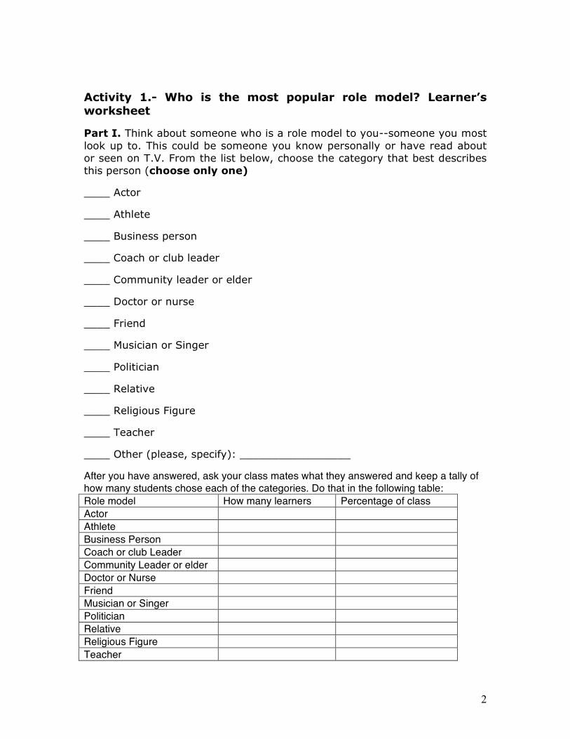
Activity 1.- Who is the most popular role model? Learner’s worksheet
Part I. Think about someone who is a role model to you--someone you most
look up to. This could be someone you know personally or have read about
or seen on T.V. From the list below, choose the category that best describes
this person (choose only one)
____ Actor
____ Athlete
____ Business person
____ Coach or club leader
____ Community leader or elder
____ Doctor or nurse
____ Friend
____ Musician or Singer
____ Politician
____ Relative
____ Religious Figure
____ Teacher
____ Other (please, specify): _________________
After you have answered, ask your class mates what they answered and keep a tally of
how many students chose each of the categories. Do that in the following table:
Role model How many learners Percentage of class
Actor
Athlete
Business Person
Coach or club Leader
Community Leader or elder
Doctor or Nurse
Friend
Musician or Singer
Politician
Relative
Religious Figure
Teacher
3
Other
Total
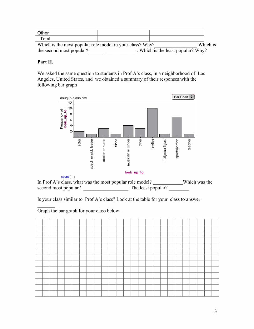
Which is the most popular role model in your class? Why?_________________ Which is the second most popular? ______ ____________. Which is the least popular? Why? Part II.
We asked the same question to students in Prof A’s class, in a neighborhood of Los Angeles, United States, and we obtained a summary of their responses with the following bar graph
( )count
2
4
6
8
10
12
look_up_to
asuquo-class.csv Bar Chart
In Prof A’s class, what was the most popular role model? ____________Which was the second most popular? __________________. The least popular? ________ Is your class similar to Prof A’s class? Look at the table for your class to answer _______ Graph the bar graph for your class below.

4
Activity 1.- Who is the most popular role model? Notes for the
teacher
You can facilitate this activity for your students by giving them first the learner’s worksheets. Write the role model categories on the blackboard, and ask students to come to the blackboard and write a vertical line in the category they selected. ( ||||| |||| etc). Write the number of students that chose each category. Compute also the percentage (number in the category divided by the total number of students in the class). Discuss with them which category is most popular for the class and which is the least popular. Which category is the second most popular? After reaching a conclusion, give students the second page and draw in the blackboard the bar graph for your class. Then, compare your graph with those of Dr. Asuquo’s class. Is your class’ most popular role model the same as in Dr. Asuquo’s class? If not, what might explain the difference? Ask students to offer possible suggestions (country, ages, ethnicity, income… etc…). The children in Dr. Asuquo’s class were 6h graders (11 to 12 years old) in the US. Most of them were Hispanic of low income families living in an area close to the Pacific Ocean in Los Angeles. Culture, age, ethnicity, income, location and several factors might explain the difference if there is any. Scoring rubrics:
A good answer will draw the table for the class correctly, with all the numbers in the column of counts adding up to the total class size. The column of percentages in the table should add up to 100. The students should be able to notice which category is most popular and which is the least popular. They should also be able to draw the bar graph with counts on the vertical axis and categories in the horizontal axis. They should be able to compare the two schools looking at Dr. Asuquo’s and your class. Students should also come up with some hypothesis as to why the results are different (or similar) for both classes. A much better answer would realize that to compare fully the two schools and to account for possible class size, the student should do the bar graphs for Dr. Asuquo and for your class with percentage in the vertical axis (relative frequency).
5
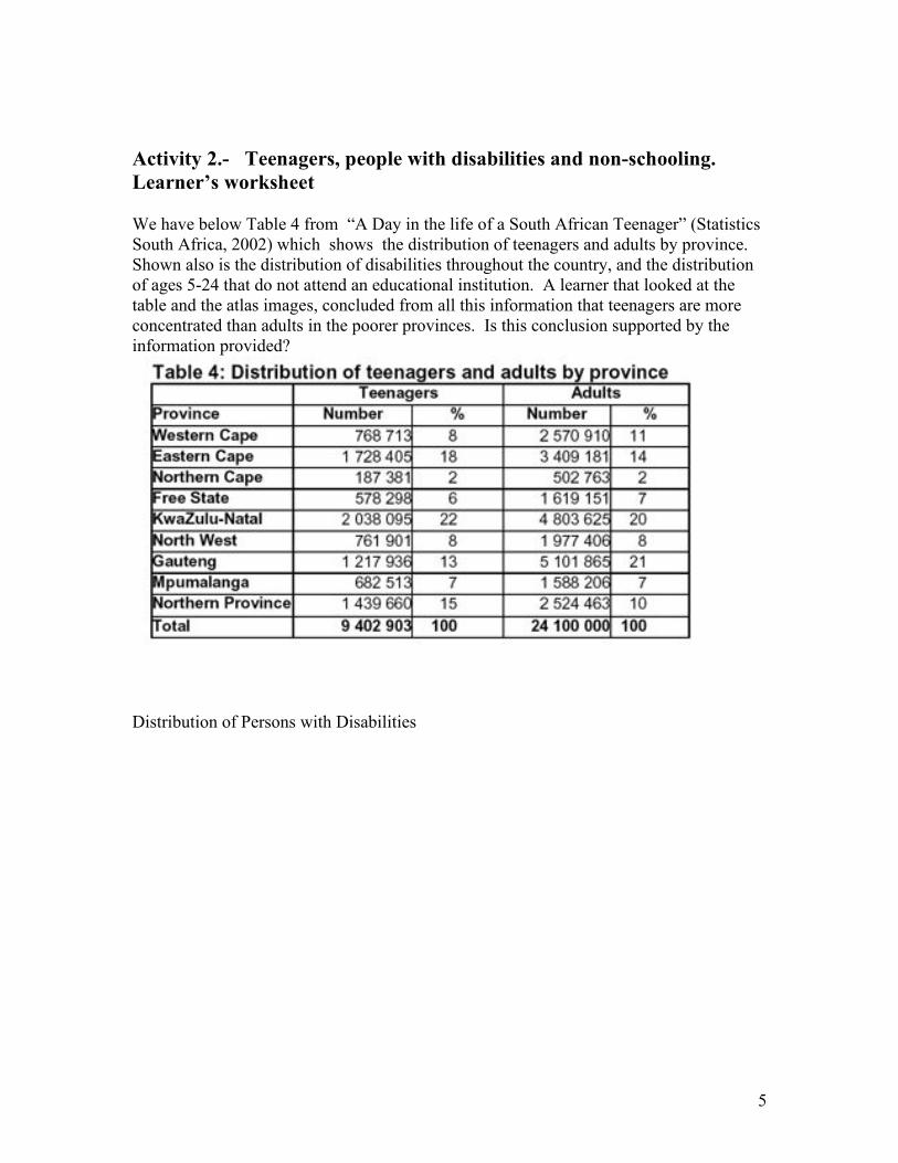
Activity 2.- Teenagers, people with disabilities and non-schooling.
Learner’s worksheet We have below Table 4 from “A Day in the life of a South African Teenager” (Statistics South Africa, 2002) which shows the distribution of teenagers and adults by province. Shown also is the distribution of disabilities throughout the country, and the distribution of ages 5-24 that do not attend an educational institution. A learner that looked at the table and the atlas images, concluded from all this information that teenagers are more concentrated than adults in the poorer provinces. Is this conclusion supported by the information provided?
Distribution of Persons with Disabilities

6
People ages 5-24 not attending an educational institution (2001)
7
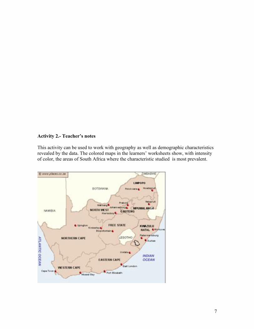
Activity 2.- Teacher’s notes
This activity can be used to work with geography as well as demographic characteristics revealed by the data. The colored maps in the learners’ worksheets show, with intensity of color, the areas of South Africa where the characteristic studied is most prevalent.

8
A good answer would start by identifying the different provinces, see the map above, and perhaps putting on top of the map, in each province, the percentage of teenagers and adults. Students should see whether the higher percentages of teenagers are in the darkest areas. If that is the case, that would establish only correlation with the variable studied, disabilities and non-attendance to educational institution. Students would then enter into a discussion of whether those two variables are really good proxies for income levels and why. More disabled people can be found in the eastern half of the country. Similarly, most people out of learning institutions happen in those areas. The table shows that high percentage of all teenagers live in some of those areas. Therefore, the learner should be able to see some relation between the situation of the regions and the prevalence of teenagers in those regions. But the correlation with poor/rich, is a little more complex. The curiosity of the student could lead him/her to ask for more data and speculate about social issues, such as whether disability and lack of schooling are correlated with income level. Questions such as “what types of disabilities” are included? Would lead to the search for more informatio
Activity 3.- Learner’s worksheet
Gestation and Longevity
Discuss the relationship between the length of the gestation period of an animal and its average longevity. Draw an appropriate graph to illustrate the relation.
Animal Gestation Average longevity Maximum longevity
days years yrs. mos. Ass 365 12 35 10 Baboon 187 20 35 7 Bear: Black 219 18 36 10 Grizzly 225 25 — Polar 240 20 34 8 Beaver 122 5 20 6 Buffalo (American) 278 15 — Bactrian camel 406 12 29 5 Cat (domestic) 63 12 28 Chimpanzee 231 20 44 6 Chipmunk 31 6 8 Cow 284 15 30 Deer (white tailed) 201 8 17 6 Dog (domestic) 61 12 20 Elephant (African) — 35 60 Elephant (Asian) 645 40 70

9
Elk 250 15 26 6 Fox (red) 52 7 14 Giraffe 425 10 33 7 Goat (domestic) 151 8 18 Gorilla 257 20 39 4 Guinea pig 68 4 7 6 Hippopotamus 238 25 — Horse 330 20 46 Kangaroo 42 7 — Leopard 98 12 19 4 Lion 100 15 25 1 Monkey (rhesus) 164 15 — (continued on next page)
10
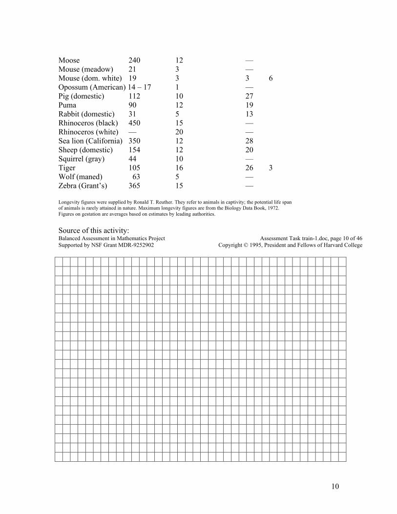
Moose 240 12 — Mouse (meadow) 21 3 — Mouse (dom. white) 19 3 3 6 Opossum (American) 14 – 17 1 — Pig (domestic) 112 10 27 Puma 90 12 19 Rabbit (domestic) 31 5 13 Rhinoceros (black) 450 15 — Rhinoceros (white) — 20 — Sea lion (California) 350 12 28 Sheep (domestic) 154 12 20 Squirrel (gray) 44 10 — Tiger 105 16 26 3 Wolf (maned) 63 5 — Zebra (Grant’s) 365 15 — Longevity figures were supplied by Ronald T. Reuther. They refer to animals in captivity; the potential life span of animals is rarely attained in nature. Maximum longevity figures are from the Biology Data Book, 1972. Figures on gestation are averages based on estimates by leading authorities.
Source of this activity: Balanced Assessment in Mathematics Project Assessment Task train-1.doc, page 10 of 46 Supported by NSF Grant MDR-9252902 Copyright © 1995, President and Fellows of Harvard College
11
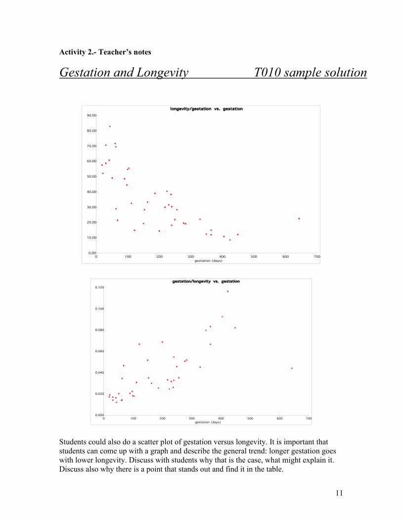
Activity 2.- Teacher’s notes
Gestation and Longevity T010 sample solution
longevity/gestation vs. gestation
0.00
10.00
20.00
30.00
40.00
50.00
60.00
70.00
80.00
90.00
0 100 200 300 400 500 600 700
gestation (days)
gestation/longevity vs. gestation
0.000
0.020
0.040
0.060
0.080
0.100
0.120
0 100 200 300 400 500 600 700
gestation (days)
Students could also do a scatter plot of gestation versus longevity. It is important that students can come up with a graph and describe the general trend: longer gestation goes with lower longevity. Discuss with students why that is the case, what might explain it. Discuss also why there is a point that stands out and find it in the table.

12
Activity 4.- Learner’s worksheet
Who’s Left?
As their topic for a group project, Chen, Shana and Jim decide to investigate how many people are left-handed. Since every seventh-grader takes math, they survey each class and record the following data:
Math Class Students in Class Left-Handed Students
7A 17 3
7B 26 5
7C 19 1
7D 22 2
7E 22 5
7F 12 3
7G 28 3
7H 25 5
7I 27 4
7J 30 3
7K 11 2
7L 19 2
1. a. How many students are in the 7th grade? What percentage of them are left-handed?
b. How can you use this information to estimate the number of left-handed people in a different group?
13
c. There are 917 students in the school. About how many of them would you expect to be left-handed? Why?
There are 311 students in the 6th grade. About how many of them would you expect to be left-handed? Why?
There are 23 students in the first period French class. About how many of them would you expect to be left-handed? Why?
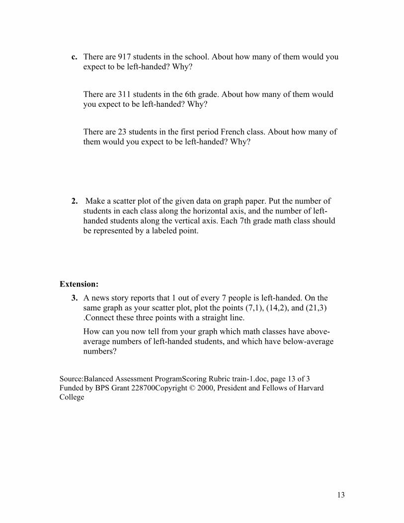
2. Make a scatter plot of the given data on graph paper. Put the number of students in each class along the horizontal axis, and the number of left-handed students along the vertical axis. Each 7th grade math class should be represented by a labeled point.
Extension:
3. A news story reports that 1 out of every 7 people is left-handed. On the same graph as your scatter plot, plot the points (7,1), (14,2), and (21,3) .Connect these three points with a straight line.
How can you now tell from your graph which math classes have above-average numbers of left-handed students, and which have below-average numbers?
Source:Balanced Assessment ProgramScoring Rubric train-1.doc, page 13 of 3 Funded by BPS Grant 228700Copyright © 2000, President and Fellows of Harvard College
14
Activity 3.- Educator’s notes.
Who’s Left M018 scoring rubric Math Domain
! Number/Quantity Shape/Space Function/Pattern
! Chance/Data Arrangement
Math Actions (possible weights: 0 through 4)
2 Modeling/Formulating 2 Manipulating/Transforming
3 Inferring/Drawing Conclusions
2 Communicating
Math Big Ideas
Scale Reference Frame ! Representation
Continuity Boundedness Invariance/Symmetry
! Equivalence General/Particular Contradiction
Use of Limits ! Approximation Other
1. a. In the given data, 38 of the 258 students, or 14.7%, are left-handed.
b. Calculate 14.7% of the total number of people in the group.
c. You would expect about 135 of the school population, 46 of the sixth grade, and 3 of the French class to be left-handed.
15
0
1
2
3
4
5
6
0 5 10 15 20 25 30 35
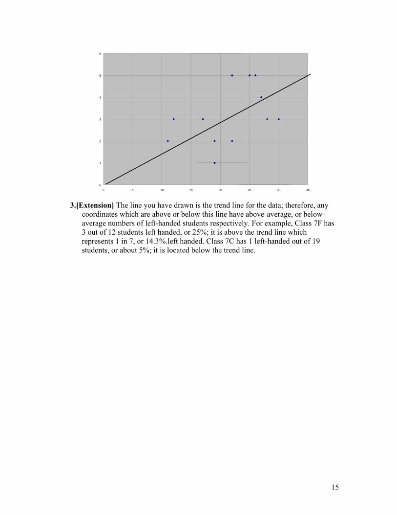
3.[Extension] The line you have drawn is the trend line for the data; therefore, any coordinates which are above or below this line have above-average, or below-average numbers of left-handed students respectively. For example, Class 7F has 3 out of 12 students left handed, or 25%; it is above the trend line which represents 1 in 7, or 14.3%.left handed. Class 7C has 1 left-handed out of 19 students, or about 5%; it is located below the trend line.
16
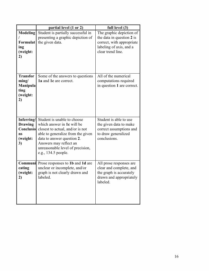
partial level (1 or 2) full level (3)
Modeling
/
Formulat
ing
(weight:
2)
Student is partially successful in presenting a graphic depiction of the given data.
The graphic depiction of the data in question 2 is correct, with appropriate labeling of axis, and a clear trend line.
Transfor
ming/
Manipula
ting
(weight:
2)
Some of the answers to questions 1a and 1c are correct.
All of the numerical computations required in question 1 are correct.
Inferring/
Drawing
Conclusio
ns
(weight:
3)
Student is unable to choose which answer in 1c will be closest to actual, and/or is not able to generalize from the given data to answer question 2. Answers may reflect an unreasonable level of precision, e.g., 134.5 people.
Student is able to use the given data to make correct assumptions and to draw generalized conclusions.
Communi
cating
(weight:
2)
Prose responses to 1b and 1d are unclear or incomplete, and/or graph is not clearly drawn and labeled.
All prose responses are clear and complete, and the graph is accurately drawn and appropriately labeled.

17
Activity 5.- What provinces are more likely to use electricity for cooking
in 2007? Learner’s worksheet. and how they compare to the nation as a whole? Why do you think they use more electricity for cooking? Do they eat more? Write a small essay, supporting your comments with the tables provided and illustrating your explanation with graphs and tables. The graphs, tables and comments must agree with each other.

18
Activity 5.- Teacher’s notes
The learner should realize that to have an idea of the total number of people using electricity in a province, the rows must be added. Also, since the national information is not given for electricity, the learner should be able to total the newly created column to obtain a total of the population that uses electricity.
To compare the provinces, the learner must convert the number of users in each provice to percentages relative to the province population. The learner must do the same with the total national number of users. Only with these percentages may the learner compare the provinces among themselves and with the national, and reach a conclusion.
A question that may arise is: what population to use: 2001 or 2007? Since the population and the electricity data come from the last survey, it makes sense to divide the numbers in the electricity table by the 2007 population.
A better answer would disaggregate the information by ethnic group, and would present a bar graph where the comparisons would be much easier to see.
19
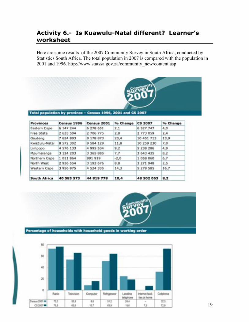
Activity 6.- Is Kuawulu-Natal different? Learner’s
worksheet Here are some results of the 2007 Community Survey in South Africa, conducted by Statistics South Africa. The total population in 2007 is compared with the population in 2001 and 1996. http://www.statssa.gov.za/community_new/content.asp
20
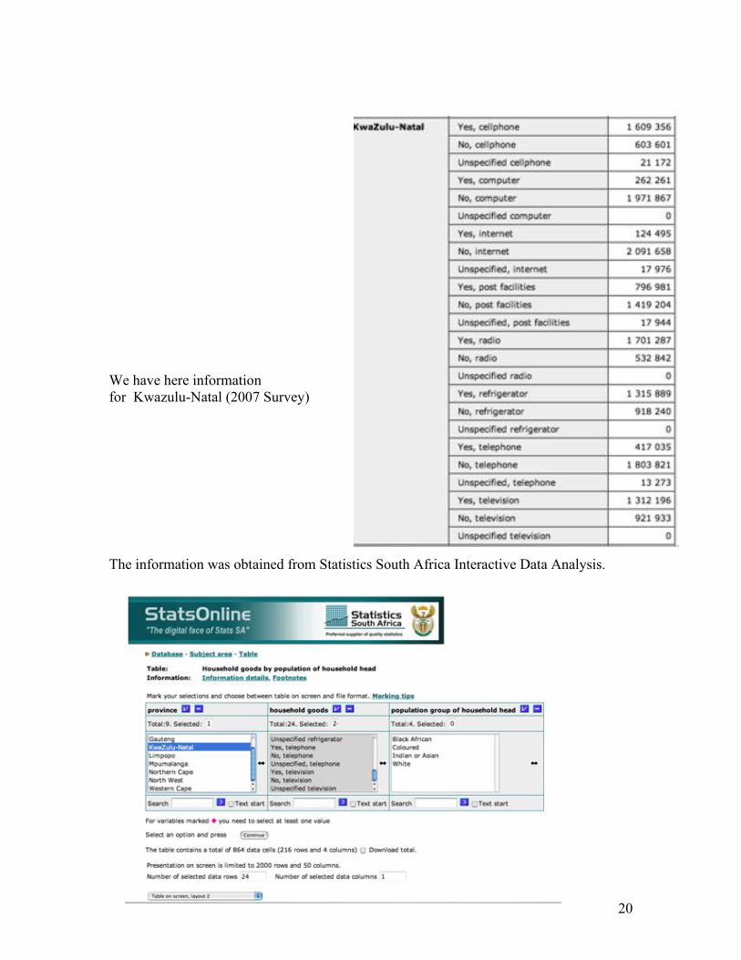
We have here information for Kwazulu-Natal (2007 Survey) The information was obtained from Statistics South Africa Interactive Data Analysis.

21
Question: How does Kwazulu-Natal fare in terms of household goods compared to the nation as a whole? Write a small essay, supporting your comments with the numbers and illustrating your explanation with graphs and tables. The graphs, tables and comments must agree with each other. Why do you think your results are the way they are? Is there some explanation? If someone without a cell phone visited South Africa and got stuck in the road without gas for the car and a person from Kwazulu-Natal stopped to help this visitor, what is the chance that this person could use his cell phone to call an emergency number?
22
Activity 6. Note to teachers
Here, a good answer would make use of all the information given, choosing the appropriate graph, but a much better answer would get Census 2001 information and use that information, too. In addition to that, it would be much better if the student’s curiosity led the student to search for other explanations. To start with, the learner must convert the data on Kwazulu-Natal (the yes question for each household good) into percentages, by dividing by the population in K-N. Only that way, the 2007 figures for K-N can be compared with the national figures given below the bar graph. With this information, the student can only compare the 2007 figures and reach a conclusion as to whether K-Z is different from the country in that period. But the student should be able to recognize that this information alone does not provide information about improvement or deterioration over time. The 2001 Census data are needed for that. The learner thus must inquire as to where is the 2001 data.
23
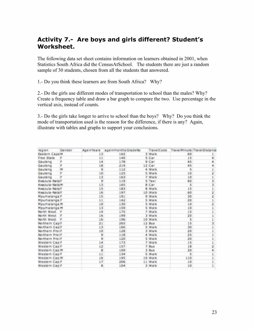
Activity 7.- Are boys and girls different? Student’s
Worksheet. The following data set sheet contains information on learners obtained in 2001, when Statistics South Africa did the CensusAtSchool. The students there are just a random sample of 30 students, chosen from all the students that answered. 1.- Do you think these learners are from South Africa? Why? 2.- Do the girls use different modes of transportation to school than the males? Why? Create a frequency table and draw a bar graph to compare the two. Use percentage in the vertical axis, instead of counts. 3.- Do the girls take longer to arrive to school than the boys? Why? Do you think the mode of transportation used is the reason for the difference, if there is any? Again, illustrate with tables and graphs to support your conclusions.
24
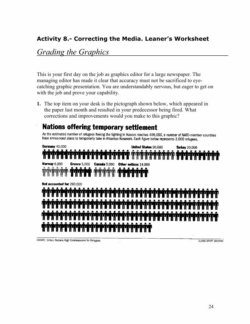
Activity 8.- Correcting the Media. Leaner’s Worksheet
Grading the Graphics
This is your first day on the job as graphics editor for a large newspaper. The managing editor has made it clear that accuracy must not be sacrificed to eye-catching graphic presentation. You are understandably nervous, but eager to get on with the job and prove your capability.
1. The top item on your desk is the pictograph shown below, which appeared in the paper last month and resulted in your predecessor being fired. What corrections and improvements would you make to this graphic?
25
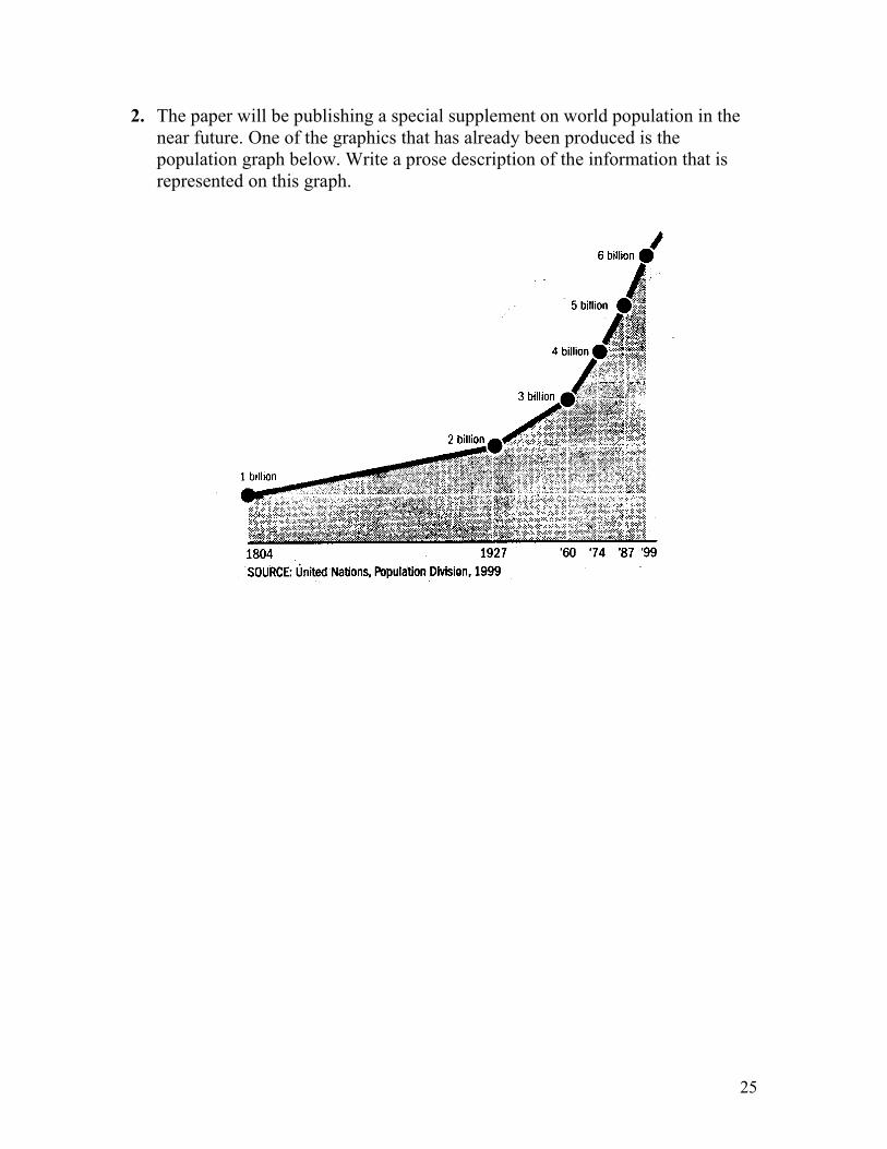
2. The paper will be publishing a special supplement on world population in the near future. One of the graphics that has already been produced is the population graph below. Write a prose description of the information that is represented on this graph.
26
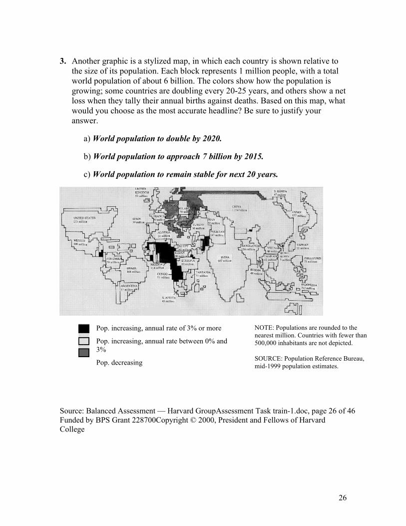
3. Another graphic is a stylized map, in which each country is shown relative to the size of its population. Each block represents 1 million people, with a total world population of about 6 billion. The colors show how the population is growing; some countries are doubling every 20-25 years, and others show a net loss when they tally their annual births against deaths. Based on this map, what would you choose as the most accurate headline? Be sure to justify your answer.
a) World population to double by 2020.
b) World population to approach 7 billion by 2015.
c) World population to remain stable for next 20 years.
Pop. increasing, annual rate of 3% or more
Pop. increasing, annual rate between 0% and 3%
Pop. decreasing
NOTE: Populations are rounded to the nearest million. Countries with fewer than 500,000 inhabitants are not depicted.
SOURCE: Population Reference Bureau, mid-1999 population estimates.
Source: Balanced Assessment — Harvard GroupAssessment Task train-1.doc, page 26 of 46 Funded by BPS Grant 228700Copyright © 2000, President and Fellows of Harvard College
27
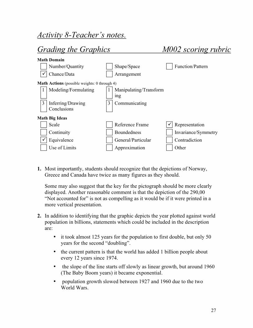
Activity 8-Teacher’s notes.
Grading the Graphics M002 scoring rubric Math Domain
Number/Quantity Shape/Space Function/Pattern
! Chance/Data Arrangement
Math Actions (possible weights: 0 through 4)
1 Modeling/Formulating 1 Manipulating/Transforming
3 Inferring/Drawing Conclusions
3 Communicating
Math Big Ideas
Scale Reference Frame ! Representation
Continuity Boundedness Invariance/Symmetry
! Equivalence General/Particular Contradiction
Use of Limits Approximation Other
1. Most importantly, students should recognize that the depictions of Norway, Greece and Canada have twice as many figures as they should.
Some may also suggest that the key for the pictograph should be more clearly displayed. Another reasonable comment is that the depiction of the 290,00 “Not accounted for” is not as compelling as it would be if it were printed in a more vertical presentation.
2. In addition to identifying that the graphic depicts the year plotted against world population in billions, statements which could be included in the description are:
• it took almost 125 years for the population to first double, but only 50 years for the second “doubling”.
• the current pattern is that the world has added 1 billion people about every 12 years since 1974.
• the slope of the line starts off slowly as linear growth, but around 1960 (The Baby Boom years) it became exponential.
• population growth slowed between 1927 and 1960 due to the two World Wars.

28
3. Since the countries which are keyed as having either a net population loss, or 3% and greater population growth are not a significant portion of the graphic, it is not possible for either the population to double by 2020, or to remain stable for the next 20 years. It is therefore reasonable to choose as the headline “World Population To Approach 7 billion by 2015”, as the majority of the countries portrayed in the graphic are experiencing 1-3% population growth. This also corresponds to the rate of growth shown in the graphic for question 2.

29
partial level (1 or 2) full level (3)
Modeling/
Formulating
(weight: 1)
Student is only partially successful in devising a strategy to analyze the graphic in question 3.
Student is completely successful in devising a strategy to answer question 3.
Transforming
/
Manipulating
(weight: 1)
Student is able to numerically interpret some of the data presented in the graphics.
Student is able to numerically interpret all of the data presented in the graphics.
Inferring/
Drawing
Conclusions
(weight: 3)
Student is able to draw conclusions from one or two of the given graphics.
Student is able to draw correct conclusions from all three graphics.
Communicati
ng
(weight: 3)
Prose explanations are unclear or incomplete. Answer to question 2 is limited to a point-by-point identification of the plot of the graph.
All prose explanations are clear, complete, and coherently expressed.
30
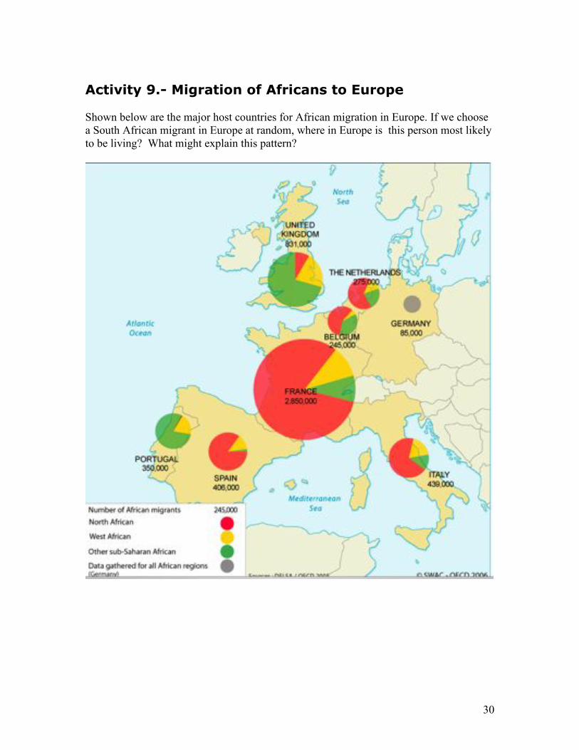
Activity 9.- Migration of Africans to Europe Shown below are the major host countries for African migration in Europe. If we choose a South African migrant in Europe at random, where in Europe is this person most likely to be living? What might explain this pattern?
31
Activity 10.- The Price of a Kilogram of Tomatoes in
your region
In this activity, you are going to collect data on the price of tomatoes. Each learner will visit 5 tomato stands (in the supermarket, in the street, or wherever you find someone selling tomatoes) in a given day. Ask each vendor how much is the kilogram of tomatoes. If the vendor sells them according to some other criterion (by the piece, by the bag, etc…) do the investigation necessary to estimate the price of a kilogram. Write your 5 prices and compute their average (add the prices and divide by 5) . Put together the prices of all students in a table as follows (add more rows as needed). Compute the average price
Learner’s
name
Vendor 1
price
Vendor 2
price
Vendor 3
price
Vendor 4
price
Vendor 5
price
Average
….. 1.- Try to find explanations for the difference in prices across vendors. 2. Is there some average in the table that stands out as very different from the others? Investigate why this is so. Ask the student that provided the prices for that average why it is so different? 3.- If you had to provide an estimate of the average price of tomatoes in your region, what would that be?
32
Lesson 1.
Percentages (http://www.stats.org/in_depth/faq/percentages.htm)
Percentages can sometimes be misleading, even for those who feel comfortable with
numbers. The word comes from the Latin: per cent means “for each hundred.” This is
why 95 percent means 95 for each hundred. It is also why the percentage is the ratio in
terms of hundreds. Suppose a poll finds that 620 people out of 1250 polled prefer
chocolate to vanilla ice cream. The ratio of chocolate lovers to the whole population is
620/1250 = .496. The percentage of those who prefer chocolate is the ratio times 100; in
this case .496 x 100 = 49.6% of those questioned prefer chocolate over vanilla.
At times we do percentages in our heads rather quickly, which can lead to erroneous
conclusions. For example, suppose a shopkeeper raised the price of a jacket by 50
percent, and then discounted it by 50 percent. The price would not be the same price as it
started! Suppose the jacket cost $100. After the 50 percent increase, it would cost $150.
Take 50 percent off of $150, for a price of $75, rather than the original $100.
Another common trap is the following: Suppose the homicide rate in a city went down 50
percent in one year, and another 30 percent the following year. Did the rate go down by
80 percent over the two-year period? No! Suppose the initial rate was 100 homicides for
every 100,000 residents. After a 50 percent reduction, the rate is 50 homicides for every
100,000 residents. Another thirty percent reduction means an additional .3 x 50 = 15
percent reduction. The final rate is then 50 - 15=35 homicides for every 100,000
residents. On the other hand, an 80 percent reduction of the original rate is .8 x 100 = 80
fewer deaths for each 100,000 residents, for a final rate of 20 homicides for every 100,000
residents. So be wary of “additional amounts” — you can’t just add the percentages.
Percentages can also mislead us if we use them when comparing diverse groups of people.
The press often comes out with headlines such as “ Mississippi has the worst maternal
death rate in the country” (note: MI is chosen for illustrative purposes only) or other
state-by-state comparisons. The implication is that Mississippi doesn’t have as good a
health care system.
Now it also turns out that blacks as a population have a worse maternal death rate than
whites in the U.S. And the poor have a worse death rate than the rich. It turns out that
Mississippi has a higher rate of blacks, and a higher rate of poor people than other states.
In fact, one can cook up numbers in which Mississippi has a lower maternal death rate for
33
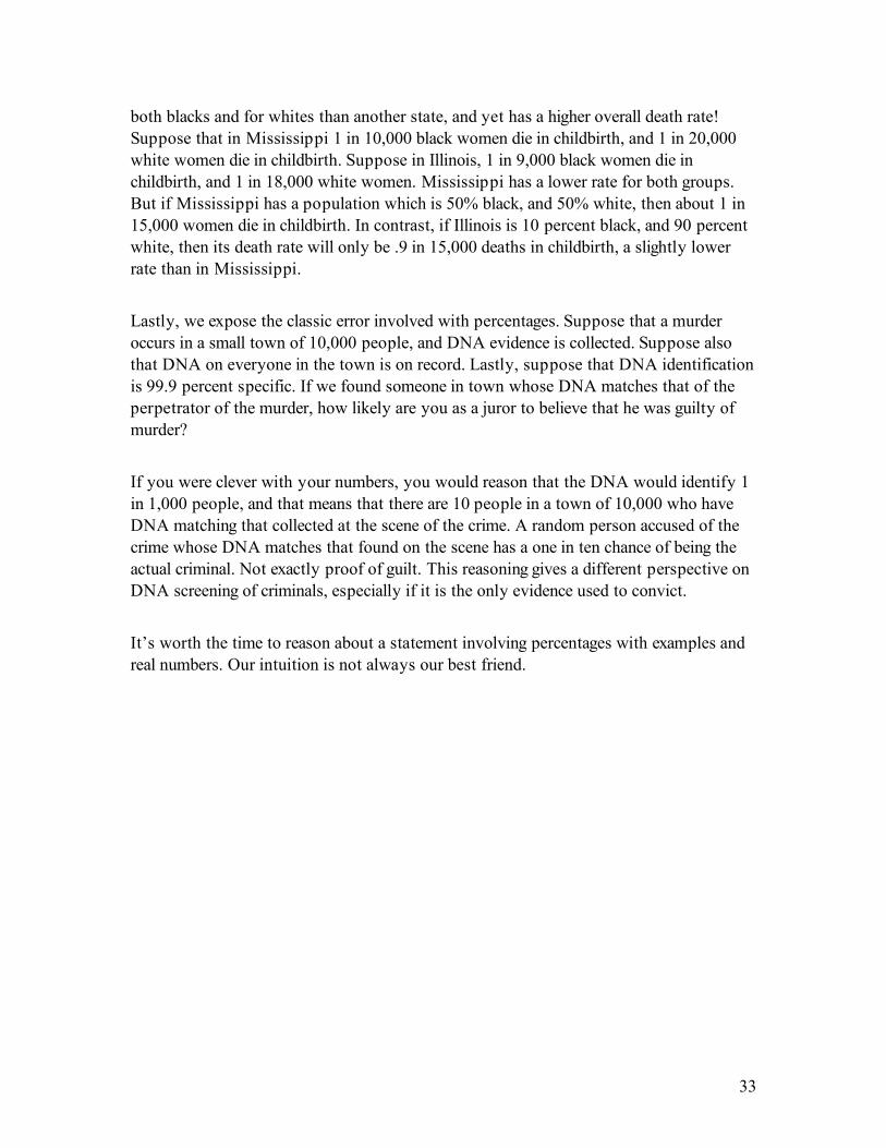
both blacks and for whites than another state, and yet has a higher overall death rate!
Suppose that in Mississippi 1 in 10,000 black women die in childbirth, and 1 in 20,000
white women die in childbirth. Suppose in Illinois, 1 in 9,000 black women die in
childbirth, and 1 in 18,000 white women. Mississippi has a lower rate for both groups.
But if Mississippi has a population which is 50% black, and 50% white, then about 1 in
15,000 women die in childbirth. In contrast, if Illinois is 10 percent black, and 90 percent
white, then its death rate will only be .9 in 15,000 deaths in childbirth, a slightly lower
rate than in Mississippi.
Lastly, we expose the classic error involved with percentages. Suppose that a murder
occurs in a small town of 10,000 people, and DNA evidence is collected. Suppose also
that DNA on everyone in the town is on record. Lastly, suppose that DNA identification
is 99.9 percent specific. If we found someone in town whose DNA matches that of the
perpetrator of the murder, how likely are you as a juror to believe that he was guilty of
murder?
If you were clever with your numbers, you would reason that the DNA would identify 1
in 1,000 people, and that means that there are 10 people in a town of 10,000 who have
DNA matching that collected at the scene of the crime. A random person accused of the
crime whose DNA matches that found on the scene has a one in ten chance of being the
actual criminal. Not exactly proof of guilt. This reasoning gives a different perspective on
DNA screening of criminals, especially if it is the only evidence used to convict.
It’s worth the time to reason about a statement involving percentages with examples and
real numbers. Our intuition is not always our best friend.
34
Lesson 2. (http://info.cancerresearchuk.org/cancerandresearch/risk/communicatingrisk/absoluteandrelativerisk/)
Absolute and relative risk
There are two main ways that scientists present risks to the public - absolute
risk and relative risk.
Absolute risk is defined as the chance of a person developing a specific
disease over a specified time-period. For example, a woman's lifetime
absolute risk of breast cancer is one in nine. That is to say, one woman in every
nine will develop breast cancer at some point in their lives.
Absolute risk can also be expressed as a percentage (e.g. a woman's absolute
risk of breast cancer can be written as 11 per cent instead of one in nine) or as
a decimal (one in nine becomes 0.11).
Relative risk is used to compare risk in two different groups of people. For
example, in 2002, Cancer Research UK researchers found that women who
drank alcohol were at slightly increased risk of developing breast cancer
compared with women who didn't drink alcohol. The study showed that, if we
call a non-drinker's breast cancer risk '1', then a woman who drinks around two
or three units of alcohol per day has a relative risk of 1.13.
What does 'increase in risk' really mean?
Looking at the example above, we can see that women who drink two or three
units of alcohol a day have a increase in their chances of developing breast
cancer from 1 ('normal' risk) to 1.13, compared with women who drink nothing
at all. But how should we react to this figure? Is this a 'big' increase in risk?
35
Remember that a woman's absolute lifetime risk of breast cancer is 11 per
cent. An increase in realtive risk from 1 to 1.13 can also be thought of as a 13
per cent increase in relative risk. But this 13 per cent increase in relative risk is
13 per cent of 11 per cent, or 1.43 per cent.
This means that a woman who drinks two units of alcohol per day has an
absolute lifetime risk of 12.43 per cent (because 11 + 1.43 = 12.43), assuming
she continues to drink at the same rate. Another way to say this is that women
who drink two or three units of alcohol per day have a lifetime risk of breast
cancer of one in eight, rather than one in nine (assuming they live to the age of
85).
Usually a scientific paper, news report or press release will make it clear whether it is talking about relative or absolute risk, but it is worth bearing in mind the difference between the two when reading stories about health risk factors.
Source: CUNY Proficiency Examination
(http://www1.cuny.edu/academics/oaa/testing/proficiency.html)
Directions
On the following pages, you will see a brief reading selection and two graphs. You should assume that the reading and graphs come from different sources and therefore may not be consistent with one another.
Your task is to identify the claims made in the reading selection and to determine how relevant data in the graphs support, partially support, and/or contradict claims in the text. In your response, you should describe two or more claims from the reading and explain how specific numerical data in the graphs support, partially support, and/or contradict the claims. At least one claim must be discussed using relevant numerical data from the first graph, and at least one other claim must be discussed using relevant numerical data from
36
the second graph.
Time Allotted
You will have one hour to read the text, examine the graphs, and write your response. You may use your dictionary at any time.
How to Prepare Your Response
You should use your time in this way:
0. Identify the claims in the reading selection. (You may take notes and/or mark on the reading if it helps you to identify the claims.)
0. Examine the data in the graphs. (You may take notes and/or mark on the graphs.)
0. Determine how relevant data in each graph support and/or contradict claims in the reading.
0. Plan a response in which you state two or more claims from the reading and explain the relationship between these claims and relevant data in the graphs, using specific numerical data from the graphs. You should use the unlined page to plan your response.
0. Write your response on the lined pages. 0. Re-read your response to ensure that it will be clear to a reader.
How Your Response will be Evaluated
Your response on the lined pages will be evaluated based on your ability to:
0. Identify and state accurately the claims in the reading selection. 0. Explain the relationship between these claims and the relevant
data in the graphs with accuracy, clarity, and completeness. 0. You can earn up to 4 points by identifying two claims and
accurately explaining how relevant numerical data from the graphs support, partially support, and/or contradict those claims. One claim must be discussed using relevant data from the first graph and the other claim discussed using relevant data from the second graph. You can earn more points by identifying additional claims and accurately relating them to relevant numerical data from the graphs, or by insightfully discussing an additional aspect of a claim's relationship to specific numerical data from a graph.
0. Your notes and marks on the reading or graphs will NOT be
37
evaluated. Your work on the unlined page will NOT be evaluated. Only your work on the lined pages of the booklet will be graded, so be sure to write your response on the lined pages of the booklet.
Sample Assignment
The Education Gender Gap
The following article was recently published in a magazine about education.
The gender bias against girls that educational specialists identified in schools in the early 1980s appears to have been eliminated. Unlike earlier indications that girls were performing consistently lower than boys and consistently lower than their abilities, statistics now show that females are the highest achievers at every level of education-from grade school through advanced University degrees. Girls' improvement is especially marked at the college level. Thirty years ago less than 40% of college graduating classes were comprised of women. Today, women earn an average 60% of all bachelor's degrees and 58% of all master's degrees. The United States Department of Education predicts these rates will continue to increase. Yet, even as girls perform better, boys have begun to perform worse. Boys' reading and writing skills are a full years behind their female classmates'. This gap is enough to put them at a profound disadvantage, since all other learning relies on these basic skills. As a result, boys are more than twice as likely as girls to be placed in a remedial education class. In addition, they are four times as likely to be diagnosed with a learning disability. It is not surprising, then, that twice as many boys drop out of school. The new gender gap in academic achievement is real, and it threatens the future of millions of American boys. It took a concerted national effort to improve academic performance for girls; no less should be required for boys.
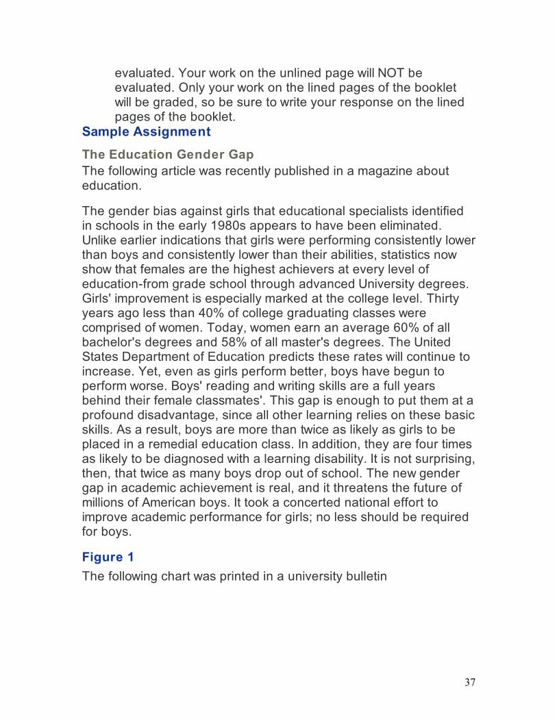
Figure 1
The following chart was printed in a university bulletin
38
[top]
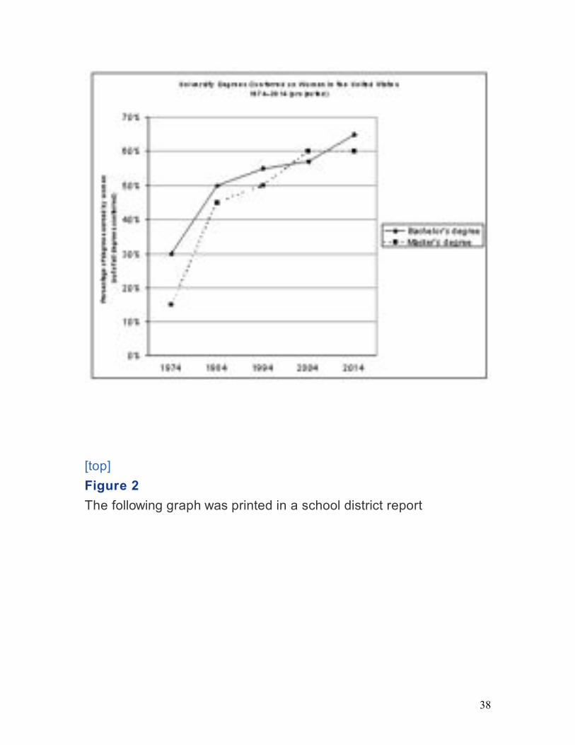
Figure 2
The following graph was printed in a school district report

39
[top]
CPE : Task 2 : Sample Student Responses
The responses on the following pages, printed with permission, were written by CUNY students at an earlier CPE administration. The examination question they responded to is reprinted here:
Response A
-Figure #1 coincides with some of the information in the first paragraph of the reading.
-in the reading: 30 years ago less than 40% of college graduating classes were comprised of women, and the graph (Figure 1) supports it by showing about 15% of degrees earned by women in 1974 (30 years ago)
-Figure 1 contradicts the reading by showing that 60% of all master's degrees and about 58% of all bachelor's degrees are earned by
40
women and the reading states the opposite: today, women earn an average of 60% of all bachelor's and 58% of all master's degrees.
-Figure 2 supports the second paragraph of the reading in that boys are more than twice as likely as girls to be placed in remedial education class by showing that for every 3 girls in a remedial class there are 7 boys (in 2003).
-Figure 2 shows that the number of boys to the number of girls diagnosed with learning disability is 8 to 2. This means that boys are 4 times more likely to be diagnosed with learning disability, which is supported in the reading (second paragraph).
-the reading says that twice as many boys drop out of school and the data in Figure 2 almost 100% agrees with this information because it shows that for every 3 boys only about 1.2 girls drop out of school. If we assume that the ratio from boys to girls is 3 to 1.2 then the reading and the figure would coincide by 90%.
-Figure 1 shows how only one of the two between a bachelor's and a master's will increase in the future, which is half in accordance with the reading which says that the United States Department of Education predicts that these rates (assuming both bachelor's and master's degrees) will continue to increase.
Comments on Response A: Score = 6 This response clearly states six claims from the reading passage and accurately supports four of them with specific evidence from both figures. Notice that it is not written in essay form, but rather clearly separates each claim into a discreet paragraph. Despite some writing problems, the evidence is usually clear and unambiguous. The first two bullets isolate claims from the first paragraph: the initial one has weak support because the 15% figure cited corresponds to master's degrees in figure 1, not the "college graduating classes" in the reading. The next four bullets succinctly show the relationship between the claims (one from paragraph one and figure 1, three from paragraph two and figure 2) and the numerical information in the figures. Examples: "for every 3 girls in a remedial class there are 7 boys"; "boys are 4 times more likely to be diagnosed with learning disability"; "Figure 1 contradicts the reading by showing that 60% of all master's degrees and about 58% of all bachelor's degrees are
41
earned by women and the reading states the opposite: today, women earn an average of 60% of all bachelor's and 58% of all master's degrees." The last bullet is a somewhat awkward and sketchy attempt to analyze future trends. Because four claims have been successfully supported four times with evidence from both figures, this response is a 6.
[top]
Response B
Figure One can be compared to the claim that "thirty years ago less than 40% of college graduating classes wee comprise by women." Figure one definitely supports the claim. Exactly 30% of Bachelor's degrees were conferred to women thirty years ago in 1974. Only 15% of Master's degrees wee conferred to women in 1974. Both of these percentages are less than 40%
Figure two can be compared to the claim that "boys are more than twice as likely as girls to be placed in a remedial education class." Figure two supports the claim. If we look at the amount of girls who are at risk of being placed in a remedial class, the number is 3 million girls. If we look at the amount of boys who are at risk of being placed in remedial classes, the number is 7 million boys. This is more than twice as many girls.
Finally, figure two can also be compared to the claim that boys "are four times as likely to be diagnosed with a learning disability". Figure two accurately supports the claim. If we compare the number of girls diagnosed with learning disabilities, which is 2 million, to the number of boys, which is 8 million, it is exactly four times as many boys.
Comments on Response B: Score = 5 This response gets a 5 because it identifies three claims from the reading and explains their relationship with Figures 1 and 2. The first claim, that 30 years ago less than 40% of college graduating classes were women, is supported by the reference to Figure 1, where we were told that in 1974 women earned only 30% of Bachelor's degrees and 15% of Master's degrees. The second claim, that says that boys are more than twice as likely as girls to be placed in a remedial class, is supported by noting that Figure 2 has 3 million girls but 7 million boys in remediation. The third claim, that boys are four times as

42
likely to be diagnosed with a learning disability, is supported by citing in Figure 2 that 8 million boys but only 2 million girls are so diagnosed. Though the writing may be recognizably that of a non-native English speaker, it in no way prevents recognition of the matched claims and data.
[top]
Response C
The article, "The Education Gender Gap," makes two very distinct and clear claims about education in the U.S. as it relates to boys and girls.
The first claim is that women presently earn an average 60% of all Bachelors Degrees and 58% of all Masters Degrees. When looking at a chart printed in an unnamed university bulletin I found that that claim is generally true. Though the chart shows that women actually earn 60% of all Masters (not 58%) and roughly 58% of all Bachelors Degrees (not 60%).
The second claim in the article is that boys are four times as likely to be diagnosed with a learning disability than girls. Based on a graph that was printed in n unnamed school district report this claim is very true. According to the graph, this district had 2 million girls at risk versus 8 million boys at risk with being diagnosed with a learning disability. That would equal the boys being four times as likely to be diagnosed with a learning disability.
Comments on Response C: Score = 4 There are two paragraphs in this response. In each, one claim from the text is clearly stated and then supported by numerical analysis of the appropriate figure. Since in order to earn a score of 4, both figures must be used successfully, this is a good example of an upper level response that could have potentially scored higher if the student had found more claims and supported them with the same specificity. After a brief introduction, both paragraphs succinctly show how the numbers in the passage and in the figures are related.
Example: "The second claim in the article is that boys are four times as likely to be diagnosed with a learning disability than girls. Based on the graph . . . [there were] 2 million girls at risk versus 8 million boys at risk." Even with an error (the millions of at-risk students were
43
not all in the school district publishing the graph!) the correspondences are clear. Note how the student accurately identifies the source of each figure.
[top]
Response D
The article The Education Gender Gap reads "The gender bias against girls that education specialists identified in school in the early 1980s appears to have been eliminated". This statement is untrue because the "University Degrees Conferred on Women in the US" chart captures data in 10 year intervals (1974-2014), therefor the data in 1980 was not specified.
Another line I find to be incorrect is "Today, women earn an average 60% of all bachelor's degrees and 58% of all Master's degrees". According to the chart, today, women earn an average 60% of all master's degrees and 58% of all bachelors.
The statement "Boys' reading and writing skills are a full 1 1/2 years behind their female classmates." There is no chart that captures this information to support this statement. We cannot determine if this is true.
The chart shows that boys are 6 times as likely to be diagnosed with a learning disability. The reading states that boys are 4 times as likely to be diagnosed with a learning disability. The last sentence in that paragraph states, "It is not surprising, then, that twice as many boys drop out of school." This is contradicting because this is right according to the chart, however, the other data was wrong, but the result is the same.
Comments on Response D: Score = 3 This response gets a 3 because it only successfully links one claim with the appropriate data while stating but not supporting an additional claim. The successful claim states that women earn 60% of all Bachelor's degrees and 58% of all Master's degrees while pointing out that Figure 1 shows 58% of Bachelor's degrees and 60% of Master's degrees. The claim that since the early 80's the gender gap has been eliminated is correctly stated but not adequately discussed in Figure 1. The statement that neither figure helps us to determine if boys are 1= years behind prevents that claim from increasing the score. The
44
claim that boys are 4 times as likely to be diagnosed with a learning disability has neither a clear discussion nor a sufficiently articulated use of data.
[top]
Response E
In the United States everybody goes to school and many go on to college. The article discusses male and female academic performance at various levels of education. The reading selection states "Today, women earn an average 60% of all bachelor's degrees and 58% of all master's degrees. However, the claim contradicts Figure 1 because the figure actually states that 58% of bachelor's degrees and 60% of master's degrees were earned by women.
Comments on Response E: Score = 2 This brief response is clearly a 2 because one claim is clearly related to one figure, and no attempt is made to do anything more, even find additional claims. The one claim, about the percentages of women's Bachelor's and Master's degrees, is shown to be contradicted by the corresponding numbers in figure 1.
[top]
Response F
The claims made in "The Education Gender Gap" that "Girls improvement is especially marked at the college level" is supported by the University Degree conferred on women in the United States chart. The chart does show the percentage of degrees earned by women. It shows an increase that is still on the rise and as mentioned in the claim by the United States Department of Education that the "rates will continue to increase".
However this chart does not give us the full picture or facts. It does not allow us to see the claims for boys. It does not compare the two together. For all I can see I would have to say yes women are on the rise in education.
Women have been on the rise since 1974 as it shows on the chart. They are both rising in Bachelor's and Master's degrees.
45
The article also claims that boys are performing worse. The graph shows the number of students at risk by the millions, and this graph clearly shows and supports the claims made to support the claim it shows that a higher number of boys are/will be diagnosed with learning disability. In addition, they (boy) are have a higher number of drop-outs, twice as much than boys.
In conclusion girls will always tend to do better in school and will and have exceeded beyond their past generations.
Comments on Response F: Score = 1 This response gets a 1. The claim that rates of women graduating will continue to rise gets no specific discussion of data in Figure 1. The claim that "boys are performing worse" also does not use specific data from Figure 2.
[top]
CPE : Task 2 : Scoring Guide
6 Accurately identifies two or more claims from the reading selection and explains the relationship of Figure 1 and 2 to these claims with accuracy, a high degree of complexity, and insight. Examinees can demonstrate a high degree of complexity or insight by successfully meeting the standards for a "5" AND by:
-1. introducing an additional claim and adequately discussing its relationship to one of the figures; or
-1. explaining an additional aspect of a figure's relationship to a claim; or
-1. discussing the relationship between one or more figures and the reading using perceptive analysis
5 Accurately identifies two or more claims from the reading selection and explains the relationship of Figure 1 and Figure 2 to these claims with accuracy and a degree of complexity. Examinees can demonstrate a degree of complexity by successfully completing one of the following:
-1. introducing a third claim and adequately discussing its relationship to one of the figures
-1. explaining an additional aspect of a figure's relationship to a claim 4 Accurately identifies two claims from the reading selection and adequately explains the relationship of Figure 1 to one of these

46
claims and Figure 2 to the other.
3 Accurately identifies two claims from the reading selection and adequately explains the relationship of one claim to one figure, but the connection between the other claim and a second figure is missing or inadequate (e.g., the connection is based on a misreading of the figure or simply repeats the language of the claim).
2 Accurately identifies one claim from the reading selection and adequately establishes a relationship between that claim and one or both of the figures.
1 Makes an attempt but does not accurately identify any of the claims or identifies one or more claims without establishing an adequate connection to either of the figures.
0 Blank, completely off-topic, illegible, or written in a language other than English.
[top]