Embed Size (px)
Citation preview
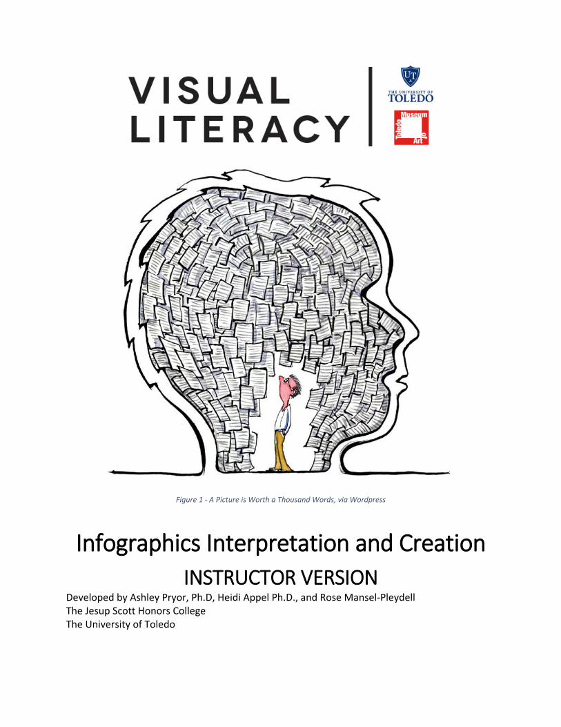
Figure 1 - A Picture is Worth a Thousand Words, via Wordpress
Infographics Interpretation and Creation INSTRUCTOR VERSION
Developed by Ashley Pryor, Ph.D, Heidi Appel Ph.D., and Rose Mansel-Pleydell The Jesup Scott Honors College The University of Toledo
Purpose The module is designed to provide students with an understanding of the use of infographics for communicating complex ideas efficiently and effectively. Students will learn about different platforms that are available for creating infographics (Easly.y, Piktochart, Canva, etc.), and how to refine and wire frame complex information into a visual representation.
Student Learning Objectives Upon completion of this module, students will be able to:
1. Critique examples of infographics for effectiveness and appropriate design 2. Communicate complex ideas, problems or issues effectively and efficiently through
the strategic use of images in an infographic 3. Determine the nature and extent of the visual materials needed to complete their
infographic 4. Find and access needed images and visual media effectively and efficiently 5. Organize and refine research using an annotated bibliography 6. Design and create a meaningful and effective infographic 7. Communicate their ideas effectively with attention to purpose, audience and style 8. Demonstrate proficiency with one infographic software application
Note that there is a companion module on Ethical Use of Visual Materials. To receive full credit for this module, please complete this brief pre-module assessment now. Instructor’s notes:
• Update with your own discipline-specific story about the importance of accurately and effectively communicating information. Examples might include convincing a boss of the need for an organizational update or discussing the ineffectiveness of lecture-style learning versus visual learning.
• Update with your own discipline-specific Student Learning Objectives for your own course.
• Notes on examples from specific disciplines: Good design decisions in engineering depend on clear display of visual data. Aesthetics of good design includes clarity in presentation of data in visual displays. Health information comes in many visual forms that influence how it is understood and interpreted.
• Transition to the activity by outlining the importance of being aware of and using visual language in broader ways than infographics. For example, introduce the topic by teaching two very basic lessons on a random subject, one using a short lecture, and one using an infographic, and then quiz students over the information. Retention for the visually presented info should be better than the lecture.
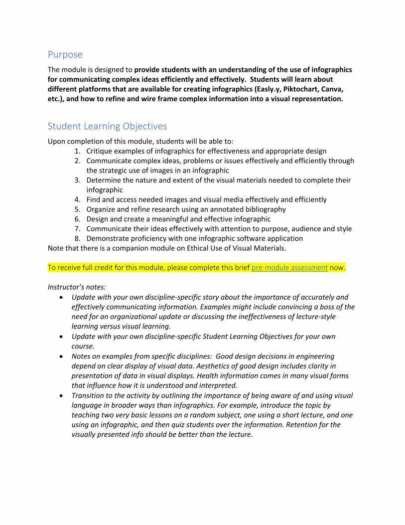
Background Infographics are everywhere you turn: A Google Search of "Infographics" on 4.28.18 yielded 58,500,000 results. Why have infographics become so popular?
Figure 2 - Phrenological Organs, via Top Hat
According to a report conducted by Infographic World, 90% of information transmitted to the brain is visual, and visuals are known to improve learning and retention by 400%. Some of the reasons for this dynamic include the following:
• Progressively shorter attention spans, thanks to smartphones; • The fact that humans absorb information faster with corresponding graphics (we may
forget what we’ve read, but remember what we’ve seen); and • Viewers tend to be triggered emotionally by images.
Source: Forbes Magazine
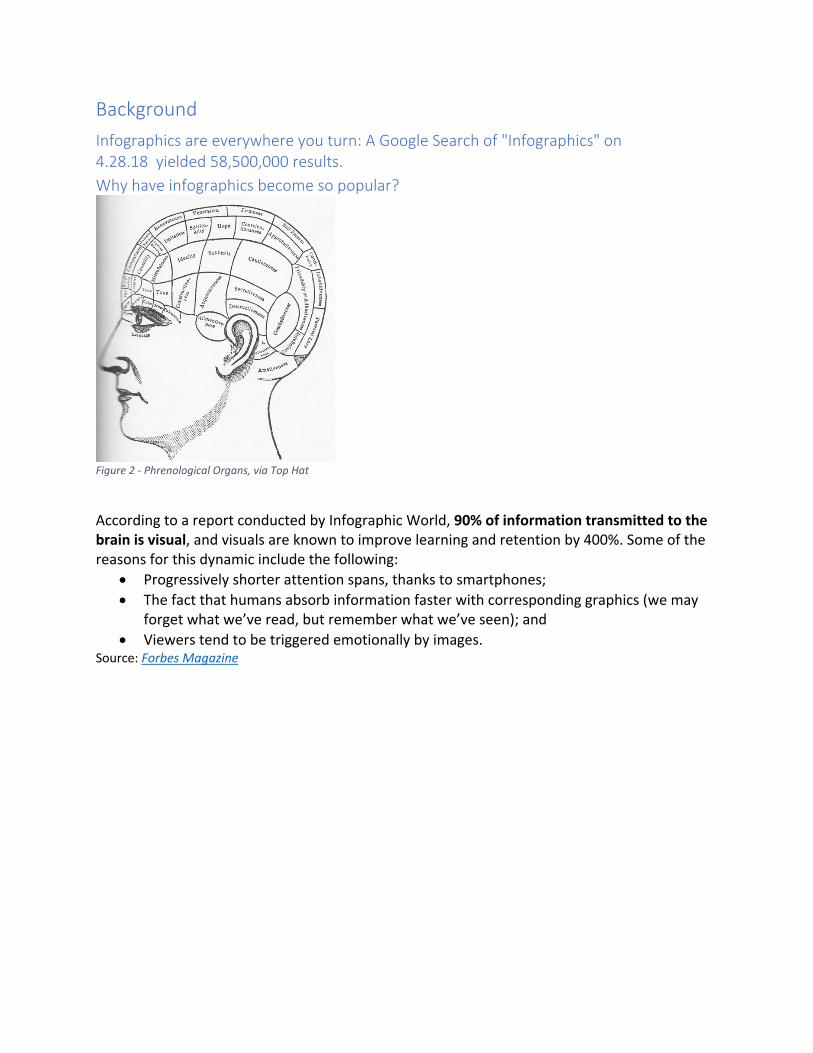
But what exactly is an Infographic? Definition of an Infographic
Figure 3 - Dictionary, via Blogspot
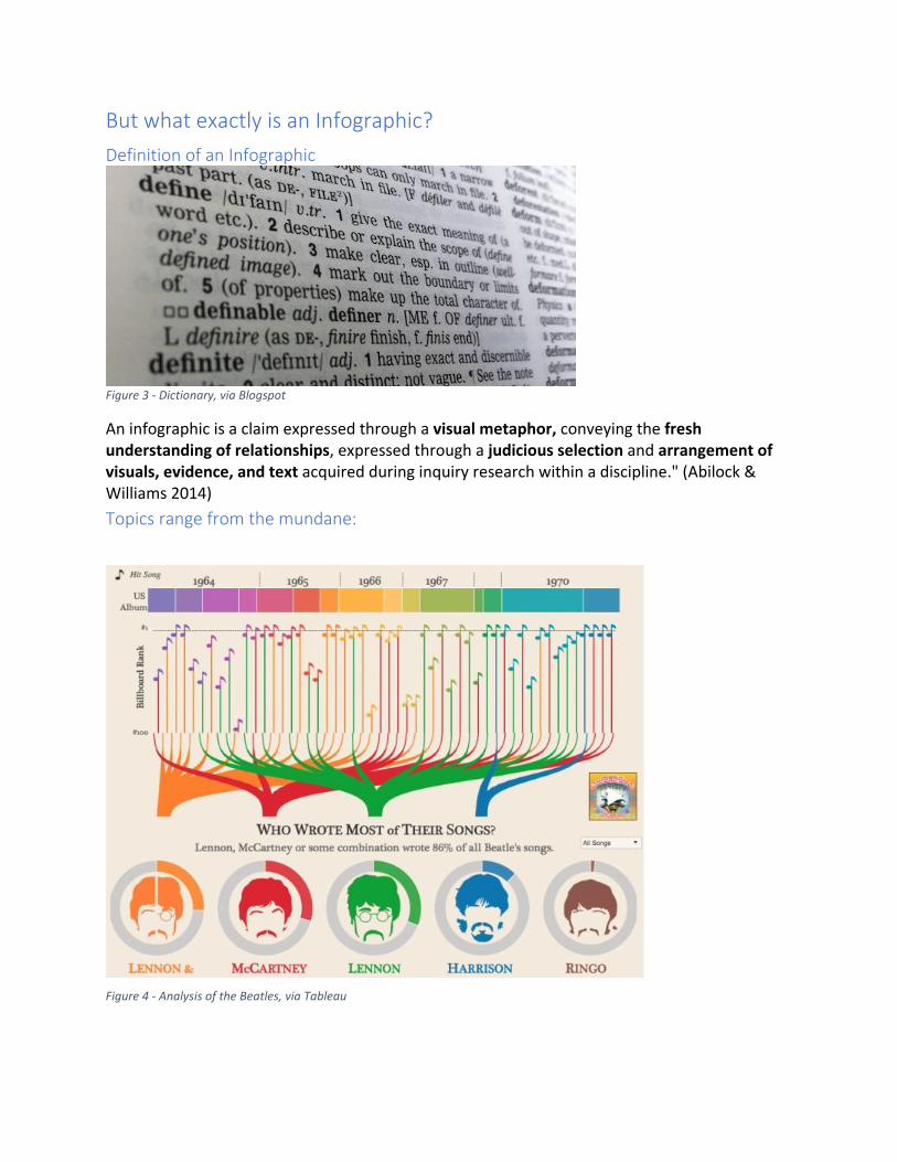
An infographic is a claim expressed through a visual metaphor, conveying the fresh understanding of relationships, expressed through a judicious selection and arrangement of visuals, evidence, and text acquired during inquiry research within a discipline." (Abilock & Williams 2014) Topics range from the mundane:
Figure 4 - Analysis of the Beatles, via Tableau
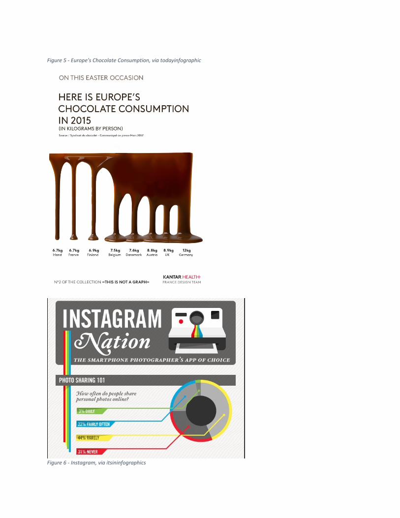
Figure 5 - Europe's Chocolate Consumption, via todayinfographic
Figure 6 - Instagram, via itsininfographics
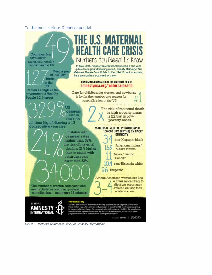
To the most serious & consequential:
Figure 7 - Maternal Healthcare Crisis, via Amnesty International
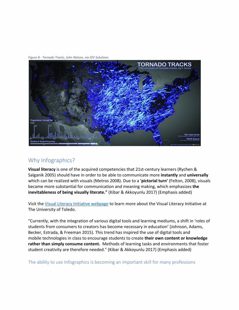
Figure 8 - Tornado Tracks, John Nelson, via IDV Solutions
Why Infographics? Visual literacy is one of the acquired competencies that 21st-century learners (Rychen & Salganik 2005) should have in order to be able to communicate more instantly and universally which can be realized with visuals (Metros 2008). Due to a 'pictorial turn' (Felton, 2008), visuals became more substantial for communication and meaning making, which emphasizes the inevitableness of being visually literate." (Kibar & Akkoyunlu 2017) (Emphasis added) Visit the Visual Literacy Initiative webpage to learn more about the Visual Literacy Initiative at The University of Toledo.
"Currently, with the integration of various digital tools and learning mediums, a shift in ‘roles of students from consumers to creators has become necessary in education’ (Johnson, Adams, Becker, Estrada, & Freeman 2015). This trend has inspired the use of digital tools and mobile technologies in class to encourage students to create their own content or knowledge rather than simply consume content. Methods of learning tasks and environments that foster student creativity are therefore needed." (Kibar & Akkoyunlu 2017) (Emphasis added) The ability to use Infographics is becoming an important skill for many professions
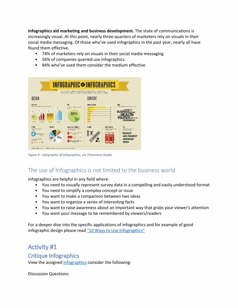
Infographics aid marketing and business development. The state of communications is increasingly visual. At this point, nearly three-quarters of marketers rely on visuals in their social media messaging. Of those who’ve used infographics in the past year, nearly all have found them effective.
• 74% of marketers rely on visuals in their social media messaging • 56% of companies queried use infographics. • 84% who’ve used them consider the medium effective
Figure 9 - Infographic of Infographics, via Threestory Studio
The use of Infographics is not limited to the business world Infographics are helpful in any field where:
• You need to visually represent survey data in a compelling and easily understood format • You need to simplify a complex concept or issue • You want to make a comparison between two ideas • You want to organize a series of interesting facts • You want to raise awareness about an important way that grabs your viewer's attention • You want your message to be remembered by viewers/readers
For a deeper dive into the specific applications of infographics and for example of good infographic design please read “10 Ways to Use Infographics”
Activity #1 Critique Infographics View the assigned infographics consider the following: Discussion Questions:
• What is your first impression of this infographic? Is it positive or negative? What sort of connotations did you experience when you viewed it?
• What is the main point the infographic makes? • Can you understand the data being presented? Why or why not? • Is this the best way to present this information? How else could it have been explained?
(Blog post, graph, slideshow, video, lecture, etc) • Why do/don’t you find the topic relevant or interesting? • Does the information seem valid? How can you tell?
Instructor’s notes:
• See the Infographics Critique Key for examples of infographic critiques. • You are encouraged to search the web for infographics and add images of your own to
critique if it is easier for you to identify strong/weak examples. • Discussion questions can be guided by the instructor (i.e., present the infographic to the
class, allow them to observe it, then begin asking “Someone tell me your first impression of this infographic?”) Or response could be in the form of a written assignment or discussion board.
• This is a great opportunity to acquaint your students with the rubric for the infographic they will be creating. Using the provided rubric or one of your own, encourage students to consider these guidelines when critiquing the infographics.
• Alternatively, based on your class’s ability, you could assign students to find an example of a good and a bad infographic and write three reasons they feel this way as an assignment.
Activity #2 Practice Making an Infographic Students will return to the following article: The Data Is In: Infographics Are Growing And Thriving In 2017 (And Beyond) Drawing from the information presented here, students will create a simple infographic as a sort of pretest to test out their knowledge of infographics and design. Prompt: Revisit the Forbes article mentioned above. With a small group, choose a topic from this article and make an infographic about the topic. The broad goal should be to make an infographic about the usefulness of infographics in communication. More specifically, you could create an infographic about why infographics work or the statistics on people’s retention from various mediums of communication. Follow these steps to create an infographic:
1. Select the important information 2. Organize the information in a rough draft or “wireframe” on a sheet of paper 3. Brainstorm how to include visuals (graphs, clipart, etc.) 4. Create an infographic using Piktochart
5. Share your infographic with the class and note strengths as well as areas for improvement
Instructor’s notes:
• If you feel it will be advantageous, you might provide students with a few pre-chosen pieces of information from the article from which to build an infographic to eliminate the step of retrieving information, which they will explore during the final project
• Aim for this step to serve as a pretest: the infographic made in this activity should be compared later to the infographic designed after learning about what makes an infographic strong or weak
• Keep this activity simple, and encourage students not to overthink the assignment, but to test out their designing skills
• In the final step, again introduce the rubric for the assignment to help familiarize students with the expectations
The Assignment: Step by Step Goal: Students are to create an infographic on a topic to be determined by the instructor and/or the class.
Step One: Defining the Context & Identifying the Scope of Work After you are assigned a topic, please answer the following questions: (questions adapted from Abilock & Williams):
1. Who is your audience that cares about this problem? 2. What is the specific problem or issue that they care about? 3. What choices, options, or trade-offs will they need to consider in order to make a
decision (if known)? 4. What research will you need to do to address questions 1-3? 5. What types of thinking will you have to do to organize the information you gather? 6. What content have you learned already that you can draw upon?
It may be helpful to look at Williams' "Infographic Question Matrix" (pages 20 & 21) to complete this process: Question Design Matrix (First Class Session) As a group, or individually, brainstorm 5-10 key ideas you think every person should know about your topic. You will have a chance to revisit this list after you have had a chance to research your topic more fully. Instructor’s notes:
• Topics may be assigned to groups, chosen from a list, or you may allow students to choose any topic they find interesting (as long as they clear the proposed idea with you)
• This would be a good opportunity to once again tie this module into your field-specific content, by providing a theme for the infographic topics, such as the lesson preceding or following the module in your course
• Group work is an important component of this assignment, because steps like the brainstorming will be much more productive in a group than by a single student
Overview: Hallmarks of Effective Infographics View this video on what makes a good infographic: https://www.youtube.com/watch?v=nLxQAa5Sras&feature=youtu.be
Recap: Key Elements of Effective Infographics Here are some general principles that you should keep in mind as you begin to think about laying out the elements of your infographic: (Adapted from “The Rules” by Amy Balliett, “Learning Infographic Design” (Lynda.com))
1. Always remember “con-text”: Infographics should be driven by images rather than text — if there is too much text, it’s a con!
2. Prioritize your goals: A key to good design is to highlight the essential information that you want to convey and edit out the rest.
3. People care less than a goldfish: A good infographic should convey its meaning in 9 seconds — the attention span of a gold fish — which is longer than humans (a mere 6–8 seconds!).
4. Good content is 50% of a successful infographic; hence, the importance of doing good research in advance of wireframing.
5. Use correct visualization throughout. 6. Be a storyteller! We all love a good story; try to organize your infographic in such a way
that it appeals to our natural hunger for a good story.
Task 1: Research & Annotated Bibliography Purpose: The purpose of this assignment is to ensure that you have sufficient and relevant content for your infographic. Additionally, the process of writing an annotation will help you identify and prioritize the key ideas that you will want to include in the infographic. Task A:
• Please choose 3 key ideas from your brainstorm list and do some research on them. (Your instructor will provide you with guidelines for locating appropriate sources for your topic.)
• After you have identified your sources, and read them, please write an annotated bibliographical entry for each resource.
• Please bring these entries with you to the next class. You will need them to complete the next stage of this project.
• If you are unfamiliar with how to create an annotated bibliography, please review the following example: Annotated Bibliography (University of New England)
Instructor’s notes:
• Remind students of scholarly platforms from which to retrieve sources for their bibliography (OhioLINK, WorldCat, Google Scholar, etc.)
• Encourage use of printed books, if it is feasible for the topic chosen. • Review the process for writing an annotation using the attached PDF • It may be helpful to set a minimum word count for the annotations, such as 100 or 150
words
Step Two: Visualizing Your Information
Overview: Wireframing What is a wireframe? A wireframe (a term that is commonly associated with website design) is a visual representation that demonstrates the relationship of elements on a page. The wireframe is a temporary and preliminary model. The wireframe is typically created on paper in advance of any digital modeling. The wireframe is by nature a work in progress, to be substituted with a polished product. It is roughly the equivalent of an “outline” in traditional writing contexts. View the following video on wireframing for web design: https://www.youtube.com/watch?v=T0vt3nLZKks&feature=youtu.be For help identifying “styles” of infographics you could use to organize info, visit the following page: http://blog.visme.co/types-of-infographics/
Task 2: Individual Wireframing from Research Task B: Using your annotated bibliographical entries as a resource, visualize the key information on a sheet of paper. The key to the successful completion of this task is to remember that you are attempting to give a visual representation of the relationship of ideas and the hierarchy of relations between them.
1. Look over your research annotations and identify the essential information that should be included in your infographic. It may be helpful to go back to your infographic questionnaire to review your answers concerning content, audience, etc.
2. On paper, sketch out at least three versions of the placement of your information, remembering that ideally you will be substituting much of the text with images.
3. Remember to consult the infographics best practices as you create your version. 4. Share your three versions with another classmate, or with your group. Which layout do
they find compelling? Why? Instructor’s notes:
• If you have access to whiteboards, this may be helpful for students because of ease of editing their wireframe sketch

• If students struggle with getting this step started, have them write or type out a traditional outline in text form and then organize “chunks” of information with sketches or index cards
Step Three: Choosing Your Infographic Software There are several options for sites that will help you to create visually appealing info graphics that are either free or low cost. Here are a few of them: Easel.ly Canva Piktochart Microsoft Powerpoint (charts and drawing tools) Google Drawing There are no hard and fast rules for choosing an infographic design site. You will find links to tutorials that can help you decide which platform best suits the anticipated needs of your infographic design. Play around with a couple of options and see which works best for you! Task C: Explore the above links. At the end of this process be prepared to identify which platform is best suited to your project and to discuss the reasons why. Instructor’s notes:
• This step can be completed in groups or as a class. • Have groups report back to you or announce to the whole class which platform they
have selected and why. • Ensure students actually look into each option; some may be more suitable than others
for certain styles or themes (i.e., graphs versus timelines). • Encourage students to find video tutorials for their software to learn how to create
certain effects or designs.
Step Four: Creating your Infographic Task D: Drawing upon what you have learned in steps 1-3, create an infographic on your topic, using the infographic platform of your choice. Your instructor will let you know how to submit your project for grading. Please print out a copy to bring to the next class, as we will be presenting the infographics for peer review. Assignment Sheet Grading Rubric Instructor’s notes:
• Choose a format for the infographics to be submitted in (PDF works well) • Compile all submissions into a folder for easy presentation to the class during the next
step
Step Five: Infographic Presentation & Peer Review Congratulations! You have completed your first infographic! Now it’s time to show off your work! To receive full credit for this module, please complete this brief post-module assessment now.
Skills Assessed in Infographic Assignments Infographics Functional Design Principles (Pettersson 2012)
1. Defining the problem 2. Providing structure 3. Providing clarity 4. Providing simplicity 5. Providing emphasis 6. Providing unity
Cognitive Design Principles (Pettersson & Avgerinou 2016) 1. Facilitating attention 2. Facilitating perception 3. Facilitating processing 4. Facilitating memory
Rubric for this assignment: Infographic Rubric Instructor’s notes:
• Structure the review however you feel would be most productive, whether that involves blind critiquing the infographics without knowing who made each one or teams presenting their infographic and then students asking questions/making comments
• You may find it helpful to also have each team or individual complete a self-evaluation and fill out a rubric for each of the infographics
• Include in the students’ grades credit for both the creation of an infographic, but also for honest and constructive critique/analysis of other teams’ work

Selected Bibliography • Abilock, D. & Williams, C. (2014). Recipe for an Infographic. Knowledge Quest, I43 (2):46. • Avgerinour, M.D., & Pettersson, R. (2016). “Teaching Reports: Information design with
teaching and learning in mind.” Journal of Visual Literacy, 35 (2): 253-267. • Davenport, T.H. (1994). Saving IT’s Soul: Human Centered Information Mangement.
Harvard Business Review, I 72 (2): 119-131. • Kirsh, B., Marlow, D., Pingley, A., Leonhirth, D. & Lownes, S., (2016). “Improving Student
Engagement with Technology Tools.” Currents in Teaching and Learning. • Petterson, R. (2012). It depends: ID-principles and guidelines. Tullinge, Sweden: Institute
for Infology. Retrieved from Rychen, D.S., & Salganik, L.H. (2005). The definition and selection of key competencies: Executive summary Organization for Economic Cooperation and Development (OECD).
• Smikicklas, M. (2012). The Power of Infographics: Using pictures to communicate and connect with your audiences. Indianapolis, IN: Pearson Education, Inc.