Embed Size (px)
Citation preview
Global Journal of Arts Humanities and Social Sciences
Vol.4, No.6,pp.34-47, June 2016
Published by European Centre for Research Training and Development UK (www.eajournals.org)
34 Print ISSN: 2052-6350(Print), Online ISSN: 2052-6369(Online)
INFLUENCE OF LAYOUT AND DESIGN ON STRATEGY AND TACTIC FOR
COMMUNICATING ADVERTISING MESSAGES
Dr. Ayo Elebute
Department of Mass Communication
Igbinedion University, Okada
Edo State, Nigeria
ABSTRACT The study examines the extent to which copy, layout and design influence
strategy and tactic for disseminating advertising messages and it investigates how aestheticism
created by a Visualizer in the copy, layout and design influence the strategy and tactic for
communicating to both prospective buyers and sceptical consumers. It also seeks to educate
product users about the importance of beauty in advertising layout, design and production
through the reinforcement of extensive illustrative and conceptual techniques. The major
keywords in the title: layout, design, strategy and tactic are conceptually operationalized in
order to hold them within the total scope of the study. It was found out that layouts and designs
processes adopted by most Visualizers always follow standardized style and a manner in which
a thought or image is expressed by choosing particular artistic elements and blending them in
a unique way. The conclusion is that when prospective buyers are confronted with advertising
copy, layout and design the first thing they see is visual, then they read the headline and later
peruse the body copy. It is, however, recommended that the visual in print advertising should
be adequately designed by Visualizer with great sense of purpose to procure the desired
attention from prospective buyers of products.
KEYWORDS: Layout and design, Strategy and tactic, Advertising messages, Artistic
elements, Prospective buyers
INTRODUCTION
Product consumers exhibit myriads of attitudes to advertising messages. Some consumers pay
attention to the messages and they are pleased as well as satisfied with them and, predictably,
they are to a large extent influenced by the layouts and designs adopted by the Visualizer. To
others, “advertising messages serve no useful purpose” because “they perceive them as false,
dishonest marketing tricks” (Wilson, 2008: 170). It is not a surprise, therefore, if this sceptical
group pays little or no attention to advertising messages. Going by the above statement, it will
not be out of place to say that most doubtful consumers must have built up negative attitudes
to advertising messages overtime. Then the question is this: can aestheticism created by a
Visualizer in layouts and designs influence the strategy and tactic for communicating
advertising messages to consumers of products and services: both the prospects and the
sceptics? This in a nutshell is the problem that this study seeks to solve.
Global Journal of Arts Humanities and Social Sciences
Vol.4, No.6,pp.34-47, June 2016
Published by European Centre for Research Training and Development UK (www.eajournals.org)
35 Print ISSN: 2052-6350(Print), Online ISSN: 2052-6369(Online)
The study also seeks to educate product consumers about the significance of aesthetics in
advertising layout, design and production through the reinforcement of extensive illustrative
and conceptual techniques that can contribute to the overall text messages by making them
appear colourful, inviting and appealing to the widest range of product buyers. Practically, to
capture and hold buyers’ interest, the copywriter begins the whole creative process not with a
bogus claim, but with a copy platform that outlines how the creative strategy and tactic will be
accomplished. The platforms, which are in form of copy policy that spells out the themes and
claims to be used in the copy, will include: (1) copy thinking that are facts about the product
selling ideas, mood of advertisement and facts about the consumers and (2) copy styles that are
influenced by education, experience and socio-cultural background of the copywriter who
dishes out writing styles that are readable, simple and easy to understand with human interest
appeal to both intended and unintended media audience.
After the copy writer has written the copy in a warm, narrative style, with each vignette
depicting an actual situation that illustrates a basic concept in the advertising message, the
Visualizer comes in handy to cement the basic concept in the message with apropos fresh ideas,
contemporaneous designs and relevant layouts examples. For an instance, after producing
initial layouts of the advertising concept the Visualizer, in collaboration with copywriter,
finally draws on his expertise in graphic design to create the most effective brochure that can
be used in marketing the proposed consumer products.
In order to grasp the nature, significance or meaning of the major keywords in this research
effort from the onset there is a need to operationalized the concepts: Layout, Design, Strategy
and Tactic in order to contain or hold them within a total scope of the study and to explain them
within the context of the subject-matter: Influence of Layout and Design: the Independent
Variable (ID), which is the presumed cause or the antecedent of the strategy and tactic for
communicating advertising messages: the Dependent Variable (DV), which is the presumed
effect or the consequent. Going by the way the subject-matter is crafted it seems there are the
co-ordinating conjunctions of an Independent Variable Influence of Layout and Design and a
Dependent Variable Strategy and Tactic for Communicating Advertising Messages.
A conjunction of the two variables is the occurrence of them at the same time or place, but it
can still be clearly stated here and now that the Dependent Variable: Strategy and Tactic for
Communicating Advertising Messages is part of what the researcher wishes to explain. How
then can we conceptualize the terms: Layout, Design, Strategy and Tactic within the realm of
the overall matter that is presented for consideration, discussion and study? This can be done
first by analysing the way in which the parts of the advertising copy are planned, detailed and
arranged through layout and design, and second by appraising the planned action and method
for accomplishing and/or achieving the desired goals through strategy and tactic.
The concept: layout embraces a total uncluttered composition of all the copy format elements
in advertising. Layout is the overall appearance of the printed page in an advertising copy. In
Global Journal of Arts Humanities and Social Sciences
Vol.4, No.6,pp.34-47, June 2016
Published by European Centre for Research Training and Development UK (www.eajournals.org)
36 Print ISSN: 2052-6350(Print), Online ISSN: 2052-6369(Online)
layout arrangement the reading of ‘composed texts’ is done from top left of the page to the
bottom right. This top left where the eyes of the reader first fall upon is technically described
as the Primary Optical Area (POA). The reading from this point decreases progressively until
the eyes rest on the letters at the bottom right, which is technically described as the Terminal
Area (TA). The exercise of reading from the top left to the bottom right is technically referred
to as the Gravity of Reading (GR). The concept: design refers to how the art director and
graphic artist choose and structure the basic artistic elements and principles that are relating to
the product advertising in the widest sense. It can therefore be summed up that design is a total
creative concept that refers to planning and making detailed drawing of visuals. It involves
choosing and structuring all artistic elements in advertising.
Conceptually, the terms: strategy (what?) and tactic (how?) are technically mixed up because
people think they are interchangeable in strategic planning, but they are not. Strategy simply
signifies difference and aforethought activity used in delivering a unique mix of value. As
rightly indicated in the above parenthesise, strategy is the “what” part of a business equation
that will help the marketer to answer the question: What am I trying to accomplish? While
tactic is the “how” part of a business equation that will help a marketer to answer the question:
How am I going to accomplish the goal? Going by this simple interrogative question analysis
it can be reiterated that strategy is a guide to a set of actions that the marketer will undertake
while tactic is the method that he/she will use in achieving an end: tactic, therefore, is a
marketing technique of (how) to accomplish the strategic objective of the marketer.
THEORETICAL FRAMEWORK AND LITERATURE REVIEW
Two fundamental theories that are related to artistic layout and design have been found
germane to this study in a significant way. They are: (1) Gestalt Theory and Aesthetic Theory.
The Gestalt is a German word that refers to visual strength, form or shapes that have particular
qualities when one considers them as whole. The similarities and differences in them are not
obvious even when one considers only the separate parts of objects. This simply presupposes
the fact that the gestalt theorists are postulating that the whole is greater than the sum of its
parts.
Drewniany and Jewler (2011) have supported the postulations of gestalt theorists when they
reiterate that “although the parts can be-and should be-observed and analyzed on their own, the
whole of a design should strike the viewer first”. The proponents of gestalt theory have also
focused on design principle of grouping things together while seeing them as a whole. They
have proposed that a pictorial work is first taken as a whole, but later the individual parts are
observed with keen eyes before a vivid description of it is done. This phenomenon they refer
to as mind tendency or conception of the mind which comes into birth in the sudden sensation
of a Visualizer when his or her deepest hearts contact with a creation. Their proposition can
simply be explained as a procedure in which a Visualizer becomes conscious of events in his
or her immediate environment using a mediated experience that arises from innate tendencies
and optical senses, which are required in order to process advertising messages strategically
and tactically.
It can best be averred here and now that the Visualizer must first comprehend the messages,
the contents and the forms of perceived objects in the mind through interplay of sight, taste and
the touch for them to be processed. The proponents of gestalt theory have equally delved into
the principle of similarity and nearness of objects in which viewers mentally close the

Global Journal of Arts Humanities and Social Sciences
Vol.4, No.6,pp.34-47, June 2016
Published by European Centre for Research Training and Development UK (www.eajournals.org)
37 Print ISSN: 2052-6350(Print), Online ISSN: 2052-6369(Online)
proximity between objects and see them as whole by citing the examples of (1) “a flock of
geese” flying in the sky. In this instance they have observed that what the viewers see first is
the collective shape and form of the geese in the sky rather than the individual geese and (2) “a
bunch of flowers” arranged in a certain way. Aesthetically they observed that the bunch of
flowers will spell out words, meaning that the viewers will perceive the words, not the
individual flowers. These observed occurrences have been similarly explained by Drewniany
and Jewler (2011:171) when they state that “viewers’ eyes are drawn more to groups than to
things spaced widely apart...and because they are drawn to such patterns, they respond to them
in predictable ways”.
Aesthetics has been described by Buser (2006) as “a branch of philosophy that attempts to
define what makes something art and to analyze the psychology of artists and the people
experiencing art”. Many theorists have assumed that artists have the ability to create a special
class of objects that are inherently beautiful hence they began to analyze the characteristics of
the objects made by artists theoretically. Subsequent to this assumption, the aesthetic theorists
have started to postulate that artists create a beautiful thing by combing representation of a
perceptual reality and a conceptual ideal. This implies that they see artists making special kind
of object by depicting in it what they actually perceive in reality and as well depicting what
they imagine in the ideal.
Though the words real and ideal are philosophically opposites and contradictory, a
combination of these two concepts in theoretical postulations has positioned artists as being
capable of transforming specific object of beauty into universal truth. How then can a
Visualizer possibly get the two (reality and ideal) together while communicating advertising
messages to the prospects? The answer can be deduced from fundamental theories of ideal and
reality that are postulated by Aristotle in the fourth century BCE.
Aristotle postulates that “serious art is supposed to imitate men and women whose character is
ethically superior to that of ordinary people and, by doing so, demonstrate goodness, beauty,
and truth” (Buser, 2006:5), but he never made a clear illustration of how reality and ideal can
be reconciled. Since Aristotle never made it vivid how a practising artist can reconcile the
imitation of perceptual reality with reproduction of conceptual ideal some aesthetic theorists
have theoretically used an illustration of how artists can depict the idealized image of the
perfectly beautiful woman while imitating reality through an ancien story relating to an artist
named Zeuxis who laboured so hard to see and learn where the most beautiful legs, the most
beautiful nose, and the most beautiful arms on various women are before making them a very
decent and wholesome bunch of human parts in his painting. Obviously, Zeuxis observes and
selects the parts before putting them together as a whole. This means that his concept of beauty
results from selecting certain parts of reality and then combining them to make the ideal.
From the above theoretical analysis it can be made acceptable to an agency Visualizer to imitate
beauty and nature from perception of his or her eye and conception of his or her mind through
the usage of realism and idealism that will serve as mimetic systems or practices of
representation in his or her layout and design while passing advertising messages to the
prospective buyers of services and products.
There are myriads of works that are related to the subject of this study in reputable journals,
books, magazines, newspapers and the Internet. Some of these related works are drawn from
Global Journal of Arts Humanities and Social Sciences
Vol.4, No.6,pp.34-47, June 2016
Published by European Centre for Research Training and Development UK (www.eajournals.org)
38 Print ISSN: 2052-6350(Print), Online ISSN: 2052-6369(Online)
the repertoire of the following scholars: Johnson (1978), Vogel (1986), Lyons (1987),
Mohrman and Scott (1988), Collins (1989), Grunberg (1989), Weltz (1990), Alperson (1992),
Caywood, Ohiwerei, Okigbo and Nzeribe (1992), Roman and Maas (1992), Andersson and
Hatch (1994), Nelson (1994), Dundas (1998), Steel (1998), Aitchison (1999), Morrison et al
(2002) and Kim and Mauborgne (2005).
Johnson (1978) focuses on contemporary advertising within the global context and peeps into
the activities of advertisers who use myriads of layouts technique to disseminate messages to
media audience. Vogel (1986) pays attention to the aestheticism of African design in which
she discovers that different cultures around the world explain the nature of their artistic designs
in their own terms. She uses the Yorùbán aesthetics as a yardstick to measure the level of
avoidance of emotions and violence in artistic designs and she explains their preference for
symmetry, that is, the clear delineation of human parts arranged equally on either side of an
upright central axis and the harmony in the contrived similarity of body parts in creating artistic
beauty.
Lyons (1987) describes strategy as “a carefully designed plan to murder a competition”. He
exploits the rhythm of language to enhance the impact of advertising strategy as a road map for
the creative team in an agency. He says:
Any premise that lacks a killer instinct is not a strategy
Any premise that does not reflect or include a consumer’s
crying is not a strategy
Any premise embalmed in stiff, predictable language is not
a strategy
Any premise that addresses the whole world, women 3 to 93
is not a strategy
Any premise interchangeable with that of another product is
not a strategy
To him, “the true test of an advertising strategy is to let another human being read it...if he or
she cannot say yes, that is me, or yes, I need that, or yes that is my problem-throw the strategy
away” (Lyons, 1987:124).
Mohrman and Scott (1988) base their arguments on design formats that can work best in the
realm of principles of artistic design and they agree that advertisements must be designed to
attract the customer. Indeed, their studies of advertisement readership show that 74 percent of
readers claim that they completely ignore advertisements. This is because the advertising
designs used failed to communicate as much information as possible in the shortest amount of
time and made the message difficult to comprehend. These studies by Mohrman and Scott are
indicative that quality of advertising is very significant.
Collins (1989) advises that: “since the visual carries much responsibility for an advertisement’s
success, it should be designed with several goals in mind”.Grunberg (1989) acknowledges that
most customers want to see items such as fashion, food and home furnishing in layout and
design bearing their true colour perspectives because colour has become transparent in
representing reality, but “most advertisers”, according to him, “take colour for granted in their
artistic designs” (Grunberg, 1989: 42). Weltz (1990) avers that “a poorly chosen or badly
Global Journal of Arts Humanities and Social Sciences
Vol.4, No.6,pp.34-47, June 2016
Published by European Centre for Research Training and Development UK (www.eajournals.org)
39 Print ISSN: 2052-6350(Print), Online ISSN: 2052-6369(Online)
translated product name can undercut advertising credibility” and he supports this claim by
making reference to a classic case when Coke’s product name was widely translated into
Chinese characters that sounded like “Coca-Cola” meaning “bite the wax tadpole”.
Alperson (1992) looks into the philosophy of the visual arts by considering art to be one of the
most important things in life-something that defines human nature and environmental beauty.
Caywood, Ohiwerei, Okigbo and Nzeribe (1992) in their contributions to the book of reading
titled: Marketing Politics: Advertising Strategies and Tactics provide the necessary political
education which voters in Nigeria need to make enlightened decisions. They advocate for the
use of appropriate methods, strategies and tactics in projecting desirable images of politicians,
their parties and programmes.
It is worthy of mention that creative brief is a document that summarizes uncovered consumer
and brand insights during the research stage and, it is also a document written by account
planners to give inspiration and direction to the creative team. Ideally, it should be
approximately one page. Roman and Maas (1992) argue that “if the account planners cannot
fit the information strategically in one page, the chances of cramming it all into a 30-second
commercial (in electronic Media) are slight”. Andersson and Hatch (1994) argue that headline
can also obliterate the readers’ clear perception of the messages if not properly cast and it can
actually contribute more to long term memory than the visuals. In his own case, Nelson (1994)
argues that the advertisements that can score the highest memory recall must be one that
employs a standard poster style format that is also called picture window layout with a single
dominant visual that occupies 60 to 70 percent of the total advertisement area in the print media.
Dundas (1998) describes two opposite extremes in writing the creative brief: “urging to fill the
piece of paper with unnecessary detail, data, fact and hearsay about a brand and revealing a
one-page summation of a mountain of strategizing and positioning work for a brand”. Steel
(1998) discusses the insights about the target audience while writing creative brief. He
clamours that the brief writer to describe his or her target audience in demographic terms.
Aitchison (1999) wants creative brief writers to keep in mind that rational benefits are easy for
competition to copy so they must try for an emotional appeal that is difficult to dub in the
creative parlance.
Morrison et al (2002) provide little information to the creative team about what motivates the
target consumers. Kim and Mauborgne (2005) point out that viable environment can be created
in such that it can make competition irrelevant through targeting current customers, urging
them to buy their usual brand more often or simply to remain brand loyal. All these literature
that had been reviewed above are not the same as the conceptual theme of this present study.
However, important points can still be adduced from them to clarify knotty issues that may
arise in the course of data analysis and to fortify the argument base of this academic discourse.
METHODOLOGY
The data for this study were gathered through content analysis in which messages in existing
literature were objectively, systematically and qualitatively described instead of interviewing
people or asking them to respond to questionnaires as in survey research or observing
behaviour as in human experiment. Using content analysis, the researcher examines advertising
messages that have been produced at times and places of his own choice. He makes adequate
Global Journal of Arts Humanities and Social Sciences
Vol.4, No.6,pp.34-47, June 2016
Published by European Centre for Research Training and Development UK (www.eajournals.org)
40 Print ISSN: 2052-6350(Print), Online ISSN: 2052-6369(Online)
study of content in myriads of advertising copies without necessarily studying the media men
who packaged the content, but making replicable and valid inferences from such media copies
to their context. The data extracted from the existing literature, advertising messages and media
copies were subjected to scrutiny in order to ascertain their veracity and validity. After
verifying and validating the genuineness of these materials, they were then synthesized and
interpreted using descriptive method of data analysis.
DATA ANALYSIS
The study has established the fact that, in a typical advertising agency, the artistic layout and
design process adopted by a Visualizer must always follow a standardized style and a manner
in which a thought or image is expressed by choosing particular artistic elements and blending
them in a unique way. This overall planning and detailing process has been observed in the
orderly arrangement of layouts that can be designed by Visualizer to strategically and tactical
communicate advertising messages, which can be fashioned in a pattern of advertising layout
formula devised by David Ogilvy for some of his most successful ‘ads’ that became known as
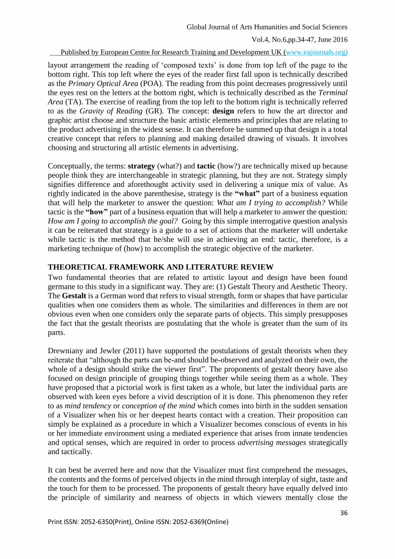
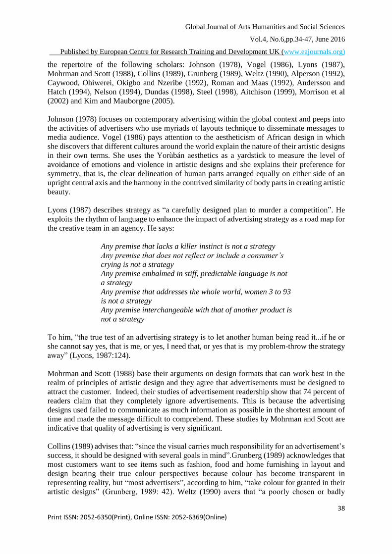
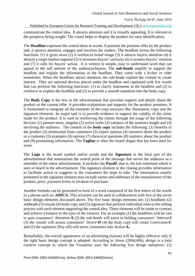
the Ogilvy. The layout formula in Plate 1below is displaying the five basic design elements that
follow the classic visual, caption, headline, body copy, and signature format originated by
Ogilvy for readers’ perusal.
Plate 1 Plate 2
Source: Researcher’s Collection
Source: Asemota and Araka (1996)
Sample Layout Formula of Ogilvy
The symbols, pictures, texts and objects which represent this layout formula are described in
the following way: The Visual is at the top of the page and it bleeds to the edge of the
advertising space for maximum impact. A descriptive caption is placed below the visual. The
headline is put next. Follow by the main advertising copy. A drop cap is considered as a
lead-in to help draw the readers into the copy. Contact information (signature) is placed in the
lower right optical corner; that is the terminal area a reader's eye gravitates to when reading
an advertisement. Apart from Ogilvy layout formula other basic advertising variations are also
derivable in the following seven basic design patterns: (1) visuals (2) headlines (3) subheads
(4) body copy (5) tagline (6) logo and (7) signature. The layout formula in Plate2 above is
carrying these seven design elements.
The visual, which comes in form of a picture that appeal to the sense of sight, can also stand
for illustration, demonstration or promotion. The visual plays an important role in the
communication of the central idea and/or the illustration that is used has visual ability to
Global Journal of Arts Humanities and Social Sciences
Vol.4, No.6,pp.34-47, June 2016
Published by European Centre for Research Training and Development UK (www.eajournals.org)
41 Print ISSN: 2052-6350(Print), Online ISSN: 2052-6369(Online)
communicate the central idea. It attracts attention and it is visually appealing. It is relevant to
the prospects being sought. The visual helps to display the product for easy identification.
The Headline expresses the central ideas in words. It presents the promise offer by the product
and, it attracts attention, engages and involves the readers. The headline serves the following
functions: (1) it gives news (2) it reinforces brand image (3) it attracts buyers attention (4) it
attracts a target market segment (5) it increases buyers’ curiosity (6) it arouses buyers’ emotion
and (7) it calls for buyers’ action. It is written in simple, easy to understand word that can
appeal to the self interest of the audiences/buyers. The sub-heads amplify or support the
headline and explain the information in the headline. They come with a kicker or rider
sometimes. When the headlines attract attention, the sub-heads explain the content to create
interest. They are optional devices placed under the headline and captioned with few words
that can perform the following functions: (1) to clarify statements in the headline and (2) to
reinforce or explain the headline and (3) to provide a smooth transition into the body copy.
The Body Copy is the text in the advertisement that provides support and details about the
product or the current offer. It provides explanation and supports for the product promises. It
is formulated to integrate all the elements of the copy structure like illustration, copy and the
signature elements. Its major task is to provide evidence to support the validity of the claim
made for the product. It is used in reinforcing the claims through the usage of the following
devices: (1) present tense, singular (2) active verbs (3) variance of the sentence length and (4)
involving the audience. The content of the body copy includes the following: (1) benefits of
the product (2) testimonial from customers (3) expert opinion (4) narrative about the product
or a customer (5) examples (6) options (7) rhetorical questions (8) statistics about the product
and (9) positioning information. The Tagline is often the brand slogan that has been used for
years.
The Logo is the brand symbol and/or words and the Signature is the final part of the
advertisement that summarises the central point of the message that serves the audience as a
reminder of the entire advertisement. It includes the Payoff, that is, the last statement which is
seen or heard in the advertisement. The signature element or the closing provides information
to facilitate action or suggests to the consumers the steps to take. The information usually
presented in the signature element may include names and addresses of the manufacturer of the
product, price, payment terms or location of purchase.
Another formula can be generated in form of a word composed of the first letters of the words
in a phrase such as: AIDCA. This acronym can be used in collaboration with five of the seven
basic design elements discussed above. The five basic design elements are: (1) headlines (2)
subheads (3) visuals (4) body copy and (5) signature that perform individual roles to the selling
process with each element supporting the central idea. These elements will be made to contrast
and achieve a balance to the eyes of the viewers. For an example (1) the headlines will be cast
to gain consumers’ Attention-A (2) the sub-heads will assist in holding consumers’ Interest-I
(3) the visuals will arouse consumers’ Desire-D (4) the body copy will create Conviction-C
and (5) the signature (Pay off) will move consumers into Action-A.
Remarkably, the overall appearance of an advertising (layout) will be highly effective only if
the right basic design concept is adopted. According to Arens (2004;406), design is a total
creative concept in which the Visualizer uses the following five design initiatives: (1)
Global Journal of Arts Humanities and Social Sciences
Vol.4, No.6,pp.34-47, June 2016
Published by European Centre for Research Training and Development UK (www.eajournals.org)
42 Print ISSN: 2052-6350(Print), Online ISSN: 2052-6369(Online)
thumbnail drawing to visualize layout approaches without wasting time on details (2) roughs
to suggest the final type style for headlines and subheads, to sketch in illustrations and photos,
and to simulate body copy with lines (3) dummies to present the handheld look and feel of
brochures, multipage materials, or point-of-purchase displays; all these are put together, page
by page and element by element, to look exactly like the finished product (4) comprehensive
layout to represent a refined facsimile of the finished advert copy that looks elaborate with
coloured photos, final type styles and sizes, sub-visuals, and a glossy spray coat. This is the
non-final art stage in which the adverts’ looks and feels are established and (5) Traditional
Mechanical Paste-up to place the types and visuals in their exact position for reproduction by
the printer. In this process the designer pastes black type and line art in place on a piece of
white art board called a paste up or a galley (a proof of typeset matter in a single column) with
overlay sheets that indicate the hue and the positioning of colour.
Observation from our research efforts is that logically coordinated and complimentary
advertising objectives, strategies, and tactics can achieve efficiency and effectiveness. We
equally observed that an advertising campaign could flop if a single, clearly defined strategy is
not adopted meaning that if a marketer adopts multiple and exclusive advertising strategies for
a single campaign: positioning the establishment as the provider of low-cost and high-cost
product, he/she might have challenges in conveying the discordant messages through a single
advertising campaign. There is clarification that a potential tactical error may lead to a problem
of designing and systematically placing a single set of effective advertising for consumers who
are interested in low-cost products and those who are interested in high-cost products. The most
effective method is to adopt a single, clear strategy and a corresponding set of suitable tactics.
Simply put, targeting a specific demographic group or area is an effective tactic to increase the
customer base of a product seller.
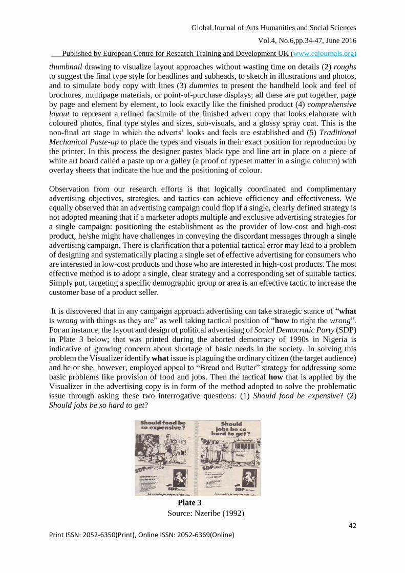
It is discovered that in any campaign approach advertising can take strategic stance of “what
is wrong with things as they are” as well taking tactical position of “how to right the wrong”.
For an instance, the layout and design of political advertising of Social Democratic Party (SDP)
in Plate 3 below; that was printed during the aborted democracy of 1990s in Nigeria is
indicative of growing concern about shortage of basic needs in the society. In solving this
problem the Visualizer identify what issue is plaguing the ordinary citizen (the target audience)
and he or she, however, employed appeal to “Bread and Butter” strategy for addressing some
basic problems like provision of food and jobs. Then the tactical how that is applied by the
Visualizer in the advertising copy is in form of the method adopted to solve the problematic
issue through asking these two interrogative questions: (1) Should food be expensive? (2)
Should jobs be so hard to get?
Plate 3
Source: Nzeribe (1992)
Global Journal of Arts Humanities and Social Sciences
Vol.4, No.6,pp.34-47, June 2016
Published by European Centre for Research Training and Development UK (www.eajournals.org)
43 Print ISSN: 2052-6350(Print), Online ISSN: 2052-6369(Online)
The above questions are based on contemporaneous issue in the country and the Visualizer
tactically states the position of (SDP) the political party on the issue while offering a promise
with a baseline that importune eligible voters to cooperate with the party to build a better
NIGERIA. In order to drive home the main political agenda of the party, the Visualizer sticks
to one point, one message and dramatically selling hard with similar body copy in the two-in-
one advertising layout for repetitive reading-see plate 3. Noticeably, the overall appearance of
the advertising copy is geared towards the traditional layout formula that has the seven basic
design elements such as: (1) headline (2) visual (3) subheads (4) body copy (5) tagline (6) logo
and (7) signature. The logo of the party that shows a reversed white horse placed on a black
background is conspicuously displayed at the terminal area of the layout to symbolize strength,
intensity, endurance, power and stability. This presupposes the fact that Nigerian peoples have
the quality of being strong, ability to endure and power to resist negative forces. All these
aforementioned qualities were used by the Visualizer to popularize the (SDP) party’s symbolic
logo that has been deliberately designed to position the mass voters as active, stable and
powerful participants in evolving a better Nigerian society.
The message strategy in advertising involves a simple description of overall creative approach
of the strategic what to say, the tactical how to say it and the technical why a special preference
for a particular output process. This aforementioned creative approach is intertwined with the
three elements of message strategy such as: (1) the verbal of what to say or the language to
use in disseminating the advertising message (2) the nonverbal of how the visuals or graphics
will appear on a copy-matter for printing- to carry the advertising message and the technical
of why the execution and mechanical outcome of the advertising message is preferred. The
workability of these three elements of message strategy is indicative that the power of creativity
in layout and design can be used to enhance advertising message. This is the reason why a
Visualizer needs to choose amid countless creative possibilities and artistic decision.
Creativity in this sense of message enhancement is the ability to invent, to originate, or to
conceive advertising idea that did not exist before. According to Arens (2004: 374) “creativity
is a step-by-step process that can be learned and used to generate original ideas or a practice
that can be used to discover original ideas and recognize existing concepts in new ways”. Going
by this conceptual clarification it can be reiterated therefore that the stimulating power and
attention catching ability of creativity in any given layout and design can enhance advertising’s
aptness to persuade, remind and inform prospects about a product or service.
An example of creative ability that is entrenched deep inside a Visualizer can be seen via the
advertising copy in plate 4, which combined plain, but well crafted textual message that reads:
He fetched the Frisbee; Good Dog. He returned it to someone else; Bad Dog. She was Blonde;
Good Dog. Old Mother Hubbard with charming visual message that is depicted in an image of
a dog to inform and remind prospects that this very common four-legged animal, which is often
kept by people as a pet or to guard or hunt deserves the best. It was intent of the Visualizer to
make explicit what is only implicit in the visual message on the right optical area (ROA) of
Global Journal of Arts Humanities and Social Sciences
Vol.4, No.6,pp.34-47, June 2016
Published by European Centre for Research Training and Development UK (www.eajournals.org)
44 Print ISSN: 2052-6350(Print), Online ISSN: 2052-6369(Online)
the copy’s panel to creatively complement the textual message on the left optical area (LOA)
of the copy’s panel to signify friendliness, protection and human quest. It was artistically
possible for the Visualizer to systematize the visual message on the copy’s panel and to revamp
or modify as well as align it to the textual message in order to demonstrate how creativity in
layout and design can strategically and tactically enhance the overall advertising message.
Plate 4
Source: Arens (2004)
Sometimes visual images in advertising layout and design can be tactically strategized to
search for new ideas through manipulation of knowledge and experience. Strategic
manipulation of visual images and embellishing them has always been a possibility for artists
for centuries. This involves the “capability of rearranging, retouching, distorting, and adjusting
images that can pose as flawless reality” (Buser, 2006: 206). It is apposite to state here and
now that through the phenomenon of déjà vu: the feeling that one has seen something before,
the agency’s Visualizer can engage in creative strategies of transforming and manipulating
ideas through techniques of (1) adaptation: in which he or she can change part of a discourse
that surrounds textual and visual messages to explain a symbolic observation or event (2)
imagination: that involves creative ability or innate tendency that a Visualizer can use in
forming a mental image of an idea not present to his or her senses or not previously known or
experienced beforehand (3) comparison: in which a Visualizer can take and use one idea to
describe another (4) elimination: a case where a Visualizer can subtract an element from a
design by removing it completely if not wanted or needed and (5) parody: a situation in which
a Visualizer can imitate the style of a well known artist to modify concepts and to create a
humorous appeal to prospects. In recent period visual artists have been altering visual images
in advertising, especially with the advent of computer software. This latter statement has been
confirmed by Barnet (2011) when he reiterates that “computer-aided processes are now often
used by the artists to manipulate images”.
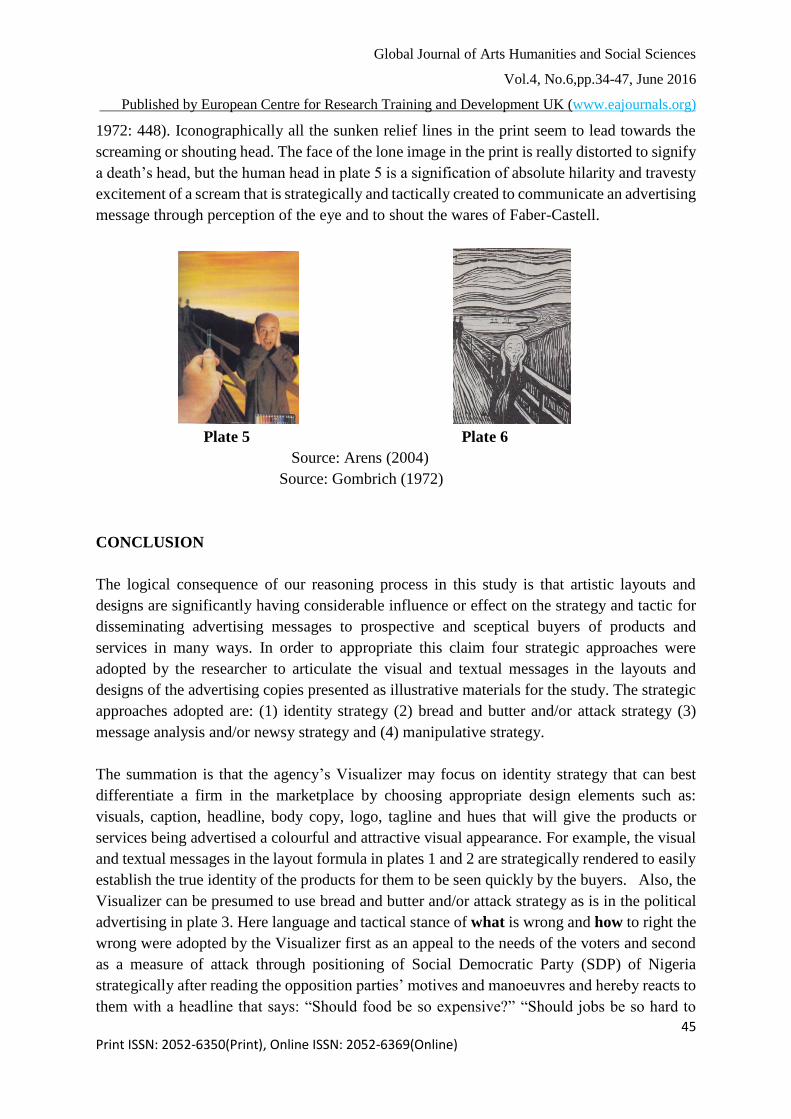
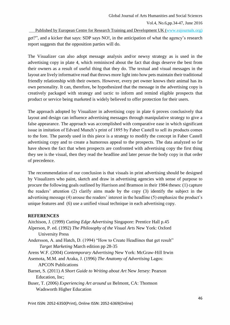
A good example of such alteration, manipulation and/or distortion can be observed in the layout
and design of an advertising piece in plate 5 below in which Faber-Castell, a business that
makes art material such as crayons, charcoals and pastels in large quantities to sell, satirically
imitated a classical lithographic print of Edvard Munch a Norwegian painter titled The Cry in
plate 6 below printed in 1895, probably to suggest that individual artists can use its
commodities to create their own art pieces. The print: The Cry by Munch is “aimed at
expressing how a sudden excitement transforms all humans’ sense impressions” (Gombrich,
Global Journal of Arts Humanities and Social Sciences
Vol.4, No.6,pp.34-47, June 2016
Published by European Centre for Research Training and Development UK (www.eajournals.org)
45 Print ISSN: 2052-6350(Print), Online ISSN: 2052-6369(Online)
1972: 448). Iconographically all the sunken relief lines in the print seem to lead towards the
screaming or shouting head. The face of the lone image in the print is really distorted to signify
a death’s head, but the human head in plate 5 is a signification of absolute hilarity and travesty
excitement of a scream that is strategically and tactically created to communicate an advertising
message through perception of the eye and to shout the wares of Faber-Castell.
Plate 5 Plate 6
Source: Arens (2004)
Source: Gombrich (1972)
CONCLUSION
The logical consequence of our reasoning process in this study is that artistic layouts and
designs are significantly having considerable influence or effect on the strategy and tactic for
disseminating advertising messages to prospective and sceptical buyers of products and
services in many ways. In order to appropriate this claim four strategic approaches were
adopted by the researcher to articulate the visual and textual messages in the layouts and
designs of the advertising copies presented as illustrative materials for the study. The strategic
approaches adopted are: (1) identity strategy (2) bread and butter and/or attack strategy (3)
message analysis and/or newsy strategy and (4) manipulative strategy.
The summation is that the agency’s Visualizer may focus on identity strategy that can best
differentiate a firm in the marketplace by choosing appropriate design elements such as:
visuals, caption, headline, body copy, logo, tagline and hues that will give the products or
services being advertised a colourful and attractive visual appearance. For example, the visual
and textual messages in the layout formula in plates 1 and 2 are strategically rendered to easily
establish the true identity of the products for them to be seen quickly by the buyers. Also, the
Visualizer can be presumed to use bread and butter and/or attack strategy as is in the political
advertising in plate 3. Here language and tactical stance of what is wrong and how to right the
wrong were adopted by the Visualizer first as an appeal to the needs of the voters and second
as a measure of attack through positioning of Social Democratic Party (SDP) of Nigeria
strategically after reading the opposition parties’ motives and manoeuvres and hereby reacts to
them with a headline that says: “Should food be so expensive?” “Should jobs be so hard to
Global Journal of Arts Humanities and Social Sciences
Vol.4, No.6,pp.34-47, June 2016
Published by European Centre for Research Training and Development UK (www.eajournals.org)
46 Print ISSN: 2052-6350(Print), Online ISSN: 2052-6369(Online)
get?”, and a kicker that says: SDP says NO!, in the anticipation of what the agency’s research
report suggests that the opposition parties will do.
The Visualizer can also adopt message analysis and/or newsy strategy as is used in the
advertising copy in plate 4, which reminisced about the fact that dogs deserve the best from
their owners as a result of useful thing that they do. The textual and visual messages in the
layout are lively informative read that throws more light into how pets maintain their traditional
friendly relationship with their owners. However, every pet owner knows their animal has its
own personality. It can, therefore, be hypothesized that the message in the advertising copy is
creatively packaged with strategy and tactic to inform and remind eligible prospects that
product or service being marketed is widely believed to offer protection for their users.
The approach adopted by Visualizer in advertising copy in plate 6 proves conclusively that
layout and design can influence advertising messages through manipulative strategy to give a
false appearance. The approach was accomplished with comparative ease in which significant
issue in imitation of Edvard Munch’s print of 1895 by Faber Castell to sell its products comes
to the fore. The parody used in this piece is a strategy to modify the concept in Faber Castell
advertising copy and to create a humorous appeal to the prospects. The data analyzed so far
have shown the fact that when prospects are confronted with advertising copy the first thing
they see is the visual, then they read the headline and later peruse the body copy in that order
of precedence.
The recommendation of our conclusion is that visuals in print advertising should be designed
by Visualizers who paint, sketch and draw in advertising agencies with sense of purpose to
procure the following goals outlined by Harrison and Bramson in their 1984 theses: (1) capture
the readers’ attention (2) clarify aims made by the copy (3) identify the subject in the
advertising message (4) arouse the readers’ interest in the headline (5) emphasize the product’s
unique features and (6) use a unified visual technique in each advertising copy.
REFERENCES
Aitchison, J. (1999) Cutting Edge Advertising Singapore: Prentice Hall p.45
Alperson, P. ed. (1992) The Philosophy of the Visual Arts New York: Oxford
University Press
Andersson, A. and Hatch, D. (1994) “How to Create Headlines that get result”
Target Marketing March edition pp 28-35
Arens W.F. (2004) Contemporary Advertising New York: McGraw-Hill Irwin
Asemota, M.M. and Araka, J. (1996) The Anatomy of Advertising Lagos:
APCON Publications
Barnet, S. (2011) A Short Guide to Writing about Art New Jersey: Pearson
Education, Inc;
Buser, T. (2006) Experiencing Art around us Belmont, CA: Thomson
Wadsworth Higher Education
Global Journal of Arts Humanities and Social Sciences
Vol.4, No.6,pp.34-47, June 2016
Published by European Centre for Research Training and Development UK (www.eajournals.org)
47 Print ISSN: 2052-6350(Print), Online ISSN: 2052-6369(Online)
Caywood, C. (1992) “Integrated Marketing Communication: Strategies and
Tactics” Marketing Politics: Advertising Strategies &Tactics Lagos:
APCON pp22-34
Collins, J.M. (1989) “Image and Advertising” Harvard Business Review
January/February edition pp93-97
Drewniany, B.L. and Jewler, J.A. (2011) Creative Strategy in Advertising
Boston, MA: Wadsworth Cengage Learning
Dundas, K. (1998) “A Passion for Advertising” Agency Summer pp38
Gombrich, E.H. (1972) The Story of Art USA: Dutton & Co; Inc.
Grunberg, A. (1989) “Selling you on Black and White”, Metropolitan Home
June edition pp42
Harrison, A.F. and Bramson, R.M. (1984) The Art of Thinking New York:
Berkley Books pp 5-18
Johnson, J.D. (1978) Advertising Today Chicago: Science Research Associates
Kim, W.C. and Mauborgne, R. (2005) Blue Ocean Strategy Boston: Harvard
Business School Press
Lyons, J. (1987) Guts: Advertising from the Inside Out New York: AMACOM
Mohrman, G. and Scott, J.E. (1988) “Truth(s) in Advertising? Part II”
Medical Marketing& Media October edition pp28-32
Morrison et al (2002) Using Qualitative Research in Advertising: Strategies,
Techniques and Applications Thousand Oaks, CA: Sage pp 112-115
Munch, E. (1895) “The Cry” A Lithographic print published in Gombrich, E.H.
(1972) The Story of Art USA: Dutton & Co; Inc.
Nelson, R.P. (1994) The Design of Advertising Dubuque, IA: Brown
&Benchmark pp107
Nzeribe, M. (1992) “Marketing Nigerian Politics: A Case Study” Marketing
Politics: Advertising Strategies &Tactics Lagos: APCON pp45-52
Ohiwerei, F. (1992) “Successful Marketing Techniques” Marketing
Politics: Advertising Strategies &Tactics Lagos: APCON pp36-43
Okigbo, C. (1992) “Marketing, Political Philosophy and communication:
A Synergy” Marketing Politics: Advertising Strategies &Tactics Lagos:
APCON pp118-128
Roman, K. and Maas, J. (1992) The New How to Advertise New York: St.
Martin’s Press pp5
Steel, J. (1998) Truth, Lies &Advertising: The Art of Account Planning
New York: Wiley
Vogel, S. (1986) African Aesthetics New York: Center for African Art
Weltz, R.N. (1990) “How Do You Say, ‘Ooops!’ Business Marketing
October edition pp52-53
Wilson, D (2008) JLS 714: Communication Research Lagos: Gold-Print
Limited for NOUN Publications