Embed Size (px)
DESCRIPTION
This is a college proyect, that was made at the University of Puerto Rico at Carolina. The Objective was to copy or imitate a magazin. Enjoy!
Citation preview

JAGUAR WEEKLY
TOP DESIGNERSA look inside our favorites TOP Designer. We have the example of self promoting, and the story behind one of the worlds best Graphic Designers. We gathered some easy to coppy tutorial, we are sure you will love!
Our JW Top
01Favorite
DESIGNERHe will BYM
Designers favorite info magazin. Bringing to you, what you like and care about.

Jaguar Weekly | Page 2
0712
19
10

Jaguar Weekly | Page 3
CONTENTSDAVID AREY 6
BAMBOO CREATE ! 8
CARLOS SEGURA 10
FUTURISTIC COMPOSITION 12 ABSTRACT COLLAGE 18
GRAPHIC DESIGNGraphic design is a creative process, one most often involving a client and a designer, and traditionally completed in conjunction with producers of form. In the 21st century, however, graphic design may be applied directly to websites, eliminating the need for an intermediary. Graphic design is undertaken to convey a specific message to a targeted audience, usually from the client, known as the ‘brief’. The term “graphic design” can also refer to a number of artistic and professional disciplines that focus on visual communication and presentation. The field as a whole is also often referred to as Visual Communication or Communication Design. Various methods are used to create and combine words, symbols, and images to create a visual representation of ideas and messages. A graphic designer may use a combination of typography, visual arts and page layout techniques to produce a balanced, focused and symmetrical final result. Graphic design often refers to both the process by which the communication is created and the products which are generated.
JAGUAR WEEKLY
Editor in ChiefDerrick Faulet
Art DirectorMaria G. Miller
Executive Editor
Terence Truman
Director of Editorial Operations
Debra Rose
Senior EditorsKathleen M. Burke
T. A. Frail
Mark Strauss
National Correspondent
Ron Wilkins
Staff Writer
Abigail Pitt
ColumnistsTimothy FerrisJonathan GoldTony Horowitz
Chloë Schama
www.JAGW.com

Jaguar Weekly | Page 4

Jaguar Weekly | Page 5
Jaguar Weekly | Page 6
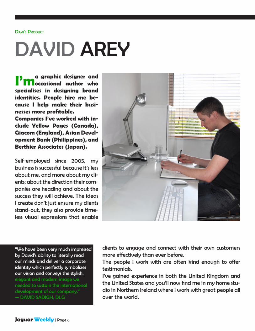
DAVID AREY
I’m a graphic designer and occasional author who
specialises in designing brand identities. People hire me be-cause I help make their busi-nesses more profitable.Companies I’ve worked with in-clude Yellow Pages (Canada), Giacom (England), Asian Devel-opment Bank (Philippines), and Berthier Associates (Japan).
Self-employed since 2005, my business is successful because it’s less about me, and more about my cli-ents; about the direction their com-panies are heading and about the success they will achieve. The ideas I create don’t just ensure my clients stand-out, they also provide time-less visual expressions that enable
clients to engage and connect with their own customers more effectively than ever before.The people I work with are often kind enough to offer testimonials.I’ve gained experience in both the United Kingdom and the United States and you’ll now find me in my home stu-dio in Northern Ireland where I work with great people all over the world.
Davi’s ProDuct
“We have been very much impressed by David’s ability to literally read our minds and deliver a corporate identity which perfectly symbolizes our vision and conveys the stylish, elegant and modern image we needed to sustain the international development of our company.”— DAVID SADIGH, DLG
Jaguar Weekly | Page 7
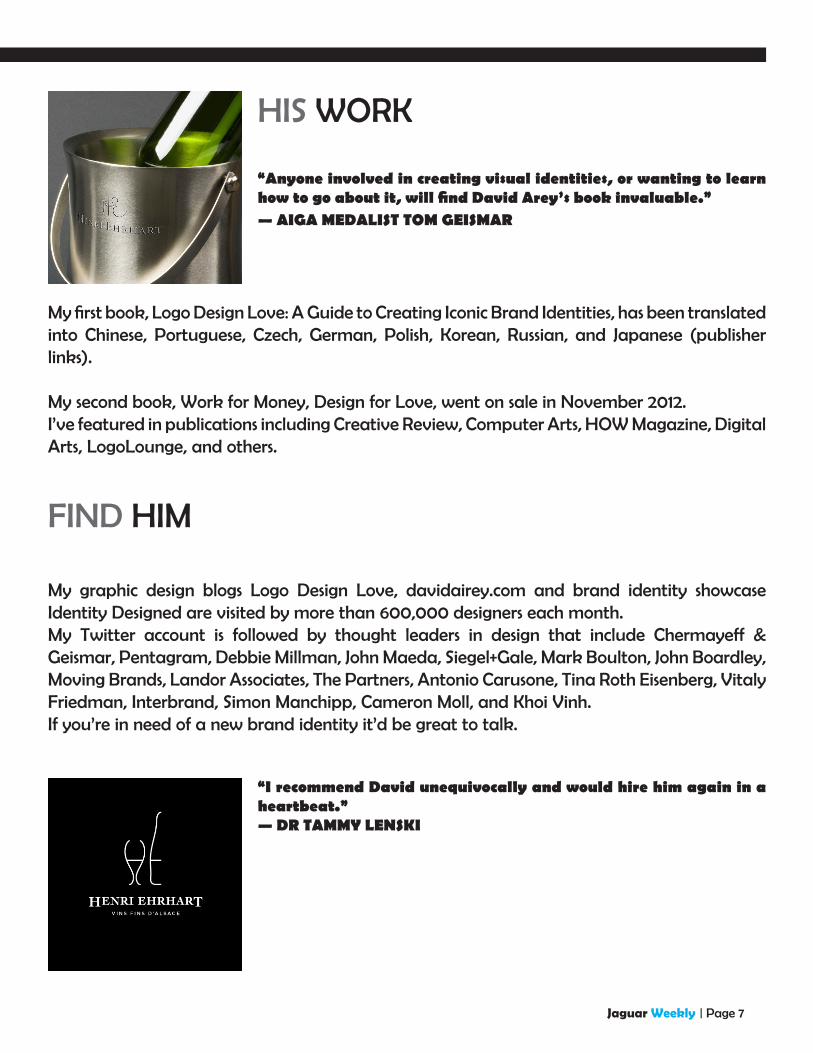
My first book, Logo Design Love: A Guide to Creating Iconic Brand Identities, has been translated into Chinese, Portuguese, Czech, German, Polish, Korean, Russian, and Japanese (publisher links).
My second book, Work for Money, Design for Love, went on sale in November 2012.I’ve featured in publications including Creative Review, Computer Arts, HOW Magazine, Digital Arts, LogoLounge, and others.
My graphic design blogs Logo Design Love, davidairey.com and brand identity showcase Identity Designed are visited by more than 600,000 designers each month.My Twitter account is followed by thought leaders in design that include Chermayeff & Geismar, Pentagram, Debbie Millman, John Maeda, Siegel+Gale, Mark Boulton, John Boardley, Moving Brands, Landor Associates, The Partners, Antonio Carusone, Tina Roth Eisenberg, Vitaly Friedman, Interbrand, Simon Manchipp, Cameron Moll, and Khoi Vinh.If you’re in need of a new brand identity it’d be great to talk.
HIS WORK
FIND HIM
“Anyone involved in creating visual identities, or wanting to learn how to go about it, will find David Arey’s book invaluable.”— AIGA MEDALIST TOM GEISMAR
“I recommend David unequivocally and would hire him again in a heartbeat.”— DR TAMMY LENSKI
Jaguar Weekly | Page 8
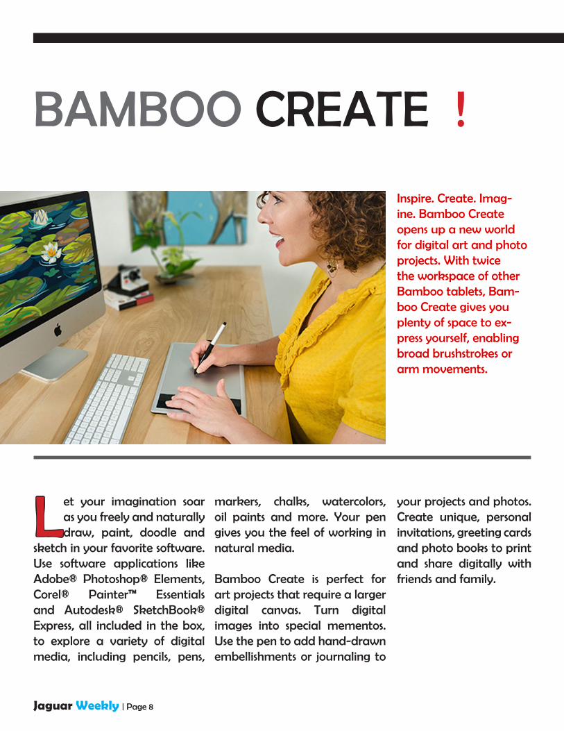
BAMBOO CREATE !
Inspire. Create. Imag-ine. Bamboo Create opens up a new world for digital art and photo projects. With twice the workspace of other Bamboo tablets, Bam-boo Create gives you plenty of space to ex-press yourself, enabling broad brushstrokes or arm movements.
Let your imagination soar as you freely and naturally draw, paint, doodle and
sketch in your favorite software. Use software applications like Adobe® Photoshop® Elements, Corel® Painter™ Essentials and Autodesk® SketchBook® Express, all included in the box, to explore a variety of digital media, including pencils, pens,
markers, chalks, watercolors, oil paints and more. Your pen gives you the feel of working in natural media.
Bamboo Create is perfect for art projects that require a larger digital canvas. Turn digital images into special mementos. Use the pen to add hand-drawn embellishments or journaling to
your projects and photos. Create unique, personal invitations, greeting cards and photo books to print and share digitally with friends and family.

Jaguar Weekly | Page 9
Keegan Phillips: I love my Create tablet. I got it a year ago, set it aside for awhile, but then started testing it out...and I was extremely satisfied! It is very user-friendly, in my opinion, and everything is working properly. I really appreciate being able to adjust the pressure sensitivity, and I was very satisfied with the accompanying programs considering the considerably low price of the complete package. I highly recommend this product to others looking to purchase a drawing tablet at an affordable price!
Al JollimoreHad mine for almost a year. Twice I had to reboot my pc to get it going and I am half way through my second nib. I use it almost daily. I thought the connection at the tablet end looked a bit dodgy so I added a little foam and tape around it. The tablet and pen have both survived a couple drops. It works perfectly. Out of the bundled software I like Autodesk’s Sketchbook the best, bought the $29 upgrade to Sketchbook Pro. Even better. Thank you Wacom and Autodesk, good stuff, I’d buy another in a second.
TESTIMONIES
Bamboo Create is the choice for those who want all the creative freedom they can get.
This model also comes with an eraser on the pen, four ExpressKeys, and the wireless
option. If you are more into paint-ing and drawing than photo ed-
iting, and you like to get very expressive with a lot movement
in your strokes, then you’ll want to go for the larger size of Bamboo
Create.

Jaguar Weekly | Page 10
Carlos Segura, founder of the Chicago-based design firm Segura Inc., came to the United States from Cuba at the age of nine. He began his career in graphic design as a production artist but soon gained more interesting challenges. He moved
to Chicago in 1980 and worked for many prestigious ad agencies, including BBDO, Marsteller, Foote Cone & Belding, Young & Rubicam, Ketchum, and DDB Needham. In 1991 he founded Segura Inc. to pursue design more creatively with the goal of blending as much “fine art” into “commercial art” as he could.
Segura Inc was the beginning of a series of commercial ventures that expanded Carlos Segura’s creative efforts. In 1994, the T26 Digital Type Foundry was born to explore the typographical side of the business. T26 fonts are now distributed throughout the world.
CARLOS SEGURAA TRUE PIONEER
Jaguar Weekly | Page 11
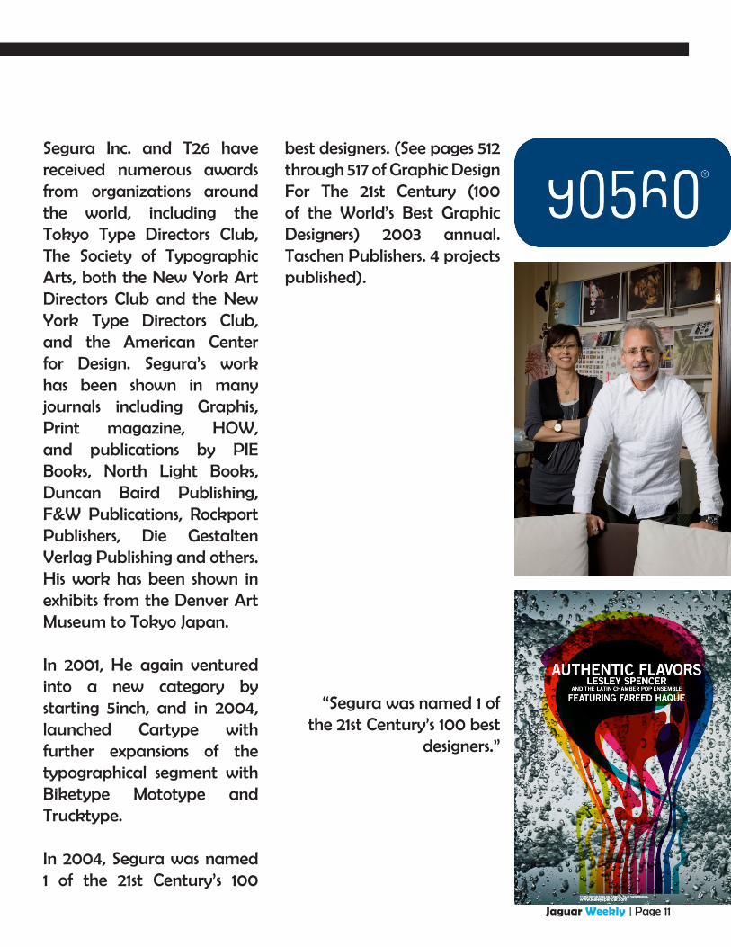
Segura Inc. and T26 have received numerous awards from organizations around the world, including the Tokyo Type Directors Club, The Society of Typographic Arts, both the New York Art Directors Club and the New York Type Directors Club, and the American Center for Design. Segura’s work has been shown in many journals including Graphis, Print magazine, HOW, and publications by PIE Books, North Light Books, Duncan Baird Publishing, F&W Publications, Rockport Publishers, Die Gestalten Verlag Publishing and others. His work has been shown in exhibits from the Denver Art Museum to Tokyo Japan.
In 2001, He again ventured into a new category by starting 5inch, and in 2004, launched Cartype with further expansions of the typographical segment with Biketype Mototype and Trucktype.
In 2004, Segura was named 1 of the 21st Century’s 100
best designers. (See pages 512 through 517 of Graphic Design For The 21st Century (100 of the World’s Best Graphic Designers) 2003 annual. Taschen Publishers. 4 projects published).
“Segura was named 1 of the 21st Century’s 100 best
designers.”

Jaguar Weekly | Page 12
FUTURISTIC COMPOSITION
Per Gustafsson shares some pro techniques for adding mood to your Photoshop projects
Control Photoshop filters and tools Use patterns, fills and other effects to manipulate an image and create a futuristic lookSince 1996 and Photoshop 4.1, I’ve been developing and exploring different techniques in Photoshop. In this Photoshop tutorial, I’m going to break down the composition of a photo and then add some digital elements, showing you how to create patterns, layer effects and 3D objects to create a moody, atmospheric effect that – in this case – is rather futuristic. Once you’re familiar with the techniques covered here, you can experiment with them in your own projects to create different moods.

Jaguar Weekly | Page 13
PHOTOSHOP TUTORIALSoftware: Photoshop CS3 or later Time needed: 1-2 hours Skills: Basic
01 To create the futuristic effect seen here, start off with a simple photograph – in this case, an office ceiling, which we’ll add speed and action to through the advanced use of some Photoshop techniques. First duplicate your photo and expand the canvas vertically, then transform and mirror it to create a kaleidoscope effect.
02 Now add more depth to the image by enhancing the feeling of perspective. Create a single line with the Pen tool on a new layer and then add some motion blur to it by selecting Filter>Blur>Motion Blur. Do this vertically only and the edges will become much more fluent. Select the layer with the Marquee tool and use the Transform command to place your new lines on the roof of the image.
03 You can now add a light source to make it look like the lines are shining from the core of the image. I’ve chosen white and then painted onto a new layer before adding a lot of Gaussian blur to it. Next, transform the layer with the Perspective tool to keep it in line with the perspective we already have in the photograph. Now that there are lights and light beams following the photo, it makes our image feel much more realistic.

Jaguar Weekly | Page 14
04 Now it’s time to change the colours. The easiest way to do this is to create several colour layers (multiple shades of blue and purple, in this case) and play around with them to get the look you want. Experiment with the Exclusion and light source tools on dark- and lightcoloured layers.
05 Now add some motion to the image. Draw a circular object, go to Filter>Distort>Twirl, and then add blur by going to Filter>Blur>Radial. Repeat and duplicate layers until you get the feeling you want.
06 Now to add an element of 3D perspective to the focal point. Select the Marquee tool and, vertically through the centre of the image, mark an area 1 pixel wide and the height of your canvas. Go to Edit>Define Pattern, then create a new layer and select it with the Rectangular Marquee tool. Now Ctrl/right-click the image and choose Fill, open the drop-down menu, select Pattern and choose the new pattern you just created.
Jaguar Weekly | Page 15
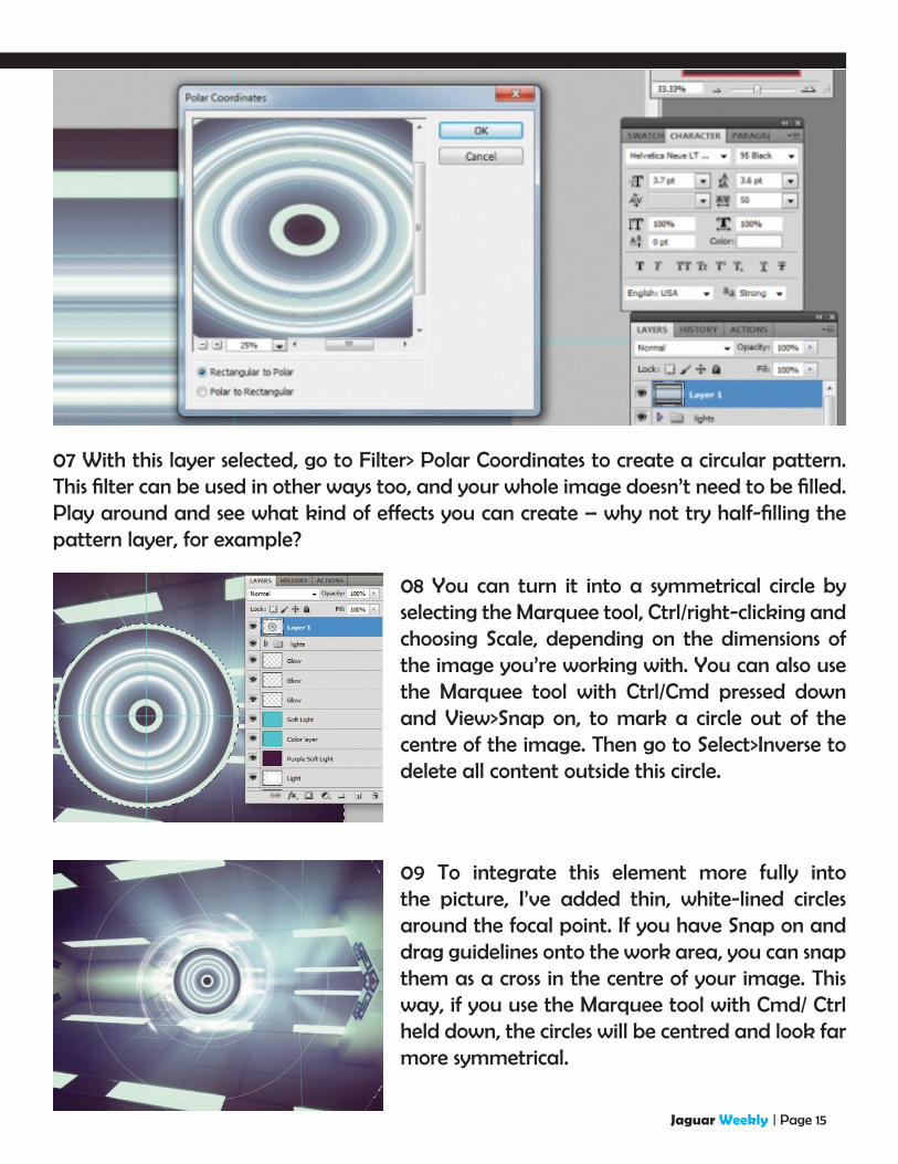
07 With this layer selected, go to Filter> Polar Coordinates to create a circular pattern. This filter can be used in other ways too, and your whole image doesn’t need to be filled. Play around and see what kind of effects you can create – why not try half-filling the pattern layer, for example?
08 You can turn it into a symmetrical circle by selecting the Marquee tool, Ctrl/right-clicking and choosing Scale, depending on the dimensions of the image you’re working with. You can also use the Marquee tool with Ctrl/Cmd pressed down and View>Snap on, to mark a circle out of the centre of the image. Then go to Select>Inverse to delete all content outside this circle.
09 To integrate this element more fully into the picture, I’ve added thin, white-lined circles around the focal point. If you have Snap on and drag guidelines onto the work area, you can snap them as a cross in the centre of your image. This way, if you use the Marquee tool with Cmd/ Ctrl held down, the circles will be centred and look far more symmetrical.

Jaguar Weekly | Page 16
10 Finally, add some particle details by making dots with the Pen tool. Now add blur to the layer, duplicate it, move it, and scale it to a smaller size. This process can be repeated as many time as you like for more particles, but when you’ve finished, merge all the particle layers. To make them blend into the image use a bit of twirl, or add the Filter>Distort>Polar coordinates again.

Jaguar Weekly | Page 17
Also known by his Modern Style moniker, Per is a pioneer of Photoshop-based digital art and has been featured in numerous books, magazines and exhibitions. His illustrations are also sold through Getty Images. You can find his work at: www.modernstyle.se
CREATED BYPer Gustafsson
Final Result

Jaguar Weekly | Page 18
In this tutorial I’ll explain how to create a stun-ning piece of artwork using found natural ele-ments and hidden shapes within objects. By cre-ating a story within your work, you can really bring your artwork to life – the theme for this piece is ‘be free’.
When you get yourself out into a natural envi-ronment and photograph found objects, you’ll discover inspirational shapes and textures every-where. I’ll talk you through how to warp and ab-stract these images to bring your artwork to life.
Abstract Collage

Jaguar Weekly | Page 19
COLLAGE TUTORIALDINES from Studio Blup walks through how to inject life into your work by manipulating found imagery and natural elements
01 The first step is to source images from your local surroundings. Hunt out textures and interesting visuals – in this particular design I’ve included natural elements. These will form the key focal point in the final collage. Look out for unusual and abstract shapes that you think will work well in your design.
02 Take your images and cut them out in Photoshop using the Pen tool, with feather settings at 0. My cut-outs can be found in the support files if you prefer to use them.

Jaguar Weekly | Page 20
03 Add a coloured circle (mine is yellow): this will act as a guide for the core shape of your artwork. You can now begin adding in ele-ments to your collage by selecting the clouds and dancers from your disc and placing them on your art board. Use the Transform tool to play about with the size of your images.
04 Start selecting interesting shapes and contours to use in your collage. Look for contrasting textures – I’ve used sharp edges as well as the soft curve highlight-ed in sections 2 and 4 of my bin bag image.
05 Cut out your chosen sections and position them on your art board. I’ve also added sections of purple cloth, which can be found on your disc, to build up my de-sign. At this stage, experiment with the shapes in your collage and try out different arrange-ments to create the effect you want within your image.

Jaguar Weekly | Page 21
06 Now sharpen the colour contrasts of the dancer fig-ures. Firstly adjust the satura-tion to -83 and then change the levels to 25 black, 0.48 grey and 223 white. The white output levels need to be set at 213.
07 Select the tree stump from the support files and place it onto your art board. Use the Warp Transform function on this image and adjust its levels to help the object blend into the collage effectively. You can duplicate as many of these as you want.

Jaguar Weekly | Page 22
08 Place the purple vectors from the support files onto your design, and use the Transform tool to decide how big you want them to be. Keep in mind that you want the focus to be on the natural elements, so don’t overuse these vector shapes.
10 When you’ve added in these various ele-ments, you can begin to bring the piece to life. You want to create the impression of movement and organic life by wrapping the warped tree stumps around the arms and faces of the dancers. To do this, select any stump with the Free Transform tool, and ad-just and rotate to the desired size.
09 Next, begin to cut the tree stump out. Adjust the levels of this to 40 black, 0.50 grey and 225 white. The white output level needs to be at 124. Once this is done, place the stump onto the back layer of your image.
Jaguar Weekly | Page 23
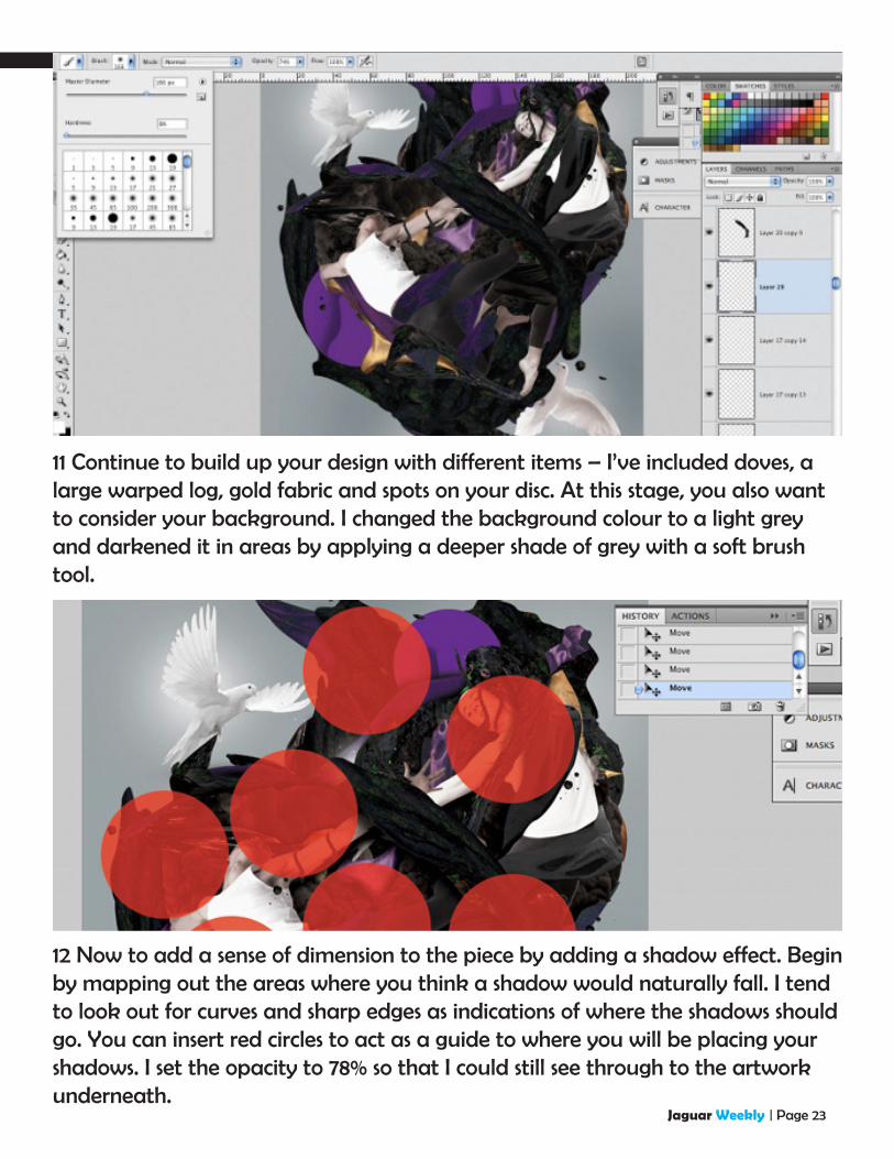
11 Continue to build up your design with different items – I’ve included doves, a large warped log, gold fabric and spots on your disc. At this stage, you also want to consider your background. I changed the background colour to a light grey and darkened it in areas by applying a deeper shade of grey with a soft brush tool.
12 Now to add a sense of dimension to the piece by adding a shadow effect. Begin by mapping out the areas where you think a shadow would naturally fall. I tend to look out for curves and sharp edges as indications of where the shadows should go. You can insert red circles to act as a guide to where you will be placing your shadows. I set the opacity to 78% so that I could still see through to the artwork underneath.
Jaguar Weekly | Page 24
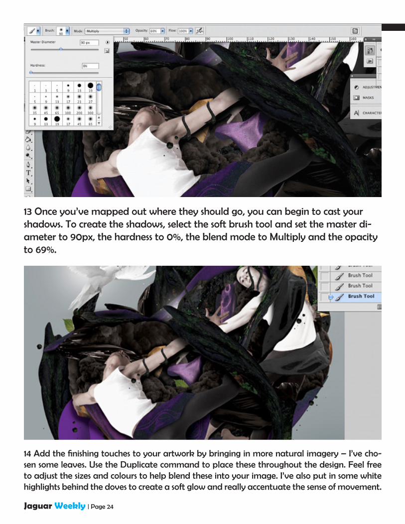
13 Once you’ve mapped out where they should go, you can begin to cast your shadows. To create the shadows, select the soft brush tool and set the master di-ameter to 90px, the hardness to 0%, the blend mode to Multiply and the opacity to 69%.
14 Add the finishing touches to your artwork by bringing in more natural imagery – I’ve cho-sen some leaves. Use the Duplicate command to place these throughout the design. Feel free to adjust the sizes and colours to help blend these into your image. I’ve also put in some white highlights behind the doves to create a soft glow and really accentuate the sense of movement.

Jaguar Weekly | Page 25
15 Finally, add a vector from Illustrator. I’ve created my own typeface – the lettering reads ‘BE’ to fit the title of the artwork ‘Be Free’. Copy and paste your vector into your image in Photo-shop, and position it or layer it as you wish.

Jaguar Weekly | Page 26
![imitation trunk [イミテーショントランク] - JCD · 製品名称 imitation trunk エントリーNO. 1821 imitation trunk[イミテーショントランク] デザイン自在](https://img.dokumen.tips/doc/110x75/5f89cfa3f220b314941082d7/imitation-trunk-ffffffff-ec-imitation-trunk.jpg)