Embed Size (px)
Citation preview
chapter one
Historical Maps in GIS
David Rumsey and Meredith Williams
Most historical GIS would be impossible without historical maps, as the chapters in this book
testify. Maps record the geographical infor-mation that is fundamental to reconstruct-ing past places, whether town, region, or nation. Historical maps often hold informa-tion retained by no other written source, such as place-names, boundaries, and physi-cal features that have been modifi ed or erased by modern development. Historical maps capture the attitudes of those who made them and represent worldviews of their time. A map’s degree of accuracy tells us much about the state of technology
and scientifi c understanding at the time of its creation. By incorporating information from historical maps, scholars doing his-torical GIS are stimulating new interest in these rich sources that have much to offer historical scholarship and teaching. At the same time, the maps themselves challenge GIS users to understand the geographic principles of cartography, particularly scale and projection. We have addressed these challenges in order to examine the value of including nineteenth- and early twentieth- century paper maps in GIS.1
One can use digital renditions of histori-cal maps to study historical landscapes, the
ch01 1 1/3/03, 11:21:23 AM
2 past time, past place: gis for history
maps themselves, and how places changed over time. GIS is breathing new life into historical maps by freeing them from the static confi nes of their original print form. It is also enabling a new level of understand-ing. Traditionally, people read and analyzed maps using a critical eye and a priori knowledge. Comparison of two or more maps was possible, but the conclusions
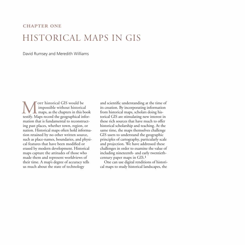
were only as reliable as the reader’s visual acuity and interpretive skill. The same limits applied to cartography, the making of maps. Cartographers traditionally made maps by gathering information from pub-lished maps or fi eld surveys. The maps they produced were often marvelous acts of interpretation. Consider the Wheeler Survey, which mapped territory west of
Figure 1. Wheeler Survey map of Yosemite Valley, 1883The government-funded Wheeler Survey produced one of the fi rst accu-rate maps of Yosemite Valley. The cartographers who drew the map used hachuring (a form of shading) to suggest the depth of the canyon and the river valleys leading to it.
ch01 2 1/3/03, 11:21:26 AM
� Chapter 1 � Historical Maps in GIS 33
the 100th meridian in a series of geo-graphical expeditions beginning in 1871. George M. Wheeler and his associates car-ried heavy plane tables, surveyor’s instru-ments, and large-format cameras by wagon and mule across mountains, canyons, and deserts. Their survey points were highly accurate for the time, but the renderings of the topography that linked those points
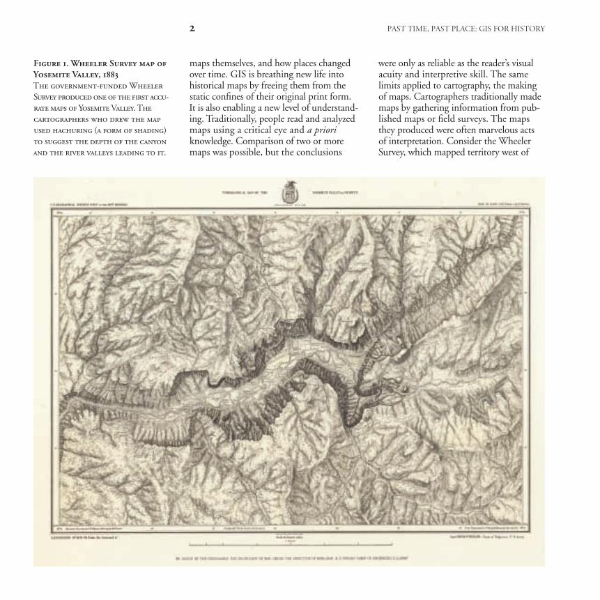
in a continuous landscape were as much art as science (fi gure 1). When their map is converted into digital form, it can be manipulated and combined with other spa-tial data, such as digital elevation models (fi gure 2). The three-dimensional landscape is more immediately recognizable. It gives us the feel of standing next to the cartog-rapher as he gazed over Yosemite Valley.
Figure 2. Wheeler’s Yosemite Valley in 3-dDraping the scanned image of the original Yosemite map over modern digital elevation model maps gives the old map a new look and immediacy. The simulated depth of the 3-d terrain model complements the beautiful hachuring of the 1883 map. In this map we used a vertical exaggeration factor of 1.5.
ch01 3 1/3/03, 11:21:52 AM
4 past time, past place: gis for history
More importantly for the aims of histori-cal research, information that was diffi cult to perceive in the historical map is now accessible for our own investigation. We can now measure elevation, distance, and area, and rotate the image to place our-selves at different viewpoints.
Ordinarily, the fi rst step in preparing a paper map for use in GIS is scanning it. For this purpose, it is best to capture map images at a very high resolution.2 If one’s main purpose is to study maps as historical documents, scanning may be all the manipulation required. Scanned maps can be easily incorporated into a GIS as
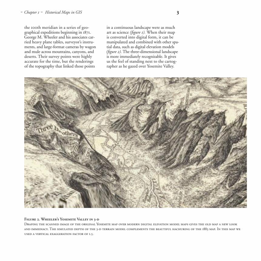
graphic images. Connected by hot links to particular features in a GIS layer, histori-cal maps can be opened to compare pres-ent and past confi gurations of a given place or landscape (fi gure 3).
Integrating historical maps in GIS to analyze the spatial information they contain, or to layer them with other spatial data, requires that the maps be georeferenced. That is, selected control points on a scan of the original map must be aligned with their actual geographical location, either by assigning geographical coordinates to each point, or by linking each point to its equivalent on a modern,
Figure 3. Chicago in 1868 and 1997 Hot links connecting historical city plans to present-day maps give students easy access to visual com-parisons. Rufus Blanchard’s Guide Map of Chicago (1868) shows the city’s characteristic grid and cross-cutting diagonal arteries, little changed in a recent ArcView® StreetMapTM. The dimensions of the city, however, have changed enormously.
ch01 4 1/3/03, 11:22:12 AM
� Chapter 1 � Historical Maps in GIS 5
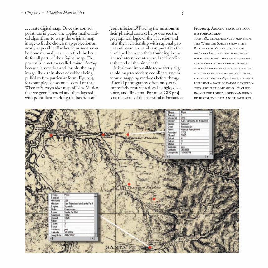
accurate digital map. Once the control points are in place, one applies mathemati-cal algorithms to warp the original map image to fi t the chosen map projection as nearly as possible. Further adjustments can be done manually to try to fi nd the best fi t for all parts of the original map. The process is sometimes called rubber sheeting because it stretches and shrinks the map image like a thin sheet of rubber being pulled to fi t a particular form. Figure 4, for example, is a scanned detail of the Wheeler Survey’s 1882 map of New Mexico that we georeferenced and then layered with point data marking the location of
Jesuit missions.3 Placing the missions in their physical context helps one see the geographical logic of their location and infer their relationship with regional pat-terns of commerce and transportation that developed between their founding in the late seventeenth century and their decline at the end of the nineteenth.
It is almost impossible to perfectly align an old map to modern coordinate systems because mapping methods before the age of aerial photography often only very imprecisely represented scale, angle, dis-tance, and direction. For most GIS proj-ects, the value of the historical information
Figure 4. Adding features to a historical mapThis 1882 georeferenced map from the Wheeler Survey shows the Rio Grande Valley just north of Santa Fe. The cartographer’s hachures mark the steep plateaus and mesas of the rugged region where Franciscan priests established missions among the native Indian people as early as 1692. The red points represent a layer of database informa-tion about the missions. By click-ing on the points, users can bring up historical data about each site.
ch01 5 1/3/03, 11:22:33 AM
6 past time, past place: gis for history
on paper maps more than compensates for the residual error in their georeferenced versions. What one should keep in mind is that georeferencing does not necessarily improve a historical map or make it more accurate. In the course of changing the original map to make it amenable to digital integration, georeferencing changes lines and shapes, the distance between objects, the map’s aesthetics, and its value as a cul-tural artifact. One gains knowledge of the original while processing it for inclusion in GIS, but one also loses something if the original map is not represented for compari-son with its actual size, proportions, and qualities. Ideally, researchers should include both the warped map and the scanned image of the original map in a GIS project or publication.
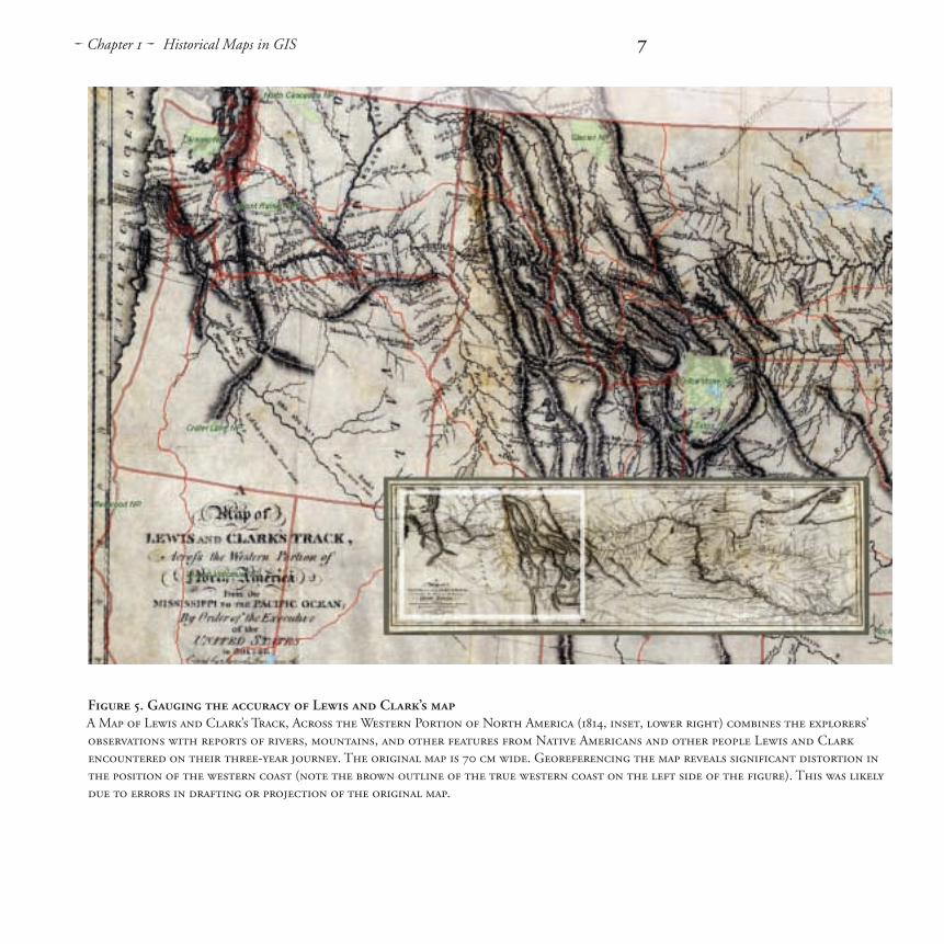
The impossibility of aligning historical maps perfectly with modern maps can itself yield historical information. During their exploration of the Louisiana Pur-chase, Meriwether Lewis and William Clark made notations of longitude and latitude, which they later used in drawing the monumental map of their expedition (fi gure 5). To bring this map into GIS, we began by estimating the projection used for Lewis and Clark’s rendering. Their map appears to be on a conic projection, since the lines of latitude are curved and
those for longitude converge. A common conic projection for maps of the continen-tal United States is Albers Equal-Area, so we used a vector layer in this projection as a base for georeferencing the exploration map. Control points were taken by assign-ing geographical coordinates to reference points, such as the explorer’s longitude and latitude marks and major river junc-tions. By then overlaying modern high-ways (red) and state boundaries (brown), one can gauge Lewis and Clark’s errors in measurement and estimation.
Small-scale historical maps like Lewis and Clark’s are prone to greater error than large-scale maps.4 A large area of the earth’s surface, like the continental United States, is harder to depict on a fl at surface than a small area such as a town.5 Large-scale maps are often more easily and accu-rately converted for use in GIS because they tend to have less egregious geographi-cal errors. Maps drawn at a large scale may also have more unique local data to con-tribute, such as information on land own-ership, the location of buildings, paths, and streams, and so forth.
Large-scale city maps can be wonderful sources for urban history, and adding one to a GIS can greatly increase its utility. Many American cities were mapped repeat-edly and in great detail in the nineteenth
ch01 6 1/3/03, 11:22:56 AM
� Chapter 1 � Historical Maps in GIS 7
Figure 5. Gauging the accuracy of Lewis and Clark’s mapA Map of Lewis and Clark’s Track, Across the Western Portion of North America (1814, inset, lower right) combines the explorers’ observations with reports of rivers, mountains, and other features from Native Americans and other people Lewis and Clark encountered on their three-year journey. The original map is 70 cm wide. Georeferencing the map reveals signifi cant distortion in the position of the western coast (note the brown outline of the true western coast on the left side of the fi gure). This was likely due to errors in drafting or projection of the original map.
ch01 7 1/3/03, 11:22:56 AM
8 past time, past place: gis for history
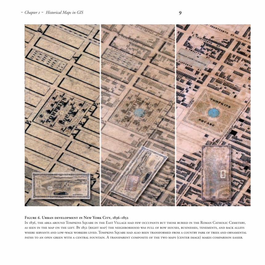
and twentieth centuries, none more so than New York. J. H. Colton’s Topographi-cal Map of the City and County of New-York (1836) and Matthew Dripps’ Map of the City of New York (1852) provide unparal-leled images of the built environment of America’s leading nineteenth-century com-mercial city. These two unusually large maps are of differing scales. Colton’s map, at a scale of 1:15,840, measures 29 by almost 70 inches. Dripps’ huge map, nearly 88 inches long and 46 inches wide, shows lower Manhattan at the very large scale of 1:3,450, approximately two inches to the city block. Although the physical size of the two maps made them diffi cult to scan, it was possible, and their large scales and precision made them relatively easy to geo-reference. Overlaying georeferenced histori-cal maps allows one to combine maps of greatly differing sizes and scales, such as these, in the same coordinate space.
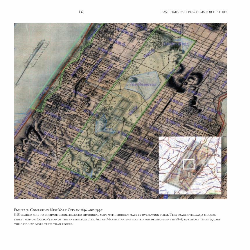
With the innovation of partially trans-parent raster layers in GIS, we were able to produce composite map images that suggest how the passage of time trans-formed the city (fi gure 6). Some changes became strikingly clear when we then over-laid a modern digital street map on the georeferenced Colton map (fi gure 7). For example, we could see that the Hudson Parkway and East River Drive, highways
that run along the west and east sides of Manhattan, respectively, were built on landfi ll beginning at about 72d Street. The original New York City reservoir, whose ghostly rectangular pools occupy the center of Central Park on the map detail, was moved north and given a more natural-seeming shape by the park’s land-scape architect, Frederick Law Olmsted. What was low-lying, swampy ground in the early 1850s, on the upper East Side between 85th and 105th streets, was drained and fi lled later in the century to provide housing for the city’s exploding population.
Visual overlay of this type is very useful in research and teaching. However, to query or measure spatial relationships between features, they must be lifted off historical maps and made into vector GIS layers. This is done by digitizing map fea-tures as points, lines, and areas. Because few archives provide access to a digitizing tablet, scholars often choose to have histor-ical maps scanned. They can then digitize the maps directly on screen. Digitizing is far more time- consuming than geo-referencing, but it adds tremendously to the amount of data available for use in GIS. By creating vector polygon features from the city blocks and building loca-tions on Colton’s New York City map,
ch01 8 1/3/03, 11:23:21 AM
� Chapter 1 � Historical Maps in GIS 9
Figure 6. Urban development in New York City, 1836–1852In 1836, the area around Tompkins Square in the East Village had few occupants but those buried in the Roman Catholic Cemetery, as seen in the map on the left. By 1852 (right map) the neighborhood was full of row houses, businesses, tenements, and back alleys where servants and low-wage workers lived. Tompkins Square had also been transformed from a country park of trees and ornamental paths to an open green with a central fountain. A transparent composite of the two maps (center image) makes comparison easier.
ch01 9 1/3/03, 11:23:21 AM
10 past time, past place: gis for history
Figure 7. Comparing New York City in 1836 and 1997GIS enables one to compare georeferenced historical maps with modern maps by overlaying them. This image overlays a modern street map on Colton’s map of the antebellum city. All of Manhattan was platted for development in 1836, but above Times Square the grid had more trees than people.
ch01 10 1/3/03, 11:23:48 AM
� Chapter 1 � Historical Maps in GIS 11
for example, we could join attribute data such as owner, land-use category, date of construction, structure type, and architec-tural style for each building. All lots could then be queried for ownership and classi-fi ed as either private or public. Different colors could then be used to signify public and private lots. Total acreage could be calculated for each land category. Perform-ing the same steps on a later map of the city and comparing the two sets of data would enable us to identify the changing patterns of public and private ownership and architectural style. The dynamics of urban change could be displayed through an animation of cartographic snapshots of New York’s built environment.
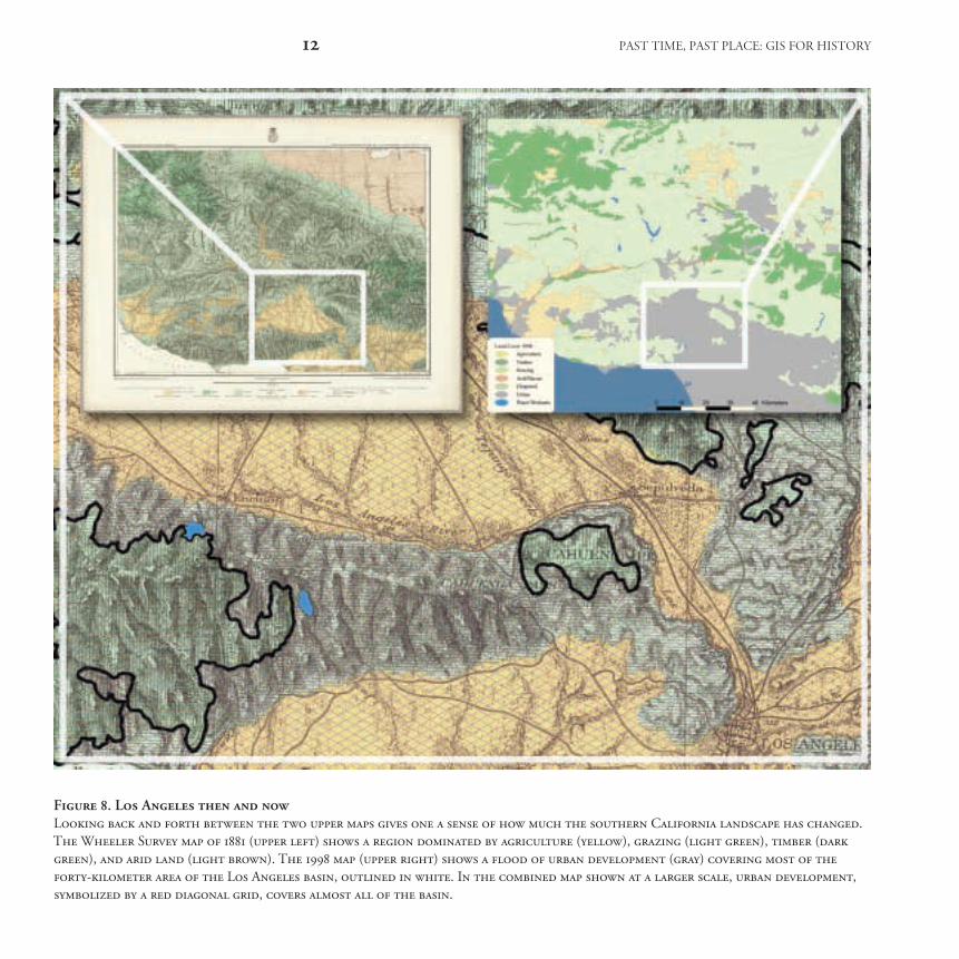
In addition to illuminating urban his-tory, historical maps can provide valuable information about environmental change. Today, satellites circle the earth recording daily changes on the planet’s surface. Sci-entists study satellites’ remotely sensed data to determine how human activity and natural phenomena interact. Histor-ical maps make it possible to extend the examination of humans’ environmen-tal impact far back before the advent of satellite imagery. To explore changes in land use in southern California, we used GIS to combine the 1881 Wheeler Survey thematic map of the area with a 1998
land-cover map from the California Gap Analysis Project (fi gure 8). The Wheeler map depicts a rural landscape scarcely touched by urbanization. It displays fi ve land-use categories: agriculture, timber, grazing, arid/barren land, and chaparral, shown in pastel tints of yellow, green, and gray. The city of Los Angeles, with just eleven thousand people, sits at the base of the Santa Monica and San Gabriel mountains. We overlaid the 1998 data as a transparent polygon layer to examine the extent of the land-use changes. Wheeler’s team would be surprised to see that today, urban development covers all but the high-est, steepest peaks.
On a number of the historical maps we have discussed, shading or hachures (fi ne black lines) suggested elevation. Using GIS, one can simulate topography more dramatically and vividly by using digital elevation models, which are raster surfaces composed of longitude (x), latitude (y), and elevation (z) coordinates.6 We already saw how draping the Wheeler Survey’s Yosemite map over a digital elevation model enhanced the historical map’s depic-tion of the landscape. Verisimilitude can be a powerful teaching tool when it helps students understand the physical character of a past place. When we displayed August Chevalier’s 1915 map of San Francisco over
ch01 11 1/3/03, 11:24:16 AM
12 past time, past place: gis for history
Figure 8. Los Angeles then and nowLooking back and forth between the two upper maps gives one a sense of how much the southern California landscape has changed. The Wheeler Survey map of 1881 (upper left) shows a region dominated by agriculture (yellow), grazing (light green), timber (dark green), and arid land (light brown). The 1998 map (upper right) shows a fl ood of urban development (gray) covering most of the forty-kilometer area of the Los Angeles basin, outlined in white. In the combined map shown at a larger scale, urban development, symbolized by a red diagonal grid, covers almost all of the basin.
ch01 12 1/3/03, 11:24:17 AM
� Chapter 1 � Historical Maps in GIS 13
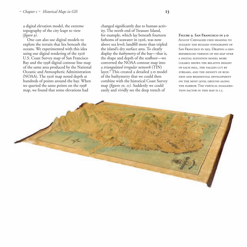
a digital elevation model, the extreme topography of the city leapt to view (fi gure 9).
One can also use digital models to explore the terrain that lies beneath the oceans. We experimented with this idea using our digital rendering of the 1926 U.S. Coast Survey map of San Francisco Bay and the 1998 digital contour line map of the same area produced by the National Oceanic and Atmospheric Administration (NOAA). The 1926 map noted depth at hundreds of points around the bay. When we queried the same points on the 1998 map, we found that some elevations had
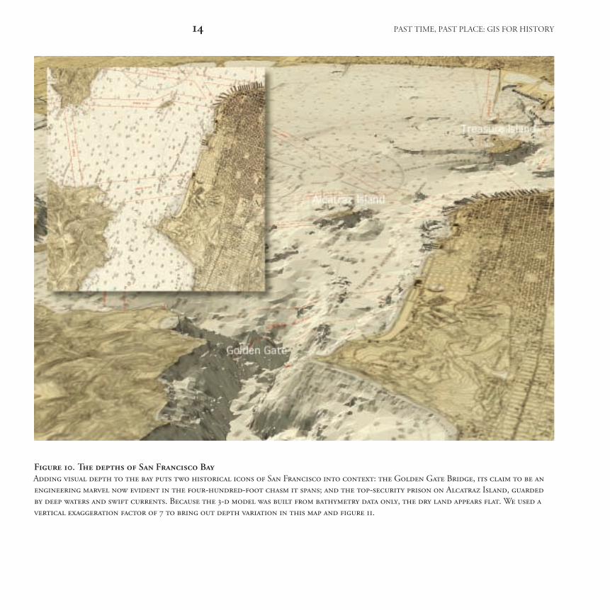
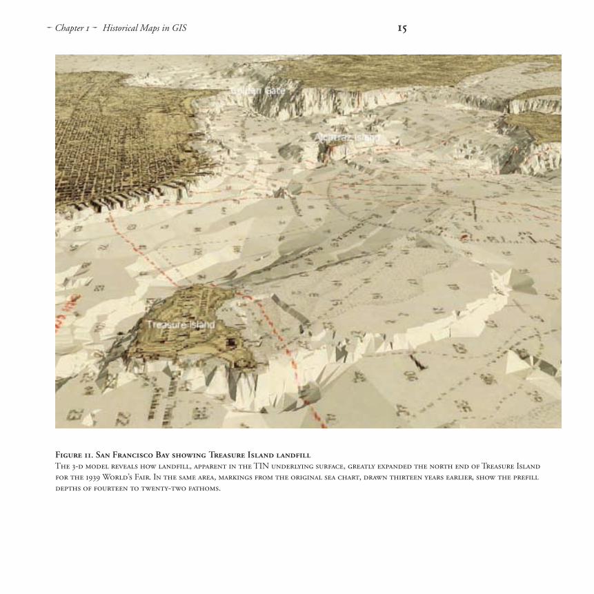
changed signifi cantly due to human activ-ity. The north end of Treasure Island, for example, which lay beneath fourteen fathoms of seawater in 1926, was now above sea level; landfi ll more than tripled the island’s dry surface area. To clearly display the bathymetry of the bay—that is, the shape and depth of the seafl oor—we converted the NOAA contour map into a triangulated irregular network (TIN) layer.7 This created a detailed 3-d model of the bathymetry that we could then combine with the historical Coast Survey map ( fi gures 10, 11). Suddenly we could easily and vividly see the deep trench of
Figure 9. San Francisco in 3-dAugust Chevalier used shading to suggest the rugged topography of San Francisco in 1915. Draping a geo-referenced version of his map over a digital elevation model more clearly shows the relative height of each hill, the valleys cut by streams, and the density of busi-ness and residential development on the most level ground along the harbor. The vertical exaggera-tion factor in this map is 1.5.
ch01 13 1/3/03, 11:24:45 AM
14 past time, past place: gis for history
Figure 10. The depths of San Francisco Bay Adding visual depth to the bay puts two historical icons of San Francisco into context: the Golden Gate Bridge, its claim to be an engineering marvel now evident in the four-hundred-foot chasm it spans; and the top-security prison on Alcatraz Island, guarded by deep waters and swift currents. Because the 3-d model was built from bathymetry data only, the dry land appears fl at. We used a vertical exaggeration factor of 7 to bring out depth variation in this map and fi gure 11.
ch01 14 1/3/03, 11:24:57 AM
� Chapter 1 � Historical Maps in GIS 15
Figure 11. San Francisco Bay showing Treasure Island landfi llThe 3-d model reveals how landfi ll, apparent in the TIN underlying surface, greatly expanded the north end of Treasure Island for the 1939 World’s Fair. In the same area, markings from the original sea chart, drawn thirteen years earlier, show the prefi ll depths of fourteen to twenty-two fathoms.
ch01 15 1/3/03, 11:25:20 AM
16 past time, past place: gis for history
the Golden Gate Strait, the relative shal-lows of San Pablo Bay, and the chasm surrounding Alcatraz Island, site of the famous prison. The 3-d viewing software even allowed us to travel around the scene as if in a submarine.
To include historical maps in GIS for teaching and research, scholars will need access to high-quality scanners or pre-pared digital images. We envisage a time in the near future when thousands of historical map images, some already georeferenced and digitized as vector layers, will be available through shared networks and public-access Web sites. Recent improvements in GIS software are resolving the problems of storing ever-larger spatial data sets by enabling users to access remotely stored data. The Library of Congress Geography and Map Divi-sion and a few other leading map col-lections in the United States and other countries have launched digital dis-semination projects. From the Library of Con gress Memory Web site, anyone can download map images and then zoom in to study their details on-screen as if with a powerful magnifying glass. The David Rumsey Historical Map Collection has
scanned more than sixty-fi ve hundred historical maps and made them available online. Rumsey will provide an increasing number of georeferenced versions in the next few years. Digital renderings of historical maps are also available through ESRI’s Geography Network and the Electronic Cultural Atlas Initiative’s Metadata Clearinghouse. Since the process of converting historical maps into GIS- compatible formats is time- consuming, resource intensive, and expensive, it is doubly important that the burden be shared and the resulting resources aggre-gated. Each digitized map will require excellent, standardized metadata to describe it and make it easy to retrieve.
Historical maps have a great deal to offer GIS, and GIS brings new techniques to the analysis and display of historical maps. As historical maps become more widely available and as GIS becomes more sophisticated, it is certain that scholars will combine the two in creative ways yet to be imagined. Cartographers of days past would have been pleased to know that centuries later a new mapping technology is stimulating new interest in their work.
ch01 16 1/3/03, 11:25:56 AM

� Chapter 1 � Historical Maps in GIS 17
Map sources
All maps courtesy of the David Rumsey Historical Map Collection, www.davidrumsey.com.
Blanchard, Rufus, Guide Map of Chicago, 1868. Chicago: Rufus Blanchard. Size: 53 cm × 41 cm. Scale: 1:25,344.
Colton, J. H., Topographical Map of the City and County of New-York, 1836. New York: J. H. Colton & Co. Size: 74 cm × 170 cm. Scale: 1:15,840.
Chevalier, August, The “Chevalier” Commercial, Pictorial and Tourist Map of San Francisco, 1915. San Francisco: Aug. Chevalier. Size: 160 cm × 145 cm. Scale: 1:9,600.
Dripps, Matthew, Map of the City of New York Extending Northward to Fiftieth St., 1852. New York: M. Dripps. Size: 223 cm × 117 cm. Scale: 1:3,450.
Lewis, Meriwether, and William Clark, A Map of Lewis and Clark’s Track, Across the Western Portion of North America, 1814. Philadelphia: Bradford and Inskeep. Size: 30 cm × 70 cm. Scale: 1:4,350,000.
United States Coast and Geodetic Survey, United States–West Coast. San Francisco Entrance, California, 1926. Washington, D.C.: U.S. Coast and Geodetic Survey. Size: 85 cm × 105 cm. Scale: 1:40,000.
Wheeler, G. M, Land Classifi cation Map of Part of S. W. California, Atlas Sheet No. 73 (C), 1881. Washington, D.C.: U.S. Government. Size: 45 cm × 52 cm. Scale: 1:253,440.
Wheeler, G. M., North Central New Mexico, Atlas Sheet No. 69 (D), 1876. Washington, D.C.: U.S. Government. Size: 45 cm × 51 cm. Scale: 1:253,440.
Wheeler, G. M., Topographical Map of the Yosemite Valley and Vicinity, 1883. Washington, D.C.: U.S. Government. Size: 43 cm × 55 cm. Scale: 1:42,240.
Software and hardware
ArcView 3.2, ArcView 8.1, Adobe® Photoshop® 5.5, Luna Imaging, Inc.’s Insight®, MrSIDTM image compression software by LizardTech®, PhaseOne image-capture software. PhaseOne PowerPhase and PowerPhase FX 4 × 5 digital scanning camera back, Sinar X 4 × 5 view cameras with Rodenstock lenses, Kaiser RePro copy stand with Videssence Fluorescent Icelites, Apple® Macintosh® g4 and g3, GatewayTM workstation, DVD storage disks.
Further reading
Brown, Lloyd A. The Story of Maps. New York: Dover, 1977; orig. pub. 1949.
Harley, J. B. The New Nature of Map: Essays in the History of Cartography. Paul Laxton, ed. Baltimore: Johns Hopkins University Press, 2001.
Paullin, Charles O. Atlas of the Historical Geography of the United States. John K. Wright, ed. Carnegie Institution of Washington Publication no. 401. Washington, D.C.: Carnegie Institution of Washington and American Geographical Society of New York, 1932.
Raisz, Erwin. General Cartography. 2d ed. New York: McGraw-Hill, 1948.
Continued
ch01 17 1/3/03, 11:25:57 AM
18 past time, past place: gis for history
Further reading (continued)
Reps, John William. Views and Viewmakers of Urban America: Lithographs of Towns and Cities in the United States and Canada, 1834–1926. Columbia, Mo.: University of Missouri Press, 1984.
Robinson, Arthur H. Early Thematic Mapping in the History of Cartography. Chicago: University of Chicago Press, 1982.
Short, John R. Representing the Republic: Mapping the United States 1600–1900. London: Reaktion Books, 2001.
Snyder, John P. Flattening the Earth: Two Thousand Years of Map Projections. Chicago: University of Chicago Press, 1993.
Woodward, David, and others, eds. History of Cartography, multiple volumes. Chicago: University of Chicago Press, beginning 1987.
Online resourcesDavid Rumsey Historical Map Collection: www.davidrumsey.com
Electronic Cultural Atlas Initiative Metadata Clearinghouse: ecai.org/tech/mdch.html
ESRI Geography Network: www.geographynetwork.com
Library of Con gress Memory Web site: memory.loc.gov/ammem/gmdhtml/gmdhome.html
Notes
1. Over the course of history, maps have been produced in many other media: static and mobile; written and oral; in two, three, and four dimensions.
2. To hold the detail in historical maps, 600 pixels per inch are often required. Because high-resolution scans result in very large raster fi les, frequently over one gigabyte, image compression is required to ease the transmission of fi les and their incorporation into GIS.
3. John Corrigan and Tracy Neal Leavelle, Catholic Missions in Colonial North America (Berkeley, Calif.: California Digital Library for the Electronic Cultural Atlas Initiative, forthcoming).
4. Map scale is the ratio of a distance on a map to the corresponding distance on the ground. The larger the ratio, the smaller the scale. A small-scale map of the world might have a ratio of 1:5,000,000, while a large-scale city map might have a ratio of 1:25,000.
5. Daniel Dorling and David Fairbairn, Mapping: Ways of Representing the World (Dorchester, Dorset: Addison Wesley Longman Limited, 1997), 28–38.
6. In order to best represent topography, we used a vertical exaggeration factor of 1.5 when displaying Chevalier’s San Francisco map and Wheeler’s Yosemite Valley map in 3-d. The 3-d bathymetry map of San Francisco was created using a vertical exaggeration factor of 7. Since this exaggeration is applied equally to the entire surface, the relationship between depths or heights in a particular landscape remain proportional.
7. In a TIN, a form of the tesseral model, the vertices of the non-overlapping triangles used to represent a surface are irregularly spaced nodes. Each node has an x,y coordinate and a surface, or z, value. Unlike a grid, a TIN allows dense information in complex areas and sparse information in simpler or more homogeneous areas, a characteristic that makes it suitable for modeling highly variable surfaces such as the chasms and plains of the seafl oor.
ch01 18 1/3/03, 11:25:57 AM


![Making maps, many maps! [What is GIS?]](https://img.dokumen.tips/doc/110x75/568154c6550346895dc2cbe3/making-maps-many-maps-what-is-gis.jpg)