Embed Size (px)
Citation preview

Graphical ANOVA and Regression
W. John Braun
22 November 2013
University of Winnipeg – Winnipeg, MB
1
Outline of Presentation
Part I. Graphical ANOVA
A Sad Story
Part II. Graphical Regression via the QR Decomposition
2

Question:
Can you teach ANOVA to a 12-year-old?
3
Part I. Graphical ANOVA
A relatively high level of mathematical sophistication is
required of an individual in order to understand ANOVA
In the words of one introductory statistics textbook author:
“the details of ANOVA are a bit daunting” (Moore, 2010)
4

Required Concepts
• Null hypothesis/Alternative hypothesis
• Variance
• Stochastic independence
• Degrees of freedom
• Sums of Squares
• F -distribution
• p-value
Most introductory-level students do not fully comprehend
these concepts (Weinberg et al., 2010)
5
Why Students Fail to Understand ANOVA
A breakdown in the understanding of ANOVA can easily
occur at any point in this sequence
Students lose “sight of the big picture of statistics
(arguably, real data analysis and inference)” by the time
they have completed the first two thirds of a traditional
introductory statistics course (Tintle et al., 2011)
6
Helping Students Understand ANOVA
David Moore’s introductory-level statistics textbook defers
ANOVA formulas to an optional section at the end of the
ANOVA chapter.
His preferred focus:
The main idea of ANOVA is more accessible and much moreimportant. Here it is: when we ask if a set of sample meansgives evidence for differences among the population means,what matters is not how far apart the sample means are buthow far apart they are relative to the variability of individualobservations (Moore, 2010, p. 642).
7
Objective
To demonstrate a method for analyzing multiple samples
which is
• focussed on the essence of ANOVA
• understandable to students with little mathematical or
statistical background, e.g., introductory statistics
students
• a graphical complement to ANOVA
8

A Paper Airplane Experiment
We will introduce graphical ANOVA with the following
problem:
Does the distance travelled by a paper airplane after beingthrown depend on the weight of the paper used in itsconstruction?
9
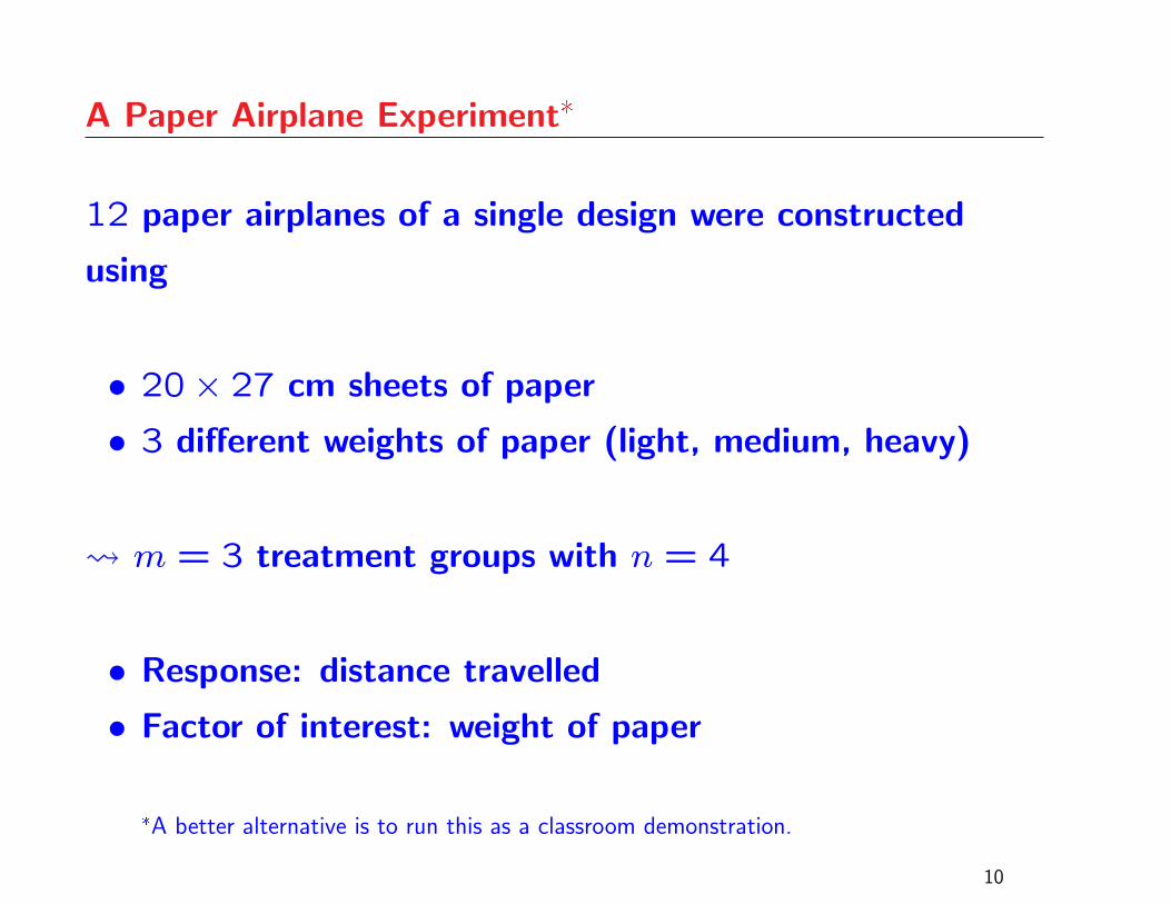
A Paper Airplane Experiment*
12 paper airplanes of a single design were constructed
using
• 20× 27 cm sheets of paper
• 3 different weights of paper (light, medium, heavy)
m = 3 treatment groups with n = 4
• Response: distance travelled
• Factor of interest: weight of paper
*A better alternative is to run this as a classroom demonstration.
10
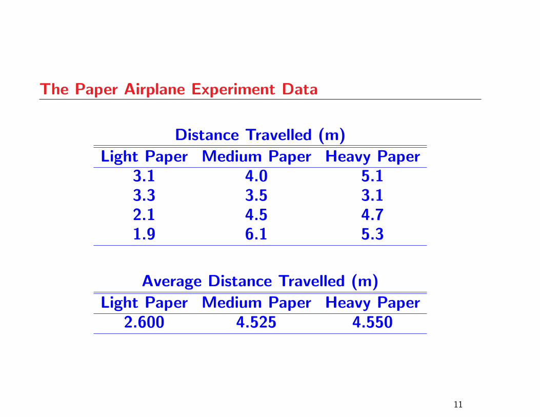
The Paper Airplane Experiment Data
Distance Travelled (m)
Light Paper Medium Paper Heavy Paper3.1 4.0 5.13.3 3.5 3.12.1 4.5 4.71.9 6.1 5.3
Average Distance Travelled (m)
Light Paper Medium Paper Heavy Paper2.600 4.525 4.550
11
Class Discussion
Flight distances are different for different treatments, but
they are also different within treatments
What has caused the variation within each treatment?
Factors other than paper weight must be having an effect
Identifying these other factors is a worthwhile exercise,
because it connects “unexplained variation”, “error” or
“noise” with tangibles that the students can understand
12
Class Discussion
Some of the possibilities are: individual airplane
construction, initial throwing height, and initial thrust and
direction
These unmeasured factors probably vary slightly from
throw to throw and thus could account for some or all of
the variation observed within each treatment
Is there confounding?*
*This would be clear in a demonstration.
13
Class Discussion
The presence of unmeasured factors makes it difficult to
tell if differences in paper type have an effect on flight
distance
Are the differences in the treatment averages due only to
the unmeasured factors?
A bootstrap hypothesis test will be used to answer this
question
14
Graphical ANOVA: A Bootstrap Hypothesis Test
Create an artificial data set which is similar to the original data set butonly the unmeasured factors will be responsible for variation
From this artificial data set, repeatedly take samples of size 4, withreplacement
Averages of these samples will vary, but only because of theunmeasured factors
If the observed averages vary more than the simulated averages, thenthere is evidence of a treatment effect paper weight affects flight distance
A graphical test: compare the observed averages with a histogram ofthe simulated averages
15
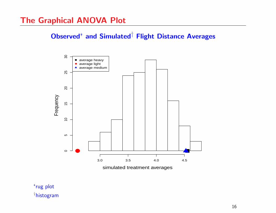
The Graphical ANOVA Plot
Observed* and Simulated� Flight Distance Averages
simulated treatment averages
Freq
uenc
y
3.0 3.5 4.0 4.5
05
1015
2025
30
●
●
average heavyaverage lightaverage medium
*rug plot�histogram
16
The Graphical ANOVA Plot
The light paper average is an outlier relative to the
histogram
There is strong evidence that the treatment means are
not all the same
Otherwise, the treatment averages should be located in
regions corresponding to higher histogram density
17
Use of Reference Plots
As with QQ-plots, one’s ability to use the graphical
ANOVA plot effectively will improve with experience
Assessing strength of evidence depends on the number of
treatments under study
Reference plots are a good way to gain some experience
before making a judgement based on given data
The following plots correspond to cases where the p-value
from the ANOVA F -test is in the vicinity of 0.05
18
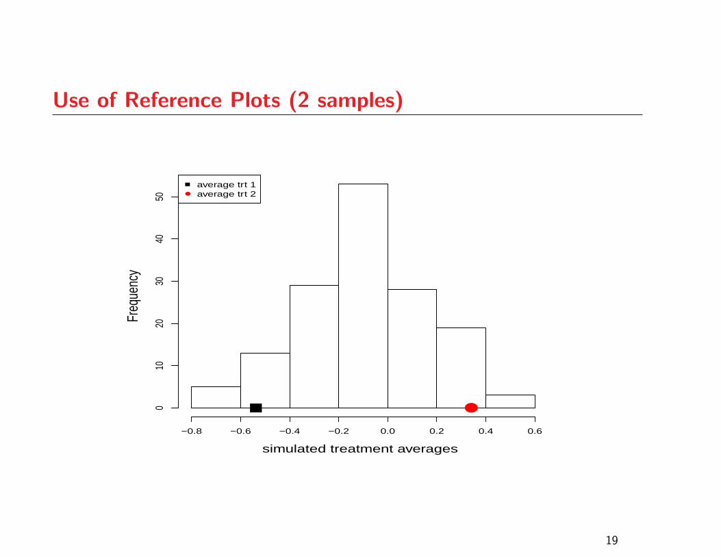
Use of Reference Plots (2 samples)
simulated treatment averages
Freq
uenc
y
−0.8 −0.6 −0.4 −0.2 0.0 0.2 0.4 0.6
010
2030
4050
●
●
average trt 1average trt 2
19
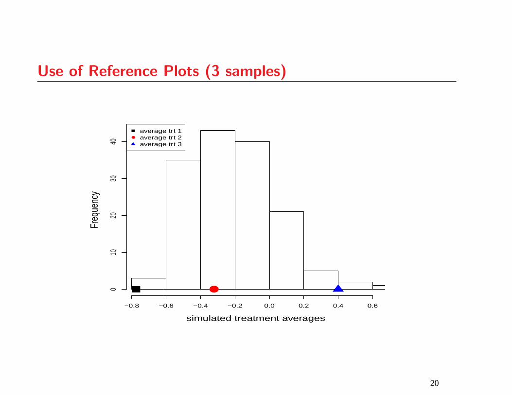
Use of Reference Plots (3 samples)
simulated treatment averages
Freq
uenc
y
−0.8 −0.6 −0.4 −0.2 0.0 0.2 0.4 0.6
010
2030
40
●
●
average trt 1average trt 2average trt 3
20
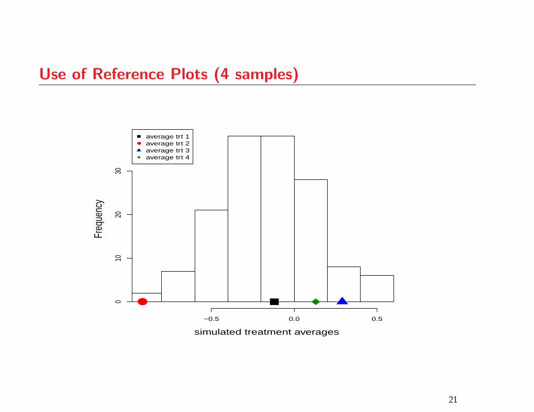
Use of Reference Plots (4 samples)
simulated treatment averages
Freq
uenc
y
−0.5 0.0 0.5
010
2030
●
●
average trt 1average trt 2average trt 3average trt 4
21
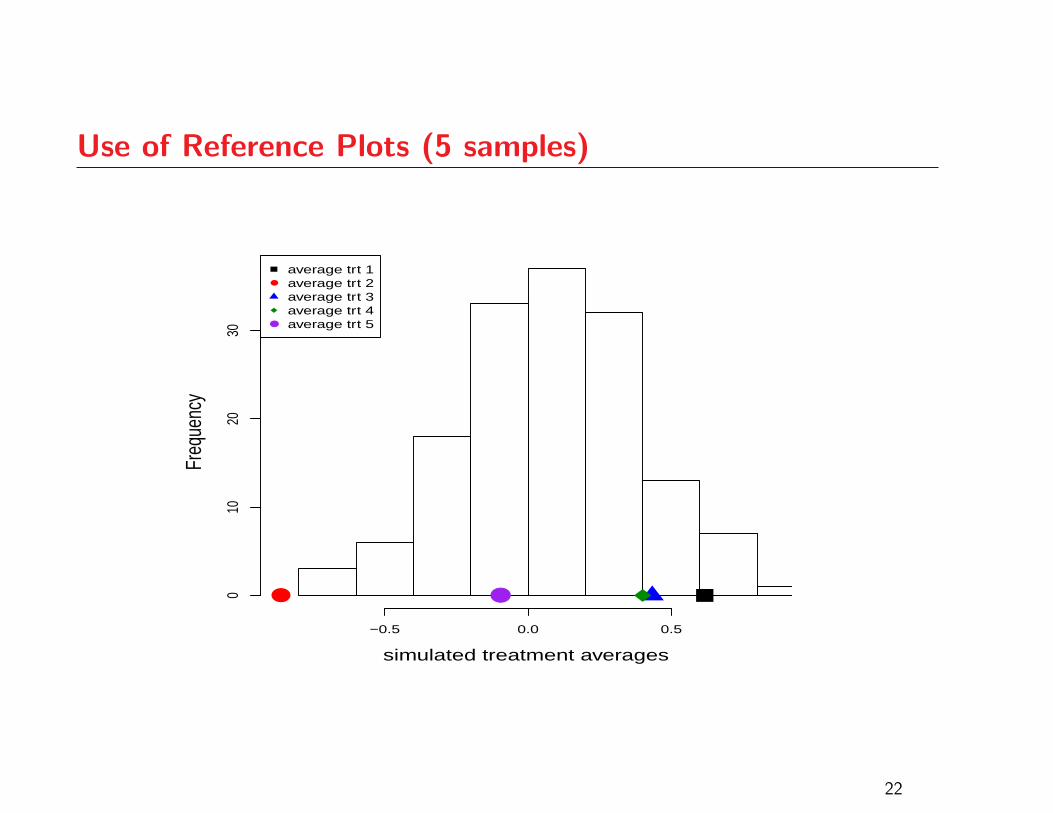
Use of Reference Plots (5 samples)
simulated treatment averages
Freq
uenc
y
−0.5 0.0 0.5
010
2030
● ●
●
●
average trt 1average trt 2average trt 3average trt 4average trt 5
22
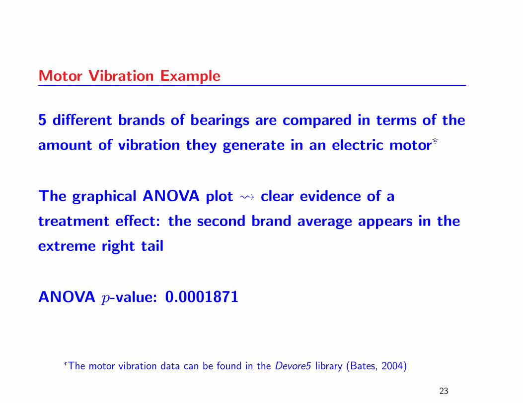
Motor Vibration Example
5 different brands of bearings are compared in terms of the
amount of vibration they generate in an electric motor*
The graphical ANOVA plot clear evidence of a
treatment effect: the second brand average appears in the
extreme right tail
ANOVA p-value: 0.0001871
*The motor vibration data can be found in the Devore5 library (Bates, 2004)
23
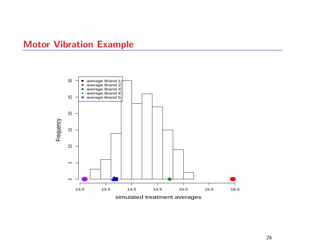
Motor Vibration Example
simulated treatment averages
Freq
uenc
y
13.0 13.5 14.0 14.5 15.0 15.5 16.0
05
1015
2025
30
●●
●
●
average Brand 1average Brand 2average Brand 3average Brand 4average Brand 5
24
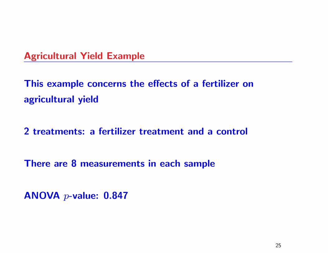
Agricultural Yield Example
This example concerns the effects of a fertilizer on
agricultural yield
2 treatments: a fertilizer treatment and a control
There are 8 measurements in each sample
ANOVA p-value: 0.847
25
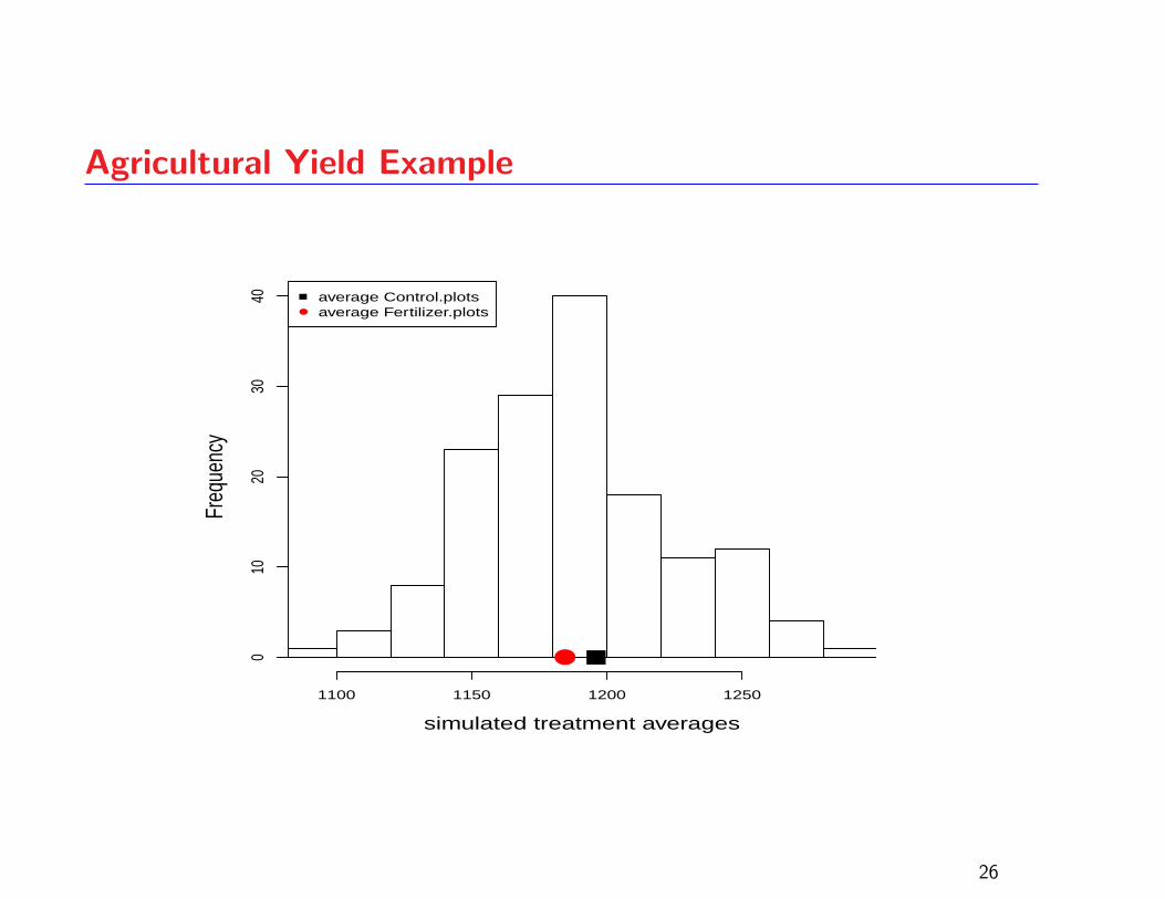
Agricultural Yield Example
simulated treatment averages
Freq
uenc
y
1100 1150 1200 1250
010
2030
40
●
●
average Control.plotsaverage Fertilizer.plots
26
Conclusion to Part I
The technique we have described has been used by a
twelve-year-old who appeared to understand it
Other mathematically challenged individuals seem to have
found the method comprehensible
It also seems to have been understood by a 10-year-old,
but he was from Australia
The technique has a similar goal to the graphical ANOVA
plot which has been advocated by Box et al (2005)
27
A Sad Story
A few years ago, a student writing the final exam in my third yearregression course motioned to me, indicating that he had a question
His question concerned whether he had to invert the simple 3× 3matrix that arose in a 2 variable multiple regression question, becausehe had forgotten how to invert a matrix
It was a bit shocking that someone at this stage of a statisticsundergraduate program could have such difficulties
When the exams were marked, it became evident that several studentswere incapable of inverting the given 3× 3 matrix
I related the story to a visiting researcher expecting the usual groan ofdisbelief about the abilities of “students these days” but was rathertaken aback at the response which was, “Why are you asking them toinvert matrices in that course?” (Guttorp, 2009)
28
A Sad Story
I had to admit that I didn’t have a good answer, being fully aware thatmatrix inversion is generally a bad idea and that good statisticalsoftware will find least-squares solutions using stable procedures whichavoid explicit matrix inversion
At the same time, other problems were evident in the teaching of thisregression course
In particular, students seemed to struggle with the F -test forsignificance of regression and were not really clear on the usefulness ofthis test
Their focus was placed on the individual coefficient t-tests, and evenwith many warnings about the dangers of misinterpreting large Rvalues and small t-test p-values as indicators of goodness of fit,students were still tempted to use these measures as criteria forassessing model validity
29
Question:
How should we teach regression to a 21-year-old?
30
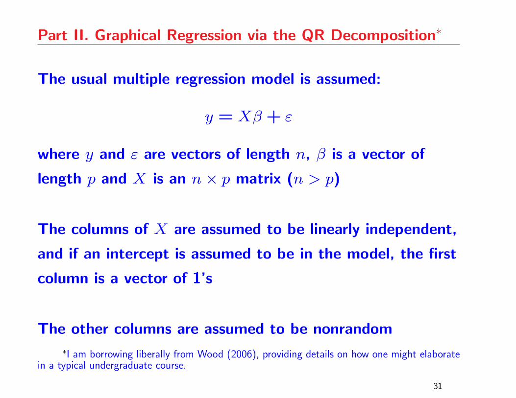
Part II. Graphical Regression via the QR Decomposition*
The usual multiple regression model is assumed:
y = Xβ+ ε
where y and ε are vectors of length n, β is a vector of
length p and X is an n× p matrix (n > p)
The columns of X are assumed to be linearly independent,
and if an intercept is assumed to be in the model, the first
column is a vector of 1’s
The other columns are assumed to be nonrandom
*I am borrowing liberally from Wood (2006), providing details on how one might elaboratein a typical undergraduate course.
31
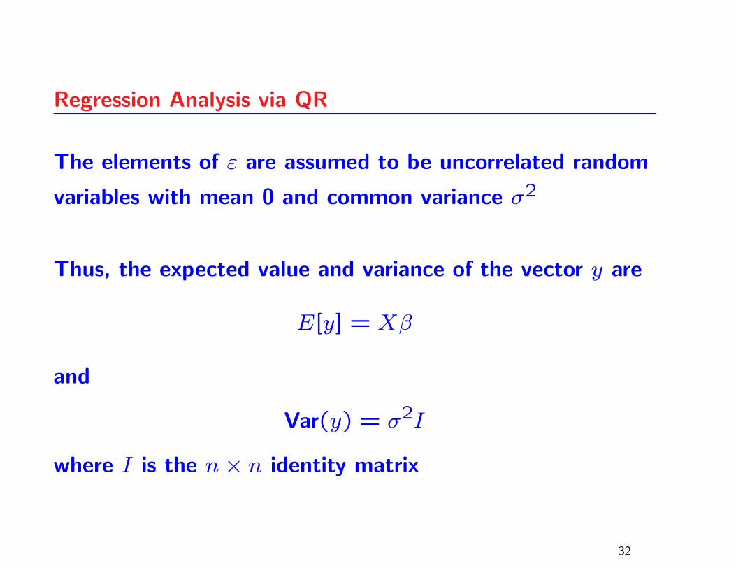
Regression Analysis via QR
The elements of ε are assumed to be uncorrelated random
variables with mean 0 and common variance σ2
Thus, the expected value and variance of the vector y are
E[y] = Xβ
and
Var(y) = σ2I
where I is the n× n identity matrix
32
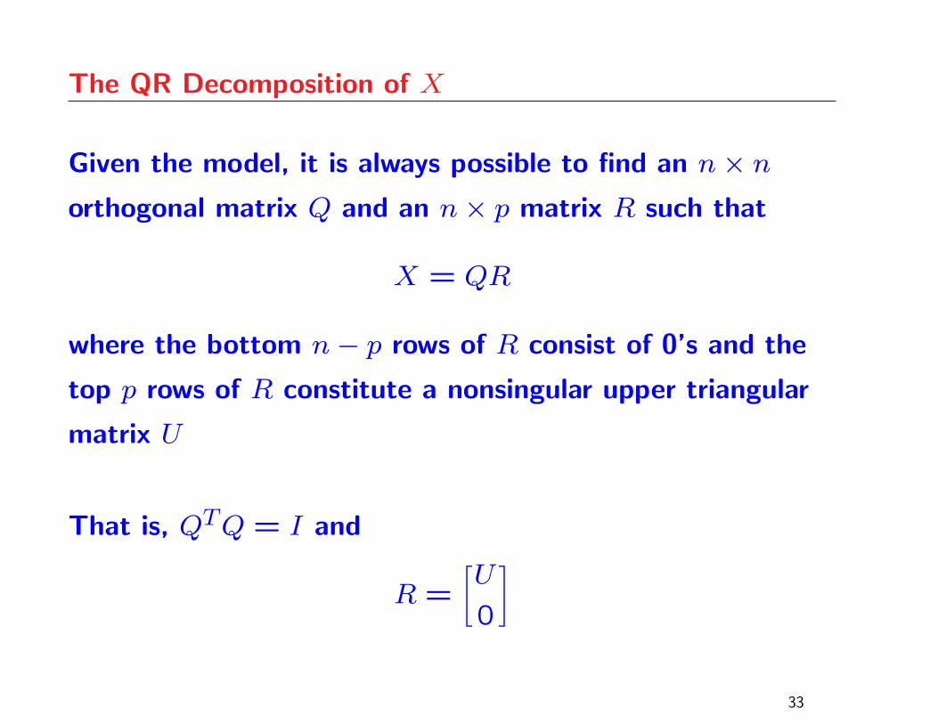
The QR Decomposition of X
Given the model, it is always possible to find an n× northogonal matrix Q and an n× p matrix R such that
X = QR
where the bottom n− p rows of R consist of 0’s and the
top p rows of R constitute a nonsingular upper triangular
matrix U
That is, QTQ = I and
R =[U
0
]
33

Parameter Estimation via QR
Multiplying the model equation on the left by QT gives
QTy = Rβ+QTε
Partitioning Q as [Q1 Q2], where Q1 represents the first p
columns of Q, the above equation can be re-written as
QT1y = Uβ+QT1ε (1)
and
QT2y = QT2ε (2)
34
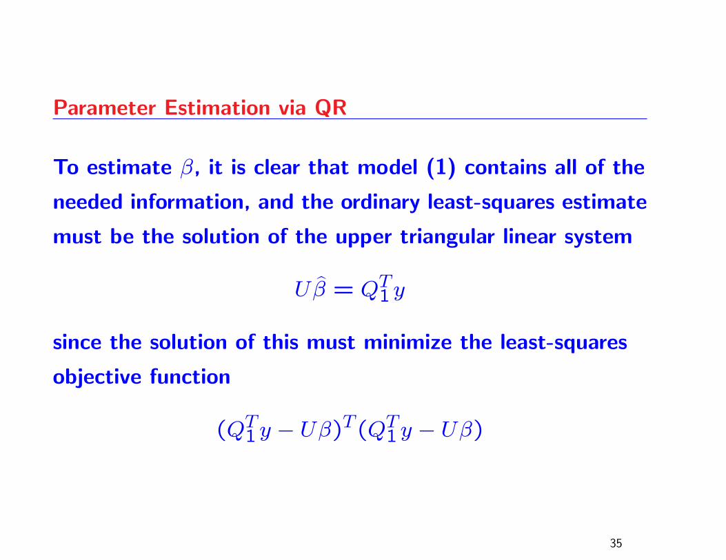
Parameter Estimation via QR
To estimate β, it is clear that model (1) contains all of the
needed information, and the ordinary least-squares estimate
must be the solution of the upper triangular linear system
Uβ̂ = QT1y
since the solution of this must minimize the least-squares
objective function
(QT1y − Uβ)T(QT1y − Uβ)
35
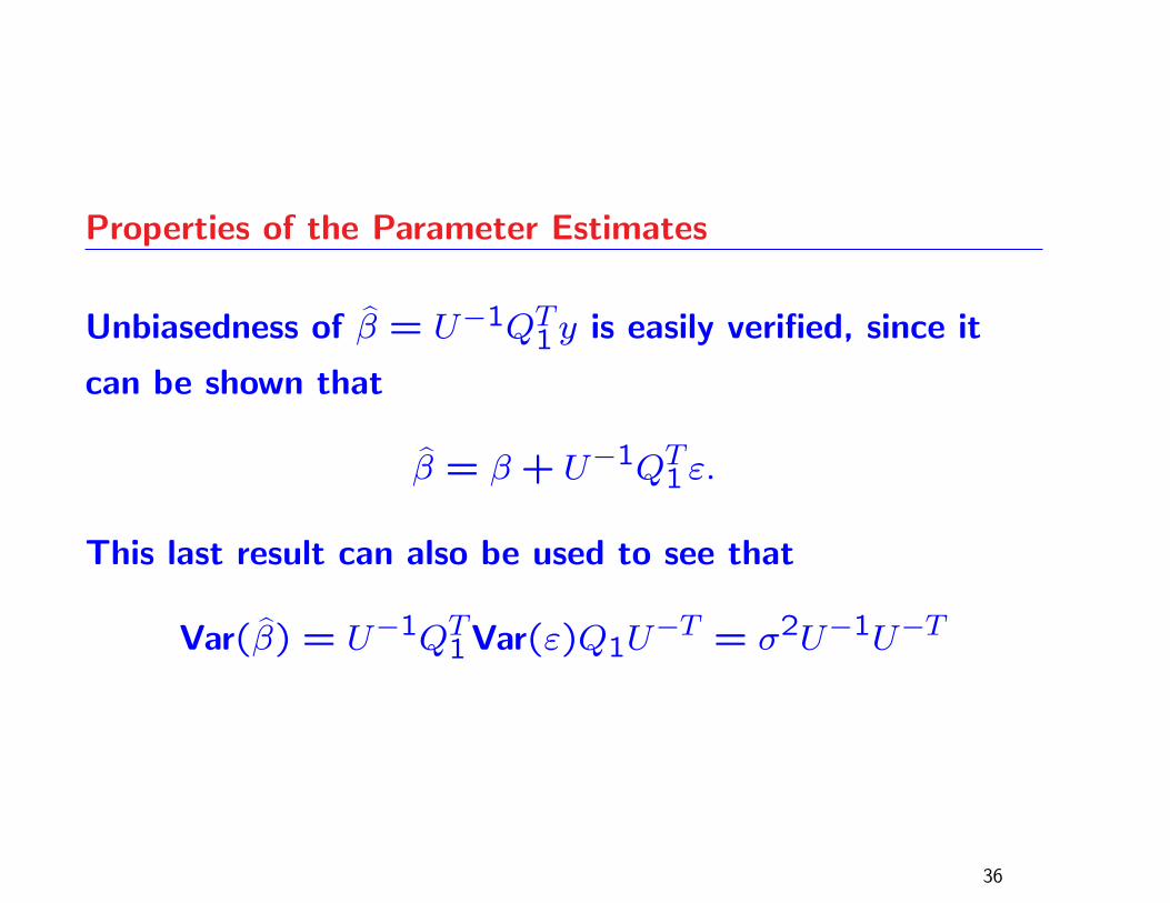
Properties of the Parameter Estimates
Unbiasedness of β̂ = U−1QT1y is easily verified, since it
can be shown that
β̂ = β+ U−1QT1ε.
This last result can also be used to see that
Var(β̂) = U−1QT1Var(ε)Q1U−T = σ2U−1U−T
36
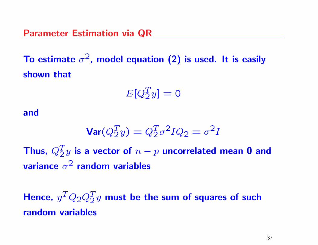
Parameter Estimation via QR
To estimate σ2, model equation (2) is used. It is easily
shown that
E[QT2y] = 0
and
Var(QT2y) = QT2σ2IQ2 = σ2I
Thus, QT2y is a vector of n− p uncorrelated mean 0 and
variance σ2 random variables
Hence, yTQ2QT2y must be the sum of squares of such
random variables
37
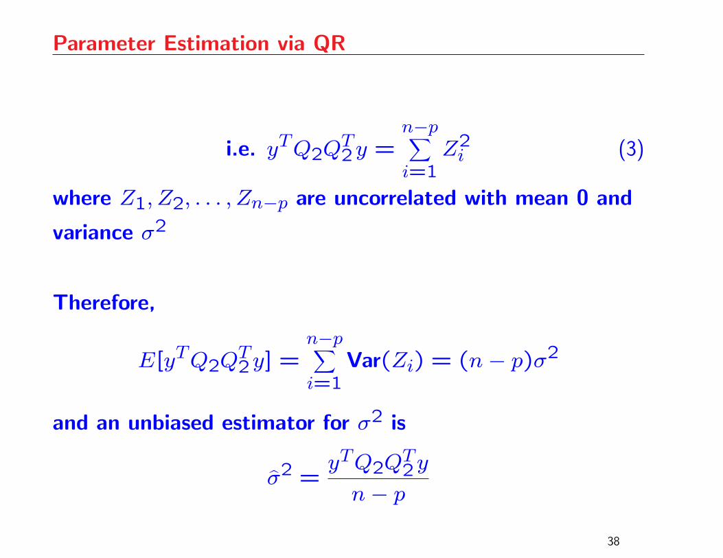
Parameter Estimation via QR
i.e. yTQ2QT2y =
n−p∑i=1
Z2i (3)
where Z1, Z2, . . . , Zn−p are uncorrelated with mean 0 and
variance σ2
Therefore,
E[yTQ2QT2y] =
n−p∑i=1
Var(Zi) = (n− p)σ2
and an unbiased estimator for σ2 is
σ̂2 =yTQ2Q
T2y
n− p
38
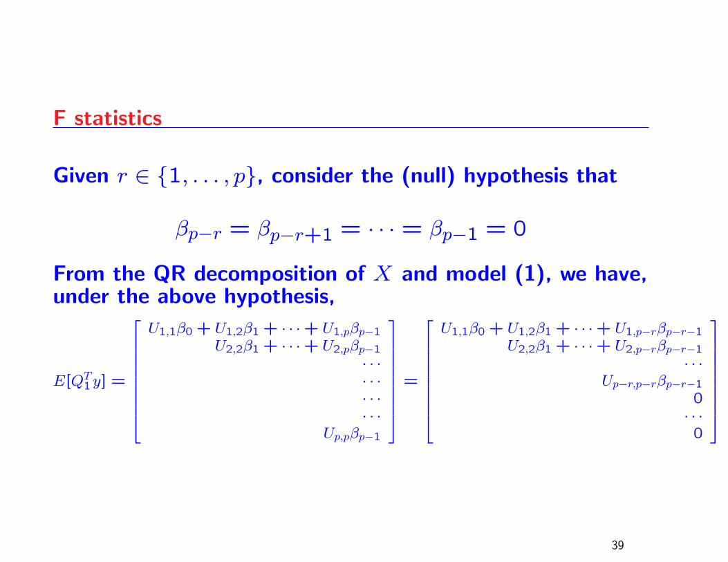
F statistics
Given r ∈ {1, . . . , p}, consider the (null) hypothesis that
βp−r = βp−r+1 = · · · = βp−1 = 0
From the QR decomposition of X and model (1), we have,under the above hypothesis,
E[QT1y] =
U1,1β0 + U1,2β1 + · · ·+ U1,pβp−1U2,2β1 + · · ·+ U2,pβp−1
· · ·· · ·· · ·· · ·
Up,pβp−1
=
U1,1β0 + U1,2β1 + · · ·+ U1,p−rβp−r−1U2,2β1 + · · ·+ U2,p−rβp−r−1
· · ·Up−r,p−rβp−r−1
0· · ·0
39
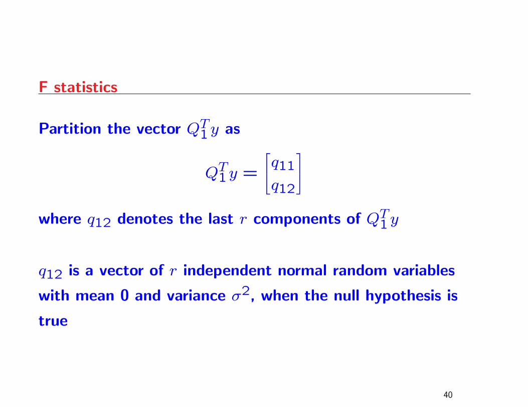
F statistics
Partition the vector QT1y as
QT1y =
q11q12
where q12 denotes the last r components of QT1y
q12 is a vector of r independent normal random variables
with mean 0 and variance σ2, when the null hypothesis is
true
40
F statistics
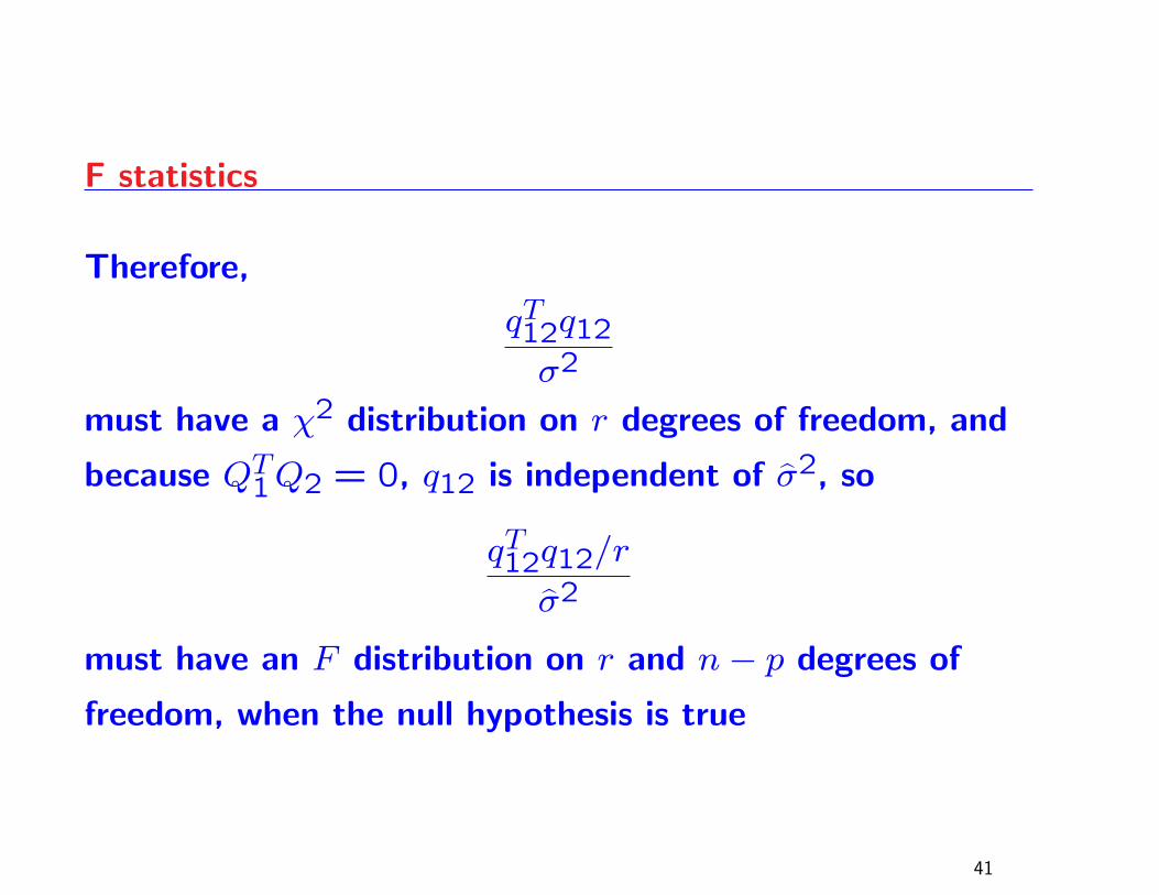
Therefore,
qT12q12σ2
must have a χ2 distribution on r degrees of freedom, and
because QT1Q2 = 0, q12 is independent of σ̂2, so
qT12q12/r
σ̂2
must have an F distribution on r and n− p degrees of
freedom, when the null hypothesis is true
41
F statistics
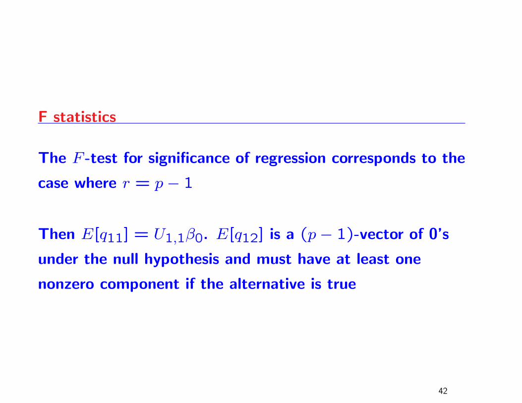
The F -test for significance of regression corresponds to the
case where r = p− 1
Then E[q11] = U1,1β0. E[q12] is a (p− 1)-vector of 0’s
under the null hypothesis and must have at least one
nonzero component if the alternative is true
42
Graphical Complements to the F -test
There may be several ways of generalizing the ANOVA plot
to the regression (or ANCOVA) context; we show here how
to use the QR decomposition to obtain such a plot
Recall: QTy is a random vector whose last n− pcomponents (i.e., QT2y) have the same mean and variance
as the errors
This can be graphically displayed in a histogram
If the data are symmetrically distributed, graphing the
distribution of the absolute values of QT2y gives a more
precise estimate of the distribution of |ε|43
Graphical Complements to the F -test
QT1y has expected value Uβ and variance σ2I
If the ith component of the vector Uβ is 0, then the ith
component of QT1y has the same mean and variance as the
errors.
Thus, we can informally check whether particular elements
of Uβ are 0 by plotting the corresponding elements of
|QT1y| as a rugplot on the |QT2y| histogram
Evidence that an element of Uβ is nonzero is indicated by
the appearance of the corresponding point of |QT1y|plotting outside the range of the histogram
44
Illustrative Examples
13 observations on an experiment to produce a synthetic
analogue to jojoba oil
Response variable: y, yield
Predictors: x1, x2 and x3 (temperature, catalyst, pressure)
Regression model:
y = β0 + β1x1 + β2x2 + β3x3 + ε.
45
errors
Fre
quen
cy
0 10 20 30 40
01
23
45
23 4
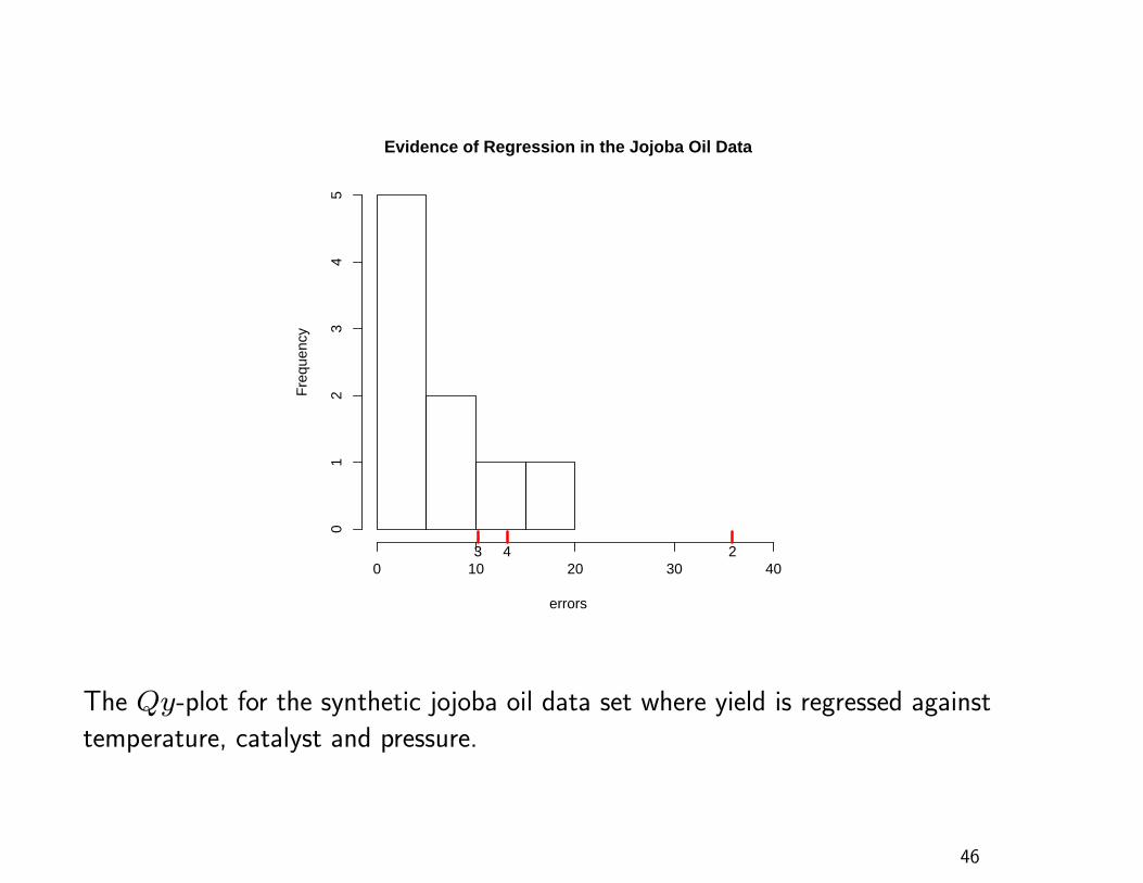
Evidence of Regression in the Jojoba Oil Data
The Qy-plot for the synthetic jojoba oil data set where yield is regressed against
temperature, catalyst and pressure.
46
Jojoba Oil Qy-Plot
Histogram: distribution of the absolute values of the errors
Rug plot: three points – the second through fourth
components of Uβ̂
The second point is outside the range of the error
distribution
strong evidence that at least one of the predictor
variables has a nonzero coefficient
The graphical result agrees with the formal F -test
(p-value: .0112)
47
A Null Case
40 observations
Response variable: simulated standard normals
Predictors: 9 simulated variables, correlated amongst
themselves but not with the response variable
Model:
y = β0 +9∑
j=1βjxj + ε
The following Qy-plot shows that there is no evidence that
any of the coefficients is nonzero48
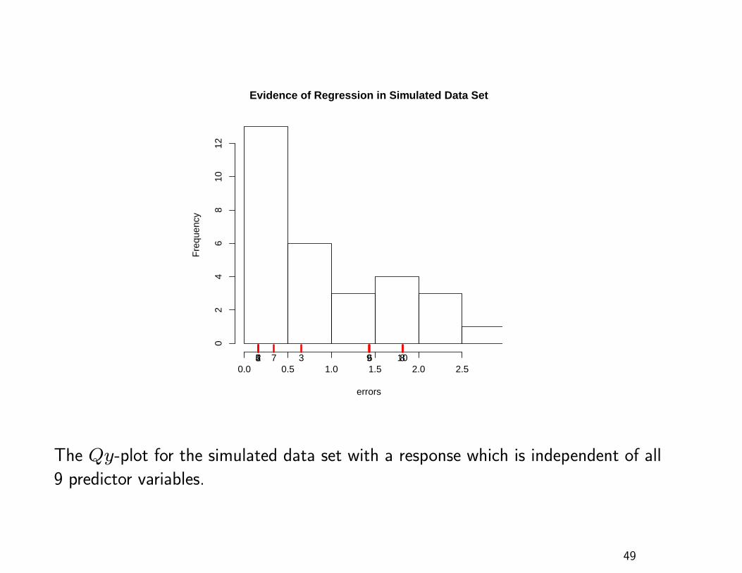
errors
Fre
quen
cy
0.0 0.5 1.0 1.5 2.0 2.5
02
46
810
12
2 345 67 89 10
Evidence of Regression in Simulated Data Set
The Qy-plot for the simulated data set with a response which is independent of all
9 predictor variables.
49
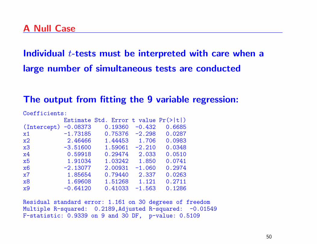
A Null Case
Individual t-tests must be interpreted with care when a
large number of simultaneous tests are conducted
The output from fitting the 9 variable regression:
Coefficients:Estimate Std. Error t value Pr(>|t|)
(Intercept) -0.08373 0.19360 -0.432 0.6685x1 -1.73185 0.75376 -2.298 0.0287x2 2.46466 1.44453 1.706 0.0983x3 -3.51600 1.59061 -2.210 0.0348x4 0.59918 0.29474 2.033 0.0510x5 1.91034 1.03242 1.850 0.0741x6 -2.13077 2.00931 -1.060 0.2974x7 1.85654 0.79440 2.337 0.0263x8 1.69608 1.51268 1.121 0.2711x9 -0.64120 0.41033 -1.563 0.1286
Residual standard error: 1.161 on 30 degrees of freedomMultiple R-squared: 0.2189,Adjusted R-squared: -0.01549F-statistic: 0.9339 on 9 and 30 DF, p-value: 0.5109
50
A Null Case
If one is not careful, one might mistakenly infer that the
coefficients of x1, x3 and x7 are nonzero on the basis of
the low t-test p-values
The F -test p-value (0.5109) confirms our earlier assertion
that there is no evidence that any of the regression
coefficients are nonzero
The statistical analyst should proceed no further with any
kind of linear model for this data set, but given our
informal survey results, one must wonder how strong the
temptation would be to apply backward variable selection
in a situation like this51
NFL Data
20 observations on 1976 National Football League (NFL)
performance
Response variable: number of games won in a 14 game
season
Predictor variables: rushing yards, passing yards, punting
average (yards/punt), field Goal Percentage (FGs
made/FGs attempted), turnover differential (turnovers
acquired - turnovers lost), penalty yards, percent rushing
(rushing plays/total plays), opponents’ rushing yards, and
opponents’ passing yards
52
errors
Fre
quen
cy
0 2 4 6 8 10
01
23
45
2345 6 7 8 910
Evidence of Regression in NFL Data Set
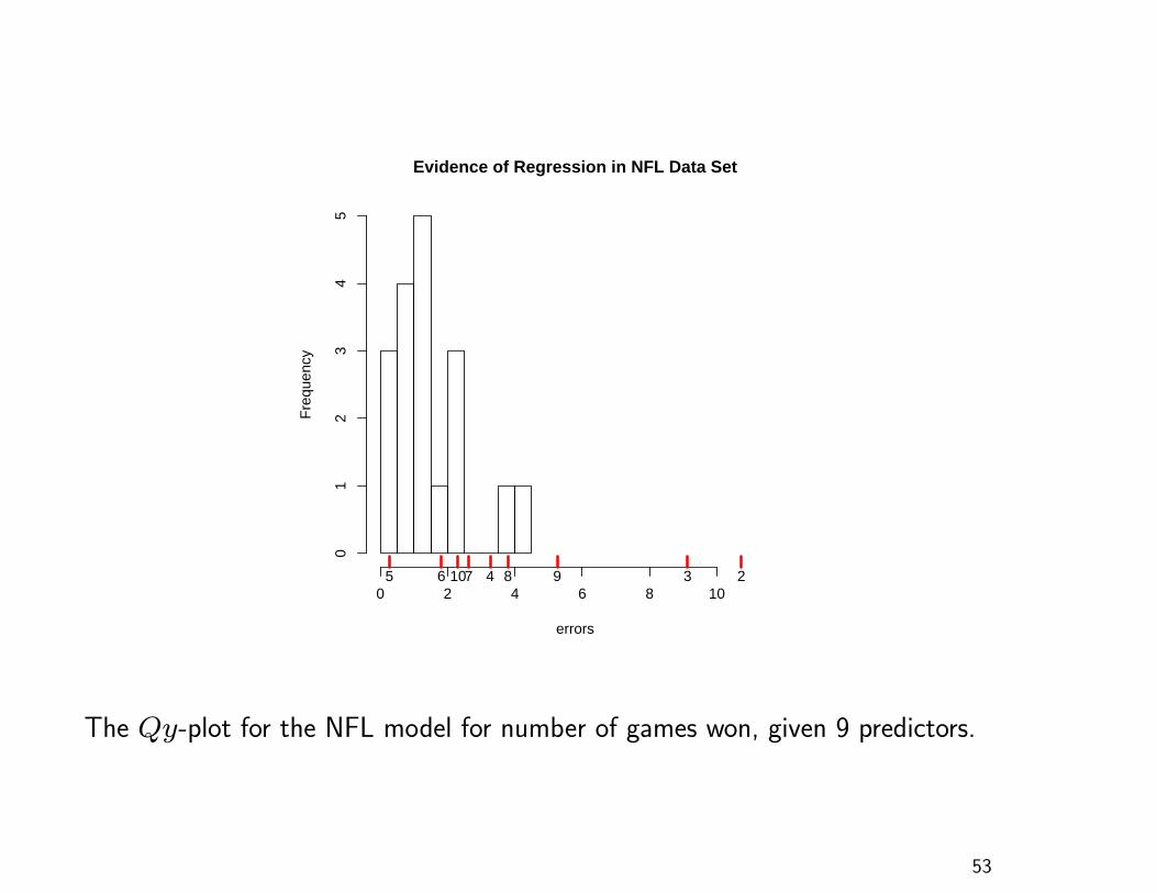
The Qy-plot for the NFL model for number of games won, given 9 predictors.
53
NFL Data
Two error points are separated from the rest of the error
distribution, a reminder that additional model diagnostics
should be studied before making any firm conclusions
Strong evidence that elements 2, 3 and 9 of Uβ are
nonzero
Do not over-interpret the plot; it is not saying that the
three predictor coefficients (β1, β2 and β8) are nonzero
The plot contains no information about which coefficients
is nonzero
54
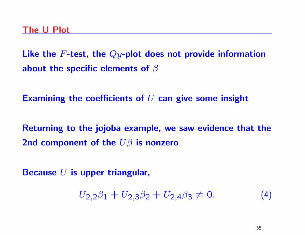
The U Plot
Like the F -test, the Qy-plot does not provide information
about the specific elements of β
Examining the coefficients of U can give some insight
Returning to the jojoba example, we saw evidence that the
2nd component of the Uβ is nonzero
Because U is upper triangular,
U2,2β1 + U2,3β2 + U2,4β3 6= 0. (4)
55
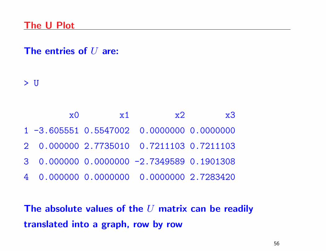
The U Plot
The entries of U are:
> U
x0 x1 x2 x3
1 -3.605551 0.5547002 0.0000000 0.0000000
2 0.000000 2.7735010 0.7211103 0.7211103
3 0.000000 0.0000000 -2.7349589 0.1901308
4 0.000000 0.0000000 0.0000000 2.7283420
The absolute values of the U matrix can be readily
translated into a graph, row by row
56
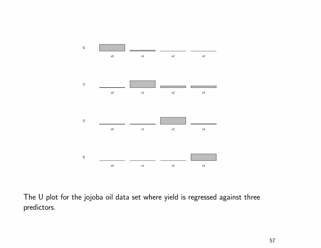
x0 x1 x2 x3
x0
x0 x1 x2 x3
x1
x0 x1 x2 x3
x2
x0 x1 x2 x3
x3
The U plot for the jojoba oil data set where yield is regressed against three
predictors.
57
The U Plot
Our focus should be on the second row which indicates
that U2,2 is large in magnitude while U2,3 and U2,4 are
smaller, but not negligible
Since the multiplier of β2 in (4) is large, relative to the
other multipliers, it is believable that β2 is nonzero
However, the fact that U2,3 and U2,4 are not negligible
makes it hard to be certain. Note that the Qy-plot leaves
the possibility open that the 3rd and 4th component of Uβ
are nonzero
58
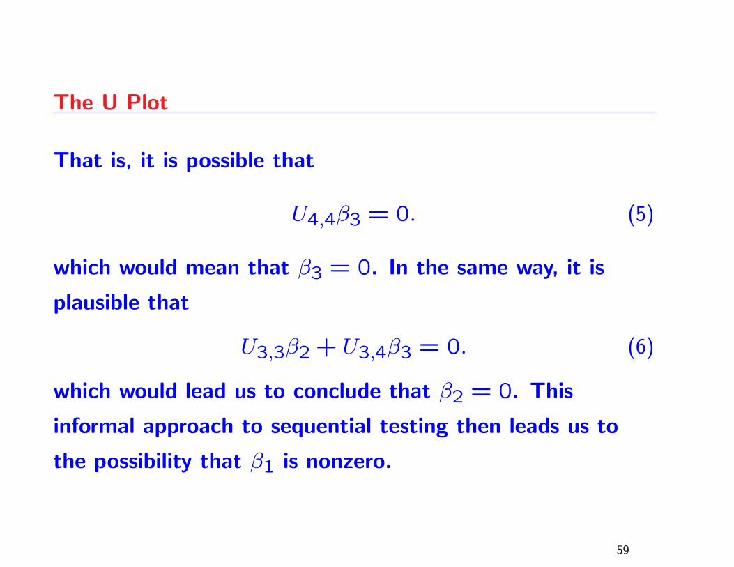
The U Plot
That is, it is possible that
U4,4β3 = 0. (5)
which would mean that β3 = 0. In the same way, it is
plausible that
U3,3β2 + U3,4β3 = 0. (6)
which would lead us to conclude that β2 = 0. This
informal approach to sequential testing then leads us to
the possibility that β1 is nonzero.
59
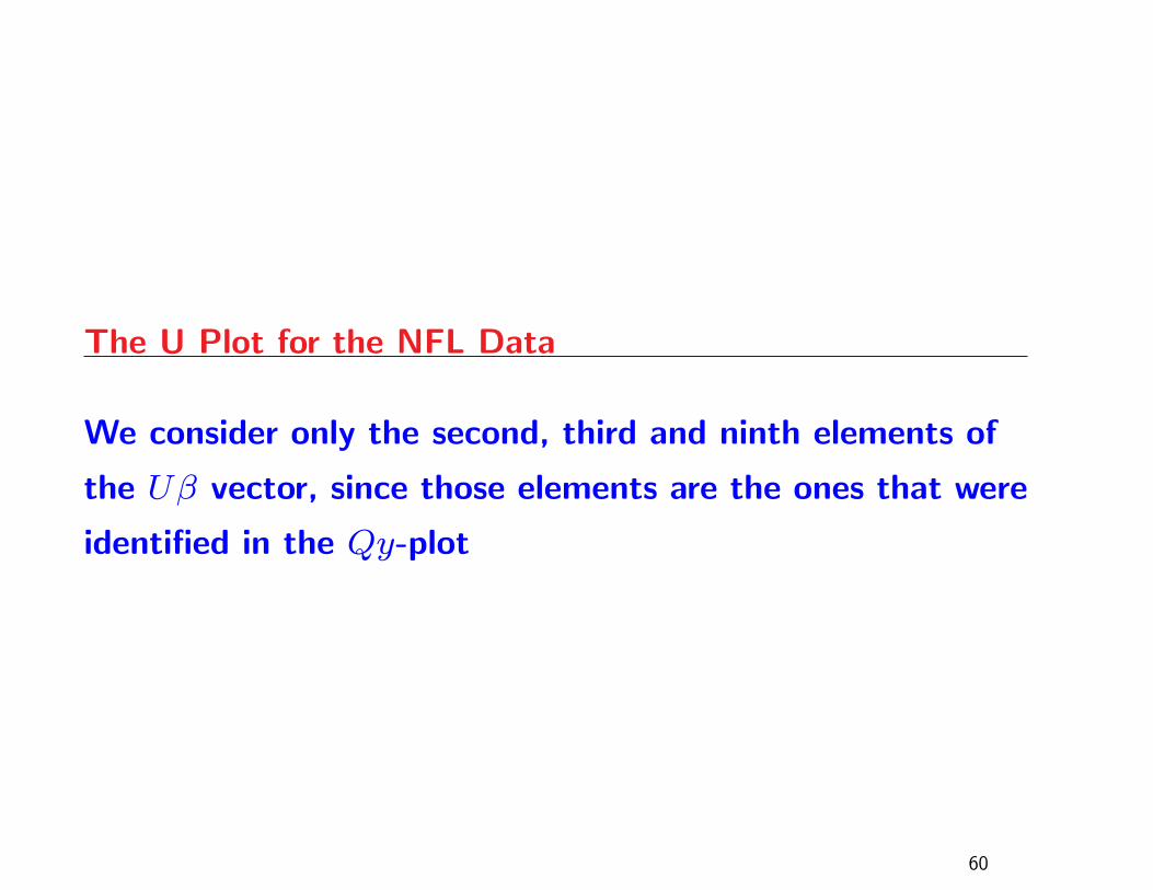
The U Plot for the NFL Data
We consider only the second, third and ninth elements of
the Uβ vector, since those elements are the ones that were
identified in the Qy-plot
60

x0 x1 x2 x3 x4 x5 x6 x7 x8 x9
x1
x0 x1 x2 x3 x4 x5 x6 x7 x8 x9
x2
x0 x1 x2 x3 x4 x5 x6 x7 x8 x9
x8
The U plot for the NFL data set, with a focus on the second, third and ninth rows.
61
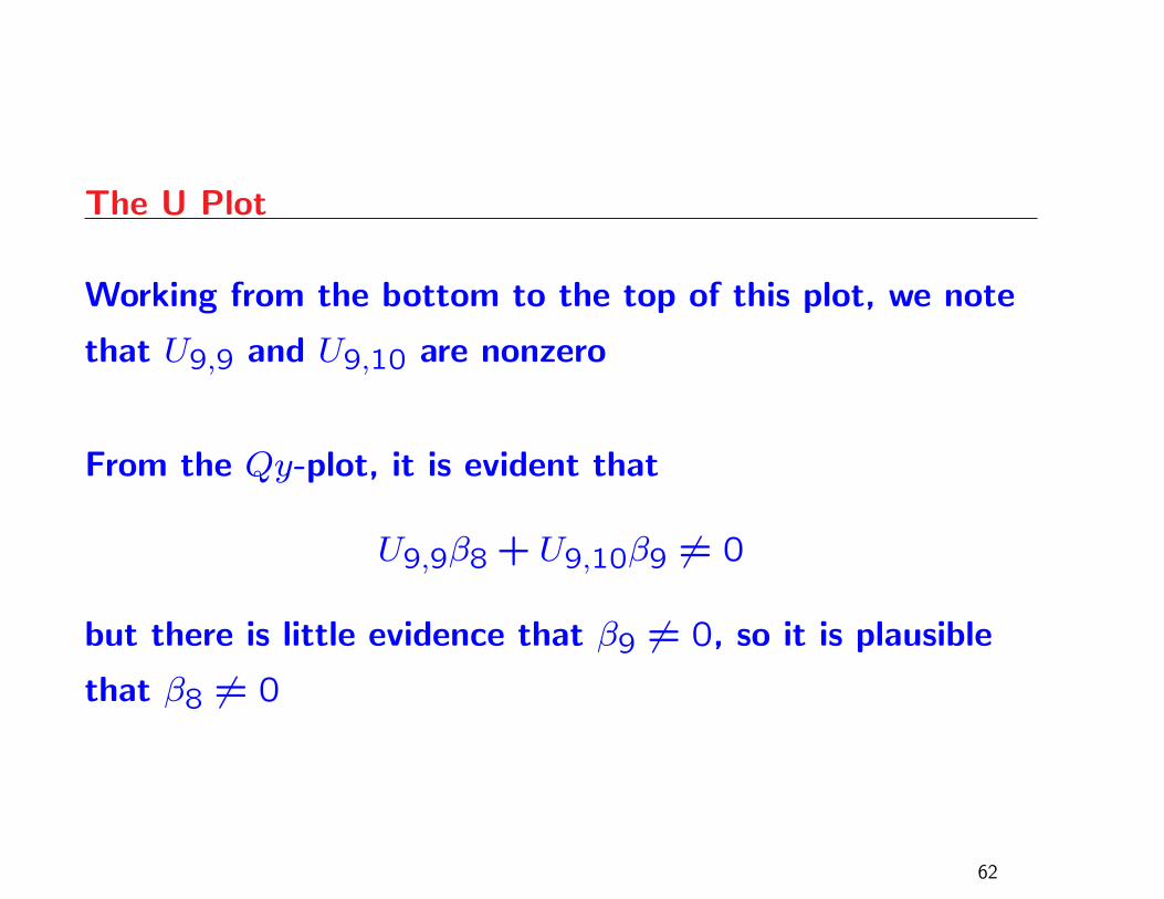
The U Plot
Working from the bottom to the top of this plot, we note
that U9,9 and U9,10 are nonzero
From the Qy-plot, it is evident that
U9,9β8 + U9,10β9 6= 0
but there is little evidence that β9 6= 0, so it is plausible
that β8 6= 0
62
The U Plot
The second row of the U-plot indicates that β2 6= 0, since
the multiplier of β8 appears to be very small
The top row of the U-plot is less clear, because the
multiplier of β8 is clearly nontrivial; this indicates that
there is very weak evidence that β1 6= 0
This graphical analysis leads us to consider a model with
only the x2 and x8 as predictors: passing yards and
opponents’ rushing yards
63
Concluding Remarks
Regression analysis can be taught, based on methods that
are actually employed in statistical software
The Qy-plot is a graphical technique which conveys the
meaning of the F -test for signficance of regression
The U-plot can be used to visualize multicollinearity
A t-plot can also be constructed
Code for the three proposed plots can be found in the
MPV library
64