Embed Size (px)
Citation preview

In what ways does your media product use, develop or challenge forms and conventions of real media products?
From the start I knew I wanted the lead image to be the most important thing on the front cover. I wanted to make a magazine that people were drawn to. Also the fact it is a ska magazine means that it is more about the artist and style than their life, which I think this shows because loads of cover lines suggest gossip, suitable for the more pop orientated magazines. My survey results backed up the idea of the poster styled front cover.

These magazine front covers link with mine because of the lead image creating more of a poster styled front cover and challenging codes and conventions instead of following them. My magazine challenges the codes and conventions too.I looked at these front covers to take my inspiration because I was instantly drawn to them and they were unique.

As we can see here the front cover catching the audience's eyes is important as it got 53% of the results. So by me going against the codes and conventions to create a poster-style front cover it will catch their eyes.

I chose to have one prominent image for my front cover because 55% of my audience said this will look best and as my first comment says it is what I wanted to have originally anyway.

Again linking with the poster style front cover my audience have voted having posters as freebies in magazines is most important as 60% of them voted this.

Bright colours
Poster styleFront cover

As we can see here the majority of people (69%) voted that bright colours would be best for my front cover but I felt that for a skamagazine black and white would be most suitable. However so that it would appeal to my audience I knew I needed to have colour so I made the models top bright red and the lead line gold.

As we can see I have not got loads of cover lines over my front cover but instead I have a skyline. This challenges the codes and conventions of a real media product because most magazines have cover lines to attract their readers attention but instead I have a strong image which creates a poster style front cover to attract them but if they want to know more they have the skyline.


House style

Front cover Double page spreadContents

My contents page however fits mostly with codes and conventions of a real media.
If we look at my features and regulars, my features are bigger than my regulars this follows the rules because features usually stand out more to attract the readers attention. Also the strapline under each story/heading is smaller but readable which draws the reader to each story.
Another thing I have done which follows the rules is that I have the features and regulars in separate columns with a smallish gutter in-between them.Also I have a follow us section which makes the magazine look more professional because it shows the magazine is multi platform. Another thing linking with that is the editors blob, because this again is linking to the readers and making them want to buy the magazine. Also it helps give a professional finish to the contents page.

I didn’t really take any ideas from magazines because I knew the kind of contents page I wanted to create but couldn’t find many like it. However below of two images of magazines I did look at and develop ideas from. Ideas such as having my masthead on the contents page, (Heat, on the left) and having just one of two main images, in my case one, (Q, on the right).
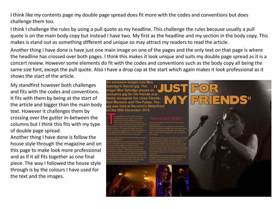
I think like my contents page my double page spread does fit more with the codes and conventions but does challenge them too.
I think I challenge the rules by using a pull quote as my headline. This challenge the rules because usually a pull quote is on the main body copy but instead I have two. My first as the headline and my section in the body copy. This makes is stand out as something different and unique so may attract my readers to read the article.
Another thing I have done is have just one main image on one of the pages and the only text on that page is where the headline has crossed over both pages. I think this makes it look unique and suits my double page spread as it is a concert review. However some elements do fit with the codes and conventions such as the body copy all being the same size font, except the pull quote. Also I have a drop cap at the start which again makes it look professional as it shows the start of the article.
My standfirst however both challenges and fits with the codes and conventions. It fits with them by being at the start of the article and bigger than the main body text. However it challenges them by crossing over the gutter in-between the columns but I think this fits with my type of double page spread.Another thing I have done is follow the house style through the magazine and on this page to make look more professional and as if it all fits together as one final piece. The way I followed the house style through is by the colours I have used for the text and the images.

I took my inspiration from two magazines because I liked the way they were presented and thought it would suit mine. However I did take most of my inspiration from the Kerrang magazine, (On the left) because I felt it look very unique and would suit my double page spread. However I did change a few things from there as I didn’t want to just copy it so I took inspiration and developed my ideas. I did the same thing really for the other magazine as I liked the use of one main image and a pull quote as the headline.

How does your media product represent particular social groups
My magazine represents people interested in ska who are 16+ by using different elements such as colour, imagery, text and more.
The main use of text to represent ska is the name of the magazine, TWO TONE. This links with ska because they are known for wearing two tone, black and white, which is why I have called it TWO TONE, also I have made the masthead black and white to again link with this. We have other uses of text such as what is written in the body copy on my double page spread and what articles are in the magazine because they all suit ska, especially the artist I have included.
Another way I have represented ska is by the imagery I have used.For example the lead image on the front cover is a black and white image which fits again with the idea that ska listeners like two tone. However the model has a bright red top which suggest that ska fans care about the style and the genre more than looks. Also it suggest that they are happy people because red is a bright colour connoting happiness.Another thing is the lead image on my double page spread is in black and white so links with the front cover image. This again shows that they are interested in black and white but instead of adding colour to that image we have smaller, colourful images.

What kind of media institution might distribute your media product?
Looking at different institutions I decided what one would be best for my magazine and why. I found two that would be most suitable for my magazine and they were Bauer and IPC.
However I think Bauer just win because they have a wider range of magazines so they are known for being diverse. This means that they maybe interested in adding another genre to their list which TWO TONE will do by being a ska magazine. Although as I have just said Bauer have a wide range of genres they don’t have any ska magazines which means TWO TONE will be able to fill this market niche and can use that as a USP, Unique Selling Point.Another advantage Bauer have is that they have other magazines under their brand that have slight links with mine like colours, fonts and use of imagery. The main magazines which are similar are Q and Kerrang.
However IPC have got UNCUT under their label which shows that they have the ability to make a magazine which is very pacific to a genre popular which means they maybe able to help advertise TWO TONE to the correct audience and make it popular. Also as it is clear they like to fill market niche’s.

Who would be the audience for your media product?
If we look at the kind of artist my survey responds like to read about we see that there is a wide range. However I know that ska is a market niche as I could not find any magazines are just about ska but there is an audience for this. So I decided for that reason that my audience will be for ska. Also even though ska has the least votes we can see there are other genres voted slightly higher that link with it like punk and reggae.

As I knew my audience had to be interested in ska I filtered the results when analysing it to just ska.
Now if we look at the results I received for age and gender we can see what kind of target audience I have. Firstly if we look at gender we can see that the majority of people who are interested in ska are women which means that I must remember this when creating the magazine.
Now if we look at the age groups of these people we notice that it is a lot closer between the two groups. This surprised me because I assumed that 24+ would have the most votes by miles but this is not the case. This shows that it was very important for me to ask this question so that I knew who I was aiming TWO TONE at.
So my target audience for TWO TONE is mostly females but some males, aged 16-19 and 24+, who are interested in Ska music.

How did you attract/ address your audience?
I attracted my audience by creating a survey on survey monkey which made it easier for me to gain so many responses. I got the responses by putting the web link on sites like facebook and twitter. Also I created a poster which had a QR code on it and a web link so my audience can answer the survey on the go and more people will see it. The poster was put up in one of the busiest rooms in my college.

Improving my magazine
To improve my magazine I used the results from survey to see what my audience felt needed changing and improving. This was beneficial because they are the ones I am targeting it at so it is useful to know if they think it is good enough.
Another way I gained feedback was by printing of my work as I went through it and getting my teacher to check over and let me know if he felt there was any changes needed and if the changes I had made looked better than before.
Finally I had one more way of getting feedback and that was by simply showing people in my class my work and seeing what they thought of it and what they think could be done better. This was useful because they were doing music magazines too so knew what I was doing and what I wanted my end piece to look like.

What have you learnt about technologies from the process of constructing this product?
I have learnt new techniques and methods to create my music magazine. Especially on Photoshop which has allowed me to make my magazine unique and eye catching by challenging codes and conventions of a real media product.Also I have learnt how use websites such blogger, slideshare, skydriveand surveymonkey.Blogger has been an easy way for me to make a record of what I have done and learnt from this project and throughout my course.Slideshare is an easy way for me to upload my presentation onto my blog so that people can see it and I can look at wherever I want. Also it made it easy for my teacher to see my work and tell me what needs doing to make it better.Skydrive was just a simple way to be able to access my working documents on the move.Surveymonkey, is the website I used to get feedback from my audience about what they thought of my magazine and any changes they felt needed doing to my magazine.

Looking back at your preliminary task, what do you feel you have learnt in the progression from it to the full product?
For my preliminary task I had to create a college magazine, (On the left). Looking at the task I have learnt a lot of different things which have helped me to create my final magazine. As we can see my college magazine was simple in design and nothing really stood out, it was as if anyone could have done it. Now when we compare it to my final front cover we can see it looks professional by the way it challenges and develops codes and conventions of a real media product.
If we look at the masthead we can see a dramatic change between them on my first one the font just looks like a cover line and doesn’t stand out. However on my final front cover we can see that the masthead stands out and is unique. It also helps us distinguish what genre the magazine is for.
If we have a look now at the cover lines we can see that on both there isn’t many, well in fact on my final one we only have the lead line and the cover lines are in the form of a skyline. This looks more professional because it challenges the codes and conventions of a real media product because we usually have cover lines over the page. However challenging them by doingthe skyline suits the magazine better.
I think the main thing which has improved dramatically however is the use of colour and the lead image. On my college magazine the image looks out of place and does not show clearly what it is about. Howeverr comparing it to my final front cover we can see that the image is dramatically better and really does suit my magazine and make it eye catching and unique. Also the colours suit better to show a house style running through and linking it all together.

Comparing the two contents pages we can see like the front cover I have developed lots of new skills which have enabled me to create a more professional magazine.
One of the most obvious changes is the title, for the college magazine it looks out of place and wrong but for my final contents page the title is interesting and unique. It fits well together with the house style of the magazine because it is similar to the masthead, and the colours link with the images on the page. Also I have put the whole masthead on my final contents page instead of just the left 3rd which gives it a professional feel.
Another thing I have done is put my cover lines into columns so that it looks more professional and like a real media product. Also the numbers are smaller which means they look better as they don’t stand out too much and look out of place.
Also the background suits better especially because it suits the genre of music my magazine is for. Another thing is that it challenges the codes and conventions of real media products instead of just following them. Whereas my college magazine has a simple pink background which makes the magazine look childish.