Embed Size (px)
Citation preview

Customizing Content Release 8.2 Version 04
January 02, 2019

Active Technologies, EDA, EDA/SQL, FIDEL, FOCUS, Information Builders, the Information Builders logo, iWay, iWaySoftware, Parlay, PC/FOCUS, RStat, Table Talk, Web390, WebFOCUS, WebFOCUS Active Technologies, and WebFOCUSMagnify are registered trademarks, and DataMigrator and Hyperstage are trademarks of Information Builders, Inc.
Adobe, the Adobe logo, Acrobat, Adobe Reader, Flash, Adobe Flash Builder, Flex, and PostScript are either registeredtrademarks or trademarks of Adobe Systems Incorporated in the United States and/or other countries.
Due to the nature of this material, this document refers to numerous hardware and software products by theirtrademarks. In most, if not all cases, these designations are claimed as trademarks or registered trademarks by theirrespective companies. It is not this publisher's intent to use any of these names generically. The reader is thereforecautioned to investigate all claimed trademark rights before using any of these names other than to refer to the productdescribed.
Copyright © 2018, by Information Builders, Inc. and iWay Software. All rights reserved. Patent Pending. This manual, orparts thereof, may not be reproduced in any form without the written permission of Information Builders, Inc.
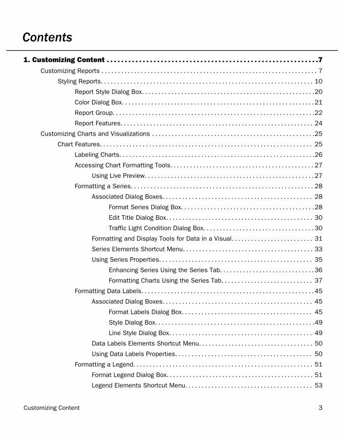
Contents
1. Customizing Content . . . . . . . . . . . . . . . . . . . . . . . . . . . . . . . . . . . . . . . . . . . . . . . . . . . . . . . . . . .7
Customizing Reports . . . . . . . . . . . . . . . . . . . . . . . . . . . . . . . . . . . . . . . . . . . . . . . . . . . . . . . . . . . . . . . . . . 7
Styling Reports. . . . . . . . . . . . . . . . . . . . . . . . . . . . . . . . . . . . . . . . . . . . . . . . . . . . . . . . . . . . . . . . . 10
Report Style Dialog Box. . . . . . . . . . . . . . . . . . . . . . . . . . . . . . . . . . . . . . . . . . . . . . . . . . . . .20
Color Dialog Box. . . . . . . . . . . . . . . . . . . . . . . . . . . . . . . . . . . . . . . . . . . . . . . . . . . . . . . . . . .21
Report Group. . . . . . . . . . . . . . . . . . . . . . . . . . . . . . . . . . . . . . . . . . . . . . . . . . . . . . . . . . . . . .22
Report Features. . . . . . . . . . . . . . . . . . . . . . . . . . . . . . . . . . . . . . . . . . . . . . . . . . . . . . . . . . . 24
Customizing Charts and Visualizations . . . . . . . . . . . . . . . . . . . . . . . . . . . . . . . . . . . . . . . . . . . . . . . . . .25
Chart Features. . . . . . . . . . . . . . . . . . . . . . . . . . . . . . . . . . . . . . . . . . . . . . . . . . . . . . . . . . . . . . . . . 25
Labeling Charts. . . . . . . . . . . . . . . . . . . . . . . . . . . . . . . . . . . . . . . . . . . . . . . . . . . . . . . . . . . .26
Accessing Chart Formatting Tools. . . . . . . . . . . . . . . . . . . . . . . . . . . . . . . . . . . . . . . . . . . . 27
Using Live Preview. . . . . . . . . . . . . . . . . . . . . . . . . . . . . . . . . . . . . . . . . . . . . . . . . . . . 27
Formatting a Series. . . . . . . . . . . . . . . . . . . . . . . . . . . . . . . . . . . . . . . . . . . . . . . . . . . . . . . . 28
Associated Dialog Boxes. . . . . . . . . . . . . . . . . . . . . . . . . . . . . . . . . . . . . . . . . . . . . . 28
Format Series Dialog Box. . . . . . . . . . . . . . . . . . . . . . . . . . . . . . . . . . . . . . . . .28
Edit Title Dialog Box. . . . . . . . . . . . . . . . . . . . . . . . . . . . . . . . . . . . . . . . . . . . . 30
Traffic Light Condition Dialog Box. . . . . . . . . . . . . . . . . . . . . . . . . . . . . . . . . . 30
Formatting and Display Tools for Data in a Visual. . . . . . . . . . . . . . . . . . . . . . . . . 31
Series Elements Shortcut Menu. . . . . . . . . . . . . . . . . . . . . . . . . . . . . . . . . . . . . . . . 33
Using Series Properties. . . . . . . . . . . . . . . . . . . . . . . . . . . . . . . . . . . . . . . . . . . . . . . 35
Enhancing Series Using the Series Tab. . . . . . . . . . . . . . . . . . . . . . . . . . . . . 36
Formatting Charts Using the Series Tab. . . . . . . . . . . . . . . . . . . . . . . . . . . . 37
Formatting Data Labels. . . . . . . . . . . . . . . . . . . . . . . . . . . . . . . . . . . . . . . . . . . . . . . . . . . . . 45
Associated Dialog Boxes. . . . . . . . . . . . . . . . . . . . . . . . . . . . . . . . . . . . . . . . . . . . . . 45
Format Labels Dialog Box. . . . . . . . . . . . . . . . . . . . . . . . . . . . . . . . . . . . . . . . 45
Style Dialog Box. . . . . . . . . . . . . . . . . . . . . . . . . . . . . . . . . . . . . . . . . . . . . . . . .49
Line Style Dialog Box. . . . . . . . . . . . . . . . . . . . . . . . . . . . . . . . . . . . . . . . . . . . 49
Data Labels Elements Shortcut Menu. . . . . . . . . . . . . . . . . . . . . . . . . . . . . . . . . . . 50
Using Data Labels Properties. . . . . . . . . . . . . . . . . . . . . . . . . . . . . . . . . . . . . . . . . . 50
Formatting a Legend. . . . . . . . . . . . . . . . . . . . . . . . . . . . . . . . . . . . . . . . . . . . . . . . . . . . . . . 51
Format Legend Dialog Box. . . . . . . . . . . . . . . . . . . . . . . . . . . . . . . . . . . . . . . . . . . . . 51
Legend Elements Shortcut Menu. . . . . . . . . . . . . . . . . . . . . . . . . . . . . . . . . . . . . . . 53
Customizing Content 3
Using Legend Properties. . . . . . . . . . . . . . . . . . . . . . . . . . . . . . . . . . . . . . . . . . . . . . .54
Formatting Gridlines. . . . . . . . . . . . . . . . . . . . . . . . . . . . . . . . . . . . . . . . . . . . . . . . . . . . . . . .56
Format Grid Lines Dialog Box. . . . . . . . . . . . . . . . . . . . . . . . . . . . . . . . . . . . . . . . . . .57
Gridline Elements Shortcut Menu. . . . . . . . . . . . . . . . . . . . . . . . . . . . . . . . . . . . . . . 59
Using Gridline Properties. . . . . . . . . . . . . . . . . . . . . . . . . . . . . . . . . . . . . . . . . . . . . . 60
Formatting Axis Labels. . . . . . . . . . . . . . . . . . . . . . . . . . . . . . . . . . . . . . . . . . . . . . . . . . . . . 66
Format Axis Dialog Box. . . . . . . . . . . . . . . . . . . . . . . . . . . . . . . . . . . . . . . . . . . . . . . . 66
Secondary Axes Options. . . . . . . . . . . . . . . . . . . . . . . . . . . . . . . . . . . . . . . . . . . . . . . 71
Axis Elements Shortcut Menu. . . . . . . . . . . . . . . . . . . . . . . . . . . . . . . . . . . . . . . . . . 71
Using Axis Properties. . . . . . . . . . . . . . . . . . . . . . . . . . . . . . . . . . . . . . . . . . . . . . . . . 73
Formatting a Frame and a Background. . . . . . . . . . . . . . . . . . . . . . . . . . . . . . . . . . . . . . . . 75
Frame & Background Dialog Box. . . . . . . . . . . . . . . . . . . . . . . . . . . . . . . . . . . . . . . . 76
Frame and Background Shortcut Menu. . . . . . . . . . . . . . . . . . . . . . . . . . . . . . . . . . 82
Using Frame and Background Properties. . . . . . . . . . . . . . . . . . . . . . . . . . . . . . . . . 83
Formatting a Gauge Chart. . . . . . . . . . . . . . . . . . . . . . . . . . . . . . . . . . . . . . . . . . . . . . . . . . .84
Format Gauge Dialog Box. . . . . . . . . . . . . . . . . . . . . . . . . . . . . . . . . . . . . . . . . . . . . . 85
Gauge Elements Shortcut Menu. . . . . . . . . . . . . . . . . . . . . . . . . . . . . . . . . . . . . . . . 88
Using Gauge Properties. . . . . . . . . . . . . . . . . . . . . . . . . . . . . . . . . . . . . . . . . . . . . . . 88
Formatting Page Headings and Page Footings. . . . . . . . . . . . . . . . . . . . . . . . . . . . . . . . . .93
Using Additional Formatting Features. . . . . . . . . . . . . . . . . . . . . . . . . . . . . . . . . . . . . . . . . 95
Collation in Charts. . . . . . . . . . . . . . . . . . . . . . . . . . . . . . . . . . . . . . . . . . . . . . . . . . . . . . . . 100
Creating Thumbnails for Use With the Home Page . . . . . . . . . . . . . . . . . . . . . . . . . . . . . . . . . . . . . . 100
Using Storyboards . . . . . . . . . . . . . . . . . . . . . . . . . . . . . . . . . . . . . . . . . . . . . . . . . . . . . . . . . . . . . . . . . . 103
Animating Visualizations . . . . . . . . . . . . . . . . . . . . . . . . . . . . . . . . . . . . . . . . . . . . . . . . . . . . . . . . . . . . .105
Using Filters to Customize the Display of Data . . . . . . . . . . . . . . . . . . . . . . . . . . . . . . . . . . . . . . . . . .106
Including or Excluding a Filter. . . . . . . . . . . . . . . . . . . . . . . . . . . . . . . . . . . . . . . . . . . . . . . . . . . .108
Sorting the Values in an Autoprompt Parameter. . . . . . . . . . . . . . . . . . . . . . . . . . . . . . . . . . . . 109
Using Auto Drill . . . . . . . . . . . . . . . . . . . . . . . . . . . . . . . . . . . . . . . . . . . . . . . . . . . . . . . . . . . . . . . . . . . . 109
Using the Auto Linking Feature to Link Content . . . . . . . . . . . . . . . . . . . . . . . . . . . . . . . . . . . . . . . . . 111
Using Optional Parameters with Auto Linking to Enhance Drilldown Results. . . . . . . . . . . . 113
Using Multi Drill . . . . . . . . . . . . . . . . . . . . . . . . . . . . . . . . . . . . . . . . . . . . . . . . . . . . . . . . . . . . . . . . . . . . 118
Adding Parameters for Data Selection at Run Time . . . . . . . . . . . . . . . . . . . . . . . . . . . . . . . . . . . . . .129
Working With Slicers . . . . . . . . . . . . . . . . . . . . . . . . . . . . . . . . . . . . . . . . . . . . . . . . . . . . . . . . . . . . . . . . 132
Contents
4 Information Builders
Creating Slicers. . . . . . . . . . . . . . . . . . . . . . . . . . . . . . . . . . . . . . . . . . . . . . . . . . . . . . . . . . . . . . . 132
Filtering With Slicers. . . . . . . . . . . . . . . . . . . . . . . . . . . . . . . . . . . . . . . . . . . . . . . . . . . . . . . . . . . 134
How Slicers Cascade Together. . . . . . . . . . . . . . . . . . . . . . . . . . . . . . . . . . . . . . . . . . . . . 134
Changing a Field Format . . . . . . . . . . . . . . . . . . . . . . . . . . . . . . . . . . . . . . . . . . . . . . . . . . . . . . . . . . . . .135
Dynamic Grouping . . . . . . . . . . . . . . . . . . . . . . . . . . . . . . . . . . . . . . . . . . . . . . . . . . . . . . . . . . . . . . . . . . 140
Customizing Domain Portal Pages . . . . . . . . . . . . . . . . . . . . . . . . . . . . . . . . . . . . . . . . . . . . . . . . . . . . 143
Using the Easy Selector. . . . . . . . . . . . . . . . . . . . . . . . . . . . . . . . . . . . . . . . . . . . . . . . . . . . . . . . 143
Building a Responsive Layout. . . . . . . . . . . . . . . . . . . . . . . . . . . . . . . . . . . . . . . . . . . . . . . . . . . .147
Working With Comments. . . . . . . . . . . . . . . . . . . . . . . . . . . . . . . . . . . . . . . . . . . . . . . . . . . . . . . .150
Using Comments at Run Time. . . . . . . . . . . . . . . . . . . . . . . . . . . . . . . . . . . . . . . . . . . . . . 151
Removing Customizations. . . . . . . . . . . . . . . . . . . . . . . . . . . . . . . . . . . . . . . . . . . . . . . . . . . . . . .153
Contents
Customizing Content 5
Contents
6 Information Builders
Chapter1Customizing Content
After you create your content, you can use the WebFOCUS Business User Edition's vastarray of features and styling options to customize your content.
In this chapter:
Customizing Reports
Customizing Charts and Visualizations
Creating Thumbnails for Use With theHome Page
Using Storyboards
Animating Visualizations
Using Filters to Customize the Display ofData
Using Auto Drill
Using the Auto Linking Feature to LinkContent
Using Multi Drill
Adding Parameters for Data Selection atRun Time
Working With Slicers
Changing a Field Format
Dynamic Grouping
Customizing Domain Portal Pages
Customizing Reports
You can customize reports using the various options on the Layout tab and Field tab.
Cell Padding. Opens the Cell Padding dialog box, where you can set specific values tocontrol the amount of space inserted between rows and columns in a report. For moreinformation, see How to Use Cell Padding in a Report on page 19.
AutoFit. Limits the width of columns in a report to be no wider than the largest value ineach column. When additional fields are added, the report automatically grows at designtime. AutoFit Column is selected, by default.
Page Break. Starts a new page when the primary sort field changes. Clicking the drop-downicon enables you to select Reset Page Numbers, which allows you to reset page numberson a page break to start at 1.
Line Break. Inserts a line in the report output when the primary sort field changes.
Sub Header. Opens a dialog box where you can type text to add a subheading just belowthe column titles in the report output when the primary sort field changes.
Customizing Content 7
Sub Footer. Opens a dialog box where you can type text to add a subfooting at the end ofthe data on each page of the report output when the primary sort field changes.
Subtotal. Inserts a line, total text (TOTAL FIELD Value), and subtotals for all numeric fieldswhen the primary sort field changes.
The drop-down menu on the Field tab, in the Format group provides three field-type options forthe selected column, which are Alphanumeric, Integer, and Decimal. Selecting the fourthoption, More options, opens the Field Format Options dialog box, which provides furtherformatting options for the selected field. For more information, see Changing a Field Format onpage 135.
You can also apply floating and non-floating currency symbols, percent signs, and commas.You can increase and decrease decimal places by clicking the appropriate buttons under thedrop-down menu.
The Currency button is a split button that turns the currency symbol on or off. Click theCurrency button to turn on the default floating currency option. Click the Currency button asecond time to turn off the floating currency option.
To turn on the non-floating currency option, open the drop-down menu and select Non floatingcurrency. To turn off the non-floating currency option, click the Currency button.
The following options on the Field tab, in the Display group:
Hide Field. Allows you to hide a selected field.
Hide Missing. Allows you to hide fields that have no value.
Aggregation. Opens a drop-down menu of the following options:
None (default)
Sum
Average
Count
Count Distinct
Percent of Count
Distinct Values
First Value
Last Value
Customizing Reports
8 Information Builders
Maximum
Minimum
Total
Percent
Row Percent
Median
Average Square
Sum is the default aggregation type value for all numeric fields added to the Measure Queryfield container in the Query pane. Changing the Measure Query field container from Sum toPrint, Count, or List overrides all assigned aggregation type values. For more informationrelated to charts, see How to Display Aggregations on Measure Data on page 40.
Traffic Lights. Opens the Traffic Light Condition dialog box. From this dialog box you can dothe following:
Add new conditional styling by applying traffic light (and other) colors to a selected fieldin the output when the field meets specified criteria
Modify existing conditional styling
Enable conditional drilldowns
For more information related to reports, see Styling Reports on page 10. For moreinformation related to charts, see Traffic Light Condition Dialog Box on page 30.
Data Bars. (Reports only.) Adds a data visualization column to the right of a selectednumeric field. The column displays values in each row using horizontal bars that extendfrom left to right in varying lengths, depending on the corresponding data values.
Within. Allows you to use specific aggregation tasks at different report levels. You can usethe Within phrase to manipulate display field values as they are aggregated within a sortgroup rather than a report column.
Column(s). Allows you to indicate the number of columns in which you wish to displaymultiple graphs. The value can be between 1 and 512. The default is 1. This option is alsoavailable from the Query pane shortcut menu for a Multi-graph component.
1. Customizing Content
Customizing Content 9
Styling Reports
You can apply custom styling to specific areas of a report. When creating a report, you canperform the following styling customization.
Global styling for the entire report.
Style data and column titles.
Style headings and footings. For more information, see How to Style Headings and Footingsin a Report on page 15.
Style the rows of data with alternating colors. For more information, see How to Style Rowsof Data With Alternating Colors in a Report on page 16.
Apply traffic light conditional styling to data. For more information, see How to Apply TrafficLight Conditional Styling to a Report (By Constant) on page 16 and How to Apply TrafficLight Conditional Styling to a Report (By Field) on page 18.
Increase or decrease the amount of space inserted between rows and columns. For moreinformation, see How to Use Cell Padding in a Report on page 19.
Procedure: How to Apply Styling to an Entire Report
1. Create a report, or open an existing report.
2. On the Home tab, in the Report group, click Style.
The Report Style dialog box opens.
3. Select any of the following styling options that are available in the Style group.
Font. Opens a drop-down list, which you can use to change the font.
Font size. Opens a drop-down list, which you can use to change the font size value.
Bold. Applies bold font formatting to the selected text.
Italic. Applies italic font formatting to the selected text
Underline. Underlines the selected text.
Justify Left. Aligns the text to the left of the canvas.
Justify Center. Aligns the text to the center of the canvas.
Justify Right. Aligns the text to the right of the canvas.
Font color. Opens the Color dialog box, where you can select the font color.
Customizing Reports
10 Information Builders
Background color. Opens the Color dialog box, where you can select the backgroundcolor for the report.
Note: If you have chosen to specify a color, you must click OK to return to the ReportStyle dialog box.
Currency Symbol. Opens a drop-down menu, from which you can choose a currencysymbol. Options are US dollar, British pound, Japanese yen, euro, new Israeli shekel.
Reset to Quick Styles from Template. Resets all settings to the default settings fromthe template.
Note: Reset only works while the Report Style dialog box is open. Once you click OK, allchanges are committed. To undo global styling after it has been committed, you must usethe Undo command on the Quick Access Toolbar.
Preview. Displays the text as you have formatted it.
4. Click OK. The report is styled accordingly.
Procedure: How to Perform Field-Level Styling in a Report
You can style data, column titles, or both, in the report output for the selected data sourcefield.
1. Create a report.
2. In the Query pane, select a data source field.
The Field tab appears on the ribbon.
3. In the Style group, click one of the following:
Data Style. Styles only the data for the selected data source field.
Title Style. Styles only the column title for the selected data source field.
Data + Title. Styles both the data and the column title for the selected data sourcefield.
4. Select any of the following styling options that are available in the Style group.
Font. Opens a drop-down list, which you can use to change the font.
Font size. Opens a drop-down list, which you can use to change the font size value.
Font color. Opens the Color dialog box, where you can select the font color.
Reset to Quick Styles from Template. Resets all settings to the default settings fromthe template.
1. Customizing Content
Customizing Content 11
Note: Reset only works while the Report Style dialog box is open. Once you click OK, allchanges are committed. To undo global styling after it has been committed, you mustuse the Undo command on the Quick Access Toolbar.
Bold. Applies bold font formatting to the selected text.
Italic. Applies italic font formatting to the selected text
Underline. Underlines the selected text.
Justify Left. Aligns the text to the left of the canvas.
Justify Center. Aligns the text to the center of the canvas.
Justify Right. Aligns the text to the right of the canvas.
Background color. Click the button to open the Color dialog box, where you can selectthe background color for the report.
Note: When working with font or background colors, you must click OK on the Colordialog box to return to the Report Style dialog box.
5. Click OK. The report is styled accordingly.
Procedure: How to Add Headings and Footings to a Report
You can make a report more meaningful by adding headings and footings. Headings andfootings supply context and key information about a report, such as its purpose and audience.Headings and footings also provide structure, helping you navigate to the detail sought. Theyenhance visual appeal.
In this procedure, you will add and style a report heading and page heading. The procedureuses sample values, but you can supply values that apply to your own, reports.
Headings and Footings are available in Query Design view, Live Preview, and Document view.
1. Create a report.
2. On the Home tab, in the Report group, click the Header & Footer button.
The Header & Footer dialog box opens.
3. Click the tab for the heading or footing element that you want to add.
For a report, you can add a report heading, page heading, page footing, or report footing.By default, the Report Header tab is selected. In this procedure, accept the default.
4. Click inside the design area of the dialog box, and type the text for the heading.
For example, the text for a sample report heading might be Quantity Sold by Product.
Customizing Reports
12 Information Builders
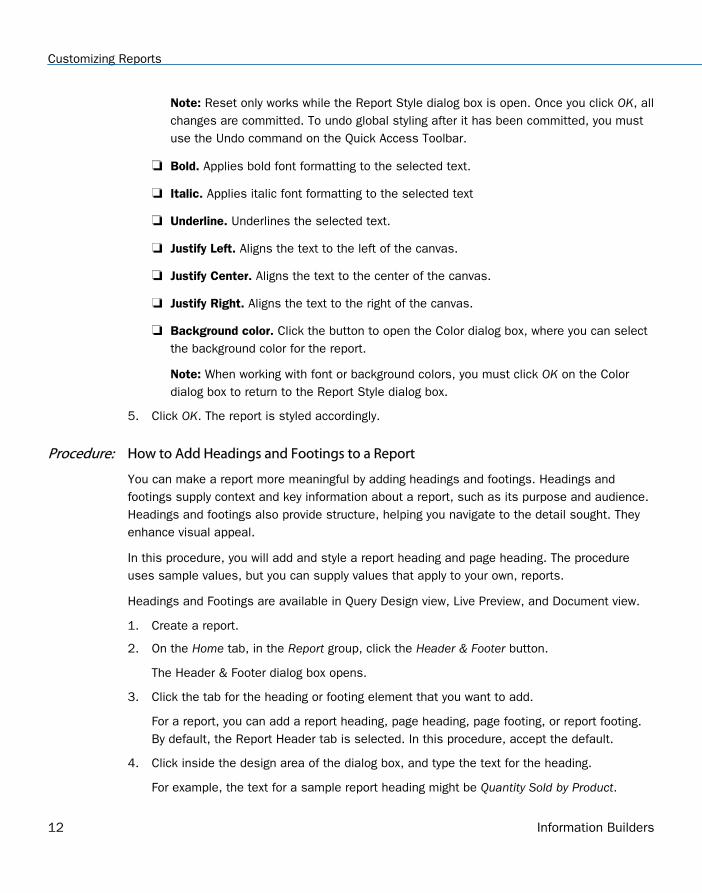
5. Using the styling ribbon, apply styling to the report heading text.
For example, click HELVETICA from the Font drop-down list. From the Font size drop-downlist, click 12.
The sample report heading with the selected styling values is shown in the followingimage.
6. Click Apply to save the changes you have made so far, without closing the dialog box.
7. To add a page heading, click the Page Header tab.
In this procedure, you are going to add one of the supplied quick text options.
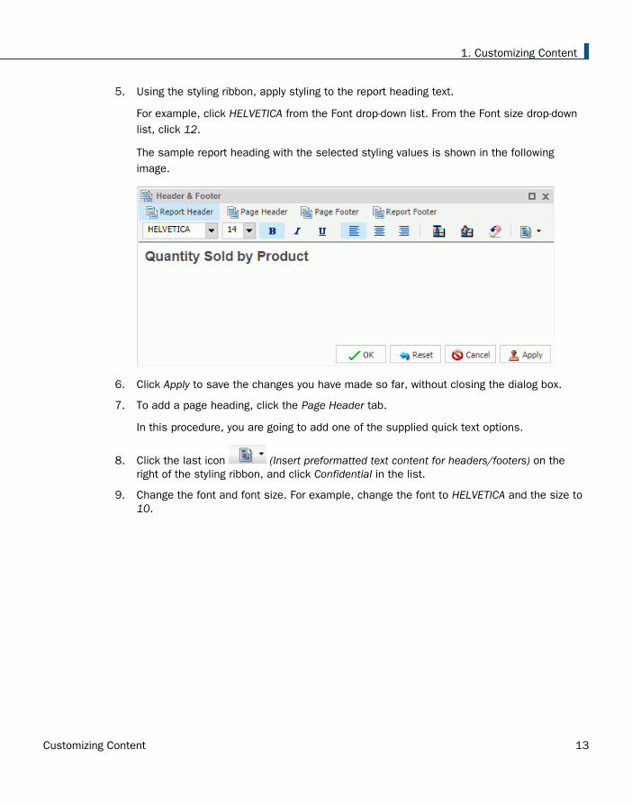
8. Click the last icon (Insert preformatted text content for headers/footers) on theright of the styling ribbon, and click Confidential in the list.
9. Change the font and font size. For example, change the font to HELVETICA and the size to10.
1. Customizing Content
Customizing Content 13
You can add your own text before or after the supplied text, for example, For RegionalManagers Only.
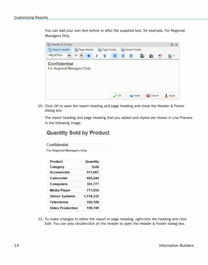
10. Click OK to save the report heading and page heading and close the Header & Footerdialog box.
The report heading and page heading that you added and styled are shown in Live Previewin the following image.
11. To make changes to either the report or page heading, right-click the heading and clickEdit. You can also double-click on the header to open the Header & Footer dialog box.
Customizing Reports
14 Information Builders
Procedure: How to Style Headings and Footings in a Report
You can style headings and footings in the report output for the selected heading or footingfield.
1. Create a report.
2. With the report opened in Live Preview, select the heading or footing text that you want tostyle.
3. On the Home tab, in the Report group, click Header & Footer.
The Header & Footer dialog box opens.
4. Select any of the following styling options that are available in the Style dialog box.
Font. Opens a drop-down list, which you can use to change the font.
Font size. Opens a drop-down list, which you can use to change the font size value.
Bold. Applies bold font formatting to the selected text.
Italic. Applies italic font formatting to the selected text
Underline. Underlines the selected text.
Justify Left. Aligns the text to the left of the canvas.
Justify Center. Aligns the text to the center of the canvas.
Justify Right. Aligns the text to the right of the canvas.
Font color. Opens the Color dialog box, where you can select the font color.
Background color. Opens the Color dialog box, where you can select the backgroundcolor for the report.
Reset to Quick Styles from Template. Resets all settings to the default settings fromthe template.
Note: Reset only works while the Report Style dialog box is open. Once you click OK, allchanges are committed. To undo global styling after it has been committed, you mustuse the Undo command on the Quick Access Toolbar.
5. Click OK. The report is styled accordingly.
1. Customizing Content
Customizing Content 15
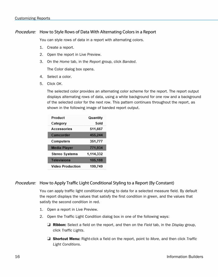
Procedure: How to Style Rows of Data With Alternating Colors in a Report
You can style rows of data in a report with alternating colors.
1. Create a report.
2. Open the report in Live Preview.
3. On the Home tab, in the Report group, click Banded.
The Color dialog box opens.
4. Select a color.
5. Click OK.
The selected color provides an alternating color scheme for the report. The report outputdisplays alternating rows of data, using a white background for one row and a backgroundof the selected color for the next row. This pattern continues throughout the report, asshown in the following image of banded report output.
Procedure: How to Apply Traffic Light Conditional Styling to a Report (By Constant)
You can apply traffic light conditional styling to data for a selected measure field. By defaultthe report displays the values that satisfy the first condition in green, and the values thatsatisfy the second condition in red.
1. Open a report in Live Preview.
2. Open the Traffic Light Condition dialog box in one of the following ways:
Ribbon: Select a field on the report, and then on the Field tab, in the Display group,click Traffic Lights.
Shortcut Menu: Right-click a field on the report, point to More, and then click TrafficLight Conditions.
Customizing Reports
16 Information Builders
The Traffic Light Condition dialog box opens.
3. From the Relational Operators drop-down menu below the field name, click a relationaloperator. For example, Equal to.
4. In the field to the right of the Relational Operators drop-down menu, click the down arrowfor the Type drop-down menu.
The Type menu opens.
5. In the Type drop-down list, click Constant.
6. Enter a value in the Value field.
or
a. From the Get Values drop-down menu, select one of the following values: All, First,Last, Minimum, Maximum, or From File. The value that you select appears in the GetValues field.
b. Select the value in the Get Values field. The value that you selected appears in theValue field.
7. Click OK.
The value that you selected appears in the field to the right of the Relational Operatorsdrop-down menu.
8. Click the Style button.
The Style menu opens.
9. From the Style menu, click the Font Color or Background Color button.
The Color dialog box opens.
10. Select a color.
11. Click OK.
The color appears in the Preview box.
12. Click Apply to apply the colors to the report.
13. Click the Drill Down button.
The Drill Down dialog box opens.
14. In the Drill Down dialog box, use the radio buttons to specify the action you wish toperform. For example, drill down to a report or webpage, create an auto link target, orrefresh a BI portal.
15. Click OK to close the dialog box.
1. Customizing Content
Customizing Content 17
16. In the Traffic Light Condition window, click the New button to set traffic light conditions foradditional fields.
Procedure: How to Apply Traffic Light Conditional Styling to a Report (By Field)
You can apply traffic light conditional styling to data for a selected measure field. By default,the report displays the values that satisfy the first condition in green, and the values thatsatisfy the second condition in red.
1. Open a report in Live Preview.
2. Open the Traffic Light Condition dialog box in one of the following ways:
Ribbon: Select a field on the report, and then on the Field tab, in the Display group,click Traffic Lights.
Shortcut Menu: Right-click a field on the report, point to More, and then click TrafficLight Conditions.
The Traffic Light Condition dialog box opens.
3. From the drop-down menu below the field name, select a relational operator. For example,Equal to.
4. In the field to the right of the Relational Operators drop-down menu, click the arrow for theType drop-down menu.
The Type dialog box opens.
5. In the Type drop-down list, select Field.
The Type dialog box displays a list of the data fields that you can choose from.
6. Select a data field from the list.
7. Click OK.
The field that you selected appears in the field to the right of the Relational Operatorsdrop-down menu.
8. Click the Style button.
The Style menu opens.
9. From the Style menu, click the Color button.
The Color dialog box opens.
10. Select a color.
The color appears in the Preview box.
Customizing Reports
18 Information Builders
11. Click OK.
12. Click the Drill Down button.
The Drill Down dialog opens.
13. In the Drill Down dialog, specify each of the following:
Drill down to a report or a webpage
URL of the webpage
An alternate comment
Target (New Window, Same Window)
Parameters that you want to use (Name, Value)
14. Click OK.
15. Click the New button to set traffic light conditions for additional fields.
Procedure: How to Use Cell Padding in a Report
You can customize the amount of space inserted between rows and columns in a report.
1. Open a report in Live Preview.
2. On the Layout tab, in the Report group, click Cell Padding, and then click Custom.
The Cell Padding dialog box opens.
3. Type the cell padding values that you want in the Top, Bottom, Left, and Right fields.
4. Click OK.
The report reflects the cell padding that you set.
1. Customizing Content
Customizing Content 19
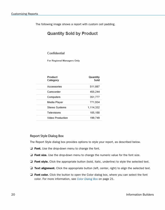
The following image shows a report with custom cell padding.
Report Style Dialog Box
The Report Style dialog box provides options to style your report, as described below.
Font. Use the drop-down menu to change the font.
Font size. Use the drop-down menu to change the numeric value for the font size.
Font style. Click the appropriate button (bold, italic, underline) to style the selected text.
Text alignment. Click the appropriate button (left, center, right) to align the selected text.
Font color. Click the button to open the Color dialog box, where you can select the fontcolor. For more information, see Color Dialog Box on page 21.
Customizing Reports
20 Information Builders
Background. Click the button to open the Color dialog box, where you can select thebackground color for the report.
Currency Symbol. Click the button to access the following currency symbols US dollar,British pound, Japanese yen, euro, new Israeli shekel.
Note: The new Israeli shekel currency symbol can be displayed with the following settingsonly:
Server codepage = 1255, 65001, 424, or 65002.
Client codepage = 1255 or 65001.
Application server encoding = Cp1255 or UTF8.
Font name = Lucida Sans Unicode or Arial Unicode MS.
Reset to Quick Styles from Template. Click the button to reset all settings to the defaultsettings from the template.
Note: Reset only works while the Report Style dialog box is open. Once you click OK, allchanges are committed. To undo global styling after it has been committed, you must usethe Undo command on the Quick Access Toolbar.
Color Dialog Box
The Color dialog box provides options for working with color in your report.
The Color dialog box options are:
Standard Color Swatches. Provides a set of 48 predefined colors from which to choose onthe left side of the dialog box. Your selection appears in the Selected Color field.
Custom Color Palette. Provides a palette on the right side of the dialog box to define acustom color. Your selection appears in the Selected Color field.
Luminosity bar. Drag the slider to change the luminosity (relative lightness or darkness) ofa color. The corresponding numerical value appears in Lum.
Hue. Indicates the hue value of your selected color. You can enter a value, or increase ordecrease the hue value by using the up and down arrows, respectively.
Sat. Indicates the saturation value of your selected color. You can enter a value, orincrease or decrease the saturation value by using the up and down arrows, respectively.
1. Customizing Content
Customizing Content 21
Lum. Indicates the luminosity (lightness or darkness) of your selected color. You can entera value, or increase or decrease the luminosity value by using the up and down arrows,respectively.
Red. Represents the numeric value of red (0 to 255).
Green. Represents the numeric value of green (0 to 255).
Blue. Represents the numeric value of blue (0 to 255).
Selected Color. Displays the color that you selected.
Transparent. Makes the color transparent. This is only available for background colors.
Report Group
The Report group on the Home tab contains commands to enhance a report.
Theme. Opens a dialog box where you can select a theme to style your report. You can usethe default StyleSheet by clicking the Use Default Stylesheet button.
You can also select a document styling theme or an application theme to style all reportscreated. Use the Environment and Styling section of the Options window, which isaccessible by clicking Options in the Application main menu.
Note: If you switch themes when working in Report mode, all custom styling is removedfrom the procedure.
Style. Opens a Report Style dialog box for applying global styling to the entire report. Formore information about the Report Style dialog box, see Report Style Dialog Box on page20. For more information about styling reports, see Styling Reports on page 10.
Banded. Opens a Color dialog box for choosing a color that provides an alternating colorscheme for the report. The report output displays alternating rows of data, using a whitebackground for one row and a background of the selected color for the next row. Thispattern continues throughout the report. For more information about the Color dialog box,see Color Dialog Box on page 21. For more information about banded styling, see How toStyle Rows of Data With Alternating Colors in a Report on page 16.
Header & Footer. Opens the Header & Footer dialog box, from which you can add and styleheadings and footings.
For a report, you can add and style report headings, page headings, page footings, andreport footings. In the dialog box, the tab for Report Header is active by default.
Customizing Reports
22 Information Builders
For a chart, you can add and style page headings and page footings. Page Header isactive by default.
You can drag fields from the Data pane into the Header & Footer dialog box.
Another way to access the Header & Footer dialog box is to click the down arrow next to theHeader & Footer button. It opens a drop-down menu from which you can select the headingor footing that you want to work with (Report Header, Page Header, Page Footer, ReportFooter). After you make your selection, the Header & Footer dialog box opens, and theheading or footing that you selected is active.
From the Header & Footer dialog box, you can add and style the active heading or footing,or choose a different heading and footing to work with by selecting the applicable tab. Youcan switch among tabs, but InfoAssist does not save changes made on the tabs until youclick Apply or OK. If you click Apply, the Header & Footer dialog box remains open. If youclick OK, the dialog box closes.
You can style a selected heading or footing using the options on the styling toolbar. Fromleft to right, you can customize the font type, font size, and font style (bold, italic, orunderline). You can align text (left, center, or right), select the font color and backgroundcolor, and restore styling settings to their default value from the template.
You can also add page footings to your reports or charts. From the Header & Footer dialogbox, select Page Footer. When working with reports, you may use the Additional alignment
options icon , to specify whether you want to align the footer relative to the data(default) or relative to the page. The Align Relative to Data option places the footer directlybelow the data, and the Align Relative to Page option positions the footer at the bottom ofthe page. When working with charts, only the default page footer alignment option issupported.
Note: The Align Relative to Page option works with reports that use positioned formats (forexample, PDF, PS, DHTML, PPT, and PPTX).
You can also insert quick text into a heading or footing. Quick text is supplied for you. Itincludes information that is typically useful in identifying a report or chart. From thepreformatted text drop-down menu, you can select:
Draft
Page X of Y
Confidential
Date (multiple formats)
1. Customizing Content
Customizing Content 23
Time (multiple formats)
Created by (followed by a name)
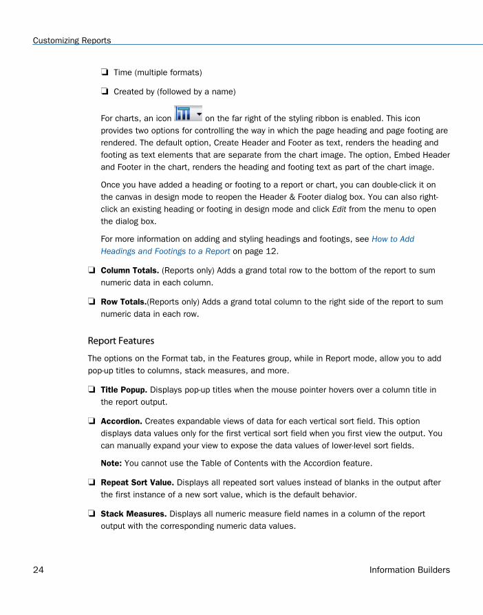
For charts, an icon on the far right of the styling ribbon is enabled. This iconprovides two options for controlling the way in which the page heading and page footing arerendered. The default option, Create Header and Footer as text, renders the heading andfooting as text elements that are separate from the chart image. The option, Embed Headerand Footer in the chart, renders the heading and footing text as part of the chart image.
Once you have added a heading or footing to a report or chart, you can double-click it onthe canvas in design mode to reopen the Header & Footer dialog box. You can also right-click an existing heading or footing in design mode and click Edit from the menu to openthe dialog box.
For more information on adding and styling headings and footings, see How to AddHeadings and Footings to a Report on page 12.
Column Totals. (Reports only) Adds a grand total row to the bottom of the report to sumnumeric data in each column.
Row Totals.(Reports only) Adds a grand total column to the right side of the report to sumnumeric data in each row.
Report Features
The options on the Format tab, in the Features group, while in Report mode, allow you to addpop-up titles to columns, stack measures, and more.
Title Popup. Displays pop-up titles when the mouse pointer hovers over a column title inthe report output.
Accordion. Creates expandable views of data for each vertical sort field. This optiondisplays data values only for the first vertical sort field when you first view the output. Youcan manually expand your view to expose the data values of lower-level sort fields.
Note: You cannot use the Table of Contents with the Accordion feature.
Repeat Sort Value. Displays all repeated sort values instead of blanks in the output afterthe first instance of a new sort value, which is the default behavior.
Stack Measures. Displays all numeric measure field names in a column of the reportoutput with the corresponding numeric data values.
Customizing Reports
24 Information Builders
active report options. Opens the active report options dialog box where you can configureyour active report options such as menu items, graph engine, and colors.
Accessibility. Allows a title to be added to a report, chart, or document that is Section 508-compliant.
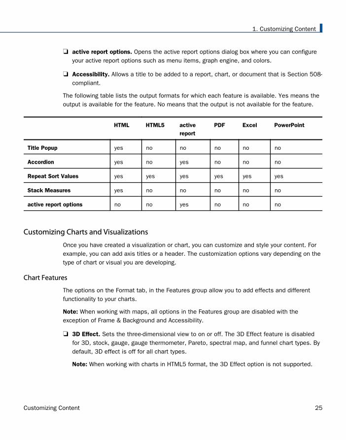
The following table lists the output formats for which each feature is available. Yes means theoutput is available for the feature. No means that the output is not available for the feature.
HTML HTML5 activereport
PDF Excel PowerPoint
Title Popup yes no no no no no
Accordion yes no yes no no no
Repeat Sort Values yes yes yes yes yes yes
Stack Measures yes no no no no no
active report options no no yes no no no
Customizing Charts and Visualizations
Once you have created a visualization or chart, you can customize and style your content. Forexample, you can add axis titles or a header. The customization options vary depending on thetype of chart or visual you are developing.
Chart Features
The options on the Format tab, in the Features group allow you to add effects and differentfunctionality to your charts.
Note: When working with maps, all options in the Features group are disabled with theexception of Frame & Background and Accessibility.
3D Effect. Sets the three-dimensional view to on or off. The 3D Effect feature is disabledfor 3D, stock, gauge, gauge thermometer, Pareto, spectral map, and funnel chart types. Bydefault, 3D effect is off for all chart types.
Note: When working with charts in HTML5 format, the 3D Effect option is not supported.
1. Customizing Content
Customizing Content 25
Rotate. Toggles between a vertical display or horizontal display of a chart. For moreinformation, see How to Rotate a Chart on page 96. The Rotate feature is disabled forpie, scatter, 3D, stock, gauge, gauge thermometer, Pareto, spectral map, and funnel charttypes.
Reference. Opens a drop-down menu that provides the Add Reference Line to Y-Axis andAdd Reference Line to X-Axis options. Selecting one of these options opens the appropriateReference Line dialog box, where you can set the specific X-axis or Y-axis value, type thetext that you want, and position the reference line on a chart. For more information, see How to Display a Static Reference Line on page 97. The Reference feature is disabled forpie, 3D, stock, gauge, gauge thermometer, Pareto, spectral map, and funnel chart types.
Annotate. Opens a drop-down menu that provides the Add an annotation option. Selectingthis option opens the Annotation dialog box, where you can type the text that you want andposition the annotation on a chart.
Grid. Opens a drop-down menu allowing you to expand options for Horizontal or VerticalGridlines. Both selections allow you to enable or disable Major and Minor Gridlines. ClickingMore Options opens the Format Grid Lines dialog box. For more information, see FormattingGridlines on page 56.
Frame & Background. Opens the Frame & Background dialog box where you can edit thebackground style and frames for charts. The dialog contains different options depending onthe chart type selected. For more information, see Formatting a Frame and a Backgroundon page 75.
Gauges. Opens the Gauge dialog box where you can edit your gauge chart. This button isonly available when a gauge chart type is selected. For more information, see How to Stylea Gauge Needle on page 92.
active report Options. Opens the active report options dialog box where you can configureyour active report options, such as menu items, graph engine, and colors. This button isavailable when the output type is set to active report.
Note: Annotate is not available in HTML5.
Accessibility. Allows a title to be added to a report, chart, or document that is Section 508-compliant.
Labeling Charts
You can add labels to charts and visualizations using the Labels group on the Format tab.
Customizing Charts and Visualizations
26 Information Builders
Note: When working with maps, the Axes option is disabled.
Axes. Opens a drop-down menu, where you can enable, stagger, and rotate horizontal andvertical axis labels. You can also edit the axis labels by clicking More Horizontal AxisOptions or More Vertical Axis Options. For more information, see Formatting Axis Labels onpage 66.
Legend. Opens a drop-down menu, where you can select the Show Legend option to displaythe legend on the chart, or clear your selection to hide the legend, change the defaultlegend position, and change the default legend orientation. For more information, see Format Legend Dialog Box on page 51.
Accessing Chart Formatting Tools
Your presentation of data on a chart or visualization is successful when it communicates toyour audience the message that you intend. InfoAssist helps you meet the needs of youraudience and convey your message by providing numerous chart features. For example, youcan adjust the appearance of a chart, add layers of information, or customize the labels thatidentify the data on the chart.
Using Live Preview
In Live Preview, the canvas on the right of the window provides a preview of the content thatyou can interact with. The preview is context sensitive, meaning that depending on whatportion you select different options become available.
In Live Preview, when you hover the mouse over a graph element (for example, legend, axislabel, title), the bounding area is highlighted with a dotted line.
In Live Preview, when you select a graph element (for example, legend, axis label, title), thebounding area is highlighted with a solid line.
Once you select a chart element, you can access all available design options on the ribbon, oryou can right-click an element to open a shortcut menu of frequently-used design options. Onceyou have selected your design option from the ribbon or the menu, InfoAssist instantly appliesit to the chart element, so that you see the result immediately.
Shortcut menus are enabled for charts that are generated with either sample data, or live datafrom your data source.
The following sections describe the chart elements and the ribbon options that you can workwith to design your charts in Live Preview.
1. Customizing Content
Customizing Content 27
Related Information:
Using Field Containers
Formatting a Series
A series is a measure field that is included in a chart or visualization. You can format a seriesin a variety of ways. For example, you can change the color of a series, add a trendline to aseries, or change the appearance of markers on a series.
You can access the full set of formatting options on the Series tab and Field tab. For moreinformation, see Series Tab and Field Tab.
You can also access a subset of frequently-used options by right-clicking a series element on achart to open a menu of those options.
Tip: The options that you see on the menu depend on the type of chart that you are creating.For example, the Series Type option would not appear on the menu for a pie chart, but it wouldappear for a bar, line, and area chart.
Associated Dialog Boxes
Whether you access series options from the ribbon or the shortcut menu, you are presentedwith a dialog box of options. The following dialog boxes are commonly used for formatting aseries:
Format Series
Edit Title
Traffic Light Condition
For Instructions on how to open these dialog boxes, see the procedures in Using SeriesProperties on page 35.
Format Series Dialog Box
The Format Series dialog box contains options to format the fill and border of each series on achart. To access this dialog box, on the Series tab, in the Style group, click Style.
The Format Series dialog box contains the following tabs:
Fill
Border
Effect (for HTML5 charts only)
Use the Fill tab to modify the color of a chart series.
Customizing Charts and Visualizations
28 Information Builders
The Fill tab contains the following options:
No fill. Select this option to remove the color from the series.
Solid fill. Select this option to display the Color and Transparency options.
Color. Click this icon to open the Color dialog box, where you can select a color for theseries.
Transparency. Move the slider to make the bands opaque (0%) or transparent (100%).The default is 0%.
Gradient fill. Select this option to display the direction of the gradient, the color pattern ofthe gradient, and the degrees of transparency for the two colors that make up the gradient.A gradient is a smooth color transition or blending of one color to another. The number ofcolors to use in a gradient is defined by the stop or pin elements.
Direction. Select from this drop-down menu to set the direction of the gradient fill. Forexample, Gradient right or Gradient left.
Use the Border tab to specify a border for a chart series.
Note: When you create a bubble chart and attempt to apply a border using the Style options onthe Series tab, the border does not display.
The Border tab contains the following options:
Show Border Color. Select this option to show a border color around each series.
Border Color. Click this icon to open the Color dialog box, where you can select a color forthe border.
Use the Effect tab to specify styling and shadowing options for HTML5 charts.
Note: This tab only displays when working with HTML5 charts.
The Effect tab contains the following options:
Riser Style. Use this drop-down menu to select a riser style. Options include: None, Bevel,Cylinder, Darken, Inverted Darken, Lighten, and Inverted Lighten.
Show Shadow. Select this option to set a shadow.
1. Customizing Content
Customizing Content 29
Edit Title Dialog Box
To edit the title of a series, right-click a series on the canvas, and click Change Title. The EnterTitle dialog box contains a text field in which you can type the title for a series on a chart. ClickOK and the title appears on the chart.
Traffic Light Condition Dialog Box
The Traffic Light Condition dialog box contains fields for adding new conditional styling ormodifying existing conditional styling by applying a traffic light color to the selected field.
The Traffic Light Condition dialog box contains the following fields.
Relational Operators. Select from this drop-down menu to set the relational operator. Forexample, Equal to.
Type/Value. Click this unlabeled field to open a dialog box that contains the followingfields:
Type. Opens a drop-down menu containing the values Constant and Field. SelectConstant to enter a constant value. Select Field to open a visual display of the fields inyour data source.
Value: Enables you to specify a value based on the Type that you select.
Note: If you are creating a Traffic Light condition on a full date field, the Value field willhave a calendar icon adjacent to it. You can use this icon to select a date using acalendar control.
Get Values. Select a value option from this drop-down list. For example, All or First.
The Traffic Light Condition dialog box contains the following buttons:
Selected Condition. Click this icon to select a condition to work on.
New. Creates a new rule.
Delete. Deletes a rule.
Color. Opens the Color dialog box.
Drill Down. Opens the Drill Down dialog box, where you can drill down to a webpage or aURL. Specify the following:
URL of the webpage or location of the report
A description
Customizing Charts and Visualizations
30 Information Builders
Target (New Window, Same Window, a value that you enter)
Parameters that you want to use (Name, Value)
Formatting and Display Tools for Data in a Visual
When working with visualizations, you can use various filtering and editing tools to format thedisplay of measure and dimension data in any given visual. For example, for measures, youcan use the Edit Format option to set the display of decimals in the values of your selectedmeasure. For measures and dimensions, you can add filters to limit the display of information.These options, which can be found on the right-click menu of a field, are defined and describedin the following table.
Option Description
Filter Values Creates a filter for the selected measure ordimension. You can select all values or onlythe one the data values that you want todisplay. In this way, you can excludeunwanted data. For visualizations, promptsare created, by default. However, you canclear this option when setting your filteroptions. This option displays for bothmeasures and dimensions.
Sort Enables you to set sorting options for themeasure or dimension that you select. Forexample, you can sort your data values inascending or descending order, or you canset limits for the display of information, thevalue for which is set to No Limit, bydefault. This option displays for bothmeasures and dimensions.
Visibility Controls the display of the selectedmeasure or dimension in a visual. Thedefault value is Show, but if you set theoption to Hide, the values are hidden fromthe visual. This option displays for bothmeasures and dimensions.
1. Customizing Content
Customizing Content 31
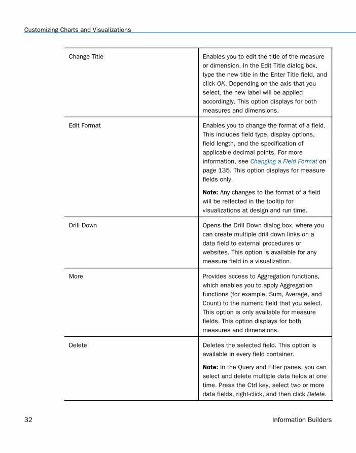
Change Title Enables you to edit the title of the measureor dimension. In the Edit Title dialog box,type the new title in the Enter Title field, andclick OK. Depending on the axis that youselect, the new label will be appliedaccordingly. This option displays for bothmeasures and dimensions.
Edit Format Enables you to change the format of a field.This includes field type, display options,field length, and the specification ofapplicable decimal points. For moreinformation, see Changing a Field Format onpage 135. This option displays for measurefields only.
Note: Any changes to the format of a fieldwill be reflected in the tooltip forvisualizations at design and run time.
Drill Down Opens the Drill Down dialog box, where youcan create multiple drill down links on adata field to external procedures orwebsites. This option is available for anymeasure field in a visualization.
More Provides access to Aggregation functions,which enables you to apply Aggregationfunctions (for example, Sum, Average, andCount) to the numeric field that you select.This option is only available for measurefields. This option displays for bothmeasures and dimensions.
Delete Deletes the selected field. This option isavailable in every field container.
Note: In the Query and Filter panes, you canselect and delete multiple data fields at onetime. Press the Ctrl key, select two or moredata fields, right-click, and then click Delete.
Customizing Charts and Visualizations
32 Information Builders
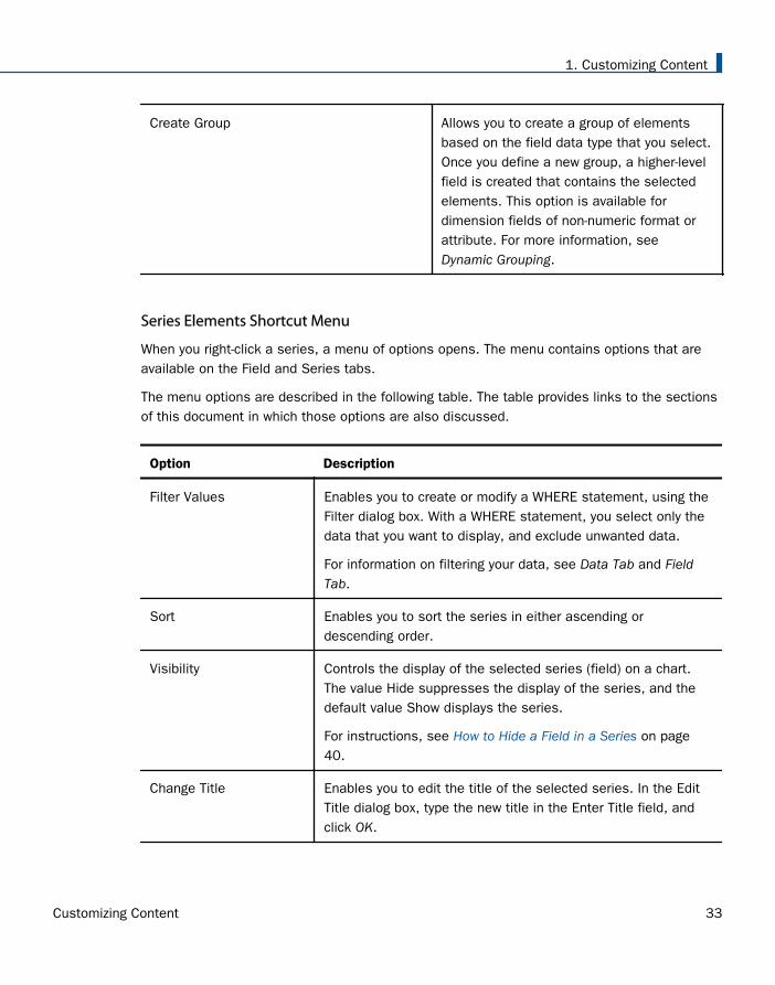
Create Group Allows you to create a group of elementsbased on the field data type that you select.Once you define a new group, a higher-levelfield is created that contains the selectedelements. This option is available fordimension fields of non-numeric format orattribute. For more information, seeDynamic Grouping.
Series Elements Shortcut Menu
When you right-click a series, a menu of options opens. The menu contains options that areavailable on the Field and Series tabs.
The menu options are described in the following table. The table provides links to the sectionsof this document in which those options are also discussed.
Option Description
Filter Values Enables you to create or modify a WHERE statement, using theFilter dialog box. With a WHERE statement, you select only thedata that you want to display, and exclude unwanted data.
For information on filtering your data, see Data Tab and FieldTab.
Sort Enables you to sort the series in either ascending ordescending order.
Visibility Controls the display of the selected series (field) on a chart.The value Hide suppresses the display of the series, and thedefault value Show displays the series.
For instructions, see How to Hide a Field in a Series on page40.
Change Title Enables you to edit the title of the selected series. In the EditTitle dialog box, type the new title in the Enter Title field, andclick OK.
1. Customizing Content
Customizing Content 33
Option Description
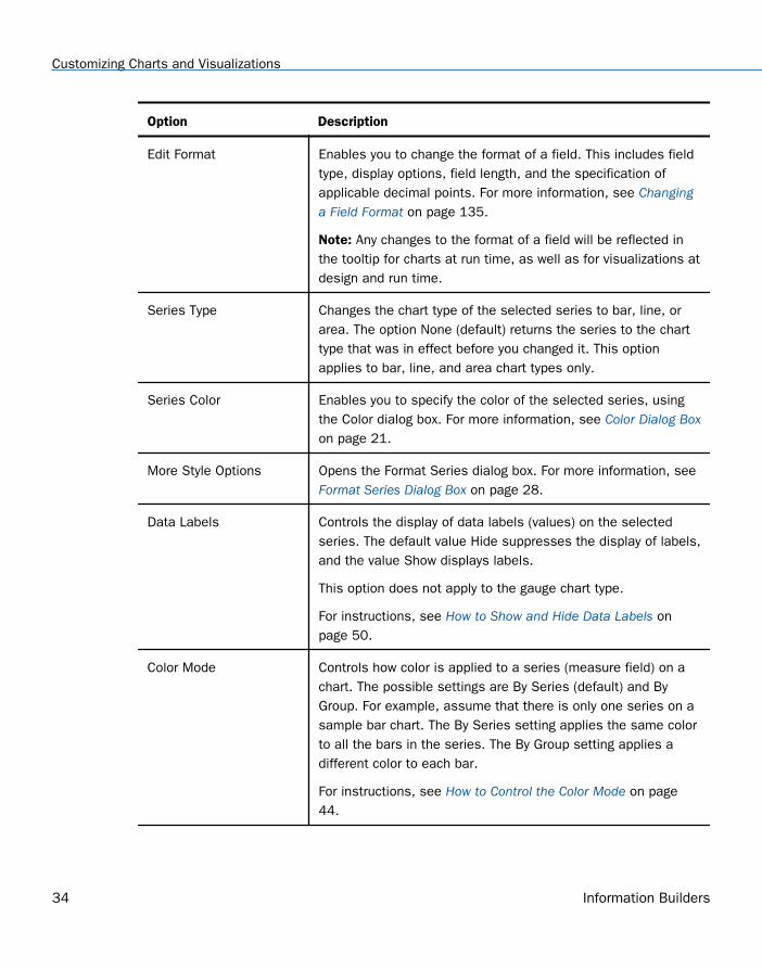
Edit Format Enables you to change the format of a field. This includes fieldtype, display options, field length, and the specification ofapplicable decimal points. For more information, see Changinga Field Format on page 135.
Note: Any changes to the format of a field will be reflected inthe tooltip for charts at run time, as well as for visualizations atdesign and run time.
Series Type Changes the chart type of the selected series to bar, line, orarea. The option None (default) returns the series to the charttype that was in effect before you changed it. This optionapplies to bar, line, and area chart types only.
Series Color Enables you to specify the color of the selected series, usingthe Color dialog box. For more information, see Color Dialog Boxon page 21.
More Style Options Opens the Format Series dialog box. For more information, see Format Series Dialog Box on page 28.
Data Labels Controls the display of data labels (values) on the selectedseries. The default value Hide suppresses the display of labels,and the value Show displays labels.
This option does not apply to the gauge chart type.
For instructions, see How to Show and Hide Data Labels onpage 50.
Color Mode Controls how color is applied to a series (measure field) on achart. The possible settings are By Series (default) and ByGroup. For example, assume that there is only one series on asample bar chart. The By Series setting applies the same colorto all the bars in the series. The By Group setting applies adifferent color to each bar.
For instructions, see How to Control the Color Mode on page44.
Customizing Charts and Visualizations
34 Information Builders
Option Description
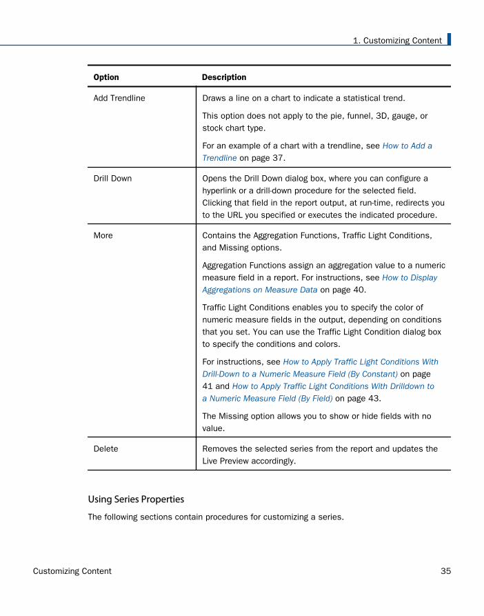
Add Trendline Draws a line on a chart to indicate a statistical trend.
This option does not apply to the pie, funnel, 3D, gauge, orstock chart type.
For an example of a chart with a trendline, see How to Add aTrendline on page 37.
Drill Down Opens the Drill Down dialog box, where you can configure ahyperlink or a drill-down procedure for the selected field.Clicking that field in the report output, at run-time, redirects youto the URL you specified or executes the indicated procedure.
More Contains the Aggregation Functions, Traffic Light Conditions,and Missing options.
Aggregation Functions assign an aggregation value to a numericmeasure field in a report. For instructions, see How to DisplayAggregations on Measure Data on page 40.
Traffic Light Conditions enables you to specify the color ofnumeric measure fields in the output, depending on conditionsthat you set. You can use the Traffic Light Condition dialog boxto specify the conditions and colors.
For instructions, see How to Apply Traffic Light Conditions WithDrill-Down to a Numeric Measure Field (By Constant) on page41 and How to Apply Traffic Light Conditions With Drilldown toa Numeric Measure Field (By Field) on page 43.
The Missing option allows you to show or hide fields with novalue.
Delete Removes the selected series from the report and updates theLive Preview accordingly.
Using Series Properties
The following sections contain procedures for customizing a series.
1. Customizing Content
Customizing Content 35
Procedure: How to Select a Series
1. Create a chart or visualization.
2. On the Series tab, in the Select group drop-down menu, select the Series that you want tocustomize.
The Series appears in the drop-down menu field.
Procedure: How to Format the Fill and Border of a Series
1. Create a chart or visualization.
2. Open the Format Series dialog box in one of the following ways:
Ribbon: On the Series tab, in the Style group, click Style.
Shortcut Menu: Right-click a series on the chart, and click More Style Options.
The Format Series dialog box opens.
3. Use the fill and border options to format the series.
For more information, see Format Series Dialog Box on page 28.
4. Click OK to close the dialog box.
The Format Series dialog box closes. The series fill and border are formatted accordingly.
5. Click Run to generate the report.
Enhancing Series Using the Series Tab
The Properties group contains commands for enhancing charts, such as changing the type oradding a trendline, for the selected series.
Procedure: How to Change the Type of a Series
1. Create a bar, line, or area chart.
2. Access the list of series types in one of the following ways:
Ribbon: On the Series tab, in the Properties group, open the Type drop-down menu.
Shortcut Menu: Right-click a series on the chart, and point to Series Type.
3. Select the type that you want the series to become.
The chart contains the new series type.
Customizing Charts and Visualizations
36 Information Builders
Procedure: How to Add a Trendline
A trendline is a line that is drawn over the plot area of a chart or visual to show the pattern ofdata points. The pattern reveals a statistical trend. In particular, the slope of the trendline,which is calculated by subtracting and dividing two different x, y coordinate values, is a valuethat indicates the rate at which the y value of a line rises or falls as the x value increases.Once the slope of your chart or visual is determined, you can further extrapolate your resultsand gain further insight into your data.
Note: The mathematical equation for the selected trendline option is only available in chartmode. It is not available in visualization mode.
1. Create a chart or visualization.
2. Access the menu of trendline types in one of the following ways:
Ribbon: On the Series tab, in the Properties group, open the Trendline drop-down menu.
Shortcut Menu: Right-click a series on the chart or visual, and point to Add Trendline.
3. Select the type of trendline that you want to display.
The trendline appears on the canvas.
4. Optionally, to display the mathematical equation for the selected trendline option, on theSeries tab, in the Properties group, click Equation.
Formatting Charts Using the Series Tab
The Series tab contains options for formatting charts.
Procedure: How to Apply Smooth Line Effect to a Line Chart
1. Create a line chart.
2. Select a series on the line chart.
3. On the Series tab, in the Line group, click Smooth Line.
The Smooth Line effect is applied to the series.
Procedure: How to Hide a Series Line Between Markers
Lines appear between markers by default.
To hide a series line between a marker:
1. Create a line chart.
2. Select a series on the line chart.
1. Customizing Content
Customizing Content 37
3. On the Series tab, in the Series group drop-down menu, select the series that you want tohide.
4. In the Line Group, click Connect Lines.
The series line between the markers disappears.
To make the series line reappear, click Connect Lines again.
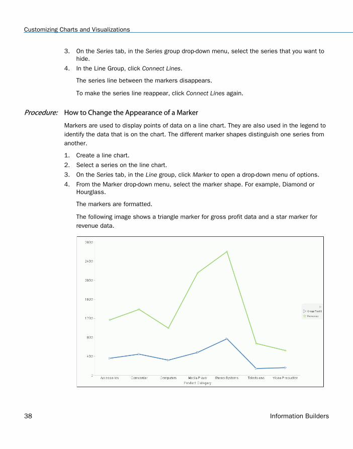
Procedure: How to Change the Appearance of a Marker
Markers are used to display points of data on a line chart. They are also used in the legend toidentify the data that is on the chart. The different marker shapes distinguish one series fromanother.
1. Create a line chart.
2. Select a series on the line chart.
3. On the Series tab, in the Line group, click Marker to open a drop-down menu of options.
4. From the Marker drop-down menu, select the marker shape. For example, Diamond orHourglass.
The markers are formatted.
The following image shows a triangle marker for gross profit data and a star marker forrevenue data.
Customizing Charts and Visualizations
38 Information Builders
Procedure: How to Expand Pie Slices
1. Create a pie chart.
2. On the Series tab, in the Select group, from the drop-down menu, select one of thefollowing:
All Series expands all slices out from the center of the pie.
A specific series expands that particular slice out from the center of the pie.
3. In the Pie group, click Expand.
The pie expands accordingly.
Procedure: How to Hide a Pie Slice
1. Create a pie chart.
2. On the Series tab, in the Select group, from the drop-down menu, select the series that youwant to hide. Then, in the Pie group, click Hide.
The slice is hidden.
Procedure: How to Filter Values in a Series
1. Create a chart.
2. Select a series on the chart.
3. Open the Filter dialog box in one of the following ways:
Ribbon: On the Field tab, in the Filter group, click Filter.
Shortcut Menu: Right-click a series, and click Filter Values.
The Filter dialog box opens.
4. Select values for values and prompts.
5. Click OK to close the dialog box.
The series values are filtered.
Procedure: How to Sort the Fields in a Series
1. Create a chart.
2. Select a series.
1. Customizing Content
Customizing Content 39
3. Sort the series in one of the following ways:
Ribbon: On the Field tab, in the Sort group, click Up to sort the series values fromsmallest to largest, or click Down to sort the series values from largest to smallest.
Shortcut Menu: Right click a series on the chart, and point to Sort, and then Sortagain. Click Ascending to sort the series values from smallest to largest, or clickDescending to sort the series values from largest to smallest. Select Limit to open alist of values to display for a sort group.
The chart appears with the series sorted accordingly.
Procedure: How to Hide a Field in a Series
1. Create a chart or visualization.
2. Hide a field in a series in one of the following ways:
Select the field in the Query pane.
Right-click the field in the chart.
Ribbon: Select the field in the Query pane or by right-clicking it in the chart. On theField tab, in the Display group, click Hide Field. Click Hide Field again to make theseries reappear.
Shortcut Menu: Right-click a series in the Query pane, or in the chart, point to Visibility,and then click Hide. Right-click the same series, point to Visibility, and then click Showto make the series reappear.
The field is hidden.
Procedure: How to Display Aggregations on Measure Data
You can display numeric measure data using a variety of aggregation values.
1. Create a chart or visualization.
2. Open the list of Aggregation options in one of the following ways:
Ribbon: On the Field tab, in the Display group, click Aggregation.
Shortcut Menu: Right-click a series, point to More, and then Aggregation Functions.
3. Select an aggregation function.
The aggregation function is applied to the series.
Customizing Charts and Visualizations
40 Information Builders
Note: If you change the Measure (Sum) Query field container in the Query pane from Sumto Print, Count, or List, the change overrides all assigned aggregation values.
Procedure: How to Display Aggregations on Dimension (Non-Numeric) Data
You can use various aggregations when working with dimension (non-numeric) fields in a chart,including Count, Count Distinct, and Percent of Count. The Count aggregation counts thenumber of occurrences of a field. Count Distinct counts the number of distinct values within afield. Percent of Count computes a field percentage, based on the number of instances found.When a dimension (non-numeric) field is placed in the Vertical Axis field container, it isconverted to a Count field. You can subsequently change the aggregation to Count Distinct orPercent of Count.
1. Create a chart.
2. Convert a dimension (non-numeric) field into a Count field by placing it in the Vertical Axisfield container.
3. Select the series on which to perform an aggregation.
4. Open the list of Aggregation options in one of the following ways:
Ribbon: On the Field tab, in the Display group, click Aggregation.
Shortcut Menu: Right-click a series, point to More, and then click AggregationFunctions.
5. Select an aggregation function.
The aggregation is applied to the series.
Procedure: How to Apply Traffic Light Conditions With Drill-Down to a Numeric Measure Field (ByConstant)
1. Create a chart or visualization.
2. Open the Traffic Light Condition dialog box in one of the following ways:
Ribbon: In the Query pane, select a field, and then on the Field tab, in the Displaygroup, click Traffic Lights.
Shortcut Menu: Right-click a series on the chart, point to More, and then click TrafficLight Conditions.
The Traffic Light Condition dialog box opens. For more information, see Traffic LightCondition Dialog Box on page 30.
3. From the Relational Operators drop-down menu below the field name, select a relationaloperator. For example, Equal to.
1. Customizing Content
Customizing Content 41
4. In the field to the right of the Relational Operators drop-down menu, click the down arrowfor the Type drop-down menu.
The Type dialog box opens.
5. In the Type dialog box, select Constant.
6. Enter a value in the Value field, or
a. From the Get Values drop-down menu, select one of the following values All, First,Last, Minimum, Maximum, From File. The value that you select appears in the GetValues field.
b. Select the value in the Get Values field. The value that you selected appears in theValue field.
7. Click OK.
The value that you selected appears in the field to the right of the operator drop-downmenu.
8. Click the Color button.
The Color dialog box opens.
9. Select a color.
10. Click OK.
The color appears in the Preview box.
11. Click OK.
12. Click the Drill Down button.
The Drill Down dialog box opens.
13. In the Drill Down dialog box, specify each of the following:
Drill down to a report or a webpage
URL of the webpage or location of the report
An alternate comment
Target (New Window, Same Window)
Parameters that you want to use (Name, Value)
14. Click OK to close the dialog box.
15. Click the New button to set traffic light conditions for additional fields.
Customizing Charts and Visualizations
42 Information Builders
Procedure: How to Apply Traffic Light Conditions With Drilldown to a Numeric Measure Field (ByField)
1. Create a chart or visualization.
2. Open the Traffic Light Condition dialog box in one of the following ways:
Ribbon: In the Query pane, select a field, and then on the Field tab, in the Displaygroup, click Traffic Lights.
Shortcut Menu: Right-click a series on your chart, point to More, and then click TrafficLight Conditions.
The Traffic Light Condition dialog box opens. For more information, see Traffic LightCondition Dialog Box on page 30.
3. From the Relational Operators drop-down menu below the field name, select a relationaloperator. For example, Greater than.
4. In the field to the right of the operator drop-down menu, click the arrow for the Type drop-down menu.
The Type dialog box opens.
5. In the Type dialog box, select Field.
The Type dialog box displays the Dimensions, and Measures and Properties of your data.You can display the data in the following ways:
View fields in business order. Select from the following options: Title, Description,Name, or Alias.
View fields in a sortable grid. Select from the following options: Name, Title, Alias,Format, Segment, Filename, Description, or Reference.
View the hierarchical structure of the data. Select from the following options: Title,Description, Name, or Alias.
6. Select a field.
7. Click OK.
The field that you selected appears in the field to the right of the operator drop-downmenu.
8. Click the Color button.
The Color dialog box opens.
9. Select a color.
The color appears in the Preview box.
1. Customizing Content
Customizing Content 43
10. Click OK.
11. Click the Drill Down button.
The Drill Down dialog box opens.
12. In the Drill Down dialog box, specify each of the following:
Drill down to a report or a webpage
URL of the webpage or location of the report
An alternate comment
Target (New Window, Same Window)
Parameters that you want to use (Name, Value)
13. Click OK to close the dialog box.
14. Click the New button to set traffic light conditions for additional fields.
Procedure: How to Change the Title of a Series
1. Create a chart or visualization.
2. Open the Edit Title dialog box in one of the following ways:
Shortcut Menu: Right-click a series on the chart, and click Change Title.
Query Pane: Right-click a series, and click Change Title.
The Edit Title dialog box opens.
3. In the Enter Title field, type the new name for the series.
4. Click OK to close the dialog box.
The series has a new title.
Procedure: How to Control the Color Mode
When you create a single-series chart, all series groups appear in the same color. To use adifferent color for each group, set the color mode to By Group.
1. Create a chart or visualization.
2. Right-click a series on the chart, point to Color Mode, and then click By Group.
A different color is applied to each group in the series. To return to the default display ofthe series in one color, right-click the series, point to Color Mode, and then click By Series.
Customizing Charts and Visualizations
44 Information Builders
3. Click Run to generate the report.
Procedure: How to Delete a Series
1. Create a chart or visualization.
2. Right-click a series on the chart, and click Delete.
The series is deleted.
Formatting Data Labels
Data labels highlight important data points on a chart. They identify exact numbers. You cancustomize data labels in a variety of ways to make them stand out more clearly on the chart.For example, you can change the position, angle, color, or size of data labels.
Associated Dialog Boxes
Whether you access data label options from the ribbon or the shortcut menu, you arepresented with a dialog box of options. The following dialog boxes are commonly used forformatting data labels:
Format Labels
Style
Line Style
For instructions on how to open these dialog boxes, see the procedures in Using Data LabelsProperties on page 50.
Format Labels Dialog Box
The Format Labels dialog box contains options for editing data labels. The Format Labelsdialog box offers different options depending on the chart type that you are using. Bar, line,and area charts share the same tabs.
The Format Labels dialog box contains the following tabs:
General Options
Advanced
Pie Title (for pie charts only)
Pie Labels (for pie charts only)
Funnel Labels (for funnel and pyramid charts)
1. Customizing Content
Customizing Content 45
General Options Tab
Use the General Options tab to add data labels to a chart and set their position, angle, andradius.
The General Options tab contains the following options:
Show Data Labels. Select this option to show data labels on a chart. Clear this option tosuppress data labels.
Position. Select an option from this drop-down menu to determine where the data label willbe positioned. The options are:
Above
Below top edge
Center
Base
Center back
Format Labels. Select from this drop-down menu of preset formats that can be applied tothe labels. Some of the options include Use Pattern, Currency General, and Date Full.
Custom Format. Enter a standard number format pattern for the data label. This option isonly available when you select the Use Pattern option from the Format Labels drop-downmenu.
The following table describes the characters that you can use in a custom format.
Character Description
# Is a digit.
0 (zero) Shows as absent.
. (period) Is a placeholder for decimal separator.
, (comma) Is a placeholder for grouping separator.
; (semicolon) Separates formats.
- (dash) Is the default negative prefix.
Customizing Charts and Visualizations
46 Information Builders
Character Description
% (percent) Divides by 100 and shows as a percentage.
x Determines that any other characters can be used inthe prefix or suffix.
‘ (apostrophe) Is used to quote special characters in a prefix orsuffix.
Style Labels. Click this icon to open the Style dialog box, where you can style text. Formore information, see Style Dialog Box on page 49.
Show Cumulative Sums. Select this option to have the data text labels show cumulativesums. Clear this option to have data text labels show individual sums. This option isavailable for stacked charts.
Show Stacked Total. Select this option to display stacked totals. Data position should beset to Center to display a stacked total. This option is available for stacked charts.
Advanced Tab
Use the Advanced tab to modify additional data labels properties.
The Advanced tab contains the following options:
Show Zero Labels. Select this option to display zero values in a chart. Clear this option todisplay all data values except zero.
Apply color to negative data labels. Select this option to style negative data labelsseparately from positive data labels.
Color. Click this icon to open the Color dialog box, where you can select a color for thenegative number.
Pie Title Tab
Use the Pie Title tab to create and style a pie title.
The Pie Title tab contains the following options:
Show Pie Title. Clear this option to suppress a pie title. Select this option to display a pietitle. This is the default option.
Style Title. Click this icon to open the Style dialog box, where you can style pie title text.
Pie Labels Tab
1. Customizing Content
Customizing Content 47
Use the Pie Labels tab to customize your pie data labels.
The Pie Labels tab contains the following options:
Label Position. Select from this drop-down menu an option to control the display of feelerlines and labels on a pie chart.
Label Display. Select from this drop-down menu an option to control the format of labelsdisplayed next to feelers on a pie chart.
Format Labels. Select from this drop-down menu of preset formats that can be applied tolabels.
Custom Format. Select this option to use a custom format from a list of preset formats.See the following table for a list and description of the characters that you can use in acustom format.
Style Labels. Click this button to open the Style dialog box, where you can style text.
Ring Label
Show Ring Label. Select this option to control the display of the total label on a pie ringchart.
Format Labels. Select from this drop-down menu of preset formats that can be applied tolabels.
Custom Format. Enter a standard number format pattern for the data label. This option isonly available when you select the Use Pattern option from the Format Labels drop-downmenu.
Style Labels. Click this button to open the Style dialog box, where you can style text.
Feeler Line
Line Style. Click this button to open the Line Style dialog box, where you can edit the color,weight, and style of the feeler line.
Funnel Labels Tab
Use the Funnel Labels tab to customize the labels on a funnel or a pyramid chart.
The Funnel Labels tab contains the following options:
Label Position. Select an option from this drop-down menu to control the display of feelerlines and labels on a funnel chart.
Format Labels. Select from this drop-down menu of preset formats that can be applied tolabels.
Customizing Charts and Visualizations
48 Information Builders
Custom Format. Select this option to use a custom format. See the table in the previoussection for a list and description of the characters that you can use in a custom format.
Style Labels. Click this button to open the Style dialog box, where you can style text.
Style Value. Opens the Style dialog box, where you can style the value.
Feeler Line
Show Feeler Lines. (Default) Clear this option to suppress feeler lines. Select this option todisplay feeler lines.
Line Style. Click this button to open the Line Style dialog box, where you can edit the color,weight, and style of the feeler line.
Note: While some style options, such as Show Pie Title and Show Feeler Lines, are enabledby default, a StyleSheet applied to the chart may contain different settings that will overridethese default settings.
Style Dialog Box
The Style dialog box contains options to style the data labels.
The Style dialog box contains the following options:
Font. Use the drop-down menu to change the font.
Font size. Use the drop-down menu to change the numeric value for the font size.
Font style. Click the appropriate button (bold, italic, underline) to style the selected text.
Text alignment. Click the appropriate button (left, center, right) to align the selected text.
Font color. Click the button to open the Color dialog box, where you can select the fontcolor.
Reset to Quick Styles from Template. Click the button to reset all settings to the defaultsettings from the template.
Note: Reset only works while the Style dialog box is open. Once you click OK, all changesare committed. To undo global styling after it has been committed, you must use the Undocommand on the Quick Access Toolbar.
Line Style Dialog Box
The Line Style dialog box contains options to style lines on a chart.
1. Customizing Content
Customizing Content 49
The Line Style dialog box contains the following options:
Color. Click this button to open the Color dialog box, where you can select the color for theline.
Weight. Click this button to open a drop-down menu of line weight options.
Style. Click this button to open a drop-down menu of line style options.
Reset. Click this button to reset the line to the default options.
Data Labels Elements Shortcut Menu
When you right-click a data label on a bar, line, or area chart, a menu of the following optionsopens:
Data Labels. Point to this option to toggle between Show and Hide.
More Label Options. Click this option to open the Format Labels dialog box.
The shortcut menu contains options that are available on the Series tab.
Using Data Labels Properties
The following sections contain procedures for customizing data labels.
Procedure: How to Show and Hide Data Labels
1. Create a chart or visualization.
2. You can access the option to show data labels in one of the following ways:
Ribbon: On the Series tab, in the Properties group, click Data Labels, and from the drop-down menu, click More Data Label Options. The Format Labels dialog box opens. Onthe General Options tab, select the Show Data Labels check box, and click OK to closethe dialog box. You can use this dialog box to format and style the data labels. Formore information, see Format Labels Dialog Box on page 45. To hide data labels, clearthis option.
Shortcut Menu: Right-click a series on the chart, point to Data Labels, and then clickShow. To hide data labels, right-click a series on the chart, point to Data Labels, andthen click Hide.
The data labels appear, and are formatted and styled accordingly.
Customizing Charts and Visualizations
50 Information Builders
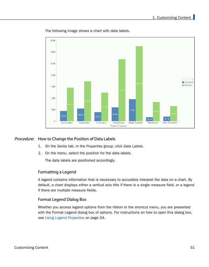
The following image shows a chart with data labels.
Procedure: How to Change the Position of Data Labels
1. On the Series tab, in the Properties group, click Data Labels.
2. On the menu, select the position for the data labels.
The data labels are positioned accordingly.
Formatting a Legend
A legend contains information that is necessary to accurately interpret the data on a chart. Bydefault, a chart displays either a vertical axis title if there is a single measure field, or a legendif there are multiple measure fields.
Format Legend Dialog Box
Whether you access legend options from the ribbon or the shortcut menu, you are presentedwith the Format Legend dialog box of options. For instructions on how to open this dialog box,see Using Legend Properties on page 54.
1. Customizing Content
Customizing Content 51
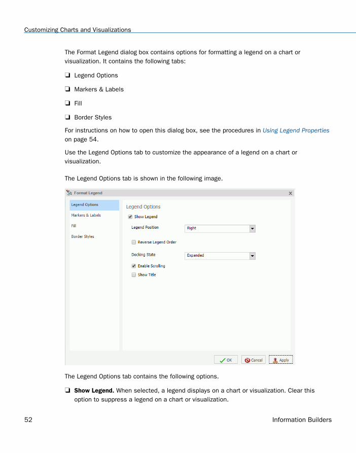
The Format Legend dialog box contains options for formatting a legend on a chart orvisualization. It contains the following tabs:
Legend Options
Markers & Labels
Fill
Border Styles
For instructions on how to open this dialog box, see the procedures in Using Legend Propertieson page 54.
Use the Legend Options tab to customize the appearance of a legend on a chart orvisualization.
The Legend Options tab is shown in the following image.
The Legend Options tab contains the following options.
Show Legend. When selected, a legend displays on a chart or visualization. Clear thisoption to suppress a legend on a chart or visualization.
Customizing Charts and Visualizations
52 Information Builders
Legend Position. Opens a drop-down menu of options to position the legend. For example,top or left.
Reverse Legend Order. Specifies that the legend be drawn in reverse order. Clear thisoption to specify that the legend be drawn in normal order.
Docking State. This option dictates how the legend is docked. It is set to Expanded bydefault, but you can set it to Collapsed, which will show that the legend is available (usingthe grey arrow). This option saves real estate in your chart by collapsing the categorical textlabels in the legend while preserving the legend label colors. This is particularly usefulwhen items in your legend have long labels and you wish to truncate them for the purposesof display. If you set this option to None, the ability to expand or collapse the legend isremoved and the grey arrow no longer displays.
Enable Scrolling. Select this check box to enable scrolling in your legend. This isparticularly useful when you have numerous entries in your legend. This check box isselected, by default. To disable scrolling in your legend, clear the Enable Scrolling checkbox. All legend options display in columns, and a scroll bar does not display.
Show Title. Select this check box to display the legend title.
Use the Markers & Labels tab to customize the appearance of markers and labels on legends.
The Markers & Labels tab contains the following options:
Style Labels. Opens the Style dialog box, where you can style text.
Marker Position. Opens a drop-down menu of options to set the position of text relative tothe legend marker. For example, Left of Text or Above Text.
Use the Fill tab to modify the color of the legend area. For more information, see Format SeriesDialog Box on page 28.
Use the Border Styles tab to place a border around a legend. For more information, see FormatSeries Dialog Box on page 28.
The Border Styles tab contains the following options:
Show Border. Select this option to place a border around a legend.
Color. With the Show Border option selected, you can click this button to open the Colordialog box, where you can select a color for the border.
Legend Elements Shortcut Menu
When you right-click a legend on a chart, a menu of options opens. The menu contains optionsthat are available on the Format tab.
1. Customizing Content
Customizing Content 53
The shortcut menu options are described in the following table. The table provides links to thesections of this document in which those options are also discussed.
Option Description
Show legend Controls the display of the legend. InfoAssist displays the legendby default. When you clear this option, InfoAssist suppresses thelegend. For instructions, see Using Legend Properties on page54.
The background shortcut menu has an option to restore thelegend after it has been suppressed.
Legend Position Controls the placement of the legend on the chart. Forinstructions see, Using Legend Properties on page 54.
Legend Area Color Enables you to specify the color of the legend background areausing the Color dialog box.
This option is available only when you right-click the area aroundthe legend. For instructions see, Using Legend Properties on page54.
Legend Border Color Enables you to specify the color of the border around the legendbackground area using the Color dialog box.
This option is available only when you right-click the area aroundthe legend. For instructions see, Using Legend Properties on page54.
More Legend Options Opens the Format Legend dialog box.
Using Legend Properties
The following sections contain procedures for customizing the legend. The procedures areorganized by the tab and group in which their associated options appear on the ribbon.
Procedure: How to Hide a Legend
1. Create a chart or visualization with multiple measure fields.
Customizing Charts and Visualizations
54 Information Builders
2. Clear the Show legend option in one of the following ways:
Ribbon: On the Format tab, in the Labels group, click Legend, then click Show legend toclear the option.
Shortcut Menu: Right-click the legend, and clear the Show legend option.
The legend is hidden.
Procedure: How to Position a Legend
1. Create a chart or visualization with multiple measure fields.
2. Open the menu of label position options in one of the following ways:
Ribbon: On the Format tab, in the Labels group, click Legend, then point to LegendPosition.
Shortcut Menu: Right-click the legend, and point to Legend Position.
3. Select a position for the legend. For example, Auto or Right.
Procedure: How to Specify the Color of a Legend Border
1. Create a chart or visualization with multiple measure fields.
2. Open the Format Legends dialog box in one of the following ways:
Ribbon: On the Format tab, in the Labels group, click Legend, then click More LegendOptions.
Shortcut Menu: Right-click the legend, and click More Legend Options.
The Format Legends dialog box opens. For more information, see Format Legend DialogBox on page 51.
3. On the Border Styles tab, select the option to Show Border.
4. Click the Color icon to open the Color dialog box, where you can specify the color of thelegend border.
5. Click OK to close the Color dialog box.
6. Click OK to close the Format Legend dialog box.
The legend border is formatted accordingly.
1. Customizing Content
Customizing Content 55
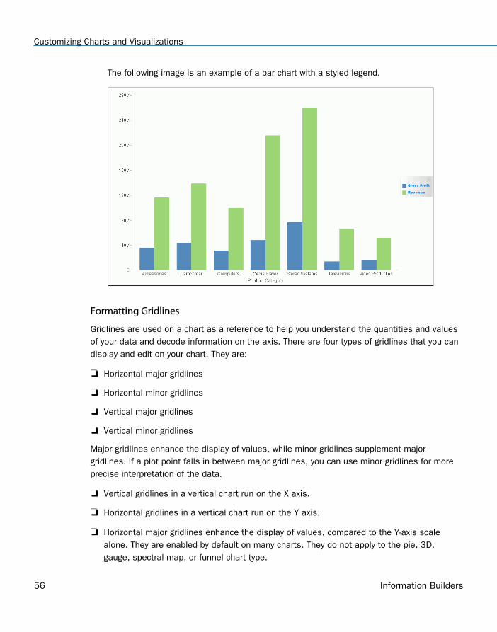
The following image is an example of a bar chart with a styled legend.
Formatting Gridlines
Gridlines are used on a chart as a reference to help you understand the quantities and valuesof your data and decode information on the axis. There are four types of gridlines that you candisplay and edit on your chart. They are:
Horizontal major gridlines
Horizontal minor gridlines
Vertical major gridlines
Vertical minor gridlines
Major gridlines enhance the display of values, while minor gridlines supplement majorgridlines. If a plot point falls in between major gridlines, you can use minor gridlines for moreprecise interpretation of the data.
Vertical gridlines in a vertical chart run on the X axis.
Horizontal gridlines in a vertical chart run on the Y axis.
Horizontal major gridlines enhance the display of values, compared to the Y-axis scalealone. They are enabled by default on many charts. They do not apply to the pie, 3D,gauge, spectral map, or funnel chart type.
Customizing Charts and Visualizations
56 Information Builders
Horizontal minor gridlines are disabled by default. They do not apply to the pie, 3D, gauge,spectral map, or funnel chart type.
Vertical major gridlines enhance the display of values, compared to the X-axis scale alone.They are enabled by default. They do not apply to the pie, 3D, gauge, spectral map, orfunnel chart type.
Vertical minor gridlines are disabled by default. They do not apply to the pie, 3D, gauge,spectral map, or funnel chart type.
Note: The orientation of a chart determines the available gridline options.
Format Grid Lines Dialog Box
You can format horizontal and vertical gridlines, color bands, and frames on a chart using theoptions in the Format Grid Lines dialog box. For instructions on how to open this dialog box,see the procedures in Using Gridline Properties on page 60.
Color bands come in a pair, with each band uniquely colored. They appear in a continuallyrepeating pattern behind a series on a chart. The contrast of colors is designed to make thechart easier to read.
Alternate formatting can be used to apply different colors to sections, called regions, of anaxis.
The Format Grid Lines dialog box contains the following tabs:
Major Grid Lines
Minor Grid Lines
Color Bands
Frames
Use the Major Grid Lines tab to format the major gridlines on the chart.
The Major Grid Lines tab contains the following options:
Show Grid Lines. Select this option to display major gridlines on a chart if minor gridlinesare the default for the chart.
Line Style. Click this icon to open the Line Style dialog box, where you can edit the color,weight, and style of the gridlines.
Show Ticks. Select this check box to enable or disable the tick mark functionality.
1. Customizing Content
Customizing Content 57
Tick Style. Select from this drop-down menu of tick styles (Inside, Outside, Spanning).
Line Style. Click this icon to open the Line Style dialog box, where you can edit the color,weight, and style of the gridlines.
Use the Minor Grid Lines tab to format the minor gridlines on your chart.
The Minor Grid Lines tab contains the following options:
Show Grid Lines. Select this option to display minor gridlines on a chart. By default, thisoption is enabled.
Line Style. Click this icon to open the Line Style dialog box, where you can edit the color,weight, and style of the gridlines.
Grid count. Set the number of minor gridlines that will appear between major gridlines.
Show Ticks. Select this check box to enable or disable the tick mark functionality.
Tick Style. Select from this drop-down menu of tick styles (Inside, Outside, Spanning).
Line Style. Click this icon to open the Line Style dialog box, where you can edit the color,weight, and style of the gridlines.
Use the Color Bands tab to format the color bands on your chart.
The Color Bands tab contains the following options:
Band 1. Select this option to add Band 1 to a chart.
Color. Click this icon to open the Color dialog box, where you can edit the color of Band1.
Transparency. Move the slider to make Band 1 opaque (0%) or transparent (100%). Thedefault is 0%.
%. Enter or select the percentage of the transparency of Band 1.
Band 2. Select this option to add Band 2 to a chart.
Color. Click this icon to open the Color dialog box, where you can edit the color of Band2.
Transparency. Move the slider to make the Band 2 opaque (0%) or transparent (100%).The default is 0%.
%. Enter or select the percentage of the transparency of Band 2.
Customizing Charts and Visualizations
58 Information Builders
Use the Frames tab to enable or disable frame regions, and to set the location and style of theframe text.
The Frames tab contains the following options:
Show Frame Regions. Select this option to show a frame region. Clear this option tosuppress a frame region.
Region. Select from this drop-down list, the region that you want to format.
Add. Click this button to add a region.
Remove. Click this button to remove a region.
Location. Enter the location of the region.
Color. Click this icon to open the Color dialog box, where you can edit the color of theframe.
Border Color. Click this icon to open the Color dialog box, where you can edit the color ofthe frame border.
Text. Enter the text that you want to appear on the frame.
Style Text. Click this icon to style the frame text.
For instructions on how to open this dialog box, see the procedures in Using Gridline Propertieson page 60.
Gridline Elements Shortcut Menu
When you right-click a gridline on a chart, a menu of options opens. The options for the gridlineelements are described in the following table.
1. Customizing Content
Customizing Content 59
Element Option Description
Horizontal Major Gridlines
Horizontal Minor Gridlines
Vertical Major Gridlines
Vertical Minor Gridlines
Delete Removes the gridlines from thechart and updates the LivePreview accordingly.
Set Line Color Enables you to specify the color ofthe gridlines, using the Colordialog box. For more information,see Color Dialog Box on page 21.
More Grid LinesOptions
Opens the Format Gridlines dialogbox.
Using Gridline Properties
The following sections contain procedures for customizing gridlines.
Procedure: How to Display Horizontal Major Gridlines
If your chart does not display gridlines by default, use this procedure to generate gridlines.
1. Create a chart or visualization.
2. On the Format tab, in the Features group, open the Grid drop-down menu, point toHorizontal Gridlines, and then click Major Gridlines.
Horizontal major gridlines are added to the chart.
Procedure: How to Display Horizontal Minor Gridlines
1. Create a chart or visualization.
2. Access the option to show gridlines in one of the following ways:
Ribbon: On the Format tab, in the Features group, open the Grid drop-down menu. Onthe Grid drop-down menu, point to Horizontal Gridlines, and then click Minor Gridlines.
Shortcut Menu: Right-click the gridlines on the chart, and click More Grid Lines Options.The Format Horizontal Grid Lines dialog box opens. On the Minor Grid Lines tab, selectShow Grid Lines.
Horizontal minor gridlines are added to the chart.
Customizing Charts and Visualizations
60 Information Builders
Procedure: How to Display Vertical Major Gridlines
1. Create a chart or visualization.
2. Access the option to show gridlines in one of the following ways:
Ribbon: On the Format tab, in the Features group, open the Grid drop-down menu. Onthe Grid drop-down menu, point to Vertical Gridlines, and then click Major Gridlines.
Shortcut Menu: Right-click the gridlines on the chart, and click More Grid Lines Options.The Format Vertical Grid Lines dialog box opens. On the Major Grid Lines tab, selectShow Major Grid Lines.
Vertical major gridlines are added to the chart.
Procedure: How to Display Vertical Minor Gridlines
1. Create a chart or visualization.
2. Access the option to show gridlines in one of the following ways:
Ribbon: On the Format tab, in the Features group, open the Grid drop-down menu. Onthe Grid drop-down menu, point to Vertical Gridlines, and then click Minor Gridlines.
Shortcut Menu: Right-click the gridlines on the chart, and click More Grid Lines Options.The Format Vertical Grid Lines dialog box opens. On the Minor Grid Lines tab, selectShow Minor Grid Lines.
Vertical minor gridlines are added to the chart.
Procedure: How to Set the Color, Weight, and Style of a Gridline
1. Open the Format Grid Lines dialog box in one of the following ways:
Ribbon: On the Format tab, in the Features group, open the Grid drop-down menu, pointto the gridline type that you want to format, and click More Grid Lines Options.
Shortcut Menu: Right-click a gridline, and click More Grid Lines Options.
The Format Grid Lines dialog box opens.
2. Click the Line Style icon.
The Line Style dialog box opens.
3. Set the color, weight, and style of the gridlines.
4. Click OK to close the Line Style dialog box.
5. Click OK again to close the Format Grid Lines dialog box.
1. Customizing Content
Customizing Content 61
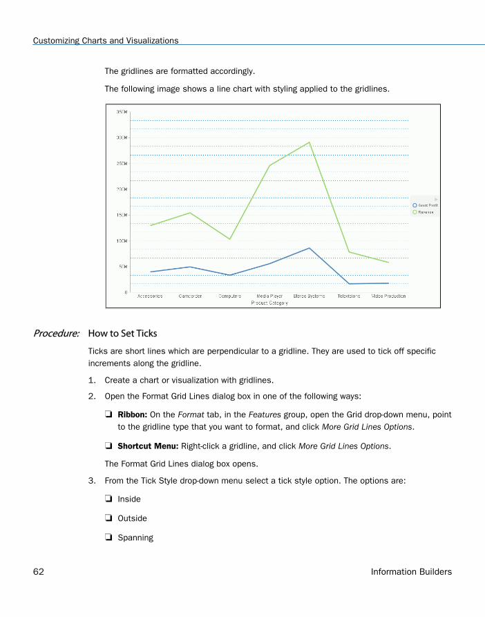
The gridlines are formatted accordingly.
The following image shows a line chart with styling applied to the gridlines.
Procedure: How to Set Ticks
Ticks are short lines which are perpendicular to a gridline. They are used to tick off specificincrements along the gridline.
1. Create a chart or visualization with gridlines.
2. Open the Format Grid Lines dialog box in one of the following ways:
Ribbon: On the Format tab, in the Features group, open the Grid drop-down menu, pointto the gridline type that you want to format, and click More Grid Lines Options.
Shortcut Menu: Right-click a gridline, and click More Grid Lines Options.
The Format Grid Lines dialog box opens.
3. From the Tick Style drop-down menu select a tick style option. The options are:
Inside
Outside
Spanning
Customizing Charts and Visualizations
62 Information Builders
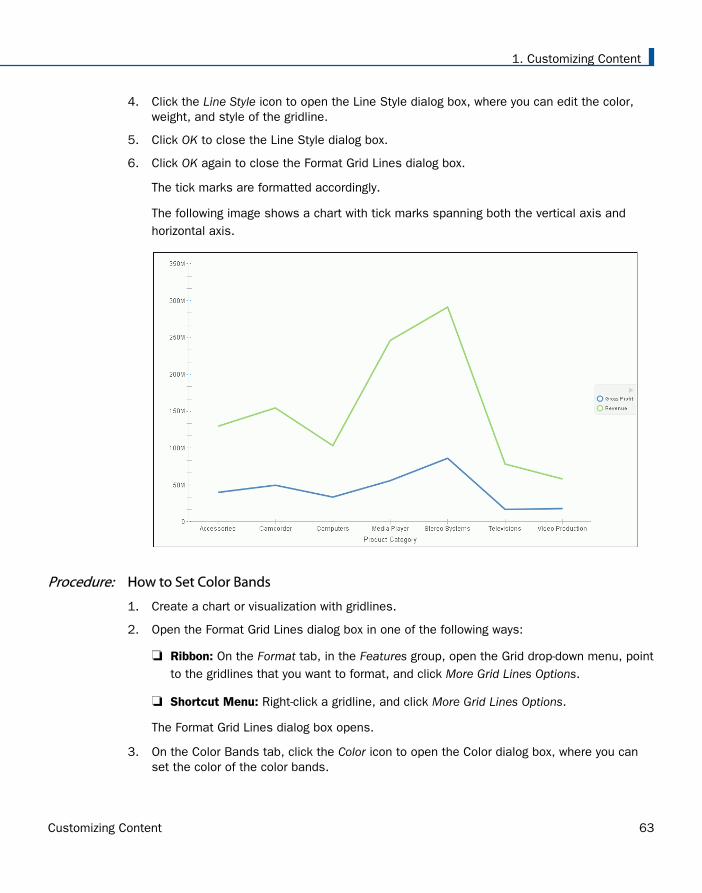
4. Click the Line Style icon to open the Line Style dialog box, where you can edit the color,weight, and style of the gridline.
5. Click OK to close the Line Style dialog box.
6. Click OK again to close the Format Grid Lines dialog box.
The tick marks are formatted accordingly.
The following image shows a chart with tick marks spanning both the vertical axis andhorizontal axis.
Procedure: How to Set Color Bands
1. Create a chart or visualization with gridlines.
2. Open the Format Grid Lines dialog box in one of the following ways:
Ribbon: On the Format tab, in the Features group, open the Grid drop-down menu, pointto the gridlines that you want to format, and click More Grid Lines Options.
Shortcut Menu: Right-click a gridline, and click More Grid Lines Options.
The Format Grid Lines dialog box opens.
3. On the Color Bands tab, click the Color icon to open the Color dialog box, where you canset the color of the color bands.
1. Customizing Content
Customizing Content 63
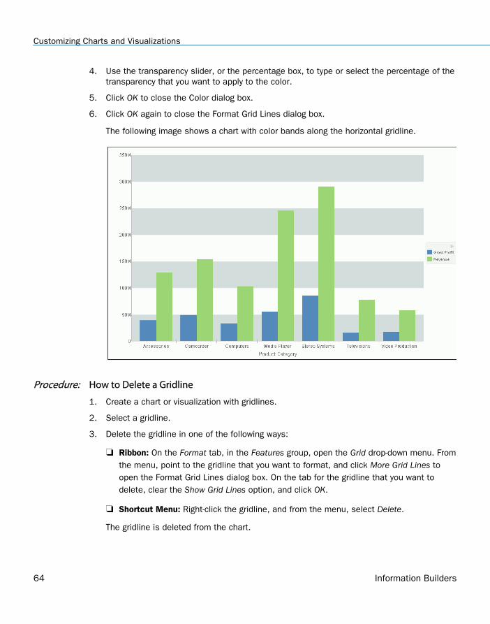
4. Use the transparency slider, or the percentage box, to type or select the percentage of thetransparency that you want to apply to the color.
5. Click OK to close the Color dialog box.
6. Click OK again to close the Format Grid Lines dialog box.
The following image shows a chart with color bands along the horizontal gridline.
Procedure: How to Delete a Gridline
1. Create a chart or visualization with gridlines.
2. Select a gridline.
3. Delete the gridline in one of the following ways:
Ribbon: On the Format tab, in the Features group, open the Grid drop-down menu. Fromthe menu, point to the gridline that you want to format, and click More Grid Lines toopen the Format Grid Lines dialog box. On the tab for the gridline that you want todelete, clear the Show Grid Lines option, and click OK.
Shortcut Menu: Right-click the gridline, and from the menu, select Delete.
The gridline is deleted from the chart.
Customizing Charts and Visualizations
64 Information Builders
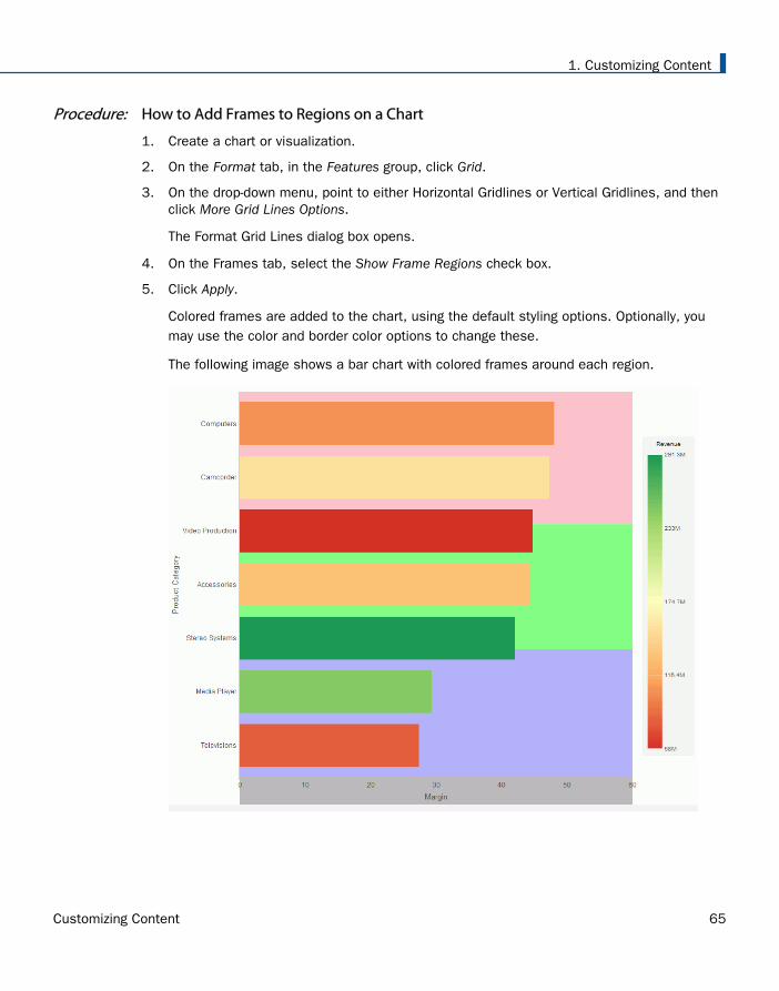
Procedure: How to Add Frames to Regions on a Chart
1. Create a chart or visualization.
2. On the Format tab, in the Features group, click Grid.
3. On the drop-down menu, point to either Horizontal Gridlines or Vertical Gridlines, and thenclick More Grid Lines Options.
The Format Grid Lines dialog box opens.
4. On the Frames tab, select the Show Frame Regions check box.
5. Click Apply.
Colored frames are added to the chart, using the default styling options. Optionally, youmay use the color and border color options to change these.
The following image shows a bar chart with colored frames around each region.
1. Customizing Content
Customizing Content 65
Formatting Axis Labels
Vertical and horizontal axes are based on the orientation of the graph. For example, in avertical graph, the horizontal axis refers to the X axis and the vertical axis refers to the Y axis.In a horizontal graph, the horizontal axis refers to the Y axis and the vertical axis refers to theX axis. This is important to consider, since options could change depending on the orientationof the graph.
A chart can contain the following types of axis labels:
Horizontal axis labels represent the X axis. They do not apply to pie, funnel, or gaugecharts.
Vertical axis labels represent the Y1 axis in a single axis chart. They represent a numericscale, usually located on the left side of a vertical chart.
Secondary horizontal and vertical labels can only be used when dual axes charts areselected.
Format Axis Dialog Box
Whether you access axis options from the ribbon, or the shortcut menu, you are presentedwith the Format Axis dialog box of options for formatting for both vertical and horizontal axes.The Format Axis dialog box contains the following tabs:
Scale
Title
Labels
Advanced
Reference: Format Vertical Axis Dialog Box
You use the Format Vertical Axis dialog box to specify formatting options for the vertical axis inyour chart.
Use the Scale tab to modify scale properties.
Customizing Charts and Visualizations
66 Information Builders
The Scale tab contains the following options:
Automatic Minimum. Supplies the minimum value on the Y-axis scale automatically. Touse manual scaling, clear this option. You can then set the minimum value by entering anumber into the Value text box.
Value. Type the minimum value in this text box if you have not selected AutomaticMinimum.
Automatic Maximum. Supplies the maximum value on the Y-axis scale automatically. Touse manual scaling, clear this option. You can then set the maximum value by entering anumber into the Value text box.
Value. Type the maximum value in this text box if you have not selected AutomaticMaximum.
Automatic Grid Step. Calculates the number of major grid steps automatically. To usemanual scaling, clear this option. You can then set the value by typing the number into theValue text box.
Value. Type the value in this text box if you have not selected Automatic Grid Step.
Logarithmic Scale. Controls whether or not the Y-axis scale progresses logarithmicallyinstead of linearly. This option is disabled by default. When selected, the logarithmic baseis set to 10.0, but can be changed by entering another value.
Include zero on scale. Controls whether or not a zero (0) value appears on the scale. Thisoption is enabled by default.
Use the Title tab to show or hide the axis title, and create and style the title for the axis.
The Title tab contains the following options:
Show title. Select this check box to show the axis title (default) or clear the check box tohide the axis title.
Text. Type a title for the axis in the Text field.
Style text. Opens the Style dialog box, where you can style the text.
Use the Labels tab to format the layout of the axis labels.
1. Customizing Content
Customizing Content 67
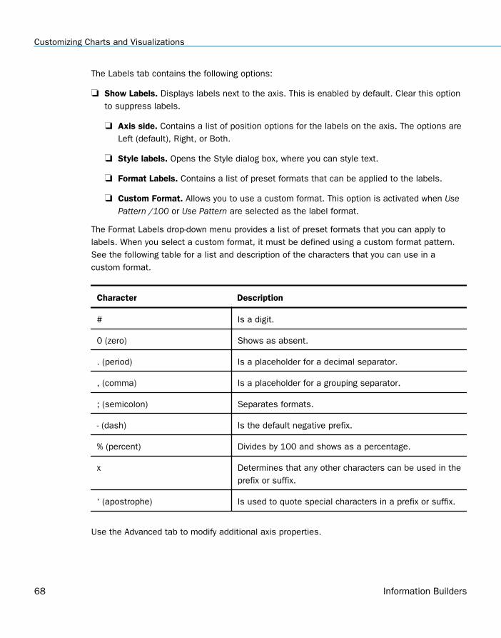
The Labels tab contains the following options:
Show Labels. Displays labels next to the axis. This is enabled by default. Clear this optionto suppress labels.
Axis side. Contains a list of position options for the labels on the axis. The options areLeft (default), Right, or Both.
Style labels. Opens the Style dialog box, where you can style text.
Format Labels. Contains a list of preset formats that can be applied to the labels.
Custom Format. Allows you to use a custom format. This option is activated when UsePattern /100 or Use Pattern are selected as the label format.
The Format Labels drop-down menu provides a list of preset formats that you can apply tolabels. When you select a custom format, it must be defined using a custom format pattern.See the following table for a list and description of the characters that you can use in acustom format.
Character Description
# Is a digit.
0 (zero) Shows as absent.
. (period) Is a placeholder for a decimal separator.
, (comma) Is a placeholder for a grouping separator.
; (semicolon) Separates formats.
- (dash) Is the default negative prefix.
% (percent) Divides by 100 and shows as a percentage.
x Determines that any other characters can be used in theprefix or suffix.
‘ (apostrophe) Is used to quote special characters in a prefix or suffix.
Use the Advanced tab to modify additional axis properties.
Customizing Charts and Visualizations
68 Information Builders
The Advanced tab contains the following options:
Exclude Minimum Label. Excludes the label with the lowest axis value from the chart.
Exclude Maximum Label. Excludes the label with the highest axis value from the chart.
Descending Axis. Draws the axis in descending order.
Show axis line. Controls the display of the axis baseline.
Line Style. Opens the Line Style dialog box, where you can edit the color, weight, andstyle of the axis line.
Show zero line. Controls the display of the zero line.
Line Style. Opens the Line Style dialog box, where you can edit the color, weight, andstyle of the zero line.
Custom Baseline. Controls the display of the custom baseline.
Value. Type a value for the custom baseline.
Line Style. Opens the Line Style dialog box, where you can edit the color, weight, andstyle of the custom baseline.
For instructions on how to open this dialog box, see the procedures in Using Axis Properties onpage 73.
Reference: Format Horizontal Axis Dialog Box
You use the Format Horizontal Axis dialog box to specify formatting options for the horizontalaxis in your chart.
Use the Scale tab to modify scale properties.
The Scale tab contains the following options:
Automatic Minimum. Supplies the minimum value on the Y-axis scale automatically. Touse manual scaling, clear this option. You can then set the minimum value by entering anumber into the Value text box.
Value. Type the minimum value in this text box if you have not selected AutomaticMinimum.
1. Customizing Content
Customizing Content 69
Automatic Maximum. Supplies the maximum value on the Y-axis scale automatically. Touse manual scaling, clear this option. You can then set the maximum value by entering anumber into the Value text box.
Value. Type the maximum value in this text box if you have not selected AutomaticMaximum.
Automatic Grid Step. Calculates the number of major grid steps automatically. To usemanual scaling, clear this option. You can then set the value by typing the number into theValue text box.
Value. Type the value in this text box if you have not selected Automatic Grid Step.
Logarithmic Scale. Controls whether or not the Y-axis scale progresses logarithmicallyinstead of linearly. This option is disabled by default. When selected, the logarithmic baseis set to 10.0, but can be changed by entering another value.
Include zero on scale. Controls whether or not a zero (0) value appears on the scale. Thisoption is enabled by default.
Use the Title tab to create and style the title for the axis.
The Title tab contains the following options:
Show title. Select this check box to show the axis title (default) or clear the check box tohide the axis title.
Text. Type a title for the axis in the Text field.
Style. Opens the Style dialog box, where you can style the text.
Use the Labels tab to format the layout of the axis labels.
The Labels tab contains the following options:
Show Labels. Displays labels next to the axis. This is enabled by default. Clear this optionto suppress labels.
Axis side. Contains a list of position options for the labels on the axis. The options areLeft (default), Right, or Both.
Style labels. Opens the Style dialog box, where you can style text.
Stagger Labels. Sets the labels to appear staggered.
Concatenate Labels. Concatenates the labels in your chart. This is enabled by default.
Customizing Charts and Visualizations
70 Information Builders
Format Labels. Contains a list of preset formats that can be applied to the labels.
Custom Format. Allows you to use a custom format. This option is activated when UsePattern /100 and Use Pattern are selected as the format labels.
Use the Advanced tab to modify additional axis properties.
The Advanced tab contains the following options:
Exclude Minimum Label. Excludes the label with the lowest axis value from the chart.
Exclude Maximum Label. Excludes the label with the highest axis value from the chart.
Descending Axis. Draws the axis in descending order.
Show zero line. Controls the display of the zero line.
Line Style. Opens the Line Style dialog box, where you can edit the color, weight, andstyle of the zero line.
For instructions on how to open this dialog box, see the procedures in Using Axis Properties onpage 73.
Secondary Axes Options
Formatting options are available for secondary axes in dual-axis charts. For example, in avertical dual-axis chart, the secondary vertical axis refers to the Y2 axis.
The Format Secondary Axis dialog box contains the following tabs for both vertical andhorizontal axes:
General. For more information, see the Scale tab options in Format Axis Dialog Box on page66.
Title. For more information, see the equivalent tab in Format Axis Dialog Box on page 66.
Labels. For more information, see the equivalent tab in Format Axis Dialog Box on page 66.
Advanced. For more information, see the equivalent tab in Format Axis Dialog Box on page66.
Axis Elements Shortcut Menu
When you right-click an axis label or title in a chart in Live Preview, a menu of options opens.The options for the right-click axis label elements are described in the following table.
1. Customizing Content
Customizing Content 71
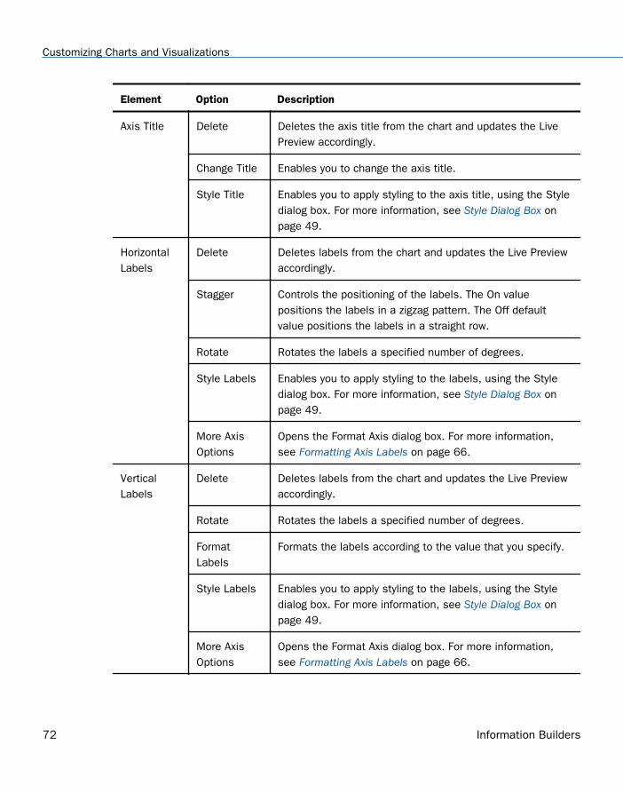
Element Option Description
Axis Title Delete Deletes the axis title from the chart and updates the LivePreview accordingly.
Change Title Enables you to change the axis title.
Style Title Enables you to apply styling to the axis title, using the Styledialog box. For more information, see Style Dialog Box onpage 49.
HorizontalLabels
Delete Deletes labels from the chart and updates the Live Previewaccordingly.
Stagger Controls the positioning of the labels. The On valuepositions the labels in a zigzag pattern. The Off defaultvalue positions the labels in a straight row.
Rotate Rotates the labels a specified number of degrees.
Style Labels Enables you to apply styling to the labels, using the Styledialog box. For more information, see Style Dialog Box onpage 49.
More AxisOptions
Opens the Format Axis dialog box. For more information,see Formatting Axis Labels on page 66.
VerticalLabels
Delete Deletes labels from the chart and updates the Live Previewaccordingly.
Rotate Rotates the labels a specified number of degrees.
FormatLabels
Formats the labels according to the value that you specify.
Style Labels Enables you to apply styling to the labels, using the Styledialog box. For more information, see Style Dialog Box onpage 49.
More AxisOptions
Opens the Format Axis dialog box. For more information,see Formatting Axis Labels on page 66.
Customizing Charts and Visualizations
72 Information Builders
Using Axis Properties
The following sections contain procedures for customizing an axis. The procedures areorganized by the tab and group in which their associated options appear on the ribbon.
Axis labels appear by default.
Procedure: How to Delete Axis Labels
1. Create a chart or visualization.
2. You can delete axis labels in one of the following ways:
Ribbon: On the Format tab, in the Labels group, open the Axes drop-down menu, pointto the axis that you are working with, and clear the Show Labels option.
Shortcut Menu: Right-click an axis label on the chart, and click Delete.
The axis labels are deleted from the chart.
Procedure: How to Stagger Axis Labels
Note: You can only apply a staggered effect to horizontal axis labels.
1. Create a chart or visualization with at least one axis label on display.
2. Access the Stagger option in one of the following ways:
Ribbon: On the Format tab, in the Labels group, open the Axes drop-down menu, pointto the axis that you are working with, and click Stagger Labels.
Shortcut Menu: Right-click an axis label on the chart, point to Stagger and select On.
The axis labels are staggered.
Procedure: How to Rotate Axis Labels
1. Create a chart or visualization with axis labels.
2. Access the Rotate option in one of the following ways:
Ribbon: On the Format tab, in the Labels group, open the Axes drop-down menu, pointto the axis that you are working with, point to Rotate Labels, and then click the degreeto which you want to rotate the axis labels.
Shortcut Menu: Right-click an axis label on the chart, point to Rotate, and then clickthe degree to which you want to rotate the axis labels.
The axis labels are rotated.
1. Customizing Content
Customizing Content 73
Procedure: How to Format Axis Labels
1. Create a chart or visualization with an axis label.
2. Access the list of axis label options in one of the following ways:
Ribbon: On the Format tab, in the Labels group, open the Axes drop-down menu, pointto the axis that you are working with, and click More Axis Options to open the FormatAxis dialog box. Open the Labels tab, and from the Labels option drop-down menu,select the formatting option that you want.
Shortcut Menu: Right-click an axis label, point to Format Labels, and click theformatting option that you want.
The axis labels are formatted accordingly.
Procedure: How to Manually Set the Scale of an Axis
1. Create a chart or visualization.
2. Open the Format Axis dialog box in one of the following ways:
Ribbon: On the Format tab, in the Labels group, open the Axes drop-down menu, pointto the axis that you are working with, and click More Axis Options.
Shortcut Menu: Right-click an axis value on the chart, and click More Axis Options.
The Format Axis dialog box opens.
3. On the scale tab, clear the Automatic Minimum option and enter your own minimum valuein the Value text box.
4. Clear the Automatic Maximum option, and enter your own maximum value in the Value textbox.
5. Clear the Automatic Grid Step option, and enter your own grid step value in the Value textbox.
6. Optionally, you can select the Logarithmic Scale option and enter the log scale base in thetext field of that name. You can also clear the Include zero on scale option if you do notwant zero to appear on the axis.
7. Click OK to close the dialog box.
The axis scale is set accordingly.
Procedure: How to Add an Axis Title
1. Create a chart or visualization with an axis label.
Customizing Charts and Visualizations
74 Information Builders
2. Open the Format Axis dialog box in one of the following ways:
Ribbon: On the Format tab, in the Labels group, open the Axes drop-down menu, pointto the axis that you are working with, and click More Axis Options.
Shortcut Menu: Right-click an axis label, and click More Axis Options.
The Format Axis dialog box opens.
3. On the Title tab, type the axis title in the Text field.
4. Click the Style text icon to open the Style dialog box, where you can style the text.
The axis title is styled accordingly.
Note: Right-click the axis title to delete, change, or style the axis title.
Procedure: How to Set Advanced Axis Properties
1. Create a chart or visualization with an axis label.
2. Open the Format Axis dialog box in one of the following ways:
Ribbon: On the Format tab, in the Labels group, open the Axes drop-down menu, pointto the axis that you are working with, and click More Axis Options.
Shortcut Menu: Right-click an axis label, and click More Axis Options.
The Format Axis dialog box opens.
3. On the Advanced tab, set the following options:
Exclude Minimum Label
Exclude Maximum Label
Descending Axis
Show zero line
You can edit the color, weight, and style of all the lines that you set in the Line Styledialog box.
4. Click OK.
The axis advanced options are set accordingly.
Formatting a Frame and a Background
The frame of a chart is the area that contains the plot points. It is also the area in whichhorizontal and vertical gridlines are drawn.
1. Customizing Content
Customizing Content 75
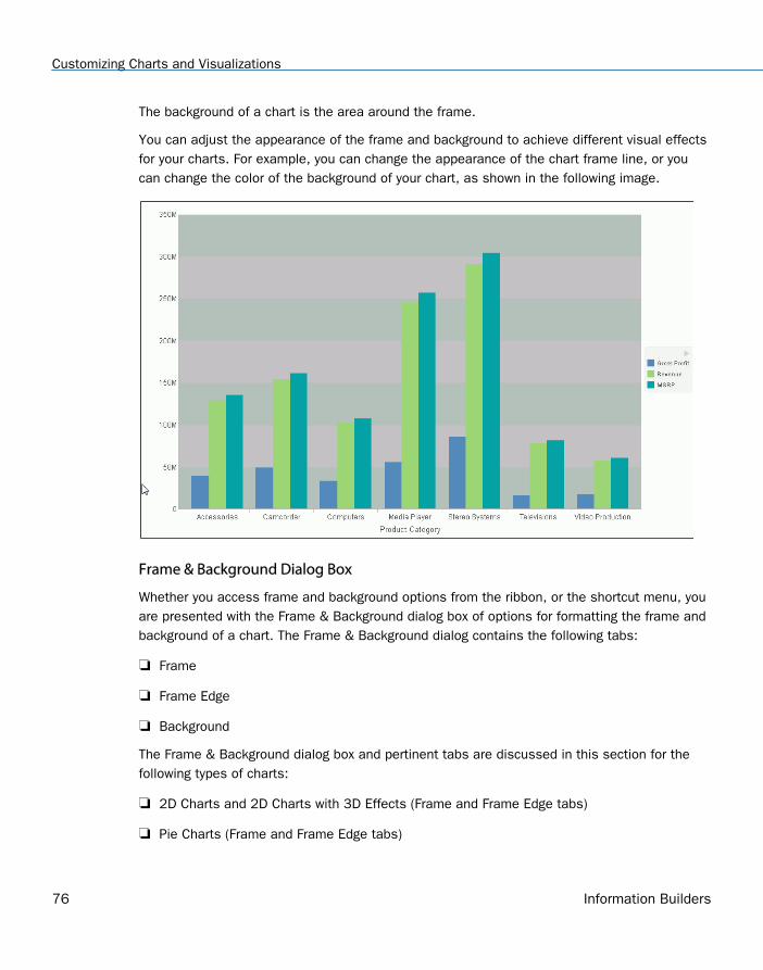
The background of a chart is the area around the frame.
You can adjust the appearance of the frame and background to achieve different visual effectsfor your charts. For example, you can change the appearance of the chart frame line, or youcan change the color of the background of your chart, as shown in the following image.
Frame & Background Dialog Box
Whether you access frame and background options from the ribbon, or the shortcut menu, youare presented with the Frame & Background dialog box of options for formatting the frame andbackground of a chart. The Frame & Background dialog contains the following tabs:
Frame
Frame Edge
Background
The Frame & Background dialog box and pertinent tabs are discussed in this section for thefollowing types of charts:
2D Charts and 2D Charts with 3D Effects (Frame and Frame Edge tabs)
Pie Charts (Frame and Frame Edge tabs)
Customizing Charts and Visualizations
76 Information Builders
3D Charts (Left Wall, Right Wall, Floor, and Advanced tabs)
Note: The options in the Frame tab vary based on the chart type selected.
Use the Frame tab for 2D charts and 2D charts with 3D effects to set a frame depth angle anddepth radius, select a fill for a frame, and set a shadow for a frame for these types of charts.
The Frame tab for 2D charts and 2D charts with 3D effects contains the following options:
Depth Angle. Enter the angle from the front of the chart to the back where the chart risersand frames are drawn. You can set the depth angle from zero to 180 degrees, but it mustbe used along with Depth Radius.
Depth Radius. Enter how far out the extruded frame will be extended. Small values, suchas zero, produce very narrow charts. Large values, the maximum being 100, producethicker charts.
Fill
No fill. (Default). Select this option to keep the legend colorless.
Solid fill. Select this option to display the Color and Transparency options.
Color. Click this icon to open the Color dialog box, where you can select a color for aframe.
Transparency. Move the slider to make the frame opaque (0%) or transparent (100%).The default is 0%.
Gradient fill. Select this option to display the direction of the gradient, the color pattern ofthe gradient, and the degrees of transparency for the two colors that make up the gradient.A gradient is a smooth color transition or blending of one color to another. The number ofcolors to use in a gradient is defined by the stop or pin elements.
Direction. Select from this drop-down menu to set the direction of the gradient fill. Forexample, Gradient right or Gradient left.
Gradient style
Color Pattern. Select the color pattern for the data series. The color pattern option on theleft is an AB wash that uses two colors in the pattern color1 - color2, for example, red-green. The color pattern option on the right is an ABA wash that uses two colors in thepattern color1 - color2 - color1, for example, red-green-red.
First Color. Click this icon to open the Color dialog box, where you can select a color for thefirst color.
1. Customizing Content
Customizing Content 77
Second Color. Click this icon to open the Color dialog box, where you can select a color forthe second color.
Shadow
Show Shadow. Select this option to set a shadow.
Use the Frame Edge tab for 2D charts and 2D charts with 3D effects to set a frame depthangle and depth radius, select a fill for a frame, and set a shadow for a frame for these typesof charts.
The Frame tab for 2D charts and 2D charts with 3D effects contains the following options:
Automatically Shade Frame Edge. Select this option to automatically shade the frameedge. Clear this option to enable the Side Frame and Bottom Frame options.
Side Frame
Show Color. Select this option to show the color of the side frame.
Color. Click this icon to open the Color dialog box, where you can select a color for the sideframe.
Show Border Color. Select this option to show the color of the border of the side frame.
Border Color. Click this icon to open the Color dialog box, where you can select a color forthe border of the side frame.
Bottom Frame
Show Color. Select this option to show the color of the bottom frame.
Color. Click this icon to open the Color dialog box, where you can select a color for thebottom frame.
Show Border Color. Select this option to show the color of the bottom frame.
Border Color. Click this icon to open the Color dialog box, where you can select a color forthe border of the bottom frame.
Use the Frame tab for pie charts to set pie depth and tilt, select a fill and color for a pie frame,and set a shadow for the frame.
The Frame tab for pie charts contains the following options:
Pie Depth. Set the depth of the edge of a pie chart. You can select a value from zero to100 to set the thickness of an edge.
Customizing Charts and Visualizations
78 Information Builders
Pie Tilt. Set the tilt of the pie chart. The smaller the value you add, the flatter the pie chartappears. The larger the value you add, more of the pie edge appears.
Fill
No fill. (Default). Results in no color added to the edge of the pie.
Solid fill. Select this option to display the Color and Transparency options.
Color. Click this icon to open the Color dialog box, where you can select a color for theframe.
Transparency. Move the slider to make the fill opaque (0%) or transparent (100%). Thedefault is 0%.
Gradient fill. Select this option to display the direction of the gradient, the color pattern ofthe gradient, and the degrees of transparency for the two colors that make up the gradient.A gradient is a smooth color transition or blending of one color to another. The number ofcolors to use in a gradient is defined by the stop or pin elements.
Direction. Select from this drop-down menu to set the direction of the gradient fill. Forexample, Gradient right or Gradient left.
Gradient Style
Color Pattern. Select the color pattern for the data series. The color pattern optionon the left is an AB wash that uses two colors in the pattern color1 - color2, forexample, red-green. The color pattern option on the right is an ABA wash that usestwo colors in the pattern color1 - color2 - color1, for example, red-green-red.
First Color. Click this icon to open the Color dialog box, where you can select a colorfor the first color.
Second Color. Click this icon to open the Color dialog box, where you can select acolor for the second color.
Shadow
Show Shadow. Select this option to set a shadow around the frame.
Use the Frame Edge tab for pie charts to set the edge of a pie frame.
1. Customizing Content
Customizing Content 79
The Frame Edge tab for pie charts contains the following options:
Automatically Shade Frame Edge. Select this option to automatically shade the frameedge. Clear this option to enable the Side Frame and Bottom Frame options.
Show Color. Select this option to show the color of the side frame.
Color. Click this icon to open the Color dialog box, where you can select a color for sideframe.
Show Border Color. Select this option to show the color of the border of the side frame.
Border Color. Click this icon to open the Color dialog box, where you can select a color forthe border of the side frame.
Bottom Frame
Show Color. Select this option to show the color of the bottom frame.
Color. Click this icon to open the Color dialog box, where you can select a color for thebottom frame.
Show Border Color. Select this option to show the color of the bottom frame.
Border Color. Click this icon to open the Color dialog box, where you can select a color forthe border of the bottom frame.
Use Wall and Floor tabs to set the walls and floor of a 3D chart.
These Wall and Floor tabs contain the following options:
Show Wall or Show Floor. Select this option to show the wall or floor (depending on thetab) of the 3D chart.
Wall Thickness. Specify the thickness of the wall or floor.
Cube Size. Specify the cube size of the wall or floor.
Color. Click this icon to open the Color dialog box, where you can select a color for the wallor floor.
Border Color. Click this icon to open the Color dialog box, where you can select a color forthe border of the wall or floor.
Show Wall (Left Wall). Select this option to show the left wall.
Show Wall (Right Wall). Select this option to show the right wall.
Customizing Charts and Visualizations
80 Information Builders
Show Floor. Select this option to show the floor.
Use the Advanced tab for 3D charts to modify additional properties for 3D frames.
The Advanced tab contains the following options:
Viewing Angles. Select from a drop-down menu of viewing angles for three-dimensionalcharts. For example, Standard or Group View.
Isometric Projection. Select this option to ignore perspective distortion in a project graphcube from an isometric view.
Proportional Cube. Select this option to define the axis size proportional to the number ofseries or groups.
Automatic shading of walls. Select this option to shade chart walls.
Automatically Shade Frame Edge. Select this option to automatically shade the frameedge.
3D Zoom Factor. Enter a value in the text box to set the global scaling factor forzooming in and out in a 3D chart. Smaller values zoom out and produce a smallerdisplay of the chart within a frame. Larger values zoom in and produce a larger displayof the chart within a frame.
Pan Horizontally. Enter a value in the text box to pan a 3D chart in the horizontaldirection. Smaller values move the frame of the chart to the left. Larger values move theframe of the chart to the right.
Pan Vertically. Enter a value in the text box to pan a 3D chart in the vertical direction.Smaller values move the frame of the chart upward. Larger values move the frame ofthe chart downward.
Use the Background tab to set and customize a border for a chart.
The Background tab contains the following options:
Show Border Color. Select this option to show the color of the border.
Border Color. Click this icon to open the Color dialog box, where you can select a color forthe border.
Solid fill. Select this option to display the Color and Transparency options.
Color. Click this icon to open the Color dialog box, where you can select a color for theframe.
1. Customizing Content
Customizing Content 81
Transparency. Move the slider to make the background opaque (0%) or transparent(100%). The default is 0%.
Gradient fill. Select this option to display the direction of the gradient, the color pattern ofthe gradient, and the degrees of transparency for the two colors that make up the gradient.A gradient is a smooth color transition or blending of one color to another. The number ofcolors to use in a gradient is defined by the stop or pin elements.
Direction. Select from this drop-down menu to set the direction of the gradient fill. Forexample, Gradient right or Radial.
Gradient Style
Color Pattern. Select the color pattern for the data series. The color pattern option on theleft is an AB wash that uses two colors in the pattern color1 - color2, for example, red-green. The color pattern option on the right is an ABA wash that uses two colors in thepattern color1 - color2 - color1, for example, red-green-red.
First Color. Click this icon to open the Color dialog box, where you can select a color for thefirst color.
Second Color. Click this icon to open the Color dialog box, where you can select a color forthe second color.
For instructions on how to open this dialog box, see the procedures in Using Frame andBackground Properties on page 83.
Frame and Background Shortcut Menu
When you right-click a chart background, a menu of options opens. The options for thebackground and frame elements are described in the following table.
Customizing Charts and Visualizations
82 Information Builders
Element Option Description
Background Background Color Enables you to specify the color of thebackground, using the Color dialog box. Forinstructions, How to Change the Color ofthe Background on page 84.
Show legend Controls the display of the legend on thebackground. When selected, it displays thelegend. When cleared, it suppresses thedisplay of the legend.
More Frame andBackground Options
Opens the Frame & Background dialog box.For more information, see Frame &Background Dialog Box on page 76.
Frame Frame Color Enables you to specify the color of theframe, using the Color dialog box. For moreinformation, see Color Dialog Box on page21.
Show 3D Controls the depth of the frame. The valueOn renders the frame in 3D depth. Thevalue Off renders the frame in onedimension.
More Frame andBackground Options
Opens the Frame & Background dialog box.For more information, see Frame &Background Dialog Box on page 76.
Using Frame and Background Properties
The following sections contain procedures for customizing frame and background properties.The options for the following procedures are found in the Features group of the Format tab.
Procedure: How to Change the Color of the Frame
The default color of the frame in a chart is determined by the Document Theme selected onthe Options dialog box. For more information, see Changing InfoAssist User Preferences.
1. Customizing Content
Customizing Content 83
This procedure describes how to change the color of the frame.
1. Create a chart or visualization.
2. Access the Frame & Background dialog box in one of the following ways:
Ribbon: On the Format tab, in the Features group, click Frame & Background.
Shortcut Menu: Right-click the chart, and click More Frame & Background Options.
The Frame & Background dialog box opens.
3. On the Frame tab, in the Fill area, click the Color icon.
Note: Solid fill must be selected for the Color icon to appear.
The Color dialog box opens. Select a new color for the frame. For more information on theColor dialog box, see Color Dialog Box on page 21. You can also set the depth angle anddepth radius for the frame, as well as set a shadow for the frame.
4. Click OK.
The chart displays the new frame color.
Procedure: How to Change the Color of the Background
The default color of the background of a chart is determined by the Document Theme selectedon the Options dialog box. For more information, see Changing InfoAssist User Preferences.
1. Create a chart or visualization.
2. Open the Frame & Background dialog box in one of the following ways:
Ribbon: On the Format tab, in the Features group, click Frame & Background.
Shortcut Menu: Right-click the background of the chart, and click Background Color.
The Frame & Background dialog box opens.
3. On the Background tab, in the Background Fill area, click the Color icon.
The Color dialog box opens. Select a new color for the background. For more informationon the Color dialog box, see Color Dialog Box on page 21.
4. Click OK.
The chart displays the new background color.
Formatting a Gauge Chart
A gauge chart is a circular chart that indicates the current position of a single data value withina given spectrum.
Customizing Charts and Visualizations
84 Information Builders
You can change the appearance of a gauge chart by using the gauge chart options found onthe Format Gauge dialog box. To access the Format Gauge dialog box, on the Format tab, inthe Features group, click Gauges.
Format Gauge Dialog Box
Whether you access gauge options from the ribbon, or the shortcut menu, you are presentedwith the Format Gauge dialog box of options for formatting a gauge chart. Such options includesetting and styling a title for the gauge chart, setting tick marks, enabling and styling colorbands, as well as setting advanced options, such as the gauge start and stop angle.
The Format Gauge dialog box contains the following tabs:
General Options
Axis Scale & Labels
Tick Marks
Bands
Advanced
Use the General Options tab to set general gauge options.
The General Options tab contains the following options:
Gauges per row. Enter or select how many gauges appear on each row. The default settingdisplays two gauge charts. A maximum of 32 gauge charts can appear on each row.
Note: The number of charts displayed per row can differ, based on the output formatselected. For example, HTML format will display two charts per row, and HTML5 will displaythree.
Gauge Title
Show title. (Default) Displays a gauge title appear for each gauge. Clear this option tosuppress the title.
Position. Select a position for the gauge title. Above is the default value.
Style. Click this icon to open the Style dialog box, where you can style text.
Gauge value
Show value. (Default) Clear this option to suppress the gauge value.
Style. Click this icon to open the Style dialog box, where you can style text.
1. Customizing Content
Customizing Content 85
Format Value. Contains a list of preset formats that can be applied.
Custom Format. Allows you to use a custom format. This option is activated when UsePattern /100 or Use Pattern are selected as the label format.
Use the Axis Scale & Labels tab to set the axis scale and label properties for the gaugeneedle.
The Axis Scale & Labels tab contains the following options:
Scale
Automatic Minimum. (Default) Sets the engine to automatically supply the minimum valueon the scale. Clear this option to manually set the minimum value by entering a numberinto the Value text box.
Value. Enter the minimum value in this text box if you have not selected AutomaticMinimum.
Automatic Maximum. (Default) Sets the engine to automatically supply the maximum valueon the scale. Clear this option to manually set the maximum value by entering a numberinto the Value text box.
Value. Enter the maximum value in this text box if you have not selected AutomaticMaximum.
Labels
Show Labels. (Default) Displays labels next to the axis. Clear this option to suppresslabels.
Style Labels. Click this icon to opens the Style dialog box, where you can style text.
Format Labels. Select from a drop-down menu of present formats that can be applied tothe labels. When a custom format is selected, the format must be defined using a customformat pattern. For a list and description of the characters that you can use in a customformat, see the table in Formatting Data Labels on page 45.
Custom Format. Text field to enter the custom format that you want to use.
The Tick Marks tab contains options to format tick marks on a gauge chart.
The Tick Marks tab contains the following options for both major and minor ticks:
Automatic Grid Step. (Default) Automatically calculates the number of major grid steps in agauge chart. Clear this option to manually set the value by entering a number in the Valuetext box.
Customizing Charts and Visualizations
86 Information Builders
Value. Enter the value in this text box if you have not selected Automatic Grid Step.
Tick Color. Click this icon to open the Color dialog box, where you can select a color for thetick marks.
Tick Mark Length. Enter a value for the relative length of major tick marks in a gauge chart.The valid range is from 0.0 to 0.5. If you set the smallest value, major tick marks do notappear.
The Bands tab contains options to format the color of the scale background on a gauge chart.
The Bands tab contains the following options:
Band 1. Opens a drop-down menu of available bands.
Add. Adds the band selected from the drop-down menu of bands to the gauge chart.You can create up to five bands for a gauge chart.
Remove. Removes the band selected from the drop-down menu of bands to the gaugechart.
Minimum Value. Enter a minimum value to a quality band in the gauge chart.
Maximum Value. Enter a maximum value to a quality band in the gauge chart.
Border Color. Opens the Color dialog box, where you can edit the color of the gauge bandborder.
Fill
No fill. Removes fill from the quality band.
Solid fill. (Default) Applies a solid color to the quality band.
Color. Click this option to open the Color dialog box, where you can select the color for thequality band.
Transparency. Move the slider to make the band opaque (0%) or transparent (100%). Thedefault is 0%.
The Advanced tab contains options to set additional properties for the gauge needle.
The Advanced tab contains the following options:
Descending Axis. Select this option to draw the gauge scale in descending order. Whenthis option is cleared (default), the gauge scale is drawn in ascending order.
Show Zero Label. Displays the zero label on the axis scale. Clear this option to start thegauge at another value. This option is selected by default.
1. Customizing Content
Customizing Content 87
Gauge Start Angle. Enter a value to rotate the gauge start angle to a specified number ofdegrees. Values can range from 0 to 359 degrees. The default is 220 degrees.
Gauge Stop Angle. Enter a value to rotate the gauge stop angle to a specified number ofdegrees. Values can range from 0 to 359 degrees. The default is 320 degrees. Setting astart angle to 0, and a stop angle to 180, creates a semi-circle.
Relative Inner Radius. Enter a value to define the inner radius of the gauge bands andlabels relative to the outer background of the gauge. Smaller values, such as 0.0, place theinner radius closer to the center of the gauge. A maximum value of 1.0, places the innerradius close to the gauge outline.
Relative Thickness. Enter a value to define the relative thickness of the gauge bands.Values can range from 0.0 to 1.0.
Gauge Elements Shortcut Menu
When you right-click a gauge chart, a menu containing the More Gauge Options becomesavailable. Select this option to open the Format Gauge dialog box. This is only available whenusing the HTML output format.
Using Gauge Properties
The following sections contain procedures for gauge properties. The Gauges option can befound on the Format tab, in the Features group.
Note: This option is only available when you are working with a gauge chart.
Procedure: How to Set the Number of Gauges Per Row
If you have multiple gauges on a chart, you might want to specify how many gauges appear oneach row.
1. Create a gauge chart that has multiple values.
2. Open the Format Gauge dialog box in one of the following ways:
Ribbon: On the Format tab, in the Features group, click Gauges.
Shortcut Menu: Right-click the gauge chart and select More Gauge Options.
The Format Gauge dialog box opens.
3. On the General options tab, in the Gauges per row field, enter or select the number ofgauges that you want to appear on one row.
4. Click OK.
Customizing Charts and Visualizations
88 Information Builders
After changing the setting from the default of 2 gauges per row to the number of values inthe chart, all the gauges now appear on one row.
Procedure: How to Set the Minimum and Maximum Axis Scale Values
1. Create a gauge chart.
2. Open the Format Gauge dialog box in one of the following ways:
Ribbon: On the Format tab, in the Features group, click Gauges.
Shortcut Menu: Right-click the gauge chart, and click More Gauge Options.
The Format Gauge dialog box opens.
3. On the Axis Scale & Labels tab, in the Scale area, either accept the minimum andmaximum values for the scale automatically supplied by the chart engine, or enter yourown in the Value fields.
4. Click Apply.
The gauge scale reflects the selections that you have made.
Procedure: How to Style Axis Labels
1. Create a gauge chart.
2. Open the Style dialog box in one of the following ways:
Ribbon: On the Format tab, in the Features group, click Gauges to open the FormatGauge dialog box. In the Format Gauge dialog box, open the Axis Scale & Labels tab. Inthe Labels area, click the Style Labels icon.
Shortcut Menu: Right-click an axis label, and click Style.
The Style dialog box opens.
3. Select your styling options.
4. Click OK.
The scale labels reflect the style selections that you have made.
Procedure: How to Format Axis Labels
1. Create a gauge chart.
1. Customizing Content
Customizing Content 89
2. Access the menu of available format options for axis labels in one of the following ways:
Ribbon: On the Format tab, in the Features group, click Gauges to open the FormatGauge dialog box. In the Format Gauge dialog box, open the Axis Scale & Labels tab. Inthe Labels area, open the Format Labels drop-down menu.
Shortcut Menu: Right-click an axis label, and point to Format.
The menu of available format options opens.
3. Select your format option.
Note: If you select a custom format (for example, User Pattern, or Use Pattern /100), fromthe Format Labels menu on the Format Gauge dialog box, the Custom Format menubecomes available. When you select a custom format, it must be defined using a customformat pattern. For a list and description of the characters that you can use in a customformat, see the table in Formatting Data Labels on page 45.
4. Click OK.
The scale labels reflect the format selection that you have made.
Procedure: How to Rotate Axis Labels
1. Create a gauge chart.
2. Right-click an axis label.
3. On the shortcut menu, point to Rotate, then select the degree to which you want the labelsrotated.
Procedure: How to Set Gauge Tick Marks
This procedure describes how to set the grid step, tick color, and tick length for the major andminor tick marks.
1. Create a gauge chart.
2. Open the Format Gauge dialog box in one of the following ways:
Ribbon: On the Format tab, in the Features group, click Gauges.
Shortcut Menu: Right-click the gauge chart and select More Gauge Options.
The Format Gauge dialog box opens.
3. On the Tick Marks tab, for the Automatic Grid Step, either accept the value automaticallysupplied by the chart engine, or enter your own, in the Value fields.
4. Click the Tick Color icon, to open the Color dialog box, where you can select a color for thetick mark.
Customizing Charts and Visualizations
90 Information Builders
5. For the Tick Mark Length, either accept the value automatically supplied by the chartengine, or enter your own, in the Value fields.
Procedure: How to Set Gauge Color Bands
1. Create a gauge chart.
2. Open the Format Gauge dialog box in one of the following ways:
Ribbon: On the Format tab, in the Features group, click Gauges.
Shortcut Menu: Right-click the gauge chart, and click More Gauge Options.
The Format Gauge dialog box opens.
3. Set the minimum and maximum value for each band that you want to appear on the gaugechart.
4. Set the color of the fill and border for each color band.
Note: The gradient fill option is not available for color bands.
5. Click OK to close the Format Gauge dialog box.
The bands are formatted accordingly.
Procedure: How to Match Needle Center Color to Band Color (Gauge Center by Quality)
This option matches the needle center color to the color of the band that the needle is pointingto.
1. Create a gauge chart.
2. On the Format tab, in the Features group, click Gauges.
The Format Gauge dialog box opens.
3. On the Bands tab, set the minimum and maximum value for each band that you want toappear on the gauge chart
4. Set the color of the fill and border for each color band.
Note: The gradient fill and transparency options are not available for gauge needles.
5. On the Advanced tab, select Gauge Center by Quality.
Note: This option displays in HTML, but not in HTML5.
6. Click OK to close the Format Gauge dialog box.
The color of the center of the gauge needle now matches the color of the band.
1. Customizing Content
Customizing Content 91
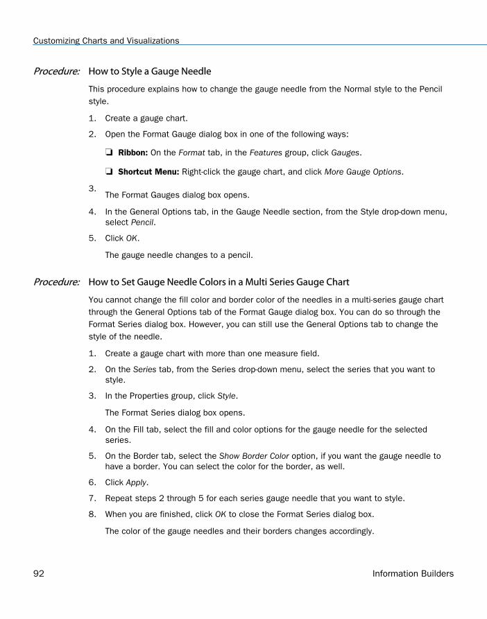
Procedure: How to Style a Gauge Needle
This procedure explains how to change the gauge needle from the Normal style to the Pencilstyle.
1. Create a gauge chart.
2. Open the Format Gauge dialog box in one of the following ways:
Ribbon: On the Format tab, in the Features group, click Gauges.
Shortcut Menu: Right-click the gauge chart, and click More Gauge Options.
3.The Format Gauges dialog box opens.
4. In the General Options tab, in the Gauge Needle section, from the Style drop-down menu,select Pencil.
5. Click OK.
The gauge needle changes to a pencil.
Procedure: How to Set Gauge Needle Colors in a Multi Series Gauge Chart
You cannot change the fill color and border color of the needles in a multi-series gauge chartthrough the General Options tab of the Format Gauge dialog box. You can do so through theFormat Series dialog box. However, you can still use the General Options tab to change thestyle of the needle.
1. Create a gauge chart with more than one measure field.
2. On the Series tab, from the Series drop-down menu, select the series that you want tostyle.
3. In the Properties group, click Style.
The Format Series dialog box opens.
4. On the Fill tab, select the fill and color options for the gauge needle for the selectedseries.
5. On the Border tab, select the Show Border Color option, if you want the gauge needle tohave a border. You can select the color for the border, as well.
6. Click Apply.
7. Repeat steps 2 through 5 for each series gauge needle that you want to style.
8. When you are finished, click OK to close the Format Series dialog box.
The color of the gauge needles and their borders changes accordingly.
Customizing Charts and Visualizations
92 Information Builders
Formatting Page Headings and Page Footings
Page headings and page footings supply context and key information about a chart, such as itspurpose, audience, and author. Page headings and page footings also enhance visual appeal.
Procedure: How to Add a Page Heading and Page Footing to a Chart
The procedure uses sample values, but you can supply values that apply to your own charts.
This feature is available in Query Design view, Live Preview, and Document view.
1. Create a chart or visualization.
2. On the Home tab, in the Report group, click Header & Footer.
The Header & Footer dialog box opens.
Tip: Another way to access the Heading & Footing dialog box is to click the arrow next tothe Header & Footer button. Doing so opens a drop-down menu from which you can selectthe heading or footing that you want to work with. After you make your selection, theHeader & Footer dialog box opens, and the heading or footing that you selected is active.
3. Click the tab for the page heading or page footing, depending on which you want to add.
By default, the Page Heading tab is selected. In this procedure, accept the default to adda page heading first.
4. Click inside the design area of the dialog box, and type the text for the page heading.
For example, the text for a sample page heading might be Customers By Occupation.
5. Using the styling options, apply styling to the page heading text.
For example, 14 pt. bold Helvetica with center alignment.
6. Click Apply to save the changes that you have made, without closing the dialog box.
7. To add a page footing, click the Page Footer tab.
For this procedure, you are going to add one of the supplied quick text options, followed bysome text of your own.
8. Click the down arrow next to the preformatted text button, and click Created by from thedrop-down list.
9. Complete the text by typing the applicable value within the supplied text, for example,Sales Manager.
10. Change the styling as you want.
11. Click OK to save the page heading and page footing and close the Header & Footer dialogbox.
The chart contains the page heading and page footing that you added and styled.
1. Customizing Content
Customizing Content 93
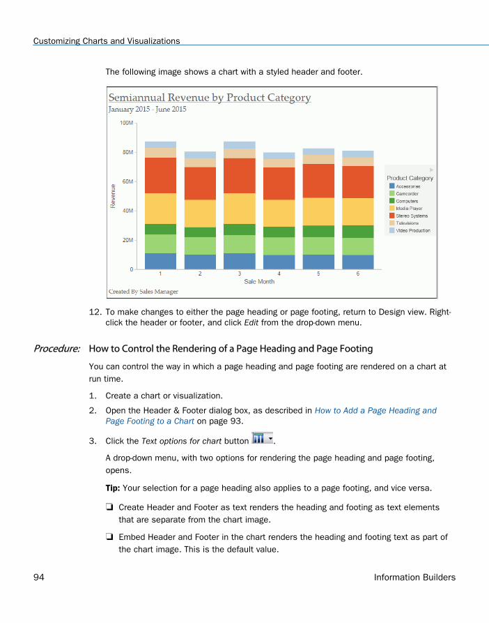
The following image shows a chart with a styled header and footer.
12. To make changes to either the page heading or page footing, return to Design view. Right-click the header or footer, and click Edit from the drop-down menu.
Procedure: How to Control the Rendering of a Page Heading and Page Footing
You can control the way in which a page heading and page footing are rendered on a chart atrun time.
1. Create a chart or visualization.
2. Open the Header & Footer dialog box, as described in How to Add a Page Heading andPage Footing to a Chart on page 93.
3. Click the Text options for chart button .
A drop-down menu, with two options for rendering the page heading and page footing,opens.
Tip: Your selection for a page heading also applies to a page footing, and vice versa.
Create Header and Footer as text renders the heading and footing as text elementsthat are separate from the chart image.
Embed Header and Footer in the chart renders the heading and footing text as part ofthe chart image. This is the default value.
Customizing Charts and Visualizations
94 Information Builders
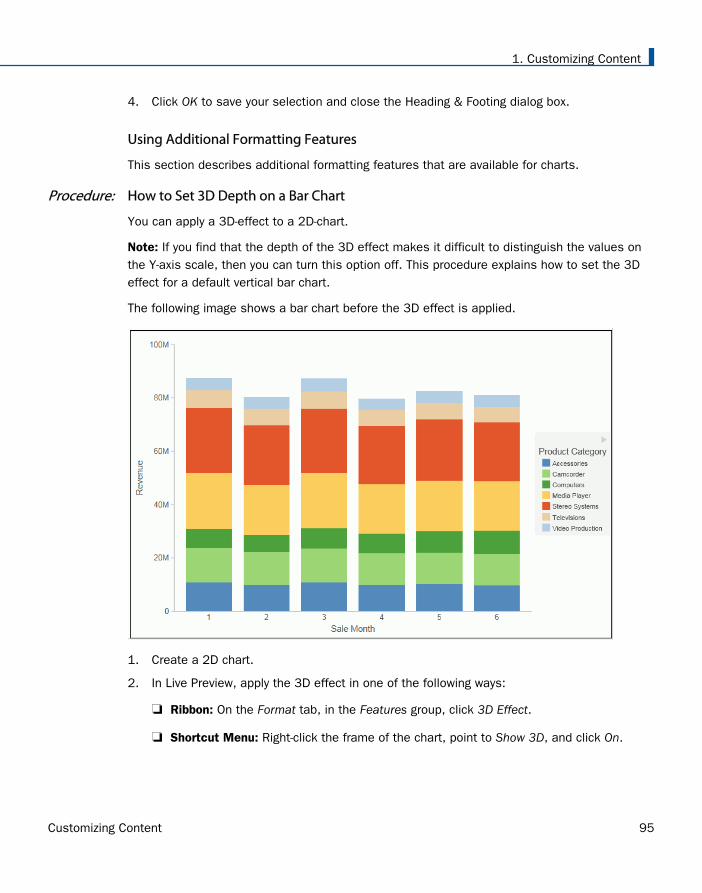
4. Click OK to save your selection and close the Heading & Footing dialog box.
Using Additional Formatting Features
This section describes additional formatting features that are available for charts.
Procedure: How to Set 3D Depth on a Bar Chart
You can apply a 3D-effect to a 2D-chart.
Note: If you find that the depth of the 3D effect makes it difficult to distinguish the values onthe Y-axis scale, then you can turn this option off. This procedure explains how to set the 3Deffect for a default vertical bar chart.
The following image shows a bar chart before the 3D effect is applied.
1. Create a 2D chart.
2. In Live Preview, apply the 3D effect in one of the following ways:
Ribbon: On the Format tab, in the Features group, click 3D Effect.
Shortcut Menu: Right-click the frame of the chart, point to Show 3D, and click On.
1. Customizing Content
Customizing Content 95
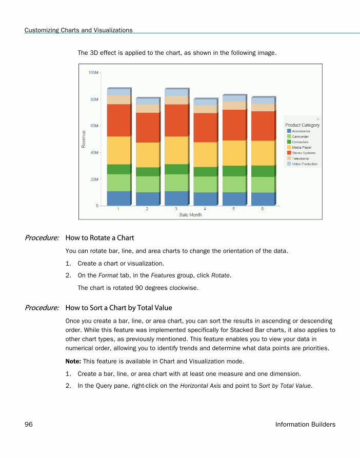
The 3D effect is applied to the chart, as shown in the following image.
Procedure: How to Rotate a Chart
You can rotate bar, line, and area charts to change the orientation of the data.
1. Create a chart or visualization.
2. On the Format tab, in the Features group, click Rotate.
The chart is rotated 90 degrees clockwise.
Procedure: How to Sort a Chart by Total Value
Once you create a bar, line, or area chart, you can sort the results in ascending or descendingorder. While this feature was implemented specifically for Stacked Bar charts, it also applies toother chart types, as previously mentioned. This feature enables you to view your data innumerical order, allowing you to identify trends and determine what data points are priorities.
Note: This feature is available in Chart and Visualization mode.
1. Create a bar, line, or area chart with at least one measure and one dimension.
2. In the Query pane, right-click on the Horizontal Axis and point to Sort by Total Value.
Customizing Charts and Visualizations
96 Information Builders
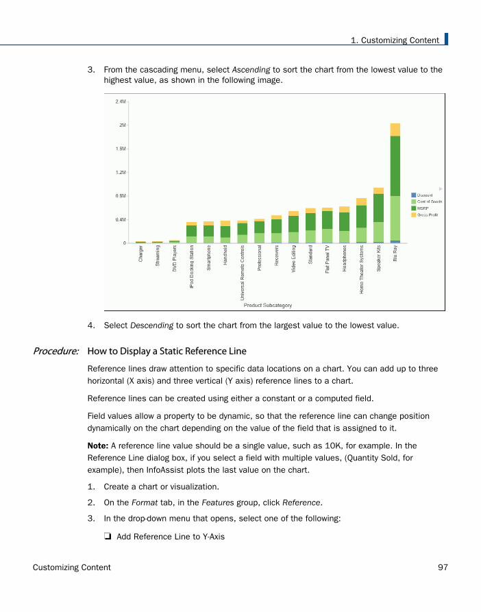
3. From the cascading menu, select Ascending to sort the chart from the lowest value to thehighest value, as shown in the following image.
4. Select Descending to sort the chart from the largest value to the lowest value.
Procedure: How to Display a Static Reference Line
Reference lines draw attention to specific data locations on a chart. You can add up to threehorizontal (X axis) and three vertical (Y axis) reference lines to a chart.
Reference lines can be created using either a constant or a computed field.
Field values allow a property to be dynamic, so that the reference line can change positiondynamically on the chart depending on the value of the field that is assigned to it.
Note: A reference line value should be a single value, such as 10K, for example. In theReference Line dialog box, if you select a field with multiple values, (Quantity Sold, forexample), then InfoAssist plots the last value on the chart.
1. Create a chart or visualization.
2. On the Format tab, in the Features group, click Reference.
3. In the drop-down menu that opens, select one of the following:
Add Reference Line to Y-Axis
1. Customizing Content
Customizing Content 97
Add Reference Line to X-Axis
The Reference Line dialog box opens.
4. Create the reference line with a static value that you set.
a. Select the Value option.
b. In the Value text field, type the value that you want to distinguish with the referenceline.
5. In the Text field, type the text for the reference line.
6. In the Position drop-down menu, select the position for the reference line on the chart. Forexample, Above Center.
7. Click the Style button to set the style for the reference line. For example, Solid.
8. Click the Color button to open the Color dialog box, where you can select a color for thereference line and the text.
9. Click the Weight button to select the weight of the reference line. For example, 1px - Light.
10. Click OK to save the options that you have selected, and close the Reference Line dialogbox.
The reference line is added to the chart.
Procedure: How to Display a Dynamic Reference Line
Reference lines can be created using either a constant or a computed field.
Field values allows a property to be dynamic, so that the reference line can change positiondynamically on the chart depending on the value of the field that is assigned to it.
Note: A reference line value should be a single value, such as 10K, for example. In theReference Line dialog box, if you select a field with multiple values, (Quantity Sold, forexample), then InfoAssist plots the last value on the chart.
The following procedure provides an example of how to create a dynamic reference line, wherethe value changes based on the date. In this example, you can track the number of estimateddelivery days per shipping company, where the number of days estimated for delivery arebased on whether or not the sale date is a holiday. This example uses the wf_retail_litesample data.
1. Create a COMPUTE field to calculate the Reference Line.
a. On the Data tab, in the Calculation group, click Summary (Compute).
The Summary Field (COMPUTE) dialog box opens.
b. In the Field text box, enter Reference.
Customizing Charts and Visualizations
98 Information Builders
c. Set the format to D12.2.
d. Enter IF WF_RETAIL_LITE.WF_RETAIL_TIME_SALES.TIME_HOL EQ 'Y' THEN 5 ELSE 2into the expression.
e. Click OK to close the dialog box.
2. Hide the Reference field from the chart.
3. Add a dynamic reference line.
a. On the Format tab, in the Features group, click Reference.
b. From the drop-down menu, select Add Reference Line to Y-Axis.
The Reference Line dialog box opens.
c. Select the Field option.
d. From the Field drop-down menu, select Reference.
e. In the Text field, enter Acceptable.
f. From the Weight drop-down menu, select 2px - Medium.
g. From the Position drop-down menu, select Above Left.
h. Optionally, you can change the color and style of the Reference line.
i. Click OK to close the Reference Line dialog box.
4. Run the chart.
Auto Prompt appears.
a. Select 20100101 (January 1, 2010) and click Run to see that five days areacceptable since the date is a holiday.
b. Select 20100202 (January 2, 2010) and click Run again to see that two days areacceptable since the date is not a holiday.
5. Click Save.
Procedure: How to Display Annotations
Annotations are explanatory notes or comments. You can add up to eight annotations on achart.
1. Create a chart or visualization.
2. On the Format tab, in the Features group, click Annotate.
3. In the drop-down menu that opens, click Add an annotation.
The Annotation dialog box opens.
1. Customizing Content
Customizing Content 99
4. In the text input field, type the text for the annotation.
5. In the Position drop-down menu, select the position for the annotation on the chart. Forexample, Top Left.
6. Click OK to save the options that you selected, and close the Annotation dialog box.
The annotation is added to the chart.
7. Click Run to generate the report.
Collation in Charts
Charts that have the new attribute syntax respect collation, which provides alphabeticalsorting. Collation is also used in other areas, such as filtering.
Collation is set to CODEPAGE by the WebFOCUS Business User Edition installation, by default.This can be changed in the Custom Settings section of the Administration Console. For moreinformation, see Configure Collation Sequence Settings.
Creating Thumbnails for Use With the Home Page
In InfoAssist, you can create and store thumbnail images for use in the Home page. Thumbnailimages allow you to see a snapshot of a report or chart without opening the file. In InfoAssist,you can create a thumbnail image by clicking on the Create Thumbnail icon, which is locatedon the Quick Access toolbar.
Creating Thumbnails for Use With the Home Page
100 Information Builders
You can create thumbnail images when working in Report and Chart mode in InfoAssist. Theseimages are smaller renditions (220x160px) of your actual report or chart as it displays in LivePreview. Once you create the thumbnail and save the report or chart, you can access thethumbnail image from the file list on the Home page, as shown in the following image.
Note: Thumbnail images are stored as part of the procedure when it is saved in the repository.
Procedure: How to Create a Thumbnail Image of a Report or Chart
1. Open InfoAssist in Report or Chart mode.
2. Create a report or chart.
3. On the Quick Access Toolbar, click Create Thumbnail, as shown outlined in blue in thefollowing image.
1. Customizing Content
Customizing Content 101
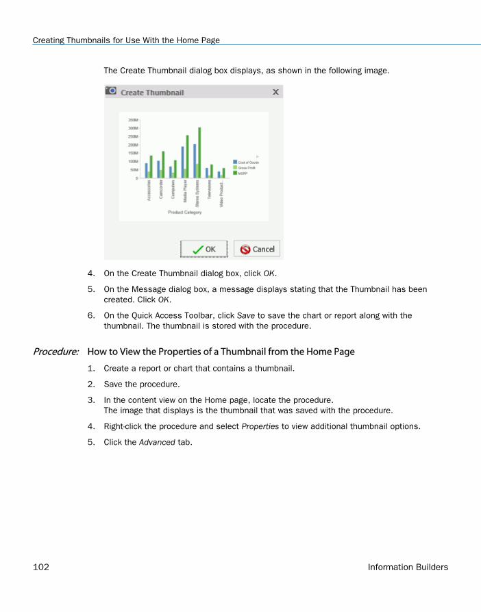
The Create Thumbnail dialog box displays, as shown in the following image.
4. On the Create Thumbnail dialog box, click OK.
5. On the Message dialog box, a message displays stating that the Thumbnail has beencreated. Click OK.
6. On the Quick Access Toolbar, click Save to save the chart or report along with thethumbnail. The thumbnail is stored with the procedure.
Procedure: How to View the Properties of a Thumbnail from the Home Page
1. Create a report or chart that contains a thumbnail.
2. Save the procedure.
3. In the content view on the Home page, locate the procedure.The image that displays is the thumbnail that was saved with the procedure.
4. Right-click the procedure and select Properties to view additional thumbnail options.
5. Click the Advanced tab.
Creating Thumbnails for Use With the Home Page
102 Information Builders
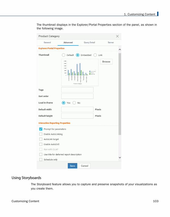
The thumbnail displays in the Explorer/Portal Properties section of the panel, as shown inthe following image.
Using Storyboards
The Storyboard feature allows you to capture and preserve snapshots of your visualizations asyou create them.
1. Customizing Content
Customizing Content 103
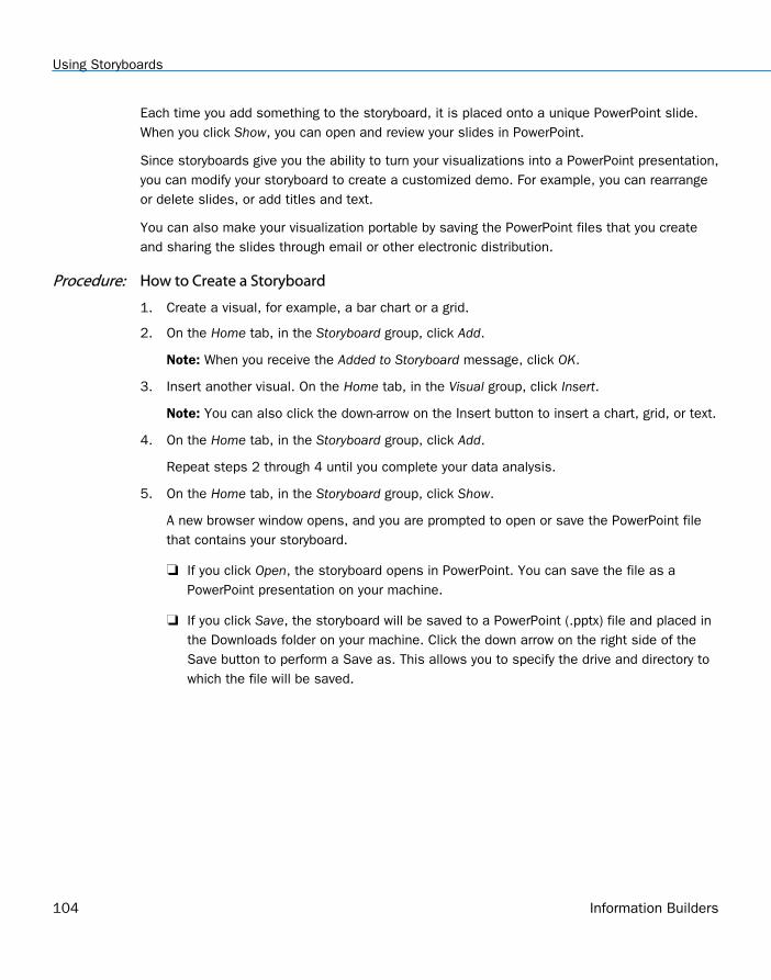
Each time you add something to the storyboard, it is placed onto a unique PowerPoint slide.When you click Show, you can open and review your slides in PowerPoint.
Since storyboards give you the ability to turn your visualizations into a PowerPoint presentation,you can modify your storyboard to create a customized demo. For example, you can rearrangeor delete slides, or add titles and text.
You can also make your visualization portable by saving the PowerPoint files that you createand sharing the slides through email or other electronic distribution.
Procedure: How to Create a Storyboard
1. Create a visual, for example, a bar chart or a grid.
2. On the Home tab, in the Storyboard group, click Add.
Note: When you receive the Added to Storyboard message, click OK.
3. Insert another visual. On the Home tab, in the Visual group, click Insert.
Note: You can also click the down-arrow on the Insert button to insert a chart, grid, or text.
4. On the Home tab, in the Storyboard group, click Add.
Repeat steps 2 through 4 until you complete your data analysis.
5. On the Home tab, in the Storyboard group, click Show.
A new browser window opens, and you are prompted to open or save the PowerPoint filethat contains your storyboard.
If you click Open, the storyboard opens in PowerPoint. You can save the file as aPowerPoint presentation on your machine.
If you click Save, the storyboard will be saved to a PowerPoint (.pptx) file and placed inthe Downloads folder on your machine. Click the down arrow on the right side of theSave button to perform a Save as. This allows you to specify the drive and directory towhich the file will be saved.
Using Storyboards
104 Information Builders
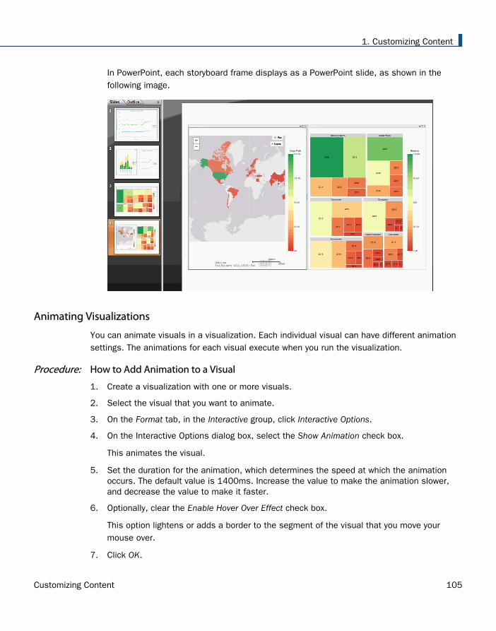
In PowerPoint, each storyboard frame displays as a PowerPoint slide, as shown in thefollowing image.
Animating Visualizations
You can animate visuals in a visualization. Each individual visual can have different animationsettings. The animations for each visual execute when you run the visualization.
Procedure: How to Add Animation to a Visual
1. Create a visualization with one or more visuals.
2. Select the visual that you want to animate.
3. On the Format tab, in the Interactive group, click Interactive Options.
4. On the Interactive Options dialog box, select the Show Animation check box.
This animates the visual.
5. Set the duration for the animation, which determines the speed at which the animationoccurs. The default value is 1400ms. Increase the value to make the animation slower,and decrease the value to make it faster.
6. Optionally, clear the Enable Hover Over Effect check box.
This option lightens or adds a border to the segment of the visual that you move yourmouse over.
7. Click OK.
1. Customizing Content
Customizing Content 105
8. Click Run.
Your visual animates automatically based on the options that you specified.
Using Filters to Customize the Display of Data
Filters enable you to customize the display of data in your report, chart, document, orvisualization. This gives you the advantage of viewing only the data that you want to see anduse.
When creating a report, you refer to fields in several parts of the request. For example, indisplay commands (PRINT, SUM), in sort phrases (BY, ACROSS), and in selection criteria(WHERE, WHERE TOTAL, IF).
Note: When using ESSBASE hierarchical data sources, creating a filter on a sort field is notsupported.
The WHERE phrase selects records from the data source to be included in a report. The data isevaluated according to the selection criteria before it is retrieved from the data source. Youcan use as many WHERE phrases as necessary to define your selection criteria.
In WHERE TOTAL tests, however, data is selected after all the data has been retrieved andprocessed.
You can group conditions and expressions within filter criteria. In addition, you can applyfunctions and calculations within criteria. For more information on filtering options, see FieldTab.
You can create Where and Where Total filters in the Filter dialog box by clicking WHERE.
Double-clicking the Double-click or press F2 to edit! text opens drop-down menus for Fields andSubqueries, Operators, and Values.
You can retrieve fields and values from the Master File and data source and Subqueries from aHOLD file.
The Field drop-down menu provides a field list from the Master File. The Field list can beviewed as follows:
In business order (default)
In a sortable grid
Using Filters to Customize the Display of Data
106 Information Builders
In a hierarchical structure of the data
If you select Subquery, then the Operator drop-down menu is replaced by a menu with theoptions of In list and Not in list.
In list. Activates a drop-down menu in the right-most part of the expression. The drop-down menu contains a list of all subqueries that you have created from the Master filein use, and an EXISTING option.
Click EXISTING to open the Open dialog box, where you can select a subquery from adifferent Master file.
Not in list. Opens the Open dialog box, where you can select a subquery from adifferent Master file.
The Operator (default) drop-down menu provides various operators for your filter. For example,Equal to.
The Value drop-down menu opens a dialog box with multiple options.
Note: If you are creating a filter on a full date field, the Value field will have a calendar iconadjacent to it. You can use this icon to select a date using a calendar control.
The Type drop-down menu contains the following options:
Constant. Enables the entry of a literal value. This value can be a positive number, anegative number, or any character string.
Parameter. Enables you to specify a parameter by entering a name and description in theprovided text input areas, as well as selecting the type of parameter (Simple, Static,Dynamic, or Optional).
Field. Enables the specification of a field name to compare against.
The value area generally contains a text input box that you can use to manually insert values.However, if you are working with a date field, the Value field is set to Today. You can optionallyselect Beginning of Month, End of Month, Beginning of Quarter, End of Quarter, Beginning ofYear, End of Year, or you can specify a Custom date using the calendar that displays when youmake that selection.
Note: The default date of Today applies to Report, Chart, and Document modes only.
The value area also contains a Get Values drop-down menu, which supplies the followingoptions:
All. Retrieves all the values from the selected field.
1. Customizing Content
Customizing Content 107
First. Retrieves the first value from the selected field.
Last. Retrieves the last value from the selected field.
Minimum. Retrieves the minimum value from the selected field.
Maximum. Retrieves the maximum value from the selected field.
From File. Retrieves a value that you specify. Selecting this option opens the Select FromFile dialog box, where you can browse to a local file and specify a file format, such as a flatfile (CSV) or an Excel spreadsheet (XLS or XLSX).
Note: The Get Values drop-down menu is only accessible if you have already selected a field.
After selecting the values that you want, you can move them into and out of the MultipleValues area with the left and right arrows. You can also change the value order and deletevalues with the up and down arrows and the Delete icon.
After creating a condition, you can insert additional conditions before and after the selectedcondition by using the Insert Before and Insert After buttons at the top of the Filter dialog box.You can use either the And or the Or conjunction to link conditions and the Group and Ungroupbuttons to nest and organize conditions.
You can create additional filters by clicking the New Filter button at the top of the Filter dialogbox.
After creating the filters that you want, click OK to save and apply the filters. You can accessthem from the Filter pane of the Resources panel.
Note: Dates shown in the live preview reflect the format specified in the data source. However,when Filters are applied to a date formatted field, the format of dates shown in the Filterinterface is derived from the locale. When the report, chart or visualization is executed, theoutput as well as any prompt will reflect the format specified in the data source.
Including or Excluding a Filter
Once you have created a filter, you can make decisions about when and where you want toinclude it in your report. For example, you might want to include one filter and exclude another.Using the Include and Exclude options in the Filter group on the Home or Field tabs, you canset filters accordingly.
You can use the following information to make decisions about your filters:
Exclude. Removes, but does not delete, the filter from the report.
Include. Restores a filter that was previously excluded from a report.
Using Filters to Customize the Display of Data
108 Information Builders
Sorting the Values in an Autoprompt Parameter
Using the prompt functionality, you can create an auto prompting parameter that displayssorted values at run time. This feature is located in the Filter Group on the Field tab.
To create an auto prompting parameter:
1. Select a field for which you want to create a parameter in your report.
2. On the Field tab, in the Filter group, click Prompt.
The Create a filtering condition dialog box displays.
3. Double-click the Value field.
Note: Parameter is selected, by default, when you are defining a prompt.
The following options display, from which you can make a selection:
Simple. This is used for prompts using Text Input. This is the default value.
Static. This is used for prompts using Selection. This option allows you to selectmultiple values at run time.
Dynamic. This is used for prompts using Data Values. This option allows you to selectmultiple values at run time.
Optional. This is used for prompts using Single or Multiselect parameters.
Sort Prompt Values. This is used to determine how the values are sorted. Ascending isthe default.
4. Click OK, and click OK again to close the Create a filtering dialog box.
When you run your report, you will be prompted for information based on the parametersyou created.
Using Auto Drill
Auto Drill enables you to navigate through different levels within the dimension hierarchy ofyour data source. This allows you to review underlying data for a particular area, and movethrough the structure of your data source based on your informational needs.
In order to use Auto Drill, you must enable it by clicking the Auto Drill button on the Format tab,in the Run with group.
Once you have enabled Auto Drill, you can develop your report or chart and run it to activatethe hyperlinks that Auto Drill creates. This enables you to navigate up or down through therelated hierarchy of your data source by clicking the links that display.
1. Customizing Content
Customizing Content 109
When you click a hyperlink, the option to drill up or drill down displays, depending on where youare in the hierarchy of your data. You can then select one of these options to begin navigatingyour data. For example, if you have Product Category in your hierarchy, you would be able todrill down to Product Subcategory. When you drill down, you can subsequently drill back up tothe originating dimension sort field. If you have selected a data source that has multiple levelsand your report or chart uses a component in the middle of the hierarchy, both the Drill up andDrill down options will display. Once you have started navigating your data using the Drill upand Drill down options, the Restore Original option displays, enabling you to start your dataanalysis over by re-executing the original Auto Drill request.
At run-time, the Auto Drill functionality displays a breadcrumb header. This defines your currentlocation in the hierarchy of your data source and enables you to navigate back and forthbetween different levels in your data.
Important:
The Auto Drill functionality is only available for data sources that have a dimensionhierarchy.
If you have Auto Drill enabled and you attempt to run your report or chart in deferred mode,the hyperlinks will not display. This is also true for Auto Drill enabled reports that aredistributed through ReportCaster.
With the exception of Visualization mode, Auto Drill is available at run-time, but not in LivePreview.
Auto Drill is supported for HTML and active report output format reports.
Auto Drill is automatically enabled in Visualization mode for data sources that have adimension hierarchy.
Auto Drill functionality is not available in reports distributed by ReportCaster, because AutoDrill uses live data, in an interactive session, for data drilling. Data values and totals maynot be the same if the data has changed since the last distribution. Mixing past data withcurrent data could impact data analysis.
Auto Drill is not supported for HTML5 output format charts that do not support the newchart attributes syntax.
Auto Drill is not supported on Across fields in active reports.
You must use dimension fields as a sorting field, either BY or ACROSS.
Using Auto Drill
110 Information Builders
Procedure: How to Use Auto Drill to Navigate the Hierarchy of Your Data Source
1. Select a data source that has a dimension hierarchy. For example, wf_retail_lite.mas.
2. Create a report or chart with one or more hierarchical fields (for example,Product,Category).
3. On the Format tab, in the Run with group, click Auto Drill.
4. Click Run.
The report or chart displays.
5. For reports, click a hyperlinked field within your report. For charts, hover over a chartaspect (for example, a bar).
A menu appears.
6. Select a hierarchical value to which to drill down.
Once you have drilled down on a field, you can subsequently drill up.
7. To return to the default state of the report or chart, click a hyperlink or hover over a chartaspect, and then click Restore Original.
Using the Auto Linking Feature to Link Content
Auto Linking makes it easy to connect reports and charts in your development environment,expanding the reporting capabilities of your organization. Using Auto Linking, you candynamically link HTML reports, active reports, and HTML5 charts with a single report or chart ofany format, based on their common sort (BY) fields and parameters referenced in any filters. Itis this commonality that dynamically links content in your WebFOCUS repository, allowing youto discover new possibilities in your data, and explore new relationships within your reportingenterprise. In addition, Auto Linking saves development time and effort, because drilldowns donot need to be manually created and maintained.
To use Auto Linking, you must use the Enable Auto Linking option in InfoAssist to set thereports or charts that can be auto-linked. In addition, you must also set reports or charts to beAuto Link targets. The options to enable and disable Auto Linking and Auto Link Targetfunctionality are available on the Format tab, in the Auto Linking group, in InfoAssist.
Note:
The Auto Link Enabled option is activated only when the HTML, HTML5, and active reportoutput format is selected.
You can open an existing report or chart and enable Auto Linking or set the item as an AutoLink target.
1. Customizing Content
Customizing Content 111
When Auto Link functionality is activated, your reports or charts display a link for each sort (BY)field with qualifying target reports or charts at run time. In Auto Link enabled reports, you mustadd sort (BY) fields in the BY field container. In Auto Link enabled charts, you can add sort (BY)fields to the Horizontal Axis, Vertical Axis, or Color field containers.
To qualify a report or chart as an Auto Link target, you must include filters that contain theparameters that you selected as the sort field or fields in the enabled report or chart. Theparameter names defined in these filters must be the same as the sort (BY) field names in theAuto Link enabled report. When you select a report or chart as the Auto Link Target, it specifiesthat the parameter information should be catalogued, and will be evaluated when an Auto Linkenabled report or chart is run.
For an Auto Link enabled report at run time, the qualifying target reports and charts are thosethat have filters with parameters for the selected sort field and the sort fields that precede it,which appear to the left. For an Auto Link enabled chart at run time, the target reports andcharts are those that have filters with parameters for all sort fields. For run time for bothreports and charts, the linked sort field values in the Auto Link enabled report or chart arepassed to the Auto Link target report so that it can be filtered by the sort (BY) field values.
For example, you may have an Auto Link enabled report that contains sort (BY) fields ProductCategory and Model, with a measure (Sum) field, Revenue. To qualify as an Auto Link target,other reports or charts in your repository can contain a single filter with a parameter forProduct Category, or two filters with parameters for both Product Category and Model. Whenyou run the Auto Link enabled report, the Product Category field will link to target reports orcharts that have a filter with a parameter for Product Category and the Model field will link totarget reports or charts that have filters for both Product Category and Model.
If you use the same example for an Auto Link enabled chart instead of a report, you canaccess the target reports or charts from a tooltip option that displays when you point yourmouse over an area of the chart, such as a bar that represents Revenue by Product Categoryand by Model.
Using the Auto Linking Feature to Link Content
112 Information Builders
Using Optional Parameters with Auto Linking to Enhance Drilldown Results
In addition to the basic Auto Linking functionality that is available in InfoAssist, you can alsoadd optional parameters to your Auto Link reports and charts, extending the capability of thisfeature. An Auto Link Enabled report can link to any target content that you are authorized toaccess that satisfies the sort (BY) field to the Auto Link Target report filter parameterrequirement. Auto Link Target reports that satisfy this requirement and also have optional filterparameters for other fields are included in the Auto Link target report evaluation, so that allpossible combinations of run-time parameters are evaluated and available as links as you runthe request. This may produce additional reports or charts in your list of available Auto Linktargets, offering you access to an expanded network of related content.
Setting a parameter to optional is not required because the Auto Link Enabled report will passthe value for the fields being filtered to the Auto Link Target report. When a sort (BY) field valuein an Auto Link Enabled report is selected, that value and the value of its parent sort fields arepassed to the Auto Link Target. When a measure value in a chart is selected, all sort (BY) fieldvalues for that measure are passed to the Auto Link Target. If you select the Optional option,the Auto Link Target report can run on its own (from the Resources Tree or within InfoAssist)without being prompted by Autoprompt for a value for the parameter. This is because optionalparameters are assigned a default value.
With Auto Linking, you can link as many reports and charts as you want, and Auto Link Enabledreports can also be an Auto Link Target which contributes to the development of a cascadinglinkage of reports. For more information, see Using Filters to Customize the Display of Data.
Note:
The linked reports displayed are limited to those that you are authorized to run or rundeferred.
If you are drilling down through a list of Auto Link target reports, a previously selected AutoLink target report will be excluded so that the available Auto Link targets are reports thatthe user has not yet viewed.
When running an HTML report with On-demand Paging enabled, the qualifying Auto Linktargets appear on the menu in the order that they are specified in the request. This is alsotrue for a chart request that is a legacy graph format (PFJ-based formats, such as PNG andnon-bucket HTML5). In reports, horizontal lines appear in the menu to separate userspecified drilldowns and Auto Link navigation options.
Consideration should be given to how many reports or charts are indicated as Auto Linktargets, as the run time Multi-drill menu for the qualifying target reports may become long inlength. In these cases, some browsers may display a script processing warning message.
1. Customizing Content
Customizing Content 113
The Auto Link Enabled and an Auto Link Target options can be set individually or both canbe set on the same report or chart if that item meets the Auto Linking requirements.
When creating a request from a HOLD file, you can enable Auto Linking.
Procedure: How to Set an Existing Report or Chart as Auto Link Enabled
1. On the Home page, right-click a report or chart and click Edit.
InfoAssist opens in the relevant mode.
2. Verify that there is a sort (BY) field in the report or chart.
For reports, sort fields are added to the BY field container.
For charts, sort fields are added to the Horizontal, Vertical, or Color field containers.
3. On the Format tab, in the Auto Linking group, click Enable Auto Linking.
4. Save the report or chart.
Your existing report or chart is now Auto Link enabled.
Procedure: How to Set an Existing Report or Chart as an Auto Link Target
1. On the Home page, right-click a report or chart and click Edit.
InfoAssist opens in the relevant mode.
2. On the Format tab, in the Auto Linking group, click Auto Link Target.
Note: Selecting Auto Link Target specifies that the parameter information for this report orchart will be stored, adding it to the repository of reports and charts that will be evaluatedwhen an Auto Link enabled report is run.
3. Add a filter with a simple or optional parameter to the target report or chart. Qualifyingtarget reports are those that have filters with parameters for the sort (BY) fields in AutoLink enabled reports or charts.
a. From the Data pane, drag a sort (BY) field into the Filter pane.
Using the Auto Linking Feature to Link Content
114 Information Builders
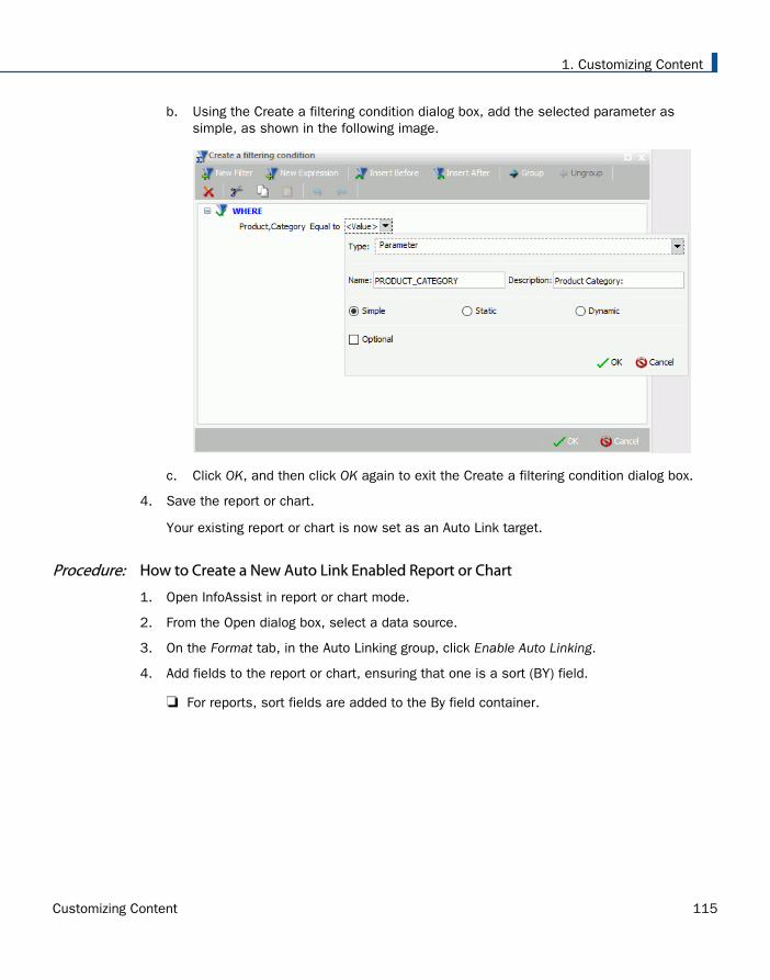
b. Using the Create a filtering condition dialog box, add the selected parameter assimple, as shown in the following image.
c. Click OK, and then click OK again to exit the Create a filtering condition dialog box.
4. Save the report or chart.
Your existing report or chart is now set as an Auto Link target.
Procedure: How to Create a New Auto Link Enabled Report or Chart
1. Open InfoAssist in report or chart mode.
2. From the Open dialog box, select a data source.
3. On the Format tab, in the Auto Linking group, click Enable Auto Linking.
4. Add fields to the report or chart, ensuring that one is a sort (BY) field.
For reports, sort fields are added to the By field container.
1. Customizing Content
Customizing Content 115
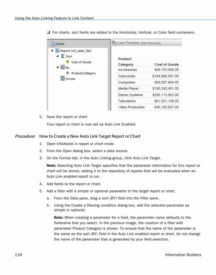
For charts, sort fields are added to the Horizontal, Vertical, or Color field containers.
5. Save the report or chart.
Your report or chart is now set as Auto Link Enabled.
Procedure: How to Create a New Auto Link Target Report or Chart
1. Open InfoAssist in report or chart mode.
2. From the Open dialog box, select a data source.
3. On the Format tab, in the Auto Linking group, click Auto Link Target.
Note: Selecting Auto Link Target specifies that the parameter information for this report orchart will be stored, adding it to the repository of reports that will be evaluated when anAuto Link enabled report is run.
4. Add fields to the report or chart.
5. Add a filter with a simple or optional parameter to the target report or chart.
a. From the Data pane, drag a sort (BY) field into the Filter pane.
b. Using the Create a filtering condition dialog box, add the selected parameter assimple or optional.
Note: When creating a parameter for a field, the parameter name defaults to thefieldname that you select. In the previous image, the creation of a filter withparameter Product Category is shown. To ensure that the name of the parameter isthe same as the sort (BY) field in the Auto Link enabled report or chart, do not changethe name of the parameter that is generated by your field selection.
Using the Auto Linking Feature to Link Content
116 Information Builders
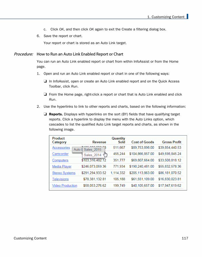
c. Click OK, and then click OK again to exit the Create a filtering dialog box.
6. Save the report or chart.
Your report or chart is stored as an Auto Link target.
Procedure: How to Run an Auto Link Enabled Report or Chart
You can run an Auto Link enabled report or chart from within InfoAssist or from the Homepage.
1. Open and run an Auto Link enabled report or chart in one of the following ways:
In InfoAssist, open or create an Auto Link enabled report and on the Quick AccessToolbar, click Run.
From the Home page, right-click a report or chart that is Auto Link enabled and clickRun.
2. Use the hyperlinks to link to other reports and charts, based on the following information:
Reports. Displays with hyperlinks on the sort (BY) fields that have qualifying targetreports. Click a hyperlink to display the menu with the Auto Links option, whichcascades to list the qualified Auto Link target reports and charts, as shown in thefollowing image.
1. Customizing Content
Customizing Content 117
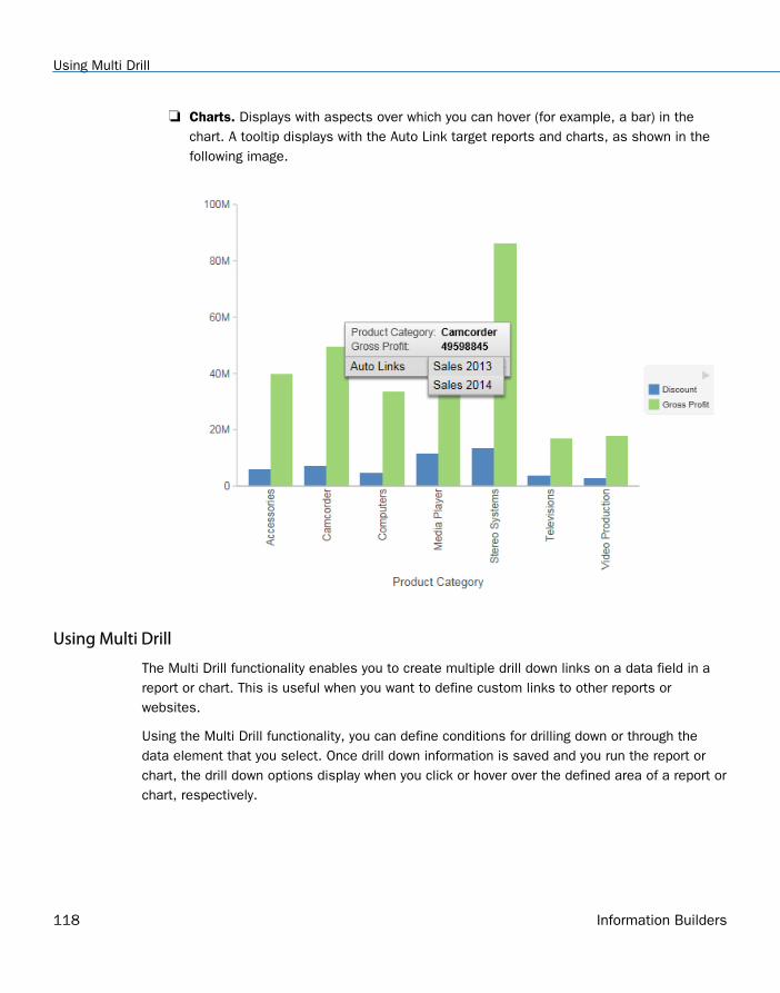
Charts. Displays with aspects over which you can hover (for example, a bar) in thechart. A tooltip displays with the Auto Link target reports and charts, as shown in thefollowing image.
Using Multi Drill
The Multi Drill functionality enables you to create multiple drill down links on a data field in areport or chart. This is useful when you want to define custom links to other reports orwebsites.
Using the Multi Drill functionality, you can define conditions for drilling down or through thedata element that you select. Once drill down information is saved and you run the report orchart, the drill down options display when you click or hover over the defined area of a report orchart, respectively.
Using Multi Drill
118 Information Builders
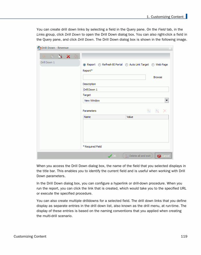
You can create drill down links by selecting a field in the Query pane. On the Field tab, in theLinks group, click Drill Down to open the Drill Down dialog box. You can also right-click a field inthe Query pane, and click Drill Down. The Drill Down dialog box is shown in the following image.
When you access the Drill Down dialog box, the name of the field that you selected displays inthe title bar. This enables you to identify the current field and is useful when working with DrillDown parameters.
In the Drill Down dialog box, you can configure a hyperlink or drill-down procedure. When yourun the report, you can click the link that is created, which would take you to the specified URLor execute the specified procedure.
You can also create multiple drilldowns for a selected field. The drill down links that you definedisplay as separate entries in the drill down list, also known as the drill menu, at run-time. Thedisplay of these entries is based on the naming conventions that you applied when creatingthe multi-drill scenario.
1. Customizing Content
Customizing Content 119
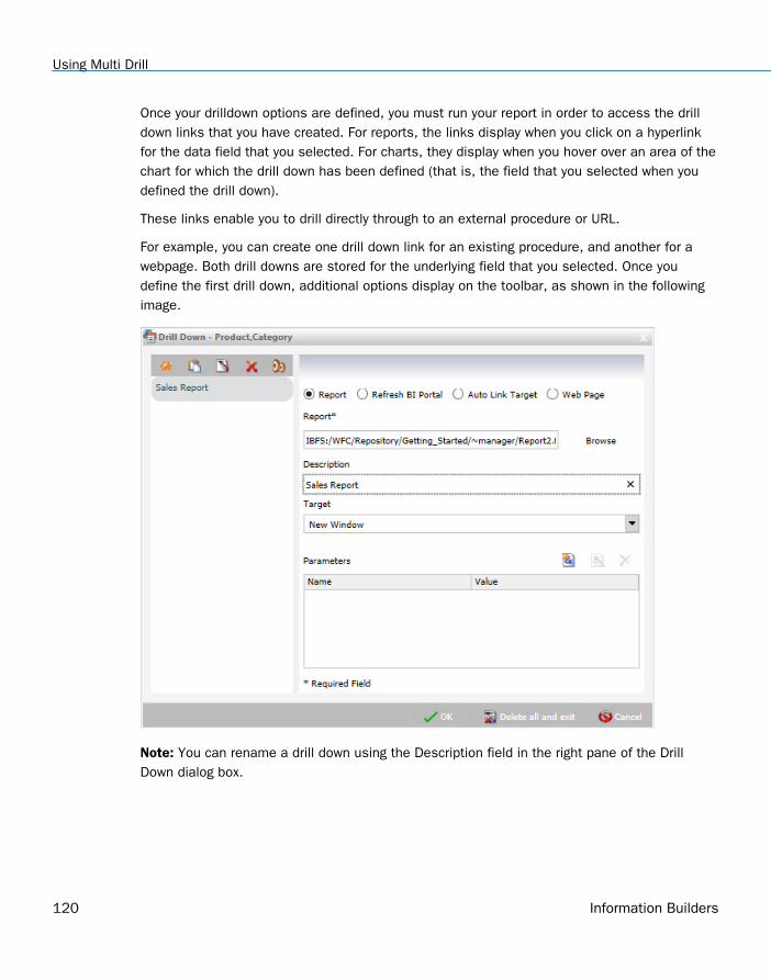
Once your drilldown options are defined, you must run your report in order to access the drilldown links that you have created. For reports, the links display when you click on a hyperlinkfor the data field that you selected. For charts, they display when you hover over an area of thechart for which the drill down has been defined (that is, the field that you selected when youdefined the drill down).
These links enable you to drill directly through to an external procedure or URL.
For example, you can create one drill down link for an existing procedure, and another for awebpage. Both drill downs are stored for the underlying field that you selected. Once youdefine the first drill down, additional options display on the toolbar, as shown in the followingimage.
Note: You can rename a drill down using the Description field in the right pane of the DrillDown dialog box.
Using Multi Drill
120 Information Builders
The following icons are available on the Drill Down dialog box toolbar:
Create a new drill down. This option is enabled when all required information is providedfor the first drill down. When you click Create a new drill down, a new drill down item iscreated. This switches the drill down functionality from a regular drill down to multi-drill. Bydefault, the name of the drilldown is Drill Down n, where n is a consecutive integer, such asDrill Down 1, Drill Down 2, etc. This option is initially disabled, but is enabled after youhave created at least one drill down link.
Duplicate the selected drill down. When an existing drill down item is selected, clickingthis option duplicates the item. A (Copy n) is appended to the name of the drill down, wheren is the consecutive number assigned to the duplicated drill down. Once assigned, thename can subsequently be changed in the Description field. Consecutive copies can alsobe rearranged by dragging the drill down items into the desired order.
Note: The Duplicate button is only active when sufficient information is available for theselected drill down item.
Rename the selected drill down. This option enables you to rename an existing drilldownand is active by default. When this option is selected, the Description field is selected,allowing you to provide a new name for the drill down link. You can enter a description up to100 characters long. If you remove the description, the drilldown is renamed to the defaultname.
Remove the selected drill down. If you have a drill down item selected, the Remove theselected drill down option is active. When you select this option, the current drilldown isdeleted. If a drill down item is removed, the next drill down item is automatically selected. Ifyou remove the last drill down item, the Drill Down dialog box resets to its initial state,restoring Drill Down 1 as the default value.
Options. The Options functionality enables you to change the order of your drill down items.This allows you to control the order in which the items are presented in the drill menu whenyou run your report and click on a hyperlink. You can change the order by selecting adefined drill down in the list that is presented under Edit Order and then clicking the MoveUp or Move Down button. You can also remove one or more drill down items from the list byselecting the desired items and then clicking the Remove from List button. If you multi-select your drill down items using the CTRL key, the Move Up and Move Down buttons aredisabled.
Note: Move Up, Move Down, and Delete are also available as context menu options whenyou right-click a drill down item in the Edit Order list.
The Drill Down dialog box contains the following options for specifying drill down information forthe selected field:
1. Customizing Content
Customizing Content 121
Note: When specifying parameters for your drill down, click Add Parameter to add them to yourparameters list.
Report. Select this option to choose a report for the current drill down. This option isselected by default.
Report. Enables you to browse to a stored report.
Description. Provides a field in which to describe the report. If you selected a report bybrowsing, this field is automatically populated with the title of the procedure or thename where procedure titles are not accessible. This field is also used to rename aspecified drill down.
Target. Allows you to specify a target for the drill down. Options include: New Window,Same Window, or a value that you specify. The default value for report is New Window.
Parameters. Displays the parameters that you have indicated for the current drill down.
Refresh BI Portal. Select this option to refresh the components of the BI Portal and passparameters to them.
Refresh. Provides options by which to refresh the page. Options include Current Pageand All Pages.
Description. Provides a field in which to describe the refresh process. This field is alsoused to rename a specified drill down.
Target. Reflects the target for the drill down. The only applicable value for Refresh BIPortal is Same Window.
Parameters. Displays the parameters that you have indicated for the current drill down.
Auto Link Target. Select this option to create an explicit list of Auto Link targets. Uponselection, these will be available in the drill down menu at run time.
Note: When working with reports, the Auto Link Target drill down option is only available fora selected dimension (BY) field. For more information, see Using the Auto Linking Feature toLink Content on page 111.
Auto Link Target. Enables you to browse to a stored target report.
Description. Provides a field in which to describe the target report. If you originallyselected a report by browsing, this field is automatically populated with the report titleor the name where titles are not accessible. This field is also used to rename aspecified drill down.
Using Multi Drill
122 Information Builders
Target. Enables you to specify a target for the drill down. Options include: New Window,Same Window, or a value that you specify. The default value for Auto Link Target is NewWindow.
Parameters. Displays the parameters that meet the column-to-parameter requirementfor the selected target report.
For more information, see Using the Auto Linking Feature to Link Content on page 111.
Web Page. Select this option to indicate that you want to drill through to a webpage. Entera value in the URL field.
URL. Enables you to specify the URL for the webpage to which to drill down. This optionis available only when Web Page is selected.
Description. Enables you to enter additional comments related to the drill down. Thisfield is also used to rename a specified drill down.
Target. Enables you to specify a target for the drill down. Options include: New Window,Same Window, or a value that you specify. The default value is New Window.
Parameters. Displays the parameters that you have indicated for the current drill down.
1. Customizing Content
Customizing Content 123
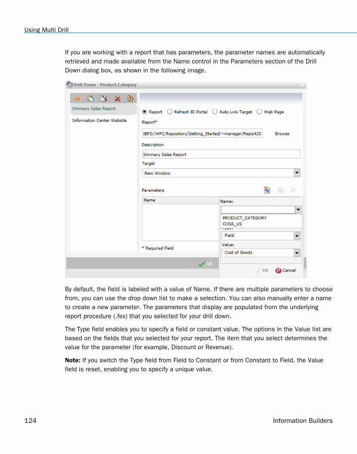
If you are working with a report that has parameters, the parameter names are automaticallyretrieved and made available from the Name control in the Parameters section of the DrillDown dialog box, as shown in the following image.
By default, the field is labeled with a value of Name. If there are multiple parameters to choosefrom, you can use the drop down list to make a selection. You can also manually enter a nameto create a new parameter. The parameters that display are populated from the underlyingreport procedure (.fex) that you selected for your drill down.
The Type field enables you to specify a field or constant value. The options in the Value list arebased on the fields that you selected for your report. The item that you select determines thevalue for the parameter (for example, Discount or Revenue).
Note: If you switch the Type field from Field to Constant or from Constant to Field, the Valuefield is reset, enabling you to specify a unique value.
Using Multi Drill
124 Information Builders
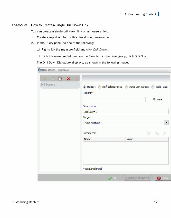
Procedure: How to Create a Single Drill Down Link
You can create a single drill down link on a measure field.
1. Create a report or chart with at least one measure field.
2. In the Query pane, do one of the following:
Right-click the measure field and click Drill Down.
Click the measure field and on the Field tab, in the Links group, click Drill Down.
The Drill Down Dialog box displays, as shown in the following image.
1. Customizing Content
Customizing Content 125
3. Select one of the following Drill Down options:
Report
Refresh BI Portal
Auto Link Target
Web Page
4. Populate the fields based on the drill down option you selected.
Note: Descriptions for these fields are provided earlier in this topic.
5. Optionally, rename the Drill Down using the Description field. This dictates how the DrillDown will appear in the left pane of the Drill Down dialog box.
6. Click OK.
The drill down link displays when you hover over the defined area of a report or chart, atrun time.
Procedure: How to Create Multi Drill Links
You can create a multiple drill down links on a single dimension field.
1. Create a report or chart with at least one dimension field.
2. In the Query pane, do one of the following:
Right-click the dimension field and click Drill Down.
Click the dimension field and on the Field tab, in the Links group, click Drill Down.
Using Multi Drill
126 Information Builders
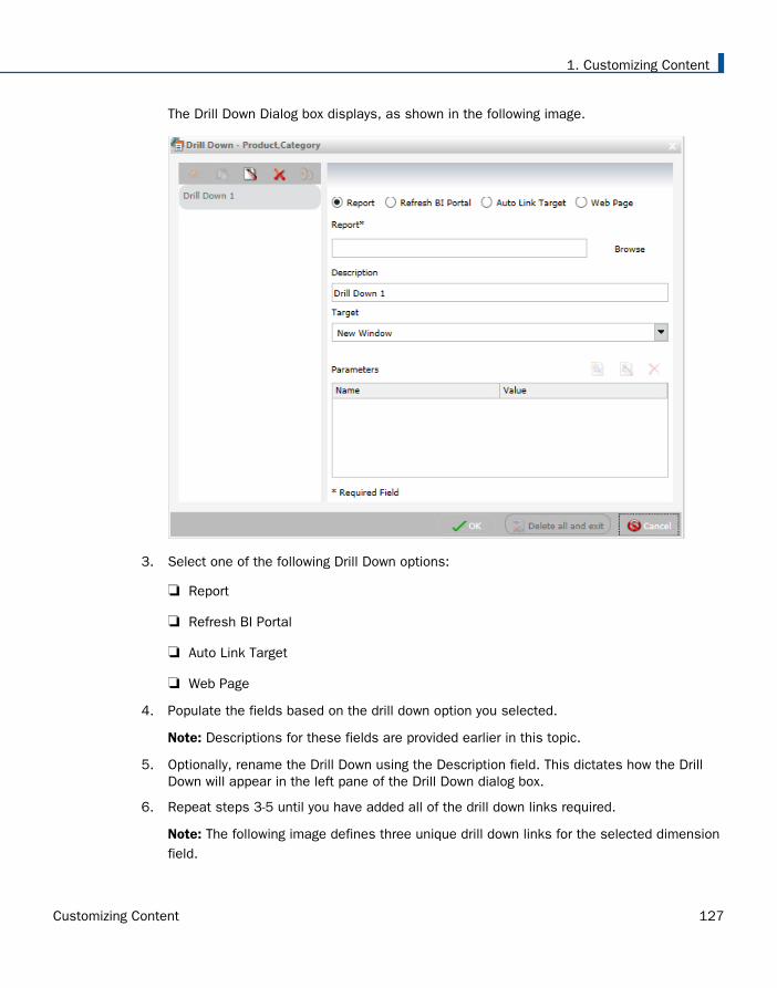
The Drill Down Dialog box displays, as shown in the following image.
3. Select one of the following Drill Down options:
Report
Refresh BI Portal
Auto Link Target
Web Page
4. Populate the fields based on the drill down option you selected.
Note: Descriptions for these fields are provided earlier in this topic.
5. Optionally, rename the Drill Down using the Description field. This dictates how the DrillDown will appear in the left pane of the Drill Down dialog box.
6. Repeat steps 3-5 until you have added all of the drill down links required.
Note: The following image defines three unique drill down links for the selected dimensionfield.
1. Customizing Content
Customizing Content 127
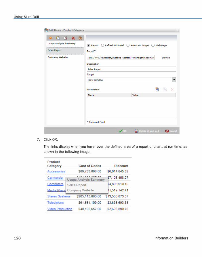
7. Click OK.
The links display when you hover over the defined area of a report or chart, at run time, asshown in the following image.
Using Multi Drill
128 Information Builders
Adding Parameters for Data Selection at Run Time
You can add new parameters to your report or chart to create parameter options for selectionat run time. This enables you to dynamically select and review different scenarios with yourdata, offering you on-demand, dynamic report or chart creation at run time.
When you add a parameter, it becomes a field container into which you can add one or moremeasures and dimensions. You create a new parameter by right-clicking on a field container inthe Query pane and clicking New Parameter. This creates a numbered parameter (for example,Parameter 1). In cases where you have multiple parameters defined, the numbering is appliedsequentially.
Once you add a parameter, you can rename the variable by right-clicking the Parameter-n fieldcontainer and clicking Parameter Prompt, where n is the number of the parameter that wasadded. Once you rename a parameter field container, the new title displays in the Query paneand at run-time. This allows you to easily identify the parameters while categorizing the datafields that you want each to contain. For example, if you add a number of Sales-related fieldsto a parameter, you can rename the parameter with a title of Sales to encapsulate the datafields that you selected. Parameters should be renamed before you run the report or chart sothat they are easy to identify.
In order to populate parameters in your report or chart, data fields must be placed in theparameter field container. You can do this by selecting fields from the Data pane and draggingthem into the relevant parameter field containers that you create.
Note: Double-clicking the data fields in the Data pane places the data field in the default fieldcontainers in the Query pane, not the parameter field container. For example, in a report, if youdouble-click Discount, the data field is placed in the Sum container (outside of the parameterfield container that you created). You can always drag a data field into a parameter containerfrom another field container in the Query pane if you wish to consider it a parameter.
You can also reorder the data fields that you have placed in a given parameter field containerby dragging them into the order that you wish to display them at run time. Parameters can bespecified in any field container, with the exception of Multi-graph. Once you have defined yourparameters and selected the relevant data fields, run the report or chart. Using the drop-downlists for each parameter, you can select different options from the parameter lists to view thedata in your report or chart dynamically. To load different scenarios, select the values and thenclick Run.
1. Customizing Content
Customizing Content 129
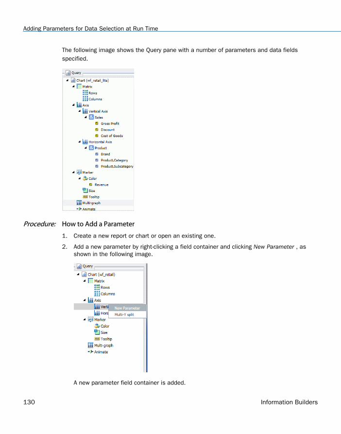
The following image shows the Query pane with a number of parameters and data fieldsspecified.
Procedure: How to Add a Parameter
1. Create a new report or chart or open an existing one.
2. Add a new parameter by right-clicking a field container and clicking New Parameter , asshown in the following image.
A new parameter field container is added.
Adding Parameters for Data Selection at Run Time
130 Information Builders
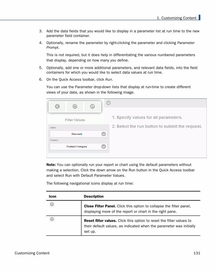
3. Add the data fields that you would like to display in a parameter list at run time to the newparameter field container.
4. Optionally, rename the parameter by right-clicking the parameter and clicking ParameterPrompt.
This is not required, but it does help in differentiating the various numbered parametersthat display, depending on how many you define.
5. Optionally, add one or more additional parameters, and relevant data fields, into the fieldcontainers for which you would like to select data values at run time.
6. On the Quick Access toolbar, click Run.
You can use the Parameter drop-down lists that display at run-time to create differentviews of your data, as shown in the following image.
Note: You can optionally run your report or chart using the default parameters withoutmaking a selection. Click the down arrow on the Run button in the Quick Access toolbarand select Run with Default Parameter Values.
The following navigational icons display at run time:
Icon Description
Close Filter Panel. Click this option to collapse the filter panel,displaying more of the report or chart in the right pane.
Reset filter values. Click this option to reset the filter values totheir default values, as indicated when the parameter was initiallyset up.
1. Customizing Content
Customizing Content 131
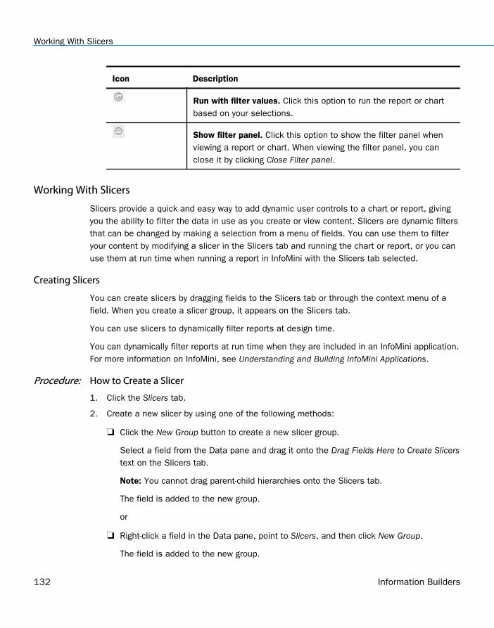
Icon Description
Run with filter values. Click this option to run the report or chartbased on your selections.
Show filter panel. Click this option to show the filter panel whenviewing a report or chart. When viewing the filter panel, you canclose it by clicking Close Filter panel.
Working With Slicers
Slicers provide a quick and easy way to add dynamic user controls to a chart or report, givingyou the ability to filter the data in use as you create or view content. Slicers are dynamic filtersthat can be changed by making a selection from a menu of fields. You can use them to filteryour content by modifying a slicer in the Slicers tab and running the chart or report, or you canuse them at run time when running a report in InfoMini with the Slicers tab selected.
Creating Slicers
You can create slicers by dragging fields to the Slicers tab or through the context menu of afield. When you create a slicer group, it appears on the Slicers tab.
You can use slicers to dynamically filter reports at design time.
You can dynamically filter reports at run time when they are included in an InfoMini application.For more information on InfoMini, see Understanding and Building InfoMini Applications.
Procedure: How to Create a Slicer
1. Click the Slicers tab.
2. Create a new slicer by using one of the following methods:
Click the New Group button to create a new slicer group.
Select a field from the Data pane and drag it onto the Drag Fields Here to Create Slicerstext on the Slicers tab.
Note: You cannot drag parent-child hierarchies onto the Slicers tab.
The field is added to the new group.
or
Right-click a field in the Data pane, point to Slicers, and then click New Group.
The field is added to the new group.
Working With Slicers
132 Information Builders
If you are creating a slicer on a full date field, a calendar icon displays adjacent to thefield. You can use this icon to select a date using a calendar control.
Procedure: How to Add a Field to an Existing Slicer Group
1. Click the Slicers tab.
2. Add a field to an existing slicer group using one of the following methods:
Select a field from the Data pane and drag it onto an existing slicer group.
or
Right-click a field in the Data pane, point to Slicers, and then click Existing Group.
Select an existing group from the menu, and then click OK.
The field is added to the existing group.
Procedure: How to Add a Hierarchy as a Slicer Group
Note: You cannot drag parent-child hierarchies onto the Slicers tab.
1. Click the Slicers tab.
2. Add a hierarchy as a slicer group using one of the following methods:
Select a hierarchy from the Data pane and drag it onto an existing slicer group.
The hierarchy is added as a new group, not as a slicer in the existing group. The newgroup is given the same name as the hierarchy.
or
Click the New Group button to create a new slicer group.
Select a hierarchy from the Data pane and drag it onto the Drag Fields Here to CreateSlicers text of the Slicers tab.
The hierarchy is added to the new group. The name of the new group changes to thename of the hierarchy automatically.
Note: Hierarchies cannot be added to existing slicer groups. If a hierarchy is dragged ontoan existing slicer group, a new group is created automatically.
There is no right-click context menu for hierarchies. To add a hierarchy as a slicer group,you must drag it into a new slicer group.
1. Customizing Content
Customizing Content 133
Filtering With Slicers
Once you add slicers to an InfoAssist report, you can use them to filter the report. You canselect values from the slicers menus, change the number of records that appear, create newslicer groups, clear existing slicer groups, and update the report preview.
Slicers that are not selected have their values filtered by the selected slicers. Only values thatmeet the criteria for previously selected slicers will appear in the menu for the next slicer.Slicers are not filtered in the order they appear in the slicer group, but by the order they areselected. Cascading of slicers is only valid for hierarchies.
Procedure: How to Change the Relationship Operator in a Slicer
1. With at least one slicer added to the report, click the Slicers tab.
2. Click the operators button on the slicer for the operation you want to change.
A list of operators (numeric) appears in the menu.
Note: Alpha fields just flip between equal and not equal.
3. Select the operator that you want from the menu. You can rest the mouse on an operatorto display a tooltip describing the operation.
How Slicers Cascade Together
Slicers cascade within a hierarchy (cube or dimension builder-based), rather than in the orderof user interaction, eliminating potential performance issues.
Procedure: How to Cascade Slicers
Controls with fields from the same hierarchy are cascaded together.
1. Create a report.
2. Create multiple slicer groups, as described in How to Create a Slicer on page 132.
Note: You can select multiple values by holding down the CTRL key while selecting itemsin the drop-down list box. In cases where multiple items are selected, the label for thedrop-down list is set to Multiple. You can click the drop-down list to review the selections.
Once you click OK, the new control appears in the drop-down menu.
The 1 prior to the decimal point indicates that this is the first cascade you have interactedwith. The 1 after the decimal point indicates that it is the first control in that cascade.
3. Filter the report using the controls in the slicer groups that you created.
Working With Slicers
134 Information Builders
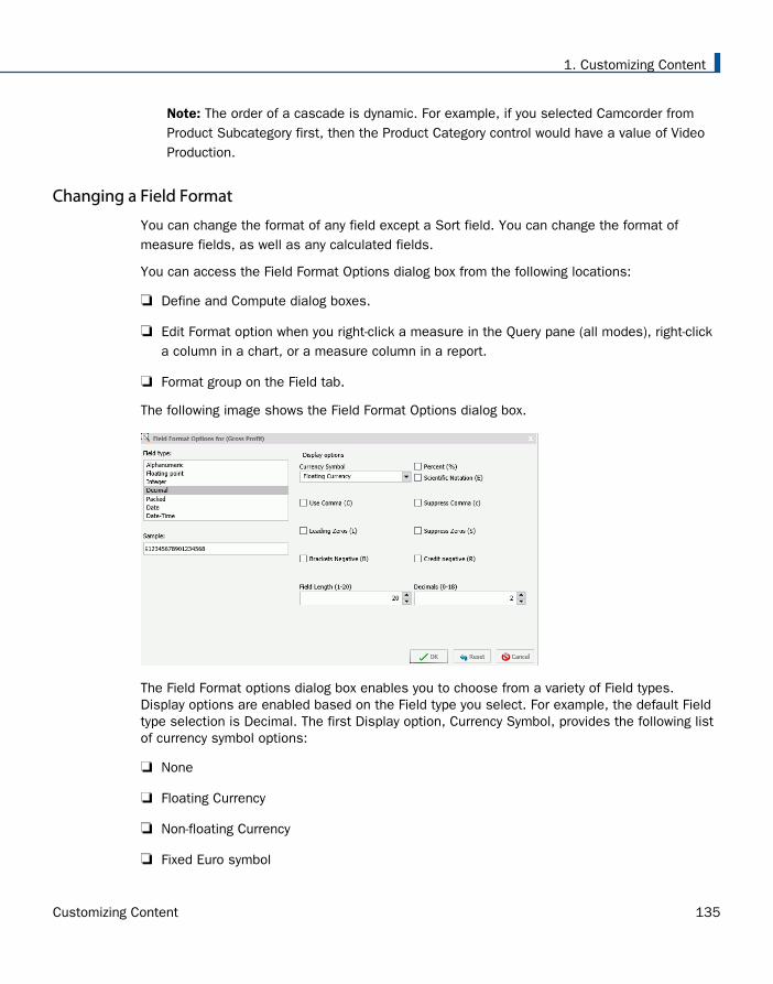
Note: The order of a cascade is dynamic. For example, if you selected Camcorder fromProduct Subcategory first, then the Product Category control would have a value of VideoProduction.
Changing a Field Format
You can change the format of any field except a Sort field. You can change the format ofmeasure fields, as well as any calculated fields.
You can access the Field Format Options dialog box from the following locations:
Define and Compute dialog boxes.
Edit Format option when you right-click a measure in the Query pane (all modes), right-clicka column in a chart, or a measure column in a report.
Format group on the Field tab.
The following image shows the Field Format Options dialog box.
The Field Format options dialog box enables you to choose from a variety of Field types.Display options are enabled based on the Field type you select. For example, the default Fieldtype selection is Decimal. The first Display option, Currency Symbol, provides the following listof currency symbol options:
None
Floating Currency
Non-floating Currency
Fixed Euro symbol
1. Customizing Content
Customizing Content 135
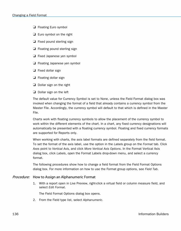
Floating Euro symbol
Euro symbol on the right
Fixed pound sterling sign
Floating pound sterling sign
Fixed Japanese yen symbol
Floating Japanese yen symbol
Fixed dollar sign
Floating dollar sign
Dollar sign on the right
Dollar sign on the left
The default value for Currency Symbol is set to None, unless the Field Format dialog box wasinvoked when changing the format of a field that already contains a currency symbol from theMaster File. Accordingly, the currency symbol will default to that which is defined in the MasterFile.
Charts work with floating currency symbols to allow the placement of the currency symbol towork within the different elements of the chart. In a chart, any fixed currency designations willautomatically be presented with a floating currency symbol. Floating and fixed currency formatsare supported for Reports only.
When working with charts, the axis label formats are defined separately from the field format.To set the format of the axis label, use the option in the Labels group on the Format tab. ClickAxes point to Vertical Axis, and click More Vertical Axis Options. In the Format Vertical Axisdialog box, click Labels, open the Format Labels drop-down menu, and select a currencyformat.
The following procedures show how to change a field format from the Field Format Optionsdialog box. For more information on how to use the Format group options, see Field Tab.
Procedure: How to Assign an Alphanumeric Format
1. With a report open in Live Preview, right-click a virtual field or column measure field, andselect Edit Format.
The Field Format Options dialog box opens.
2. From the Field type list, select Alphanumeric.
Changing a Field Format
136 Information Builders
3. To assign a different length, specify a number between 1 and 4095 in the Total lengthfield. The default value is 20.
4. Click OK to close the Field Format Options dialog box and return to the canvas.
The new format appears in the previously selected column.
Procedure: How to Assign a Numeric Format
1. With a report open in Live Preview, right-click a virtual or column measure field, and clickEdit Format.
The Field Format Options dialog box opens.
2. From the Field type list, click one of the following options:
Floating Point (default length 7.2)
Integer (default length 5)
Decimal (default length 12.2)
Packed (default length 12.2)
If the selected field matches the selected format type, its current length appears in theField Length field. Otherwise, the default length appears in the Field Length field. TheDecimals field shows the numbers of decimal places for Floating Point, Decimal, andPacked.
To assign a different length, specify it in the Field Length field for format types asfollows: 1-9 for Floating Point, 1-11 for Integer, 1-20 for Decimal, and 1-33 for Packed.
To assign a different number of decimal places for Floating Point, Decimal, or Packed,specify the number in the Decimals field.
3. Click OK to close the Field Format Options dialog box and return to the canvas.
The new format appears in the previously selected column.
Procedure: How to Assign a Date Format
1. With a report open in Live Preview, right-click a virtual or column measure field, and selectEdit Format.
The Field Format Options dialog box opens.
1. Customizing Content
Customizing Content 137
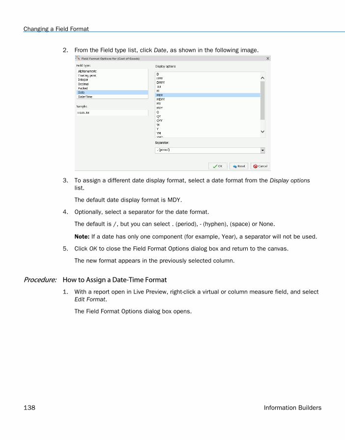
2. From the Field type list, click Date, as shown in the following image.
3. To assign a different date display format, select a date format from the Display optionslist.
The default date display format is MDY.
4. Optionally, select a separator for the date format.
The default is /, but you can select . (period), - (hyphen), (space) or None.
Note: If a date has only one component (for example, Year), a separator will not be used.
5. Click OK to close the Field Format Options dialog box and return to the canvas.
The new format appears in the previously selected column.
Procedure: How to Assign a Date-Time Format
1. With a report open in Live Preview, right-click a virtual or column measure field, and selectEdit Format.
The Field Format Options dialog box opens.
Changing a Field Format
138 Information Builders
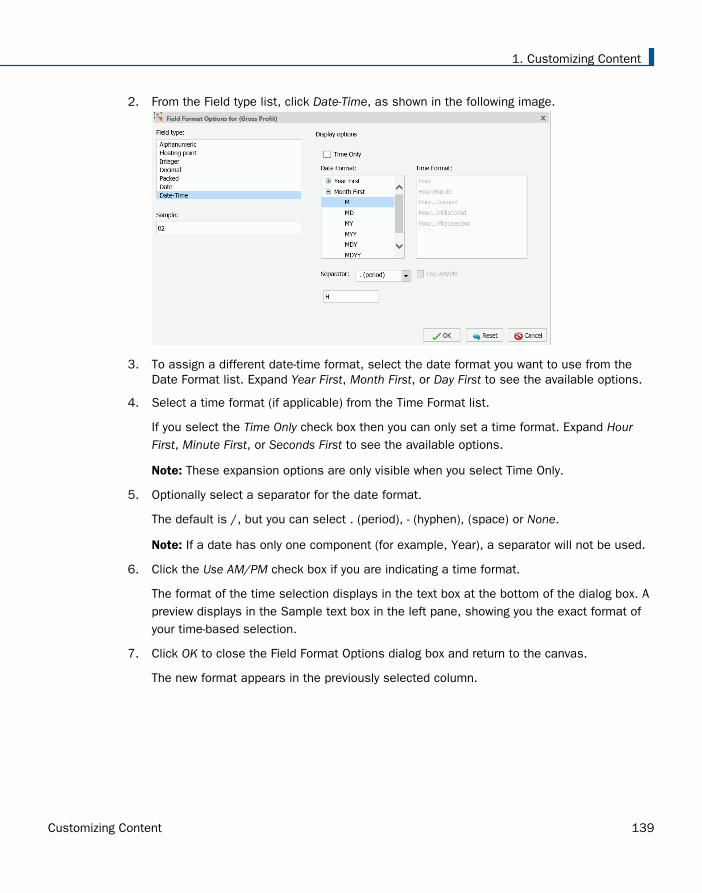
2. From the Field type list, click Date-Time, as shown in the following image.
3. To assign a different date-time format, select the date format you want to use from theDate Format list. Expand Year First, Month First, or Day First to see the available options.
4. Select a time format (if applicable) from the Time Format list.
If you select the Time Only check box then you can only set a time format. Expand HourFirst, Minute First, or Seconds First to see the available options.
Note: These expansion options are only visible when you select Time Only.
5. Optionally select a separator for the date format.
The default is /, but you can select . (period), - (hyphen), (space) or None.
Note: If a date has only one component (for example, Year), a separator will not be used.
6. Click the Use AM/PM check box if you are indicating a time format.
The format of the time selection displays in the text box at the bottom of the dialog box. Apreview displays in the Sample text box in the left pane, showing you the exact format ofyour time-based selection.
7. Click OK to close the Field Format Options dialog box and return to the canvas.
The new format appears in the previously selected column.
1. Customizing Content
Customizing Content 139
Procedure: How to Add a Percent Sign to a Numeric Field
You can add a percent sign to the end of a numeric value (Decimal, Integer, and Floating Pointformats). This numeric display option includes a percent sign along with the numeric data, butdoes not calculate the percent.
1. With a report open in Live Preview, right-click a virtual or column measure field, and selectEdit Format.
The Field Format Options dialog box opens.
2. From the Field type list, click a numeric value format (Floating point, Integer, Decimal, orPacked), and then select the Percent (%) check box.
3. Click OK to close the Field Format Options dialog box and return to the canvas.
The new format appears in the previously selected column.
Dynamic Grouping
Dynamic grouping allows you to create groups of elements based on the field data type thatyou select. For example, in the wf_retail_lite database, there are a number of brands oftelevisions. Using the dynamic grouping functionality, you can create groups based on thepopularity of a particular brand. The first group might include top sellers such as LG and Sony.The second group might contain the remaining brands (Panasonic, GPX, Supersonic, Tivax, andAudiovox). This would allow you to group top sellers into one group, and the remaining brandsinto another group.
Note: The Create Group option is only available for dimension fields of non-numeric format orattribute.
You can also specify multiple, unique groupings in the same session. For example, you mightwant to group the data to indicate groups of products, or specific regions.
Note: If you want to exclude a specific data element from your analysis, you can use the filterfunctionality.
The grouping that you specify is applied and this new group then replaces the original field thatyou selected in the Query pane. The name that you specify when creating the group is reflectedin the Query pane.
Note: You can edit the group once it has been created by right-clicking on the group field andclicking Edit Group.
Procedure: How to Create a Dynamic Group
1. From the Data pane, add one or more data fields to your report or chart.
Dynamic Grouping
140 Information Builders
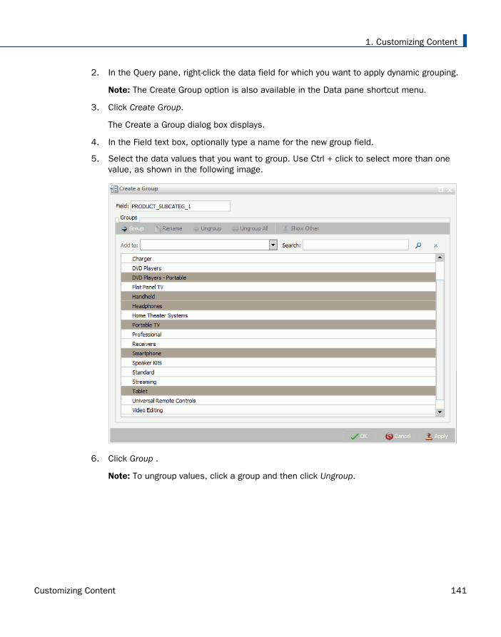
2. In the Query pane, right-click the data field for which you want to apply dynamic grouping.
Note: The Create Group option is also available in the Data pane shortcut menu.
3. Click Create Group.
The Create a Group dialog box displays.
4. In the Field text box, optionally type a name for the new group field.
5. Select the data values that you want to group. Use Ctrl + click to select more than onevalue, as shown in the following image.
6. Click Group .
Note: To ungroup values, click a group and then click Ungroup.
1. Customizing Content
Customizing Content 141
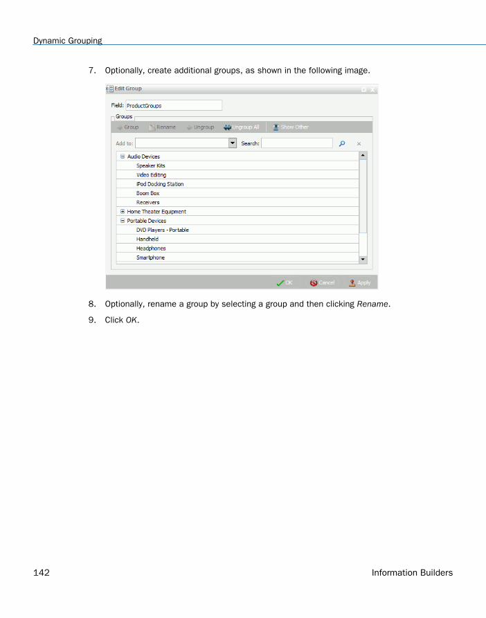
7. Optionally, create additional groups, as shown in the following image.
8. Optionally, rename a group by selecting a group and then clicking Rename.
9. Click OK.
Dynamic Grouping
142 Information Builders
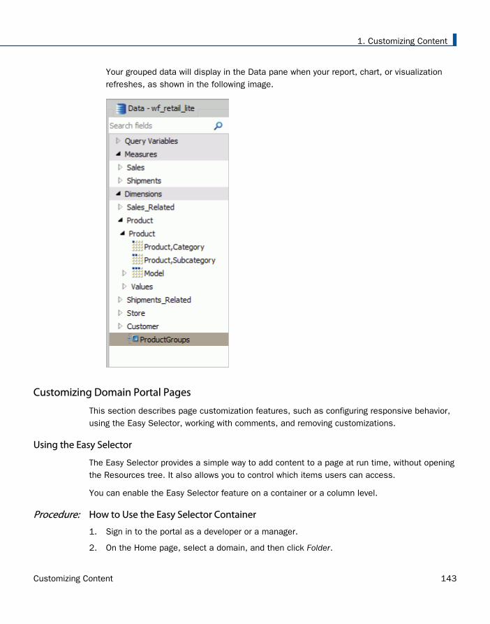
Your grouped data will display in the Data pane when your report, chart, or visualizationrefreshes, as shown in the following image.
Customizing Domain Portal Pages
This section describes page customization features, such as configuring responsive behavior,using the Easy Selector, working with comments, and removing customizations.
Using the Easy Selector
The Easy Selector provides a simple way to add content to a page at run time, without openingthe Resources tree. It also allows you to control which items users can access.
You can enable the Easy Selector feature on a container or a column level.
Procedure: How to Use the Easy Selector Container
1. Sign in to the portal as a developer or a manager.
2. On the Home page, select a domain, and then click Folder.
1. Customizing Content
Customizing Content 143
3. Populate this folder with the content that you intend to make available through the EasySelector at run time, such as reports, charts or pages.
Note: Ensure that the folder only includes file content and no subfolders.
4. Publish the folder.
5. On the Home page, and click Portal Page.
The Page Designer opens.
6. Select a columnar template from the Add Page dialog box, and click Create.
7. On the Insert tab, in the Containers group, click Easy Selector.
The Easy Selector container is inserted into the page, and the Browse For Folder dialogbox opens, where you can select a target folder.
8. Optionally, navigate to the folder that you that want to display inside the Easy Selector atrun time, and then click OK. If no target folder is selected, the entire repository isdisplayed at run time, allowing the user to explore all available domains and folders.
Note: You can also change the folder location by clicking Select Folder in the Propertiespanel, and navigating to a different folder. It is not recommended to change the folderlocation after the end users have begun using the Easy Selector.
9. Repeat steps 7 and 8 to create more Easy Selector containers, if needed.
Note: You can multiselect the containers by holding the Ctrl key.
10. Click Save and close the Page Designer.
Note: You must publish your portal page and add it to the portal before adding contentusing the Easy Selector.
11. On the portal page you created, click the Add content button.
The Select Item dialog box opens.
Customizing Domain Portal Pages
144 Information Builders
12. Navigate to an item that you want to show on the portal page and click Add, as shown inthe following image.
The item opens inside the Easy Selector container.
Procedure: How to Use Easy Selector in a Column
1. Sign in to the portal as a developer or a manager.
2. On the Home page, select a domain, and then click Folder.
3. Populate this folder with the content that you intend to make available through the EasySelector at run time.
Note: Ensure that the folder only includes file content and no subfolders.
4. Publish the folder.
5. On the Home page, click Portal Page.
The Page Designer opens.
6. Select a columnar template from the Add Page dialog box, and click Create.
7. With the page canvas selected, in the Properties panel, clear the Lock Page check box andselect the Prevent Layout Change check box.
1. Customizing Content
Customizing Content 145
Note: This configuration allows users to add new content to a page at run time, whilepreventing them from changing the column layout, which is important for the EasySelector.
8. In the Properties panel, click Container Defaults.
The Container Defaults dialog box opens. Here, you can customize the drop-down menu forthe items that are displayed on the page at run time. Click OK to close the ContainerDefaults dialog box.
9. Select a column.
10. In the Properties panel, select the Show Easy Selector check box.
The Browse For Folder dialog box opens, where you can select a target folder.
11. Click the folder you that want to display inside the Easy Selector at run time, and thenclick OK.
Note: You can change the folder location by clicking the Select Folder button andnavigating to a different folder. It is not recommended to change the folder location afterthe end users have begun using the Easy Selector.
12. Repeat steps 9-11 for each columns .
Note: You can multiselect the columns by holding the Ctrl key.
13. Click Save and close the Page Designer.
Note: You must publish your portal page and add it to the portal before adding contentusing the Easy Selector.
14. On the portal page you created, click the Add content button.
The Select Item dialog box opens.
15. Select an item from the list and click Add.
Customizing Domain Portal Pages
146 Information Builders
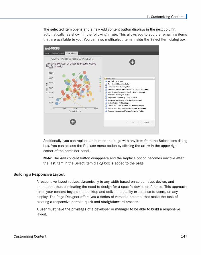
The selected item opens and a new Add content button displays in the next column,automatically, as shown in the following image. This allows you to add the remaining itemsthat are available to you. You can also multiselect items inside the Select Item dialog box.
Additionally, you can replace an item on the page with any item from the Select Item dialogbox. You can access the Replace menu option by clicking the arrow in the upper-rightcorner of the container panel.
Note: The Add content button disappears and the Replace option becomes inactive afterthe last item in the Select Item dialog box is added to the page.
Building a Responsive Layout
A responsive layout resizes dynamically to any width based on screen size, device, andorientation, thus eliminating the need to design for a specific device preference. This approachtakes your content beyond the desktop and delivers a quality experience to users, on anydisplay. The Page Designer offers you a series of versatile presets, that make the task ofcreating a responsive portal a quick and straightforward process.
A user must have the privileges of a developer or manager to be able to build a responsivelayout.
1. Customizing Content
Customizing Content 147
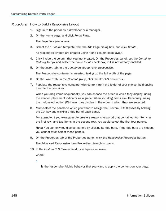
Procedure: How to Build a Responsive Layout
1. Sign in to the portal as a developer or a manager.
2. On the Home page, and click Portal Page.
The Page Designer opens.
3. Select the 1 Column template from the Add Page dialog box, and click Create.
All responsive layouts are created using a one column page layout.
4. Click inside the column that you just created. On the Properties panel, set the ContainerPadding to 5px and select the Same for All check box, if it is not already enabled.
5. On the Insert tab, in the Containers group, click Responsive.
The Responsive container is inserted, taking up the full width of the page.
6. On the Insert tab, in the Content group, click WebFOCUS Resources.
7. Populate the responsive container with content from the folder of your choice, by draggingthem to the container.
When you drag items sequentially, you can choose the order in which they display, usingthe shaded placement indicator as a guide. When you drag items simultaneously, usingthe multiselect option (Ctrl key), they display in the order in which they are selected.
8. Multi-select the panels to which you want to assign the Custom CSS Classes by holdingthe Ctrl key and clicking a title bar of each panel.
For example, if you were going to create a responsive portal that contained four items inthe first row, and two items in the second row, you would select the first four panels.
Note: You can only multi-select panels by clicking its title bars. If the title bars are hidden,you cannot multi-select these panels.
9. On the Properties tab of the Properties panel, click the Responsive Properties button.
The Advanced Responsive Item Properties dialog box opens.
10. In the Custom CSS Classes field, type bip-responsive-n.
where:
n
Is the responsive folding behavior that you want to apply the content on your page.
Customizing Domain Portal Pages
148 Information Builders
For example, bip-responsive-4-2-1 means that the content will display four items acrosson wide screens, two items across on medium screens, and one item across onnarrow screens. If you use bip-responsive-3-2-1, the content will display three itemsacross, then two items across, then one item across. If you use bip-responsive-2-1,content will display two items across, then one item across. If you choose bip-responsive-1, the item will fill the entire row.
Note: When one of the built-in responsive classes is used in the Custom CSS Classesfield, it sets the width of the panel as a percentage of the page width, based on mediaqueries. The percentage width setting made in these built-in responsive classes overridesany width settings defined on the panel.
11. Click OK to close the Advanced Responsive Properties dialog box.
The first row of panels are now stretched evenly across the Responsive container.
12. Multiselect the remaining panels by holding the Ctrl key and clicking each panel.
13. On the Properties panel, click the Responsive Properties button.
The Advanced Responsive Item Properties dialog box opens.
14. In the Custom CSS Classes field, type bip-responsive-2-1. This will enable the remaining twopanels to go from two across to one across on a smaller screen.
15. Set Minimum Height to 440px.
16. Click OK to save the properties.
The remaining panels now stretch across the Responsive container, in the second row.
Note: You can create multiple layouts using this principle and varying the CSS classes toreflect the desired percentage.
17. With the Responsive container selected, make the following changes:
On the Properties tab of the Properties panel, set Height to Dynamic.
On the Title tab of the Properties panel, select the Hide Title Bar check box.
On the Style tab of the Ribbon, in the Border group, click Style, and then select None.
Note: These changes render the Responsive container invisible on the page at runtime,and in the Page Designer. To edit the content in your Responsive container or access itsproperties, you can use the breadcrumb trail below the Property sheet to select it.
18. Click the Save button and close the Page Designer.
19. Publish your page, and add it to the portal.
20. Change the size of your browser window to observe the responsive behavior.
1. Customizing Content
Customizing Content 149
All items rearrange perfectly to fill the page.
Working With Comments
In domain portal pages, you can use comments to interact with your peers in a multi-userenvironment. Developers and managers can enable comments in the Page Designer. You canenable comments on portal pages, containers, and individual content items.
Procedure: How to Enable Comments on a Domain Portal Page
1. Sign in to the portal as a developer or manager.
2. On the Home page, click Portal Page.
The Page Designer opens.
3. In the Add Page dialog box, choose a page template and, optionally, add new pageinformation.
4. Click Create.
5. In the Properties panel, click the Comments drop-down menu and update the style of yourcomments to reflect any standards.
6. Save the portal page and close the Page Designer.
Procedure: How to Enable Comments on a Container
1. Sign in to the portal as a developer or manager.
2. On the Home page, click Portal Page.
The Page Designer opens.
3. In the Add Page dialog box, choose a page template and, optionally, add new pageinformation.
4. Click Create.
5. On the Insert tab, in the Containers group, click any container button.
The container is placed on the page canvas.
6. In the Properties panel, select the Show Comments check box.
When enabled, this option allows you to show and hide comments on a container or itemat run time.
7. Save the portal page and close the Page Designer.
Customizing Domain Portal Pages
150 Information Builders
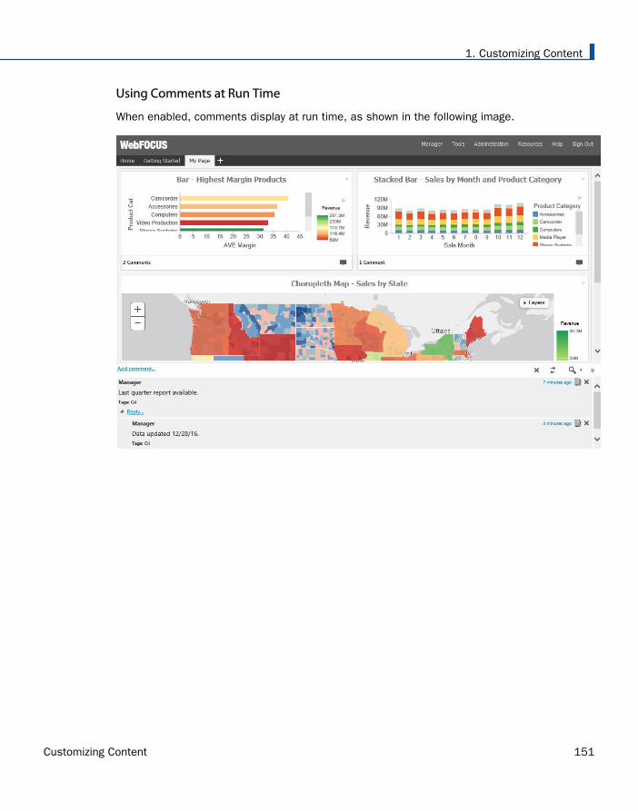
Using Comments at Run Time
When enabled, comments display at run time, as shown in the following image.
1. Customizing Content
Customizing Content 151
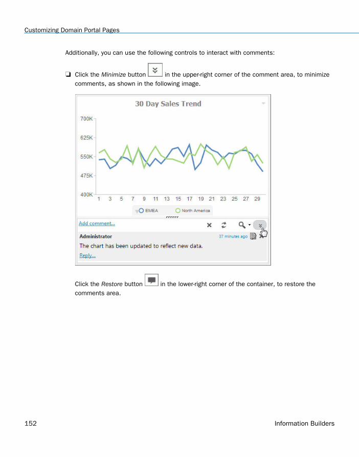
Additionally, you can use the following controls to interact with comments:
Click the Minimize button in the upper-right corner of the comment area, to minimizecomments, as shown in the following image.
Click the Restore button in the lower-right corner of the container, to restore thecomments area.
Customizing Domain Portal Pages
152 Information Builders
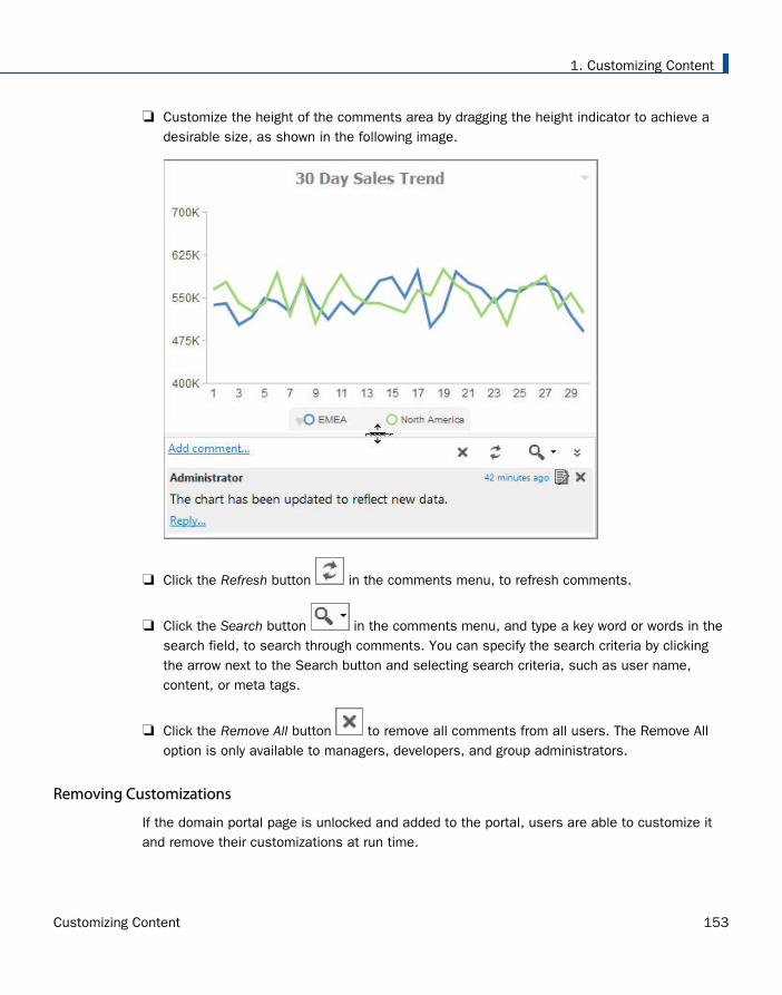
Customize the height of the comments area by dragging the height indicator to achieve adesirable size, as shown in the following image.
Click the Refresh button in the comments menu, to refresh comments.
Click the Search button in the comments menu, and type a key word or words in thesearch field, to search through comments. You can specify the search criteria by clickingthe arrow next to the Search button and selecting search criteria, such as user name,content, or meta tags.
Click the Remove All button to remove all comments from all users. The Remove Alloption is only available to managers, developers, and group administrators.
Removing Customizations
If the domain portal page is unlocked and added to the portal, users are able to customize itand remove their customizations at run time.
1. Customizing Content
Customizing Content 153
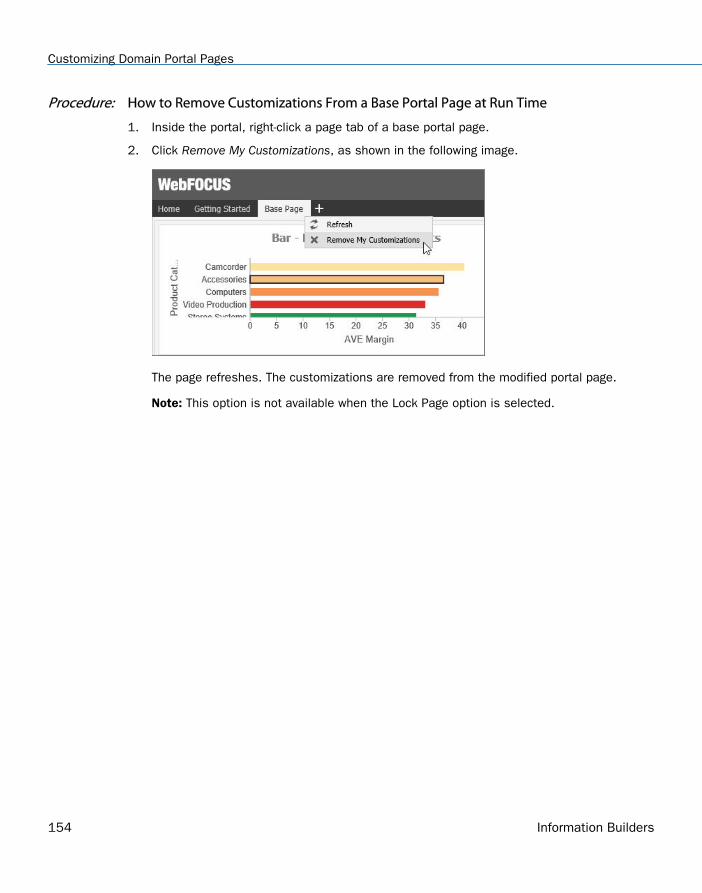
Procedure: How to Remove Customizations From a Base Portal Page at Run Time
1. Inside the portal, right-click a page tab of a base portal page.
2. Click Remove My Customizations, as shown in the following image.
The page refreshes. The customizations are removed from the modified portal page.
Note: This option is not available when the Lock Page option is selected.
Customizing Domain Portal Pages
154 Information Builders
FeedbackCustomer success is our top priority. Connect with us today!
Information Builders Technical Content Management team is comprised of many talentedindividuals who work together to design and deliver quality technical documentation products.Your feedback supports our ongoing efforts!
You can also preview new innovations to get an early look at new content products andservices. Your participation helps us create great experiences for every customer.
To send us feedback or make a connection, contact Sarah Buccellato, Technical Editor,Technical Content Management at [email protected].
To request permission to repurpose copyrighted material, please contact Frances Gambino,Vice President, Technical Content Management at [email protected].

Information Builders, Inc.Two Penn PlazaNew York, NY 10121-2898
Customizing Content Release 8.2 Version 04