Embed Size (px)
Citation preview
63
▶ Express the extent to which two measures are associated
▶ Explain what a scatter diagram is and how it is used ▶ Define a positive correlation and a negative correlation ▶ Discuss some of the differences between
correlation and regression ▶ Tell how a regression line describes the relationship
between two variables
▶ Discuss under which circumstances you would use the point biserial correlation, the phi coefficient, and the tetrachoric correlation
▶ Outline the procedure you would use to predict one score from the linear combination of several scores
▶ Explain factor analysis and how it is used
LE AR N I NG O B J EC TIVE SWhen you have completed this chapter,1 you should be able to:
Correlation and Regression
C H A P T E R
3
1Portions of this chapter are taken from Basic Statistics for the Behavioral Sciences by Robert M. Kaplan (Newton, MA: Allyn & Bacon, 1987).
98137_ch03_rev02_063-098.indd 63 11/15/16 5:42 PM
Not For Sale
© 2
01 C
enga
ge L
earn
ing.
All
Rig
hts R
eser
ved.
Thi
s con
tent
is n
ot y
et fi
nal a
nd C
enga
ge L
earn
ing
does
not
gua
rant
ee th
is p
age
will
con
tain
cur
rent
mat
eria
l or m
atch
the
publ
ishe
d pr
oduc
t.

64 CHAPTER 3 ● Correlation and Regression
A banner headline in an issue of a tabloid news report read, “Food Causes Most Marriage Problems.” The article talked about the “startling results of studies by doctors and marriage counselors.” Before we are willing to accept the mag-
azine’s conclusion, we must ask many questions. Did the tabloid report enough data for us to evaluate the hypothesis? Do we feel comfortable concluding that an associ-ation between diet and divorce has been established?
There were many problems with the tabloid news report. The observation was based on the clinical experiences of some health practitioners who found that many couples who came in for counseling had poor diets. One major oversight was that there was no control group of people who were not having marriage problems. We do not know from the study whether couples with problems have poor diets more often than do people in general. Another problem is that neither diet nor marital happiness was measured in a systematic way. Thus, we are left with subjective opinions about the levels of these variables. Finally, we do not know the direction of the causation: Does poor diet cause unhappiness, or does unhappiness cause poor diet? Another possibility is that some other problem (such as stress) may cause both poor diet and unhappiness. So it turns out that the article was not based on any systematic study. It merely cited the opinions of some physicians and marriage counselors who felt that high levels of blood sugar are related to low energy levels, which in turn cause marital unhappiness.
This chapter focuses on one of the many issues raised in the report—the level of association between variables. The tabloid report tells us that diet and unhappiness are associated, but not to what extent. Is the association greater than we would expect by chance? Is it a strong or is it a weak association?
Lots of things seem to be related. For example, long-term stress is associated with heart disease, training is associated with good performance in athletics, and overeating is associated with indigestion. People often observe associations between events. For some events, the association is obvious. For example, the angle of the sun in the sky and the time of day are associated in a predictable way. This is because time was originally defined by the angle of the sun in the sky. Other associations are less obvious, such as the association between performing well on the Scholastic Aptitude Test SAT Mathematics Subject Test and obtaining good grades in college.
Sometimes, we do not know whether events are meaningfully associated with one another. If we do conclude that events are fundamentally associated, then we need to determine a precise index of the degree. This chapter discusses statistical procedures that allow us to make precise estimates of the degree to which variables are associated. These methods are quite important; we shall refer to them frequently in the remainder of this book. The indexes of association used most frequently in testing are correlation, regression, and multiple regression.
The Scatter DiagramBefore discussing the measures of association, we shall look at visual displays of the relationships between variables. In Chapter 2, we concentrated on univariate distri-butions of scores, which involve only one variable for each individual under study. This chapter considers statistical methods for studying bivariate distributions, which
98137_ch03_rev02_063-098.indd 64 11/15/16 5:42 PM
Not For Sale
© 2
01 C
enga
ge L
earn
ing.
All
Rig
hts R
eser
ved.
Thi
s con
tent
is n
ot y
et fi
nal a
nd C
enga
ge L
earn
ing
does
not
gua
rant
ee th
is p
age
will
con
tain
cur
rent
mat
eria
l or m
atch
the
publ
ishe
d pr
oduc
t.

CHAPTER 3 ● Correlation and Regression 65
have two scores for each individual. For example, when we study the relationship between test scores and classroom performance, we are dealing with a bivariate dis-tribution. Each person has a score on the test and a score for classroom performance. We must examine the scores of all the individuals to know whether these two vari-ables are associated.
The American Psychological Association’s Task Force on Statistical Inference has suggested that visual inspection of data is an important step in data analysis (Wilkinson, 1999) and there is increasing interest in data visualization (Cook, Lee, & Majumder, 2016). A scatter diagram is a picture of the relationship between two variables. An example of a scatter diagram is shown in Figure 3.1, which relates scores on a measure of anger for medical students to scores on the Center for Epidemiologic Studies Depression Scale CES-D. The axes in the figure represent the scales for two variables. Values of X for the anger inventory are shown on the horizontal axis, and values of Y for the CES-D are on the vertical axis. Each point on the scatter diagram shows where a particular individual scored on both X and Y. For example, one person had a score of 14 on the CES-D and a score of 21 on the anger inventory. This point is circled in the figure. You can locate it by finding 21 on the X axis and then going straight up to the level of 14 on the Y axis. Each point indicates the scores for X and Y for one individual. As you can see, the figure presents a lot of information. Each point represents the performance of one person who has been assessed on two measures.
The next sections present methods for summarizing the information in a scatter diagram by finding the straight line that comes closest to more points than any other line. One important reason for examining the scatter diagram is that the relationships between X and Y are not always best described by a straight line. For example, Figure 3.2 shows the hypothetical relationship between levels of antidepressant medication in the blood of depressed patients and the number of symptoms they report. However, the relationship is systematic. Patients who have too little or too much medication experience more symptoms than do those who get an intermediate amount. The methods of linear correlation or linear regression to be presented in this chapter are not appropriate for describing nonlinear relationships such as this.
FIGURE 3.1 A scatter diagram. The circled point shows a person who had a score of 21 on X and 14 on Y.
30
CES
-D
020
Anger Inventory10
25
20
15
10
5
15 25 30 40 5035 45
98137_ch03_rev02_063-098.indd 65 11/15/16 5:42 PM
Not For Sale
© 2
01 C
enga
ge L
earn
ing.
All
Rig
hts R
eser
ved.
Thi
s con
tent
is n
ot y
et fi
nal a
nd C
enga
ge L
earn
ing
does
not
gua
rant
ee th
is p
age
will
con
tain
cur
rent
mat
eria
l or m
atch
the
publ
ishe
d pr
oduc
t.

66 CHAPTER 3 ● Correlation and Regression
CorrelationIn correlational analysis, we ask whether two variables covary. In other words, does Y get larger as X gets larger? For example, does the patient feel dizzier when the doctor increases the dose of a drug? Do people get more diseases when they are under more stress? Correlational analysis is designed primarily to examine linear relationships between variables. Although one can use correlational techniques to study nonlinear relationships, doing so lies beyond the scope of this book.2
A correlation coefficient is a mathematical index that describes the direction and magnitude of a relationship. Figure 3.3 shows three different types of relationships between variables. Part (a) of the figure demonstrates a positive correlation. This means that high scores on Y are associated with high scores on X, and low scores on Y correspond to low scores on X. Part (b) shows negative correlation. When there is a negative correlation, higher scores on Y are associated with lower scores on X, and lower scores on Y are associated with higher scores on X. This might describe the relationship between barbiturate use and amount of activity: The higher the drug dose, the less active the patients are. Part (c) of Figure 3.3 shows no correlation, or a situation in which the variables are not related. Here, scores on X do not give us information about scores on Y. An example of this sort of relationship is the lack of correlation between shoe size and IQ.
There are many ways to calculate a correlation coefficient. All involve pairs of observations: For each observation on one variable, there is an observation on one other variable for the same person.3 Appendix 3.1 (at the end of this chapter) offers an example of the calculation of a correlation. All methods of calculating a correlation coefficient are mathematically equivalent. Before we present methods for calculating the correlation coefficient, however, we shall discuss regression, the method on which correlation is based.
FIGURE 3.2 A scatter diagram showing a nonlinear relationship.
8
Y
Sym
ptom
Che
cklis
t Tot
al S
core
2
Plasma Concentration of Antidepressant0 21 3 5 7 94 6 8 10
X
7
6
5
4
3
(From R. M. Kaplan & Grant, 2000).
2Readers who are interested in studying nonlinear relationships should review German and Hill (2007).3The pairs of scores do not always need to be for a person. They might also be for a group, an institution, a team, and so on.
98137_ch03_rev02_063-098.indd 66 11/15/16 5:42 PM
Not For Sale
© 2
01 C
enga
ge L
earn
ing.
All
Rig
hts R
eser
ved.
Thi
s con
tent
is n
ot y
et fi
nal a
nd C
enga
ge L
earn
ing
does
not
gua
rant
ee th
is p
age
will
con
tain
cur
rent
mat
eria
l or m
atch
the
publ
ishe
d pr
oduc
t.
CHAPTER 3 ● Correlation and Regression 67
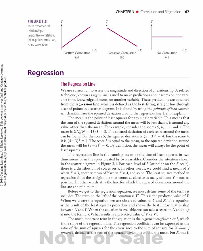
RegressionThe Regression LineWe use correlation to assess the magnitude and direction of a relationship. A related technique, known as regression, is used to make predictions about scores on one vari-able from knowledge of scores on another variable. These predictions are obtained from the regression line, which is defined as the best-fitting straight line through a set of points in a scatter diagram. It is found by using the principle of least squares, which minimizes the squared deviation around the regression line. Let us explain.
The mean is the point of least squares for any single variable. This means that the sum of the squared deviations around the mean will be less than it is around any value other than the mean. For example, consider the scores 5, 4, 3, 2, and 1. The mean is ΣXi>N 5 15>5 5 3. The squared deviation of each score around the mean can be found. For the score 5, the squared deviation is (523)2 5 4. For the score 4, it is (423)2 5 1. The score 3 is equal to the mean, so the squared deviation around the mean will be (323)2 5 0. By definition, the mean will always be the point of least squares.
The regression line is the running mean or the line of least squares in two dimensions or in the space created by two variables. Consider the situation shown in the scatter diagram in Figure 3.1. For each level of X (or point on the X scale), there is a distribution of scores on Y. In other words, we could find a mean of Y when X is 3, another mean of Y when X is 4, and so on. The least squares method in regression finds the straight line that comes as close to as many of these Y means as possible. In other words, it is the line for which the squared deviations around the line are at a minimum.
Before we get to the regression equation, we must define some of the terms it includes. The term on the left of the equation is Y′. This is the predicted value of Y. When we create the equation, we use observed values of Y and X. The equation is the result of the least squares procedure and shows the best linear relationship between X and Y. When the equation is available, we can take a score on X and plug it into the formula. What results is a predicted value of Y, or Y′.
The most important term in the equation is the regression coefficient, or b, which is the slope of the regression line. The regression coefficient can be expressed as the ratio of the sum of squares for the covariance to the sum of squares for X. Sum of squares is defined as the sum of the squared deviations around the mean. For X, this is
Y
(a)Positive Correlation
X
Y
(b)Negative Correlation
X
Y
(c)No Correlation
X
FIGURE 3.3 Three hypothetical relationships: (a) positive correlation, (b) negative correlation, (c) no correlation.
98137_ch03_rev02_063-098.indd 67 11/15/16 5:42 PM
Not For Sale
© 2
01 C
enga
ge L
earn
ing.
All
Rig
hts R
eser
ved.
Thi
s con
tent
is n
ot y
et fi
nal a
nd C
enga
ge L
earn
ing
does
not
gua
rant
ee th
is p
age
will
con
tain
cur
rent
mat
eria
l or m
atch
the
publ
ishe
d pr
oduc
t.
68 CHAPTER 3 ● Correlation and Regression
the sum of the squared deviations around the X variable. Covariance is used to express how much two measures covary, or vary together. To understand covariance, let’s look at the extreme case of the relationship between two identical sets of scores. In this case, there will be a perfect association. We know that we can create a new score that exactly repeats the scores on any one variable. If we created this new twin variable, then it would covary perfectly with the original variable. Regression analysis attempts to determine how similar the variance between two variables is by dividing the covariance by the average variance of each variable. The covariance is calculated from the cross products, or products of variations around each mean. Symbolically, this is
ΣXY 5 Σ 1X2X ) (Y2Y 2The regression coefficient or slope is:
b 5N1ΣXY 22 1ΣX 2 1ΣY 2
N ΣX 22 1ΣX 22The slope describes how much change is expected in Y each time X increases
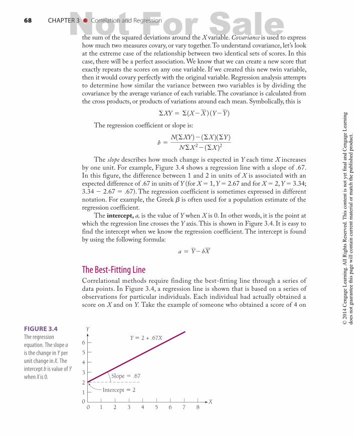
by one unit. For example, Figure 3.4 shows a regression line with a slope of .67. In this figure, the difference between 1 and 2 in units of X is associated with an expected difference of .67 in units of Y (for X 5 1, Y 5 2.67 and for X 5 2, Y 5 3.34; 3.34 2 2.67 5 .67). The regression coefficient is sometimes expressed in different notation. For example, the Greek b is often used for a population estimate of the regression coefficient.
The intercept, a, is the value of Y when X is 0. In other words, it is the point at which the regression line crosses the Y axis. This is shown in Figure 3.4. It is easy to find the intercept when we know the regression coefficient. The intercept is found by using the following formula:
a 5 Y2bX
The Best-Fitting LineCorrelational methods require finding the best-fitting line through a series of data points. In Figure 3.4, a regression line is shown that is based on a series of observations for particular individuals. Each individual had actually obtained a score on X and on Y. Take the example of someone who obtained a score of 4 on
6
5
4
3
2
1
0
Y
8765432
Intercept 5 2
Slope 5 .67
Y 5 2 + .67X
10X
FIGURE 3.4 The regression equation. The slope a is the change in Y per unit change in X. The intercept b is value of Y when X is 0.
98137_ch03_rev02_063-098.indd 68 11/15/16 5:42 PM
Not For Sale
© 2
01 C
enga
ge L
earn
ing.
All
Rig
hts R
eser
ved.
Thi
s con
tent
is n
ot y
et fi
nal a
nd C
enga
ge L
earn
ing
does
not
gua
rant
ee th
is p
age
will
con
tain
cur
rent
mat
eria
l or m
atch
the
publ
ishe
d pr
oduc
t.
CHAPTER 3 ● Correlation and Regression 69
X and 6 on Y. The regression equation gives a predicted value for Y, denoted as Y′. Using the regression equation, we can calculate Y′ for this person. It is
Y′ 5 21 .67Xso
Y′ 5 21 .67142 5 4.68
The actual and predicted scores on Y are rarely exactly the same. Suppose that the person actually received a score of 4 on Y and that the regression equation predicted that he or she would have a score of 4.68 on Y. The difference between the observed and predicted score (Y 2 Y′) is called the residual. The best-fitting line keeps residuals to a minimum. In other words, it minimizes the deviation between observed and predicted Y scores. Because residuals can be positive or negative and will cancel to 0 if averaged, the best-fitting line is most appropriately found by squaring each residual. Thus, the best-fitting line is obtained by keeping these squared residuals as small as possible. This is known as the principle of least squares. Formally, it is stated as
Σ 1Y2Y′22 is at a minimumAn example showing how to calculate a regression equation is given in
Appendix 3.1. Whether or not you become proficient at calculating regression equations, you should learn to interpret them in order to be a good consumer of research information.
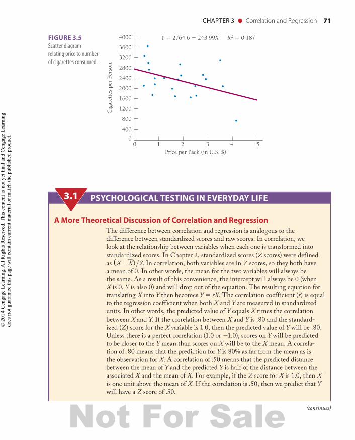
Table 3.1 and Figure 3.5 present an example of a regression problem. The data come from international studies on the relationship between price per pack of cigarettes and the number of cigarettes consumed per capita. There is considerable variability in the price per pack of cigarettes among European countries. The differences between countries are primarily defined by the level of taxation. Some countries, such as Norway, have high taxes on tobacco; therefore, the price per pack for cigarettes is much higher. Figure 3.5 shows the scatter diagram as it relates price to number of cigarettes consumed.
Although the relationship is not strong, there is a negative trend, which is defined by the regression equation. The intercept in this equation is 2764.6. This means the line intersects the Y axis at 2764.6. The intercept provides an estimate of the number of cigarettes that would be consumed if cigarettes were free. The regression coefficient for this model is b 5 2243.99 and tells how much cigarette consumption should decline for each dollar that is added to the price of a pack of cigarettes. In other words, this equation suggests that, on average, people will smoke 244 fewer cigarettes per year for each dollar added to the price of cigarettes. Thus, according to this simple model, adding a $2 tax to cigarettes would decrease consumption on average by approximately 488 cigarettes per year (Kaplan et al., 1995).
Correlation is a special case of regression in which the scores for both variables are in standardized, or Z, units. Having the scores in Z units is a nice convenience because it eliminates the need to find the intercept. In correlation, the intercept is always 0. Furthermore, the slope in correlation is easier to interpret because it is in a standardized unit. An example of how to calculate a correlation coefficient is given in Appendix 3.1. In calculating the correlation coefficient, we can bypass the step
98137_ch03_rev02_063-098.indd 69 11/15/16 5:42 PM
Not For Sale
© 2
01 C
enga
ge L
earn
ing.
All
Rig
hts R
eser
ved.
Thi
s con
tent
is n
ot y
et fi
nal a
nd C
enga
ge L
earn
ing
does
not
gua
rant
ee th
is p
age
will
con
tain
cur
rent
mat
eria
l or m
atch
the
publ
ishe
d pr
oduc
t.
70 CHAPTER 3 ● Correlation and Regression
of changing all the scores into Z units. This gets done as part of the calculation process. You may notice that Steps 1–13 are identical for calculating regression and correlation (Appendix 3.1). Psychological Testing in Everyday Life 3.1 gives a theoretical discussion of correlation and regression.
The Pearson product moment correlation coefficient is a ratio used to determine the degree of variation in one variable that can be estimated from knowledge about variation in the other variable. The correlation coefficient can take on any value from 21.0 to 1.0.
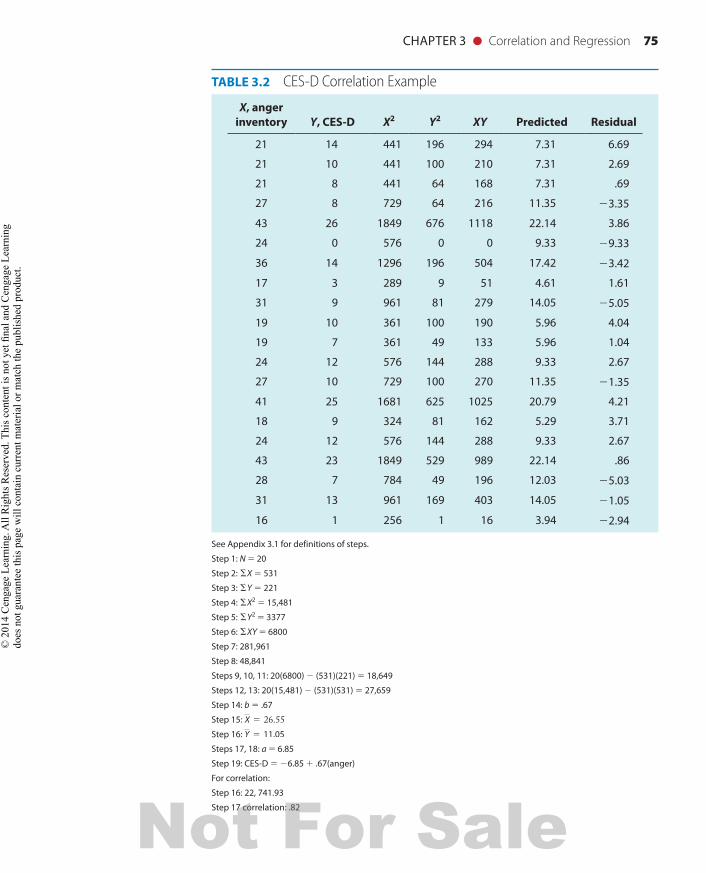
Table 3.2 gives the raw data for CES-D scores (X) and anger inventory scores (Y) for medical students. Try to find the regression of anger on CES-D and the correlation between these two measures. The correct answer is r 5 .82.
As you will see from Appendix 3.1, calculations of the correlation coefficient and the regression can be long and difficult. You may be able to avoid the many computational steps by using a calculator or one of the many calculation tools on the Internet. Many inexpensive pocket calculators automatically perform correlation and regression.
TABLE 3.1 Relationship of Cigarette Price and Consumption
Country Average cigarettes/year Price per pack ($)
1. Belgium 1990 1.54
2. Czechoslovakia 2520 1.90
3. Denmark 2110 3.60
4. Finland 1720 2.50
5. France 2400 0.80
6. GFR 2380 2.90
7. GDR 2340 1.78
8. Greece 3640 0.48
9. Hungary 3260 0.36
10. Iceland 3100 3.51
11. Ireland 2560 2.77
12. Italy 2460 1.21
13. Netherlands 1690 1.65
14. Norway 710 4.17
15. Portugal 1730 0.72
16. Romania 2110 0.37
17. Spain 2740 0.55
18. Sweden 1660 2.30
19. Switzerland 2960 1.84
20. Turkey 3000 0.54
21. USSR 2170 0.80
22. UK 2120 2.45
98137_ch03_rev02_063-098.indd 70 11/15/16 5:42 PM
Not For Sale
© 2
01 C
enga
ge L
earn
ing.
All
Rig
hts R
eser
ved.
Thi
s con
tent
is n
ot y
et fi
nal a
nd C
enga
ge L
earn
ing
does
not
gua
rant
ee th
is p
age
will
con
tain
cur
rent
mat
eria
l or m
atch
the
publ
ishe
d pr
oduc
t.
CHAPTER 3 ● Correlation and Regression 71
3200
3600
4000
2800
2400
2000
400
1600
1200
800
052 3 41
Price per Pack (in U.S. $)0
Cig
aret
tes
per
Pers
on
Y 5 2764.6 2 243.99X R2 5 0.187FIGURE 3.5 Scatter diagram relating price to number of cigarettes consumed.
PSYCHOLOGICAL TESTING IN EVERYDAY LIFE
A More Theoretical Discussion of Correlation and RegressionThe difference between correlation and regression is analogous to the difference between standardized scores and raw scores. In correlation, we look at the relationship between variables when each one is transformed into standardized scores. In Chapter 2, standardized scores (Z scores) were defined as (X2X) >S. In correlation, both variables are in Z scores, so they both have a mean of 0. In other words, the mean for the two variables will always be the same. As a result of this convenience, the intercept will always be 0 (when X is 0, Y is also 0) and will drop out of the equation. The resulting equation for translating X into Y then becomes Y 5 rX. The correlation coefficient (r) is equal to the regression coefficient when both X and Y are measured in standardized units. In other words, the predicted value of Y equals X times the correlation between X and Y. If the correlation between X and Y is .80 and the standard-ized (Z) score for the X variable is 1.0, then the predicted value of Y will be .80. Unless there is a perfect correlation (1.0 or 21.0), scores on Y will be predicted to be closer to the Y mean than scores on X will be to the X mean. A correla-tion of .80 means that the prediction for Y is 80% as far from the mean as is the observation for X. A correlation of .50 means that the predicted distance between the mean of Y and the predicted Y is half of the distance between the associated X and the mean of X. For example, if the Z score for X is 1.0, then X is one unit above the mean of X. If the correlation is .50, then we predict that Y will have a Z score of .50.
3.1
(continues)
98137_ch03_rev02_063-098.indd 71 11/15/16 5:42 PM
Not For Sale
© 2
01 C
enga
ge L
earn
ing.
All
Rig
hts R
eser
ved.
Thi
s con
tent
is n
ot y
et fi
nal a
nd C
enga
ge L
earn
ing
does
not
gua
rant
ee th
is p
age
will
con
tain
cur
rent
mat
eria
l or m
atch
the
publ
ishe
d pr
oduc
t.
72 CHAPTER 3 ● Correlation and Regression
One benefit of using the correlation coefficient is that it has a reciprocal na-ture. The correlation between X and Y will always be the same as the correlation between Y and X. For example, if the correlation between drug dose and activity is .68, the correlation between activity and drug dose is .68.
On the other hand, regression does not have this property. Regression is used to transform scores on one variable into estimated scores on the other. We often use regression to predict raw scores on Y on the basis of raw scores on X. For instance, we might seek an equation to predict a student’s grade point aver-age (GPA) on the basis of his or her SAT score. Because regression uses the raw units of the variables, the reciprocal property does not hold. The coefficient that describes the regression of X on Y is usually not the same as the coefficient that describes the regression of Y on X.
The term regression was first used in 1885 by an extraordinary British intellectual named Sir Francis Galton. Fond of describing social and political changes that occur over successive generations, Galton noted that extraordi-narily tall men tended to have sons who were a little shorter than them and that unusually small men tended to have sons closer to the average height (but still shorter than average). Over time, individuals with all sorts of unusual char-acteristics tended to produce offspring who were closer to the average. Galton thought of this as a regression toward mediocrity, an idea that became the basis for a statistical procedure that described how scores tend to regress toward the mean. If a person is extreme on X, then regression predicts that he or she will be less extreme on Y. Karl Pearson developed the first statistical models of correlation and regression in the late 19th century.
Statistical Definition of RegressionRegression analysis shows how change in one variable is related to change in another variable. In psychological testing, we often use regression to determine whether changes in test scores are related to changes in performance. Do people who score higher on tests of manual dexterity perform better in dental school? Can IQ scores measured during high school predict monetary income 20 years later? Regression analysis and related correlational methods reveal the degree to which these variables are linearly related. In addition, they offer an equation that estimates scores on a criterion (such as dental-school grades) on the basis of scores on a predictor (such as manual dexterity).
In Chapter 2, we introduced the concept of variance. You might remember that variance was defined as the average squared deviation around the mean. We used the term sum of squares for the sum of squared deviations around the mean. Symbolically, this is
Σ 1X2X 22
PSYCHOLOGICAL TESTING IN EVERYDAY LIFE (continued)3.1
98137_ch03_rev02_063-098.indd 72 11/15/16 5:42 PM
Not For Sale
© 2
01 C
enga
ge L
earn
ing.
All
Rig
hts R
eser
ved.
Thi
s con
tent
is n
ot y
et fi
nal a
nd C
enga
ge L
earn
ing
does
not
gua
rant
ee th
is p
age
will
con
tain
cur
rent
mat
eria
l or m
atch
the
publ
ishe
d pr
oduc
t.
CHAPTER 3 ● Correlation and Regression 73
The variance is the sum of squares divided by N 2 1. The formula for this is
S2X 5Σ 1X2X 22
N21We also gave some formulas for the variance of raw scores. The variance of
X can be calculated from raw scores using the formula
S2X 5
ΣX 221ΣX 22
NN21
If there is another variable, Y, then we can calculate the variance using a similar formula:
S2Y 5
ΣY 221ΣY 22
NN21
To calculate regression, we need a term for the covariance. To calculate the covariance, we need to find the sum of cross products, which is defined as
ΣX Y 5 Σ 1X2X 2 1Y2Y 2and the raw score formula, which is often used for calculation, is
ΣX Y21ΣX 2 1ΣY 2
NThe covariance is the sum of cross products divided by N 2 1.
Now look at the similarity of the formula for the covariance and the formula for the variance:
S2XY 5
ΣX Y21ΣX 2 1ΣY 2
NN21
S2X 5
ΣX 221ΣX 22
NN21
Try substituting X for Y in the formula for the covariance. You should get
ΣX X21ΣX 2 1ΣX 2
NN21
(continues)
98137_ch03_rev02_063-098.indd 73 11/15/16 5:42 PM
Not For Sale
© 2
01 C
enga
ge L
earn
ing.
All
Rig
hts R
eser
ved.
Thi
s con
tent
is n
ot y
et fi
nal a
nd C
enga
ge L
earn
ing
does
not
gua
rant
ee th
is p
age
will
con
tain
cur
rent
mat
eria
l or m
atch
the
publ
ishe
d pr
oduc
t.
74 CHAPTER 3 ● Correlation and Regression
If you replace SXX with SX2 and (SX )(SX ) with (SX)2, you will see the relationship between variance and covariance:
ΣX 221ΣX 22
NN21
In regression analysis, we examine the ratio of the covariance to the average of the variances for the two separate measures. This gives us an estimate of how much variance in one variable we can determine by knowing about the variation in the other variable.
PSYCHOLOGICAL TESTING IN EVERYDAY LIFE (continued)3.1
Testing the Statistical Significance of a Correlation CoefficientOne of the most important questions in evaluating a correlation is whether it is larger than we would expect by chance. The correlation between two randomly cre-ated variables will not always be 0.0. By chance alone, it is possible to observe a correlation higher or lower than 0.0. However, the expected value the correlation averaged over many randomly created data sets is 0.0, and we can estimate the prob-ability that correlations of various magnitudes occurred by chance alone. We begin with the null hypothesis that there is no relationship between variables. The null hypothesis is rejected if there is evidence that the association between two variables is significantly different from 0. Correlation coefficients can be tested for statistical significance using the t distribution. The t distribution is not a single distribution (such as the Z distribution) but a family of distributions, each with its own degrees of freedom. The degrees of freedom (df ) are defined as the sample size minus two, or N 2 2. The formula for calculating the t value is
t 5 rÄN2212r 2
The significance of the t value—where, df 5 N 2 2 and N is the number of pairs—can then be obtained by using Appendix 3.1.
Let’s take one example of a correlation of .37 based on 50 pairs of observations. Using the formula, we obtain
t 5 .37Ä 48.86
5 .3717.472 5 2.76
Suppose we had stated the null hypothesis that the population association between these two variables is 0. Test statistics are used to estimate whether the
98137_ch03_rev02_063-098.indd 74 11/15/16 5:42 PM
Not For Sale
© 2
01 C
enga
ge L
earn
ing.
All
Rig
hts R
eser
ved.
Thi
s con
tent
is n
ot y
et fi
nal a
nd C
enga
ge L
earn
ing
does
not
gua
rant
ee th
is p
age
will
con
tain
cur
rent
mat
eria
l or m
atch
the
publ
ishe
d pr
oduc
t.
CHAPTER 3 ● Correlation and Regression 75
TABLE 3.2 CES-D Correlation Example
X, anger inventory Y, CES-D X2 Y2 XY Predicted Residual
21 14 441 196 294 7.31 6.69
21 10 441 100 210 7.31 2.69
21 8 441 64 168 7.31 .69
27 8 729 64 216 11.35 23.35
43 26 1849 676 1118 22.14 3.86
24 0 576 0 0 9.33 29.33
36 14 1296 196 504 17.42 23.42
17 3 289 9 51 4.61 1.61
31 9 961 81 279 14.05 25.05
19 10 361 100 190 5.96 4.04
19 7 361 49 133 5.96 1.04
24 12 576 144 288 9.33 2.67
27 10 729 100 270 11.35 21.35
41 25 1681 625 1025 20.79 4.21
18 9 324 81 162 5.29 3.71
24 12 576 144 288 9.33 2.67
43 23 1849 529 989 22.14 .86
28 7 784 49 196 12.03 25.03
31 13 961 169 403 14.05 21.05
16 1 256 1 16 3.94 22.94
See Appendix 3.1 for definitions of steps.Step 1: N 5 20Step 2: ΣX 5 531Step 3: ΣY 5 221Step 4: ΣX2 5 15,481Step 5: ΣY2 5 3377Step 6: ΣXY 5 6800Step 7: 281,961Step 8: 48,841Steps 9, 10, 11: 20(6800) 2 (531)(221) 5 18,649Steps 12, 13: 20(15,481) 2 (531)(531) 5 27,659Step 14: b 5 .67Step 15: X 5 26.55Step 16: Y 5 11.05Steps 17, 18: a 5 6.85Step 19: CES-D 5 26.85 1 .67(anger)For correlation:Step 16: 22, 741.93Step 17 correlation: .82
98137_ch03_rev02_063-098.indd 75 11/15/16 5:42 PM
Not For Sale
© 2
01 C
enga
ge L
earn
ing.
All
Rig
hts R
eser
ved.
Thi
s con
tent
is n
ot y
et fi
nal a
nd C
enga
ge L
earn
ing
does
not
gua
rant
ee th
is p
age
will
con
tain
cur
rent
mat
eria
l or m
atch
the
publ
ishe
d pr
oduc
t.
76 CHAPTER 3 ● Correlation and Regression
observed correlation based on samples is significantly different from 0. This would be tested against the alternative hypothesis that the association between the two measures is significantly different from 0 in a two-tailed test. A significance level of .05 is used. Formally, then, the hypothesis and alternative hypothesis are
H0 : r 5 0H1 : r ≠ 0
Using the formula, we obtain a t value of 2.76 with 48 degrees of freedom. Accord-ing to Appendix 3.1, this t value is sufficient to reject the null hypothesis. Thus, we conclude that the association between these two variables was not the result of chance.
There are also statistical tables that give the critical values for r. One of these tables is included as Appendix 2. The table lists critical values of r for both the .05 and the .01 alpha levels according to degrees of freedom. For the correlation coefficient, df 5 N 2 2. Suppose, for example, that you want to determine whether a correlation coefficient of .45 is statistically significant for a sample of 20 subjects. The degrees of freedom would be 18 (20 2 2 5 18). According to Appendix 2, the critical value for the .05 level is .444 with 18 df. Because .45 exceeds .444, you would conclude that the chances of finding a correlation as large as the one observed by chance alone would be less than 5 in 100. However, the observed correlation is less than the criterion value for the .01 level (that would require .561 with 18 df ).
How to Interpret a Regression PlotRegression plots are pictures that show the relationship between variables. A common use of correlation is to determine the criterion validity evidence for a test, or the relationship between a test score and some well-defined criterion. The association between a test of job aptitude and the criterion of actual performance on the job is an example of criterion validity evidence. The problems dealt with in studies of criterion validity evidence require one to predict some criterion score on the basis of a predictor or test score. Suppose that you want to build a test to predict how enjoy-able someone will turn out to be as a date. If you selected your dates randomly and with no information about them in advance, then you might be best off just using normative information.
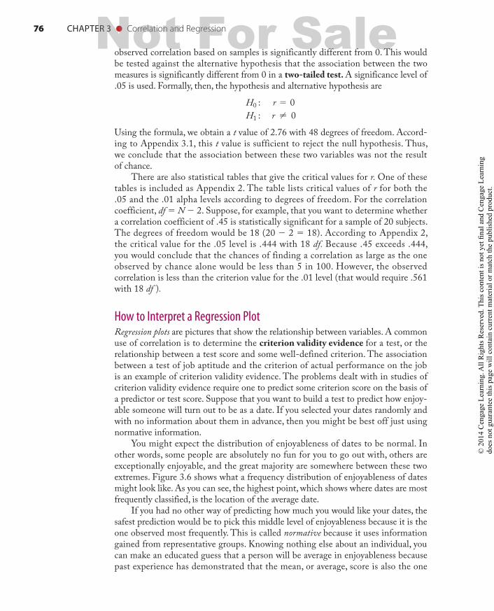
You might expect the distribution of enjoyableness of dates to be normal. In other words, some people are absolutely no fun for you to go out with, others are exceptionally enjoyable, and the great majority are somewhere between these two extremes. Figure 3.6 shows what a frequency distribution of enjoyableness of dates might look like. As you can see, the highest point, which shows where dates are most frequently classified, is the location of the average date.
If you had no other way of predicting how much you would like your dates, the safest prediction would be to pick this middle level of enjoyableness because it is the one observed most frequently. This is called normative because it uses information gained from representative groups. Knowing nothing else about an individual, you can make an educated guess that a person will be average in enjoyableness because past experience has demonstrated that the mean, or average, score is also the one
98137_ch03_rev02_063-098.indd 76 11/15/16 5:42 PM
Not For Sale
© 2
01 C
enga
ge L
earn
ing.
All
Rig
hts R
eser
ved.
Thi
s con
tent
is n
ot y
et fi
nal a
nd C
enga
ge L
earn
ing
does
not
gua
rant
ee th
is p
age
will
con
tain
cur
rent
mat
eria
l or m
atch
the
publ
ishe
d pr
oduc
t.
CHAPTER 3 ● Correlation and Regression 77
observed most frequently. In other words, knowing about the average date gives you some information about what to expect from a particular date. But it is doubtful that you would really want to choose dates this way. You probably would rather use other information such as educational background, attitudes, and hobbies to predict a good date.
Most of us, in fact, use some system to help us make important personal choices. The systems we come up with, however, are never perfect, but they are better than using normative information alone. In regression studies, researchers develop equations that help them describe more precisely where tests fall between being perfect predictors and being no better than just using the normative information. This is done by graphing the relationship between test scores and the criterion. Then a mathematical procedure is used to find the straight line that comes as close to as many of the points as possible. (You may want to review this chapter’s earlier section on the regression line.)
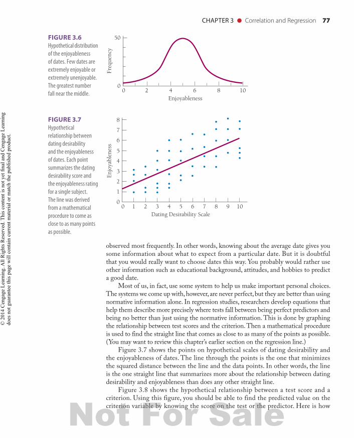
Figure 3.7 shows the points on hypothetical scales of dating desirability and the enjoyableness of dates. The line through the points is the one that minimizes the squared distance between the line and the data points. In other words, the line is the one straight line that summarizes more about the relationship between dating desirability and enjoyableness than does any other straight line.
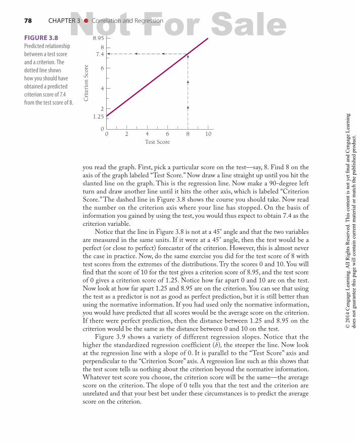
Figure 3.8 shows the hypothetical relationship between a test score and a criterion. Using this figure, you should be able to find the predicted value on the criterion variable by knowing the score on the test or the predictor. Here is how
8
7
6
5
1
4
3
2
Enjo
yabl
enes
s
010987654321
Dating Desirability Scale0
50
Freq
uenc
y
0108642
Enjoyableness0
FIGURE 3.6 Hypothetical distribution of the enjoyableness of dates. Few dates are extremely enjoyable or extremely unenjoyable. The greatest number fall near the middle.
FIGURE 3.7 Hypothetical relationship between dating desirability and the enjoyableness of dates. Each point summarizes the dating desirability score and the enjoyableness rating for a single subject. The line was derived from a mathematical procedure to come as close to as many points as possible.
98137_ch03_rev02_063-098.indd 77 11/15/16 5:42 PM
Not For Sale
© 2
01 C
enga
ge L
earn
ing.
All
Rig
hts R
eser
ved.
Thi
s con
tent
is n
ot y
et fi
nal a
nd C
enga
ge L
earn
ing
does
not
gua
rant
ee th
is p
age
will
con
tain
cur
rent
mat
eria
l or m
atch
the
publ
ishe
d pr
oduc
t.
78 CHAPTER 3 ● Correlation and Regression
you read the graph. First, pick a particular score on the test—say, 8. Find 8 on the axis of the graph labeled “Test Score.” Now draw a line straight up until you hit the slanted line on the graph. This is the regression line. Now make a 90-degree left turn and draw another line until it hits the other axis, which is labeled “Criterion Score.” The dashed line in Figure 3.8 shows the course you should take. Now read the number on the criterion axis where your line has stopped. On the basis of information you gained by using the test, you would thus expect to obtain 7.4 as the criterion variable.
Notice that the line in Figure 3.8 is not at a 45° angle and that the two variables are measured in the same units. If it were at a 45° angle, then the test would be a perfect (or close to perfect) forecaster of the criterion. However, this is almost never the case in practice. Now, do the same exercise you did for the test score of 8 with test scores from the extremes of the distributions. Try the scores 0 and 10. You will find that the score of 10 for the test gives a criterion score of 8.95, and the test score of 0 gives a criterion score of 1.25. Notice how far apart 0 and 10 are on the test. Now look at how far apart 1.25 and 8.95 are on the criterion. You can see that using the test as a predictor is not as good as perfect prediction, but it is still better than using the normative information. If you had used only the normative information, you would have predicted that all scores would be the average score on the criterion. If there were perfect prediction, then the distance between 1.25 and 8.95 on the criterion would be the same as the distance between 0 and 10 on the test.
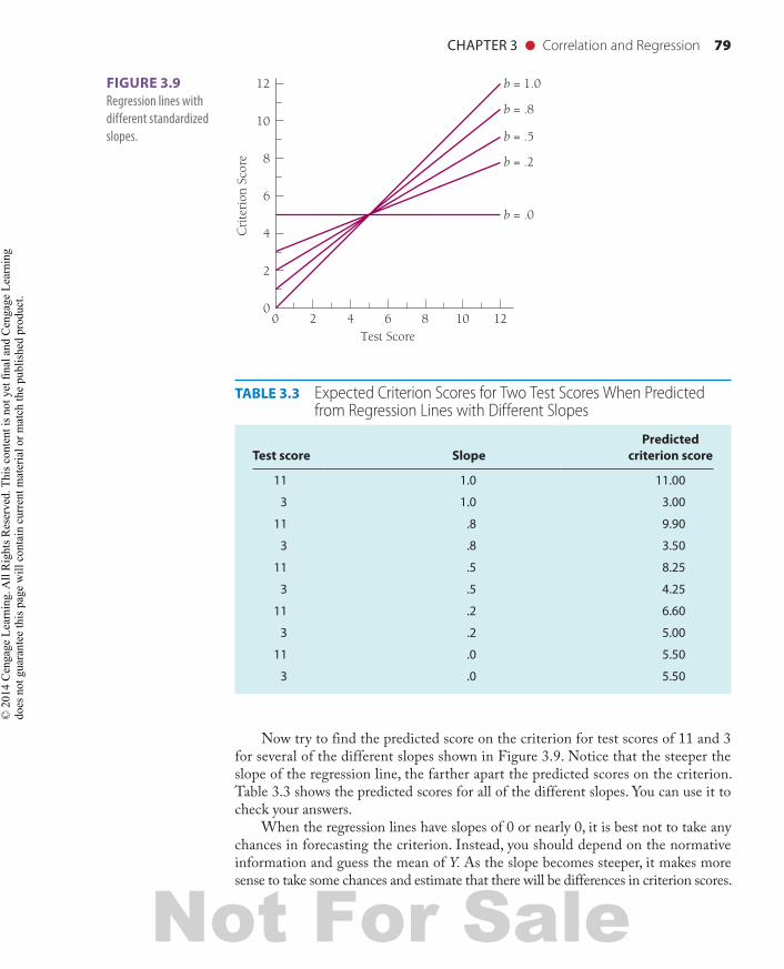
Figure 3.9 shows a variety of different regression slopes. Notice that the higher the standardized regression coefficient (b), the steeper the line. Now look at the regression line with a slope of 0. It is parallel to the “Test Score” axis and perpendicular to the “Criterion Score” axis. A regression line such as this shows that the test score tells us nothing about the criterion beyond the normative information. Whatever test score you choose, the criterion score will be the same—the average score on the criterion. The slope of 0 tells you that the test and the criterion are unrelated and that your best bet under these circumstances is to predict the average score on the criterion.
FIGURE 3.8 Predicted relationship between a test score and a criterion. The dotted line shows how you should have obtained a predicted criterion score of 7.4 from the test score of 8.
1086420Test Score
Cri
teri
on S
core
87.4
8.95
6
4
2
0
1.25
98137_ch03_rev02_063-098.indd 78 11/15/16 5:42 PM
Not For Sale
© 2
01 C
enga
ge L
earn
ing.
All
Rig
hts R
eser
ved.
Thi
s con
tent
is n
ot y
et fi
nal a
nd C
enga
ge L
earn
ing
does
not
gua
rant
ee th
is p
age
will
con
tain
cur
rent
mat
eria
l or m
atch
the
publ
ishe
d pr
oduc
t.
CHAPTER 3 ● Correlation and Regression 79
Now try to find the predicted score on the criterion for test scores of 11 and 3 for several of the different slopes shown in Figure 3.9. Notice that the steeper the slope of the regression line, the farther apart the predicted scores on the criterion. Table 3.3 shows the predicted scores for all of the different slopes. You can use it to check your answers.
When the regression lines have slopes of 0 or nearly 0, it is best not to take any chances in forecasting the criterion. Instead, you should depend on the normative information and guess the mean of Y. As the slope becomes steeper, it makes more sense to take some chances and estimate that there will be differences in criterion scores.
12108640 2Test Score
Cri
teri
on S
core
12
10
8
6
4
2
0
b = .0
b = .2
b = .5
b = .8
b = 1.0FIGURE 3.9 Regression lines with different standardized slopes.
TABLE 3.3 Expected Criterion Scores for Two Test Scores When Predicted from Regression Lines with Different Slopes
Test score SlopePredicted
criterion score
11 1.0 11.00
3 1.0 3.00
11 .8 9.90
3 .8 3.50
11 .5 8.25
3 .5 4.25
11 .2 6.60
3 .2 5.00
11 .0 5.50
3 .0 5.50
98137_ch03_rev02_063-098.indd 79 11/15/16 5:42 PM
Not For Sale
© 2
01 C
enga
ge L
earn
ing.
All
Rig
hts R
eser
ved.
Thi
s con
tent
is n
ot y
et fi
nal a
nd C
enga
ge L
earn
ing
does
not
gua
rant
ee th
is p
age
will
con
tain
cur
rent
mat
eria
l or m
atch
the
publ
ishe
d pr
oduc
t.
80 CHAPTER 3 ● Correlation and Regression
Figure 3.9 is also instructive regarding psychological tests. For example, if SAT scores have a slope of 0.5 for predicting grades in college, this means that the relationship between the SAT and performance is defined by the “b 5 0.5” line. Using this sort of information, college administrators can infer that SAT scores may predict differences in college performance. However, because the slope is not steep, those predictions are not far from what they would get if they used the normative information.
Other Correlation CoefficientsThe Pearson product moment correlation is only one of many types of correlation coefficients. It is the most commonly used because most often we want to find the correlation between two continuous variables. Continuous variables such as height, weight, and intelligence can take on any values over a range of values. But sometimes we want to find the correlations between variables scaled in other ways.
Spearman’s rho is a method of correlation for finding the association between two sets of ranks. The rho coefficient (r) is easy to calculate and is often used when the individuals in a sample can be ranked on two variables but their actual scores are not known or have a normal distribution.
One whole family of correlation coefficients involves dichotomous variables. Dichotomous variables have only two levels. Examples are yes-no, correct-incorrect, and male-female. Some dichotomous variables are called true dichotomous because they naturally form two categories. For example, gender is a true dichotomous variable. Other dichotomous variables are called artif icially dichotomous because they reflect an underlying continuous scale forced into a dichotomy. Passing or failing a bar examination is an example of such an artificial dichotomy; although many scores can be obtained, the examiners consider only pass and fail. The types of correlation coefficients used to find the relationship between dichotomous and continuous variables are shown in Table 3.4.
The biserial correlation expresses the relationship between a continuous variable and an artificial dichotomous variable. For example, the biserial correlation
TABLE 3.4 Appropriate Correlation Coefficients for Relationships between Dichotomous and Continuous Variables*
Variable X
Variable Y ContinuousArtificial dichotomous
True dichotomous
Continuous Pearson r Biserial r Point biserial r
Artificial dichotomous Biserial r Tetrachoric r Phi
True dichotomous Point biserial r Phi Phi
*The entries in the table suggest which type of correlation coefficient is appropriate given the characteristics of the two variables. For example, if variable Y is continuous and variable X is true dichotomous, you would use the point biserial correlation.
98137_ch03_rev02_063-098.indd 80 11/15/16 5:42 PM
Not For Sale
© 2
01 C
enga
ge L
earn
ing.
All
Rig
hts R
eser
ved.
Thi
s con
tent
is n
ot y
et fi
nal a
nd C
enga
ge L
earn
ing
does
not
gua
rant
ee th
is p
age
will
con
tain
cur
rent
mat
eria
l or m
atch
the
publ
ishe
d pr
oduc
t.
CHAPTER 3 ● Correlation and Regression 81
PSYCHOLOGICAL TESTING IN EVERYDAY LIFE
Formulas for Spearman’s Rho, the Point Biserial Correlation, and the Phi Coefficient
Spearman’s rho formula: r 5 126Σd 2i
N 323where
r 5 Spearman’s rho coefficientdi 5 a subject’s rank order on variable 2 minus his or her rank
order on variable 1N 5 the number of paired ranks
When used: To find the association between pairs of observations, each expressed in ranks.
Point biserial correlation formula: rpbis 5 c Y12YSy
d Ä Px12Px
whererpbis 5 the point biserial correlation coefficient
X 5 a true dichotomous (two-choice) variableY 5 a continuous (multilevel) variableY1 5 the mean of Y for subjects have a “plus” score on XP 5 the mean of Y for all subjectsSy 5 the standard deviation for scoresPx 5 the proportion of subjects giving a “plus” score on X
3.2
might be used to assess the relationship between passing or failing the bar examination (artificial dichotomous variable) and GPA in law school (continuous variable). If the dichotomous variable had been “true” (such as gender), then we would use the point biserial correlation. For instance, the point biserial correlation would be used to find the relationship between gender and GPA. When both variables are dichotomous and at least one of the dichotomies is “true,” then the association between them can be estimated using the phi coeff icient. For example, the relationship between passing or failing the bar examination and gender could be estimated using the phi coefficient. If both dichotomous variables are artificial, we might use a special correlation coefficient known as the tetrachoric correlation. Among these special correlation coefficients, the point biserial, phi, and Spearman’s rho coefficients are probably used most often. The formulas for calculating these correlations are given in Psychological Testing in Everyday Life 3.2.
(continues)
98137_ch03_rev02_063-098.indd 81 11/15/16 5:42 PM
Not For Sale
© 2
01 C
enga
ge L
earn
ing.
All
Rig
hts R
eser
ved.
Thi
s con
tent
is n
ot y
et fi
nal a
nd C
enga
ge L
earn
ing
does
not
gua
rant
ee th
is p
age
will
con
tain
cur
rent
mat
eria
l or m
atch
the
publ
ishe
d pr
oduc
t.
82 CHAPTER 3 ● Correlation and Regression
When used: To find the association between a dichotomous (two-choice) vari-able and a continuous variable. For the true dichotomous variable, one of the two choices is arbitrarily designated as a “plus” response.
Phi coefficient formula: f 5Pc2Px Py
Px112Px2Py 112Py2where
f 5 the phi coefficientPc 5 the proportion in the “plus” category for both variablesPx 5 the proportion in the “plus” category for the first variablePy 5 the proportion in the “plus” category for the second variable
When used: To find the association between two dichotomous (two-category) variables. A dichotomous variable might be yes/no or on/off. In each case, one of the two choices is arbitrarily chosen as a “plus” response. When you use phi, one of the variables must be “true” dichotomy (if both were “artificial,” the tetracho-ric correlation would be more appropriate).
PSYCHOLOGICAL TESTING IN EVERYDAY LIFE (continued)3.2
Terms and Issues in the Use of CorrelationWhen you use correlation or read studies that report correlational analysis, you will need to know the terminology. Some of the terms and issues you should be familiar with are residual, standard error of estimate, coeff icient of determination, coeff icient of alienation, shrinkage, cross validation, correlation—causation problem, and third vari-able. Brief discussions of these terms and concepts follow.
ResidualA regression equation gives a predicted value of Y′ for each value of X. In addition to these predicted values, there are observed values of Y. The difference between the predicted and the observed values is called the residual. Symbolically, the residual is defined as Y2Y′.
Consider the example of the CES-D. Earlier we calculated the regression equation that predicted CES-D scores from scores on the anger inventory. The equation suggested that predicted CES-D 5 26.85 1 .67 3 anger score. Let’s take the example of a person who had an anger score of 19 and an observed CES-D score of 7. The predicted CES-D score is
26.851 1.673192 5 5.88
98137_ch03_rev02_063-098.indd 82 11/15/16 5:42 PM
Not For Sale
© 2
01 C
enga
ge L
earn
ing.
All
Rig
hts R
eser
ved.
Thi
s con
tent
is n
ot y
et fi
nal a
nd C
enga
ge L
earn
ing
does
not
gua
rant
ee th
is p
age
will
con
tain
cur
rent
mat
eria
l or m
atch
the
publ
ishe
d pr
oduc
t.
CHAPTER 3 ● Correlation and Regression 83
In other words, the person had an observed score of 7 and a predicted score of 5.88. The residual is4
725.88 5 1.12In regression analysis, the residuals have certain properties. One important
property is that the sum of the residuals always equals 0 [Σ(Y2Y′) 5 0]. In addition, the sum of the squared residuals is the smallest value according to the principle of least squares [Σ(Y2Y′)2 5 smallest value].
Standard Error of EstimateOnce we have obtained the residuals, we can find their standard deviation. However, in creating the regression equation, we have found two constants (a and b). Thus, we must use two degrees of freedom rather than one, as is usually the case in finding the standard deviation. The standard deviation of the residuals is known as the standard error of estimate, which is defined as
Syx 5 ÅΣ(Y2Y′)2
N22The standard error of estimate is a measure of the accuracy of prediction. Prediction is most accurate when the standard error of estimate is relatively small. As it be-comes larger, the prediction becomes less accurate.
Coefficient of DeterminationThe correlation coefficient squared is known as the coefficient of determination. This value tells us the proportion of the total variation in scores on Y that we know as a function of information about X. For example, if the correlation between the SAT score and performance in the first year of college is .40, then the coefficient of determination is .16. The calculation is simply .402 5 .16. This means that we can explain 16% of the variation in first-year college performance by knowing SAT scores. In the CES-D and anger example, the correlation is .82. Therefore, the coef-ficient of determination is .67 (calculated as .822 5 .67), suggesting that 67% of the variance in CES-D can be accounted for by the anger score.
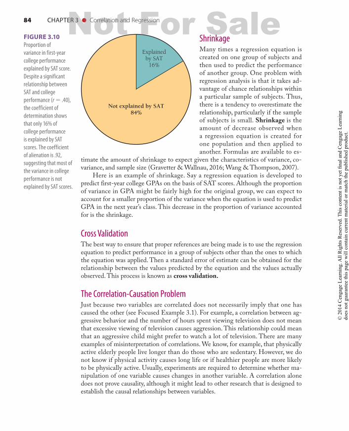
Coefficient of AlienationThe coefficient of alienation is a measure of nonassociation between two vari-ables. This is calculated as "12r 2, where r is the coefficient of determination. For the SAT example, the coefficient of alienation is !12 .16 5 !.84 5 .92. This means that there is a high degree of nonassociation between SAT scores and col-lege performance. In the CES-D and anger example, the coefficient of alienation is !12 .67 5 .57. Figure 3.10 shows the coefficient of determination and the coeffi-cient of alienation represented in a pie chart.
4There is a small discrepancy between 1.12 and 1.04 for the example in Table 3.2, page 77. The differ-ence is the result of rounding error.
98137_ch03_rev02_063-098.indd 83 11/15/16 5:42 PM
Not For Sale
© 2
01 C
enga
ge L
earn
ing.
All
Rig
hts R
eser
ved.
Thi
s con
tent
is n
ot y
et fi
nal a
nd C
enga
ge L
earn
ing
does
not
gua
rant
ee th
is p
age
will
con
tain
cur
rent
mat
eria
l or m
atch
the
publ
ishe
d pr
oduc
t.
84 CHAPTER 3 ● Correlation and Regression
ShrinkageMany times a regression equation is created on one group of subjects and then used to predict the performance of another group. One problem with regression analysis is that it takes ad-vantage of chance relationships within a particular sample of subjects. Thus, there is a tendency to overestimate the relationship, particularly if the sample of subjects is small. Shrinkage is the amount of decrease observed when a regression equation is created for one population and then applied to another. Formulas are available to es-
timate the amount of shrinkage to expect given the characteristics of variance, co-variance, and sample size (Gravetter & Wallnau, 2016; Wang & Thompson, 2007).
Here is an example of shrinkage. Say a regression equation is developed to predict first-year college GPAs on the basis of SAT scores. Although the proportion of variance in GPA might be fairly high for the original group, we can expect to account for a smaller proportion of the variance when the equation is used to predict GPA in the next year’s class. This decrease in the proportion of variance accounted for is the shrinkage.
Cross ValidationThe best way to ensure that proper references are being made is to use the regression equation to predict performance in a group of subjects other than the ones to which the equation was applied. Then a standard error of estimate can be obtained for the relationship between the values predicted by the equation and the values actually observed. This process is known as cross validation.
The Correlation-Causation ProblemJust because two variables are correlated does not necessarily imply that one has caused the other (see Focused Example 3.1). For example, a correlation between ag-gressive behavior and the number of hours spent viewing television does not mean that excessive viewing of television causes aggression. This relationship could mean that an aggressive child might prefer to watch a lot of television. There are many examples of misinterpretation of correlations. We know, for example, that physically active elderly people live longer than do those who are sedentary. However, we do not know if physical activity causes long life or if healthier people are more likely to be physically active. Usually, experiments are required to determine whether ma-nipulation of one variable causes changes in another variable. A correlation alone does not prove causality, although it might lead to other research that is designed to establish the causal relationships between variables.
Explainedby SAT
16%
Not explained by SAT84%
FIGURE 3.10 Proportion of variance in first-year college performance explained by SAT score. Despite a significant relationship between SAT and college performance (r 5 .40), the coefficient of determination shows that only 16% of college performance is explained by SAT scores. The coefficient of alienation is .92, suggesting that most of the variance in college performance is not explained by SAT scores.
98137_ch03_rev02_063-098.indd 84 11/15/16 5:42 PM
Not For Sale
© 2
01 C
enga
ge L
earn
ing.
All
Rig
hts R
eser
ved.
Thi
s con
tent
is n
ot y
et fi
nal a
nd C
enga
ge L
earn
ing
does
not
gua
rant
ee th
is p
age
will
con
tain
cur
rent
mat
eria
l or m
atch
the
publ
ishe
d pr
oduc
t.

CHAPTER 3 ● Correlation and Regression 85
FOCUSED EXAMPLE
The Danger of Inferring Causation from CorrelationA newspaper article once rated 130 job categories for stressfulness by examining Tennessee hospi-tal and death records for evidence of stress-related diseases such as heart attacks, ulcers, arthritis, and mental disorders. The 12 highest and the 12 lowest jobs are listed in the table to the right.
The article advises readers to avoid the “most stressful” job categories. The evidence, however, may not warrant the advice offered in the article. Although certain diseases may be associated with particular oc-cupations, holding these jobs does not necessarily cause the illnesses. Other explanations abound. For example, people with a propensity for heart attacks and ulcers might tend to select jobs as unskilled la-borers or secretaries. Thus, the direction of causation might be that a health condition causes job selection rather than the reverse. Another possibility involves a third variable, some other factor that causes the apparent relationship between job and health. For example, a certain income level might cause both stress and illness. Finally, wealthy people tend to have better health than poor people. Impoverished condi-tions may cause a person to accept certain jobs and also to have more diseases.
These three possible explanations are dia-grammed in the right-hand column. An arrow in-dicates a causal connection. In this example, we are not ruling out the possibility that jobs cause illness. In fact, it is quite plausible. However, because the nature of the evidence is correlational, we cannot say with certainty that a job causes illness.
3.1
Most Stressful Least Stressful
1. Unskilled laborer 1. Clothing sewer
2. Secretary 2. Garment checker
3. Assembly-line inspector
3. Stock clerk
4. Clinical lab technician 4. Skilled craftsperson
5. Office manager 5. Housekeeper
6. Foreperson 6. Farm laborer
7. Manager/administrator 7. Heavy equipment operator
8. Waiter 8. Freight handler
9. Factory machine operator
9. Child-care worker
10. Farm owner 10. Factory package wrapper
11. Miner 11. College professor
12. House painter 12. Personnel worker
Job ➝ Illness Illnes ➝ Job Economic Status
Job IllnessJob causes illness
Tendency toward illness causes people to choose certain jobs
Economic status (third variable) causes job selection and illness
Third Variable ExplanationThere are other possible explanations for the observed relationship between televi-sion viewing and aggressive behavior. One is that some third variable, such as poor social adjustment, causes both. Thus, the apparent relationship between viewing and aggression actually might be the result of some variable not included in the analy-sis. In the example of the relationship between physical activity and life expectancy, chronic disease may cause both sedentary lifestyle and shortened life expectancy. We usually refer to this external influence as a third variable.
98137_ch03_rev02_063-098.indd 85 11/15/16 5:42 PM
Not For Sale
© 2
01 C
enga
ge L
earn
ing.
All
Rig
hts R
eser
ved.
Thi
s con
tent
is n
ot y
et fi
nal a
nd C
enga
ge L
earn
ing
does
not
gua
rant
ee th
is p
age
will
con
tain
cur
rent
mat
eria
l or m
atch
the
publ
ishe
d pr
oduc
t.
86 CHAPTER 3 ● Correlation and Regression
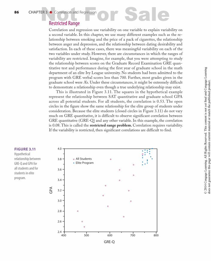
Restricted RangeCorrelation and regression use variability on one variable to explain variability on a second variable. In this chapter, we use many different examples such as the re-lationship between smoking and the price of a pack of cigarettes, the relationship between anger and depression, and the relationship between dating desirability and satisfaction. In each of these cases, there was meaningful variability on each of the two variables under study. However, there are circumstances in which the ranges of variability are restricted. Imagine, for example, that you were attempting to study the relationship between scores on the Graduate Record Examination GRE quan-titative test and performance during the first year of graduate school in the math department of an elite Ivy League university. No students had been admitted to the program with GRE verbal scores less than 700. Further, most grades given in the graduate school were A’s. Under these circumstances, it might be extremely difficult to demonstrate a relationship even though a true underlying relationship may exist.
This is illustrated in Figure 3.11. The squares in the hypothetical example represent the relationship between SAT quantitative and graduate school GPA across all potential students. For all students, the correlation is 0.53. The open circles in the figure show the same relationship for the elite group of students under consideration. Because the elite students (closed circles in Figure 3.11) do not vary much on GRE quantitative, it is difficult to observe significant correlation between GRE quantitative (GRE-Q) and any other variable. In this example, the correlation is 0.08. This is called the restricted range problem. Correlation requires variability. If the variability is restricted, then significant correlations are difficult to find.
All StudentsElite Program
GRE-Q
GPA
4.0
3.8
3.6
3.4
3.2
3.0
2.8
2.6
400 500 600 700 8002.4
FIGURE 3.11 Hypothetical relationship between GRE-Q and GPA for all students and for students in elite program.
98137_ch03_rev02_063-098.indd 86 11/15/16 5:42 PM
Not For Sale
© 2
01 C
enga
ge L
earn
ing.
All
Rig
hts R
eser
ved.
Thi
s con
tent
is n
ot y
et fi
nal a
nd C
enga
ge L
earn
ing
does
not
gua
rant
ee th
is p
age
will
con
tain
cur
rent
mat
eria
l or m
atch
the
publ
ishe
d pr
oduc
t.
CHAPTER 3 ● Correlation and Regression 87
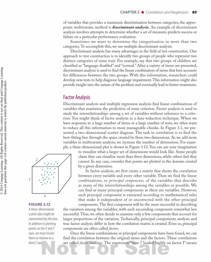
Multivariate Analysis (Optional)Multivariate analysis considers the relationship among combinations of three or more variables. For example, the prediction of success in the first year of college from the linear combination of SAT verbal and quantitative scores is a problem for multivariate analysis. However, because the field of multivariate analysis requires an understanding of linear and matrix algebra, a detailed discussion of it lies beyond the scope of this book.
On the other hand, you should have at least a general idea of what the different common testing methods entail. This section will familiarize you with some of the multivariate analysis terminology. It will also help you identify the situations in which some of the different multivariate methods are used. Several references are available in case you would like to learn more about the technical details (Brown, 2015; Gravetter & Wallnau, 2016; Vogt & Johnson, 2015).
General ApproachThe correlational techniques presented to this point describe the relationship be-tween only two variables such as stress and illness. To understand more fully the causes of illness, we need to consider many potential factors besides stress. Multi-variate analysis allows us to study the relationship between many predictors and one outcome, as well as the relationship among the predictors.
Multivariate methods differ in the number and kind of predictor variables they use. All of these methods transform groups of variables into linear combinations. A linear combination of variables is a weighted composite of the original variables. The weighting system combines the variables in order to achieve some goal. Multivariate techniques differ according to the goal they are trying to achieve.
A linear combination of variables looks like this:Y′ 5 a1b1 X11b2 X21b3 X31c1bk Xk
where Y′ is the predicted value of Y, a is a constant, X1 to Xk are variables and there are k such variables, and the b’s are regression coefficients. If you feel anxious about such a complex-looking equation, there is no need to panic. Actually, this equation describes something similar to what was presented in the section on regression. The difference is that instead of relating Y to X, we are now dealing with a linear combi-nation of X’s. The whole right side of the equation creates a new composite variable by transforming a set of predictor variables.
An Example Using Multiple RegressionSuppose we want to predict success in law school from three variables: undergrad-uate GPA, rating by former professors, and age. This type of multivariate analysis is called multiple regression, and the goal of the analysis is to find the linear combina-tion of the three variables that provides the best prediction of law school success. We find the correlation between the criterion (law school GPA) and some composite of the predictors (undergraduate GPA plus professor rating plus age). The combina-tion of the three predictors, however, is not just the sum of the three scores. Instead,
98137_ch03_rev02_063-098.indd 87 11/15/16 5:42 PM
Not For Sale
© 2
01 C
enga
ge L
earn
ing.
All
Rig
hts R
eser
ved.
Thi
s con
tent
is n
ot y
et fi
nal a
nd C
enga
ge L
earn
ing
does
not
gua
rant
ee th
is p
age
will
con
tain
cur
rent
mat
eria
l or m
atch
the
publ
ishe
d pr
oduc
t.
88 CHAPTER 3 ● Correlation and Regression
we program the computer to find a specific way of adding the predictors that will make the correlation between the composite and the criterion as high as possible. A weighted composite might look something like this:
law school GPA 5 .80 (Z scores of undergraduate GPA) 1 .54 (Z scores of professor ratings) 1 .03 (Z scores of age)
This example suggests that undergraduate GPA is given more weight in the prediction of law school GPA than are the other variables. The undergraduate GPA is multiplied by .80, whereas the other variables are multiplied by much smaller coefficients. Age is multiplied by only .03, which is almost no contribution. This is because .03 times any Z score for age will give a number that is nearly 0; in effect, we would be adding 0 to the composite.
The reason for using Z scores for the three predictors is that the coefficients in the linear composite are greatly affected by the range of values taken on by the variables. GPA is measured on a scale from 0 to 4.0, whereas the range in age might be 21 to 70. To compare the coefficients to one another, we need to transform all the variables into similar units. This is accomplished by using Z scores (see Chapter 2). When the variables are expressed in Z units, the coefficients, or weights for the variables, are known as standardized regression coeff icients (sometimes called B’s or betas). There are also some cases in which we would want to use the variables’ original units. For example, we sometimes want to find an equation we can use to estimate someone’s predicted level of success on the basis of personal characteristics, and we do not want to bother changing these characteristics into Z units. When we do this, the weights in the model are called raw regression coeff icients (sometimes called b’s).
Before moving on, we should caution you about interpreting regression coefficients. Besides reflecting the relationship between a particular variable and the criterion, the coefficients are affected by the relationship among the predictor variables. Be careful when the predictor variables are highly correlated with one another. Two predictor variables that are highly correlated with the criterion will not both have large regression coefficients if they are highly correlated with each other as well. For example, suppose that undergraduate GPA and the professors’ rating are both highly correlated with law school GPA. However, these two predictors also are highly correlated with each other. In effect, the two measures seem to be of the same thing (which would not be surprising, because the professors assigned the grades). As such, professors’ rating may get a lower regression coefficient because some of its predictive power is already taken into consideration through its association with undergraduate GPA. We can only interpret regression coefficients confidently when the predictor variables do not overlap and are uncorrected. They may do so when the predictors are uncorrected.
Discriminant AnalysisMultiple regression is appropriate when the criterion variable is continuous (not nominal). However, there are many cases in testing where the criterion is a set of cat-egories. For example, we often want to know the linear combination of variables that differentiates passing from failing. When the task is to find the linear combination
98137_ch03_rev02_063-098.indd 88 11/15/16 5:42 PM
Not For Sale
© 2
01 C
enga
ge L
earn
ing.
All
Rig
hts R
eser
ved.
Thi
s con
tent
is n
ot y
et fi
nal a
nd C
enga
ge L
earn
ing
does
not
gua
rant
ee th
is p
age
will
con
tain
cur
rent
mat
eria
l or m
atch
the
publ
ishe
d pr
oduc
t.
CHAPTER 3 ● Correlation and Regression 89
of variables that provides a maximum discrimination between categories, the appro-priate multivariate method is discriminant analysis. An example of discriminant analysis involves attempts to determine whether a set of measures predicts success or failure on a particular performance evaluation.
Sometimes we want to determine the categorization in more than two categories. To accomplish this, we use multiple discriminant analysis.
Discriminant analysis has many advantages in the field of test construction. One approach to test construction is to identify two groups of people who represent two distinct categories of some trait. For example, say that two groups of children are classified as “language disabled” and “normal.” After a variety of items are presented, discriminant analysis is used to find the linear combination of items that best accounts for differences between the two groups. With this information, researchers could develop new tests to help diagnose language impairment. This information might also provide insight into the nature of the problem and eventually lead to better treatments.
Factor AnalysisDiscriminant analysis and multiple regression analysis find linear combinations of variables that maximize the prediction of some criterion. Factor analysis is used to study the interrelationships among a set of variables without reference to a crite-rion. You might think of factor analysis as a data-reduction technique. When we have responses to a large number of items or a large number of tests, we often want to reduce all this information to more manageable chunks. In Figure 3.1, we pre-sented a two-dimensional scatter diagram. The task in correlation is to find the best-fitting line through the space created by these two dimensions. As we add more variables in multivariate analysis, we increase the number of dimensions. For exam-ple, a three-dimensional plot is shown in Figure 3.12. You can use your imagination
to visualize what a larger set of dimensions would look like. Some people claim they can visualize more than three dimensions, while others feel they cannot. In any case, consider that points are plotted in the domain created by a given dimension.
In factor analysis, we first create a matrix that shows the correlation between every variable and every other variable. Then we find the linear combinations, or principal components, of the variables that describe as many of the interrelationships among the variables as possible. We can find as many principal components as there are variables. However, each principal component is extracted according to mathematical rules that make it independent of or uncorrected with the other principal components. The first component will be the most successful in describing
the variation among the variables, with each succeeding component somewhat less successful. Thus, we often decide to examine only a few components that account for larger proportions of the variation. Technically, principal components analysis and true factor analysis differ in how the correlation matrix is created. Even so, principal components are often called factors.
Once the linear combinations or principal components have been found, we can find the correlation between the original items and the factors. These correlations are called factor loadings. The expression “item 7 loaded highly on factor I” means
FIGURE 3.12 A three-dimensional scatter plot might be represented by this box. In addition to plotting points on the X and Y axes, we must locate them in relation to a third Z axis.
Y
X
Z
98137_ch03_rev02_063-098.indd 89 11/15/16 5:42 PM
Not For Sale
© 2
01 C
enga
ge L
earn
ing.
All
Rig
hts R
eser
ved.
Thi
s con
tent
is n
ot y
et fi
nal a
nd C
enga
ge L
earn
ing
does
not
gua
rant
ee th
is p
age
will
con
tain
cur
rent
mat
eria
l or m
atch
the
publ
ishe
d pr
oduc
t.

90 CHAPTER 3 ● Correlation and Regression
FOCUSED EXAMPLE3.2
The Factors of TrustRotter (1967) described a scale for the measure-ment of interpersonal trust. Trust was defined as “an expectancy held by an individual or a group that the word, promise, verbal or written state-ment of another individual or group can be relied upon” (p. 651). However, after the publication of the original trust ar ticle, several authors re-ported that trust seems to be composed of sev-eral independent factors (Chun & Campbell, 1974; Kaplan, 1973; Wright & Tedeschi, 1975). In each case, the items were given to a large group of people, and the results were subjected to factor analysis. This procedure reduces the many items down to a smaller number of factors, or linear combinations of the original items. Then item loadings, or the cor-relations of the original items with the factors, are studied in order to name the factors. The table that follows shows the loadings of the items on three of the factors (Kaplan, 1973).
Once they have obtained the factor loadings, researchers must attempt to name the factors by ex-amining which items load highly on them. In this case, an item was used to help interpret a factor if its item loading on the factor was greater than .35 or less than 2.35. Three factors of trust were found.
Factor I: Institutional trust. This represented trust toward major social agents in society. It included items regarding the competence of politicians, such as “This country has a dark future unless we can attract better people into politics” (2.67). Many of the items con-veyed the idea of misrepresentation of public events by either the government or the mass media. For ex-ample, some items with high loadings were “Most people would be horrified if they knew how much news the public hears and sees is distorted” (2.69) and
“Even though we have reports in newspapers, radio, and TV, it is hard to get objective accounts of public events” (2.67).
Factor II: Sincerity. Items loading highly on sincer-ity tended to focus on the perceived sincerity of others. These items included “Most idealists are sincere and usually practice what they preach” (.62) and “Most peo-ple answer public opinion polls honestly” (.58). Nearly all the items with high loadings on the second factor began with the word “most.” Because of this loose wording, it would be possible for people to agree with the items because they believe in the sincerity of most people in a given group but still feel little trust for the group because of a few “rotten eggs.” Thus, a woman could believe most car repairers are sincere but still service her car herself because she fears being overcharged.
Factor III: Caution. This contained items that ex-pressed fear that some people will take advantage of others, such as “In dealing with strangers, one is better off being cautious until they have provided evidence that they are trustworthy” (.74) and “In these compet-itive times you have to be alert or someone is likely to take advantage of you” (.53). Note that caution appears to be independent of perceived sincerity.
The data imply that generalized trust may be composed of several dimensions. It also implies that focusing on specific components of trust rather than the generalized case will likely help researchers the most in using this trust scale.
Focused Example adapted from Rotter (1967); table taken from Kaplan (1973).
there is a high correlation between item 7 and the first principal component. By examining which variables load highly on each factor, we can start interpreting the meanings of the factors. Focused Example 3.2 shows how the meanings of various factors in a scale on interpersonal trust are evaluated.
Factor analysis is a complex and technical method with many options the user must learn about. For example, users frequently use methods that help them get a clearer picture of the meaning of the components by transforming the variables in
98137_ch03_rev02_063-098.indd 90 11/15/16 5:42 PM
Not For Sale
© 2
01 C
enga
ge L
earn
ing.
All
Rig
hts R
eser
ved.
Thi
s con
tent
is n
ot y
et fi
nal a
nd C
enga
ge L
earn
ing
does
not
gua
rant
ee th
is p
age
will
con
tain
cur
rent
mat
eria
l or m
atch
the
publ
ishe
d pr
oduc
t.
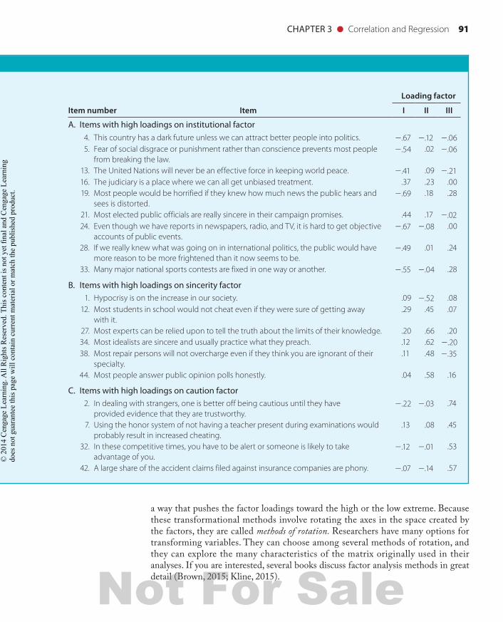
CHAPTER 3 ● Correlation and Regression 91
FOCUSED EXAMPLE
Loading factor
Item number Item I II III
A. Items with high loadings on institutional factor 4. This country has a dark future unless we can attract better people into politics. 2.67 2.12 2.06 5. Fear of social disgrace or punishment rather than conscience prevents most people
from breaking the law.2.54 .02 2.06
13. The United Nations will never be an effective force in keeping world peace. 2.41 .09 2.21 16. The judiciary is a place where we can all get unbiased treatment. .37 .23 .00 19. Most people would be horrified if they knew how much news the public hears and
sees is distorted.2.69 .18 .28
21. Most elected public officials are really sincere in their campaign promises. .44 .17 2.02 24. Even though we have reports in newspapers, radio, and TV, it is hard to get objective
accounts of public events.2.67 2.08 .00
28. If we really knew what was going on in international politics, the public would have more reason to be more frightened than it now seems to be.
2.49 .01 .24
33. Many major national sports contests are fixed in one way or another. 2.55 2.04 .28
B. Items with high loadings on sincerity factor 1. Hypocrisy is on the increase in our society. .09 2.52 .08 12. Most students in school would not cheat even if they were sure of getting away
with it..29 .45 .07
27. Most experts can be relied upon to tell the truth about the limits of their knowledge. .20 .66 .20 34. Most idealists are sincere and usually practice what they preach. .12 .62 2.20 38. Most repair persons will not overcharge even if they think you are ignorant of their
specialty..11 .48 2.35
44. Most people answer public opinion polls honestly. .04 .58 .16
C. Items with high loadings on caution factor 2. In dealing with strangers, one is better off being cautious until they have
provided evidence that they are trustworthy.2.22 2.03 .74
7. Using the honor system of not having a teacher present during examinations would probably result in increased cheating.
.13 .08 .45
32. In these competitive times, you have to be alert or someone is likely to take advantage of you.
2.12 2.01 .53
42. A large share of the accident claims filed against insurance companies are phony. 2.07 2.14 .57
a way that pushes the factor loadings toward the high or the low extreme. Because these transformational methods involve rotating the axes in the space created by the factors, they are called methods of rotation. Researchers have many options for transforming variables. They can choose among several methods of rotation, and they can explore the many characteristics of the matrix originally used in their analyses. If you are interested, several books discuss factor analysis methods in great detail (Brown, 2015; Kline, 2015).
98137_ch03_rev02_063-098.indd 91 11/15/16 5:42 PM
Not For Sale
© 2
01 C
enga
ge L
earn
ing.
All
Rig
hts R
eser
ved.
Thi
s con
tent
is n
ot y
et fi
nal a
nd C
enga
ge L
earn
ing
does
not
gua
rant
ee th
is p
age
will
con
tain
cur
rent
mat
eria
l or m
atch
the
publ
ishe
d pr
oduc
t.

92 CHAPTER 3 ● Correlation and Regression
SummaryThis chapter began with a discussion of a claim made in a grocery store tabloid that poor diet causes marital problems. Actually, there was no specific evidence that diet causes the problems—only that diet and marital difficulties are associated. However, the Enquirer failed to specify the exact strength of the association. The rest of the chapter was designed to help you be more specific than the Enquirer by learning to specify associations with precise mathematical indexes known as correlation coefficients.
First, we presented pictures of the association between two variables; these pic-tures are called scatter diagrams. Second, we presented a method for finding a linear equation to describe the relationship between two variables. This regression method uses the data in raw units. The results of regression analysis are two constants: A slope describes the degree of relatedness between the variables, and an intercept gives the value of the Y variable when the X variable is 0. When both of the variables are in standardized or Z units, the intercept is always 0 and drops out of the equation. In this unique situation, we solve for only one constant, which is r, or the correlation coefficient.
When using correlational methods, we must take many things into consider-ation. For example, correlation does not mean the same thing as causation. In the case of the National Enquirer article, the observed correlation between diet and problems in marriage may mean that diet causes the personal difficulties. However, it may also mean that marriage problems cause poor eating habits or that some third variable causes both diet habits and marital problems. In addition to the difficulties associated with causation, we must always consider the strength of the correlational relationship. The coeff icient of determination describes the percentage of variation in one variable that is known on the basis of its association with another variable. The coeff icient of alienation is an index of what is not known from information about the other variable.
A regression line is the best-fitting straight line through a set of points in a scat-ter diagram. The regression line is described by a mathematical index known as the regression equation. The regression coeff icient is the ratio of covariance to variance and is also known as the slope of the regression line. The regression coefficient describes how much change is expected in the Y variable each time the X variable increases by one unit. Other concepts discussed were the intercept, the residual (the difference between the predicted value given by a regression equation and the observed value), and the standard error of estimate (the standard deviation of the residuals obtained from the regression equation).
The field of multivariate analysis involves a complicated but important set of methods for studying the relationships among many variables. Multiple regression is a multivariate method for studying the relationship between one criterion variable and two or more predictor variables. A similar method known as discriminant anal-ysis is used to study the relationship between a categorical criterion and two or more predictors. Factor analysis is another multivariate method for reducing a large set of variables down to a smaller set of composite variables.
Correlational methods are the most commonly used statistical techniques in the testing field. The concepts presented in this overview will be referred to throughout the rest of this book.
98137_ch03_rev02_063-098.indd 92 11/15/16 5:42 PM
Not For Sale
© 2
01 C
enga
ge L
earn
ing.
All
Rig
hts R
eser
ved.
Thi
s con
tent
is n
ot y
et fi
nal a
nd C
enga
ge L
earn
ing
does
not
gua
rant
ee th
is p
age
will
con
tain
cur
rent
mat
eria
l or m
atch
the
publ
ishe
d pr
oduc
t.

CHAPTER 3 ● Correlation and Regression 93
APPENDIX 3.1: Calculation of a Regression Equation and a Correlation Coefficient
In this appendix, we consider the relationship between team performance and payroll for teams in baseball’s National League. Data used here are from the 2016 sea-son and available on the Internet at www.espn.com. The 2016 season was of particular interest to baseball fans because the World Series pitted the Chicago Cubs with a pay-roll of more than $154 million against the Cleveland Indians with a payroll of a mere $74 million. The Cubs/Indians won the Series, raising the question of whether there is a relationship between expenditure and performance of professional baseball teams.
In this example, payroll for National League teams is measured as mean player salary (expressed in millions of dollars) whereas performance is measured by the num-ber of games won1. The data are shown in Table 3.5 and summarized in Figure 3.13. Each dot in the figure represents one team. In 2016, there was a positive relationship between payroll and performance. In other words, teams with higher median sala-ries had better performance. As Figure 3.13 indicates, each increase in expenditure is
TABLE 3.5 Games Won and Median Salaries for Teams in Baseball’s National
Team
Average Salary
(X)
Games Won
(Y) X 2 Y 2 XY
Dodgers $8.85 91 $78.35 8,281 805.49
Giants $6.89 87 $47.47 7,569 599.44
Cubs $6.18 103 $38.23 10,609 636.85
Cardinals $5.72 86 $32.74 7,396 492.10
Nationals $5.67 95 $32.10 9,025 538.28
Mets $5.36 87 $28.68 7,569 465.93
Rockies $4.51 75 $20.30 5,625 337.94
Pirates $4.15 78 $17.23 6,084 323.79
Padres $4.06 68 $16.46 4,624 275.88
Reds $3.60 68 $12.95 4,624 244.68
Diamondbacks $3.57 69 $12.75 4,761 246.37
Phillies $3.36 71 $11.28 5,041 238.50
Marlins $3.09 79 $9.56 6,241 244.31
Brewers $2.77 73 $7.68 5,329 202.31
Braves $2.76 68 $7.62 4,624 187.70
SUM (∑) $70.53 1,198 373.42 97,402 5,839.57
1In this example we use total payroll divided by 25, which is the number of players allowed on the roster. Some of the clubs pay more than 25 players. This may explain why estimates of average salary differ in different data sets.
98137_ch03_rev02_063-098.indd 93 11/15/16 6:53 PM
Not For Sale
© 2
01 C
enga
ge L
earn
ing.
All
Rig
hts R
eser
ved.
Thi
s con
tent
is n
ot y
et fi
nal a
nd C
enga
ge L
earn
ing
does
not
gua
rant
ee th
is p
age
will
con
tain
cur
rent
mat
eria
l or m
atch
the
publ
ishe
d pr
oduc
t.
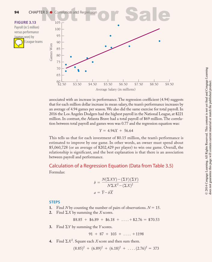
94 CHAPTER 3 ● Correlation and Regression
associated with an increase in performance. The regression coefficient (4.94) suggests that for each million dollar increase in mean salary, the team’s performance increases by an average of 4.94 games per season. We also did the same exercise for total payroll. In 2016 the Los Angeles Dodgers had the highest payroll in the National League, at $221 million. In contrast, the Atlanta Brave had a total payroll of $69 million. The correla-tion between total payroll and games won was 0.77 and the regression equation was:
Y 5 4.94X 1 56.64This tells us that for each investment of $0.15 million, the team’s performance is estimated to improve by one game. In other words, an owner must spend about $5,060,728 (or an average of $202,429 per player) to win one game. Overall, the relationship is significant, and the best explanation is that there is an association between payroll and performance.
Calculation of a Regression Equation (Data from Table 3.5)Formulas:
b 5N 1ΣX Y 22 1ΣY 2 1ΣY 2
N ΣX 22 1ΣX 22 a 5 Y2bX
STEPS1. Find N by counting the number of pairs of observations. N 5 15.2. Find ΣX by summing the X scores.
$8.85 1 $6.89 1 $6.18 1 c.1 $2.76 5 $70.533. Find ΣY by summing the Y scores.
91 1 87 1 103 1 c. 111984. Find ΣX 2. Square each X score and then sum them.18.8522 1 16.8922 1 16.1822 1 c. 12.7622 5 373
60
65
70
75
80
85
90
95
100
105
$2.50 $3.50 $4.50 $5.50 $6.50 $7.50 $8.50 $9.50
Gam
es W
on
Average Salary (in millions)
FIGURE 3.13 Payroll (in $ million) versus performance (games won) by National League teams in 2011.
98137_ch03_rev02_063-098.indd 94 11/15/16 6:54 PM
Not For Sale
© 2
01 C
enga
ge L
earn
ing.
All
Rig
hts R
eser
ved.
Thi
s con
tent
is n
ot y
et fi
nal a
nd C
enga
ge L
earn
ing
does
not
gua
rant
ee th
is p
age
will
con
tain
cur
rent
mat
eria
l or m
atch
the
publ
ishe
d pr
oduc
t.
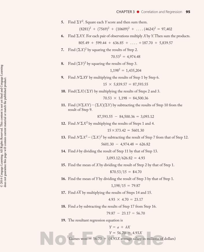
CHAPTER 3 ● Correlation and Regression 95
5. Find ΣY 2. Square each Y score and then sum them.1828122 1 1756922 1 11060922 1 c. 1462422 5 97,4026. Find ΣX Y. For each pair of observations multiply X by Y. Then sum the products.
805.49 1 599.44 1 636.85 1 c. 1187.70 1 5,839.577. Find 1ΣX 22 by squaring the results of Step 2.
70.532 5 4,974.488. Find 1ΣY 22 by squaring the results of Step 3.
1,1982 5 1,435,2049. Find N ΣXY by multiplying the results of Step 1 by Step 6.
15 3 5,839.57 5 87,593.5510. Find(ΣX) (ΣY) by multiplying the results of Steps 2 and 3.
70.53 3 1,198 5 84,500.3611. Find 1N ΣX Y 22 1ΣX 2 1ΣY 2 by subtracting the results of Step 10 from the
result of Step 9.87,593.55 2 84,500.36 5 3,093.12
12. Find N ΣX 2 by multiplying the results of Steps 1 and 4.153373.42 5 5601.30
13. Find N ΣX 22 (ΣX )2 by subtracting the result of Step 7 from that of Step 12.5601.30 2 4,974.48 5 626.82
14. Find b by dividing the result of Step 11 by that of Step 13.3,093.12>626.82 5 4.93
15. Find the mean of X by dividing the result of Step 2 by that of Step 1.$70.53>15 5 $4.70
16. Find the mean of Y by dividing the result of Step 3 by that of Step 1.1,198>15 5 79.87
17. Find bX by multiplying the results of Steps 14 and 15.4.93 3 4.70 5 23.17
18. Find a by subtracting the results of Step 17 from Step 16.79.87 2 23.17 5 56.70
19. The resultant regression equation is Y 5 a 1 bX Y 5 56.70 1 4.93X
Games won 5 56.70 1 (4.93X average salary in millions of dollars)
98137_ch03_rev02_063-098.indd 95 11/15/16 6:54 PM
Not For Sale
© 2
01 C
enga
ge L
earn
ing.
All
Rig
hts R
eser
ved.
Thi
s con
tent
is n
ot y
et fi
nal a
nd C
enga
ge L
earn
ing
does
not
gua
rant
ee th
is p
age
will
con
tain
cur
rent
mat
eria
l or m
atch
the
publ
ishe
d pr
oduc
t.
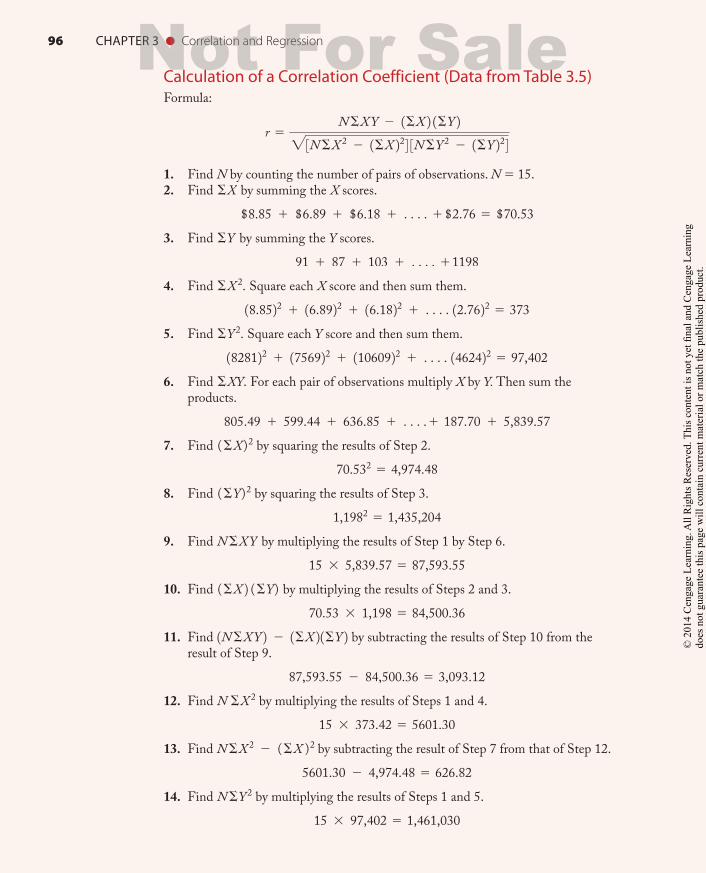
96 CHAPTER 3 ● Correlation and Regression
Calculation of a Correlation Coefficient (Data from Table 3.5)Formula:
r 5N ΣX Y 2 1ΣX 2 1ΣY 2"3N ΣX 2 2 1ΣX 224 3N ΣY 2 2 1ΣY 224
1. Find N by counting the number of pairs of observations. N 5 15.2. Find ΣX by summing the X scores.
$8.85 1 $6.89 1 $6.18 1 c. 1 $2.76 5 $70.533. Find ΣY by summing the Y scores.
91 1 87 1 103 1 c. 111984. Find ΣX 2. Square each X score and then sum them.18.8522 1 16.8922 1 16.1822 1 c. 12.7622 5 3735. Find ΣY 2. Square each Y score and then sum them.1828122 1 1756922 1 11060922 1 c. 1462422 5 97,4026. Find ΣXY. For each pair of observations multiply X by Y. Then sum the
products.805.49 1 599.44 1 636.85 1 c.1 187.70 1 5,839.57
7. Find (ΣX)2 by squaring the results of Step 2.70.532 5 4,974.48
8. Find (ΣY)2 by squaring the results of Step 3.1,1982 5 1,435,204
9. Find N ΣX Y by multiplying the results of Step 1 by Step 6.15 3 5,839.57 5 87,593.55
10. Find (ΣX 2 (ΣY) by multiplying the results of Steps 2 and 3.70.53 3 1,198 5 84,500.36
11. Find 1N ΣX Y 2 2 1ΣX 2 1ΣY 2 by subtracting the results of Step 10 from the result of Step 9.
87,593.55 2 84,500.36 5 3,093.1212. Find N ΣX 2 by multiplying the results of Steps 1 and 4.
15 3 373.42 5 5601.3013. Find N ΣX 2 2 (ΣX )2 by subtracting the result of Step 7 from that of Step 12.
5601.30 2 4,974.48 5 626.8214. Find N ΣY 2 by multiplying the results of Steps 1 and 5.
15 3 97,402 5 1,461,030
98137_ch03_rev02_063-098.indd 96 11/15/16 6:54 PM
Not For Sale
© 2
01 C
enga
ge L
earn
ing.
All
Rig
hts R
eser
ved.
Thi
s con
tent
is n
ot y
et fi
nal a
nd C
enga
ge L
earn
ing
does
not
gua
rant
ee th
is p
age
will
con
tain
cur
rent
mat
eria
l or m
atch
the
publ
ishe
d pr
oduc
t.

CHAPTER 3 ● Correlation and Regression 97
15. Find N ΣY 2 2 (ΣY )2 by subtracting the result of Step 8 from that of Step 14.1,461,030 2 1,435,204 5 25,826
16. Find "3N ΣX 2 2 1ΣX 224 3N ΣY 2 2 1ΣY 224 by multiplying the results of Steps 13 and 15 and taking the square root of the product.!626.82 3 25,826 5 4023.46
17. Find r 5N ΣX Y 2 1ΣX 2 1ΣY 2$3N ΣX 2 2 1ΣX 224 3N ΣY 2 2 1ΣY 224 , by dividing the result of
Step 11 by that of Step 16.3,093.12>4023.46 5 0.77
98137_ch03_rev02_063-098.indd 97 11/15/16 6:54 PM
Not For Sale
© 2
01 C
enga
ge L
earn
ing.
All
Rig
hts R
eser
ved.
Thi
s con
tent
is n
ot y
et fi
nal a
nd C
enga
ge L
earn
ing
does
not
gua
rant
ee th
is p
age
will
con
tain
cur
rent
mat
eria
l or m
atch
the
publ
ishe
d pr
oduc
t.

98137_ch03_rev02_063-098.indd 98 11/15/16 5:43 PM
Not For Sale
© 2
01 C
enga
ge L
earn
ing.
All
Rig
hts R
eser
ved.
Thi
s con
tent
is n
ot y
et fi
nal a
nd C
enga
ge L
earn
ing
does
not
gua
rant
ee th
is p
age
will
con
tain
cur
rent
mat
eria
l or m
atch
the
publ
ishe
d pr
oduc
t.