Embed Size (px)
Citation preview
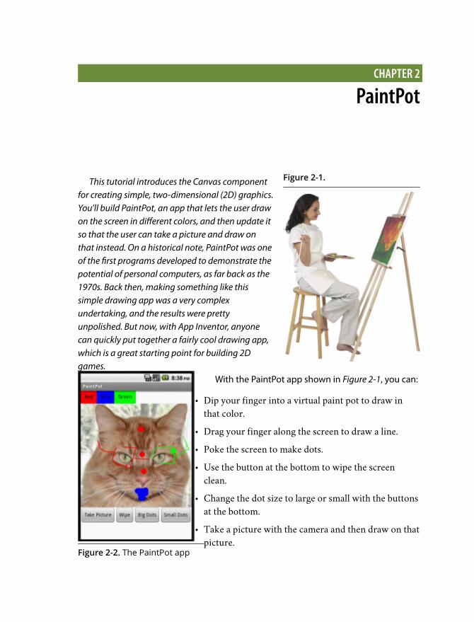
Figure 2-1.
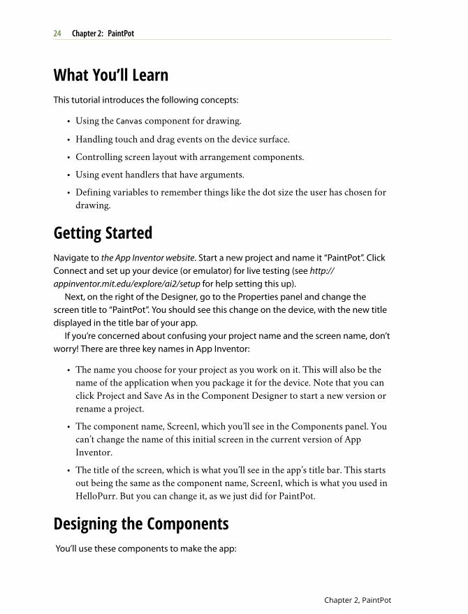
Figure 2-2. The PaintPot app
CHAPTER 2
PaintPot
This tutorial introduces the Canvas componentfor creating simple, two-dimensional (2D) graphics.You’ll build PaintPot, an app that lets the user drawon the screen in different colors, and then update itso that the user can take a picture and draw onthat instead. On a historical note, PaintPot was oneof the first programs developed to demonstrate thepotential of personal computers, as far back as the1970s. Back then, making something like thissimple drawing app was a very complexundertaking, and the results were prettyunpolished. But now, with App Inventor, anyonecan quickly put together a fairly cool drawing app,which is a great starting point for building 2Dgames.
With the PaintPot app shown in Figure 2-1, you can:
• Dip your finger into a virtual paint pot to draw inthat color.
• Drag your finger along the screen to draw a line.
• Poke the screen to make dots.
• Use the button at the bottom to wipe the screenclean.
• Change the dot size to large or small with the buttonsat the bottom.
• Take a picture with the camera and then draw on thatpicture.
What You’ll LearnThis tutorial introduces the following concepts:
• Using the Canvas component for drawing.
• Handling touch and drag events on the device surface.
• Controlling screen layout with arrangement components.
• Using event handlers that have arguments.
• Defining variables to remember things like the dot size the user has chosen fordrawing.
Getting StartedNavigate to the App Inventor website. Start a new project and name it “PaintPot”. ClickConnect and set up your device (or emulator) for live testing (see http://appinventor.mit.edu/explore/ai2/setup for help setting this up).
Next, on the right of the Designer, go to the Properties panel and change thescreen title to “PaintPot”. You should see this change on the device, with the new titledisplayed in the title bar of your app.
If you’re concerned about confusing your project name and the screen name, don’tworry! There are three key names in App Inventor:
• The name you choose for your project as you work on it. This will also be thename of the application when you package it for the device. Note that you canclick Project and Save As in the Component Designer to start a new version orrename a project.
• The component name, Screen1, which you’ll see in the Components panel. Youcan’t change the name of this initial screen in the current version of AppInventor.
• The title of the screen, which is what you’ll see in the app’s title bar. This startsout being the same as the component name, Screen1, which is what you used inHelloPurr. But you can change it, as we just did for PaintPot.
Designing the Components You’ll use these components to make the app:
24 Chapter 2: PaintPot
Chapter 2, PaintPot
• Three Button components for selecting red, blue, or green paint, and aHorizontalArrangement component for organizing them.
• One Button component for wiping the drawing clean, two for changing the sizeof the dots that are drawn, and one for invoking the camera to take a picture.
• A Canvas component, which is the drawing surface. Canvas has aBackgroundImage property, which you’ll set to the kitty.png file from theHelloPurr tutorial in Chapter 1. Later in this chapter, you’ll modify the app sothat the background can be set to a picture the user takes.
CREATING THE COLOR BUTTONS
First, create the three color buttons by following these instructions:
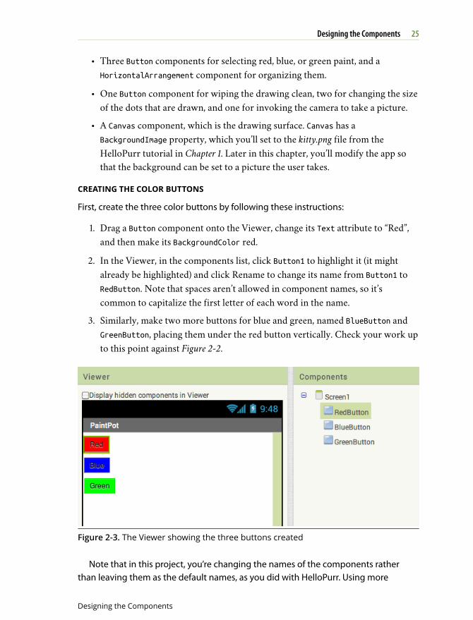
1. Drag a Button component onto the Viewer, change its Text attribute to “Red”,and then make its BackgroundColor red.
2. In the Viewer, in the components list, click Button1 to highlight it (it mightalready be highlighted) and click Rename to change its name from Button1 toRedButton. Note that spaces aren’t allowed in component names, so it’scommon to capitalize the first letter of each word in the name.
3. Similarly, make two more buttons for blue and green, named BlueButton andGreenButton, placing them under the red button vertically. Check your work upto this point against Figure 2-2.
Figure 2-3. The Viewer showing the three buttons created
Note that in this project, you’re changing the names of the components ratherthan leaving them as the default names, as you did with HelloPurr. Using more
25Designing the Components
Designing the Components
meaningful names makes your projects more readable, and it will really help whenyou move to the Blocks Editor and must refer to the components by name. In thisbook, we’ll use the convention of having the component name end with its type (forexample, RedButton).
Test your app If you haven’t clicked Connect and connectedyour device, do so now and check how your app looks on yourdevice or in the emulator.
USING ARRANGEMENTS FOR BETTER LAYOUTS
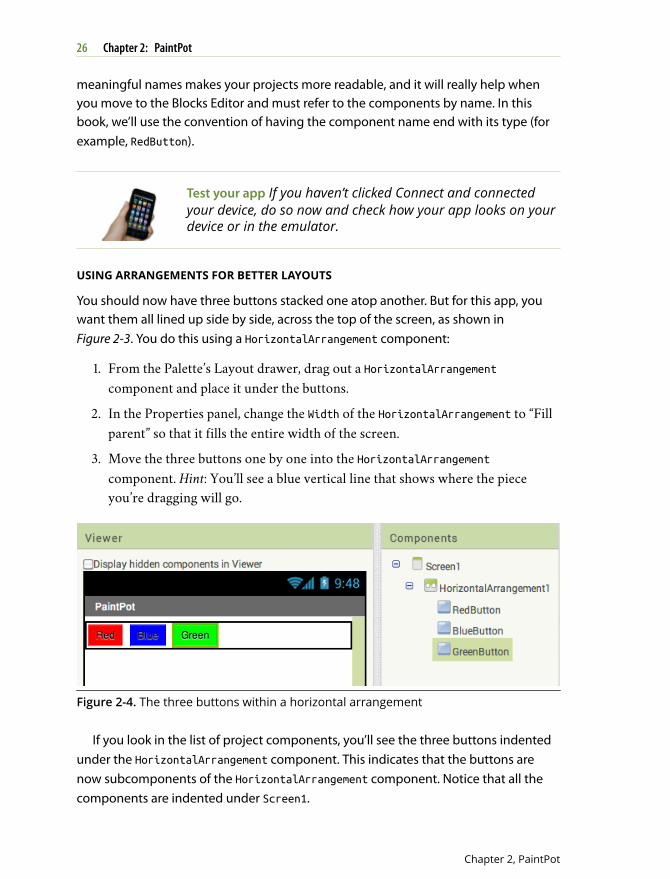
You should now have three buttons stacked one atop another. But for this app, youwant them all lined up side by side, across the top of the screen, as shown inFigure 2-3. You do this using a HorizontalArrangement component:
1. From the Palette’s Layout drawer, drag out a HorizontalArrangementcomponent and place it under the buttons.
2. In the Properties panel, change the Width of the HorizontalArrangement to “Fillparent” so that it fills the entire width of the screen.
3. Move the three buttons one by one into the HorizontalArrangementcomponent. Hint: You’ll see a blue vertical line that shows where the pieceyou’re dragging will go.
Figure 2-4. The three buttons within a horizontal arrangement
If you look in the list of project components, you’ll see the three buttons indentedunder the HorizontalArrangement component. This indicates that the buttons arenow subcomponents of the HorizontalArrangement component. Notice that all thecomponents are indented under Screen1.
26 Chapter 2: PaintPot
Chapter 2, PaintPot
You can center the entire row of buttons on the screen by changing Screen1’sAlignHorizontal property to “Center”.
Test your app On the device, you should see your three buttonslined up in a row at the top of the screen, although thingsmight not look exactly as they do on the Designer. Forexample, the outline around HorizontalArrangement appearsin the Viewer but not on the device.
In general, you use screen arrangements to create simple vertical, horizontal, ortabular layouts. You can also create more complex layouts by inserting (or nesting)screen arrangement components within one another.
ADDING THE CANVAS
The next step is to set up the canvas where the drawing will occur:
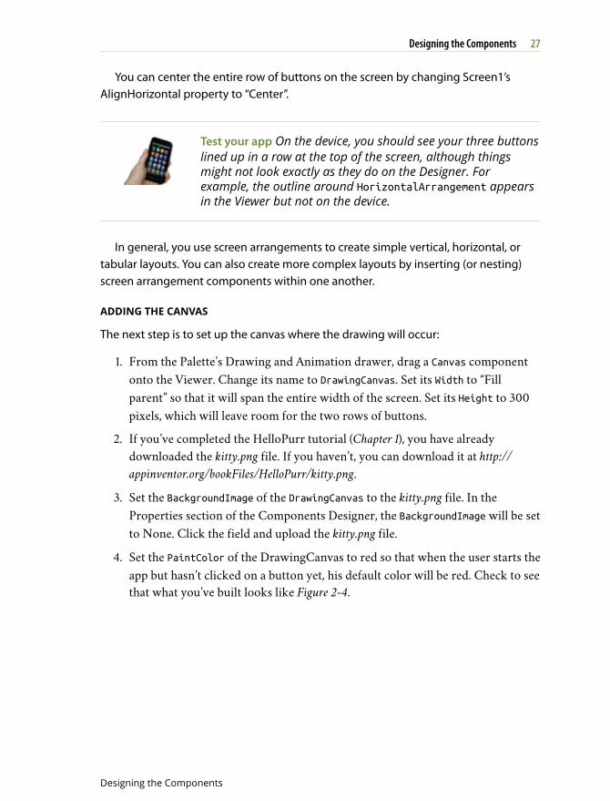
1. From the Palette’s Drawing and Animation drawer, drag a Canvas componentonto the Viewer. Change its name to DrawingCanvas. Set its Width to “Fillparent” so that it will span the entire width of the screen. Set its Height to 300pixels, which will leave room for the two rows of buttons.
2. If you’ve completed the HelloPurr tutorial (Chapter 1), you have alreadydownloaded the kitty.png file. If you haven’t, you can download it at http://appinventor.org/bookFiles/HelloPurr/kitty.png.
3. Set the BackgroundImage of the DrawingCanvas to the kitty.png file. In theProperties section of the Components Designer, the BackgroundImage will be setto None. Click the field and upload the kitty.png file.
4. Set the PaintColor of the DrawingCanvas to red so that when the user starts theapp but hasn’t clicked on a button yet, his default color will be red. Check to seethat what you’ve built looks like Figure 2-4.
27Designing the Components
Designing the Components
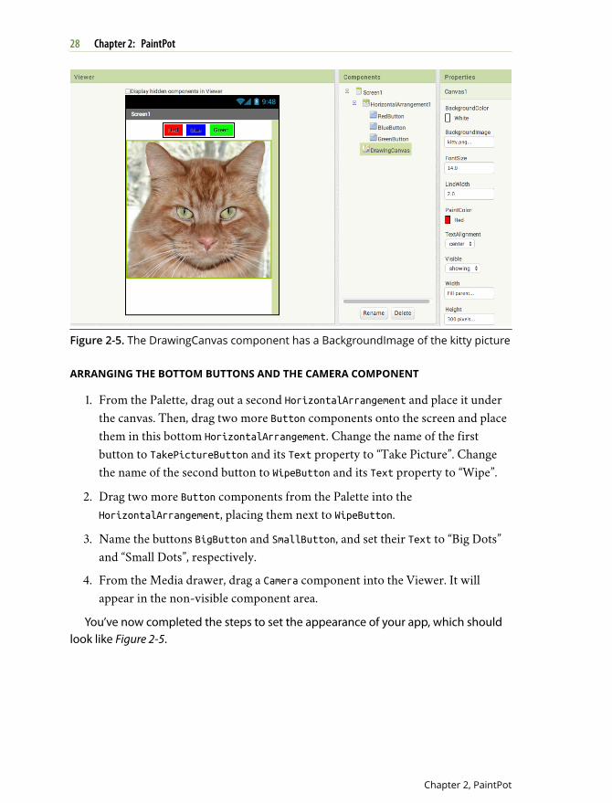
Figure 2-5. The DrawingCanvas component has a BackgroundImage of the kitty picture
ARRANGING THE BOTTOM BUTTONS AND THE CAMERA COMPONENT
1. From the Palette, drag out a second HorizontalArrangement and place it underthe canvas. Then, drag two more Button components onto the screen and placethem in this bottom HorizontalArrangement. Change the name of the firstbutton to TakePictureButton and its Text property to “Take Picture”. Changethe name of the second button to WipeButton and its Text property to “Wipe”.
2. Drag two more Button components from the Palette into theHorizontalArrangement, placing them next to WipeButton.
3. Name the buttons BigButton and SmallButton, and set their Text to “Big Dots”and “Small Dots”, respectively.
4. From the Media drawer, drag a Camera component into the Viewer. It willappear in the non-visible component area.
You’ve now completed the steps to set the appearance of your app, which shouldlook like Figure 2-5.
28 Chapter 2: PaintPot
Chapter 2, PaintPot
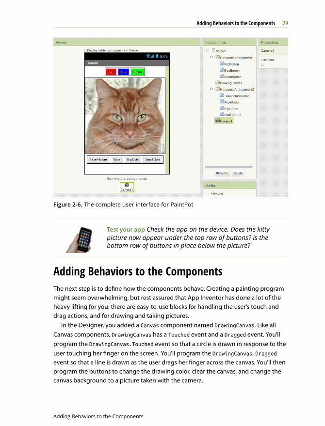
Figure 2-6. The complete user interface for PaintPot
Test your app Check the app on the device. Does the kittypicture now appear under the top row of buttons? Is thebottom row of buttons in place below the picture?
Adding Behaviors to the ComponentsThe next step is to define how the components behave. Creating a painting programmight seem overwhelming, but rest assured that App Inventor has done a lot of theheavy lifting for you: there are easy-to-use blocks for handling the user’s touch anddrag actions, and for drawing and taking pictures.
In the Designer, you added a Canvas component named DrawingCanvas. Like allCanvas components, DrawingCanvas has a Touched event and a Dragged event. You’llprogram the DrawingCanvas.Touched event so that a circle is drawn in response to theuser touching her finger on the screen. You’ll program the DrawingCanvas.Draggedevent so that a line is drawn as the user drags her finger across the canvas. You’ll thenprogram the buttons to change the drawing color, clear the canvas, and change thecanvas background to a picture taken with the camera.
29Adding Behaviors to the Components
Adding Behaviors to the Components
ADDING THE TOUCH EVENT TO DRAW A DOT
First, you’ll arrange things so that when you touch the DrawingCanvas, you draw a dotat the point of contact:
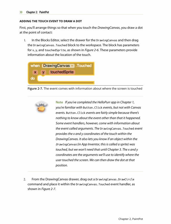
1. In the Blocks Editor, select the drawer for the DrawingCanvas and then dragthe DrawingCanvas.Touched block to the workspace. The block has parametersfor x, y, and touchedSprite, as shown in Figure 2-6. These parameters provideinformation about the location of the touch.
Figure 2-7. The event comes with information about where the screen is touched
Note If you’ve completed the HelloPurr app in Chapter 1,you’re familiar with Button.Click events, but not with Canvasevents. Button.Click events are fairly simple because there’snothing to know about the event other than that it happened.Some event handlers, however, come with information aboutthe event called arguments. The DrawingCanvas.Touched eventprovides the x and y coordinates of the touch within theDrawingCanvas. It also lets you know if an object within theDrawingCanvas (in App Inventor, this is called a sprite) wastouched, but we won’t need that until Chapter 3. The x and ycoordinates are the arguments we’ll use to identify where theuser touched the screen. We can then draw the dot at thatposition.
2. From the DrawingCanvas drawer, drag out a DrawingCanvas.DrawCirclecommand and place it within the DrawingCanvas.Touched event handler, asshown in Figure 2-7.
30 Chapter 2: PaintPot
Chapter 2, PaintPot
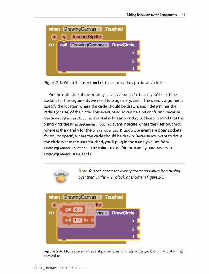
Figure 2-8. When the user touches the canvas, the app draws a circle
On the right side of the DrawingCanvas.DrawCircle block, you’ll see threesockets for the arguments we need to plug in: x, y, and r. The x and y argumentsspecify the location where the circle should be drawn, and r determines theradius (or size) of the circle. This event handler can be a bit confusing becausethe DrawingCanvas.Touched event also has an x and y; just keep in mind that thex and y for the DrawingCanvas.Touched event indicate where the user touched,whereas the x and y for the DrawingCanvas.DrawCircle event are open socketsfor you to specify where the circle should be drawn. Because you want to drawthe circle where the user touched, you’ll plug in the x and y values fromDrawingCanvas.Touched as the values to use for the x and y parameters inDrawingCanvas.DrawCircle.
Note You can access the event parameter values by mousingover them in the when block, as shown in Figure 2-8.
Figure 2-9. Mouse over an event parameter to drag out a get block for obtainingthe value
31Adding Behaviors to the Components
Adding Behaviors to the Components
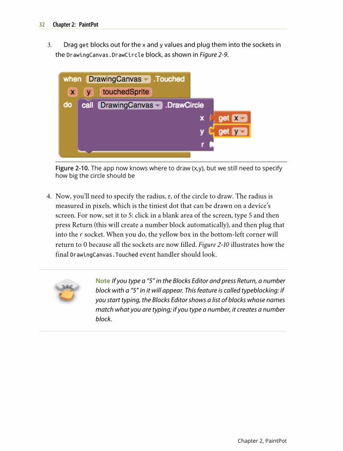
3. Drag get blocks out for the x and y values and plug them into the sockets inthe DrawingCanvas.DrawCircle block, as shown in Figure 2-9.
Figure 2-10. The app now knows where to draw (x,y), but we still need to specifyhow big the circle should be
4. Now, you’ll need to specify the radius, r, of the circle to draw. The radius ismeasured in pixels, which is the tiniest dot that can be drawn on a device’sscreen. For now, set it to 5: click in a blank area of the screen, type 5 and thenpress Return (this will create a number block automatically), and then plug thatinto the r socket. When you do, the yellow box in the bottom-left corner willreturn to 0 because all the sockets are now filled. Figure 2-10 illustrates how thefinal DrawingCanvas.Touched event handler should look.
Note If you type a “5” in the Blocks Editor and press Return, a numberblock with a “5” in it will appear. This feature is called typeblocking: ifyou start typing, the Blocks Editor shows a list of blocks whose namesmatch what you are typing; if you type a number, it creates a numberblock.
32 Chapter 2: PaintPot
Chapter 2, PaintPot
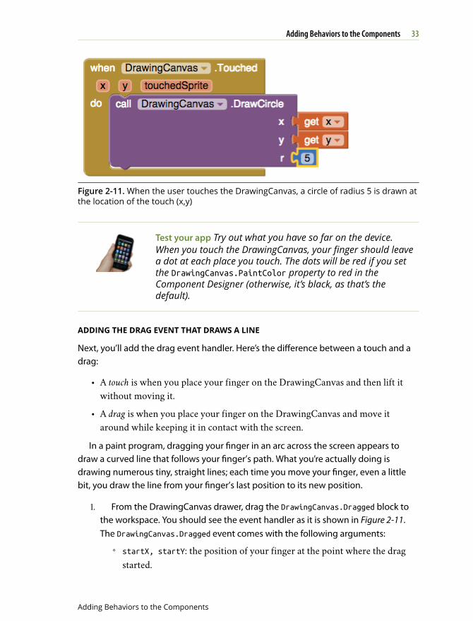
Figure 2-11. When the user touches the DrawingCanvas, a circle of radius 5 is drawn atthe location of the touch (x,y)
Test your app Try out what you have so far on the device.When you touch the DrawingCanvas, your finger should leavea dot at each place you touch. The dots will be red if you setthe DrawingCanvas.PaintColor property to red in theComponent Designer (otherwise, it’s black, as that’s thedefault).
ADDING THE DRAG EVENT THAT DRAWS A LINE
Next, you’ll add the drag event handler. Here’s the difference between a touch and adrag:
• A touch is when you place your finger on the DrawingCanvas and then lift itwithout moving it.
• A drag is when you place your finger on the DrawingCanvas and move itaround while keeping it in contact with the screen.
In a paint program, dragging your finger in an arc across the screen appears todraw a curved line that follows your finger’s path. What you’re actually doing isdrawing numerous tiny, straight lines; each time you move your finger, even a littlebit, you draw the line from your finger’s last position to its new position.
1. From the DrawingCanvas drawer, drag the DrawingCanvas.Dragged block tothe workspace. You should see the event handler as it is shown in Figure 2-11.The DrawingCanvas.Dragged event comes with the following arguments:
◦ startX, startY: the position of your finger at the point where the dragstarted.
33Adding Behaviors to the Components
Adding Behaviors to the Components
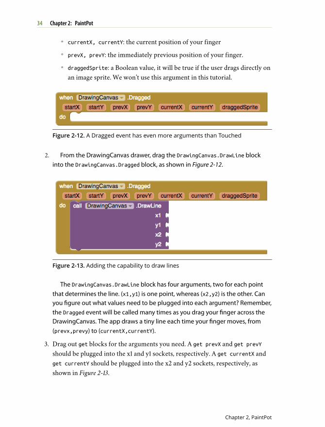
◦ currentX, currentY: the current position of your finger
◦ prevX, prevY: the immediately previous position of your finger.
◦ draggedSprite: a Boolean value, it will be true if the user drags directly onan image sprite. We won’t use this argument in this tutorial.
Figure 2-12. A Dragged event has even more arguments than Touched
2. From the DrawingCanvas drawer, drag the DrawingCanvas.DrawLine blockinto the DrawingCanvas.Dragged block, as shown in Figure 2-12.
Figure 2-13. Adding the capability to draw lines
The DrawingCanvas.DrawLine block has four arguments, two for each pointthat determines the line. (x1,y1) is one point, whereas (x2,y2) is the other. Canyou figure out what values need to be plugged into each argument? Remember,the Dragged event will be called many times as you drag your finger across theDrawingCanvas. The app draws a tiny line each time your finger moves, from(prevx,prevy) to (currentX,currentY).
3. Drag out get blocks for the arguments you need. A get prevX and get prevYshould be plugged into the x1 and y1 sockets, respectively. A get currentX andget currentY should be plugged into the x2 and y2 sockets, respectively, asshown in Figure 2-13.
34 Chapter 2: PaintPot
Chapter 2, PaintPot
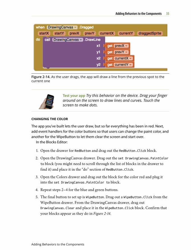
Figure 2-14. As the user drags, the app will draw a line from the previous spot to thecurrent one
Test your app Try this behavior on the device. Drag your fingeraround on the screen to draw lines and curves. Touch thescreen to make dots.
CHANGING THE COLOR
The app you’ve built lets the user draw, but so far everything has been in red. Next,add event handlers for the color buttons so that users can change the paint color, andanother for the WipeButton to let them clear the screen and start over.
In the Blocks Editor:
1. Open the drawer for RedButton and drag out the RedButton.Click block.
2. Open the DrawingCanvas drawer. Drag out the set DrawingCanvas.PaintColorto block (you might need to scroll through the list of blocks in the drawer tofind it) and place it in the “do” section of RedButton.Click.
3. Open the Colors drawer and drag out the block for the color red and plug itinto the set DrawingCanvas.PaintColor to block.
4. Repeat steps 2–4 for the blue and green buttons.
5. The final button to set up is WipeButton. Drag out a WipeButton.Click from theWipeButton drawer. From the DrawingCanvas drawer, drag outDrawingCanvas.Clear and place it in the WipeButton.Click block. Confirm thatyour blocks appear as they do in Figure 2-14.
35Adding Behaviors to the Components
Adding Behaviors to the Components
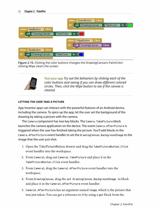
Figure 2-15. Clicking the color buttons changes the DrawingCanvas’s PaintColor;clicking Wipe clears the screen
Test your app Try out the behaviors by clicking each of thecolor buttons and seeing if you can draw different coloredcircles. Then, click the Wipe button to see if the canvas iscleared.
LETTING THE USER TAKE A PICTURE
App Inventor apps can interact with the powerful features of an Android device,including the camera. To spice up the app, let the user set the background of thedrawing by taking a picture with the camera.
The Camera component has two key blocks. The Camera.TakePicture blocklaunches the camera application on the device. The event Camera.AfterPicture istriggered when the user has finished taking the picture. You’ll add blocks in theCamera.AfterPicture event handler to set the DrawingCanvas.BackgroundImage to theimage that the user just shot.
1. Open the TakePictureButton drawer and drag the TakePictureButton.Clickevent handler into the workspace.
2. From Camera1, drag out Camera1.TakePicture and place it in theTakePictureButton.Click event handler.
3. From Camera1, drag the Camera1.AfterPicture event handler into theworkspace.
4. From DrawingCanvas, drag the set DrawingCanvas.BackgroundImage to blockand place it in the Camera1.AfterPicture event handler.
5. Camera1.AfterPicture has an argument named image, which is the picture thatwas just taken. You can get a reference to it by using a get block from the
36 Chapter 2: PaintPot
Chapter 2, PaintPot
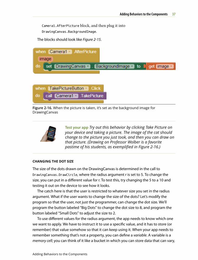
Camera1.AfterPicture block, and then plug it intoDrawingCanvas.BackgroundImage.
The blocks should look like Figure 2-15.
Figure 2-16. When the picture is taken, it’s set as the background image forDrawingCanvas
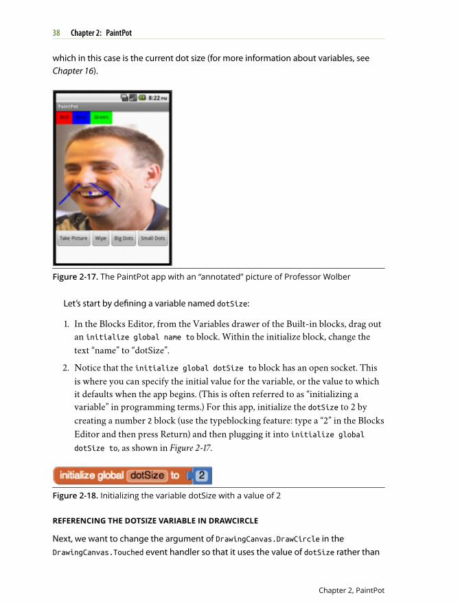
Test your app Try out this behavior by clicking Take Picture onyour device and taking a picture. The image of the cat shouldchange to the picture you just took, and then you can draw onthat picture. (Drawing on Professor Wolber is a favoritepastime of his students, as exemplified in Figure 2-16.)
CHANGING THE DOT SIZE
The size of the dots drawn on the DrawingCanvas is determined in the call toDrawingCanvas.DrawCircle, where the radius argument r is set to 5. To change thesize, you can put in a different value for r. To test this, try changing the 5 to a 10 andtesting it out on the device to see how it looks.
The catch here is that the user is restricted to whatever size you set in the radiusargument. What if the user wants to change the size of the dots? Let’s modify theprogram so that the user, not just the programmer, can change the dot size. We’llprogram the button labeled “Big Dots” to change the dot size to 8, and program thebutton labeled “Small Dots” to adjust the size to 2.
To use different values for the radius argument, the app needs to know which onewe want to apply. We have to instruct it to use a specific value, and it has to store (orremember) that value somehow so that it can keep using it. When your app needs toremember something that’s not a property, you can define a variable. A variable is amemory cell; you can think of it like a bucket in which you can store data that can vary,
37Adding Behaviors to the Components
Adding Behaviors to the Components
which in this case is the current dot size (for more information about variables, seeChapter 16).
Figure 2-17. The PaintPot app with an “annotated” picture of Professor Wolber
Let’s start by defining a variable named dotSize:
1. In the Blocks Editor, from the Variables drawer of the Built-in blocks, drag outan initialize global name to block. Within the initialize block, change thetext “name” to “dotSize”.
2. Notice that the initialize global dotSize to block has an open socket. Thisis where you can specify the initial value for the variable, or the value to whichit defaults when the app begins. (This is often referred to as “initializing avariable” in programming terms.) For this app, initialize the dotSize to 2 bycreating a number 2 block (use the typeblocking feature: type a “2” in the BlocksEditor and then press Return) and then plugging it into initialize globaldotSize to, as shown in Figure 2-17.
Figure 2-18. Initializing the variable dotSize with a value of 2
REFERENCING THE DOTSIZE VARIABLE IN DRAWCIRCLE
Next, we want to change the argument of DrawingCanvas.DrawCircle in theDrawingCanvas.Touched event handler so that it uses the value of dotSize rather than
38 Chapter 2: PaintPot
Chapter 2, PaintPot
always using a fixed number. (It might seem like we’ve “fixed” dotSize to the value 2rather than made it variable because we initialized it that way, but you’ll see in aminute how we can change the value of dotSize and, therefore, change the size ofthe dot that is drawn.)
1. Drag out a get block from the initilize global dotsize to block. You shouldsee a get global dotSize block that provides the value of the variable.
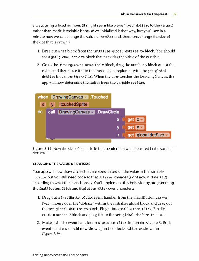
2. Go to the DrawingCanvas.DrawCircle block, drag the number 5 block out of ther slot, and then place it into the trash. Then, replace it with the get globaldotSize block (see Figure 2-18). When the user touches the DrawingCanvas, theapp will now determine the radius from the variable dotSize.
Figure 2-19. Now the size of each circle is dependent on what is stored in the variabledotSize
CHANGING THE VALUE OF DOTSIZE
Your app will now draw circles that are sized based on the value in the variabledotSize, but you still need code so that dotSize changes (right now it stays as 2)according to what the user chooses. You’ll implement this behavior by programmingthe SmallButton.Click and BigButton.Click event handlers:
1. Drag out a SmallButton.Click event handler from the SmallButton drawer.Next, mouse over the “dotsize” within the initialize global block and drag outthe set global dotSize to block. Plug it into SmallButton.Click. Finally,create a number 2 block and plug it into the set global dotSize to block.
2. Make a similar event handler for BigButton.Click, but set dotSize to 8. Bothevent handlers should now show up in the Blocks Editor, as shown inFigure 2-19.
39Adding Behaviors to the Components
Adding Behaviors to the Components
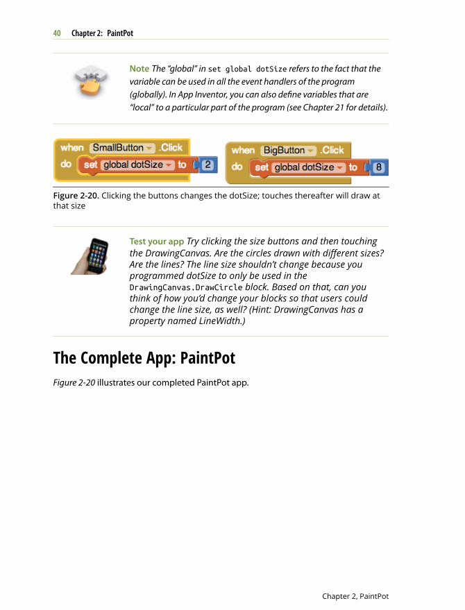
Note The “global” in set global dotSize refers to the fact that thevariable can be used in all the event handlers of the program(globally). In App Inventor, you can also define variables that are“local” to a particular part of the program (see Chapter 21 for details).
Figure 2-20. Clicking the buttons changes the dotSize; touches thereafter will draw atthat size
Test your app Try clicking the size buttons and then touchingthe DrawingCanvas. Are the circles drawn with different sizes?Are the lines? The line size shouldn’t change because youprogrammed dotSize to only be used in theDrawingCanvas.DrawCircle block. Based on that, can youthink of how you’d change your blocks so that users couldchange the line size, as well? (Hint: DrawingCanvas has aproperty named LineWidth.)
The Complete App: PaintPotFigure 2-20 illustrates our completed PaintPot app.
40 Chapter 2: PaintPot
Chapter 2, PaintPot
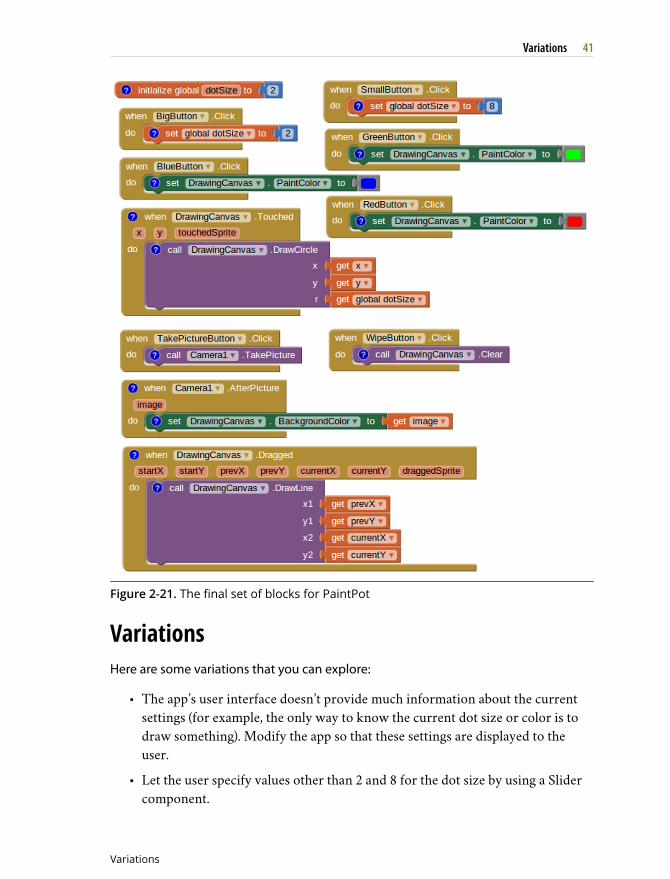
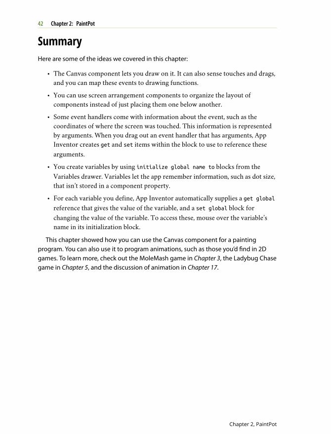
Figure 2-21. The final set of blocks for PaintPot
VariationsHere are some variations that you can explore:
• The app’s user interface doesn’t provide much information about the currentsettings (for example, the only way to know the current dot size or color is todraw something). Modify the app so that these settings are displayed to theuser.
• Let the user specify values other than 2 and 8 for the dot size by using a Slidercomponent.
41Variations
Variations
SummaryHere are some of the ideas we covered in this chapter:
• The Canvas component lets you draw on it. It can also sense touches and drags,and you can map these events to drawing functions.
• You can use screen arrangement components to organize the layout ofcomponents instead of just placing them one below another.
• Some event handlers come with information about the event, such as thecoordinates of where the screen was touched. This information is representedby arguments. When you drag out an event handler that has arguments, AppInventor creates get and set items within the block to use to reference thesearguments.
• You create variables by using initialize global name to blocks from theVariables drawer. Variables let the app remember information, such as dot size,that isn’t stored in a component property.
• For each variable you define, App Inventor automatically supplies a get globalreference that gives the value of the variable, and a set global block forchanging the value of the variable. To access these, mouse over the variable’sname in its initialization block.
This chapter showed how you can use the Canvas component for a paintingprogram. You can also use it to program animations, such as those you’d find in 2Dgames. To learn more, check out the MoleMash game in Chapter 3, the Ladybug Chasegame in Chapter 5, and the discussion of animation in Chapter 17.
42 Chapter 2: PaintPot
Chapter 2, PaintPot