Embed Size (px)
Citation preview
Chapter 1
DNA MicroArray Data Analysis
The analysis of microarray data to produce lists of differentially expressed geneshas several steps which can differ based on the type of data being assayed. How-ever, all data follows the same general pipeline which involves reading raw data,quality assessing the data, removing bad spots/arrays from further analysis, pre-processing the data and calculating differential expression by statistical analysis.This list of differentially expressed genes can subsequently be annotated withuseful information that explains the various genes’ function, for example, geneontology. I will now explain in more detail how this data analysis pipeline isfollowed for the types of data supported by this system.
1.1 Preprocessing of Microarray Data
Before any kind of microarray data can be analysed for differential expressionseveral steps must be taken. Raw data must be quality assessed to ensure itsintegrity. Unprocessed raw data will always be subject to some form of technicalvariation and thus must be preprocessed to remove as many unwanted sources ofvariation as is possible, to ensure that results are of the highest attainable levelof accuracy. Ideally, the data being assayed should be preprocessed using severaldifferent methods, the results of which should be compared to identify whichmethod is of the highest level of suitability. The most appropriate method shouldthen be used to preprocess the raw data before differential expression analysis.
1.1.1 Preprocessing Affymetrix GeneChip Arrays
Because of the design of these kinds of chips, the steps that need to be takenbefore differential expression analysis are slightly more elaborate than for cDNAarrays, which we will outline later in the chapter.
1
Background Correction
The first step is generally to background correct the intensity reading for eachspot. Background fluorescence can arise from many sources, such as non-specificbinding of labelled sample to the array surface, processing effects such as depositsleft after the wash stage or optical noise from the scanner [?]. There is alwayssome level of background noise, even if nothing but sterile water is labeled andhybridised to the array, some fluorescence will still be picked up by the scanner[?]. Different algorithms will use different methods of background correction. Thepopular Robust Multi-Array Analysis (RMA) algorithm, for example, uses theconvolution of signal and noise distributions [?].
Normalization
The next stage is normalization. The purpose of this step is to adjust data for tech-nical variation, as opposed to biological differences between the samples. Therewill always be slight discrepancy between the hybridisation processes for each ar-ray and these variations tend to lead to scaling differences between the overallfluorescence intensity levels of various arrays. For example the quantity of RNAin a sample, the amount of time for which a sample spends hybridising or thevolume of a sample can all introduce significant variance. Even subtle physicaldifferences between arrays or between the scanners used to read arrays can havean effect.
Put simply, normalization ensures that when comparing expression levels ofdifferent arrays, that we are, as much as is possible, comparing like with like.Studies have shown that the normalization method used has a significant differenceon final differential expression levels, so it is vital to choose an appropriate method[?].
PM Correction
As stated previously, PM probes on the GeneChip measure both the relativeabundance of the corresponding gene and the amount of non-specific binding,which arises when mRNA binds to a probe which is not targeting it. MM probesare designed to give a measure for non-specific binding of their corresponding PMprobe. It then seems obvious that the MM values should be subtracted from theircorresponding PM values as a first step in the analysis process.
In reality however, this does not work, because generally about 30% of MMsare actually larger than their corresponding PMs [?]. This is because, as well asmeasuring background signal, high volumes of mRNA targeted intentionally bythe PM probes tend to also bind to MMs. Many of the most popular preprocessing
2
methods solve this problem by simply ignoring the MM probes altogether and PMvalues are corrected for non-specific binding using other methods.
Summarisation
We have already seen how GeneChip arrays work by using 11 different PM spotsto target 11 separate 25 base long sections of a target genes mRNA. The final stepin preprocessing GeneChip Data is to summarise the data from these 11 separateprobes into an expression value for the gene in question. There are a numberof different ways that this can be achieved, but the end result is always a singleexpression value for each gene on each chip.
1.1.2 Preprocessing Methods Implemented for AffymetrixGeneChip Array
Having introduced the general pipeline followed to preprocess Affymetrix microar-ray data, we will outline some of the preprocessing methods implemented by thissystem and describe their operation as well as justifying their inclusion.
There are a number of popular composite preprocessing algorithms. Thesealgorithms implement the four preprocessing steps outlined above and outputbackground corrected and normalized expression measures for each gene on eacharray. The preproessing methods implemented by this system are as follows.
MicroArray Suite 5.0 (MAS5)
MAS5 is an algorithm developed by Affymetrix and is described in their whitepaper “Statistical Algorithms Description Document” (2002) [?]. This algorithmbackground corrects both PM and MM probes; MMs are then converted into idealmismatches, where their values are always smaller than their corresponding PMvalues. Remeber than approximently 30% of the time MM values are greater thantheir PMs. If MM < PM, then MM value is left unchanged. A robust mean overthe log2 transformed differences between PMs and the already calculated idealmismatch is computed. Expression values are normalized by setting the trimmedmean of the original signals of each chip to a prespecified value. Hence, MAS5data is normalized after summarisation, not before, as in many other algorithms.
Probe Logarithmic Intensity Error Estimation (PLIER)
PLIER is the current recommended algorithm from Affymetrix. Affymetrix claimthat the algorithm improves on MAS5 by introducing a higher reproducibility ofsignal (lower coefficient of variation) without loss of accuracy; higher sensitivityto changes in abundance for targets near background and dynamic weighting of
3
the most informative probes in a dataset to determine signal [?]. In this systemthe PLIER algorithm is modified to include quantile normalization as PLIER doesnot normalize data by default.
Robust Multi-Array Analysis (RMA)
RMA is an academic alternative to Affymetrix’s algorithms for converting probelevel data to gene expression measures. This method is distinct from Affymetrix’smethods in that it completely ignores the MM probe readings; the inventors ofthe algorithm claim that the MM probes introduce more noise and that, whileacknowledging that these probes do provide useful information, have not, at thetime of publication of the method, found a productive way to use it [?].
The methods works by adjusting for background noise on a raw intensity scale,which does not lead to negative background corrected values. The log2 trans-formed value of each background corrected PM probe is obtained and these valuesare normalized using quantiles normalization, which was developed by Bolstad etal. (2003) [?]. Robust multi-array analysis is then carried out on the quantiles[?].
GeneChip RMA (GCRMA)
GCRMA is largely based on RMA and in fact only differs in the backgroundcorrection step where it uses probe sequence information to help estimate thebackground. This leads to improved accuracy in fold changes but at the expenseof marginally lower precision [?].
Other Methods Implemented
The system can also carry out a preprocessing method by which the user canmanually create the algorithm used, by specifying explicitly which of a selectionof available functions, should be applied at each of the various stages, the optionsavailable to the user are as follows.
• Background Correction:
– Mas5
– RMA
– RMA2
• Normalization:
– Constant
4
– Contrasts
– Invariant Set
– Loess
– Qspline
– Quantiles
– Robust Quantiles
• PM Correction:
– PM Only
– Subtract MM
– MAS5
• Summarisation:
– Average Difference
– LiWong
– MAS5
– Median Polish
– Playerout
The above options can be combined as the user desires to tailor preprocessingto their needs. This route is not recommended for novice users.
1.1.3 Preprocessing of cDNA Data
The general steps followed when preprocessing cDNA data are quite similar to theabove. The main differences are that their is no need for PM correction, as thereare no MM probes on cDNA arrays and that their is no summarisation stage, aseach gene is represented by a single probe.
Background Correction
Background fluorescence occurs virtually identically in cDNA arrays as it does aspreviously described in oligonucleotide arrays [?]. The methods used to correctfor background noise are described below.
5
Normalizing Within Arrays
There are a number of reasons that this step is performed for cDNA arrays. Asnoted by Smyth (2003) imbalances between the red (Cy5) and green (Cy3) dyesof cDNA arrays may arise from differences between the labelling efficiencies orscanning properties of the two dyes, complicated perhaps by, for example, the useof different scanners or different settings.
If the imbalance is more complicated than a simple scaling of one channelrelative to the other, as it usually is, then the dye bias is a function of intensityand normalization will need to be intensity dependent. The dye-bias will alsogenerally vary with spatial position on the slide. Positions on a slide may differbecause of differences between the print-tips on the array printer, variation overthe course of the print-run, non-uniformity in the hybridisation, or from artifactson the surface of the array which affect one colour more than the other. [?]
Normalizing Between Arrays
Similarly to as outlined for oligonucleotide microarrays, cDNA arrays often suffersubstantial scale differences because of technical variation, which could be down toany number of factors. Performing normalization between arrays will compensatefor such effects and thus yield more reliable results.
1.1.4 Preprocessing Methods Implemented for cDNA Ar-rays
There are a large number of methods available for preprocessing of dual dye data.The system implements the following methods.
• Background Correction [?]:
– Subtract
– Half
– Minimum
– MovingMin
– Edwards
– NormExp
– RMA
• Normalize Between Arrays [?]:
– Aquantile
6
– Scale
– Quantile
– Gquantile
– Rquantile
– Tquantile
• Normalize Within Arrays[?]:
– Print Tip Loess
– Median
– Loess
– Composite
– Control
– Robust Spline
1.1.5 Preprocessing of Single Dye Arrays
The VSN method [?] has been implemented to handle preprocessing of singlechannel data, such as that of Exiqon miRNA arrays. The function calibratesfor sample-to-sample variations through shifting and scaling, and transforms theintensities to a scale where the variance is independent of the mean intensity. Itcombines background correction and normalization into one single procedure. Fora matrix xki, with k counting the probes and i the arrays, the function fits anormalization transformation
xki 7→ hi(xki) = glog
(xki − ai
bi
)(1.1)
where bi is the scale parameter for array i, ai is a background offset and glogis the generalised logarithm as described by Rocke and Durbin (2003) [?].
1.2 Data Quality Assessment Methods Imple-
mented in System
Having introduced preprocessing of both Affymetrix GeneChip and cDNA mi-croarray data, we now introduce and illustrate the importance of, the concept ofquality assessment of microarrays data.
Quality assessment is an important phase that applies to analysis of all types ofmicroarrays. Quality assessment of data ensures that the best use is made of the
7
information available and ensures meaningful results at the end of an analysis.It also aides us in choosing an appropriate preprocessing method, as data canbe examined and visualised before and after preprocessing, where the impact ofvarious algorithms can be compared and contrasted; a large number of tools havebeen implemented to see what effect the steps taken in preprocessing have had onthe raw data.
These tools include visualisation plots as well as specific metrics that can beexamined to assess whether discrepancies can be corrected by preprocessing, orthat an array should be excluded in further analysis, or if necessary redone in thelaboratory.
1.2.1 Quality Assessment of Affymetrix Genechip Data
There are a number of useful tools implemented to assess the quality of GeneChipdata. We will now proceed to outline them and their various uses, using anexample dataset.
The dataset being used to demonstrate preprocessing and quality assessment ofGeneChip microarray data is from an experiment to determine the effects of nega-tive energy balance on the postpartum cow. The bovine version of the AffymetrixGeneChip was used in this experiment. A set of six arrays from a negative energybalance group are compared to a set of six control arrays in order to determinedifferential gene expression.
8
Boxplot
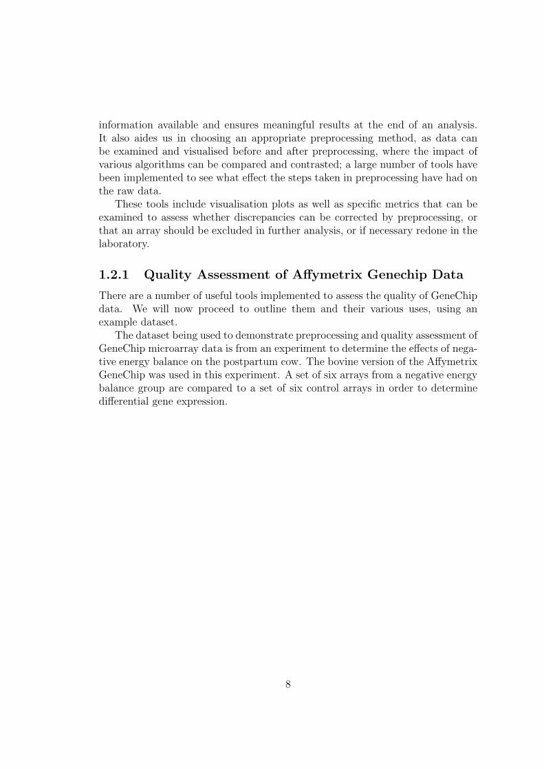
A boxplot is a convenient means by which to compare the probe intensity levelsbetween the arrays of a dataset. Either end of the box represents the upperand lower quartile. The line in the middle of the box represents the median.Horizontal lines, connected to the box by “whiskers”, indicate the largest andsmallest values not considered outliers. Outliers are values that lie more than 1.5times the interquartile range from the first of third quartile (the edges of the box);they are represented by a small circle.
If one or more arrays have intensity levels which are drastically different fromthe rest of the arrays, this may indicate a problem with these arrays. These kindsof problems can however sometimes be corrected by normalization. For microarraydata, these graphs are always constructed using log2 transformed probe intensityvalues, as the graph would be virtually unreadable using raw values, as you cansee below, where raw values are juxtaposed with log2 transformed values.
Figure 1.1: Boxplot of raw probe inten-sity values
Figure 1.2: Boxplot of log2 transformedprobe intensity values
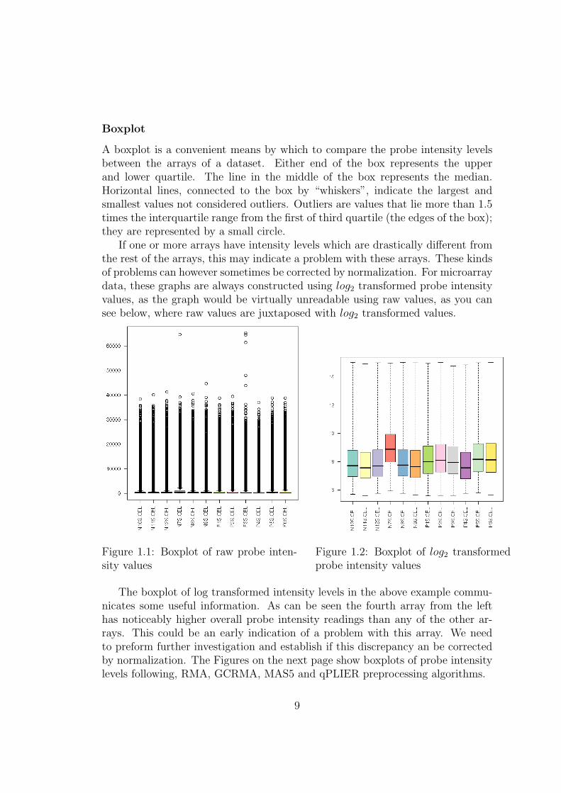
The boxplot of log transformed intensity levels in the above example commu-nicates some useful information. As can be seen the fourth array from the lefthas noticeably higher overall probe intensity readings than any of the other ar-rays. This could be an early indication of a problem with this array. We needto preform further investigation and establish if this discrepancy an be correctedby normalization. The Figures on the next page show boxplots of probe intensitylevels following, RMA, GCRMA, MAS5 and qPLIER preprocessing algorithms.
9
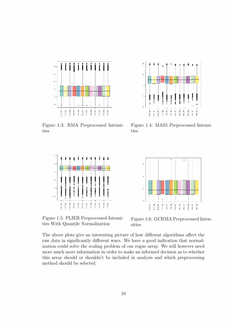
Figure 1.3: RMA Preprocessed Intensi-ties
Figure 1.4: MAS5 Preprocessed Intensi-ties
Figure 1.5: PLIER Preprocessed Intensi-ties With Quantile Normalization
Figure 1.6: GCRMA Preprocessed Inten-sities
The above plots give an interesting picture of how different algorithms affect theraw data in significantly different ways. We have a good indication that normal-ization could solve the scaling problem of our rogue array. We will however needmore much more information in order to make an informed decision as to whetherthis array should or shouldn’t be included in analysis and which preprocessingmethod should be selected.
10
Histogram
A histogram of array intensity levels tells us quite a similar story to that of aboxplot. It is again used to visualise the spread of data and compare and contrastprobe intensity between the arrays of the dataset. The x-axis represents probedensity level and the y-axis indicates probe intensity. This plot provides us witha slightly more detailed picture and there are a number of inferences that can bemade from these plots; a bimodal distribution in the raw data, for example, isoften indicative of an array containing a spacial artifact and an array which isshifted to the right often has abnormally high background interference.
As you can see from the plot of our raw data below, the array “NS7.CEL” isonce again a problem, being shifted slightly to the right, which as stated abovecould indicate high levels of background noise. This point is worth continuedinvestigation.
For comparison purposes I have also included an image of RMA preprocessedvalues. Even with normalization the same array still has the highest overall values.
Figure 1.7: Raw probe intensity valuesplotted on a histogram
Figure 1.8: RMA Preprocessed His-togram
11
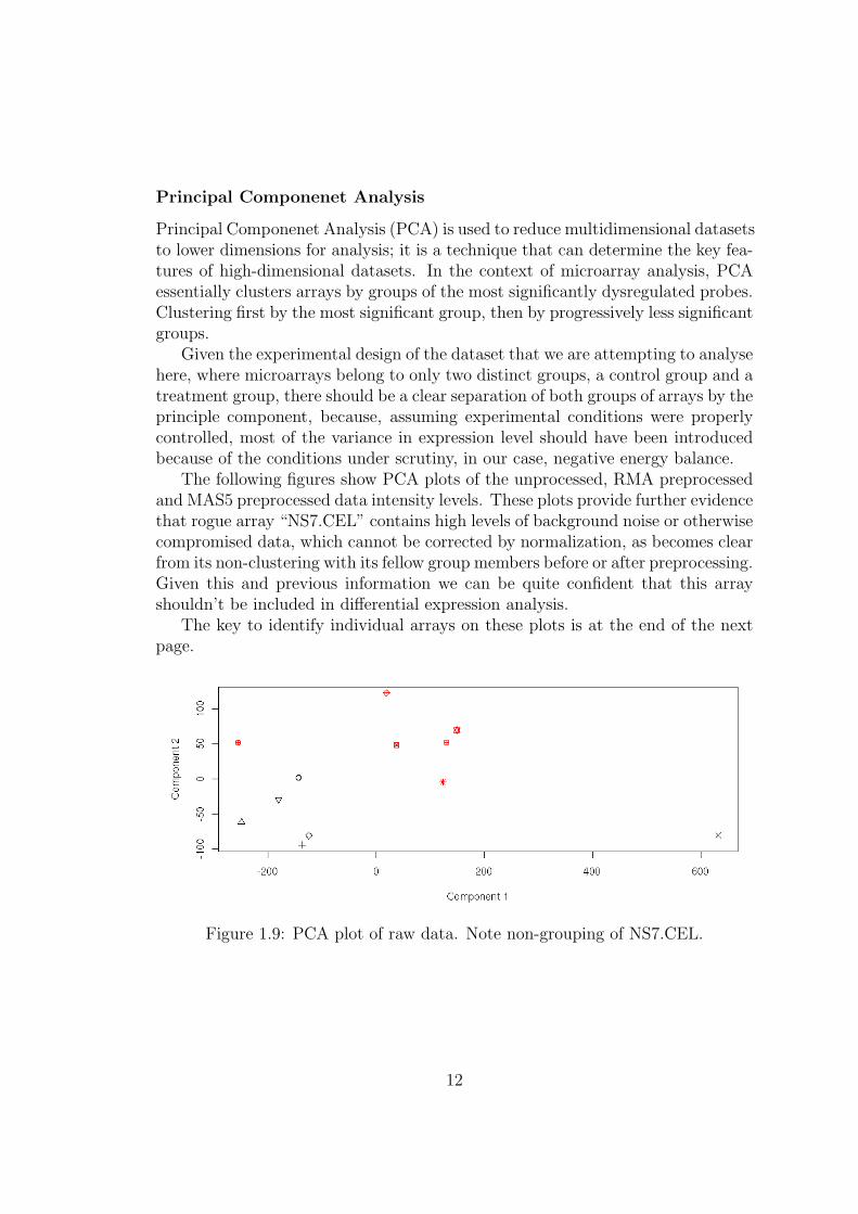
Principal Componenet Analysis
Principal Componenet Analysis (PCA) is used to reduce multidimensional datasetsto lower dimensions for analysis; it is a technique that can determine the key fea-tures of high-dimensional datasets. In the context of microarray analysis, PCAessentially clusters arrays by groups of the most significantly dysregulated probes.Clustering first by the most significant group, then by progressively less significantgroups.
Given the experimental design of the dataset that we are attempting to analysehere, where microarrays belong to only two distinct groups, a control group and atreatment group, there should be a clear separation of both groups of arrays by theprinciple component, because, assuming experimental conditions were properlycontrolled, most of the variance in expression level should have been introducedbecause of the conditions under scrutiny, in our case, negative energy balance.
The following figures show PCA plots of the unprocessed, RMA preprocessedand MAS5 preprocessed data intensity levels. These plots provide further evidencethat rogue array “NS7.CEL” contains high levels of background noise or otherwisecompromised data, which cannot be corrected by normalization, as becomes clearfrom its non-clustering with its fellow group members before or after preprocessing.Given this and previous information we can be quite confident that this arrayshouldn’t be included in differential expression analysis.
The key to identify individual arrays on these plots is at the end of the nextpage.
Figure 1.9: PCA plot of raw data. Note non-grouping of NS7.CEL.
12
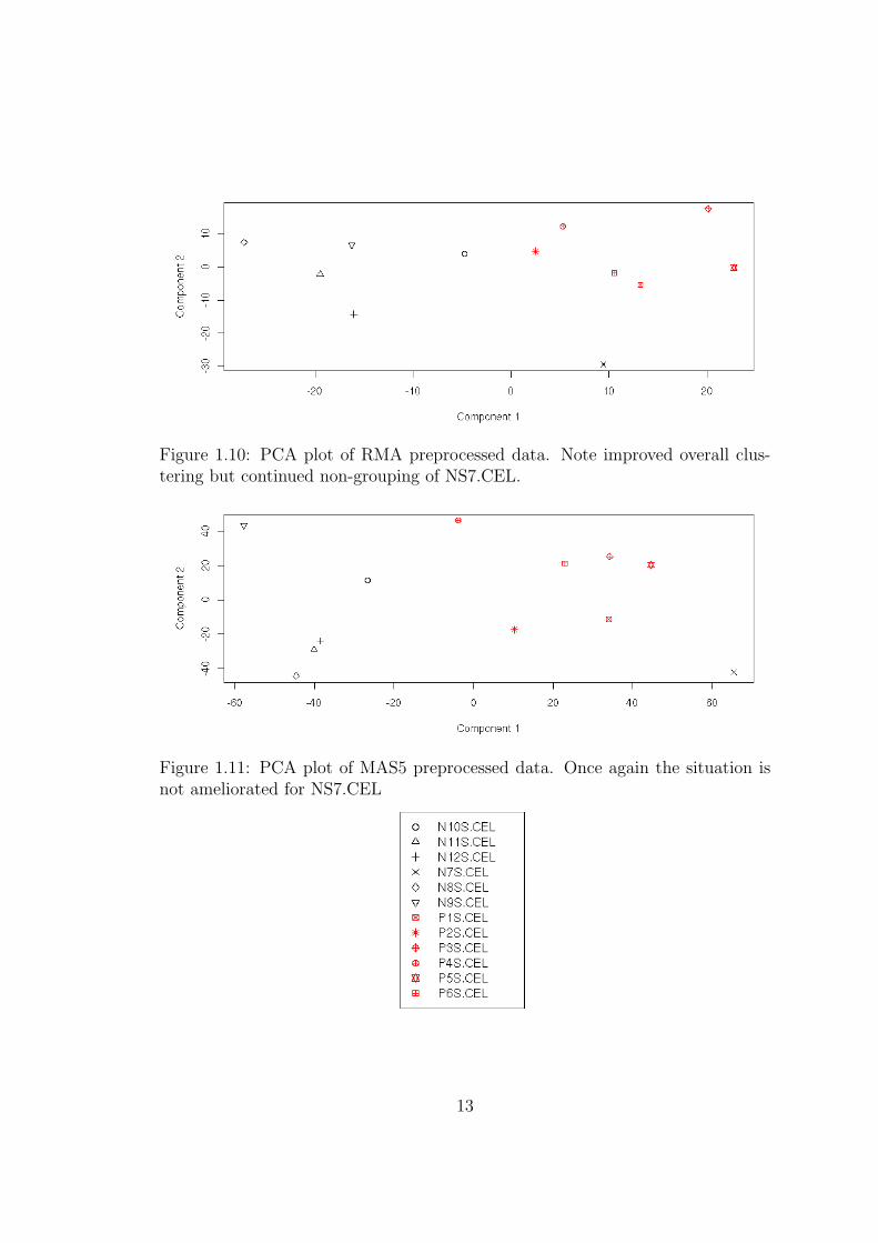
Figure 1.10: PCA plot of RMA preprocessed data. Note improved overall clus-tering but continued non-grouping of NS7.CEL.
Figure 1.11: PCA plot of MAS5 preprocessed data. Once again the situation isnot ameliorated for NS7.CEL
13
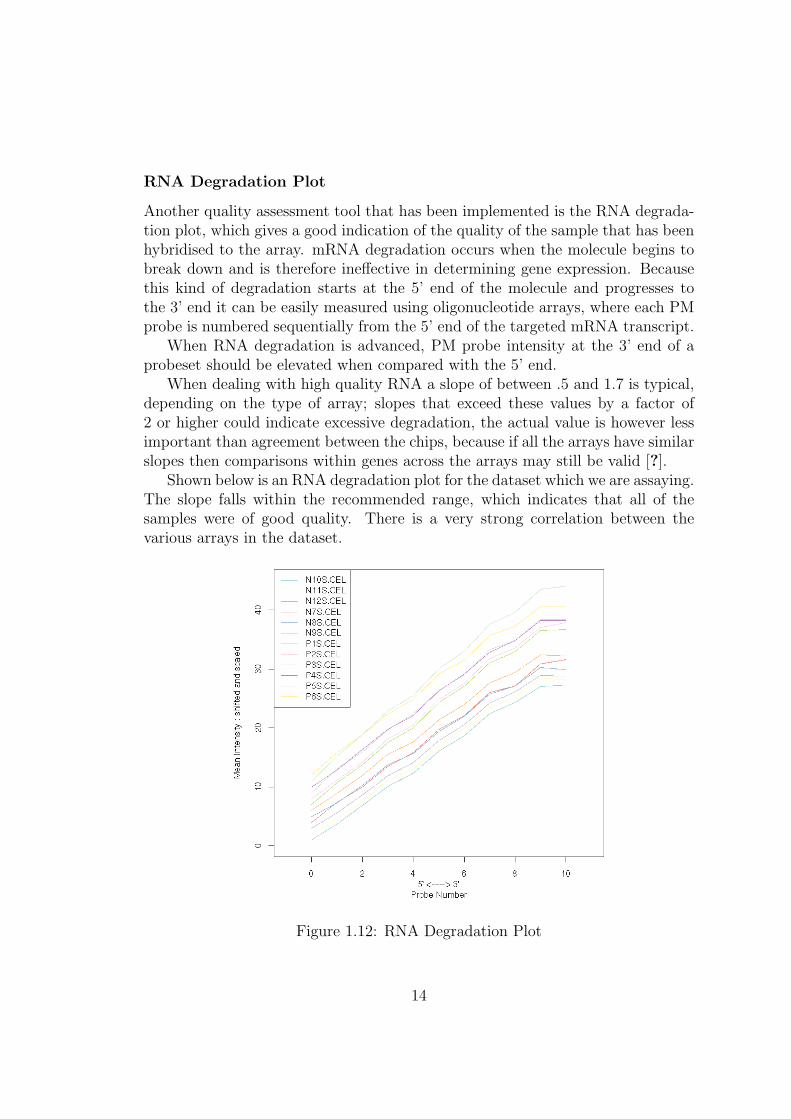
RNA Degradation Plot
Another quality assessment tool that has been implemented is the RNA degrada-tion plot, which gives a good indication of the quality of the sample that has beenhybridised to the array. mRNA degradation occurs when the molecule begins tobreak down and is therefore ineffective in determining gene expression. Becausethis kind of degradation starts at the 5’ end of the molecule and progresses tothe 3’ end it can be easily measured using oligonucleotide arrays, where each PMprobe is numbered sequentially from the 5’ end of the targeted mRNA transcript.
When RNA degradation is advanced, PM probe intensity at the 3’ end of aprobeset should be elevated when compared with the 5’ end.
When dealing with high quality RNA a slope of between .5 and 1.7 is typical,depending on the type of array; slopes that exceed these values by a factor of2 or higher could indicate excessive degradation, the actual value is however lessimportant than agreement between the chips, because if all the arrays have similarslopes then comparisons within genes across the arrays may still be valid [?].
Shown below is an RNA degradation plot for the dataset which we are assaying.The slope falls within the recommended range, which indicates that all of thesamples were of good quality. There is a very strong correlation between thevarious arrays in the dataset.
Figure 1.12: RNA Degradation Plot
14
Simple Affy Plot and Affymetrix Recommended Metrics
Affymetrix reccomends the examination of a number of quantities for qualityassessment of GeneChip data; these metrics have been included in the qualityassessment tools of this system. These are specifically, averages background, scalefactor and percent present calls.
Average background indicates the level of background noise a chip is experienc-ing. There are several reasons that chips may have significantly different averagebackground intensities. It might be simply that the overall signal from the arrayis greater, because different amounts of RNA were present during hybridisation,or that hybridisation was more efficient, thus producing a more fluorescent chip.It is recommended that these values should be similar across all chips [?].
Scaling factor refers to the level of scaling applied to an array when normalizedusing Affymetrix’s MAS5 algorithm. By default MAS5 scales the intensity of eacharray so that they all have the same mean. So scaling factor is a measure of howfar a chips overall values are scaled because of this. Affymetrix recommends thatscale factors be within 3-fold of each other [?].
Percent Present calls are generated by looking at the difference between PMand MM probes for each pair in a probeset and simply represents the percentageof probesets called present on an array. Probesets are flagged marginal or absentwhen the PM values for that probeset are not considered to be significantly abovethe MM probes. Similarly to scale factors, significant variations in percent presentcalls across the arrays in a study should be treated with caution [?]. Again it isrecommended by Affymetrix that these values be similar.
Below are tables of these values for our example dataset.
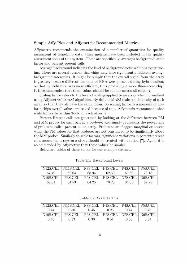
Table 1.1: Background Levels
N12S.CEL N11S.CEL N8S.CEL P1S.CEL P4S.CEL P5S.CEL67.49 62.04 68.94 62.50 60.89 73.18
N10S.CEL P3S.CEL P6S.CEL P2S.CEL N7S.CEL N9S.CEL65.61 64.53 64.25 70.25 84.85 62.75
Table 1.2: Scale Factors
N12S.CEL N11S.CEL N8S.CEL P1S.CEL P4S.CEL P5S.CEL0.44 0.50 0.45 0.26 0.44 0.43
N10S.CEL P3S.CEL P6S.CEL P2S.CEL N7S.CEL N9S.CEL0.40 0.33 0.38 0.51 0.36 0.34
15
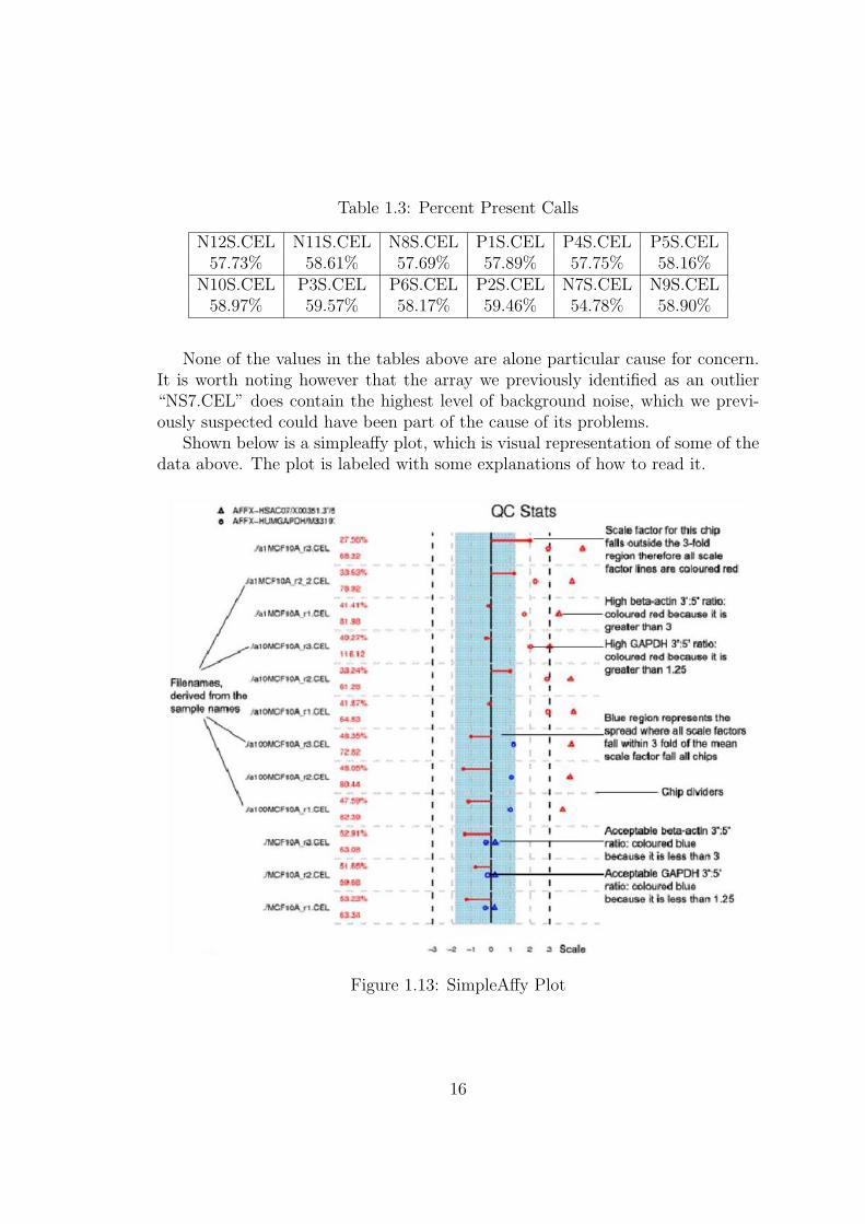
Table 1.3: Percent Present Calls
N12S.CEL N11S.CEL N8S.CEL P1S.CEL P4S.CEL P5S.CEL57.73% 58.61% 57.69% 57.89% 57.75% 58.16%
N10S.CEL P3S.CEL P6S.CEL P2S.CEL N7S.CEL N9S.CEL58.97% 59.57% 58.17% 59.46% 54.78% 58.90%
None of the values in the tables above are alone particular cause for concern.It is worth noting however that the array we previously identified as an outlier“NS7.CEL” does contain the highest level of background noise, which we previ-ously suspected could have been part of the cause of its problems.
Shown below is a simpleaffy plot, which is visual representation of some of thedata above. The plot is labeled with some explanations of how to read it.
Figure 1.13: SimpleAffy Plot
16
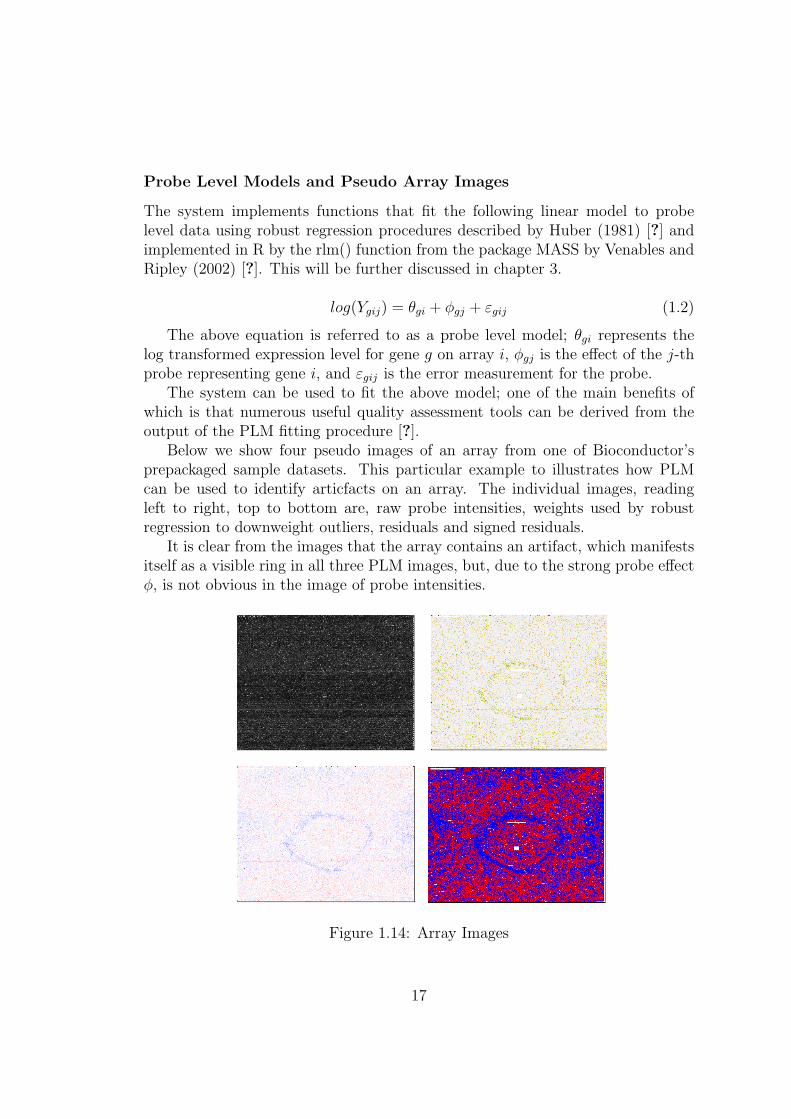
Probe Level Models and Pseudo Array Images
The system implements functions that fit the following linear model to probelevel data using robust regression procedures described by Huber (1981) [?] andimplemented in R by the rlm() function from the package MASS by Venables andRipley (2002) [?]. This will be further discussed in chapter 3.
log(Ygij) = θgi + φgj + εgij (1.2)
The above equation is referred to as a probe level model; θgi represents thelog transformed expression level for gene g on array i, φgj is the effect of the j-thprobe representing gene i, and εgij is the error measurement for the probe.
The system can be used to fit the above model; one of the main benefits ofwhich is that numerous useful quality assessment tools can be derived from theoutput of the PLM fitting procedure [?].
Below we show four pseudo images of an array from one of Bioconductor’sprepackaged sample datasets. This particular example to illustrates how PLMcan be used to identify articfacts on an array. The individual images, readingleft to right, top to bottom are, raw probe intensities, weights used by robustregression to downweight outliers, residuals and signed residuals.
It is clear from the images that the array contains an artifact, which manifestsitself as a visible ring in all three PLM images, but, due to the strong probe effectφ, is not obvious in the image of probe intensities.
Figure 1.14: Array Images
17
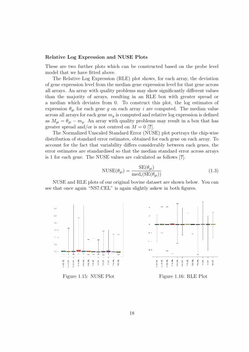
Relative Log Expression and NUSE Plots
These are two further plots which can be constructed based on the probe levelmodel that we have fitted above.
The Relative Log Expression (RLE) plot shows, for each array, the deviationof gene expression level from the median gene expression level for that gene acrossall arrays. An array with quality problems may show significantly different valuesthan the majority of arrays, resulting in an RLE box with greater spread ora median which deviates from 0. To construct this plot, the log estimates ofexpression θgi for each gene g on each array i are computed. The median valueacross all arrays for each gene mg is computed and relative log expression is definedas Mgi = θgi −mg. An array with quality problems may result in a box that hasgreater spread and/or is not centred on M = 0 [?].
The Normalized Unscaled Standard Error (NUSE) plot portrays the chip-wisedistribution of standard error estimates, obtained for each gene on each array. Toaccount for the fact that variability differs considerably between each genes, theerror estimates are standardised so that the median standard error across arraysis 1 for each gene. The NUSE values are calculated as follows [?].
NUSE(θgi) =SE(θgi)
medi(SE(θgi))(1.3)
NUSE and RLE plots of our original bovine dataset are shown below. You cansee that once again “NS7.CEL” is again slightly askew in both figures.
Figure 1.15: NUSE Plot Figure 1.16: RLE Plot
18
1.2.2 Quality Assessment of cDNA Data
There are also number of useful tools implemented to assess the quality of cDNAdata. This subsection aims to to outline these tools and their various uses.
The dataset which will be used to demonstrate preprocessing and quality as-sessment of cDNA microarray data is the Swirl dataset, which is one of the exampledatasets packaged with Bioconductor.
To give a very brief background; this experiment was carried out using zebrafishas a model organism to study the early development in vertebrates. Swirl is a pointmutant in the BMP2 gene that affects the dorsal/ventral body axis. The maingoal of the Swirl experiment is to identify genes with altered expression in theSwirl mutant compared to wild-type zebrafish. Each of the four arrays in theexperiment compares RNA from the mutant Swirl zebrafish to that of the normal“wild-type” fish.
The following pages outline the cDNA quality assessed tools implemented inthis system.
19
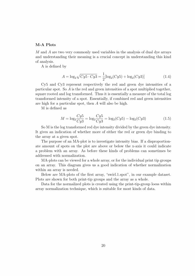
M-A Plots
M and A are two very commonly used variables in the analysis of dual dye arraysand understanding their meaning is a crucial concept in understanding this kindof analysis.
A is defined by
A = log2
√Cy5 · Cy3 =
1
2[log2(Cy5) + log2(Cy3)] (1.4)
Cy5 and Cy3 represent respectively the red and green dye intensities of aparticular spot. So A is the red and green intensities of a spot multiplied together,square rooted and log transformed. Thus it is essentially a measure of the total logtransformed intensity of a spot. Essentially, if combined red and green intensitiesare high for a particular spot, then A will also be high.
M is defined as
M = log2Cy5
Cy3= log2
Cy5
Cy3= log2(Cy5)− log2(Cy3) (1.5)
So M is the log transformed red dye intensity divided by the green dye intensity.It gives an indication of whether more of either the red or green dye binding tothe array at a given spot.
The purpose of an MA-plot is to investigate intensity bias. If a disproportion-ate amount of spots on the plot are above or below the x-axis it could indicatea problem with an array. As before these kinds of problems can sometimes beaddressed with normalization.
MA-plots can be viewed for a whole array, or for the individual print tip groupson an array. This diagram gives us a good indication of whether normalizationwithin an array is needed.
Below are MA-plots of the first array, “swirl.1.spot”, in our example dataset.Plots are shown for both print-tip groups and the array as a whole.
Data for the normalized plots is created using the print-tip-group loess withinarray normalization technique, which is suitable for most kinds of data.
20
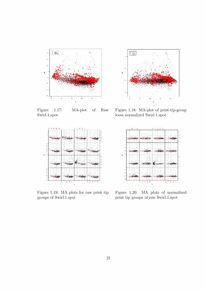
Figure 1.17: MA-plot of RawSwirl.1.spot
Figure 1.18: MA-plot of print-tip-grouploess normalized Swirl.1.spot
Figure 1.19: MA plots for raw print tipgroups of Swirl.1.spot
Figure 1.20: MA plots of normalizedprint tip groups of raw Swirl.1.spot
21

Pseudo Array Images
As outlined previously, viewing array images can be a useful step in identifyingartifacts on an array, that may lead to the arrays exclusion from an experiment.Included below are pseudo-images for another array in our experiment, this time“Swirl.2.spot”. Shown are foreground and background red and green images.The range of intensity values is also printed on the bottom of the image, thisindicates what intensities the various colours represent. For example on our redforeground image, the intensity range is 7.5 to 15.6, indicating that a spot withlog transformed intensity level of 7.6 is represented by pure white and a spot withintensity of 15.6 is represented by pure red, while values in between are representedby colours varying progressively from white to red.
Also shown are images of M, the log ratio of red and green intensities, for bothraw and print-tip-group loess normalized data.
Figure 1.21: Array image of green fore-ground intensities
Figure 1.22: Array image of green back-ground intensities
22
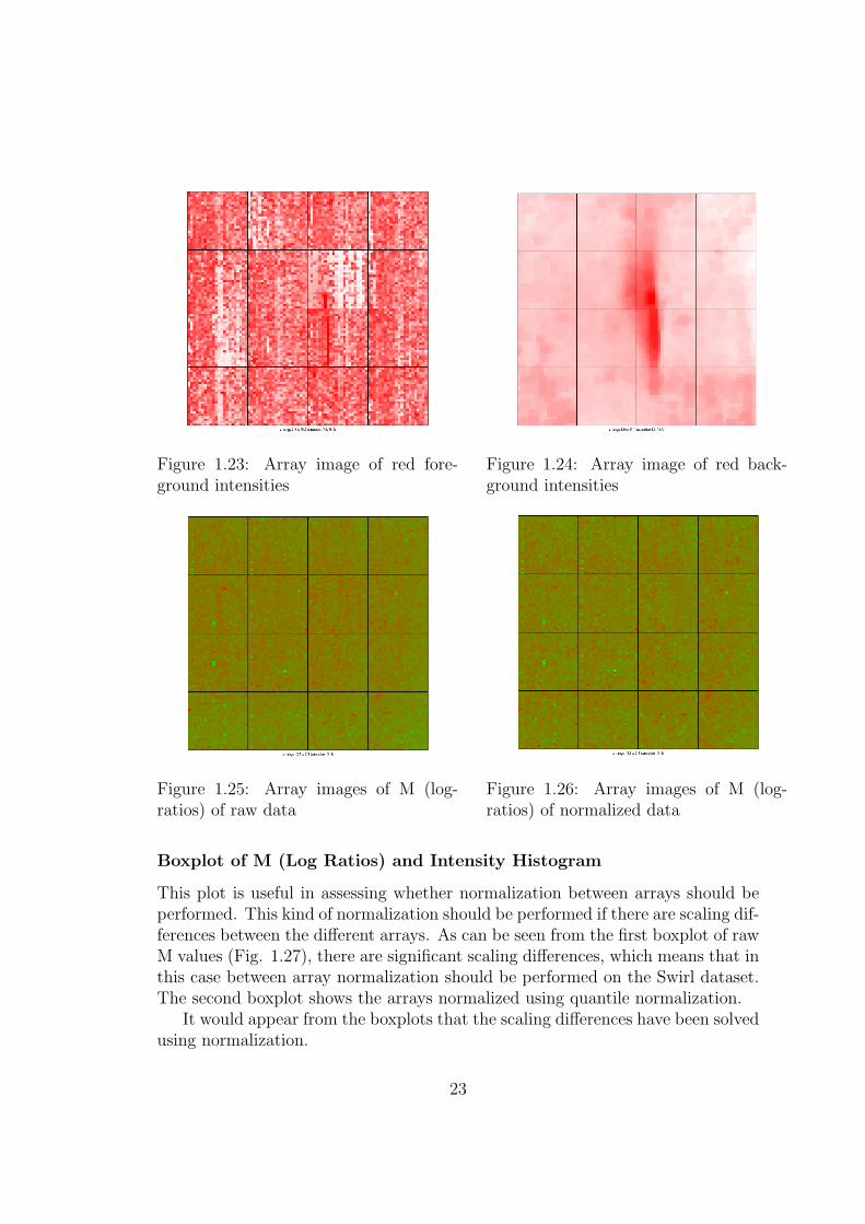
Figure 1.23: Array image of red fore-ground intensities
Figure 1.24: Array image of red back-ground intensities
Figure 1.25: Array images of M (log-ratios) of raw data
Figure 1.26: Array images of M (log-ratios) of normalized data
Boxplot of M (Log Ratios) and Intensity Histogram
This plot is useful in assessing whether normalization between arrays should beperformed. This kind of normalization should be performed if there are scaling dif-ferences between the different arrays. As can be seen from the first boxplot of rawM values (Fig. 1.27), there are significant scaling differences, which means that inthis case between array normalization should be performed on the Swirl dataset.The second boxplot shows the arrays normalized using quantile normalization.
It would appear from the boxplots that the scaling differences have been solvedusing normalization.
23
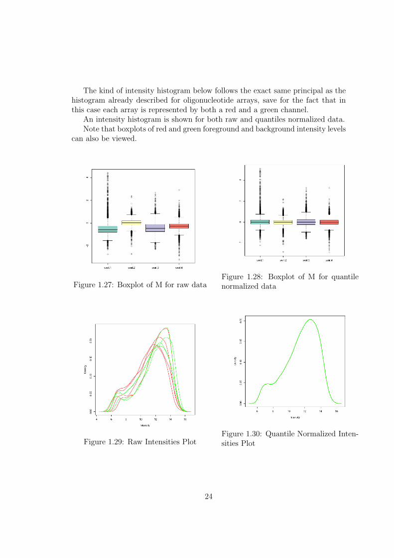
The kind of intensity histogram below follows the exact same principal as thehistogram already described for oligonucleotide arrays, save for the fact that inthis case each array is represented by both a red and a green channel.
An intensity histogram is shown for both raw and quantiles normalized data.Note that boxplots of red and green foreground and background intensity levels
can also be viewed.
Figure 1.27: Boxplot of M for raw dataFigure 1.28: Boxplot of M for quantilenormalized data
Figure 1.29: Raw Intensities PlotFigure 1.30: Quantile Normalized Inten-sities Plot
24
1.2.3 Quality Assessment of Single Dye Data
Support for single channel platforms like Exiqon miRNA arrays in Bioconductoris still in something of an experimental stage and can be somewhat ad-hoc; asalready stated, only the VSN preprocessing method is available. Quality controloptions are slightly more limited than for other platforms, but there is still enoughavailable for a user to make a reasonable judgement about the integrity of adataset’s constituent arrays.
The system implements many of the same plots as before. Available for assess-ment are, array images of both foreground and background intensities, boxplotsof raw and preprocessed foreground and background intensities, density plots ofraw and preprocessed data and PCA and accompanying scree plots of raw andpreprocessed data. All of these plots should be assayed in a similar manner asalready described for other platforms.
1.3 Calculating Differential Expression
Differential expression analysis of microarray data is fraught with many classicalstatistical issues, such as appropriate test statistics, replicate structure, samplesize, outlier detection and statistical significance of results. The original andsimplest approach to identifying differentially expressed genes was to use a foldchange criteria; selecting cutoff was something of an ad-hoc procedure; a 2-foldchange was however thought as being a suitable cutoff. This selection processis however, completely biased towards individual genes with large fold changesand completely disregards the fact that groups of related genes showing smallerdeviations could be just as important and also does not allow for assessment ofsignificance of expression differences in the presence of biological and experimentalvariation [?].
There are a number of statistical tests available that can be applied to assessdifferential expression between populations of microarray data, such as the t-test,which can be used to assess the statistical probability that, given the number ofsamples available, the true expression levels for a given gene differ in the overallpopulations. In such an analysis, the number of samples is invariably far less thanthe number of genes which are being investigated. The number of genes couldrun into tens of thousands, but the number of arrays used will, due to overall costor rarity of tissue samples, rarely exceed thirty, thus creating a multiple testingproblem. For example, on an array of 25,000 genes, if even 5% are misinterpretedas being differentially expressed, or “false positives”, then ∼1,250 genes will beconstrued as being differentially expressed when they are in fact not.
There are a number of solutions available to the problem of false positiveswhich result from the large number of variables in a statistical test; they include
25
False Discovery Rate (FDR) developed by Benjamini and Hochberg (1995) [?], orthe more stringent Bonferroni Method which controls the family-wise error rate.These and other methods can be applied to address the problem of false positivesin microarray gene expression analysis.
The system developed during this project uses the functions available in Bio-conductors LIMMA package to calculate differential expression of GeneChip, dualdye and single dye data, as the same principals can be applied to all of these datatypes.
Further to that, the system also implements the functionality of the morerecent PUMA package, for analysis of GeneChip data.
Note that further technical details of how these packages are integrated willbe discussed at a later point in this thesis.
1.3.1 The LIMMA Package
LIMMA is an R library which is part of the Bioconductor project and is used forthe analysis of gene expression microarray data. It incorporates the use of linearmodels for assessment of differential expression. LIMMA provides the ability toanalyse comparisons between many RNA targets simultaneously in complicateddesigned experiments. Empirical Bayesian methods are used to provide stableresults even when the number of arrays is small.
The general procedure followed in analysis using the package is as follows.This procedure first fits a linear model to the expression data for each probe.
The expression data should be log-ratios M for two-colour array platforms or log-expression values for one-channel platforms. The coefficients of the fitted modelsdescribe the differences between the RNA sources hybridised to the arrays, thesecoefficients are described by the design matrix. The probe-wise fitted model resultsare stored in a compact form suitable for further processing by other functions inthe Limma package.
The fitted model object is then re-orientated from the coefficients of the orig-inal design matrix to any set of contrasts of the original coefficients. The coeffi-cients, correlation matrix and unscaled standard deviations are then re-calculatedin terms of the contrasts.
Finally, Empirical Bayes shrinkage is used to compute moderated t-statistics,moderated F-statistic, and B-statistic (log-odds of differential expression) by shrink-age of the standard errors towards a common value. This method has the advan-tage of being able to provide a stable result even when the number of arrays inan experiment is small [?].
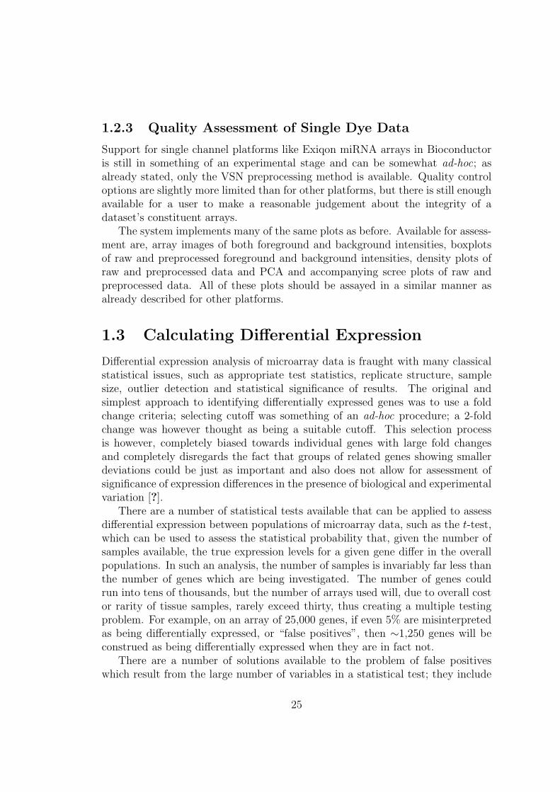
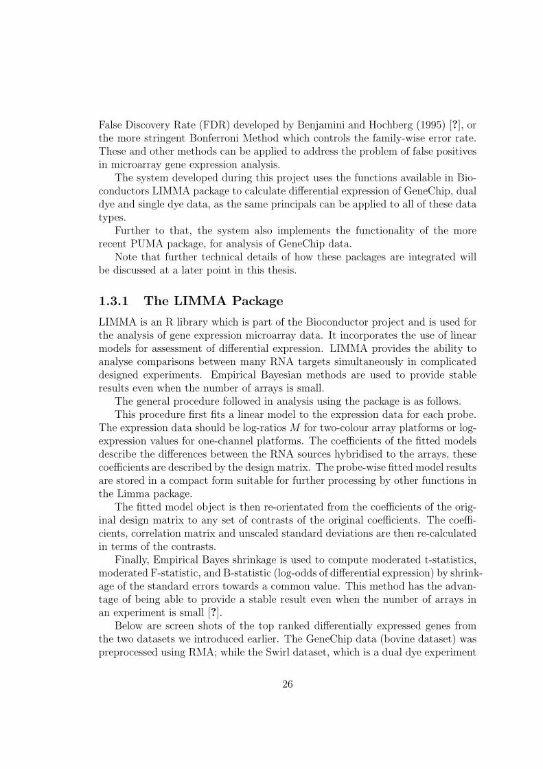
Below are screen shots of the top ranked differentially expressed genes fromthe two datasets we introduced earlier. The GeneChip data (bovine dataset) waspreprocessed using RMA; while the Swirl dataset, which is a dual dye experiment
26
where array image analysis was performed using Spotfire Software, was prepro-cessed using background subtraction, Print-tip-group Loess normalization withinarrays and Quantile normalization between arrays. In both cases, the adjustedp-values are corrected for multiple testing using the Benjamini and Hochbergmethod.
These screen shots are of HTML tables output by the system. How these arecreated will become clear over the subsequent chapters.
Figure 1.31: Top 10 genes for Bovine dataset
Figure 1.32: Top 10 genes for Swirl dataset
1.3.2 The PUMA Package
PUMA is an acronym for Propagating Uncertainty in Microarray Analysis [?].It is a package that is specifically targeted at GeneChip data. Unlike previousanalyses of Affymetrix GeneChip data, PUMA does not simply provide a pointestimates of gene expression levels. The designers of PUMA argue that the original
27
set of ∼11 probes contain much useful information about uncertainty associatedwith their final expression measure. Using probabilistic methods, it is possible toassociate gene expression levels from probe level analysis with credibility intervalsthat quantify uncertainty associated with the estimate of target concentration ina sample. By propagating this uncertainty to downstream analyses, it is arguedthat the reliability of results is improved. Included in the package are summari-sation, differential expression detection, clustering and PCA methods, togetherwith useful plotting functions.
PUMA uses the multi-mgMOS preprocessing method[?], which uses Bayesianmethods to associate credibility intervals with expression levels.
For PCA, a noise-propagation in principal components analysis method[?] isused, which propagates the expression level uncertainty to improve the results ofPCA.
By default, genes are ranked for differential expression using the Probabilityof Positive Log Ratio (PPLR) method[?] which combines uncertainty informationfrom replicated experiments in order to obtain point estimates and standard errorsof the expression levels within each condition. These point estimates and standarderrors can then be used to obtain a PPLR score for each probeset, which can thenbe used to rank probesets by probability of differential expression between twoconditions [?].
1.4 Use of Remapped Probe Sets For GeneChip
Arrays
As already outlined, most GeneChip arrays use 11 different 25-base long probesto target specific genes.
A problem is however introduced by the ever changing nature of knowledgeof genomic sequences of different organisms. As such knowledge evolves, it hasbecome clear that the original probe to transcript mappings assigned in an array’sChip Definition File (CDF), defined initially by the manufacturer, are in certaincases, known to be no longer entirely accurate. In simple terms, some probes arenot targeting the sequence that they were originally thought to be targeting.
Because of this a number of groups have developed alternative probe to probe-set mappings, which are defined in remapped Chip Definition Files.
This system gives the user the option of using some of the remapped CDFpackages created by the AffyProbeMiner project [?], as an alternative to the de-fault Affymetrix CDFs. AffyProbeMiner regroups probes in the GeneChip intonew probesets according to the verified complete coding sequences available inGeneBank and RefSeq databases. This remapping has been shown to affect 20-30% of all probesets, with genes shown to be differentially expressed using the
28
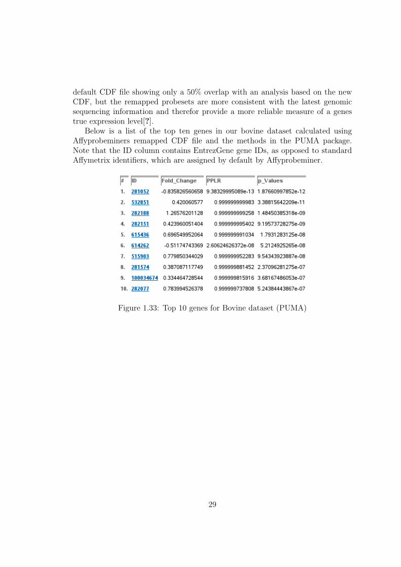
default CDF file showing only a 50% overlap with an analysis based on the newCDF, but the remapped probesets are more consistent with the latest genomicsequencing information and therefor provide a more reliable measure of a genestrue expression level[?].
Below is a list of the top ten genes in our bovine dataset calculated usingAffyprobeminers remapped CDF file and the methods in the PUMA package.Note that the ID column contains EntrezGene gene IDs, as opposed to standardAffymetrix identifiers, which are assigned by default by Affyprobeminer.
Figure 1.33: Top 10 genes for Bovine dataset (PUMA)
29