Embed Size (px)
Citation preview
Capstone Appendix
A guide to your lab computer software

Important Notes
Many of the Images will look slightly different from what you will see in lab. This is because each lab setup is different and so requires different tools and sensors. If you are confused by anything ask your instructor. The blue links in this file work like web links. Use them to aid in navigation. This functionality has only been tested with Adobe Reader and may not work with other software. If you find any errors in this appendix, please email [email protected] with the subject line “Appendix Error” For all other inquiries email [email protected]
Subjects 1. Definitions
2. Common Symbols
3. Taking Data
4. Managing Data/Data Appearance
5. Graphing Tools
6. Signal Generator
7. Video Data
8. The Calculator
9. Data Summary
10. Zeroing sensors
11. Curve Fit Editor
12. The Journal
– Screenshots
Definitions • Display: the areas in a tab that are used to show text or
data such as a plot or table. These can be selected by clicking inside them, and have a thin blue border when selected.
• Noise: irrelevant or meaningless data or output occurring along with desired information.
• Page: The entire viewing area, including the tools and controls pallets, the display area, and option menus. Commonly also called a tab.
• Page Content: The area of the page where displays are located and data is manipulated.
• Run: The set of data saved each time data is recorded.
• Sensor: Any instrument that is plugged into the interface capable of recording data.
• Snapshot: Capstone’s word for taking a screenshot of something in the software.
• Trace: The plot made from real time data on and oscilloscope.
Back to Subjects

Common Symbols The following symbols are used throughout the Capstone software
• Data Runs Triangle
This symbol is used to show that data runs will be used or inserted.
• Settings Gear
This gear means that there are settings that can be adjusted for that particular part of Capstone
• Thumb Tack.
This is used to “stick” parts of the screen in place to prevent overlapping.
• Delete X
This “x” is used to show that the action will delete something. Be sure that you know what will be deleted when clicking something with this on it.
Back to Subjects

Taking Data Most data is taken from a sensor and will show in a display during and after a run.
• There are three modes of recording data. The are used by clicking the buttons shown below.
Fast Monitor Mode When is clicked Fast
Monitor mode Shows the data being measured but does not keep each data point.
Keep Mode When is clicked Keep mode
will show the data being measured but will only keep a data point once __ is clicked.
Continuous Mode This is the most common
mode, it starts recording data once is clicked. Sometimes no data will appear until a certain condition is met, when this is the case it will be explained in your manual.
Stop Data Recording To stop recording data in any
mode, click .
In continuous mode Data taking may stop automatically once certain conditions are met
All of these buttons will be located in the area highlighted in YELLOW to the right
Back to Subjects

Graphing Tools The next few slides explain how to use tools and functions in Capstone to best see and analyze your data.
• In this Section:
• Scaling the Graph
• Selecting Data To Display
• Highlight Data Tool
• Manipulating Data Points
• Statistics
• Area Under the Curve Tool
• Trend Line Tool
• Coordinates Tool
• Slope Tool
• Annotate
• Smoothing Tool
• The Tools above are all located in the are highlighted with GREEN and will change the area highlighted with BLUE (the plot area)
• Most tools can be deleted by selecting them and pressing the delete key
Back to Subjects

Scaling the Graph 1 These functions allow you to zoom in and out on your data to see fine detail or the total picture.
• There are two main scaling buttons.
• Will scale the graph so that all of the Data will be included in the graph, or it will scale to the size of the highlight box on screen.
• Gives three options that will change how the graphs scale behaves while data is being recorded.
• Scale Both Axes will allow the entire graph to move and scale so that all data is always displayed.
• Scroll x-axis, Scale Y-axis will keep a set range in the x axis that will scroll as data is taken while scaling to show data in the Y-axis.
• Scroll x-axis, Do NOT Scale y-axis will keep a set range on the x-axis that will scroll as data is taken and will keep a set range on the y-axis that will not show data that is out of that range.
*Note that all of these options will take place starting when the button is pressed.
• Will change this plot
To this plot
Back to Subjects Graphing Tools
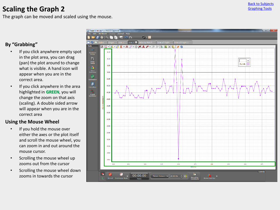
Scaling the Graph 2 The graph can be moved and scaled using the mouse.
• By “Grabbing”
• If you click anywhere empty spot in the plot area, you can drag (pan) the plot around to change what is visible. A hand icon will appear when you are in the correct area.
• If you click anywhere in the area highlighted in GREEN, you will change the zoom on that axis (scaling). A double sided arrow will appear when you are in the correct area
• Using the Mouse Wheel
• If you hold the mouse over either the axes or the plot itself and scroll the mouse wheel, you can zoom in and out around the mouse cursor.
• Scrolling the mouse wheel up zooms out from the cursor
• Scrolling the mouse wheel down zooms in towards the cursor
Back to Subjects Graphing Tools
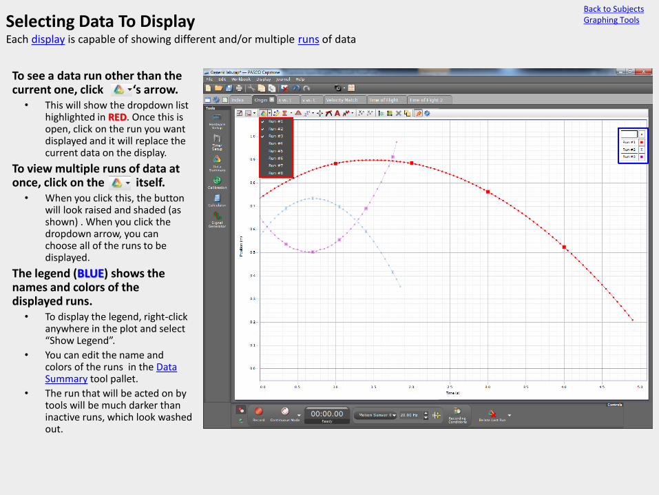
Selecting Data To Display Each display is capable of showing different and/or multiple runs of data
• To see a data run other than the current one, click the ‘s arrow.
• This will show the dropdown list highlighted in RED. Once this is open, click on the run you want displayed and it will replace the current data on the display.
• To view multiple runs of data at once, click on the itself.
• When you click this, the button will look raised and shaded (as shown) . When you click the dropdown arrow, you can choose all of the runs to be displayed.
• The legend (BLUE) shows the names and colors of the displayed runs.
• To display the legend, right-click anywhere in the plot and select “Show Legend”.
• You can edit the name and colors of the runs in the Data Summary tool pallet.
• The run that will be acted on by tools will be much darker than inactive runs, which look washed out.
Back to Subjects Graphing Tools

The Highlight Tool This tool enables you to select specific data points to manipulate.
• Each time t (GREEN) is clicked, a highlight box will appear.
• If any part of this box is placed over data, that data will be highlighted in yellow and selected. Related data in a table will also be selected by this.
• You can move the highlight box by dragging from its middle, or you can change its shape by dragging an anchor point (BLUE).
• You can Have multiple highlight boxes at once.
• Each box can select different data but only one can be active at a time.
• Boxes for different runs can be made be selecting that run before clicking . The highlight box will be the same color as the run
• To delete or turn off a highlight box, right click in the middle of it (RED).
• This also brings up options for Data Manipulation.
Back to Subjects Graphing Tools
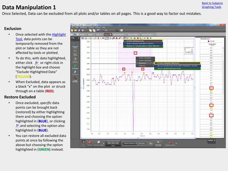
Data Manipulation 1 Once Selected, Data can be excluded from all plots and/or tables on all pages. This is a good way to factor out mistakes.
• Exclusion
• Once selected with the Highlight Tool, data points can be temporarily removed from the plot or table so they are not affected by tools or plotted.
• To do this, with data highlighted, either click or right click in the highlight box and choose “Exclude Highlighted Data” (YELLOW).
• When Excluded, data appears as a black “x” on the plot or struck through on a table (RED).
• Restore Excluded
• Once excluded, specific data points can be brought back (restored) by either highlighting them and choosing the option highlighted in (BLUE), or clicking . and selecting the option also highlighted in (BLUE).
• You can restore all excluded data points at once by following the above but choosing the option highlighted in (GREEN) instead.
Back to Subjects Graphing Tools

Data Manipulation 2 Once Selected, Data can be deleted from the run. This should be done once you know the data will not be needed.
• Deleting Selected Data
• Once selected with the Highlight Tool, data points can be permanently removed from the data run (not just the plot or table). They will not show up anywhere once deleted. To do this with data highlighted, either click or right click in the highlight box and choose “Delete Highlighted Data” (RED).
• Deleting Excluded Data
• All data points that have been excluded can be removed at once by right clicking in a highlight box or clicking and choosing the option highlighted in BLUE.
• Undoing
• If you accidentally delete data that you want, you can undo the entire deletion by holding Ctrl and pressing “z” or going to the edit (GREEN) menu and clicking Undo. This is the only method to restore data deleted this way.
Back to Subjects Graphing Tools

Statistics The Statistics button is used to show useful information about the data graphically and numerically.
• Clicking will drop down a menu with four options that can be toggled. This can apply to all of the data or a specific highlighted set.
• Minimum • This will put a horizontal line
across the plot at the minimum y-axis value from the data with a number displaying that value (RED).
• Maximum • This will put a horizontal line
across the plot at the maximum y-axis value from the data with a number displaying that value (BLUE).
• Mean • This will put a horizontal line
across the plot at the mean of all of the y-axis values from the data with a number displaying that value (YELLOW).
• Standard Deviation • This will calculate the
Standard Deviation and show it numerically (GREEN). It will also make a gradient that fades out from the mean as it approaches a y distance of one standard deviation.
Back to Subjects Graphing Tools

The Area Under The Curve Tool This tool will give the area from the origin.
• When is clicked (GREEN), the area from the data curve to the y-axis zero line will be shaded in.
• The area covered by the shading will be given numerically in a mobile text box (RED)
• Area from +y values to the origin is treated as positive and area from –y values to the origin is treated as negative. The area given is a sum of both.
• By default, when clicked, the area tool gives the area of the entire plot. If, however, any data is highlighted, the area and shading will only include that data.
Back to Subjects Graphing Tools
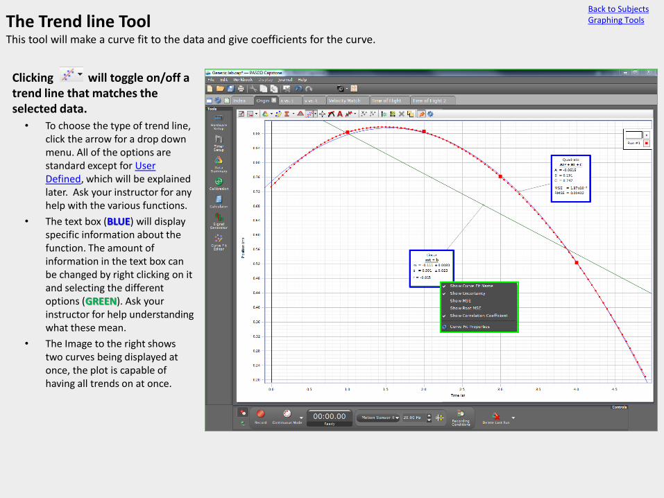
The Trend line Tool This tool will make a curve fit to the data and give coefficients for the curve.
• Clicking will toggle on/off a trend line that matches the selected data.
• To choose the type of trend line, click the arrow for a drop down menu. All of the options are standard except for User Defined, which will be explained later. Ask your instructor for any help with the various functions.
• The text box (BLUE) will display specific information about the function. The amount of information in the text box can be changed by right clicking on it and selecting the different options (GREEN). Ask your instructor for help understanding what these mean.
• The Image to the right shows two curves being displayed at once, the plot is capable of having all trends on at once.
Back to Subjects Graphing Tools
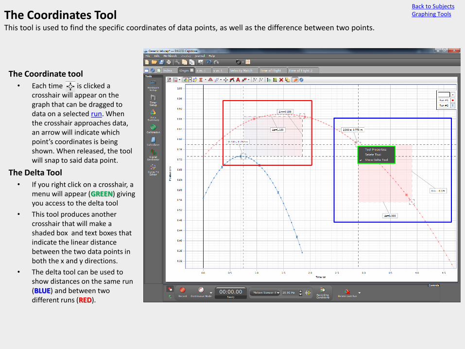
The Coordinates Tool This tool is used to find the specific coordinates of data points, as well as the difference between two points.
• The Coordinate tool
• Each time is clicked a crosshair will appear on the graph that can be dragged to data on a selected run. When the crosshair approaches data, an arrow will indicate which point’s coordinates is being shown. When released, the tool will snap to said data point.
• The Delta Tool
• If you right click on a crosshair, a menu will appear (GREEN) giving you access to the delta tool
• This tool produces another crosshair that will make a shaded box and text boxes that indicate the linear distance between the two data points in both the x and y directions.
• The delta tool can be used to show distances on the same run (BLUE) and between two different runs (RED).
Back to Subjects Graphing Tools

The Slope Tool The slope tool can be used to quickly get the rate of change of a curve as well as finding tangents to the curve.
• Clicking will make a dashed line and small text box appear on the plot area.
• By grabbing the dashed line and moving it closer to a selected curve, it will “snap” to data points in the same way the coordinates tool does.
• Once snapped to a point, a line will appear connecting the data one point to the left and right to the selected point in a straight line. It will also show the slope of this line numerically (BLUE)
• By default the slope only connects the nearest points but this can be changed by right clicking on the slope text box and choosing “Slope Tool Properties” (GREEN).Ask your TA if you need any help with the properties.
Back to Subjects Graphing Tools
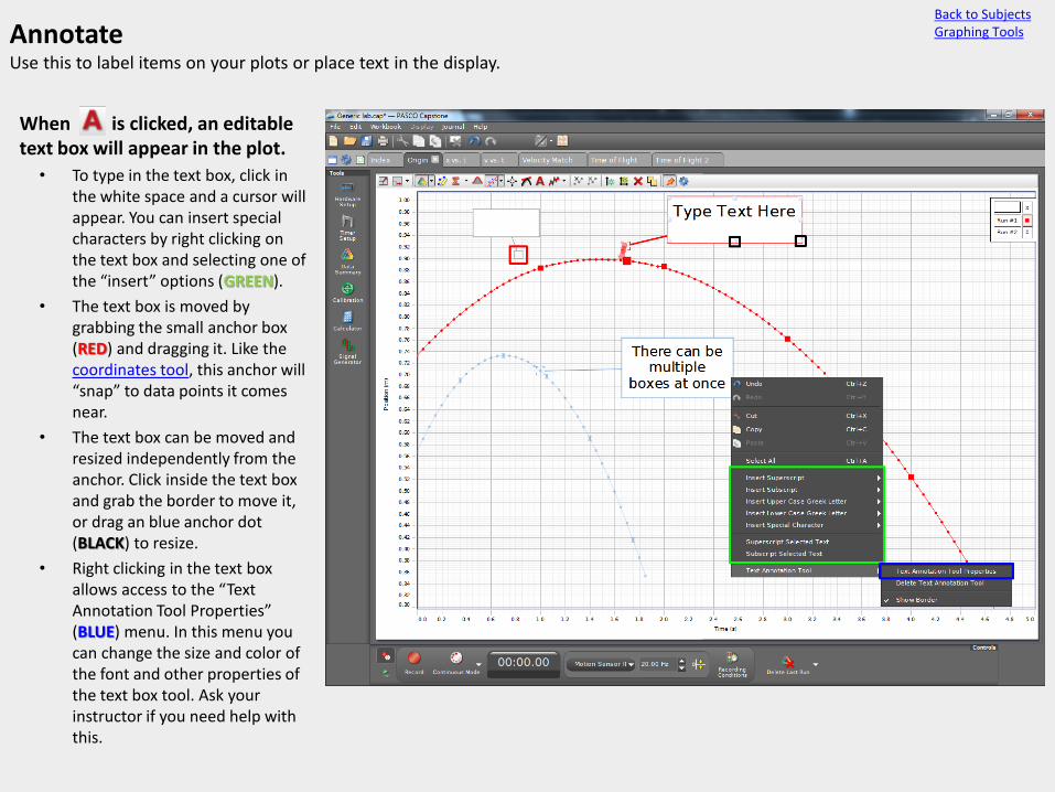
Annotate Use this to label items on your plots or place text in the display.
• When is clicked, an editable text box will appear in the plot.
• To type in the text box, click in the white space and a cursor will appear. You can insert special characters by right clicking on the text box and selecting one of the “insert” options (GREEN).
• The text box is moved by grabbing the small anchor box (RED) and dragging it. Like the coordinates tool, this anchor will “snap” to data points it comes near.
• The text box can be moved and resized independently from the anchor. Click inside the text box and grab the border to move it, or drag an blue anchor dot (BLACK) to resize.
• Right clicking in the text box allows access to the “Text Annotation Tool Properties” (BLUE) menu. In this menu you can change the size and color of the font and other properties of the text box tool. Ask your instructor if you need help with this.
Back to Subjects Graphing Tools

The Smoothing Tool If your data has too much noise in it, the smoothing tool can be used to reduce it.
• Clicking on ’s arrow will show the smoothing slider (RED).
• The slider moves from 5 to 25, the large the number, the more the data will be smoothed.
• The smoothing tool works by filtering out noise using Savitzky-Golay filtering. While this usually works well to reduce noise, sometimes it will produce bad curves.
• Clicking the button itself will toggle smoothing on or off
• only affects curves in the current display.
• To change the actual data, the smooth filter (hyperlink when page is made) in the calculator can be used.
Back to Subjects Graphing Tools
The picture to the right shows what should be a constant acceleration plot. The plot has many small bumps and 3 large ones caused by errors in data taking. (Smoothing is not yet toggled on.)
With the smoothing slider set to the max 25, the acceleration becomes much flatter, closer to a constant line.
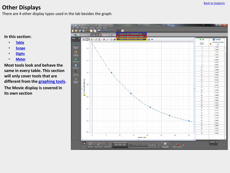
Other Displays There are 4 other display types used in the lab besides the graph.
• In this section:
• Table
• Scope
• Digits
• Meter
• Most tools look and behave the same in every table. This section will only cover tools that are different from the graphing tools.
• The Movie display is covered in its own section
Back to Subjects

Table The table is used to show and analyze data numerically.
Table Tools Behaves the same as the
graphing highlight tool with the exception of needing to use the i button to turn off highlighting.
The same as the statistics tool.
The same as the exclude tool.
The same as the delete data tool.
Displays more digits in the selected column.
This can change the number of decimal places, or number of significant figures, depending on the number style
Displays less digits in the selected column.
This can change the number of decimal places, or number of significant figures, depending on the number style .
Inserts an empty cell above the selected cell (user entered data only).
Removes the selected cell and data (user entered data only).
Restores the number format to the default.
Back to Subjects Other Displays
Tables can show equations like a spreadsheet. To edit them, click in the box at the top (RED). These will then show in the calculator where it is easier to edit them.

The Scope The scope display mimics an oscilloscope.
What it shows
• The scope display is used to measure events that happen quickly and/or repeat over small timescales.
ex: analyzing sound waves.
• The scope will display in real time what input it is receiving. Depending on the timescale, this may make the trace move through the scope. To make a trace be still, a trigger can be set up.
The Trigger
• Clicking will put an arrow on the scope (GREEN). This is the trigger arrow. The scope will look for the pattern selected in the trigger menu (RED) and lock it where the arrow is.
• The trigger options are positive edge or negative edge. These describe the slope of the trace.
Ex: the trigger in the image to the right is set to a positive edge.
• Triggers can only be set for the left Y-axis (in this image, sound intensity).
Back to Subjects Other Displays

The Scope Tools The scope display mimics an oscilloscope. It is used to display events that happen very quickly.
Tools
Scales the scope.
Shows only one trace then stops taking data (currently broken).
Allows Capstone to change the sample rate based on the time axis’ zoom level to prevent choppy data.
Data runs.
Moves the trace up.
Reset trace to original position.
Moves the trace down.
Coordinates tool.
The create data set button makes a set of data from the trace allowing it to be manipulated elsewhere even if it was taken in monitor mode.
Increases the precision by taking 500 more measurements.
Decreases precision by taking 500 less measurement (50 min).
Back to Subjects Other Displays

Digits and Meter Both displays show just one data point at a time and are generally used to show data as it’s recorded.
Meter (Top)
Changes the range of the meter so that the data displayed fits clearly similar to the graph version
Allows the meter to scale with data as it’s taken, similar to the graph version
Makes the meter more precise by adding more tick marks and values.
Makes the meter less precise but easier to read by removing tick marks and values.
Behaves like the statistics tool.
Digits (bottom)
Displays more digits in the same way as the table version.
Displays less digits in the same way as the table version.
Restores the default number format.
Makes the digits display show only the value of the selected statistic. (The button will be darkened when turned on).
Back to Subjects Other Displays
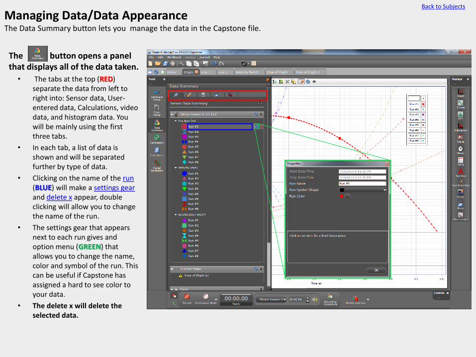
Managing Data/Data Appearance The Data Summary button lets you manage the data in the Capstone file.
• The button opens a panel that displays all of the data taken.
• The tabs at the top (RED) separate the data from left to right into: Sensor data, User- entered data, Calculations, video data, and histogram data. You will be mainly using the first three tabs.
• In each tab, a list of data is shown and will be separated further by type of data.
• Clicking on the name of the run (BLUE) will make a settings gear and delete x appear, double clicking will allow you to change the name of the run.
• The settings gear that appears next to each run gives and option menu (GREEN) that allows you to change the name, color and symbol of the run. This can be useful if Capstone has assigned a hard to see color to your data.
• The delete x will delete the selected data.
Back to Subjects

Zeroing Sensors sensors without a tare button must be zeroed using the Capstone software.
• Zeroing while taking data.
• Clicking while recording data will make the data jump and read as if the sensor were reading zero, then continue taking data from there.
• The picture to the right shows a motion detector that has been zeroed while moving towards the motion detector (RED).
• Zeroing before taking data.
• Clicking before recording data will make the next measurement start at zero.
• When is clicked, the sensor will have to take a measurement so be sure not to interfere with the sensor when zeroing.
• Uses
• Zeroing data is the only way to have negative measurements for some sensors (like the motion sensor).
• Zeroing can compensate for an offset, allowing differences to be measured.
Back to Subjects

The Journal The journal is used to keep a log of what has been done in the lab.
Clicking will open the journal pane on the right.
Deletes the currently selected snapshot from the journal
Shows a zoomed in image of the screenshot.
Moves the screenshot order up or down respectively. This can also be done by dragging the snapshots.
Toggles whether the snapshot annotations (GREEN) are visible.
Prints the journal. The printers will only print grayscale so be sure you label clearly.
Saves the journal as an web file.
To annotate a snapshot, click in the area highlighted in (GREEN) and a text box will appear. This is where any extra notes about the plot should be added.
If the journal pane is too small, it can be resized by clicking and dragging the area highlighted in (RED)
Back to Subjects
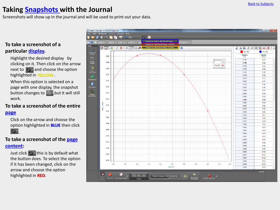
Taking Snapshots with the Journal Screenshots will show up in the journal and will be used to print out your data.
• To take a screenshot of a particular display.
Highlight the desired display by clicking on it. Then click on the arrow next to and choose the option highlighted in YELLOW .
When this option is selected on a page with one display, the snapshot button changes to ,but it will still work.
• To take a screenshot of the entire page
Click on the arrow and choose the option highlighted in BLUE then click
.
• To take a screenshot of the page content:
Just click this is by default what the button does. To select the option if it has been changed, click on the arrow and choose the option highlighted in RED.
Back to Subjects

The Calculator Overview Capstone’s calculator is a powerful tool for analyzing and combining data.
• The calculator panel is opened and closed by clicking .
• To create or edit an equation, double click in the white space (BLUE).
Equations need to have a left and right side separated by an equals sign. The left side will be the name of the equation.
Ex: Energy = .5*[Velocity(m/s)]^2
After typing the equation, press enter, and type in the units. (As you type, suggested units will appear).
• To enter data or another equation into the equation click [dat and choose from the drop down menu (RED).
• Equations from the calculator can be plotted by clicking the axis label (GREEN).
Back to Subjects
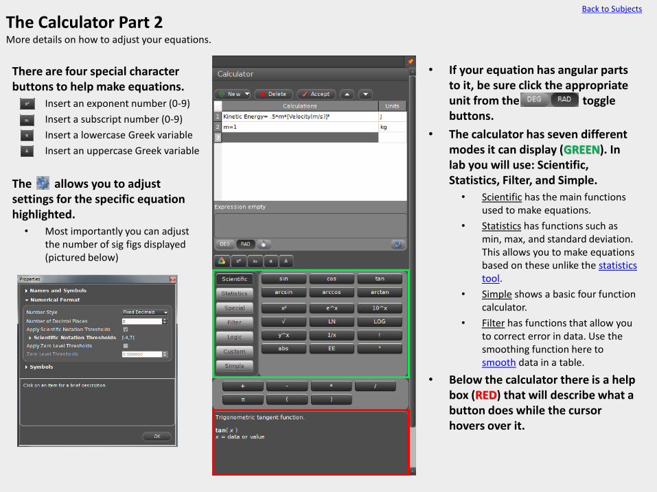
The Calculator Part 2 More details on how to adjust your equations.
• There are four special character buttons to help make equations.
• Insert an exponent number (0-9)
• Insert a subscript number (0-9)
• Insert a lowercase Greek variable
• Insert an uppercase Greek variable
• The allows you to adjust settings for the specific equation highlighted.
• Most importantly you can adjust the number of sig figs displayed (pictured below)
Back to Subjects
• If your equation has angular parts to it, be sure click the appropriate unit from the [degradbu toggle buttons.
• The calculator has seven different modes it can display (GREEN). In lab you will use: Scientific, Statistics, Filter, and Simple.
• Scientific has the main functions used to make equations.
• Statistics has functions such as min, max, and standard deviation. This allows you to make equations based on these unlike the statistics tool.
• Simple shows a basic four function calculator.
• Filter has functions that allow you to correct error in data. Use the smoothing function here to smooth data in a table.
• Below the calculator there is a help box (RED) that will describe what a button does while the cursor hovers over it.

Signal Generator The interface has 3 outputs; 1 banana plug and 2 coaxial outputs.
• Click to open the panel.
• Waveform • Choose between 5 standard
waveforms and DC output.
• The other options present depend on which waveform is selected.
• Sweep Type • Gives options to run through a
range of frequencies.
• If a sweep is selected frequency will be replaced with more options (RED) to adjust the sweep.
• Amplitude • Determines the voltage of the
waveform.
• Limits • Sets a maximum voltage for the
output.
• Unlike outputs 2 and 3, output 1 has options to offset the voltage, and limit the current output.
• A c button means the variable can be made to change according to a calculation.
• These equations are editable in the calculator panel.
• Lower Buttons • Auto: Turns the signal on only
when recording data.
• On : Turns the signal on until it is turned off.
• Off: Turns the signal off
Back to Subjects

Curve Fit Editor The curve editor allows you to change the variables in curve fits, or create your own.
• To make a user defined curve fit
• Using the trend line tool select “User defined: f(n)”
• Click on the desire curve annotation box (RED).
• Click to open the editor if it is not already open. In the text box next to Y=, type the desired equation and click apply.
• Viewing and Resizing
• Click the tack button to show both the display and the curve editor with no overlap.
• To resize, drag the highlighted area (GREEN). This will allow the plot area to be bigger.
• Helpful Settings (BLUE)
• Numerical Format changes the number of digits displayed.
• Curve fit annotation changes what information displays in the annotation (RED)
• Curve fit annotation appearance changes the color of the annotation and trend line as well as the thickness of the trend line
Back to Subjects
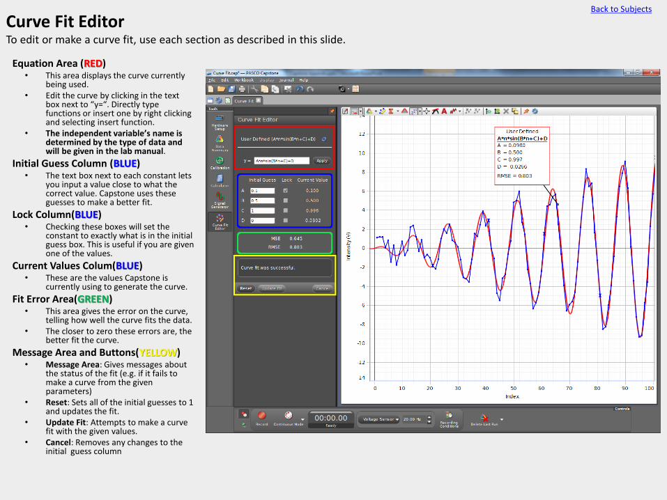
Curve Fit Editor To edit or make a curve fit, use each section as described in this slide.
• Equation Area (RED) • This area displays the curve currently
being used. • Edit the curve by clicking in the text
box next to “y=“. Directly type functions or insert one by right clicking and selecting insert function.
• The independent variable’s name is determined by the type of data and will be given in the lab manual.
• Initial Guess Column (BLUE) • The text box next to each constant lets
you input a value close to what the correct value. Capstone uses these guesses to make a better fit.
• Lock Column(BLUE) • Checking these boxes will set the
constant to exactly what is in the initial guess box. This is useful if you are given one of the values.
• Current Values Colum(BLUE) • These are the values Capstone is
currently using to generate the curve.
• Fit Error Area(GREEN) • This area gives the error on the curve,
telling how well the curve fits the data. • The closer to zero these errors are, the
better fit the curve.
• Message Area and Buttons(YELLOW) • Message Area: Gives messages about
the status of the fit (e.g. if it fails to make a curve from the given parameters)
• Reset: Sets all of the initial guesses to 1 and updates the fit.
• Update Fit: Attempts to make a curve fit with the given values.
• Cancel: Removes any changes to the initial guess column
Back to Subjects