Embed Size (px)
Citation preview
Leonardo
Between Art, Science and Technology: Data Representation ArchitectureAuthor(s): Julio Bermúdez, Jim Agutter, Stefano Foresti, Dwayne Westenskow, Noah Syroid,Frank Drews and Elizabeth TashjianSource: Leonardo, Vol. 38, No. 4 (2005), pp. 280-285, 296-297Published by: The MIT PressStable URL: http://www.jstor.org/stable/20206068 .
Accessed: 12/06/2014 21:50
Your use of the JSTOR archive indicates your acceptance of the Terms & Conditions of Use, available at .http://www.jstor.org/page/info/about/policies/terms.jsp
.JSTOR is a not-for-profit service that helps scholars, researchers, and students discover, use, and build upon a wide range ofcontent in a trusted digital archive. We use information technology and tools to increase productivity and facilitate new formsof scholarship. For more information about JSTOR, please contact [email protected].
.
The MIT Press and Leonardo are collaborating with JSTOR to digitize, preserve and extend access toLeonardo.
http://www.jstor.org
This content downloaded from 195.78.108.199 on Thu, 12 Jun 2014 21:50:01 PMAll use subject to JSTOR Terms and Conditions
3
This content downloaded from 195.78.108.199 on Thu, 12 Jun 2014 21:50:01 PMAll use subject to JSTOR Terms and Conditions
Between Art, Science
and Technology: Data
Representation Architecture
fulio Berm?dez, ?m Agutter, Stefano Foresti, Dwayne Westenskow, Noah Syroid, Frank Drews and Elizabeth Tashjian
The Growing Challenges of a data-saturated world
We are living in a world overflowing with information [ 1 ]. Mil
lions of labs and scientists across the globe are continually con
ducting millions of experiments, observations and analyses,
producing ever-growing amounts of information. Our ordi
nary lives have become data traces, too: ATM and credit card
transactions, on-line registration of software, cellular phone calls and so on. Security concerns after 9/11 have only inten
sified this demand for and accumulation of data. The central
issue has shifted from getting data to making sense of it.
Over 20 years of work in scientific visualization, human fac
tors and semiotics indicates that there exists a direct correla
tion between how data is represented and the meaning that
can be extracted from it. Better representations mean better
understanding. In fact, the way that data is presented has an
overwhelming weight in how a system or situation is perceived and what ultimately drives decision-making processes, not only
for science but for public policy as
well [2]. Currently, there is wide
agreement that visualization is the
best representational method for
turning complex data into infor
mation [31.
Although there has been much work in the visualization de
sign area, scientists and other data producers and end users
are only beginning to tap the possibilities of communicating data visually. There are many well-documented examples of
inappropriate decisions based upon poorly presented infor
mation, often leading to disastrous effects (from the crisis at
the Shearon Harris nuclear power plant in 1979 and the Chal
lenger and Chernobyl disasters in 1985 to the breakdown in
intelligence-sharing leading to 9/11). Yet more negative ef
fects may be found in the less spectacular but more pervasive
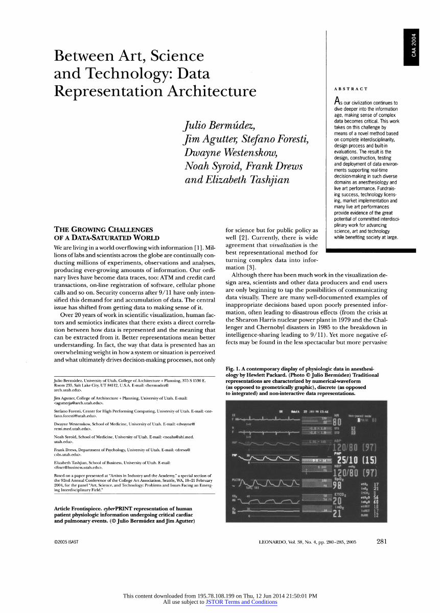
Fig. 1. A contemporary display of physiologic data in anesthesi
ology by Hewlett Packard. (Photo ? Julio Bermudez) Traditional
representations are characterized by numerical-waveform
(as opposed to geometrically graphic), discrete (as opposed to integrated) and non-interactive data representations.
UM
ABSTRACT
Ms our civilization continues to dive deeper into the information
age, making sense of complex data becomes critical. This work takes on this challenge by means of a novel method based on complete interdisciplinary, design process and built-in evaluations. The result is the
design, construction, testing and deployment of data environ ments supporting real-time
decision-making in such diverse domains as anesthesiology and live art performance. Fundrais
ing success, technology licens
ing, market implementation and
many live art performances provide evidence of the great potential of committed interdisci
plinary work for advancing science, art and technology while benefiting society at large.
Julio Berm?dez, University of Utah, College of Architecture + Planning, 375 S 1530 E, Room 235, Salt Lake City, UT 84112, U.S.A. E-mail: <bermudez@ arch.ntah.edu>.
Jim Agutter, College of Architecture + Planning, University of Utah. E-mail: <[email protected]>.
Stefano Foresti, Center for High Performing Computing, University of Utah. E-mail: <ste [email protected]>.
Dwayne Westenskovv, School of Medicine, University of Utah. E-mail: <dwayne@ remi.med.utah.edu>.
Noah Syroid, School of Medicine, University of Utah. E-mail: <[email protected]. utah.edu>.
Frank Drews, Department of Psychology, University of Utah. E-mail: <drews@ csbs.utah.edu>.
Elizabeth Tashjian, School of Business, University of Utah. E-mail: <[email protected]>.
Based on a paper presented at "Artists in Industry and the Academy," a special section of the 92nd Annual Conference of the College Art Association, Seattle, WA, 18-21 February 2004, for the panel "Art, Science, and Technology: Problems and Issues Facing an Emerg ing Interdisciplinary Field."
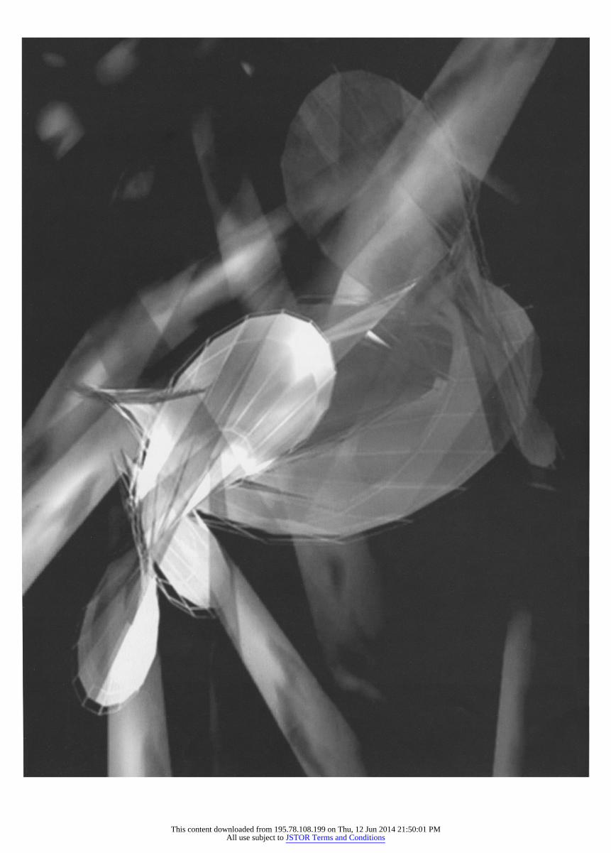
Article Frontispiece. cy&erPRINT representation of human
patient physiologic information undergoing critical cardiac and pulmonary events. (? Julio Bermudez and Jim Agutter)
?2005ISAST LEONARDO, Vol. 38, No. 4, pp. 280-285,2005 281
This content downloaded from 195.78.108.199 on Thu, 12 Jun 2014 21:50:01 PMAll use subject to JSTOR Terms and Conditions
libo- ' %j^^^^Hv) iPBfil? ̂^^^^HflHfll^^_^^^^^^^^H
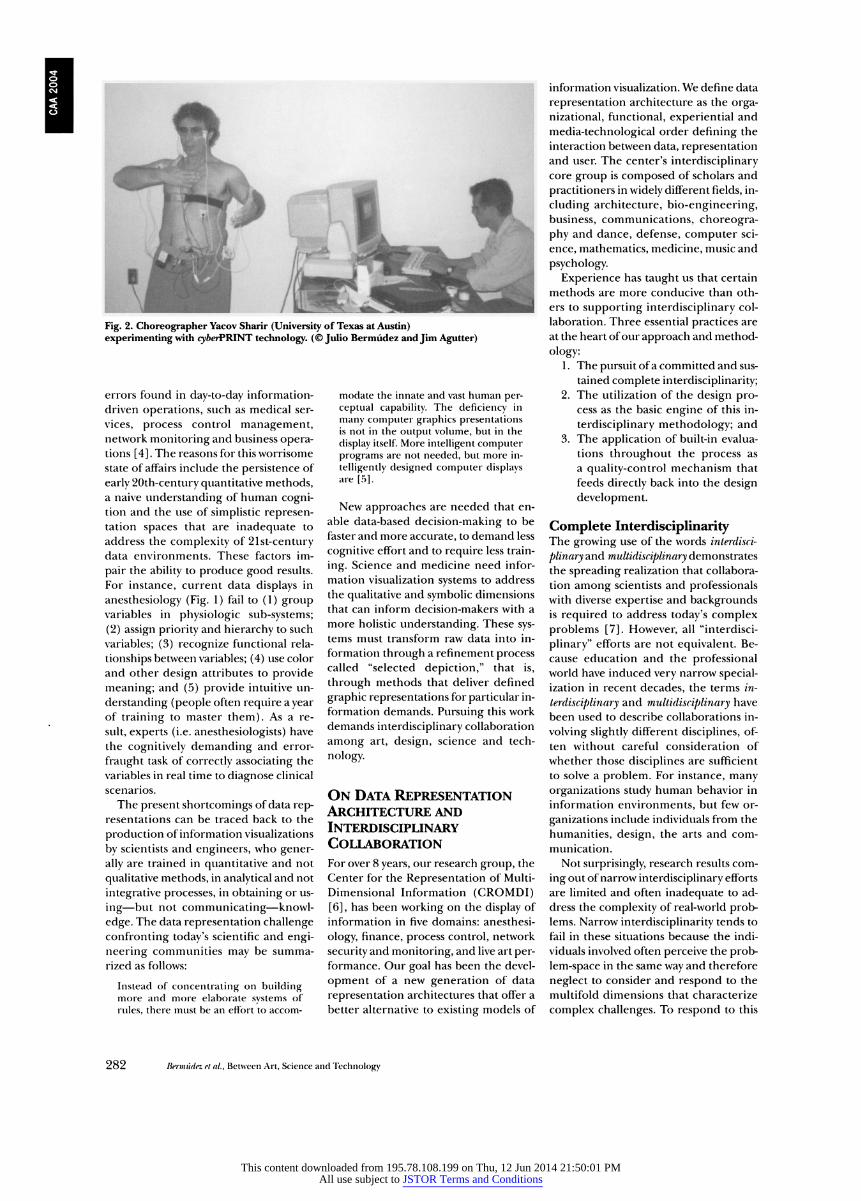
Fig. 2. Choreographer Yacov Sharir (University of Texas at Austin)
experimenting with cy&erPRINT technology. (? Julio Bermudez and Jim Agutter)
errors found in day-to-day information
driven operations, such as medical ser
vices, process control management, network monitoring and business opera tions [4]. The reasons for this worrisome
state of affairs include the persistence of
early 20th-century quantitative methods, a naive understanding of human cogni tion and the use of simplistic represen tation spaces that are inadequate to
address the complexity of 21st-century data environments. These factors im
pair the ability to produce good results.
For instance, current data displays in
anesthesiology (Fig. 1) fail to (1) group variables in physiologic sub-systems;
(2) assign priority and hierarchy to such
variables; (3) recognize functional rela
tionships between variables; (4) use color
and other design attributes to provide
meaning; and (5) provide intuitive un
derstanding (people often require a year of training to master them). As a re
sult, experts (i.e. anesthesiologists) have
the cognitively demanding and error
fraught task of correctly associating the
variables in real time to diagnose clinical
scenarios.
The present shortcomings of data rep resentations can be traced back to the
production of information visualizations
by scientists and engineers, who gener
ally are trained in quantitative and not
qualitative methods, in analytical and not
integrative processes, in obtaining or us
ing?but not communicating?knowl
edge. The data representation challenge
confronting today's scientific and engi
neering communities may be summa
rized as follows:
Instead of concentrating on building more and more elaborate systems of
rules, there must be an effort to accom
modate the innate and vast human per ceptual capability. The deficiency in
many computer graphics presentations is not in the output volume, but in the
display itself. More intelligent computer programs are not needed, but more in
telligently designed computer displays are [5].
New approaches are needed that en
able data-based decision-making to be
faster and more accurate, to demand less
cognitive effort and to require less train
ing. Science and medicine need infor
mation visualization systems to address
the qualitative and symbolic dimensions
that can inform decision-makers with a
more holistic understanding. These sys tems must transform raw data into in
formation through a refinement process called "selected depiction," that is,
through methods that deliver defined
graphic representations for particular in
formation demands. Pursuing this work
demands interdisciplinary collaboration
among art, design, science and tech
nology.
On Data Representation Architecture and Interdisciplinary Collaboration For over 8 years, our research group, the
Center for the Representation of Multi
Dimensional Information (CROMDI) [6], has been working on the display of
information in five domains: anesthesi
ology, finance, process control, network
security and monitoring, and live art per formance. Our goal has been the devel
opment of a new generation of data
representation architectures that offer a
better alternative to existing models of
information visualization. We define data
representation architecture as the orga
nizational, functional, experiential and
media-technological order defining the
interaction between data, representation and user. The center's interdisciplinary core group is composed of scholars and
practitioners in widely different fields, in
cluding architecture, bio-engineering, business, communications, choreogra
phy and dance, defense, computer sci
ence, mathematics, medicine, music and
psychology.
Experience has taught us that certain
methods are more conducive than oth
ers to supporting interdisciplinary col
laboration. Three essential practices are
at the heart of our approach and method
ology: 1. The pursuit of a committed and sus
tained complete interdisciplinarity; 2. The utilization of the design pro
cess as the basic engine of this in
terdisciplinary methodology; and
3. The application of built-in evalua
tions throughout the process as
a quality-control mechanism that
feeds directly back into the design
development.
Complete Interdisciplinarity The growing use of the words interdisci
plinary and multidisciplinary demonstrates
the spreading realization that collabora
tion among scientists and professionals with diverse expertise and backgrounds is required to address today's complex
problems [7]. However, all "interdisci
plinary" efforts are not equivalent. Be
cause education and the professional world have induced very narrow special ization in recent decades, the terms in
terdisciplinary and multidisciplinary have
been used to describe collaborations in
volving slightly different disciplines, of
ten without careful consideration of
whether those disciplines are sufficient
to solve a problem. For instance, many
organizations study human behavior in
information environments, but few or
ganizations include individuals from the
humanities, design, the arts and com
munication.
Not surprisingly, research results com
ing out of narrow interdisciplinary efforts
are limited and often inadequate to ad
dress the complexity of real-world prob lems. Narrow interdisciplinarity tends to
fail in these situations because the indi
viduals involved often perceive the prob
lem-space in the same way and therefore
neglect to consider and respond to the
multifold dimensions that characterize
complex challenges. To respond to this
282 f?erm?dez et ai, Between Art, Science and Technology
This content downloaded from 195.78.108.199 on Thu, 12 Jun 2014 21:50:01 PMAll use subject to JSTOR Terms and Conditions
important shortcoming, we coined the
term complete interdisciplinary to indicate
the involvement of all the disciplines that
are necessary and sufficient for the re
finement of raw data into useful infor
mation. This means a very wide and
diverse collection of fields encompassing the hard and social sciences, the hu
manities, and art and design. CROMDI
has been deliberately modeling its inter
disciplinary collaboration following com
plete interdisciplinarity.
Design Process as
Interdisciplinary Methodology Our work strategy initially was not set up to follow a design process methodology.
The process evolved naturally during the
first 2 years of collaborative work and has
remained constant since then. We "or
ganically" discovered that the most ef
fective information visualization tools for
decision-making are developed with an
iterative design process that permits a si
multaneous attention to multiple per
spectives, methods, skills and knowledge bases. We also found that the design
process allowed for a spontaneous and
natural way of socially engaging a wide
range of disciplines and individuals work
ing on a very difficult problem. This
experience corroborates existing knowl
edge that the design studio model in
general and the design process in partic ular are a successful working laboratory and methodology for addressing open
ended, fuzzy and multivariable problems
[8]. Although this finding may not seem unusual or surprising to designers, ar
chitects or artists, it was indeed an im
portant realization for collaborators from
other domains.
Built-in Evaluation Process
Developing successful data-representa tion architectures is also highly depend ent on a built-in evaluation/testing
process [9]. Here the contribution of the
psychology experts is of great impor tance. Human factors analysis provides the methodological knowledge necessary to evaluate the efficiency of new ways of
information representation. We use a traditional experimental ap
proach to evaluate the effectiveness of
the designs. Performance success be
tween an experimental group of subjects
using the new data representation is com
pared with a control group of subjects us
ing an ordinary data display. We employ different evaluation protocols adapted to
test design proposals at different levels
of development. In addition to more tra
ditional measures such as quality and
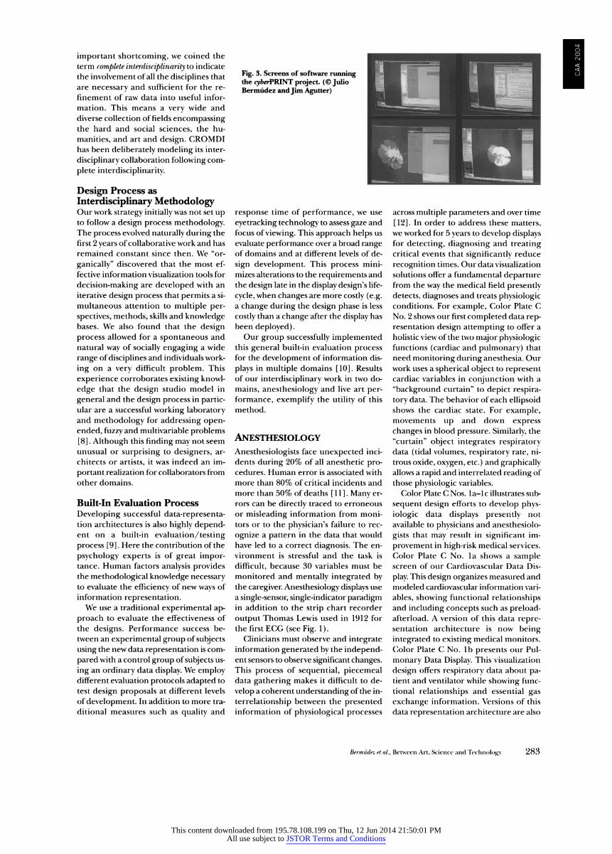
Fig. 3. Screens of software running B W^? '^^^^B' "'^^^H I ^B9 the cyfterPRINT project. (?Julio I ^H ^^^H ^H I ̂̂ H Berm?dez and Jim Agutter) ^^K^^H ^^^^^^B^^H I
response time of performance, we use
eyetracking technology to assess gaze and
focus of viewing. This approach helps us
evaluate performance over a broad range of domains and at different levels of de
sign development. This process mini
mizes alterations to the requirements and
the design late in the display design's life
cycle, when changes are more costly (e.g. a change during the design phase is less
costly than a change after the display has
been deployed). Our group successfully implemented
this general built-in evaluation process for the development of information dis
plays in multiple domains [10]. Results
of our interdisciplinary work in two do
mains, anesthesiology and live art per
formance, exemplify the utility of this
method.
Anesthesiology
Anesthesiologists face unexpected inci
dents during 20% of all anesthetic pro cedures. Human error is associated with
more than 80% of critical incidents and
more than 50% of deaths [11]. Many er
rors can be directly traced to erroneous
or misleading information from moni
tors or to the physician's failure to rec
ognize a pattern in the data that would
have led to a correct diagnosis. The en
vironment is stressful and the task is
difficult, because 30 variables must be
monitored and mentally integrated by the caregiver. Anesthesiology displays use
a single-sensor, single-indicator paradigm in addition to the strip chart recorder
output Thomas Lewis used in 1912 for
the first ECG (see Fig. 1). Clinicians must observe and integrate
information generated by the independ ent sensors to observe significant changes. This process of sequential, piecemeal data gathering makes it difficult to de
velop a coherent understanding of the in
terrelationship between the presented information of physiological processes
across multiple parameters and over time
[12]. In order to address these matters,
we worked for 5 years to develop displays for detecting, diagnosing and treating critical events that significantly reduce
recognition times. Our data visualization
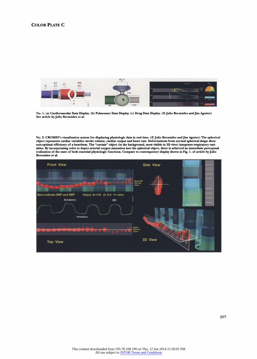
solutions offer a fundamental departure from the way the medical field presently detects, diagnoses and treats physiologic conditions. For example, Color Plate C
No. 2 shows our first completed data rep resentation design attempting to offer a
holistic view of the two major physiologic functions (cardiac and pulmonary) that
need monitoring during anesthesia. Our
work uses a spherical object to represent cardiac variables in conjunction with a
"background curtain" to depict respira
tory data. The behavior of each ellipsoid shows the cardiac state. For example,
movements up and down express
changes in blood pressure. Similarly, the
"curtain" object integrates respiratory data (tidal volumes, respiratory rate, ni
trous oxide, oxygen, etc.) and graphically allows a rapid and interrelated reading of
those physiologic variables.
Color Plate C Nos. la-lc illustrates sub
sequent design efforts to develop phys
iologic data displays presently not
available to physicians and anesthesiolo
gists that may result in significant im
provement in high-risk medical services.
Color Plate C No. la shows a sample screen of our Cardiovascular Data Dis
play. This design organizes measured and
modeled cardiovascular information vari
ables, showing functional relationships and including concepts such as preload afterload. A version of this data repre sentation architecture is now being
integrated to existing medical monitors.
Color Plate C No. lb presents our Pul
monary Data Display. This visualization
design offers respiratory data about pa tient and ventilator while showing func
tional relationships and essential gas
exchange information. Versions of this
data representation architecture are also
Berm?dez et ai, Between Art, Science and Technology 283
This content downloaded from 195.78.108.199 on Thu, 12 Jun 2014 21:50:01 PMAll use subject to JSTOR Terms and Conditions
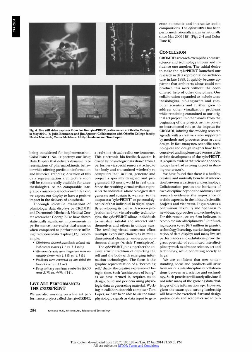
Fig. 4. Five still video captures from last live cyberPBINT performance at Oberlin College in May 2004. (? Julio Bermudez and Jim Agutter) Collaboration with Oberlin College faculty
Nusha Martynuk, Carter McAdams, Holly Handman and Tom Lopez.
being considered for implementation. Color Plate C No. lc portrays our Drug Data Display that delivers dynamic rep resentations of pharmacokinetic behav
ior while offering prediction information
and historical trending. A version of this
data representation architecture soon
will be commercially available for anes
thesiologists. As no comparable inte
grated visual display tools currently exist, we expect our display to have a positive
impact in the delivery of anesthesia.
Thorough scientific evaluations of
physiologic data displays by CROMDI and Dartmouth-Hitchcock Medical Cen
ter researcher George Blike have shown
statistically significant improvements in
performance in several critical scenarios
when compared to performance utiliz
ing traditional data displays [13]. For ex
ample: Clinicians detected anesthesia-related crit
ical events sooner (3.1 vs. 5.5 min) Abnormal events were diagnosed more ac
curately (error rate 1.1% vs. 4.1%) Problems were corrected in one-third the
time (17 sec vs. 45 sec)
Drug delivery was better controlled (EC95 error 21% vs. 44%) [14].
Live Art Performance: The cyberPWNT We are also working on a live art per formance project called the cyberFTHNT,
a real-time virtual-reality environment.
This electronic bio-feedback system is
driven by physiologic data drawn from a
performer via special sensors attached to
her body and transmitted wirelessly to
computers that, in turn, generate and
project a specially designed and pro
grammed 3D music world in real time.
Since the resulting virtual artifact repre sents the individual whose biological data
generate and sustain it, we refer to the
output as a "cyberPBJNT" or personal sig nature ofthat individual in digital space.
By enveloping its user with screen pro
jection and/or virtual-reality technolo
gies, the cyberPWNT allows individuals
to visualize, inhabit and interact with
themselves and others in unique ways. The resulting virtual construct offers
multiple expressive choices as its multi
dimensional character undergoes con
tinuous change (Article Frontispiece). The cyberPBINTjoins together the an
cient artistic tradition of depicting the
self and the body with emerging infor
mation technologies. The focus is the
graphic representation of a "becoming
self," that is, the creative expression of be
ing in time. Such "architecture of being," as we have termed it, requires us to
design, build and perform using physio
logic data as generating material. Work
ing in collaboration with composer Tom
Lopez, we have been able to use the same
physiologic signals as data input to gen
?rate automatic and interactive audio
compositions. The cyberPJUNT has been
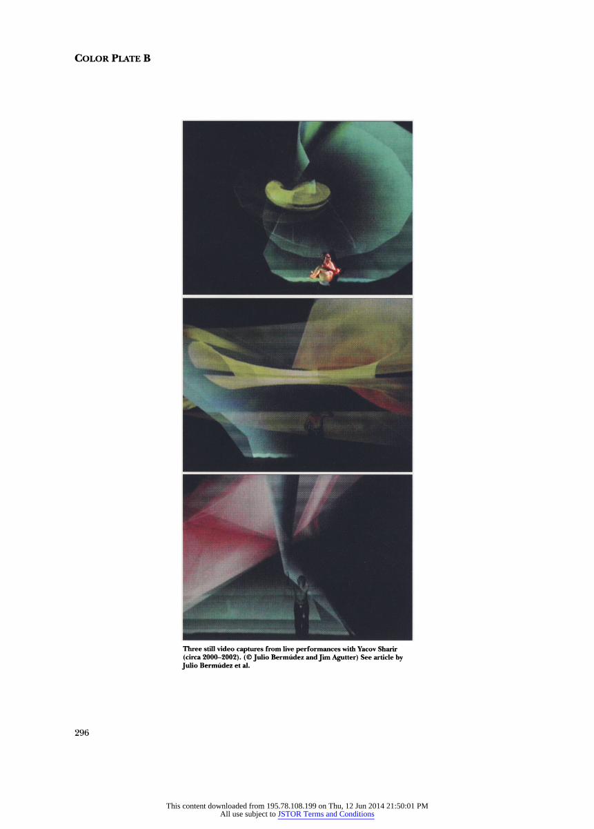
performed nationally and internationally since May 2000 [15] (Figs 2-4 and Color Plate B).
Conclusion CROMDI's research exemplifies how art,
science and technology inform and in
fluence one another. The initial desire
to make the cyberPBINT launched our
research in data representation architec
ture in late 1995. It quickly became ap
parent that architects alone could not
produce this work without the coor
dinated help of other disciplines. Our
collaboration expanded to include anes
thesiologists, bio-engineers and com
puter scientists and further grew to
address other visualization problems while remaining committed to our orig inal art project. In other words, from the
beginning of the project, art has played an instrumental role as the impetus for
CROMDI, infusing the evolving research
agenda with a creative vision supported
by methods and processes from art and
design. In fact, many new scientific, tech
nological and design insights have been
conceived and implemented because of 'the
artistic development of the cyberPBINT. It is equally evident that science and tech
nology have had a strong impact in shap
ing our artwork.
We have found that there is a healthy, creative and mutually beneficial interac
tion between art, science and technology. Collaboration pushes the horizons of
each discipline beyond the ordinary. Our
research evidences the importance of
artistic expertise in the midst of scientific
projects and vice versa. It guarantees a
continuous flexibility and openness to
new ideas, approaches and technologies. For this reason, we are firm believers in
"complete interdisciplinarity." Our fund
ing success (over $4.7 million in grants),
technology licensing, market implemen tation of data displays and many live art
performances and exhibitions prove the
great potential of committed interdisci
plinary work to advance science, art and
technology, while benefiting society at
large. We are confident that new under
standing, ideas and products will arise
from serious interdisciplinary collabora
tions between art, science and technol
ogy. Such practices will surely alleviate if
not solve many of the growing data chal
lenges of the information age. However,
given the status quo, strong leadership will have to be exercised if art and design
professionals and academics are to pur
284 Berm?dez et ai, Between Art, Science and Technology
This content downloaded from 195.78.108.199 on Thu, 12 Jun 2014 21:50:01 PMAll use subject to JSTOR Terms and Conditions
sue and teach cross-, inter-, and trans-dis
ciplinary work. The potential payoff is
enormous: a true renaissance in the role
of art and design in society.
Acknowledgments
This work has been made possible by grants from the National Institutes of Health (I-RO? HL64590-01), the University of Utah FCG (2000, 2004), the Utah Foundation (TIG 1997-1999) and the State of Utah Centers of Excellence program (2000-2005).
3
Berm?dez et al., Between Art, Science and Technology 285
References
1. R. Wurman, Information Anxiety 2 (Indianapolis, IN: Que, 2001); R. Wurman, Information Anxiety (New
York: Doubleday, 1989).
2. E. Tufte, Visual Explanations (Cheshire, CT: Graph ics Press, 1997) ; E. Tufte, Envisioning Information (Cheshire, CT: Graphics Press, 1990); E. Tufte, The Visual Display of Quantitative Information (Cheshire, CT: Graphics Press, 1983); C. Ware, Information Vi sualization from Design (San Francisco, CA: Morgan Kaufmann, 2000).
3. M.J. Adams, YJ. Tenney and R.W. Pew, "Situation Awareness and the Cognitive Management of Com
plex Systems," Human Factors 37 (1995) pp. 85-104; B.P. Goettl, CD. Wickens and A.F. Kramer, "Inte
grated Displays and the Perception of Graphical Data" Ergonomics 34 (1991) pp. 1047-1063; G. Klima, Multi-Media and Human Perception (Elnora, NY: Meridian Press, 1985); P1000 Science and Technol
ogy Information Visualization, "A Roadmap to Pro vide Information Visualization Technology Broadly within the Intelligence Community. Version 2," NSF
Report (16 September 1996); T. Parks, Looking at Look
ing (Thousand Oaks, CA: Sage Publications, 2001); R. Wurman, Information Architects (Zurich, Switzer land: Graphis, 1996).
4. P. Bradford, Information Architects (Zurich, Switzer land: Graphics Press International, 1996) ; J. Reason,
Human Error (Cambridge, U.K.: Cambridge Univ. Press, 1990); E. Tufte, Visual Explanations [2].
5. P. Richards and R. Glassberg, U.S. patent docu ment no. 5,121,469, "Method and Apparatus for Pro
cessing and Displaying Multivariate Time Series
Data," approved 9 June 1992.
6. <http://www.cromdi.utah.edu>.
7. S. Benowitz, "Wave of the Future: Interdisciplinary Collaborations," The Scientist 9 (26 June 1995) p. 13; R. Kahn and D. Prager, "Interdisciplinary Collabo rations Are a Scientific and Social Imperative," The Scientist 8 (11 July 1994) p. 12; J. Rentsch and R. Klimoski, "Why Do Great Minds Think Alike?: An tecedents of Team Member Schema Agreement,"
Journal of Organizational Behavior 22 (2001) pp. 107-120; R. Zare, "Knowledge and Distributed In
telligence," Science 275 (1997) p. 1047.
8. N. Cross, "Designerly Ways of Knowing," Design Studies 3, No. 4, 221-227 (1982); P. Rowe, Design Thinking (Cambridge, MA: MIT Press, 1987); D. Sch?n, The Reflective Practitioner (New York: Basic Books, 1983).
9. R. Spence, Information Visualization (Boston: Ad
dison-Wesley, 2001).
10. J. Agutter et al., "Evaluation of a Graphic Car diovascular Display in a High Fidelity Simulator," Anesthesia and Analgesia 97 (2003) pp. 1403-1413; Y
Zhang et al., "Effects of Integrated Graphical Displays on Situation Awareness in Anesthesiology," Cogni tion, Technology and Work*, No. 2, 82-90 (2002); N.
Syroid et al., "Development and Evaluation of a
Graphical Anesthesia Drug Display," Anesthesiology 97
(2002) pp. 565-575; S. W?chter et al., "The Employ ment of an Iterative Design Process to Develop a Pul
monary Graphical Display," Journal of the American Medical Informatics Association 10 (2003) pp. 363-372; Y. Zhang et al., "Improving Situation Awareness in
Anesthesiology," in D. Harris, ed., Engineering Psy chology and Cognitive Ergonomics (Brookfield, WI: Ash
gate, in press).
11. M. Allnutt, "Human Factors in Accidents," Qual ity & Safety in Health Care 11 (2002) pp. 369-375; R.
Cook and D. Woods, "Operating at the Sharp End: The Complexity of Human Error," Human Error in Medicinen (1994) pp. 225-310; J. Forrest et al., "Mul ticenter Study of General Anesthesia. II. Results," Anesthesiology 72 (1990) pp. 262-268; D. Gaba, "Hu man Error in Dynamic Medical Domains," Human Error in Medicine 11 (1994) pp. 197-224.
12. D. Gaba, M. Maxwell and A. DeAnda, "Anesthetic
Mishaps: Breaking the Chain of Accident Evolution," Anesthesiology 66 (1987) pp. 670-676; L. KohnJ. Cor
rigan and M. Donaldson, eds., To Err Is Human: Build
ing a Safer Health System (Washington, DC: National
Academy Press, 1999); W Runciman and A Sellen, "Errors, Incidents and Accidents in Anaesthesia," Anaesthesia and Intensive Care 21, No. 5, 506-519 (1993).
13. J. Agutter et al., "Metaphor Graphic Display for Cardiovascular System," Proceedings of the American So
ciety of Anesthesiologists Meeting 2001 (Lippincot Williams) p. 519; R. Albert et al, "Psychophysical Scal
ing of a Visual Cardiovascular Metaphor" (scientific poster), Anesthesia ?f Analgesia 97, Supplement 3, pre sented at the Annual Meeting of the Society for Tech
nology in Anesthesia (Winner Best Abstract Clinical Award Extending the Senses), San Diego, CA, Janu ary 2003; G. Blike, "The Boundary Information in a
Gray-Scale Object Display and a Color-Enhanced Variant, Improve Problem Recognition Compared to an Alphanumeric Display," Anesthesiology 87 (1997) p. 458; P. Michels, D. Gravenstein and D. Westenskow, "An Integrated Graphic Data Display Improves De tection and Identification of Critical Events During
Anesthesia," Journal of Clinical Monitoring 13 (1997) pp. 249-259.
14. For more information see J. Agutter et al., "Ar chitecture and Data Representation: Modeling Phys iologic Processes," EAAE/ARCC Research Conference
Proceedings (Paris, France: ARCC, 2000) ;J. Berm?dez et al., "Data Representation Architecture," in M. Clay ton and G. Vasquez de Velasco, eds., ACADIA Pro
ceedings (Washington, DC: ACADIA, 2000) pp. 91-102.
15. <www.arch.utah.edu/cyberprint/>.
This content downloaded from 195.78.108.199 on Thu, 12 Jun 2014 21:50:01 PMAll use subject to JSTOR Terms and Conditions
Color Plate B
Three still video captures from Uve performances with Yacov Sharir
(circa 2000-2002). (? Julio Berm?dez and Jim Agutter) See article by Julio Berm?dez et al.
296
This content downloaded from 195.78.108.199 on Thu, 12 Jun 2014 21:50:01 PMAll use subject to JSTOR Terms and Conditions
Color Plate C
No. 1. (a) Cardiovascular Data Display, (b) Pulmonary Data Display, (c) Drug Data Display. (?Julio Berm?dez and Jim Agutter) See article by Julio Berm?dez et al.
No. 2. CROMDI's visualization system for displaying physiologic data in real time. (? Julio Berm?dez and Jim Agutter) The spherical object represents cardiac variables: stroke volume, cardiac output and heart rate. Deformations from normal spherical shape show
non-optimal efficiency of a heartbeat. The "curtain" object (in the background, most visible in 3D view) integrates respiratory vari ables. By incorporating color to depict arterial oxygen saturation into the spherical object, there is achieved an immediate perceptual realization of the state of both essential physiologic functions. Compare to contemporary display shown in Fig. 1. of article by Julio Berm?dez et al.
ssSBHmw '??!H(Wrr^ ^^SB^HR ?BBHBw jHHH|^^^^^^^^^^^^^^^^^^^2^^^^^^^^^^^^^^^^h#9s?''W? ^h ^^^^1
^imM^mXm.^ -::-:HHP-' : i. #?A??*?? OiR^H^^^^^H '
I H
297
This content downloaded from 195.78.108.199 on Thu, 12 Jun 2014 21:50:01 PMAll use subject to JSTOR Terms and Conditions