Embed Size (px)
DESCRIPTION
The Aesthetics of ReadingKevin Larson (Microsoft) & Rosalind Picard (MIT)Dr. Kevin LarsonMicrosoft Advanced Reading Technologies 1 Microsoft WayRedmond, WAPhone: (425 ) 703-5204Fax: (425) 936-7329Dr. Rosalind W. PicardDirector of Affective Computing Research Co-Director Things That Think Consortium MIT Media Laboratory20 Ames StreetCambridge, MA 02139Phone: (617) 253-0611Fax: (617) 253-5275AbstractIn this paper we demonstrate a new methodology that can be used to measure aesthetic differences by examining the cognitive effects produced by elevated mood. Specifically in this paper we examine the benefits of good typography and find that good typography induces a good mood. When participants were asked to read text with either good or poor typography in two studies, the participants who received the good typography performed better on relative subjective duration and on certain cognitive tasks.
Citation preview

The Aesthetics of Reading
Kevin Larson (Microsoft) & Rosalind Picard (MIT)
Dr. Kevin Larson
Microsoft Advanced Reading Technologies
1 Microsoft Way
Redmond, WA
Phone: (425 ) 703-5204
Fax: (425) 936-7329
Dr. Rosalind W. Picard
Director of Affective Computing Research
Co-Director Things That Think Consortium
MIT Media Laboratory
20 Ames Street
Cambridge, MA 02139
Phone: (617) 253-0611
Fax: (617) 253-5275
Abstract
In this paper we demonstrate a new methodology that can be used to measure aesthetic
differences by examining the cognitive effects produced by elevated mood. Specifically in this
paper we examine the benefits of good typography and find that good typography induces a good
mood. When participants were asked to read text with either good or poor typography in two
studies, the participants who received the good typography performed better on relative
subjective duration and on certain cognitive tasks.

The Aesthetics of Reading
Kevin Larson (Microsoft) & Rosalind Picard (MIT)
Abstract
It has been previously demonstrated that when people are in a positive mood that they will
perform better on cognitive tasks that involve creativity (Isen, 1987). It is fairly easy to
manipulate mood, the presentation of a small gift or watching five minutes of a humorous video is
enough to generate measurable differences on certain cognitive tasks. In this paper we
demonstrate that it is possible to apply this finding to the measurement of affect in software
systems or other product evaluations. When participants were asked to read text with either good
or bad typography in two different studies, the participants who received the good typography
afterwards performed better on Isen’s cognitive tasks as well as on subjective duration
assessment.
Introduction
Microsoft’s Advanced Reading Technology team is working to improve the quality of on-screen
text. This involves improvements to rendering technologies (e.g. ClearType), fonts, and text
layout. There is also a large basic research effort, much of which is bring conducted with academic
collaborators.
Some improvements to on-screen text have had measurable performance benefits. Gugerty,
Tyrrell, Aten, & Edmonds (2004) have found reading speed and comprehension advantages for
the ClearType rendering engine over the basic black & white rendering engine. In a thatistoscopic
lexical decision task they found that participants were statistically reliably more accurate at
recognizing words rendered with ClearType, with a magnitude difference of roughly 17%. In a
sentence comprehension study they found statistically reliable differences in favor of ClearType
for both reading speed and comprehension.
But other on-screen reading improvements don’t demonstrate the large performance differences
that we see with ClearType. Barbara Chaparro at Wichita State University (unpublished)
investigated the performance difference between documents with good page layout and poor page
layout and found no speed or comprehension differences between these two conditions. Users
reported with Likert scale questionnaires that they greatly preferred the good page layout
documents. Good page layout includes typographically correct headers, paragraph indentation,
good figure placement, and block quoting.

Figure 1: Pages from page layout documents. The right-hand page has good image placement,
good headers, and well marked paragraphs. There was no reading speed or comprehension
difference, but the good page layout was greatly preferred.
Chaparro also investigated a variety of typographic improvements grouped together under a
technology called OpenType. OpenType provides application support for features such as
ligatures, kerning, small caps, old style numerals, and sub/superscript. In this study no reading
speed or comprehension differences were found, nor did users report preference differences with
the Likert scale preference questionnaires. It appears that these differences, which are very
obvious to any typographer, are too subtle for most readers to notice explicitly.
Figure 2: The right-hand sample paragraph demonstrates the OpenType ligatures, kerning,
small caps, old style numerals, and sub/superscript features. There were no reading speed,
comprehension, or preference differences between these two conditions.

The art of typography
Typographers are attuned to subtle features when they design and set type. One such feature that
is quite noticeable to the readers’ perceptual system is symmetry. It is a surprisingly difficult
challenge to make and render symmetric type. All the strokes across a font need to be of equal
weight - if one vertical stem is heavier than the next then the relative darkness will appear as a
dark spot on the page. The white space within characters needs to be balanced - if the space under
one arch of an m is not equal to the other arch or to the arch of the n, this will also appear as a
dark spot on the page. And the white space between characters needs to be equal to complete the
desired symmetry.
Figure 3: The first paragraph has uneven stroke weight and uneven spacing both within
characters and between characters. The second paragraph only has poor spacing between
characters. The third paragraph has symmetric characters and spacing.
Designing type with even spacing between characters appears to be a straight forward task, but
this is also a design challenge. If all characters had vertical stems on the left and right side then it
would be a simple task of measuring the distance between one letter and the next. Unfortunately
round and triangular characters make this a much more difficult task. When the simple horizontal
distance rule is applied between characters of different shapes, the result is uneven spacing.
Instead typographers look at the apparent space between character pairs. This results in two
round characters being placed closer together than two vertical characters.

Figure 4: The samples on the left are spaced with an equal amount of horizontal distance
between each letter. The samples on the right are adjusted by a typographer to have an
apparent equal amount of space between each letter.
Type design and setting is an artistic enterprise with the goal of creating a beautiful page of text.
While it was surprising that there were no performance differences in the page setting study, it
was astonishing that there were no preference differences in the OpenType study. The features
that are part of OpenType are considered essential to typographers and are generally believed to
improve the aesthetics of the page. The participants generally agreed that the OpenType features
were beneficial after they were pointed out. It would be beneficial to have a methodology that can
detect typographic improvements without first drawing attention to the differences.
The impact of positive emotion
Our goal with this project is to develop a measure that is sensitive to improvements in aesthetics.
By extending two earlier methodologies we hope to find one that is successful in detecting
differences. The first methodology is based on the adage time flies when you’re having fun.
Participants’ perception of time is manipulated by the enjoyment of their activity. The second
methodology is based on the finding that participants perform better on certain cognitive tasks
when they are in a good mood.
Weybrew extended Zeigarnik’s work on task interruption by demonstrating that task
interruptions cause participants to overestimate task duration (Weybrew, 1984). While
interruptions cause task durations to by overestimated, non-interrupted tasks tended to be
underestimated. Weybrew also found that more engaging tasks tend to be underestimated. Recent
work has turned this finding into a useful usability measure called relative subjective duration
(Czerwinski, Horvitz, Cutrell, 2001). Relative subjective duration (RSD) measures participant’s
perception of how long they have been performing a task. Difficult tasks tend to be overestimated
in duration while easy tasks are underestimated in duration.

Our hope is that RSD not only detects task difficulty, but also aesthetic differences. In our studies
we will access RSD by interrupting the participants after they have been reading for a certain
period of time. We expect that duration of reading tasks with good typography and aesthetic
qualities will be underestimated by participants while duration of tasks with poor typography and
aesthetic qualities will be overestimated by participants.
The second methodology is based on research conducted by Alice Isen and her colleagues that has
shown that participants who are put in a good mood before performing certain cognitive tasks will
perform better than participants who are not (Isen, Daubman, & Nowicki, 1987). Participants can
be placed in a good mood by receiving a small gift such as a candy bar or by watching five minutes
of a humorous video. After bring induced into a good mood, participants perform better on
creative cognitive tasks such as the candle task (Duncker, 1945) and remote associates task
(Mednick, 1962) then a group of participants that were not induced into a good mood.
If a candy bar or humorous video can induce a good mood, can good typography induce a similar
kind of good mood? We expect that after reading documents with good typography that
participants will perform better on the tasks that Isen used to measure creative cognition.
We conducted two studies where half of the participants read with good typography and half with
poor typography. Our hypothesis is that the participants in the good typography condition will
underestimate time with RSD and perform better on cognitive tasks then the participants in the
poor typography condition. This would suggest that good typography does elevate mood.
Study 1
In our first study, we asked participants to read text with high quality typography or with poor
typography and took three kinds of measurements: Relative subjective duration, Likert scale
preference questions, and performance in the candle task. Each participant was given a Tablet
computer with special software that let them read a full issue of the New Yorker magazine.
Methods
• Subjects
Twenty participants were selected from the Microsoft database of computer users in the Puget
Sound area who are willing to participate in usability studies in exchange for software gratuities.
Half the participants were female; all were aged 20-40 years old and had 20/20 or better
corrected vision. All participants classified themselves as occasional readers of the New Yorker
magazine. Ten participants were randomly assigned each to the good typography or poor
typography condition. One participant in the poor typography condition was familiar with the
candle task, and her data from that task was discarded.

• Materials
Prototype software created by the Microsoft ePeriodicals team was used in this study. ePeriodicals
are electronic versions of print magazines designed for the Tablet PC. Each page is designed to fit
perfectly on a full screen in portrait orientation without any scrolling. Page turning (page up and
page down) happens with the Tablet PC hardware buttons. It is also possible to navigate directly
to the table of contents or any article directly with the simple pen user interface. In this study we
used the content from the January 5, 2004 edition of the New Yorker magazine. This includes the
text, images, and advertisements used in that edition of the print magazine. The page layout
differed from that of the print magazine to accommodate the size of the Tablet PC screen.
We created two versions of the New Yorker ePeriodical. The good typography version was the best
ePeriodical we could make at the time using the New Yorker font with ClearType and good
hyphenation and justification. The bad typography version used the bitmap version of the Courier
font and had an extra 2 points of space added between every word. While it looks terrible, users
had no trouble reading the text – and the content was exactly the same in the two conditions.
Figure 5: The New Yorker with good typography
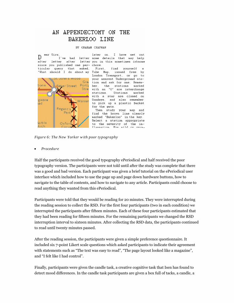
Figure 6: The New Yorker with poor typography
• Procedure
Half the participants received the good typography ePeriodical and half received the poor
typography version. The participants were not told until after the study was complete that there
was a good and bad version. Each participant was given a brief tutorial on the ePeriodical user
interface which included how to use the page up and page down hardware buttons, how to
navigate to the table of contents, and how to navigate to any article. Participants could choose to
read anything they wanted from this ePeriodical.
Participants were told that they would be reading for 20 minutes. They were interrupted during
the reading session to collect the RSD. For the first four participants (two in each condition) we
interrupted the participants after fifteen minutes. Each of these four participants estimated that
they had been reading for fifteen minutes. For the remaining participants we changed the RSD
interruption interval to sixteen minutes. After collecting the RSD data, the participants continued
to read until twenty minutes passed.
After the reading session, the participants were given a simple preference questionnaire. It
included six 7-point Likert scale questions which asked participants to indicate their agreement
with statements such as “The text was easy to read”, “The page layout looked like a magazine”,
and “I felt like I had control”.
Finally, participants were given the candle task, a creative cognitive task that Isen has found to
detect mood differences. In the candle task participants are given a box full of tacks, a candle, a

match, and a corkboard affixed to a wall; their task is to attach the candle to the corkboard in such
a way that the wax won’t drip all over the place when lit. They were given ten minutes to solve the
task. The task is considered correctly solved if the tacks are emptied from the box, the box tacked
to the corkboard, and the candle placed inside the box. All other solutions are considered
incorrect. One of the participants in the poor typography condition said that she knew the
solution to the candle task because she was familiar with the task from a psychology course in
college. This participants data was not included in the candle task results.
Results
We took three measures: Relative subjective duration, a Likert scale preference questionnaire,
and the candle task. We found reliable differences with RSD and the candle task, but none with
the preference questionnaire.
With RSD we found that participants in the poor typography condition underestimated their
reading time by 24 seconds on average, while participants in the good typography condition
underestimated their reading time by 3 minutes and 18 seconds on average. This is a reliable
difference, t(18)=2.17, p<.05. This data includes the lack of difference with the first four
participants who had an earlier interruption point. Because participants in both conditions
underestimated the amount of time they had been reading, this indicates that the reading task
was pleasant and engaging. The greater underestimation in the good typography condition
indicates that good quality typography is responsible for greater engagement during the reading
task.
With the candle task we found that 4 of 10 participants successfully correctly solved the task in
the good typography condition while 0 of 9 participants correctly solved the task in the poor
typography condition. This is a reliable difference, χ2 (1) = 2.47, p < .05. This indicates that
participants in the good typography condition were in a better mood before starting the candle
task then were the participants in the poor typography condition.
Study 2
Excited by the results of the first study, we decided to run a second test very similar to the first to
confirm our findings. We made two major changes to the study. First, because in the first study
we found larger RSD difference with a longer duration interruption point, we decided to increase
the duration even further to 17 minutes. Second, we changed the final cognitive task from the
candle task to the remote associates task, another cognitive task that Isen has shown to be
impacted by positive mood.
In the remote associates task participants are given three words such as water, skate, and cream
and asked to generate a word that will create a common compound with each of the three words.
In this example the correct answer is ice. The three items were shown on a computer screen, and
the participants pressed a keyboard button as soon as they knew the answer. The items were

shown for up to 15 seconds. After the participant pressed the button or 15 seconds had elapsed,
the participants were asked to respond with the compound associate. We collected both reaction
time and accuracy data from this test. Isen found that participants placed in a positive mood
successfully completed a high percentage of these trials and at a faster rate then participants not
placed in a positive mood.
Most other details of the study are identical to the first study. We again used the January 5, 2004
edition of the New Yorker for the ePeriodical content, and created the good and poor typography
versions with the same differences. The same experimenter gave the participants the same
instructions about how to use an ePeriodical. Twenty new participants were recruited for the
between subjects design with the same set of selection criterion as the first study.
Results
In the second study we took three measures: Relative subjective duration, a Likert scale
preference questionnaire, and the remote associates task. We found reliable differences with RSD
and the preference questionnaire, but not with the remote associates task.
With RSD we found that participants in the poor typography condition underestimated their
reading time by 2 minutes and 21 seconds on average, while participants in the good typography
condition underestimated their reading time by 5 minutes and 12 seconds on average. This is a
reliable difference, t(18)=2.19, p<.05. The findings are similar to Study 1, again participants
underestimated reading duration in both the good and poor typography conditions, but had a
larger underestimation in the good typography condition. The overestimations are greater in this
study than in study 1 for both the good and poor typography. The main difference is that we
extended the time duration to 17 minutes which resulted in a greater range of time estimations.
Reading in both conditions still appears to be an engaging task, but reading with good typography
is more engaging.
We used the same 7-point Likert scale questions as in the first study, but this time some of the
preference scores were reliably in favor of the good typography:
Statement Bad
Typography
Good
Typography
Reliability
The text was easy to read. 3.6 5.5 t(18)=2.63, p<.05
The page layout looked like a
magazine.
5.0 6.7 t(18)=4.02, p<.01
I felt like I had control. 4.8 6.2 t(18)=2.55, p<.05
It was easy to get where I
wanted to go.
4.4 5.8 t(18)=2.15, p<.05

We expected to find preference differences in favor of the good typography ePeriodical in both
studies, and do not have an explanation why reliable differences were not found in the first study.
There were clear differences in text quality and magazine appearance that should have been
noticeable to the reader, even though it is a between subjects design where any given reader only
sees either the good or the poor typography ePeriodical. There were no actual navigation
differences between the two versions, and participant ratings reflect general perceived
improvement for the good typography ePeriodical.
With the remote associates test we found that the good typography participants succeeded at 52%
of the tasks at an average speed of 6395ms to the poor typography’s 48% at an average speed of
6715ms. Neither the accuracy nor the speed difference is statistically reliable.
Conclusion
From these studies we have both discovered methodologies for measuring affect differences and
that high quality typography can improve mood. RSD previously had been used to measure
differences in task difficulty. In these studies RSD has been expanded to detect differences where
the aesthetics of the text differed while the task (reading) is unchanged. Creative cognitive tasks
have been previously shown performance improvements when participants were induced into a
positive mood. These studies have shown the potential for using those same tasks to measure
mood differences. However the results were mixed with the candle task showing the expected
benefit while no difference was found with the remote associates task.
We have also demonstrated that high quality typography appears to induce a positive mood,
similar to earlier mood inducers such as a small gift or watching a humorous video. This is an
exciting finding because there are important differences between good and poor typography that
appear to have little effect on common performance measures such as reading speed and
comprehension. To help move the field of typography forward we need methods that can
successfully measure aesthetic differences.
This is still a young project and there is much to do. One potential problem with these studies is
that the affect value of the reading content was not controlled in this study since every participant
could read the articles of their choosing. One article in the ePeriodical told of the loss of the
author’s childhood dog. This was clearly a sad story and could have had an undue impact if more
participants in one condition choose to read this story. In future work we will examine placing
tighter controls on the content that the participants read in order to eliminate this as a
confounding factor. We are also planning to examine subtler typographic differences. In these
studies we manipulated font quality, rendering quality, and layout quality. Next we would like to
see if this methodology is sensitive enough to detect aesthetic differences such as those seen in
Chaparro’s page setting and OpenType studies. We hope these methodologies are sensitive
enough to measure more subtle typographic differences.

Acknowledgements
Special thanks to Tracy Premo who ran the studies, and to Radoslav Nickolov and Steven Kim for
helping create the good and bad ePeriodicals.
References
Bowden, E.M. & Jung-Beeman, M. (2003). One hundred forty-four Compound Remote Associate
Problems: Short insight-like problems with one-word solutions. Behavioral Research,
Methods, Instruments, and Computers, 35, 634-639.
Czerwinski, M., Horvitz, E. & Cutrell, E. (2001). Subjective Duration Assessment: An Implicit
Probe for Software Usability. In Proceedings of IHM-HCI 2001 Conference, Volume 2,
(September, 2001, Lille, France), p. 167-170.
Duncker, K. (1945). On problem solving. Psychological Monographs, 58 (5).
Gugerty, L., Tyrrell, R.A., Aten, T.R., & Edmonds, K.A. (2004). The effects of sub-pixel addressing
on users’ performance, ACM Transactions on Applied Perception.
Isen, A. M. (1993). Positive affect and decision making. In M. Lewis & J. Haviland (Eds.),
Handbook of Emotion (p. 261-277). NY: Guilford.
Isen, A.M., Daubman, K.A., Nowicki, G.P. (1987). Positive Affect facilitates creative problem
solving. Journal of Personality and Social Psychology, 1122-1131.
Mednick, S.A. (1962). The associative basis of the creative process. Psychological Review, 69,
220-232.
Weybrew, B.B. (1984). The Zeigarnik phenomenon revisited: Implications for enhancement of
morale. Perceptual and Motor Skills, 58, p. 223-226.
Ziegarnik, B. (1927). Uber das Behalten von erledigten und unerledigten handlungen.
Psychologische Forschung, 9, 1-85.