Embed Size (px)
Citation preview

14 fully-licensed families FREELicensed for use in commercial web pages, HTML emails and HTML ads,
they’re beautiful, legible, and ready to publish with the Monotype Web Font Platform.

Our selection criteria
Design Pedigree
We have selected typefaces that represent quality and pedigree from well established libraries like Monotype, Linotype, ITC, Ascender, and Bitstream.
Type style variety
We identified the top type style categories (ie. Humanist Sans Serif, Grotesque Sans Serif, etc.) and selected a nice variety of typeface families that would have broad appeal and be visually attractive as alternatives to system fonts.
Fonts weight
We reviewed each family and selected the most useful font weights/styles for web fonts usage in digital advertising.
Languages
We selected the W02 character set (Extended Latin) where available for broad coverage across the most popular Latin languages. In most cases, this character set will be further reduced with subsetting during the publish process.
Core font families in detail

News Gothic (Bitstream)
News Gothic BT is the renowned Bitstream version of the typeface originally created by Morris Fuller Benton in 1908. News Gothic has stood the test of time because of its straightforward design characteristics, economy of space, legibility and persuasive attitude. The News Gothic BT typefaces were engineered to standout in the grotesque san serif category because of their versatility and warm personality.
You can use News Gothic BT for everything from headlines to body copy, especially when space is at a premium.

Neuzeit Office (Linotype)
Neuzeit® Office was designed by Akira Kobayashi, Linotype’s Type Director. This retooling of a classic design that harkens back to the Bauhaus and De Stijl movements is a remarkable achievement. Neuzeit Office has both grotesque and geometric sans serif attributes, and was crafted into a high performing family with open, legible letterforms.
Use this family when looking for a no-nonsense, European aesthetic.

Harmonia Sans (Monotype)
The Harmonia Sans™ font family is a ground-breaking geometric sans serif design by Jim Wasco. With a clean and cheerfully modern appearance, Harmonia Sans provides designers with a powerful range of weights that can let the typography sing in a design.
Harmonia Sans performs well in a range of type sizes in both print and digital environments. For headings, try uppercase characters with increased letter spacing for a crisp, stylish feeling.

Burlingame (Monotype)
The Burlingame™ typeface family was designed by Carl Crossgrove for today’s constrained digital settings and in challenging print environments. Burlingame is a sturdy square sans serif design that performs with strength and grace at any size. It features open, clear shapes with a high degree of legibility, making it a multifaceted, multipurpose typeface family for a wide range of modern uses.
Burlingame is perfect for chunky headlines that need a masculine, tech or sporty touch.

Ayita Pro (Ascender)
Ayita™ Pro is a fresh sans serif design by Jim Ford. This cheerful, contemporary and friendly typeface family is elegant and hard-working. Ayita Pro features an exuberant rhythm and flow that gives type a platform to deliver messages with style and strength.
Try Ayita when you want to set your text in motion, and let your messages shine.
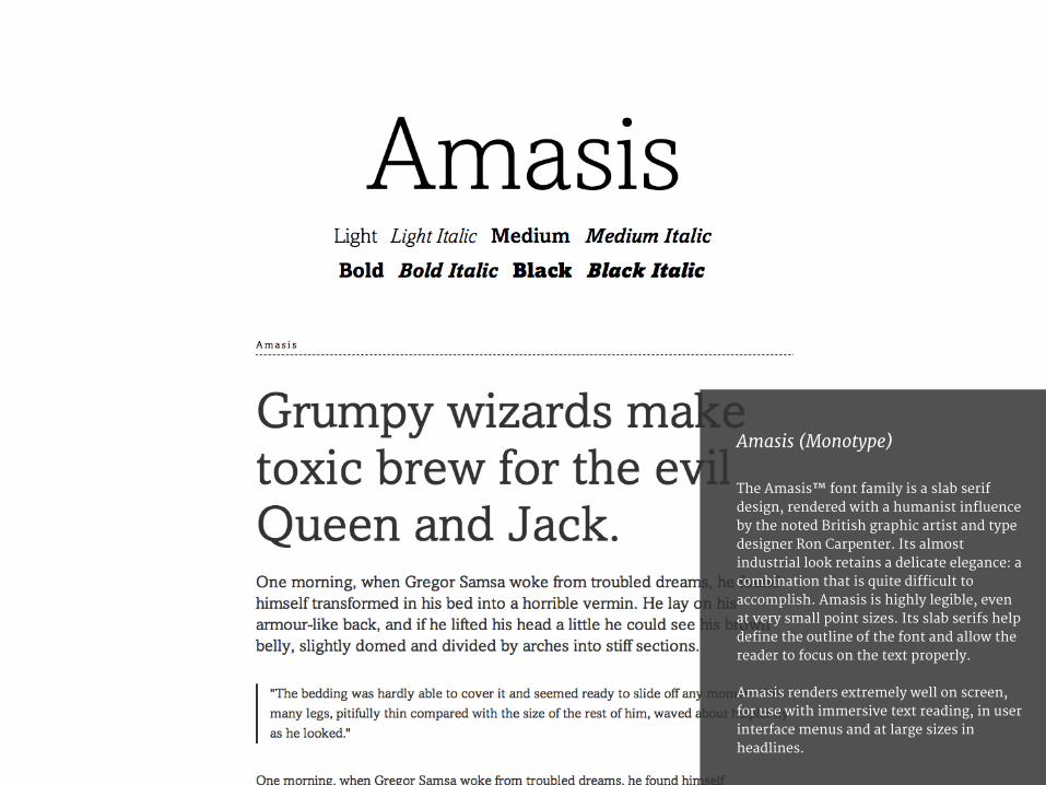
Amasis (Monotype)
The Amasis™ font family is a slab serif design, rendered with a humanist influence by the noted British graphic artist and type designer Ron Carpenter. Its almost industrial look retains a delicate elegance: a combination that is quite difficult to accomplish. Amasis is highly legible, even at very small point sizes. Its slab serifs help define the outline of the font and allow the reader to focus on the text properly.
Amasis renders extremely well on screen, for use with immersive text reading, in user interface menus and at large sizes in headlines.

Bembo Book (Monotype)
Monotype’s Bembo® is a renowned tribute to fine books of Renaissance Italy. It was meticulously designed to capture the golden age in printed text. Bembo has a dependable range of weights and styles, with stylish italics that make in an excellent all-purpose font family.
Bembo is the quintessential serif text font, packed with grace and elegance.

Dante eText (Monotype)
Dante® is a classic serif text family with exception warmth and beauty. It originated as hand-cut hot metal type, and has been carefully redrawn for digital use. The Dante eText versions were crafted with subtle enhancements to make the text perform well on screen in ebooks, websites and digital ads.
Look no further than Dante if you want a beautiful text face for your typographic palette.

Charlotte Serif (ITC)
The Charlotte™ font family was inspired by 18th century French type designer Pierre-Simon Fournier. Charlotte’s clean cut style, accentuated by a strong vertical stress and unbracketed serifs, exudes an authoritative tone, guaranteeing its effectiveness for almost all text setting applications.
Charlotte is especially useful when a formal, premium appearance is desired.

Linotype Didot eText (Linotype)
The Linotype Didot® eText family has a 200 year old style that drips with intellectual elegance that’s at home in a fashion environment. Its first appearance on the screen was fraught with legibility traps due to a high thick-to-thin contrast throughout the alphabet. So the real achievement in this revival of a design classic is that it had been specifically tailored for text-heavy reading environments at smaller sizes.
Try Linotype Didot™ eText typeface at text sizes as small as 12px, and watch as it scales up beautifully.

Crestwood (Ascender)
Crestwood™ is an updated version of an elegant, semi-formal script typeface. It harkens back to the days of hand calligraphy and fine engraving. Its delicate but stylish lettering gives words a luxurious flavor.
Crestwood can dignify almost any text, and is best used at larger sizes.

English 111 (Bitstream)
English 111 is a formal script font family produced by Matthew Carter at Bitstream. It is inspired by the work of George Shelley, the English writing master of the mid-eighteenth century. English 111 is a connecting script with a dignified, almost ceremonial tone. Its three variants (Adagio, Presto and Vivace) have varying levels of flourishes and swashes to provide calligraphic embellishments.
When your words need an official, celebratory quality then English 111 has an air of formality that is most inviting.

Old English (Monotype)
The Old English™ typeface was produced by Monotype’s design staff as a tribute to the classic English Blackletter and German Fraktur typefaces, and specifically the work of the venerable William Caslon foundry, circa 1760! It is beautifully crafted with precise detailing, and can wonderfully grace everything from certificates to tattoos.
You can trust this font to give authority and prestige to your headlines.

Ford’s Folly (Ascender)
The Ford’s Folly™ typeface captures the look and spirit of handwriting using a Sharpie Extra Fine felt pen. It is based on the handsome, energetic handwriting of Jim Ford. With its authentic, rough texture, it has a personal feeling that is great for creating casual content.
Ford’s Folly has an energetic, enthusiastic voice and is best used at text sizes of 16px and above.