Embed Size (px)
Citation preview
TypographyThe art of using text to produce professional looking publications.
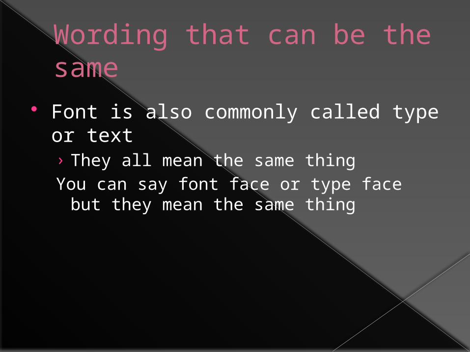
Wording that can be the same
Font is also commonly called type or text› They all mean the same thingYou can say font face or type face but they
mean the same thing
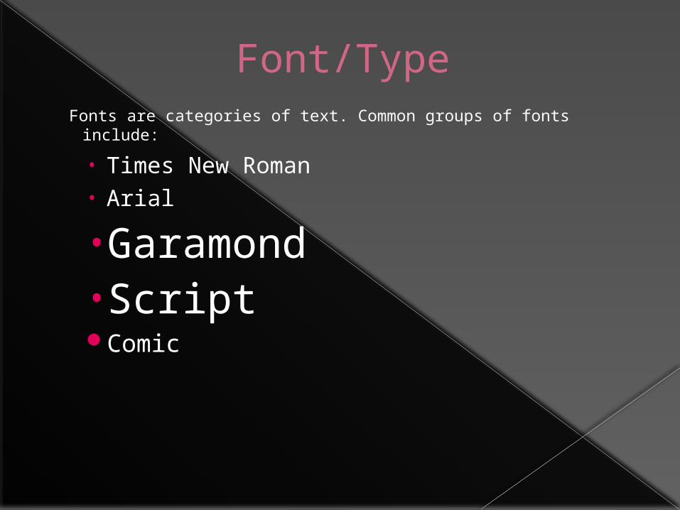
Font/TypeFonts are categories of text. Common groups of fonts include:
• Times New Roman• Arial
•Garamond• ScriptComic
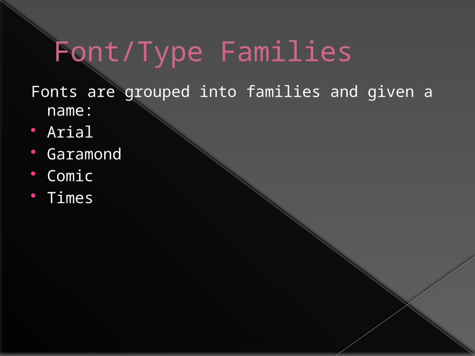
Font/Type FamiliesFonts are grouped into families and given a name: Arial Garamond Comic Times
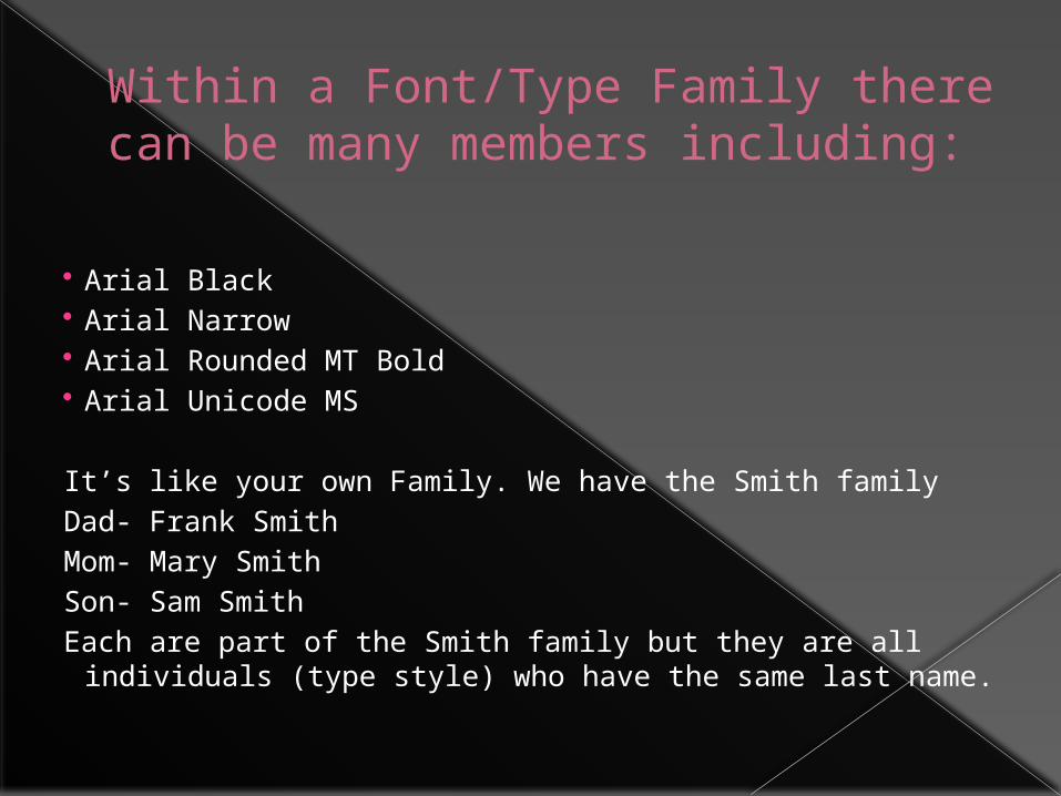
Within a Font/Type Family there can be many members including:
Arial Black Arial Narrow Arial Rounded MT Bold Arial Unicode MS It’s like your own Family. We have the Smith familyDad- Frank SmithMom- Mary SmithSon- Sam SmithEach are part of the Smith family but they are all individuals
(type style) who have the same last name.
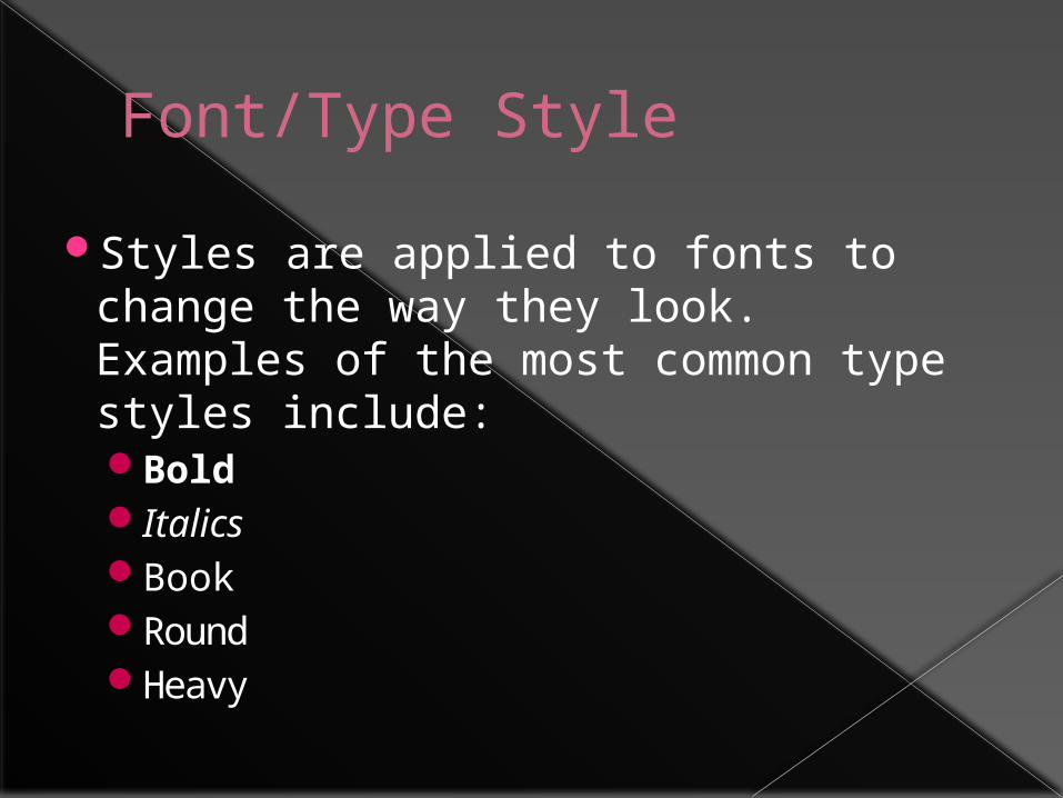
Font/Type Style
Styles are applied to fonts to change the way they look. Examples of the most common type styles include:BoldItalicsBookRoundHeavy
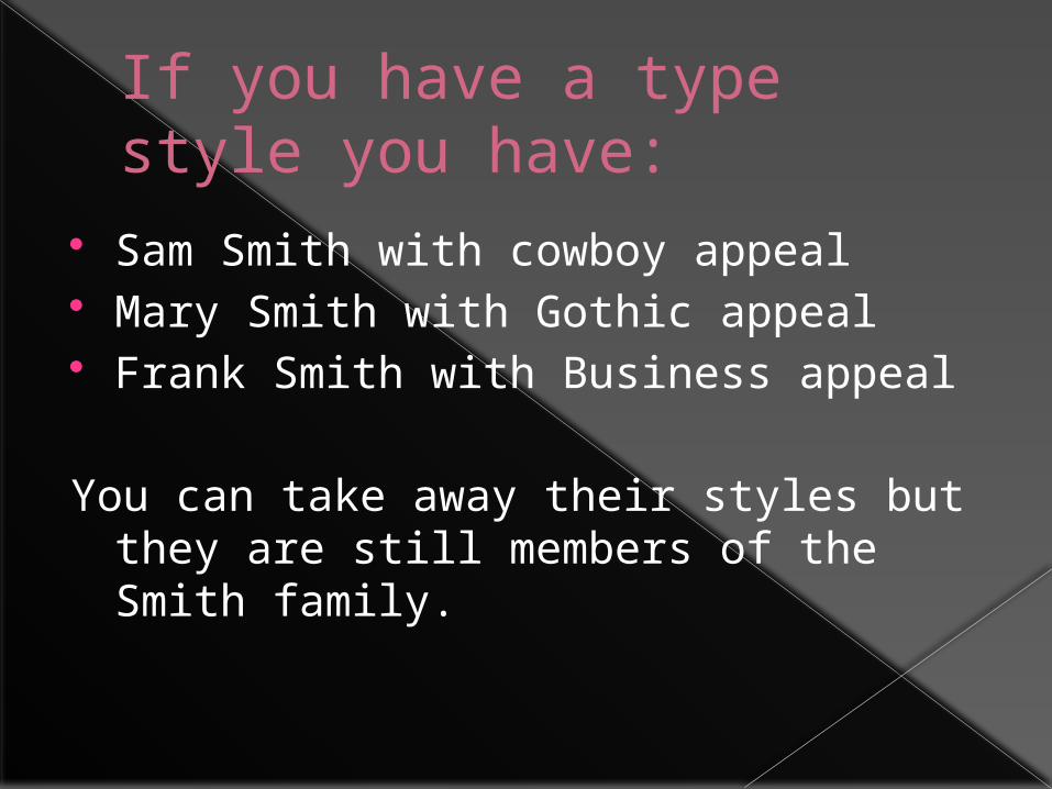
If you have a type style you have:
Sam Smith with cowboy appeal Mary Smith with Gothic appeal Frank Smith with Business appeal
You can take away their styles but they are still members of the Smith family.
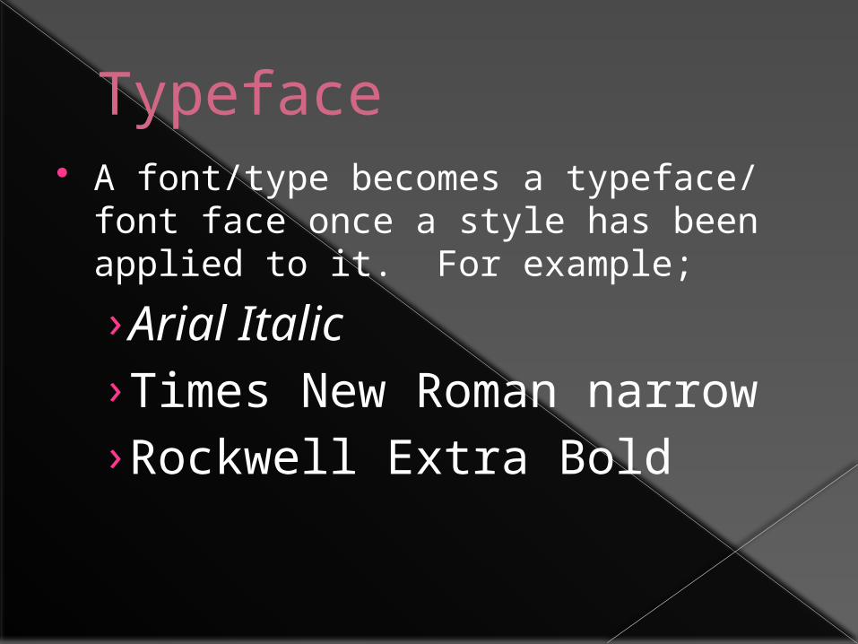
Typeface A font/type becomes a typeface/ font
face once a style has been applied to it. For example;
› Arial Italic› Times New Roman narrow› Rockwell Extra Bold
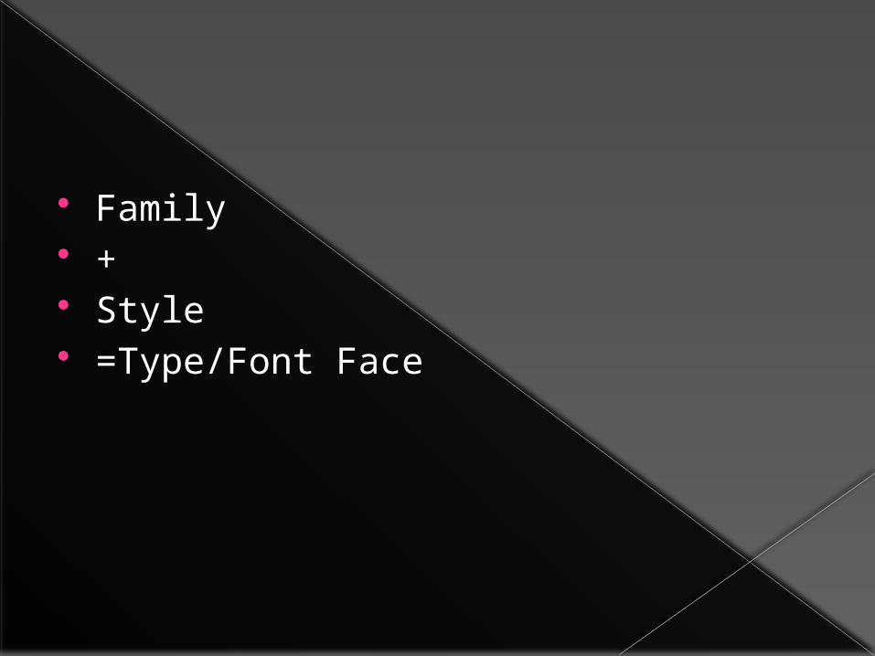
Family + Style =Type/Font Face
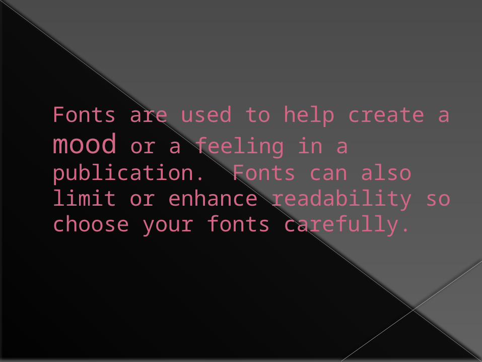
Fonts are used to help create a
mood or a feeling in a publication. Fonts can also limit or enhance readability so choose your fonts carefully.
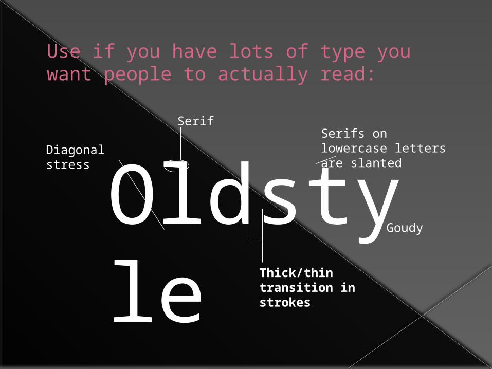
Use if you have lots of type you want people to actually read:
Oldstyle Thick/thin transition
in strokes
Diagonal stress
SerifSerifs on lowercase letters are slanted
Goudy

Modern Not good choices for extended amounts of
body copy Thin lines almost disappear, thick lines
are prominent
Effect on the page is called “dazzling”
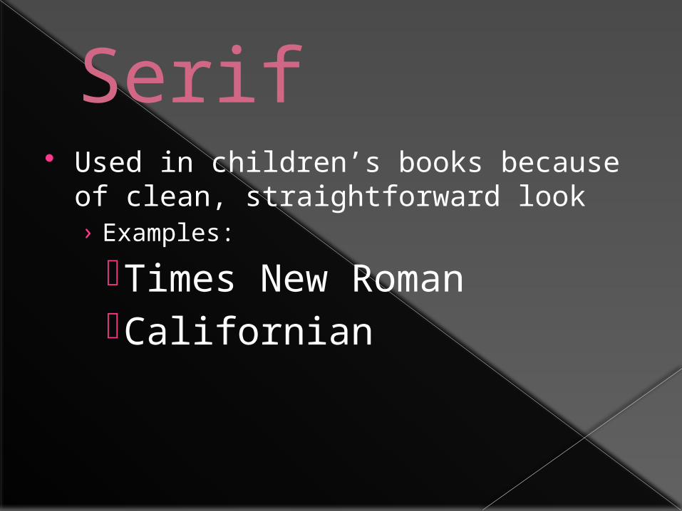
Serif Used in children’s books because of
clean, straightforward look› Examples:
Times New RomanCalifornian
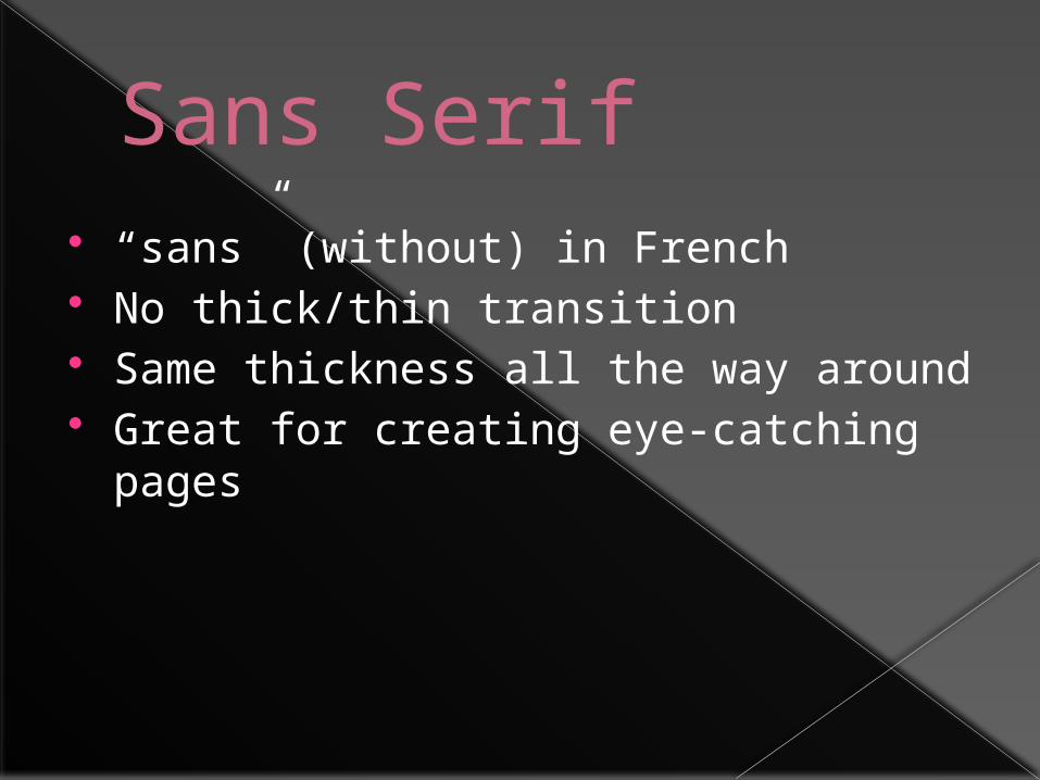
Sans Serif “sans” (without) in French No thick/thin transition Same thickness all the way around Great for creating eye-catching pages
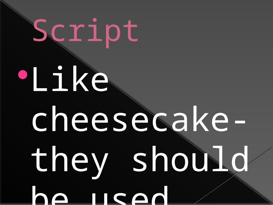
ScriptLike cheesecake- they should be used sparingly so nobody gets sick
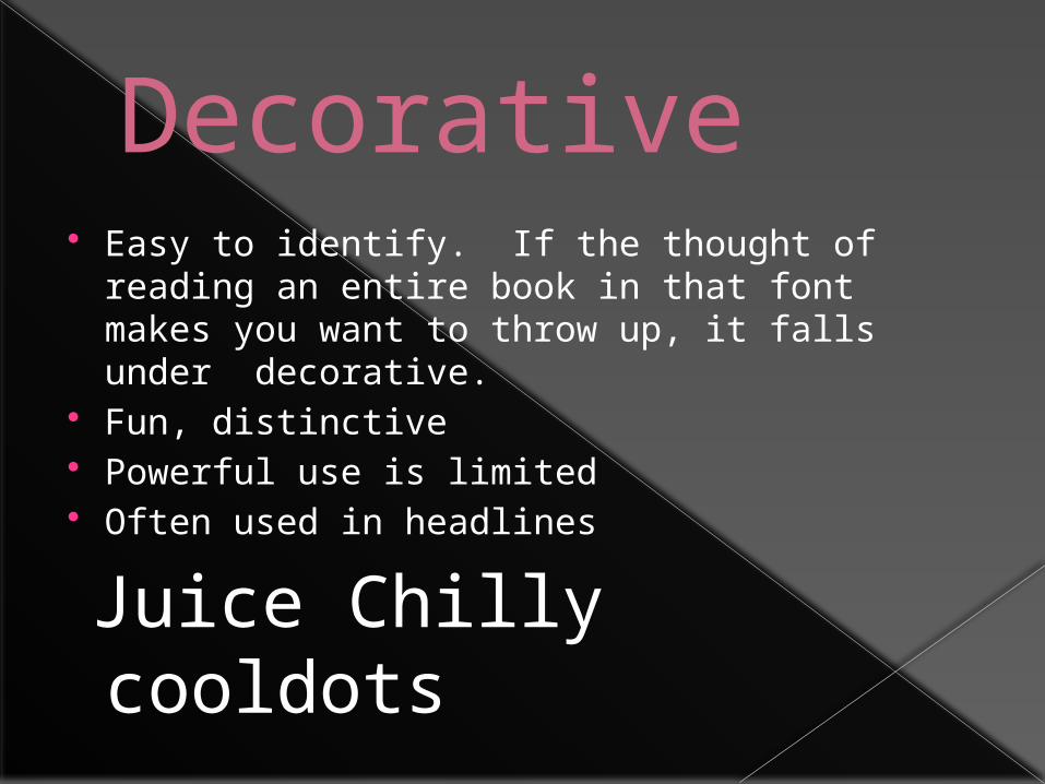
Decorative Easy to identify. If the thought of
reading an entire book in that font makes you want to throw up, it falls under decorative.
Fun, distinctive Powerful use is limited Often used in headlines
Juice Chilly cooldots
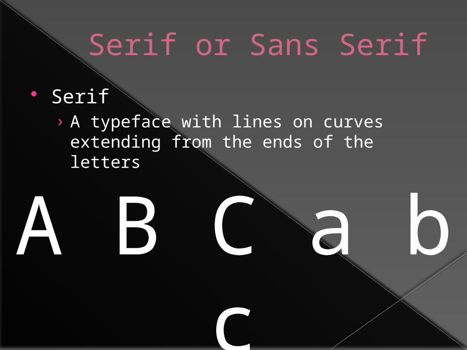
Serif or Sans Serif
Serif› A typeface with lines on curves extending
from the ends of the letters
A B C a b c
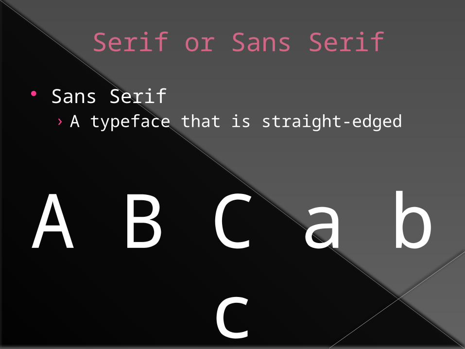
Serif or Sans Serif
Sans Serif› A typeface that is straight-edged
A B C a b c
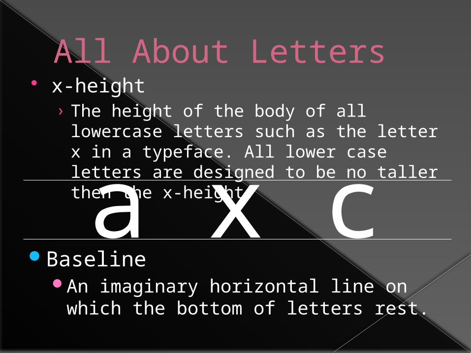
All About Letters x-height
› The height of the body of all lowercase letters such as the letter x in a typeface. All lower case letters are designed to be no taller then the x-height.
a x cBaseline
An imaginary horizontal line on which the bottom of letters rest.
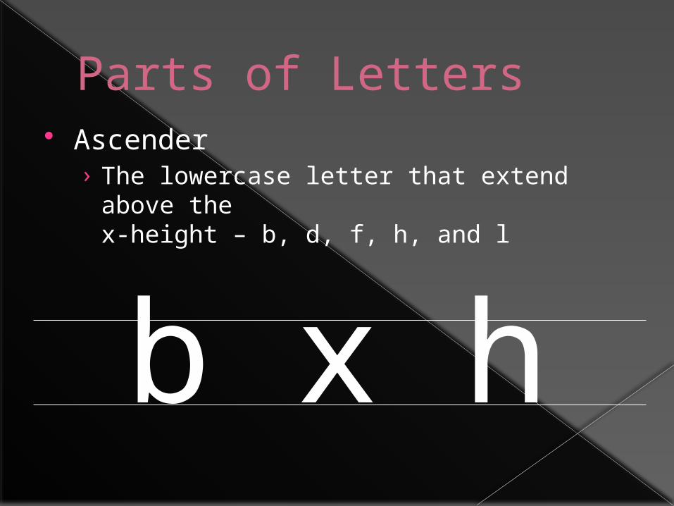
Parts of Letters Ascender
› The lowercase letter that extend above the
x-height – b, d, f, h, and l
b x h
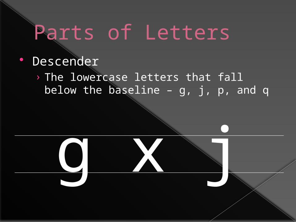
Parts of Letters Descender
› The lowercase letters that fall below the baseline – g, j, p, and q
g x j
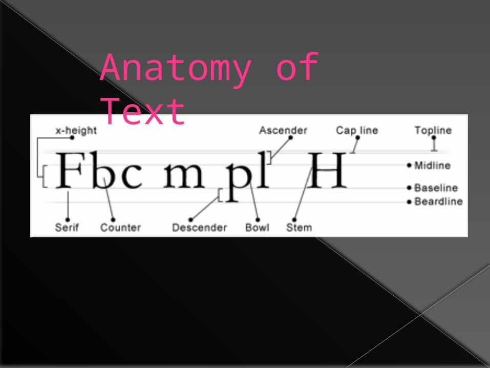
Anatomy of Text
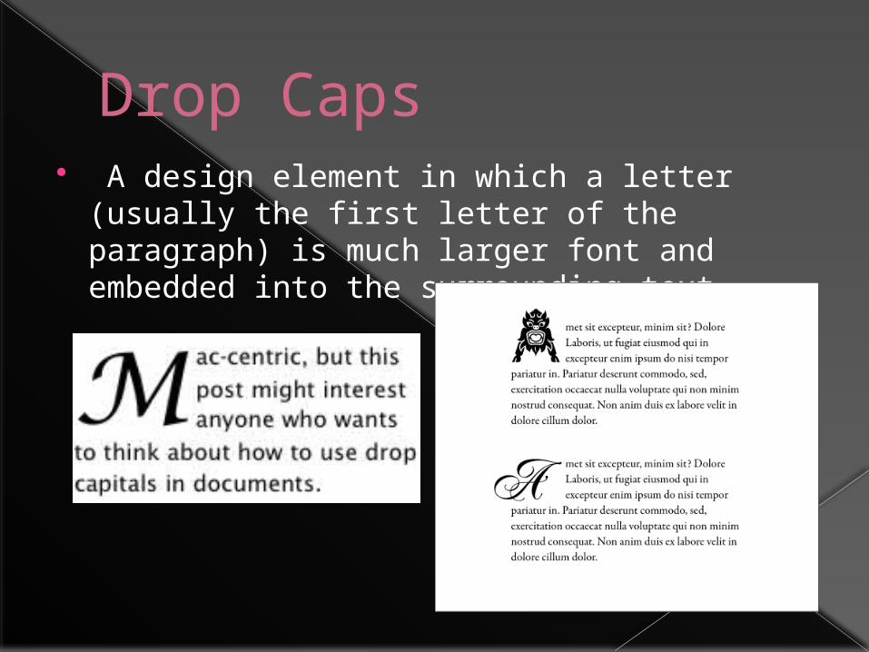
Drop Caps A design element in which a letter (usually
the first letter of the paragraph) is much larger font and embedded into the surrounding text.
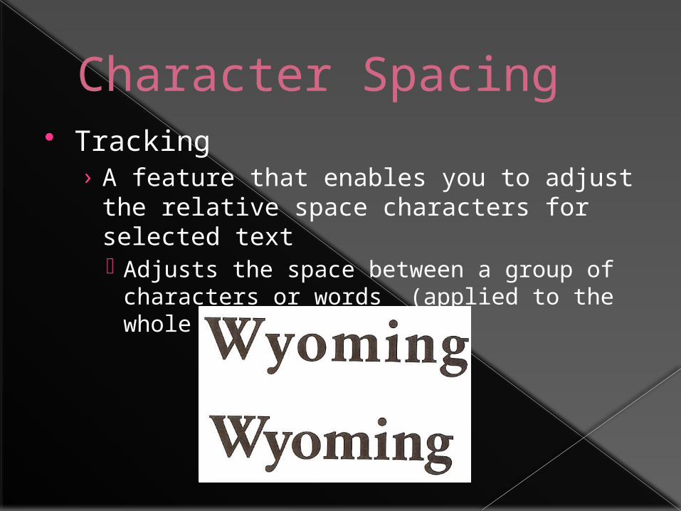
Character Spacing Tracking
› A feature that enables you to adjust the relative space characters for selected text Adjusts the space between a group of
characters or words (applied to the whole word)
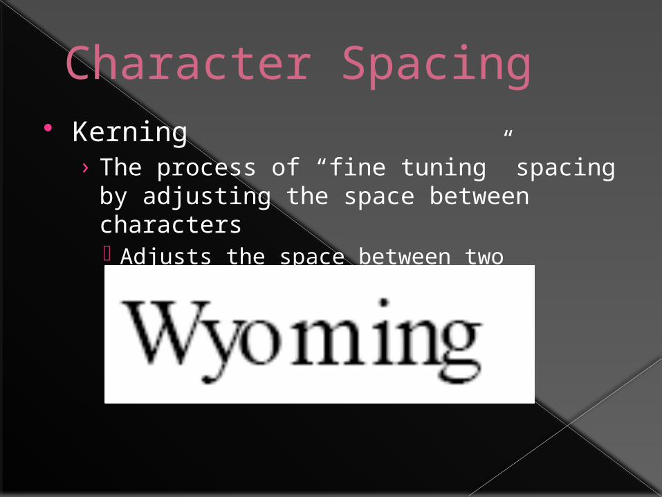
Character Spacing Kerning
› The process of “fine tuning” spacing by adjusting the space between characters Adjusts the space between two characters
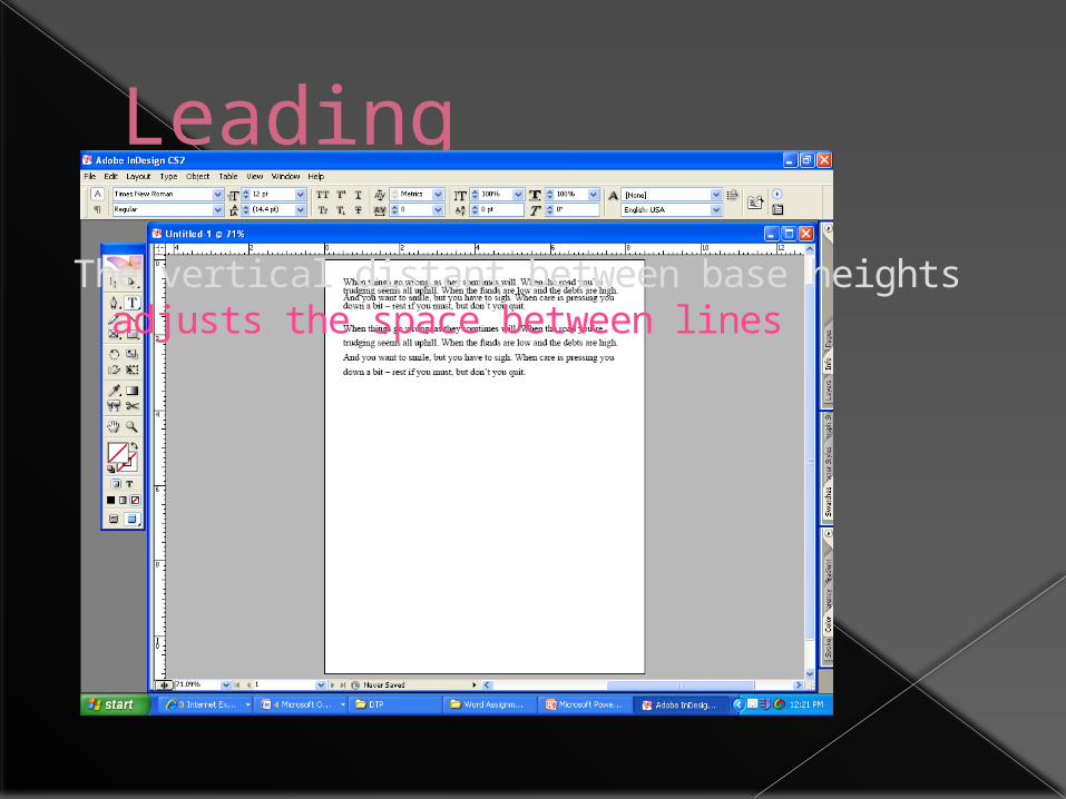
Leading
The vertical distant between base heightsadjusts the space between lines
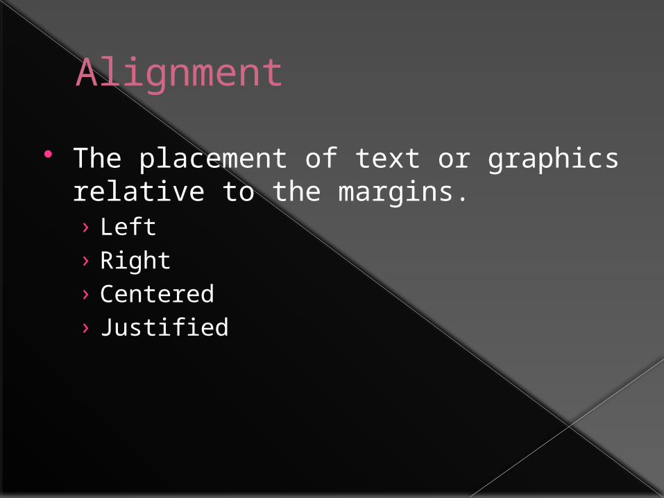
Alignment
The placement of text or graphics relative to the margins.› Left› Right› Centered› Justified
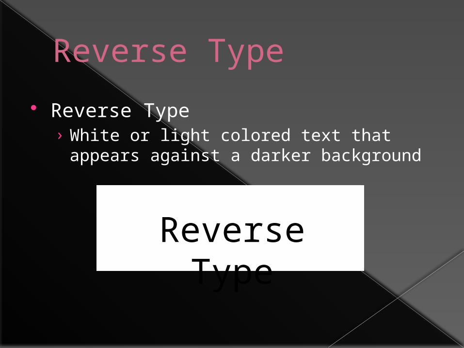
Reverse Type
Reverse Type› White or light colored text that appears
against a darker background
Reverse Type
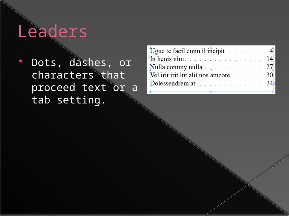
Leaders
Dots, dashes, or characters that proceed text or a tab setting.