Embed Size (px)
Citation preview
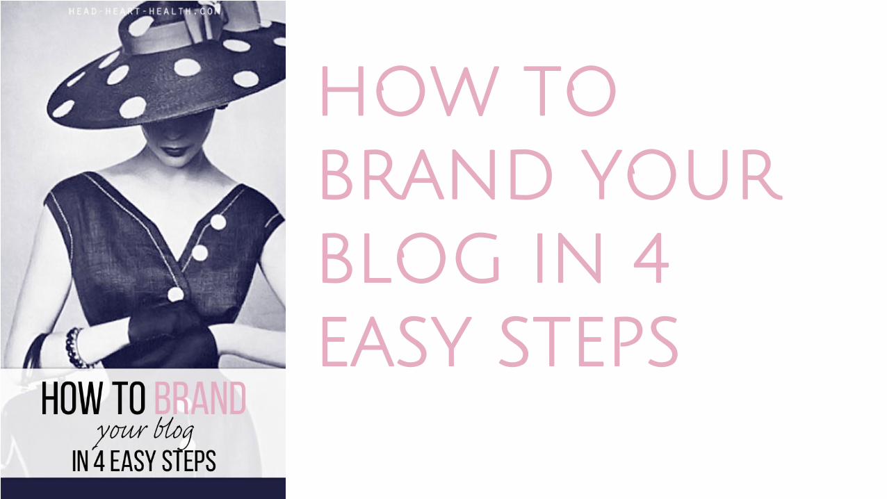
HOW TO BRAND YOUR BLOG IN 4 EASY STEPS
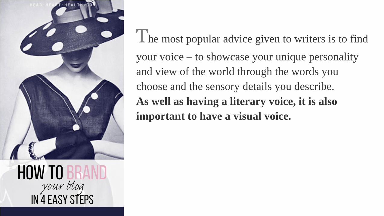
The most popular advice given to writers is to find
your voice – to showcase your unique personality
and view of the world through the words you
choose and the sensory details you describe.
As well as having a literary voice, it is also
important to have a visual voice.

The internet is a visual medium, in the same way
television and magazines are. Beautiful looking
blogs will attract more readers than those filled
with messy layouts, unattractive photos and jarring
colours. Here are a few tips to help you brand your
blog with a consistent, pleasing visual style.
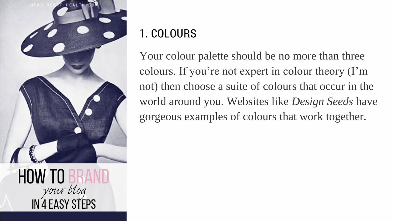
1. COLOURS
Your colour palette should be no more than three
colours. If you’re not expert in colour theory (I’m
not) then choose a suite of colours that occur in the
world around you. Websites like Design Seeds have
gorgeous examples of colours that work together.
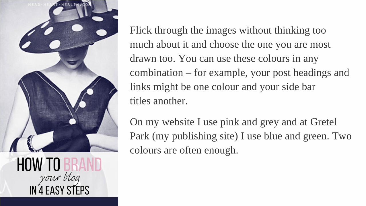
Flick through the images without thinking too
much about it and choose the one you are most
drawn too. You can use these colours in any
combination – for example, your post headings and
links might be one colour and your side bar
titles another.
On my website I use pink and grey and at Gretel
Park (my publishing site) I use blue and green. Two
colours are often enough.
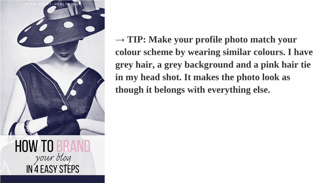
→ TIP: Make your profile photo match your
colour scheme by wearing similar colours. I have
grey hair, a grey background and a pink hair tie
in my head shot. It makes the photo look as
though it belongs with everything else.
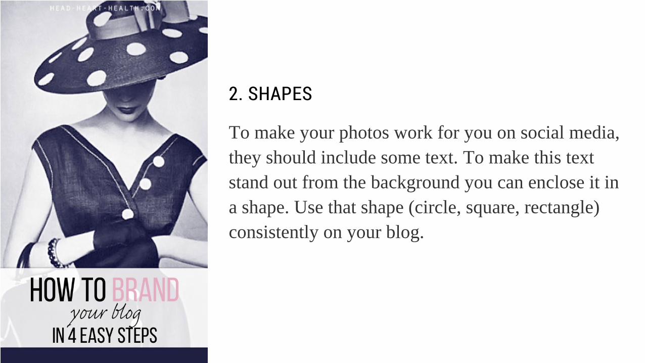
2. SHAPES
To make your photos work for you on social media,
they should include some text. To make this text
stand out from the background you can enclose it in
a shape. Use that shape (circle, square, rectangle)
consistently on your blog.
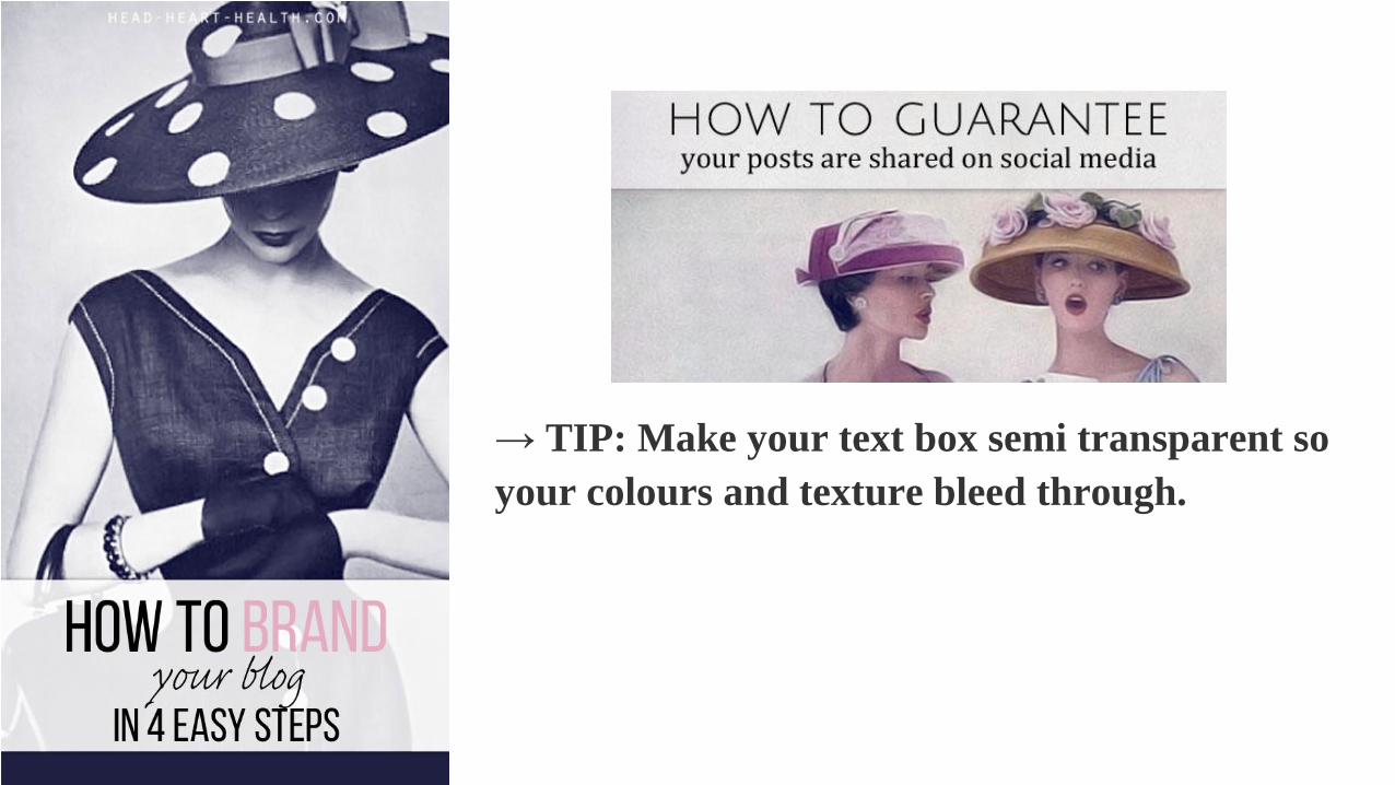
→ TIP: Make your text box semi transparent so
your colours and texture bleed through.
3. FONTS
You need a pair of fonts on your blog. You can find
suggestions for combining fonts here (ones you
might already have). An easy rule of thumb is to
have a sans-serif (no edges) and a serif font
together. For inspiration, search Pinterest with the
terms “font pairing”.

→ TIP: Combine uppercase letters
with lowercase letters for a more professional
look.
4. IMAGE STYLE
My visual style has evolved into classic muted or
black and white vintage photos. Ideally, your
photos should all have the same look and feel – the
colours, the focus, the mood etc.
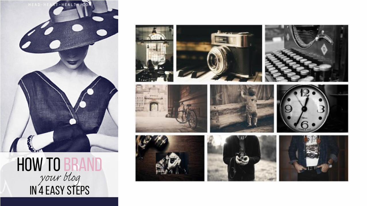


→ TIP: You don’t have to use photos – you can
use drawings, paintings, icons, patterns, plain
colours or abstracts as your signature images.

By spending a little time now deciding your colour,
shape, font and image preferences, you will be
rewarded with an attractive, professional looking
blog and less confusion deciding what images to
add to your posts.
Knowing your blog’s visual brand will also save
you time because can set up image templates
to streamline your blogging process.
≡

Need help?
– YOUR PERSONALISED BLOG BRAND
MAKEOVER –
ONLY $149 $49 limited introductory offer
Take the hassle out of creating your visual blog style with
1. guidance on your colours, shapes, fonts and images
2. custom designed templates for your blog image,
twitter image and pinterest image
3. matching facebook, twitter & google+ header
Email: [email protected]
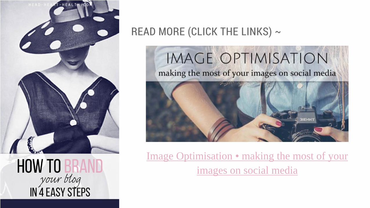
READ MORE (CLICK THE LINKS) ~
Image Optimisation • making the most of your
images on social media
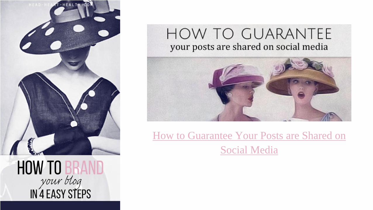
How to Guarantee Your Posts are Shared on
Social Media
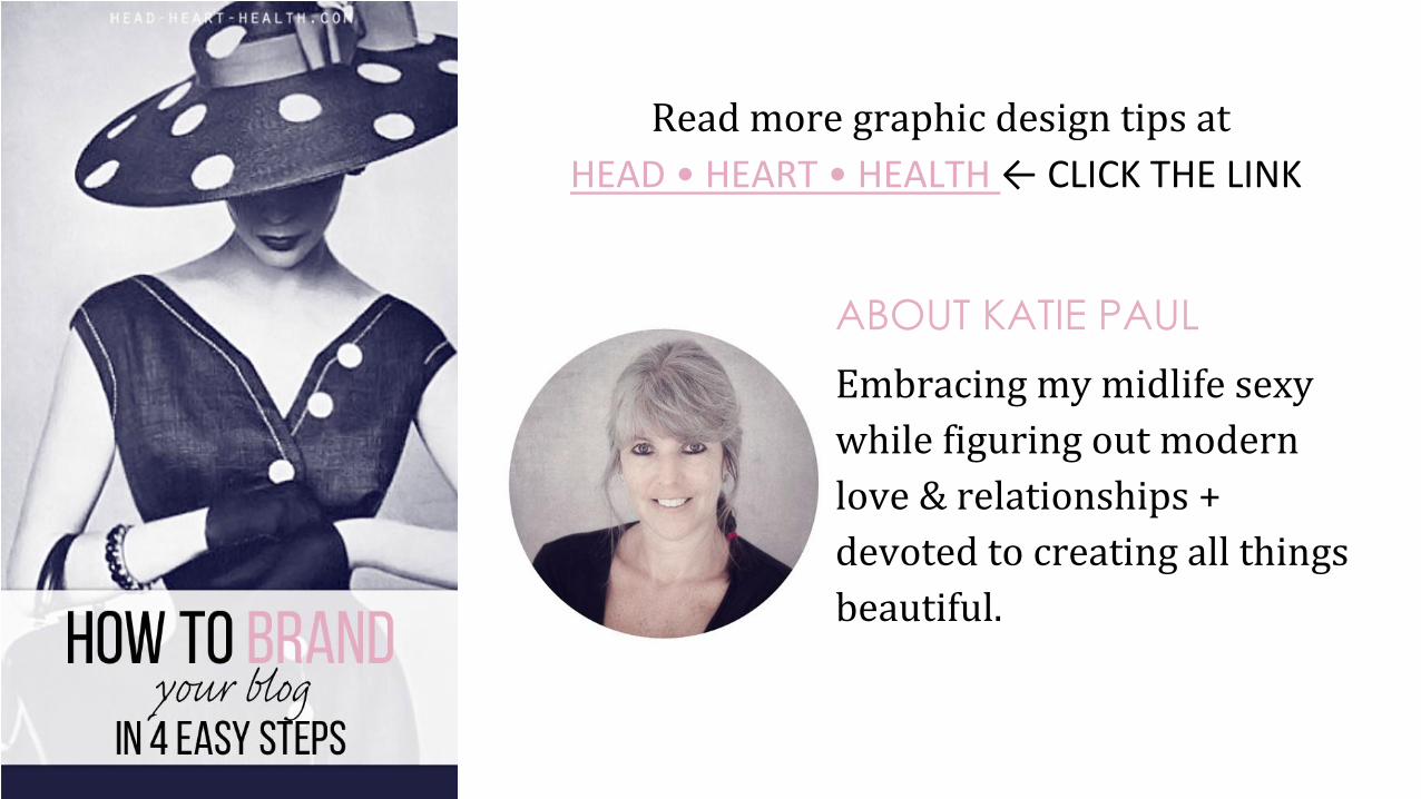
Read more graphic design tips at
HEAD • HEART • HEALTH ← CLICK THE LINK
ABOUT KATIE PAUL
Embracing my midlife sexy
while figuring out modern
love & relationships +
devoted to creating all things
beautiful.


![076: Your Voice is Louder than Words: Interview …...076: Your Voice is Louder than Words: Interview with Todd Henry [Music Playing] T People talk about finding your voice, finding](https://img.dokumen.tips/doc/110x75/5f0359f87e708231d408c937/076-your-voice-is-louder-than-words-interview-076-your-voice-is-louder-than.jpg)