Embed Size (px)
Citation preview

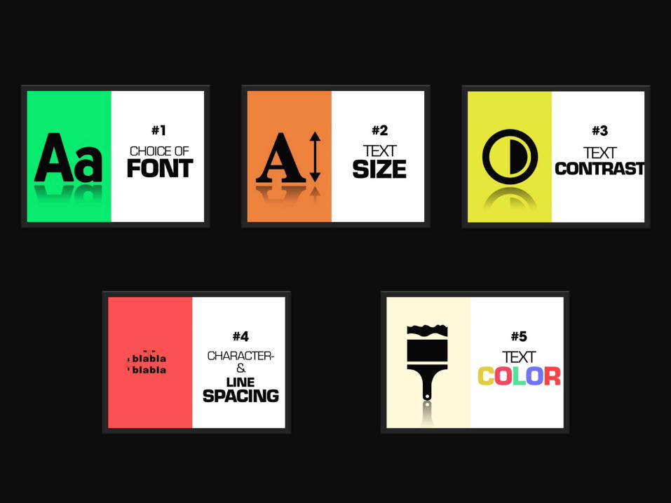
TIPS
FOR BETTER TYPOGRAPHY IN YOUR SLIDES
CHOICE OF
FONT
#1
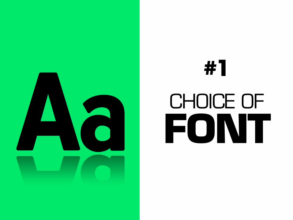
Good fonts are visually
EXCITING

Futura Montserrat
Lily Script One ITC Avant Garde Akidenz-Grotesk
Bebas Neue
Ubuntu
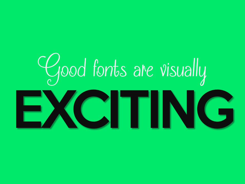
A boring font can also become
EXCITING if you play with it a little


which brings us to tip number two…
TEXT SIZE
#2
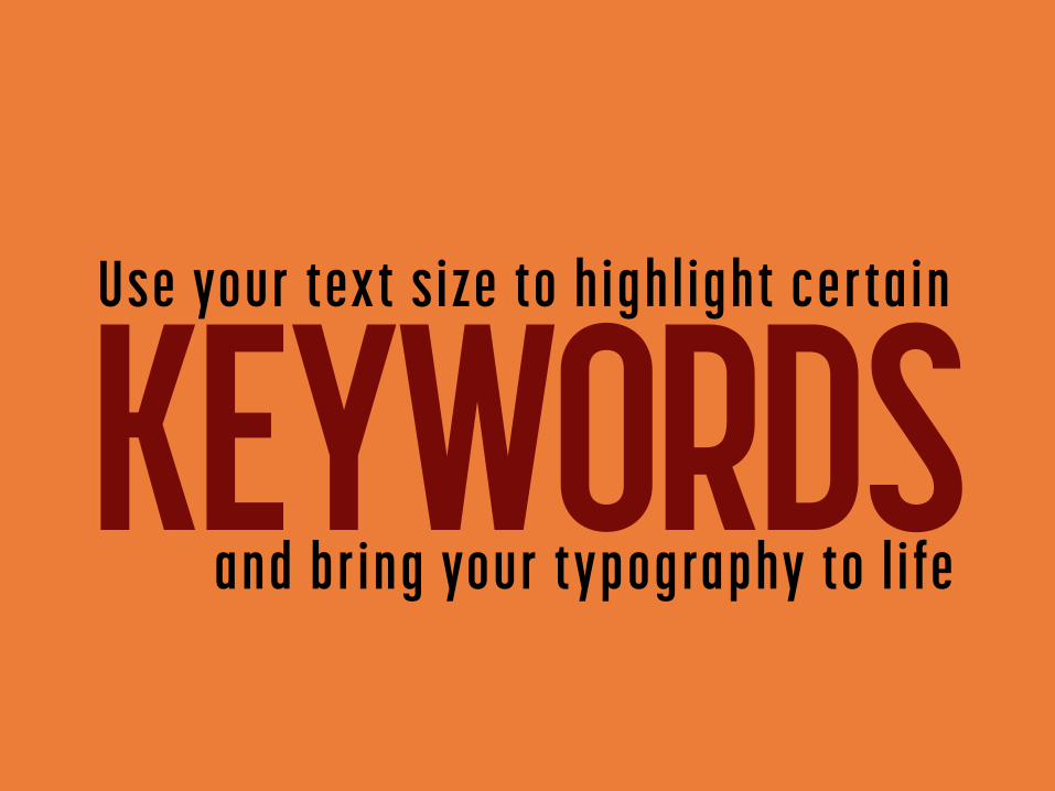
KEYWORDS Use your text s ize to highl ight certain
and br ing your typography to l i fe

TEXT CONTRAST
#3
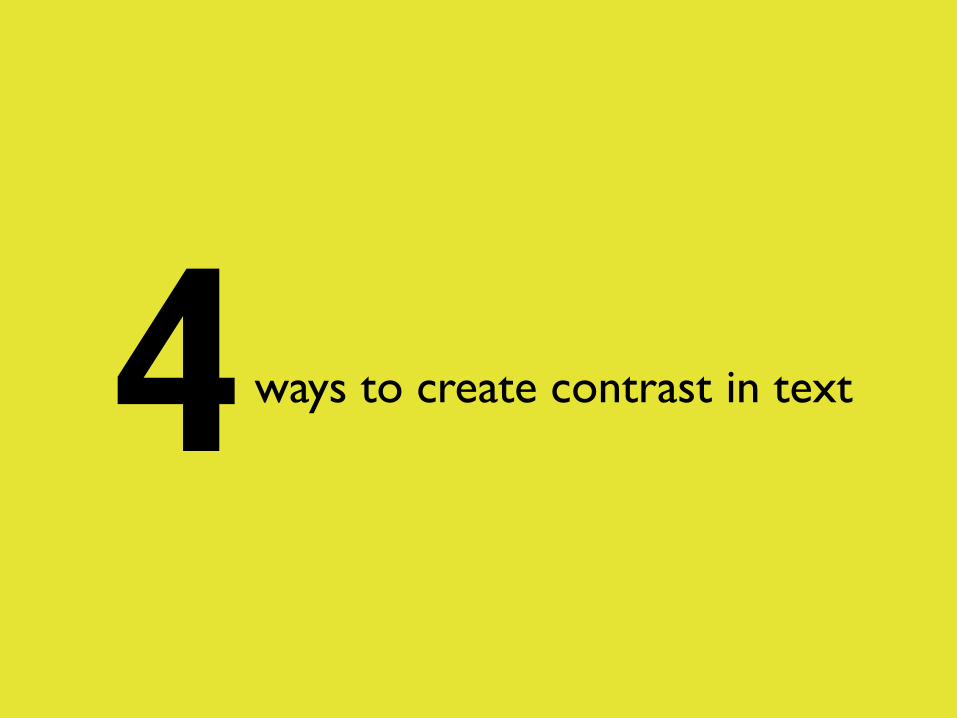
4 ways to create contrast in text
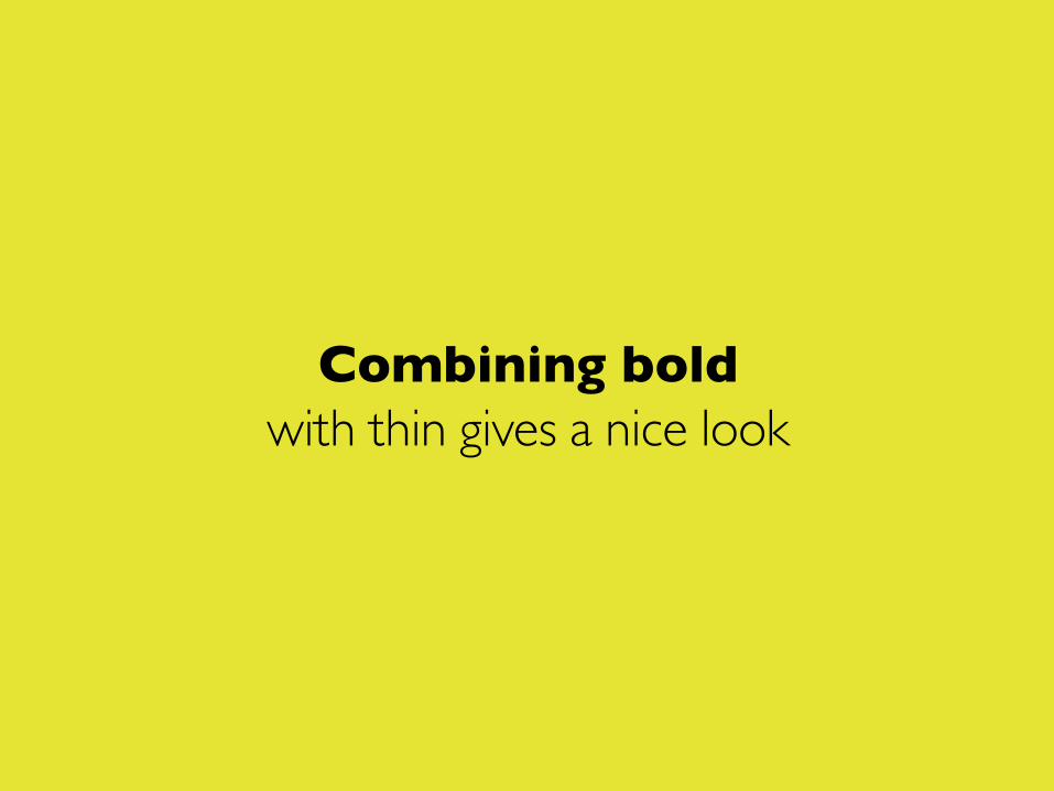
Combining bold with thin gives a nice look

BIG versus small
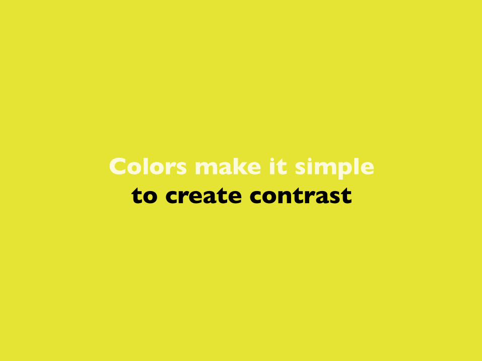
Colors make it simple to create contrast

And the combination of fonts is also PERFECT
for the contrast effect
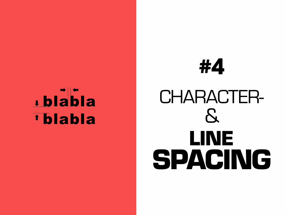
CHARACTER- &
LINE SPACING
#4
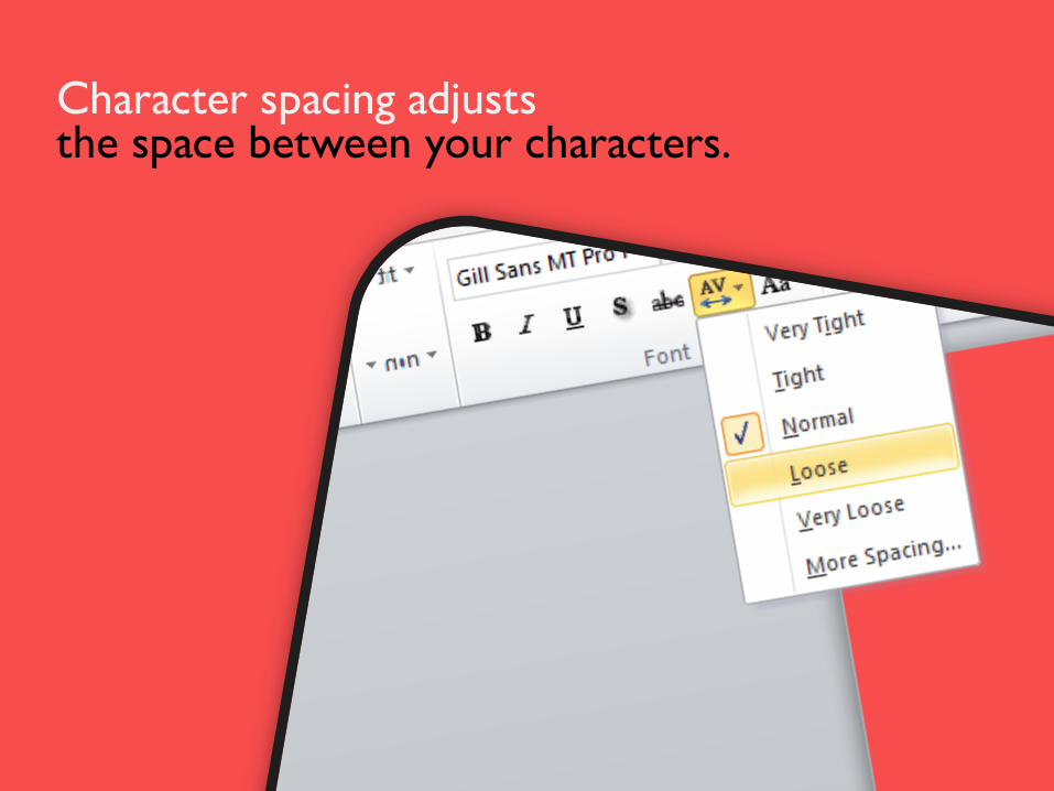
Character spacing adjusts the space between your characters.
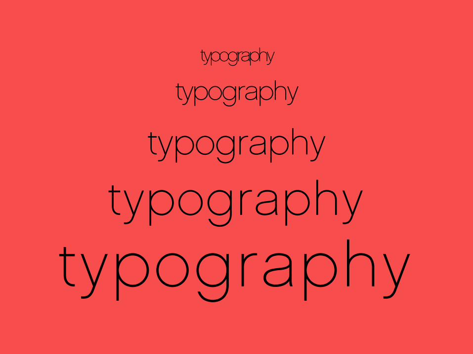
typography
typography
typography
typography
typography
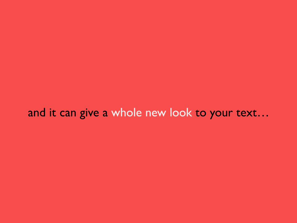
and it can give a whole new look to your text…

This is loose spacing
which gives a fresh look and a feeling of openness
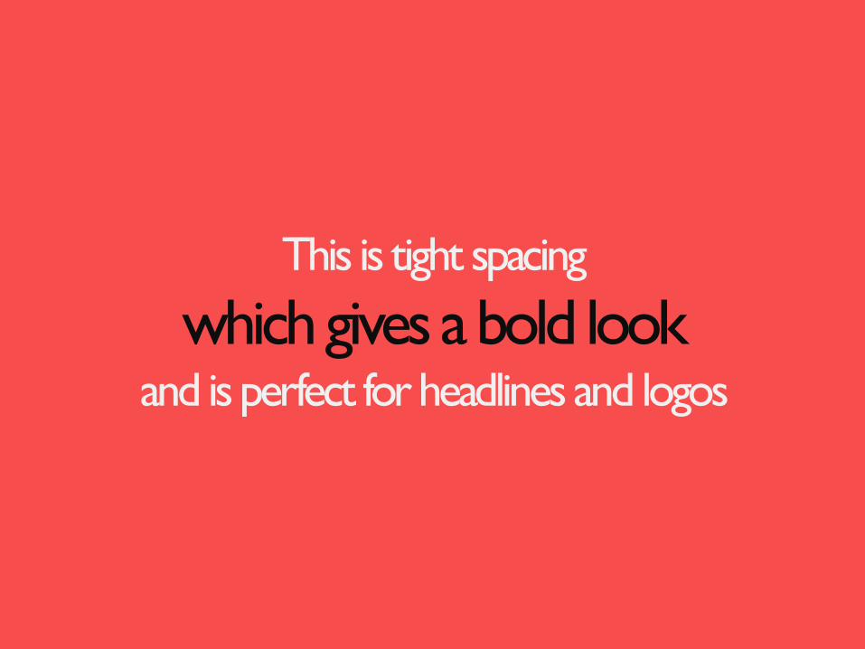
This is tight spacing
which gives a bold look and is perfect for headlines and logos
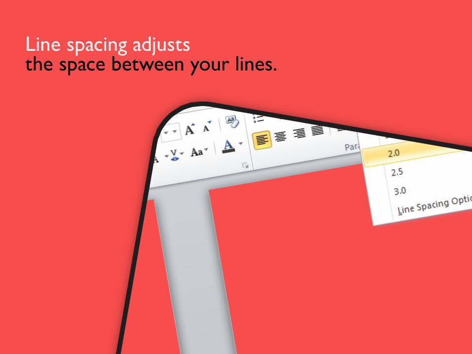
Line spacing adjusts the space between your lines.
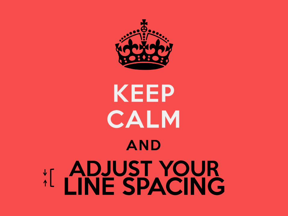
KEEP CALM
AND ADJUST YOUR LINE SPACING
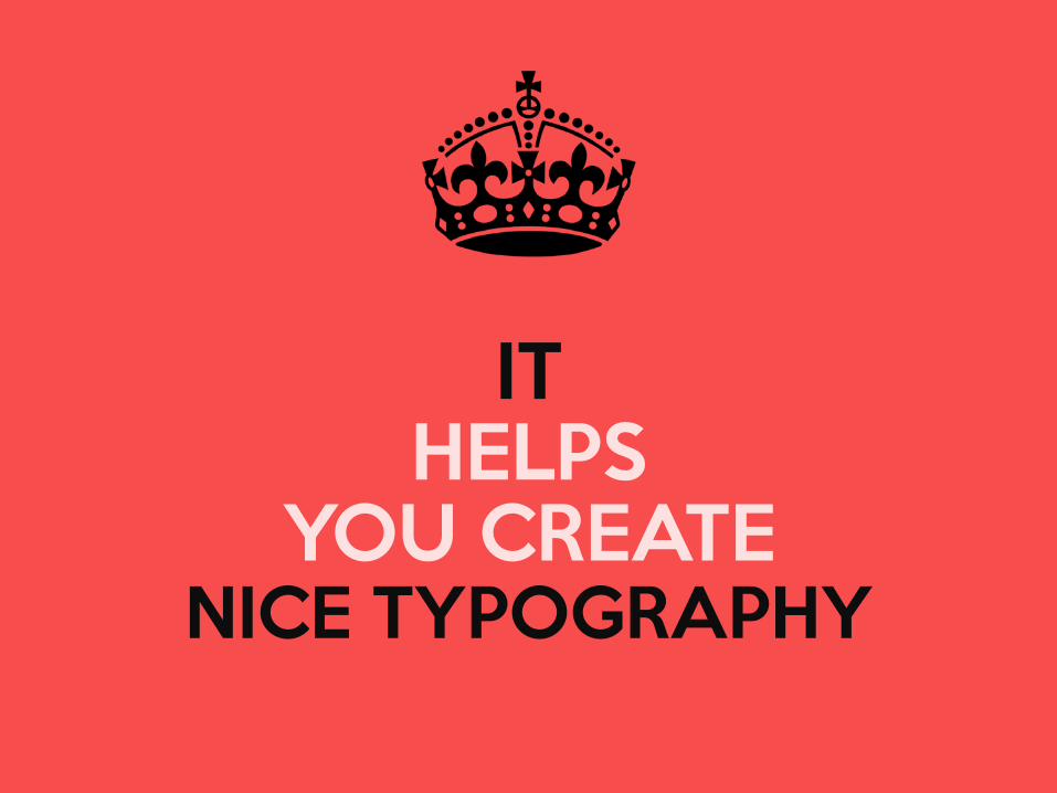
IT HELPS
YOU CREATE NICE TYPOGRAPHY
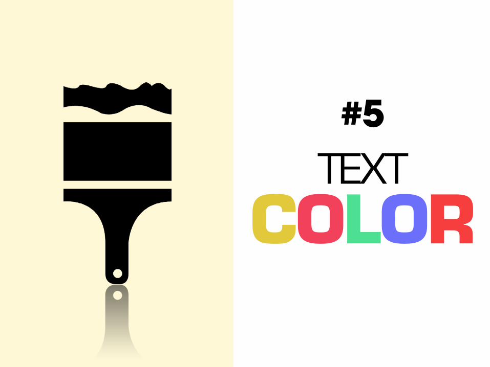
TEXT COLOR
#5
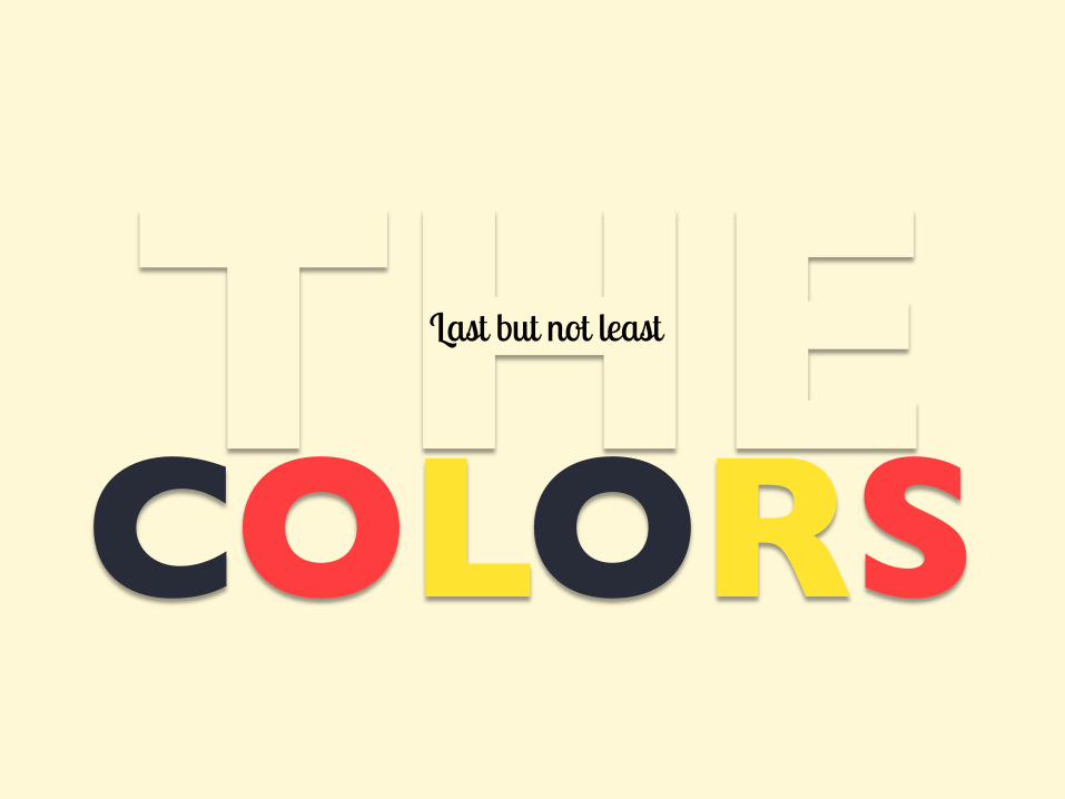
COLORS Last but not least
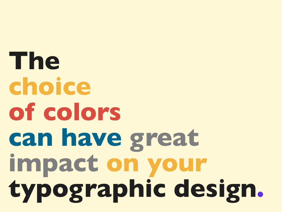
The choice of colors can have great impact on your typographic design.
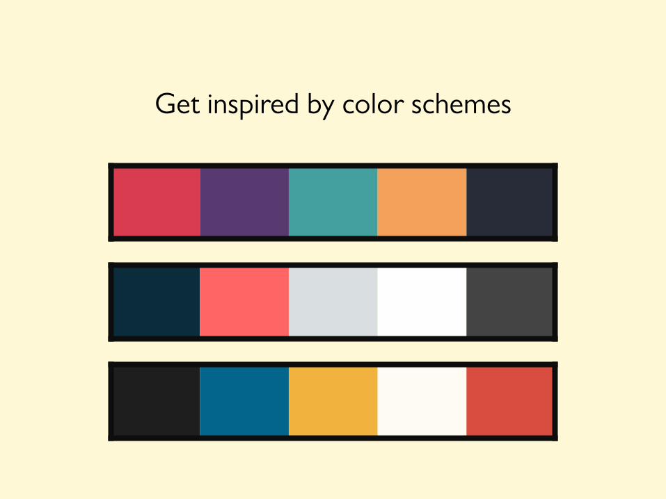
Get inspired by color schemes
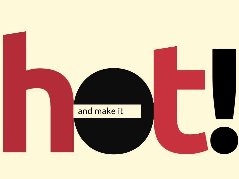
and make it
by Damon Nofar @damonify on twitter
Icons Font icon made by Zurb from Flaticon.com Letter Size icon made by Freepik from Flaticon.com Contrast icon made by Adam Whitcroft from Flaticon.com Paintbrush icon made by Freepik from Flaticon.com Inspiration ”Make it better” Kinetic Typography on YouTube Slides That Rock Resources Flaticon.com Dafont.com (free fonts) Kuler.adobe.com (color palette) Corner Ribbon by Brankic1979