Embed Size (px)
Citation preview

6 MAY 2015AMANDA MAKULECJSI CENTER FOR HEALTH INFORMATION, MONITORING & EVALUATIONPhoto credit: Robin Hammond
TECH CHANGE | TECHNOLOGY FOR MONITORING & EVALUATION
MAKING DATA MEANINGFUL

Amanda MakulecProgram Manager & RME AssociateJohn Snow, Inc.
Passionate about how visualizing data effectively can empower people to make decisions.

Monitoring and evaluation is fundamentally about generating information that can inform decisions.

We want to be purposeful in how we collect and analyze data.

But we also want to be purposeful in how we visualize our data.

Advances in data collection technology enable us to collect data more efficiently than ever before.
Effective visualizations help stakeholders use that information for decisionmaking.

Some people think design means how it looks. But of course,
if you dig deeper, design is how it
works. -Steve Jobs, Apple

meaningful beautiful
Well designed visualizations

An example: PRB World Population Report 2010

PRB World Population Digital Visualizations 2014
Developing data visualizations as part of international development programs presents unique challenges.
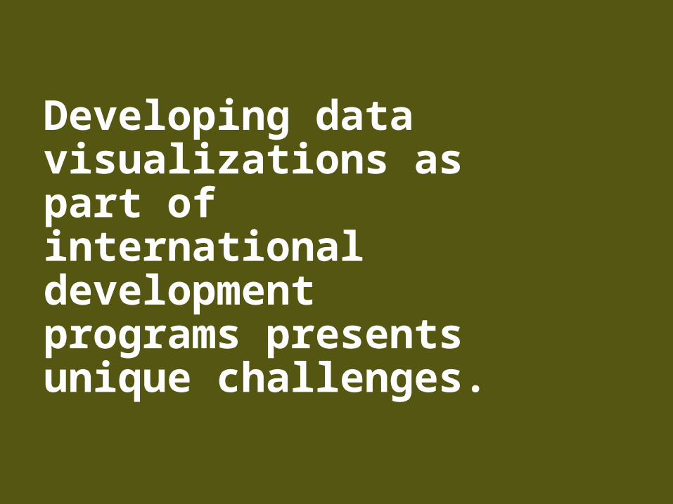
Limited resources mean team members often wear multiple hats.
© Robin Hammond
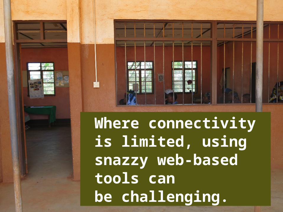
Where connectivity is limited, using snazzy web-based tools can be challenging.

© Robin Hammond
The level of analytical understanding across audiences can vary widely.

And report formats and templates required by donors have not (historically) been heavily visual.
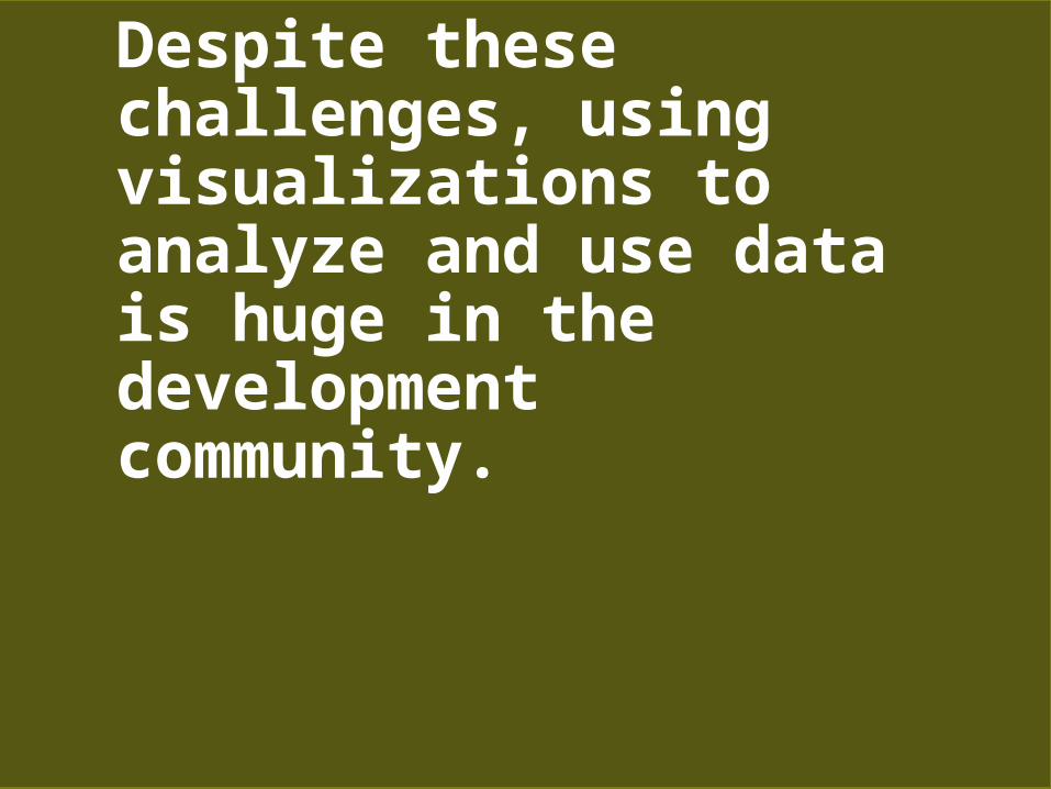
Despite these challenges, using visualizations to analyze and use data is huge in the development community.


There are some simple principles worth considering when designing visualizations in development programs.

1The most useful data visualizations are often designed by a team.

Consider whose expertise would be useful.
M&E Advisor
Graphic Designer
Technical Expert
Communications Expert
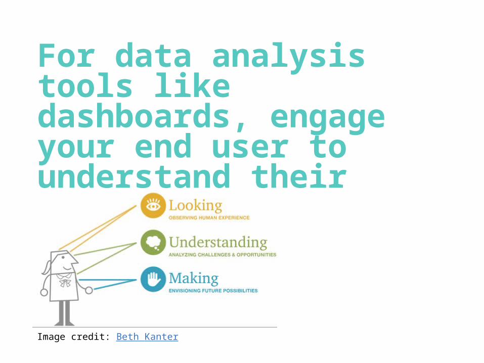
For data analysis tools like dashboards, engage your end user to understand their needs.
Image credit: Beth Kanter

2Be purposeful when identifying the audience for your visualization.

Different stakeholders have different data needs.
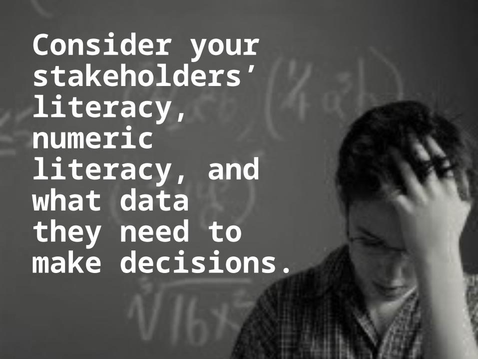
Consider your stakeholders’ literacy, numeric literacy, and what data they need to make decisions.
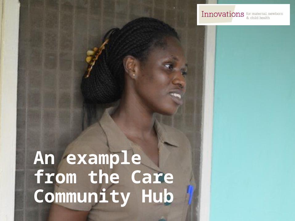
An example from the Care Community Hub

3Identify the story you want to tell & consider additional available data.

Start with the data you’ve collected.
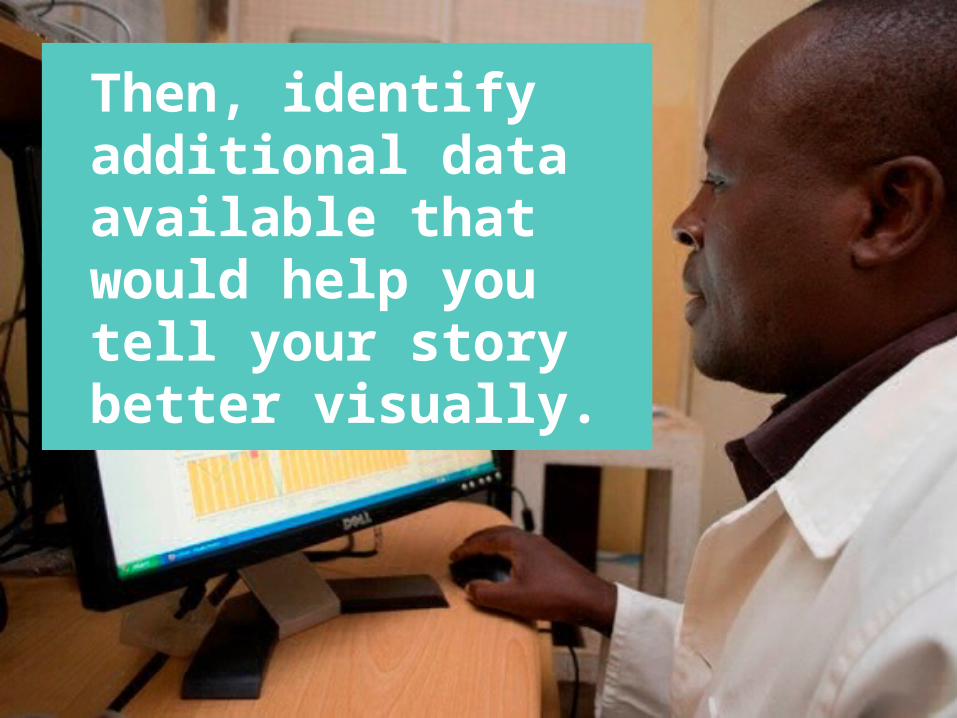
Then, identify additional data available that would help you tell your story better visually.

4Invest time in choosing the right visualization product.
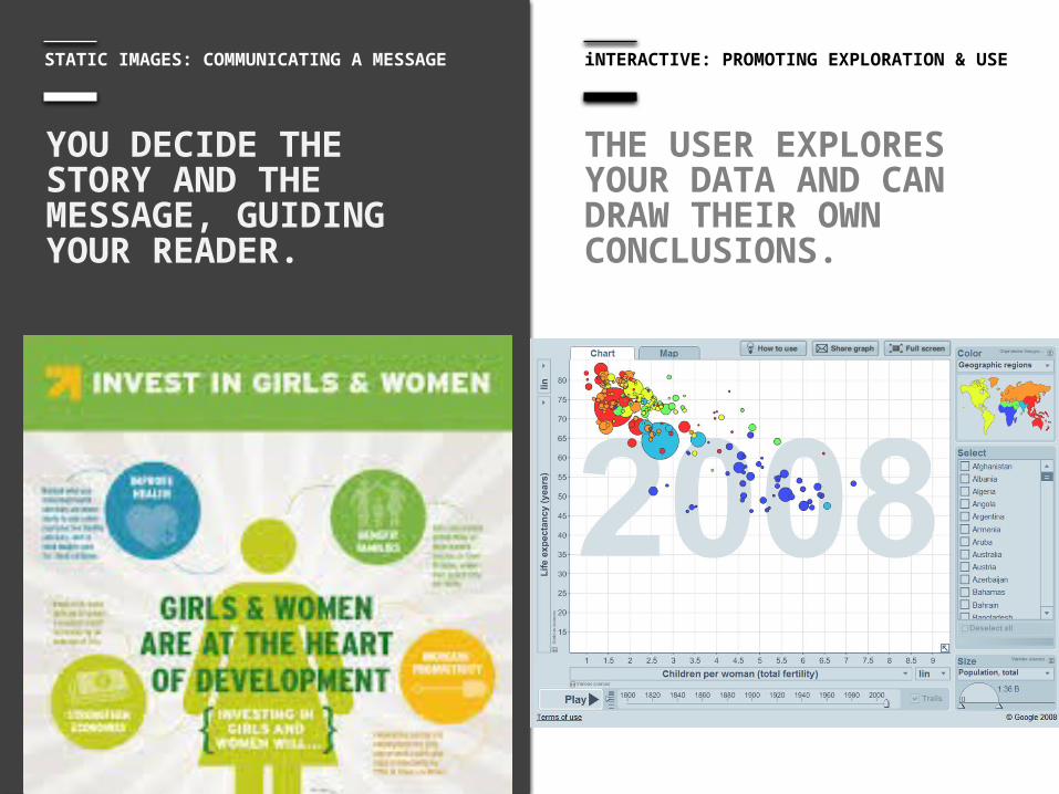
STATIC IMAGES: COMMUNICATING A MESSAGE
THE USER EXPLORES YOUR DATA AND CAN DRAW THEIR OWN CONCLUSIONS.
YOU DECIDE THE STORY AND THE MESSAGE, GUIDING YOUR READER.
iNTERACTIVE: PROMOTING EXPLORATION & USE

CHARTS AND GRAPHS
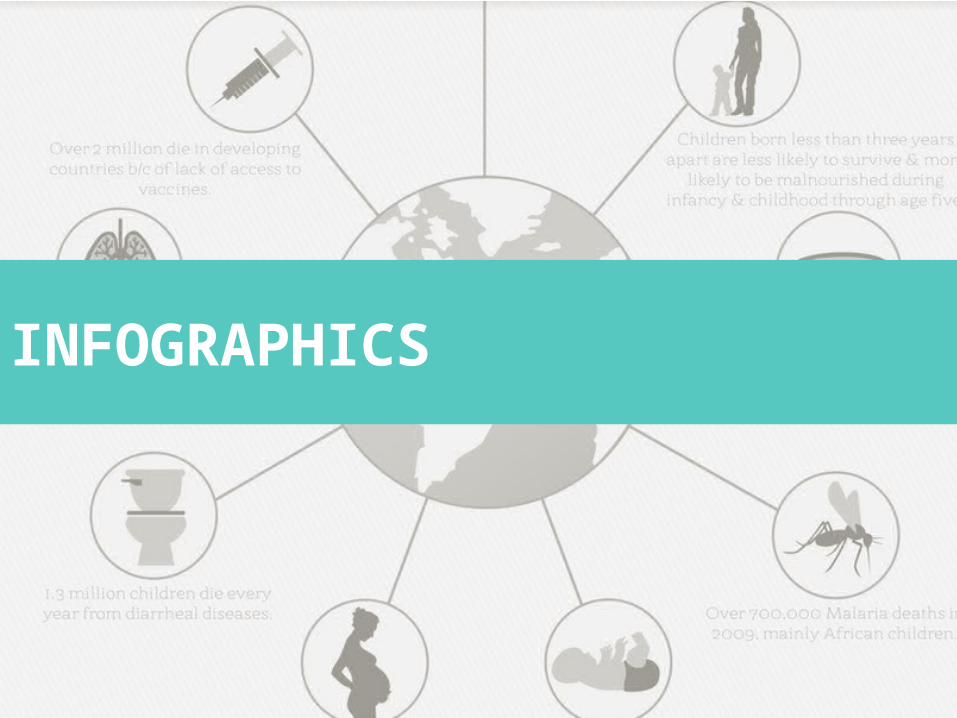
_ infographics
INFOGRAPHICS
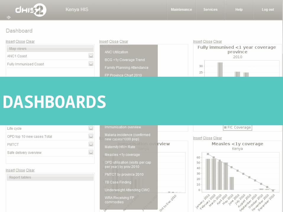
_ dashboards
DASHBOARDS

MAPS
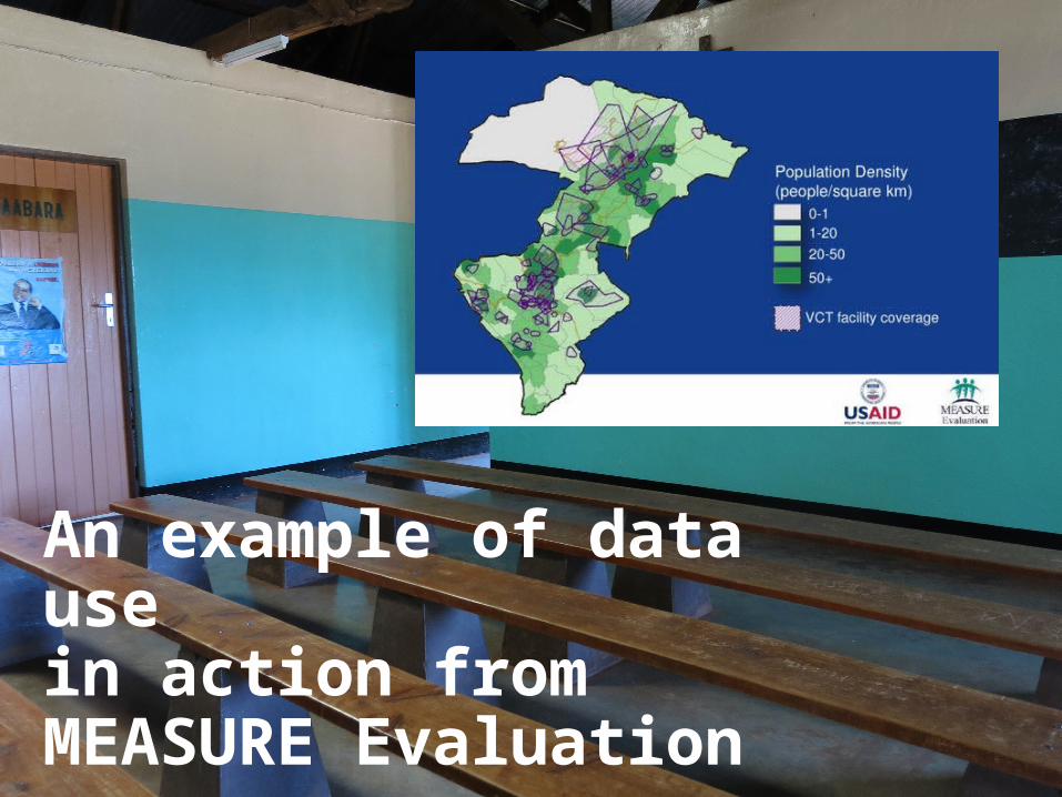
An example of data use in action from MEASURE Evaluation
5Consider access to technology and where you need print materials.

Don’t forget to make sure your beautiful design prints well in black and white though!

6You can build beautiful visualizations with simple tools you already know.

Jumping straight to design tools can get complicated.

Instead, sketching is a great place to start.
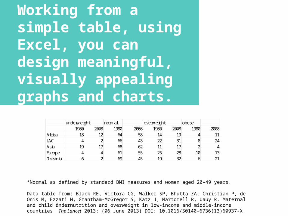
*Normal as defined by standard BMI measures and women aged 20-49 years.
Data table from: Black RE, Victora CG, Walker SP, Bhutta ZA, Christian P, de Onis M, Ezzati M, Grantham-McGregor S, Katz J, Martorell R, Uauy R. Maternal and child undernutrition and overweight in low-income and middle-income countries” The Lancet 2013; (06 June 2013) DOI: 10.1016/S0140-6736(13)60937-X.
underweight normal overweight obese1980 2008 1980 2008 1980 2008 1980 2008
Africa 18 12 64 58 14 19 4 11LAC 4 2 66 43 22 31 8 24Asia 19 17 68 62 11 17 2 4Europe 4 4 61 55 25 28 10 13Oceania 6 2 69 45 19 32 6 21
Working from a simple table, using Excel, you can design meaningful, visually appealing graphs and charts.
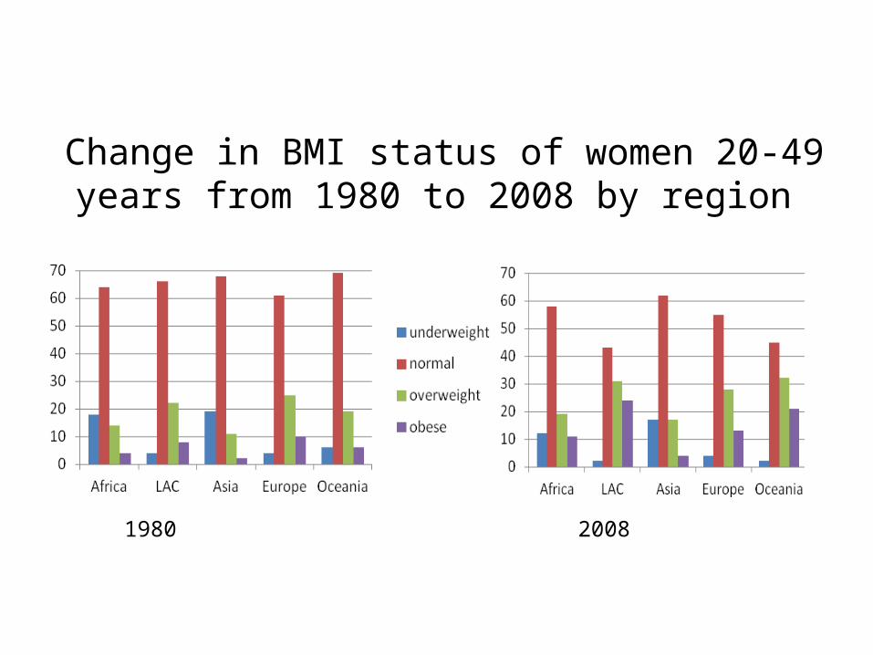
Change in BMI status of women 20-49 years from 1980 to 2008 by region
1980 2008

The proportion of women who are overweight has increased in low and middle income countries.
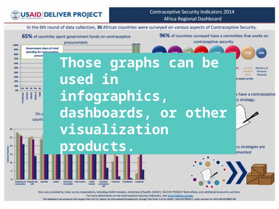
Those graphs can be used in infographics, dashboards, or other visualization products.

Bonus: A few ideas for visualizing qualitative data

The challenge of visualizing qualitative data requires thoughtful consideration of design and layout.

Use icons with key themes to draw attention visually to paragraphs of text.
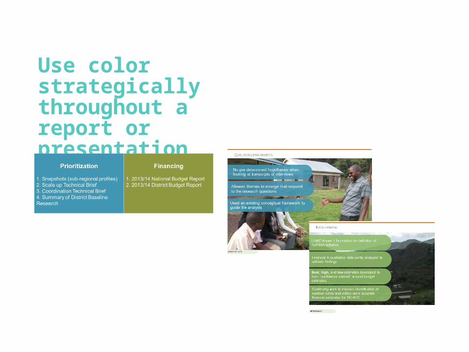
Use color strategically throughout a report or presentation
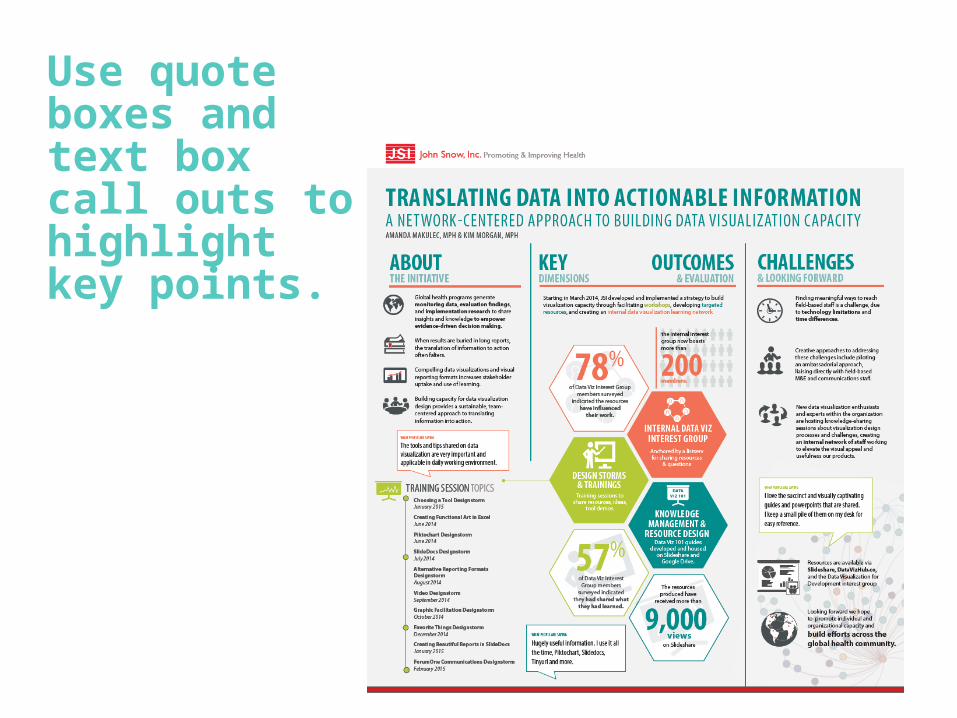
Use quote boxes and text box call outs to highlight key points.
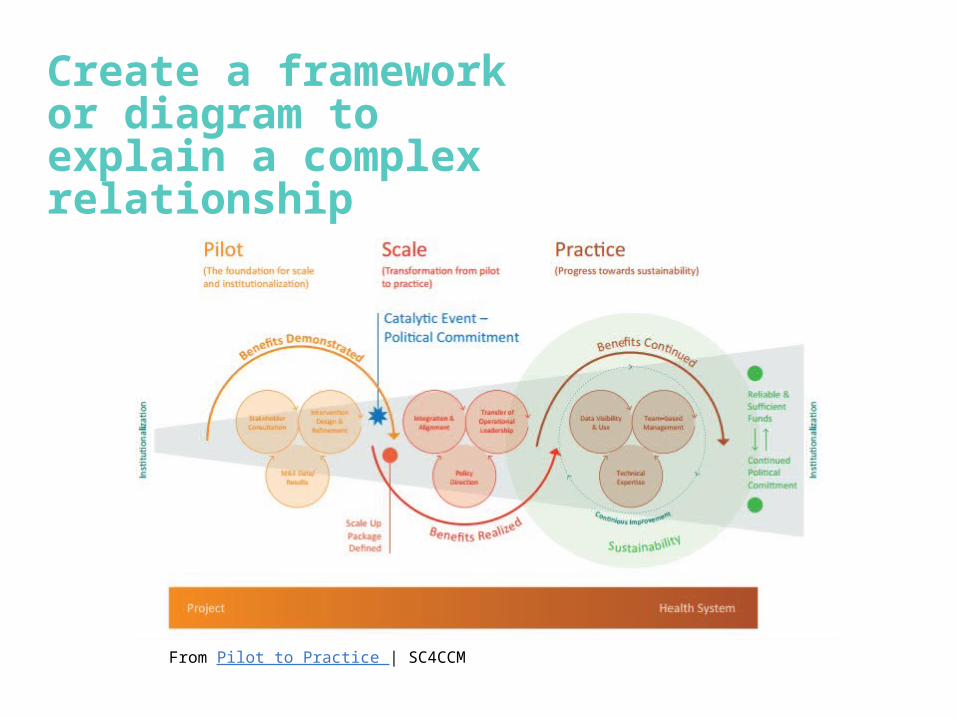
Create a framework or diagram to explain a complex relationship
From Pilot to Practice | SC4CCM

Nov
2013
Dec
Jan 2014
Feb MarApril
May
June
July
Aug
Sept Oct
Nov
Dec
Jan
2015
Feb MarApril
May
June
July
April
Sept Oct
Nov
Baseline data collection
Follow-on data collection starts & is continuous to Nov 2015
Budget data validation(July-Aug)Documentation
of Yr1 initial findings (Aug-Oct)
Yr2 budget data collection; Yr1 information sharing
Yr2 budget data validation
Global dissemination starts
Data collection concludes
District baseline data collection
District data validation
Documentation of Yr1 findings
District follow up period
District information sharing (Jan-Feb)
District budget data validation
Final round of data collection
nati
on
al
dis
tric
t
Develop simple timelines

Or more complex ones

And consider exploring some of the tools available in this space