Embed Size (px)
Citation preview

DELINEATING CANCER GENOMICS
THROUGH DATA VISUALIZATION
Project report submitted
in partial fulfilment of the requirement for the degree of
Bachelor of Design
By
Linu George (111020516)
Rupam Das (11020529)
Under the supervision of
Dr. Prasad Bokil
DEPARTMENT OF DESIGN
INDIAN INSTITUTE OF TECHNOLOGY GUWAHATI
(July 2014 - November 2014)
Approval Sheet
This project report entitled "Delineating cancer genomics through Data Visualization" by Linu
George (11020516) and Rupam Das (11020529) is approved for the degree of Bachelor of
Design.
Examiners
____________________
____________________
____________________
Supervisor(s)
____________________
____________________
____________________
Chairman
____________________
Date: 10th November, 2014
Place: IIT Guwahati

ii
Declaration
We declare that this written submission represents our ideas in our own words and where others'
ideas or words have been included, we have adequately cited and referenced the original. We
also declare that we have adhered to all principles of academic honesty and integrity and have
not misrepresented or fabricated or falsified any idea/data/fact/source in our submission. We
understand that any violation of the above will be cause for disciplinary action by the institute
and can also evoke penal action from the sources which have thus not been properly cited or
from whom proper permission has not been taken when needed.
______________________ __________________
Linu George Rupam Das
11020506 11020529
Date: 10th November, 2014
iii
Certificate
It is certified that the work contained in the project report titled " Delineating cancer genomics
through Data Visualization " by Linu George (11020506) and Rupam Das (11020529), has been
carried out under my supervision and that this work has not been submitted elsewhere for a
degree.
________________________________
Dr Prasad Bokil
Asst. Professor
Department of Design
Indian Institute of Technology
Novemeber, 2014

iv
Acknowledgement
First and foremost, we are extremely thankful to our project supervisor Dr Prasad Bokil for his
invaluable support and guidance which made our project work productive, stimulating and
enjoyable. We feel honoured to have worked with him, and owe a great debt of gratitude for
his patience and inspiration.
We are grateful to the Department of Design, IIT Guwahati, for providing us with a rich learning
and working environment, without which many of our ideas probably would have not come to
fruition.
Last, but never the least, we would like to thank our family members who have been a constant
source of motivation for everything good that we have attempted to do so far in life.
______________________ _____________________
Linu George Rupam Das
11020516 11020529
v
ABSTRACT
In spite in advances in technologies for working with data, people spend undue amount of time
in understanding the data and manipulating it into holistic visualization. Data visualization
software for complex dataset such as in cancer genomics (which we have taken as case study)
are not able to provide effective visualization for the users. Identification and characterization
of cancer detection are important areas of research that are based on the integrated analysis of
multiple heterogeneous genomics datasets. In this report, we review the key issues and
challenges associated with cancer genomics through exploration of data visualization
techniques, interactions and methods, which will in-turn advance the state of the art.

1. INTRODUCTION
Data visualization is a concept that is used for the representation of raw and crude form of
information in visual form which helps the user to perceive as well as understand the given
scenario. We proceeded with a very basic of the topic and tried to explore each and every
possibilities of the domain of visualization. As we were going through the references and
sources of our project we found out there is lack of coherence between the data that being
presented and the data that is being showcased. The raw cancer data that has been provided to
us was in a much disorganized manner, which made it very tough to decipher meaningful
visualization out of that datasets.
The advent of high-throughput technologies have given rise to fruitful research on large-scale
genomic data analysis. Since genomic data is usually very large and complex, visualization
tools are always essential for data examination and interpretation [12]. As we know that the
amount of bio-medical data available on the Web grows exponentially with time. The resulting
large volume of data makes manual exploration very tedious. Moreover, the velocity at which
this data changes and the variety of formats in which bio-medical data is published and
documented in the Web makes it difficult to access them in an integrated form. Finally, the lack
of an integrated vocabulary makes querying more difficult [13].
The data is the key component of the visualization and it plays a large role in determining the
effectiveness of the visualization tool. This large set of unorganized clattered data lead to
accumulation of huge chunk of information which should be dealt with the elegant techniques
of visual graphics and visualization. This can help in comprehension of huge amounts of data
into a well-organized form by inducing the user to think about the data and encourage the eye
to compare different pieces of data.
To overcome this problem we went through many of the resources that are already there for
these researches and found out similarities and dissimilarities, which led to the documentation
of large set of trends and possibilities which has been documented in our later chapters.
1.1 Objectives of the project
1. To find out the recent trends in the domain of data visualization.
2. Use these knowledge to brainstorm various possibilities in the domain of cancer.
3. Explore new visualization mediums to depict the same information.
2
4. Generate concept low fidelity prototypes for that cancer data set.
5. Explain the scope of work that can be done in later stages.
1.2 Need of data visualization
Visualization is the graphical presentation of information, with the goal of providing the viewer
with a qualitative understanding of the information contents. It is also the process of
transforming objects, concepts, and numbers into a form that is visible to the human eyes. When
we say “information”, we may refer to data, processes, relations, or concepts.
It’s also about understanding ratios and relationships among numbers. Not about understanding
individual numbers, but about understanding the patterns, trends, and relationships that exist in
groups of numbers.
To see and understand pictures is one of the natural instincts of human, and to understand
numerical data it takes years’ worth of training from schools, and even so, a lot of people are
still not good with numerical data. Data visualization shifts the load from numerical reasoning
to visual reasoning. Getting information from pictures is far more time-saving than looking
through text and numbers – that’s why many decision makers would rather have information
presented to them in graphical form, as opposed to a written or textual form [1].
As we go through various forms of visualization we also discovered that data visualization is
not scientific visualization. Scientific visualization uses animation, simulation, and
sophisticated computer graphics to create visual models of structures and processed that cannot
otherwise be seen, or seen in sufficient detail [1].
While data visualization is a way of communicating and presenting the display presentation of
the given set of data is a way that helps to minimize the cognitive load of that human who is
trying to understand data. The cognitive mind of the humans always tries to create pattern and
way out to appropriately recognize, interpret, select and associate the right kind data in a short
period of time from the given dataset.
2. LITERATURE REVIEW
2.1 Data visualisation: An overview
3
• In spite of advances in technologies for working with data, analysts still spend an
inordinate amount of time
• The diagnosing data quality issues and manipulating data into a usable form.
• This process of ‘data wrangling’ often constitutes the most tedious and time-consuming
aspect of analysis.
• Though data cleaning and integration are longstanding issues in the database
community, relatively little research has explored how interactive visualization can
advance the state of the art.
• Data visualization is a quite new and promising field in computer science and uses
computer graphic effects to reveal the patterns, trends, relationships out of datasets.
2.2 Background
The history of visualization was shaped to some extent by available technology and by the
pressing needs of the time, they include: primitive paintings on clays, maps on walls,
photographs, table of numbers (with rows and columns concepts), these are all some kind of
data visualization – although we may not call them under this name at that time. These
eventually led to new opportunities for the analysis and communication of data using
visualization. The current scenario is very encouraging which helps us to use and practice
various possibilities of desktop screens, mouse, and keyboard-based systems that are making
them increasingly attractive [2]. Talking about graphics, we should remind what is called
graphical entities and attributes. They are the following variables which decides what data
should be categorize to which part [1]:
Entity: point, line(curve), polyline, glyph, surface, solid, image, text
Attribute: color/intensity, location, style, size, relative position/motion
Numeric, symbolic (or mix): 123, or @
Scalar, vector, or complex structure:
Various units: meters, inch.
Discrete or continuous: 1, 2, 3, or p

4
Spatial, quantity, category, temporal, relational, structural
Accurate or approximate
Dense or space
Ordered or non-ordered
Disjoint or overlapping
Binary, enumerated, multilevel
Independent or dependent
Multidimensional, etc.
We consider the data is properly visualized, if the visualization is [6]:
Effective: viewers can interpret it easily.
Accurate: sufficient for correct quantitative evaluation.
Aesthetics: must not offend viewer's senses
Adaptable: can adjust to serve multiple needs
2.3 Data visualization: A Case Study
Ranjit Kumar is a Senior Biologist in SAP Labs with a PhD degree in Bioinformatics
Engineering. He is 32 years old and Married with two children. His is focused, goal-oriented
person with very good concept understanding skills.
One of his concerns is analysis and collection of legible data from the information provided to
them in the software. He spends time by performing experimental tests for proper functioning
of data visualizing platform. He also helps in reviewing and testing of the built software, along
with doing literature review and compiling of prerequisite of the software. While doing the full
length reviews of the software that he uses he often faces the problem of data inconsistencies
which makes it rather inconvenient and tedious for him to manipulate and integrate all the data
into one common data model. As we all know that cancer data is very huge and can be of
enormous size, one can’t expect a data scientist to wrangle all the data on his own and make
amends on the data. During the use of the existing software there can be time where he can have
an error in judgment which may result to resetting all the previous data and come again from
the start.
5
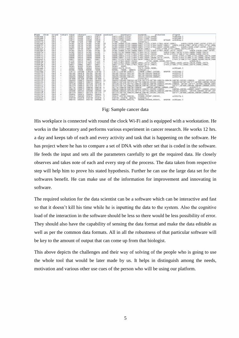
Fig: Sample cancer data
His workplace is connected with round the clock Wi-Fi and is equipped with a workstation. He
works in the laboratory and performs various experiment in cancer research. He works 12 hrs.
a day and keeps tab of each and every activity and task that is happening on the software. He
has project where he has to compare a set of DNA with other set that is coded in the software.
He feeds the input and sets all the parameters carefully to get the required data. He closely
observes and takes note of each and every step of the process. The data taken from respective
step will help him to prove his stated hypothesis. Further he can use the large data set for the
softwares benefit. He can make use of the information for improvement and innovating in
software.
The required solution for the data scientist can be a software which can be interactive and fast
so that it doesn’t kill his time while he is inputting the data to the system. Also the cognitive
load of the interaction in the software should be less so there would be less possibility of error.
They should also have the capability of sensing the data format and make the data editable as
well as per the common data formats. All in all the robustness of that particular software will
be key to the amount of output that can come up from that biologist.
This above depicts the challenges and their way of solving of the people who is going to use
the whole tool that would be later made by us. It helps in distinguish among the needs,
motivation and various other use cues of the person who will be using our platform.
6
2.4 Brief history of data visualization
Statistical graphics and data visualization is a relatively modern developments in statistics with
graphic portrayal of quantitative information has been going on from the beginning. Map-
making and visual depiction were very much done during the early 17th centuries when the first
roots of data visualization was sowed. With that thematic cartography, statistics and statistical
graphics, with applications and innovations in many fields of medicine and science that are
often intertwined with each other came up along the way in this brief history of visualized data.
Nowadays variety of advancements contributed to the widespread use of data visualization
which resulted in technologies for drawing and reproducing images, advances in mathematics
and statistics, and new developments in data collection, empirical observation and recording.
Pre-17th Century: Early maps and diagrams
The earliest seeds of visualization arose in geometric diagrams, in tables of the positions of
stars and other celestial bodies, and in the making of maps to aid in navigation and
exploration. The idea of coordinates was used by ancient Egyptian surveyors in laying out
towns, earthly and heavenly positions were located by something akin to latitude and
longitude at least by 200 BC, and the map projection of a spherical earth into latitude and
longitude by Claudius Ptolemy [c. 85–c. 165] in Alexandria would serve as reference
standards until the 14th century [3].
1600-1699: Measurement and theory
During the 17th century the problems were concerned with physical measurement— of time,
distance, and space— for astronomy, surveying, map making, navigation and territorial
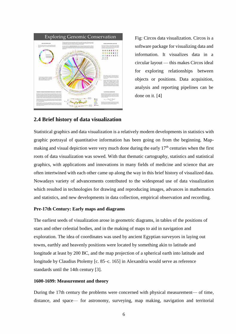
Fig: Circos data visualization. Circos is a
software package for visualizing data and
information. It visualizes data in a
circular layout — this makes Circos ideal
for exploring relationships between
objects or positions. Data acquisition,
analysis and reporting pipelines can be
done on it. [4]
7
expansion. In this century we also saw great new growth in theory and growth of practical
application— the rise of analytic geometry and coordinate systems and various other system
and theories of errors of measurement and estimation. It also saw the birth of probability theory
and the beginning of demographic statistics which includes the study of population, land, taxes,
value of goods, etc. for the purpose of understanding the wealth of the state.
1700-1799: New graphic forms
With the increased interest and importance of data, and the idea of graphic representation
established, the 18th century witnessed the expansion of these aspects to new domains and new
graphic forms. In cartography, map-makers began to try to show more than just geographical
position on a map. As a result, new data representations were invented, and thematic mapping
of physical quantities took root. Towards the end of this century, the first attempts at the
thematic mapping of geologic, economic, and medical data were being made [3]. During that
time only there were widespread use of abstract graphs, and graphs of functions with the help
of statistical theory (measurement error) and systematic collection of empirical data.
1800-1850: Beginnings of modern graphics
With the advent of previous innovation on design and techniques of statistical graphics and
thematic mapping was becoming more and more popular. In statistical graphics, all of the
modern forms of data display were invented: bar and pie charts, histograms, line graphs and
time-series plots, contour plots, scatterplots came up during that time. In the same way the
thematic cartography led to mapping progressed from single maps to comprehensive atlases,
depicting data on a wide variety of topics and also introduced a wide range of novel forms of
symbolism. During this period graphical analysis of natural and physical phenomena (lines of
magnetism, weather, tides, etc.) began to appear regularly in scientific publications as well [3].
1850–1900: The Golden Age of statistical graphics
By the mid1800s the whole of Europe woke up on the call of rapid growth of visualization and
data graphics. This led to establishment of state statistical offices were established throughout
the region in recognition of the growing importance of numerical information for social
planning, industrialization, commerce, and transportation.
8
2.5 State of the Art
There is various software in the internet from where you can download and make use of that to
create your visualization by just inputting the required data. They can be listed as follows:
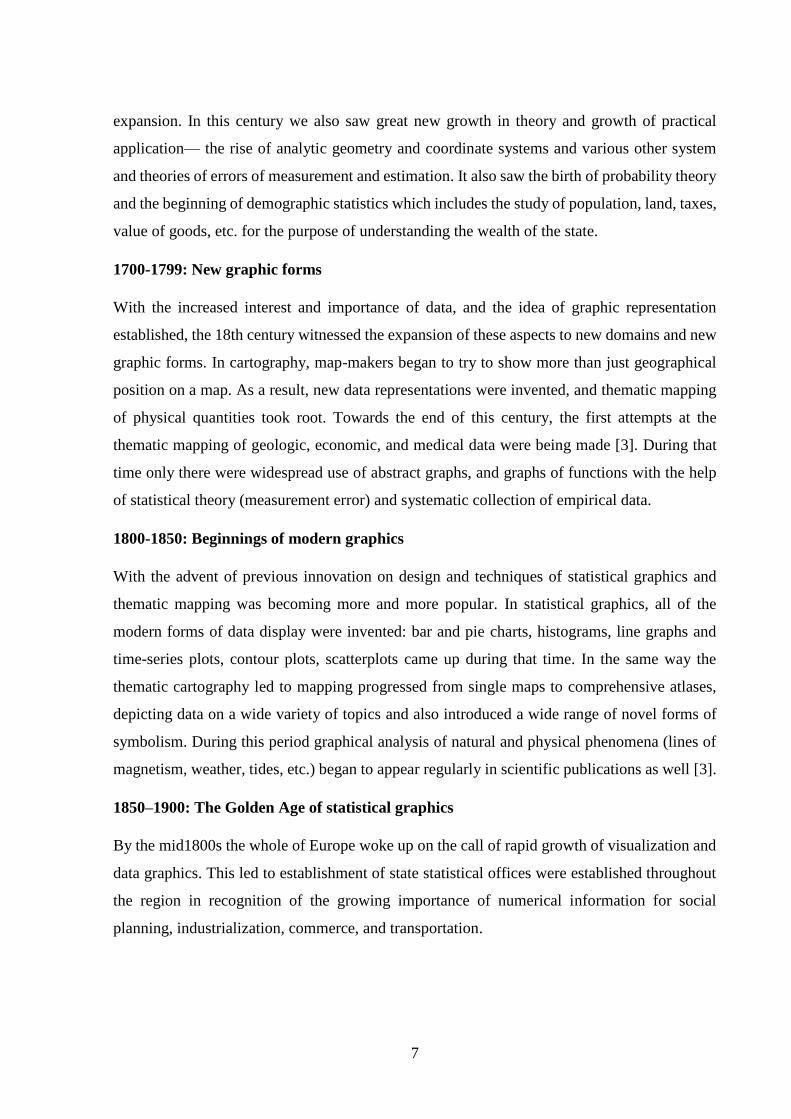
Visual.ly
It has combined gallery and infographic generation tool. It offers a simple toolset for building
data representations, as well as a platform to share your creations. This goes beyond pure data
visualisation, but if you want to create something that stands on its own.
Fig 17: A Visual.ly chart
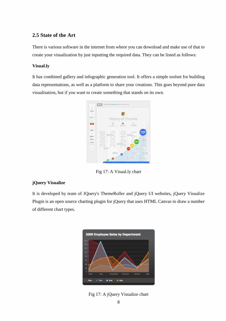
jQuery Visualize
It is developed by team of JQuery's ThemeRoller and jQuery UI websites, jQuery Visualize
Plugin is an open source charting plugin for jQuery that uses HTML Canvas to draw a number
of different chart types.
Fig 17: A jQuery Visualize chart
9
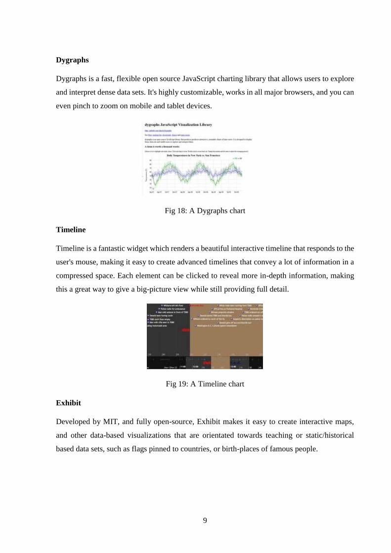
Dygraphs
Dygraphs is a fast, flexible open source JavaScript charting library that allows users to explore
and interpret dense data sets. It's highly customizable, works in all major browsers, and you can
even pinch to zoom on mobile and tablet devices.
Fig 18: A Dygraphs chart
Timeline
Timeline is a fantastic widget which renders a beautiful interactive timeline that responds to the
user's mouse, making it easy to create advanced timelines that convey a lot of information in a
compressed space. Each element can be clicked to reveal more in-depth information, making
this a great way to give a big-picture view while still providing full detail.
Fig 19: A Timeline chart
Exhibit
Developed by MIT, and fully open-source, Exhibit makes it easy to create interactive maps,
and other data-based visualizations that are orientated towards teaching or static/historical
based data sets, such as flags pinned to countries, or birth-places of famous people.
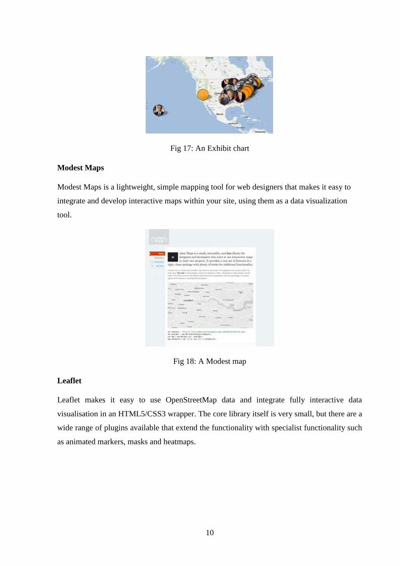
10
Fig 17: An Exhibit chart
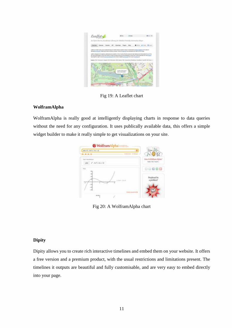
Modest Maps
Modest Maps is a lightweight, simple mapping tool for web designers that makes it easy to
integrate and develop interactive maps within your site, using them as a data visualization
tool.
Fig 18: A Modest map
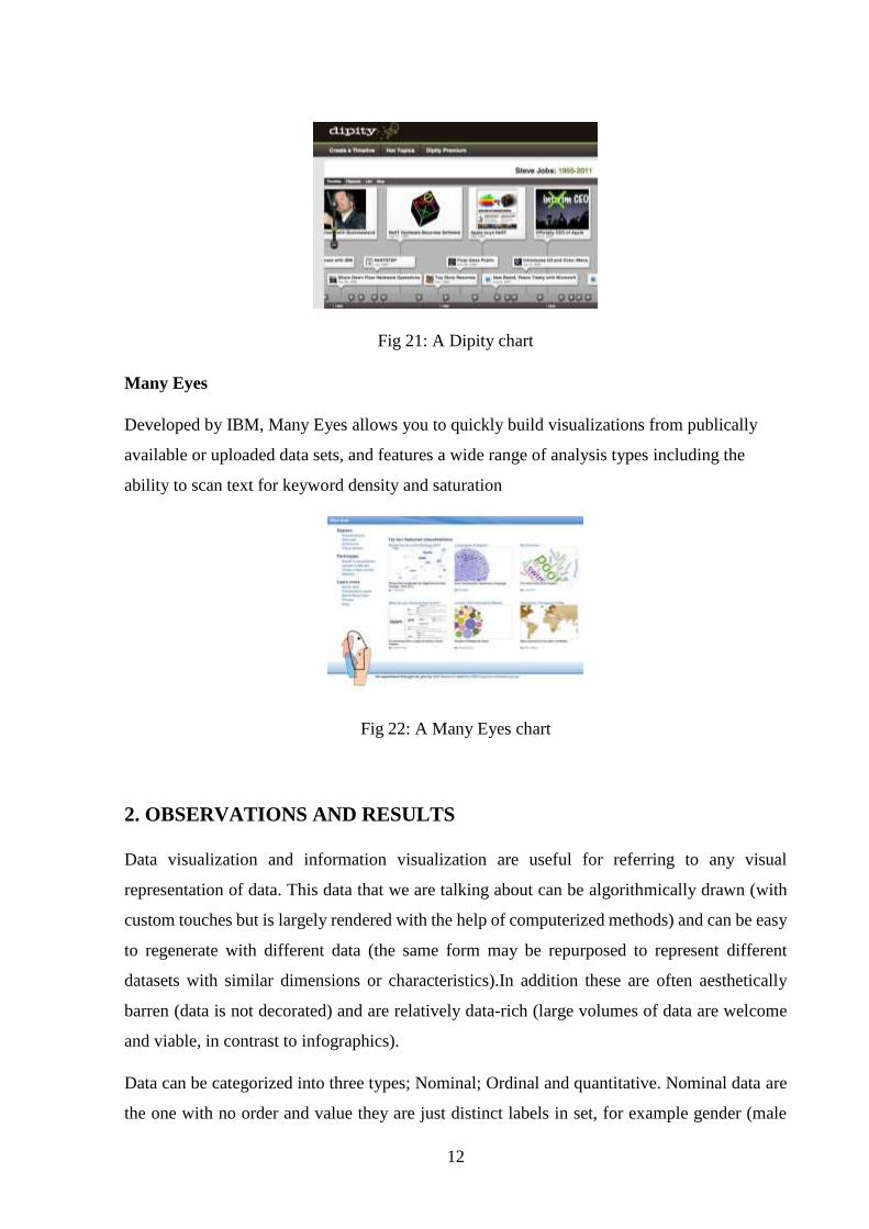
Leaflet
Leaflet makes it easy to use OpenStreetMap data and integrate fully interactive data
visualisation in an HTML5/CSS3 wrapper. The core library itself is very small, but there are a
wide range of plugins available that extend the functionality with specialist functionality such
as animated markers, masks and heatmaps.
11
Fig 19: A Leaflet chart
WolframAlpha
WolframAlpha is really good at intelligently displaying charts in response to data queries
without the need for any configuration. It uses publically available data, this offers a simple
widget builder to make it really simple to get visualizations on your site.
Fig 20: A WolframAlpha chart
Dipity
Dipity allows you to create rich interactive timelines and embed them on your website. It offers
a free version and a premium product, with the usual restrictions and limitations present. The
timelines it outputs are beautiful and fully customisable, and are very easy to embed directly
into your page.
12
Fig 21: A Dipity chart
Many Eyes
Developed by IBM, Many Eyes allows you to quickly build visualizations from publically
available or uploaded data sets, and features a wide range of analysis types including the
ability to scan text for keyword density and saturation
Fig 22: A Many Eyes chart
2. OBSERVATIONS AND RESULTS
Data visualization and information visualization are useful for referring to any visual
representation of data. This data that we are talking about can be algorithmically drawn (with
custom touches but is largely rendered with the help of computerized methods) and can be easy
to regenerate with different data (the same form may be repurposed to represent different
datasets with similar dimensions or characteristics).In addition these are often aesthetically
barren (data is not decorated) and are relatively data-rich (large volumes of data are welcome
and viable, in contrast to infographics).
Data can be categorized into three types; Nominal; Ordinal and quantitative. Nominal data are
the one with no order and value they are just distinct labels in set, for example gender (male

13
and female). Ordinal are data which may or mayn’t have value but they occur in a definite
order/sequence or pattern, for example days of a week (mon-sun). And lastly quantitative data
are the one with no order or patterns but have only its numerical value with them, for example
physical measurements like temperature.
As we go on further into the depth of data visualization, according to B. Shneiderman data can
be divided into various information taxonomy like as follows:
1D linear data: Sequences of some other data element (characters, numbers, documents,
words, etc.)
2D map data: Data with a genuine sense of “area,” such as maps, floor plans, and layouts
3D world data: Data that has “volume,” typically real world objects and structures; the
third dimension adds new challenges regarding navigation and rendering.
Multidimensional data: Data with more than 3 dimensions, such as relational or
statistical databases where attributes can be thought of as axes in an n-dimensional
space; typically uses multiple “layers” of 2D or 3D views like Fisher’s Iris data set [14].
Temporal data: A special case of 1D linear data, where the sequence of elements is
based on time; having start and end times influences the visualization approach
Tree data: Data with a hierarchical, recursive structure, with elements (except the root)
having exactly one parent; visualization approaches include outlines, 3D views, and
space-filling treemaps like Linnean taxonomies [15], phylogenies[16].
Network data: Any graph-structured data, presenting challenges in terms of layout and
traversal; going domain specific may help refine visualization choices like metabolic
pathways.
Data Visualization Techniques
Choropleth map
It is a thematic map in which areas are shaded or patterned in proportion to the measurement of
the statistical variable being displayed on the map, such as population density or per-capita
income. The choropleth map provides an easy way to visualize how a measurement varies
across a geographic area or it shows the level of variability within a region. When mapping
quantitative data, a specific colour progression is used to depict the data. Generally, single-hue
progressions fade from a dark shade of the chosen colour to a very light or white shade of
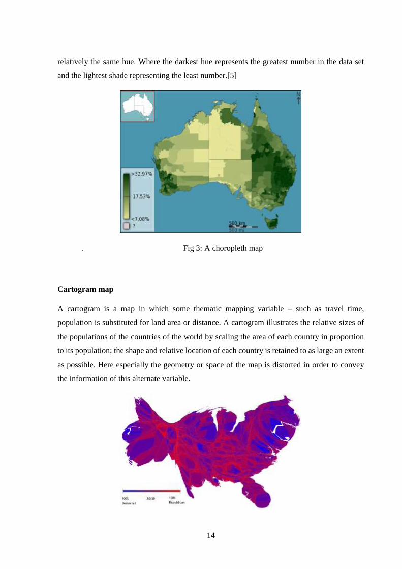
14
relatively the same hue. Where the darkest hue represents the greatest number in the data set
and the lightest shade representing the least number.[5]
. Fig 3: A choropleth map
Cartogram map
A cartogram is a map in which some thematic mapping variable – such as travel time,
population is substituted for land area or distance. A cartogram illustrates the relative sizes of
the populations of the countries of the world by scaling the area of each country in proportion
to its population; the shape and relative location of each country is retained to as large an extent
as possible. Here especially the geometry or space of the map is distorted in order to convey
the information of this alternate variable.
15
Fig 4: Area cartogram of the United States
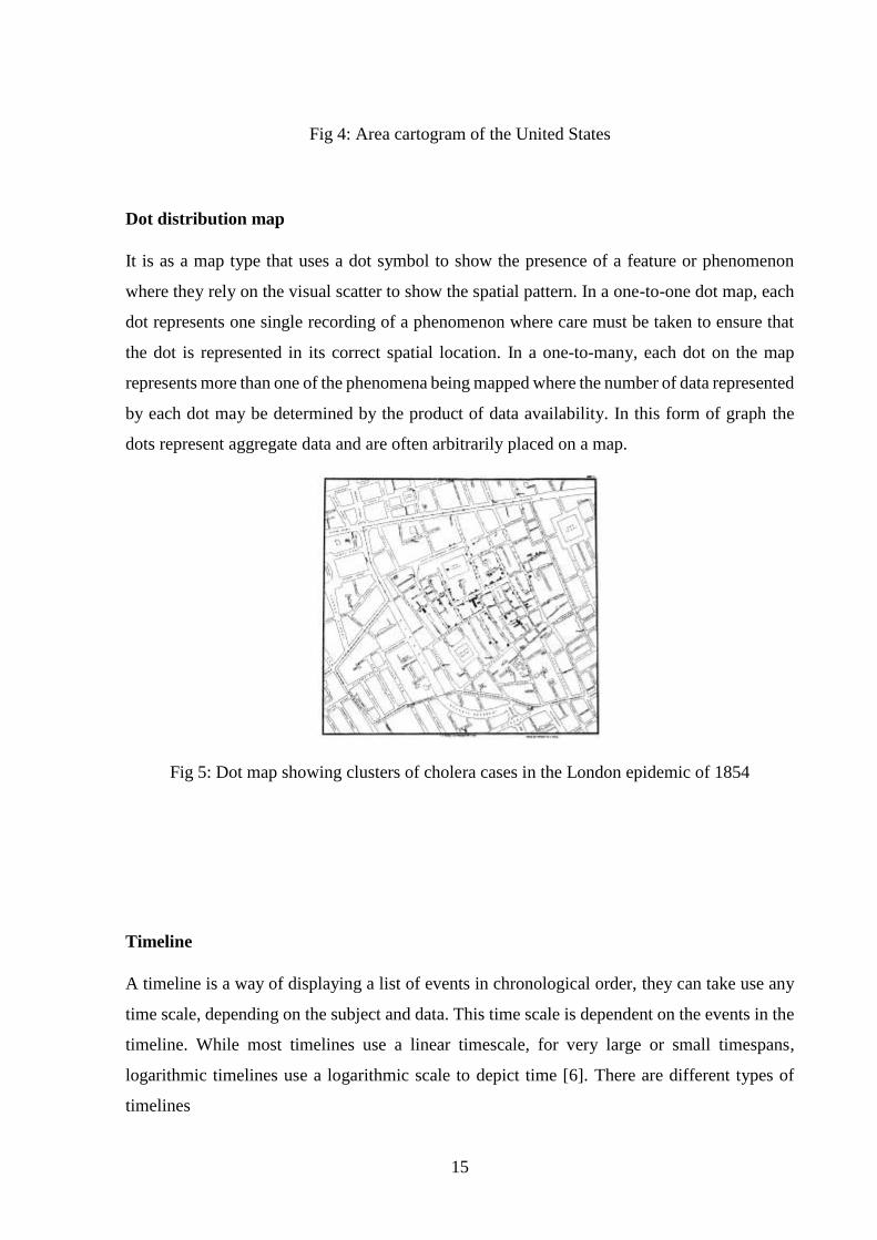
Dot distribution map
It is as a map type that uses a dot symbol to show the presence of a feature or phenomenon
where they rely on the visual scatter to show the spatial pattern. In a one-to-one dot map, each
dot represents one single recording of a phenomenon where care must be taken to ensure that
the dot is represented in its correct spatial location. In a one-to-many, each dot on the map
represents more than one of the phenomena being mapped where the number of data represented
by each dot may be determined by the product of data availability. In this form of graph the
dots represent aggregate data and are often arbitrarily placed on a map.
Fig 5: Dot map showing clusters of cholera cases in the London epidemic of 1854
Timeline
A timeline is a way of displaying a list of events in chronological order, they can take use any
time scale, depending on the subject and data. This time scale is dependent on the events in the
timeline. While most timelines use a linear timescale, for very large or small timespans,
logarithmic timelines use a logarithmic scale to depict time [6]. There are different types of
timelines
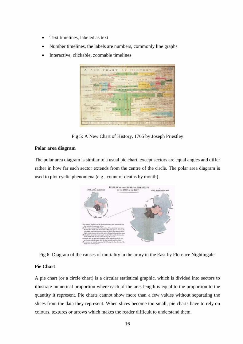
16
Text timelines, labeled as text
Number timelines, the labels are numbers, commonly line graphs
Interactive, clickable, zoomable timelines
Fig 5: A New Chart of History, 1765 by Joseph Priestley
Polar area diagram
The polar area diagram is similar to a usual pie chart, except sectors are equal angles and differ
rather in how far each sector extends from the centre of the circle. The polar area diagram is
used to plot cyclic phenomena (e.g., count of deaths by month).
Fig 6: Diagram of the causes of mortality in the army in the East by Florence Nightingale.
Pie Chart
A pie chart (or a circle chart) is a circular statistical graphic, which is divided into sectors to
illustrate numerical proportion where each of the arcs length is equal to the proportion to the
quantity it represent. Pie charts cannot show more than a few values without separating the
slices from the data they represent. When slices become too small, pie charts have to rely on
colours, textures or arrows which makes the reader difficult to understand them.
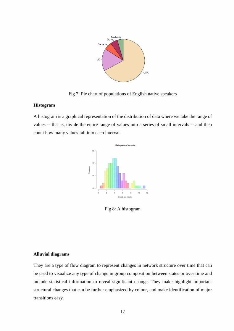
17
Fig 7: Pie chart of populations of English native speakers
Histogram
A histogram is a graphical representation of the distribution of data where we take the range of
values -- that is, divide the entire range of values into a series of small intervals -- and then
count how many values fall into each interval.
Fig 8: A histogram
Alluvial diagrams
They are a type of flow diagram to represent changes in network structure over time that can
be used to visualize any type of change in group composition between states or over time and
include statistical information to reveal significant change. They make highlight important
structural changes that can be further emphasized by colour, and make identification of major
transitions easy.
18
Fig 9: Diagram illustrates how the scientific study on neuroscience.
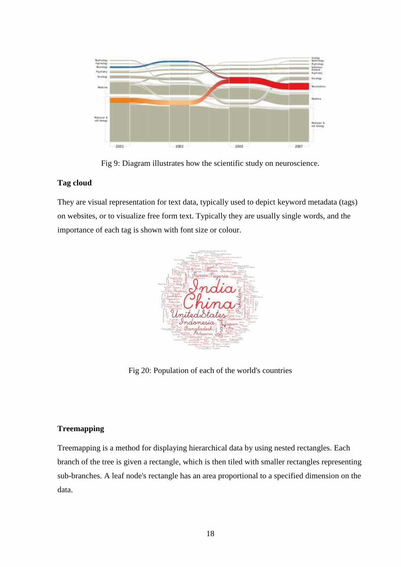
Tag cloud
They are visual representation for text data, typically used to depict keyword metadata (tags)
on websites, or to visualize free form text. Typically they are usually single words, and the
importance of each tag is shown with font size or colour.
Fig 20: Population of each of the world's countries
Treemapping
Treemapping is a method for displaying hierarchical data by using nested rectangles. Each
branch of the tree is given a rectangle, which is then tiled with smaller rectangles representing
sub-branches. A leaf node's rectangle has an area proportional to a specified dimension on the
data.
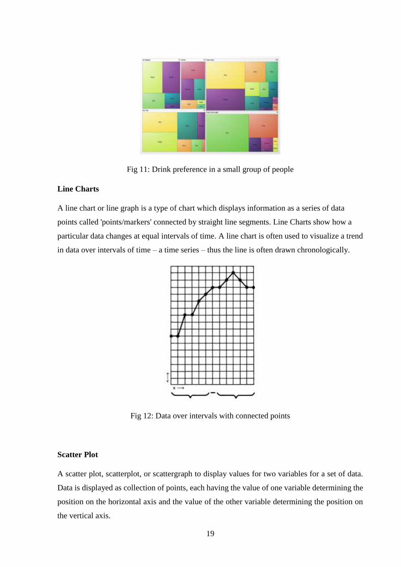
19
Fig 11: Drink preference in a small group of people
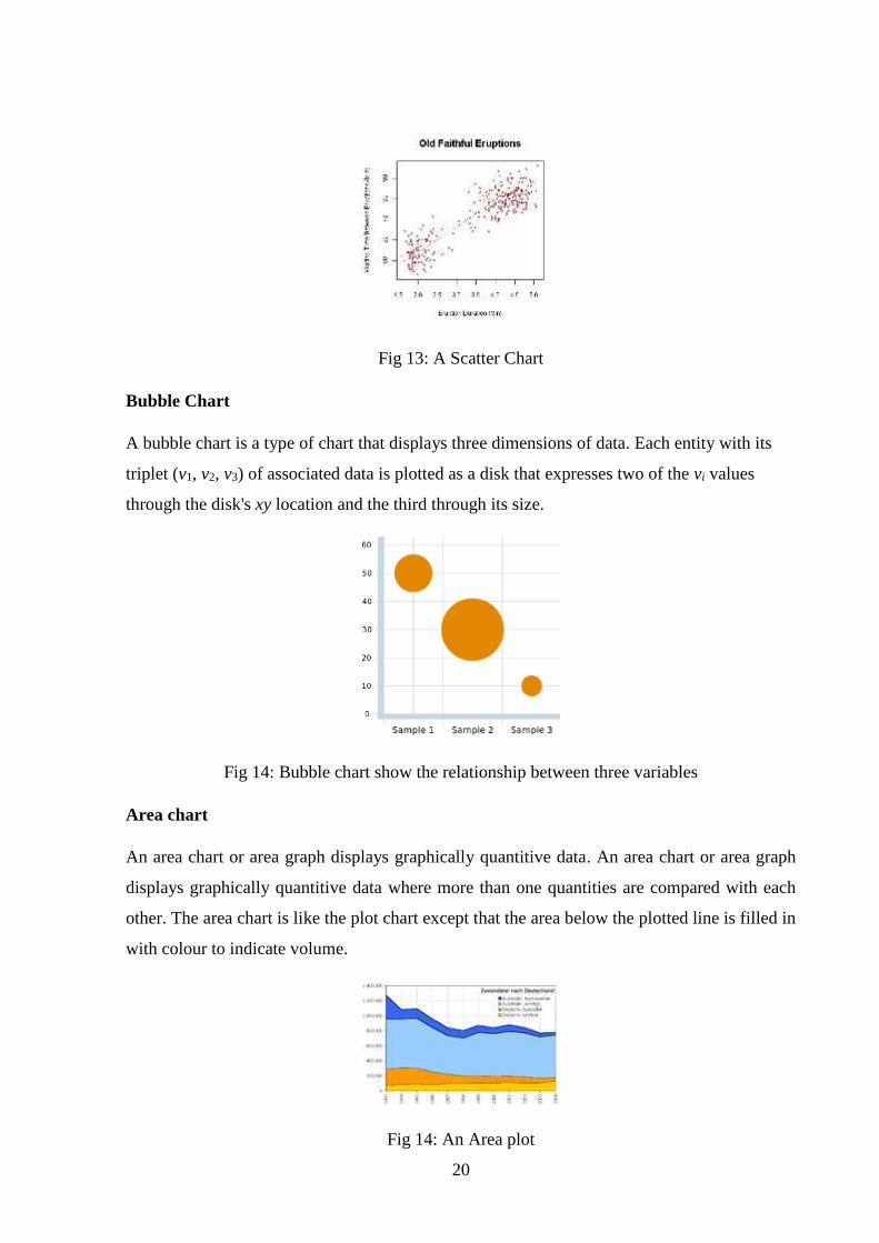
Line Charts
A line chart or line graph is a type of chart which displays information as a series of data
points called 'points/markers' connected by straight line segments. Line Charts show how a
particular data changes at equal intervals of time. A line chart is often used to visualize a trend
in data over intervals of time – a time series – thus the line is often drawn chronologically.
Fig 12: Data over intervals with connected points
Scatter Plot
A scatter plot, scatterplot, or scattergraph to display values for two variables for a set of data.
Data is displayed as collection of points, each having the value of one variable determining the
position on the horizontal axis and the value of the other variable determining the position on
the vertical axis.
20
Fig 13: A Scatter Chart
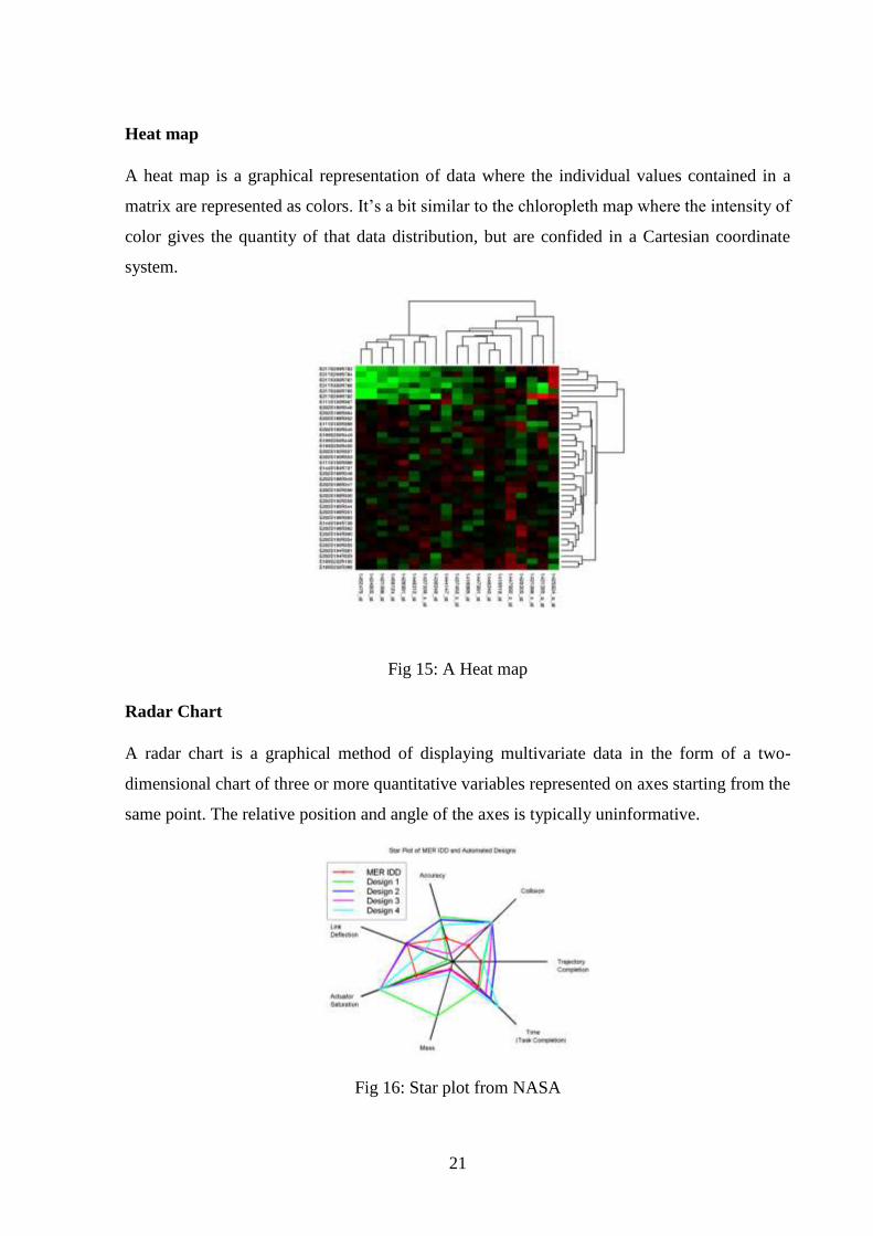
Bubble Chart
A bubble chart is a type of chart that displays three dimensions of data. Each entity with its
triplet (v1, v2, v3) of associated data is plotted as a disk that expresses two of the vi values
through the disk's xy location and the third through its size.
Fig 14: Bubble chart show the relationship between three variables
Area chart
An area chart or area graph displays graphically quantitive data. An area chart or area graph
displays graphically quantitive data where more than one quantities are compared with each
other. The area chart is like the plot chart except that the area below the plotted line is filled in
with colour to indicate volume.
Fig 14: An Area plot
21
Heat map
A heat map is a graphical representation of data where the individual values contained in a
matrix are represented as colors. It’s a bit similar to the chloropleth map where the intensity of
color gives the quantity of that data distribution, but are confided in a Cartesian coordinate
system.
Fig 15: A Heat map
Radar Chart
A radar chart is a graphical method of displaying multivariate data in the form of a two-
dimensional chart of three or more quantitative variables represented on axes starting from the
same point. The relative position and angle of the axes is typically uninformative.
Fig 16: Star plot from NASA
22
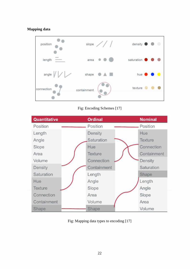
Mapping data
Fig: Encoding Schemes [17]
Fig: Mapping data types to encoding [17]
23
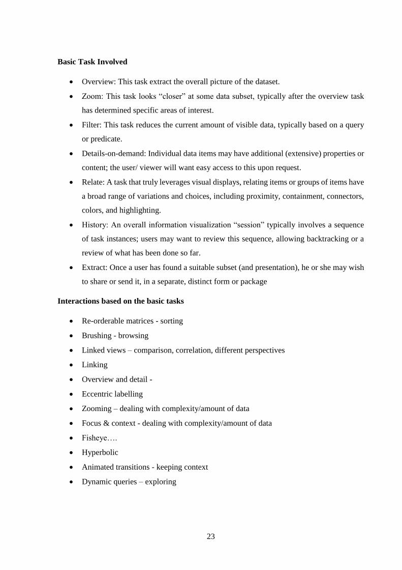
Basic Task Involved
Overview: This task extract the overall picture of the dataset.
Zoom: This task looks “closer” at some data subset, typically after the overview task
has determined specific areas of interest.
Filter: This task reduces the current amount of visible data, typically based on a query
or predicate.
Details-on-demand: Individual data items may have additional (extensive) properties or
content; the user/ viewer will want easy access to this upon request.
Relate: A task that truly leverages visual displays, relating items or groups of items have
a broad range of variations and choices, including proximity, containment, connectors,
colors, and highlighting.
History: An overall information visualization “session” typically involves a sequence
of task instances; users may want to review this sequence, allowing backtracking or a
review of what has been done so far.
Extract: Once a user has found a suitable subset (and presentation), he or she may wish
to share or send it, in a separate, distinct form or package
Interactions based on the basic tasks
Re-orderable matrices - sorting
Brushing - browsing
Linked views – comparison, correlation, different perspectives
Linking
Overview and detail -
Eccentric labelling
Zooming – dealing with complexity/amount of data
Focus & context - dealing with complexity/amount of data
Fisheye….
Hyperbolic
Animated transitions - keeping context
Dynamic queries – exploring
24
Challenges
Information visualization remains a wide-open field with a number of existing challenges:
Importing data: Inputting the data into the given software is very tedious process of
match making and accessibility.
Visual vs. textual — Visual representations don’t obviate the need for labels; the idea
is to bring them together in a way that plays to their respective strengths
Related data — Users/viewers may want to jump across data sets, if those sets are
available in a compatible form.
Large volumes — Data are now available on the order of millions or billions, presenting
challenges of scale in terms of technology and approach; note that, given the right
presentation, human perception can still gain a decent understanding of such large data
sets.
Data mining — Automatically finding patterns or trends was once viewed as a distinct
area, but is now seen as complementary to information visualization, since the right
display can highlight such patterns and trends.
Collaboration — There is frequently need to perceive data sets in groups or teams, so
that element needs to factor in.
Universal usability — Visualization approaches might lock out certain users, such as
the visually impaired or the colorblind, or carry cultural or economic assumptions
A Probable Proposal
Visualization of multi-dimensional data is a challenging task. The goal is not the display of
multiple data dimensions, but user comprehension of the multi-dimensional data. A glyph-
based system allows the visualization of both regular and irregular grids of volumetric data. A
glyph's location, 3D size, color, and opacity encode up to 8 attributes of scalar data per glyph.
Glyph, or iconic, visualization is an attempt to encode more information in a comprehensible
format, allowing multiple values to be encoded in the parameters of the glyphs [18]. The shape,
color, transparency, orientation, etc., of the glyph can be used to visualize data values. Glyph
rendering is an extension to the use of glyphs and icons in numerous fields, including
cartography, logic, and pictorial information systems [19].
We are thinking of incorporating three dimensional shape attributes (e.g 3D n sided polygon)
for various stages of our visualization component which can be controlled through customizable
25
modularities by the user to make it simple, flexible and elegant. This n-dimensional polygon
might visualize a futuristic perspective for a universal visualization system where key issues
and challenges could address the sustainable development of data visualization techniques.
REFERENCES
1. Zhao Kaidi. (2000). Data visualization. Technical Survey, Matrix Number: HT00-6177E
2. Petra Isenberg, Tobias Isenberg, Tobias Hesselmann, Bongshin Lee, Ulrich von Zadow,
Anthony Tang. (2013 Data Visualization on Interactive Surfaces: A Research
Agenda. Computer Graphics and Applications, IEEE, (Volume:33 , Issue: 2 ),16 – 24.
3. Michael Friendly. (2006). A brief history of data visualization. In Handbook of
Computational Statistics: Data Visualization, C. Chen, W. Härdle, A Unwin (Ed.),
Heidelberg: Springer-Verlag, Ch. 1, pp. 1–34.
4. Visualizing Genomic Data, Guide to Use in Genomics and Sequence Analysis.
http://circos.ca/guide/genomic/
5. Introduction to Data Visualization, Common Static Visualization Types
http://guides.library.duke.edu/vis_types
6. The 36 best tools for data visualization.
http://www.creativebloq.com/design-tools/data-visualization-712402
7. Manolis Savva, Nicholas Kong, Arti Chhajta, Fei-Fei Li, Maneesh Agrawala, and Jeffrey
Heer. (2011). ReVision: automated classification, analysis and redesign of chart images.
UIST, page 393-402. ACM
26
8. Zhicheng Liu, Biye Jiang, Jeffrey Heer, (2013). imMens: Real-time Visual Querying of Big
Data. Computer Graphics Forum (Proc. EuroVis), 32(3).
9. Cody Dunne, Ben Shneiderman. Motif simplification: improving network visualization
readability with fan, connector, and clique glyphs. CHI '13 Proceedings of the SIGCHI
Conference on Human Factors in Computing Systems. Pages 3247-3256.
10. Sean Kandel, Andreas Paepcke, Joseph Hellerstein, Jeffrey Heer. (2011). Wrangler:
Interactive Visual Specification of Data Transformation Scripts. ACM Human Factors in
Computing Systems (CHI).
11. Philip J. Guo, Sean Kandel, Joseph Hellerstein, Jeffrey Heer. (2011). Proactive
Wrangling: Mixed-Initiative End-User Programming of Data Transformation Scripts. ACM
User Interface Software & Technology (UIST).
12. Jiang H, Wang F, Dyer NP, Wong WH. (2010). CisGenome Browser: a flexible tool for
genomic data visualization. Bioinformatics.(Oxford England), 26(14):1781-2.
13. A. Lex, M. Streit, H.-J. Schulz, C. Partl, D. Schmalstieg, P.J. Park and N. Gehlenborg.
(2012). StratomeX: Visual Analysis of Large-Scale Heterogeneous Genomics Data for Cancer
Subtype Characterization, Eurographics Conference on Visualization (EuroVis), Volume 31,
Number 3, pages 1175–118.
14. Ronald Fisher’s Iris flower data set
https://en.wikipedia.org/wiki/Iris_flower_data_set
15. Linnean taxonomies
http://en.wikipedia.org/wiki/Linnaean_taxonomy
16. Phylogenetics
http://en.wikipedia.org/wiki/Phylogenetics
27
17. Jock Mackinlay. 1986. Automating the design of graphical presentations of relational
information. ACM Trans. Graph. 5, 2 (April 1986), 110-141. DOI=10.1145/22949.22950
http://doi.acm.org/10.1145/22949.22950
18. Post FJ, van Walsum T, Post FH, Silver D. Ionic techniques for feature visualization. In
Proceedings Visualization '95, October 1995, p. 288}95.
19. Ribarsky W, Ayers E, Eble J, Mukherja S. Glyphmaker: creating customized
visualizations of complex data. IEEE Computer 1994;27(7):57}64.