Embed Size (px)
Citation preview

E L U N A 2 0 1 5 M i n n e a p o l i s , M N
2015
Data Visualization Analyzing your library data
Michael Cummings, TheGeorge Washington University
Ex Libris Users of North America

Data Visualization ELUNA 2015
The greatest value of a picture is when it forces us to notice what we never expected to see.
John Tukey
Page 1 of 53

Data Visualization ELUNA 2015 Table of Contents
Introduction .................................................................................................................................................. 4
Data Visualization ......................................................................................................................................... 4
Goals ..................................................................................................................................................... 4
Ex Libris Alma ................................................................................................................................................ 5
How to get library data ................................................................................................................................. 6
Ex Libris Open Interface Web Services (Voyager) ..................................................................................... 6
Ex Libris “Canned Reports” for Microsoft Access (Voyager) ..................................................................... 6
Ex Libris Global Data Change (Voyager) .................................................................................................... 6
VGER Select (Voyager) .............................................................................................................................. 6
Oracle SQL*Plus ........................................................................................................................................ 6
SQL*Plus shell scripts ............................................................................................................................ 6
SQL*Plus XML / XSLT example .............................................................................................................. 8
CGI / Perl Scripts ................................................................................................................................. 13
Other options ...................................................................................................................................... 14
Community Resources ............................................................................................................................ 17
Ex Libris Developer Network ............................................................................................................... 17
ELUNA document repository .............................................................................................................. 17
Data Visualizations with Microsoft Access ................................................................................................. 18
ExLibris Reports Module (Voyager) ......................................................................................................... 18
Example Fund Status Report (Voyager) .............................................................................................. 18
Standard Query vs Crosstab Query ......................................................................................................... 22
Example - standard query. Get expenses for a subset of serials. ....................................................... 22
Standard Query Output ...................................................................................................................... 23
Same example – as Crosstab Query .................................................................................................... 24
Crosstab Query Output ....................................................................................................................... 25
Data Visualizations with Microsoft Excel .................................................................................................... 26
Excel Formulas ........................................................................................................................................ 26
Sort & Filter ............................................................................................................................................. 27
Pivot table ............................................................................................................................................... 28
Pivot Chart .............................................................................................................................................. 32
Page 2 of 53

Data Visualization ELUNA 2015 Data Visualizations with Tableau ................................................................................................................ 36
Step 1. Create a Tableau Public account ............................................................................................. 37
Step 2. Download the App .................................................................................................................. 39
Step 3. Open a data file. ...................................................................................................................... 39
Step 4. Configure a visualization ......................................................................................................... 40
Show Me ............................................................................................................................................. 42
Analysis, Quick Filters.......................................................................................................................... 47
Step 5. Save to web ............................................................................................................................. 48
Step 6. View on the web ..................................................................................................................... 49
Download ............................................................................................................................................ 50
Share ................................................................................................................................................... 51
Data Visualization Guides ........................................................................................................................... 53
Page 3 of 53

Data Visualization ELUNA 2015 Introduction This document is a supplement to my ELUNA 2015 presentation titled “Data Visualization: Analyzing your library data.”
Michael Cummings Library Systems Coordinator Scholarly Technology Group The George Washington University [email protected] (202) 994-4806 (202) 507-2675 mobile
Slideshare: http://www.slideshare.net/cummingsdc github: https://github.com/cummingsm ELUNA: http://documents.el-una.org/view/creators/Cummings=3AMichael=3A=3A.html
Data Visualization The library staff and management may want to analyze a variety of topics including circulation statistics, collection profiles, acquisition expenditures and other information available from the integrated library system. The information may be used not only to review past performance but also to inform ‘data driven’ decisions. This paper summarizes several ways to obtain data and discusses tools for data visualization: Microsoft Access, Excel, and Tableau.
Goals Keep in mind that the purpose of creating data visualizations is not just to make interesting
pictures. Stephen Few, author of several books on the subject lists these three Tasks and Goals:
Task Goal Searching for significant facts Discovery
Examining and making sense of data Understanding
Conveying information to others Informed Decisions
“Why do we visualize quantitative data?” http://www.perceptualedge.com/blog/?p=1897 Stephen Few
Page 4 of 53

Data Visualization ELUNA 2015 Ex Libris Alma Ex Libris Alma Analytics is a powerful tool that enables libraries to analyze data in their systems. Alma provides a relatively easy interface for managers and staff to create reports and to share reports. Alma users may create informative dashboards that highlight pending tasks. Dashboards may be made available to the appropriate users, and may contain tables, charts, and graphs.
Screen shot of the Ex Libris Alma Analytics user interface.
This document outlines a few options for exporting, and presenting data from integrated library systems for libraries that are not yet using Ex Libris Alma Analytics.
Page 5 of 53

Data Visualization ELUNA 2015 How to get library data “First things first” as they say. Here is a summary of approaches that libraries might take to acquire a set of data records from their system. The exported data could be in the form of comma or pipe-separated values (CSV), a spreadsheet, or data exchange formats like XML or JSON.
Ex Libris Open Interface Web Services (Voyager) The Voyager open interfaces are sets of application programming interfaces (APIs) that enable
the interaction between Voyager and other applications. There are two types of open interfaces in Voyager: XML over HTTP and RESTful APIs. Both types of interfaces are provided via the VXWS service in Voyager. https://developers.exlibrisgroup.com/voyager/apis
Ex Libris “Canned Reports” for Microsoft Access (Voyager) Ex Libris provides a Microsoft Access database (Reports.mdb) containing pre-defined SQL
queries, and reports. This Access database, along with a properly configured Oracle ODBC driver for Windows is a tool libraries have been using for years to produce reports from Voyager. The database also includes custom functions that enable query developers to access MARC fields and subfields, some of which are not stored in the Oracle relational database tables.
Ex Libris Global Data Change (Voyager) Librarians can easily make mass data changes to bibliographic, holdings, and authority records
with this utility. It is also a tool that can be used to perform queries to generate a set of records which may be exported.
VGER Select (Voyager) VGER Select is a program that may be used to query the Voyager system. This free software is
quite useful for querying the MARC tags, subfields, or indicators which it does very efficiently. Developed by Gary Strawn, Northwestern University. http://www.library.northwestern.edu/public
Oracle SQL*Plus The free verson of Oracle’s SQL driver may be downloaded from the Oracle web site. When
configured to use a read-only user account, the driver may be used to connect to an Oracle database (e.g., Voyager).
SQL*Plus shell scripts In a Linux environment, you can use cron to schedule) and automate the process of parsing,
formatting, and distributing the results. See presentation from ELUNA 2012, “From Voyager to your website: Using Linux Shell scriptsand Oracle SQL*Plus to generate web pages.” The slides are available on SlideShare. http://www.slideshare.net/cummingsdc
Page 6 of 53

Data Visualization ELUNA 2015
In God we trust. All others must bring data.
W. Edwards Deming
Page 7 of 53

Data Visualization ELUNA 2015 SQL*Plus XML / XSLT example
Web applications and data visualization software can ingest and parse data stored in XML format, so generating results as XML may be a good approach.
There are not a lot of questions on the listserv about exporting library data to XML or transforming the XML with XSLT. However, since some data visualization tools can ingest and parse XML, I’m providing an example.
Oracle SQL*Plus supports output to XML as an alternative to standard tab-delimited or pipe-delimited SQL output. The following example illustrates:
• an Oracle SQL*Plus query that specifies output format as XML
• the XML data (snippet)
• the XSLT stylesheet that transforms the XML
• a simple web page output by the XSLT transformation
Page 8 of 53

Data Visualization ELUNA 2015 Oracle SQL*Plus query that specifies output format as XML
set HEADING OFF set LINESIZE 1000 set PAGESIZE 2000 set LONG 1000000 spool elunadata.xml select dbms_xmlgen.getxml('SELECT FUNDLEDGER_VW.NORMAL_FUND_NAME,FUNDLEDGER_VW.FISCAL_PERIOD_NAME, FUNDLEDGER_VW.FISCAL_PERIOD_START,FUNDLEDGER_VW.FISCAL_PERIOD_END, BIB_INDEX.DISPLAY_HEADING, LINE_ITEM.BIB_ID, BIB_INDEX.NORMAL_HEADING,AMOUNT FROM
(((LINE_ITEM INNER JOIN INVOICE_LINE_ITEM ON LINE_ITEM.LINE_ITEM_ID = INVOICE_LINE_ITEM.LINE_ITEM_ID) INNER JOIN INVOICE_LINE_ITEM_FUNDS ON INVOICE_LINE_ITEM.INV_LINE_ITEM_ID = INVOICE_LINE_ITEM_FUNDS.INV_LINE_ITEM_ID) INNER JOIN BIB_INDEX ON LINE_ITEM.BIB_ID = BIB_INDEX.BIB_ID) INNER JOIN FUNDLEDGER_VW ON (INVOICE_LINE_ITEM_FUNDS.FUND_ID = FUNDLEDGER_VW.FUND_ID) AND (INVOICE_LINE_ITEM_FUNDS.LEDGER_ID = FUNDLEDGER_VW.LEDGER_ID)
WHERE (((BIB_INDEX.INDEX_CODE)=''022A'') AND ((BIB_INDEX.NORMAL_HEADING) In (''0218 5393'',''0218 2165'',''0219 0613'',''0217 7323'',''0217 751X'',''0217 9792'')))
ORDER BY BIB_INDEX.DISPLAY_HEADING, FUNDLEDGER_VW.FISCAL_PERIOD_NAME') XML from dual;
An SQL query to select results as XML
Notes:
• output is spooled to a file; • the select query statement is enclosed by an outer select statement, • single quote characters that are within the select query are entered twice, • and the last line reads “XML from dual;”
Page 9 of 53

Data Visualization ELUNA 2015 The XML data (snippet) <?xml version="1.0"?> <?xml-stylesheet type="text/xsl" href="eluna.xsl"?> <ROWSET> <ROW> <NORMAL_FUND_NAME>PHYSICS2011SUBS</NORMAL_FUND_NAME> <FISCAL_PERIOD_NAME>GW 1997/1998</FISCAL_PERIOD_NAME> <FISCAL_PERIOD_START>01-JUL-97</FISCAL_PERIOD_START> <FISCAL_PERIOD_END>30-SEP-98</FISCAL_PERIOD_END> <DISPLAY_HEADING>0217-7323</DISPLAY_HEADING> <BIB_ID>2454309</BIB_ID> <NORMAL_HEADING>0217 7323</NORMAL_HEADING> <AMOUNT>177800</AMOUNT> </ROW> <ROW> <NORMAL_FUND_NAME>PHYS2011SUBS</NORMAL_FUND_NAME> <FISCAL_PERIOD_NAME>GW 1998/1999</FISCAL_PERIOD_NAME> <FISCAL_PERIOD_START>01-JUL-98</FISCAL_PERIOD_START> <FISCAL_PERIOD_END>09-AUG-99</FISCAL_PERIOD_END> <DISPLAY_HEADING>0217-7323</DISPLAY_HEADING> <BIB_ID>2454309</BIB_ID> <NORMAL_HEADING>0217 7323</NORMAL_HEADING> <AMOUNT>186400</AMOUNT> </ROW> . (SNIP SEVERAL ROWS) . <ROW> <NORMAL_FUND_NAME>LIBTSUBELEC301RPT</NORMAL_FUND_NAME> <FISCAL_PERIOD_NAME>GW 2014/2015</FISCAL_PERIOD_NAME> <FISCAL_PERIOD_START>01-JUL-14</FISCAL_PERIOD_START> <FISCAL_PERIOD_END>30-JUN-15</FISCAL_PERIOD_END> <DISPLAY_HEADING>0219-0613</DISPLAY_HEADING> <BIB_ID>3194653</BIB_ID> <NORMAL_HEADING>0219 0613</NORMAL_HEADING> <AMOUNT>21100</AMOUNT> </ROW> </ROWSET>
The beginning and end of the XML output
Note the XSLT stylesheet reference to “eluna.xsl” has been added. The file “eluna.xsl” is shown on the next page.
Page 10 of 53

Data Visualization ELUNA 2015 the XSLT stylesheet that transforms the XML
eluna.xsl
<?xml version="1.0" encoding="UTF-8"?> <html xsl:version="1.0" xmlns:xsl="http://www.w3.org/1999/XSL/Transform"> <body style="font-family:Arial;
font-size:12pt; background-color:#EAEAEA">
<TABLE BORDER="0" CELLPADDING="4"
CELLSPACING="1" WIDTH="80%" BGCOLOR="#EAEAEA">
<xsl:for-each select="ROWSET/ROW">
<TR> <TD COLSPAN="4">ISSN:
<xsl:value-of select="NORMAL_HEADING"/> </TD>
</TR> <TR BGCOLOR="#FFFFFF"> <TD WIDTH="10%"> </TD> <TD><xsl:value-of select="FISCAL_PERIOD_NAME"/></TD> <TD><xsl:value-of select="NORMAL_FUND_NAME"/></TD> <TD ALIGN="RIGHT">
<B>$ <xsl:value-of select="format-number(AMOUNT div 100,'###,###,##0.00')" />
</B> </TD>
</TR>
</xsl:for-each>
</TABLE> </body> </html> Simple XSLT stylesheet for transforming the XML data to an HTML-4 web page with a table layout.
The web page that this generates is shown in the screenshot on the following page.
Page 11 of 53

Data Visualization ELUNA 2015 a simple web page output by the XSLT transformation
Web page after XSLT transformation of the XML data
Page 12 of 53

Data Visualization ELUNA 2015 CGI / Perl Scripts
CGI and Perl scripts are relatively old technology. However, a CGI / Perl script may be used call an SQL query to retrieve data. The data file could be sent to a data visualization script.
Here is an example of a simple web service response as XML from a CGI Perl script.
Example of a CGI / Perl script web service
This script returns one data record, but could just as easily have returned a set of records.
Page 13 of 53

Data Visualization ELUNA 2015 Other options More options for acquiring the data to use in a visualization include harvesting data from repositories, scraping web page data, or using one of many API’s.
OAI/PMH harvesting
SYNTAX http{DNS}/oai/request?verb=ListRecords&set={setid}&metadataPrefix=oai_dc
EXAMPLE
http://gwdspace.wrlc.org:8180/oai/request?verb=ListRecords&set=hdl_123456789_4055&metadataPrefix=oai_dc
Screen shot of OAI/PMH query results
Page 14 of 53

Data Visualization ELUNA 2015 curl
SYNTAX curl -s http://{DNS}
EXAMPLE
curl -s http://catalog.hathitrust.org/api/volumes/brief/oclc/10055598.json
{"records":{"008887395":{"recordURL":"http:\/\/catalog.hathitrust.org\/Record\/008887395","titles":["The \"Coastwise exemption,\" the nation against it, an appeal on behalf of the national honor and a sound business policy.","\"Coastwise exemption,\" the nation against it, an appeal on behalf of the national honor and a sound business policy."], "isbns":[], "issns":[], "oclcs":["10055598"], "lccns":[], "publishDates":["1913"]}}, "items":[{"orig":"Princeton University","fromRecord":"008887395", "htid":"njp.32101026764652", "itemURL":"http:\/\/hdl.handle.net\/2027\/njp.32101026764652","rightsCode":"pd","lastUpdate":"20130804","enumcron":false,"usRightsString":"Full view"},{"orig":"Harvard University", "fromRecord":"008887395", "htid": "hvd.hnfd3s","itemURL":"http:\/\/hdl.handle.net\/2027\/hvd.hnfd3s","rightsCode":"pd","lastUpdate":"20141021","enumcron":false,"usRightsString":"Full view"}]}
Screen shot of HathiTrust API results
Page 15 of 53

Data Visualization ELUNA 2015
Custom library catalog interface including results from the Hathi Trust API
Screen shot of a library application that uses the Hathi Trust API
Phantom.js (http://phantomjs.org/)
Speaking of APIs, please see the presentations from ELUNA 2013 and ELUNA 2014 for information about using various API’s, phantom.js, and the casperjs test suite. http://www.slideshare.net/cummingsdc
Page 16 of 53

Data Visualization ELUNA 2015 Community Resources
Ex Libris Developer Network The Ex Libris Developer Network is a repository of documentation and technical information
about products. https://developers.exlibrisgroup.com/
ELUNA document repository
Page 17 of 53

Data Visualization ELUNA 2015 Data Visualizations with Microsoft Access This section describes how the Access Reports module and Access crosstab query may be used to develop data visualizations.
ExLibris Reports Module (Voyager) The Reports module may be used to format query results that otherwise are available in a
spreadsheet format. The formatting may include headers and footers for the overall report, as well as by page, and by group. The reports may include calculated fields like subtotals and totals.
Example Fund Status Report (Voyager) At GWU the staff generally prefers to receive query results as a table rather than a formatted
report. The users like to be able to sort, filter, and annotate the output. However, we use the Reports module to generate a “Fund Status” report which is described here.
Voyager users will be familiar with the screen shot below of the Acquisitions module showing the status of a particular fund. A user may click on each fund to get the expenditure information, but they cannot see more than one at a time or export the data.
Screen shot of the Voyager 8 Acquisitions Module, a fund allocation
Page 18 of 53

Data Visualization ELUNA 2015
A query that outputs the Ledgers and associated Funds with Allocation, Commitment, Expenditures, and Balances is fairly straightforward.
Screen shot of Microsoft Access query output
We use the Access Reports module to format the data by level. The report sorts the funds within each level, lists the commitments and expenses, and has calculated fields for subtotals and totals.
Screen shot of the Microsoft Access Report Module – Report Design
Page 19 of 53

Data Visualization ELUNA 2015
The data source for the report is a table which is the result of running a few queries in sequence. The report provides a snapshot of the fund status as of the day and time the report was generated. It is easier to see the status across several funds by paging through the report than selecting one fund at a time within the Voyager client.
Screen shot of a page from the custom Fund Status Report
A sample Access database containing the queries and report design may be downloaded from the GWU github repository. Setup instructions explaining how to customize the queries and report for use in other libraries are provided. https://github.com/cummingsm/Voyager_Fund_Status
Although this report is not graphical, one could argue that it qualifies as a data visualization because it conveys the information in a way that makes it easy to understand. It makes it easier discover over expenditures or high available balances, and ultimately to make informed decisions.
Page 20 of 53

Data Visualization ELUNA 2015
If you can’t explain it simply, you don’t understand it well enough.
Albert Einstein
Page 21 of 53
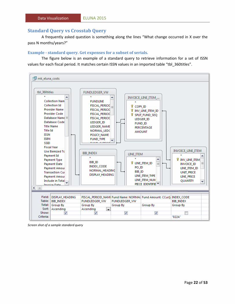
Data Visualization ELUNA 2015 Standard Query vs Crosstab Query A frequently asked question is something along the lines “What change occurred in X over the pass N months/years?”
Example - standard query. Get expenses for a subset of serials. The figure below is an example of a standard query to retrieve information for a set of ISSN
values for each fiscal period. It matches certain ISSN values in an imported table “tbl_360titles”.
Screen shot of a sample standard query
Page 22 of 53

Data Visualization ELUNA 2015 Standard Query Output
The results for each ISSN (DISPLAY_HEADING) amount per fiscal period. Notice the highlighted rows in the screen shot are for ISSN 0217-7323 from 1997/1998 through 2014/2015.
Screen shot of results for a standard query
Page 23 of 53

Data Visualization ELUNA 2015 Same example – as Crosstab Query 1. Start by selecting Crosstab from the Query Type menu ...
Screen shot of the crosstab query definition
2. Make a few adjustments. For this example the goal is to display the ISSN numbers as rows and the fiscal period names as the column headings, with the amounts as the values.
Crosstab Row Heading = BIB_INDEX.DISPLAY_HEADING Crosstab Column Heading = FUNDLEDGER_VW.FISCAL_PERIOD_NAME Crosstab Value = Expression ‘Fund Amount’ as Sum(CCur([AMOUNT]/100))
3. Run the query
Page 24 of 53

Data Visualization ELUNA 2015 Crosstab Query Output The crosstab query output shows the year by year expenditure for each ISSN. The highlighted row for number 0217-7323 is the same dataset from the standard query except the values are shown in columns labelled by fiscal year and the fund names are not detailed.
Screenshot of the crosstab query output
Similar to the standard query display, it is obvious from the crosstab query output that the expenditures for these serials have been increasing from year to year. An advantage of looking at the data as a crosstab view is that you can look down a column representing a fiscal year, and easily pick out a given ISSN and fiscal year expenditure.
Later we will look at taking this a step further by converting the crosstab table into a time series line graph.
Page 25 of 53

Data Visualization ELUNA 2015 Data Visualizations with Microsoft Excel This section discusses how to clean the data with Excel functions and how to use Excel features for sort and filter, pivot table, and pivot graph.
Excel Formulas Data cleanup is almost always necessary to “transform” data extracted from a system. Typically you will need to compensate for inconsistent abbreviations (e.g., Fund Names), or you may want to convert a data element from a string to a number, convert a date, etc. Below is an example of Excel’s Formula menu. The Text function has been selected.
Screen shot of the Text function window. Conversion of a string to return characters from the middle
Page 26 of 53

Data Visualization ELUNA 2015 Sort & Filter
When you provide an Excel dataset to users, remind them that the Excel sort and filter function may be used to select certain data and hide others based on filter criteria. Show the users where to turn on the feature in the menu bar, and how to apply filters on the column headings as shown below.
Excel Sort & Filter menu; filter control on column headers; set filter options panel
Page 27 of 53

Data Visualization ELUNA 2015 Pivot table A pivot table is basically the same as the crosstab view. Continuing with the example of a list of expenses for each fiscal year for a set of ISSN, follow these steps.
Steps to start a pivot table:
• Select all rows, columns • Select Insert • Select Pivot Table
leftmost option in screen shot • Choose new worksheet
When you start the pivot table you will be prompted to choose the rows and columns to include in the table.
Page 28 of 53

Data Visualization ELUNA 2015 Pivot table wizard
Screen shot of the initial view after starting the pivot table wizard The section labelled “Pivot Table Field List” identifies the columns in the source spreadsheet: ISSN, FISCAL_PERIOD_NAME, Amount, FY. Below that section, there are four areas, Report Filter, Column Labels, Row Labels, and Values. The instruction panel on the left explains that the next step is to choose fields.
Page 29 of 53

Data Visualization ELUNA 2015 Pivot table configuration
Screen shot of the view after selecting fields, column labels, row labels, and values. Step-by-step
1. Select the field ISSN, drag and drop ISSN to the Row Labels section
2. Select the field FY, drag and drop FY to the Column Labels section
3. Select the field Amount, drag and drop Amount to the Values section
4. Click on the Amount in the Values section
5. Select Value Field Settings, select Sum
6. Click Number Format, select Currency
7. Select cell A3 ‘Amount’, change it to ‘Expenses
8. To limit the view, Select FY (cell B3), choose 2010 through 2014
Page 30 of 53

Data Visualization ELUNA 2015
9. Select cell A4, change ‘Row Labels” to “ISSN”
10. Optionally, go to the Design tab on the menu and choose a design theme
11. Optionally, go to the Home tab on the menu, choose a Conditional formatting color theme
Microsoft Excel style themes applied to pivot table
Page 31 of 53

Data Visualization ELUNA 2015 Pivot Chart
Next, let’s see how to convert the pivot table into a graphic.
1. Go to the Options group in the menu bar. You should see an option for PivotChart. 2. Select the PivotChart option 3. On the Insert Chart dialog box select the Line graph
The steps are illustrated in the screen shots on the following page.
Page 32 of 53
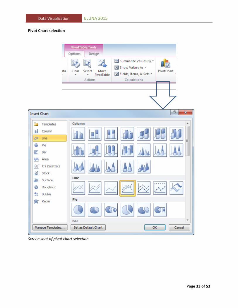
Data Visualization ELUNA 2015 Pivot Chart selection
Screen shot of pivot chart selection
Page 33 of 53

Data Visualization ELUNA 2015
Screen shot of the initial view of the Excel PivotChart This Excel chart is interactive. You can select FISCAL YEARS, bottom left and ISSN filter on the right.
Page 34 of 53

Data Visualization ELUNA 2015
Screen shot of the Excel PivotChart after applying filter by ISSN
Page 35 of 53

Data Visualization ELUNA 2015 Data Visualizations with Tableau Tableau software is one of the leaders in the business intelligence and analytics area.
http://www.informationweek.com/big-data/big-data-analytics/gartner-bi-magic-quadrant-2015-spots-market-turmoil/d/d-id/1319214
http://www.forbes.com/sites/louiscolumbus/2015/02/25/key-take-aways-from-gartners-2015-magic-quadrant-for-business-intelligence-and-analytics-platforms/
Page 36 of 53

Data Visualization ELUNA 2015 Step 1. Create a Tableau Public account
The first thing you’ll need to do to start exploring Tableau Public is to create an account.
https://public.tableau.com/s/#modal-signin
The free version of the software ”Tableau Public” provides up to 1 Gigabyte of online storage per user. Although Tableau Public has fewer features than the full version, it is a good place to evaluate the product. 1
Using Tableau is also a great way to learn the concepts of “dimension” vs “measures” that are common among business intelligence tools -- including Oracle BI which is the tool underlying Ex Libris’ Alma Analytics.
1 The GWU Division of Information technology hosts the commercial version of Tableau Server providing a repository where university departments can post visualizations that have access restrictions.
Page 37 of 53

Data Visualization ELUNA 2015
You set up a profile, and may decide which of your visualizations you want to share or feature.
You will have access to numerous training videos from your user account.
Page 38 of 53

Data Visualization ELUNA 2015 Step 2. Download the App
Next you will need to download the Tableau Public app. The application is available for Windows and Mac OS.
Select ‘Download the App’ from the menu. The download executable wizard makes it simple to install. You’ll be creating “workbooks” which you can upload to the Tableau Public server.
Step 3. Open a data file. Tableau Public will open spreadsheets or text files. The commercial product is compatible with a
wide variety of databases.
Page 39 of 53

Data Visualization ELUNA 2015 Step 4. Configure a visualization Let’s build the same time series example we created in Excel.
Screen shot of the worksheet before configuration
Tableau determined that there are some numeric values in the imported data. It assigns the Fund Amount as a “measure.” The “dimensions” are character/string fields and a date field, “Fydt.” Dimensions Display Heading Fiscal Period Name Fund Name FY Fydt Measure Names Measures Fund Amount Number of Records Measure Values
Page 40 of 53

Data Visualization ELUNA 2015
Screen shot of the worksheet definition after dropping the dimensions into the row and column.
Step-by-step
1. Drag and drop the dimension “Fydt” to the top of the worksheet
2. Drag and drop the display heading to the left column
3. Rename display heading as ISSN
4. Observe that Tableau is waiting for you to add something into the middle of the worksheet
where it currently repeats “Abc”
5. There is a pop-up wizard labelled “Show Me”
Page 41 of 53

Data Visualization ELUNA 2015 Show Me
Tableau’s “Show Me” wizard is programmed to recognize the the available dimensions and measures, and to guide the user to select an option for a visualization. You can reposition the floating Show Me widget, or dock it on the menu. Click on one of the thumbnails that represent a type of visualization. Tableau will fill-in the values. Several variations generated by the Show Me wizard are shown on the following pages.
Page 42 of 53

Data Visualization ELUNA 2015
Above all else show the data.
Edward Tufte
Page 43 of 53

Data Visualization ELUNA 2015
Screen shot of a basic crosstab table
Tableau can produce a basic crosstab table similar to the results of the Access Crosstab query or Excel PivotTable.
Page 44 of 53

Data Visualization ELUNA 2015
Screen shot of a crosstab table with color emphasis
When the option on the top right is selected, Tableau converts the plain table to a colorized table where of values, and a legend has been added.
Page 45 of 53

Data Visualization ELUNA 2015
Screen shot of a stacked bar chart option
One click on the stacked bar option triggers Tableau to create a stacked bar graph with a legend. You can see that combined costs decreased from 2011 to 2012 when three ISSN were not purchased.
You can experiment by selecting other graphing options. The show me guide has greyed-out some options which are not appropriate. For example since we don’t have geocoding the maps option is greyed-out.
Let’s select the time series line graph option which is most similar to what we tried in Excel. The time series graph is displayed on the next page.
Page 46 of 53

Data Visualization ELUNA 2015
Screen shot showing the Analysis options. Quick filters is an option.
Analysis, Quick Filters Go to the Analysis menu, select quick filter, and choose ISSN. There are many options for the
format of the filter, for this example I chose a multi-select checkbox.
You could add more worksheets to the visualization. Each worksheet may be displayed as a separate tab when the visualization is posted online. You may also display multiple worksheets in one view as a ‘dashboard.’
Page 47 of 53

Data Visualization ELUNA 2015
Screen shot of the visualization save on the Tableau Public website
Step 5. Save to web After I am satisfied with the configuration of my visualization is save the worksheet to the web. It is hosted at public.tableau.com under my account. https://public.tableau.com/profile/mikegwu#!/
Page 48 of 53

Data Visualization ELUNA 2015
Screen shot of the ISSN filter interaction
Step 6. View on the web The top three lines stand out as funds that increase more dramatically than the others. To
isolate the top three, we apply the filter on the three ISSN numbers starting with “0217”. When the user hovers their mouse over the line it displays the ISSN, Year, and Amount are displayed.
Page 49 of 53

Data Visualization ELUNA 2015
Screen shot of the prompt for viewers to download from the web
Download A user may download the visualization or the underlying data. Several options are available including Tableau workbook, PDF, Image, Crosstab, and Data.
Page 50 of 53

Data Visualization ELUNA 2015
Screen shot of the prompt for viewers to share the visualization
Share A user may share the visualization. They can share the original view or the view they have created by applying filters. The user may share via FaceBook or Twitter, they may copy the link to the visualization, or copy the embed code which may be used to display the visualization within a web page.
An example of an embedded visualization is shown on the next page.
Page 51 of 53

Data Visualization ELUNA 2015
Screen shot of a visualization hosted at Tableau but embedded in a web page
Page 52 of 53
Data Visualization ELUNA 2015 Data Visualization Guides I recommend the series of books by Edward Tufte, and books and blogs by Stephen Few as excellent guides describing the best type of visualization for any given situation. The authors also give examples of poorly designed visualizations, and how to correct them. Few, S. (2009). Now you see it : Simple visualization techniques for quantitative analysis. Oakland, Calif.: Analytics Press.
Tufte, E. R. (2006). Beautiful evidence. Cheshire, Conn.: Graphics Press.
Tufte, E. R. (1997). Visual display of quantitative information. Cheshire, Conn.: Graphics Press.
Tufte, E. R. (1997). Visual explanations : Images and quantities, evidence and narrative. Cheshire, Conn.: Graphics Press.
Tufte, E. R. (1990). Envisioning information. Cheshire, Conn. (P.O. Box 430, Cheshire 06410): Graphics Press.
An article from The Next Web, April, 2015 has a good summary of tools:
The 14 best data visualization tools http://thenextweb.com/dd/2015/04/21/the-14-best-data-visualization-tools/ D3, Fusion Charts, Chart.js, Google Charts, Highcharts, Leaflet, dygraphs, Datawrapper, Tableau, Raw, TimelineJS, Infogram, Plotly, ChartBlocks Need more? Ask your librarian!
Page 53 of 53