Embed Size (px)
Citation preview

CREATING EFFECTIVE DATA VISUALIZATIONS FOR ONLINE LEARNING
Dr. Shalin Hai-Jew
Kansas State University
4th Annual Big 12 Teaching & Learning Conference
Texas Tech University
June 8 – 9, 2017
PRESENTATION DESCRIPTION
• Virtually every type of online learning involves some type of data visualization.
Some common data visualizations include timelines, process diagrams,
linegraphs, bar charts, pie charts, treemap diagrams, dendrograms, cluster
diagrams, geographical maps, network graphs, word clouds, word networks,
scatter diagrams, scatterplot matrices, intensity matrices, decision trees, and
others. Indeed, there is also data in screenshots, photos, drawings, videos, or
other types of visuals. Online dashboards contain rich data visualizations to
convey dynamic data. Some data, such as big data, may only be conveyed in
visuals for human understanding and interpretation; in raw form, the meaning is
obscured and elusive. Data visualizations highlight salient aspects of data, and
they have to be aligned for particular multi-uses: (1) user awareness and
understanding, (2) data analytics, and (3) decision-making.
2

PRESENTATION DESCRIPTION(CONT.)
• This session defines some best practices for informative and engaging data
visualizations for online learning. Original real-world examples are provided
from modern software programs.
3

OVERVIEW
• Oversimplification about Data,
Information, and Data Visualizations
• Data Visualization Sampler (and Audience
Interpretations)
• Data as Visualization
• Data Visualizations in Online Learning
• Defining “Effective” Data Visualizations
• Human Visual Perception
• Cognitive Theory of Multimedia Learning
• Steps to Creating Data Visualizations
• Conventions of Data Visualizations
• 2D
• 3D
• 4D
4

OVERVIEW (CONT.)
• Sequencing Data Visualizations
• Contextualizing Data Visualizations
• User Interactivity with the Data
Visualizations
• About Data Visualizations and Decision-
making
• Some Quick Takeaways
• A Note about the Software
• Contact and Conclusion
5

OVERSIMPLIFICATIONS ABOUT DATA, INFORMATION,
AND DATA VISUALIZATION
6

ABOUT DATA
• Anything that contains raw information
• May be structured (labeled data, such as in data tables)
• May be unstructured or semi-structured (such as imagery, text, audio, video, mixed
media, and other non-traditional contents that contain informational value /
extractable meaning)
• Structured data tend to follow the basics of row data as individual records and
column data as attributes or variables
• Matrices may contain similar attributes in the columns (banners) and rows (stubs)
depending on the type of matrix
7
ABOUT DATA (CONT.)
• Raw master files of data should be kept
• Data are generally parsed in the following ways: classification, frequency (or
intensity), relationship [null, associational (negative or positive), causal, time
relation (slice-in-time, over time, discrete time or continuous time, predictive
or future-focused), space relation, and others]
8

ABOUT DATA (CONT.)
• Only as good as the sourcing and methods for collection
• Should be legally sourced and collected
• Should be accurately maintained and handled (with whatever levels of confidentiality required)
• Is only “good” for a particular time (but also valuable in time for historical purposes and base-lining and possible trend-line analysis)
• Is the base material on which research assertions and analyses are made
• May be grounds for fresh research hypothesizing
• May be a renewable resource in some circumstances and one-offs in others
9
ABOUT PUBLICLY SHARED DATASETS
• Full dataset may be shared online at the time of publication per grant funder
requirements and some practices in some domains
• Shared dataset needs to be properly documented in terms of sources and
methods and in terms of crediting
• This is often in a README file accompanying the data or included at the top-level of
the dataset as a text box
• Data limitations and qualifiers need to be acknowledged
10
ABOUT PUBLICLY SHARED DATASETS (CONT.)
• Data need to be cleaned:
• Repeated information should be omitted
• Outliers should be deleted (or mitigated)
• Data norming should be applied so that the meanings of disparate terms may be
captured, and others
• Data may need to be re-structured for different types of data analytics in
different software programs
11

ABOUT PUBLICLY SHARED DATASETS(CONT.)
• Shared dataset data need to be properly labeled; the data need to be
structured in conventional ways for ease-of-use and professionalism
• Columns as variables, rows as individual data entries
• Data need to be versioned in multiple formats for download and sharing
• Data need to be de-identified and made robust against re-identification
(avoidance of data leakage)
12
ABOUT INFORMATION
• Is an extraction from raw data, and is more processed (filtered, cleaned,
selective) than raw data
• Contains some interpretation
• Contains applied value for human use and benefit for awareness, decision-
making, and other applications
• Should be accurate and avoid any sort of mis-representation, even by nuance
or false inference
13
ABOUT DATA VISUALIZATIONS
• Is a purposive and selective data summarization (of the underlying data), and it
generally contains particular dimensions or facets of the underlying data
• May be linked to the underlying data (for reproducibility)
• Involves titles, shape labels, data labels, and keys / legends
• Includes visual aesthetic style elements
• Is usually stand-alone but also used in an original context (so may have
dependencies)
• Follows particular data visualization conventions
14
ABOUT DATA VISUALIZATIONS (CONT.)
• May be 2D (x- and y-axes), 3D (x, y, and z axes), and 4D (x and y axes and time;
x, y, and z axes and time as the 4th dimension)
• Should follow all laws
• Should respect intellectual property and not contravene IP rights
• Should also give credit where it is due
• Should respect privacy rights and not contravene privacy rights
• Should have legal and signed media releases for all depictions of people’s likenesses
• Should be accessible, with the information available in multiple modalities
15
ABOUT DATA VISUALIZATIONS (CONT.)
• May be drawn from different sources:
• raw data: structured, unstructured, semi-structured
• synthetic (faux) data
• processed information
• theory(ies)
• model(s)
• projection(s)
• concepts
• A data visualization may be drawn from a combination of sources
• The underlying sources and the visuals inform understandings of the data visualization and the confidence that may be applied
16

ABOUT DATA VISUALIZATIONS (CONT.)
• May be created in a number of ways:
• manually drawn with diagramming tools, note-taking tools, tablet drawing programs
• drawn by machine based on both data and various computer algorithms
• statistical analyses (correlations, chi-square test, simple regression, multiple
regression, t-tests, ANOVAs, sign tests, and others)
• cluster (similarity / dissimilarity) analysis
• machine learning or computational identification of patterns in data
17
ABOUT DATA VISUALIZATIONS (CONT.)
• drawn by computer program (cont.)
• agent-based modeling
• data modeling
• simulation
• virtual immersive worlds, and others
• and often created with a mixed sequence, such as some computational data
visualization augmented by manual data labels and other visual overlays
18
DATA VISUALIZATION SAMPLER (AND AUDIENCE INTERPRETATIONS)
19

WHAT DO THE FOLLOWING DATA VISUALIZATIONS SHOW?
• The following data visualizations are based on education-seeded datasets and
various software programs.
• The data sources include the following: curated text sets, LMS data portal
data, social media datasets, crowd-sourced encyclopedias, non-consumptive
text analysis data, and others.
• The data visualizations are labeled by the following: (1) data, (2) data
visualization type, and (3) software technology.
20
GENERAL STEPS TO RESEARCH AND THE ROLES OF DATA VISUALIZATION
21

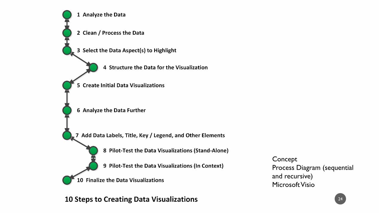
22
Concept
Process Diagram
Microsoft Visio

10 STEPS TO CREATING DATA VISUALIZATIONS
23
24
Concept
Process Diagram (sequential
and recursive)
Microsoft Visio

@USEDGOV TWEETSTREAM
25

26
@usedgov Tweetstream
Geographical Map
NVivo 11 Plus

27
@usedgov Tweetstream
Sociogram
NVivo 11 Plus

28
@usedgov Tweetstream
Dendrogram (horizontal)
NVivo 11 Plus

29
@usedgov Tweetstream
2D Cluster Diagram
NVivo 11 Plus

30
@usedgov Tweetstream
Ring Lattice Graph / Circle Diagram
NVivo 11 Plus

31
@usedgov Tweetstream
3D Cluster Diagram
NVivo 11 Plus
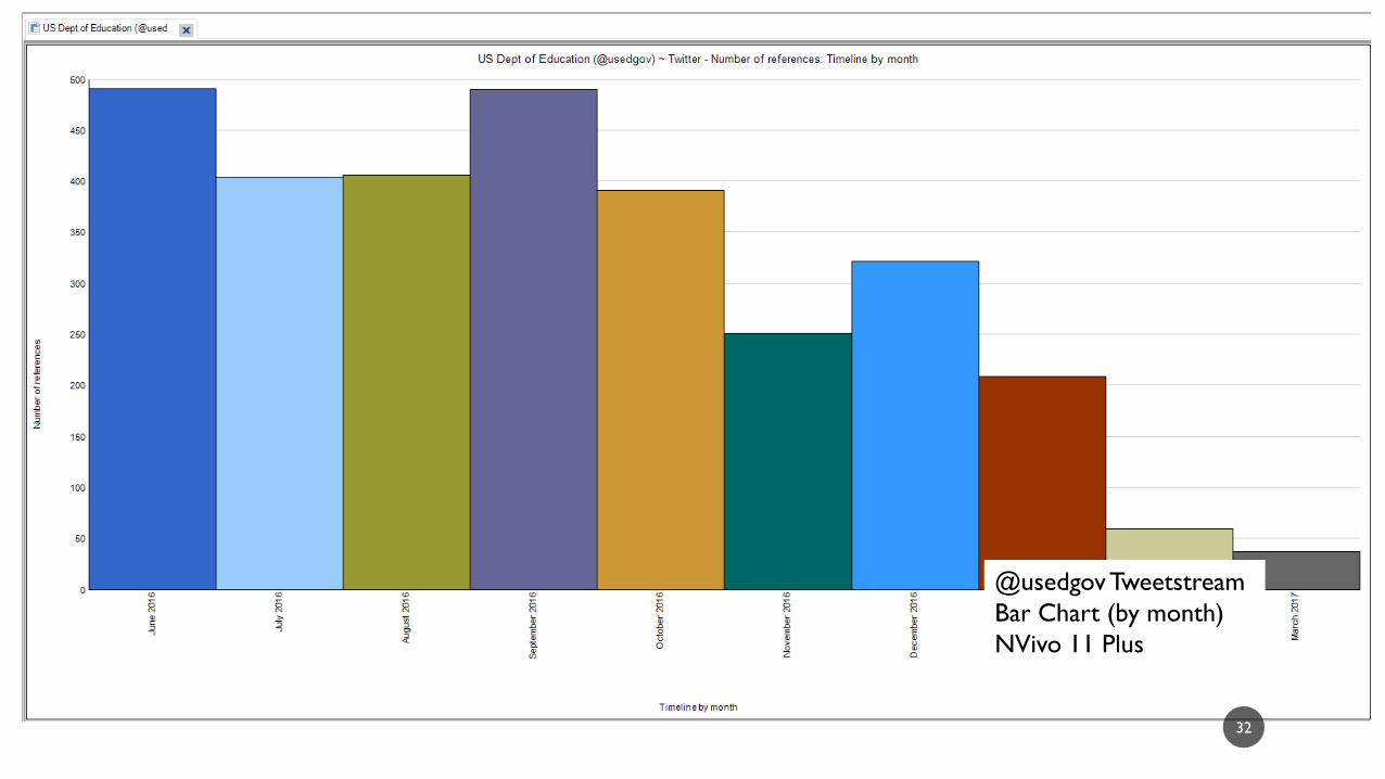
32
@usedgov Tweetstream
Bar Chart (by month)
NVivo 11 Plus

33
@usedgov Tweetstream
Pie Chart (by month)
NVivo 11 Plus
34
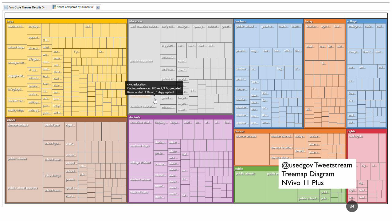
@usedgov Tweetstream
Treemap Diagram
NVivo 11 Plus

35
@usedgov Tweetstream
Sunburst Diagram
NVivo 11 Plus
36
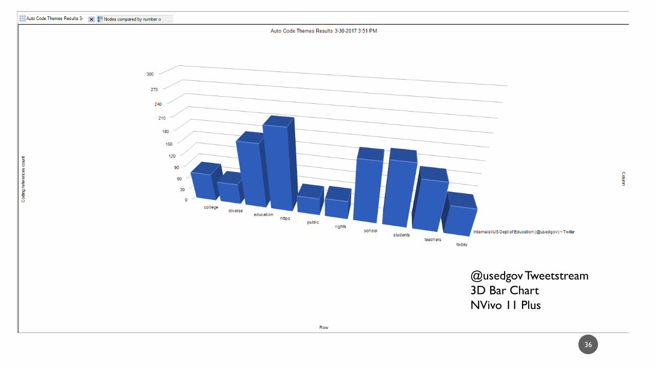
@usedgov Tweetstream
3D Bar Chart
NVivo 11 Plus

37
@usedgov Tweetstream
Intensity Matrix
NVivo 11 Plus
38
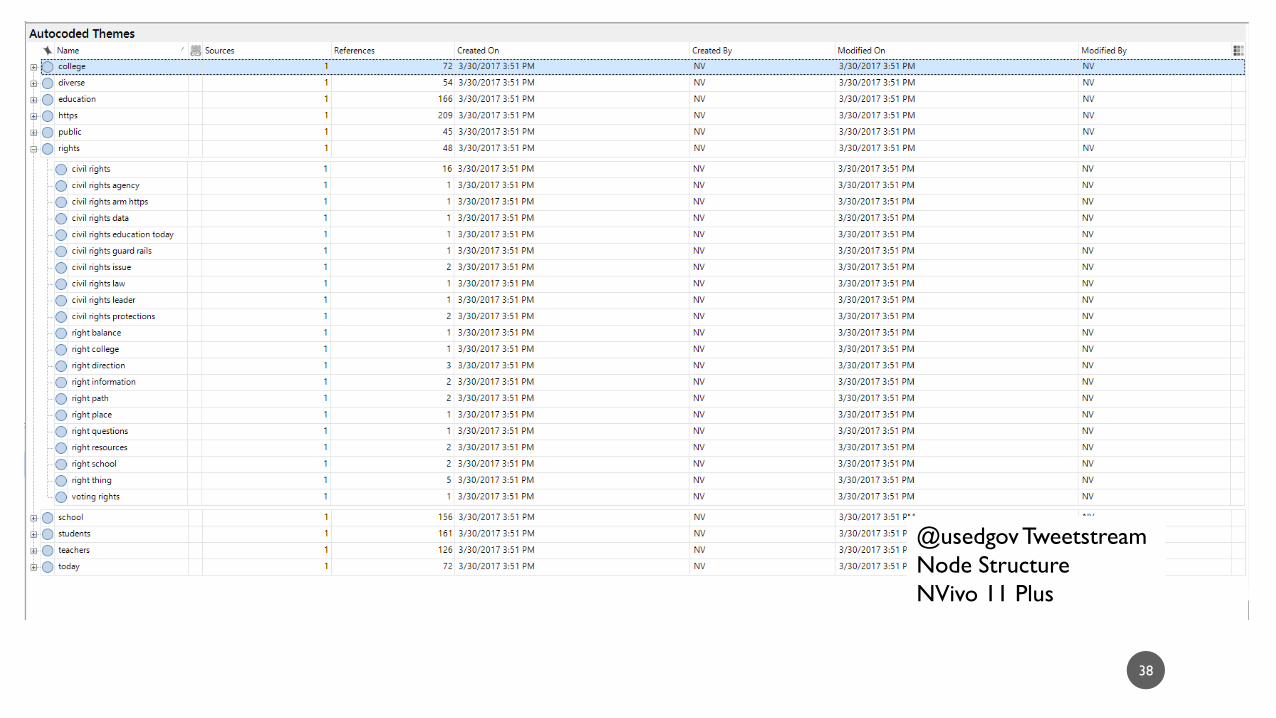
@usedgov Tweetstream
Node Structure
NVivo 11 Plus

39
@usedgov Tweetstream
Treemap Diagram
NVivo 11 Plus
40
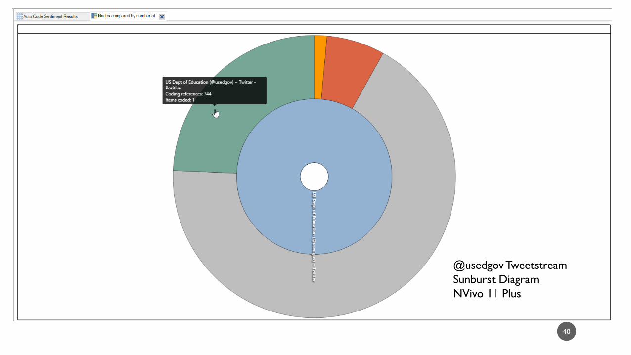
@usedgov Tweetstream
Sunburst Diagram
NVivo 11 Plus

41
@usedgov Tweetstream
3D Bar Chart
NVivo 11 Plus

42
@usedgov Tweetstream
Word Cloud
NVivo 11 Plus

43
@usedgov Tweetstream
Treemap Diagram
NVivo 11 Plus

44
@usedgov Tweetstream
Word Tree (interactive)
NVivo 11 Plus

45
@usedgov Tweetstream
Dendrogram (vertical)
NVivo 11 Plus

46
@usedgov Tweetstream and
@educationgovuk Tweetstream
(based on word similarity)
3D Cluster Diagram
NVivo 11 Plus

48
Education Article on Wikipedia
Spider / Radar Chart
LIWC2015 and MS Excel 2016
96.40
58.96
23.08
46.70 0.00
10.00
20.00
30.00
40.00
50.00
60.00
70.00
80.00
90.00
100.00
Analytic
Clout
Authentic
Tone
Education Article on Wikipedia

49
Education Article on Wikipedia
Treemap Diagram
LIWC2015 and MS Excel 2016
50
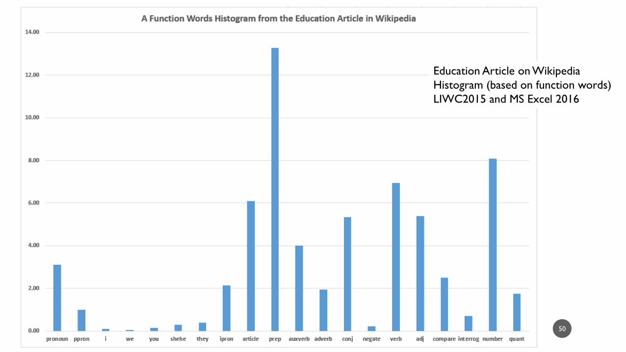
Education Article on Wikipedia
Histogram (based on function words)
LIWC2015 and MS Excel 2016

EDUCATION, TRAINING, ONLINE LEARNING, DISTANCE LEARNING /
GOOGLE BOOKS NGRAM VIEWER
51
52
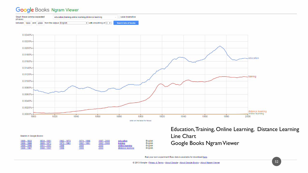
Education, Training, Online Learning, Distance Learning
Line Chart
Google Books Ngram Viewer
“EDUCATION” RELATED TAGS NETWORK ON FLICKR (2 DEG.)
53

54
“Education” Seedingg Term
Related Tags Network on Flickr (1 deg.)
NodeXL
55
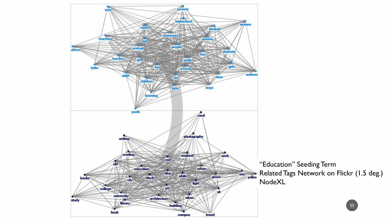
“Education” Seeding Term
Related Tags Network on Flickr (1.5 deg.)
NodeXL

56
“Education” Seedingg Term
Related Tags Network on Flickr (2 deg.)
NodeXL
@USEDGOV USER NETWORK ON TWITTER
57

58
@usedgov user network on Twitter
Social Network Graph
NodeXL

“EDUCATION” ARTICLE NETWORK ON WIKIPEDIA (1DEG.)
59
60
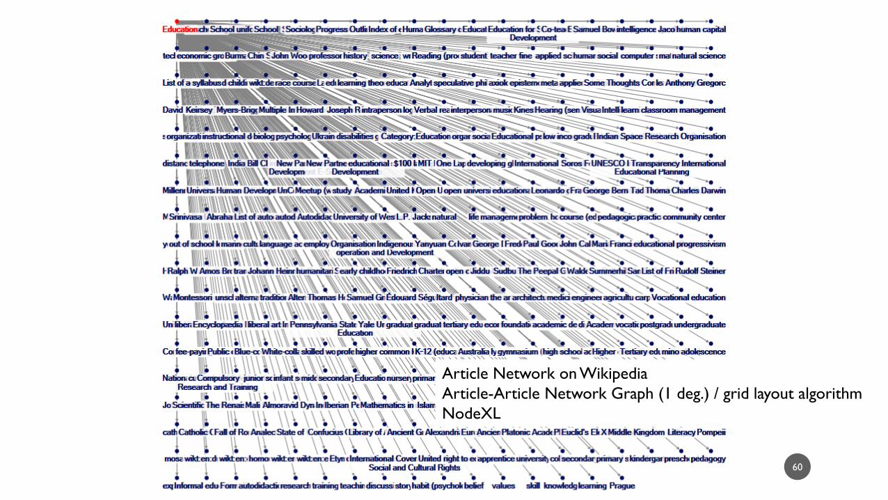
Article Network on Wikipedia
Article-Article Network Graph (1 deg.) / grid layout algorithm
NodeXL
AN INFORMATION TECHNOLOGY (IT) SATISFACTION SURVEY
61
62
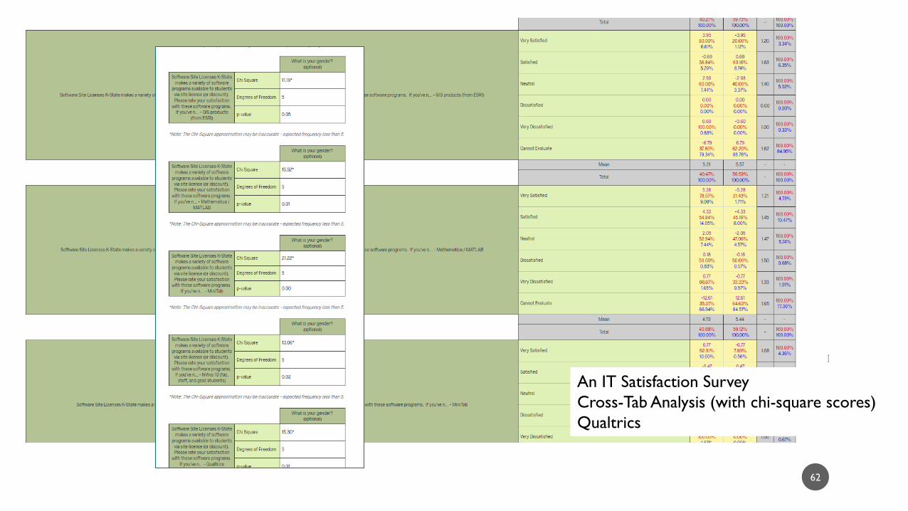
An IT Satisfaction Survey
Cross-Tab Analysis (with chi-square scores)
Qualtrics
THIRD PARTY TOOLS ACTIVATED IN K-STATE INSTANCE OF CANVAS LMS IN DESCENDING
ORDER
63
64
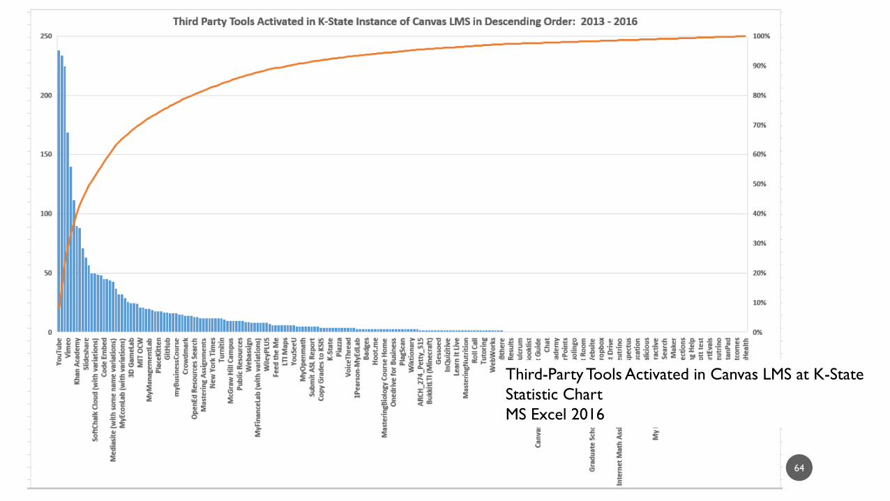
Third-Party Tools Activated in Canvas LMS at K-State
Statistic Chart
MS Excel 2016

65
Third-Party Tools Activated in Canvas LMS at K-State
Packed Bubble Diagram
Tableau Public

66
Third-Party Tools Activated in Canvas LMS at K-State
Treemap Diagram
Tableau Public
SELECTED POPULAR ACTIVATED THIRD-PARTY SOFTWARE IN CANVAS LMS AT K-
STATE
67

68
Canvas LMS Data Portal Data
Streamgraph (a time-based filled-area chart)
MS Excel 2016 with Streamgraph Add-on
(by Microsoft Research)

COURSE WORKFLOW STATES IN THE K-STATE CANVAS LMS INSTANCE
69

70
Canvas LMS Data Portal Data
Doughnut
MS Excel 2016

VARIANT BILL-OUTS FOR SET OF INSTRUCTIONAL DESIGN PROJECTS ON A
UNIVERSITY CAMPUS
71

72
Billing Data for Instructional Design Projects
Scattergraph with Lines
MS Excel 2016

73
Billing Data for Instructional Design Projects
Treemap
MS Excel 2016

TIME-TO-EVENT ANALYSIS (FORMERLY “SURVIVAL ANALYSIS” ) OF INSTRUCTIONAL DES IGN PROJECTS AND TIME WHEN A PROJECT ACHIEVES EVENT ( IS PAID OUT) OR IS CENSORED
(DOES NOT ACHIEVE EVENT DURING THE RESEARCH PERIOD)
74
75
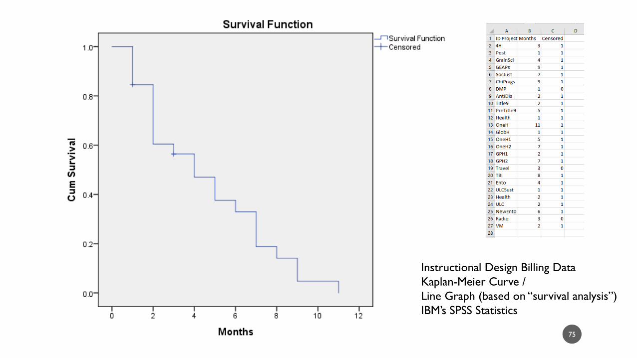
Instructional Design Billing Data
Kaplan-Meier Curve /
Line Graph (based on “survival analysis”)
IBM’s SPSS Statistics

76
Instructional Design Billing Data
Line Chart (based on “survival analysis,”
non-descending stepwise curve)
IBM’s SPSS Statistics
MASTERY OF SOFTWARE CONCEPTUALIZATION
77

78
Conceptual Way to Understand Whether One
Understands a Software Program
Decision Tree
MS Visio
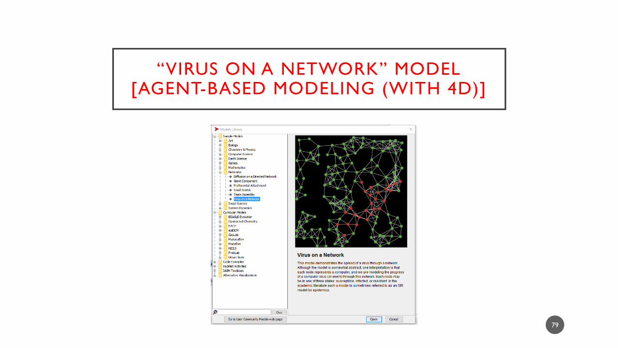
“VIRUS ON A NETWORK” MODEL[AGENT-BASED MODELING (WITH 4D)]
79
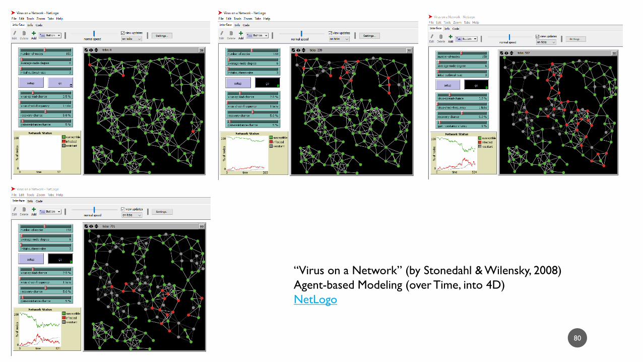
80
“Virus on a Network” (by Stonedahl & Wilensky, 2008)
Agent-based Modeling (over Time, into 4D)
NetLogo

EDX.ORG ACADEMIC YEAR 2012 – 2013(PUBLIC DATASET)
81
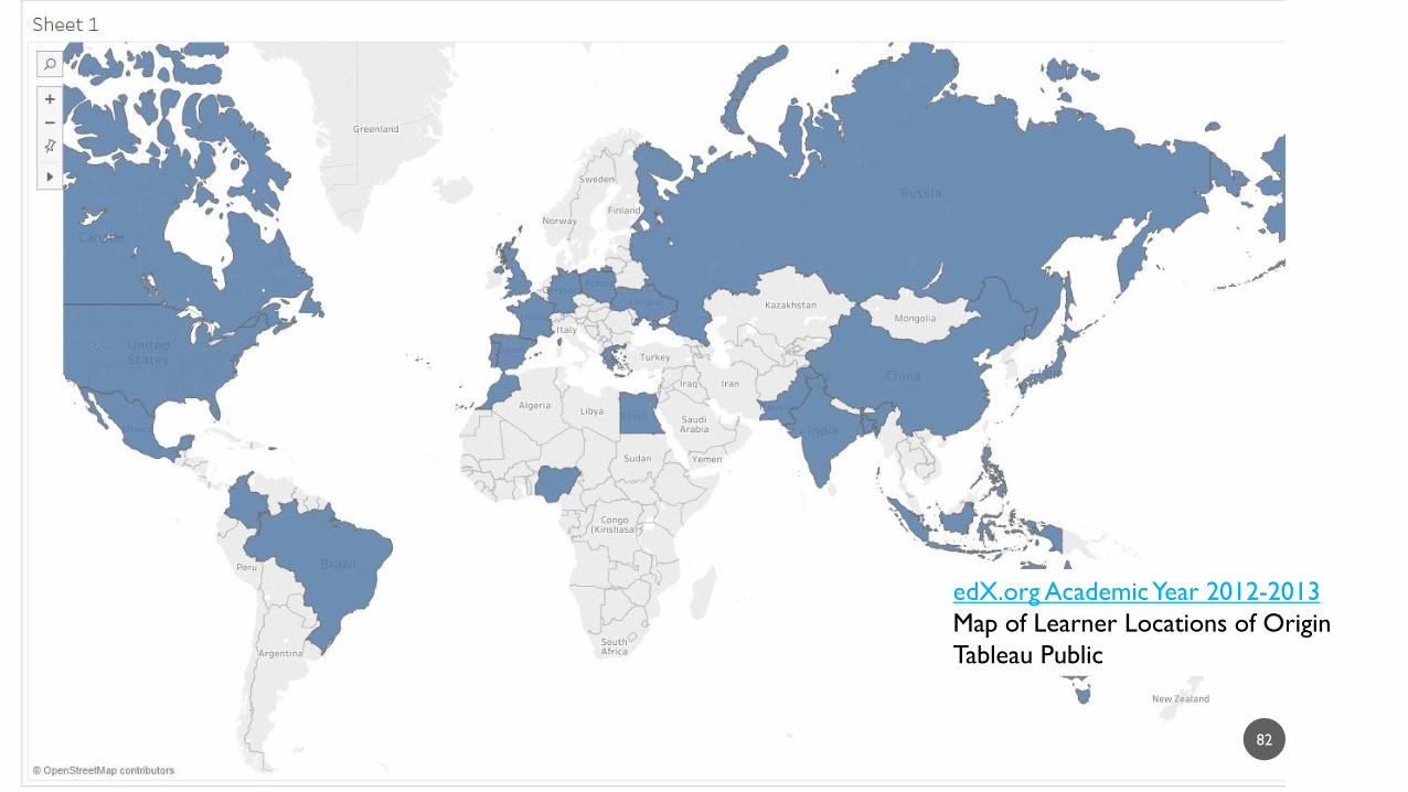
82
edX.org Academic Year 2012-2013
Map of Learner Locations of Origin
Tableau Public

CLASSIC OPEN-SOURCE IRIS DATASET
83
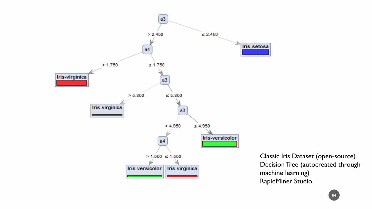
84
Classic Iris Dataset (open-source)
Decision Tree (autocreated through
machine learning)
RapidMiner Studio

EXAMPLE CUSTOMER DATASET (AS PROVIDED IN RAPIDMINER STUDIO)
85

86
Example Customer Dataset
Decision Tree
RapidMiner Studio
DATA AS VISUALIZATION
87

DATA
• What / Entity
• Frequency / Intensity (How Much?)
• Relationships (Association, Causation,
Hierarchical, and Others)
• Slice-in-Time
• Changes over Time
• Shape
• Size, Thickness, Height
• Connected Lines, Scatter in Space, Tree
Structure Diagrams, and Others
• Time Label, Time Indicator
• Line / Scatter over the X-axis
VISUALIZATION
88
DATA -> VISUALIZATION

DATA VISUALIZATIONS IN ONLINE LEARNING
89

COMMON FORMS
• Timelines
• Bar Charts, Pie Charts, Line Charts, and
Others
• Models (Venn Diagrams, Figures)
• Geographical Maps
• Photos / Imagery
• Simulations
• 3D Immersive Virtual Worlds
• 4D Immersive Virtual Worlds
• Games
• Video
90

ONLINE LEARNING CONTEXTS
• Online learning includes both term-length courses and short courses (such as for trainings).
• In online learning, instructors maintain a level of telepresence through interactions and intercommunications with learners.
• Learners maintain some level of inter-communications with their peers. They co-create learning communities to support each other’s learning.
• In an online learning context, learners have to be somewhat self-driven and self-directed.
• Given that online learning occurs via the Web and Internet, learners have easy access to online resources: digital libraries, websites, immersive virtual spaces, online datasets, and other contents.
• Depending on the sociability of others, they will have access to experts and peers to engage with about various topics.
91

ONLINE LEARNING CONTEXTS (CONT.)
• The nature of the online learning context means that online learners will have
access to other datasets and data visualizations related to the same
information…and other perspectives and points-of-view.
• Ostensibly, they’ll be able to see if data visualizations are borrowed and reproduced
from elsewhere (through reverse image search, through basic Web image search).
• They’ll be able to access public datasets.
• They’ll be able to see if there are different datasets, data visualizations, and different
understandings and interpretations of the issue.
92
REQUIRED LEARNER RESPONSES
• The data visualization(s) need to be designed so that learners do the following:
• Pause, not just blitz past
• Engage with the visualization (and interact for the interactive visualizations)
• Extract accurate meaning for the learning
• Reflect
• Follow-through on learning activities
• Experience inspiration
93
DEFINING “EFFECTIVE” DATA VISUALIZATIONS
94

EFFECTIVE DATA VISUALIZATIONS…
• represent the selected underlying data accurately based on the inherent form and structures in the underlying data and on user needs (and control against misperceptions and misunderstandings);
• highlight relevant aspects of the underlying data;
• convey information in an aesthetically pleasing way (to attract human attention and to increase the memorability of the visualization and the underlying information);
• align with conventions of the respective data visualizations (directionality of reading, respective sizes of elements, placement of elements in relation to each other, naming and labeling protocols, perspective, and other aspects);
95

EFFECTIVE DATA VISUALIZATIONS…(CONT.)
• maintain consistency both within and across related data visualizations;
• are accessible in terms of element labeling, text readability, image resolution,
and uses of color [proper contrast, proper color palettes, and way(s) to convey
information beyond color];
• are presented in a contextualized way, including access to information about
the underlying research, data collection, and data cleaning;
• avoid unnecessary (read: purely decorative) elements, and
• occasionally connect to the underlying data (data portals, interactive web-
based data visualizations), among others.
96

HUMAN VISUAL PERCEPTION
97

VISUAL PERCEPTION
• The human visual perception system includes the eyes (cornea, lens, and
retina), the optic nerves, and visual paths in the brain to process light
information.
• The retina contains 150 million light-sensitive rod and cone cells
• In the brain, there are hundreds of millions of neurons that process visual information
(“and take up about 30 percent of the cortex, as compared with 8 percent for touch
and just 3 percent for hearing”)
• Optic nerves consist of “a million fibers” each (Grady, June 1, 1993, “The Vision Thing:
Mainly in the Brain,” Discover)
98

BEYOND THE PHYSICAL
• Perceptual signals do not only come from the world but also from the mind
and body (internally).
• Vision, though, is informed by the prior experiences (prior observed patterns)
of the individual.
• One researcher suggests that in visual perception: 40% comes from visual signals, and
60% comes from prior experiences and memory (Catmull, 2014, Creativity, Inc.:
Overcoming the Unseen Forces that Stand in the Way of True Inspiration, p. 178).
99
COGNITIVE THEORY OF MULTIMEDIA LEARNING
100

MAIN THEORISTS AND THEORIES
• Richard Mayer’s Cognitive Theory of Multimedia Learning (2002):
Engaging cognitively involves costs to the learner.
• (1) Intrinsic cognitive load is related to the difficulty of the topic-to-be-learned.
• (2) Extraneous cognitive load is based on how information is designed and
presented.
• (3) Germane cognitive load is dependent on “the processing, construction and
automation of schemas” (schemas being frameworks for understanding parts of the
world). There are ways to design multimedia to align with human cognitive limits to
lighten cognitive loads to enhance learning.
101
MAIN THEORISTS AND THEORIES (CONT.)
• John Sweller’s Cognitive Load Theory (1988): “Means-ends analysis”
requires high cognitive load on people, and those who teach can lighten the
load by offering organizing schemas and “worked-examples” and “goal-free
problems.”
• Allan Paivio’s Dual-Coding Theory (1960s / 1971): Humans process
information through separate auditory and visual channels. Verbal (word,
symbolic) and non-verbal (visual image) information is processed in different
channels.
102
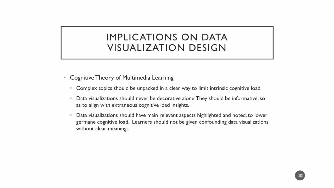
IMPLICATIONS ON DATA VISUALIZATION DESIGN
• Cognitive Theory of Multimedia Learning
• Complex topics should be unpacked in a clear way to limit intrinsic cognitive load.
• Data visualizations should never be decorative alone. They should be informative, so
as to align with extraneous cognitive load insights.
• Data visualizations should have main relevant aspects highlighted and noted, to lower
germane cognitive load. Learners should not be given confounding data visualizations
without clear meanings.
103
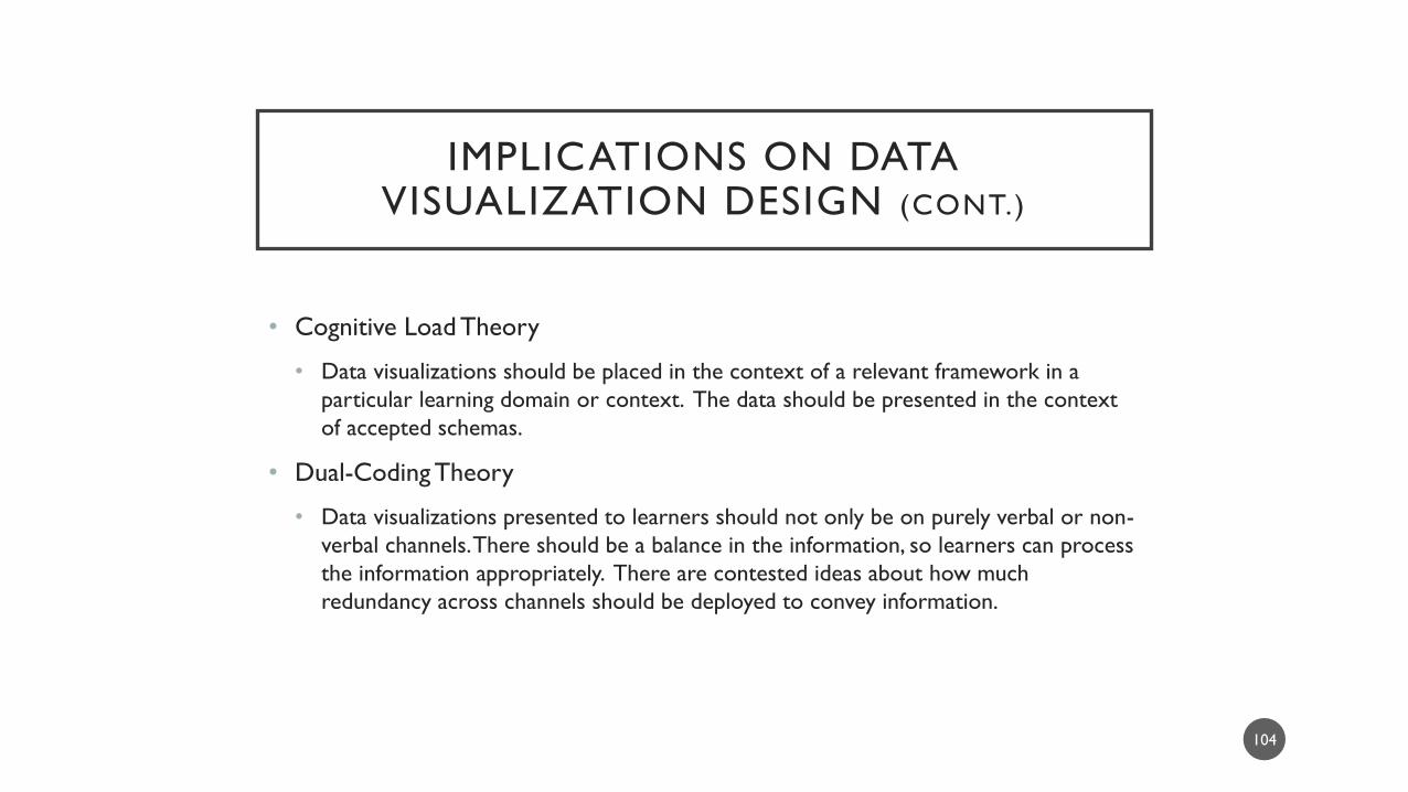
IMPLICATIONS ON DATA VISUALIZATION DESIGN (CONT.)
• Cognitive Load Theory
• Data visualizations should be placed in the context of a relevant framework in a
particular learning domain or context. The data should be presented in the context
of accepted schemas.
• Dual-Coding Theory
• Data visualizations presented to learners should not only be on purely verbal or non-
verbal channels. There should be a balance in the information, so learners can process
the information appropriately. There are contested ideas about how much
redundancy across channels should be deployed to convey information.
104

STEPS TO CREATING DATA VISUALIZATIONS
105
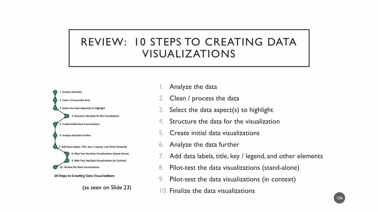
REVIEW: 10 STEPS TO CREATING DATA VISUALIZATIONS
1. Analyze the data
2. Clean / process the data
3. Select the data aspect(s) to highlight
4. Structure the data for the visualization
5. Create initial data visualizations
6. Analyze the data further
7. Add data labels, title, key / legend, and other elements
8. Pilot-test the data visualizations (stand-alone)
9. Pilot-test the data visualizations (in context)
10. Finalize the data visualizations 106
(as seen on Slide 23)

DEBRIEFING THE SEQUENCE
• A data visualization begins with intimate knowledge of the underlying data.
• Data often has to be processed in the correct format for visualization.
• Data visualizations are used partially as a data exploration method.
• Data are often processed in multiple different methods…and even in multiple different software programs in order to see what may be learned from the data.
107
• Depending on aesthetics, some may process data in one tool and export the resulting data tables and / or other digital artifacts for final processing in other software programs.
• There are data visualization drafts created before a final one is output (for presentation).
• Data visualizations have to be human-readable and human-usable.

MORE TO THE STORY…
• To create relevant data visualizations, those who would design data visualizations need to understand the following:
• the underlying data and prior research
• the statistical assumptions
• the conventions of the particular data visualizations
• the target audiences (and the incidental audiences)
• the socio-cultural and geographical backgrounds of the target and incidental audiences (in order to avoid miscommunications and potential offense)
• the requirements (color processing, resolution, and others) and technical versions of the imagery needed for digital distribution and print
108
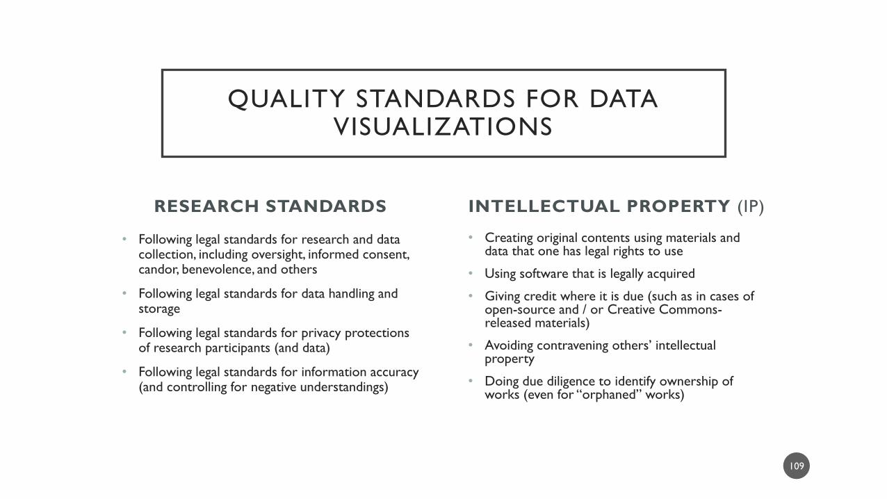
RESEARCH STANDARDS
• Following legal standards for research and data collection, including oversight, informed consent, candor, benevolence, and others
• Following legal standards for data handling and storage
• Following legal standards for privacy protections of research participants (and data)
• Following legal standards for information accuracy (and controlling for negative understandings)
• Creating original contents using materials and data that one has legal rights to use
• Using software that is legally acquired
• Giving credit where it is due (such as in cases of open-source and / or Creative Commons-released materials)
• Avoiding contravening others’ intellectual property
• Doing due diligence to identify ownership of works (even for “orphaned” works)
INTELLECTUAL PROPERTY (IP)
109
QUALITY STANDARDS FOR DATA VISUALIZATIONS
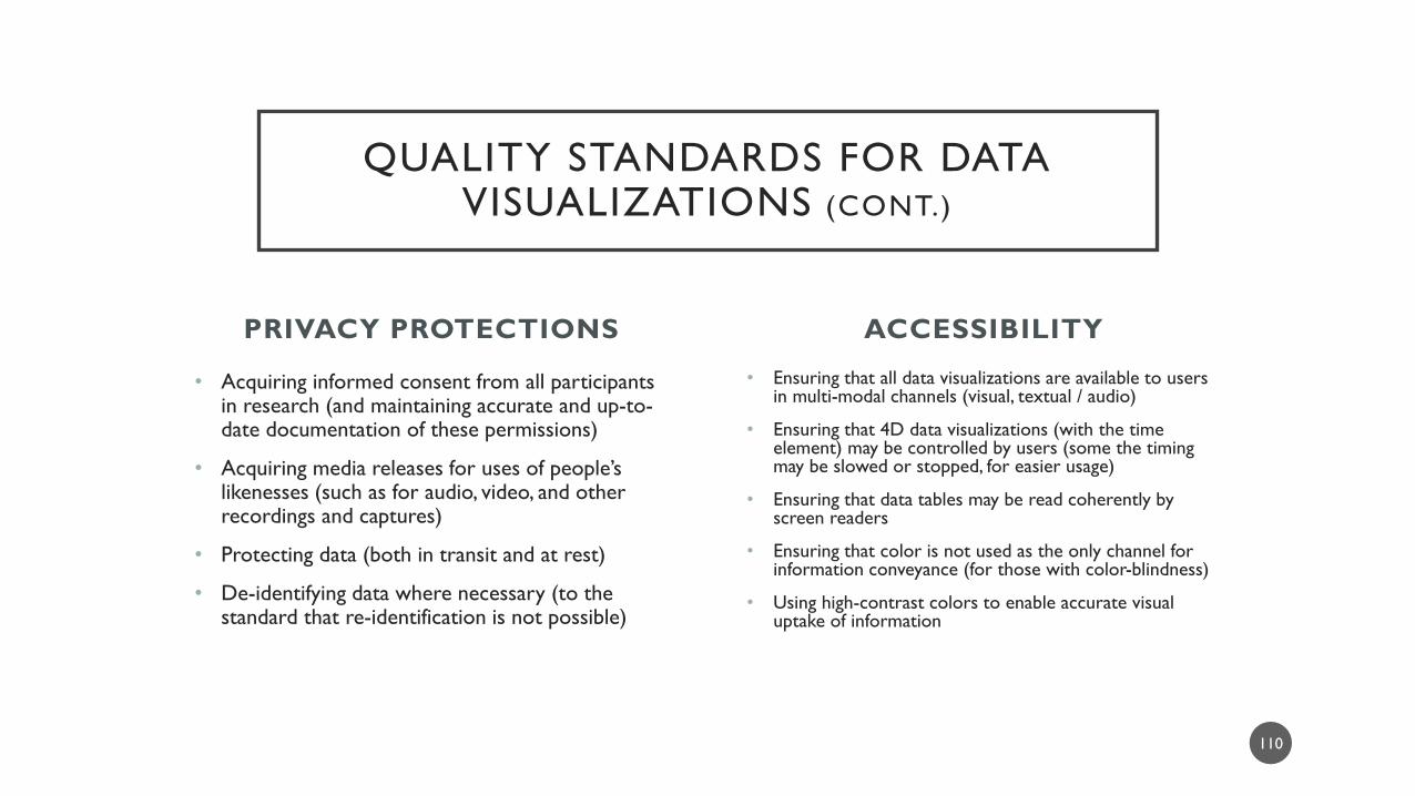
PRIVACY PROTECTIONS
• Acquiring informed consent from all participants in research (and maintaining accurate and up-to-date documentation of these permissions)
• Acquiring media releases for uses of people’s likenesses (such as for audio, video, and other recordings and captures)
• Protecting data (both in transit and at rest)
• De-identifying data where necessary (to the standard that re-identification is not possible)
• Ensuring that all data visualizations are available to users in multi-modal channels (visual, textual / audio)
• Ensuring that 4D data visualizations (with the time element) may be controlled by users (some the timing may be slowed or stopped, for easier usage)
• Ensuring that data tables may be read coherently by screen readers
• Ensuring that color is not used as the only channel for information conveyance (for those with color-blindness)
• Using high-contrast colors to enable accurate visual uptake of information
ACCESSIBILITY
110
QUALITY STANDARDS FOR DATA VISUALIZATIONS (CONT.)

ADDITIONAL COMMON ERRORS IN DATA VISUALIZATIONS
The Data
• Introducing error in data handling, data processing, and / or data cleaning
• People who work too quickly will accidentally delete information or corrupt it if they
are non-thinking in their work
• Using an unaligned data visualization type for the underlying data
• It’s easy to get a software program to output a data visualization without actually
understanding what is going on with the data or in the software
111

ADDITIONAL COMMON ERRORS IN DATA VISUALIZATIONS (CONT.)
The Data (cont.)
• Using high-density data that may overpower the data visualization
• Excessive nodes in a network will make the network unreadable
• Insufficient understanding of the limits of assertions that may be made with
that visualization
• Not remembering that data visualizations are summary data, not comprehensive (in
most cases)
• Not remembering that data visualizations are inherently ambiguous and polysemous
(multi-meaninged) and can be interpreted in different ways by different beholders
112

ADDITIONAL COMMON ERRORS IN DATA VISUALIZATIONS (CONT.)
The Data (cont.)
• Labeling data visualization elements incorrectly
• Insufficient labeling of visual elements (such as data labels) in the data visualization
• Incorrect labeling of data elements (confusing rates over time with set amounts)
• Using mixed measures in data
• Not using consistent time measures
113
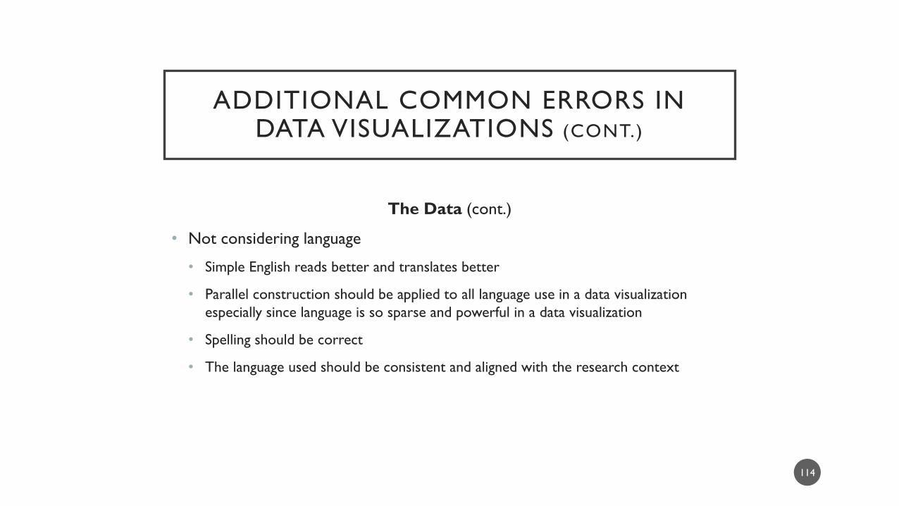
ADDITIONAL COMMON ERRORS IN DATA VISUALIZATIONS (CONT.)
The Data (cont.)
• Not considering language
• Simple English reads better and translates better
• Parallel construction should be applied to all language use in a data visualization
especially since language is so sparse and powerful in a data visualization
• Spelling should be correct
• The language used should be consistent and aligned with the research context
114

ADDITIONAL COMMON ERRORS IN DATA VISUALIZATIONS (CONT.)
The Software
• Using software without understanding the software
• Researchers will use software programs without reading the manuals and the underlying documentation (or they’ll go to forums before they go to the actual documentation)
• Of course, some software makers do not document as well as they should (most will not reveal underlying algorithms, for example)
• Researchers need to understand the software programs they’re using, particularly for coding and analysis
• They need to represent what they learned while using the software, not just mention that they used the software (as if that would lend their work credibility)
• Shabby work reads as shabby, and name-dropping a software tool will not make things better
115
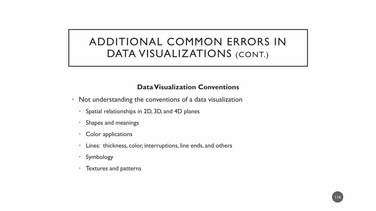
ADDITIONAL COMMON ERRORS IN DATA VISUALIZATIONS (CONT.)
Data Visualization Conventions
• Not understanding the conventions of a data visualization
• Spatial relationships in 2D, 3D, and 4D planes
• Shapes and meanings
• Color applications
• Lines: thickness, color, interruptions, line ends, and others
• Symbology
• Textures and patterns
116

ADDITIONAL COMMON ERRORS IN DATA VISUALIZATIONS (CONT.)
Contextual Details
• Not offering sufficient contextual details to fully understand a data visualization
• Not including data parameters for data processing in a data visualization
• Not indicating that a data visualization is conceptual vs. empirical
• Not labeling synthetic or faux data as such
• Misrepresentations of information
117

ADDITIONAL COMMON ERRORS IN DATA VISUALIZATIONS (CONT.)
Going Glam / Not Going Glam
• Using data visualizations that are glamorous (read: 3D) but which misrepresent data
• Misplacement of data on the x, y, or z axes
• Occlusion of visual data
• Not considering aesthetics
• Using mixed color palettes (or using colors without any consistency or strategy)
• Using poor aspect ratio (stretching data visualizations)
• Not designing for white space (by overloading a data visualization)
118

ADDITIONAL COMMON ERRORS IN DATA VISUALIZATIONS (CONT.)
Audience Needs
• Not fully considering audience needs [such as by running pilot tests; such as building for both expert and general audiences (simultaneously)]
• Visual perception needs; cognitive and symbolic processing needs (symbols, language); accessibility needs
• Learner developmental stage needs (with implications for the data visualization and the sequence of related data visualizations)
• Informational needs
• Technological needs (such as viewing data visualizations on mobile devices and smartphones with small screens)
119
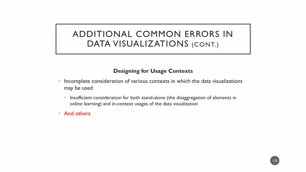
ADDITIONAL COMMON ERRORS IN DATA VISUALIZATIONS (CONT.)
Designing for Usage Contexts
• Incomplete consideration of various contexts in which the data visualizations
may be used
• Insufficient consideration for both stand-alone (the disaggregation of elements in
online learning) and in-context usages of the data visualization
• And others
120

TEMPLATING
• For those working on projects, it helps to…
• define comprehensive data visualization
standards early in a project stylebook
• use prototypes of data visualizations and
images and test these with people who are
similar to those who will ultimately consume
the data visualizations
• create evolving data visualization templates for
use during the lifespan of the project
• It is important to keep clear
documentation of all work and how the
data visualizations were created
• It is important to keep all raw files,
especially data ones, for re-do’s as
needed
CLEAR DOCUMENTATION
AND STORAGE OF RAW FILES
121
QUALITY APPROACHES
CONVENTIONS OF DATA VISUALIZATIONS
122
SOME COMMON DATA VISUALIZATION CONVENTIONS
• There are senses that there are optimal amounts of data for a particular data visualization. Excessive data makes a data visualization hard-to-read or confusing; too sparse data makes a data visualization feel incomplete.
• Data visualizations are generally read from top-to-bottom and left-to-right.
• Timelines are read either from top-to-bottom or left-to-right, for example.
• If there is a sequence of data visualizations, these are usually presented from simple to complex.
• In linear regressions, the x-axis is usually time, and the y-axis is the variable. Or, both can be variables.
• Data may be engaged with with varying levels of granularity. Less specific data may not be labeled, but at finer levels of granularity, data labels are often used.
123

SOME COMMON DATA VISUALIZATION CONVENTIONS (CONT.)
• Time is often an important part of a data visualization, whether time is treated
as discrete (slice-in-time), periodic (in phases), or as continuous. Time is an
important variable in all research.
• Data visualizations are usually named for easier reference.
• If external data is used, the data source should be cited.
• Some data visualizations are offered along with underlying datasets that inform
the data visualization—for reproducibility of the data visualization (and for
enriched research using the shared data).
124

SOME COMMON DATA VISUALIZATION CONVENTIONS (CONT.)
• Aesthetically, data visualizations are created with a proper balance of filled-in
spaces and white spaces.
• Color palettes are deployed for both aesthetics and for accessibility (proper
color contrasts).
• Font types tend to be sans serif for easier readability.
• Font sizes tend to be within a certain size range, so that there are not huge
differences in sizes, particularly for shared and similar types of data. (The font
sizes of titles may be quite a bit larger than other fonts used in a data
visualization because of its role in the visualization.)
125
2D
126

BASICS ABOUT 2D DATA VISUALIZATIONS
• 2D data visualizations exist on a flat two-dimensional plane.
• The planes are usually squares or rectangles (quadrilaterals). Within the area,
various types of data visualizations may be displayed.
• Generally 2D data visualizations are understood to have an x-axis and a y-axis
(such as linear regression graphs, bar charts, and others). In some cases, the x-
and y- axes do not apply since the visualization may be rotated and maintain
the same meaning (such as some forms of network graphs, bubble diagrams,
and others).
127

3D
128
BASICS ABOUT 3D DATA VISUALIZATIONS
• Three-dimensional (3D) data visualizations are drawn on a space that involves
more than area (also volume) and three dimensions: x-axes, y-axes, and z-axes.
• In many software tools, the 3D effect is created with shading and the
appearance (illusion) of a third dimension.
• Such visualizations tend to be rotate-able and zoomable for clarity.
• People are not thought to process 3D data very well because of challenges
with occlusion and visual ambiguity.
• Often, 3D visualizations may also be offered in 2D.
129

4D
130
BASICS ABOUT 4D DATA VISUALIZATIONS
• The fourth dimension is conceptualized as time. For data visualizations, this means changes over time.
• Changes over time may be seen in spaces that are two-dimensional or three-dimensional.
• Time may be discrete (a particular slice-in-time), phased (into periods), or continuous.
• Time may be presented in sequential order or reverse-sequential order, in terms of phased or continuous time.
• In data visualizations, time may be run forwards or backwards in simulations, virtual immersive worlds, and video.
131

SEQUENCING DATA VISUALIZATIONS
132

SOME ORDER PREFERABLE
• Data visualizations may be presented in a particular order or sequence.
• The order may be somewhat serendipitous only in terms of placement in a slideshow,
in a book, on a web page, and so on.
• The order may be purposeful to highlight some macro-level observation about the
data.
• No matter how the presentation order comes about, it helps to have an
underlying rationale or logical trajectory for the sequence.
• This small section provides some ideas for the data visualization sequencing.
133
TIME-BASED ORDER
• Data visualizations may show a phenomenon changing over time.
• The changes may be a factor of time, a factor of an intervention or multiple
interventions, a factor of a process, or other factors.
• Time itself may be discrete, phased, or continuous.
• The time may be in sequential order, reverse-sequential order, or some mix of
phasing.
134

SIMPLE-TO-COMPLEX ORDER
• Data visualizations may be presented in a simple-to-complex way, to bring
observers along with the flow of the data revelations.
• Simple pieces may be offered first to build up to a complex summary data
visualization, for example.
• Or, the data visualizations may begin with a complex visualization and then
offer more simple zoomed-in views of to offer more in-depth discussion and
insights.
135
THEORETICAL AND ACTUAL ORDER
• Another sequence may begin with a concept or model or some theoretical
conceptualization followed by empirical and actual data.
• This is the top-down approach, beginning with the general and moving to the specifics.
• Or, the sequence can go the other way, with observations from-world…and
moving to a more general data visualization.
• This is more of a bottom-up approach, beginning with specifics and moving to the
general.
136
FEATURE-BASED ORDER
• Most datasets today are multi-dimensional and complex. One way to sequence
data visualizations is to focus on different aspects or features of the dataset.
• It may be helpful to create an over-arching structure of the dataset’s features
and use those to organize the data visualizations.
• For example, if datasets involve a learning management system, would it be
helpful to organize the data visualizations by the data dictionary? The various
features of the LMS from most commonly used to the least commonly used?
The features by role (student, faculty, advisor, instructional designer, librarian,
and administrator)?
137

CONTEXTUALIZING DATA VISUALIZATIONS
138
A DATA VISUALIZATION “SURROUND”
• Data visualizations may be presented not only as stand-alone visualizations but within a context or surround.
• A most close-in aspect of context may involve the data visualization directly.
• An important aspect of context involves the backstory behind the data visualization.
• Where did the data come from? What sort of research was conducted in order to capture the data? How was the data cleaned and processed?
• If datasets were mixed, where did the data come from? How were the datasets mixed? Who should be credited?
• What are some qualifiers that need to be applied to the data visualizations?
139

SOME BENEFITS OF PROVIDING “CONTEXT”
• If designed properly, a context for a data visualization achieves the following:
• enriches the data
• provides direction for proper interpretation of the data (highlights what “story” the data are telling)
• suggests the relevance of the data in the real world
• raises interest about the data visualization(s)
• offers access to the underlying dataset
• provides ideas about where to acquire more relevant information about the related data
• gives credit where it is due for the data visualization, the dataset, the research, and other related information, and others
140

ELEMENTS OF “CONTEXT”
• At a superficial level, data visualization “context” involves the lead-up and lead-away text surrounding the data visualization.
• This may include stories to “set up” the phenomenon under study.
• This may include table data and downloadable datasets.
• This may include captioning, credits, research citations, and other details.
• This may include qualifiers.
• This may include lead-up multimedia (audio, video, and others) to prime learners to understand the data visualization.
• There may be a lead-up or lead-away interview by the researchers or data analysts or others related to the work.
141
“CONTEXT” BY ASSIGNMENT
• The learning situation offers some direction for the design of data visualization context. Especially in a learning context, the instrumental uses of the data visualization are important.
• The assignment should specify how learners should read / use the data visualization or the data visualization sequence.
• For cognitive scaffolding, it may help to let learners know what to pay attention to in the respective data visualizations. In a simple case, learners may only need to view the data visualization and interpret what its meaning is.
• Some assignments can be broadly open-ended, with the data visualization(s) as a jumping-off point for discussions, analyses, research, and other work.
142

DATA VISUALIZATIONS IN ONLINE LEARNING CONTEXTS
• A slideshow
• A video
• A simulation
• A discussion board conversation
• A case for analysis
• A role play
• A group project
• A writing assignment
• A research assignment
• A field trip, and others
143

“CONTEXT” BY ISSUE
• Another method to build a surround around a data visualization or series of
data visualizations is by contextualizing these as part of an issue.
• An issue may be an in-world phenomenon, with its own history, evolution,
present, and future. There may be particular dynamics with this phenomenon
and certain levers and mechanisms that may affect the changes to this
phenomenon.
• The data visualization(s) may be presented to highlight aspects of this in-world
issue.
144
USER INTERACTIVITY WITH THE DATA VISUALIZATIONS
145

WHY USER INTERACTIVITY?
• Data visualizations are not just static and flat files.
• Many enable various types of interactions:
• adjusting parameters of a model (such as data inputs and outputs);
• engaging time (speeding it up, slowing it down, stopping it);
• zooming in and out to disambiguate, and
• accessing underlying data.
• Interactions with data visualizations may enable easier learning (with lower
cognitive loads) and the creation of insights.
146

DATA INPUTS AND OUTPUTS
• There are a number of data visualizations (built on NetLogo, Wolfram Language, and others) that enable users to change up the parameters of the data visualizations (including data) in order to see what will happen.
• Such data visualizations are focused on system effects of different parameters.
• Often, inputs may be emplaced with slider bars or forms.
• In some cases, it is important to design these with natural data limits (so as not to enable going beyond reality). In other cases, such interactive data visualizations are able to be informed by imaginary data ranges and others.
• Some of these data visualizations enable predictivity into the unknown and into the future. (Agent-based models can be played out into imagination realms by enabling hundreds of thousands of iterations or more, to see how systems change over time given theoretical parameters.)
147
ENGAGING TIME
• Some data visualizations enable viewers to engage time…to start at particular
points of the 4D visualization, to pause, to restart, and so on. Data
visualizations may sometimes be slowed or speeded up.
• The phenomenon in such data visualizations include those that illuminate
systems and system effects.
148

ZOOMING IN AND OUT TO DISAMBIGUATE
• Some data visualizations may be sufficiently complex that objects in data
visualizations may be occluded. To disambiguate complex data visualizations,
such as word networks or 3D cluster diagrams, many enable zooming in and
out to disambiguate the data.
• Many of these also enable the moving around of nodes and links in order to
enable clear visibility.
149

ACCESS TO UNDERLYING DATA
• Another type of interactivity with data visualizations involves viewers accessing
the underlying data behind the data visualization.
• For example, a text set which has been coded for sentiment may be explored
by clicking on a bar on a bar chart, to access the coded data under that
particular level of sentiment. Or a node representing an interview subject may
be clicked to access the underlying transcript.
• This type of interactivity enables the individual to explore the related data
more deeply.
150

ABOUT DATA VISUALIZATIONS AND DECISION-MAKING
151

HUMAN DECISION-MAKING
• Data and data visualizations provide information about in-world phenomena and in-world potentials.
• There are computational methods that enable the surfacing of latent patterns from data that would be invisible otherwise.
• Data visualizations make latent insights visible and human-perceivable.
• Ultimately, it is the data behind the data visualization that should inform the decision-making.
• It’s rare that one data visualization or even a sequence or a set will be sufficiently informative or compelling to sway an important decision, but data visualizations may be powerful depending on how they are created and harnessed.
152

SOME QUICK TAKEAWAYS
153

THE UNDERLYING DATA
• Data visualizations reference underlying data in a data summarization way.
• This data may be descriptive, inferential, deductive, inductive, analytical,
conceptual, predictive, or some mix of the prior.
• Historically, structured and semi-structured data have particular ways that they
are explored and visually expressed.
• Data visualizations have conventions that they must follow based on prior practice
and common understandings.
154
SOFTWARE TOOLS
• Software tools have to be used appropriately for accurate data visualizations.
Tools have differing strengths for data visualizations.
• Predictive analytics tools have tests of models…
• Manual drawing tools have grids, guidelines, templates, and pre-made shapes.
• Data visualizations should accurately represent the underlying data. The design
of the data visualization should be tailored to the targeted and potential
audiences and work against negative learning / misunderstandings.
155

STAYING LEGAL
• Data visualizations should be based on solid research practices.
• Data visualizations should be created in legal ways. Relevant laws include
intellectual property, privacy protections, accessibility, and others.
156

TECHNOLOGICAL FEATURES
• Data visualizations should be designed optimally for the following technological
features:
• accessibility
• human usability across platforms and devices
• machine readability
• preservation (future-proofing across time)
157

A NOTE ABOUT THE SOFTWARE
158
SOFTWARE
• The data visualizations were created with various types of data, various data
sources, various seeding terms and data parameters, and software.
• The software used for data visualizations include the following (in alphabetical
order): Google Books Ngram Viewer, IBM’s SPSS Statistics, LIWC2015,
Microsoft Excel 2016, MS Visio, NetLogo, NodeXL (Network Overview,
Discovery and Exploration for Excel by Microsoft and available on CodePlex),
NVivo 11 Plus (QSR International), Qualtrics, RapidMiner Studio, and Tableau
Public.
• Backup software include Gadwin PrintScreen and Adobe Photoshop.
159

CONTACT AND CONCLUSION
• Dr. Shalin Hai-Jew
• Instructional Designer
• iTAC
• Kansas State University
• 212 Hale Library
• 785-532-5262
• Note: The presenter has no professional
ties to any of the software makers
mentioned here.
• Thanks! I am grateful to the organizers
of the 4th Annual Big 12 Teaching &
Learning Conference at Texas Tech
University for including this presentation
in their lineup.
160