Embed Size (px)
Citation preview
1
PortfolioAdrienne LaBare
1
Contact
Adrienne LaBare60121 Garcia BLVD
Joint Base Lewis-McChord, [email protected]
801.376.7968
Table ofContents
2
4
6
8
10
12
14
16
18
Brochure
Web Page Mock Up
Business Identity
Prezi Presentation
PhotoDesign
Infographic
Montage
Coding
Magazine Cover
32
Date
Course
Instructor
Programs
Description
Objective
Process
Comm 130 Section 13
Sara Tranberg
November 30, 2016
Adobe Photoshop, InDesign
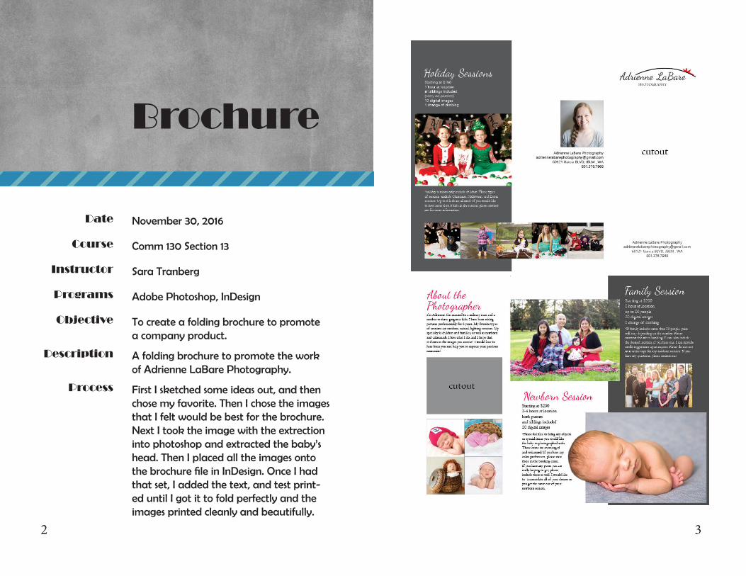
To create a folding brochure to promotea company product.
A folding brochure to promote the workof Adrienne LaBare Photography.
First I sketched some ideas out, and then chose my favorite. Then I chose the images that I felt would be best for the brochure. Next I took the image with the extrection into photoshop and extracted the baby’s head. Then I placed all the images onto the brochure file in InDesign. Once I had that set, I added the text, and test print-ed until I got it to fold perfectly and the images printed cleanly and beautifully.
Brochure
54
Date
Course
Instructor
Programs
Description
Objective
Process
Comm 130 Section 13
Sara Tranberg
Web PageMock Up
November 16, 2016
Adobe Photoshop
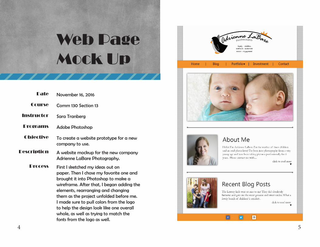
To create a website prototype for a new company to use.
A website mockup for the new companyAdrienne LaBare Photography.
First I sketched my ideas out on paper. Then I chose my favorite one and brought it into Photoshop to make a wireframe. After that, I began adding the elements, rearranging and changingthem as the project unfolded before me. I made sure to pull colors from the logo to help the design look like one overall whole, as well as trying to match the fonts from the logo as well.
76
Date
Course
Instructor
Programs
Description
Objective
Process
Comm 130 Section 13
Sara Tranberg
October 26, 2016
Adobe Illustrator, InDesign
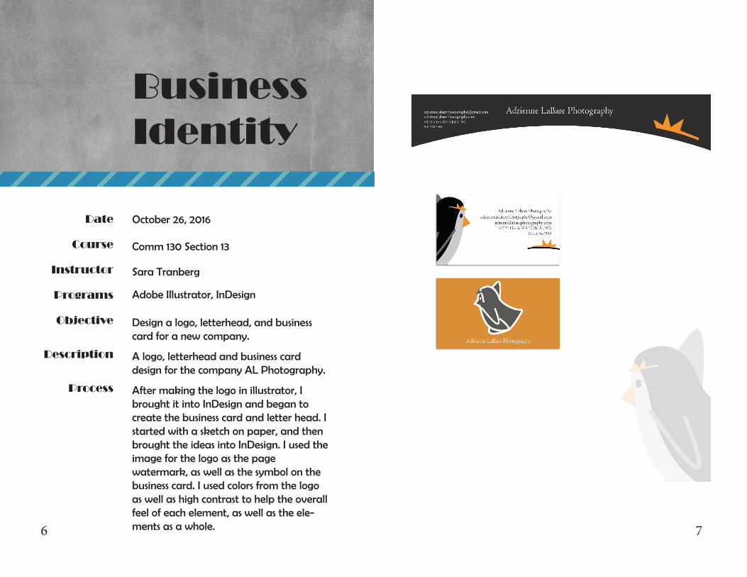
Design a logo, letterhead, and businesscard for a new company.
A logo, letterhead and business card design for the company AL Photography.
After making the logo in illustrator, I brought it into InDesign and began tocreate the business card and letter head. I started with a sketch on paper, and then brought the ideas into InDesign. I used the image for the logo as the pagewatermark, as well as the symbol on the business card. I used colors from the logo as well as high contrast to help the overall feel of each element, as well as the ele-ments as a whole.
BusinessIdentity
98
Date
Course
Instructor
Programs
Description
Objective
Process
Comm 130 Section 13
Sara Tranberg
Prezi Presentation
October 5, 2016
Prezi Presentation Software
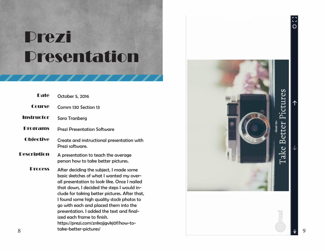
Create and instructional presentation with Prezi software.
A presentation to teach the average person how to take better pictures.
After deciding the subject, I made some basic sketches of what I wanted my over-all presentation to look like. Once I nailed that down, I decided the steps I would in-clude for taking better pictures. After that, I found some high quality stock photos to go with each and placed them into the presentation. I added the text and final-ized each frame to finish. https://prezi.com/znkojjgvkj0f/how-to-take-better-pictures/
1110
Date
Course
Instructor
Programs
Description
Objective
Process
Comm 130 Section 13
Sara Tranberg
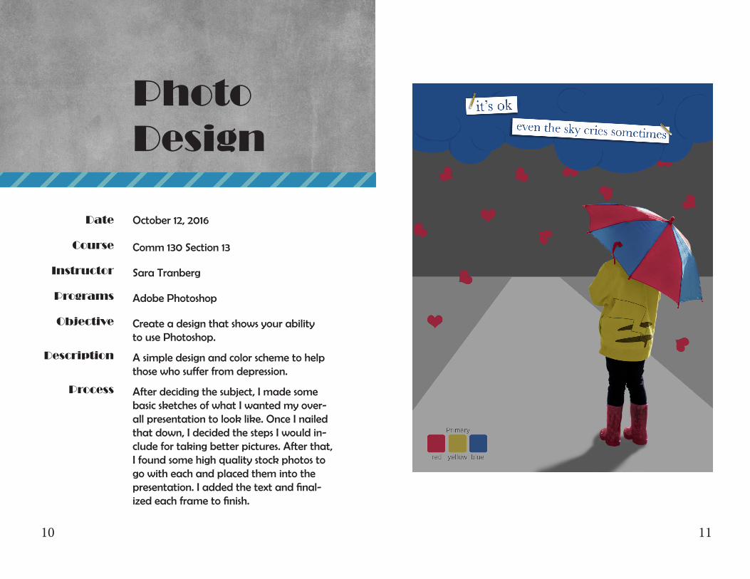
PhotoDesign
October 12, 2016
Adobe Photoshop
Create a design that shows your abilityto use Photoshop.
A simple design and color scheme to helpthose who suffer from depression.
After deciding the subject, I made some basic sketches of what I wanted my over-all presentation to look like. Once I nailed that down, I decided the steps I would in-clude for taking better pictures. After that, I found some high quality stock photos to go with each and placed them into the presentation. I added the text and final-ized each frame to finish.
1312
Date
Course
Instructor
Programs
Description
Objective
Process
Comm 130 Section 13
Sara Tranberg
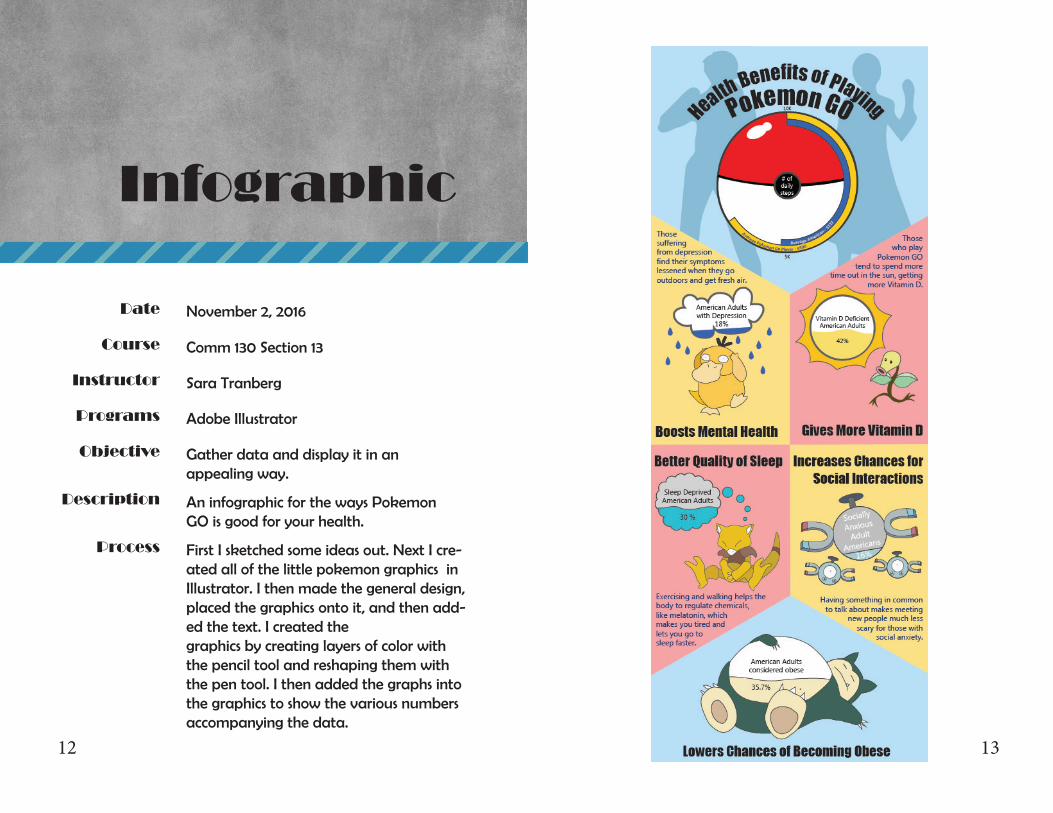
Infographic
November 2, 2016
Adobe Illustrator
Gather data and display it in an appealing way.
An infographic for the ways PokemonGO is good for your health.
First I sketched some ideas out. Next I cre-ated all of the little pokemon graphics in Illustrator. I then made the general design, placed the graphics onto it, and then add-ed the text. I created the graphics by creating layers of color with the pencil tool and reshaping them with the pen tool. I then added the graphs into the graphics to show the various numbers accompanying the data.
1514
Date
Course
Instructor
Programs
Description
Objective
Process
Comm 130 Section 13
Sara Tranberg
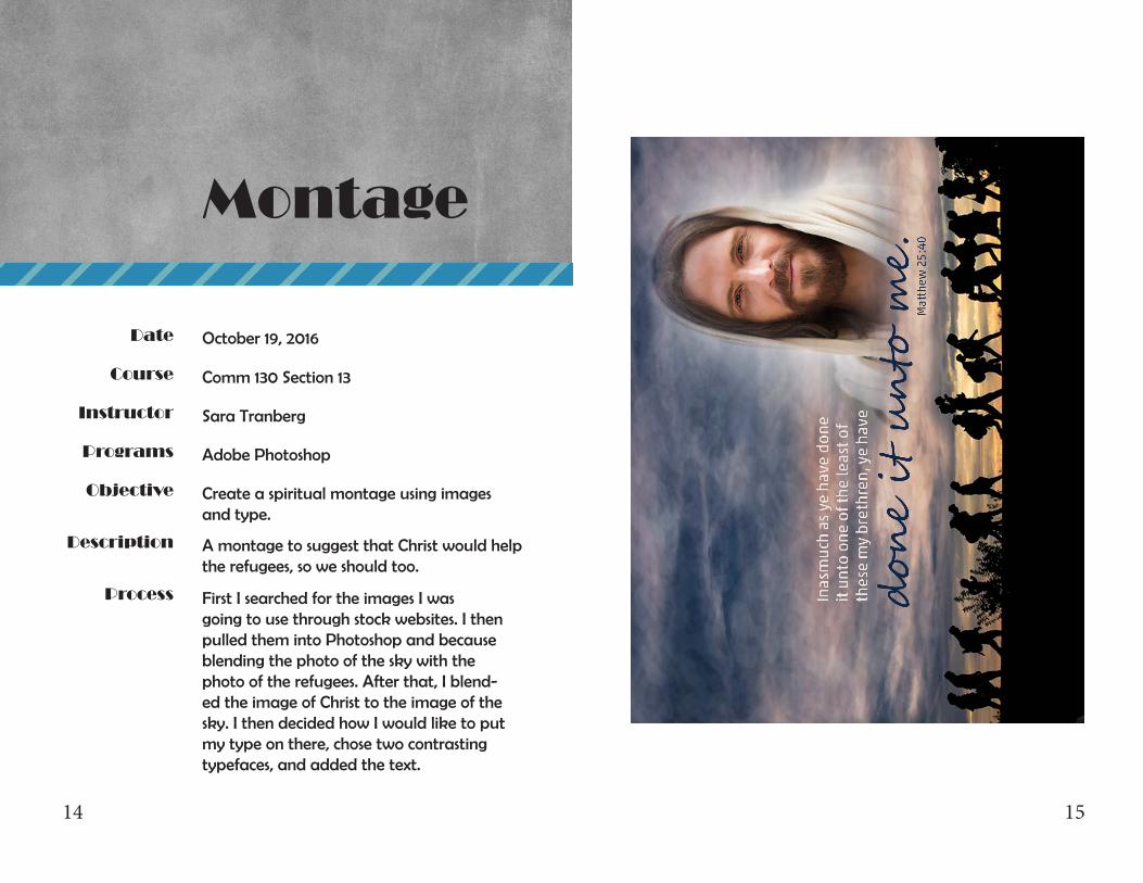
Montage
October 19, 2016
Adobe Photoshop
Create a spiritual montage using imagesand type.
A montage to suggest that Christ would help the refugees, so we should too.
First I searched for the images I was going to use through stock websites. I then pulled them into Photoshop and because blending the photo of the sky with the photo of the refugees. After that, I blend-ed the image of Christ to the image of the sky. I then decided how I would like to put my type on there, chose two contrasting typefaces, and added the text.
1716
Date
Course
Instructor
Programs
Description
Objective
Process
Comm 130 Section 13
Sara Tranberg
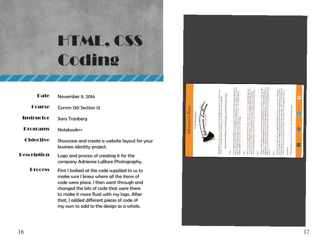
HTML, CSS Coding
Notebook++
November 9, 2016
Showcase and create a website layout for your business identity project.
Logo and process of creating it for thecompany Adrienne LaBare Photography.
First I looked at the code supplied to us to make sure I knew where all the items of code were place. I then went through and changed the bits of code that were there to make it more fluid with my logo. After that, I added different pieces of code of my own to add to the design as a whole.
1918
Date
Course
Instructor
Programs
Description
Objective
Process
Comm 130 Section 13
Sara Tranberg
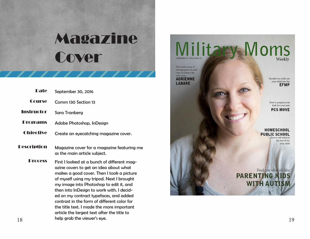
MagazineCover
September 30, 2016
Adobe Photoshop, InDesign
Create an eyecatching magazine cover.
Magazine cover for a magazine featuring me as the main article subject.
First I looked at a bunch of different mag-azine covers to get an idea about what makes a good cover. Then I took a picture of myself using my tripod. Next I brought my image into Photoshop to edit it, and then into InDesign to work with. I decid-ed on my contract typefaces, and added contrast in the form of different color for the title text. I made the more important article the largest text after the title to help grab the viewer’s eye.